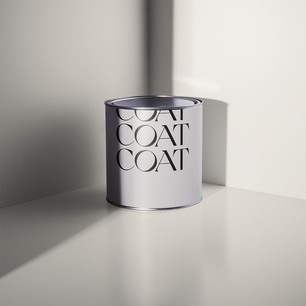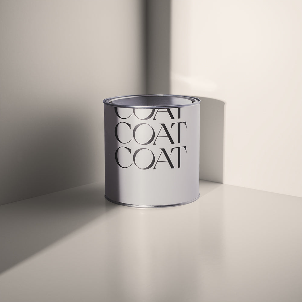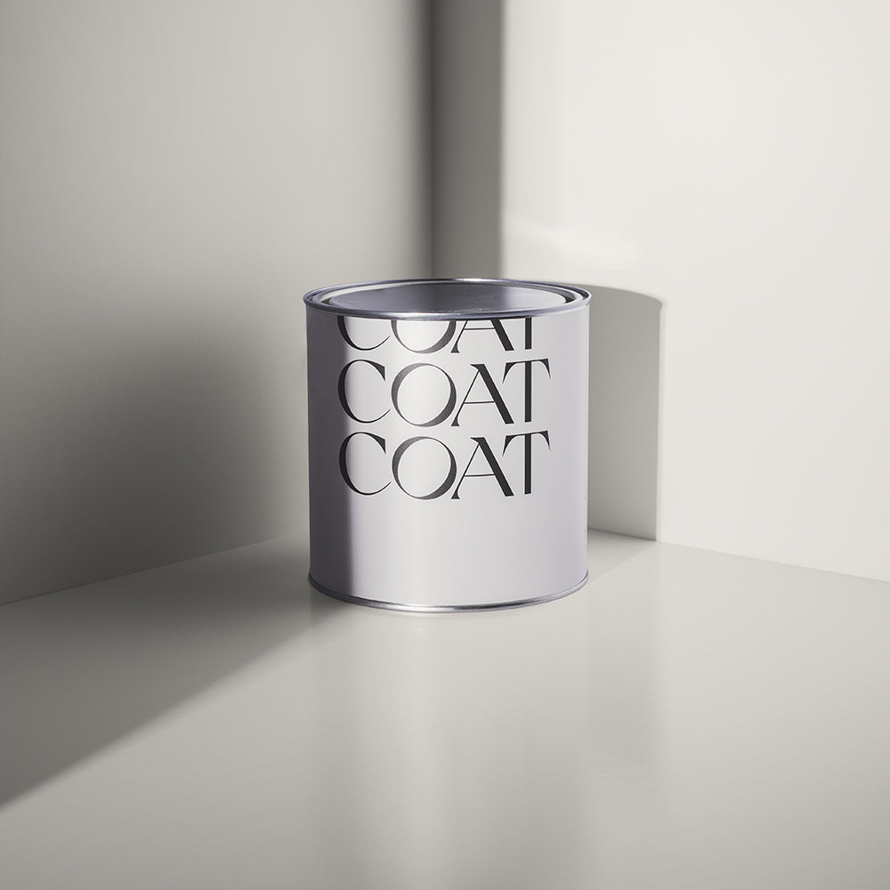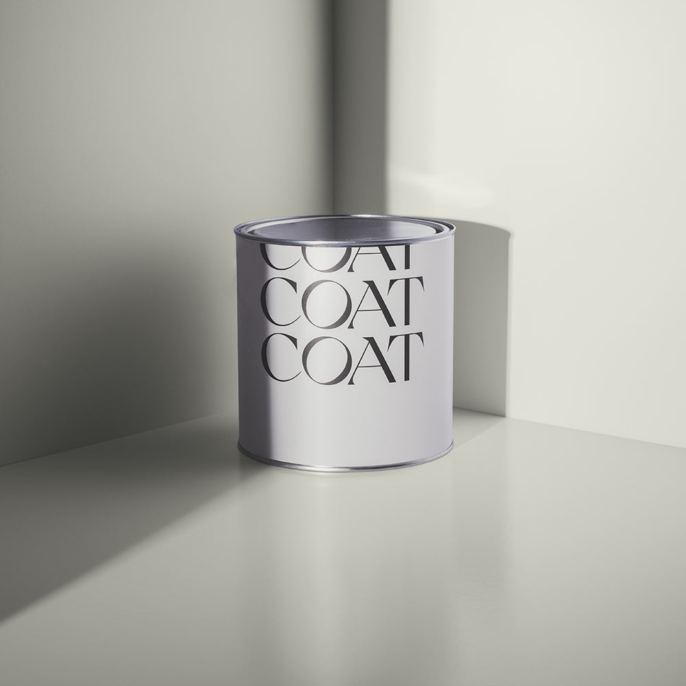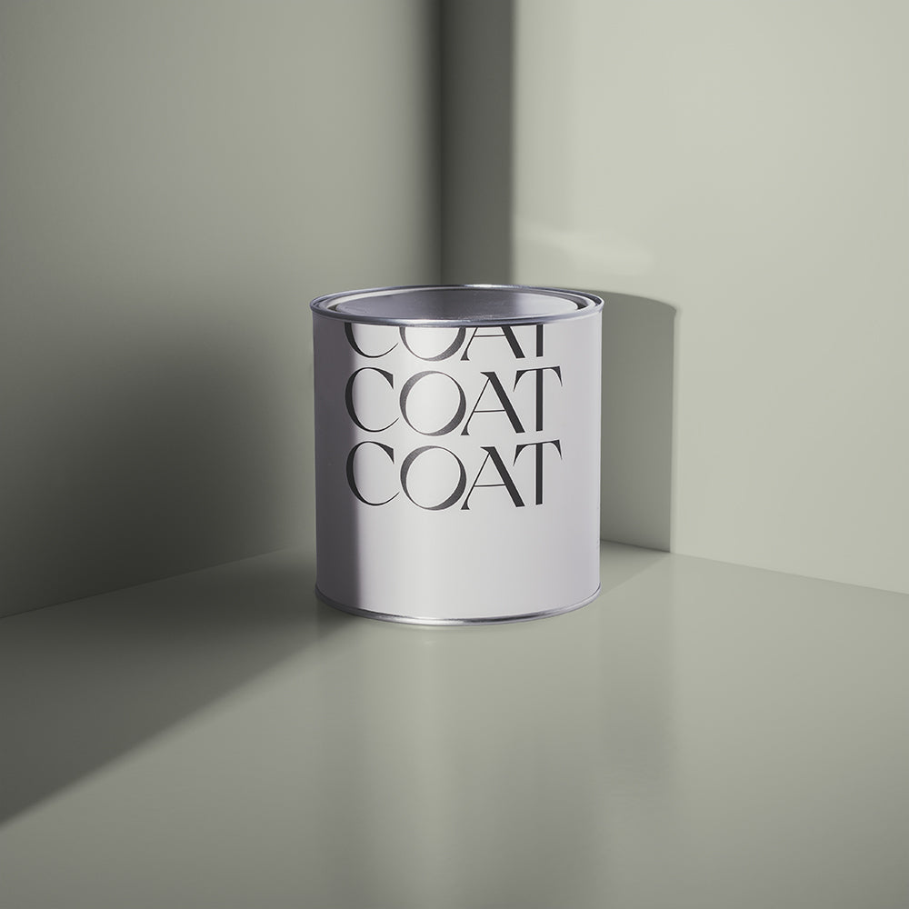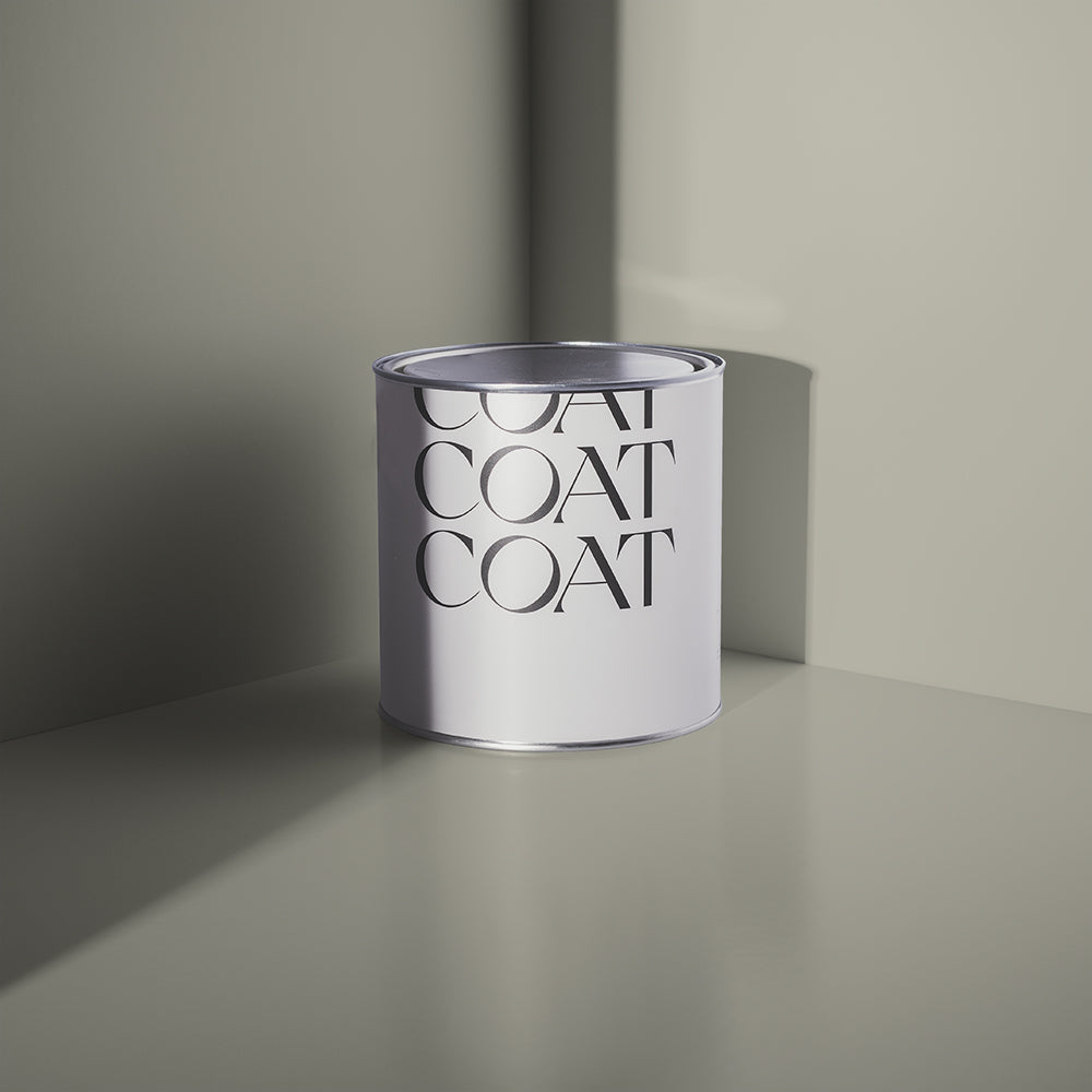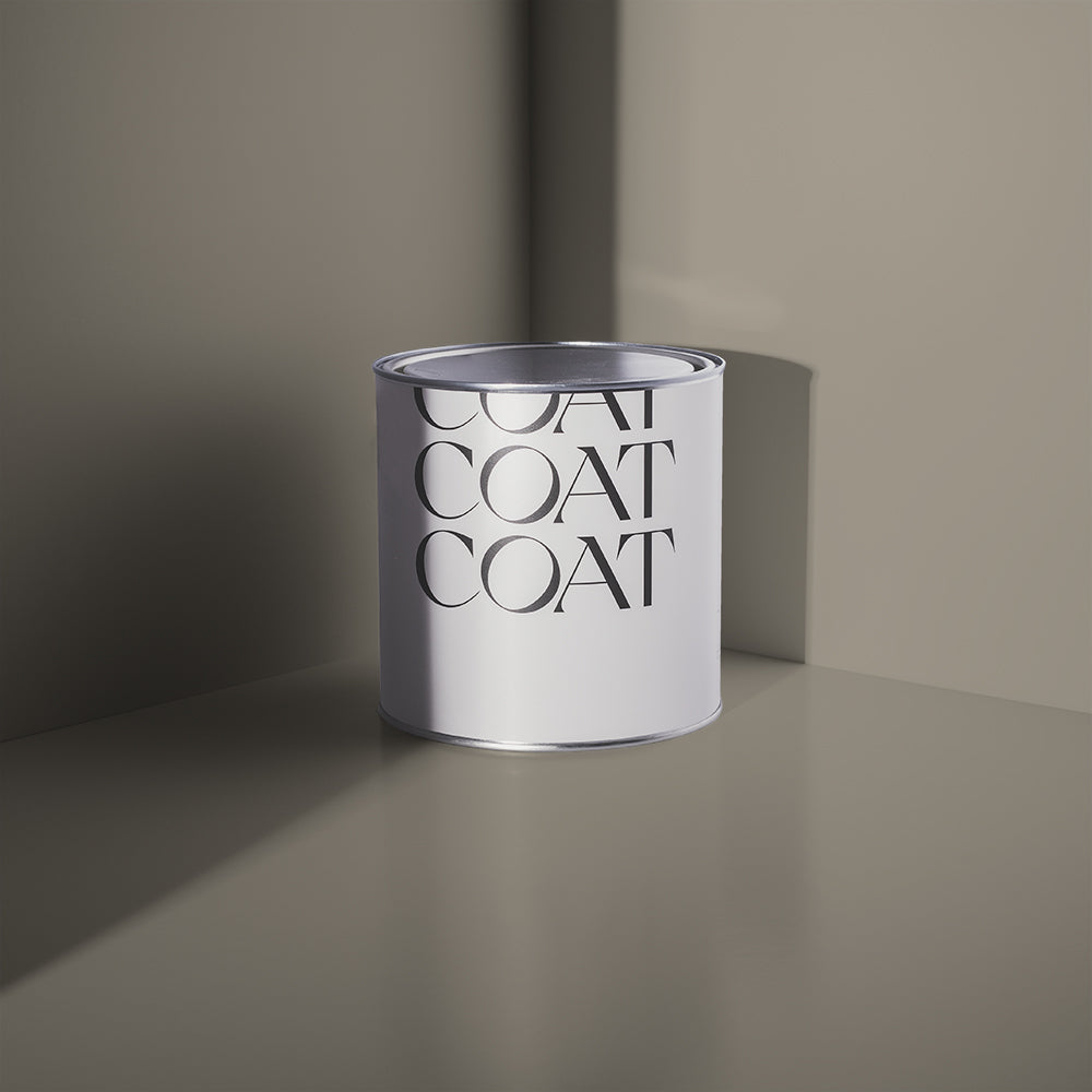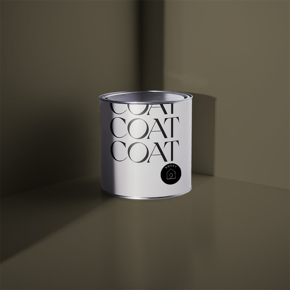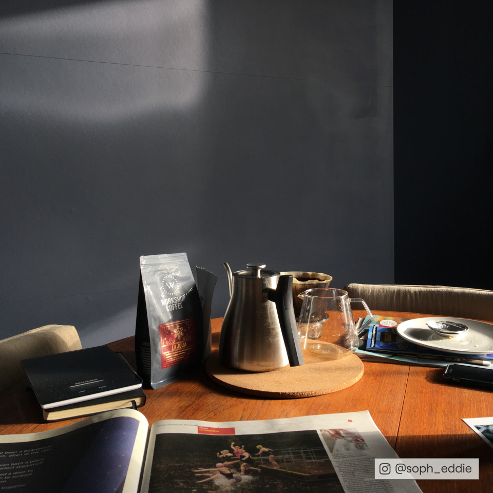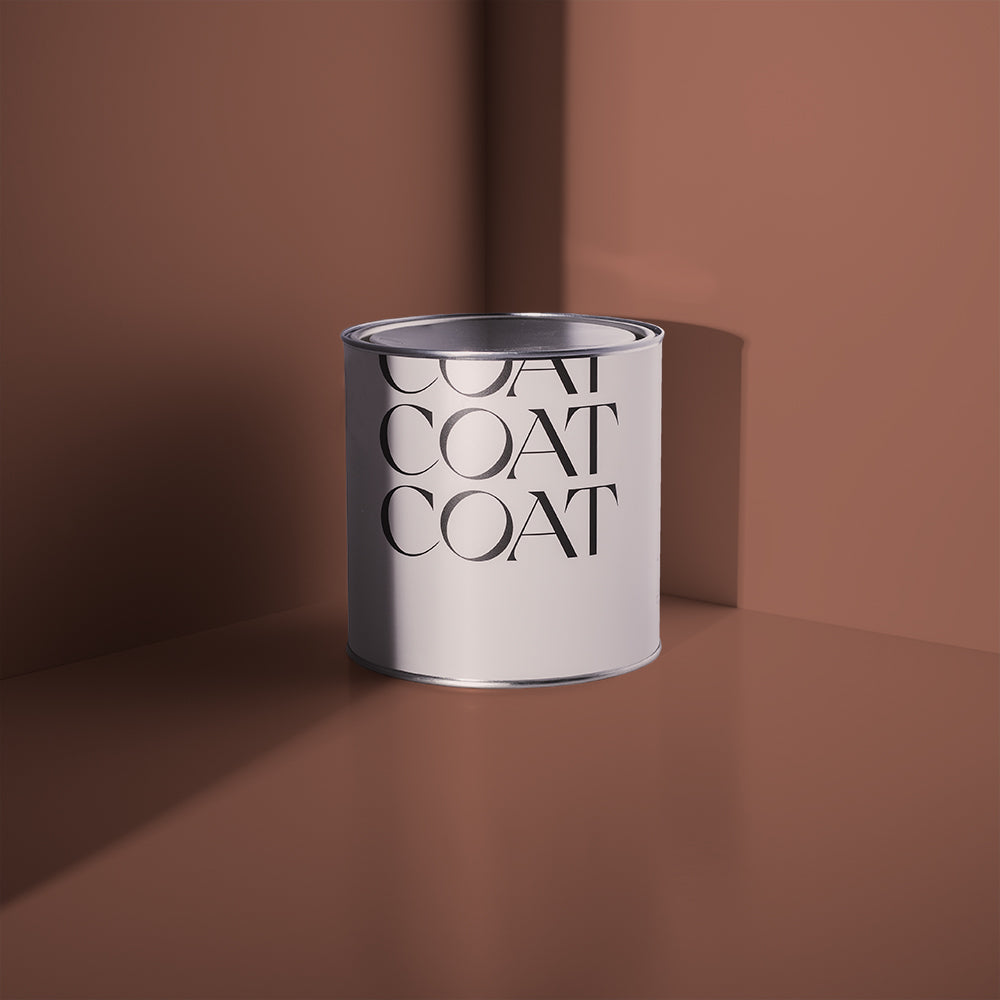
The Summer Edit: A Limited Edition
Summer has finally arrived and at COAT we’ve been taking inspo from our travels and are getting ready to embrace those holiday vibes at home. For this season we’re launching four new shades that perfectly capture the essence of summer. From the sunsets of Santorini to the deserts of Morocco, each shade will transport you to breathtaking landscapes and infuse your space with a sense of wanderlust.
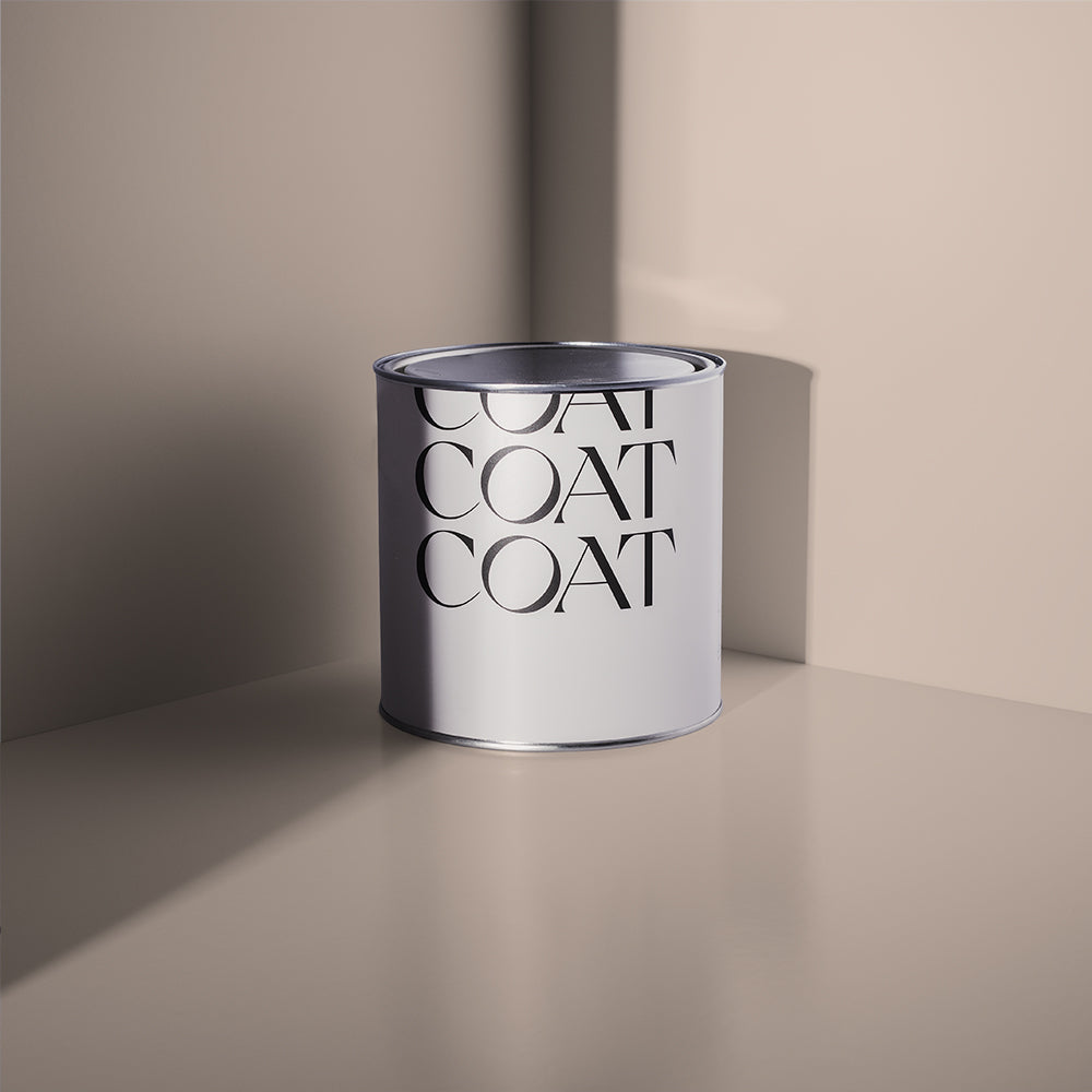
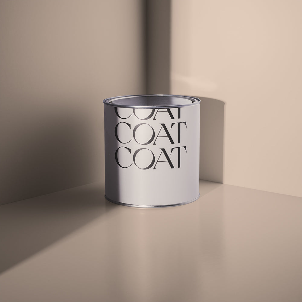
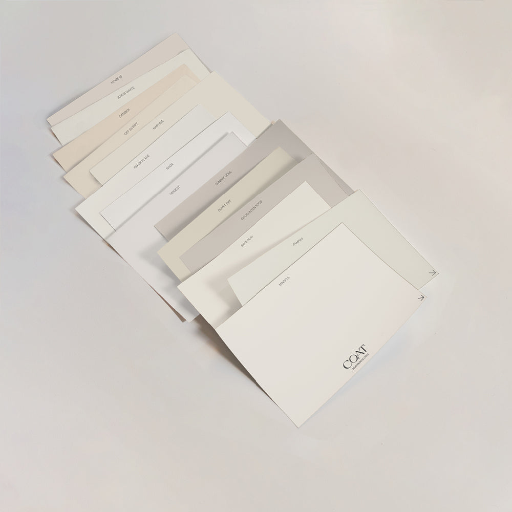
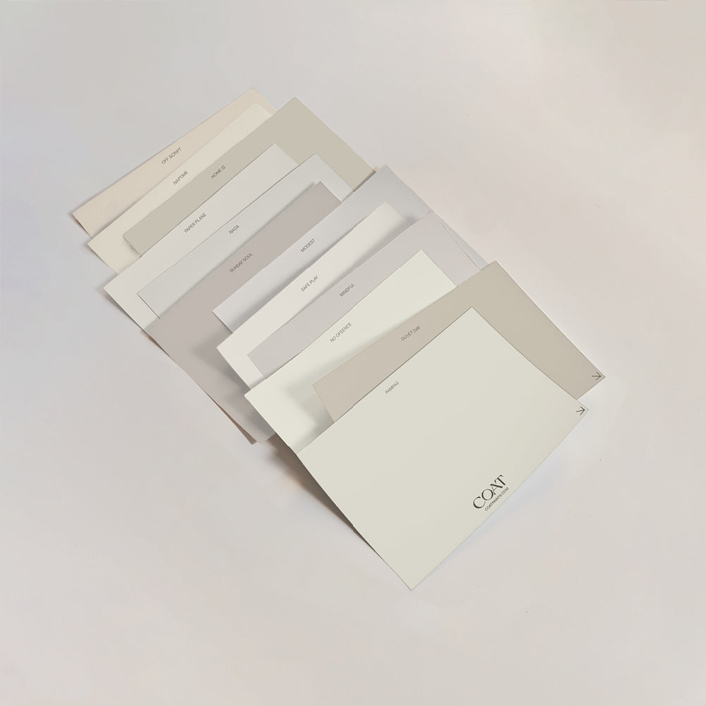
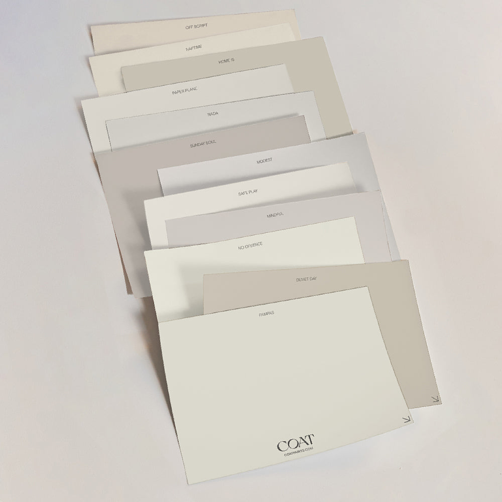
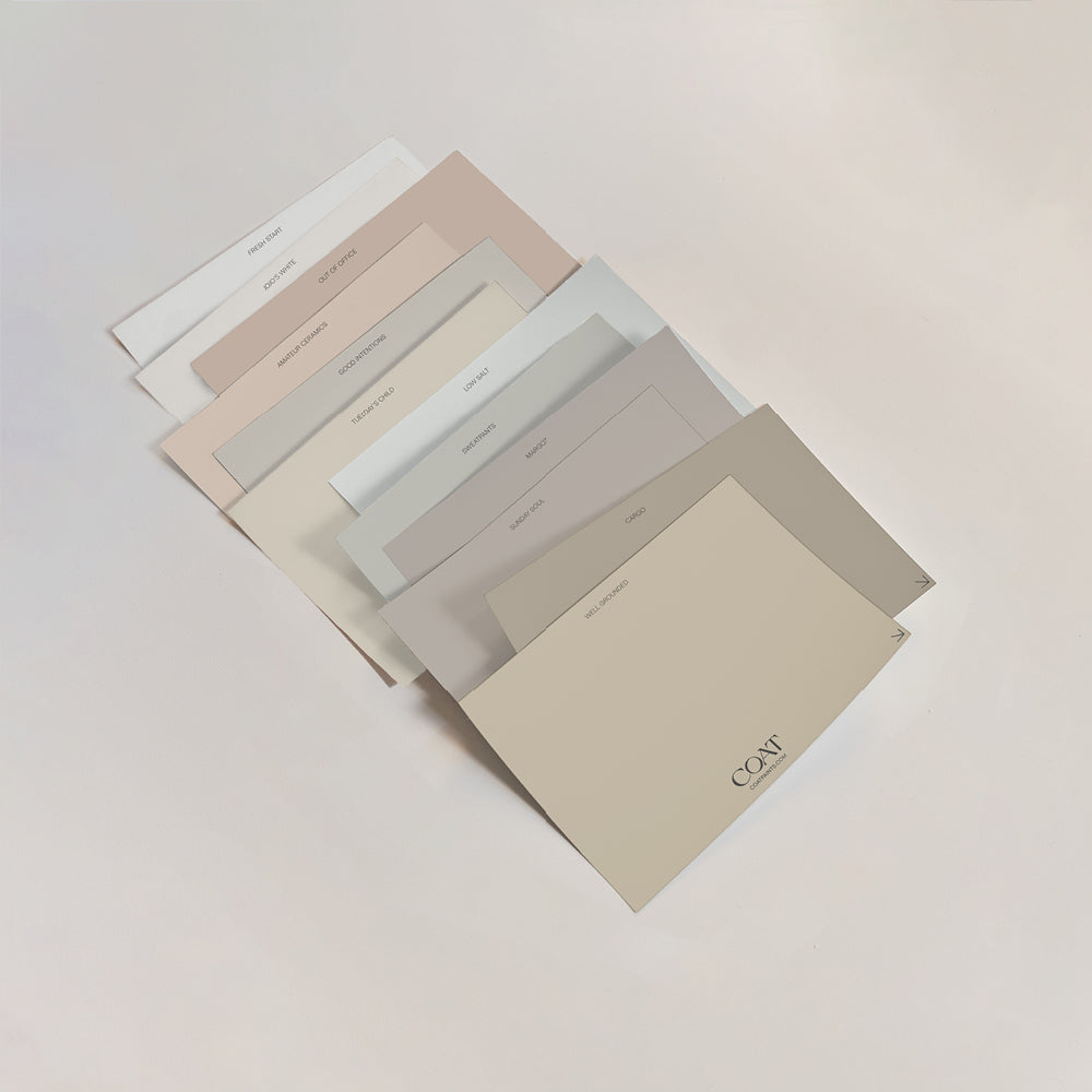
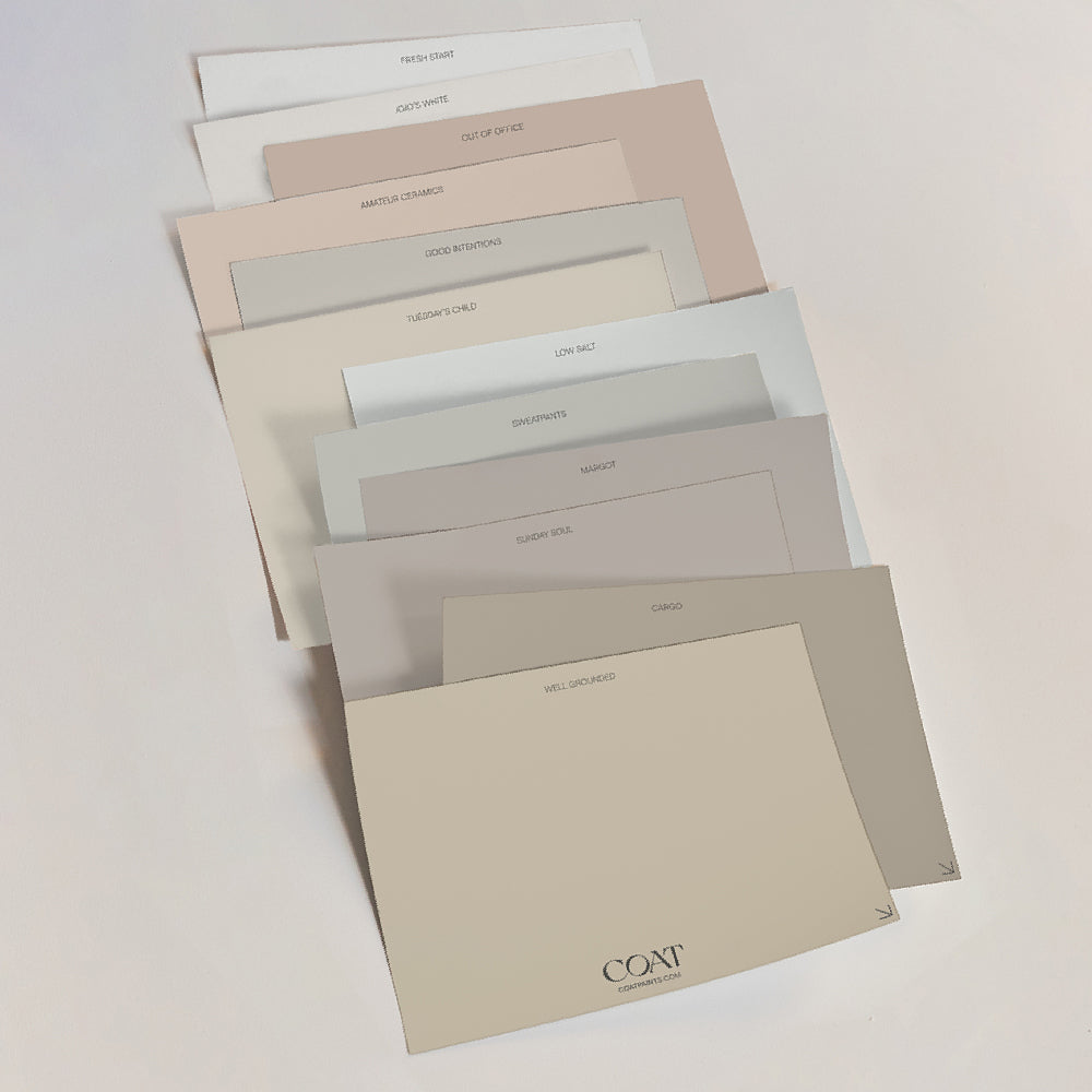
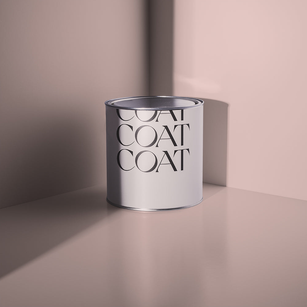
These limited edition shades will only be available for three months. Grab The Summer Edit Samples Pack now.

Out Of Office
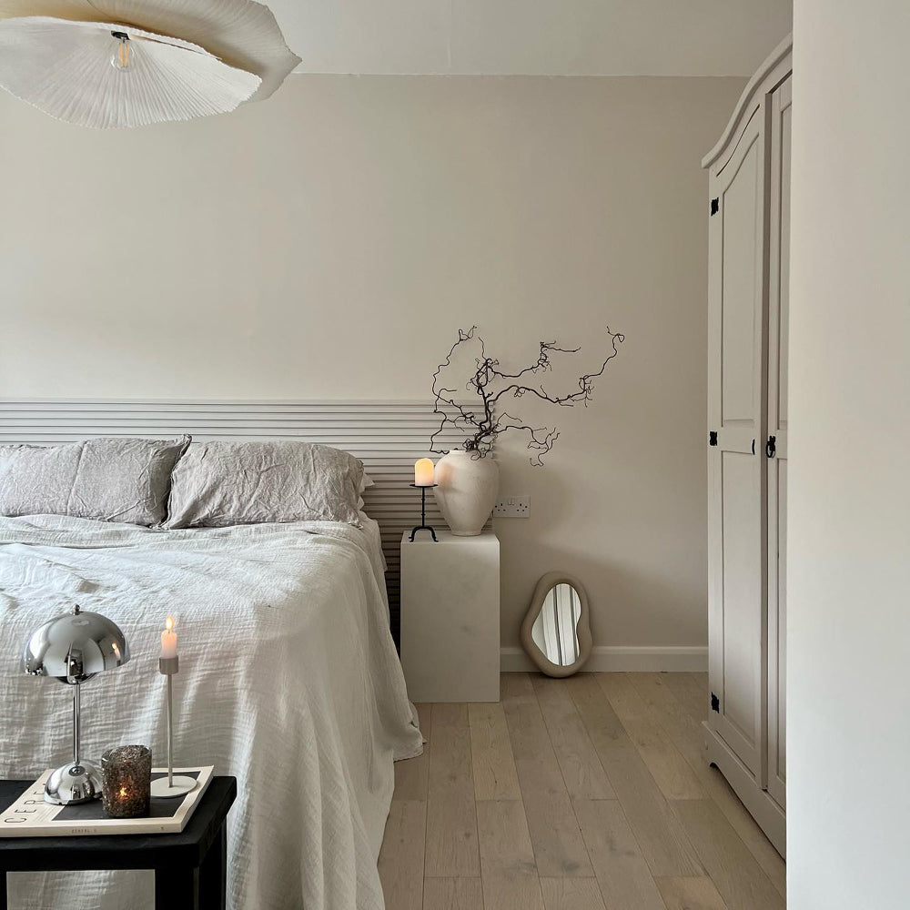
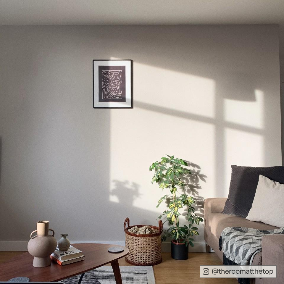
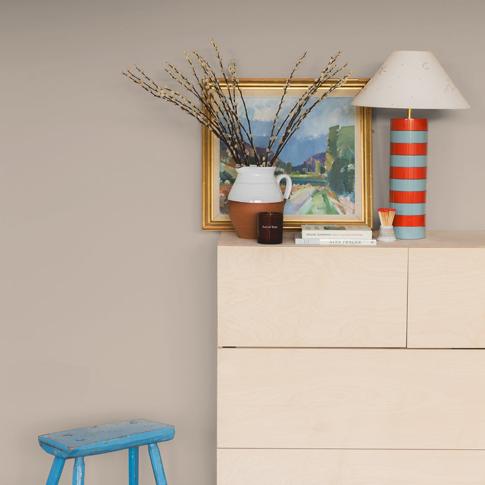
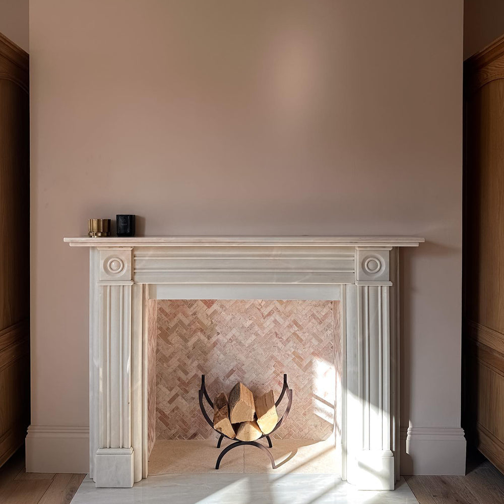
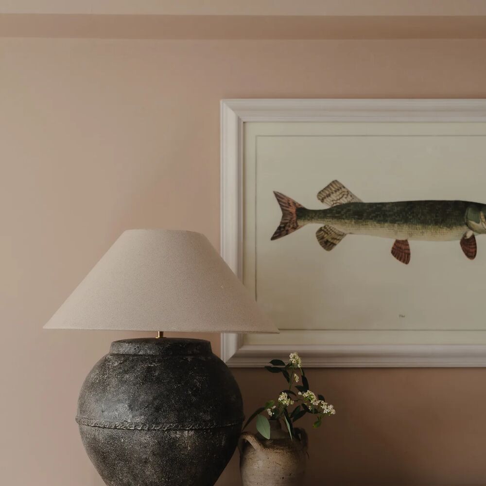
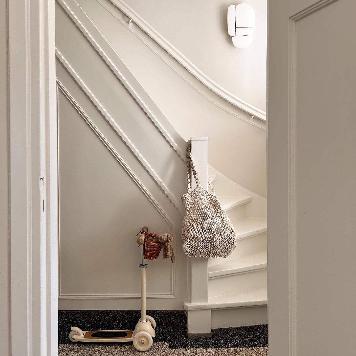
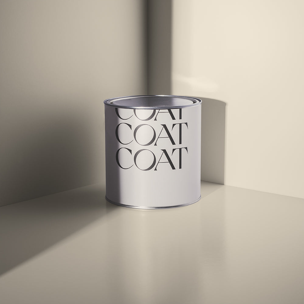
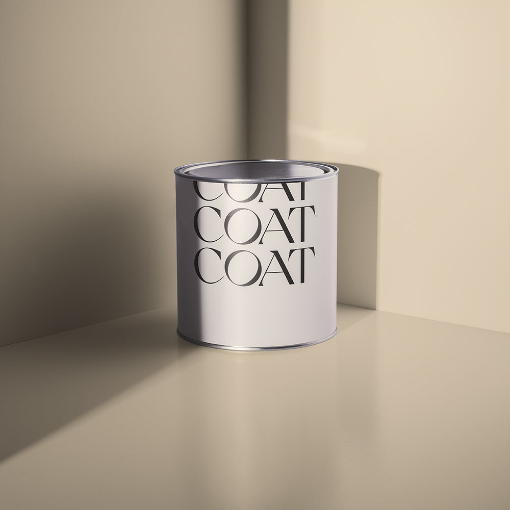
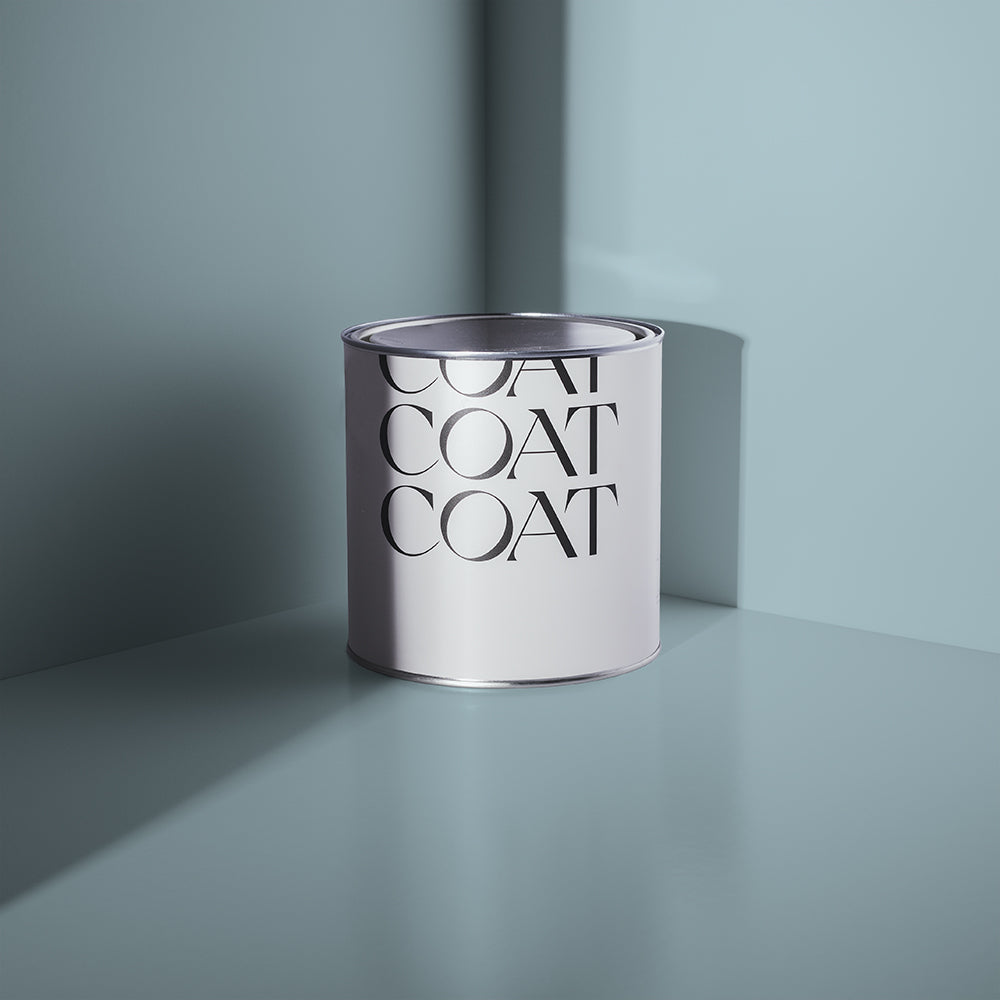
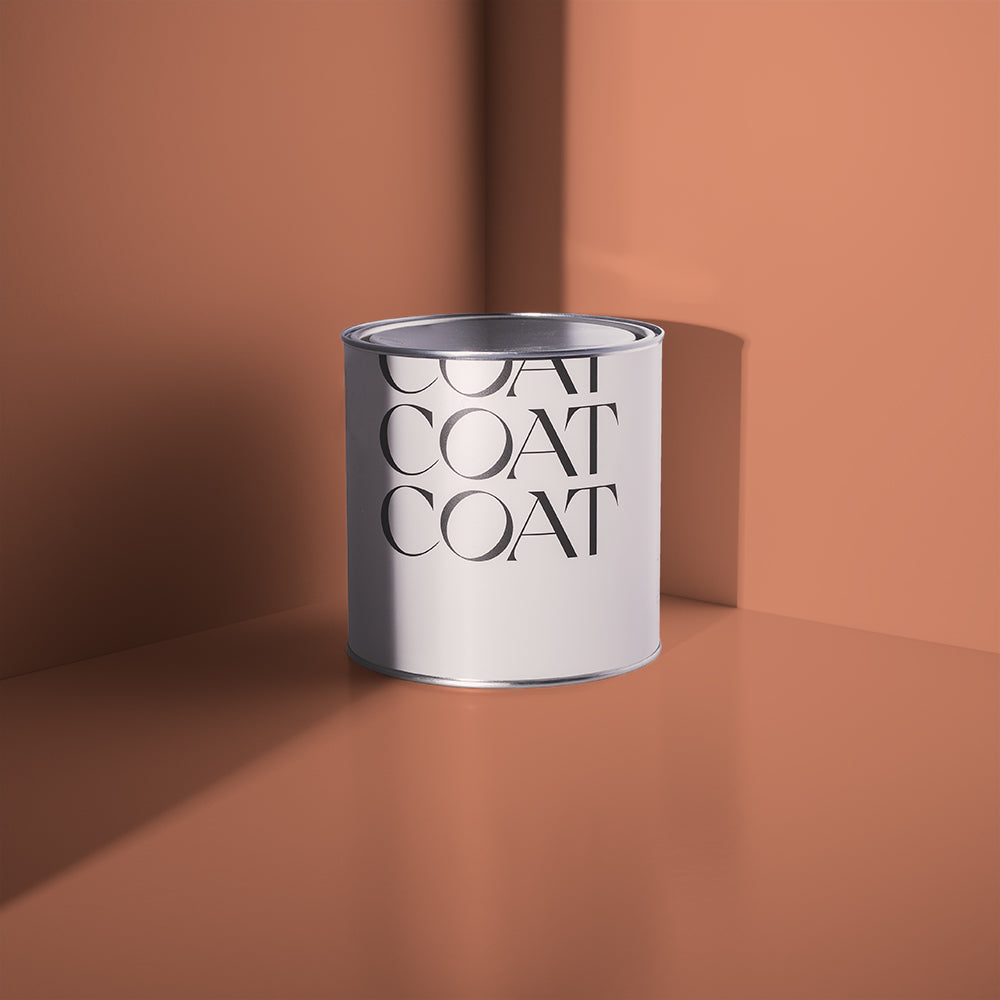
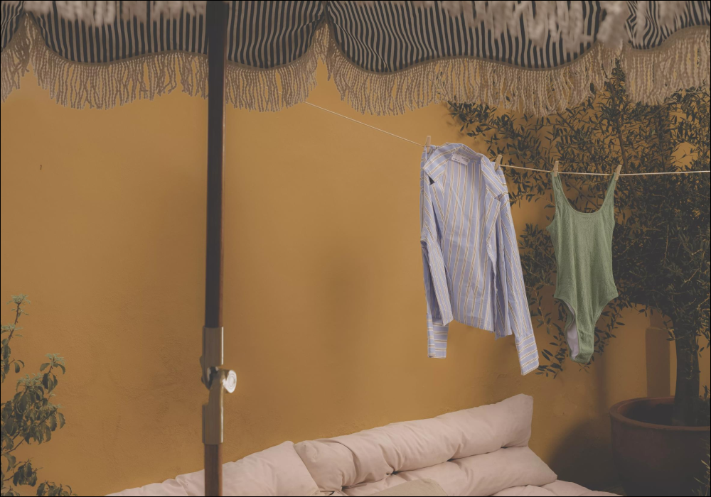
Sun-bleached stone and warmer climates are calling. With this reddish, stony neutral - every day feels sun-kissed.
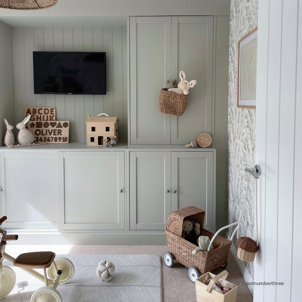
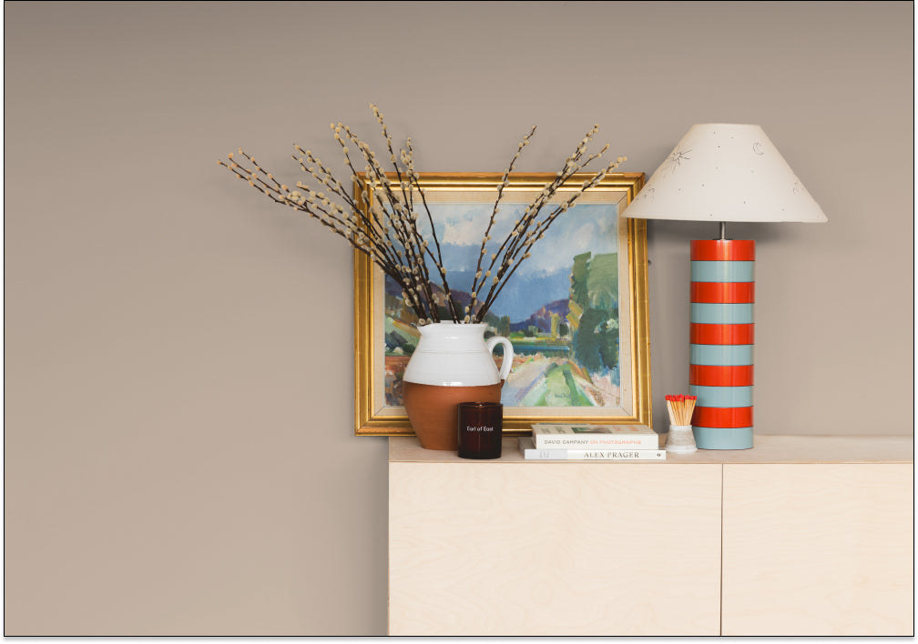
Out Of Office is a touch redder and less grey than our taupes, making it an inviting addition. Its yellow undertone also means that it balances with a large variety of natural materials, making it ideal with woods, stone and marble.
OOO works particularly well in North facing spaces, where it provides some brightness - its red undertone giving the space a welcoming glow. It's also the perfect colour for ceilings and woodwork if you’re using more vibrant reds like Medina Quarter on the walls.
Use on walls and woodwork and complement with bookcases, cabinets or wardrobes in Buon Fresco for a really easy, inviting neutral scheme. Voltaire would make the perfect ceiling colour when using Out Of Office on your walls.
For more open plan spaces, especially kitchens, Out Of Office is great on cabinetry when combined with warmer off whites like Modest or Mindful on the walls.
Looking for the a sun-bleached stone shade? Grab an Out Of Office sample.

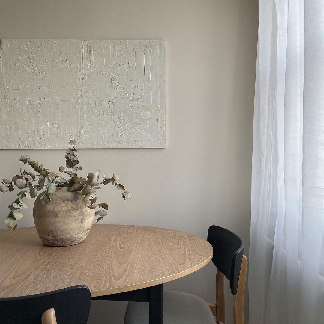
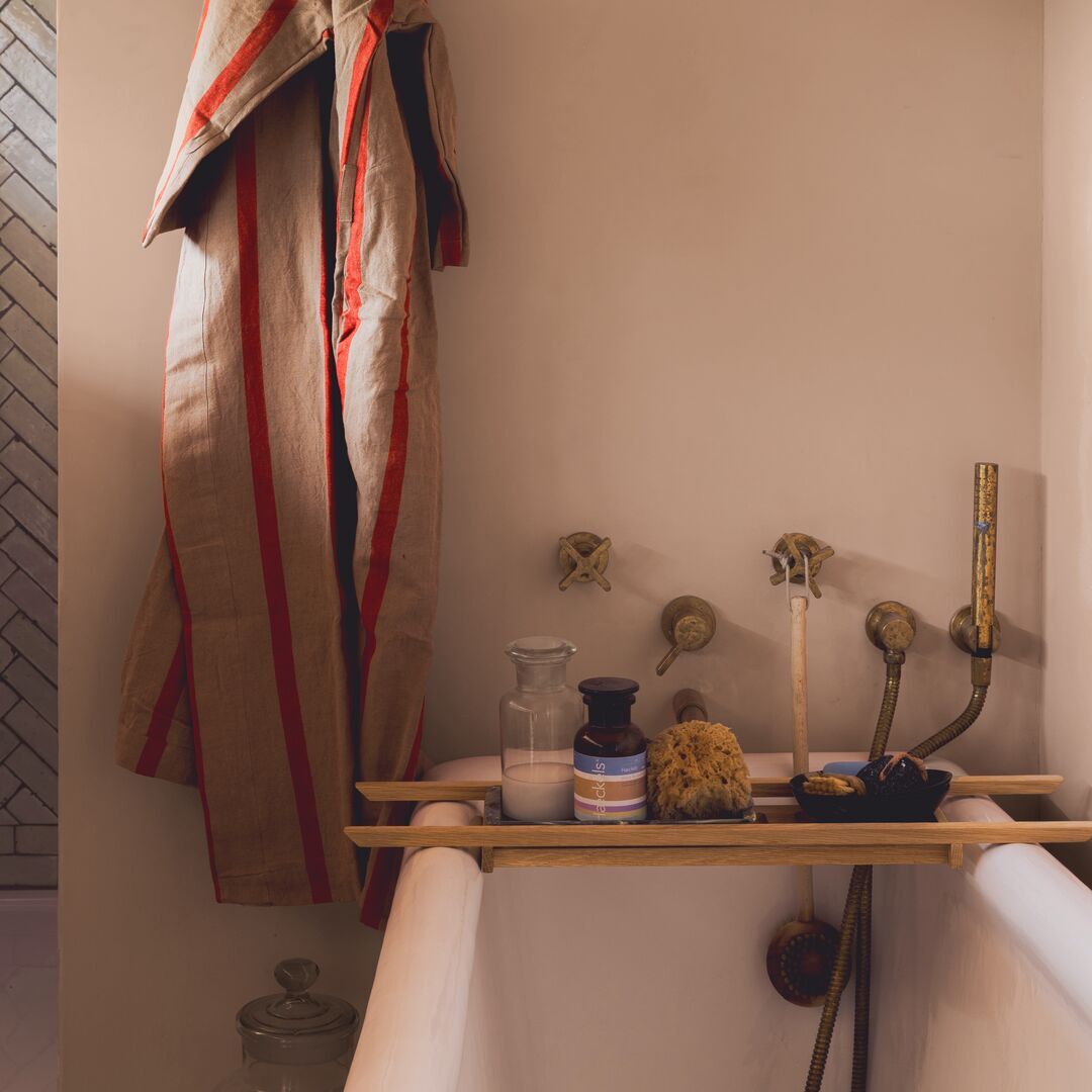
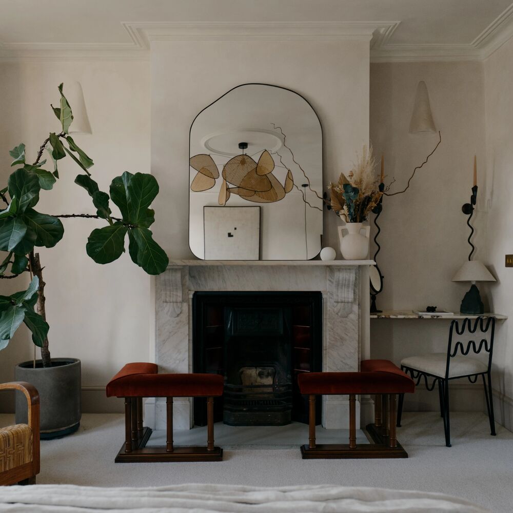
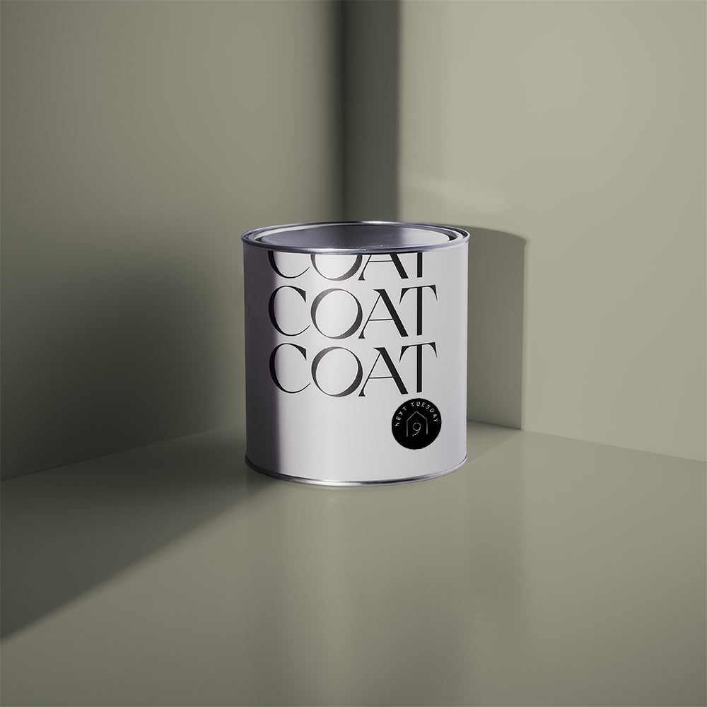
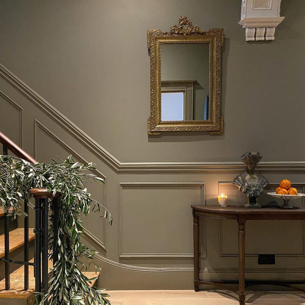
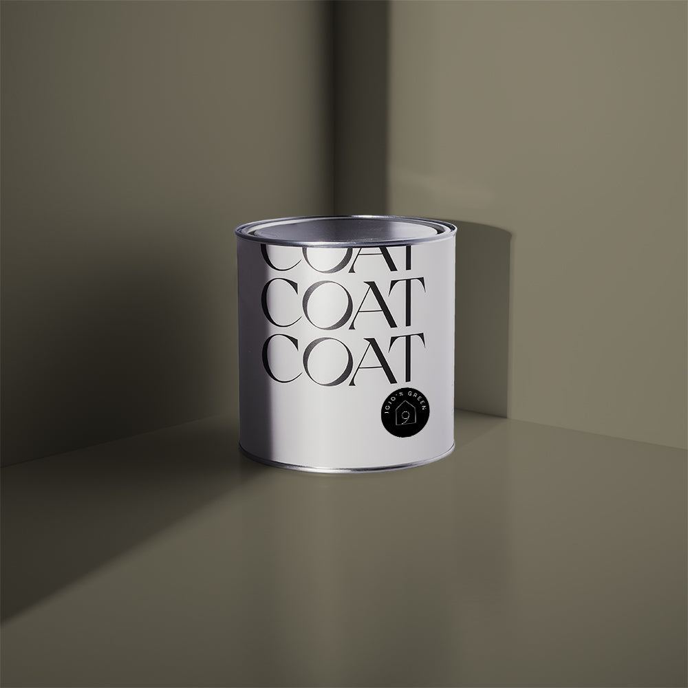
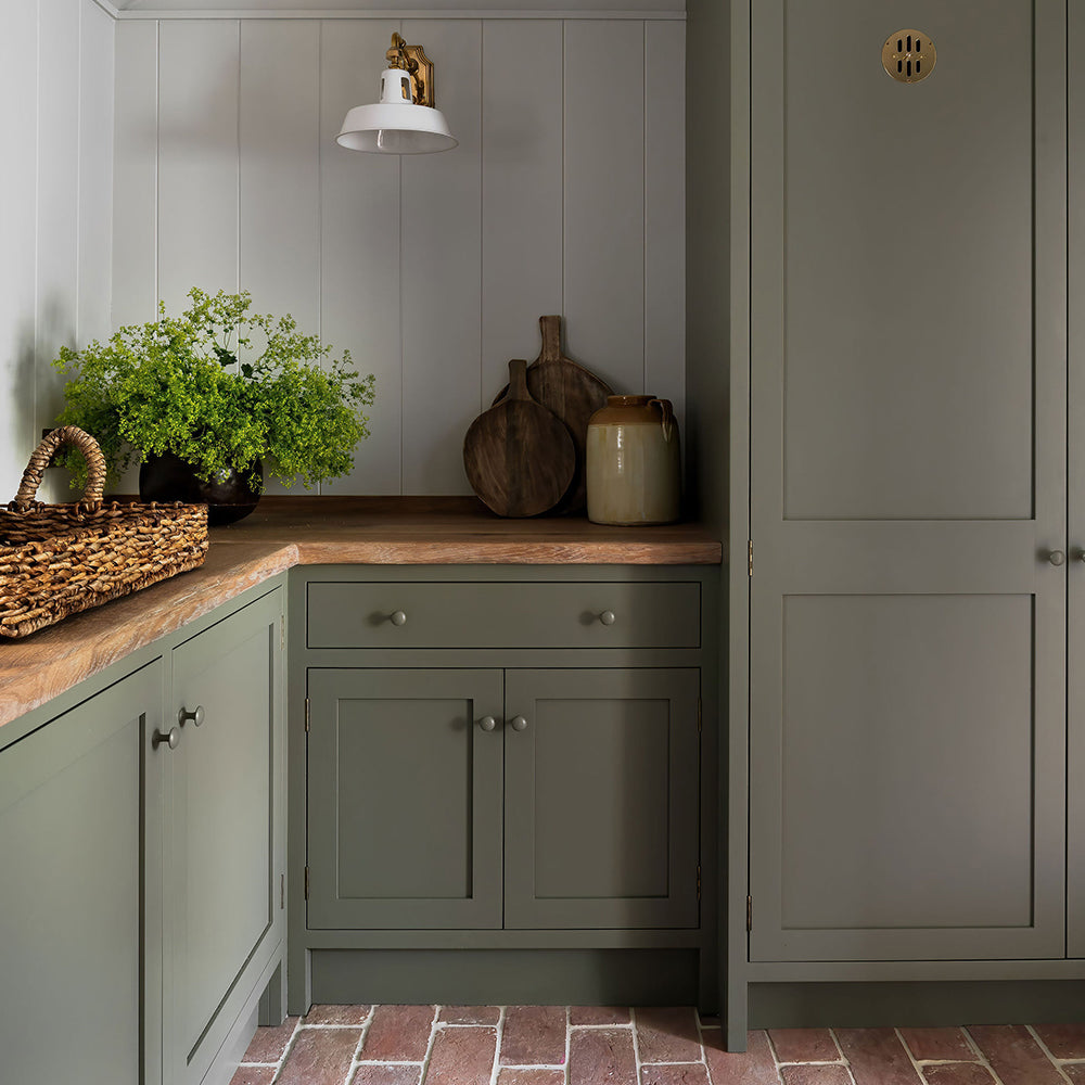
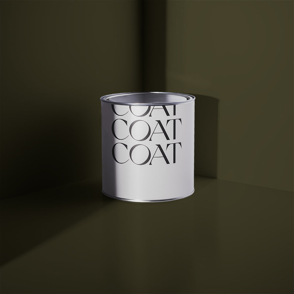
Buon Fresco
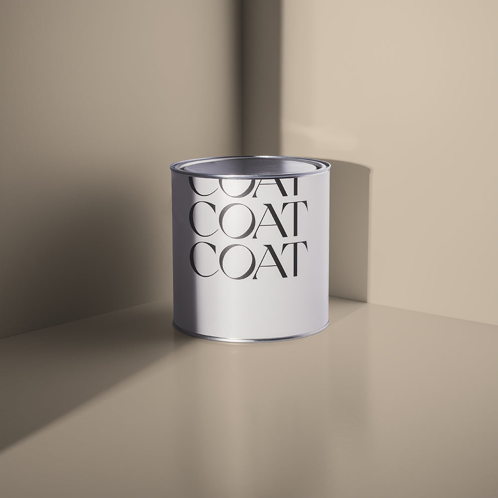
A deep neutral with a wet-plaster look. A modern take on the ‘true fresh’ style of Italian painting.
With its red base, it’s perfectly at home when paired with Out Of Office (which can be used as an off-white for ceilings and woodwork). Buon Fresco takes its name from the Italian decorating style, where pigments are ground into water and then applied straight to wet plaster.
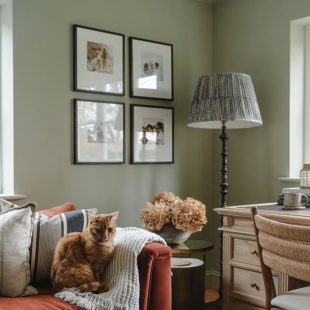
This slightly deeper neutral does the job of Out Of Office in South facing spaces, where it will be brighter and more plaster-vibes. It’s also perfect for exterior spaces where you need something stony and grounded without too much vibrancy.

A deep neutral with a wet-plaster look, go on...grab your Buon Fresco sample here.
Buon Fresco also makes for the perfect partner when combined with our new red, Medina Quarter. Use Buon Fresco in rooms painted in this earthy red for woodwork, ceilings and cabinets to help soften contrast and make for a much more laid back space. Stony, warm neutrals are also perfect for creating an inviting garden space where they provide a flattering backdrop for foliage and flowers.
If you’re feeling bold, try pairing with a dark brown on woodwork; Gumption would be the perfect choice for this.

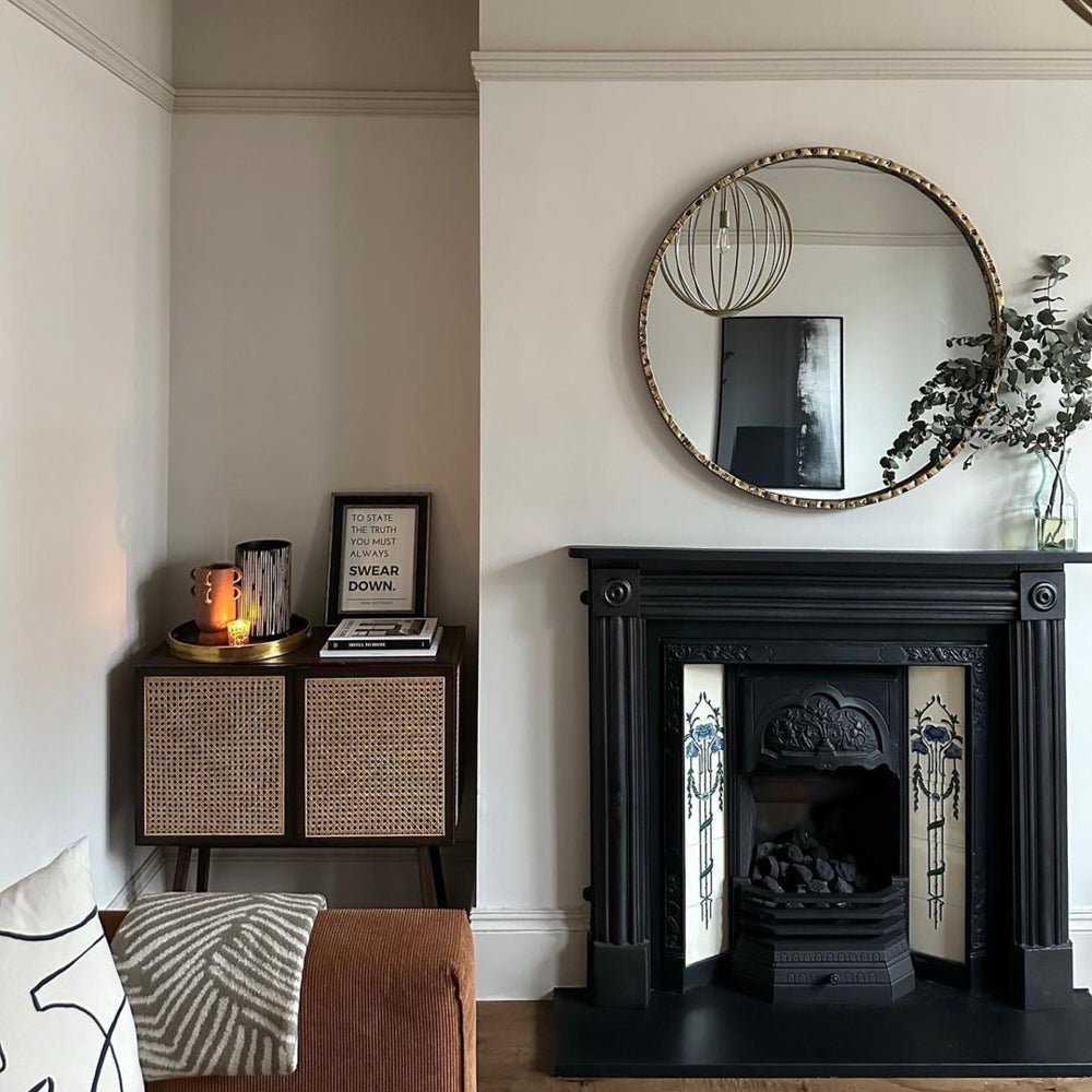
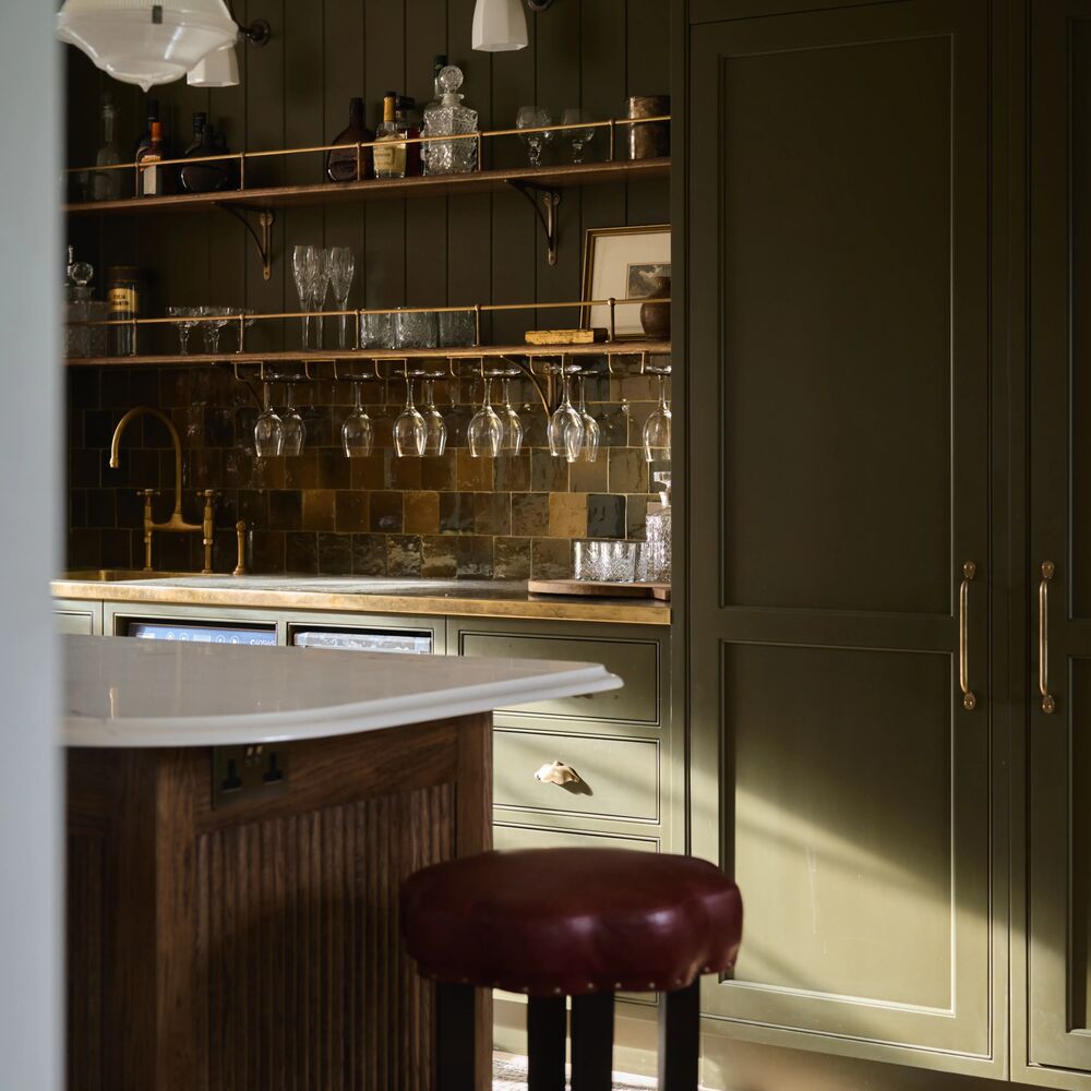
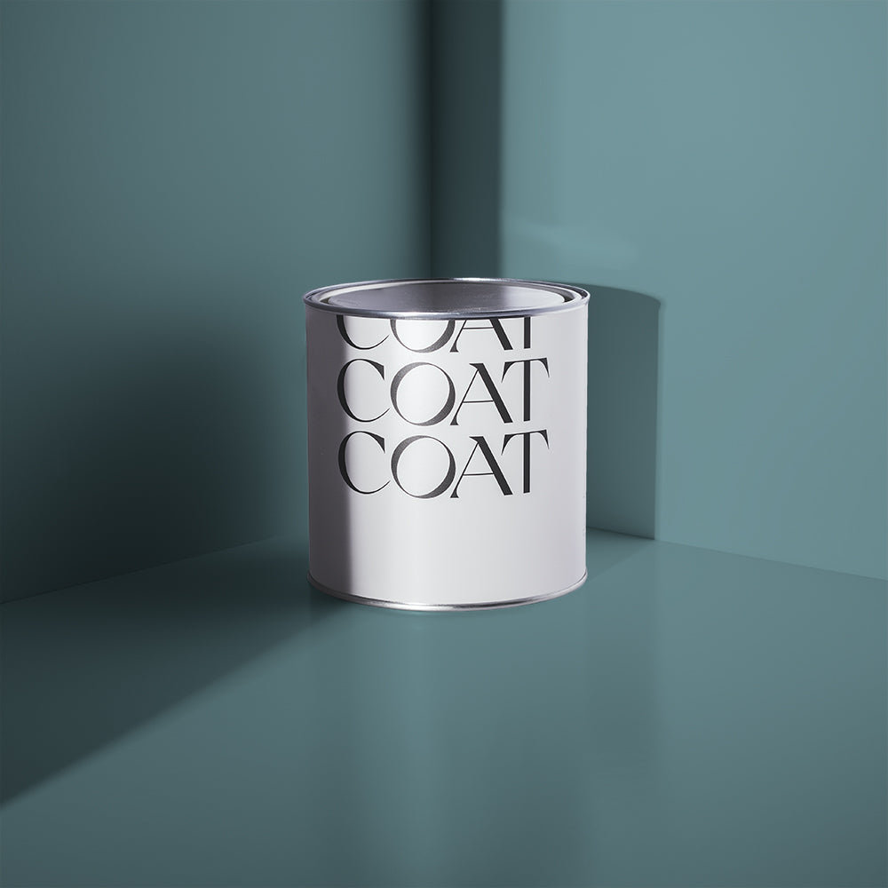
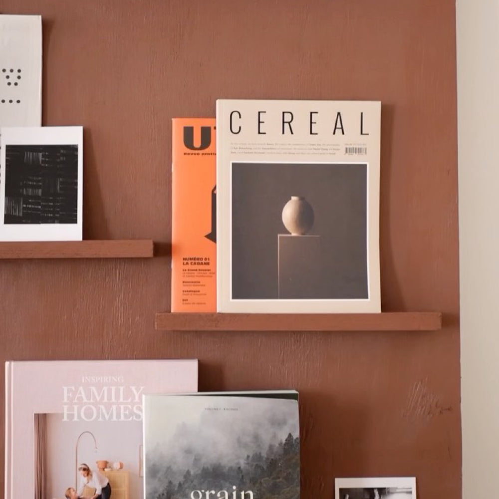
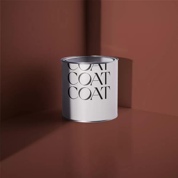
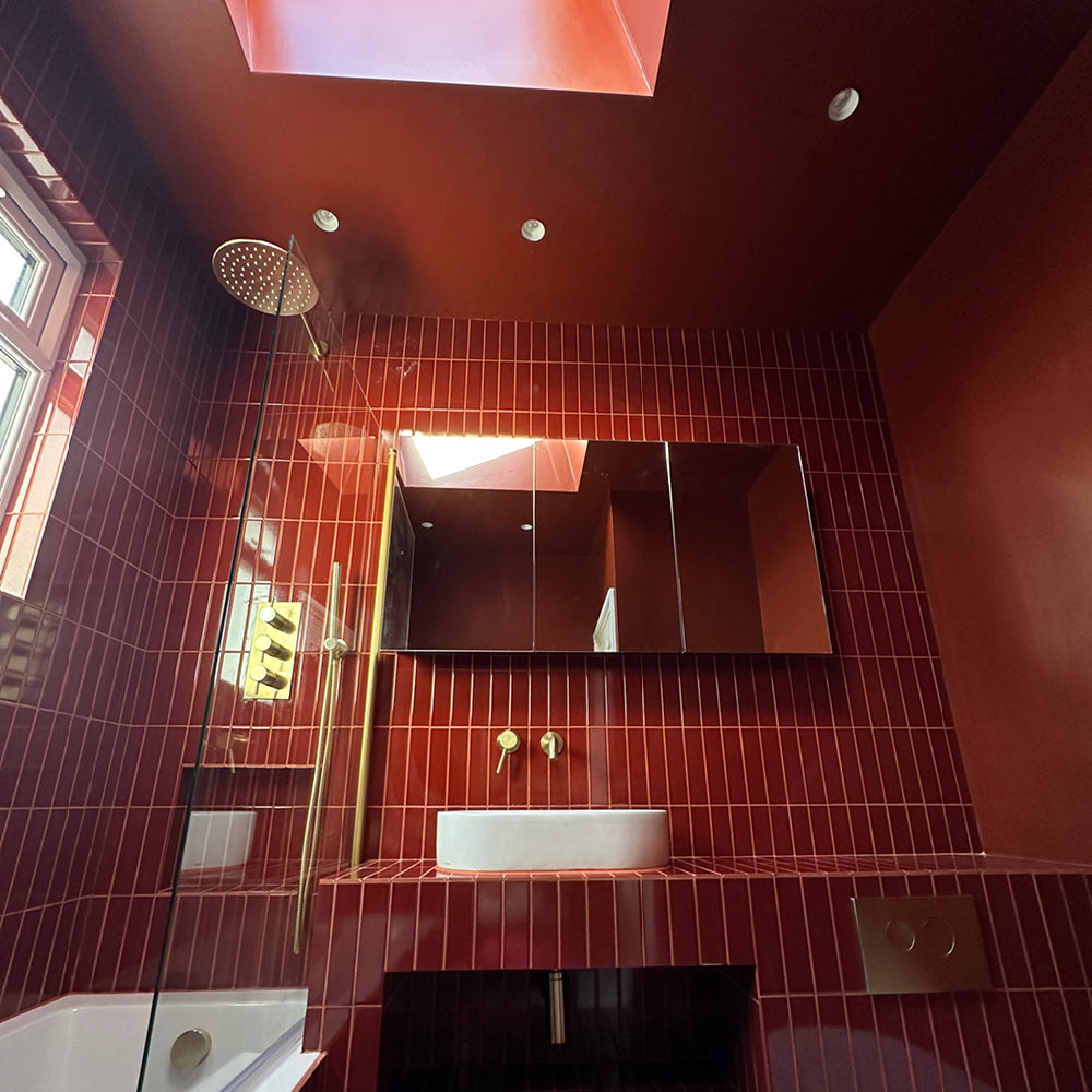
Medina Quarter
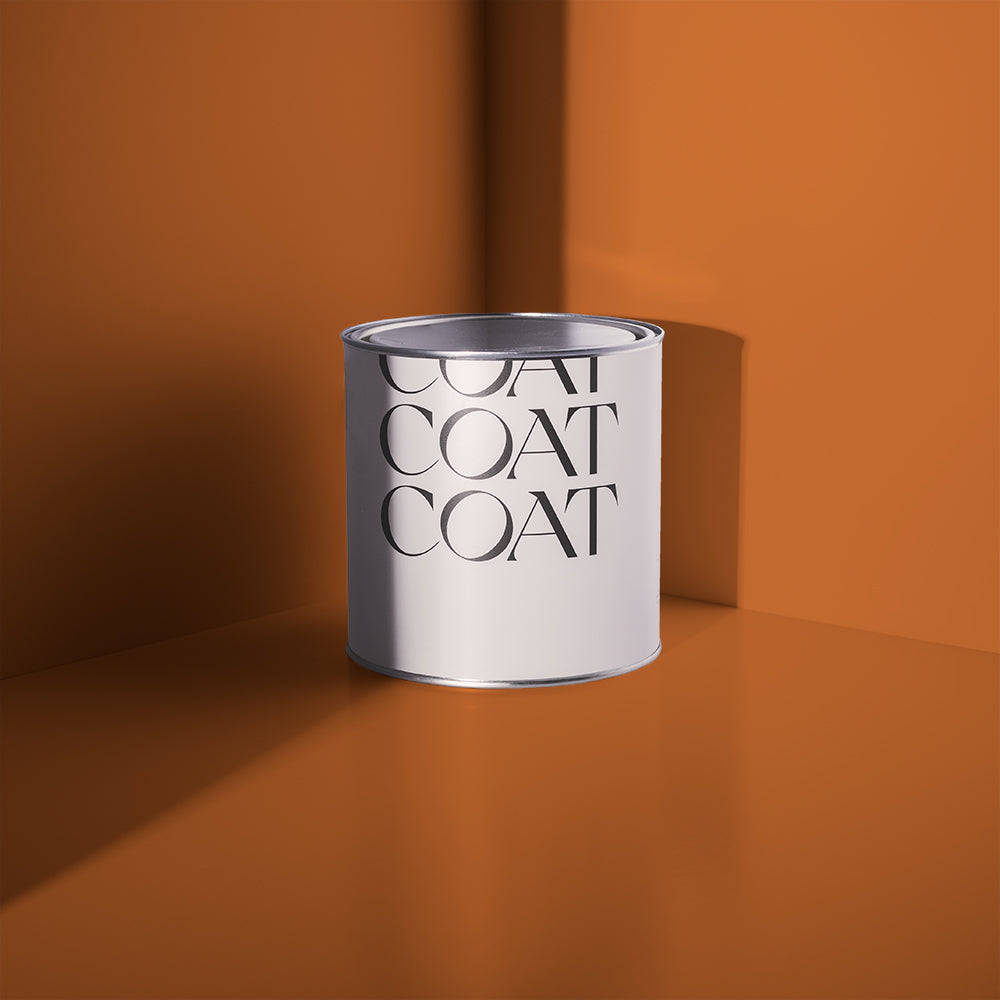
A rich and earthy red with the warmth of North Africa. Medina Quarter will add warmth and drama to any space - without feeling shouty.
This colour is inspired by the rich colours found in fabrics across North Africa, where ground pigments create alluring colours with an enticing depth.
Use Medina Quarter anywhere for a shot of heat. This complex red works well in any space because of its yellow undertone. Particularly effective for North facing rooms where it can warm up the room, but can be at home anywhere. In outdoor spaces, its yellow undertone will soften it, creating a very rich terracotta look.

Add a pop of colour to your space with Medina Quarter. Get your hands on a sample to get the look.
Medina Quarter rooms pair effortlessly with Buon Fresco or Out Of Office woodwork and ceilings, for a look that is easy on the eye and the soul. Red can be difficult to use in interiors, but the key is about reducing contrast, so avoiding bright whites. For those looking for a more exotic look, try pairing Medina Quarter with deep browns, blues and yellows: Gumption, 2AM and House Points would all make excellent additions on small pieces of furniture.

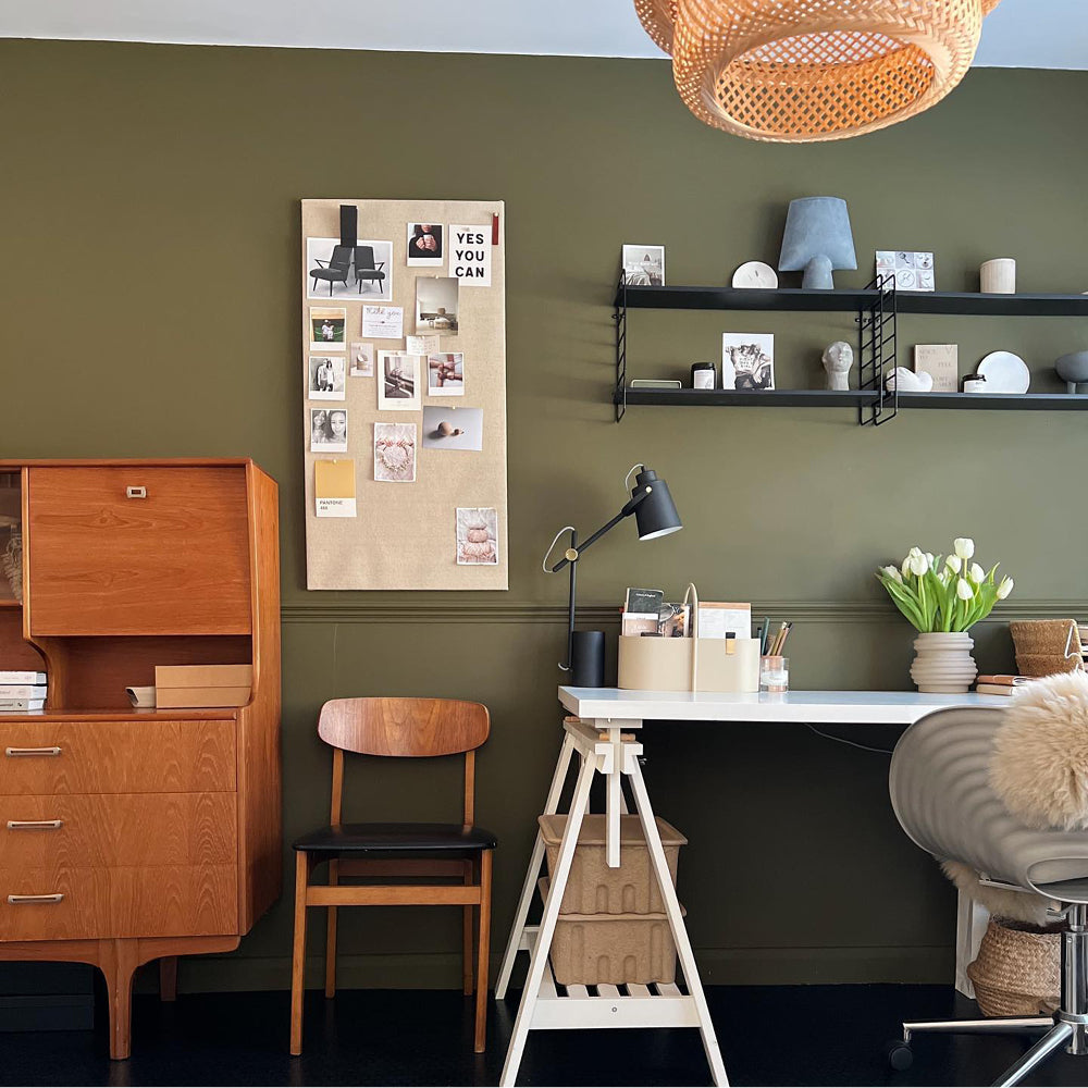
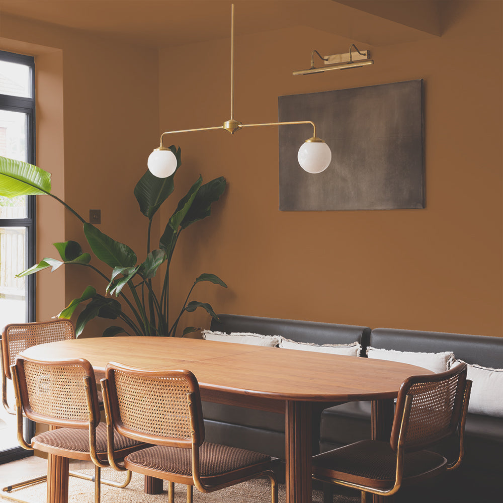
Miles From Monday
A dark inviting ochre yellow. Deep like the evening sun, it’s a subdued yellow shade - far from any hustle and bustle.
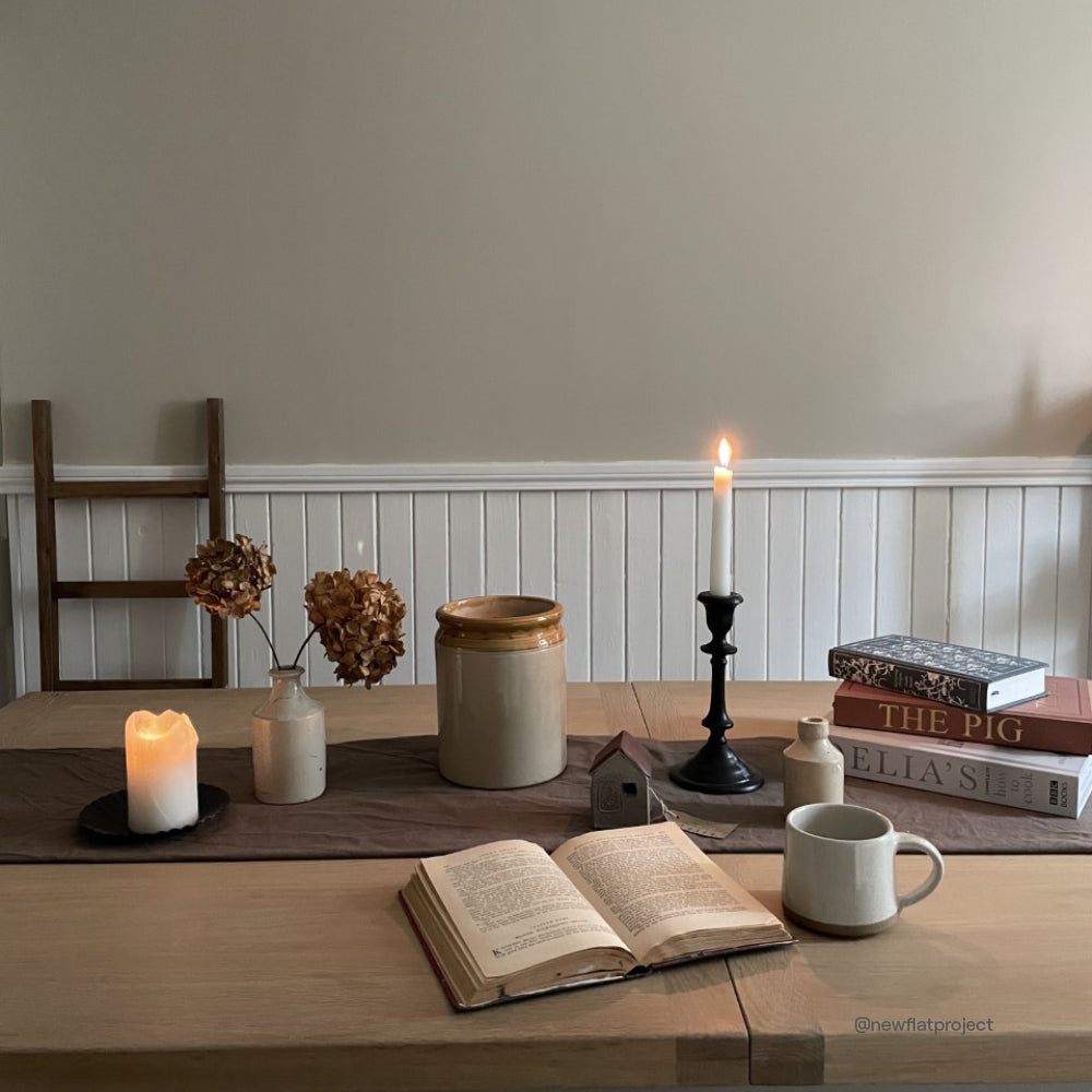
Miles From Monday is an ochre yellow. It contains a fair amount of red and orangey pigment, making for a yellow with unparalleled depth. Think of a deep sunset; this dark yellow tone is far from the busy colour we often associate yellow to be. This perfectly subdued colour works best as an accent with the existing COAT beiges, like Duvet Day, Biscuits For Breakfast and Moving Day. Miles From Monday is particularly suited to kitchen cabinetry.

Feeling inspired? Check out the full Limited Edition Edit by ordering a Summer Edit Sample Pack.
Yellows can be a complex colour to decorate with, often because they’re not earthy enough - something this colour has in spades.
Miles from Monday is great in North facing spaces as an alternative to Medina Quarter but is also great for East facing rooms where this ochre tone feels more subdued due to the greenish nature of the light (particularly in garden facing kitchens).
For an effortless, but intriguing scheme, use Sunday Soul or Cold Brew for the walls and woodwork and a Miles From Monday on the ceiling to create a warm glow across the space. Miles From Monday can also be used as an alternative to more terracotta colours when used outside. It will feel slightly sunnier while maintaining depth and intrigue, and avoiding making your outdoor space look too obviously orange.
Get stuck in, and chat to us if you need some advice.
Publish Date
Author