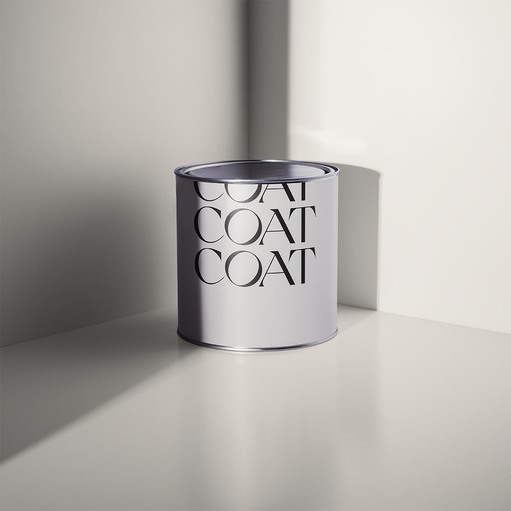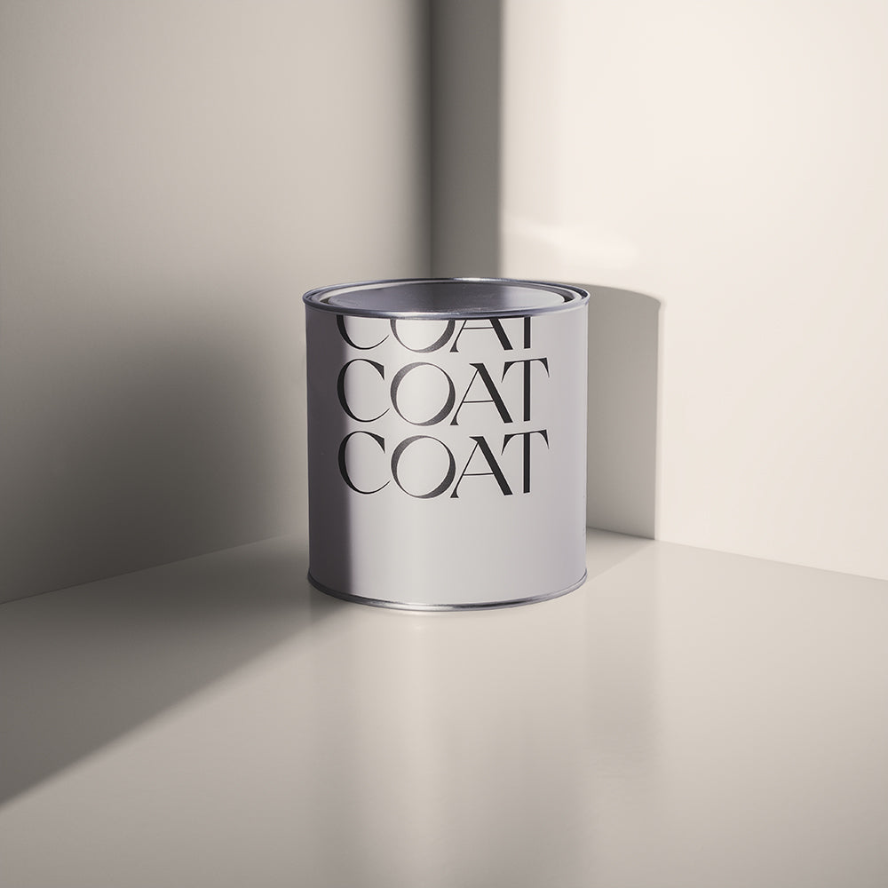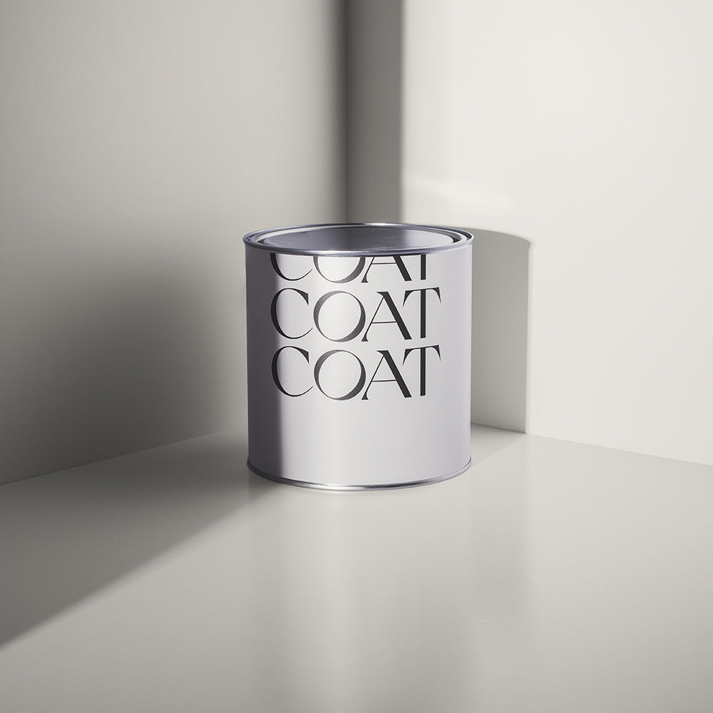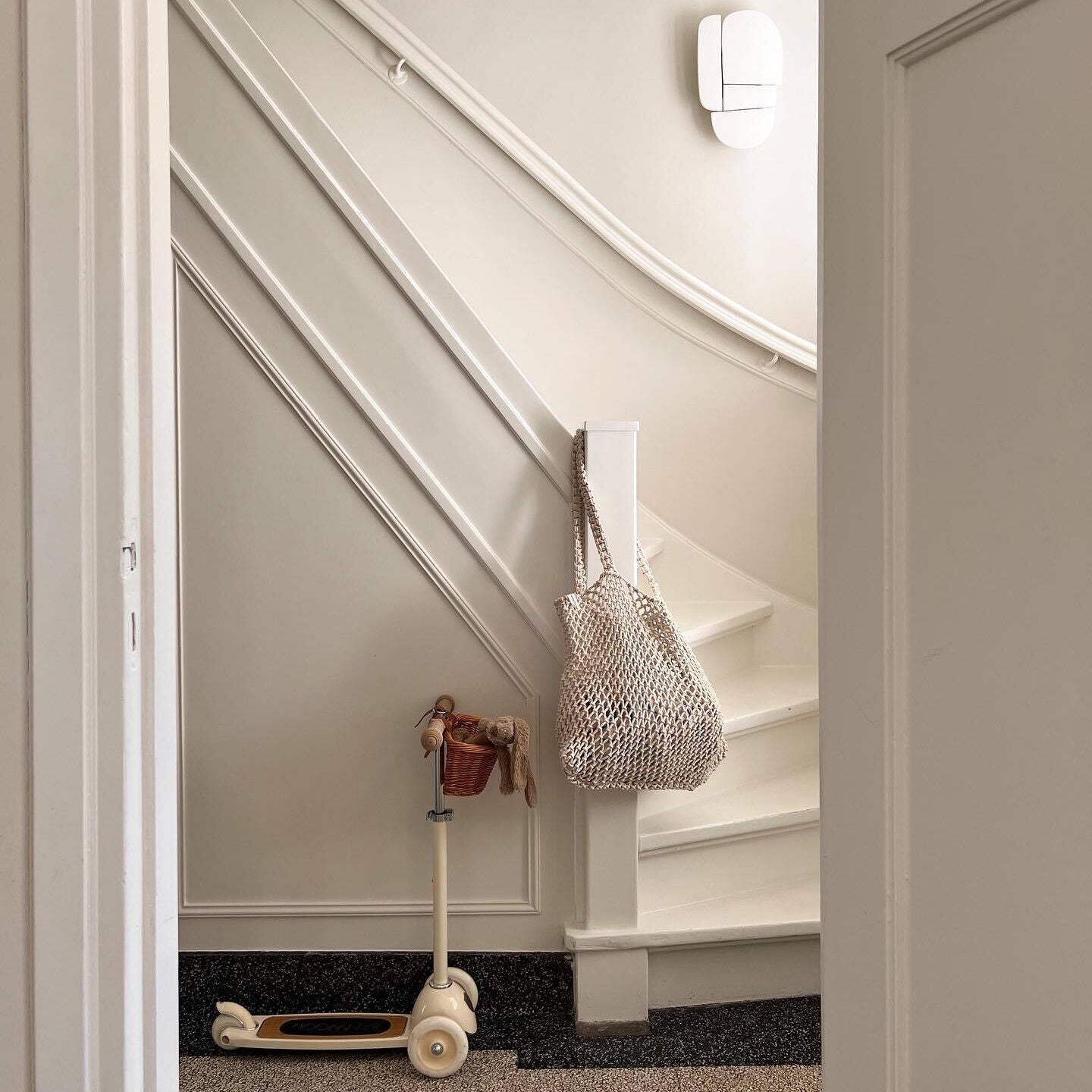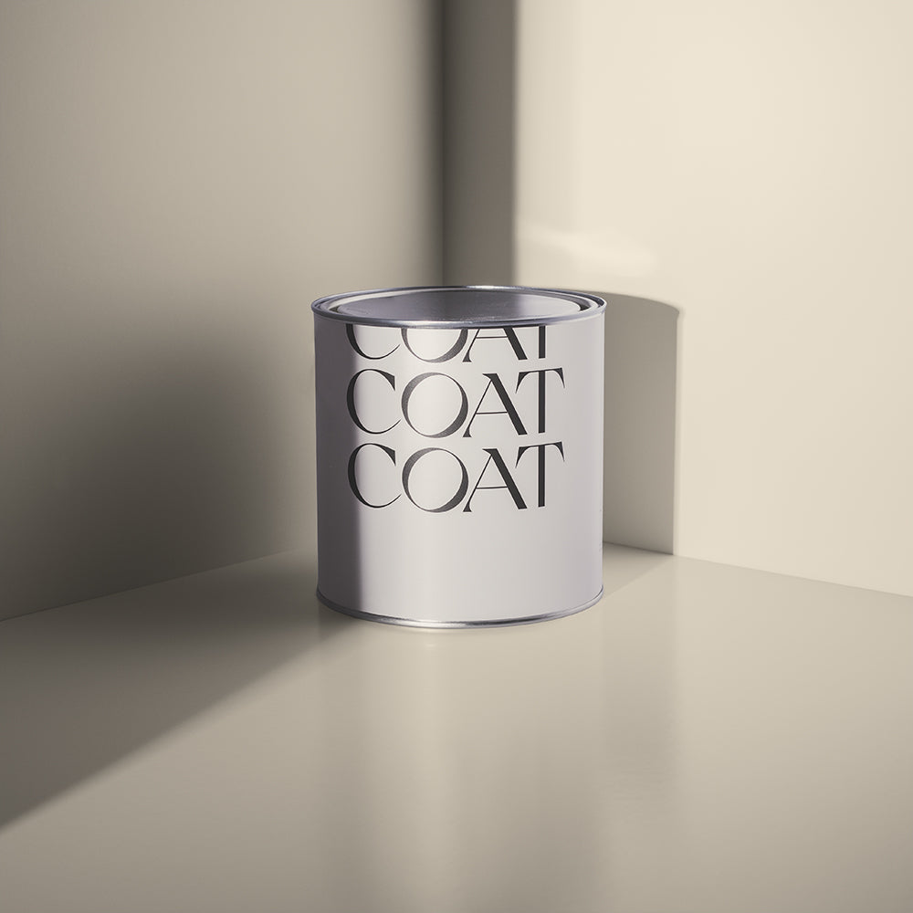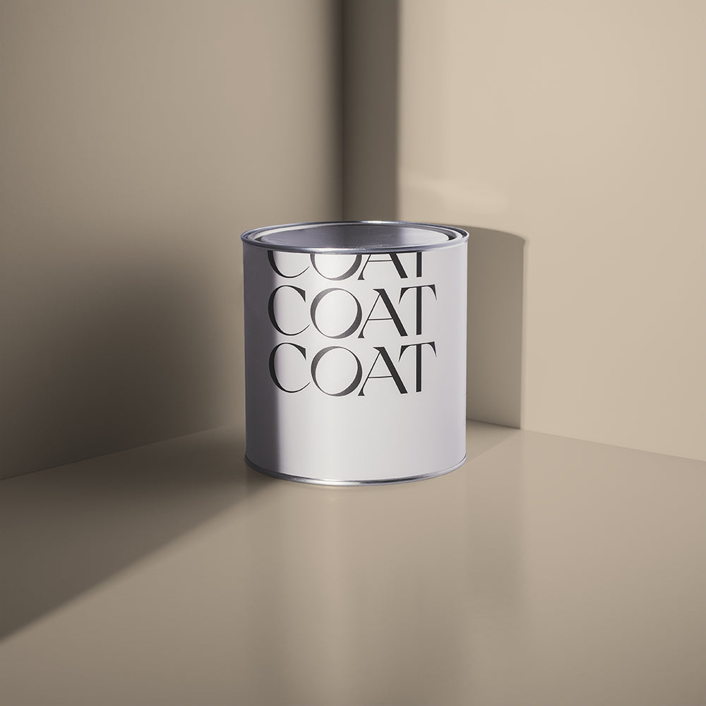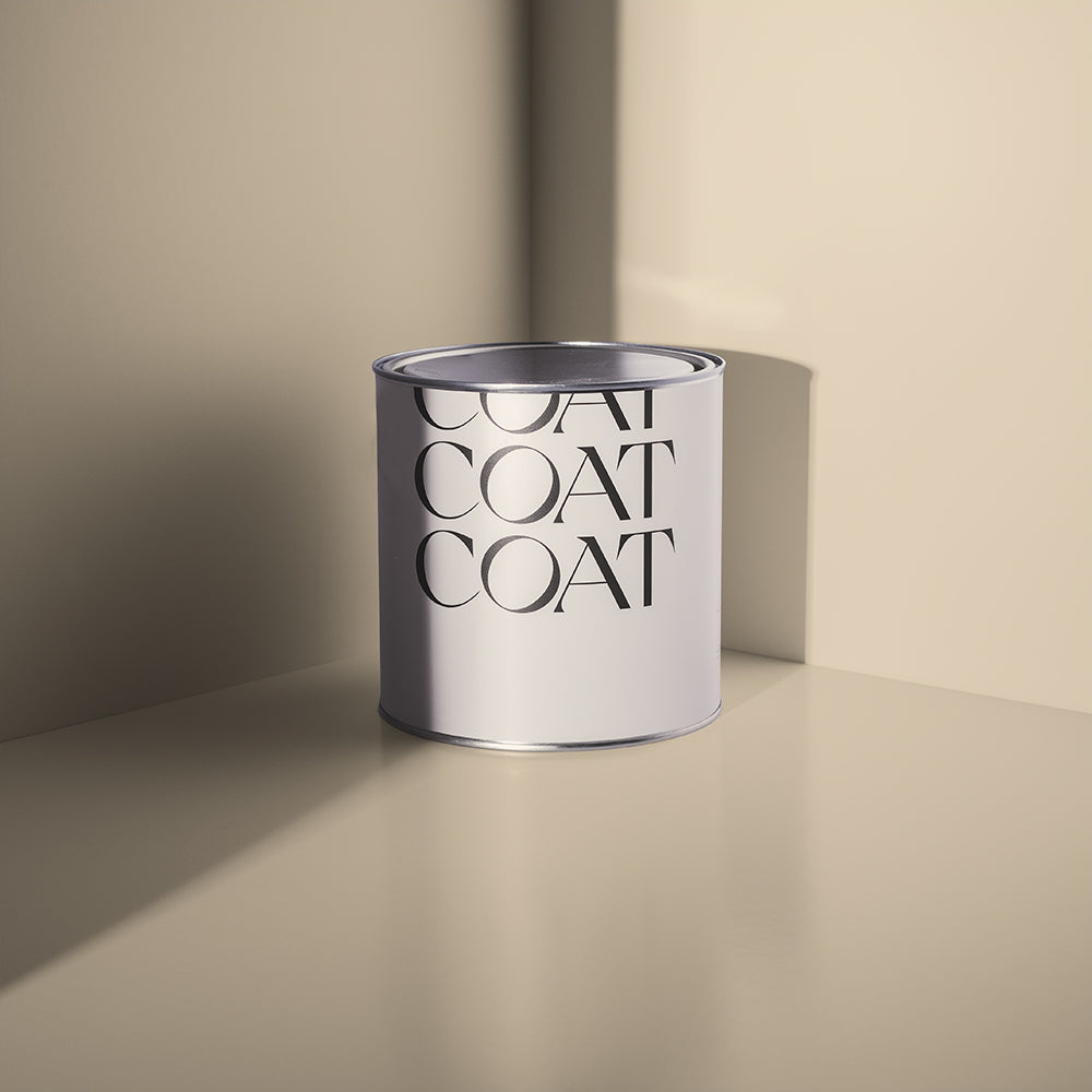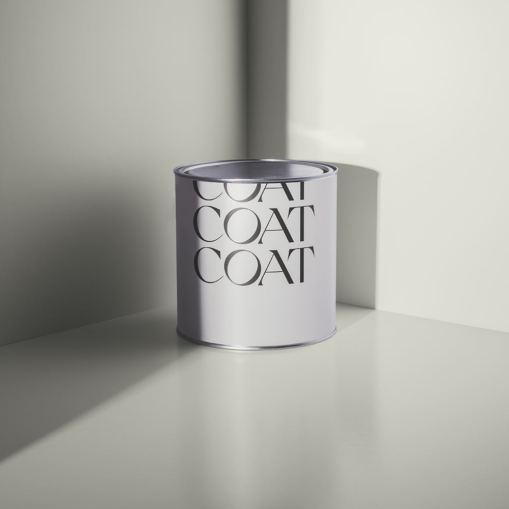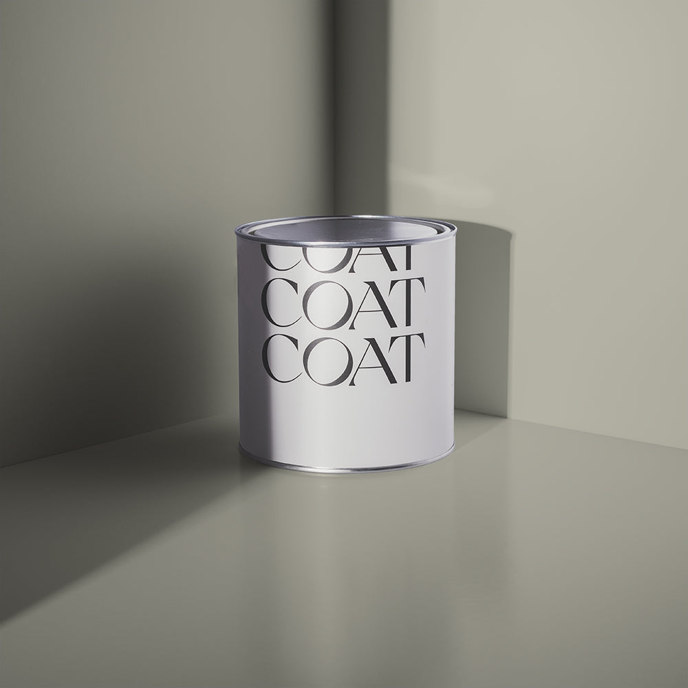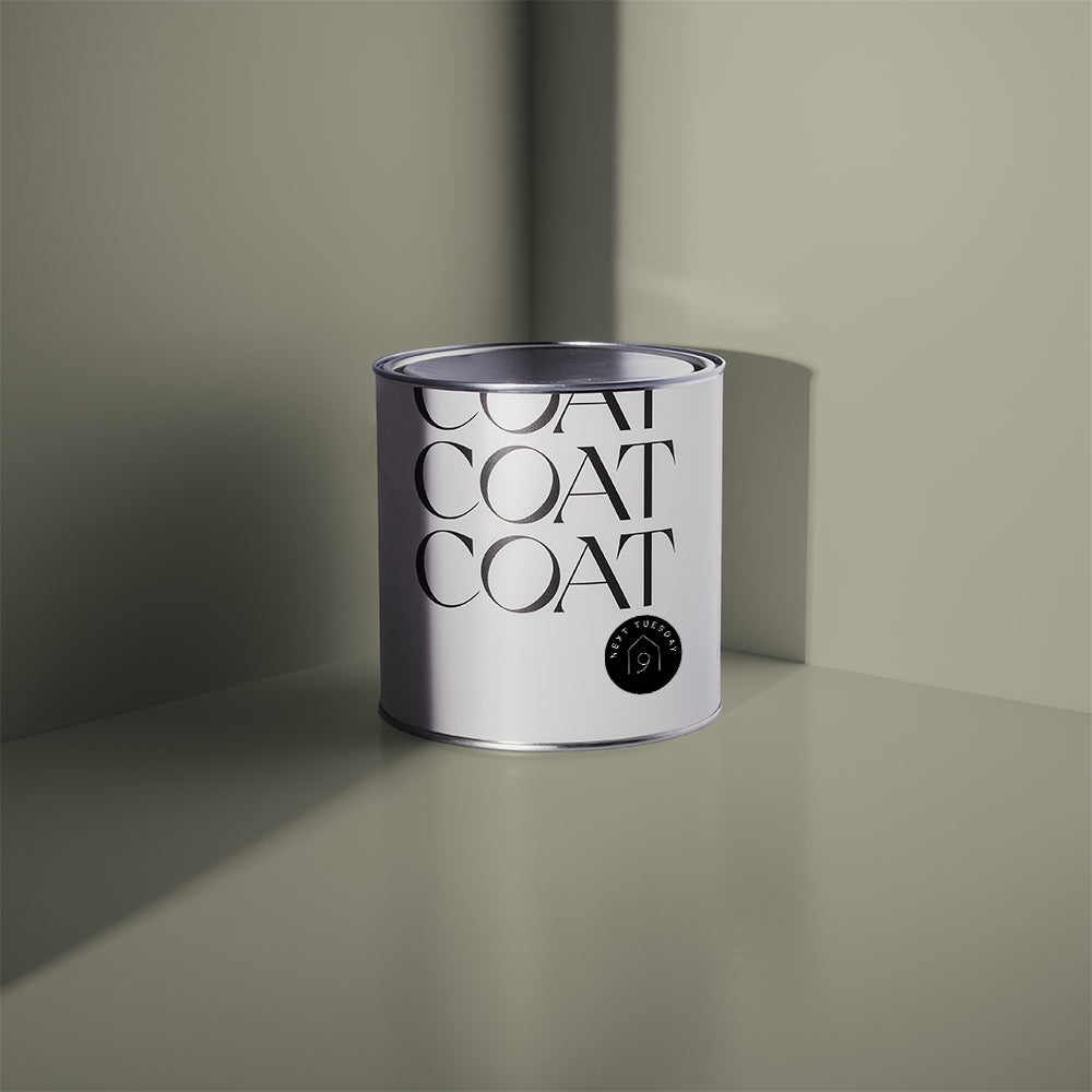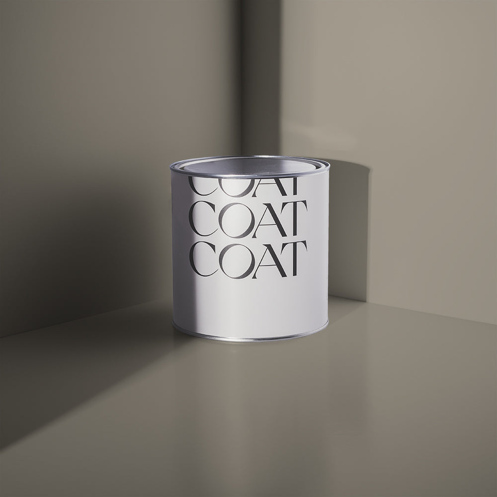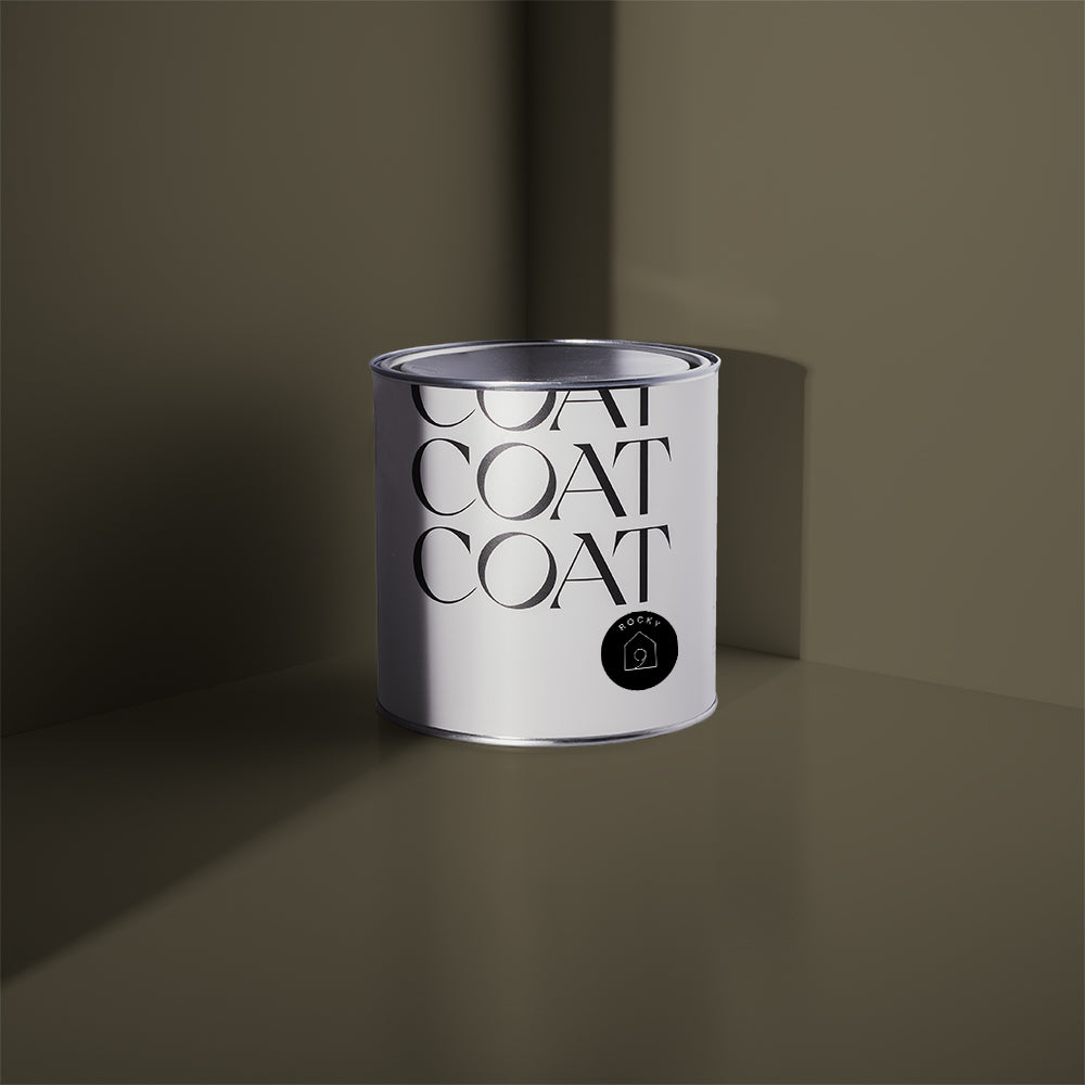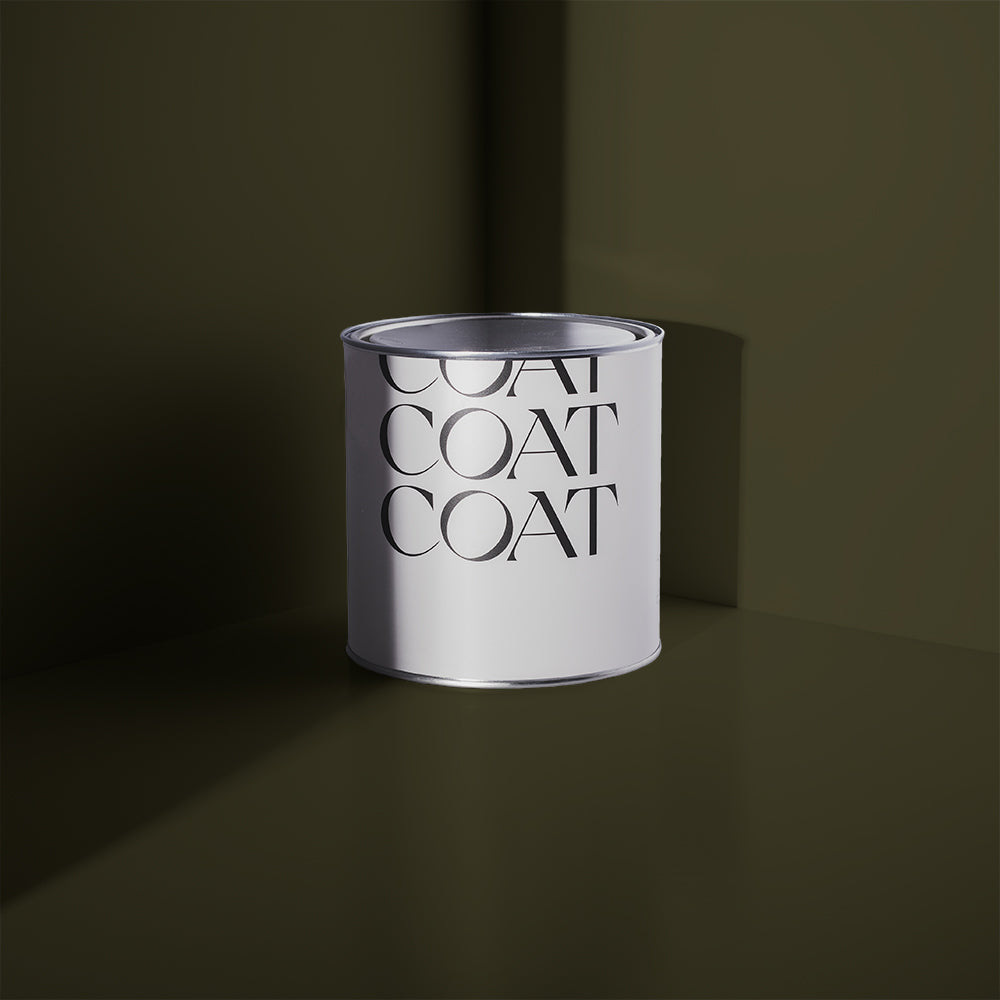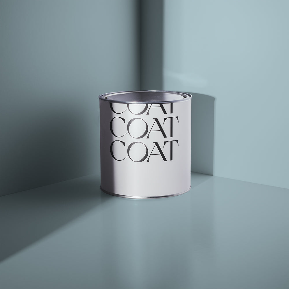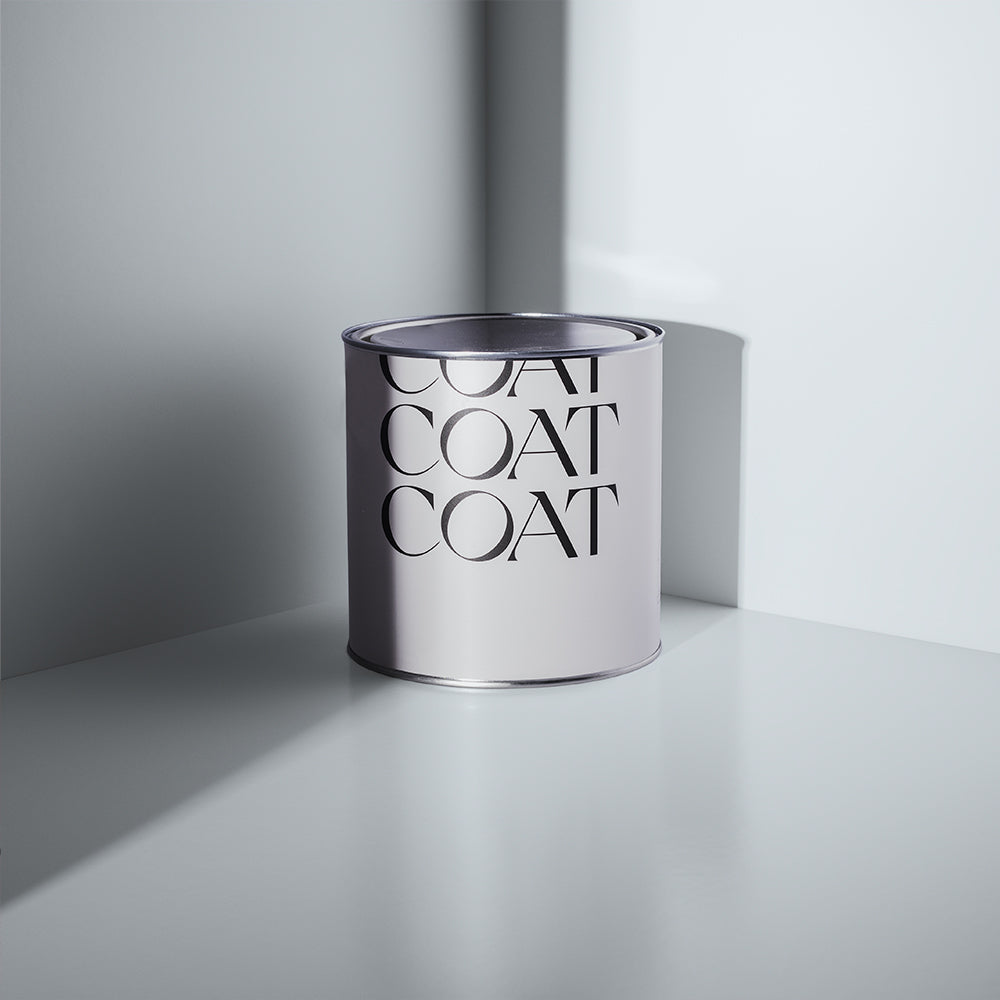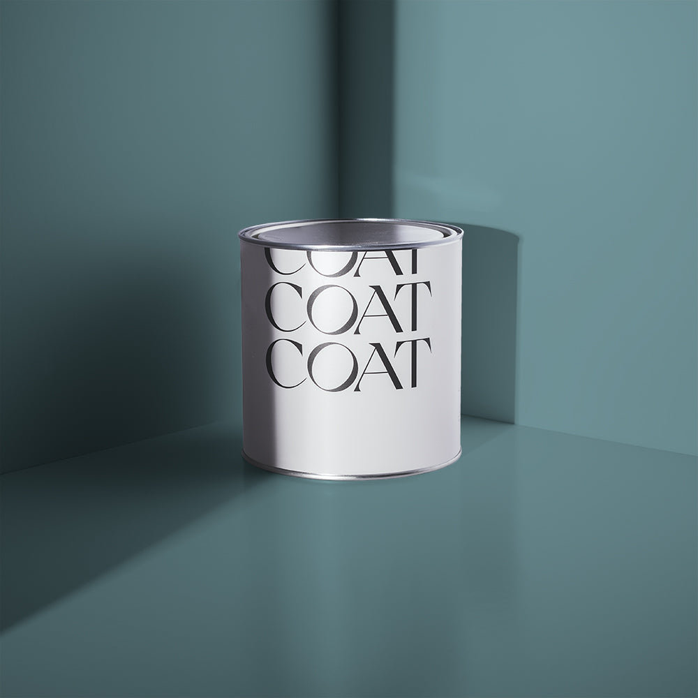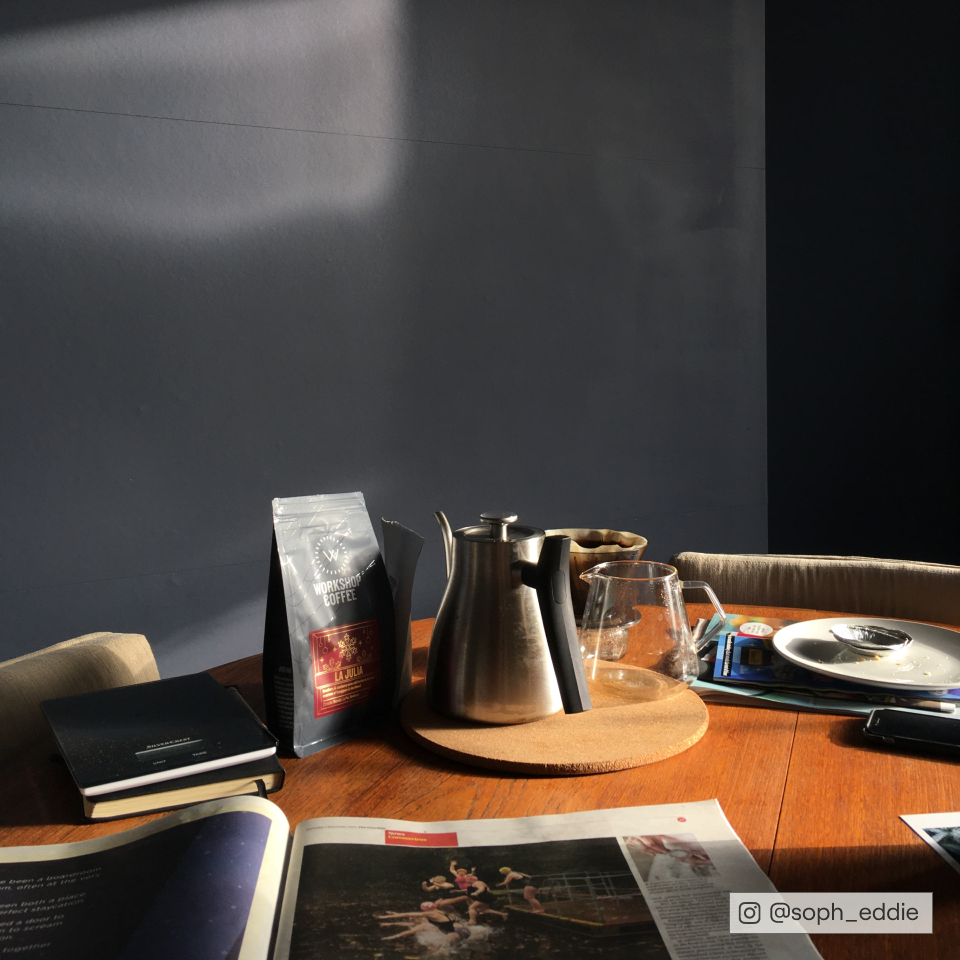
New Colours for 2023
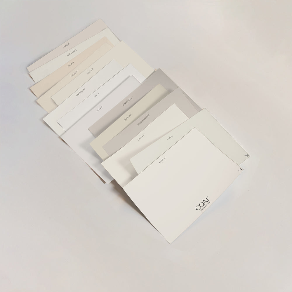
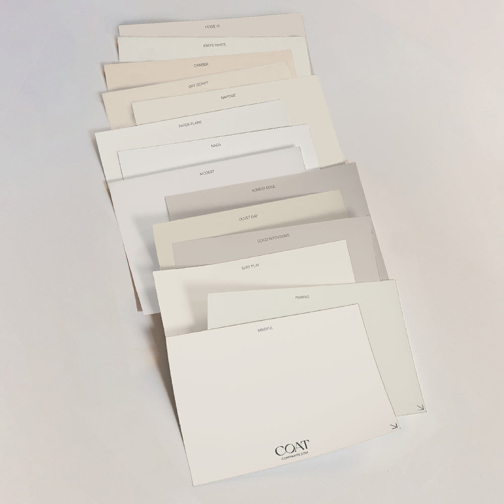
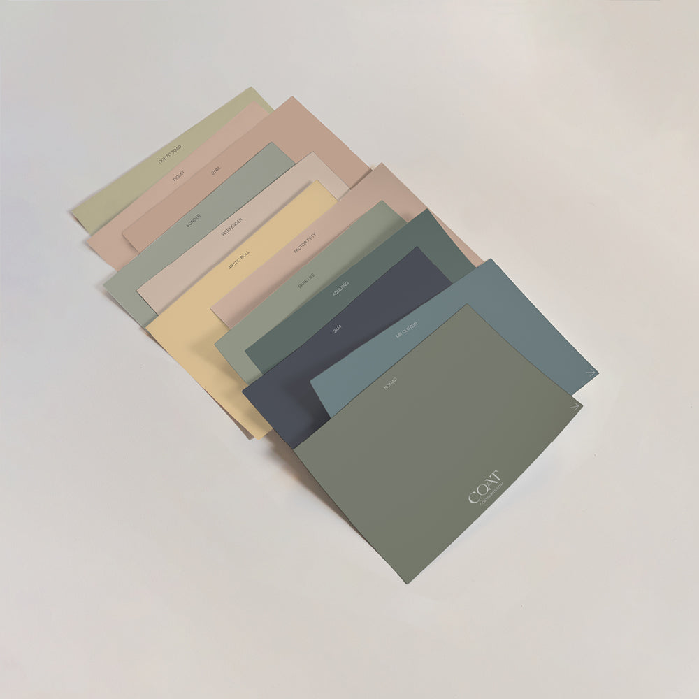
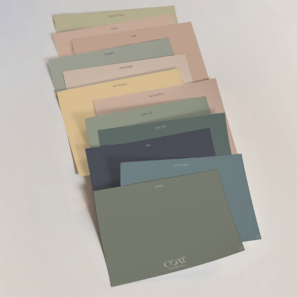
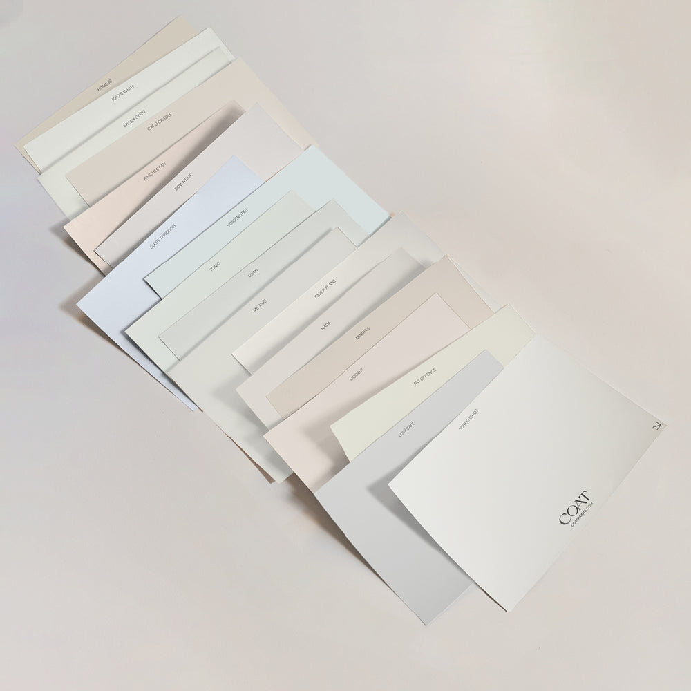
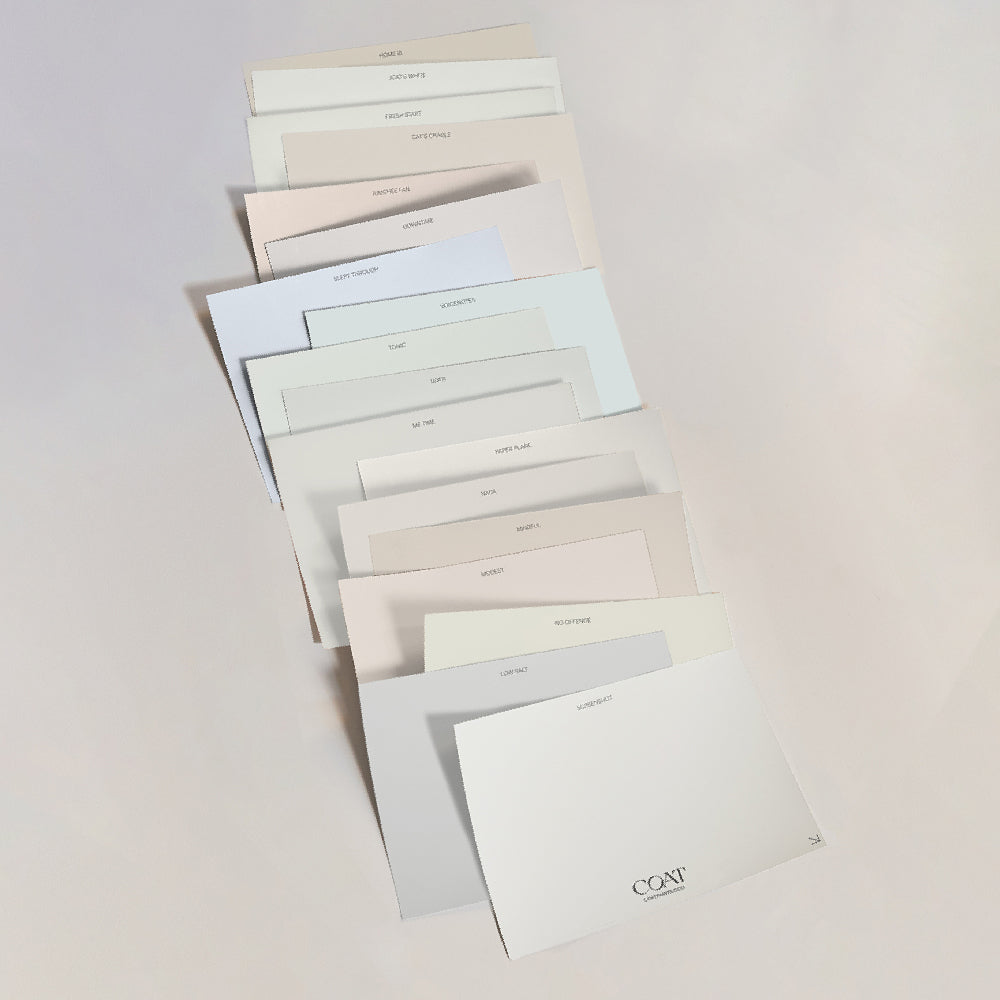
To finish off an awesome year at COAT, we’re adding 13 new shades to our range. We’ve created these colours in response to data, incoming trends for 2023 and most importantly from customer feedback.
So whether you're planning some holiday projects, or that infamous 'new year new home' feeling, we're pretty sure these new players will get you (colour) scheming.
TL;DR? Shop the new shades now.
New Everyday Colours
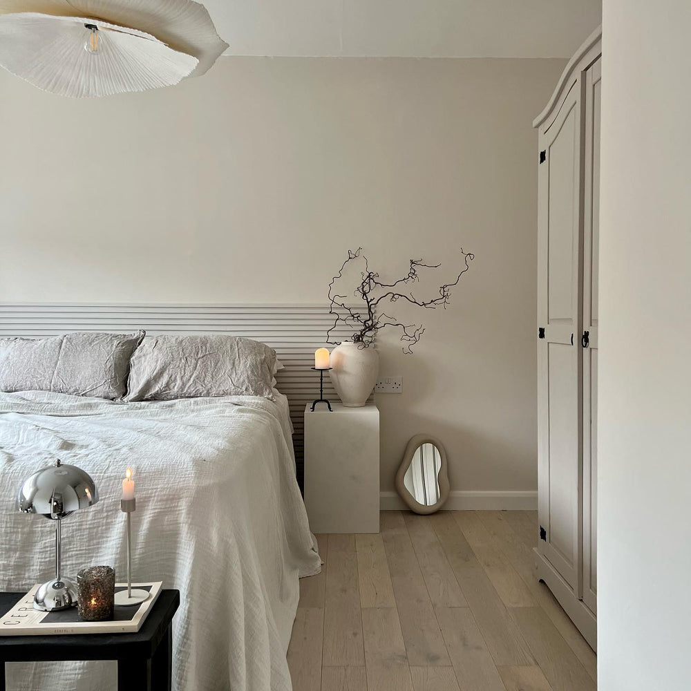
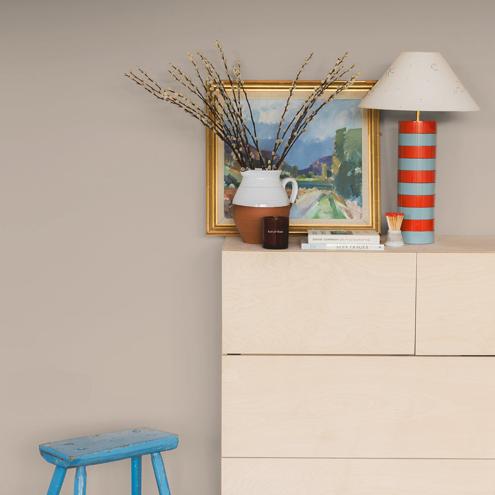
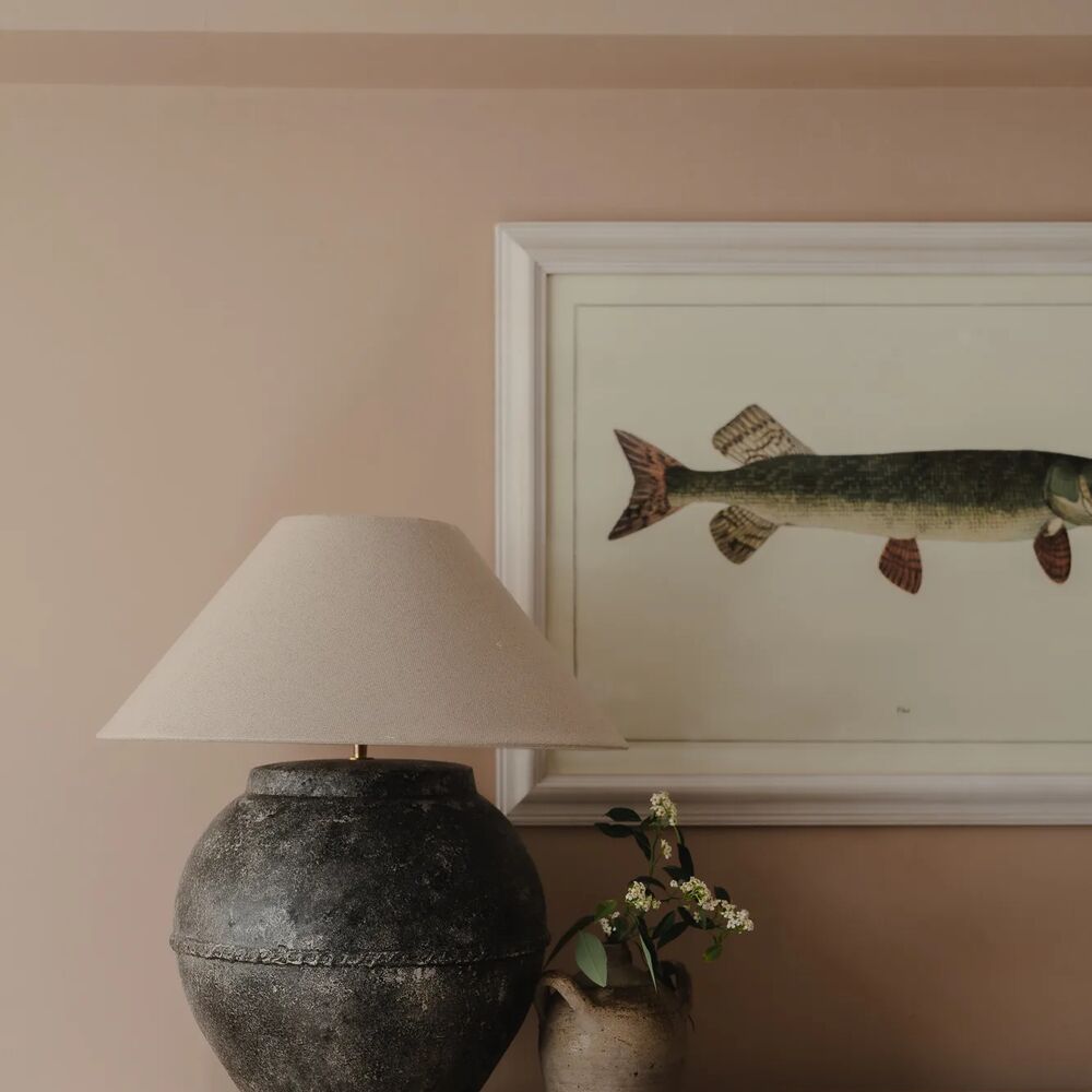
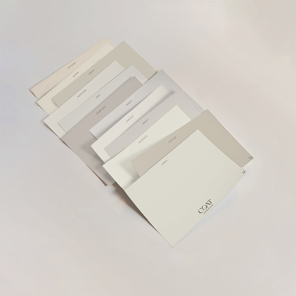
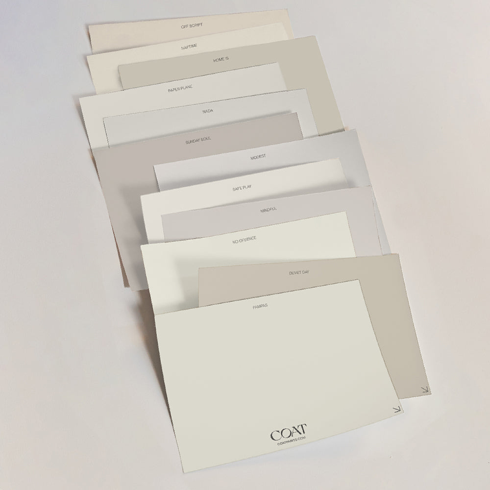
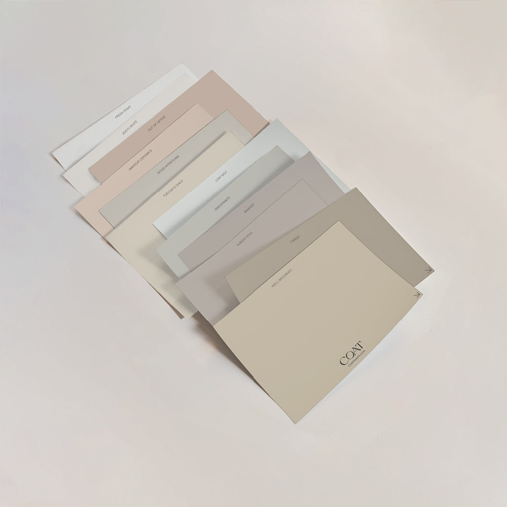
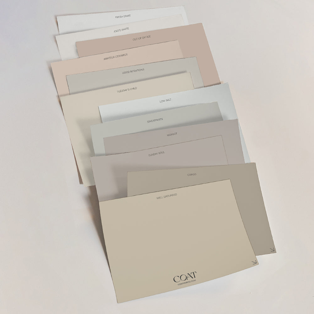
Neutrals are going nowhere. You heard it here first. So we're giving you guys five new ones designed to comfortably fit in with our existing neutral families. These timeless, flexible shades will help home decorators and designers alike pick complementary colours with ease.
ALGORITHM

A calculated, cool, pale grey. This sophisticated, modern grey is perfect for ultra-sleek interiors. Algorithm bridges the gap between our bright white, Screenshot and our cool, mid grey, On Mute. A bright, airy grey, that makes the perfect backdrop for the returning Y2K aesthetic, but also looks at home in traditional homes, where its cool, blue undertone can help lend an element of opulence.
JUST, BARELY

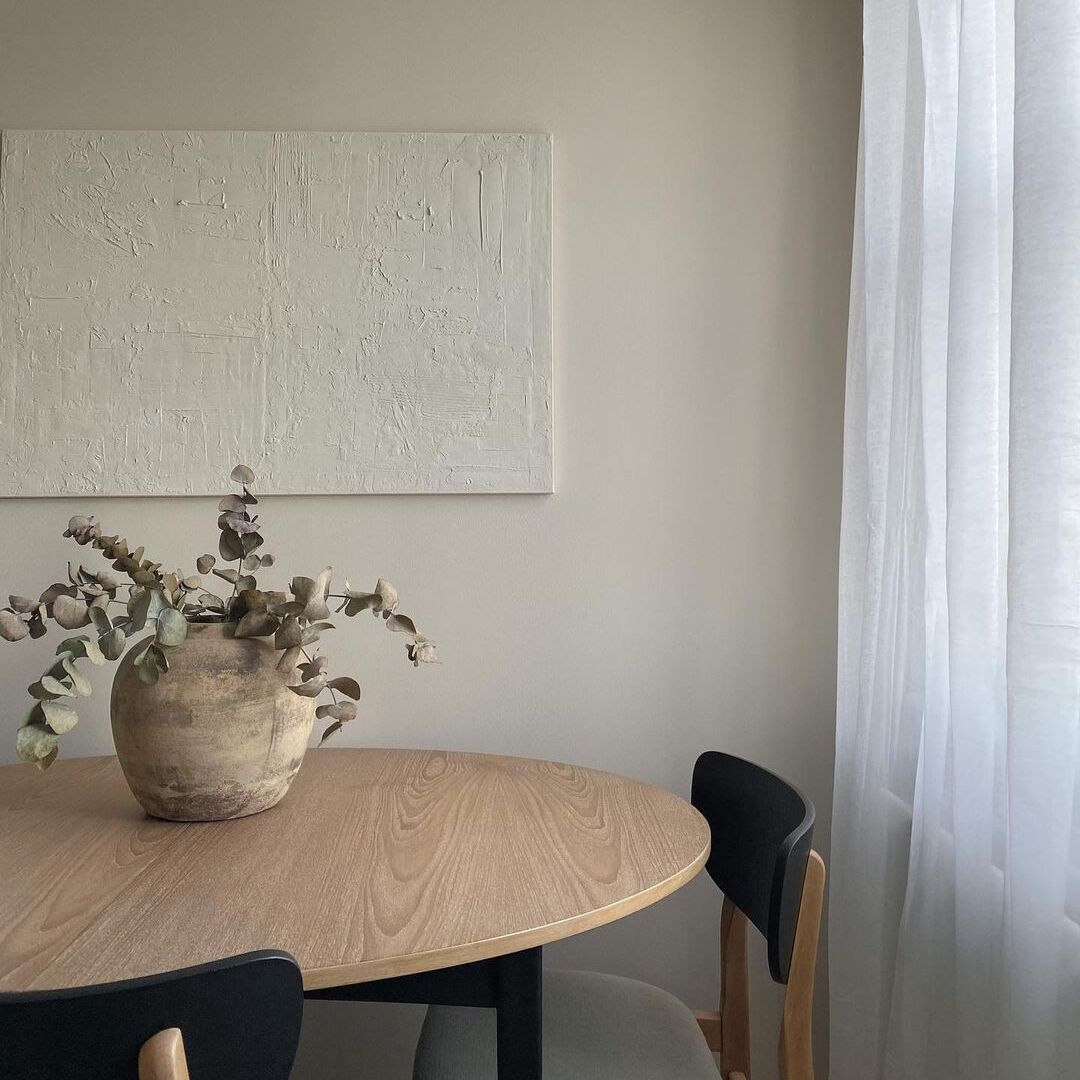
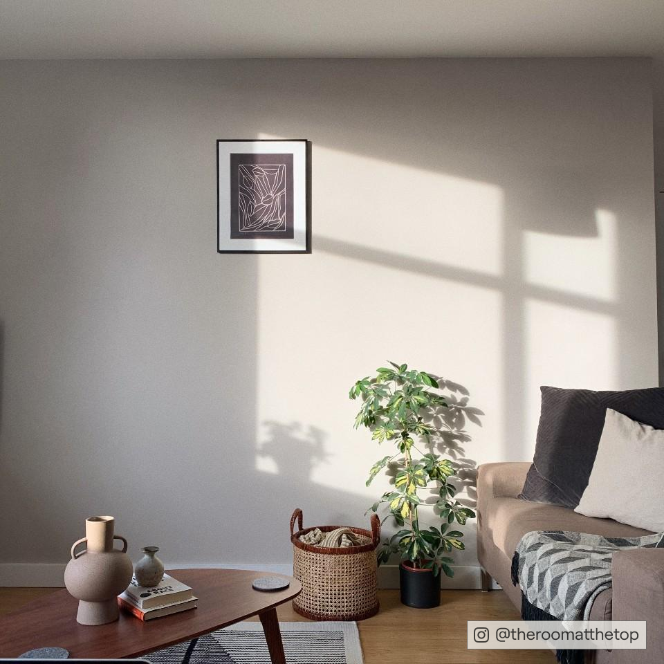
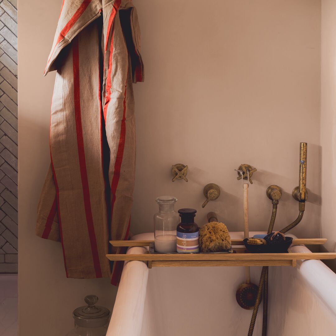
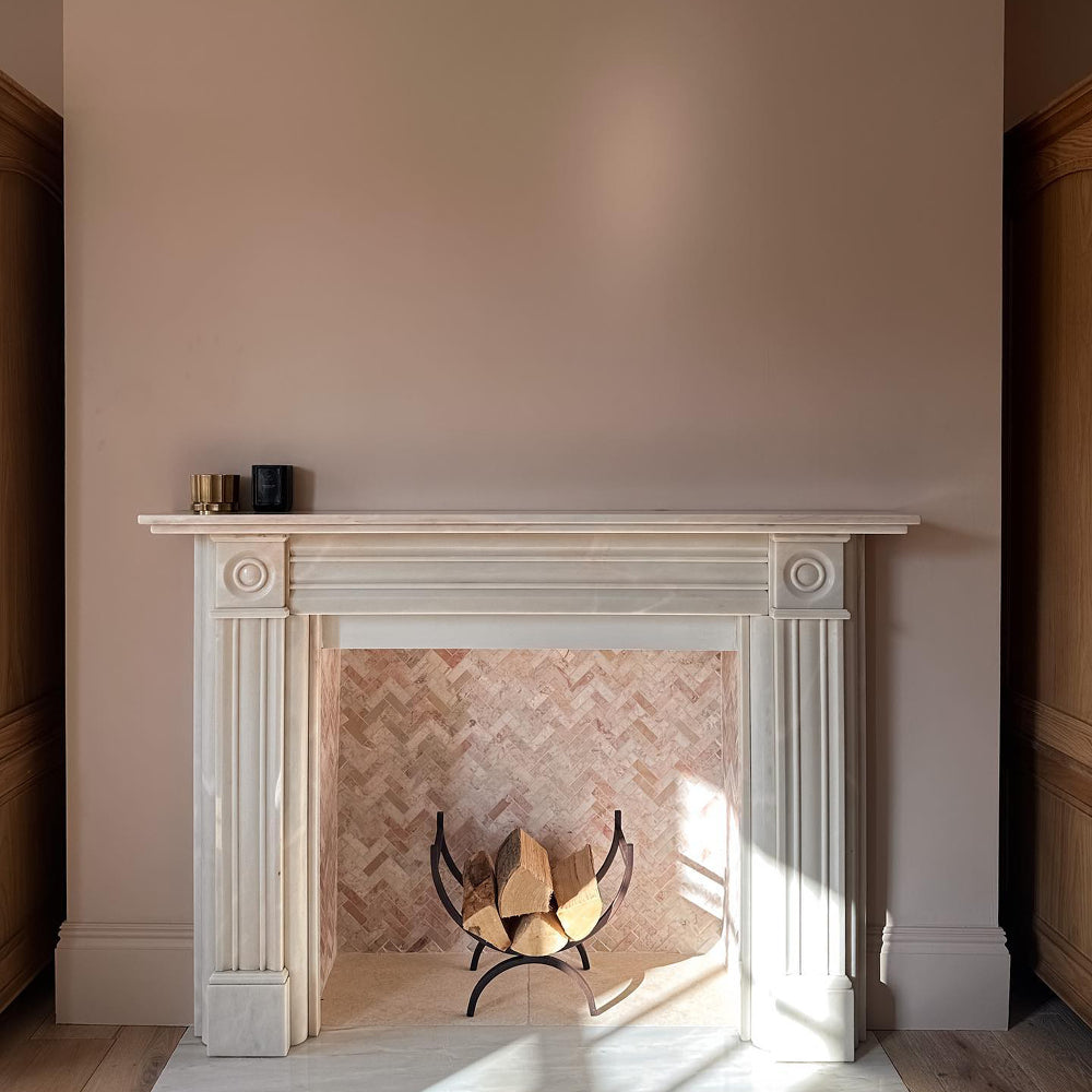
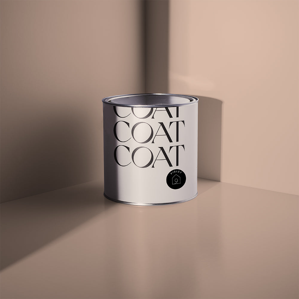
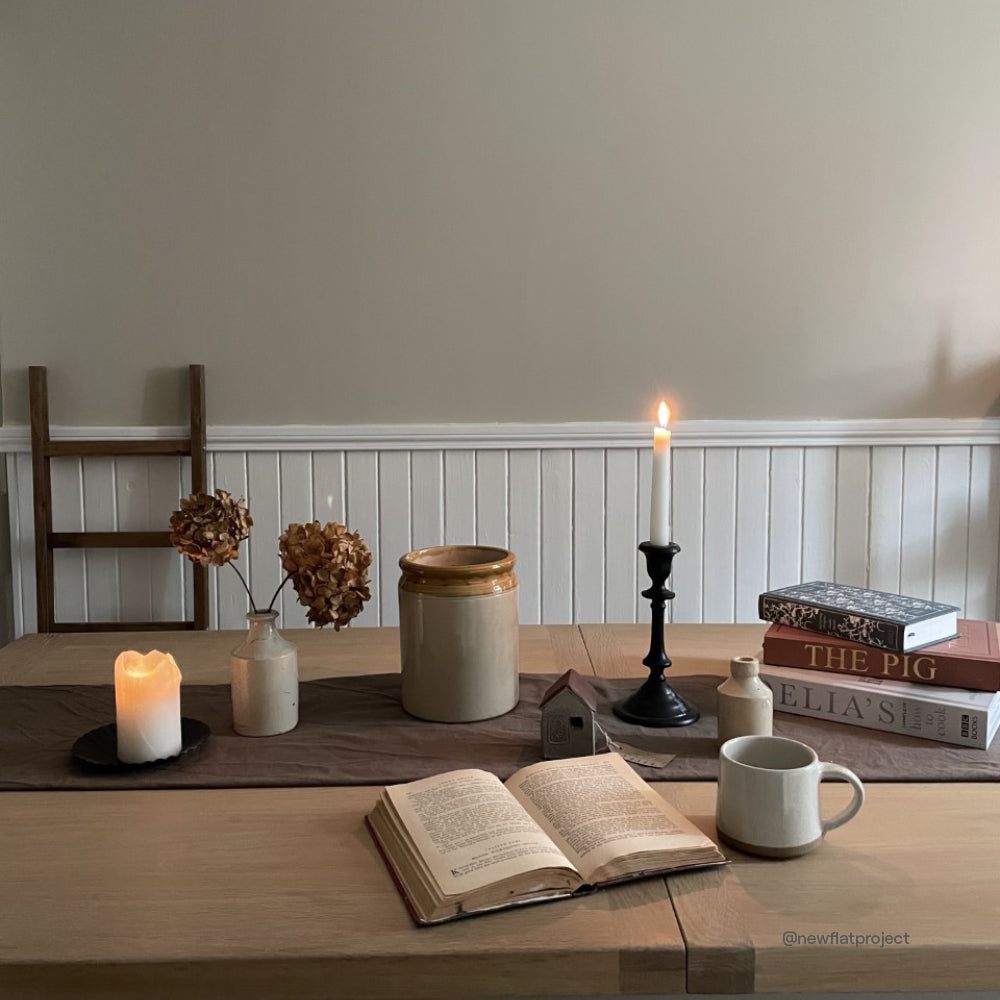
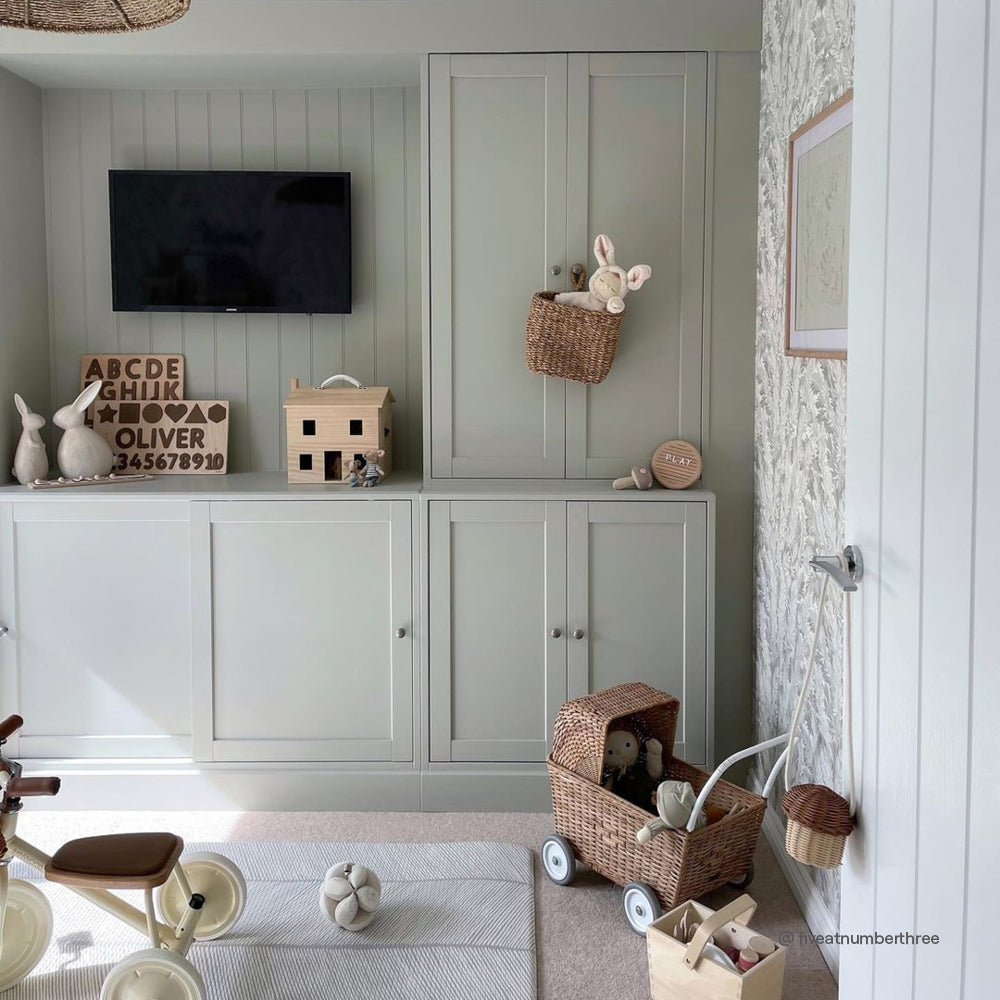
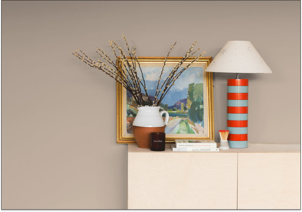
A warm, greyish off-white. Just, Barely is an antique white with inviting yellow and grey undertones that make it look as though it is just, barely there (see what we did?). Designed to sit in our warm grey colour scale between grey white, Low Salt, and the popular light grey, Sweatpants. This is the perfect white for ceilings and woodwork for most of our darker colours, because it’s softer than a pure white. Just, Barely is also an exceptional background colour for traditional homes that need a modern feel.
MODEST

A taupe off-white. Modest has been made to pair with our most popular colours: Mindful, Good Intentions and Sunday Soul. It’s an earthy white, with subtle red, yellow and grey undertones. This makes it feel warm and inviting in any space, while feeling understatedly Modest. Useful as a woodwork and ceiling colour to soften contrasts with deep reds, blues and pinks, this off-white is probably the most versatile colour in the COAT range.
Can't resist? Grab a sample.
100% MAYBE

(Paired here with East for Trees)
A greenish off-white. Designed for those that want a white that feels natural and organic that doesn’t look yellow or beige. This subtle colour is a touch green and a touch grey. It 100% Maybe the perfect partner to our green greige, Kind Regards, but is also the perfect white to complement all of our green tones, especially The Trail and Darlington.
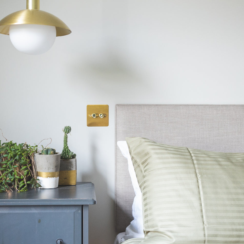
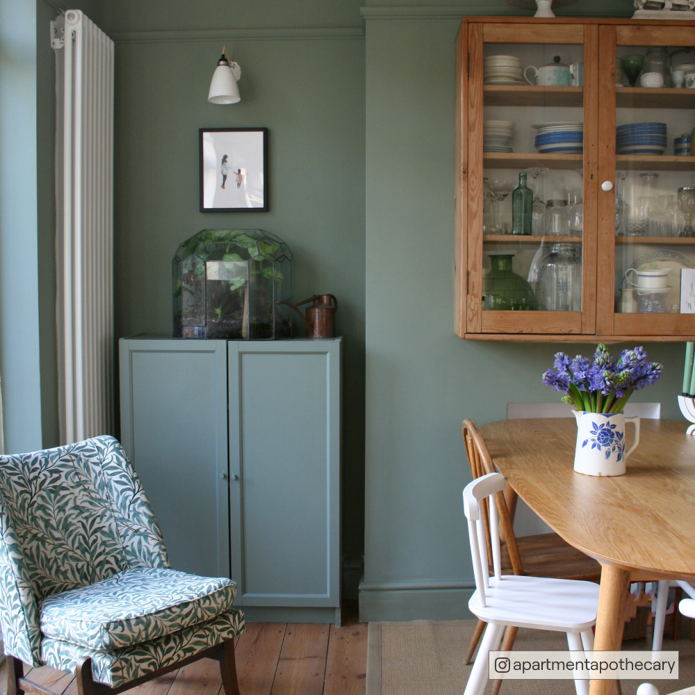
HELLO VERA

A pale, beige green. This warm, pastel green is a bit yellow and so provides a soothing but welcoming colour that is an essential for the Japandi and biophilic design trends. Hello Vera’s also a fantastic alternative to a white, when used in combination with some of our bold greens, like Pan and Nomad, or to compliment other subtle greens like And Breathe.
AXOLOTL

(Paired here with Just, Barely walls)
A soft, pale pink named after the adorable amphibian, this pink is softer and more delicate than the COAT OG Granny Chic, but shares its slight greyness. Axolotl can also be used as an off-white when combined with some of our deeper pinks, like Ciao, Sofia and Mrs Bouquet. This pink will also take on some freshness paired with warm, grey whites like Just, Barely.
Got the gist? Explore the whole drop
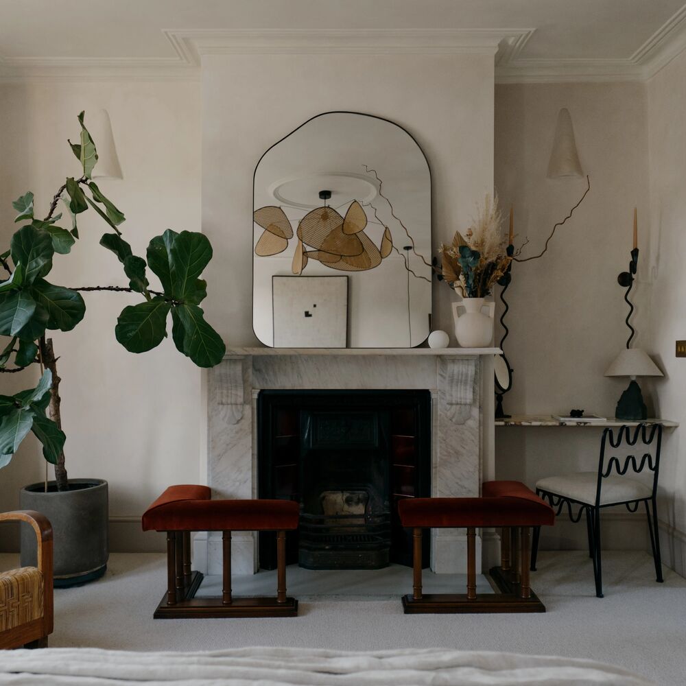
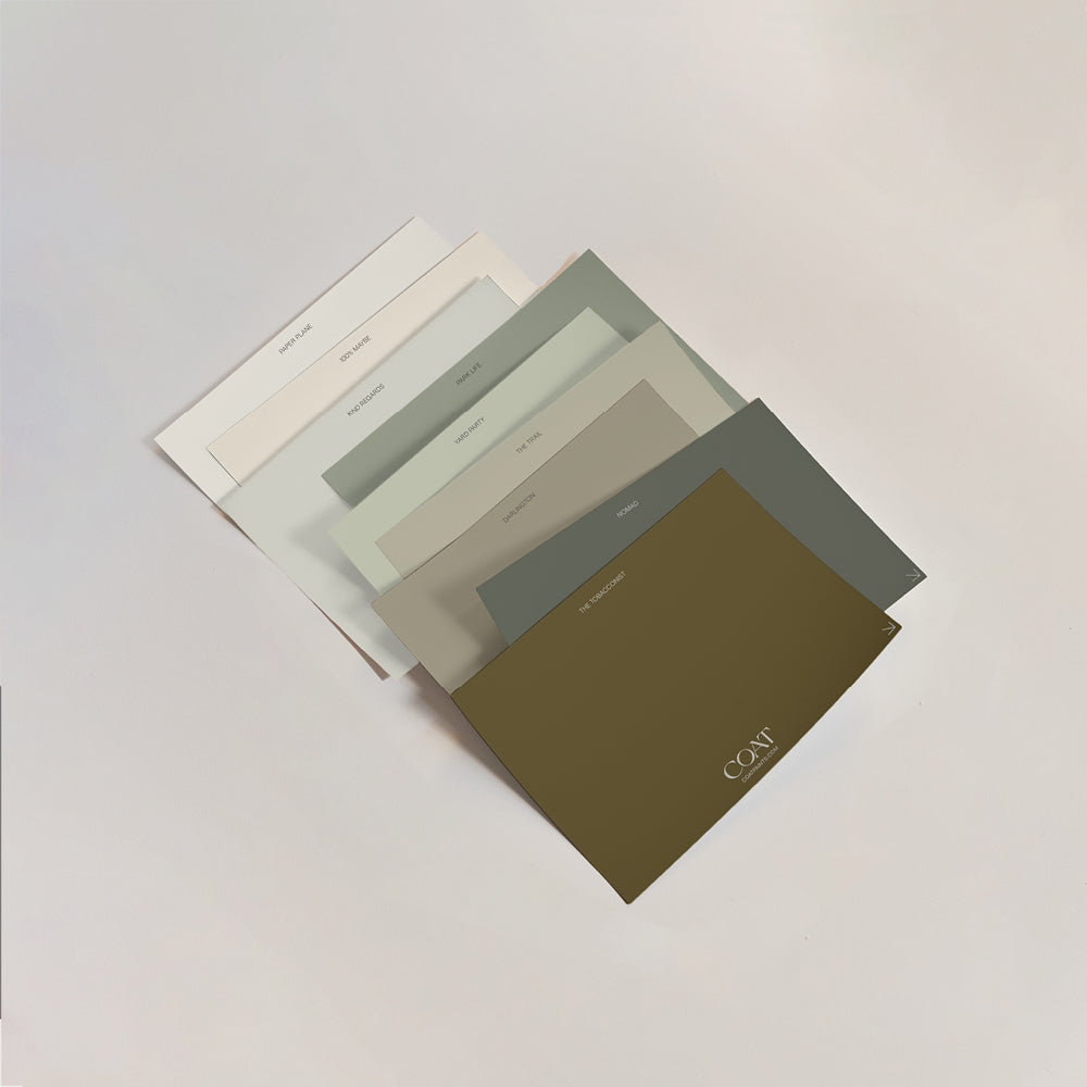
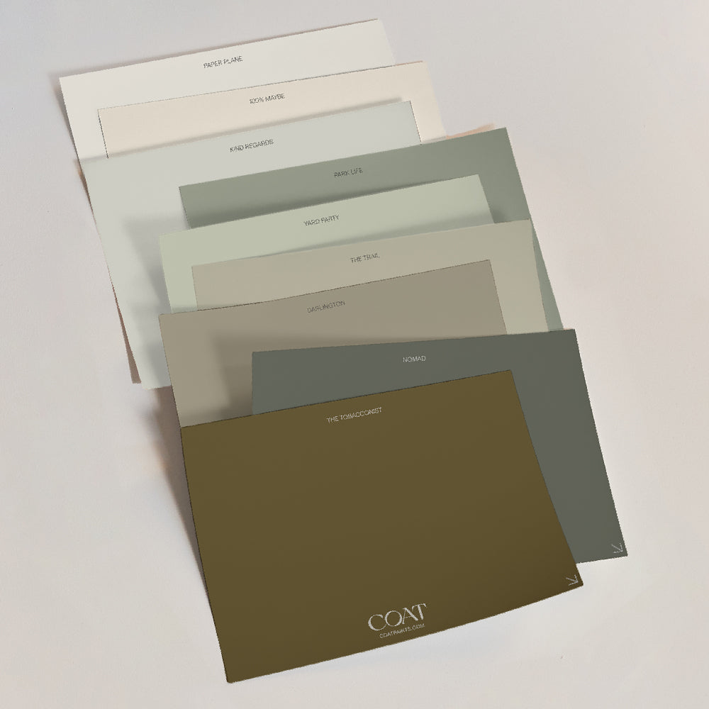
New Accent Colours
Creating deeper more saturated colours can be really tricky; pastels can look sun faded and flat or can feel too sickly sweet; and darks can tend to feel too grey or cold. So we’ve been busy making colours that will look effortlessly inviting and are perfect for a spot of drama in more neutral spaces, but also will add depth and warmth to spaces that need to feel a touch cosier.
Ready? Can't hold us back.
BISCUITS FOR BREAKFAST

A deep beige, that’s slightly grey. An accent colour added to our range to work effortlessly with Safe Play and Duvet Day, adding interest and additional warmth to beige schemes that need a bit more life. Bikkies has become a firm fave at COAT HQ for being a neutral that can also provide passive depth and drama to a home. Give it a go for an interior that is comforting and just a little naughty.
Hungry? Grab a Sample
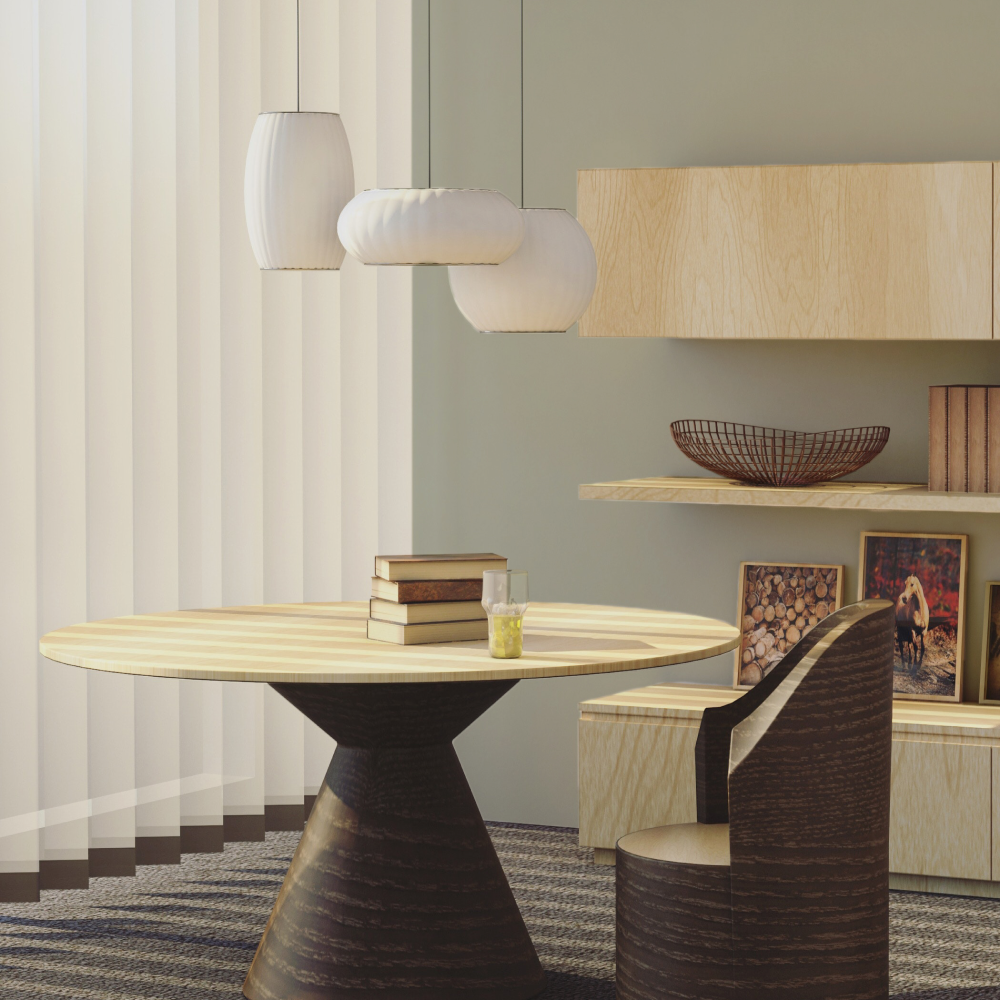
EAST FOR TREES

This colour is best described as green. East For Trees is warmer, but more saturated than sage greens like Park Life; this is the colour that everyone thinks of when they think of green. It’s slightly sophisticated, and could be described as a traditional bold green. Paired with 100% Maybe, Hello Vera or with Nomad, this bright is a sure statement.
SHAMPOO & SET

A greyed lavender, Shampoo & Set is subtle and balances warm and cool tones for a light colour that feels fresh and stylish. It makes a great alternative to white in spaces that have very cold or grey lighting conditions. Pair with a bold, royal purple like new colour, Trinket or bestselling COAT OG dark, royal blue, 2AM. For a fresh twist on monochromes, drop it next to classic black and whites like The Record Store and Screenshot.
TRINKET

Trinket is a deep, royal purple that's more dramatic than a series of The Crown when used on its own. Designed to form an elegant combination with Shampoo & Set, and pairs beautifully with blacks like The Record Store and David Rose or with off-whites like Just, Barely. We know that purple isn’t for everyone, but that’s why we made the perfect one. For those that want some simple maximalism.
Feeling Royal? Grab a sample.
GUMPTION

A dark taupe brown. When used as a wall colour, Gumption has some serious… well, gumption. It’s dramatic and spirited. It pairs perfectly as an accent colour for our most popular colours, Mindful and Sunday Soul. Especially great for woodwork, library spaces and hallways. Think gentleman’s club, but more inclusive.
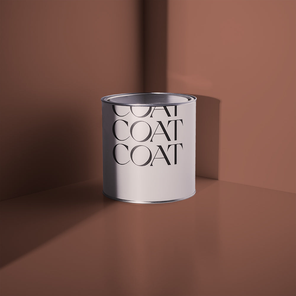
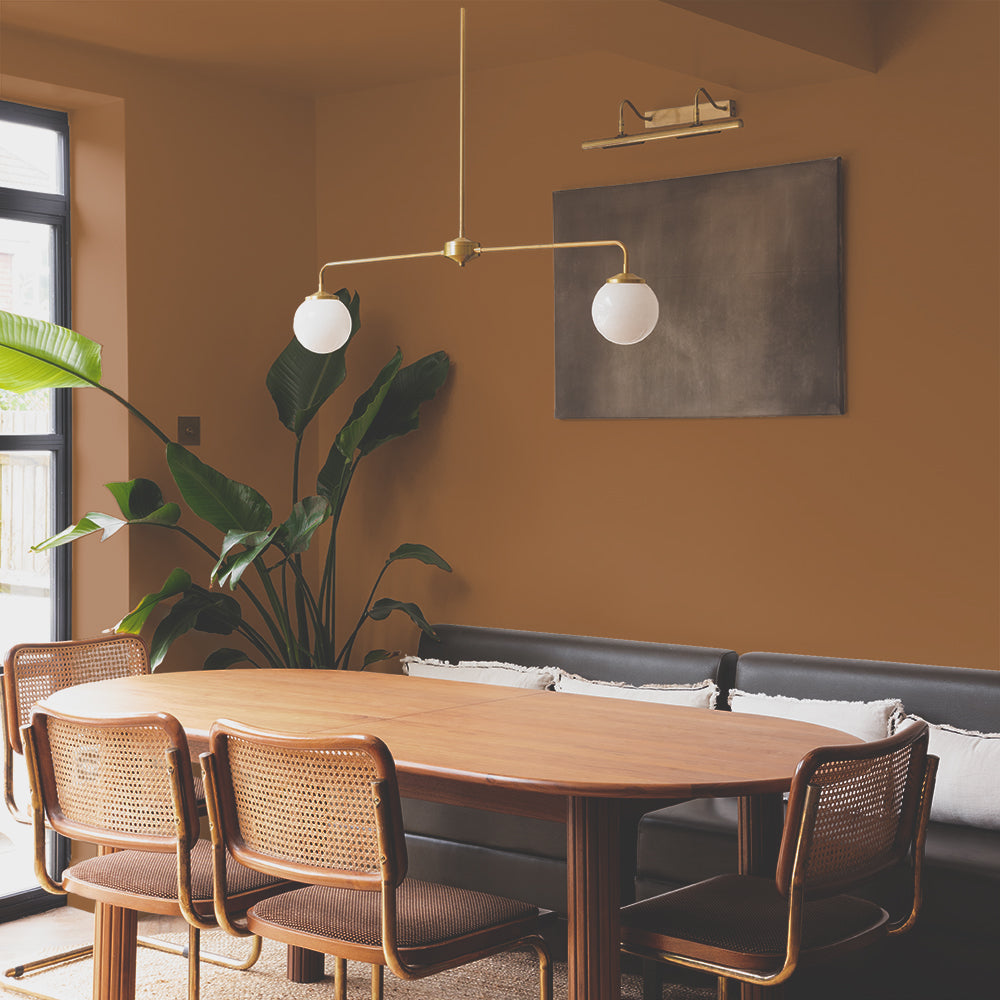
HARDBACK

A dark bronze. Reminiscent of old hardback books, with that deep bronze colour that feels richly familiar. Hardback pairs beautifully with our greige colour shades Tuesday’s Child, Cargo and Debate Club. Although traditional in its roots, when combined with brass hardware and more modern beiges like Moving Day, this colour makes a stunning example of how darker colours can feel timelessly modern.
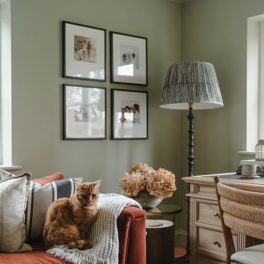
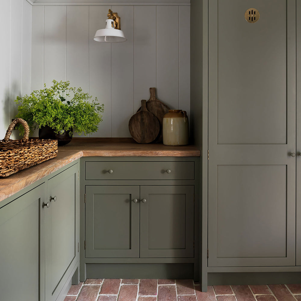
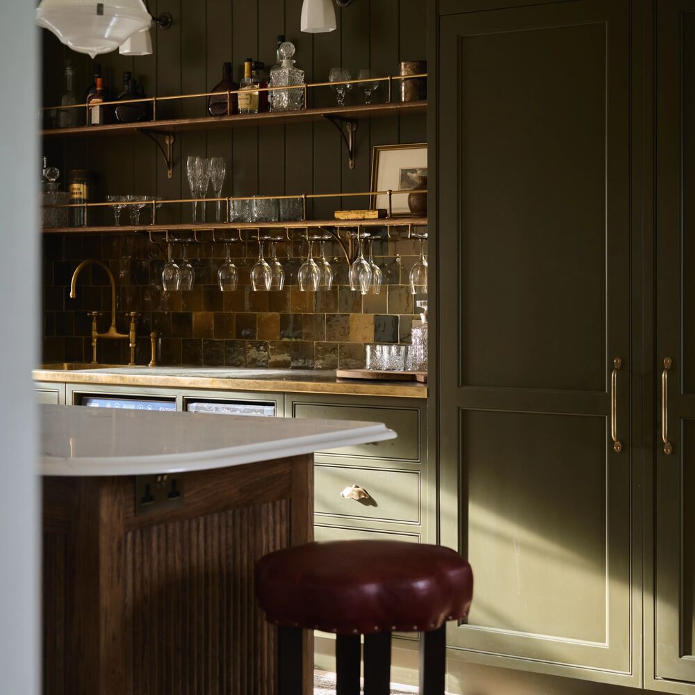
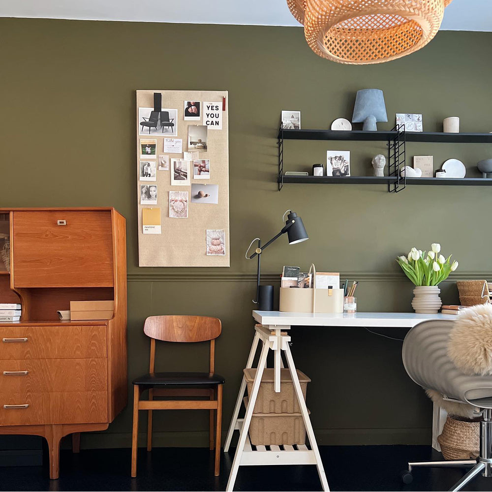
THE RANGER

A dark grey green it's a lone ranger of a colour that works fantastically alone and will make a room feel brooding when used all over the walls and woodwork. The Ranger also complements our grey-green shades, Yard Party, The Trail and Darlington to create an effortless green scheme that fits particularly well in Victorian and modern homes.
And there you have it. Fresh neutrals and dramatic darks to get you thinking for your new year schemes.
Ready to shop? Head to the drop and grab a sample.
Publish Date
Author