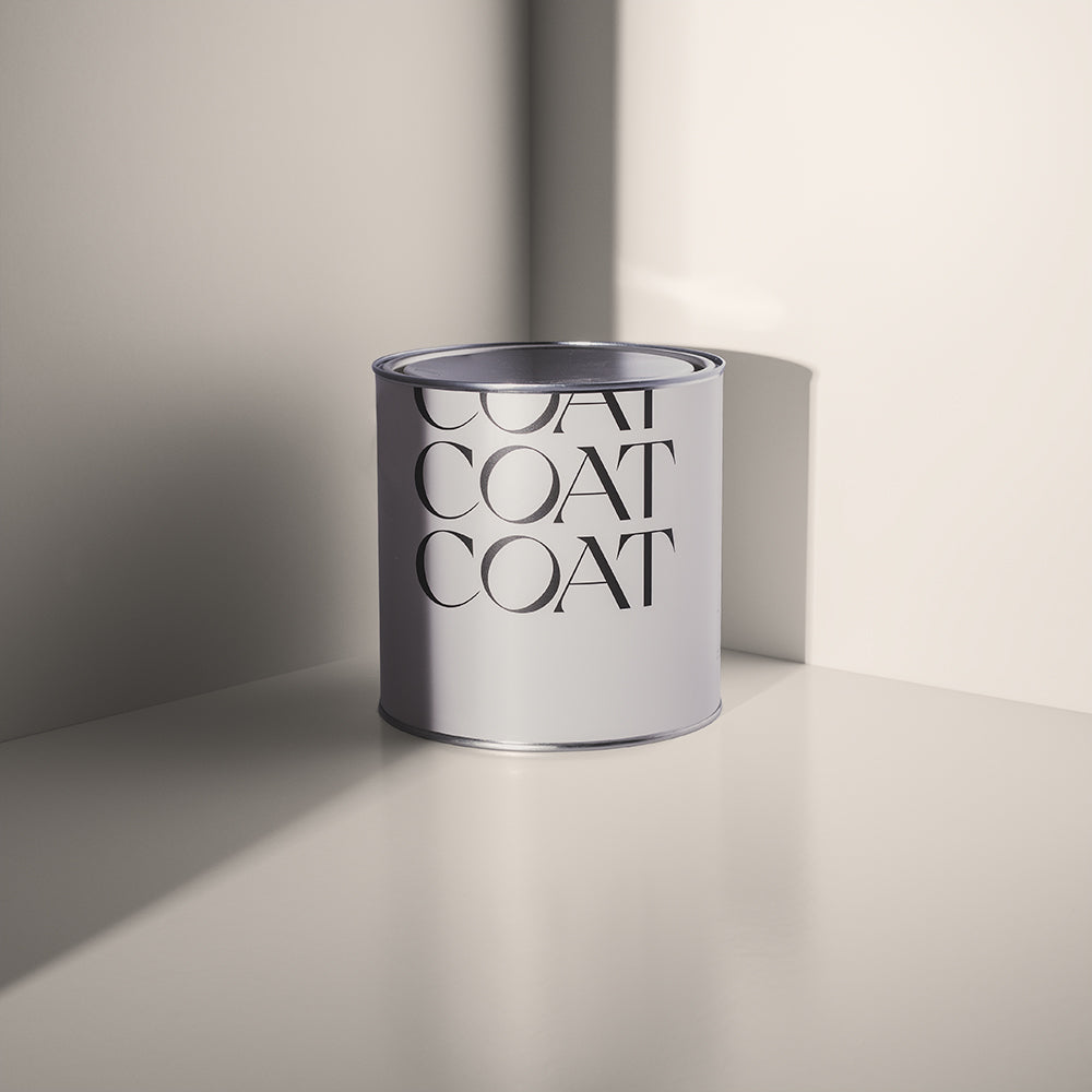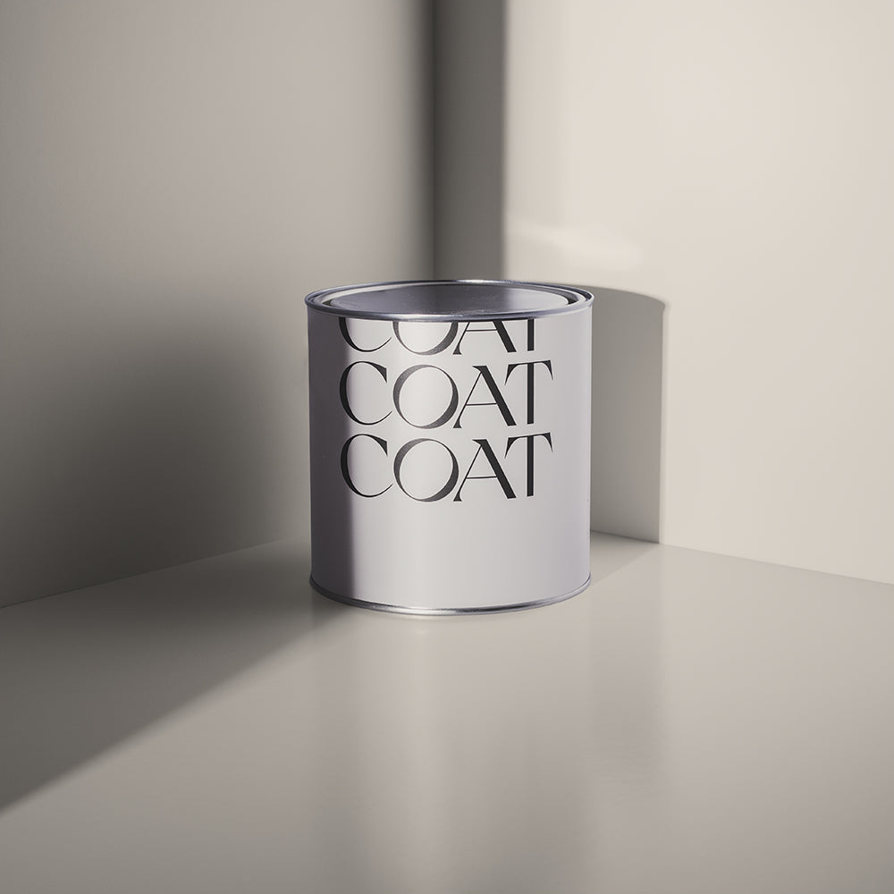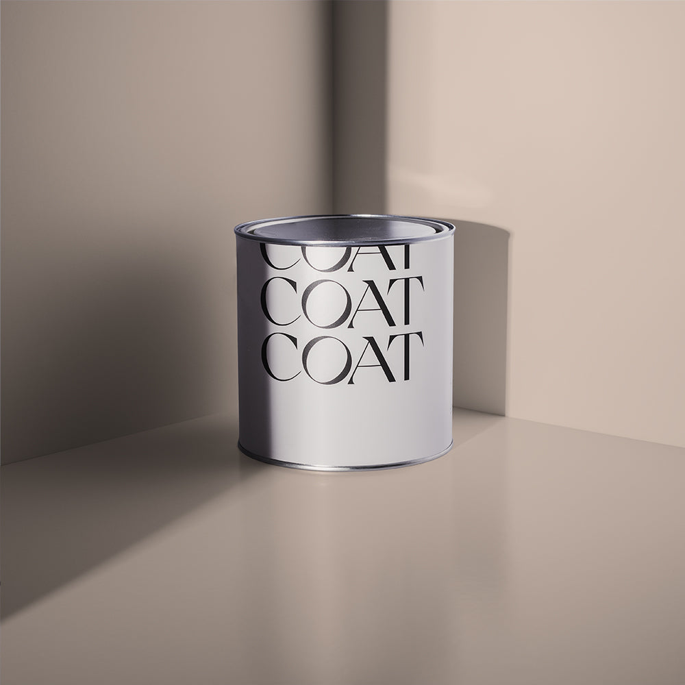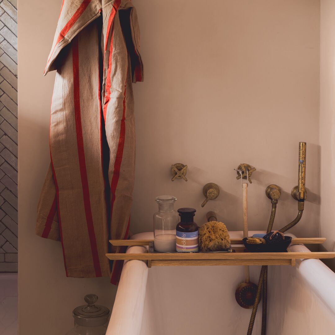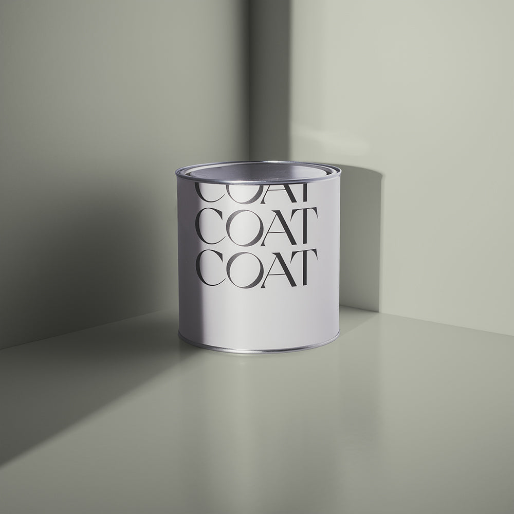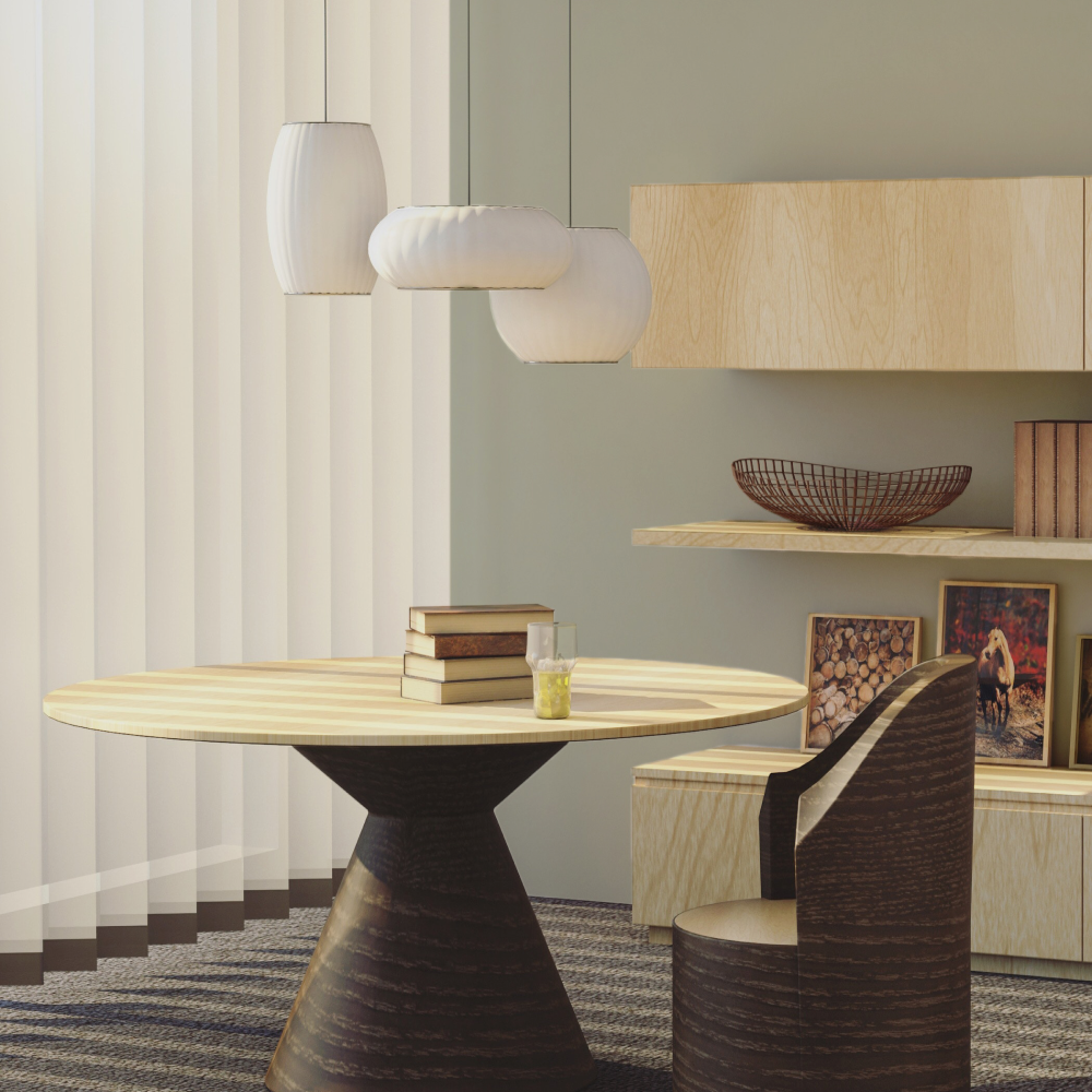
Introducing the Polite Palette for 2024
Meet the quietly confident new shades joining the COAT Palette this December.
Dropping now, these achingly usable colours are the only backdrop you'll need for your 2024 refresh.
TL; DR - Shop the shades now.
Life's Perfect Backdrop
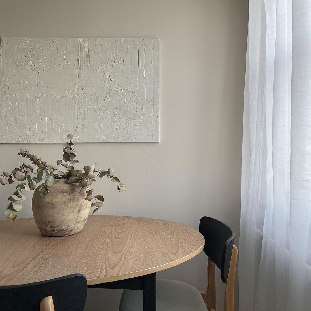
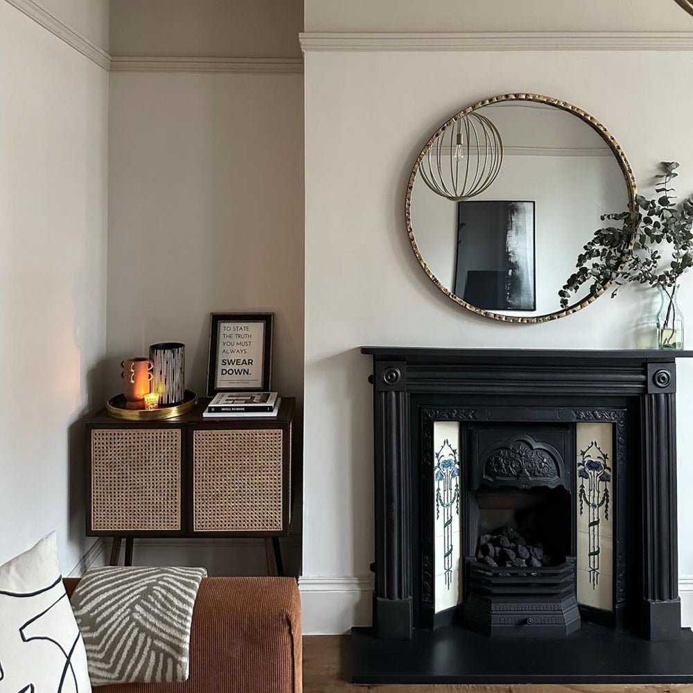
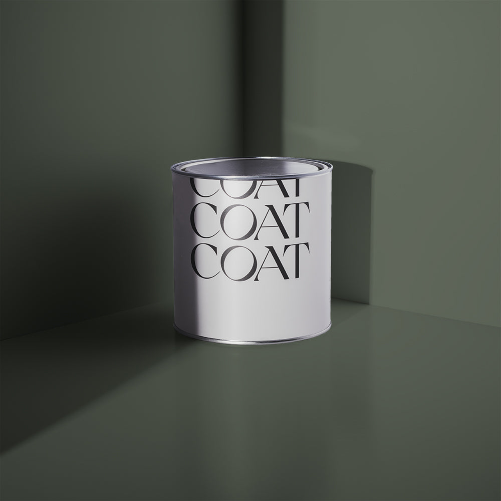
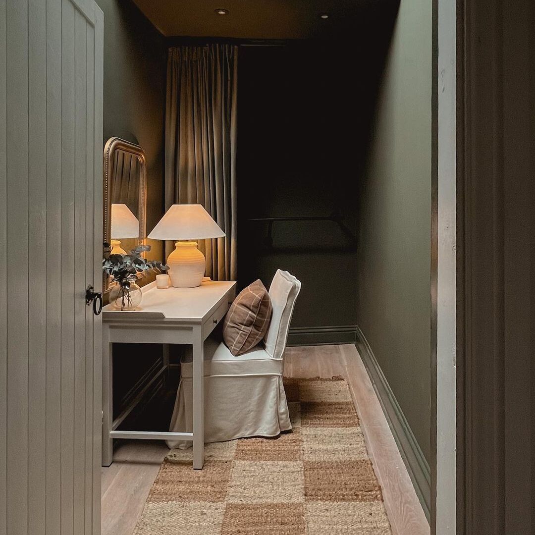
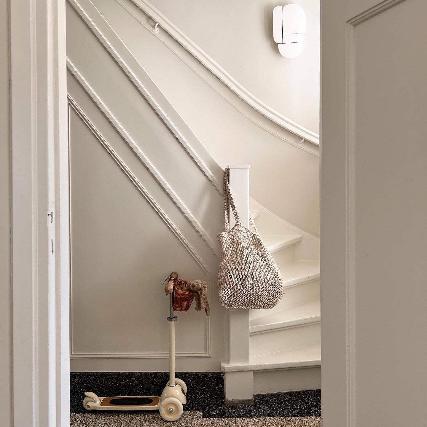
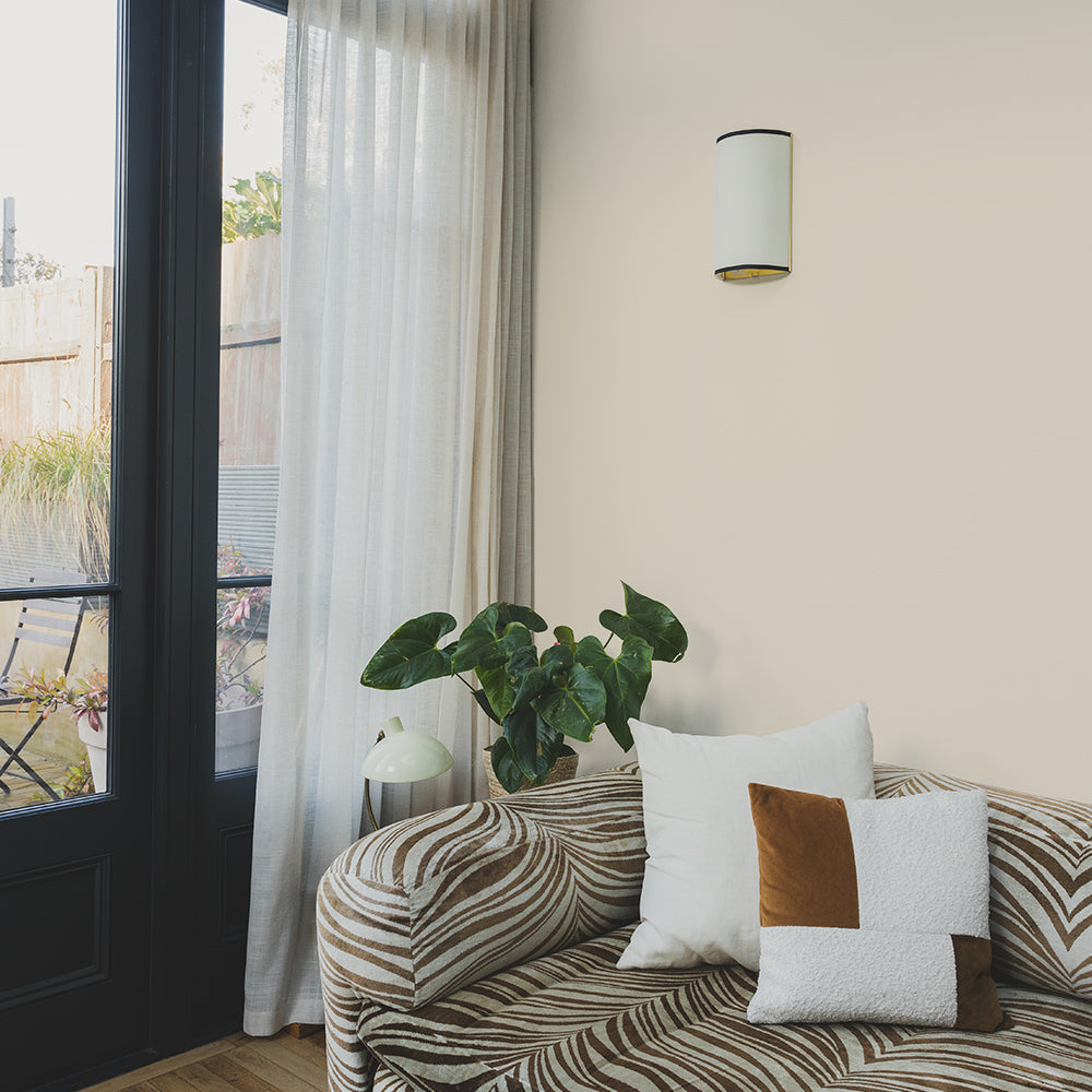
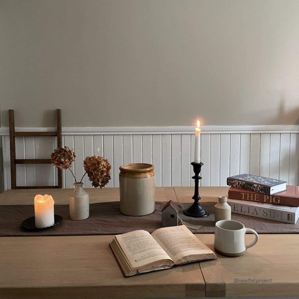
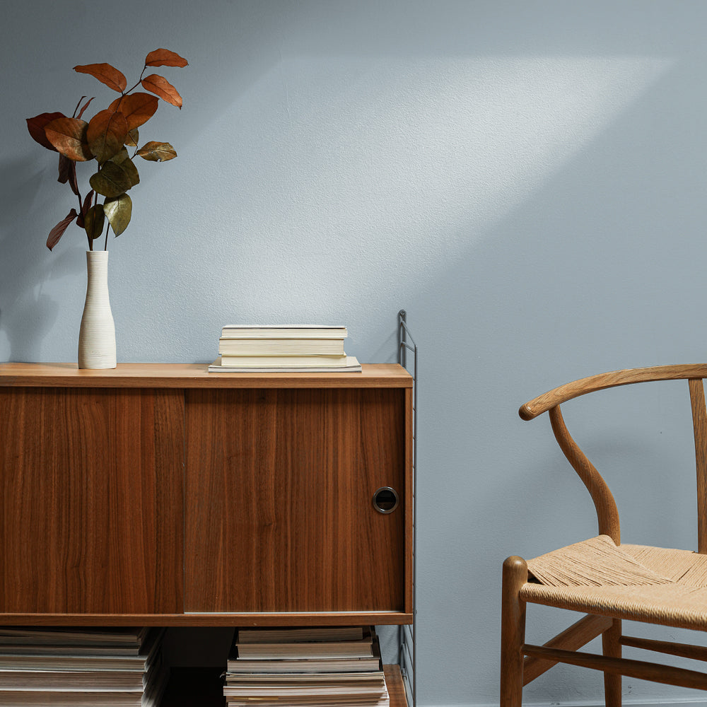
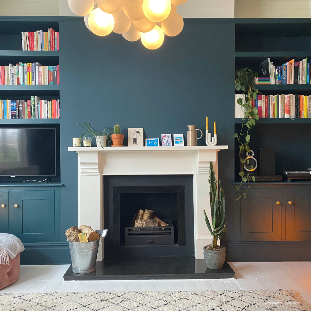
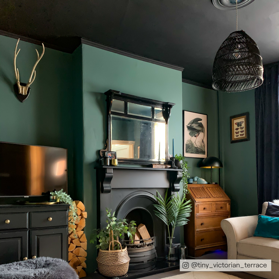
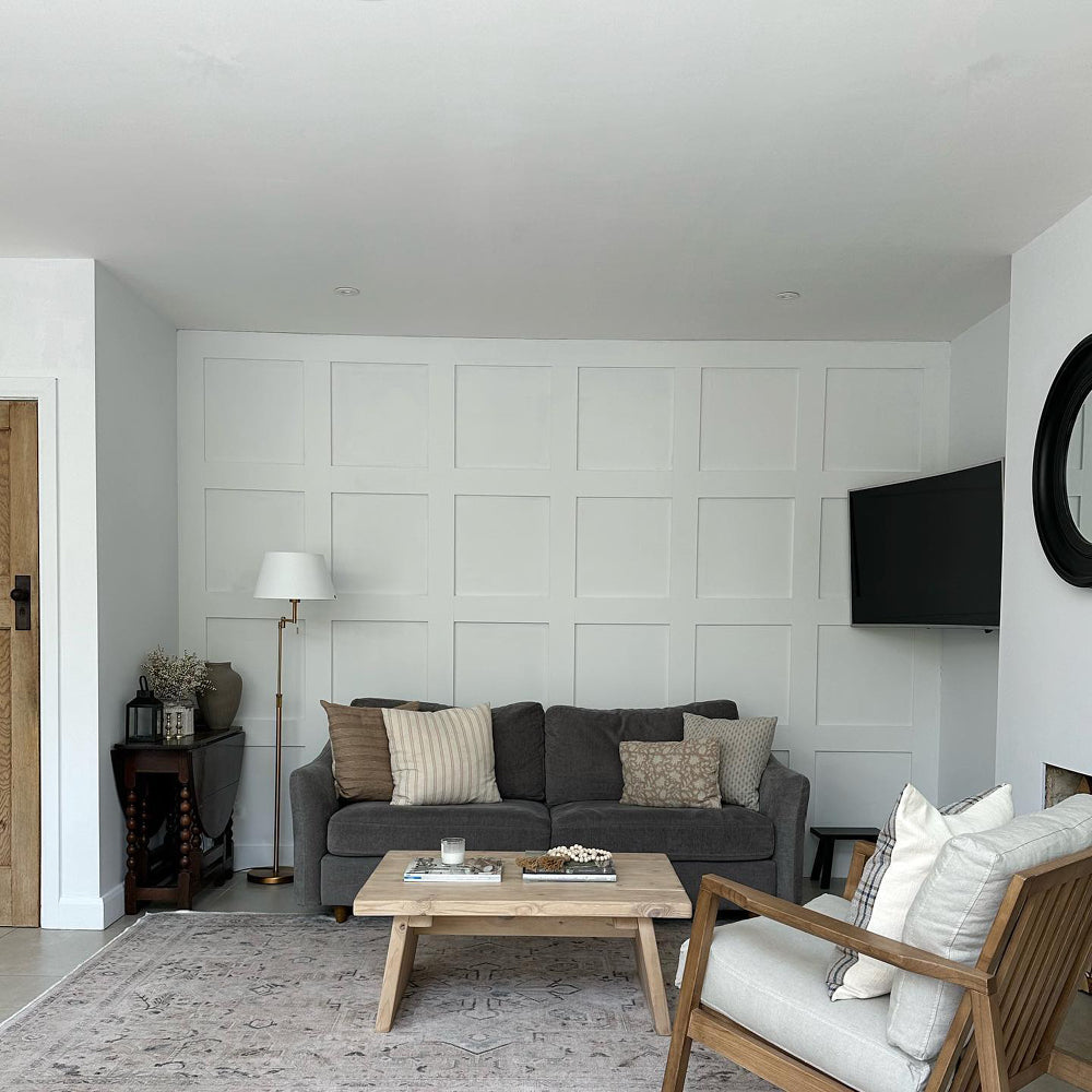
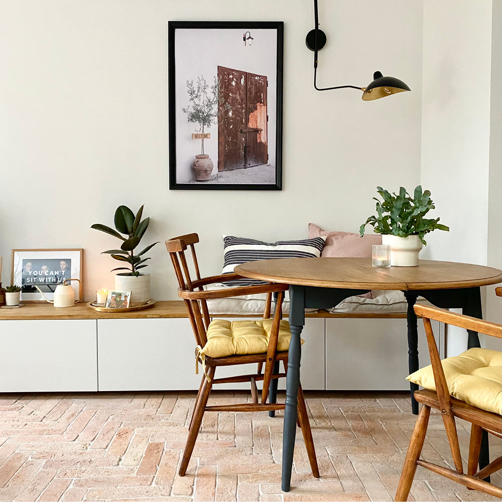
Forget colour of the year, we're into more muted shades here at COAT HQ. Deliberate but never brash, these shades have been developed directly from customer feedback.Carefully created to play the humble backdrop to your own style and most loved items, rather than to be the star performer.
As Rob rightly puts it - “The role of paint changes throughout our lives. From exploring ourselves and making a statement - to becoming a backdrop for the adult style we now own.”
The Polite Palette
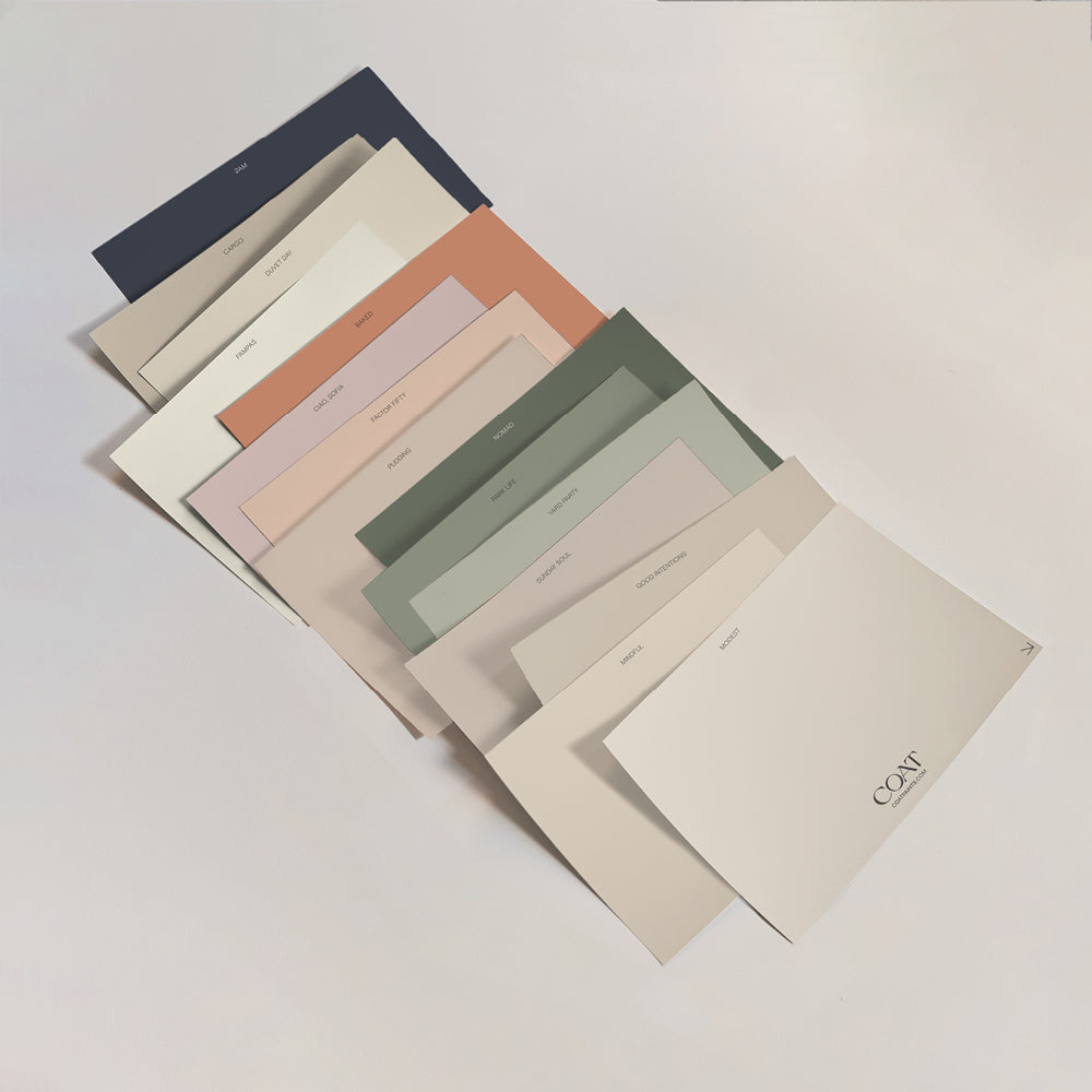
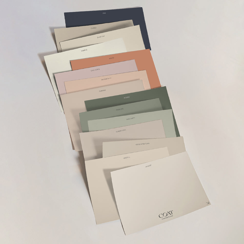
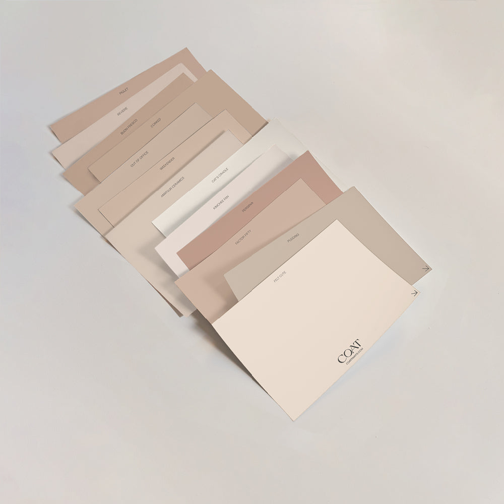
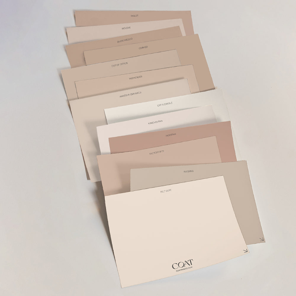
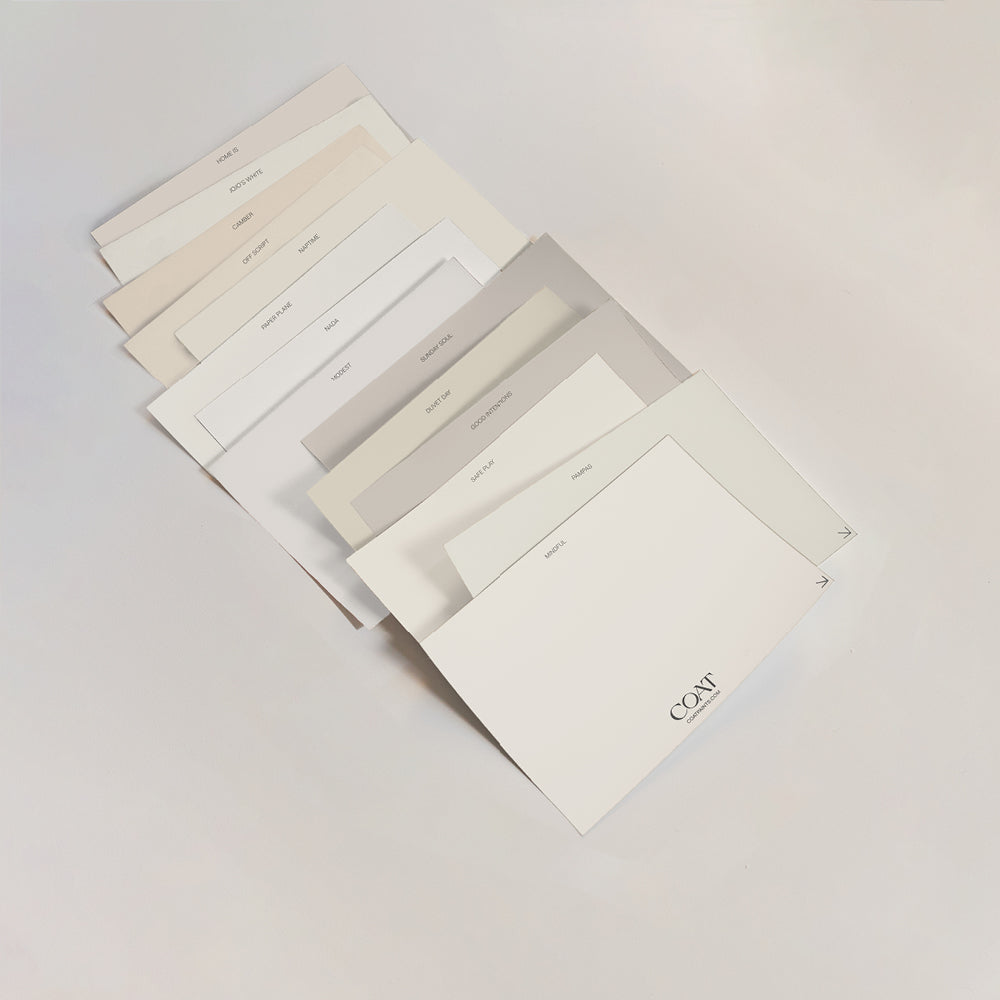
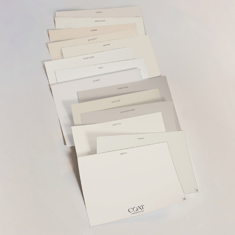
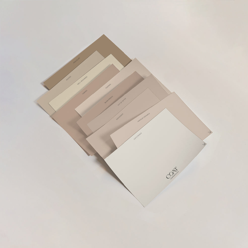
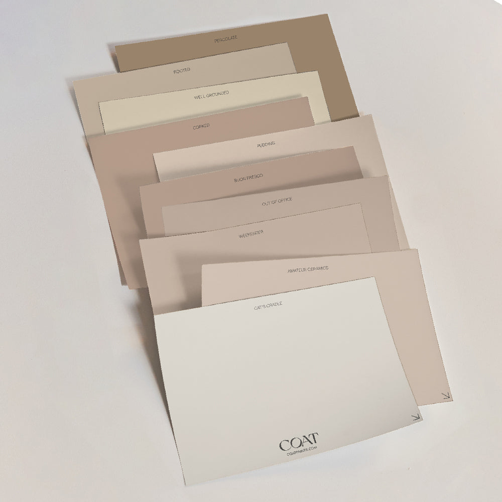
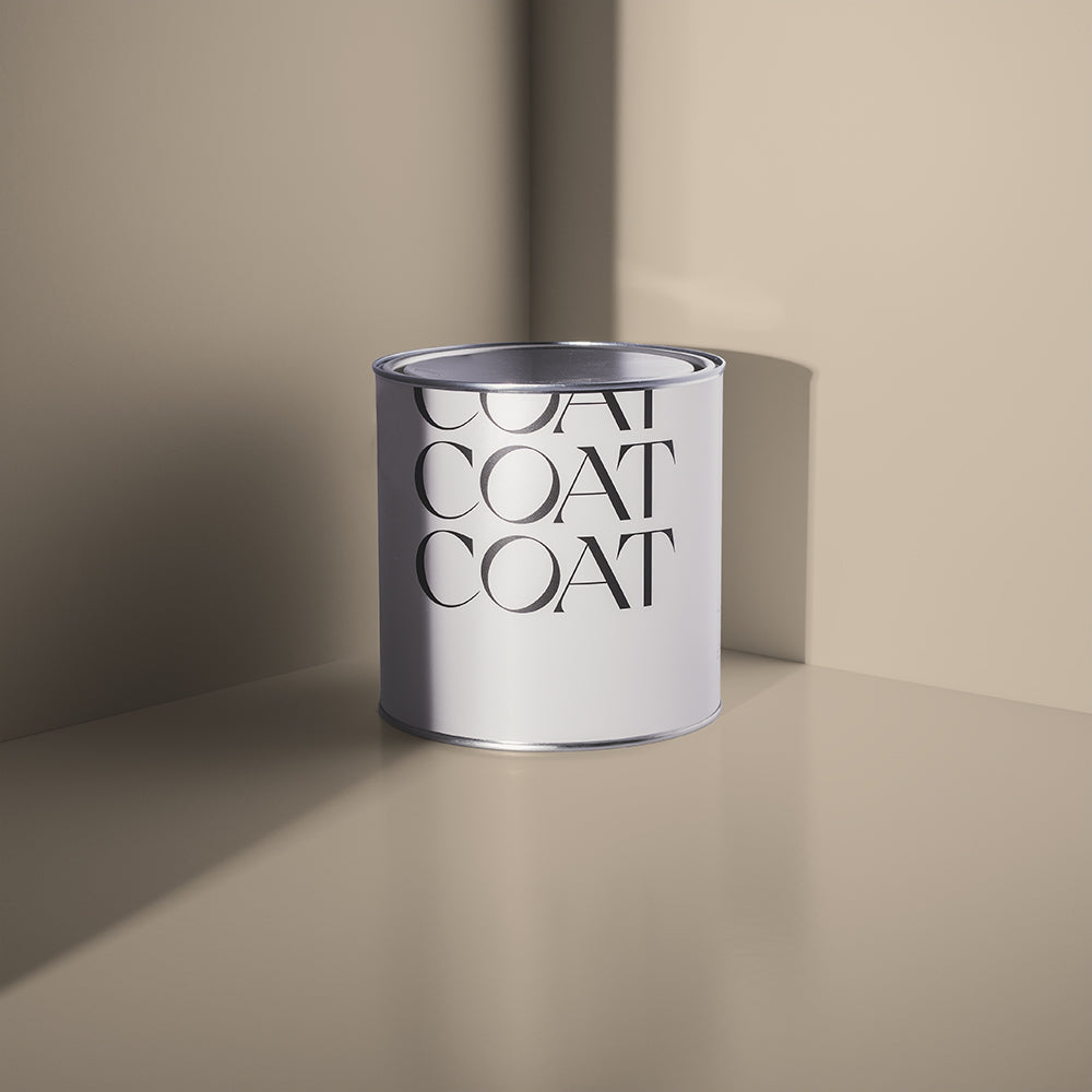
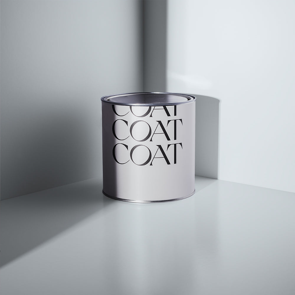
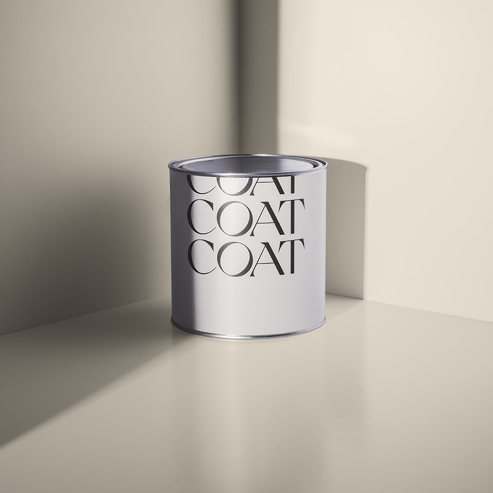
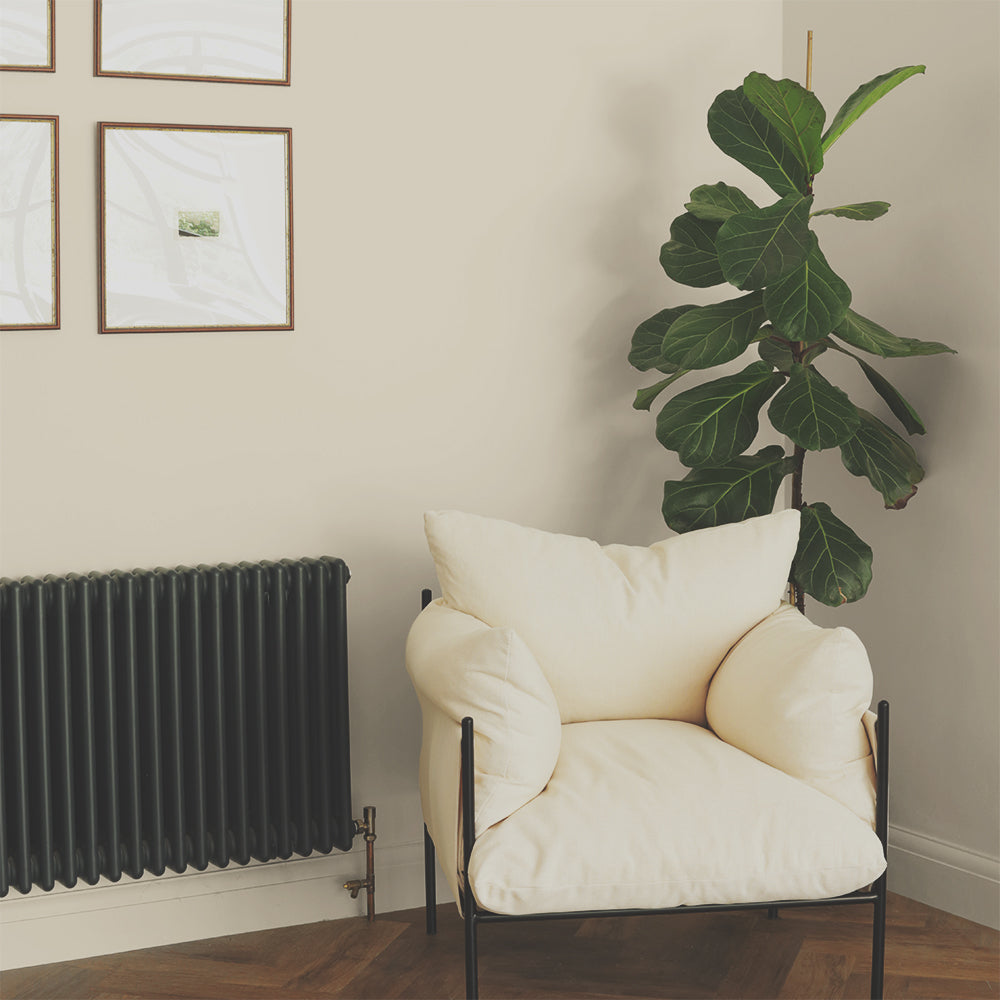
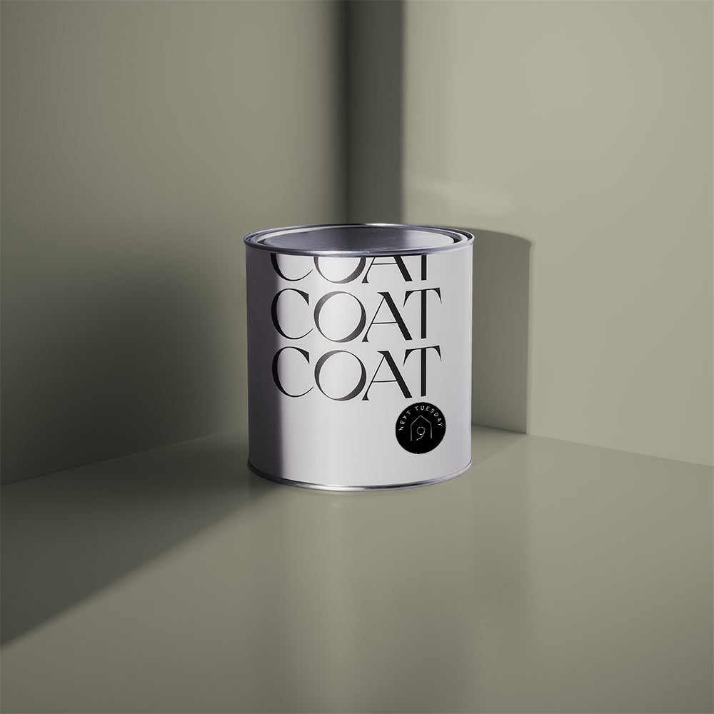
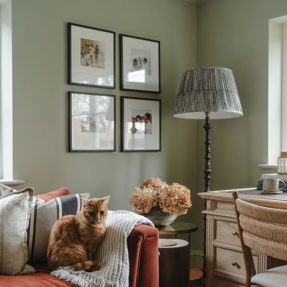
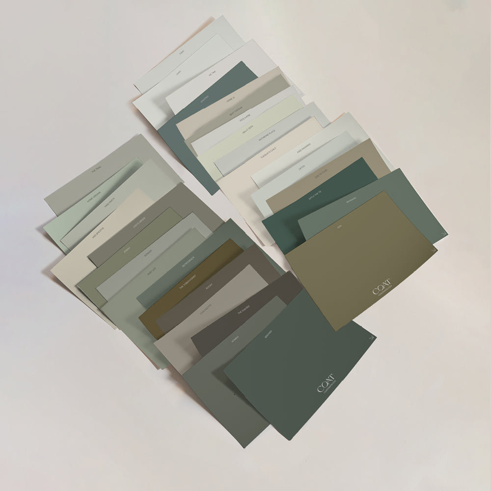
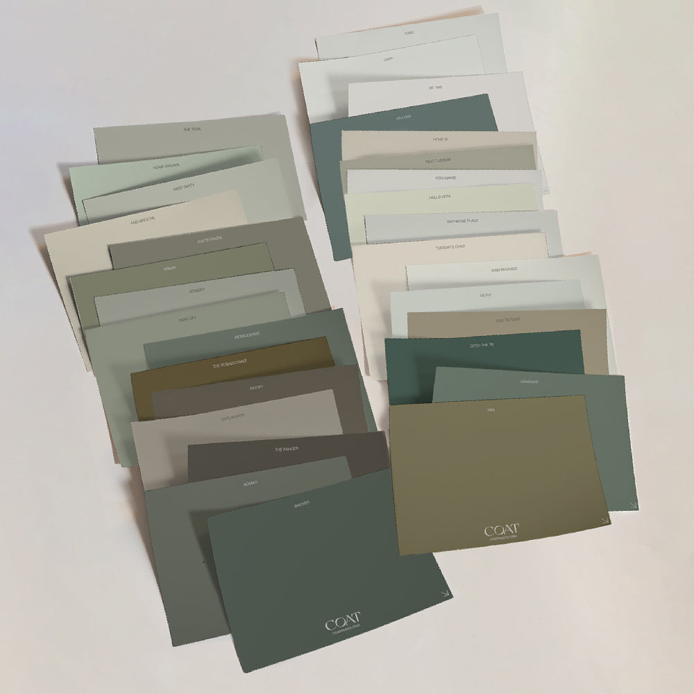
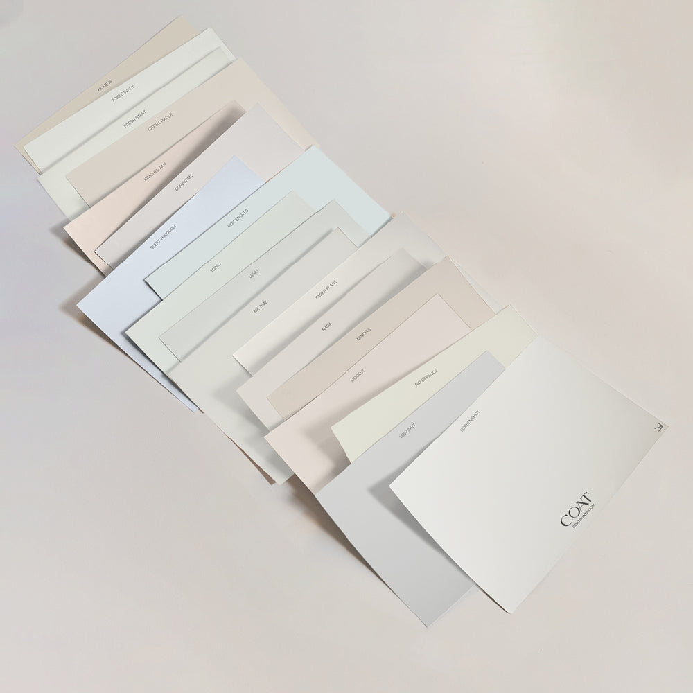
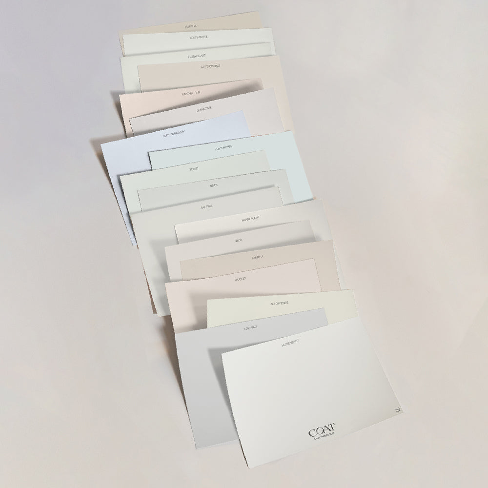
15 new shades, and 2 re-entries following popular demand. Covering the full spectrum of undertones; and perfectly complementing the rest of the COAT palette the power of these neutral shades shouldn't be underestimated.
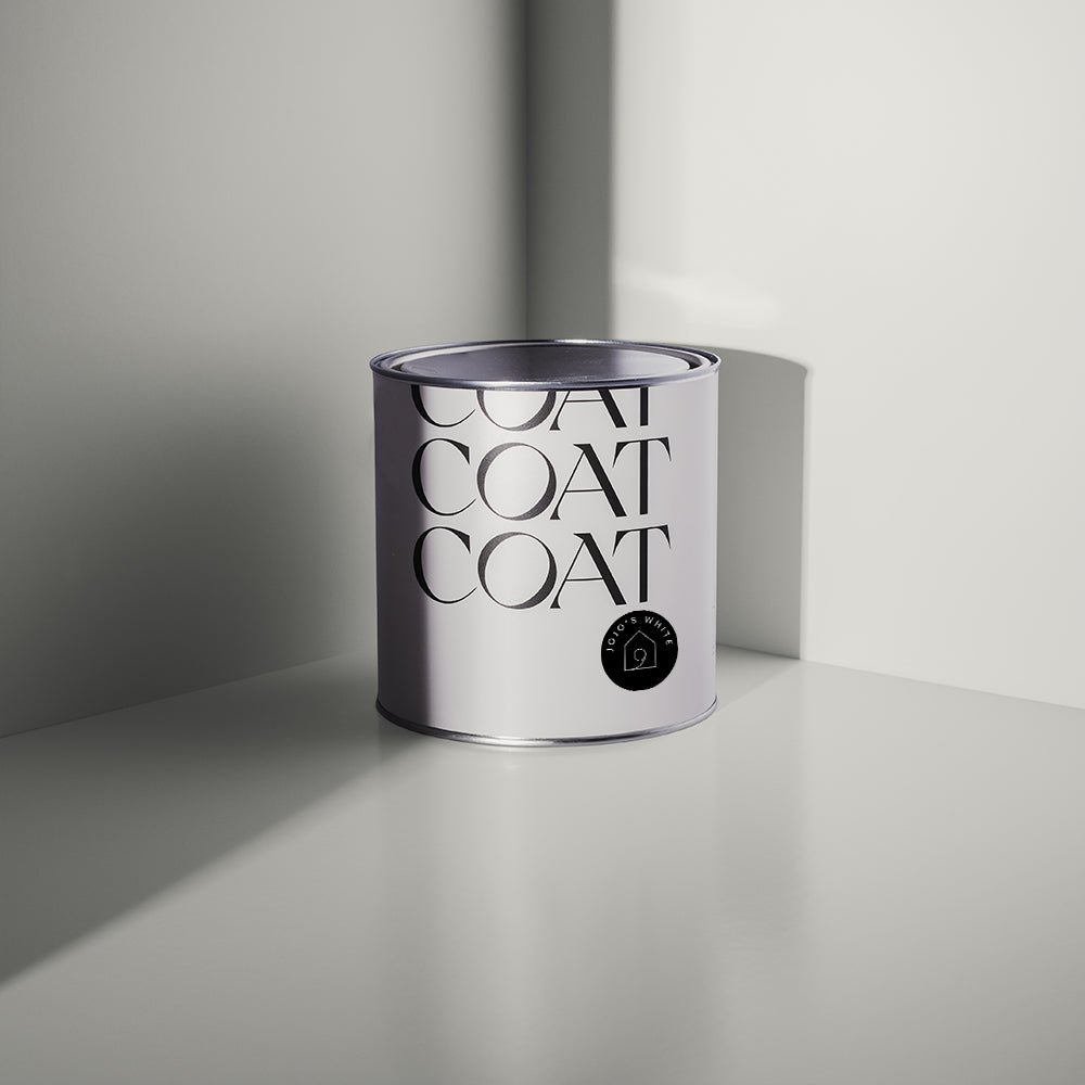
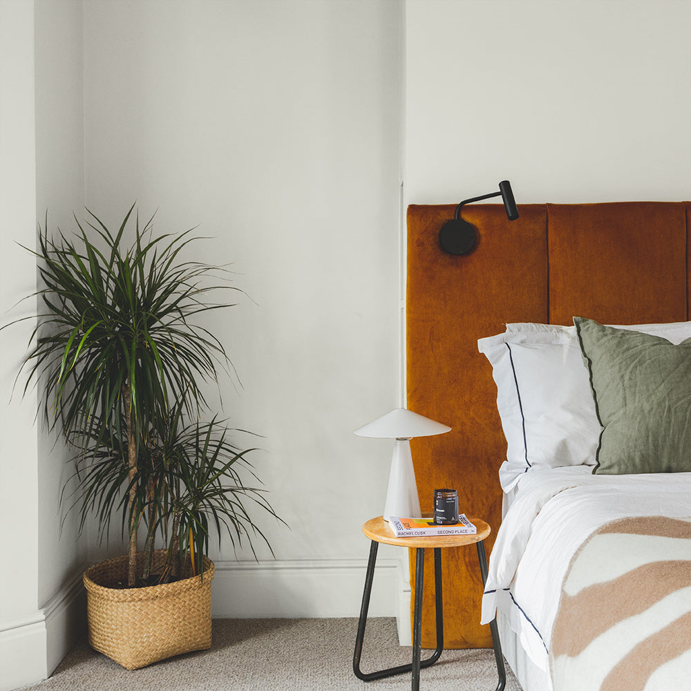
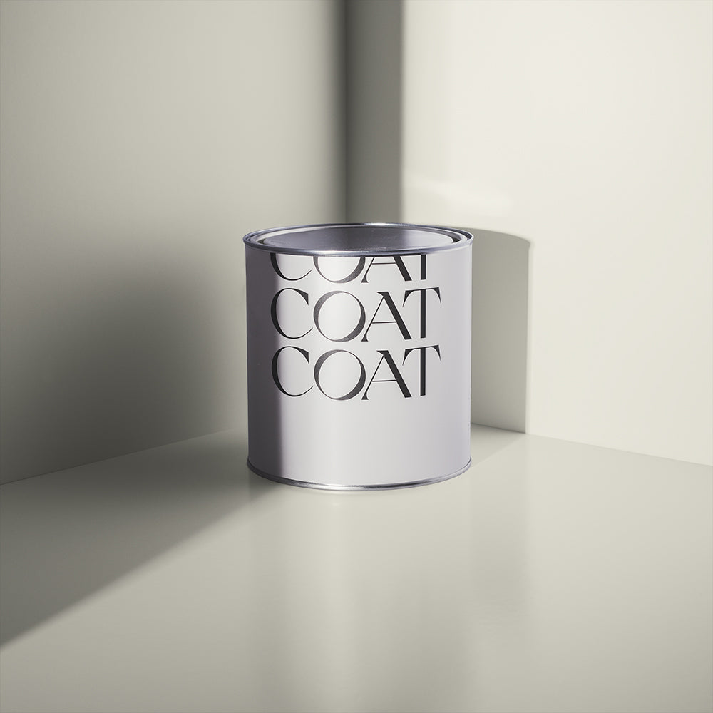
GHOSTED

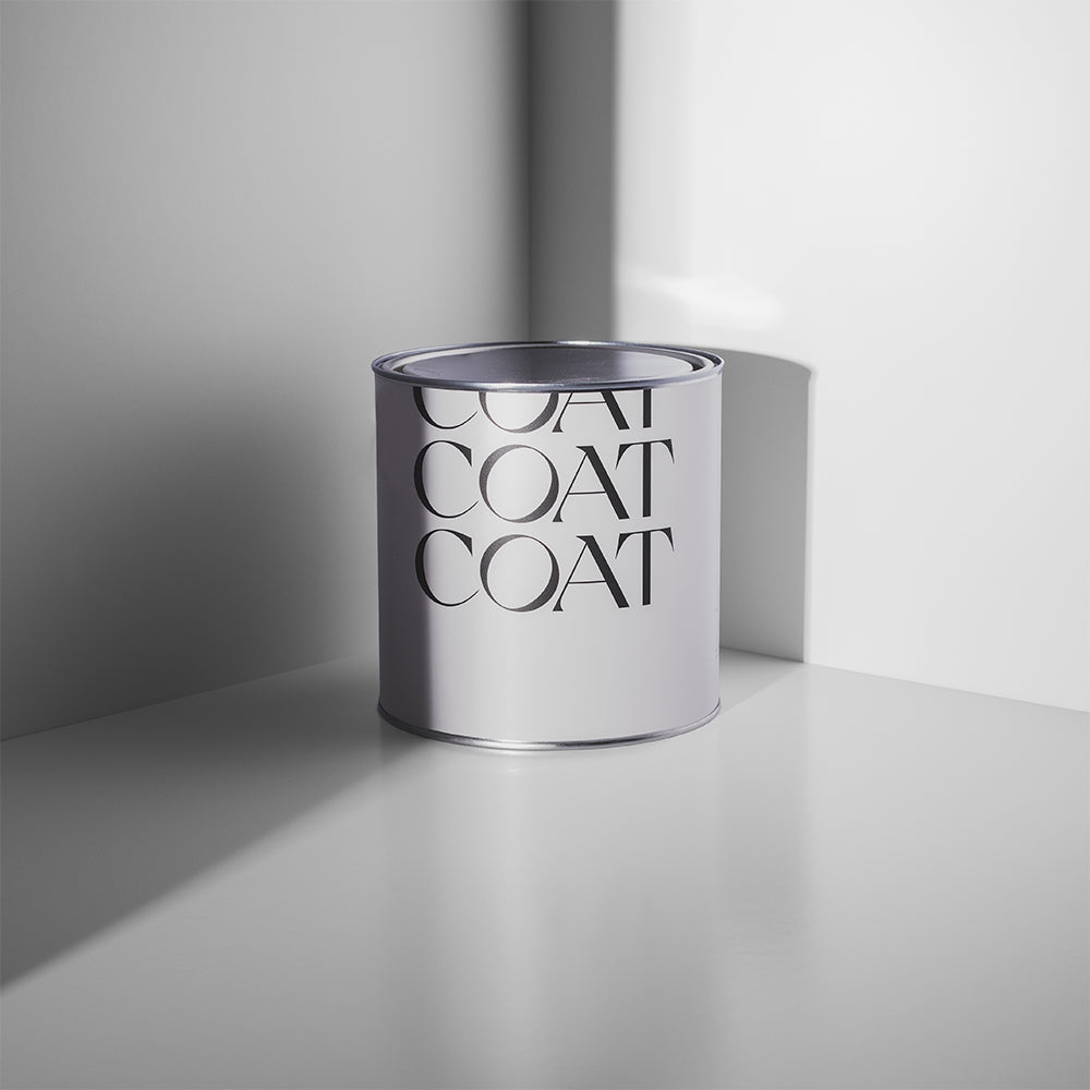
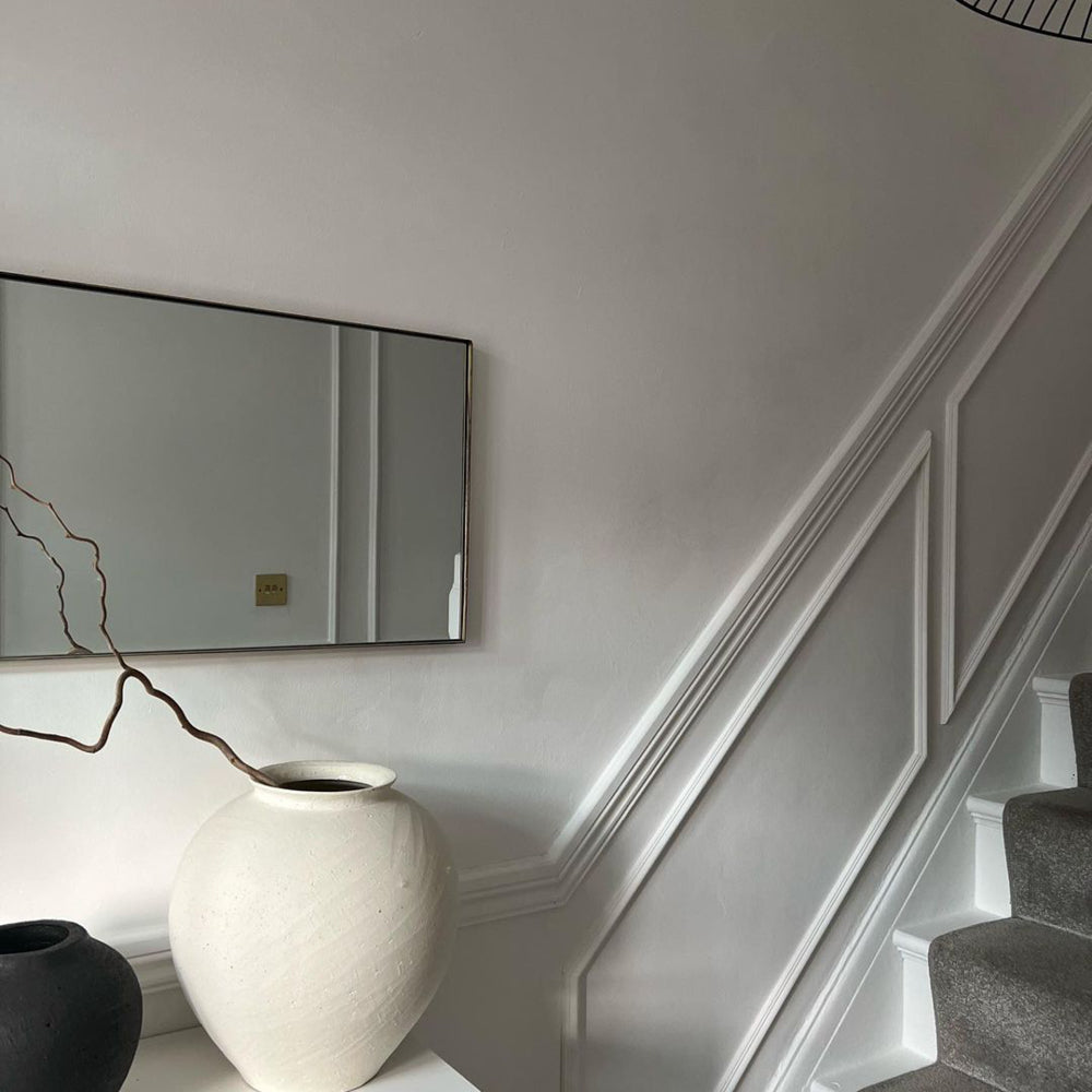
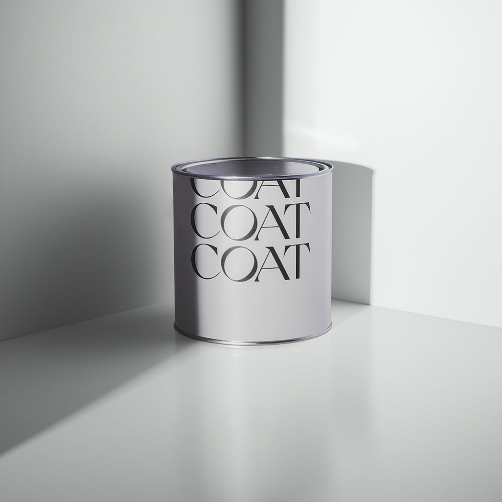
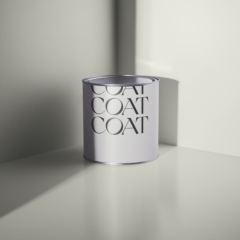
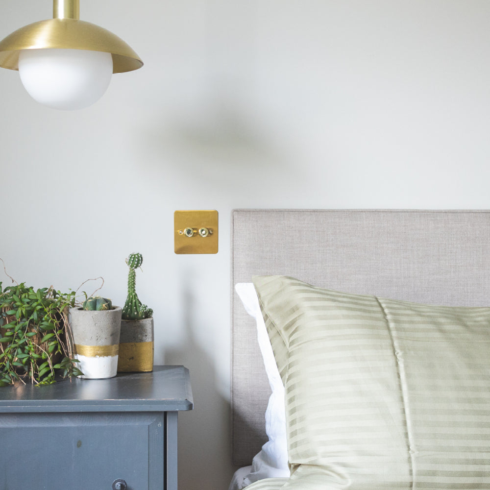
White with a touch of black, it's barely there. This refined off white is effortlessly classy and works perfectly in any space.
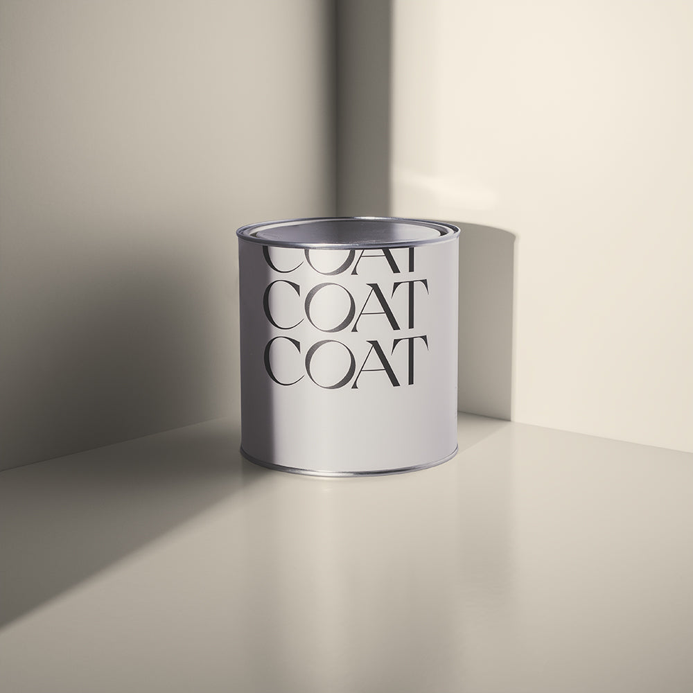
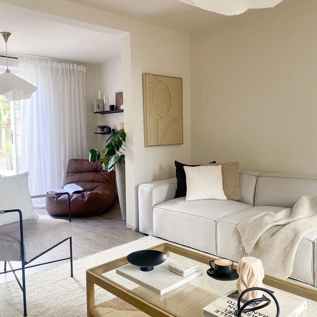
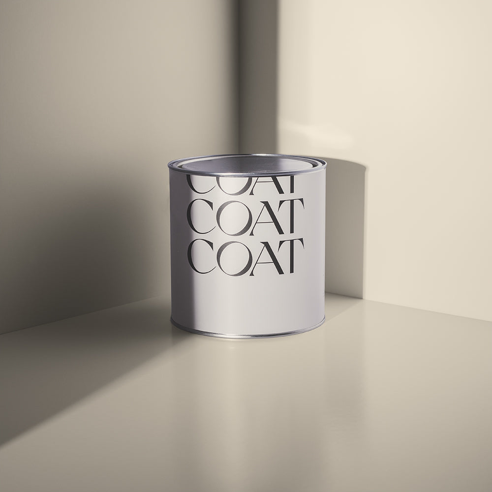
NADA

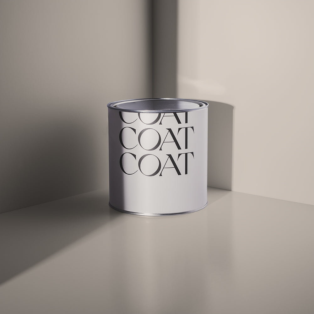
White but with very subtle taupe undertones, so it feels warm and grounded. Effortlessly classy in any space, and perfect to add warmth where pure white feels too cold. Acts as the perfect off white pair to our bestselling taupes Mindful, Good Intentions and Sunday Soul.
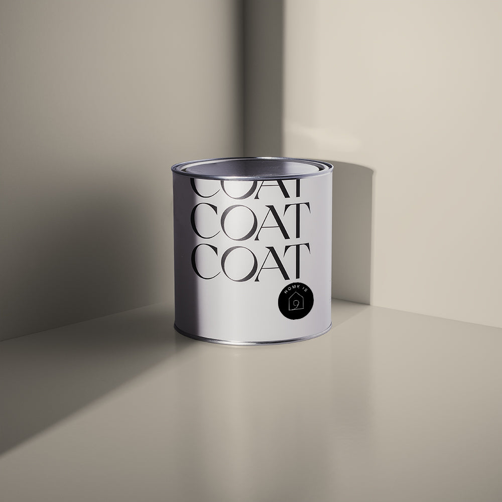
PAPER PLANE

A natural white with very subtle organic green and yellow undertones, for a soft backdrop in any room. The perfect white for adding warmth in darker or north facing areas; and a great pair to our greeny greiges like Tuesday's Child, Cargo and Debate Club.
Grab a Paper Plane Sample now.
GREYFRIARS BOBBY

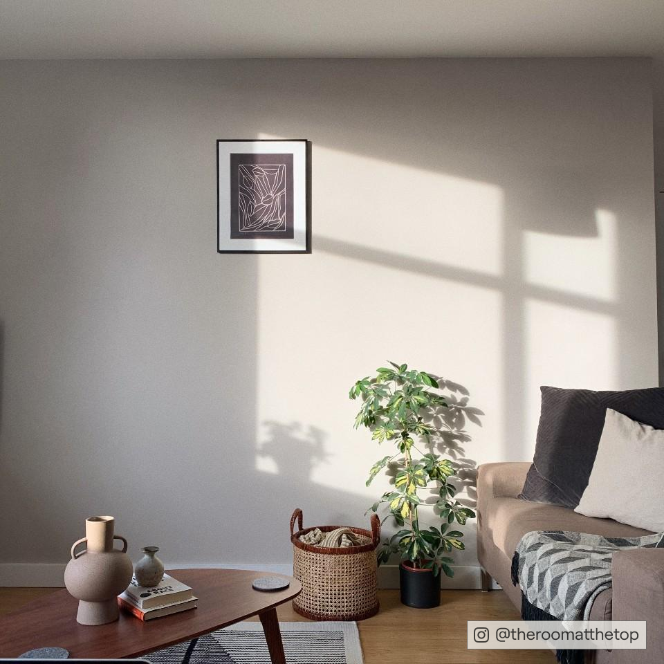
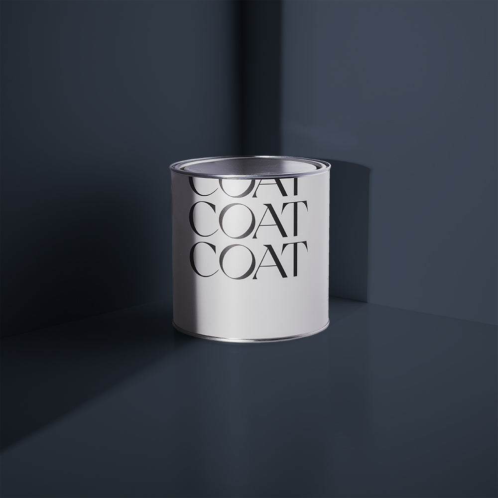
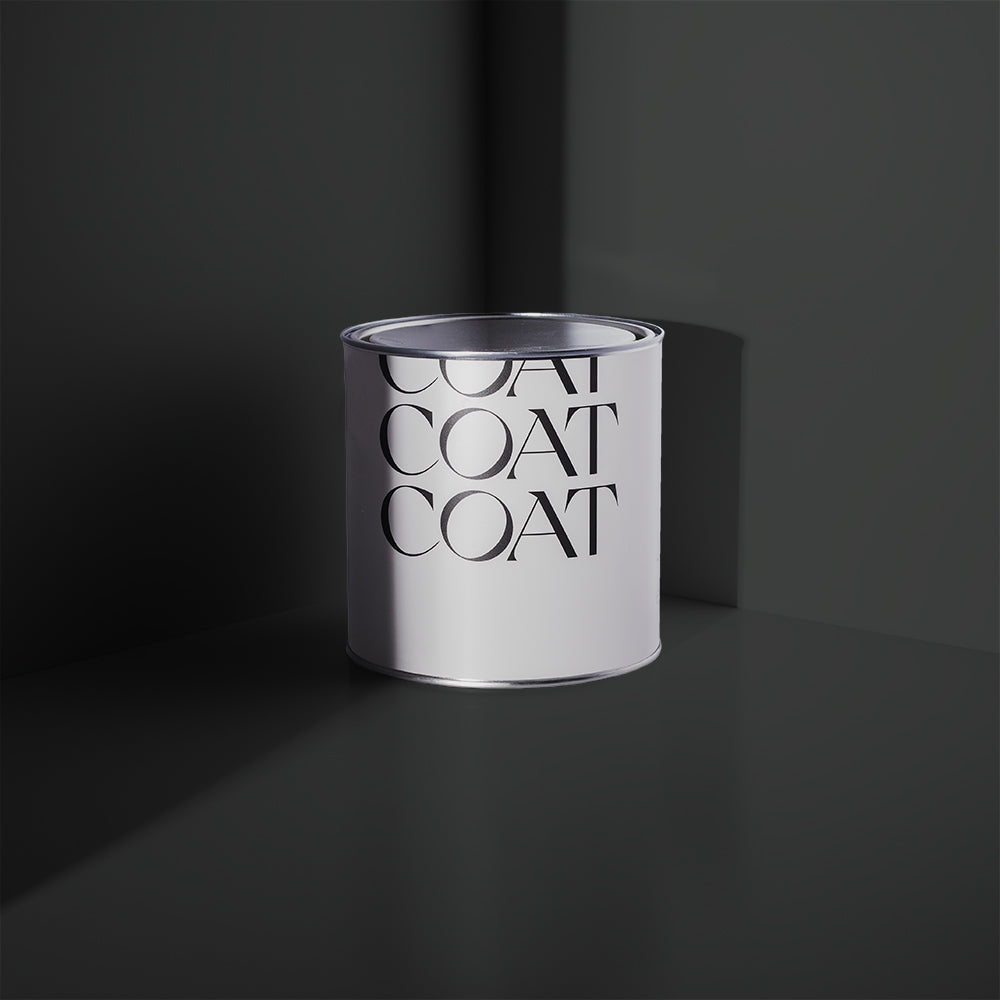
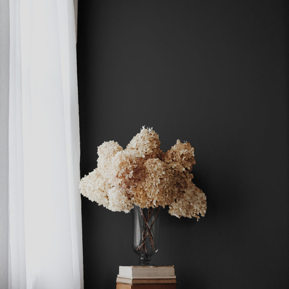
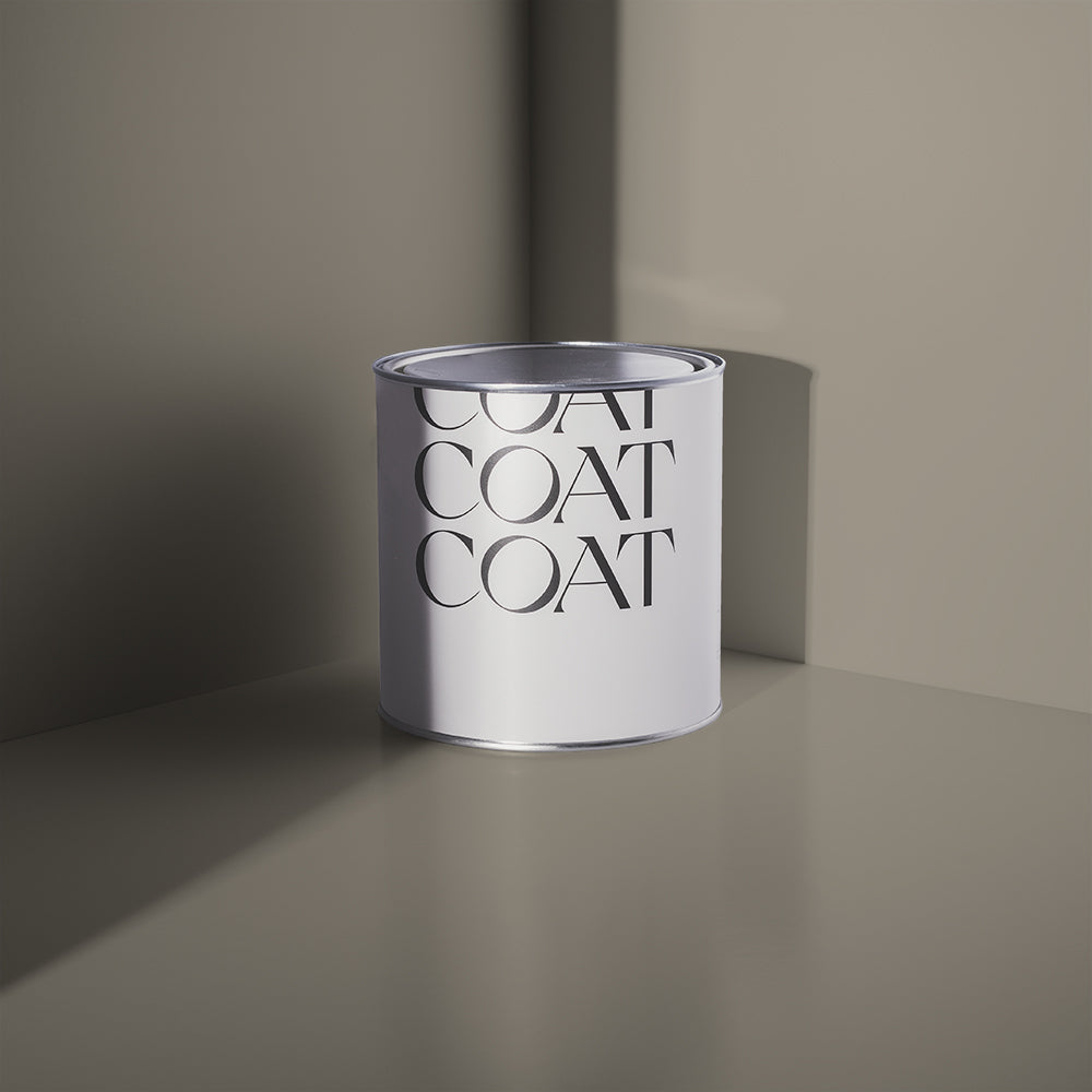
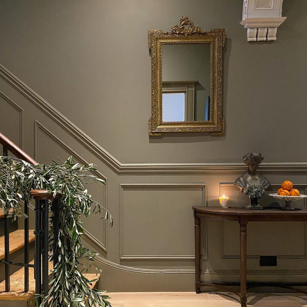
A warm and perfectly loyal mid-grey that'll be by your side for years. A little yellow pigment creates warmth that feels homely and cocooning. A great mid-tone complement colour to our classic off white Low Salt; or a lighter pair to our favourite complex shade Cod Brew.
Grab a Greyfriars Bobby Sample now.
ME TIME

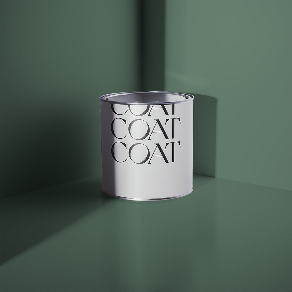
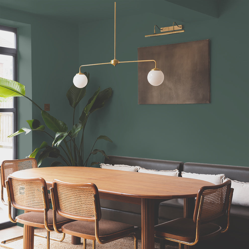
White with the tiniest warm green undertone. Perfect for neutral lovers who want a calming space to kick back and relax. Pair with Yard Party for a fresh, yet muted green scheme; or Sunday Soul for the chillest vibe.
UJJAYI

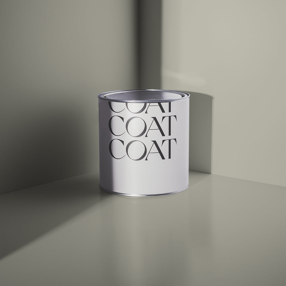
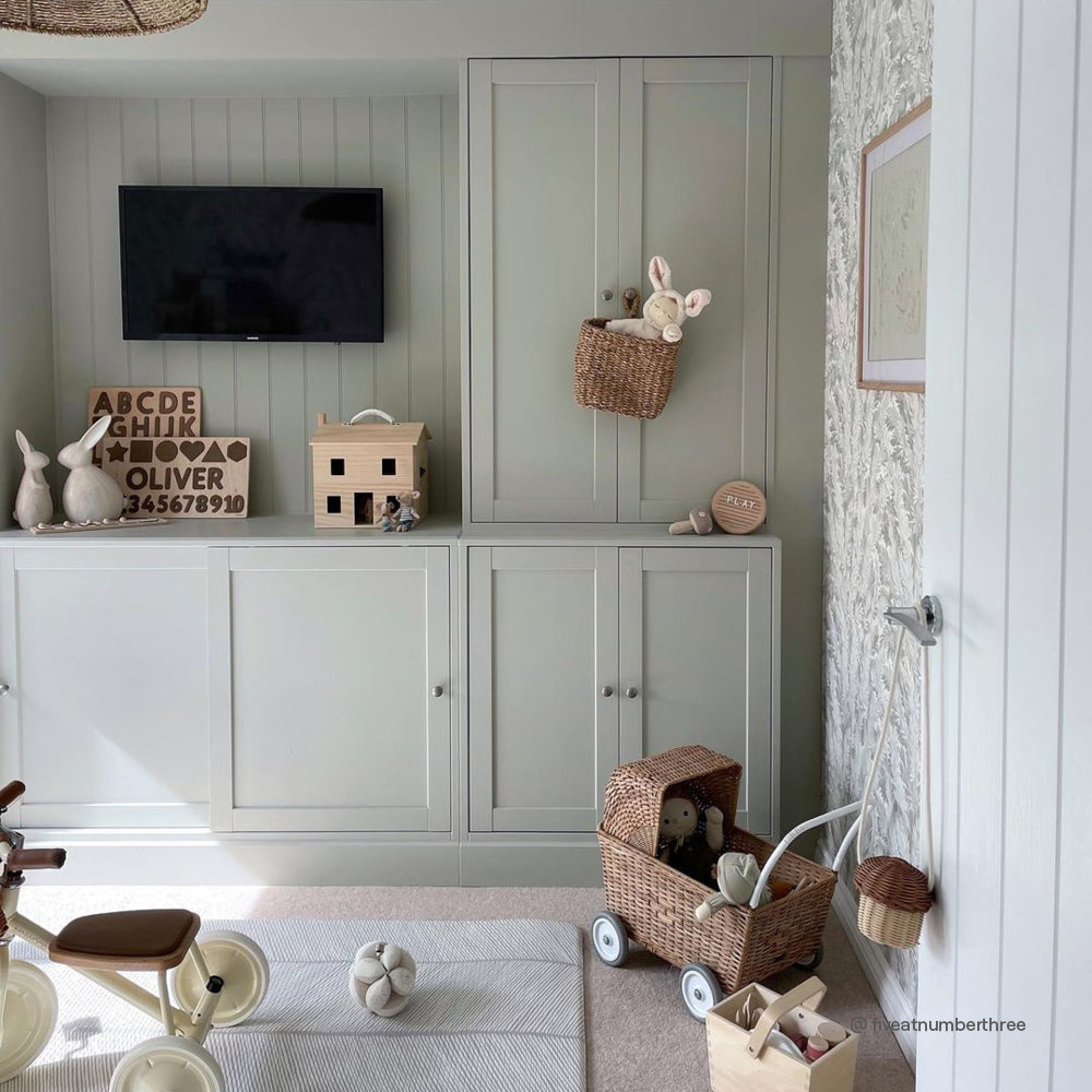
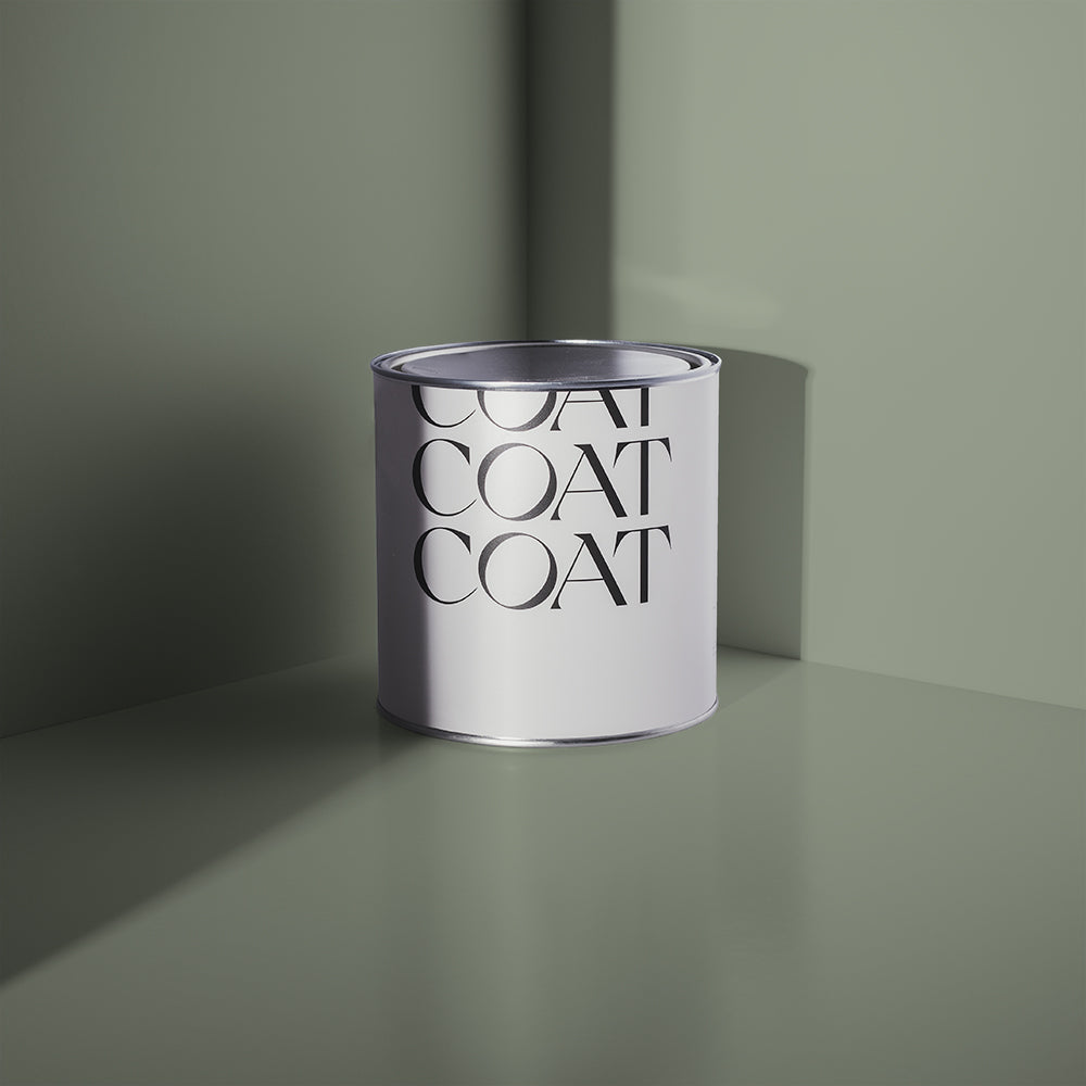
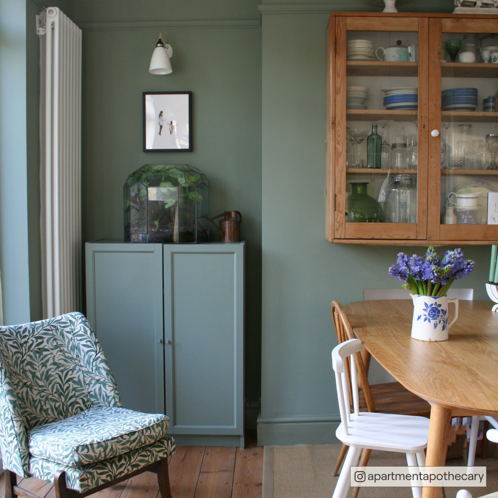
Breathe deep and slow with this perfect sage green backdrop. A touch of grey makes this off white look classy and relaxed in all light conditions. You've got this - pair with our best sages Detox or Park Life for an added oomph of zen.
TONIC

A refreshing off white to forget the day's stresses. This contemporary white has a touch of fresh green to create calming spaces. Try pairing with Pampas or Kind Regards as a great antidote to the outside chaos.
VOICENOTES

White with a hint of duck egg blue. Everyone's talking about this unique colour, that's knocked back with grey undertones for a classy look in any room. Pair with it's darker feathered friend Free Range; or our more muted pal Hamilton for a modern light blue scheme.
SLEPT THROUGH

A muted white with a shot of pale blue that's barely there. For neutral lovers drawn to pale blue, this one works as an effortless backdrop without shouting. A great subtle choice against our friend Margot; or of course the new white pair to our timeless classics Lie In or All Inclusive.
Grab a Slept Through Sample now.
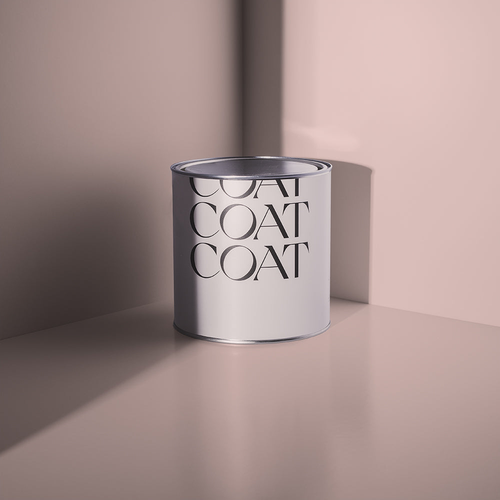
DOWNTIME

White with a tiny touch of pink. With subtle grey undertones this very pale pink looks sophisticated, and not sweet, as a hushed colour in any lighting. Blue and Pink is a pair that's not going anywhere, so check it out alongside COAT's OG shade 2AM; or place as a lighter complement to Ciao, Sofia.
KIMCHEE FAN

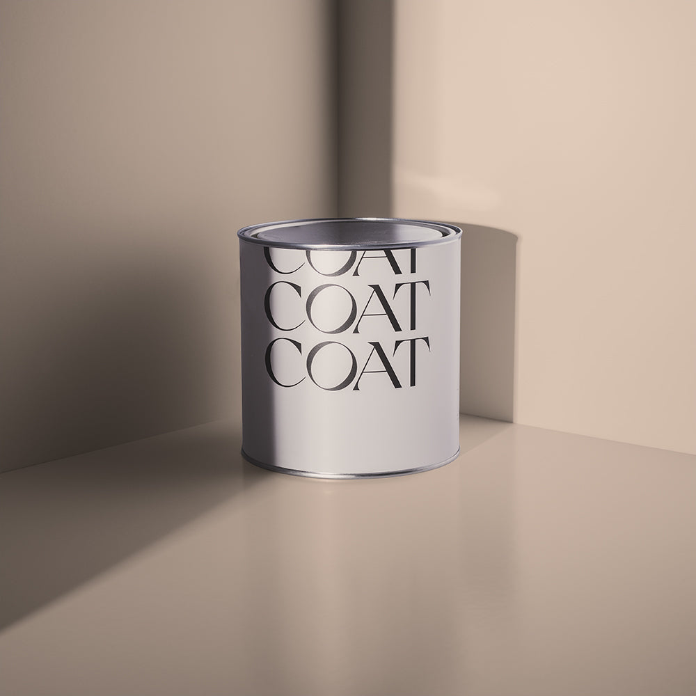
A warm light plaster that's stylish and rich. This unique colour doesn't shout, but somehow creates a grown up grounding to any space. In darker rooms it feels deeply comforting. Create the perfect pastel scheme alongside Nada; or embrace the Mediterranean vibe with a plaster pair to Factor Fifty.
Grab a Kimchee Fan Sample now.
CAT'S CRADLE

Take your time with this soft white, inspired by a classic. Off white with just a touch of stone makes this colour as versatile as they come, and comfortable alongside any style or decor. Pair with COAT's classic taupe Good Intentions for an achingly simple neutral scheme; or soften the bolder edges of The Record Store for a statement piece.
Grab a Cat's Cradle Sample now.
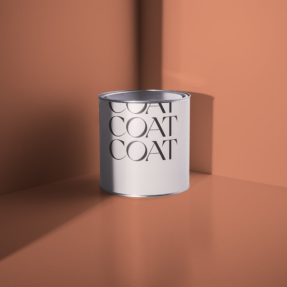
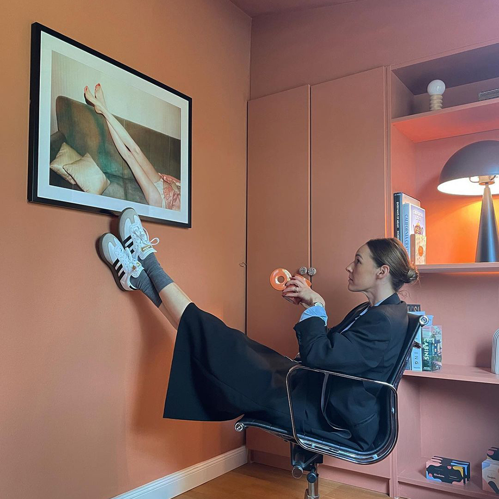
AMATEUR CERAMICS

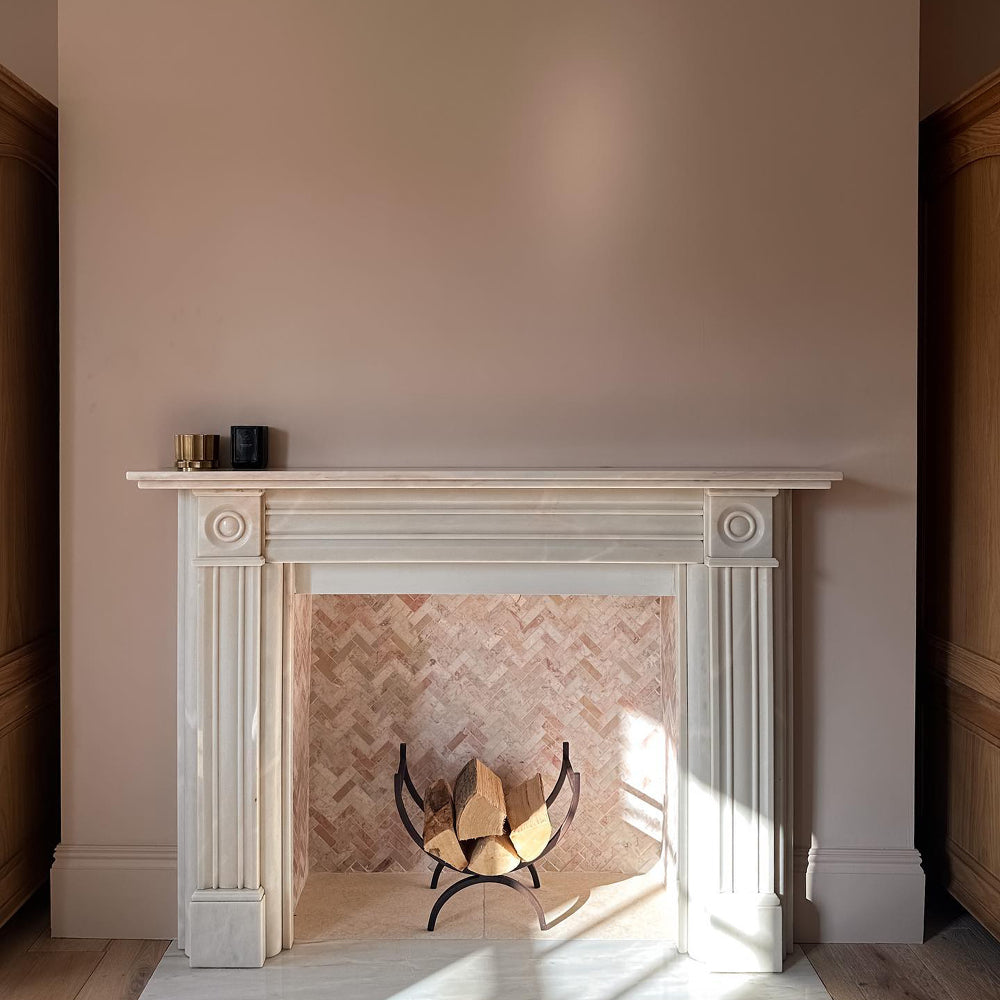
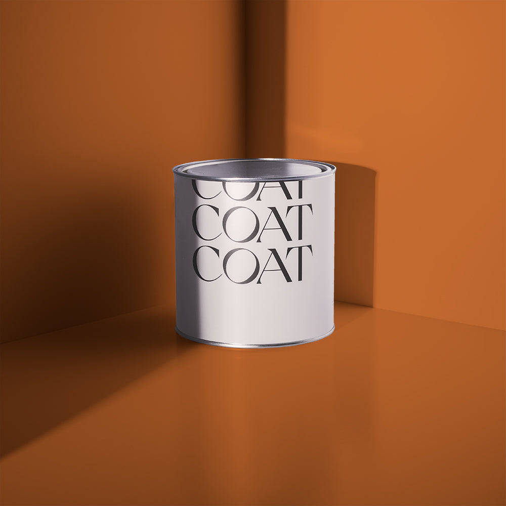
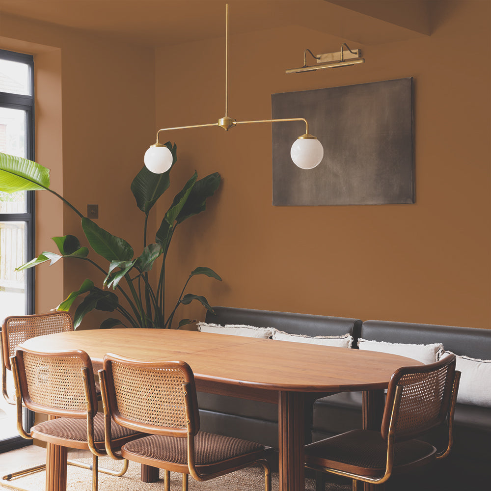
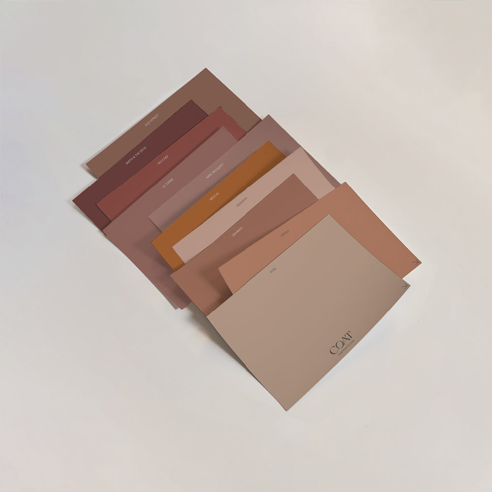
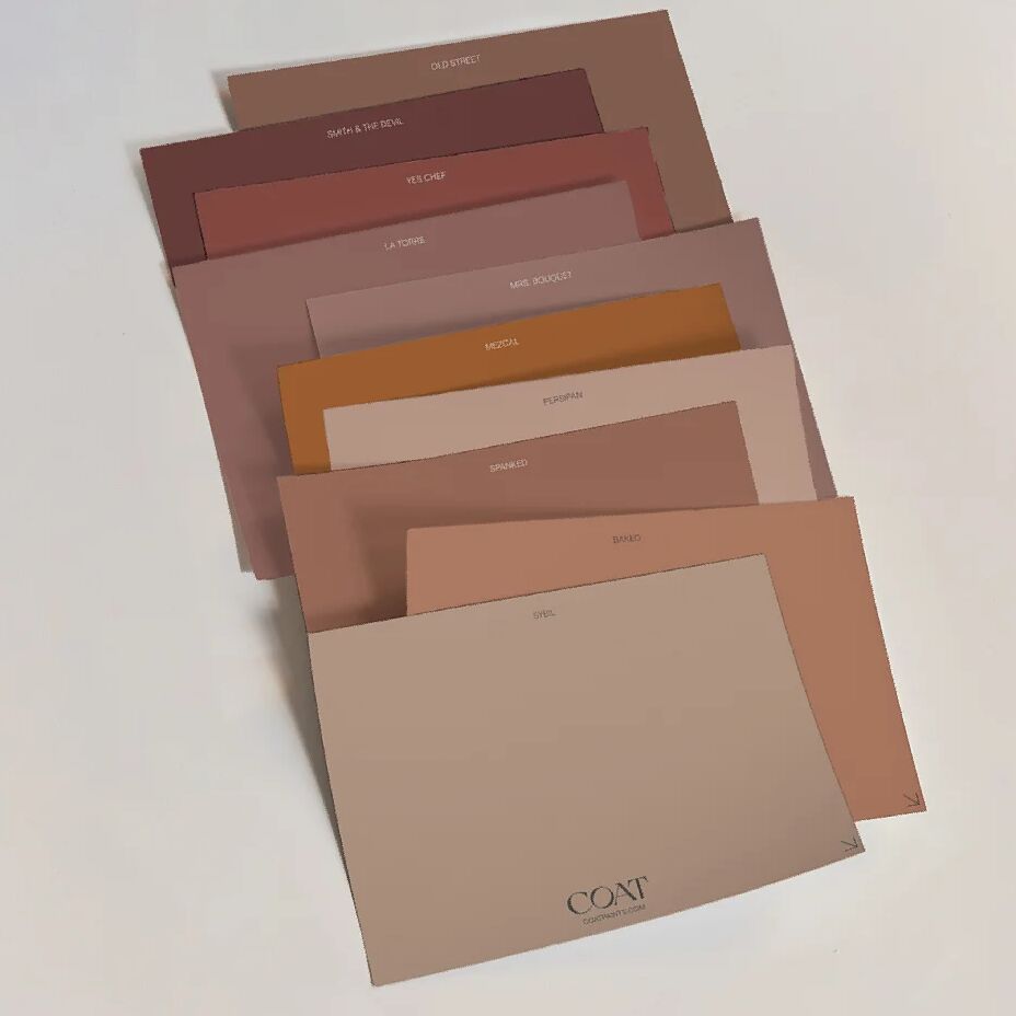
Just the slightest Terracotta warmth. This organic colour is unique and sophisticated, grounded in red undertones for warmth and grey notes for sophistication. Pair will the stand out newcomer in the palette Yes Chef to keep those summer vibes coming all year round.
Grab an Amateur Ceramics Sample now.
WEEKENDER

A feel good neutral that's all about the weekend. Baked-in warmth, with a stony vibe that feels as comforting as that Friday night feeling. Enhance the cosy curl up with Nomad or David Rose as stronger contrasting options.
OUT OF OFFICE

You loved it so much in our Summer Edit that it's back for good. Sun-bleached stone and warmer climates keep calling. With this reddish, stony neutral - every day feels sunkissed. Consider pairing with Dodie for a blue contrast reflecting those hazy summer horizons.
Grab an Out of Office Sample now.
BUON FRESCO

A rich neutral with a wet-plaster look. A modern take on the ‘true fresh’ style of Italian painting. A deeper companion to bestselling Mindful; or a sweet treat alongside our rich brown Gumption.
Grab a Buon Fresco Sample now.
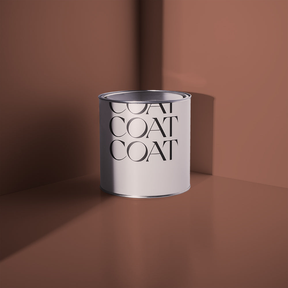
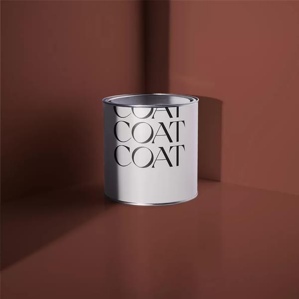
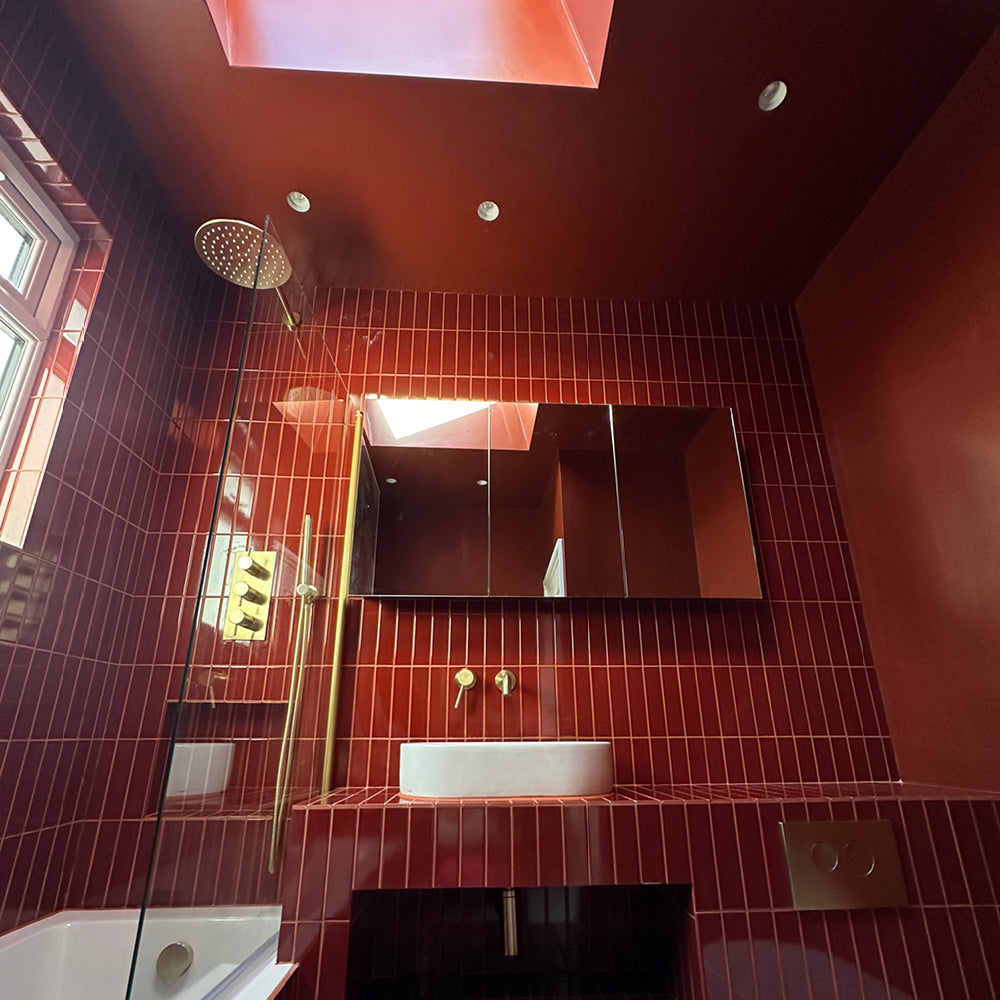
YES CHEF

And there you have it. Fresh neutrals that unashamedly keep it simple so the rest of your style can shine.
Ready to shop? Head to the drop and grab a sample.
Publish Date
Author
