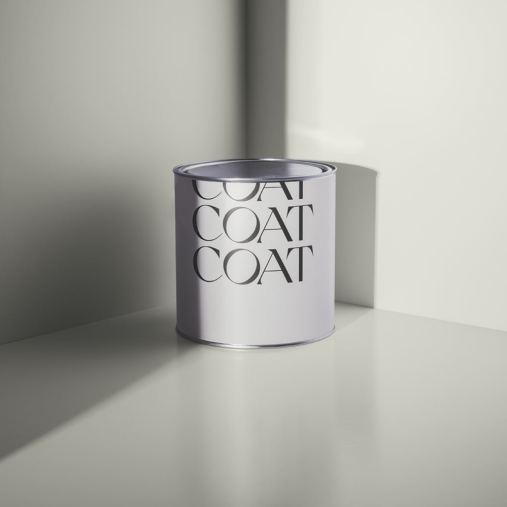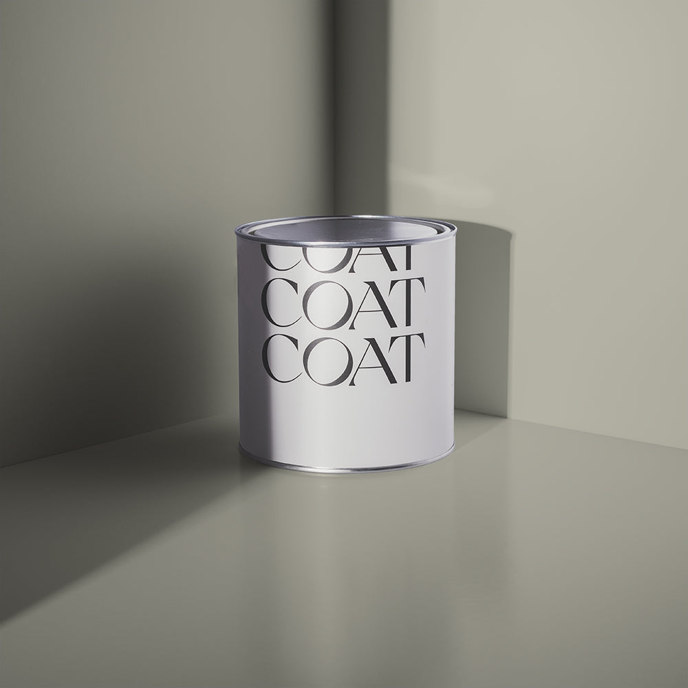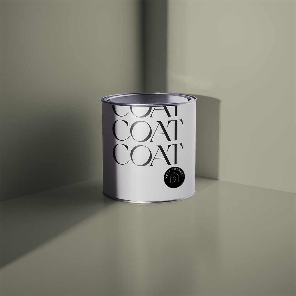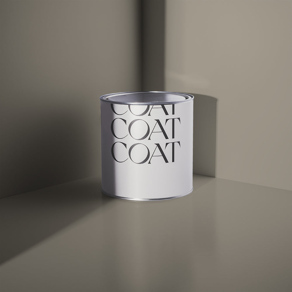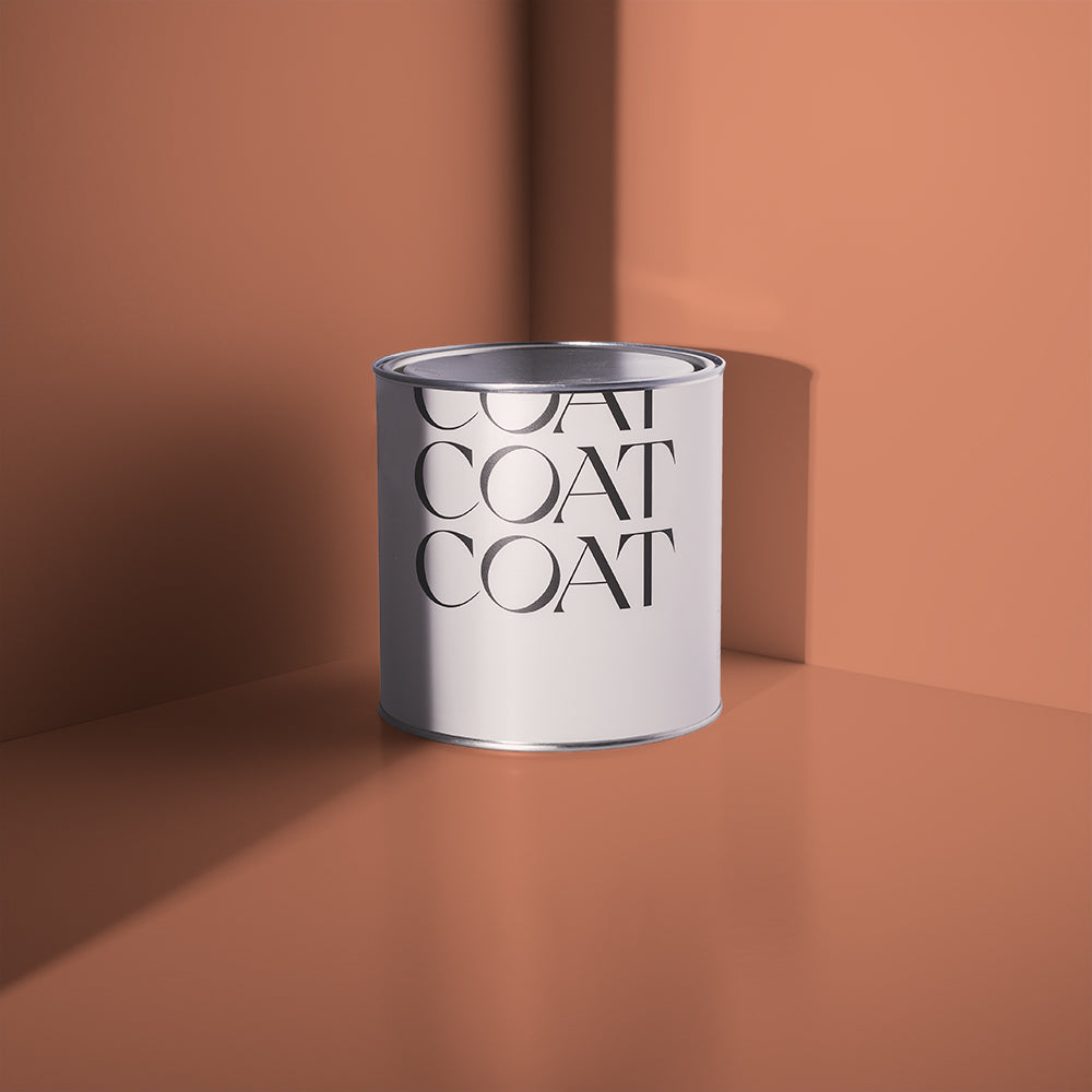
Popular Paint Colours for 2022 - Our Prediction
So, you’re looking to give a room a new COAT? We’re all looking forward to a bit more collective freedom in the next year. The interior colour trends 2022 are definitely all about this. We’re gonna talk a bit about what paint colours are gonna bring the good vibes to your home, where and how they can be used and some helpful advice from the experts.
Decorating a space gives it a completely new feel, even if it’s just changing the colour of the woodwork. You can make it feel cleaner and airier; or darker and more intimate. There’s so many options that you could go for and hopefully this lil’ breakdown of how to use the predicted popular paint colours of 2022 will be helpful to you.
Let’s get into and get you on trend for 2022 across your walls, ceilings, woodwork, picture frames, that manky bit of furniture you’ve been meaning to paint for ages…
Grey Paint Trends
2022’s trends are generally heading towards bright, saturated colours, which can be a big leap for many of us that are used to more relaxed interior styles. Fortunately, the ever reliable grey is still around to save the day. Grey creates the perfect backdrop to some of these vibrant colours, particularly for bright, buttery yellows and ultramarine blues and teals that are really present in trend circles.
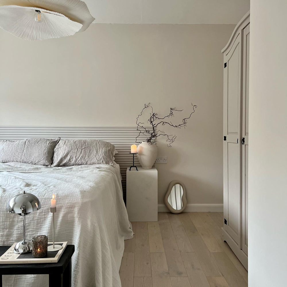
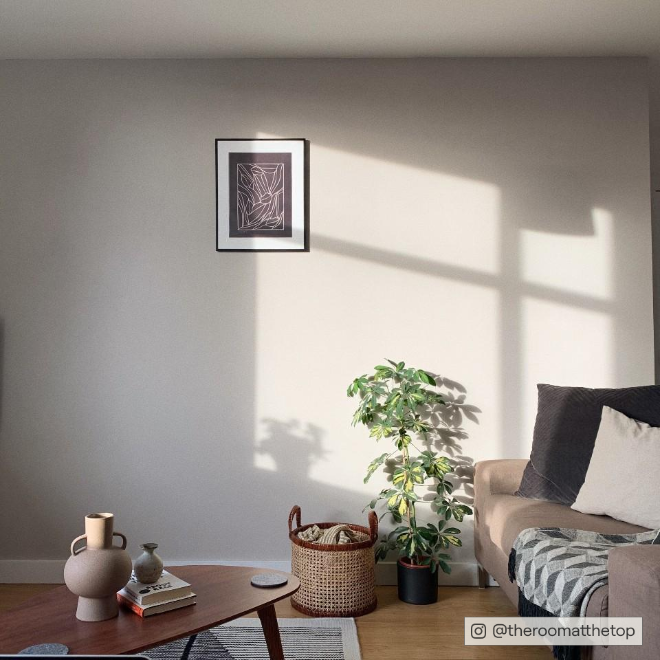
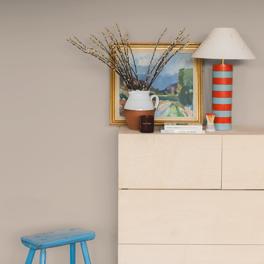
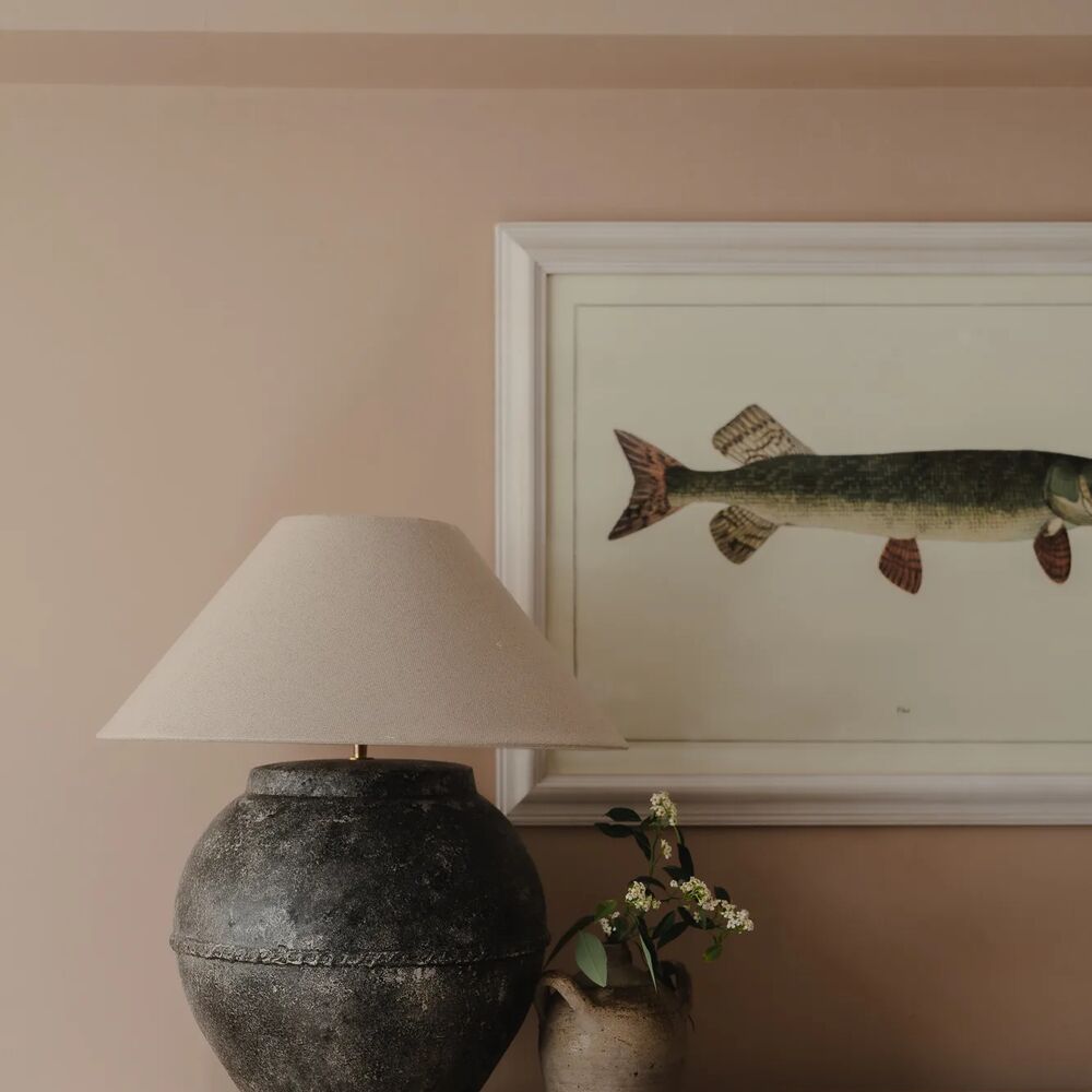
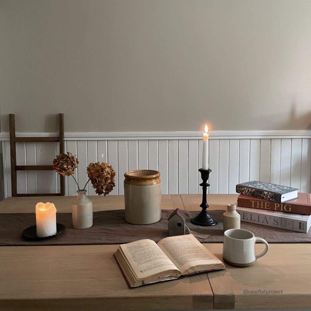
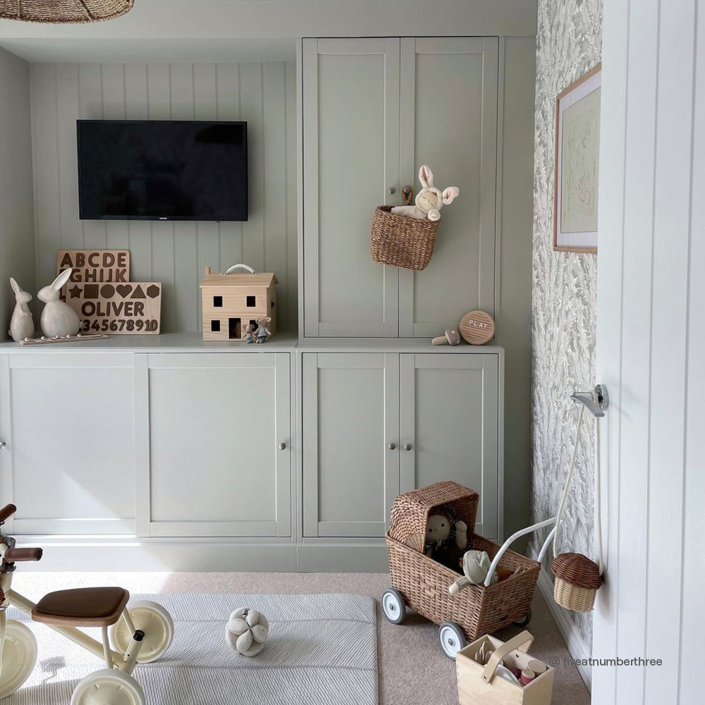
Brighter greys create a calming atmosphere. Try using Mindful, a light, beigey grey.

These grey colours make the perfect background for acidic greens, lavenders and bright yellows. Try using these as accent colours on cushions and art work on your more Mindful backdrop. This helps you eye rest in between bursts of colour.
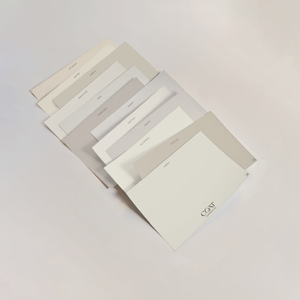
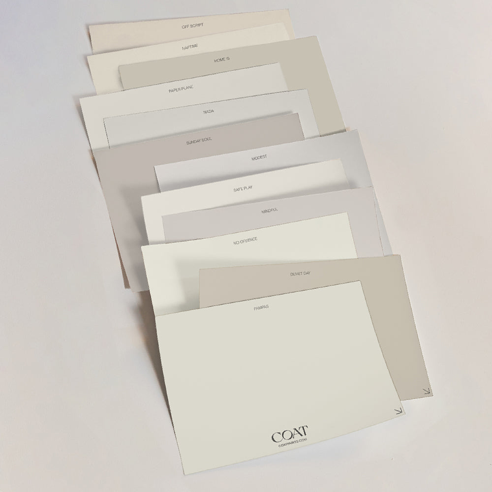
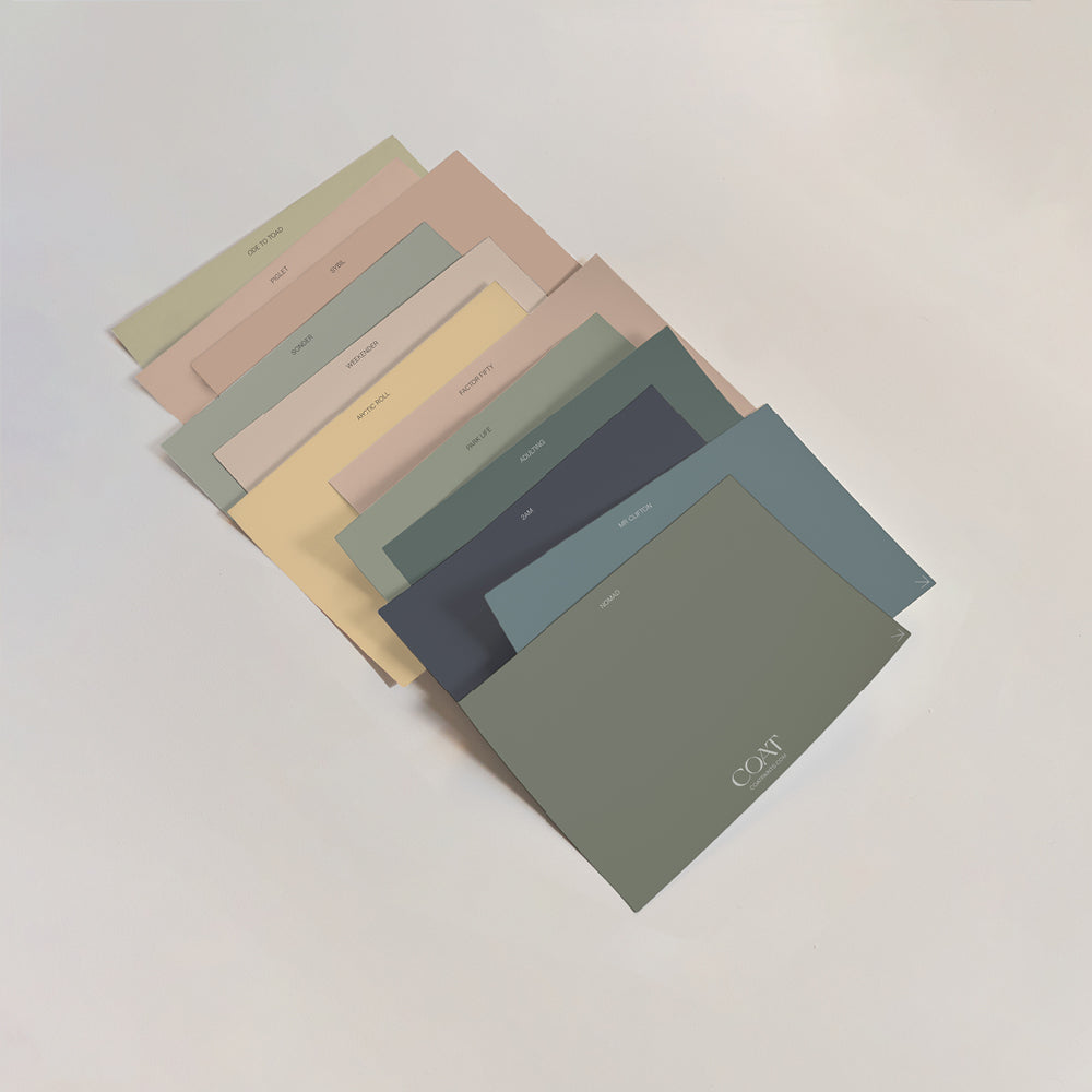
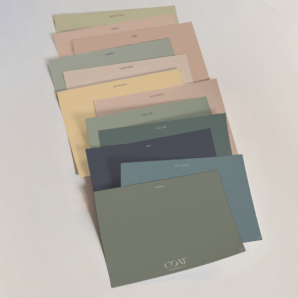
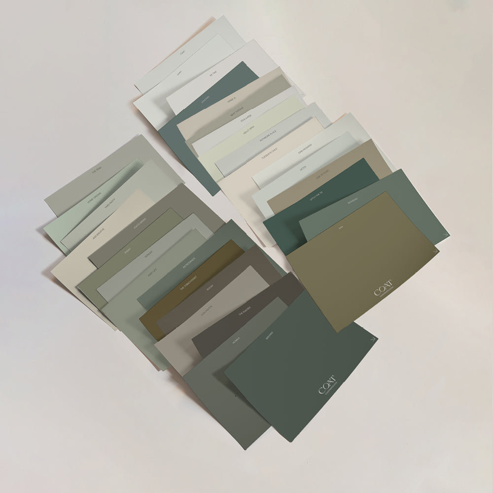
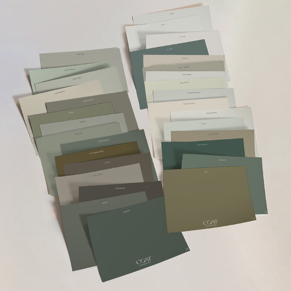
Inspired? Grab Peel & Stick Swatches to try at home 🙌🏼
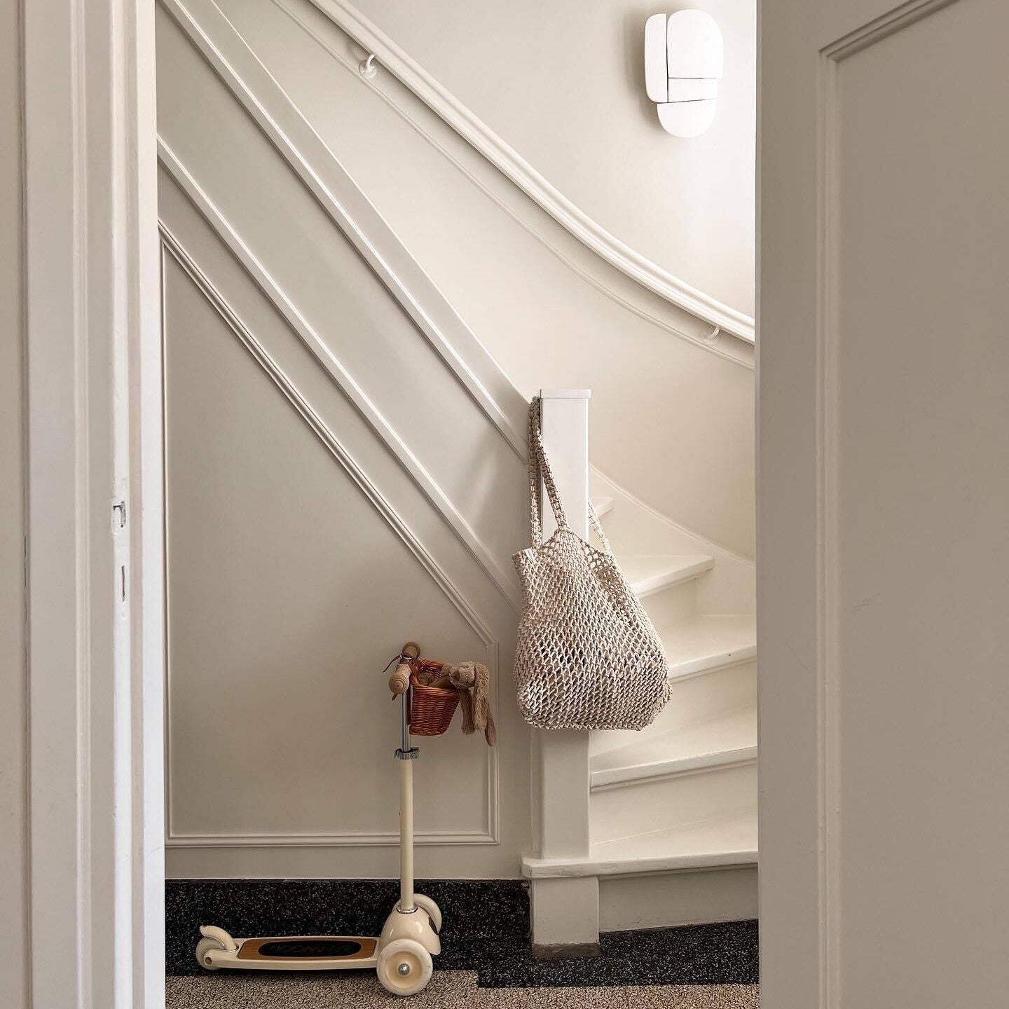
Warm, mid toned greys such as Sunday Soul are super welcoming because of the their brown shades, and also feel really natural. Using mid grey shades is practical in hallways, as marks and scuffs are less visible on them than their lighter and darker counterparts.

These middle of the road greys are also great with bright yellow and teal highlights (think blankets and curtains), which are bang on 2022 trend.
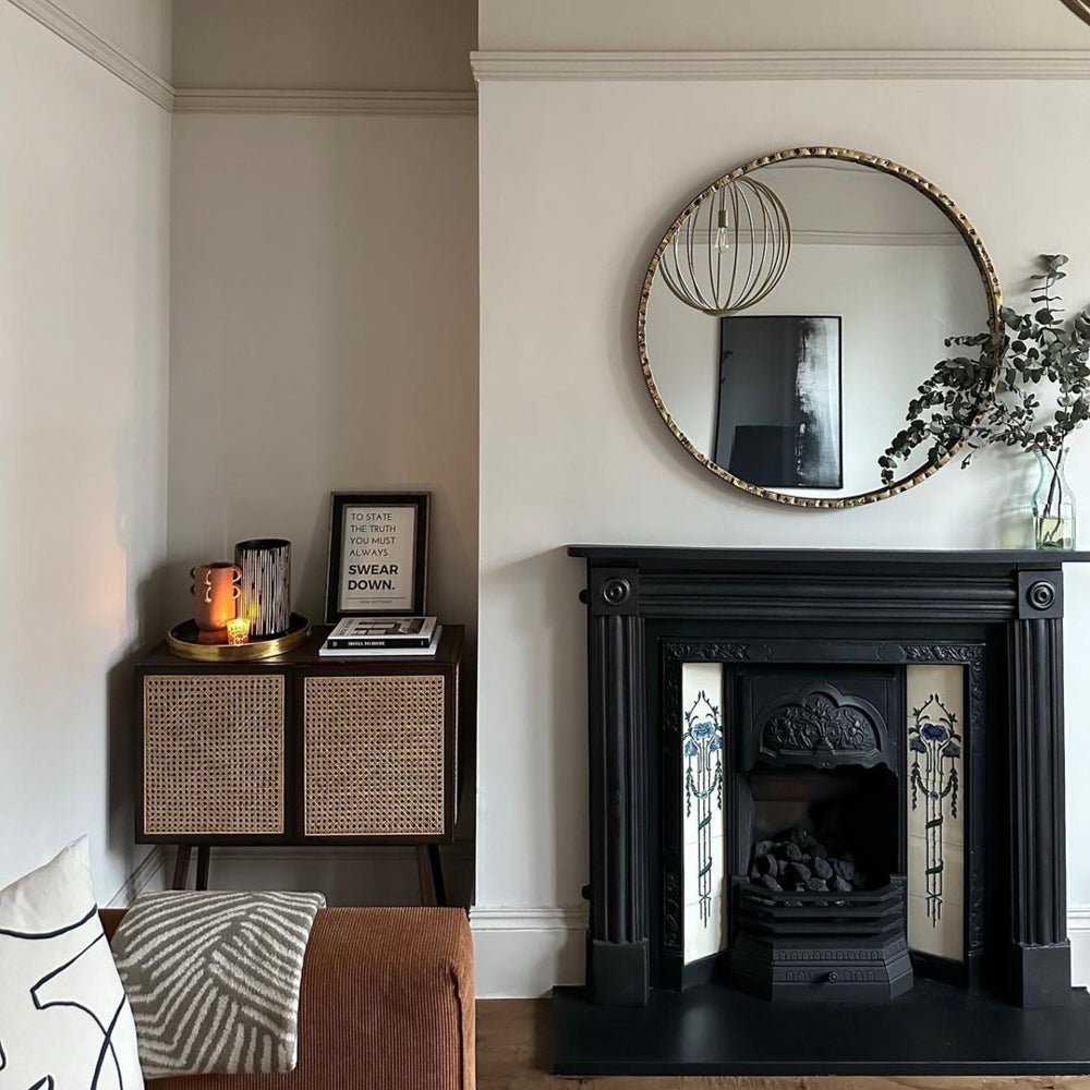
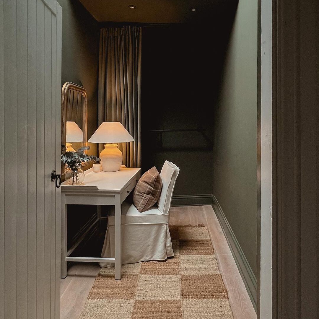
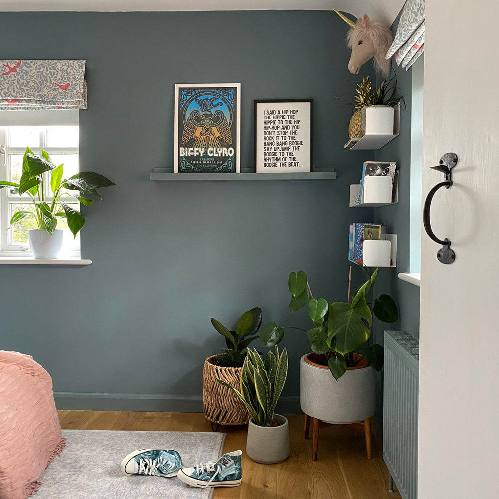
Dark greys like The Coal Drop and Darlington are deep with green undertones, which make us feel cocooned but also remind us of the great outdoors. “Use these dark colours on your ceilings and woodwork to create the ultimate cocoon.” COAT’s Colour Lead, Aaron Markwell says, “Combine with deep black furniture in The Record Store, black candles and accessories. This tricks the eye into thinking that the dark background isn’t really that dark.”

Greys are the support players of many colour schemes, they’re easy to live with and neutralise acidic tones. They can be soothing when used in combination with each other and also offer a great contrast to whites and blacks, to create moody monochromatics rooms. Grey is a great backdrop, so mix it with the more vibrant trend colours to help you create all the chilled vibes in your home.
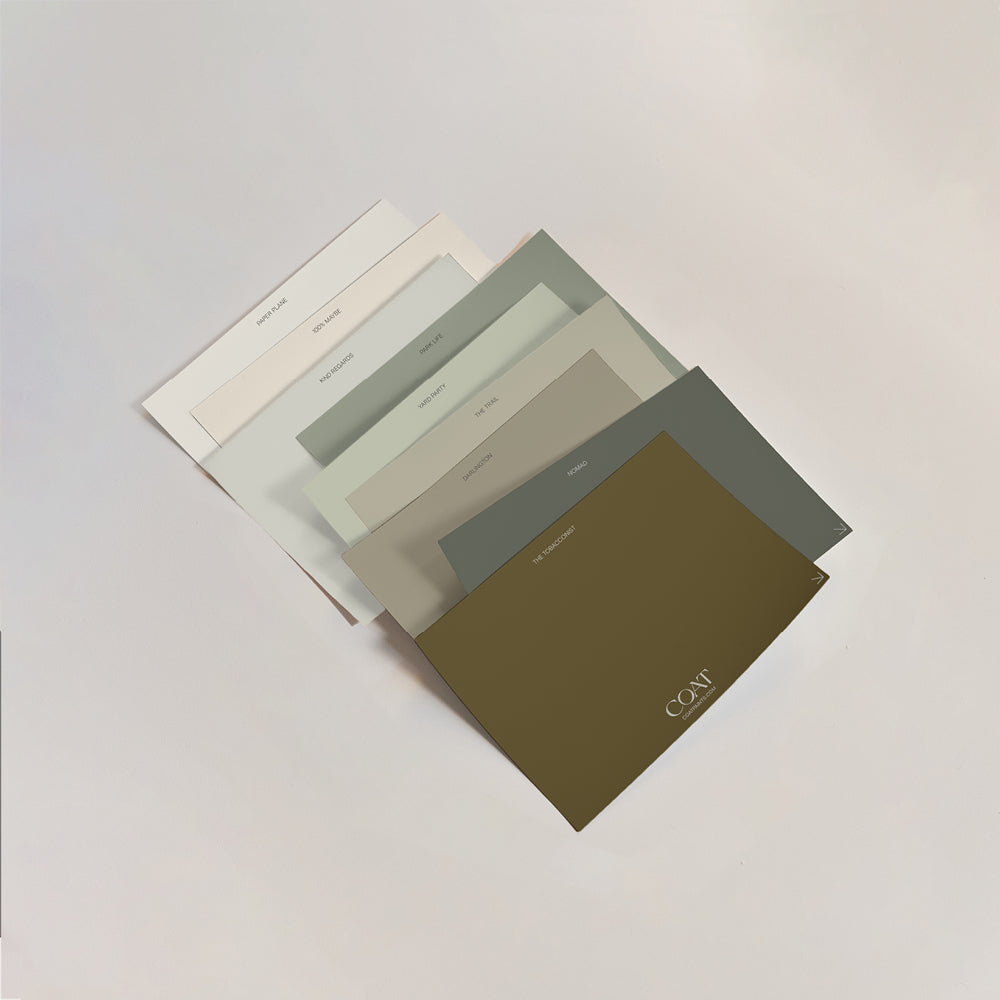
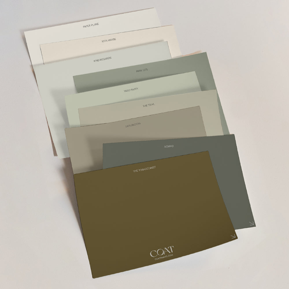
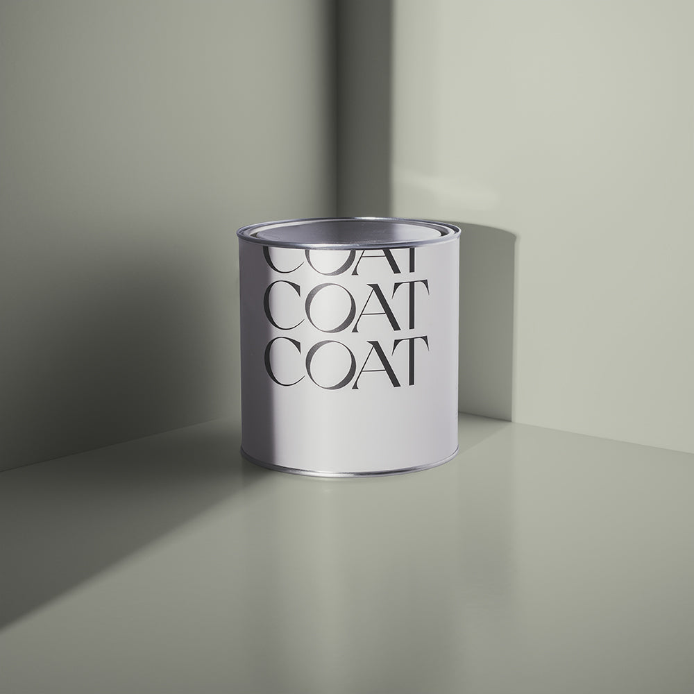
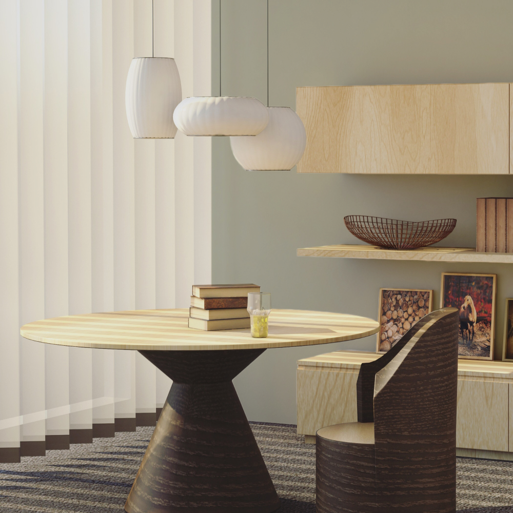
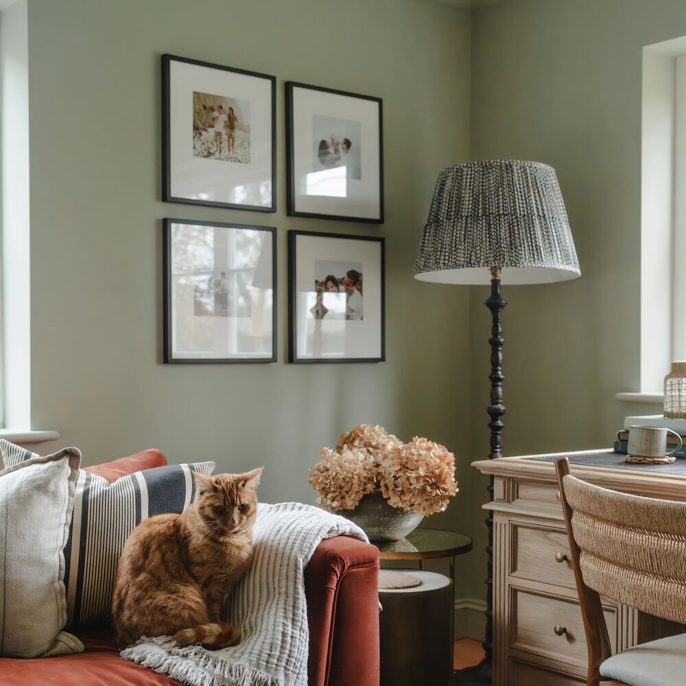
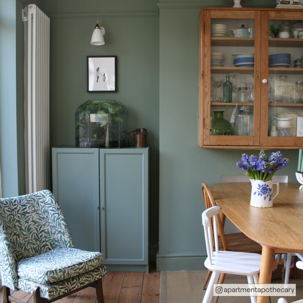
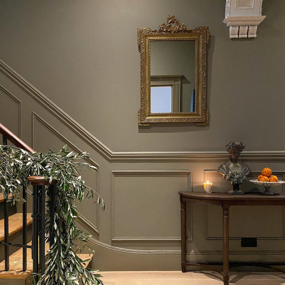
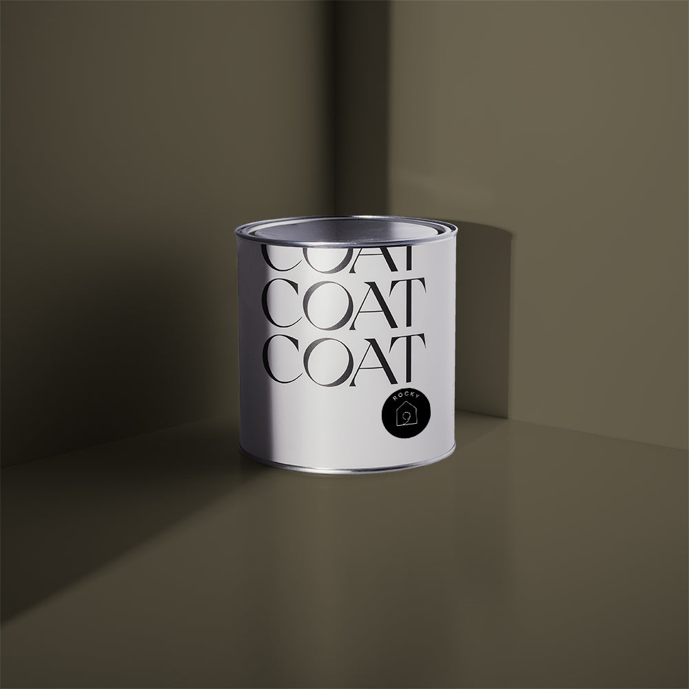
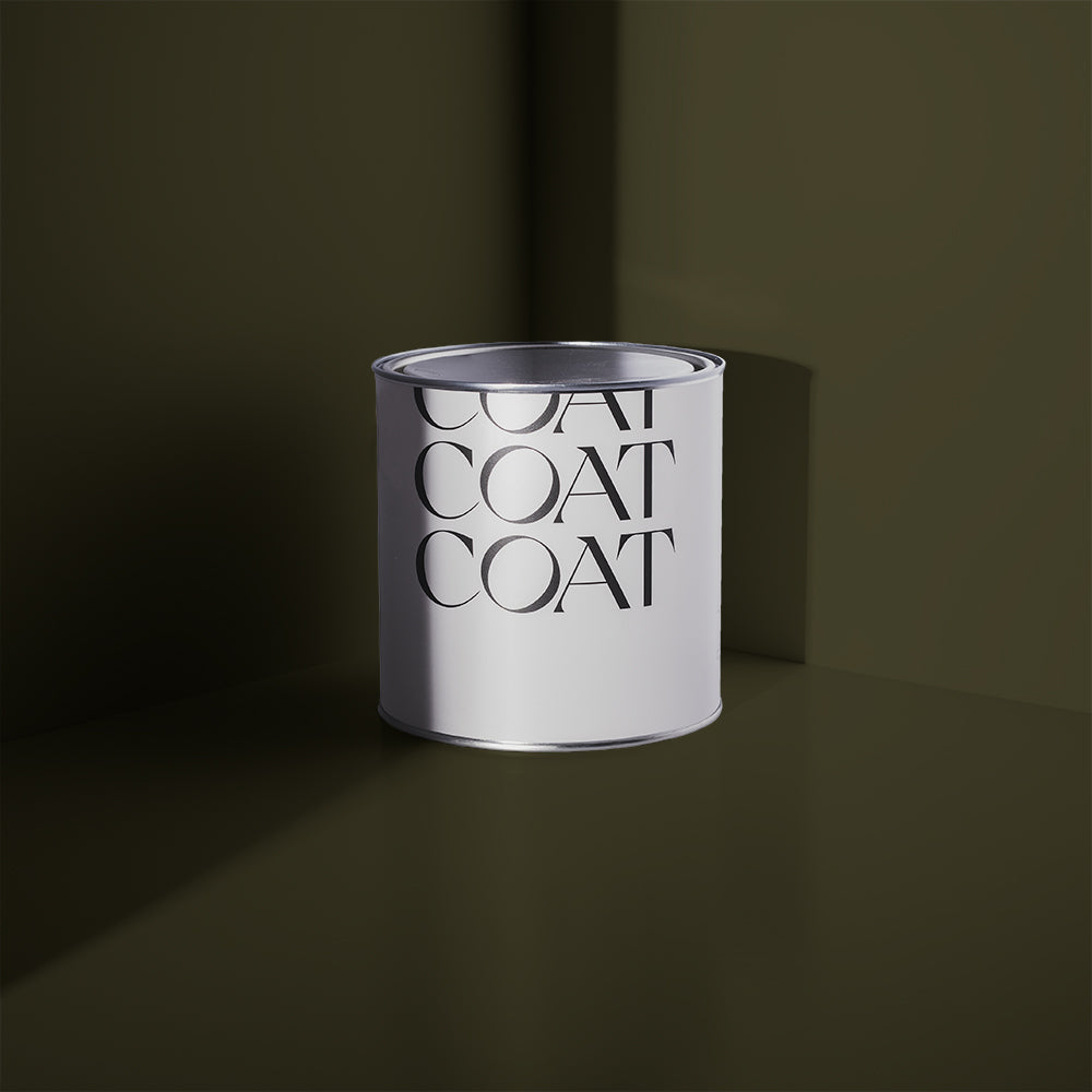
Green Paint Trends
Natural, neutral and bringing the outdoors in, greens are harmonious with the world outside. We all need a bit of that right now, so COATing your walls and getting your fingers green is definitely the way to stay ahead.
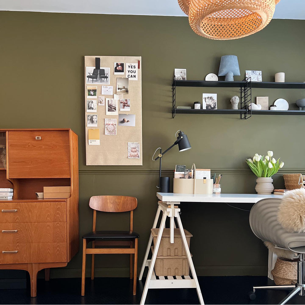
Green is here to stay for 2022, particularly with strong tones like chartreuse (yellow-green to you and me ;-)). A strong acidic colour can be quite the dive, so we’ve curated some greens to help you incorporate this shade in a more relaxed way. With greens and neutrals still being on top of why not get the best of both worlds. And Breathe has both green and beige tones. Due to this balancing act, it’s the perfect colour to use with linens and woods - right on trend with Japandi aesthetics. It also has both the undertones that are in so you can also do accent cushions of curtains in this bold colour to make a statement.

Our green tones taking your fancy? Grab our Peel & Stick Swatches to try at home 🙌🏼
2022 is heading in a pretty vibrant direction, so if that’s your vibe then look no further. Using bright teals are great for dining rooms and snugs, because they’re comforting and energetic. They make you want to interact with people, laugh, play and have fun.
But combining these colours can be tricky. Using a complimentary brighter colour for ceilings and woodwork is much better than using a clean white. With these rich teals, use Detox, a clean, cool green that will behave like a soft white. This will reduce contrast and make the room look softer to the eye. Entertainment sorted.
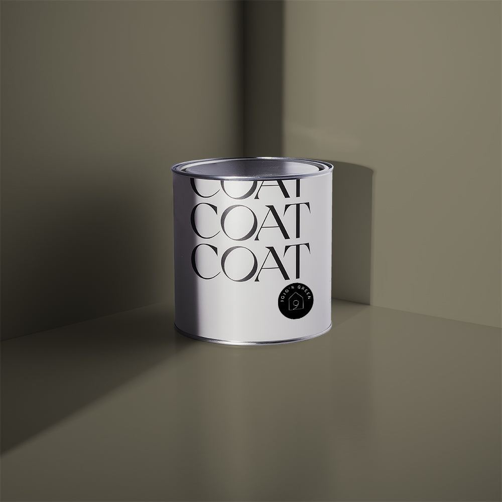
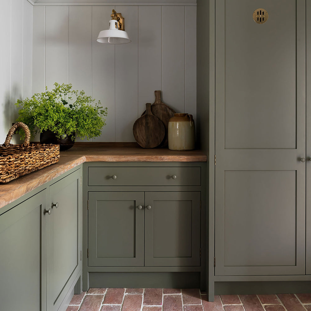
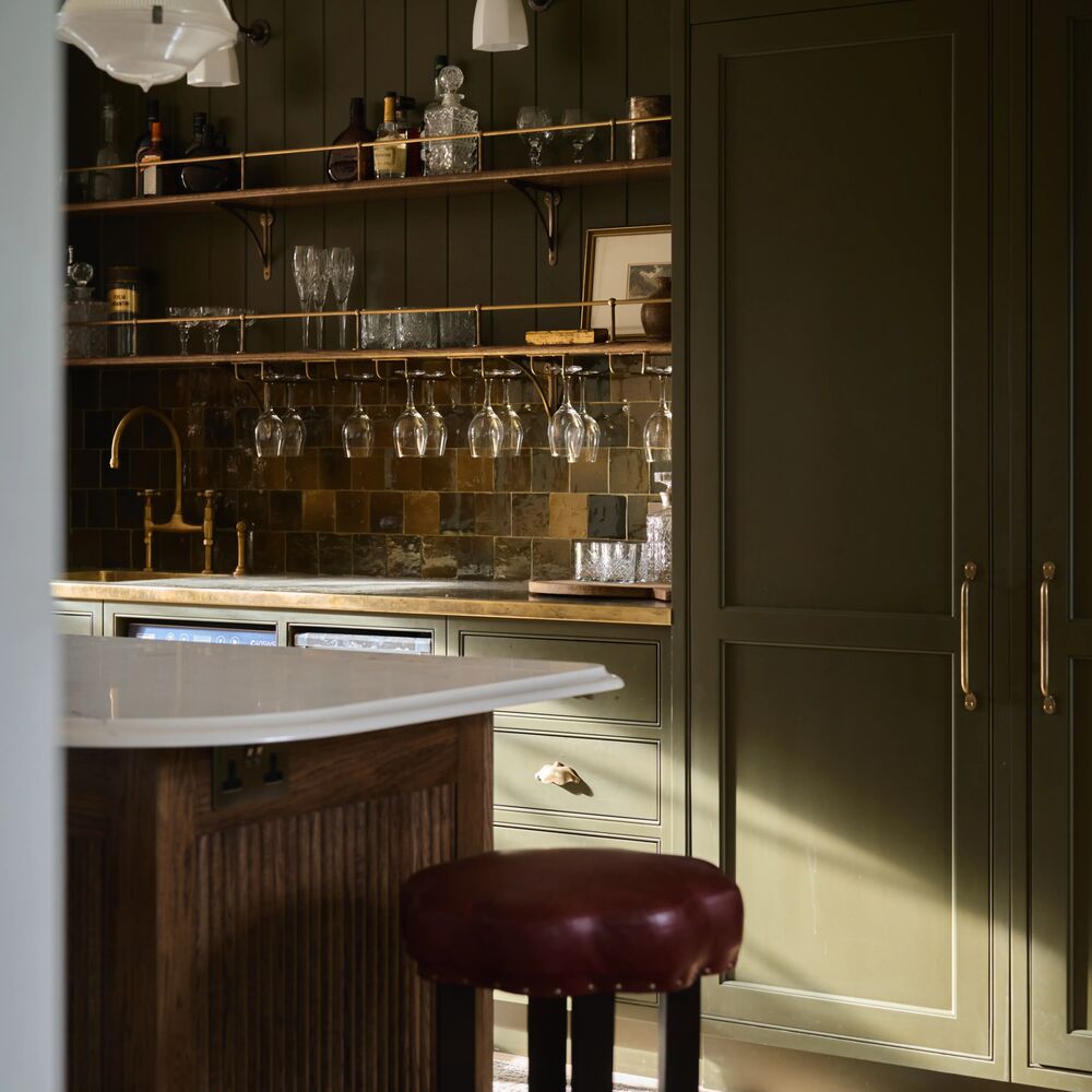
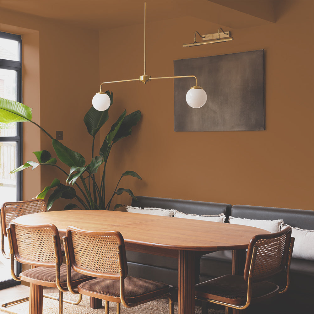
Our collaboration with Heal’s has created a palette of six luxe paint colours. Two of which are dark greens. Mansard and Brewer are designed to make your friends and family green with envy (when they see your fresh COAT). Kitchen cabinets in Mansard with a kitchen island in Brewer will be the ultimate green kitchen this year. This combination looks classical, but because of their contemporary grey undertone, will keep you bang on trend.

Neutral Paint Colours
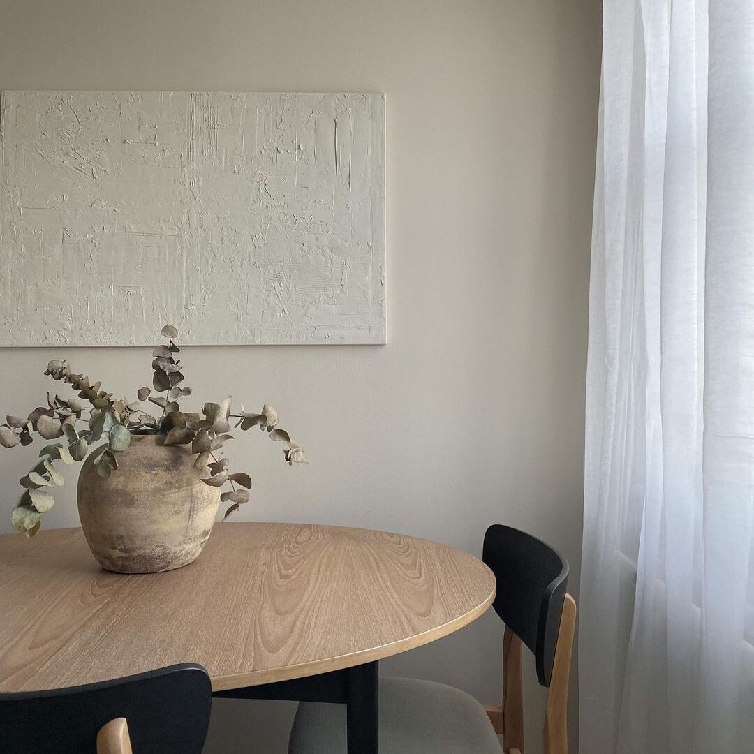
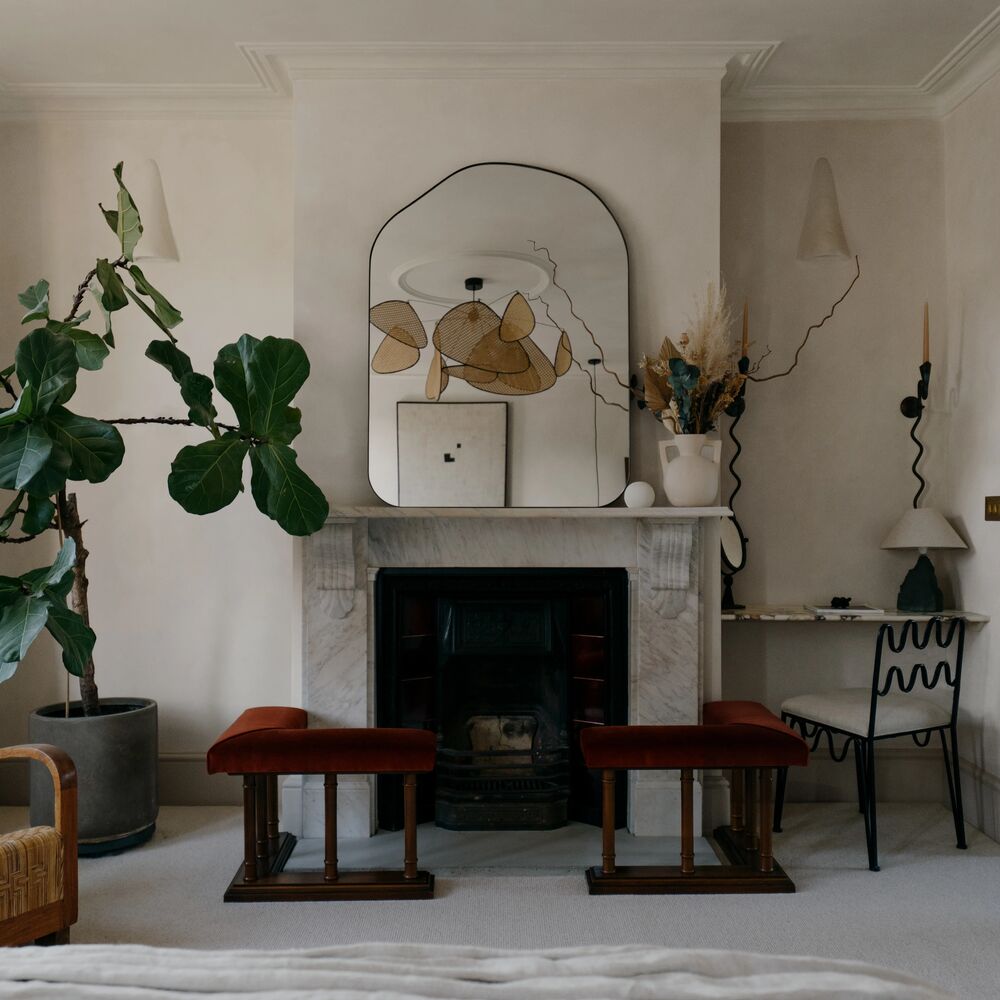
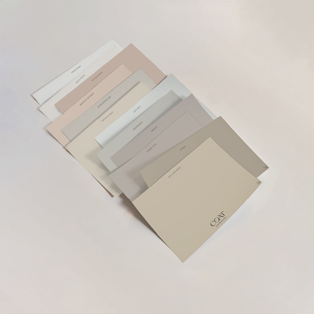
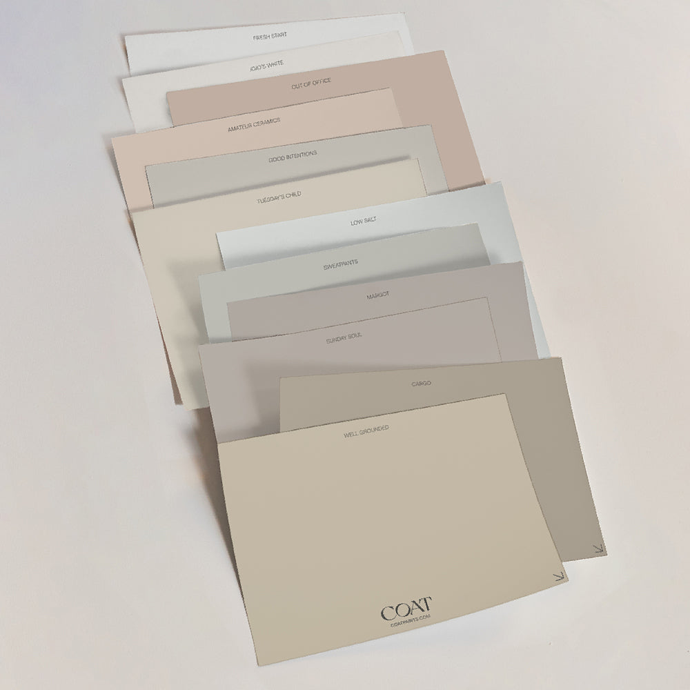
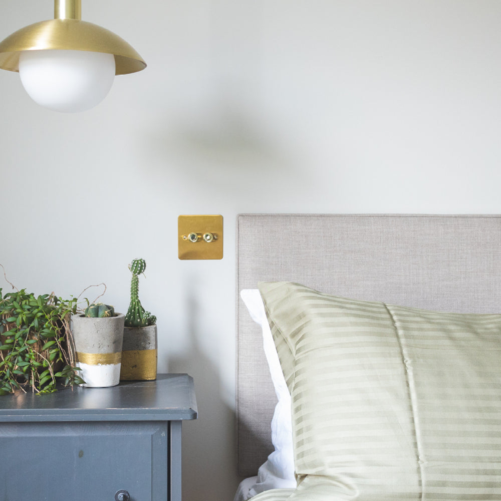
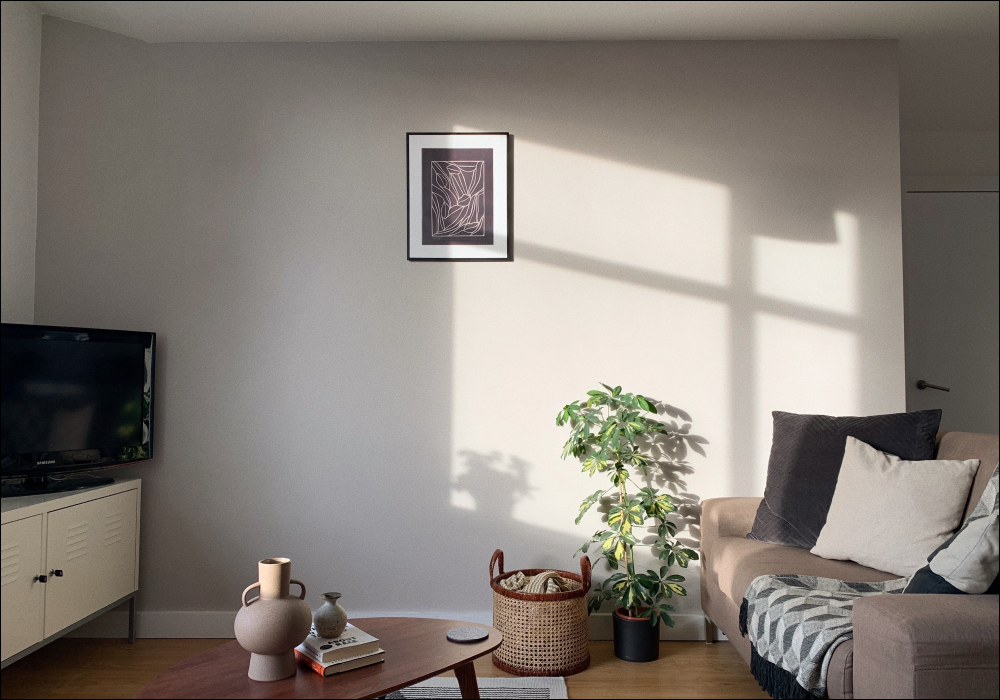
At COAT we’re known for our neutrals such as Sunday Soul, Humble and Duvet Day. They have warm undertones, which make the perfect backdrop for natural materials and textures for woods, linens and rich velvets.
Expected to remain one of our most popular paint colours in 2022 is the ultimate chilled neutral: Duvet Day.
Our neutrals are a winner, try our Peel & Stick Swatches at home 🙌🏼

It’s a total zen vibe and will certainly make you want to stay in bed. Here’s its secret…... Duvet Day has a yellow base that makes it feel familiar and so is particularly restful for the eye. A green undertone with just a dash of black pigment helps to liven it up and means it is more adaptable than manky magnolia. “Using these rich beiges with dark colours, particularly blacks like The Records Store, help us see how bright a beige is” says COAT’s Lead Colour Consultant, Aaron. “This provides places to rest your eyes on darker colours. If painting things black is too much for you, try minimalist black and white paintings on a Duvet Day backdrop.”
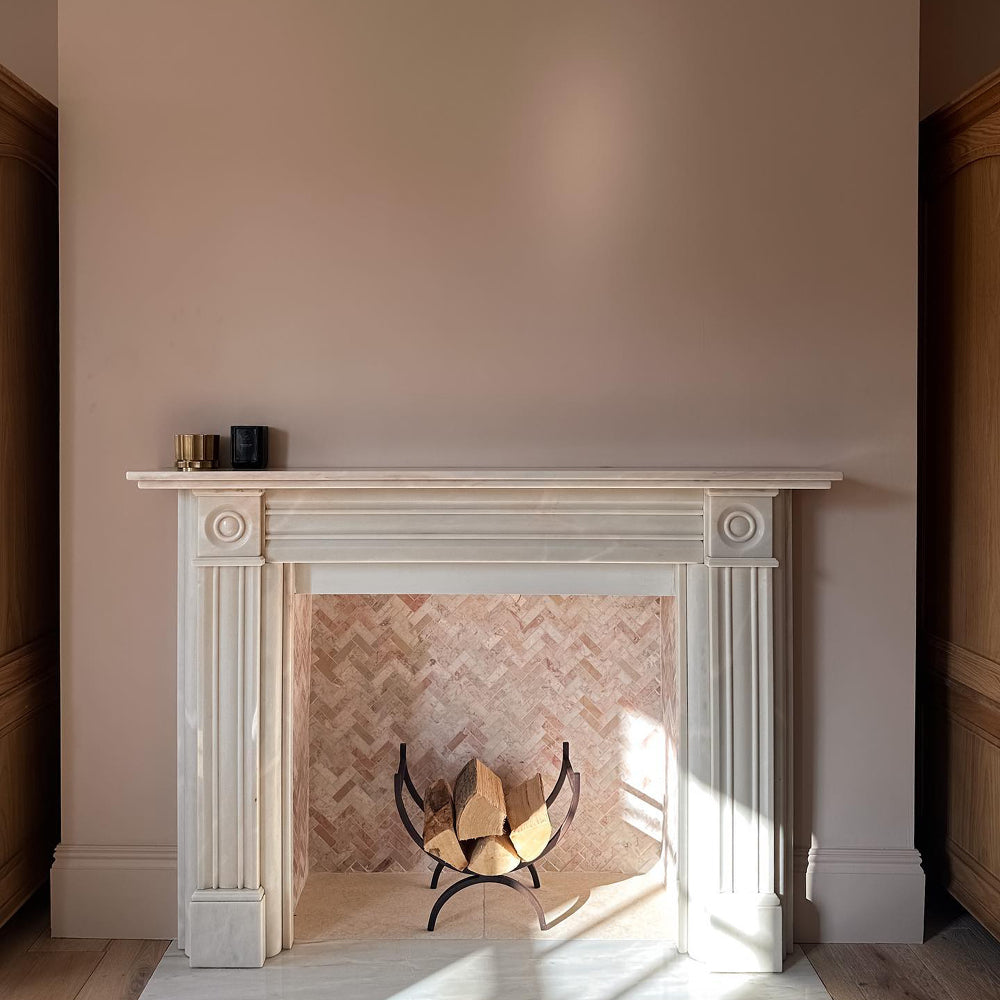
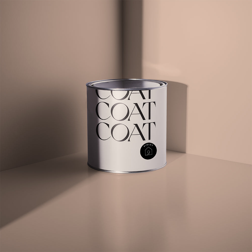
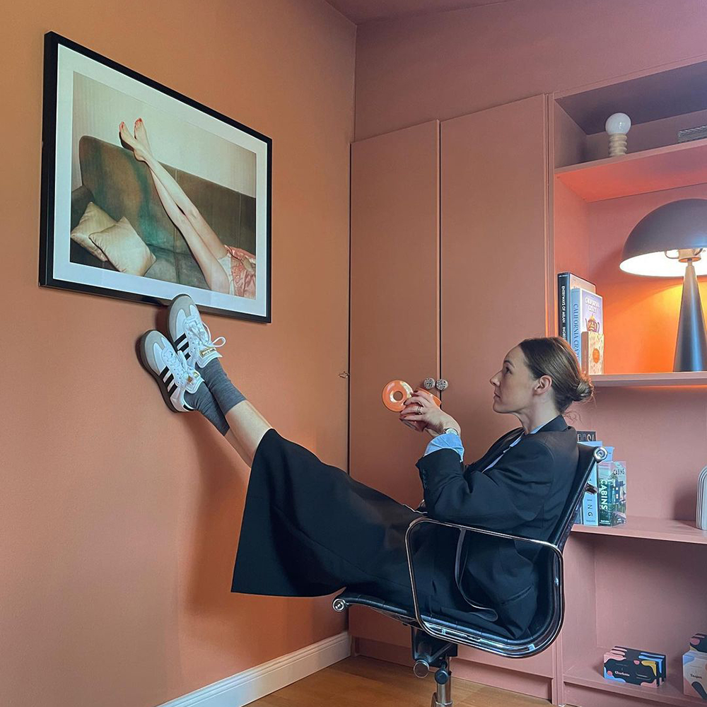
Warm, yellow- pinky tones are still top of the 2022 colour trends because of their delicate and nurturing nature. The perfect backdrop for bright living rooms, bedrooms and bathrooms. Examples like Pudding create a welcoming vibe. It’s got the yellow and pink pigments to create a truly tasty neutral. It looks fab in south and west facing spaces, where the lighting is cooler in the mornings. Pair Pudding with a warm white like Pampas on the woodwork and ceilings and coral accessories for a squishy embrace.

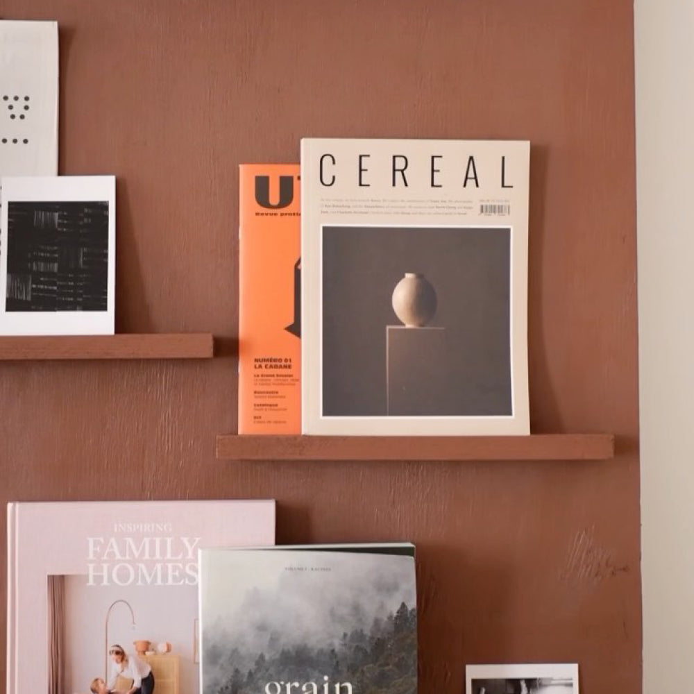
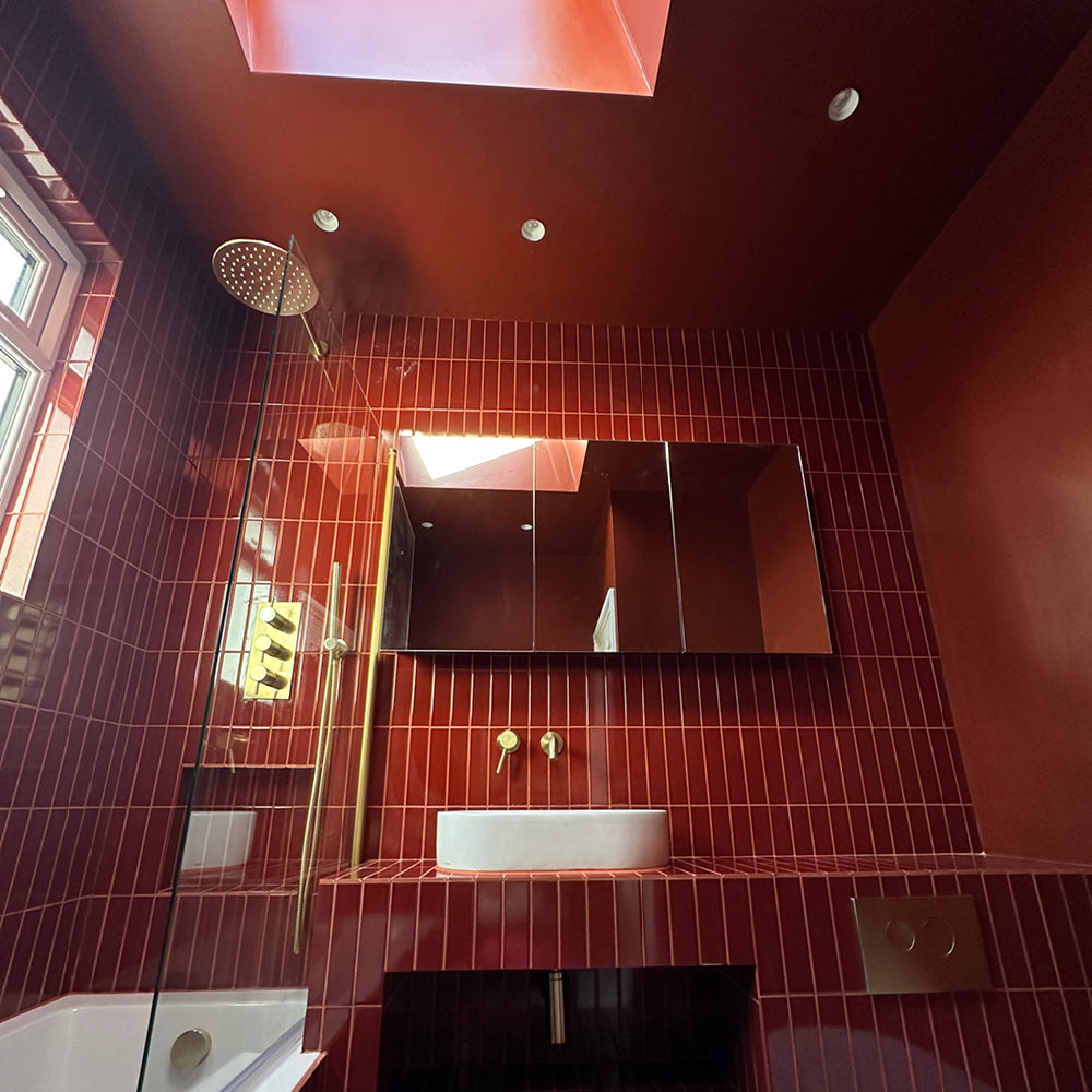
2022 Interior trends are welcoming 70s aesthetics back, and so if you’re wanting to get all the groovy vibes, use a combo of warming neutrals. “When it comes to colour, create 70s wall graphics using warm neutrals like Well Grounded with dark red, The Old Corset Factory,” says Aaron. “Now imagine some 70s teak chairs you buy at auction and reupholster in a 70s District line pattern like this one from Kirkby designs.”
Blue Paint Colours
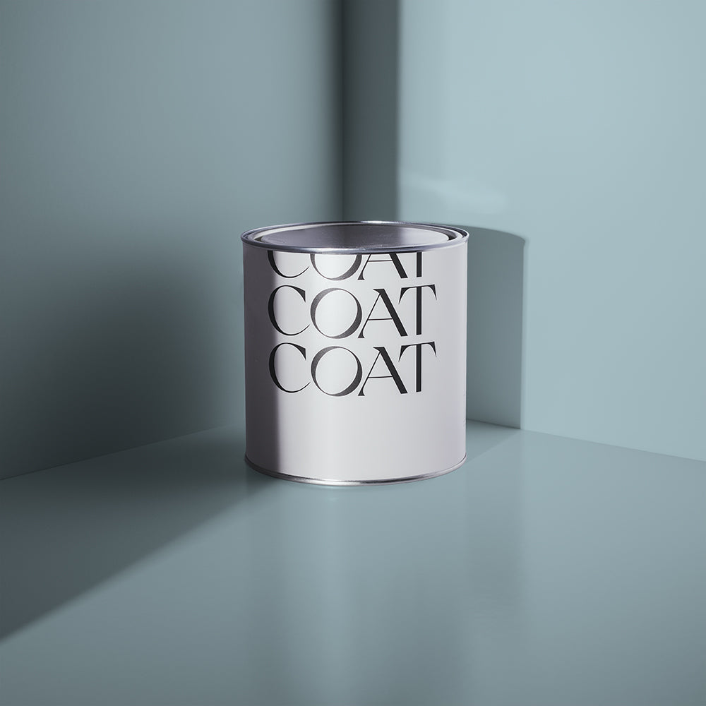
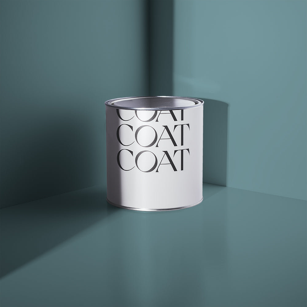
Blue is restful and relaxing, and has such a variety of shades and undertones which can really enrich your home. For air and light, paler blues are the way forward, and to ground spaces the use of a dark blue is extremely effective. Some greener undertones are great in blues for freshening up dark spaces, whereas a yellow undertone in a blue feels warmer and more inviting. The possibilities are endless, so let’s run through the most popular COAT blues and how they’ll work in 2022.
Best pun ever warning: make a room a tall (The) Drink of water, by painting your ceilings, walls and woodwork all the same colour. This works particularly well in small, dark spaces, helping the eye to lose the proportions of the space. This dark marine will give you “infinity pool at midnight” vibes and provides the best backdrop for loads of artwork and plush velvets as well as being a supporting player to a 2022 colour trend we can get behind. Bright yellows are definitely coming back in, and using it as a striking contrast to The Drink creates a great colour pop. Think rich, bright velvets, yellow ceramic vases, and vibrant pop art.

Cure your January blues with these dreamy shades. Grab our Peel & Stick Swatches at home 🙌🏼
We talked about teals in the greens section, but let’s be more specific. Our vibrant teal The Four Poster from the Heal’s X COAT palette goes really well with bold florals and brightly-coloured lamps, hitting the nail on the head for 2022’s Optimistic Maximalism trend. Great for a dining room, The Four Poster is invigorating - easily getting conversation flowing at dinner, but remains soothing due to it’s green undertones. A tasty teal is a top 2022 colour trend, so make sure to drop by the COAT store for a sample.
Sometimes you need a colour that isn’t blue or green or grey. It has to be all 3: enter Adulting. It pays its own way and finely balances three jobs: bringing botanical vibes, providing reliability and having a delicate, antique-like finish. It can do all these things because this most mature colour is a deep green blue with a grey undertone.

Using it in any space will certainly make you feel grown up, and picking it certainly takes out some of the stress of trying to pick between blues, greens and greys. Why make the choice so hard when you can choose all 3… that’s some proper adulting (see where we went there?).
Keep your eyes peeled for some great new COAT colours in 2022 to keep you all on trend. And in the meantime, head over to our site and grab some Peel & Stick Swatches to try at home 🙌🏼
Publish Date
Author