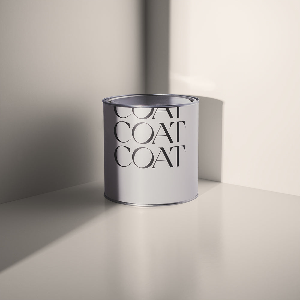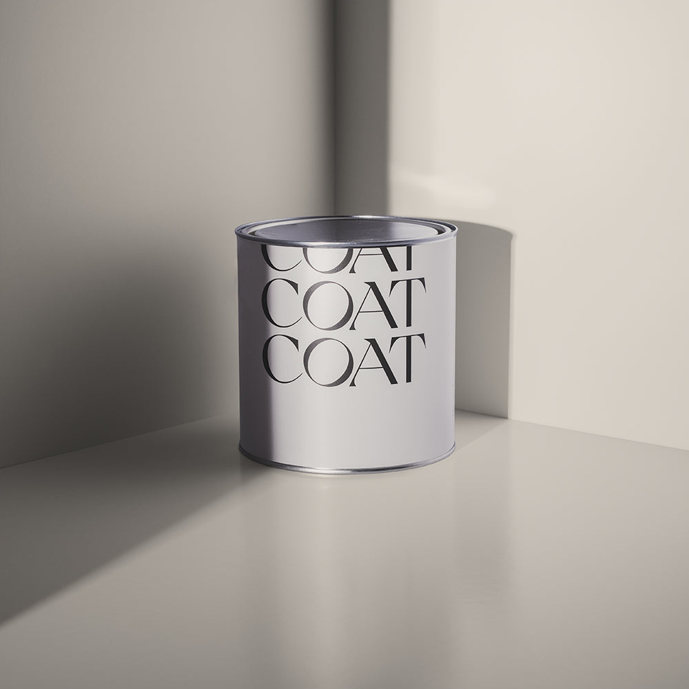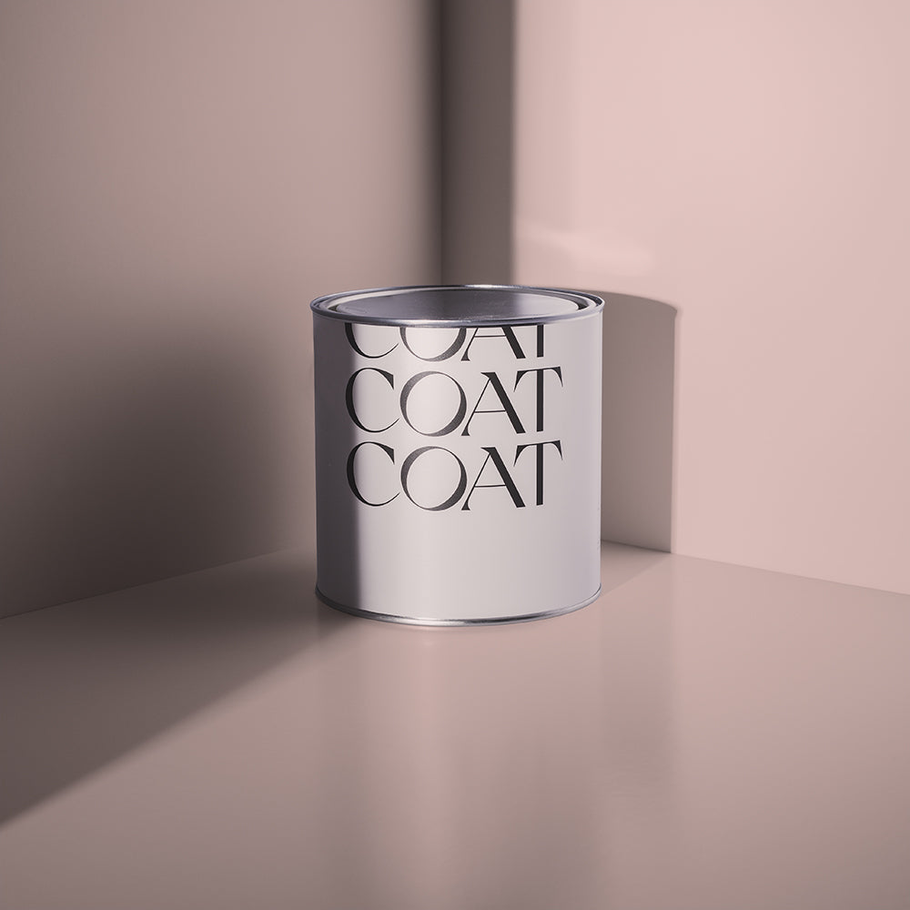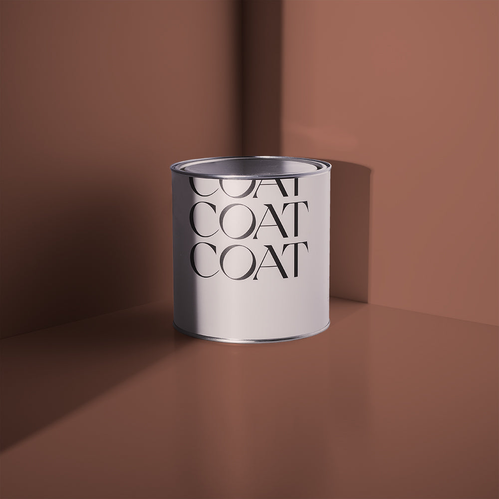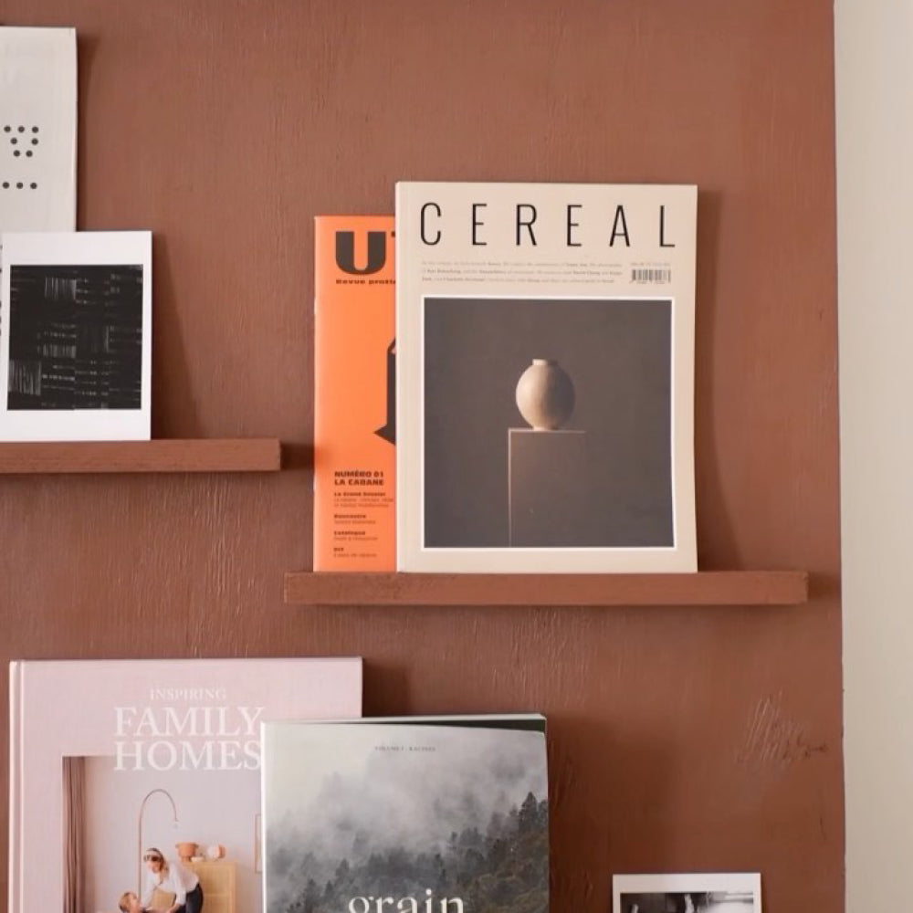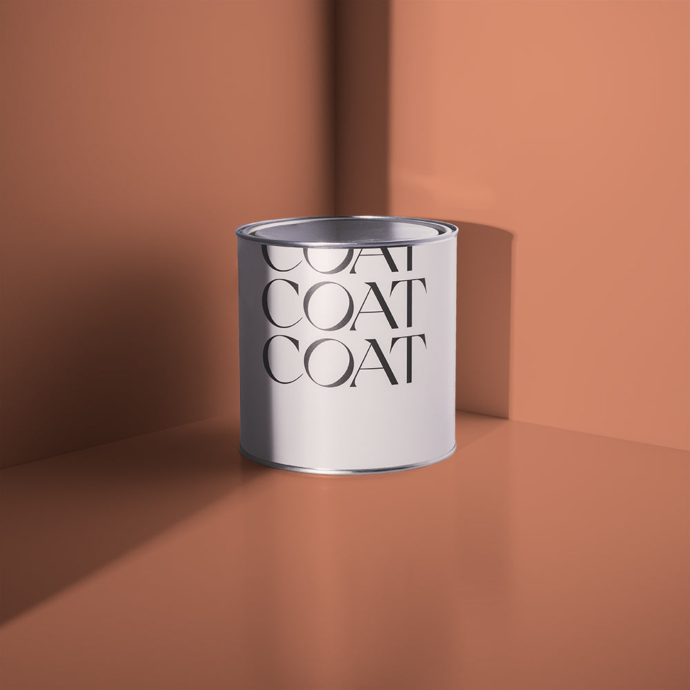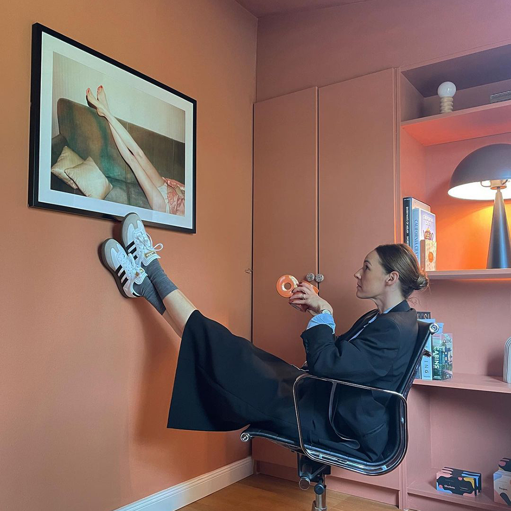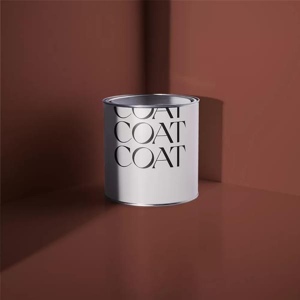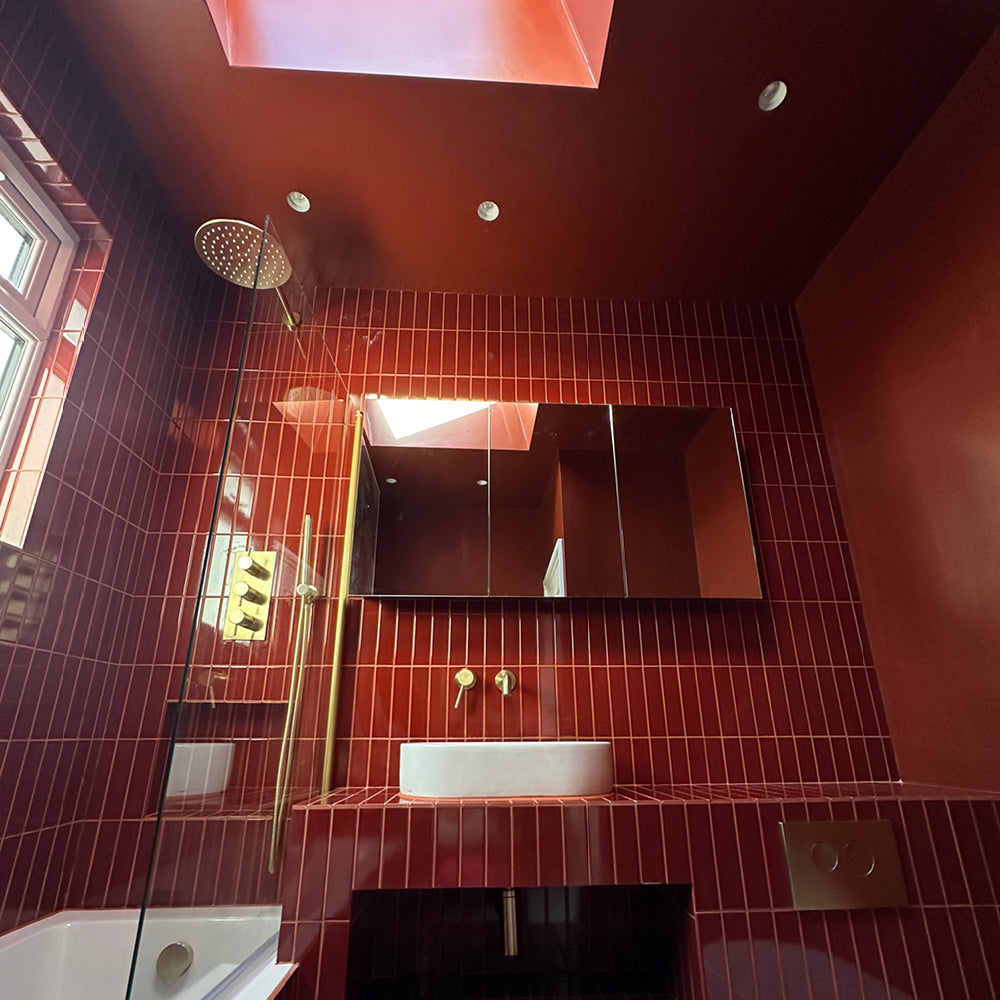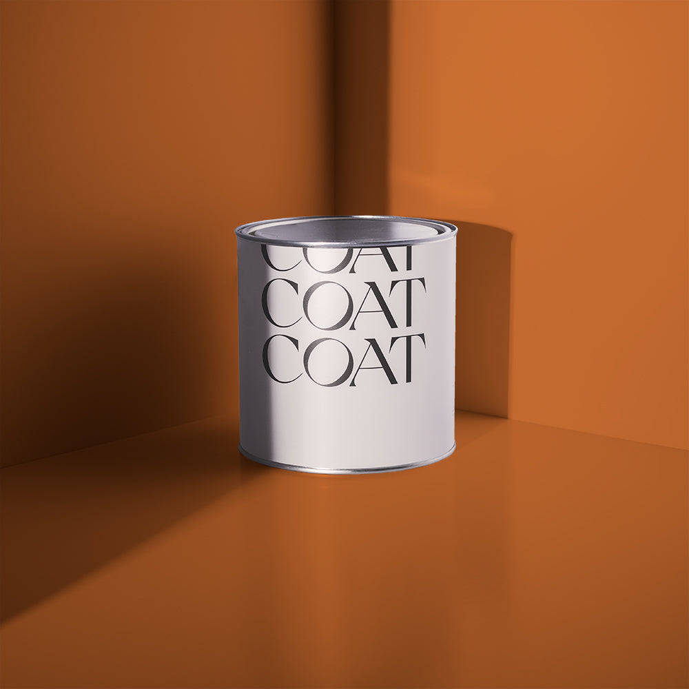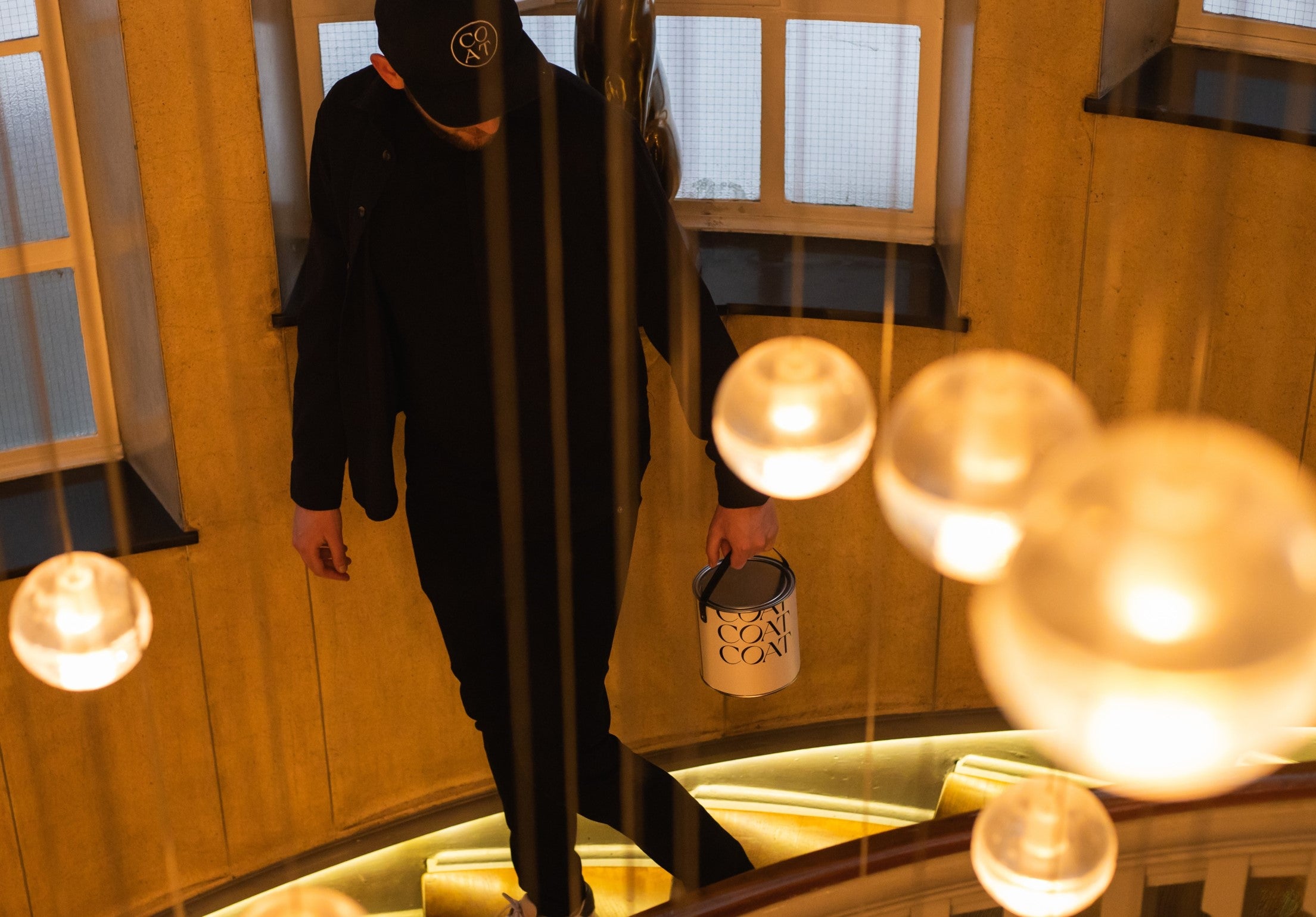
Introducing Heal’s x COAT - an exclusive collection for the iconic retailer
If we’re talking design icons in homeware land, it doesn’t get bigger than Heal’s. Over 200 years have passed since John Harris Heal founded the namesake store in 1810 and opened the first doors in Rathbone Place. Design has been a key foundation at Heal’s from the start, by the time we were born the brand was firmly on the map as an iconic and aspirational destination for all design-led interior enthusiasts. Enter the COAT team.
With centuries of heritage under its belt, Heal’s has always pathed the way for innovation and trend setting. Relentlessly forward thinking, and often being the first point of call for style and design led products.
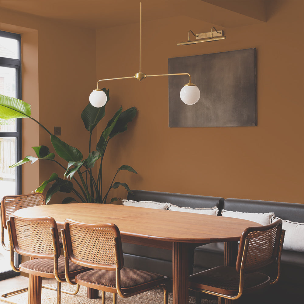
And whilst a relative newcomer to the game, COAT has put innovation and quality at the forefront of our business from day 1. Together with Heal’s, we’ve curated 6 exclusive new bang on-trend colours using COAT’s signature quality paint to bring the stories that we all know and love to life.

This bold collection captures the Heal’s legacy, whilst also leading the modern generation into a new age of decorating.
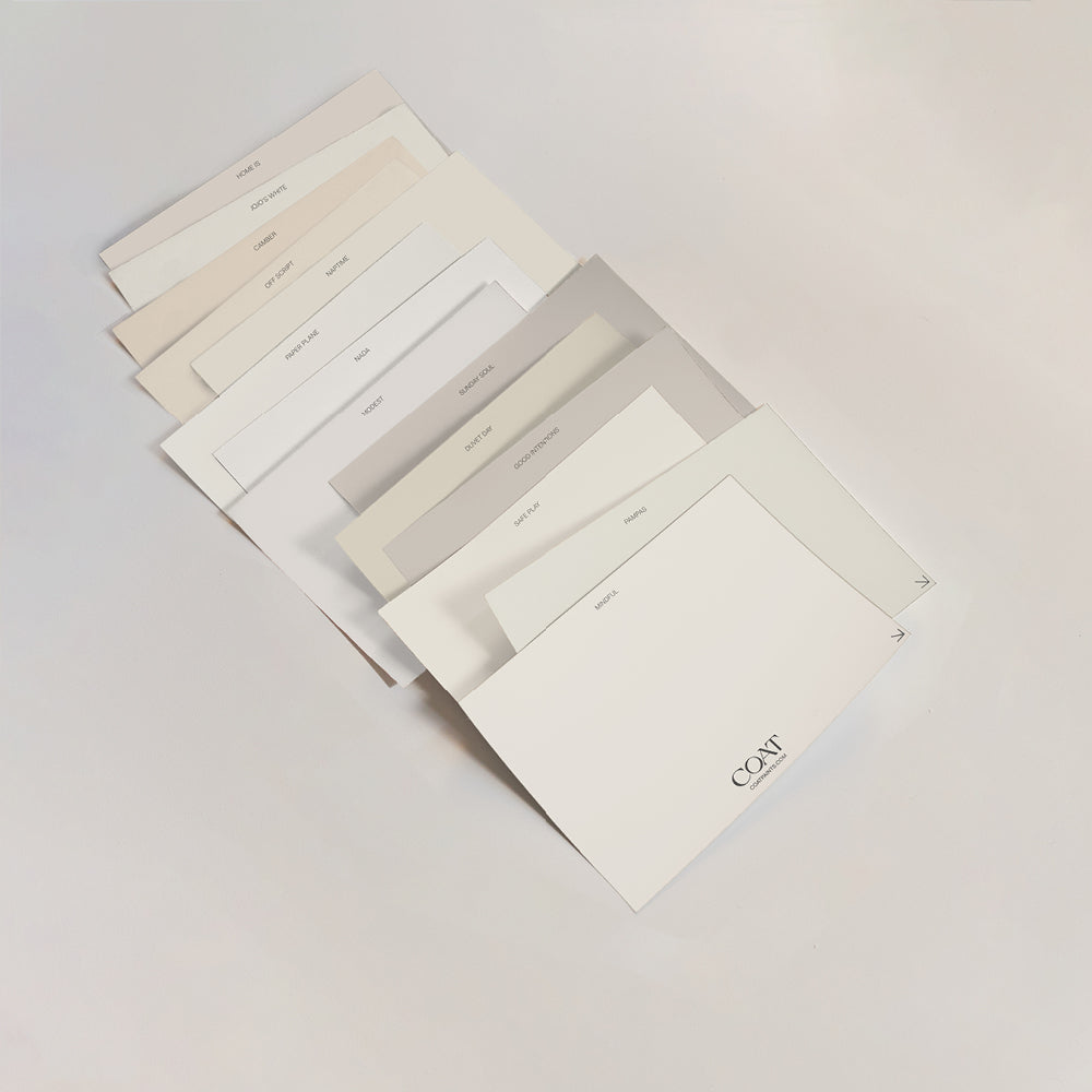
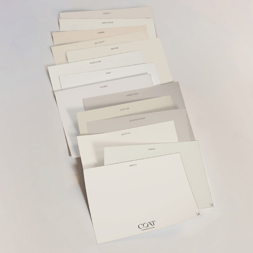
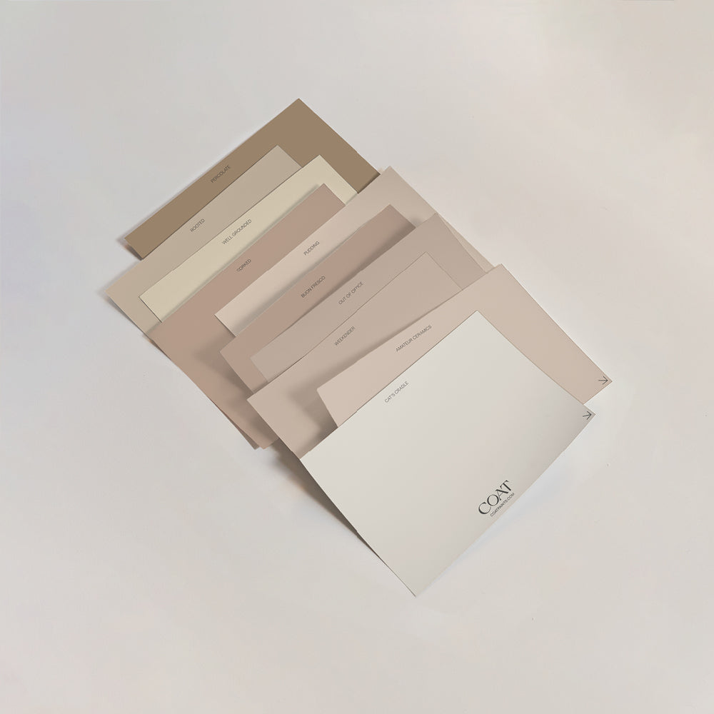
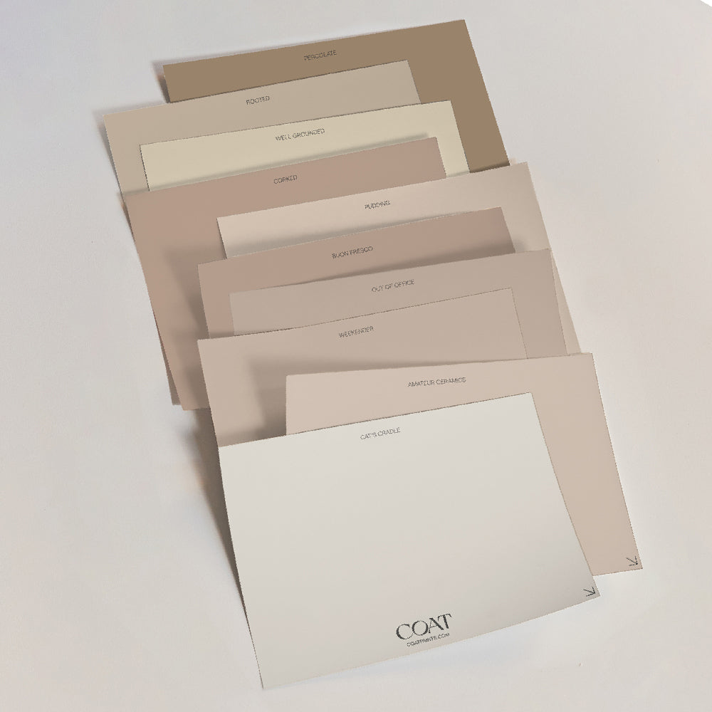
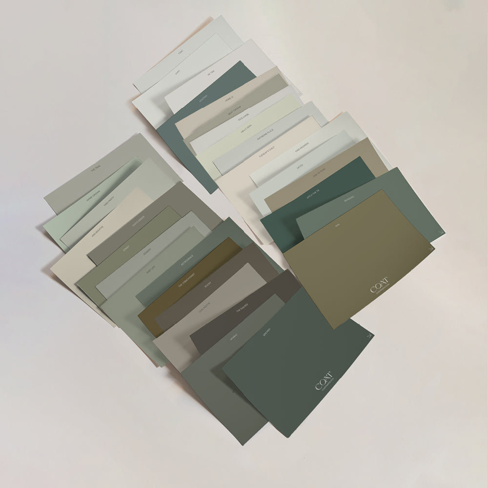
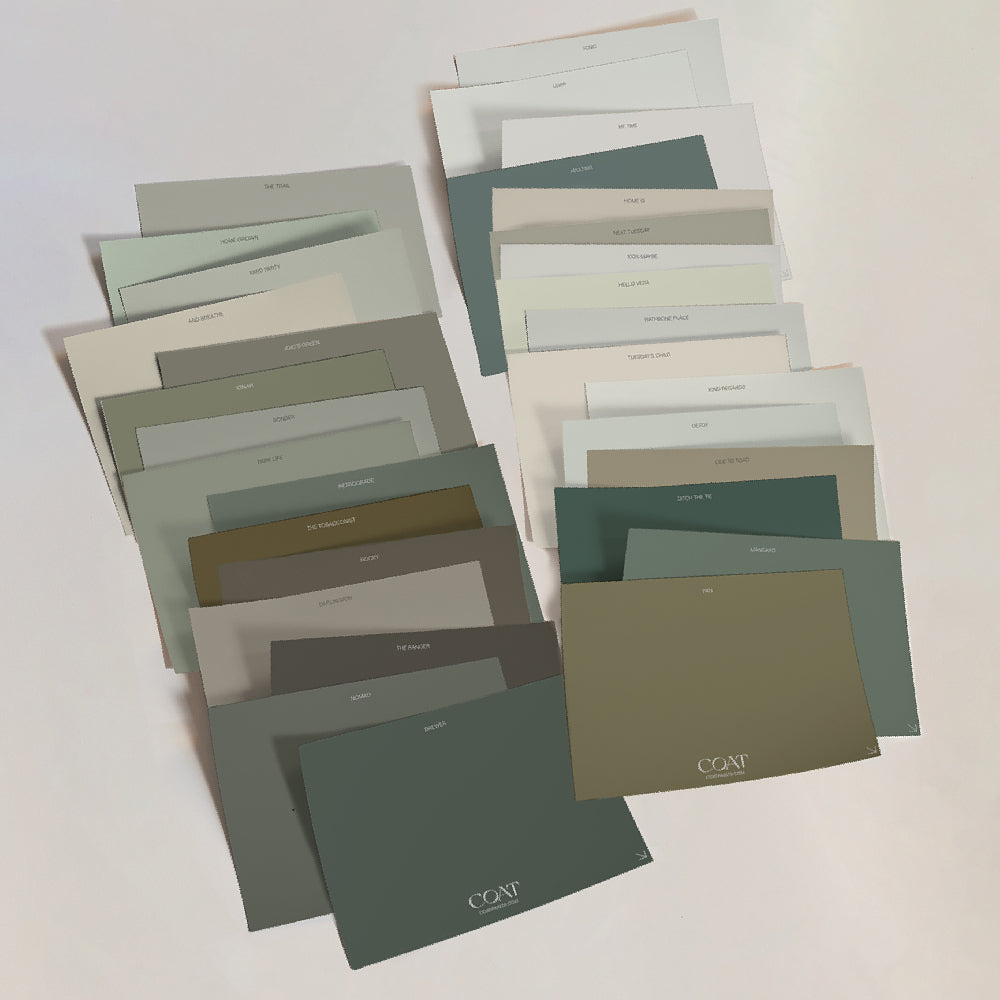
Can't wait? Grab a swatch pack now.
Ready to meet the colours?
Ambrose
"If in doubt, innovate"
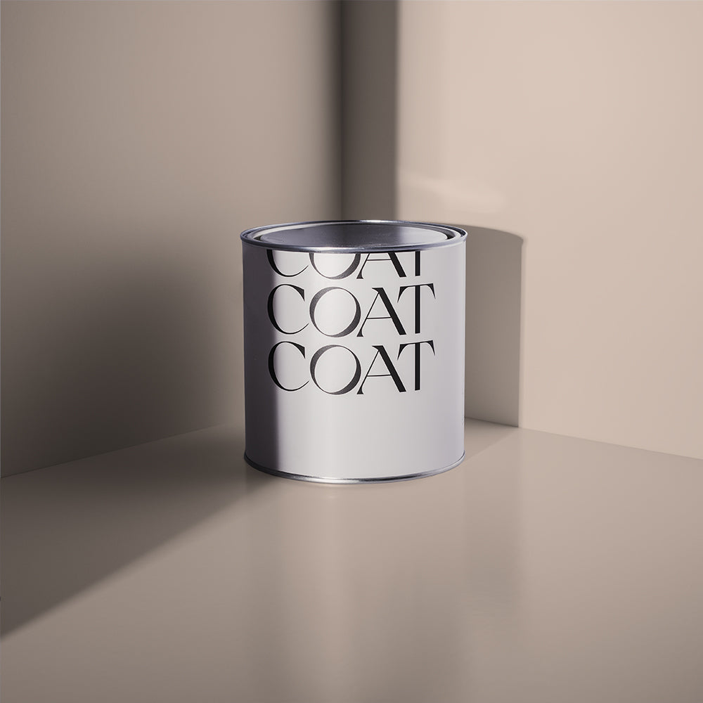
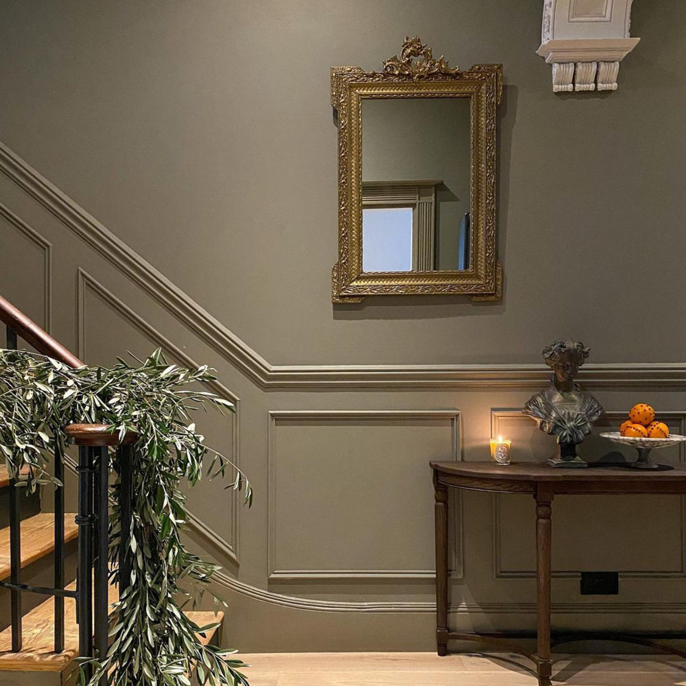
The main man, Sir Ambrose Heal was a designer, retailer and influential figure that put Heal’s at the forefront of design and retail innovation in Britain. His work was largely based on the study of antique furniture and influence from the Arts and Crafts movement.
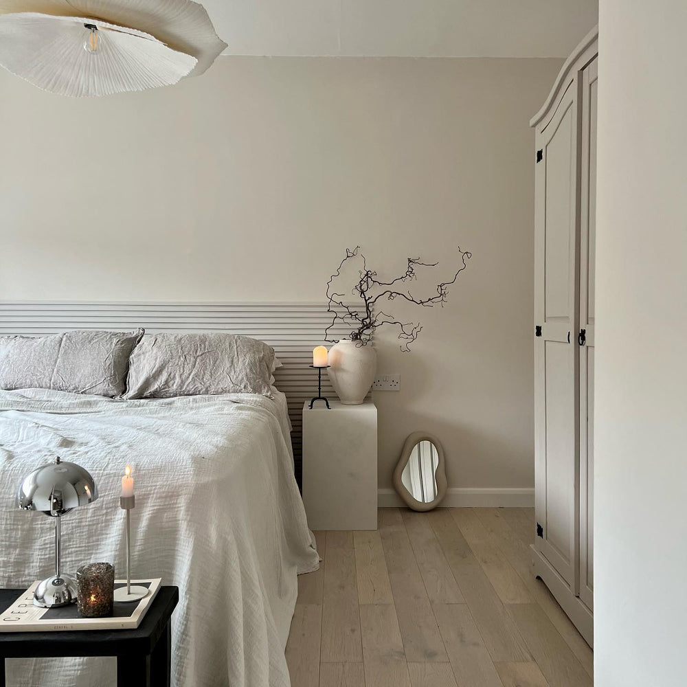
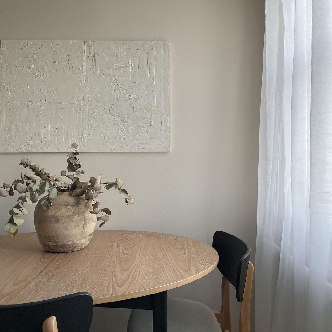
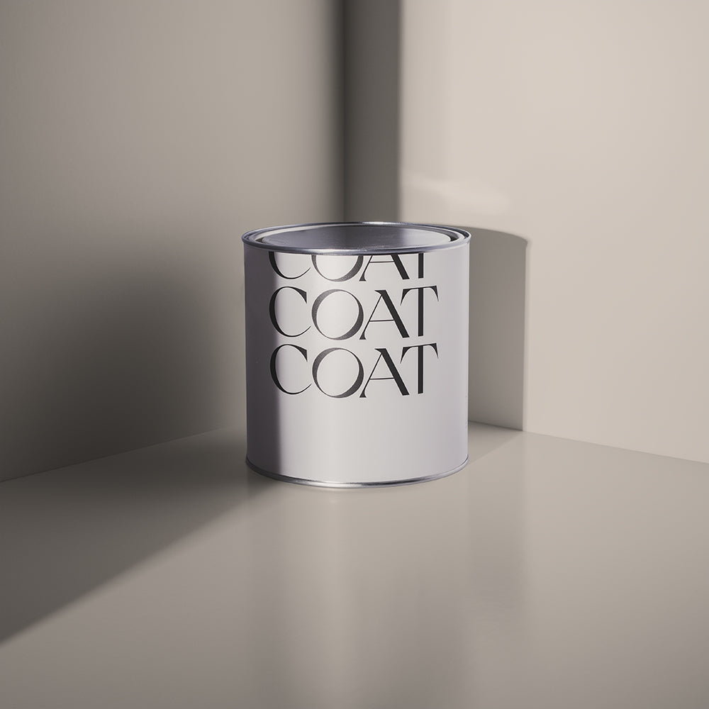
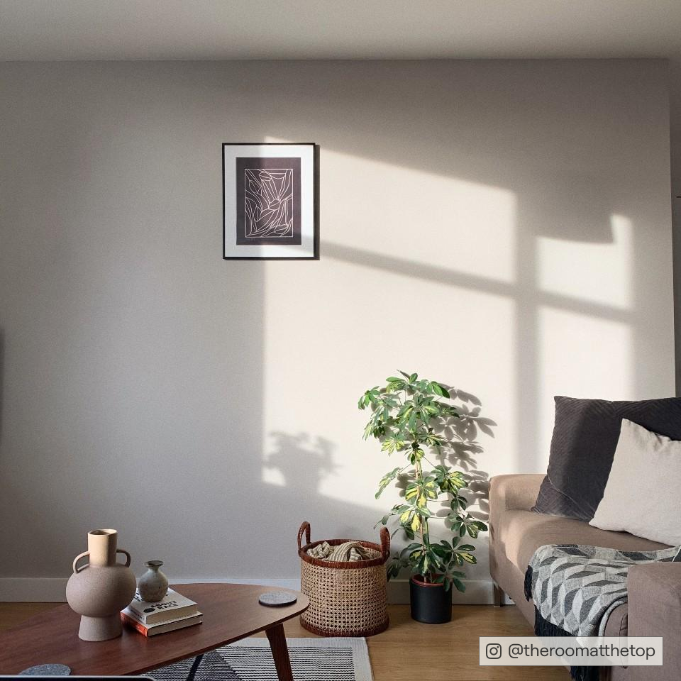
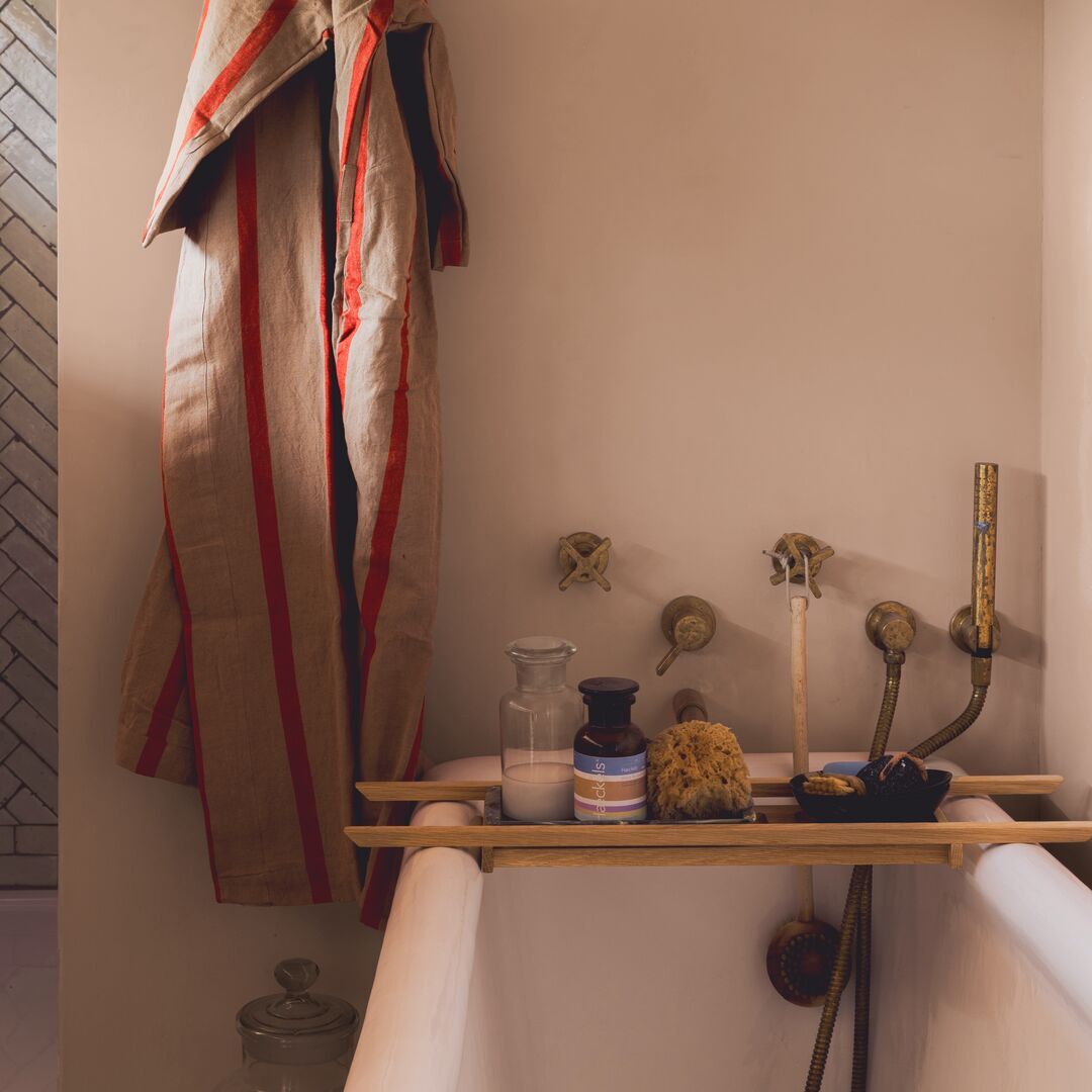
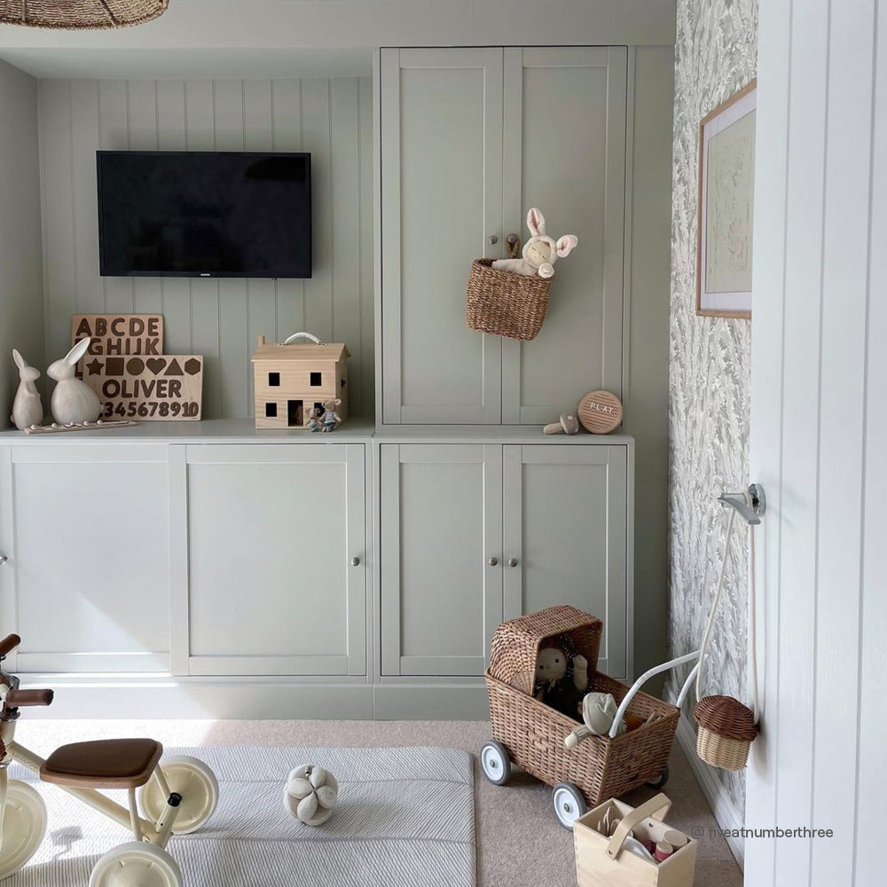
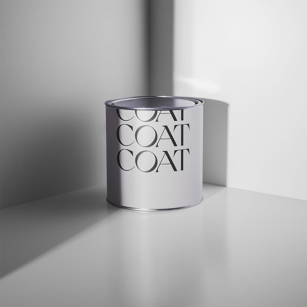
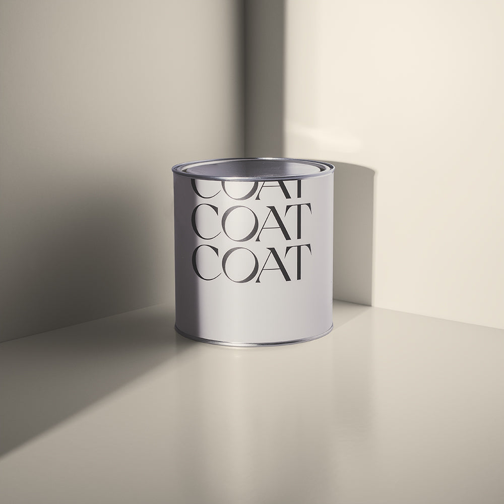
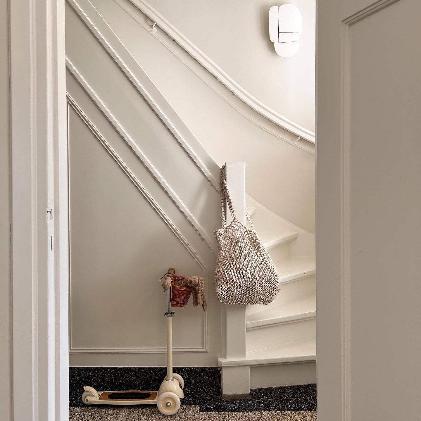
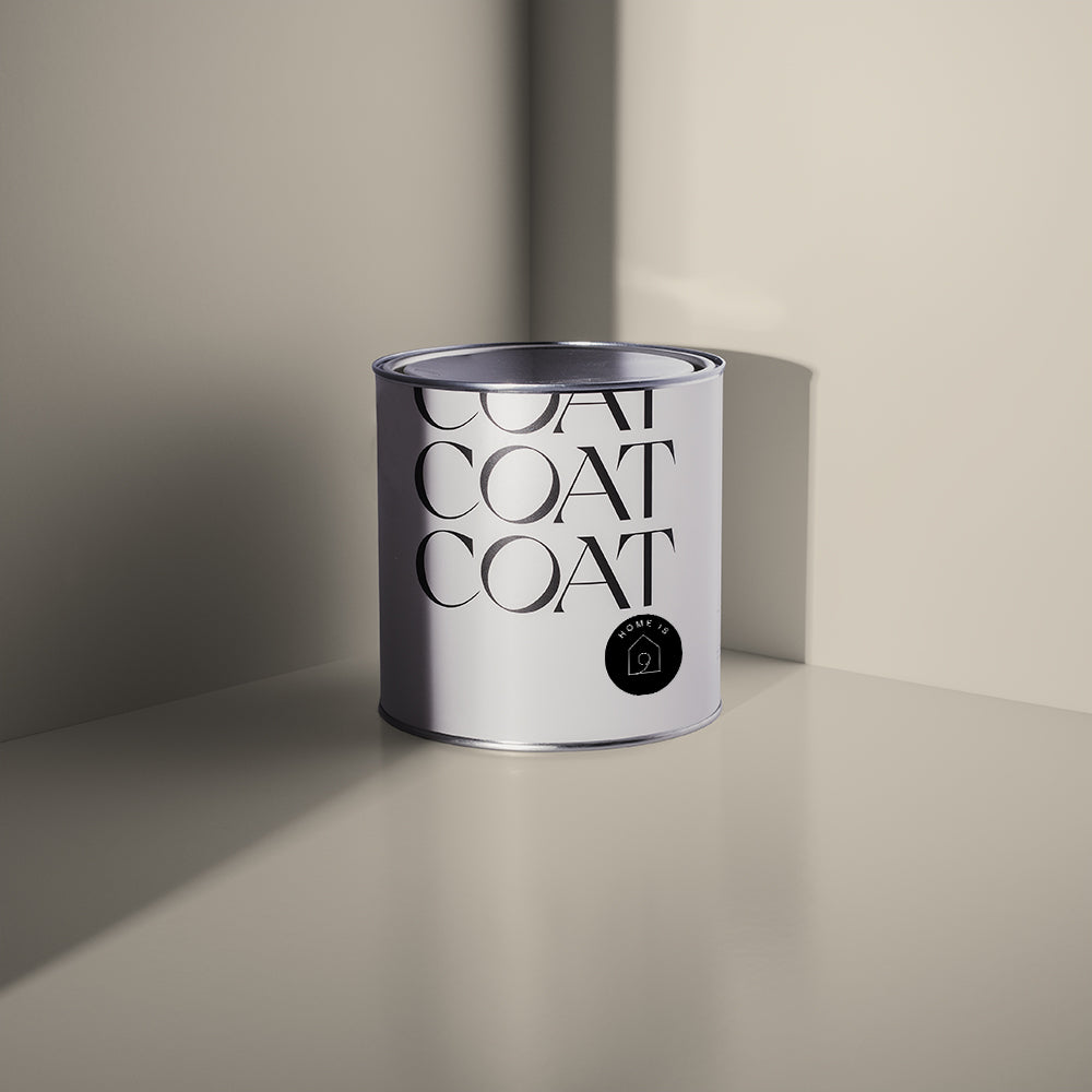
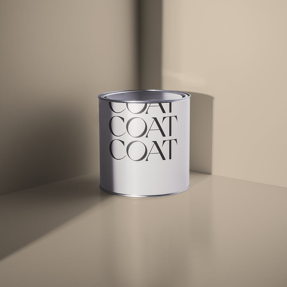
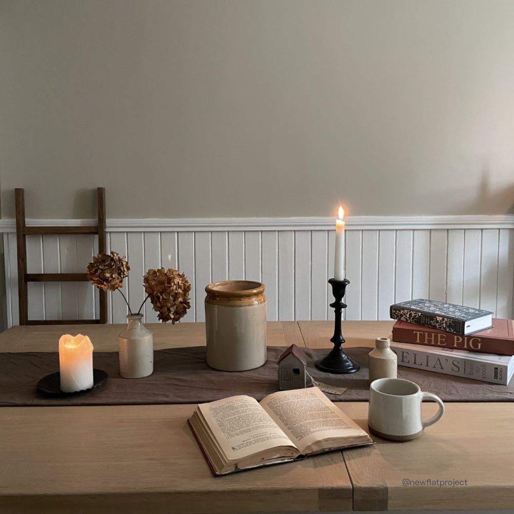
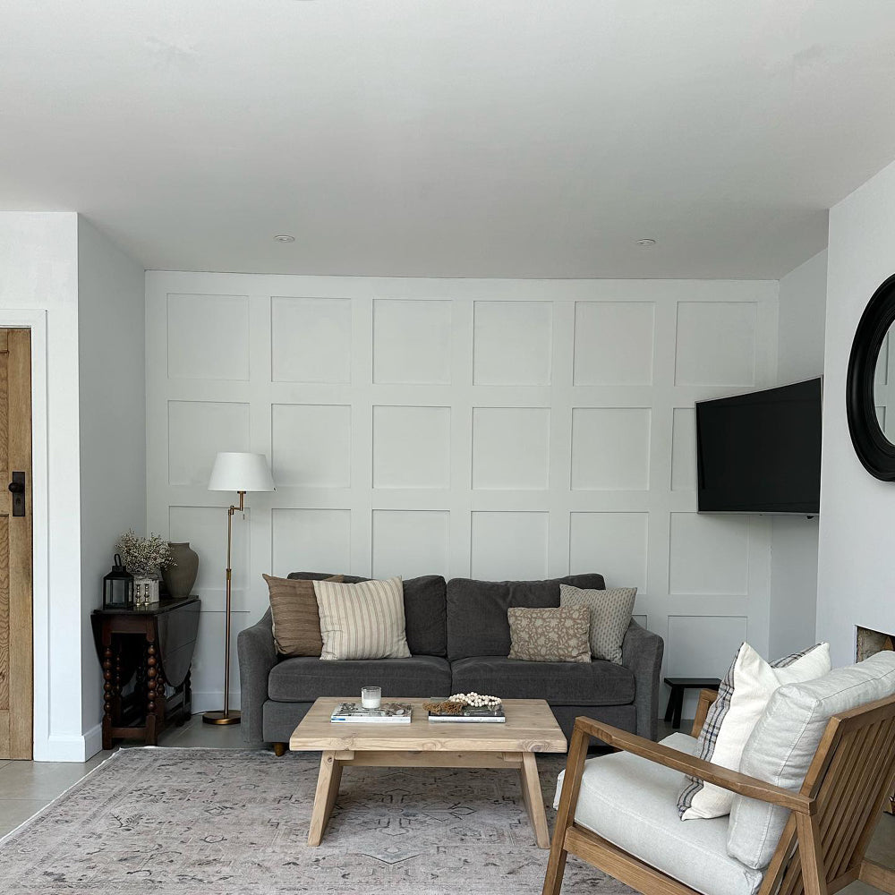
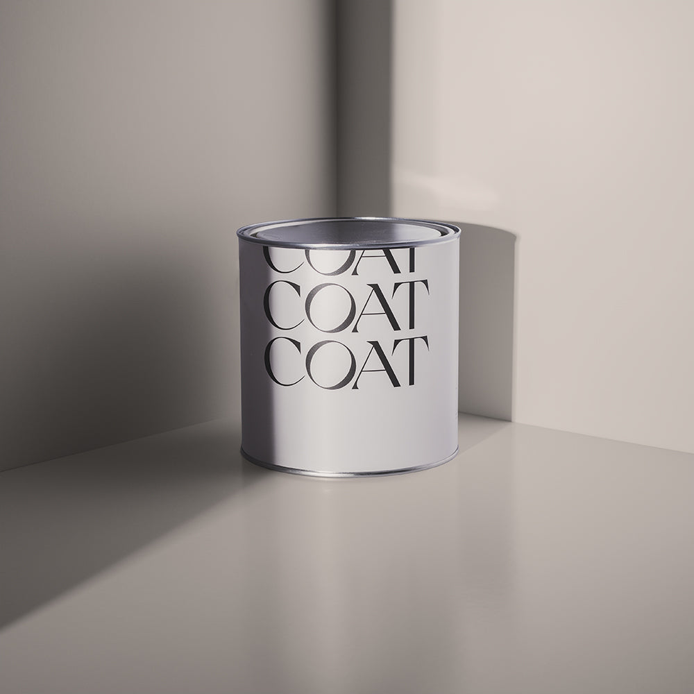
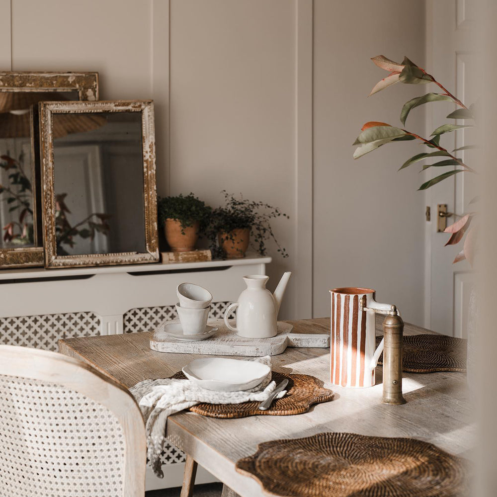
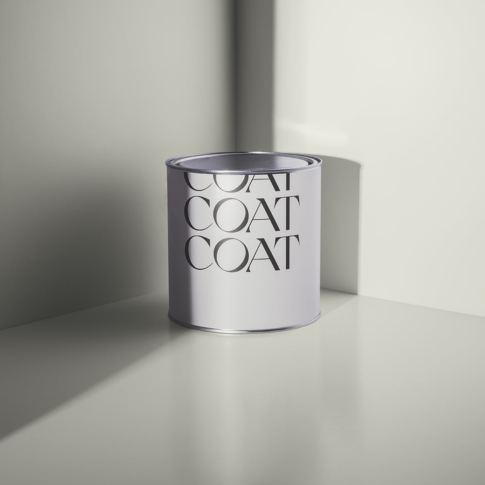
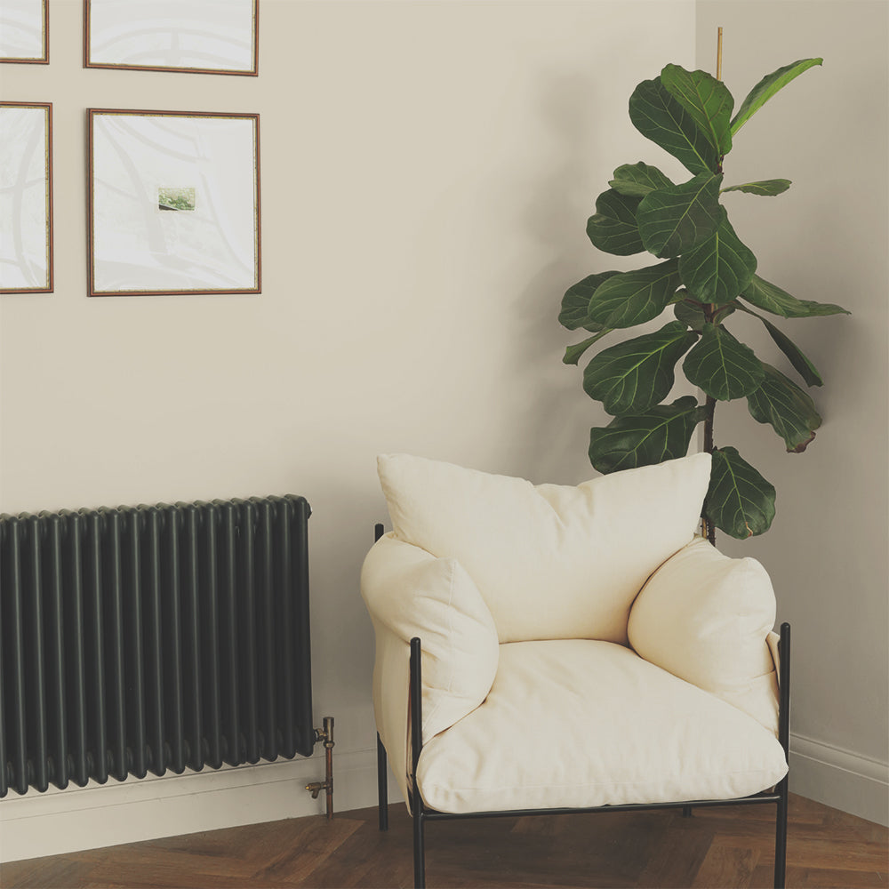
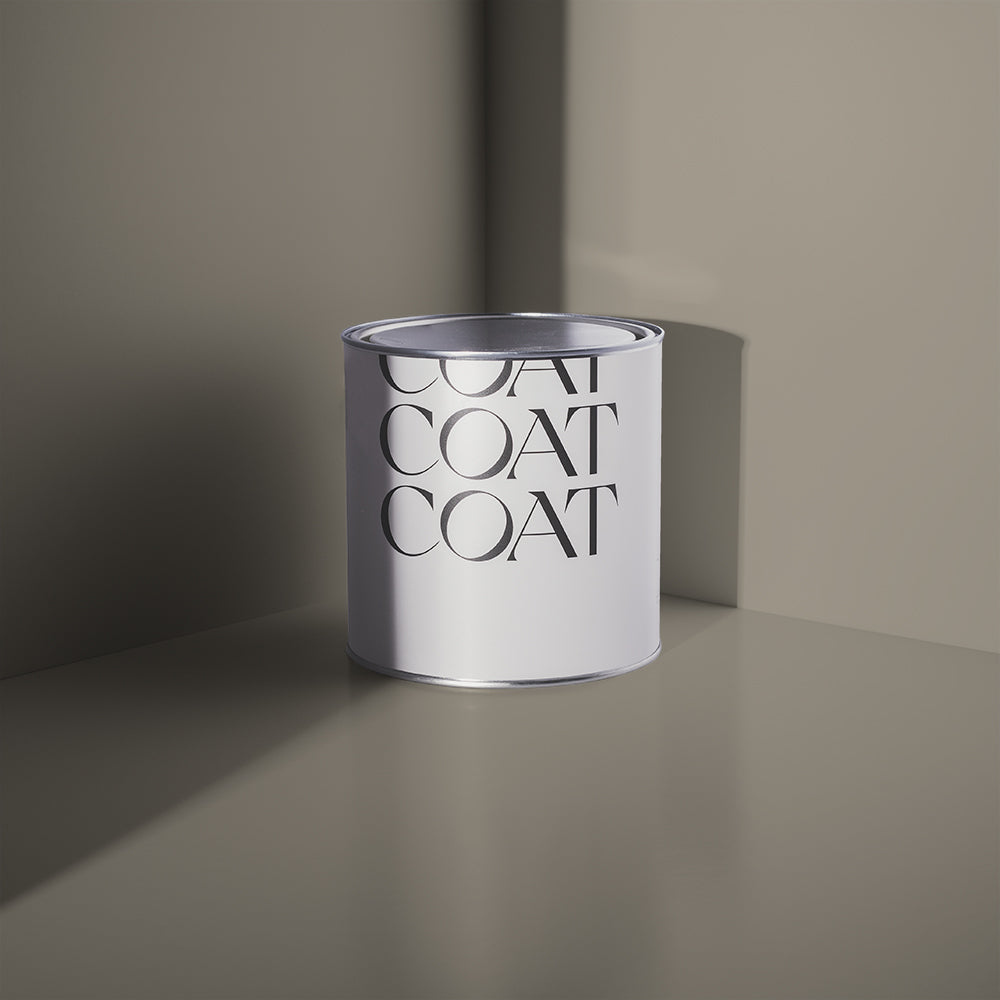
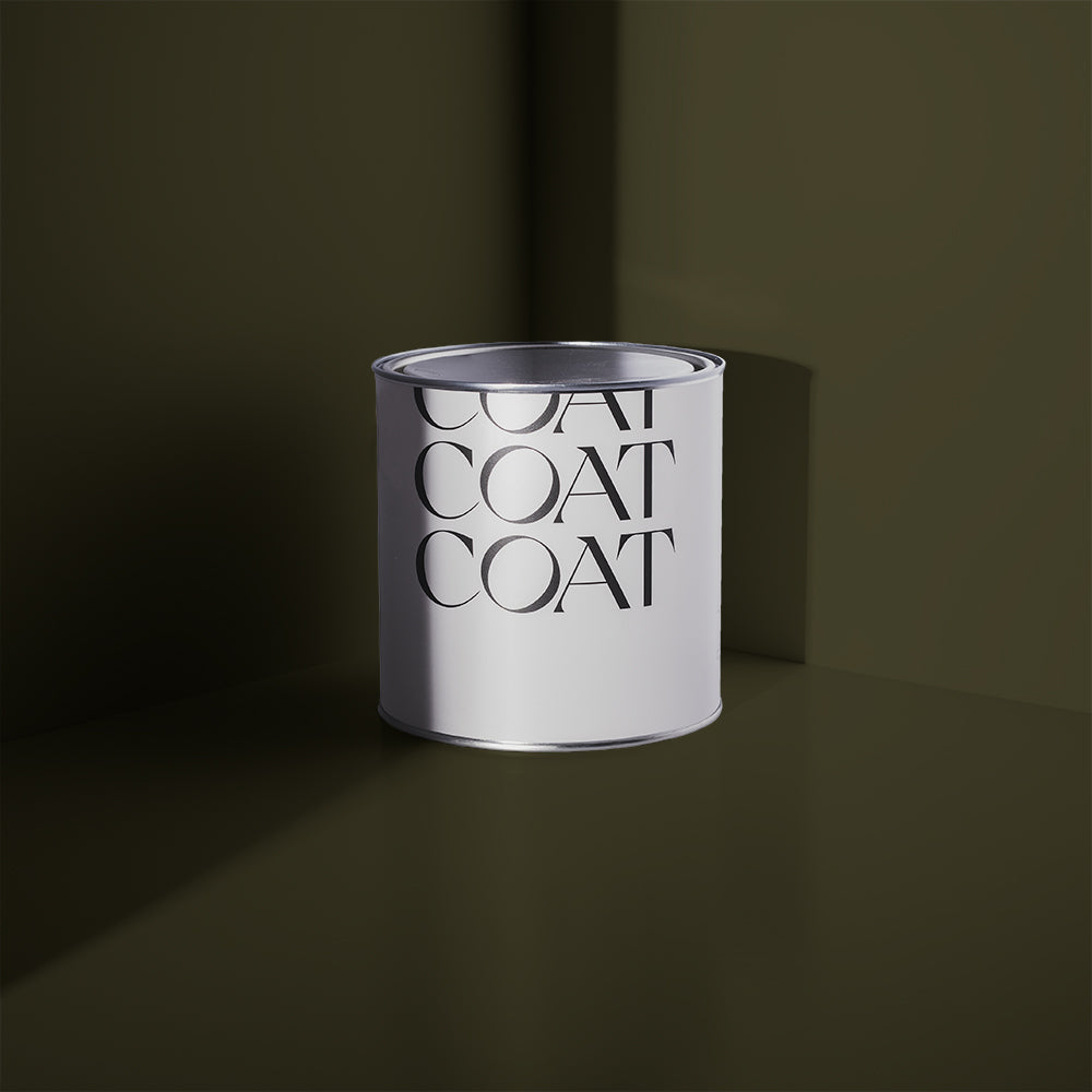
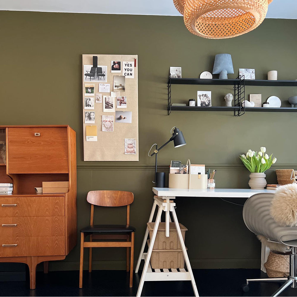
Ambrose is a stony, drab neutral. Containing warming yellow and grey undertones this colour would be at home as a neutral for Arts & Crafts style panelling, a complimentary white to deep reds in a Victorian home or the perfect backdrop for a Japandi style room.

COAT the whole room in Ambrose and pair with some teak and warm coloured leather furniture from Heal’s for a comforting and inviting living space. Or use as a white with deep colours like The Old Corset Factory or new Heal’s X COAT colour, Brewer. Ambrose also goes with popular COAT grey, Sweatpants, as a subtly contrasting colour for woodwork.
Grab an Ambrose Peel & Stick swatch now to give it a go.
Rathbone Place
Rathbone Place takes its name from the street where the first Heal’s store opened in 1810, this was before moving to the world famous flagship store on Tottenham Court Road.

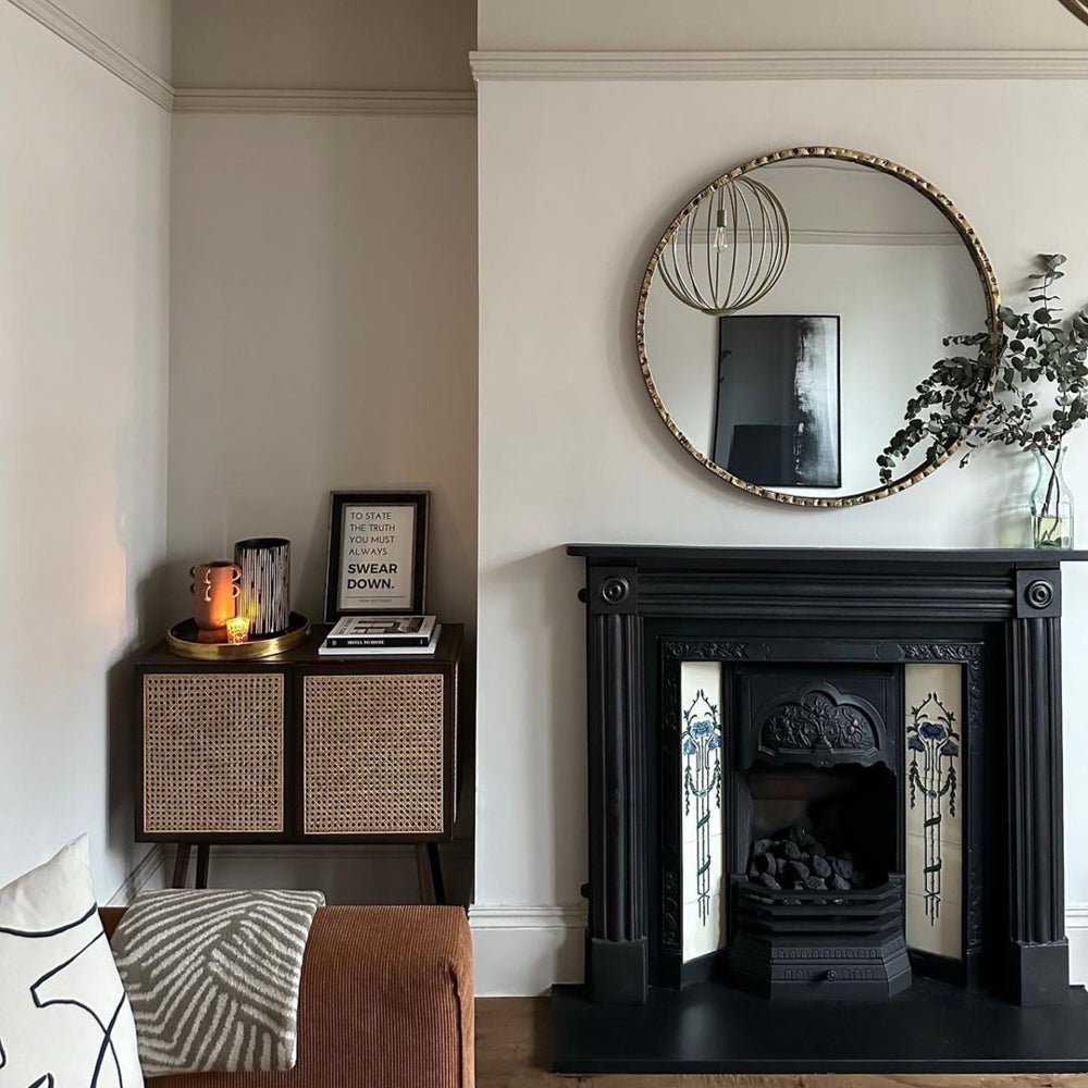
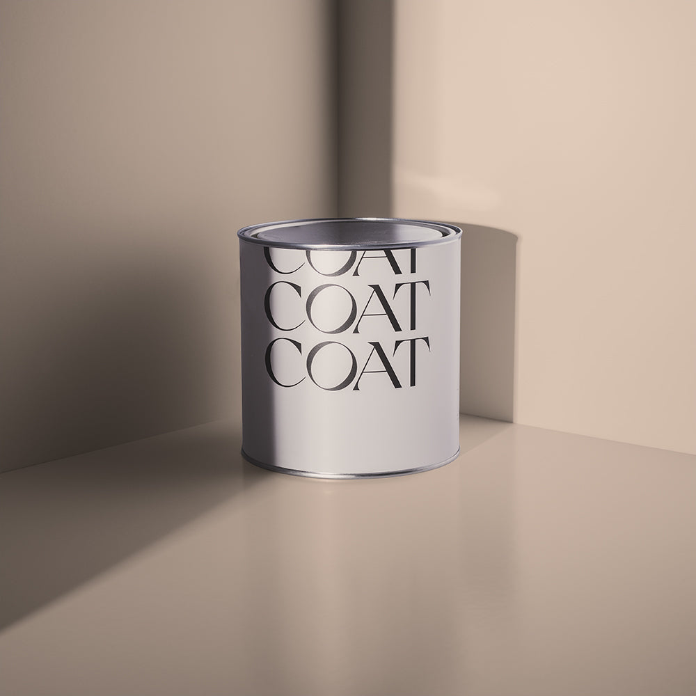
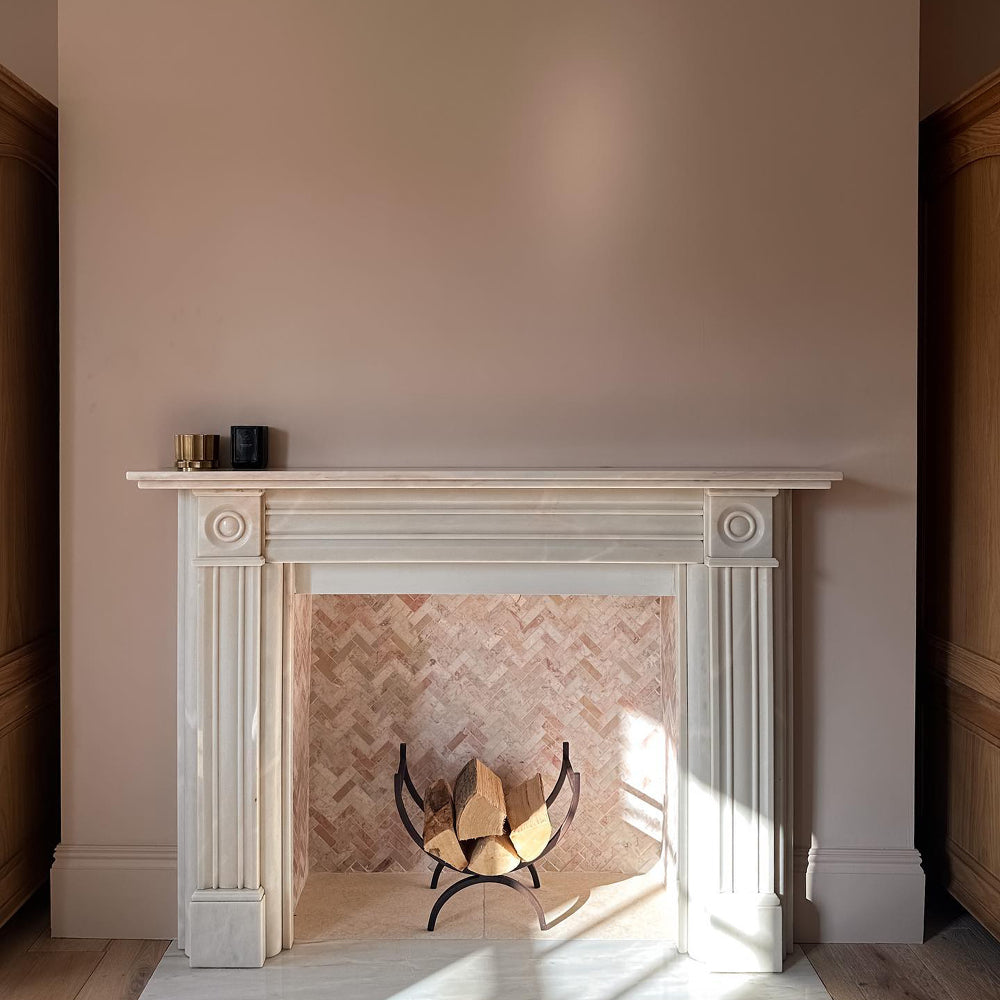
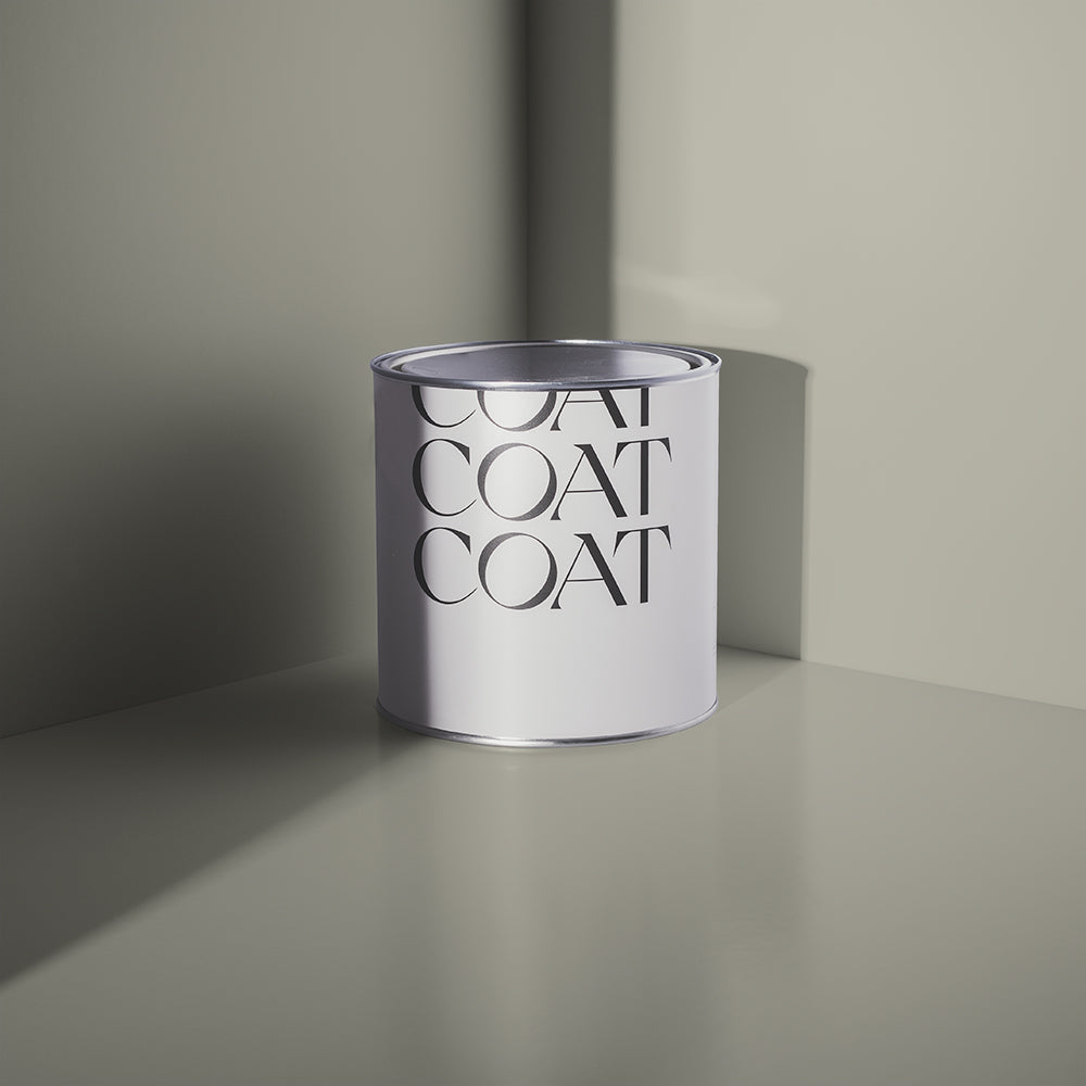
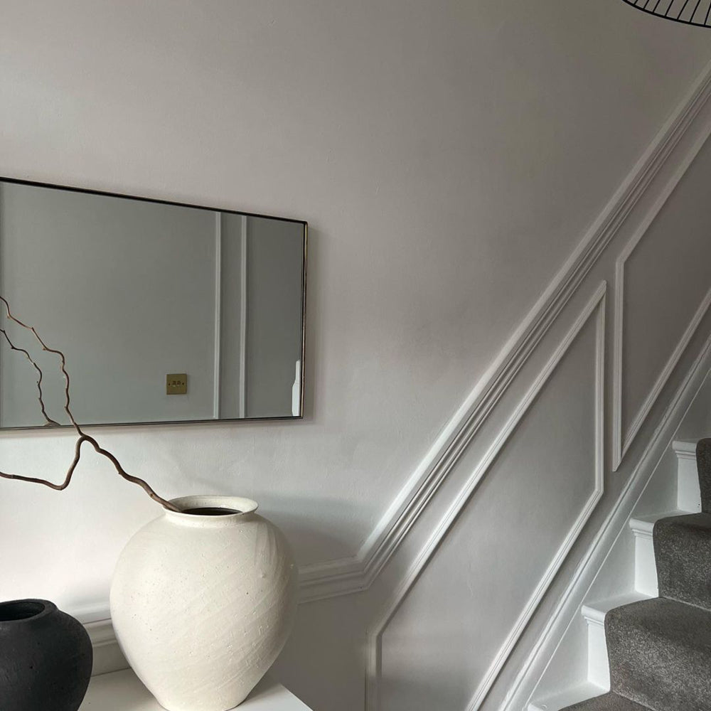
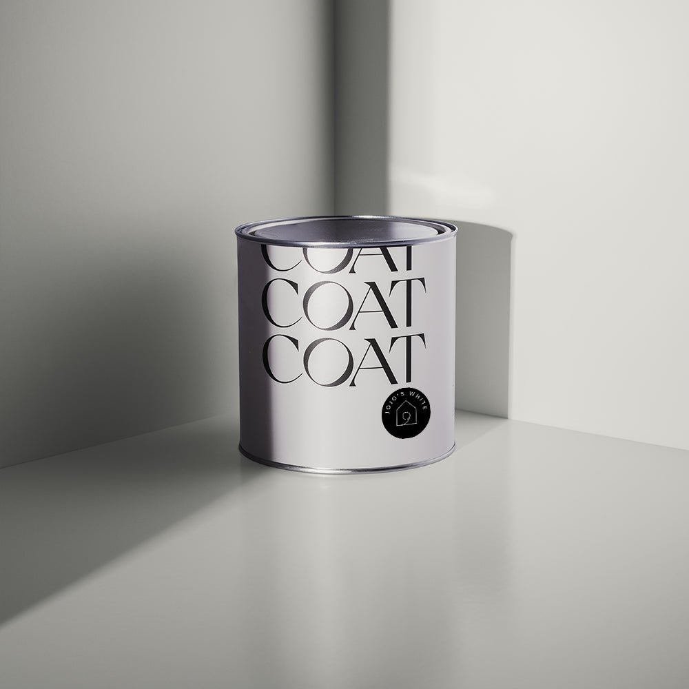
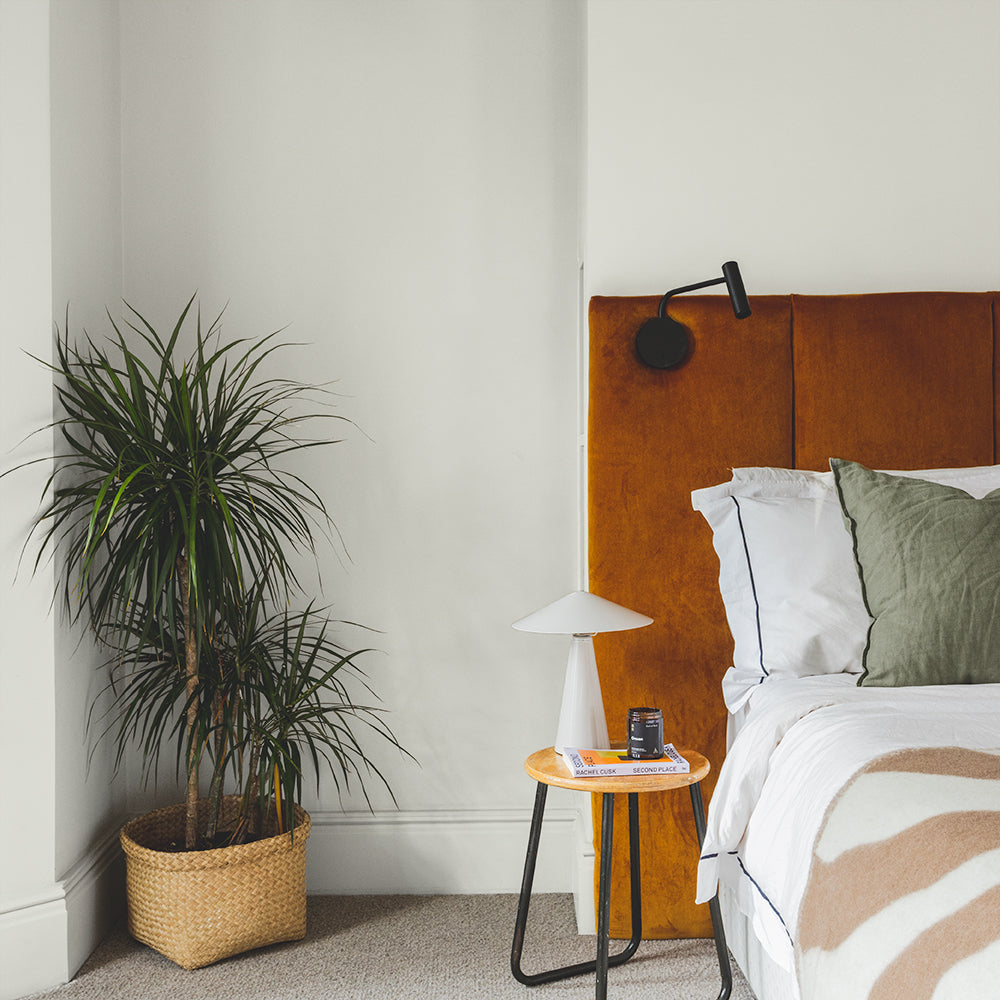
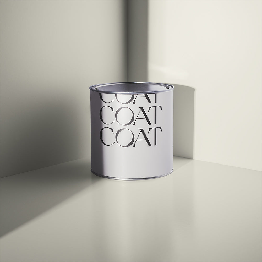
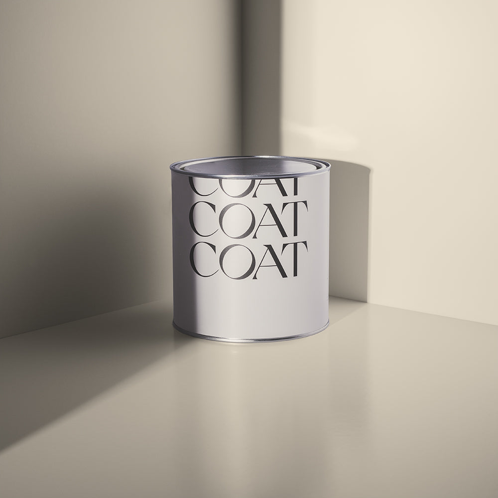
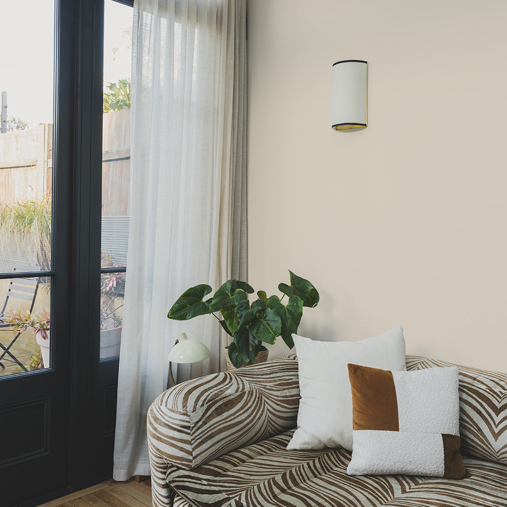
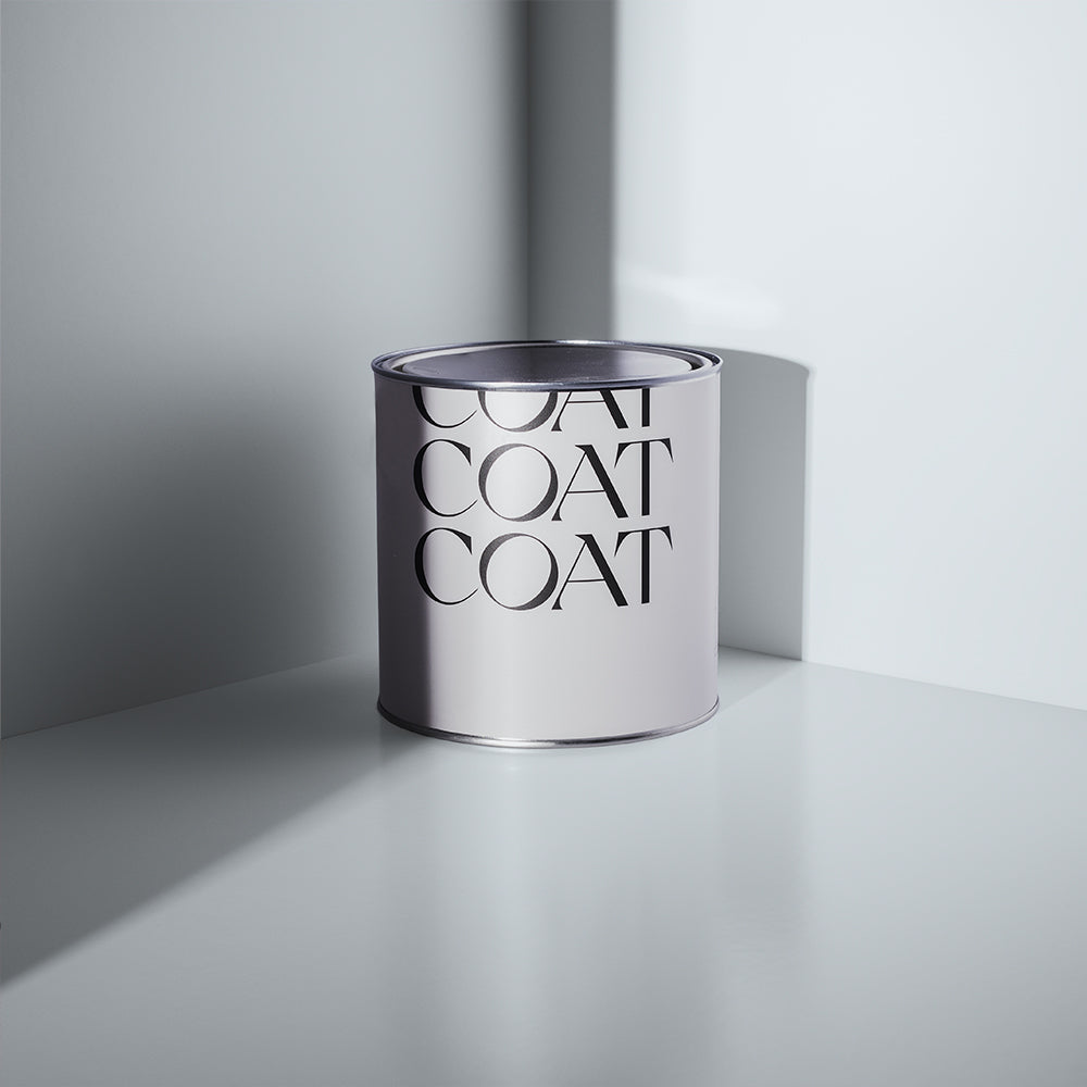
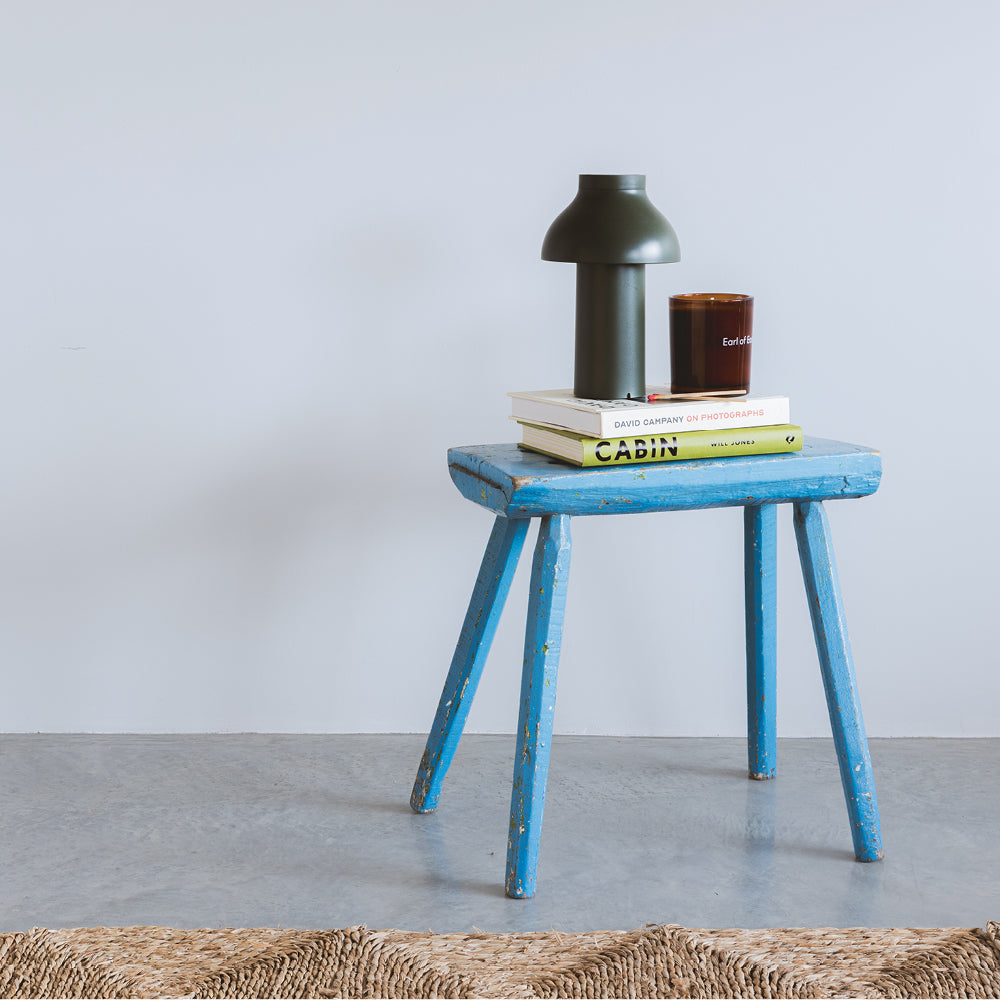
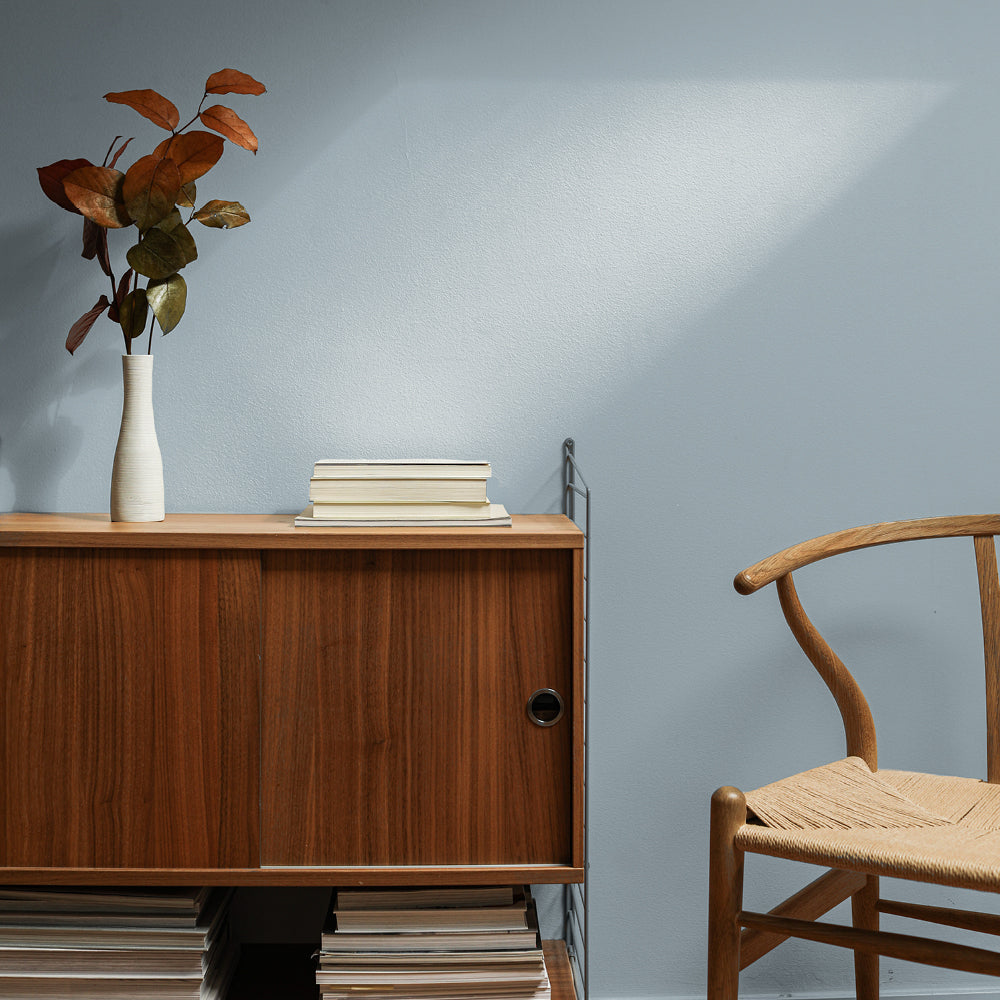
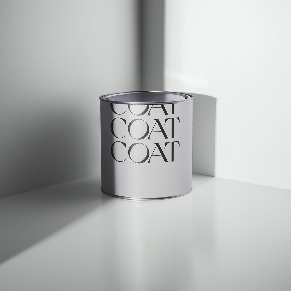
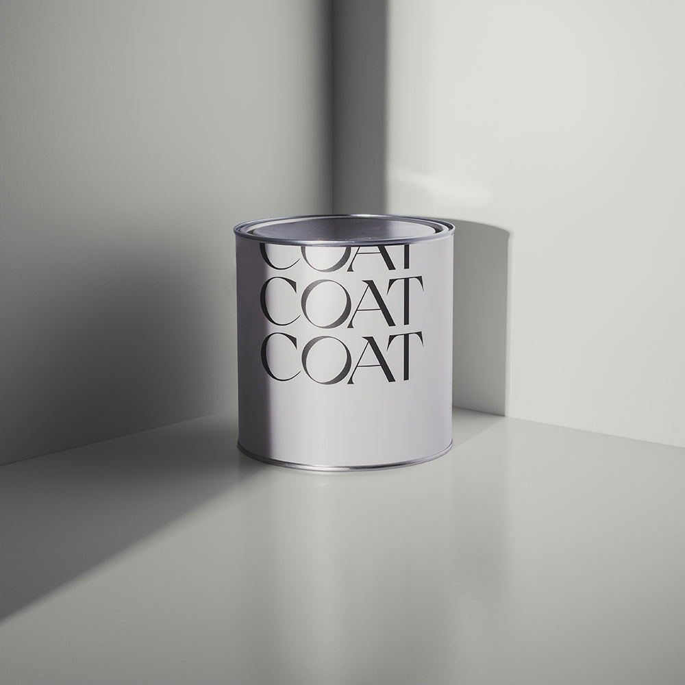
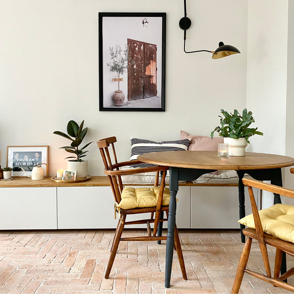
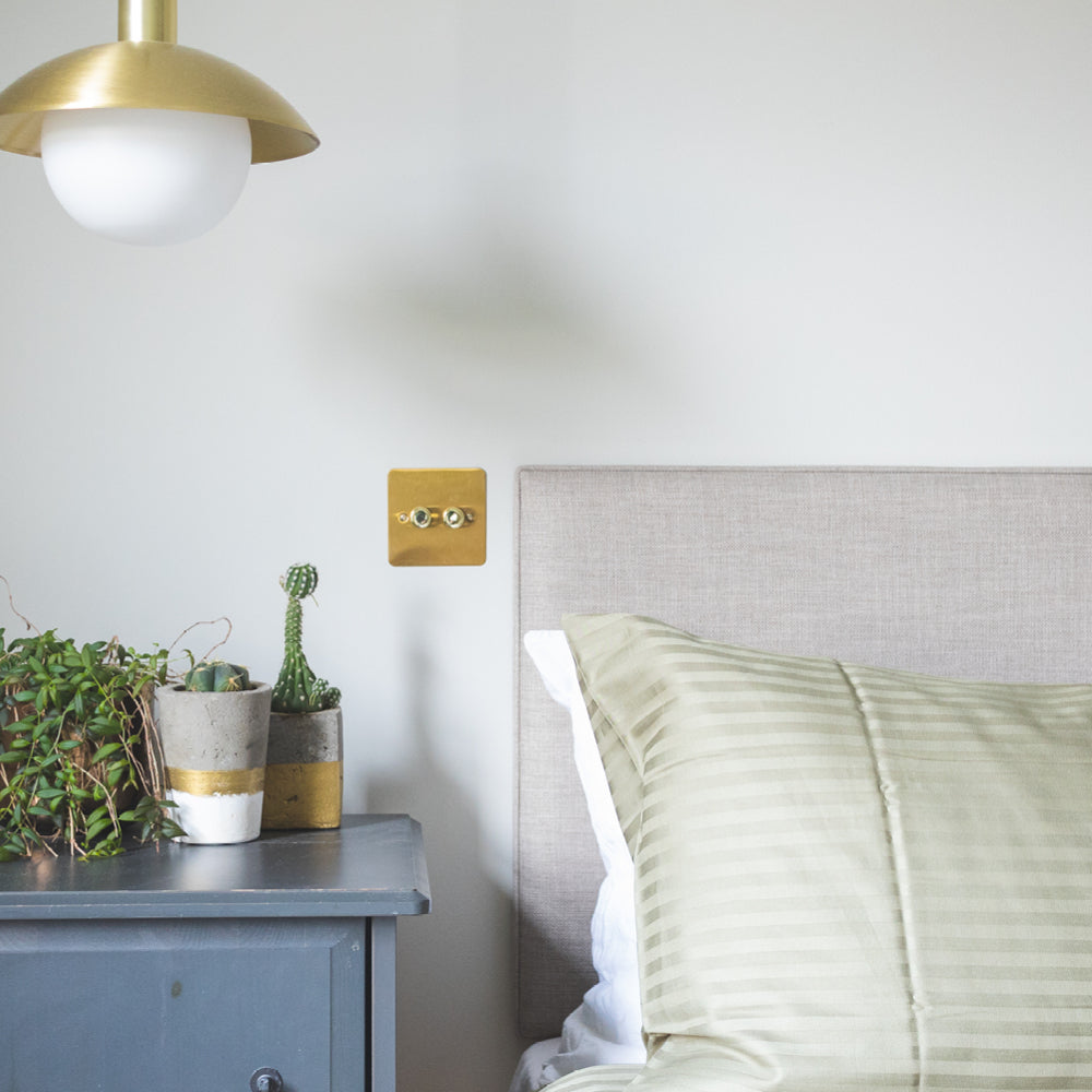
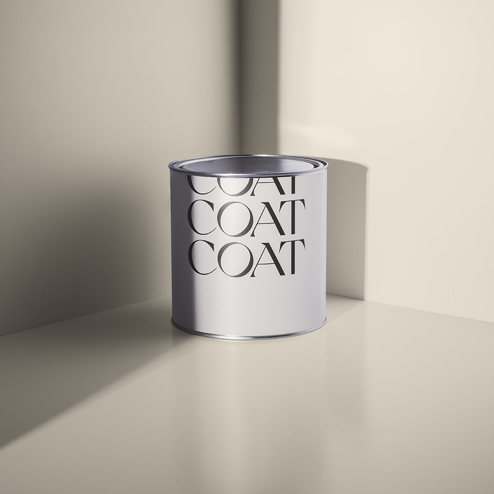
A bright, effortless neutral with subtle yellow, green and grey undertones - reminiscent of Venetian Palazzo stonework - makes Rathbone Place the most versatile of the Heal’s x COAT collection. Imagine, street musicians playing in the background on a balmy Italian evening with a chilled glass of white in hand. Bliss.

Pair with Dodie woodwork for a high-contrast, monochromatic scheme that’s warm and inviting. Alternatively, use as a complimentary white for your skirting and ceilings with Mansard walls and an upcycled dresser in Brewer.
Grab an Rathbone Place Peel & Stick swatch now.
Mansard
His interest in fine art and its parallels with design and commerce led Ambrose Heal to open the Mansard Gallery in Heal’s to display the most innovative art of the period.

It was at the Mansard Gallery that the British public were first introduced to Pablo Picasso, Henri Matisse and Amedeo Modigliani. The gallery was also often visited by some renowned faces from the Bloomsbury Group - spot Virginia Wolff anyone?

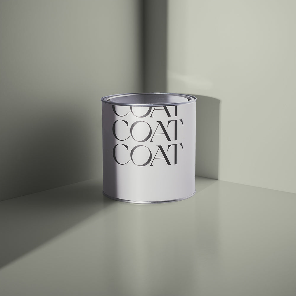
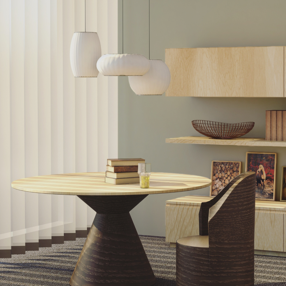
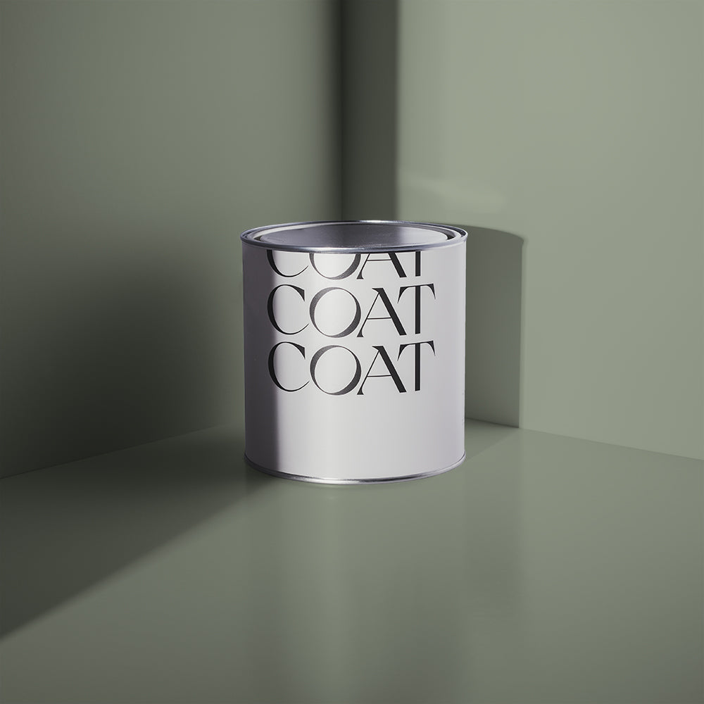
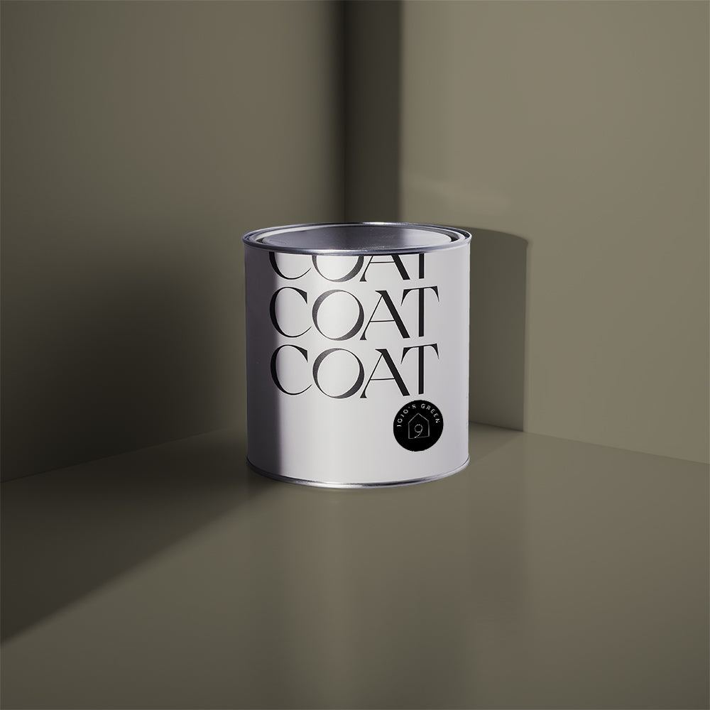
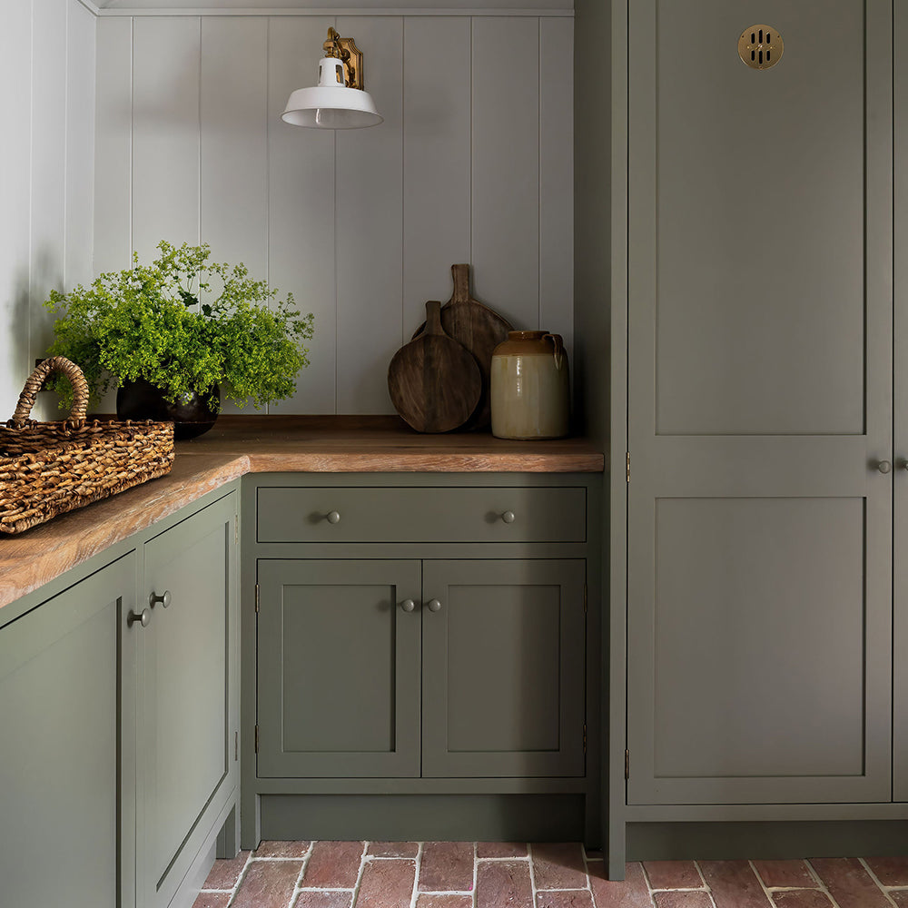
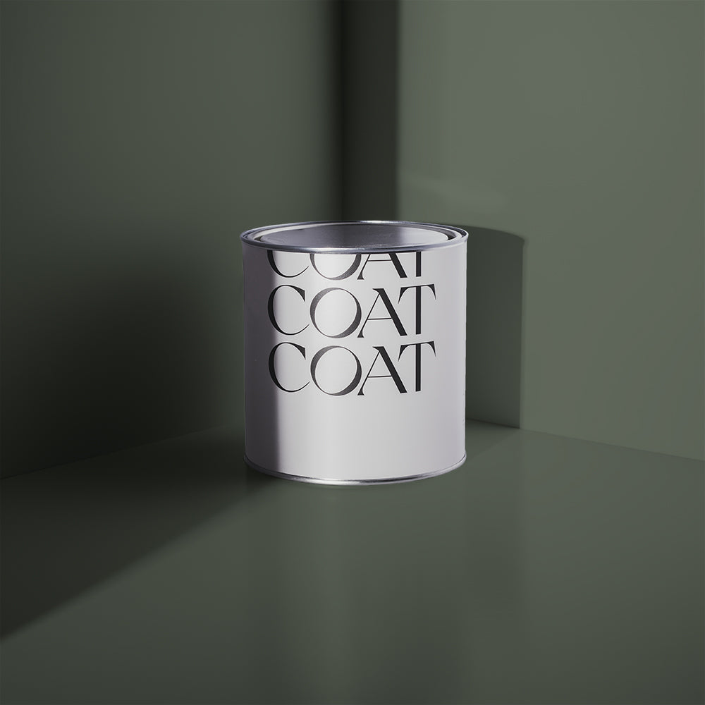
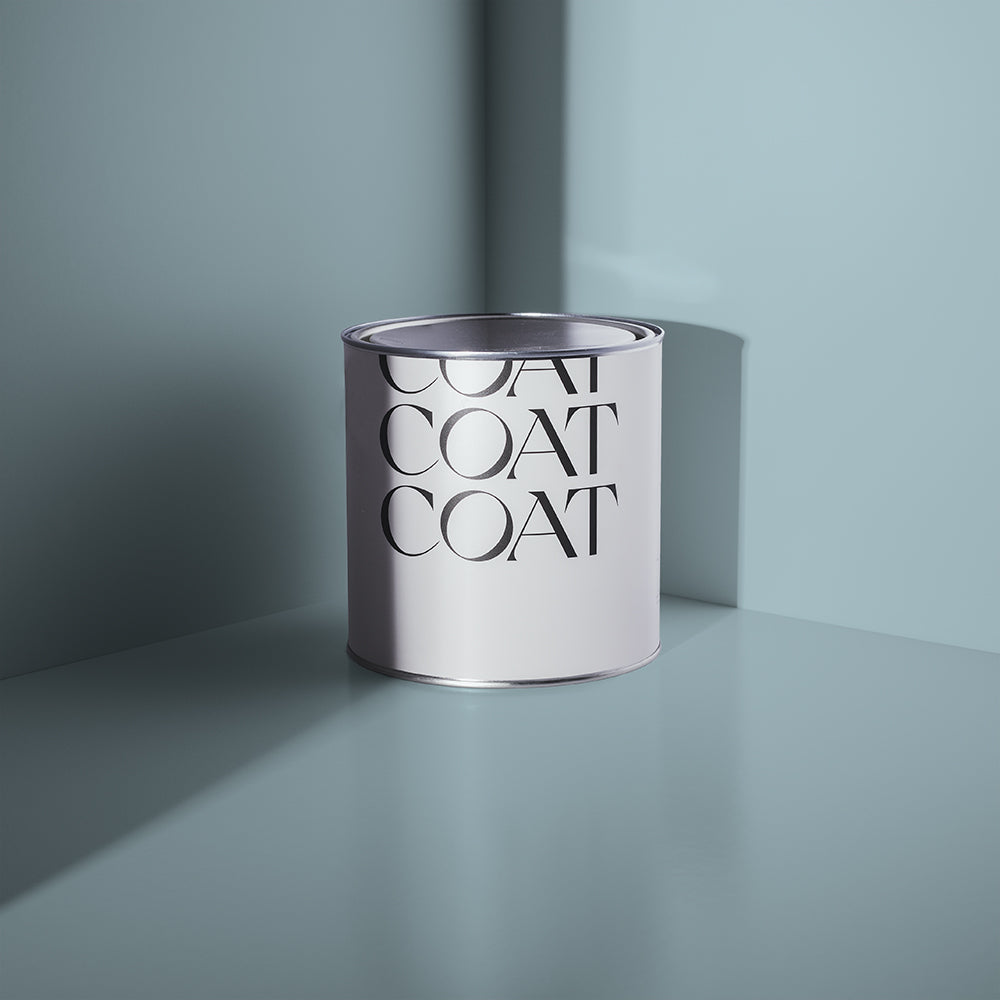
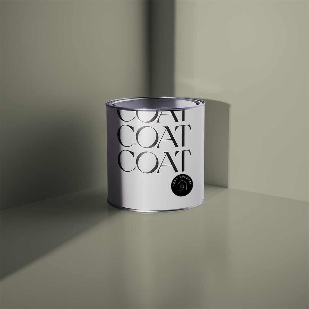
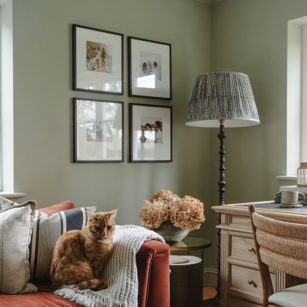
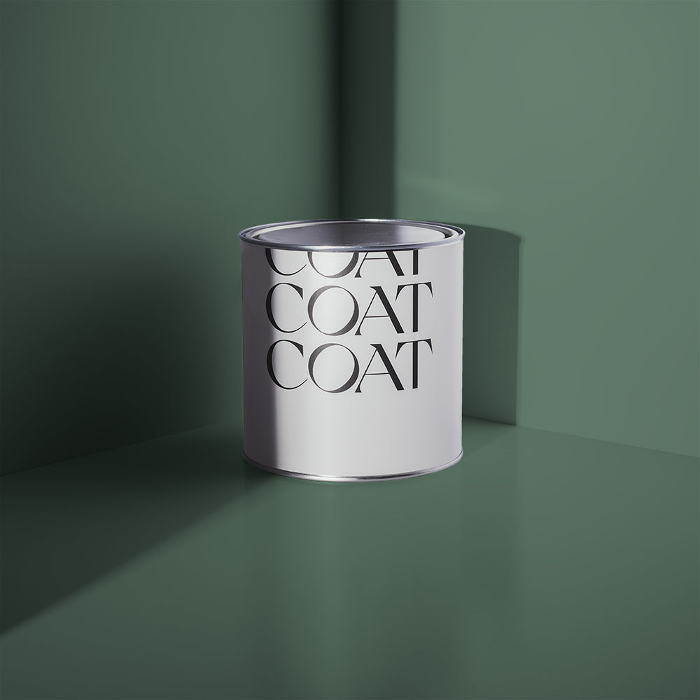
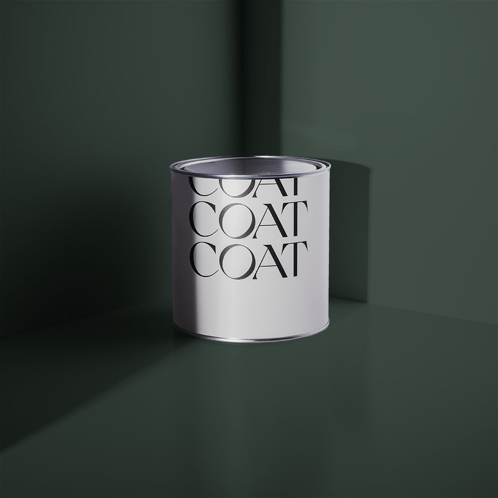
Mansard appears as a mid to dark green with a subtle grey undertone.
Colour block rooms next to each other in The Coal Drop and Mansard for dark, dramatic vibes. Mansard works well as a low-light to more neutral colours like Kind Regards and Detox (think about painting a dresser for example). For max impact, use as a graphic highlight on Brewer walls and then hang art, or put a plant in this space.
Brewer
A stairway to heaven? The interiors angels think so.

Cecil Brewer designed the Brewer staircase in the Heal’s flagship Tottenham Court Road store. The staircase was completed in 1916, and went up to the famed Mansard Gallery, which opened in 1917 (see how the paints are all connected? Clever huh?).
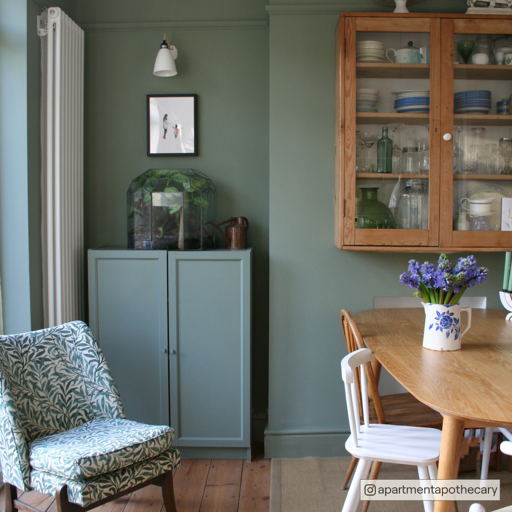
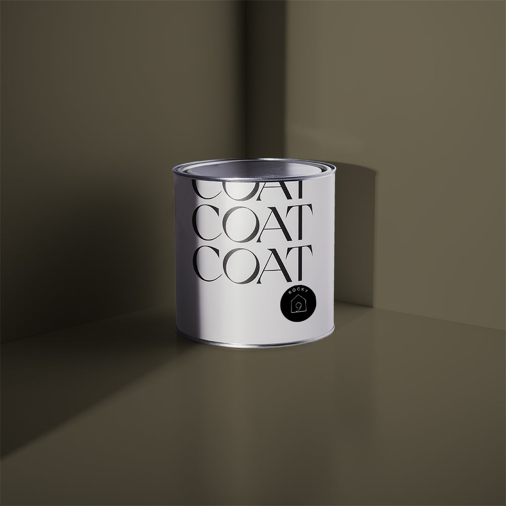
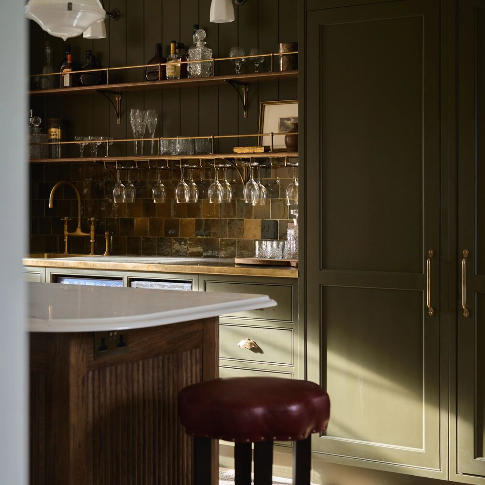
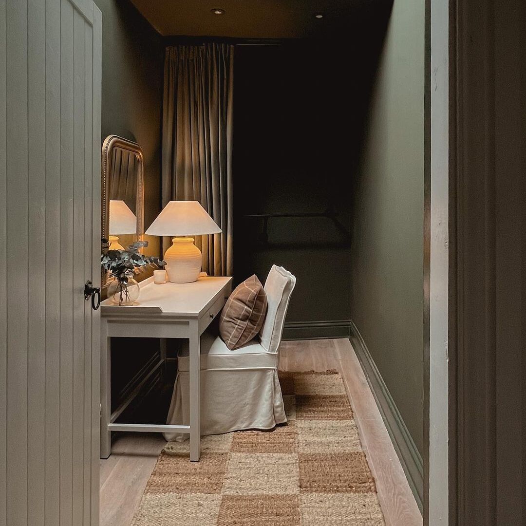
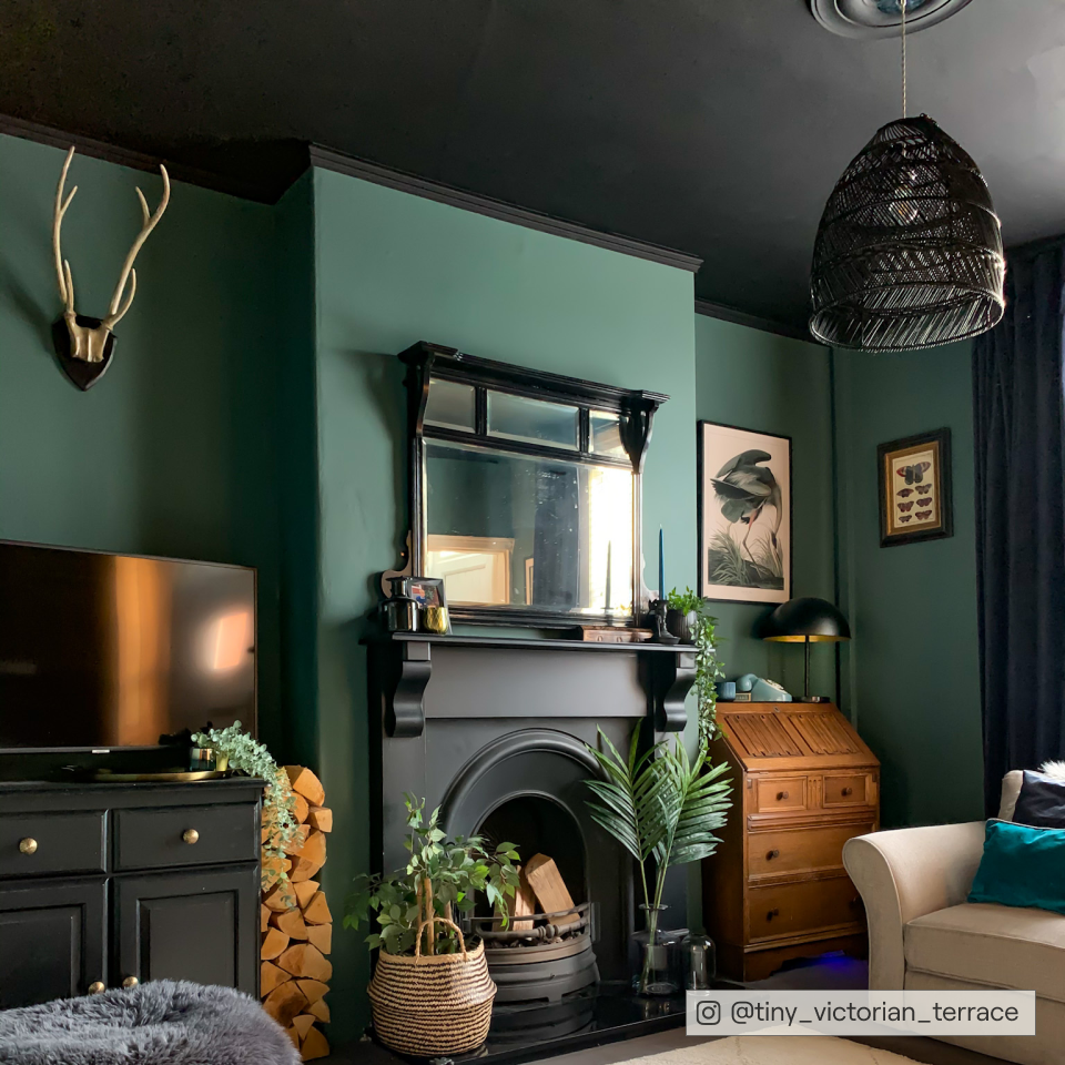
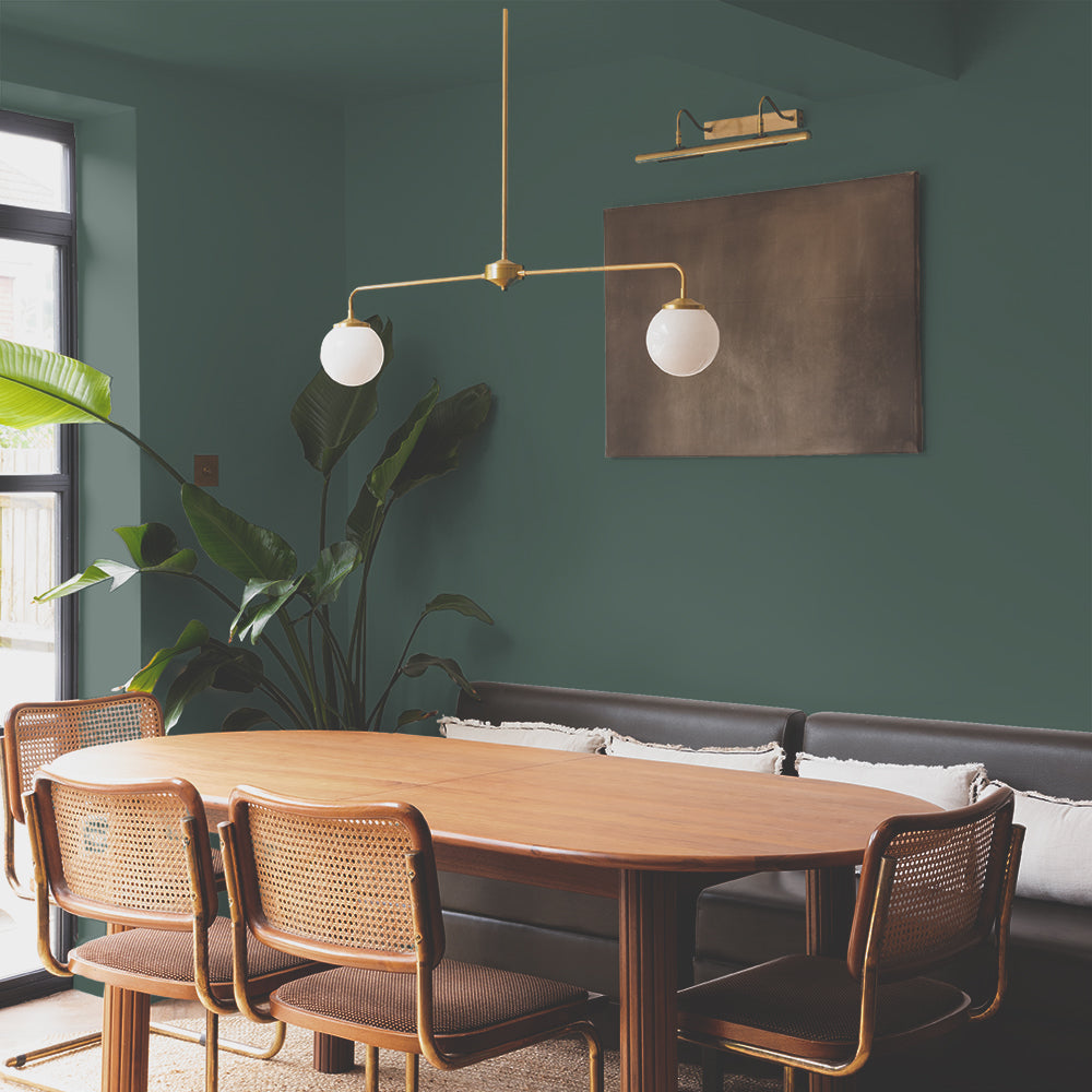
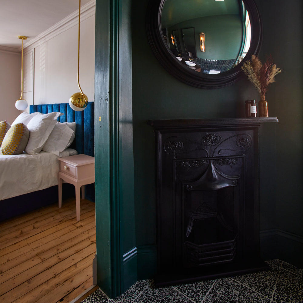
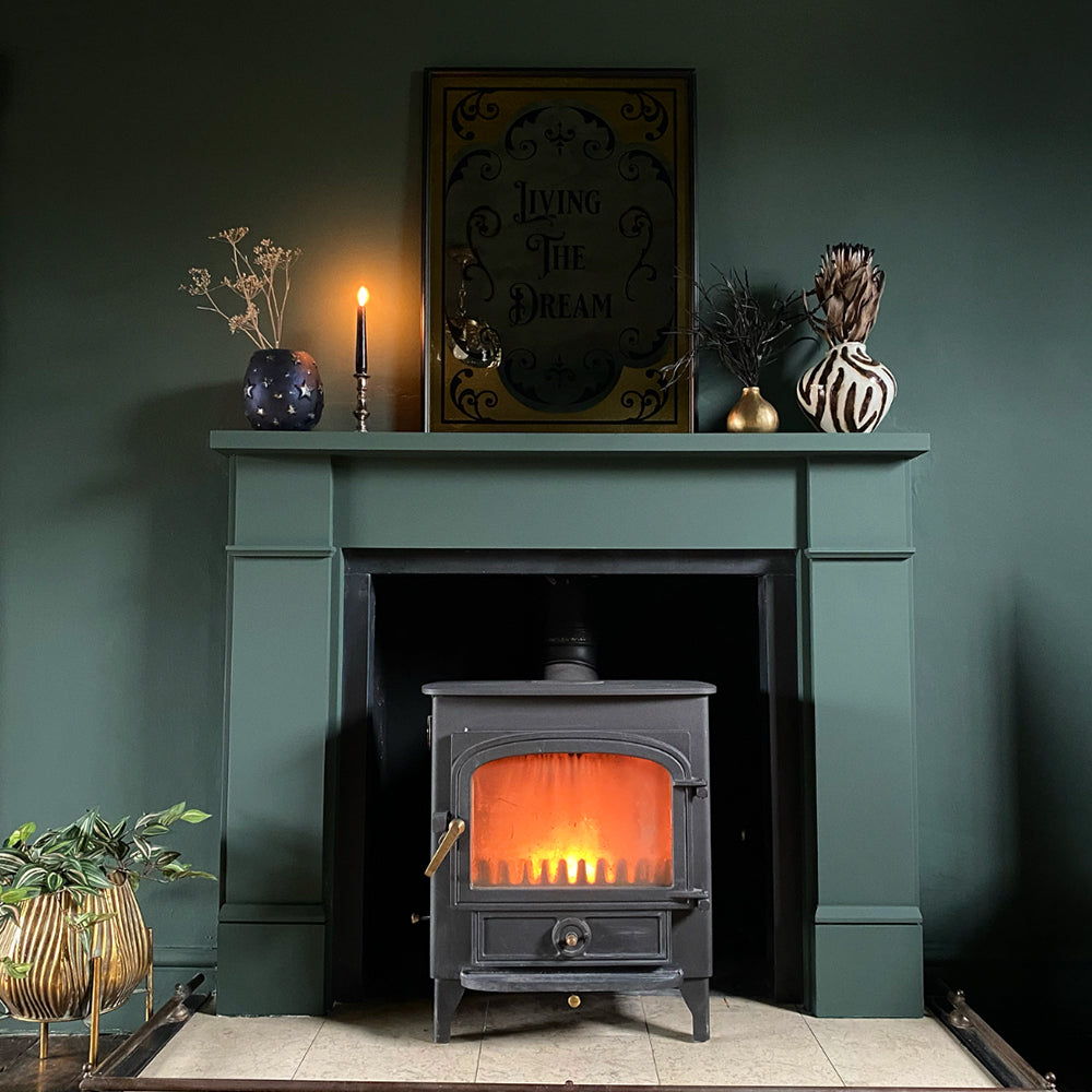
Brewer is the perfect botanical, dark green. Bringing slightly more heritage vibes than COAT’s other greens, it brings a deep and warm lux to any room.

Tip of the day - A Brewer kitchen island with a Mansard wall cabinetry will soon be a cult classic, so be the one to do it first!
Use Brewer on skirting and architraves in rooms COATed in Rathbone Place or Kind Regards to ground these pale colours. Thinking of using Brewer as a wall colour? Use black leathers, candles, chandeliers (all things gothic) and strong mid-century furniture shapes, like the classic Eames Chair in Santos Palisander. Using blacks with dark colours tricks the eye into thinking the room isn’t that dark…sneaky.
Give Brewer a try on your walls now - grab a swatch.
Dodie
Dodie Smith (1896-1990) was an acclaimed playwright and author, who captured the imagination of millions with her work, including the doggy favourite 101 Dalmatians.
But before she found fame as a writer, Dodie was a struggling actress in London who eventually gave up her acting pursuits and found a job at Heal’s as a shop assistant. Having joined the business in 1923, she went on to run the toy department among other responsibilities.
During her time at Heal’s, Dodie became fond of the Heal’s cat which remains on our Cecil Brewer staircase to this day.

She wrote in her autobiography Look Back with Astonishment, “On the sill of a window that lit it was a very tall bronze cat, (really a serval) which I came to think of as presiding deity of Heal’s. I later let it be known that it would grant wishes and I was to see various members of the staff reaching up, rather furtively, to touch its paws. And when I eventually sold the cat, which was priced at £40, Mr Heal wrote firmly to the customer – who must have been startled – cancelling the sale, and had a card lettered saying ‘Heal’s Mascot. Not for Sale’.”

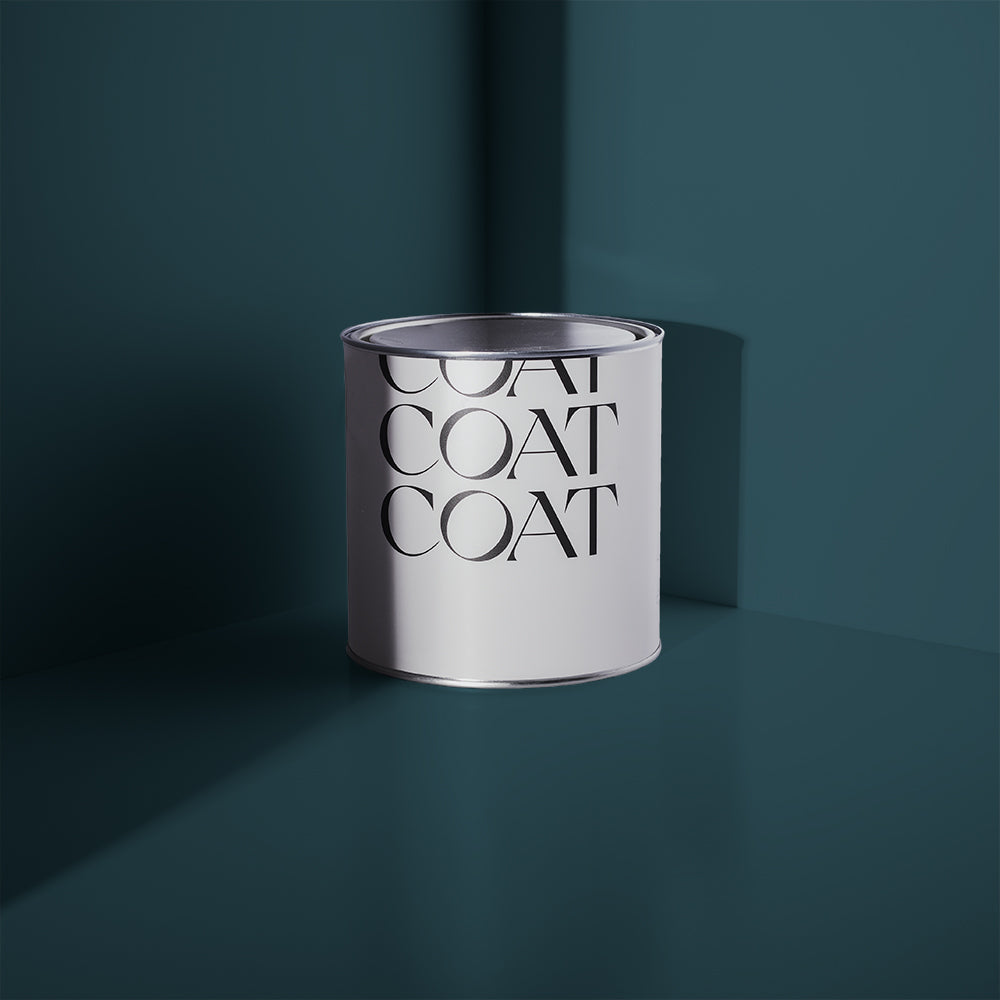
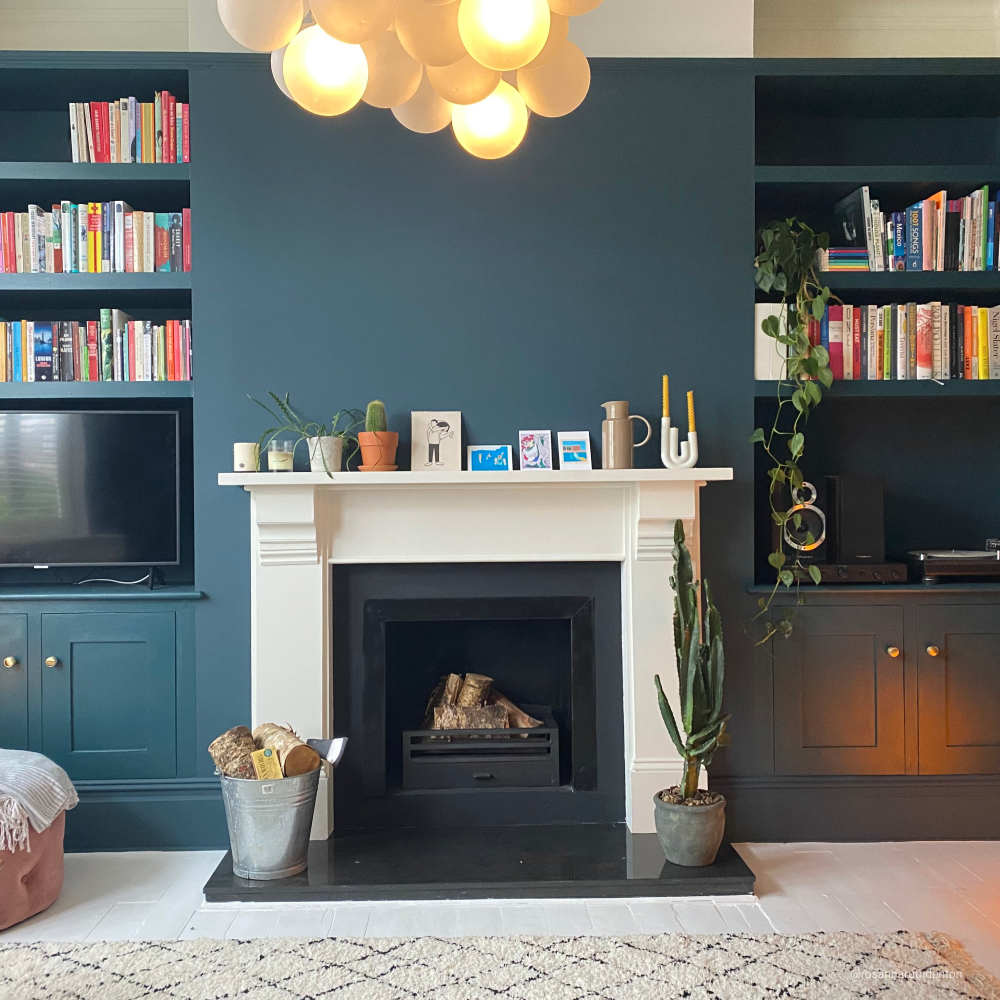
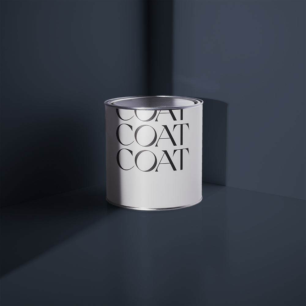
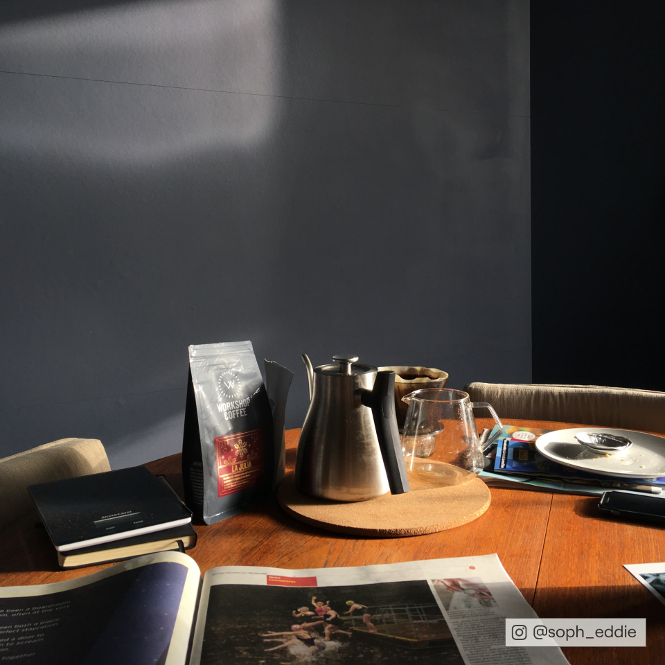
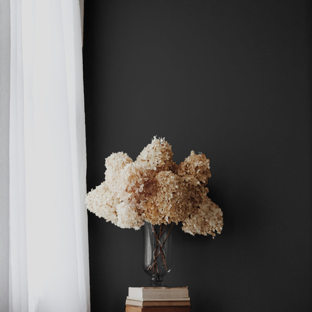
Dodie is a luxe dark blue with a hefty grey overtone.
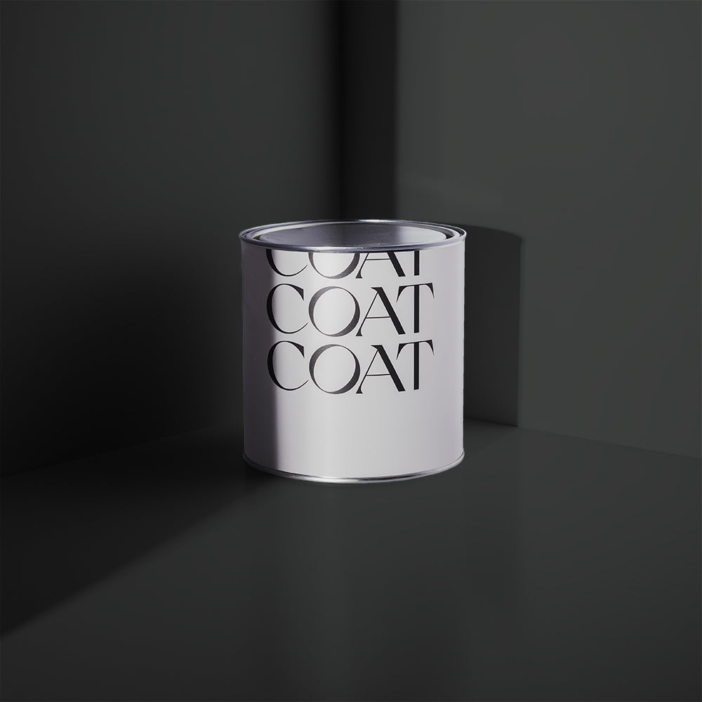
Use as an off-black for furniture with existing COAT favourites Lie-In and Mr. Clifton, to create a calming bedroom space. For a dark, moody space COAT your walls and woodwork in Dodie, ceilings in Rathbone Place and finish off this lavish vibe with a cocktail cabinet in The Four-Poster.
And last but not least - the brightest icon of them all…...
The Four-Poster
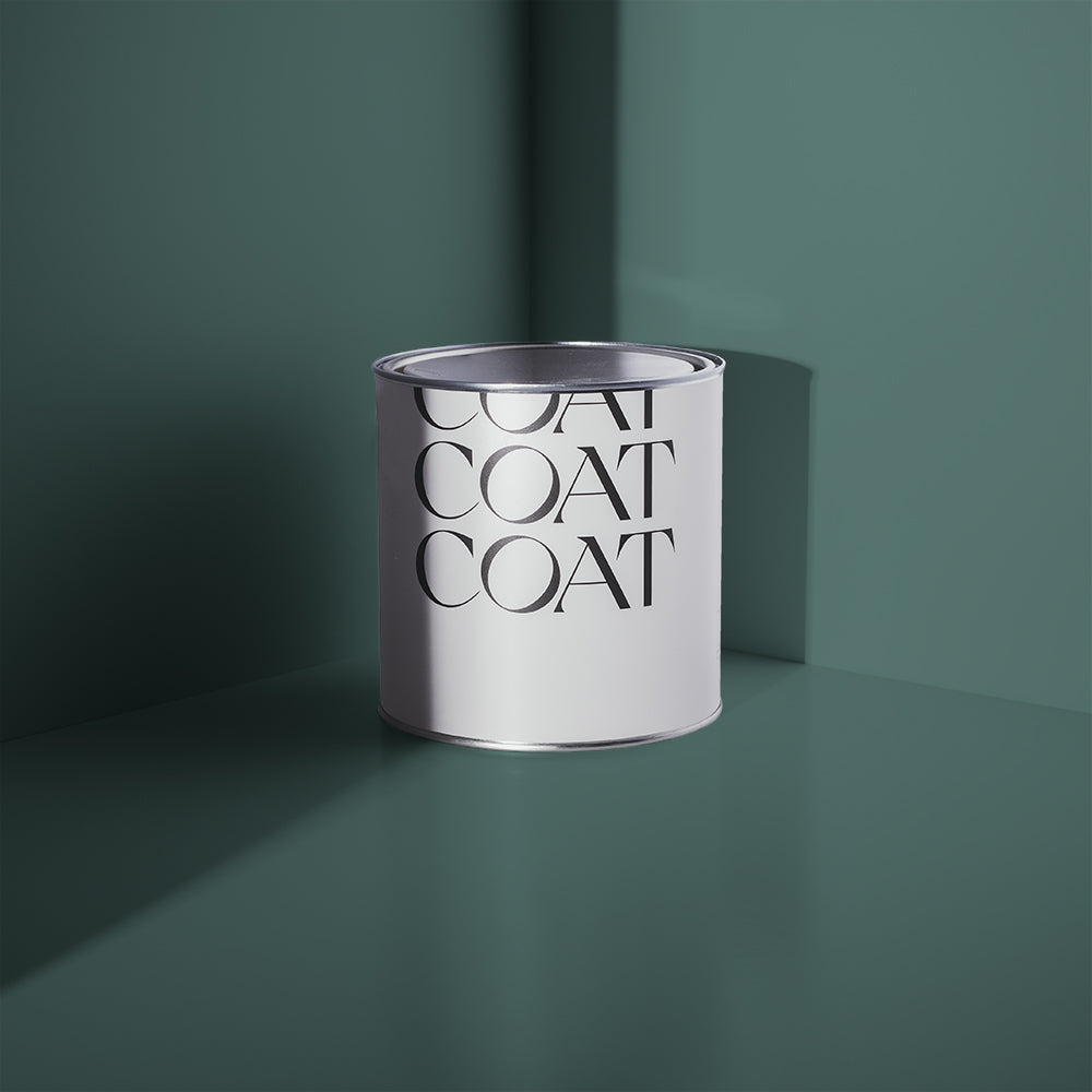
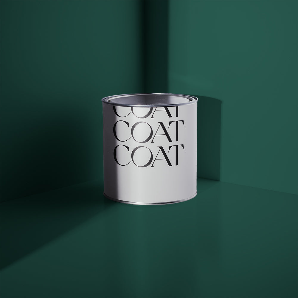
The Four-Poster is a fully saturated teal, with a slight black pigment. Fab as a highlight colour in alcoves with off-black colour schemes, like Dodie, making sophisticated, underground bar vibes.
This colour comes from the iconic four-poster bed sign that hung outside of the Heal’s flagship store. It is still available for the public to see in the bedroom section of Heal’s on Tottenham Court Road. This sign became a familiar meeting place for Londoners and was such a successful piece of branding that on the Heal’s centenary commemorative stamps were issued bearing the logo.

The Four-Poster would make for an energising dining room wall colour when combined with Detox woodwork and black Tom Dixon Dining chairs.
Inspired? Us too. Shop for Heal's x COAT now.
As part of this collaboration, we’re also excited to announce that the whole COAT paint range, including this exclusive collection will now be stocked by Heal's and be a core feature of the Interior Planning Service’s design work with clients.
“We are so excited to be able to include COAT paints in our projects, offering an extended end to end process when working with Heal's Interior Planning Service. Just when we thought it couldn't get any better, we also have a selection of Heal's exclusive paint colours to choose from, covering a fabulous range of tones and palettes. Adding warmth, colour and depth to our clients homes, paint is the injection of personality, character and charm to add the perfect finishing touch to any scheme.” says Nicola Smith, Head of Heal’s Interior Planning Service.
Publish Date
Author
