Cornwall with Lily Bertrand-Webb: A Palette Built From Memories
I have always been drawn to green and blue. Not one or the other, both, together, the way they exist everywhere in nature if you stop long enough to notice. The way the sea meets the cliff. The way a garden bleeds into the sky on a clear morning. I grew up in West London and it was there I first learned to see it, the green of the parks, the grey-blue of the Thames, the sky pressing between the buildings. It is a contrast that has followed me my whole life, and it is the reason I picked up a camera in the first place.

But colour, real colour, the kind that gets under your skin, came to me through my grandparents' island. Dominica. They call it the Nature Isle of the Caribbean, and they mean it. The greens there are almost violent in their intensity. The reds of the tropical flowers against that lush green landscape are bold and unapologetic in a way that stays with you long after you've left.

When I moved to my new country house in West Cornwall last year, something unexpected happened. I kept being reminded of Dominica. The wildness of the landscape, the way colour here is never subtle, the contrast of the red earth against the green fields, it felt familiar in the best possible way. An island in the Caribbean and a peninsula in the far west of England, and yet somehow the same feeling.

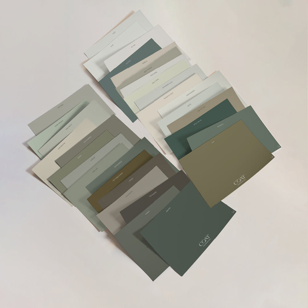
It was in this spirit that I approached choosing the colours for my home. I wasn't looking for a palette so much as a feeling, the feeling of every place I have loved, translated into the walls of a home. Shop Lily's palette here.

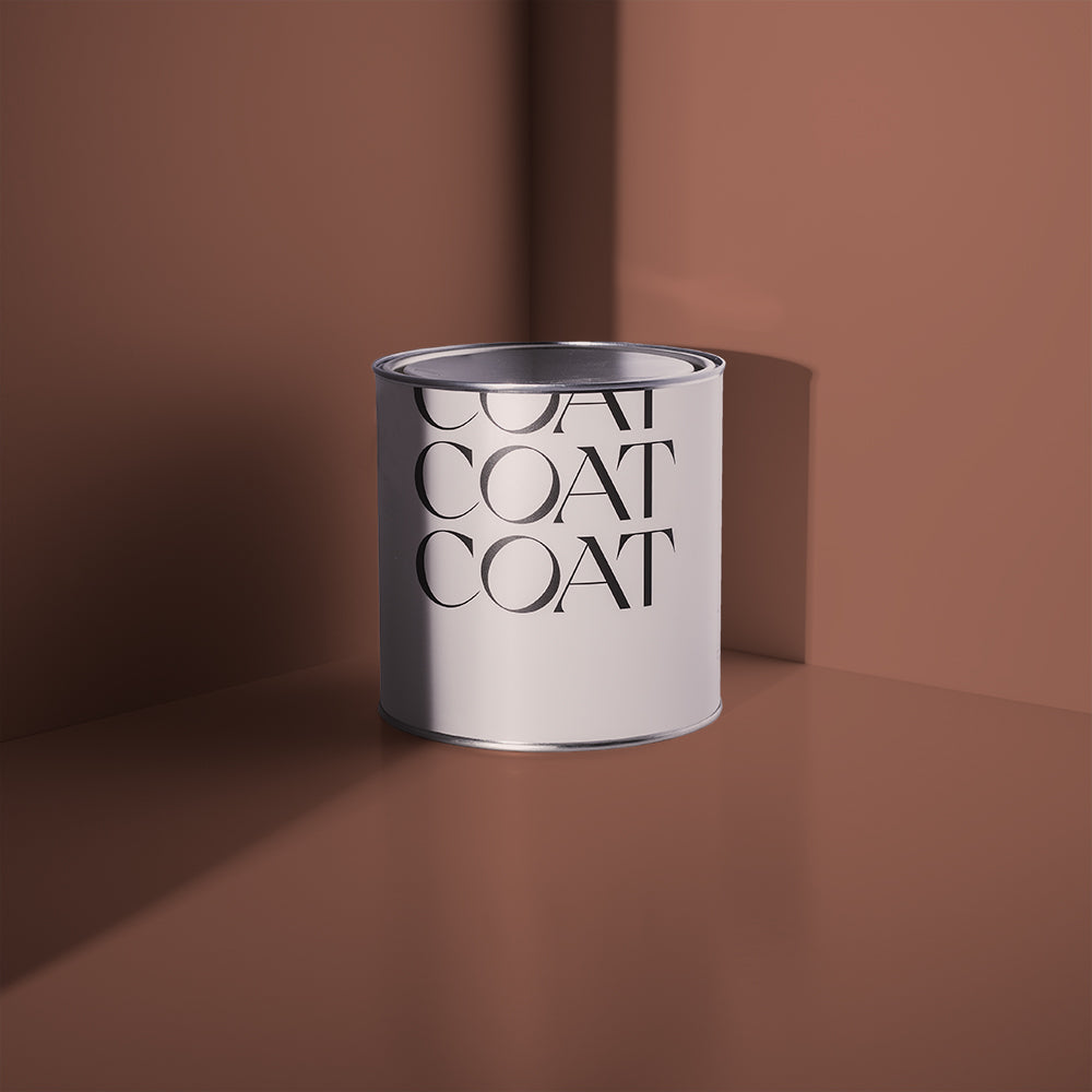
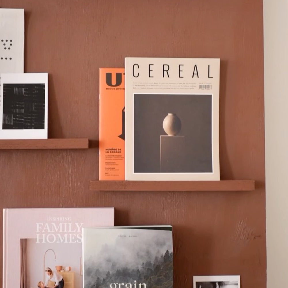
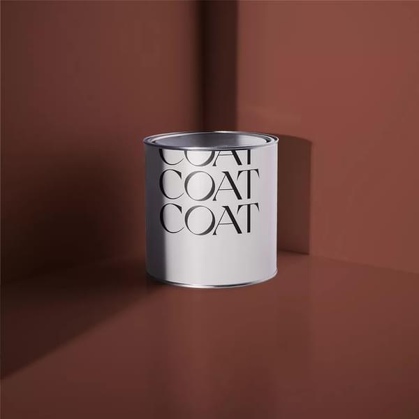
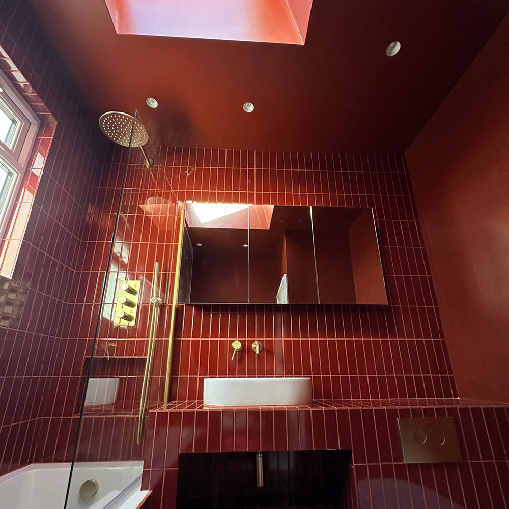
Wilderness Hill was the first to feel right. That deep, rich red. I started testing it on our garden shed and I haven't been able to stop looking at it against the green of the garden. It is Dominica. It is Cornwall. It is that contrast I have been chasing my whole life.

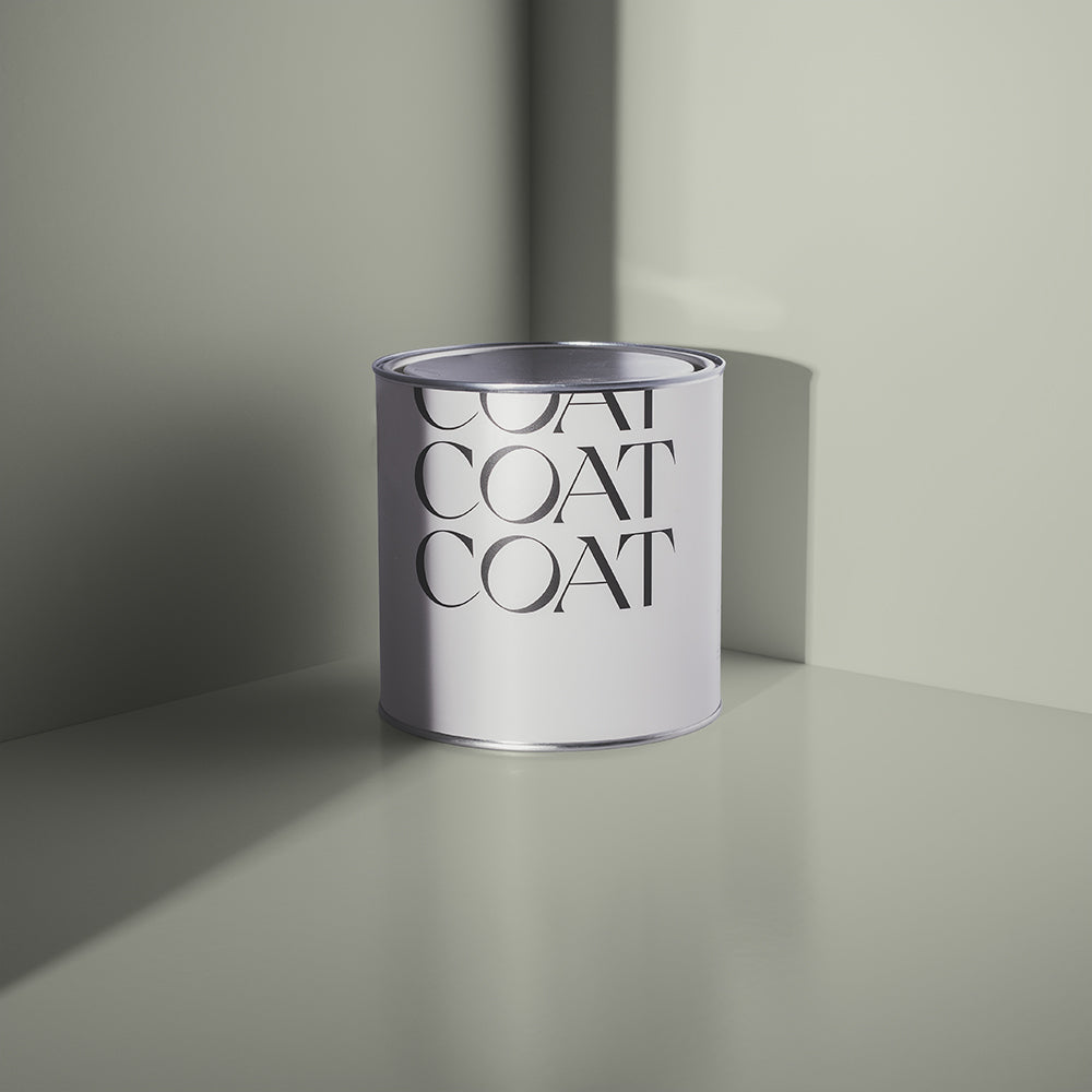
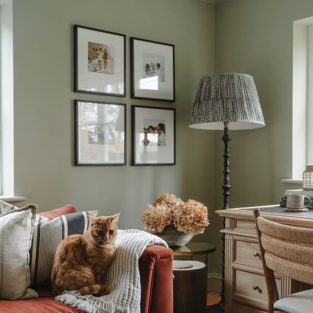
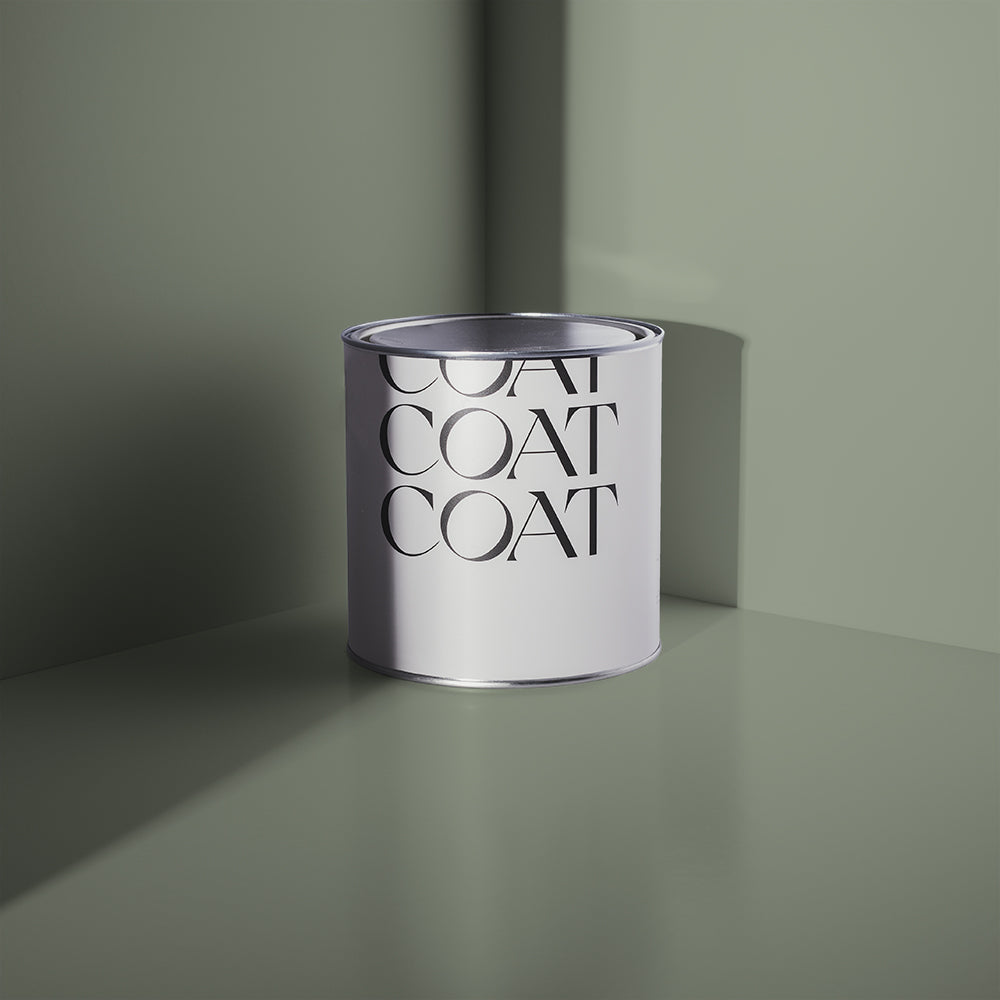
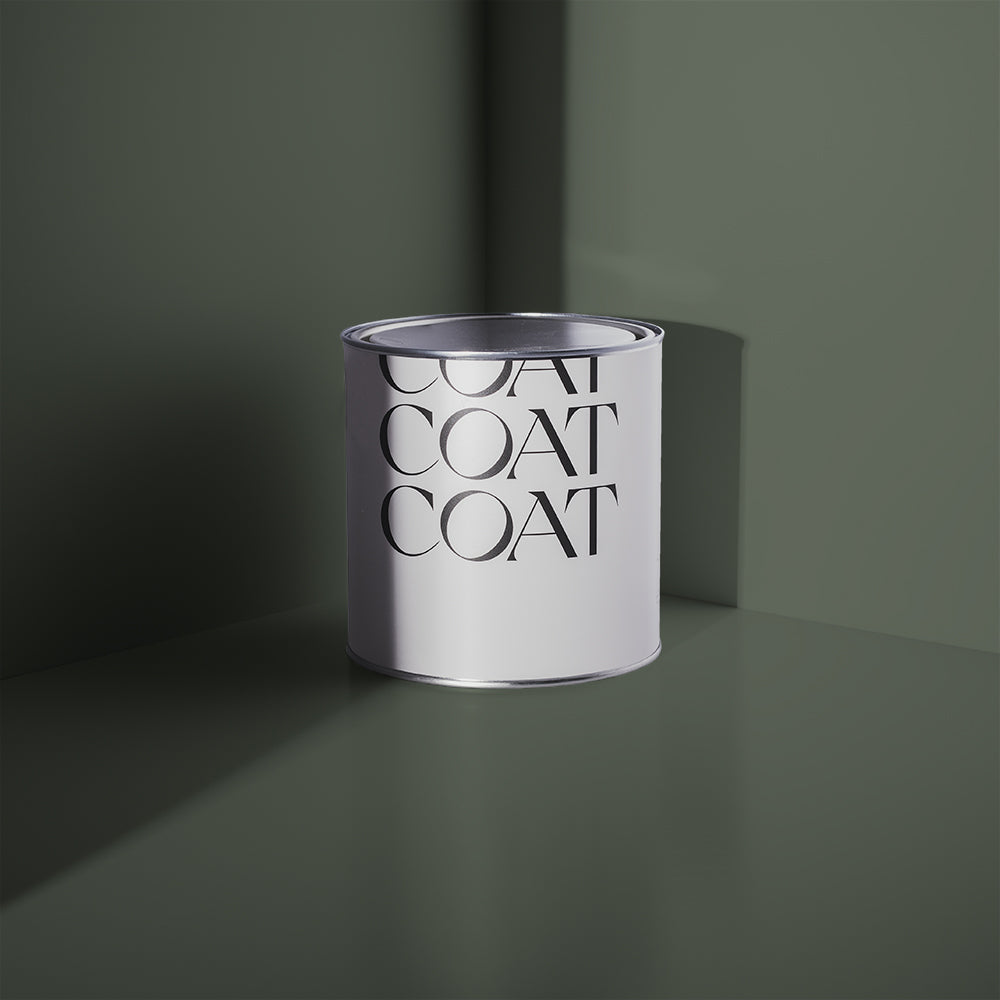
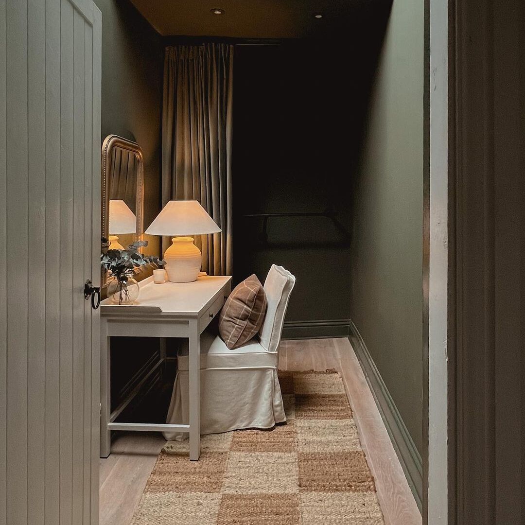
Nourish I chose because I love green, have always loved green, and because our boiler cupboard door is the first thing you see when you walk into the kitchen. I wanted it to feel like a third window. Our kitchen already looks out to a fig tree on one side and the back garden on the other, all trees and plants and living things pressing up against the glass. Nourish carries that outside in.

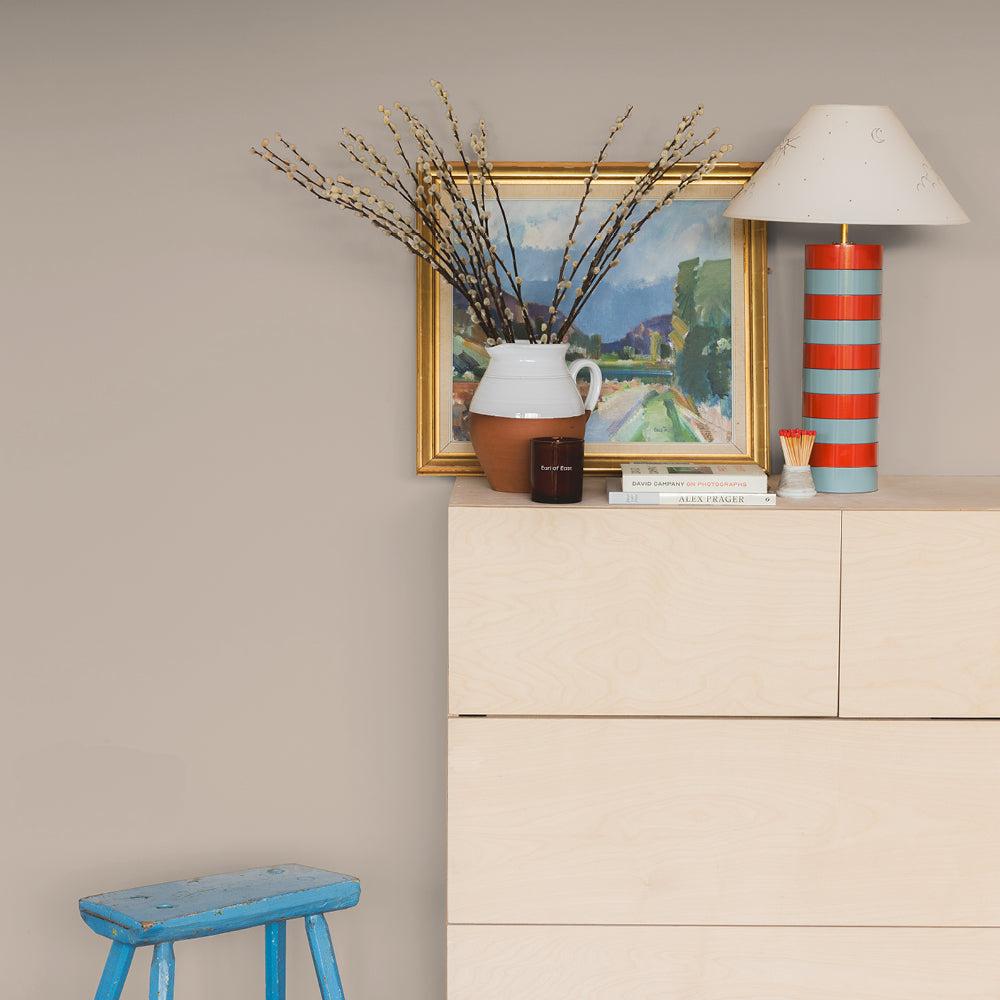
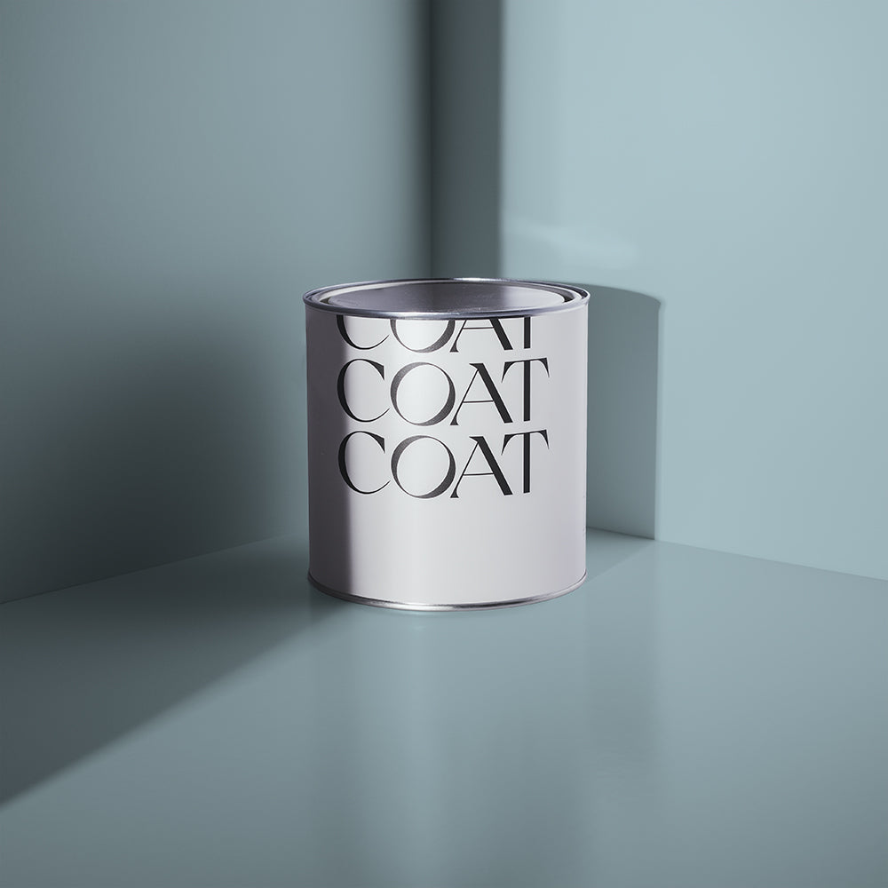
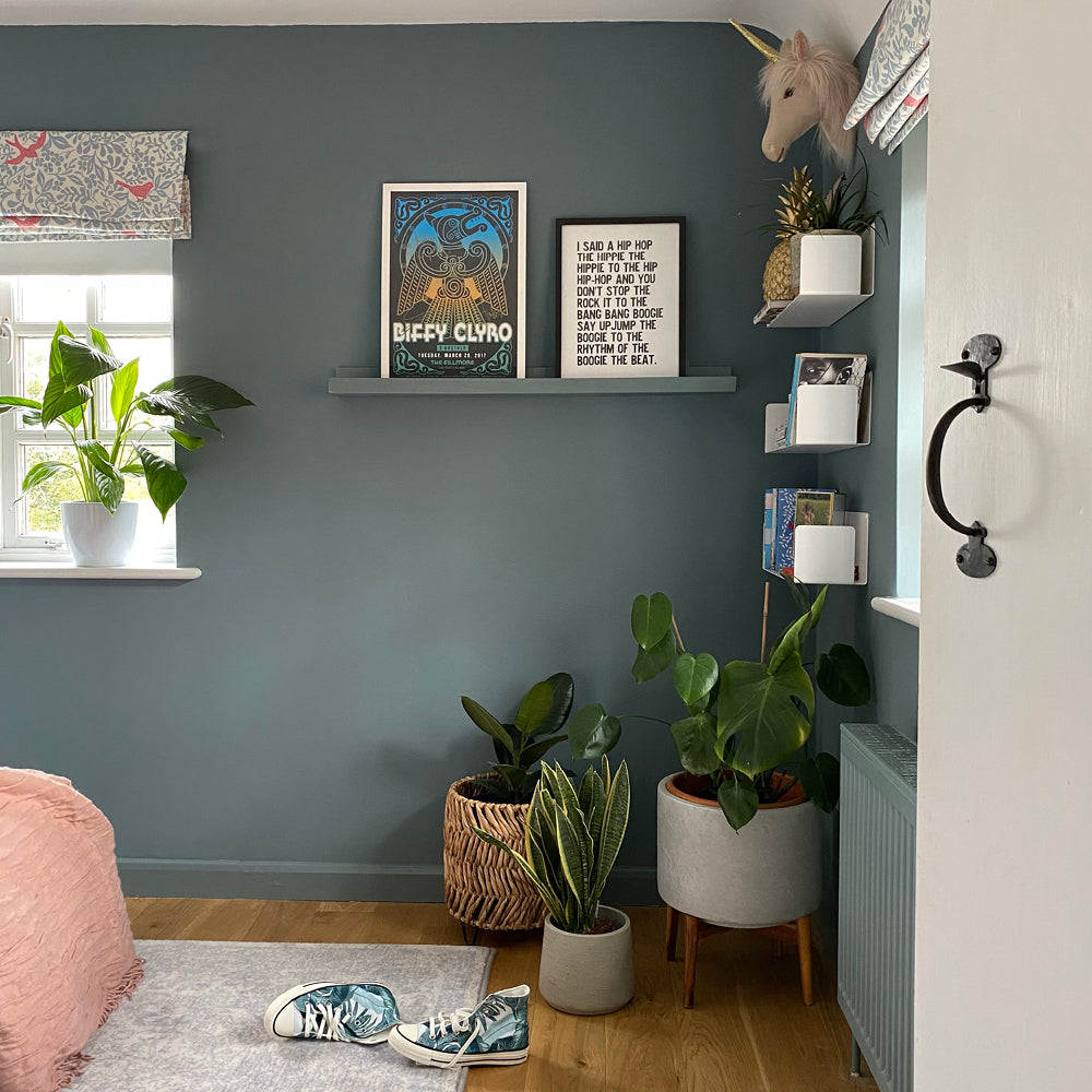
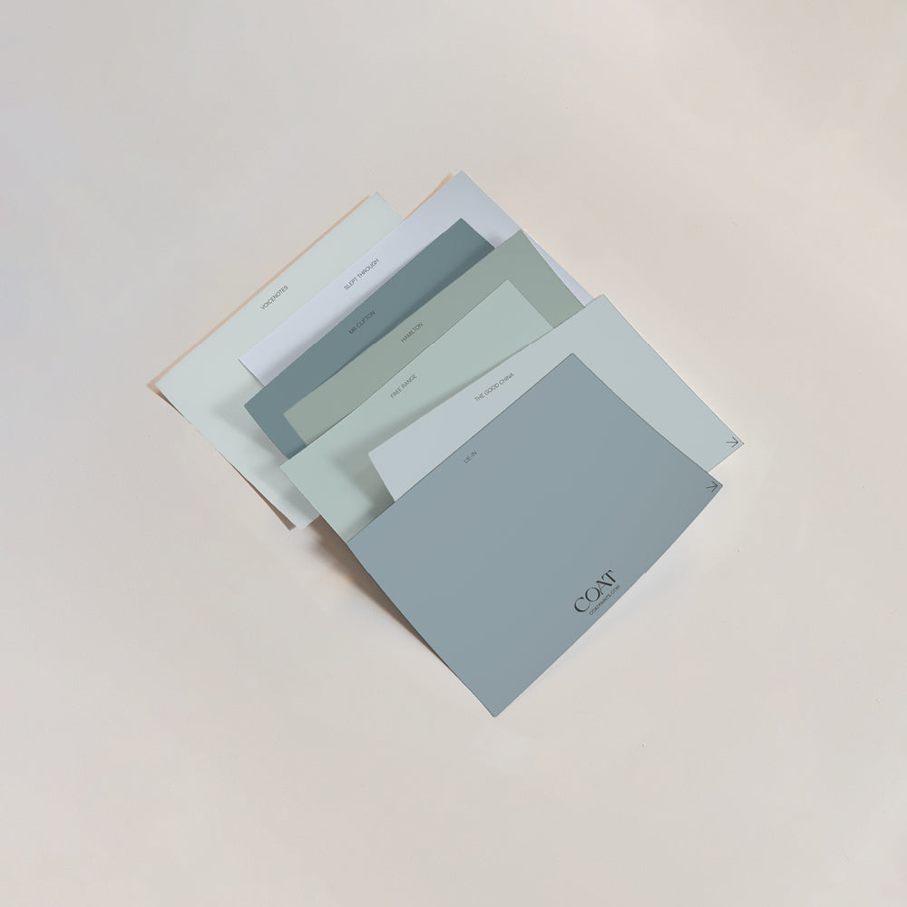
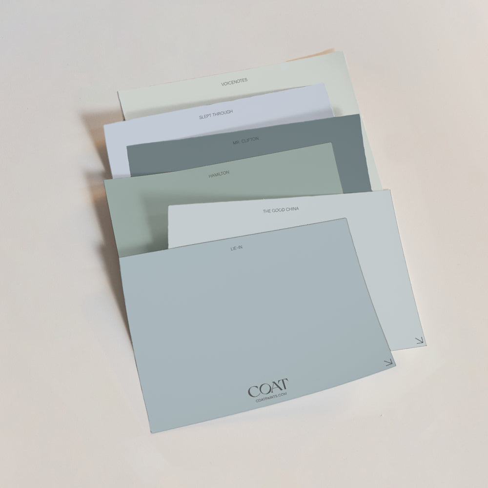
Lie-In is blue and it makes me happy every time I look at it. Our kitchen sits in a darker corner of the house and I wanted something that would lift it, something joyful and unexpected. It ties in beautifully with a landscape painting I picked up in a Penzance antique shop and one of my own film photographs from a coastal walk in West Cornwall. The whole corner has become its own little world.

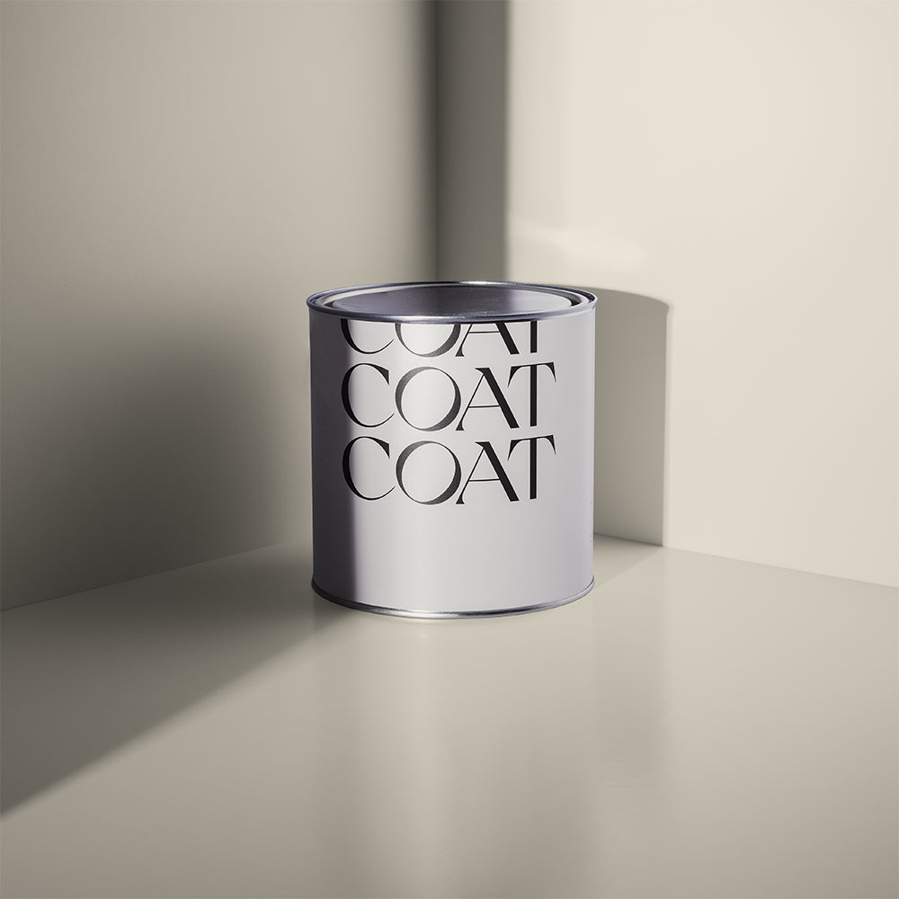
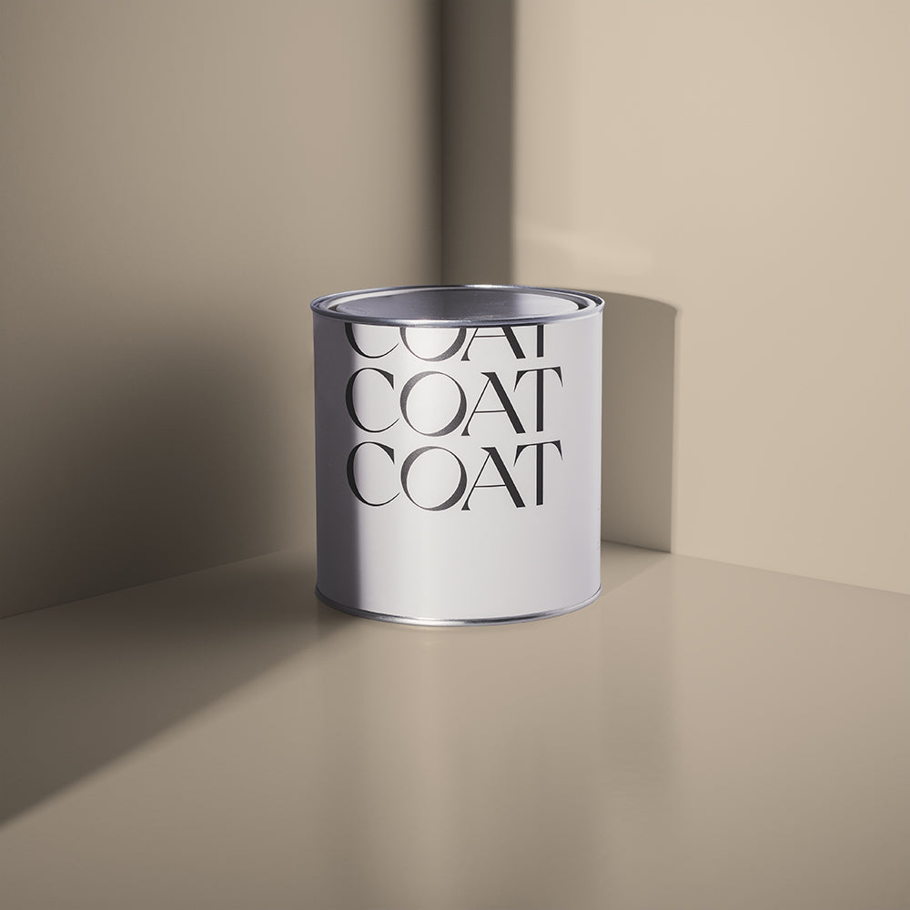
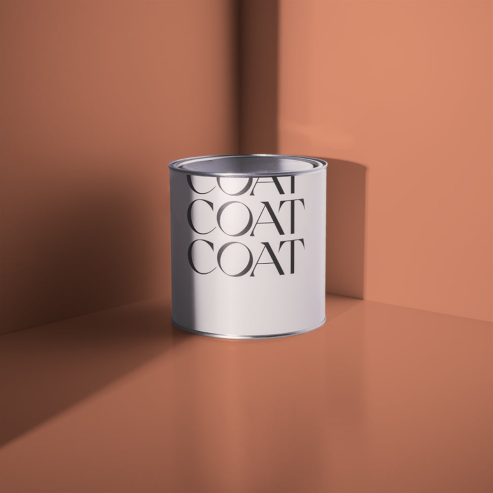
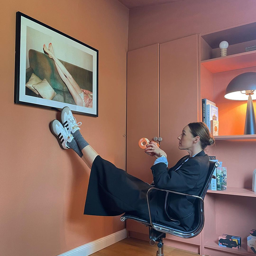
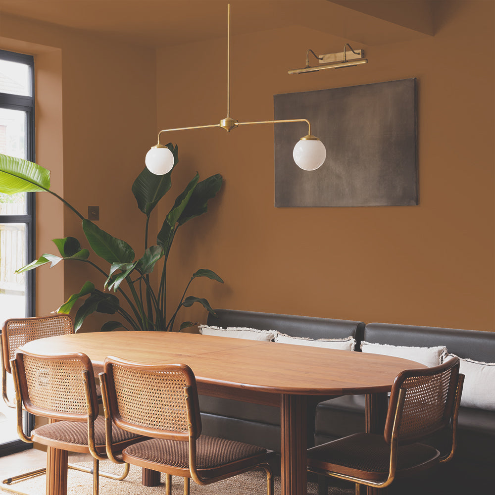
Brasserie Brown I would never have chosen myself. It was suggested by COAT who told me it would work with the darkness of the kitchen and bring warmth to the space. They were right. I think of it as a nature colour, the brown of soil, of bark, of the fig tree outside the window. It grounds everything.

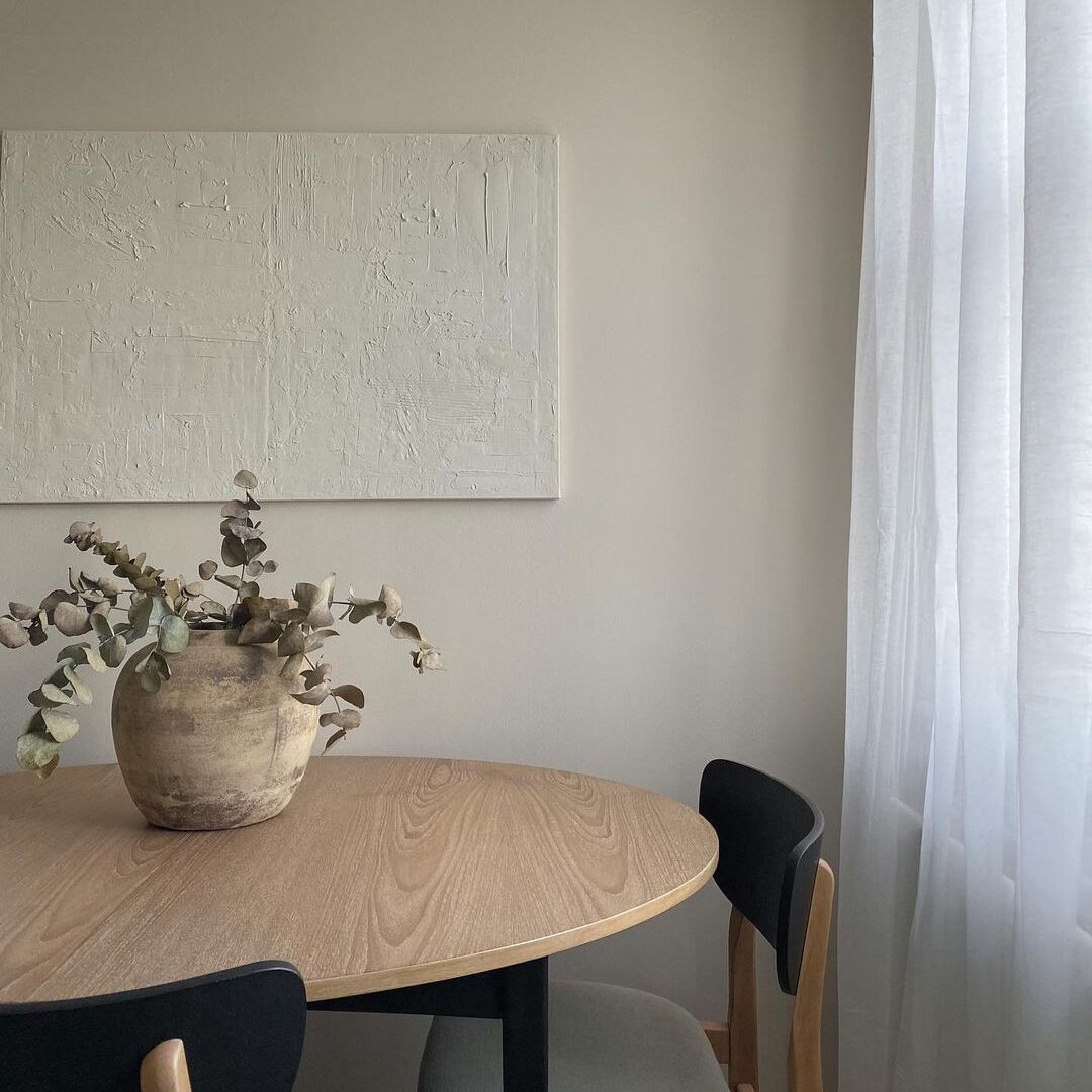
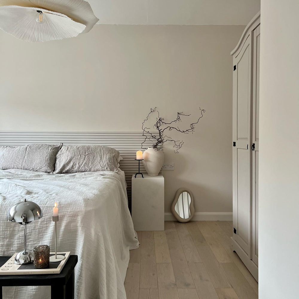
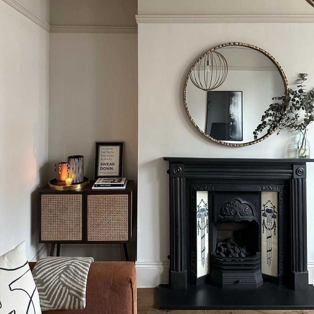
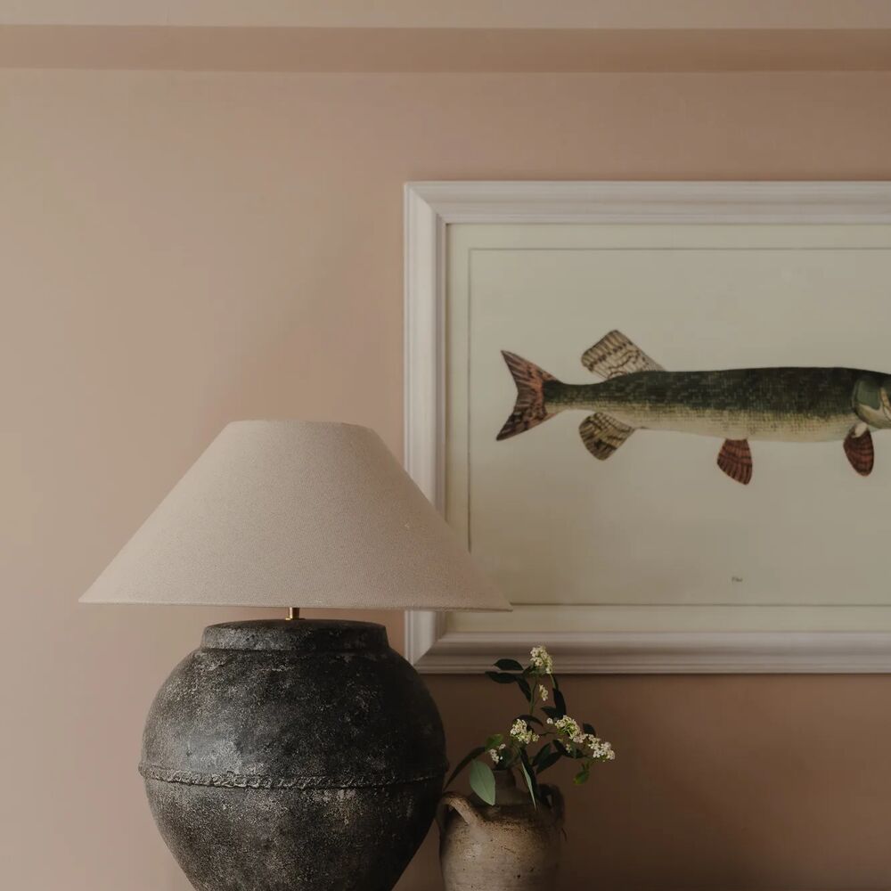
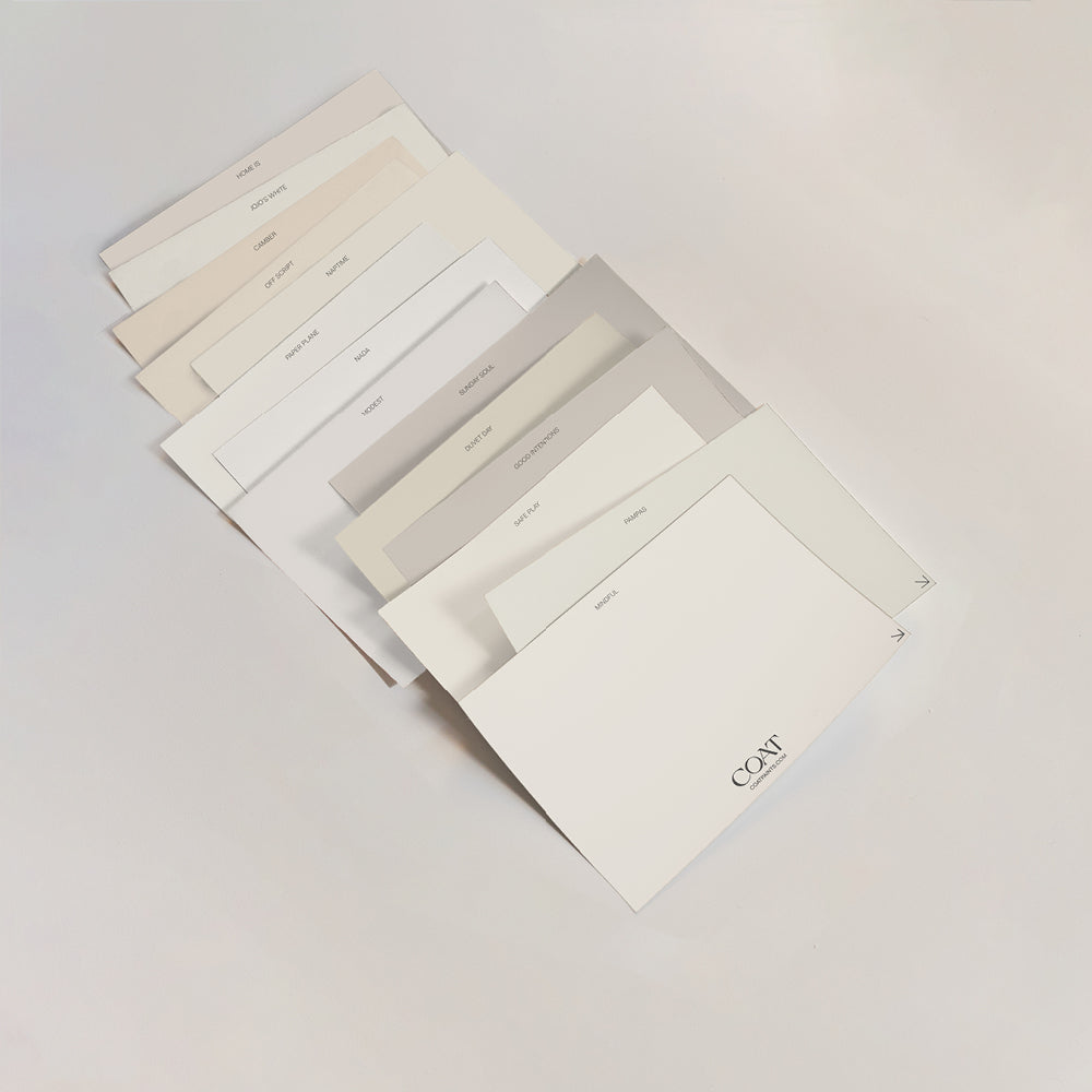
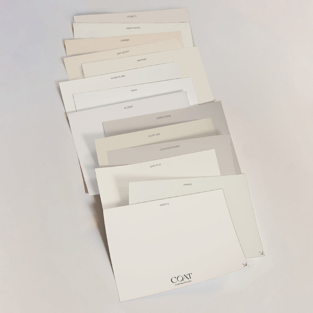
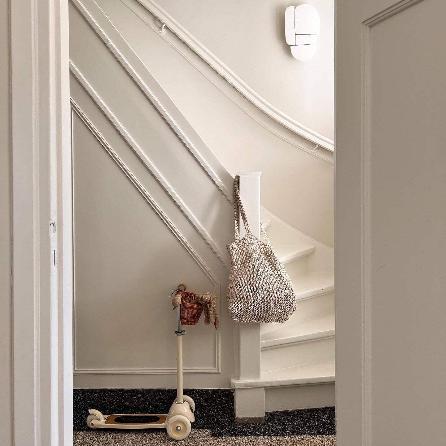
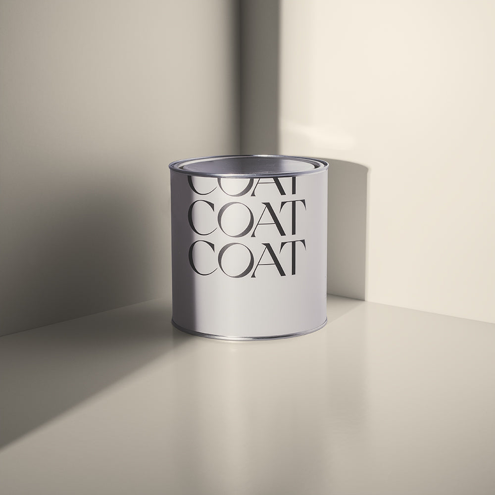
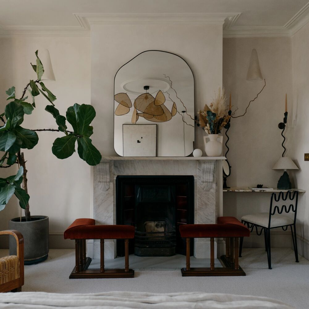
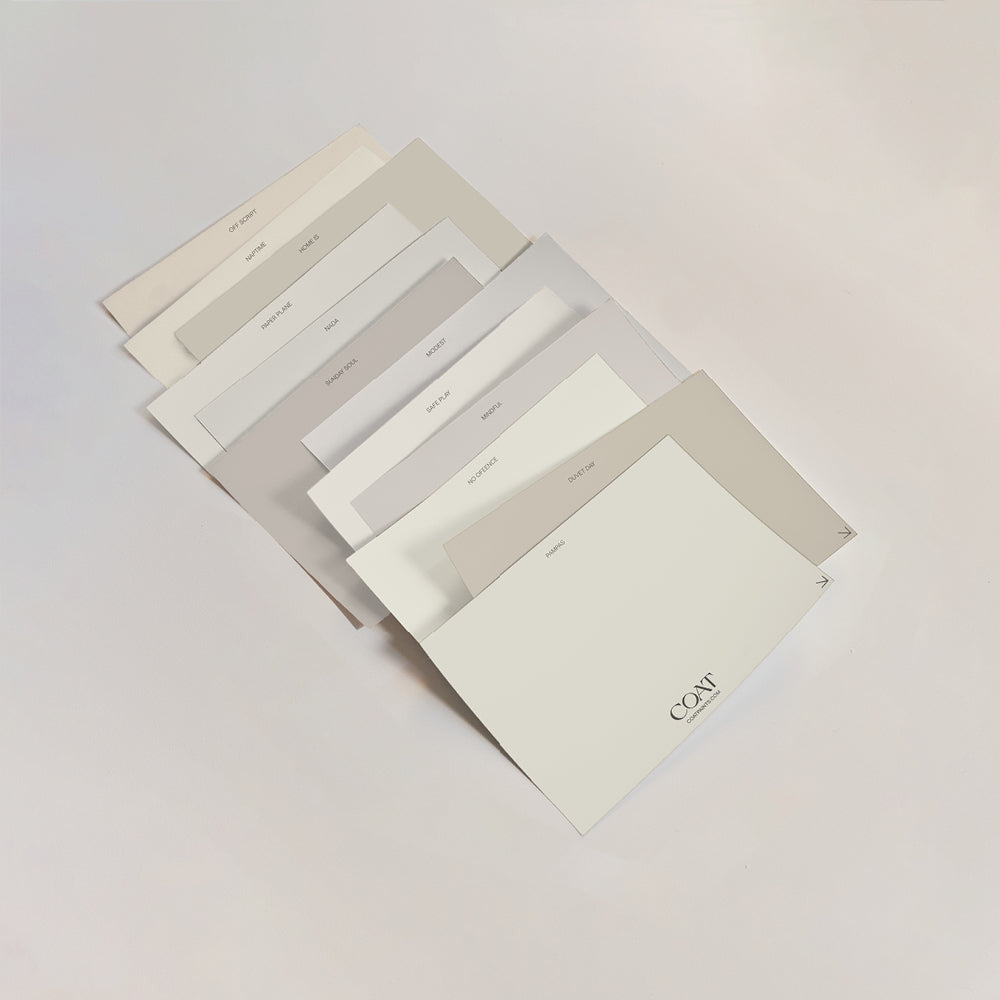
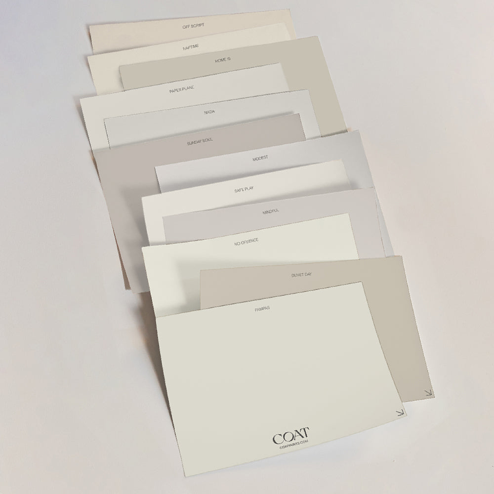
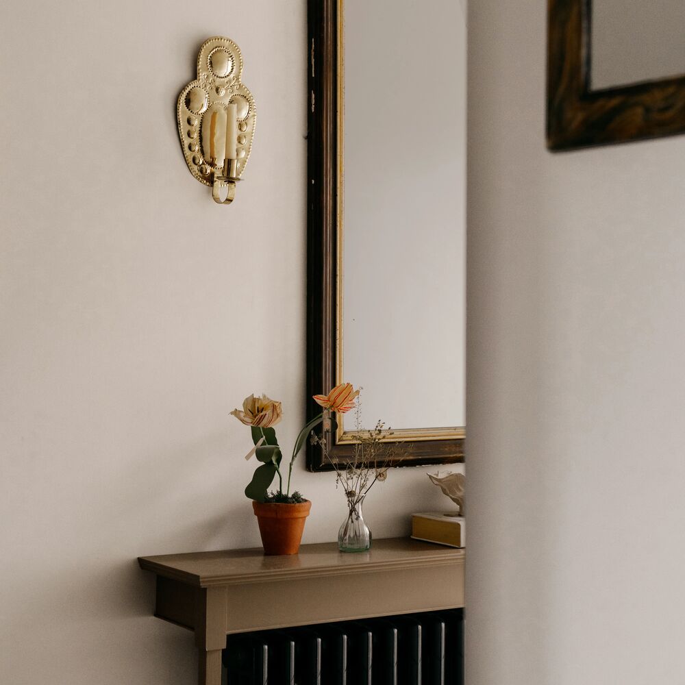
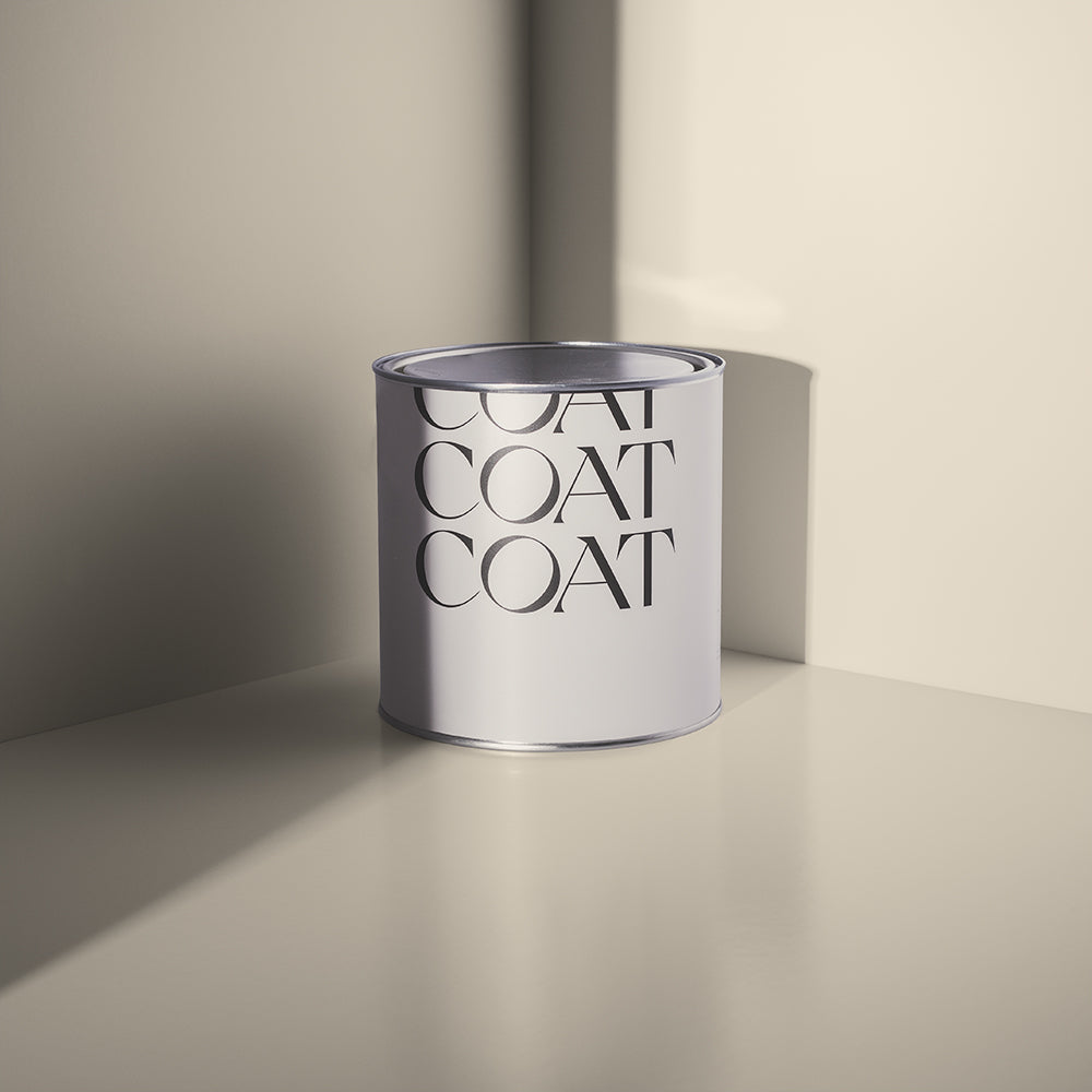
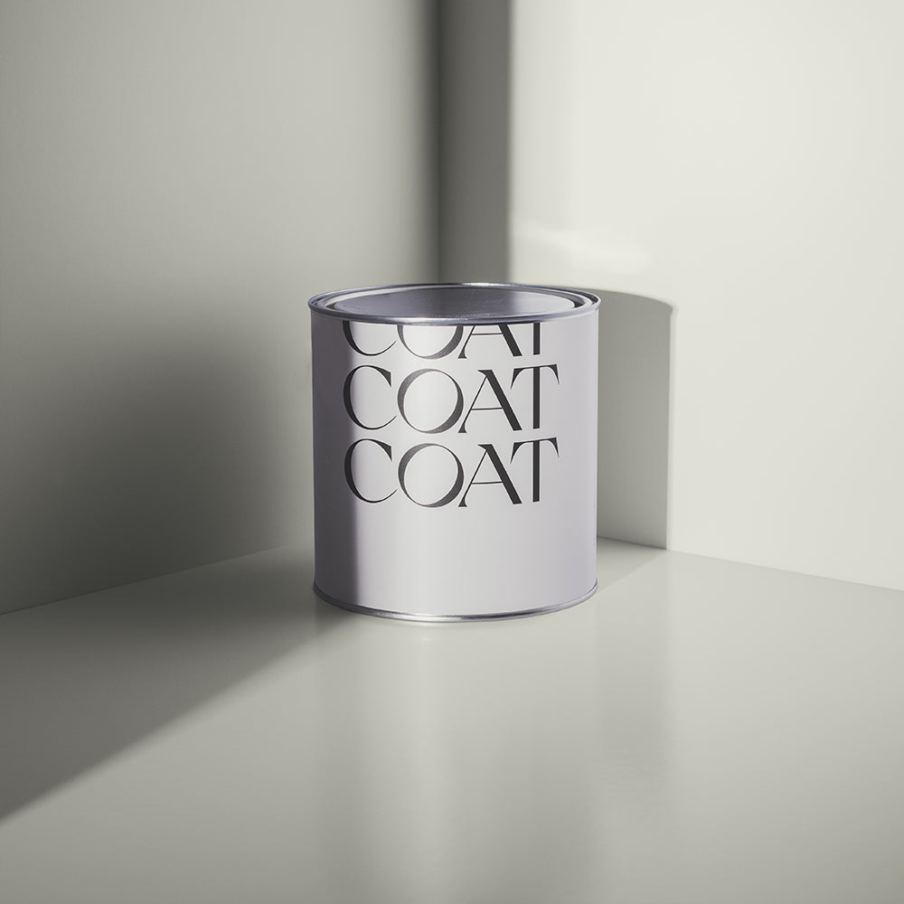
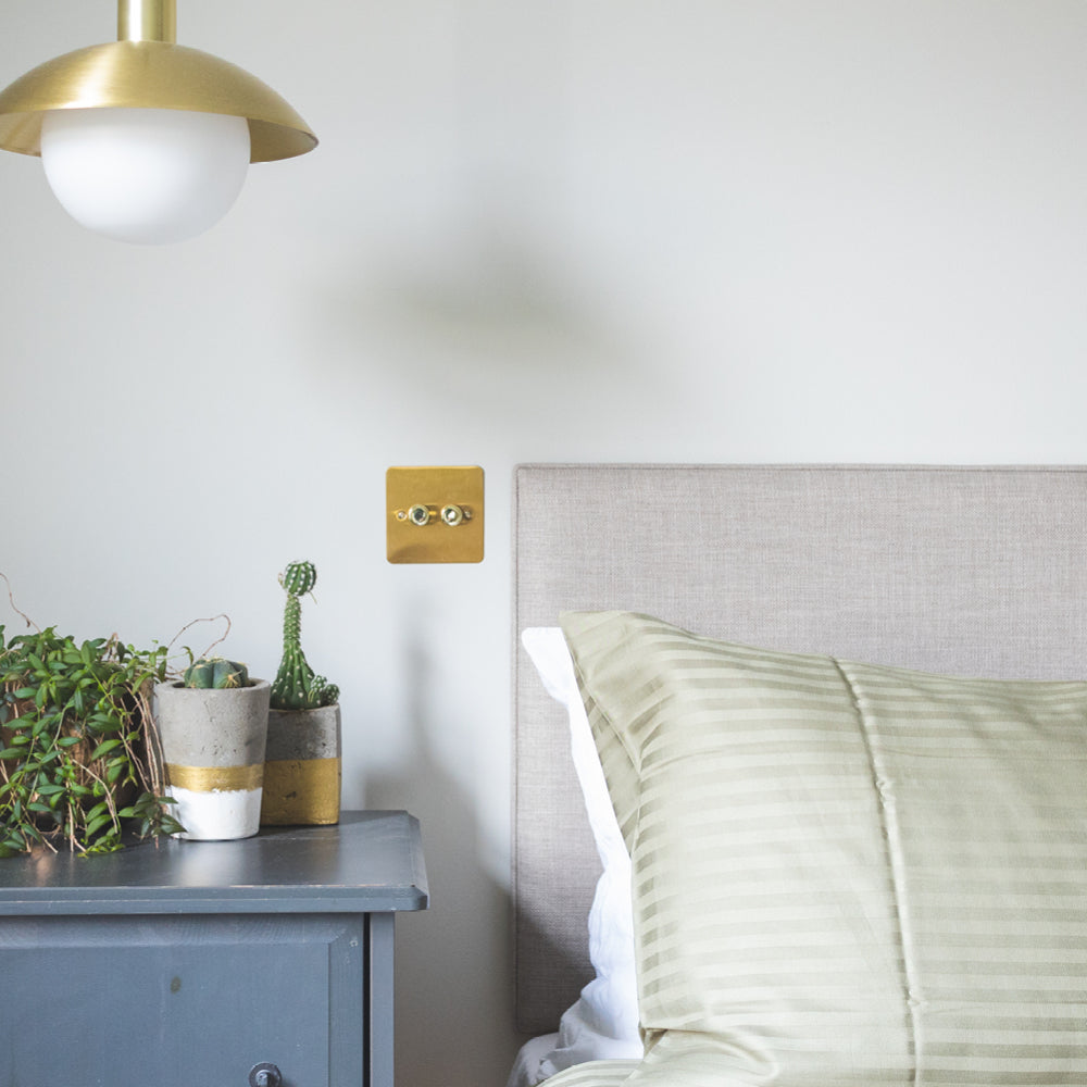
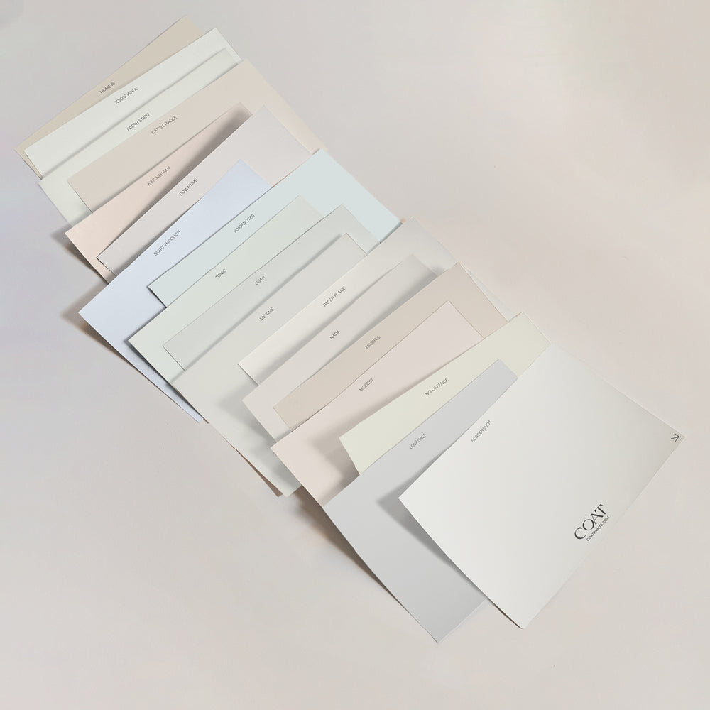
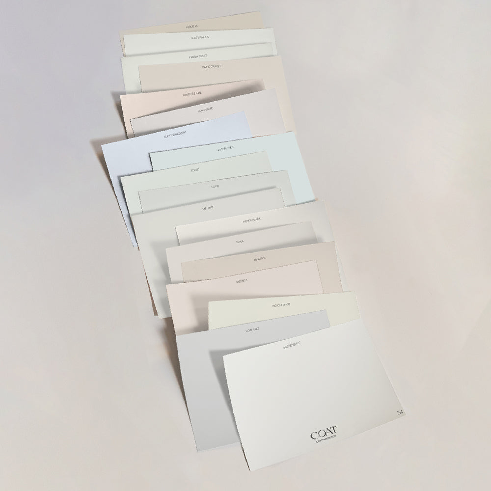
Nada is the quietest of all my choices and perhaps the most important. A soft, creamy white, not pure white, which can feel cold and sharp, but something warmer and calmer. It sits around the wooden furniture and my framed photographs and simply lets everything breathe.

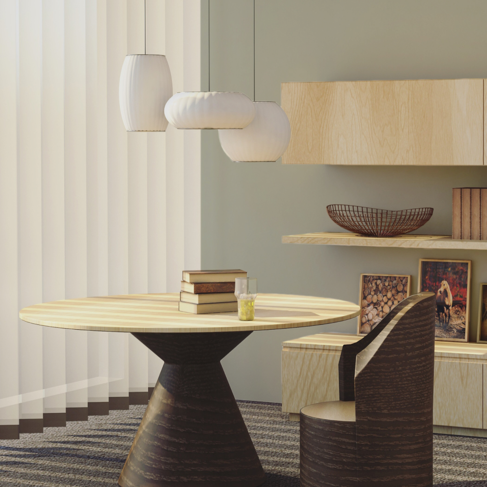
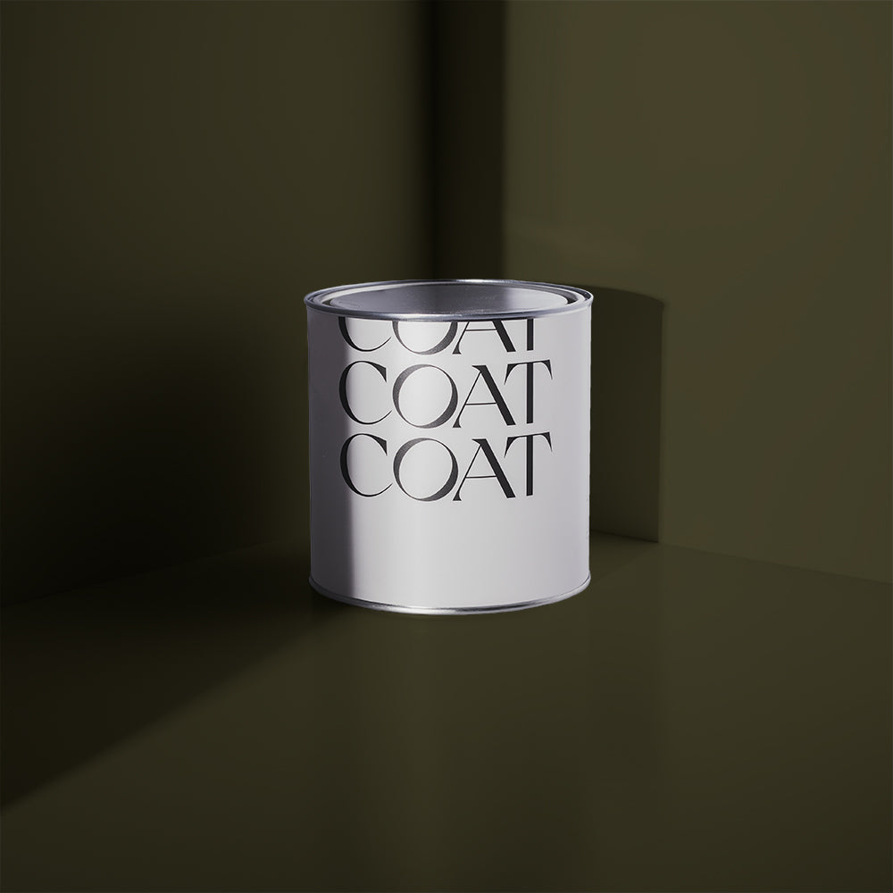
Jonah is for the outside. Our little outdoor loo sits next to the fig tree in the garden, and I wanted it to disappear into the landscape around it. A rich olive green that blends with the foliage and the earth, it feels like it has always been there. Next to the Wilderness Hill red on the door, the two together are pure Dominica, bold, natural and full of life.

Choosing colours for a home is not so different from choosing what to photograph. You are always asking the same question: what do I want to hold onto? What do I want to remember? These colours are, in their own way, a portrait of everywhere I have ever been and everything I have ever loved and I cannot wait to live inside them. Shop Lily's palette.

Written and photographed by Lily Bertrand-Webb
Publish Date
Author