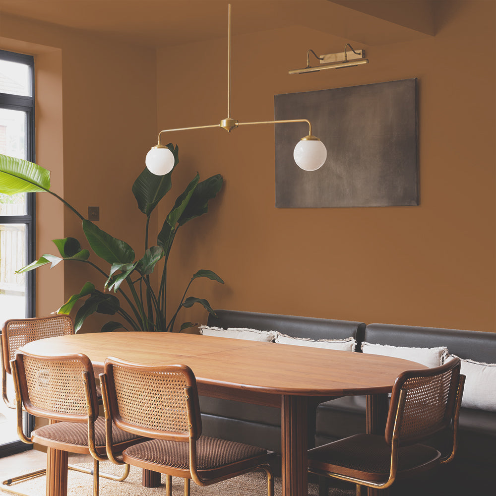
South-Facing Rooms: How to Handle Strong Light Without Washing Out Your Colour
A south-facing room is the one everyone wants, right up until the paint colour they loved online looks nothing like it did on screen.
Strong, direct sunlight is generous with light but not always kind to colour. Pale shades can bleach out and lose their character by midday. Bold, saturated colours can tip from confident into overwhelming. The room isn't the problem. The issue is choosing a colour without accounting for how much light it's about to receive.
Why South-Facing Light Is Different
South-facing rooms get direct sun for large parts of the day, and that light is warm and intense rather than flat. It's brilliant for a room's overall feel, but it puts real pressure on a paint colour. Pale neutrals can lose depth and start to look one-dimensional. Anything with a strong pigment can shift and intensify as the sun moves across the wall, sometimes dramatically between morning and afternoon.
The colours that hold up best in strong light tend to share one thing: enough pigment depth or a cool undertone to stop them washing out, without being so dark or saturated that they turn harsh under direct sun.
Our Recommendations
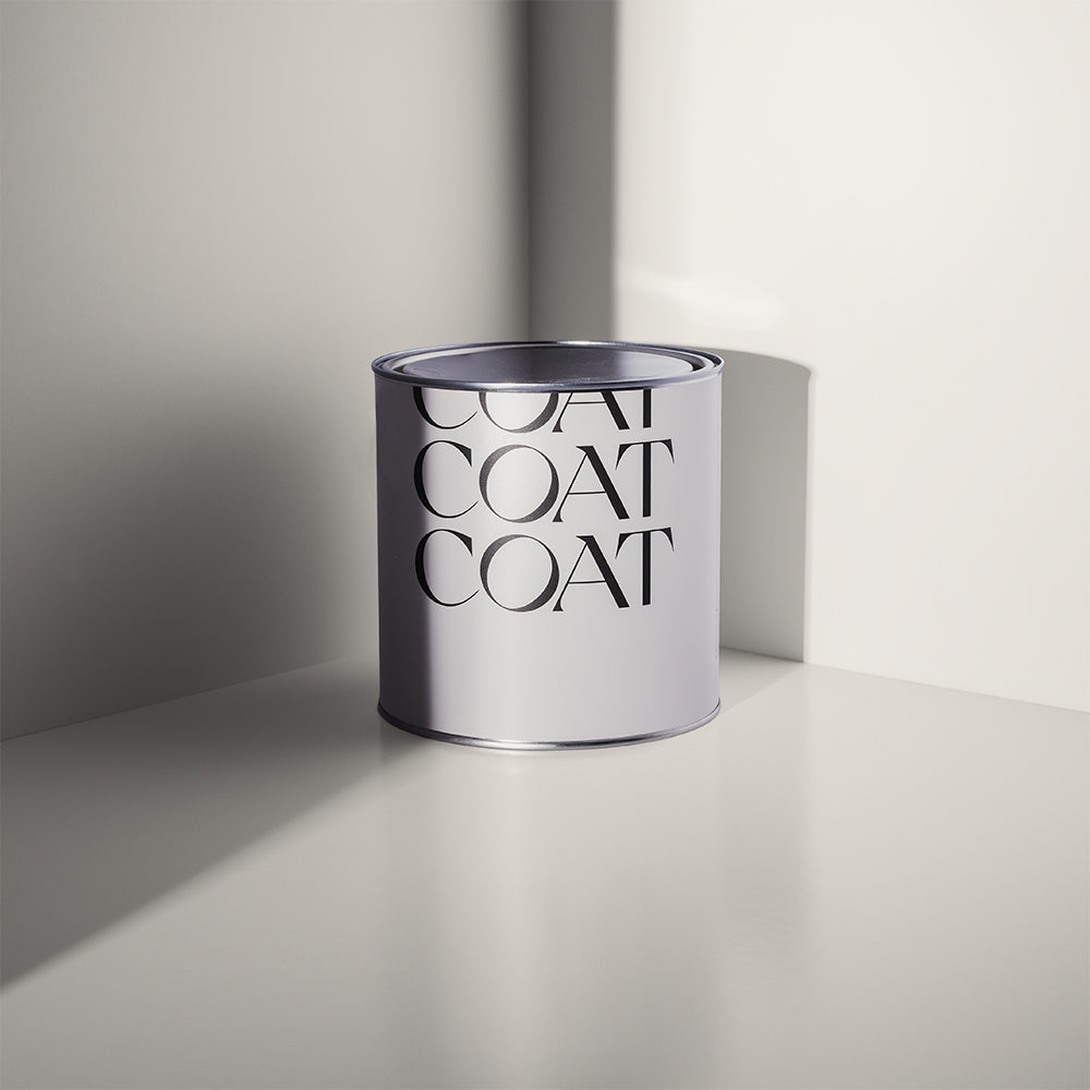
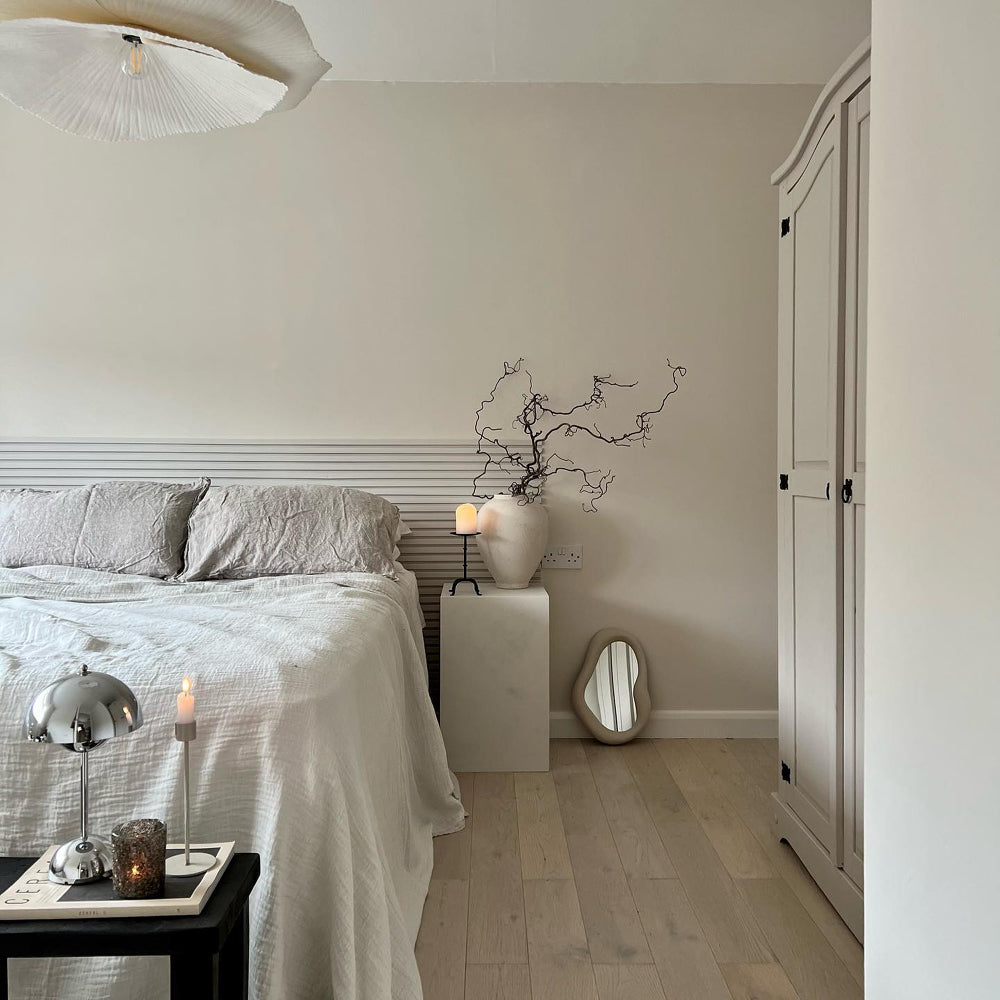
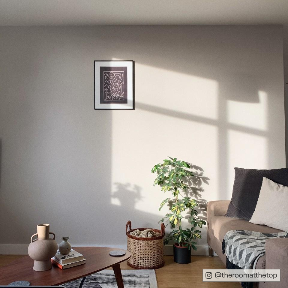
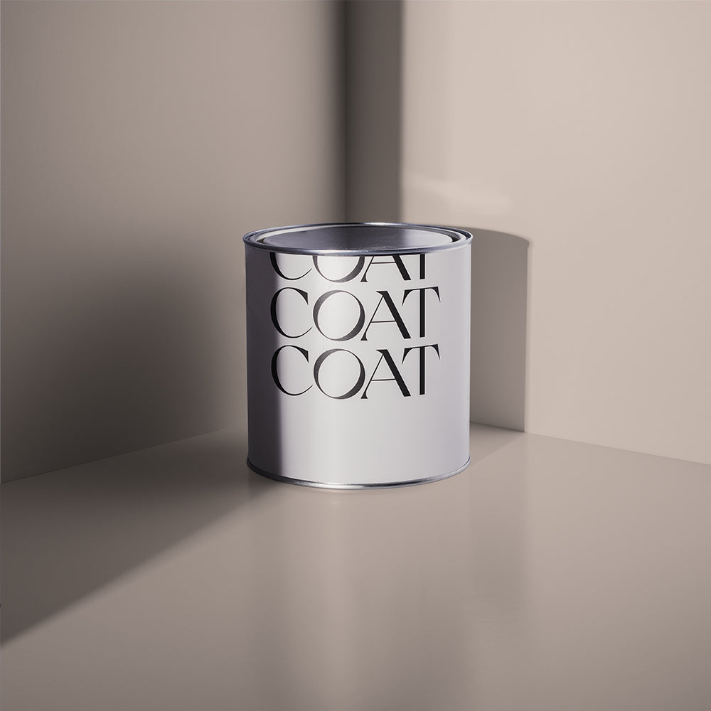
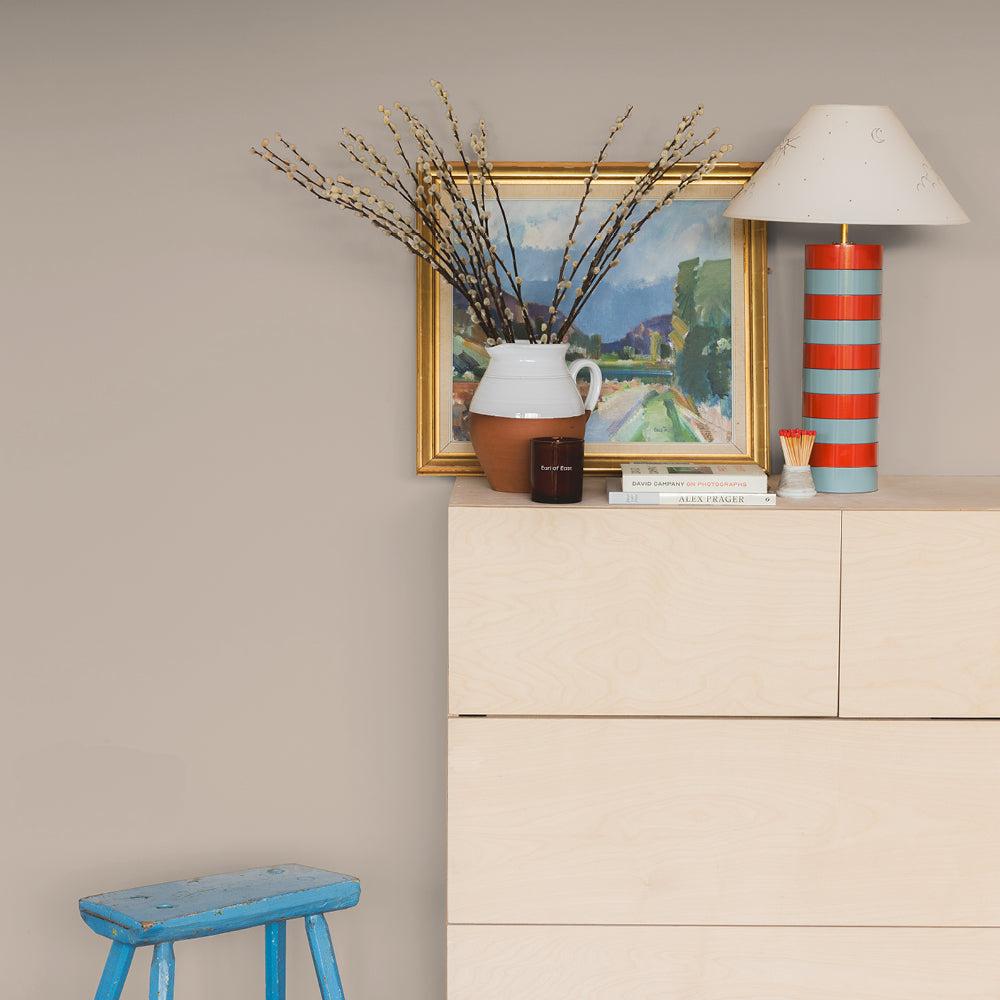
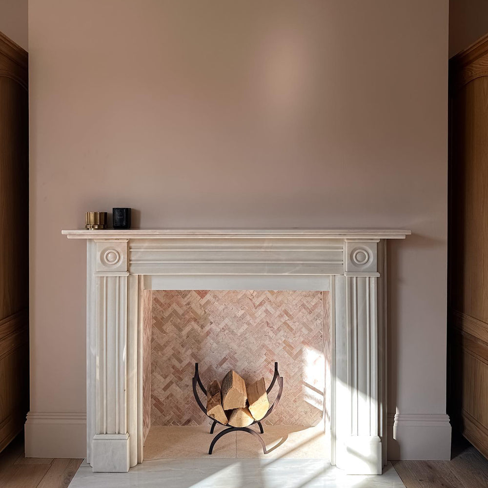
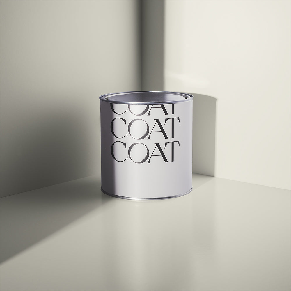
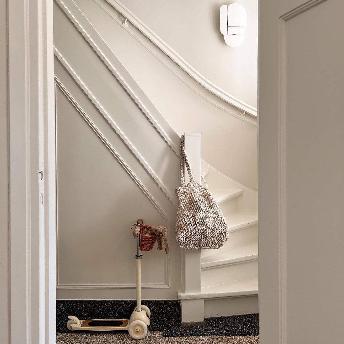
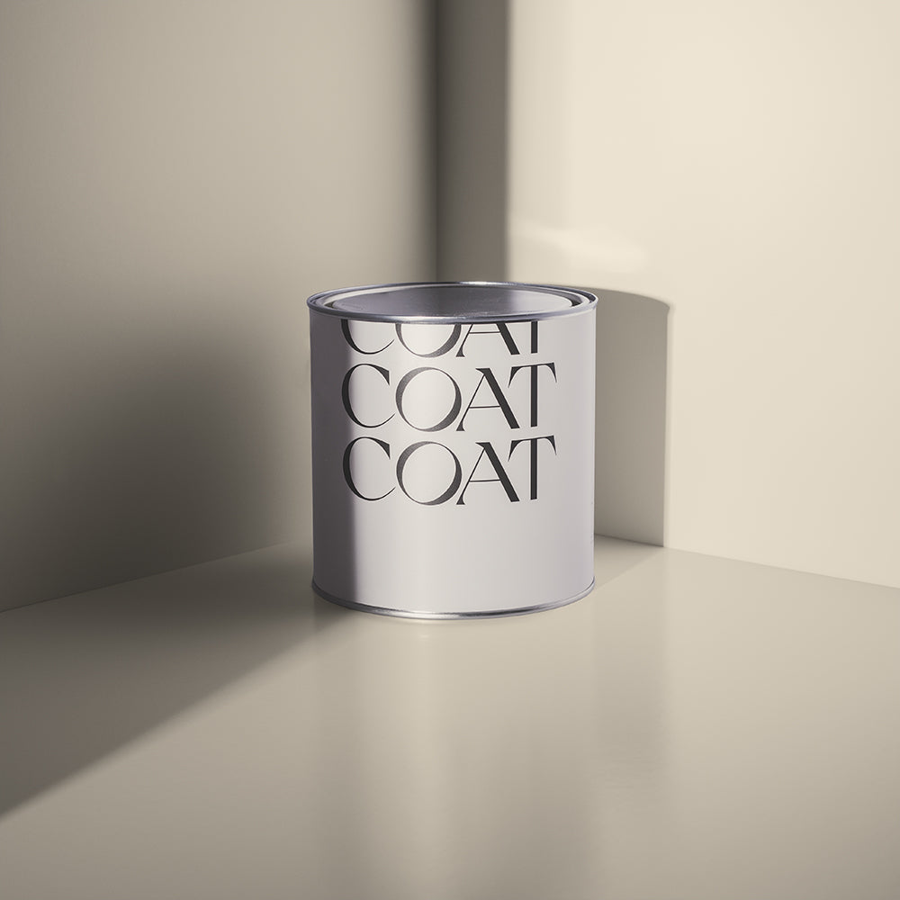
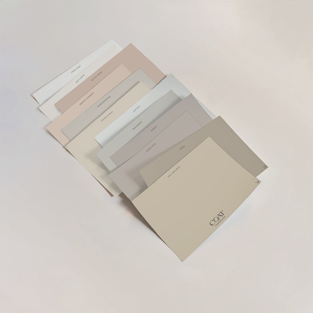
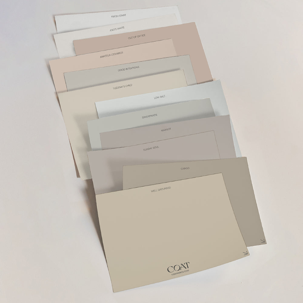
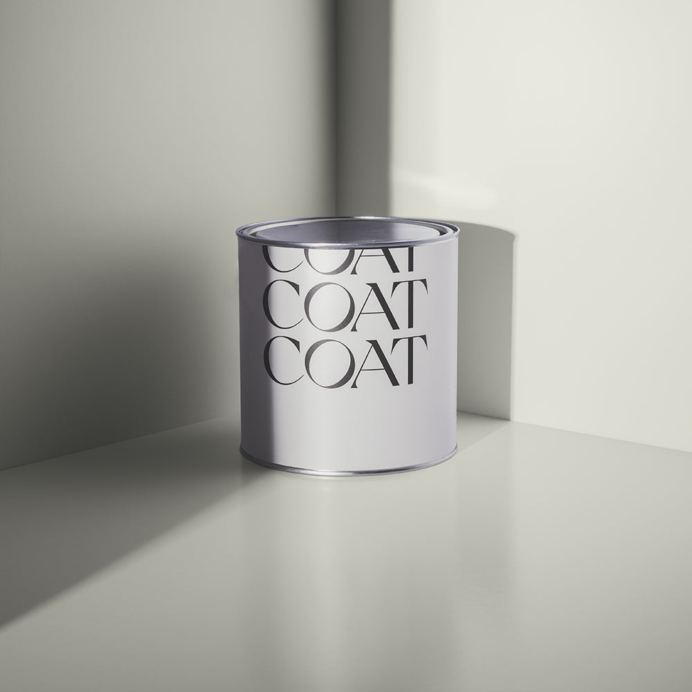
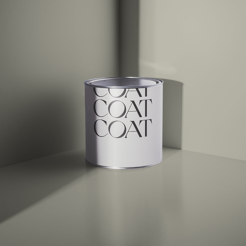
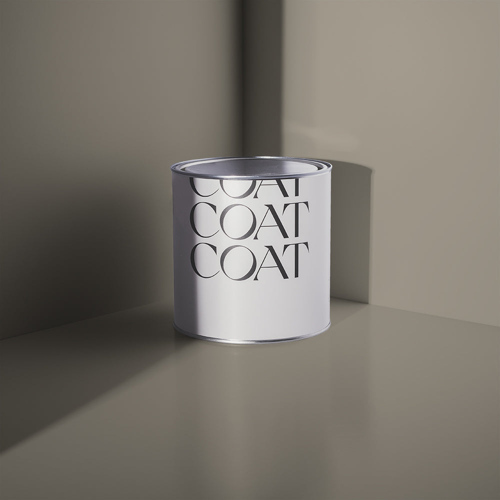
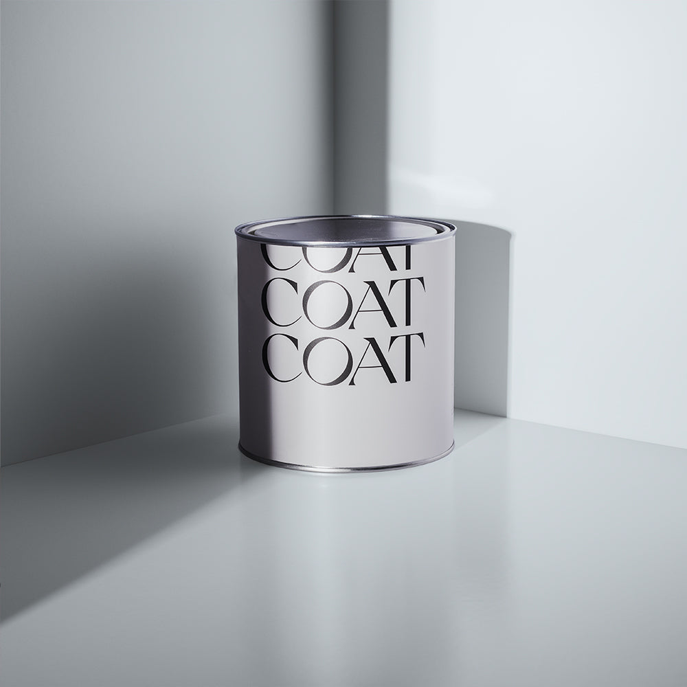
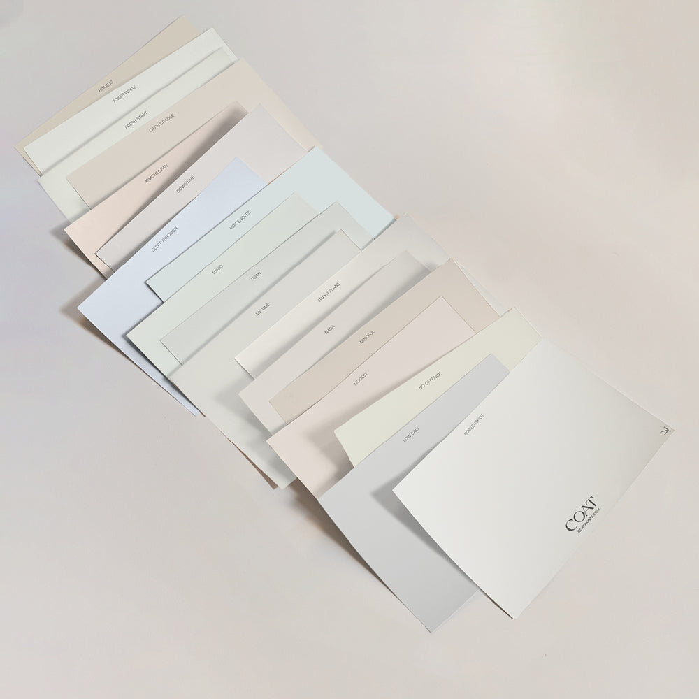
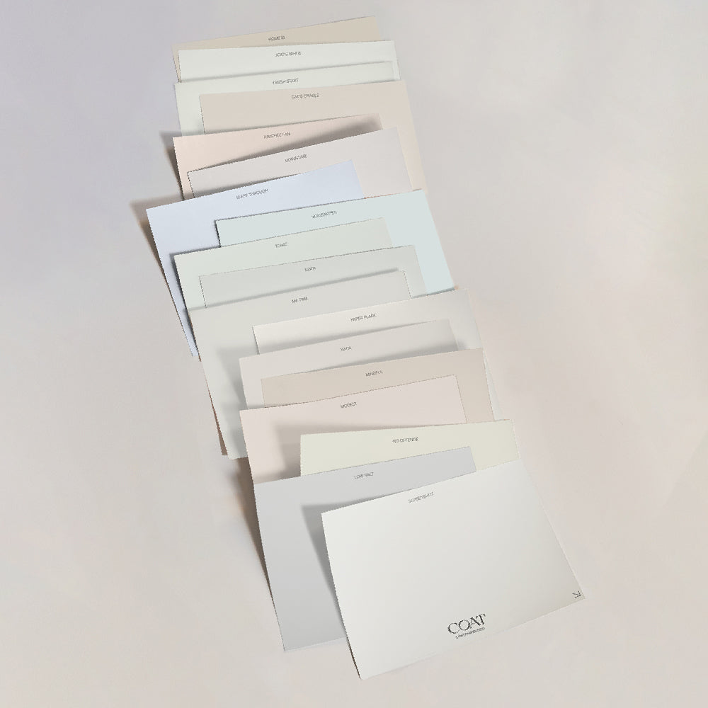
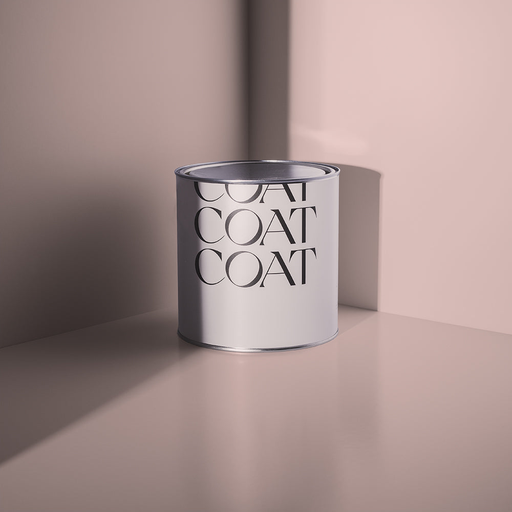
Low Salt (view Low Salt) is a grey off-white with just enough grey in the mix to stay composed under strong light. It's one of our bestselling neutrals, and it's a genuinely reliable choice for a bright south-facing room where a warmer white might start to look washed out by early afternoon.

Low Salt has just enough black pigment to refine harsher south-facing light.
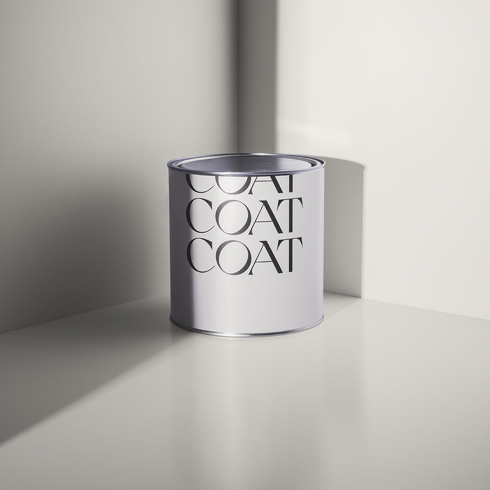
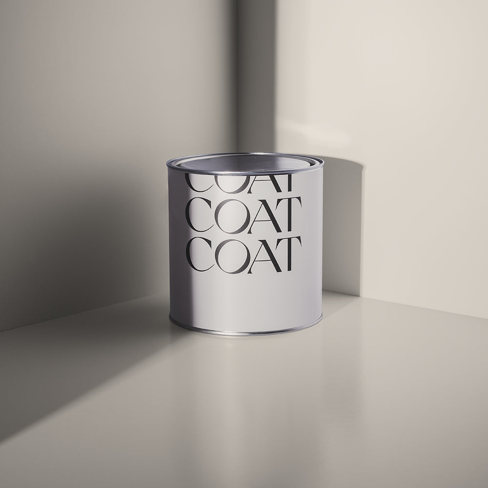
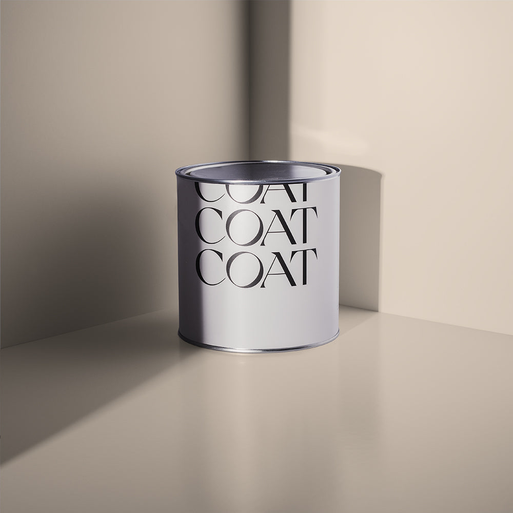
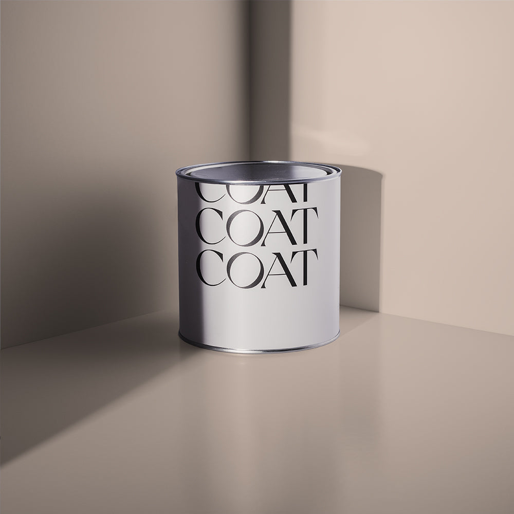
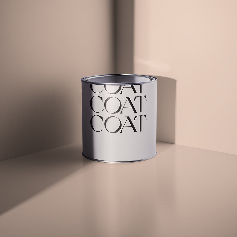
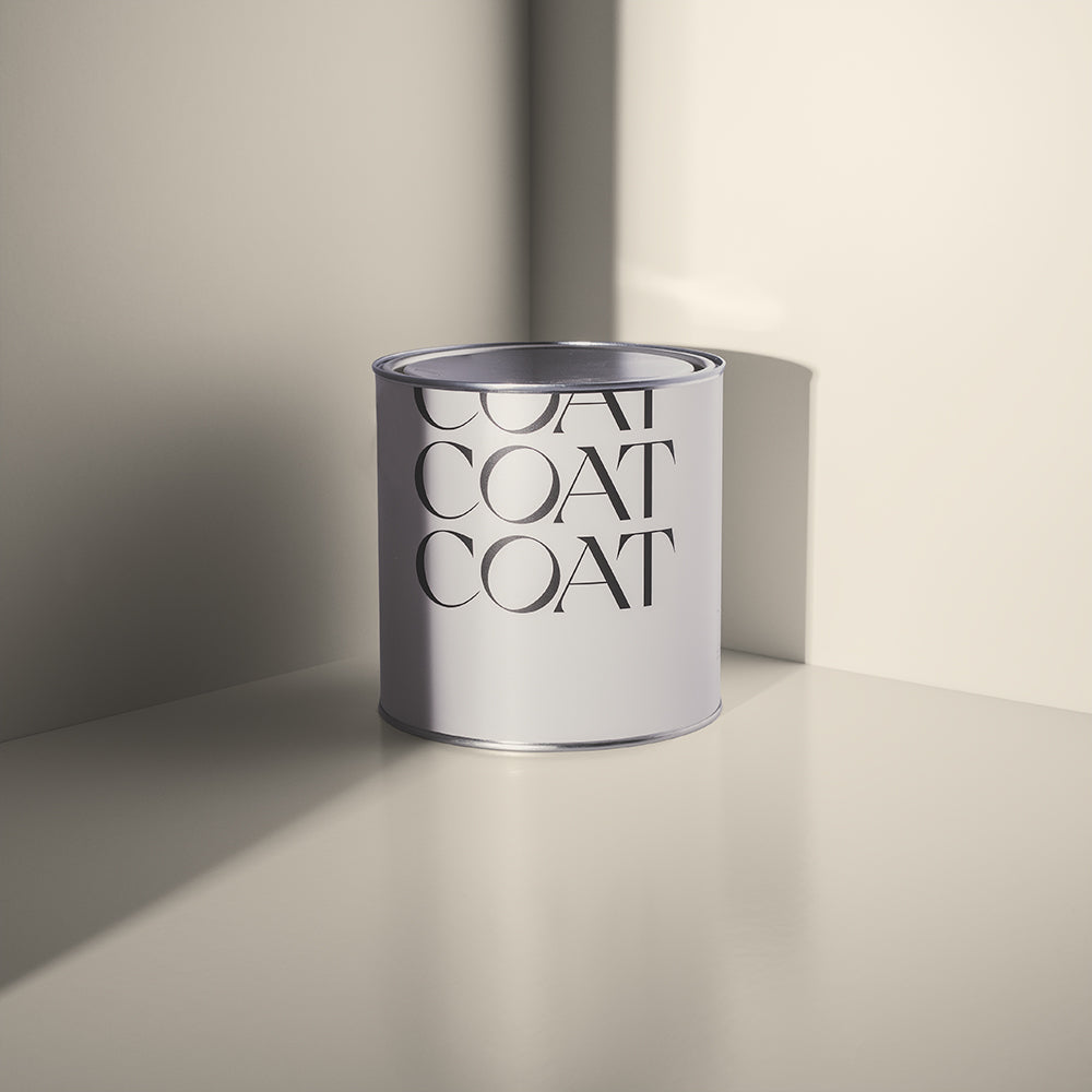
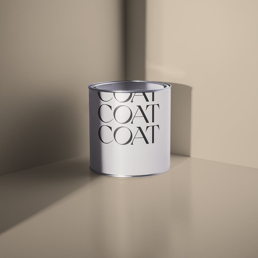
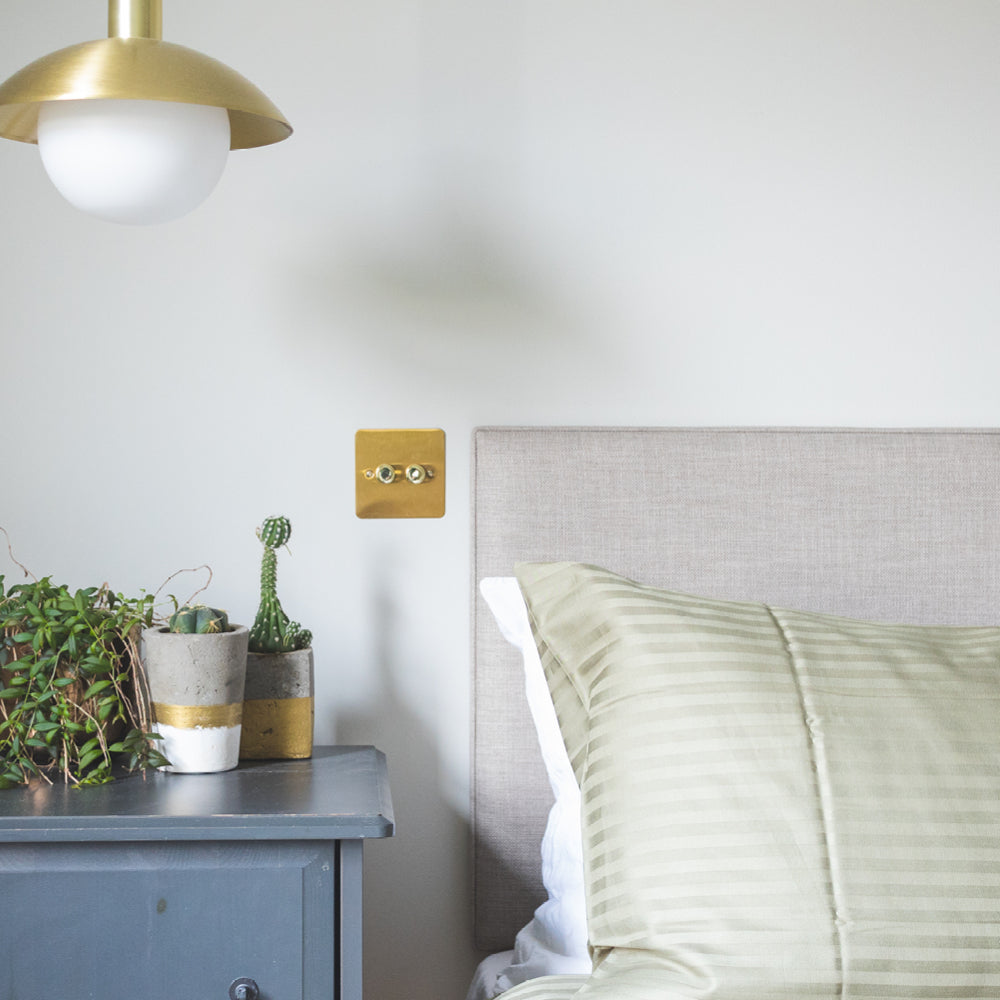
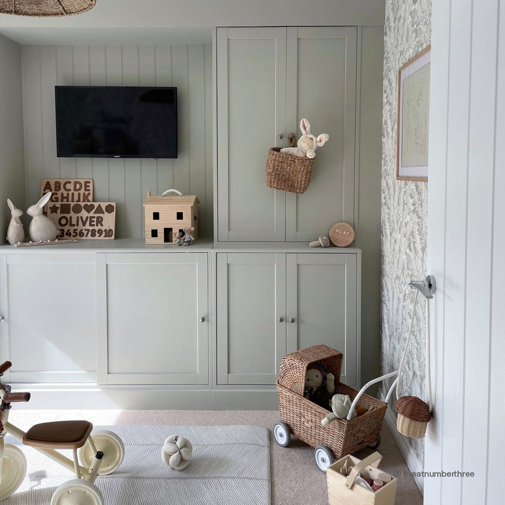
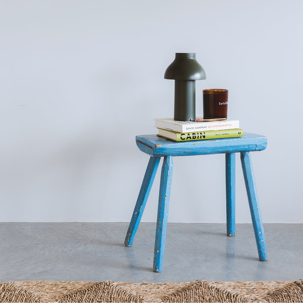
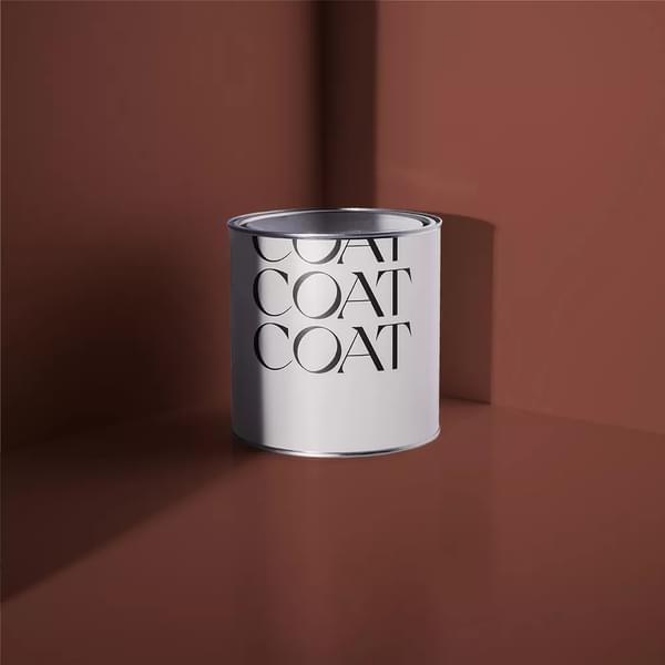
Screenshot (view Screenshot), our purest white, is simple enough to handle strong light without drama. It won't fight the sun or shift character through the day, which makes it a safe, confident choice for south-facing spaces that get a lot of light.

Screenshot is our purest white, with just the smallest touch of black pigment.
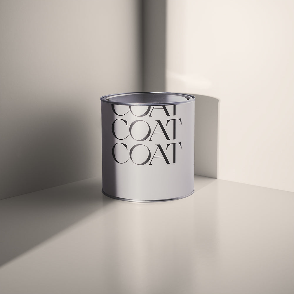
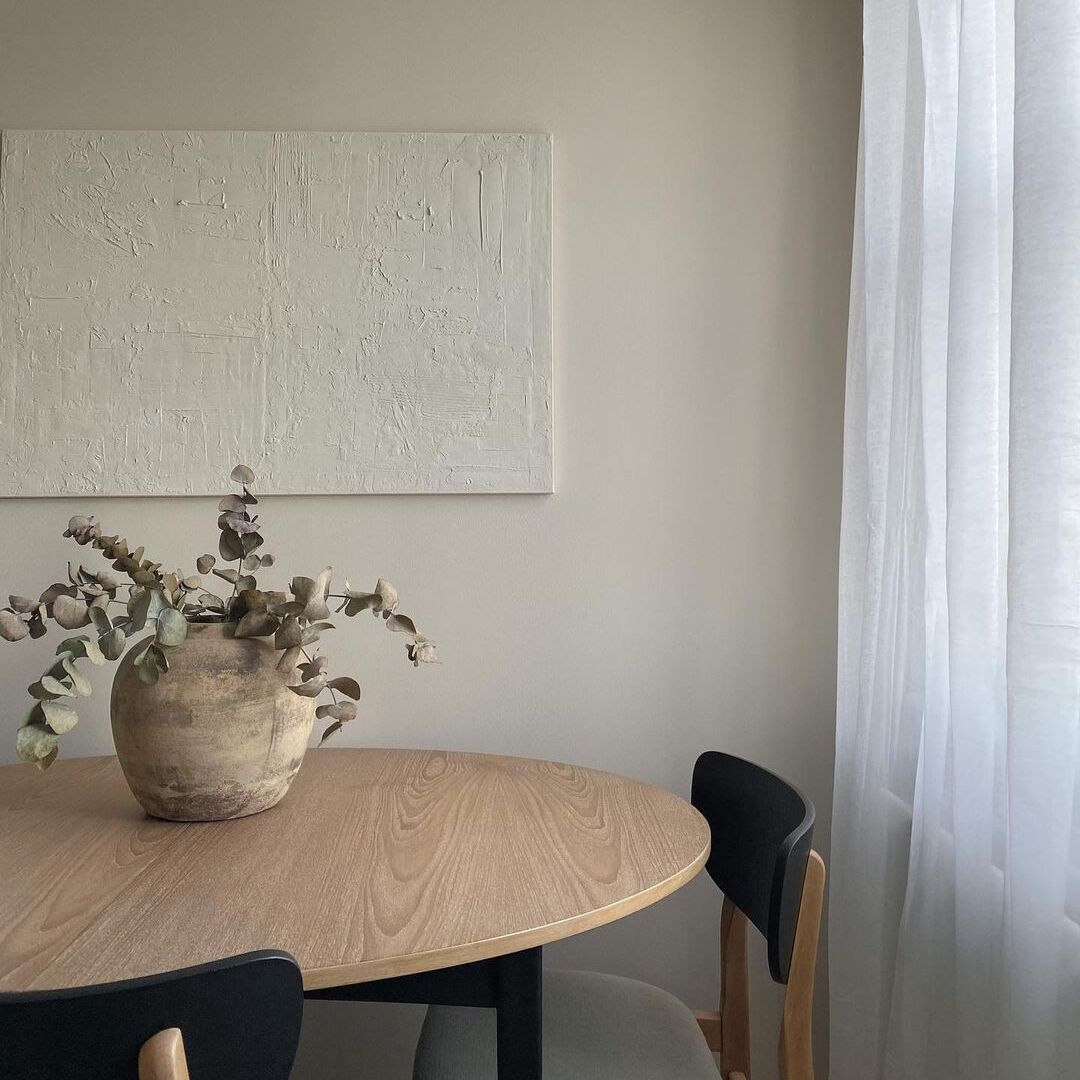
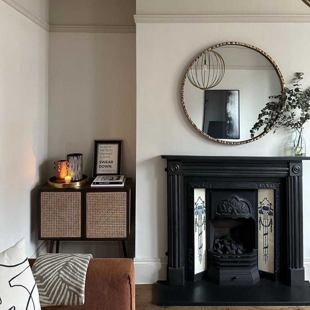
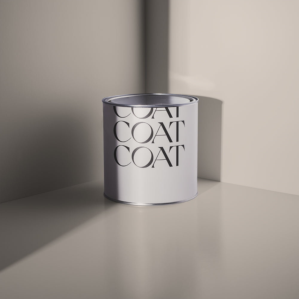
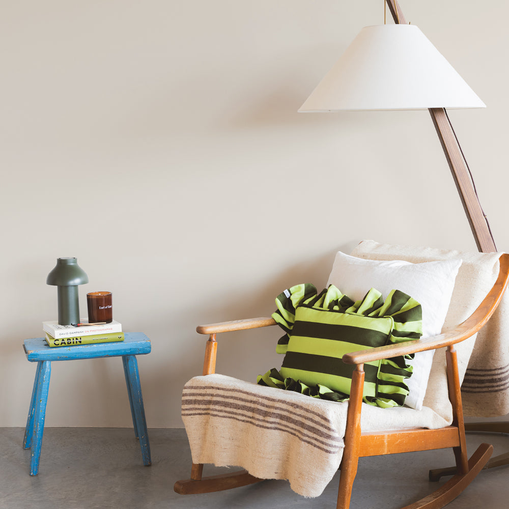
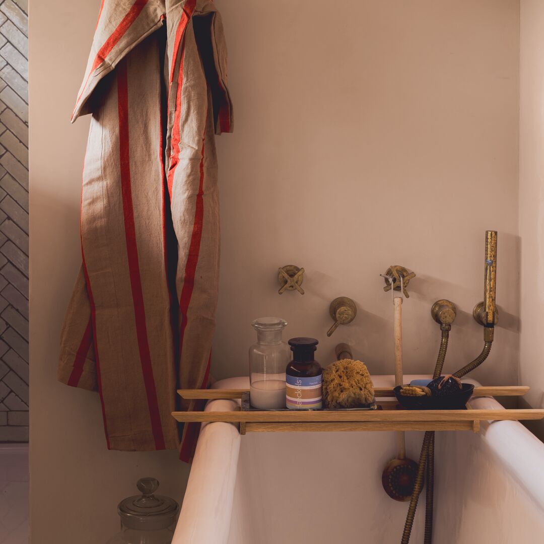
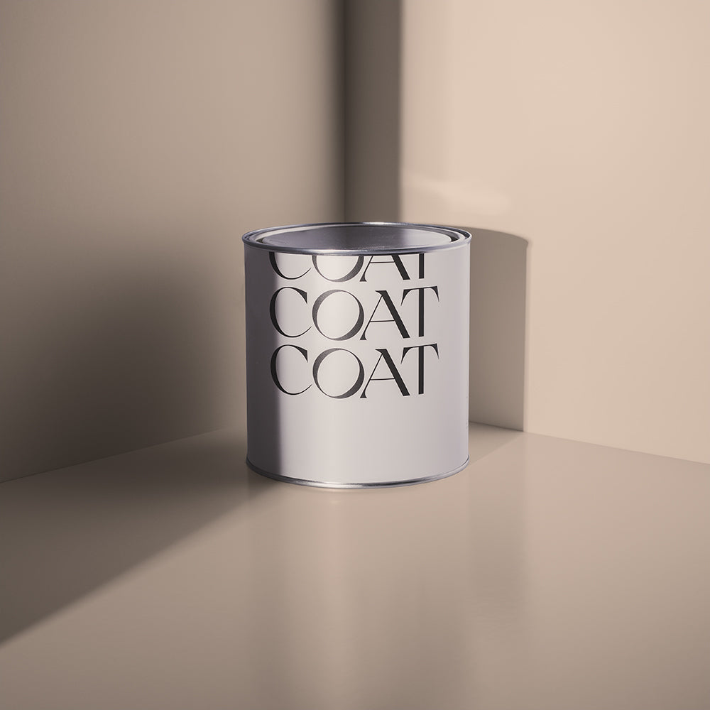
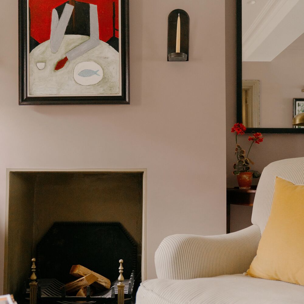
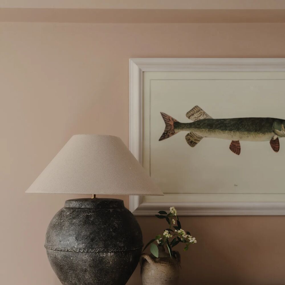
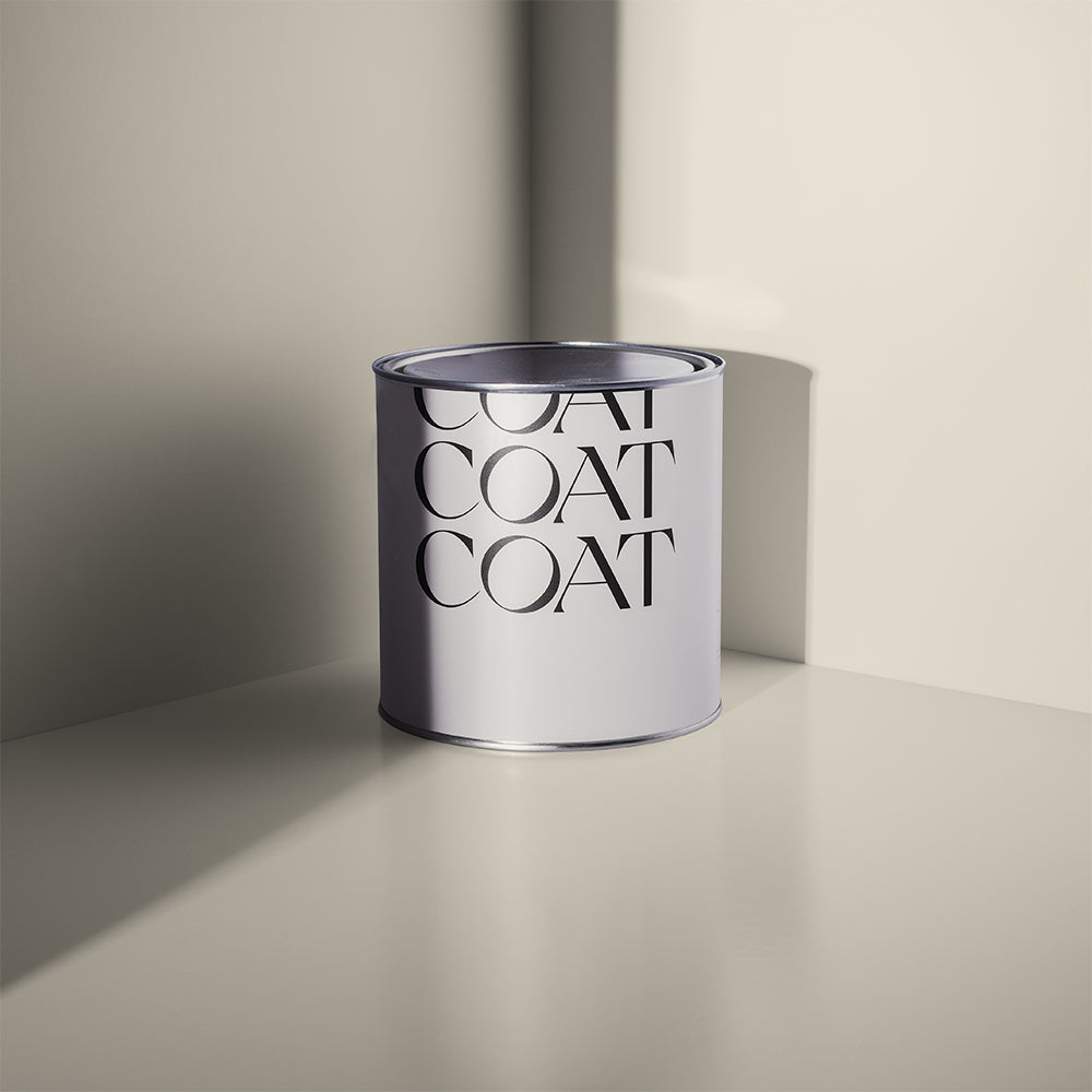
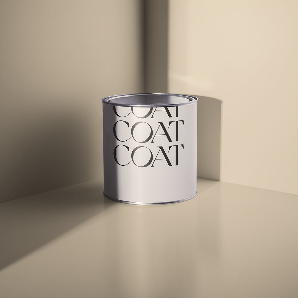
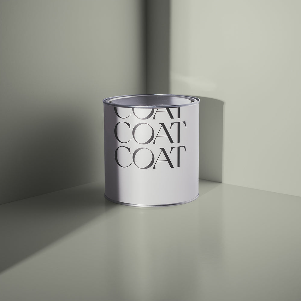
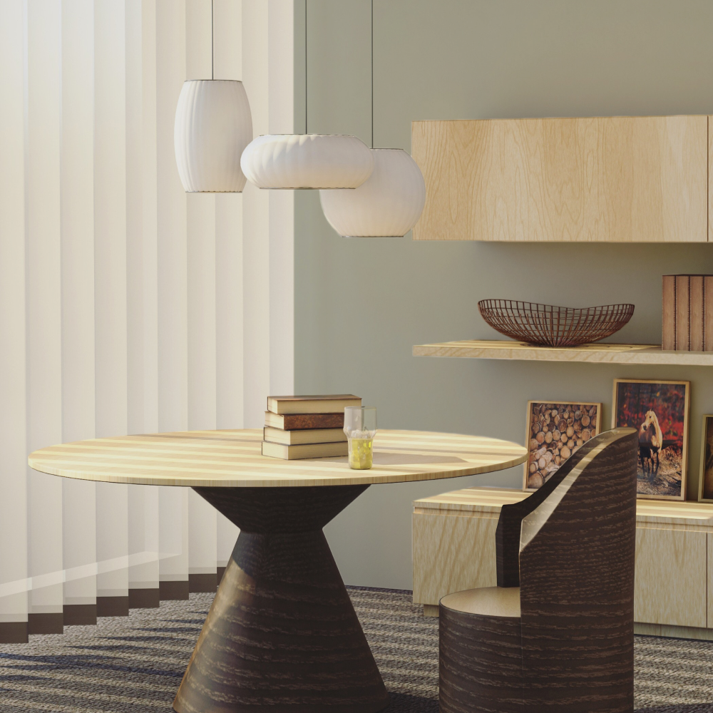
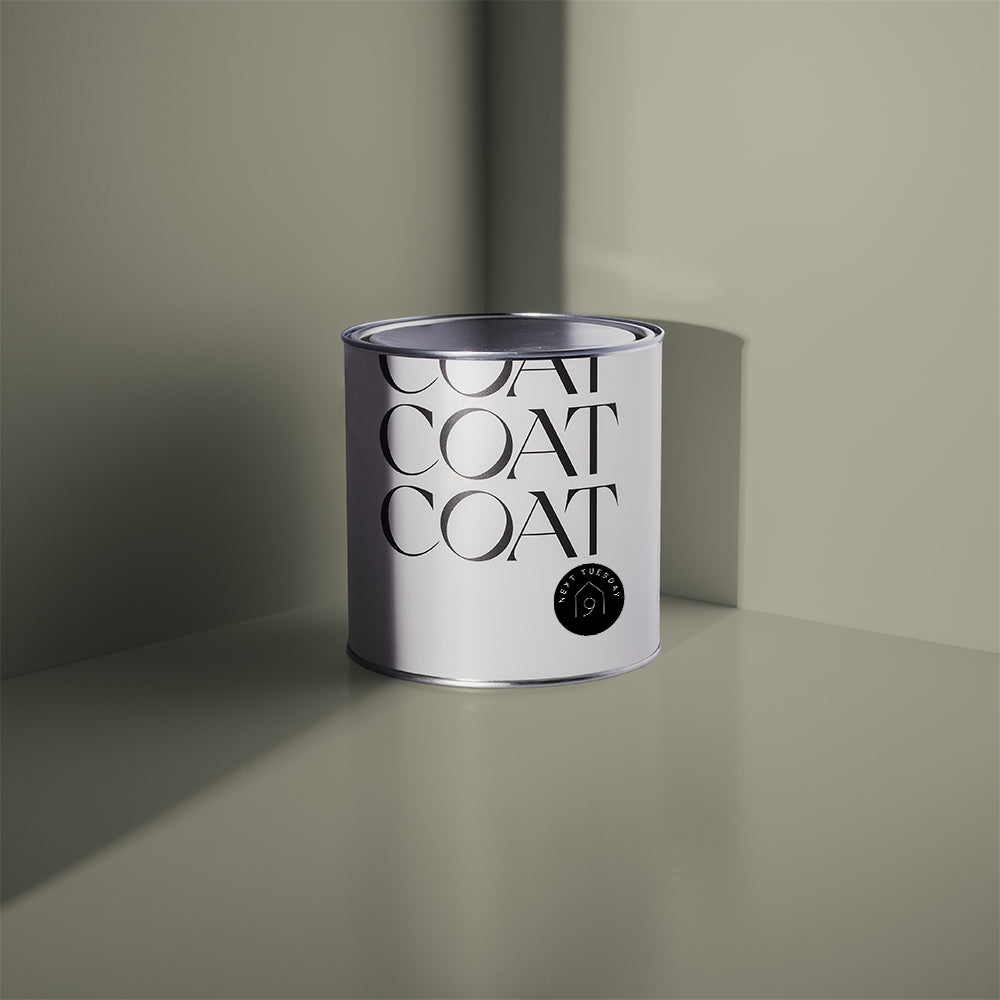
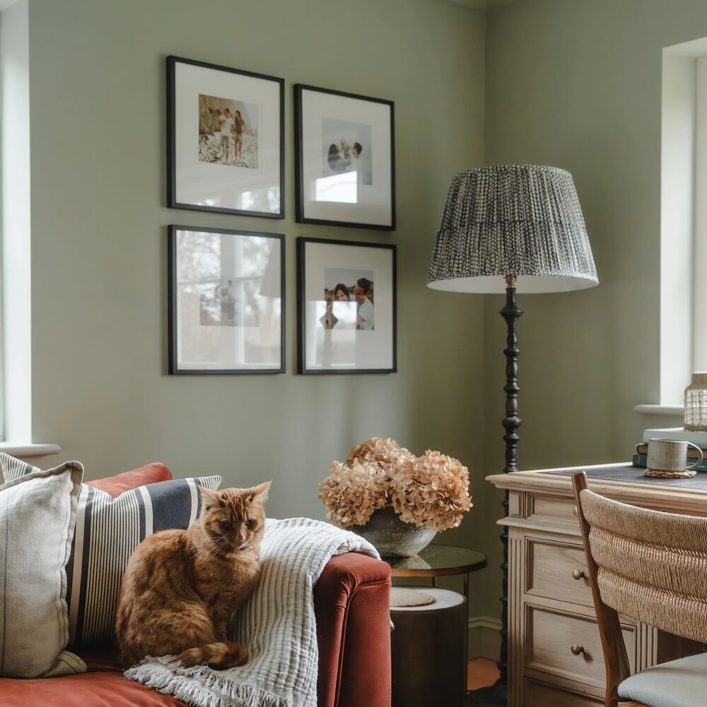
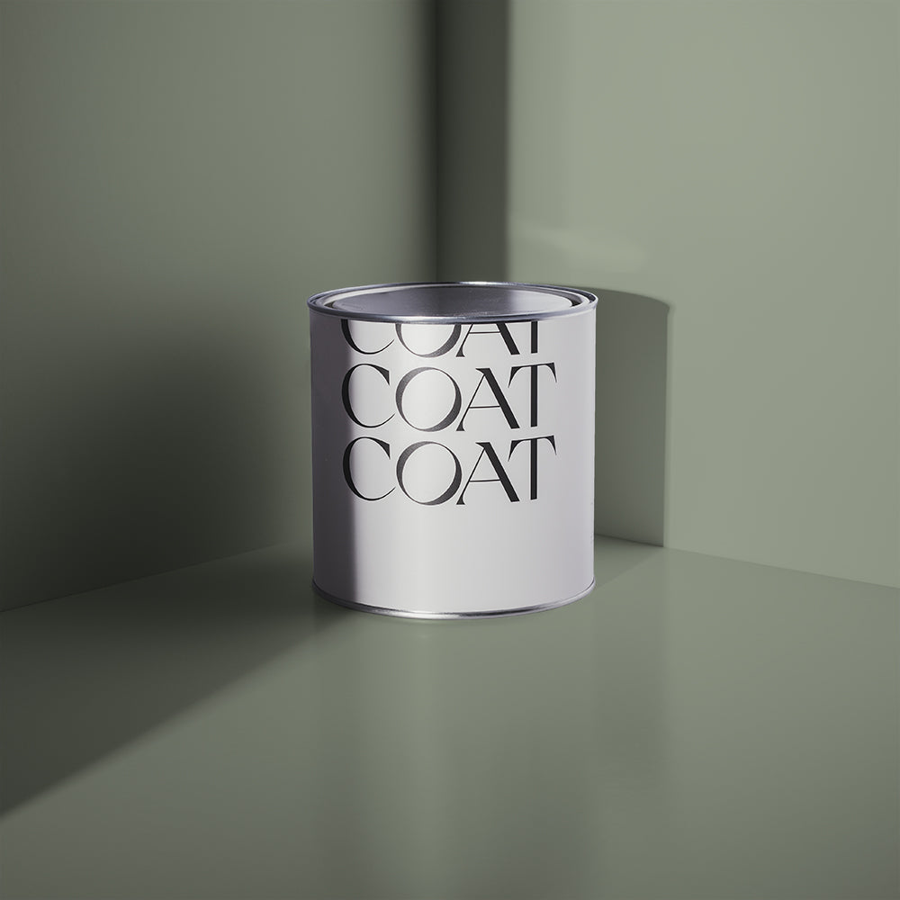
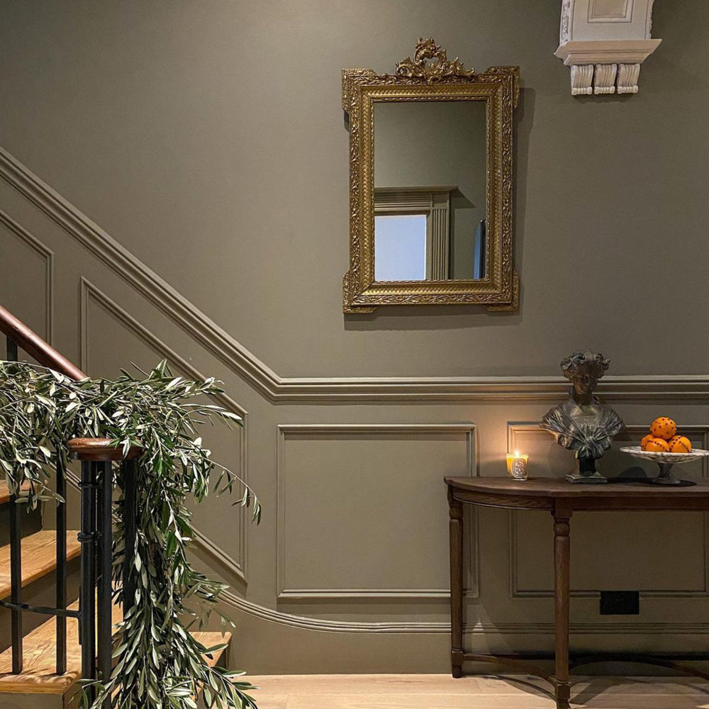
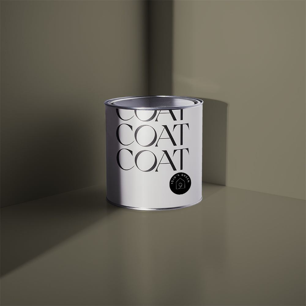
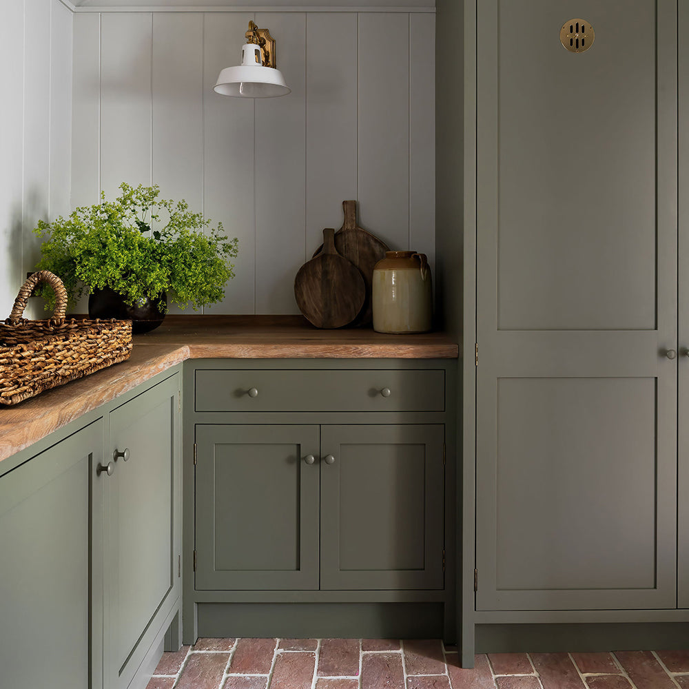
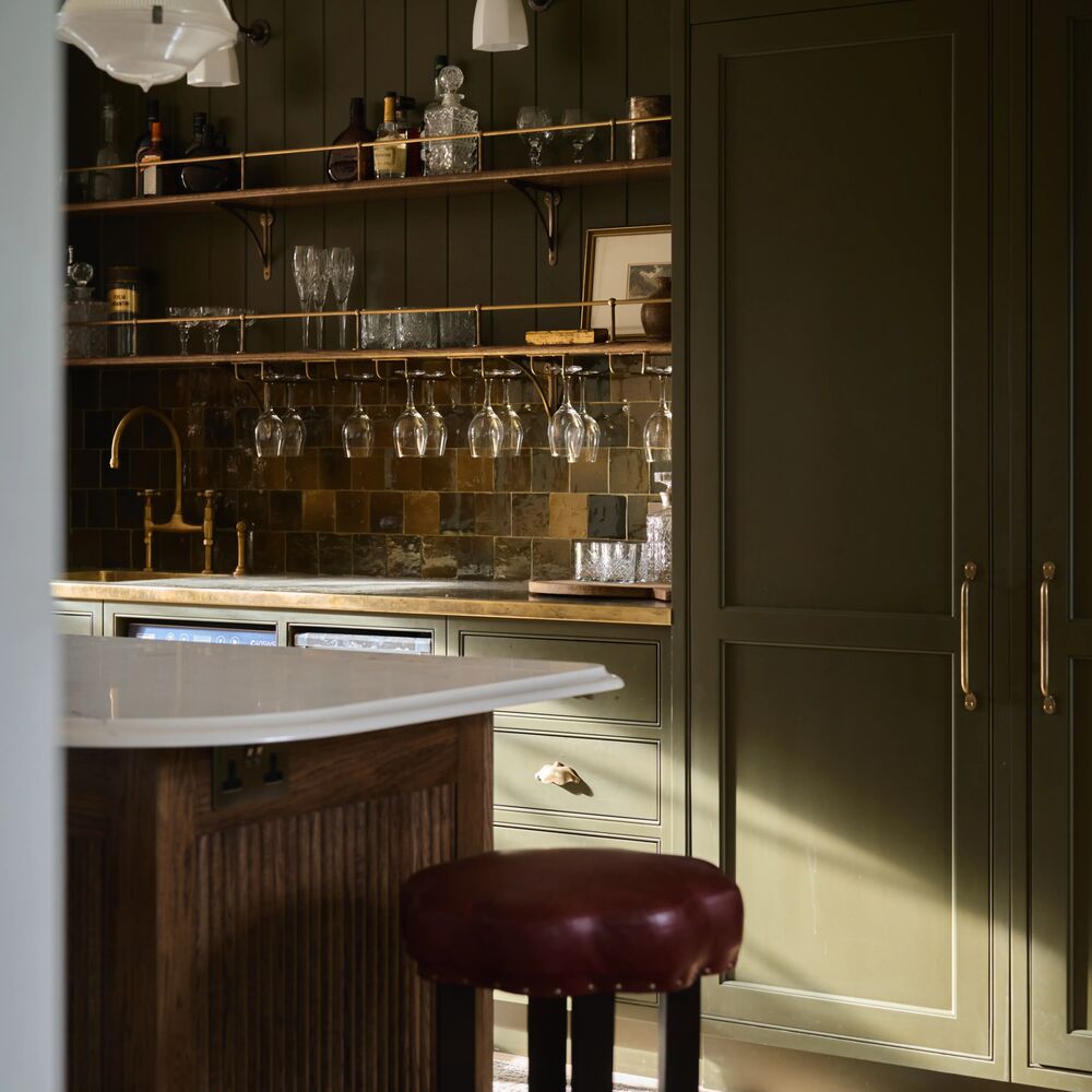
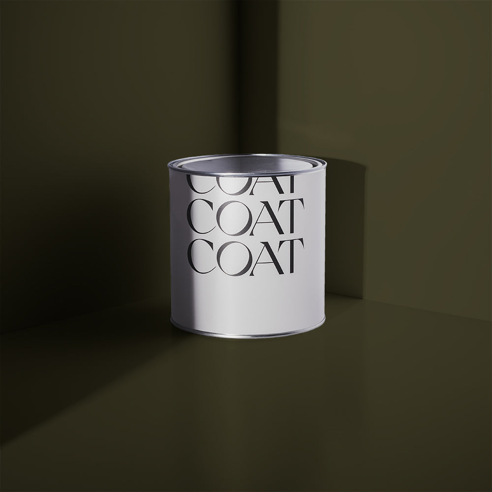
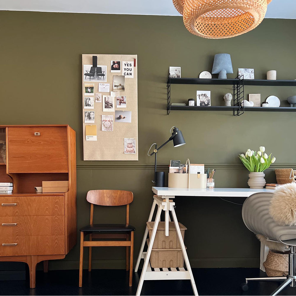
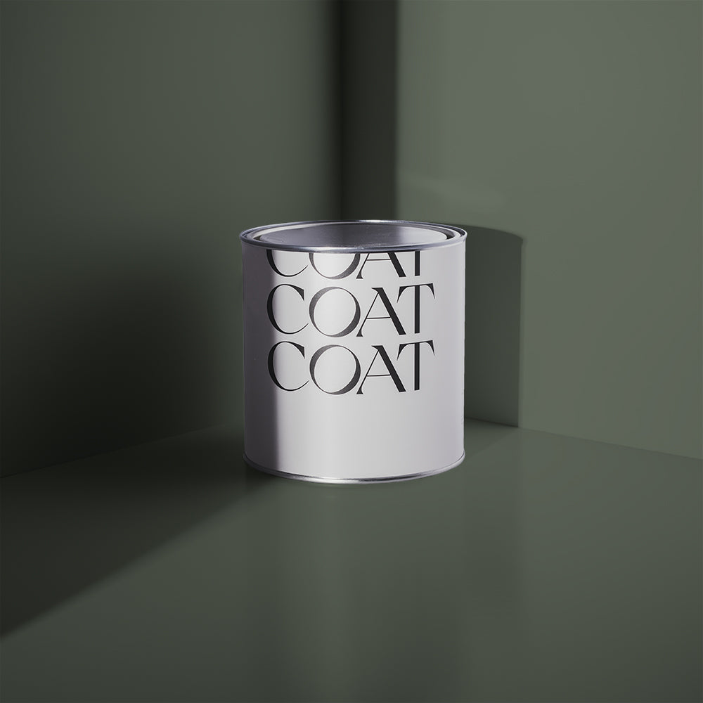
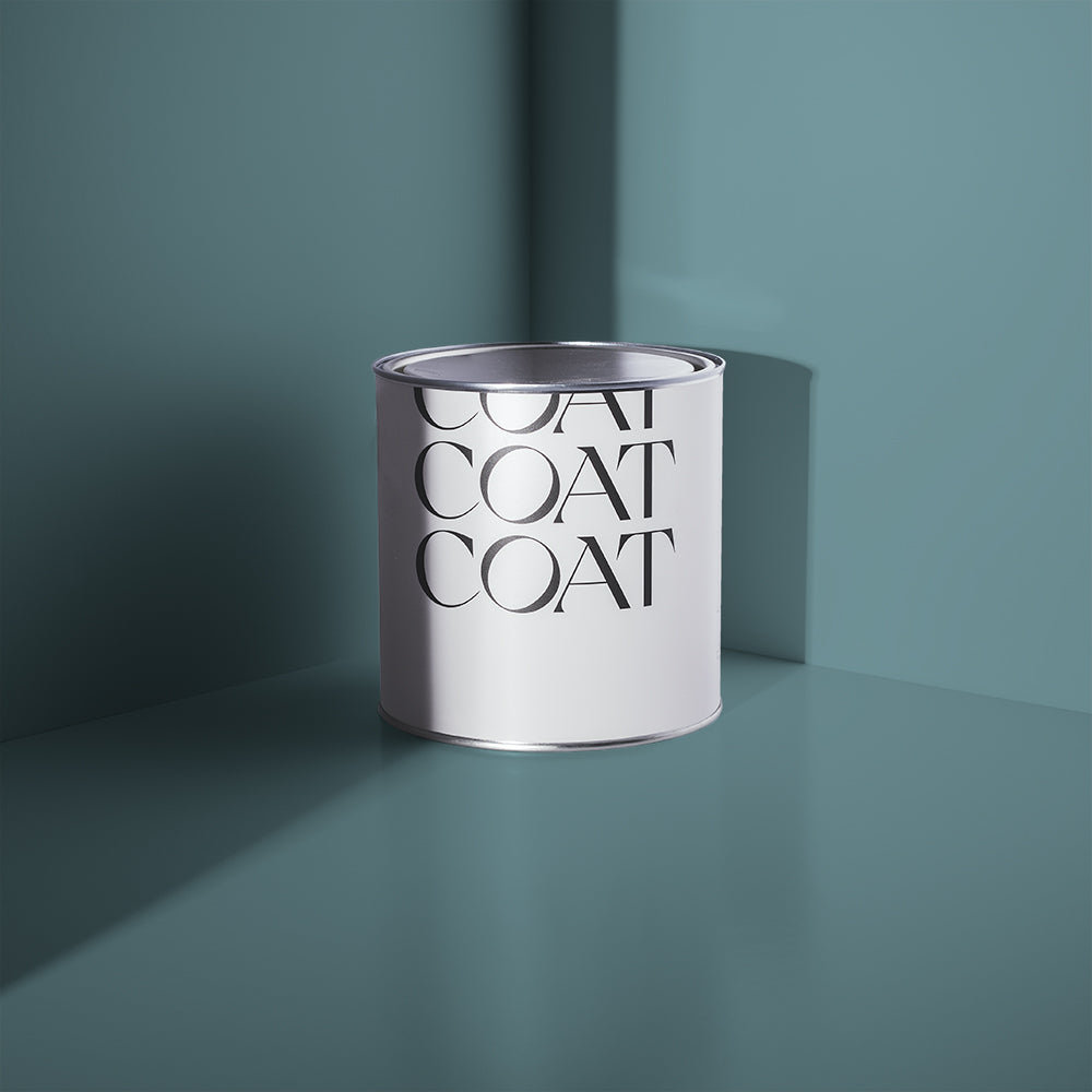
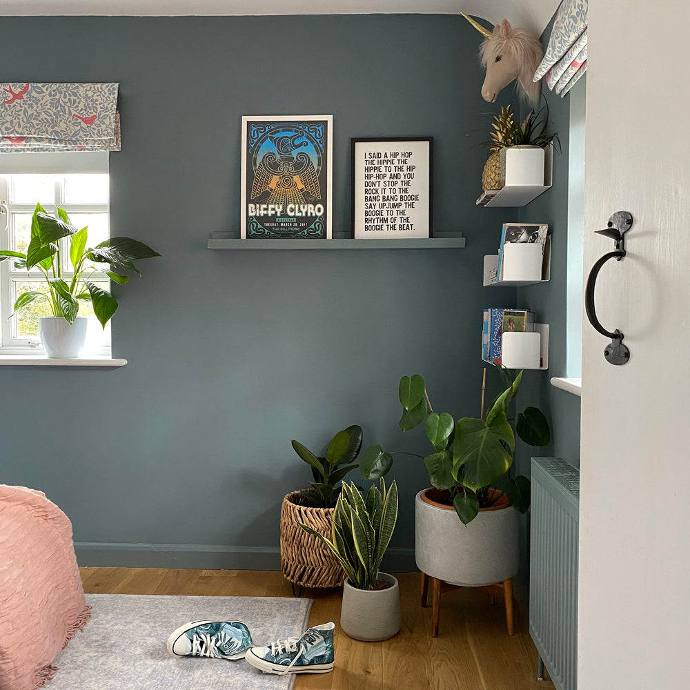
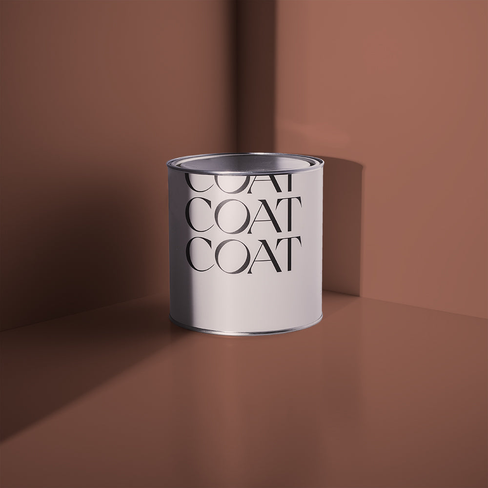
If you want a colour built specifically for this problem, our expert pick is Tuesday's Child (view Tuesday's Child). With green and yellow undertones, this shade is interesting enough to play as a confident neutral - with enough pigment to balance brighter light. It also feels incredibly cosy and natural when the night draws in.
 Tuesday's Child is our expert pick for South Facing spaces.
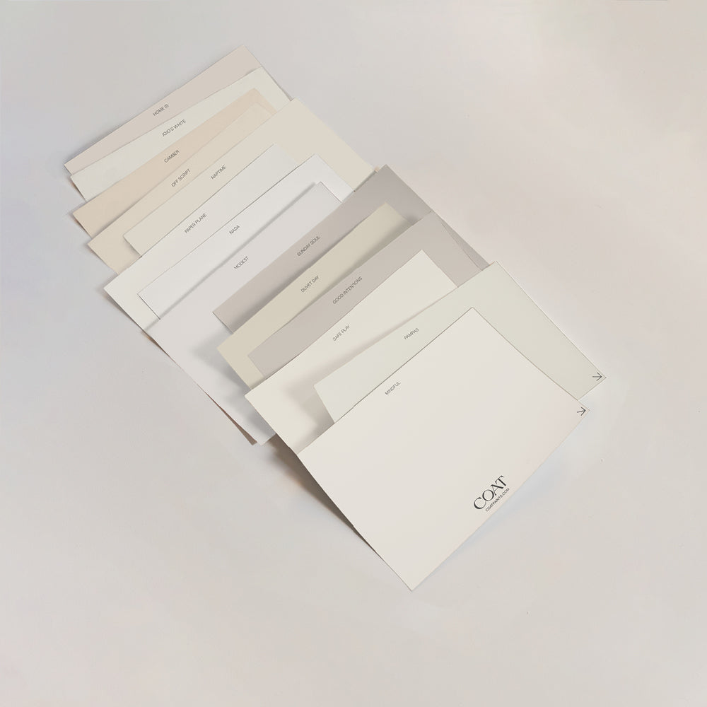
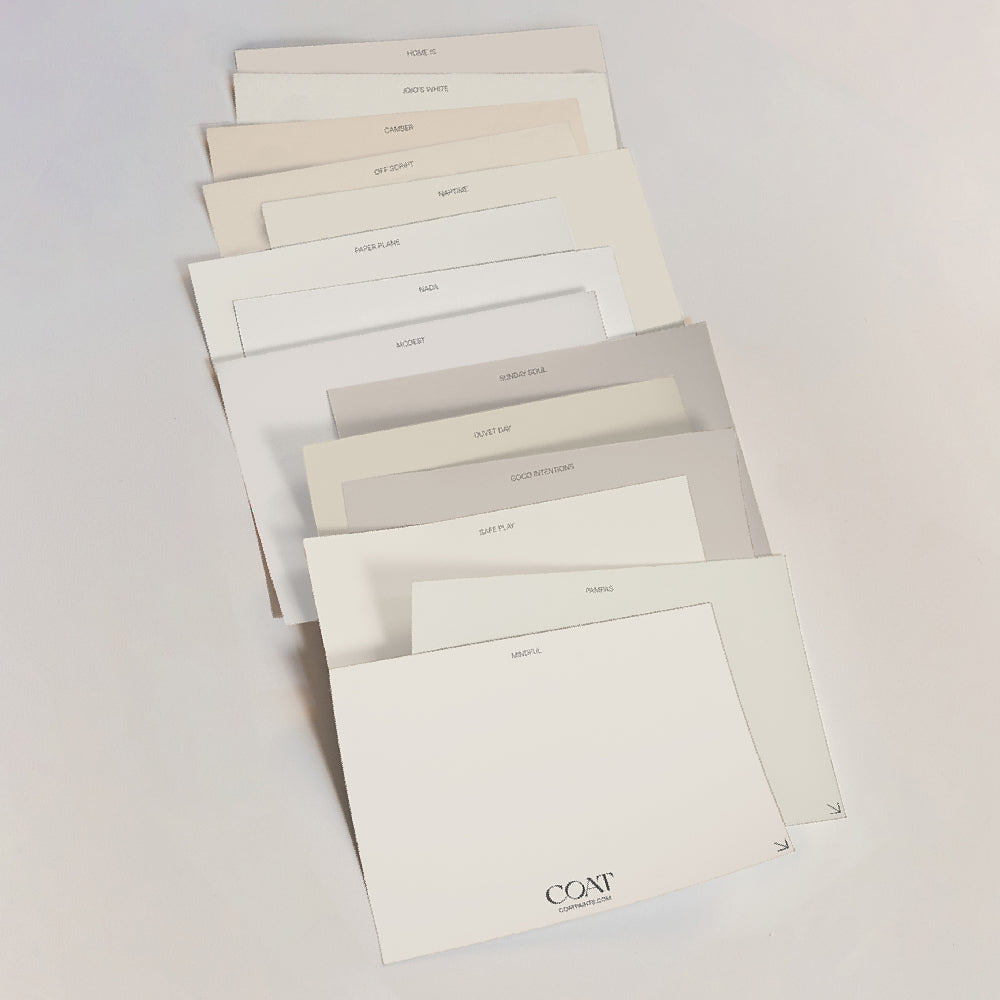
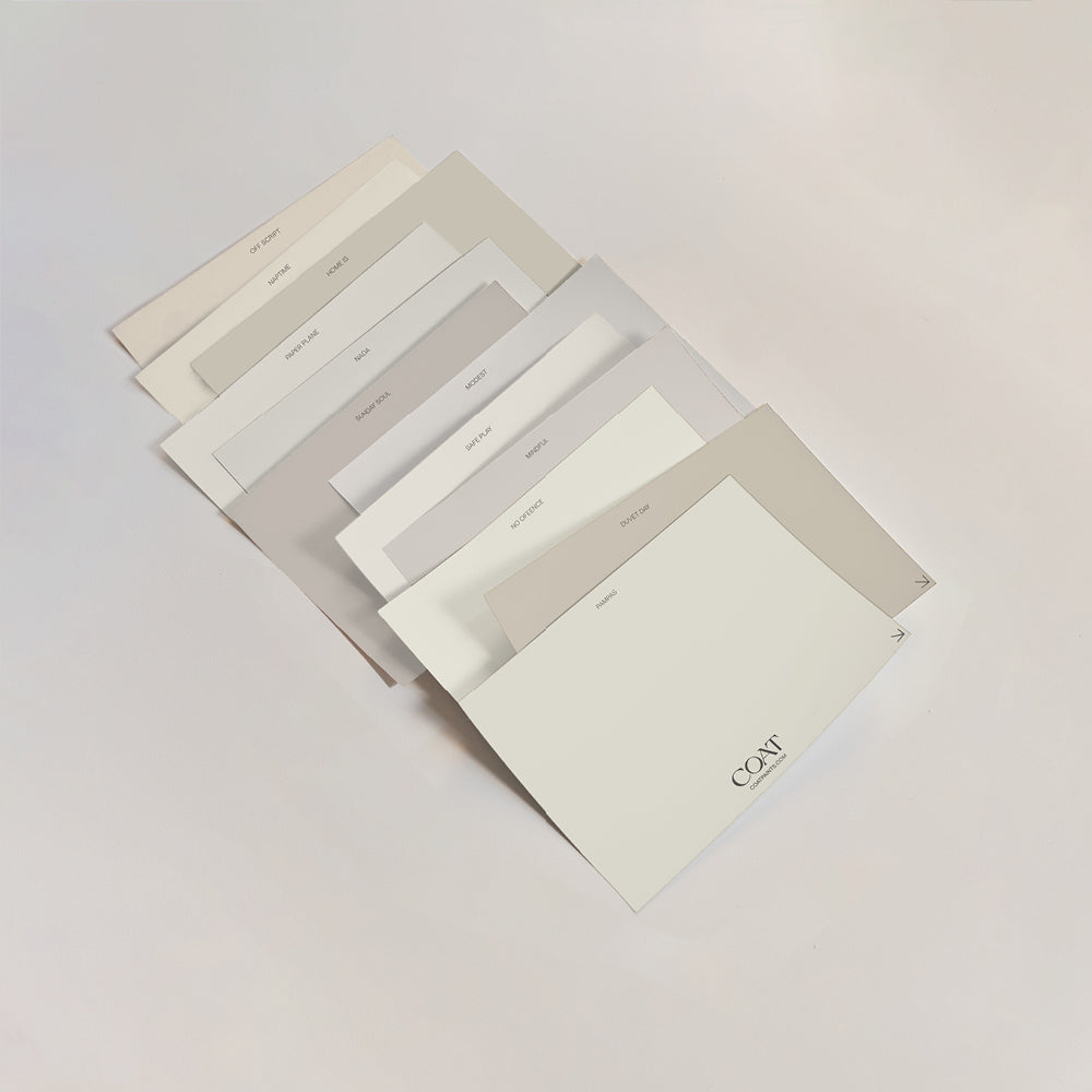
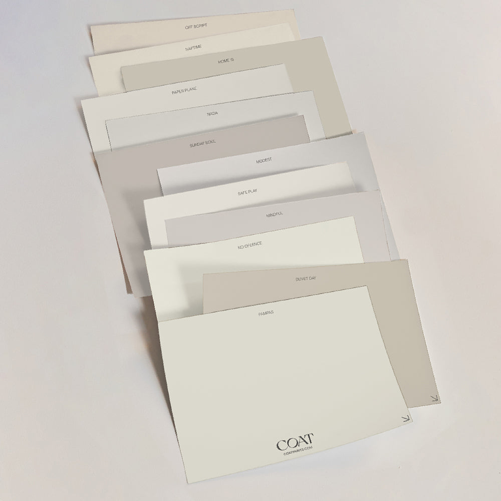
For more shades built to hold their own in strong light, our South Facing Rooms collection is a good place to start.
“Strong light can be unforgiving. It reads very yellow, and can wash out colours without the right pigments. That's why we test everything in real UK light before it goes anywhere near a customer's wall,” says our co-founder Rob Abrahams.
Frequently Asked Questions
Does south-facing light wash out paint colour?
It can, particularly with pale or thinly pigmented paints. Strong, direct sunlight intensifies colour but can also flatten it, so a colour with good depth of pigment tends to hold up better than a very pale, low-pigment shade.
What's the best paint colour for a bright south-facing room?
A cool-toned neutral with good pigment depth, such as a grey off-white, generally performs best. It counters the warmth of direct sun without looking cold, and it won't wash out the way a very pale warm white can.
Should I avoid bold colours in a south-facing room?
Not necessarily, but be aware that direct sunlight will intensify a saturated colour, sometimes considerably. If you want to use a bold shade, test it with a real sample in the room across a full day first. Choose colours with some element of black pigment, which means that they look slightly more muted than bright.
Our Expert Advice for South-Facing Spaces:
In strong, direct light, pigment depth matters more than brightness. Choose a colour built to hold its own in the sun, test it properly with a real sample, and check it at both midday and late afternoon before you paint the whole room.
Publish Date
Author