How Paint Colour Sells a House: A Developer's Masterclass with Studio KP
How do you choose paint colours, when the house isn't for you? When design decisions are more commercial than emotional, the right colour scheme and styling choices can make the difference between a desirable property that flies off the market - and a whitewashed box that doesn't.

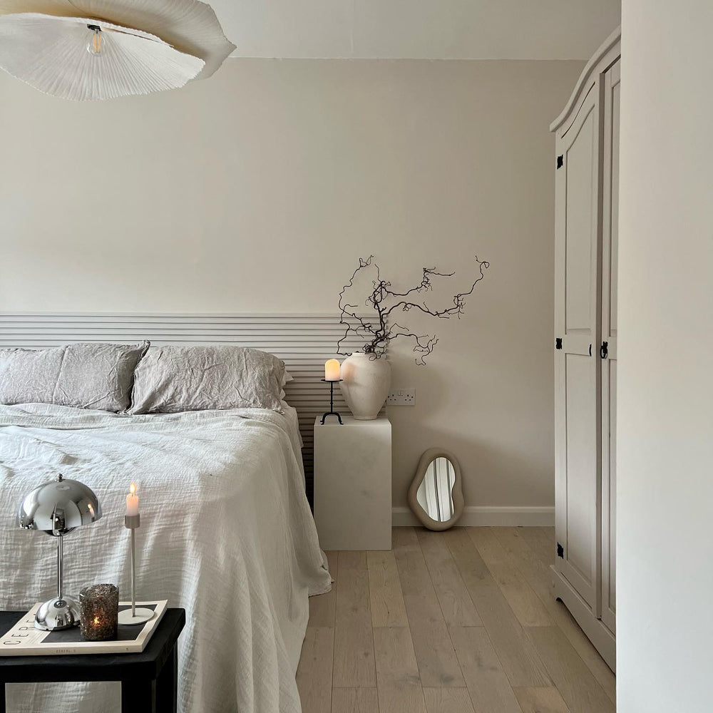
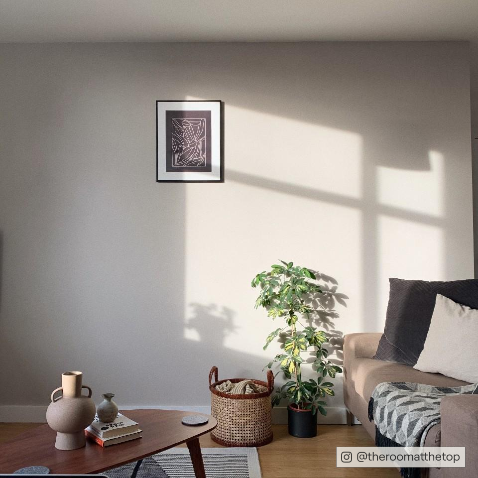
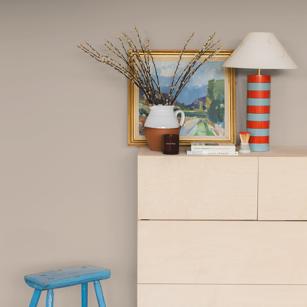
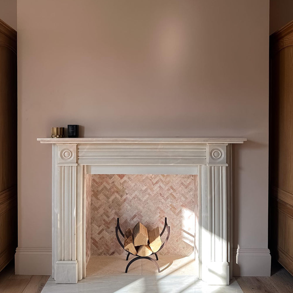
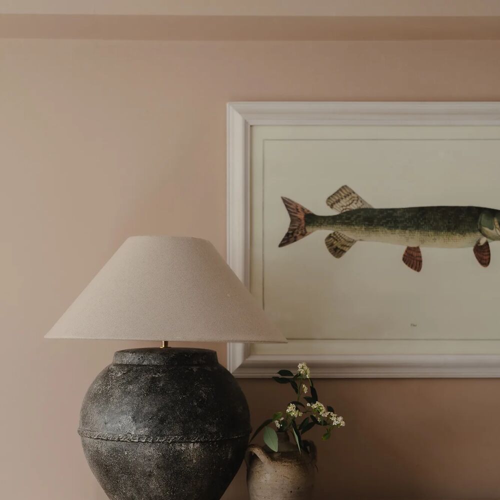
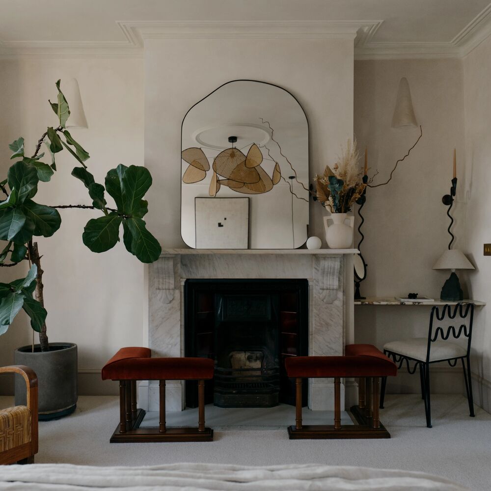
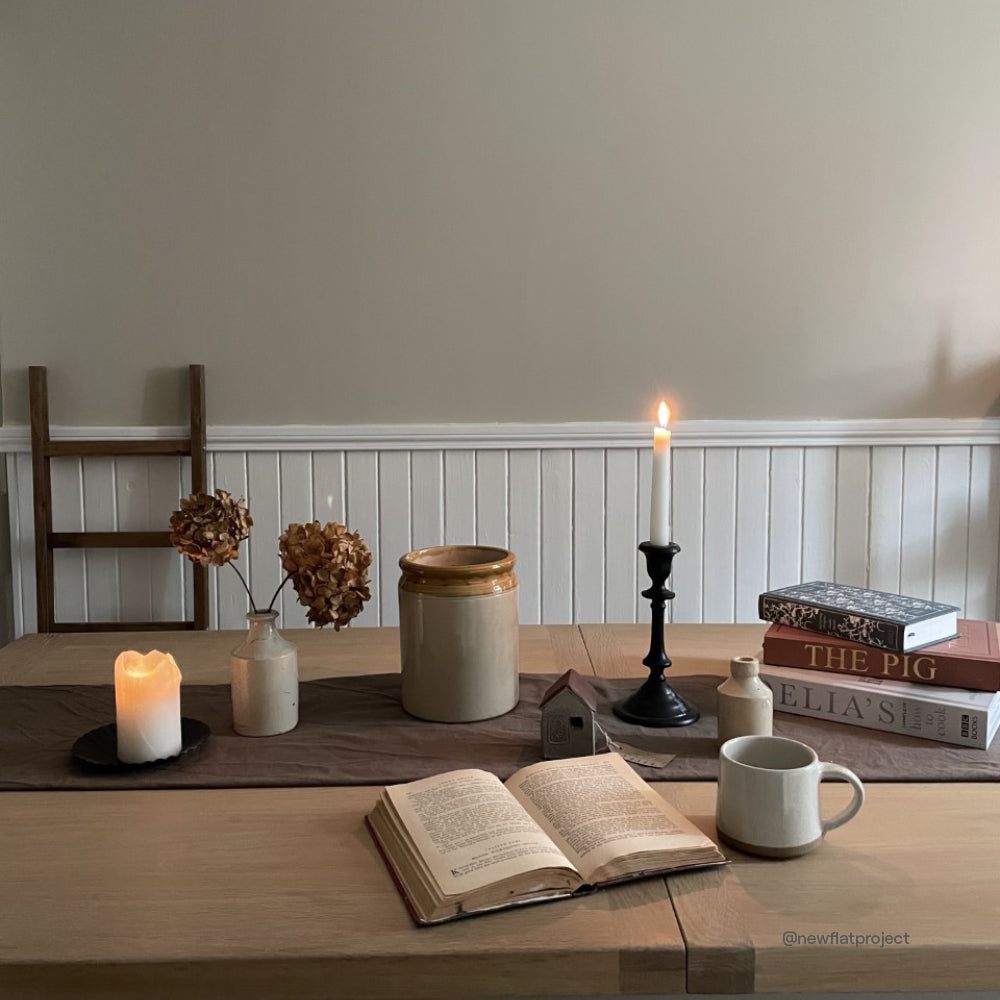
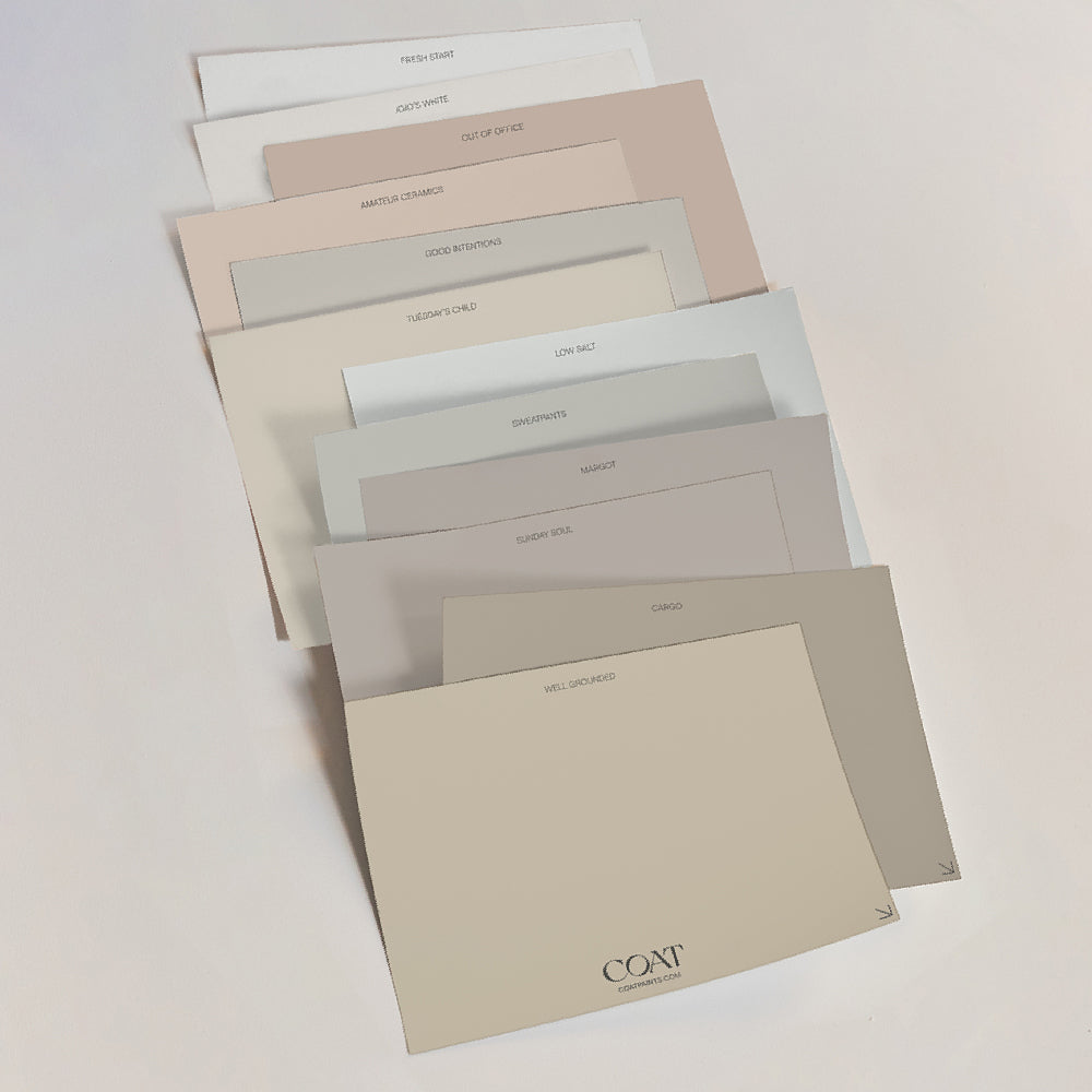
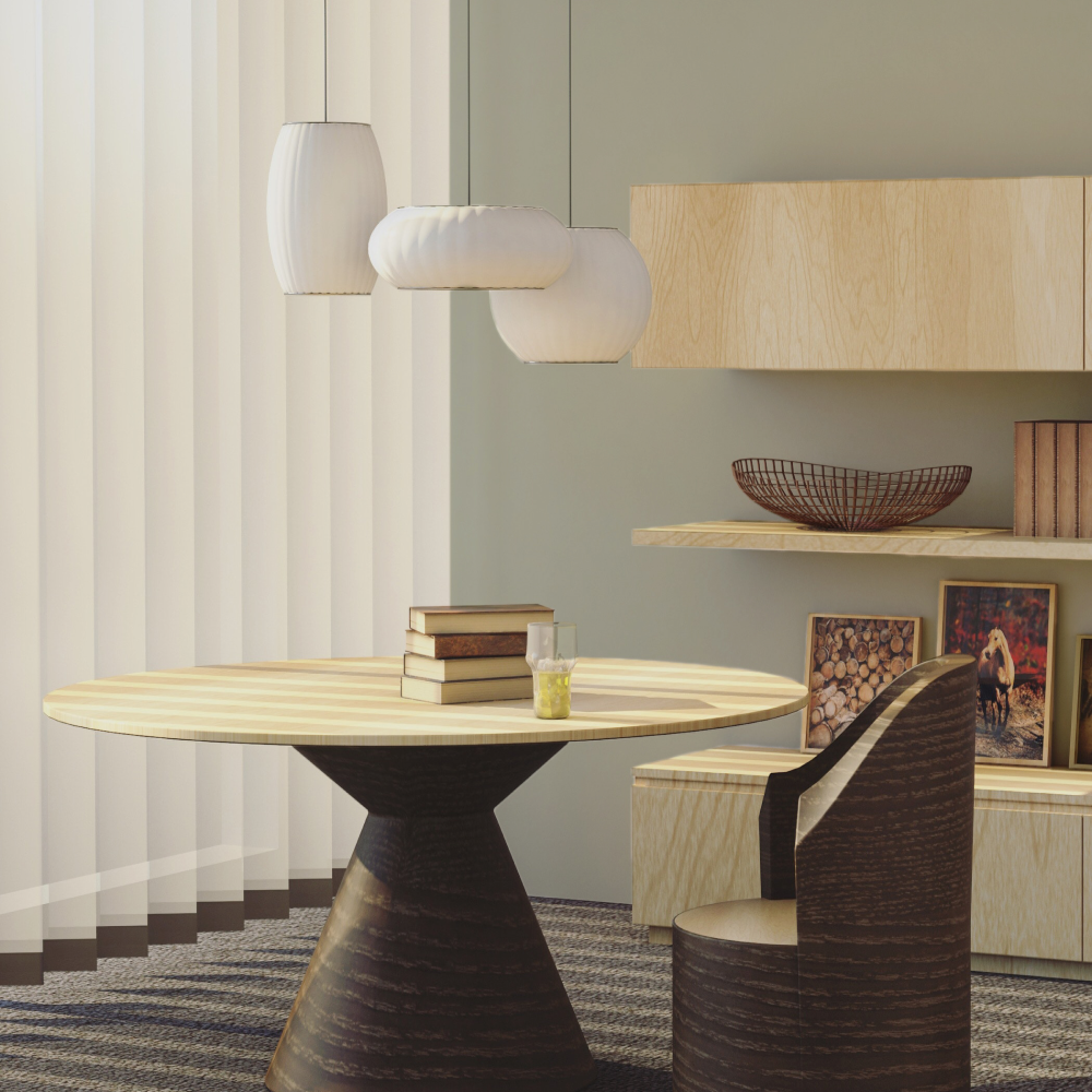
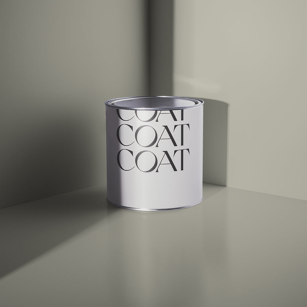
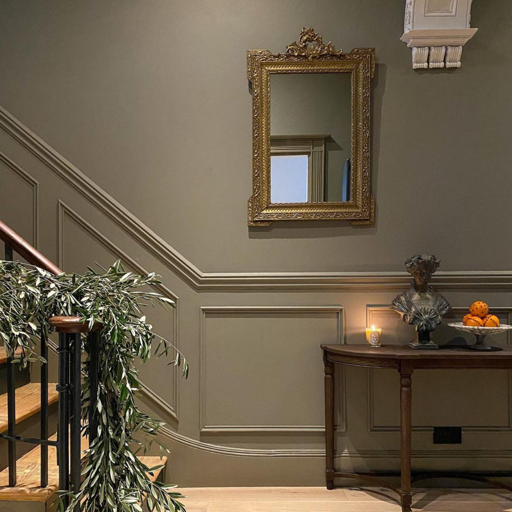
Tuesday's Child is a warm, nuanced neutral paint colour that feels deeply designer
We went behind the profile with Sophie, the talented designer and developer behind Studio KP - @studiokp.interiordesign on Instagram. Sophie took on exactly that challenge, developing a tired ex-HMO in need of some serious work with a clear intent to develop and sell. And what a result...

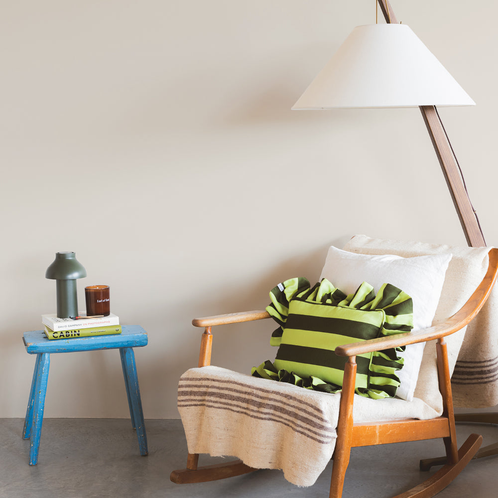
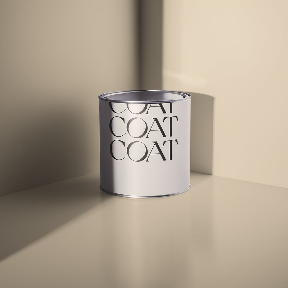
Tuesday's Child (Warm Neutral) is deliberate, but still subtle
“Back in February, we bought a dilapidated end-of-terrace Victorian house that needed serious work” says Sophie. “The bones were good, triple-fronted, high ceilings, loads of natural light, but it took some vision to see past the illegal HMO it had become.”

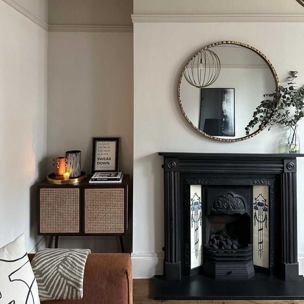
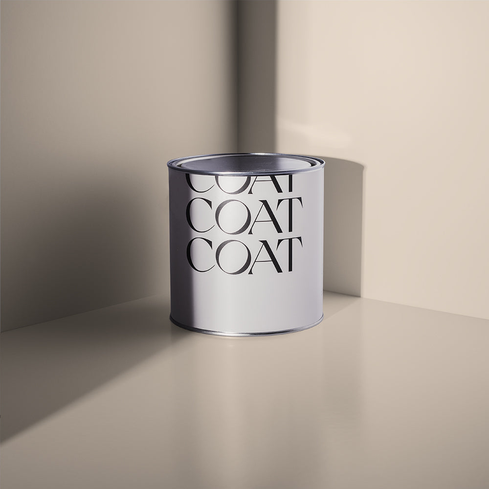
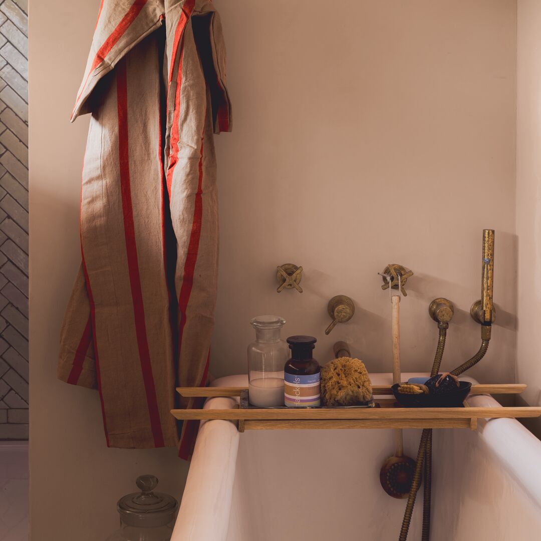
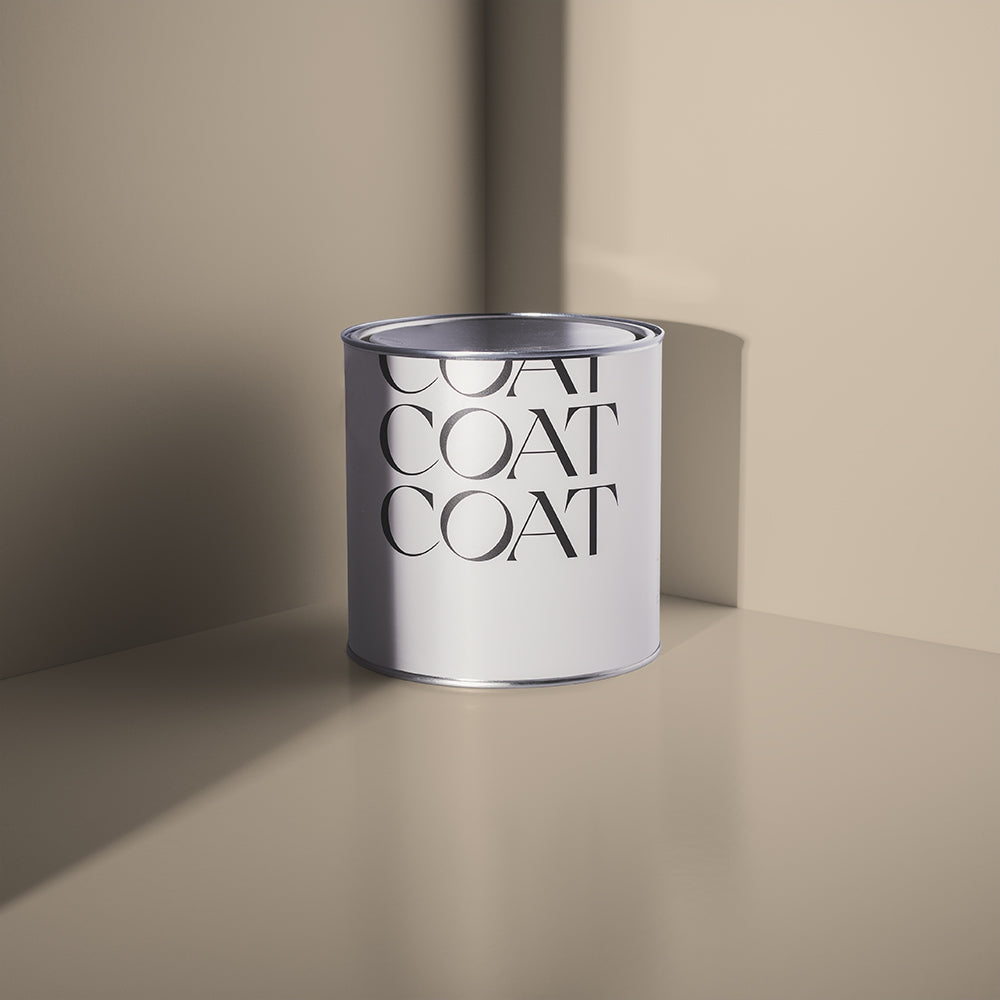
Humble (Sand Beige) on the walls, with Cheap Soufflé (Cream Yellow) skirting offers a warm, tonal look
“The brief was simple: turn a rundown halfway house into a high-end family home, stage it, and sell it. No one would be living there, which presented its own challenge” says Sophie. “Buying a home is an emotional thing. The smell, the feeling, the sense that something happy happened here. Replicating that in an empty house takes effort. Freshly washed clothes, windows thrown open, candles lit before viewings, little shoes by the door, books on bedside tables, fresh flowers. The details that make a house feel like someone's home.”

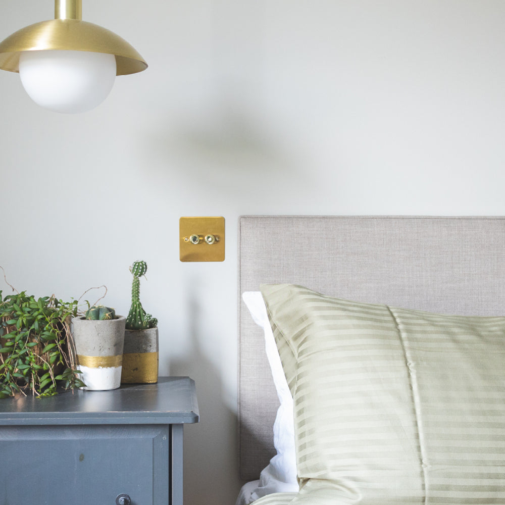
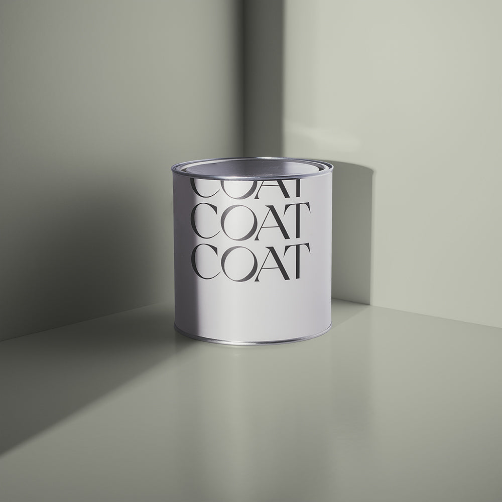
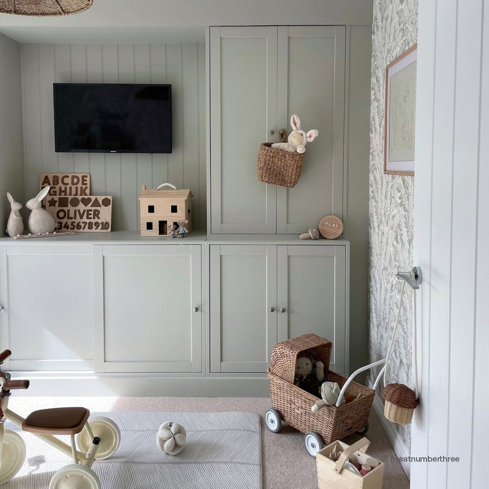
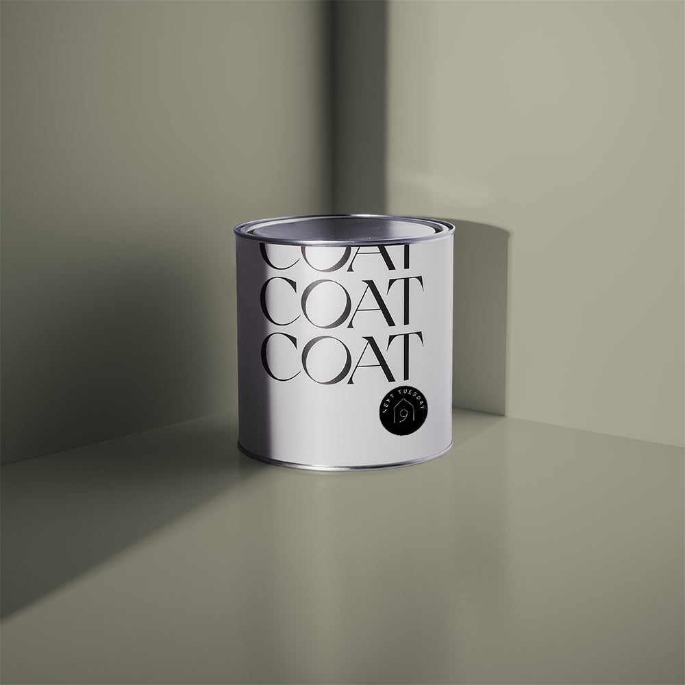
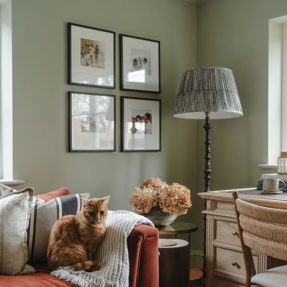
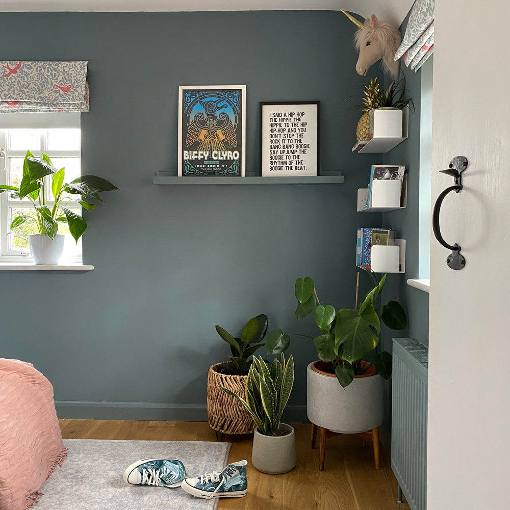
Next Tuesday (Warm Green) in the bedroom proves that muted greens can add a designer feel, without polarising
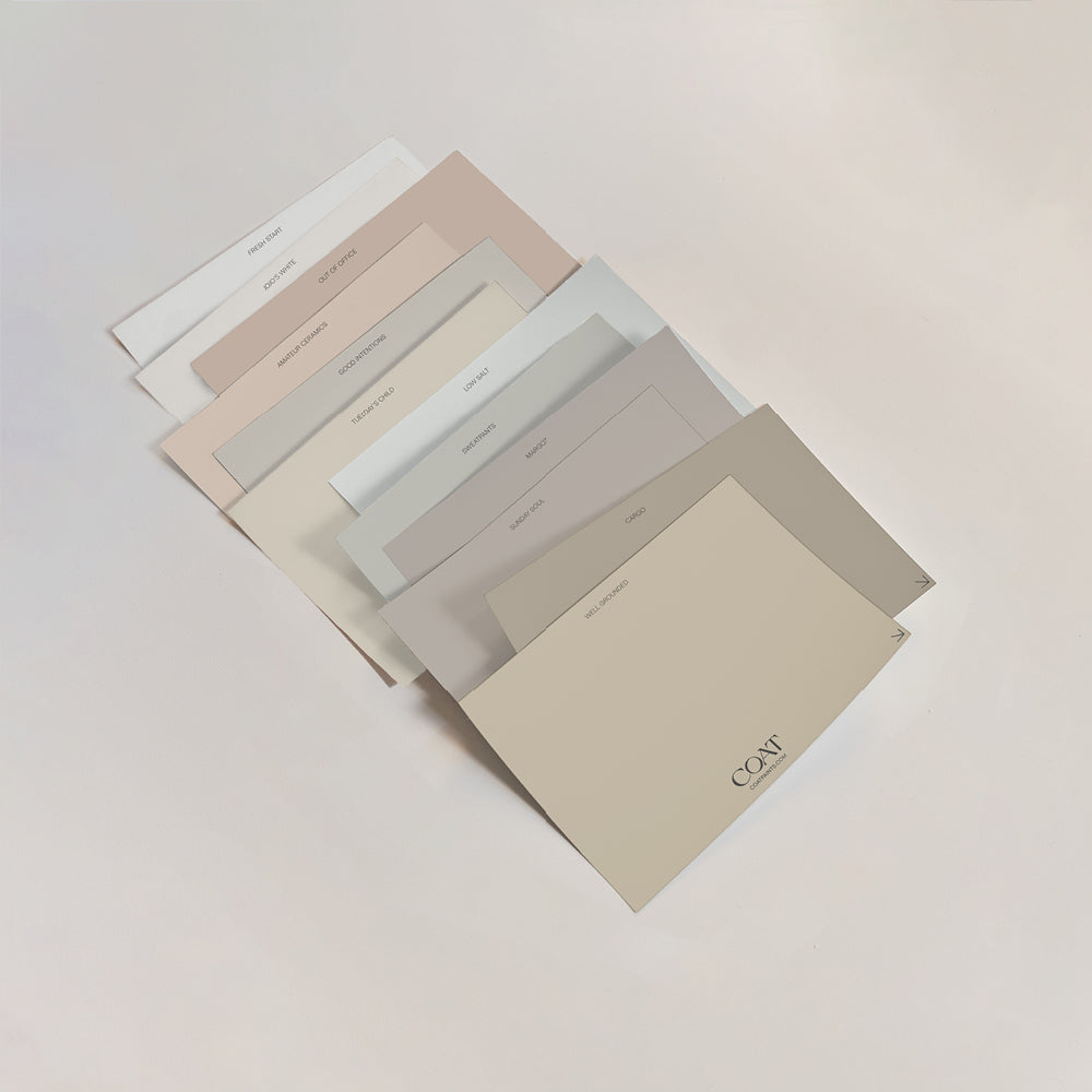
“The right paint colour can do a lot” says Rob Abrahams, co-founder at COAT. “In a house being renovated to sell, it’s right to choose shades that have universal appeal - whilst also making the most of character features that will drive a higher sale price. Whitewashing does not do this. You need a cohesive neutral palette with warm undertones, and enough contrast to highlight the things you want.”

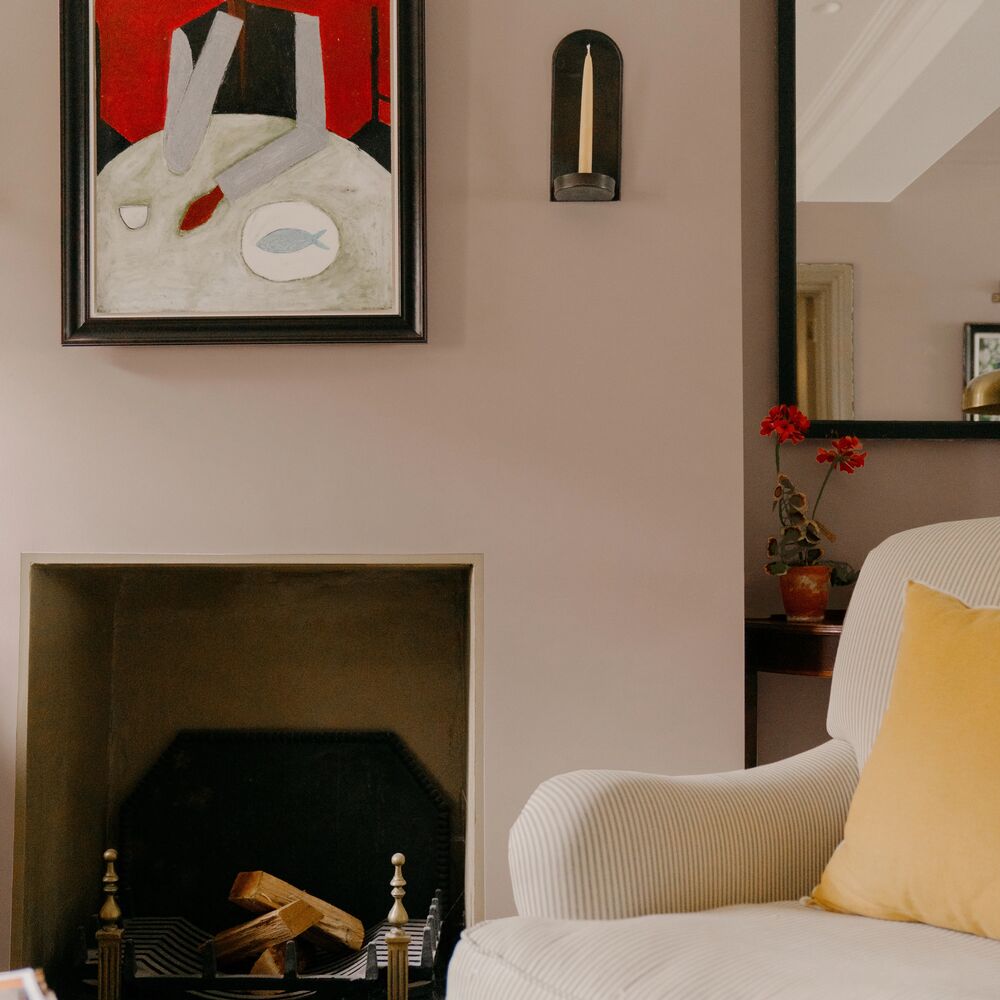
Adding contrast to neutral walls with window coverings and art brings the scheme together
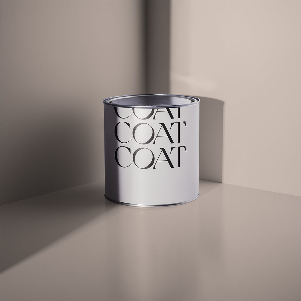
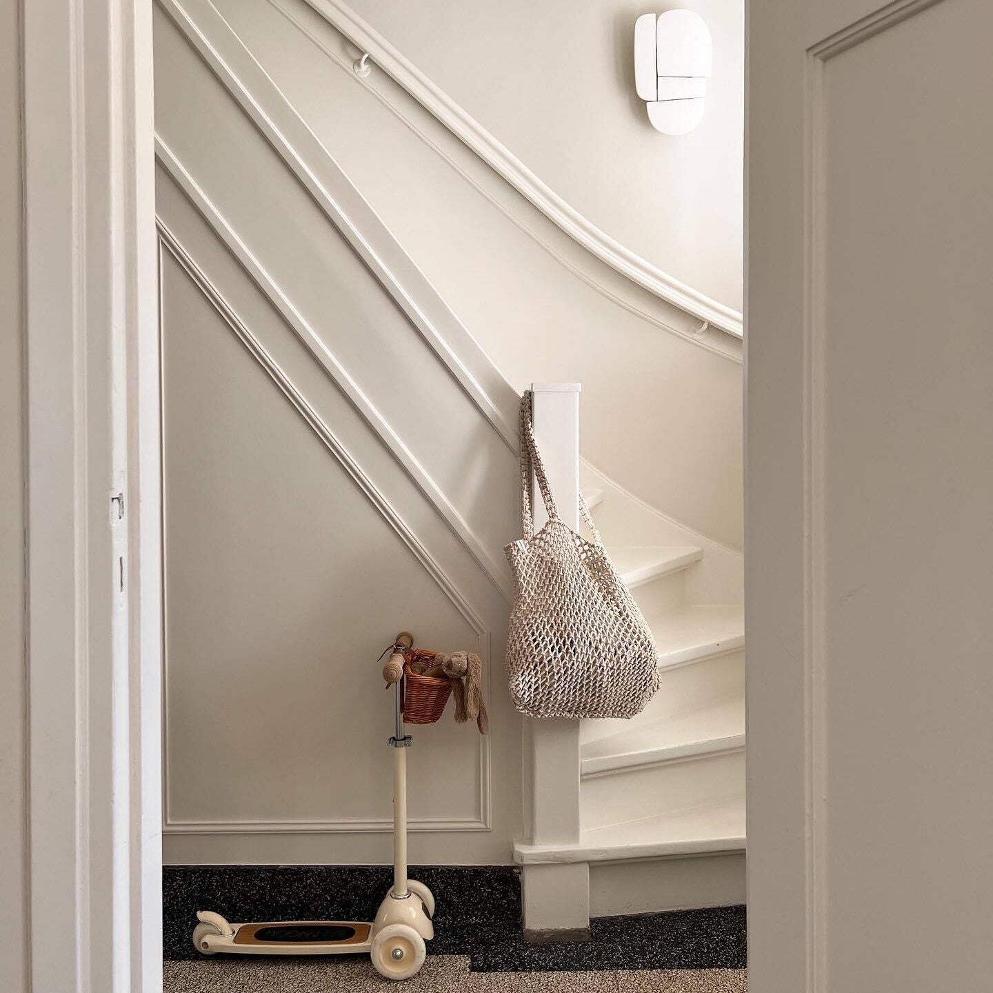
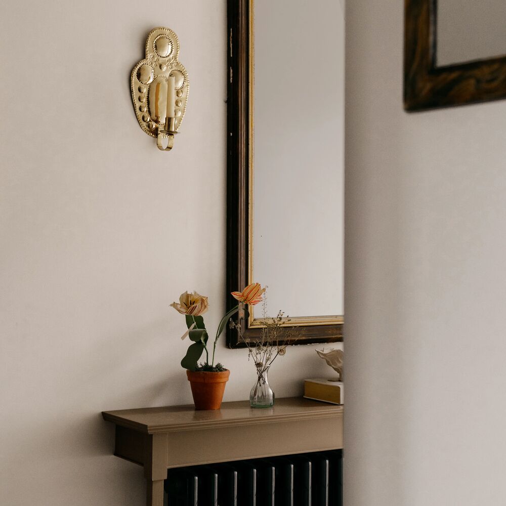
Sophie leaned into warmer, biscuity tones throughout, choosing Humble for the walls and Cake Mix on the skirtings in her hallway. It's an instantly relaxed pairing, a natural backdrop that doesn't ask too much of anyone walking through the door. La Torre on the internal front door grounds the hallway beautifully, adding depth without pulling focus away from the space itself.

A touch of La Torre (Soft Red) on the door, with Humble (Sand Beige) walls, and Sonder (Mid Sage Green) bannister
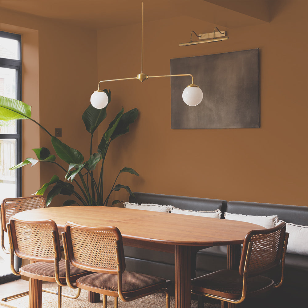
“Choosing paint for a development project is a balancing act” says Sophie. “You want it to feel considered, like a designer has been through with real intent, without being so bold that the colours start dividing opinion. Big Hoops was always going in somewhere, but colour-drenching an entire living room felt like too much of a risk for a property built to appeal broadly. Instead, it went on the bookcase, with Tuesday's Child across the walls and ceiling. Present enough to notice, restrained enough to work for everyone who walks through”.

Big Hoops (Golden Ochre) on the cabinetry feels luxurious and considered, without dividing opinion
The Takeaway: For anyone staging a property, whether a single room or a whole house - the paint colour doesn’t need to be loud to be most effective. But it does need to be deliberate, and feel designed. A handful of well-chosen neutral shades, with a pop of contrast, will create a balanced scheme that sells a house for far more than a magnolia drench ever could.

Publish Date
Author