Summer Colour Palette 2022
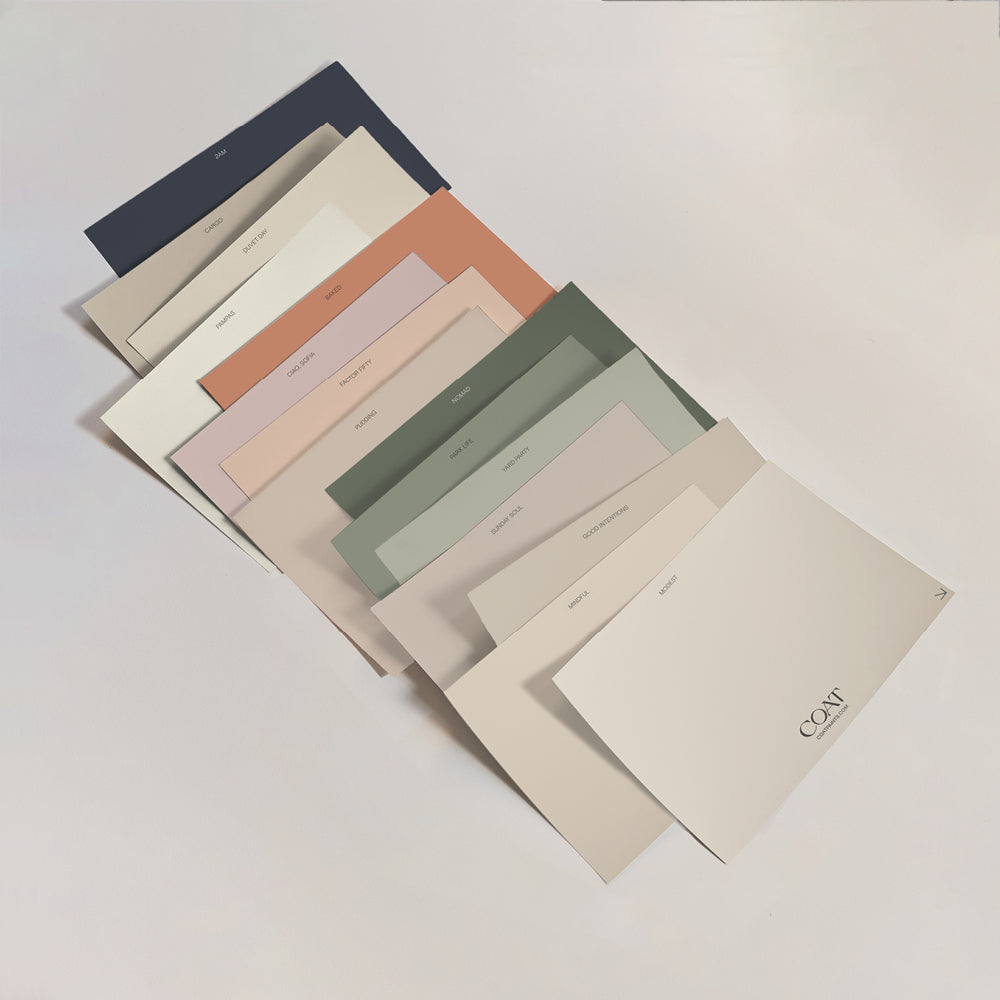
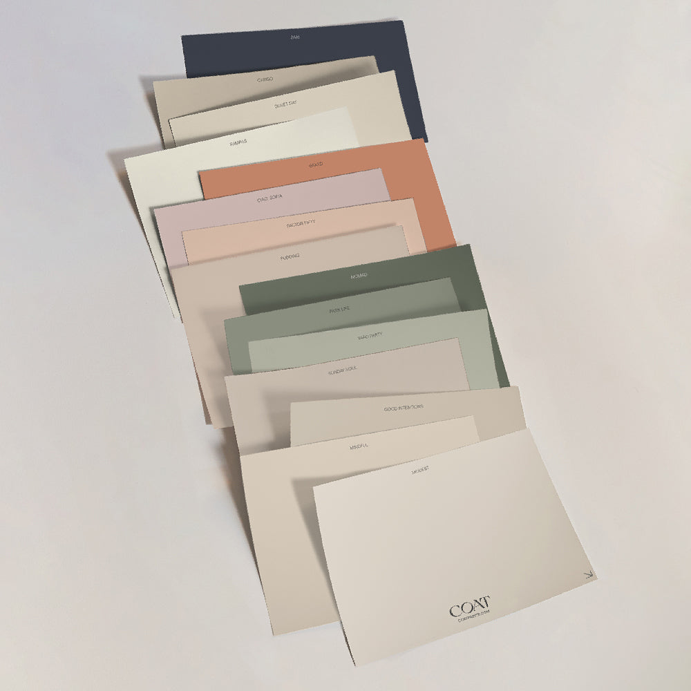
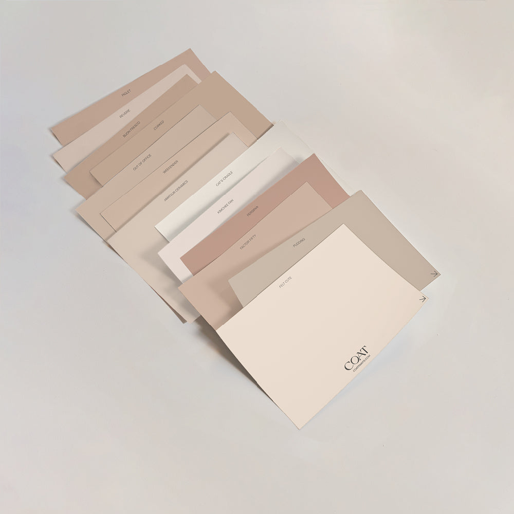
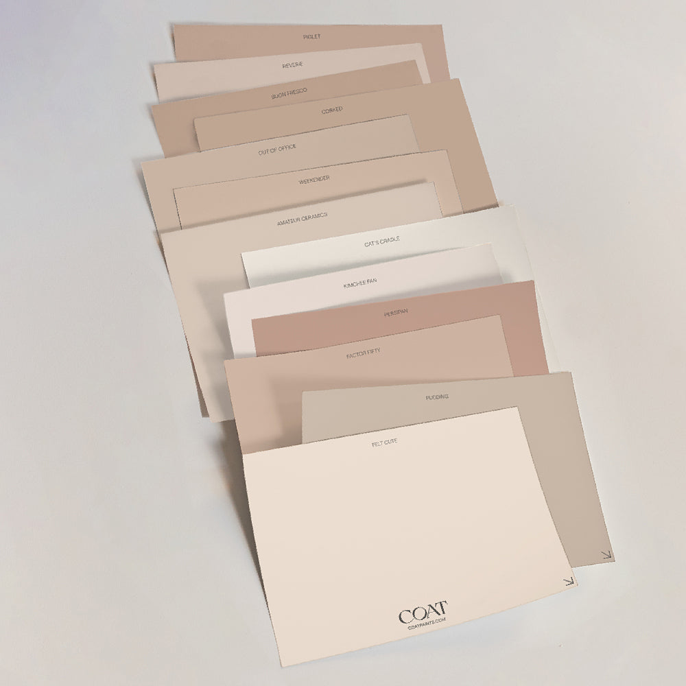
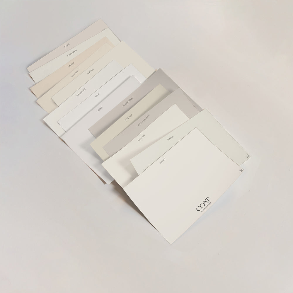
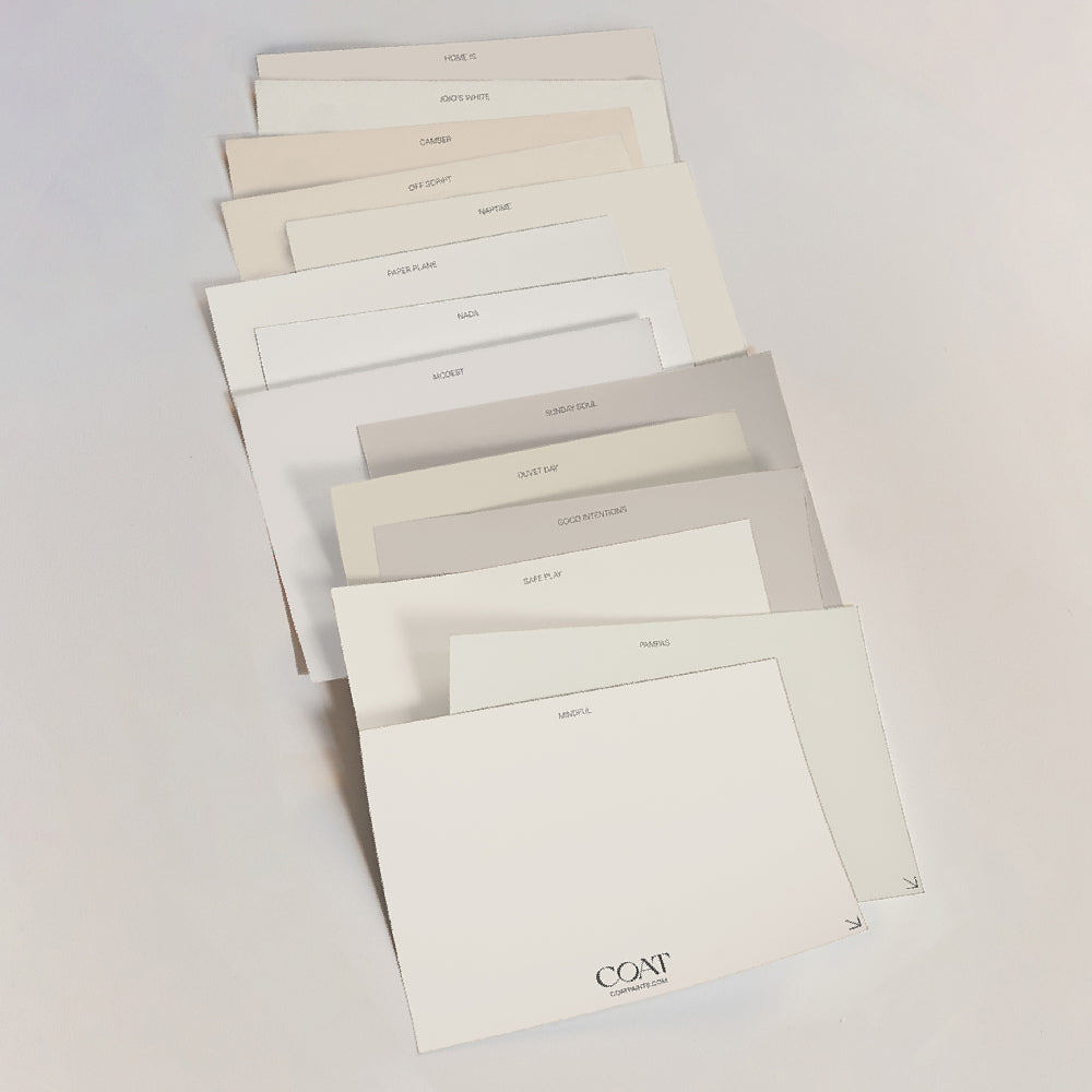
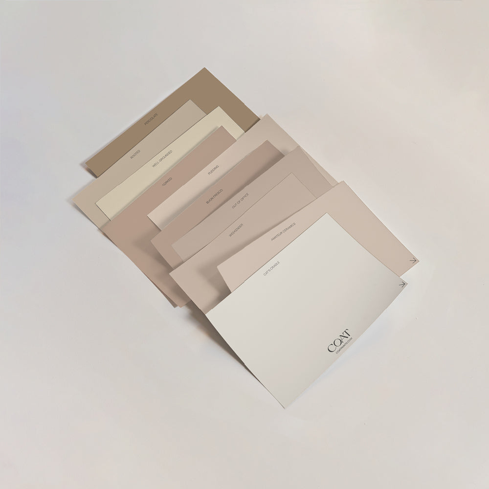
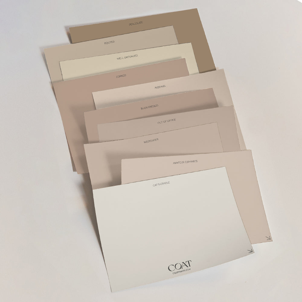
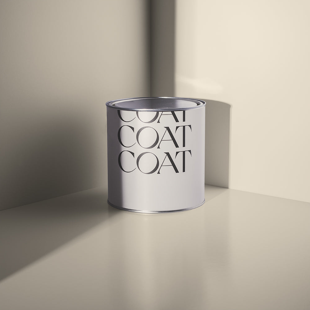
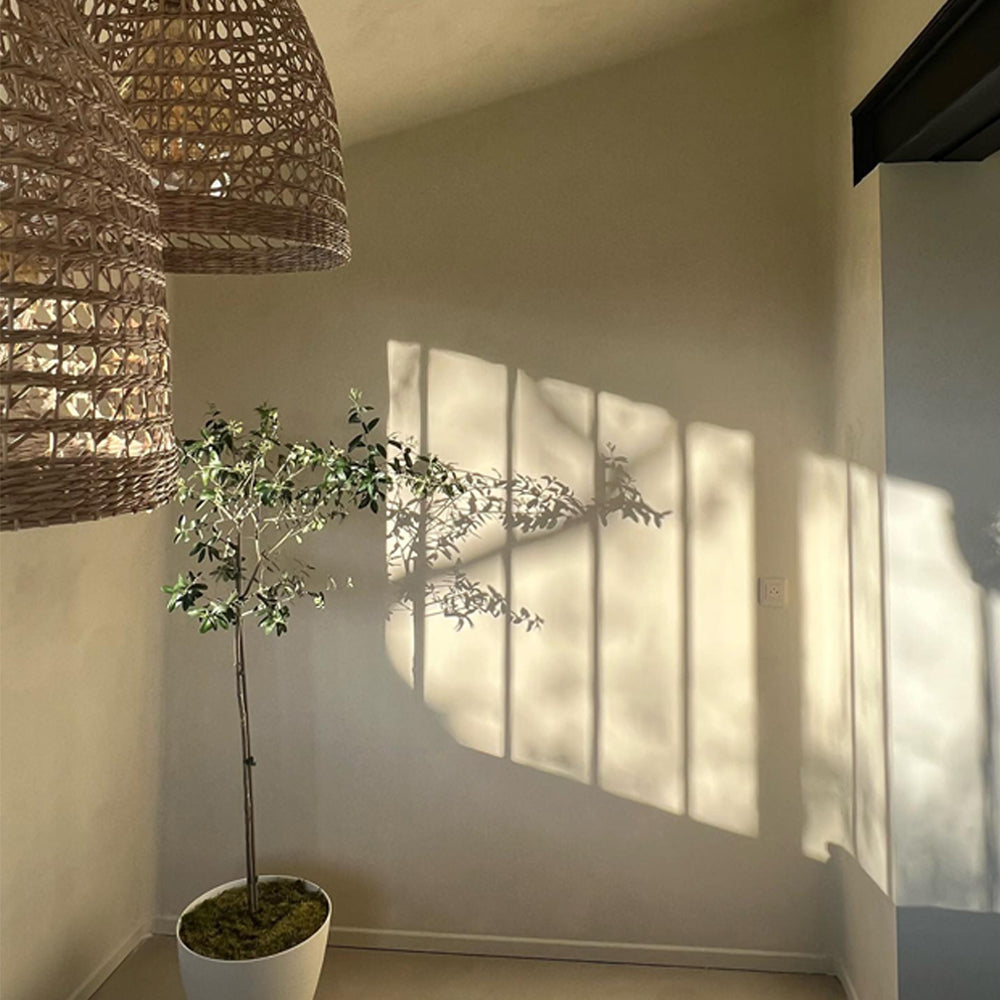
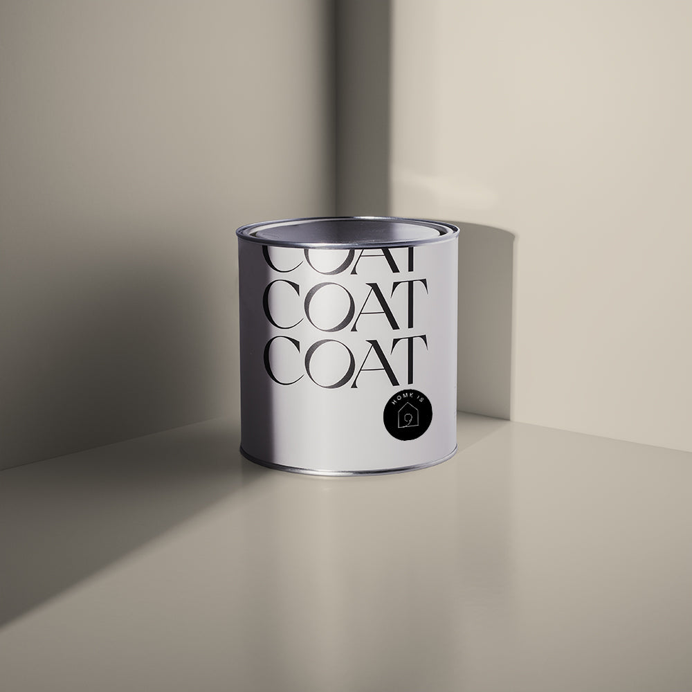
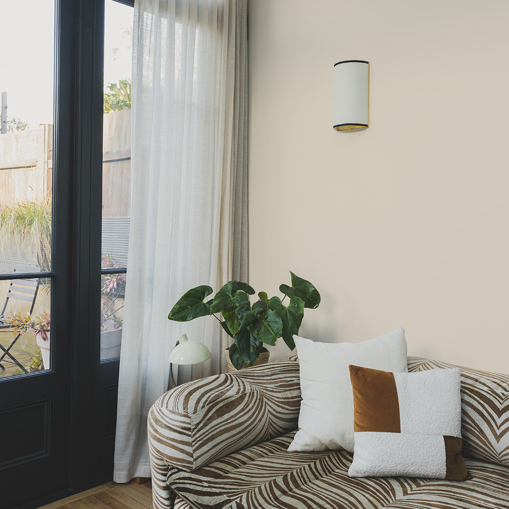
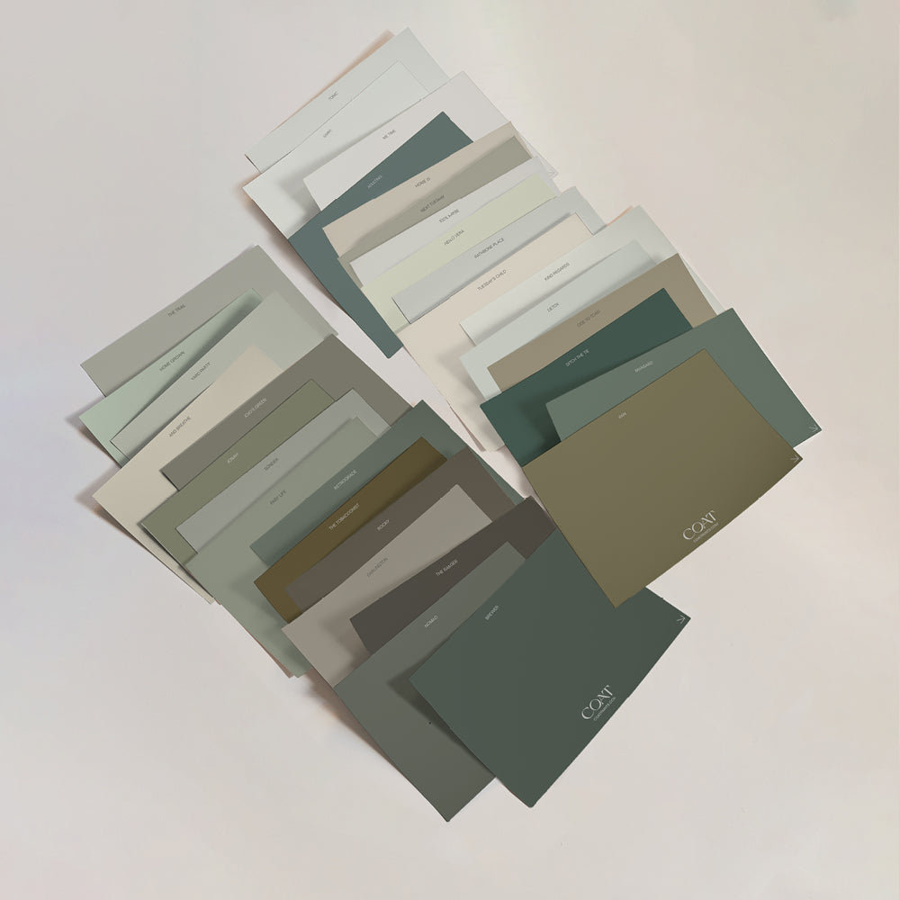
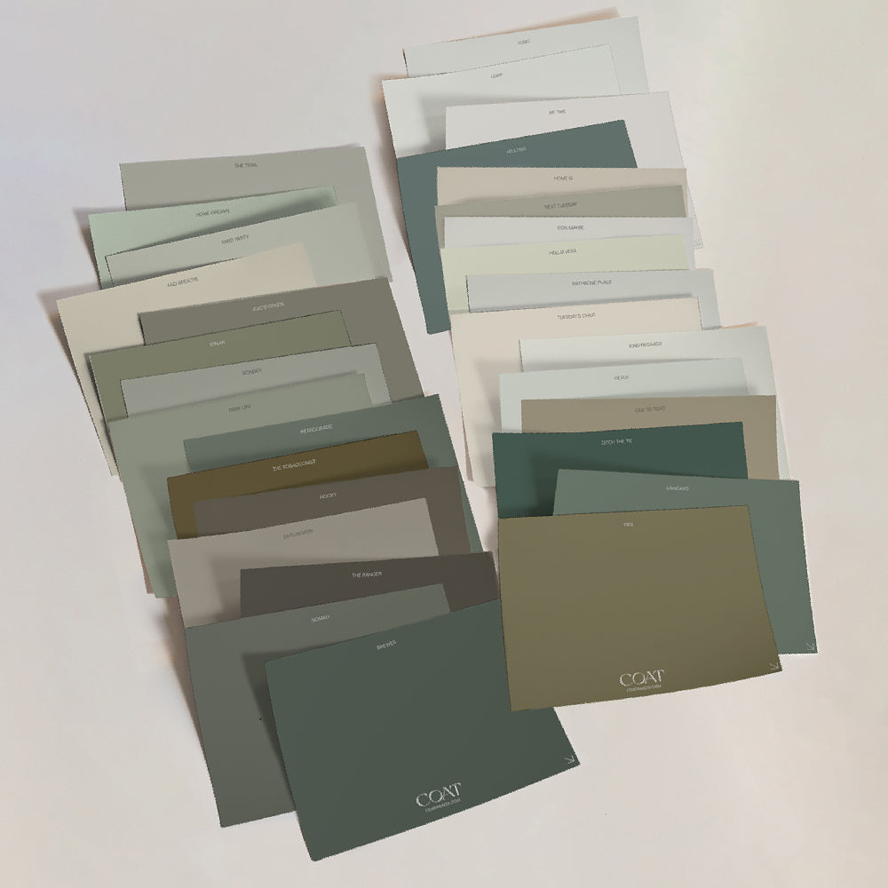
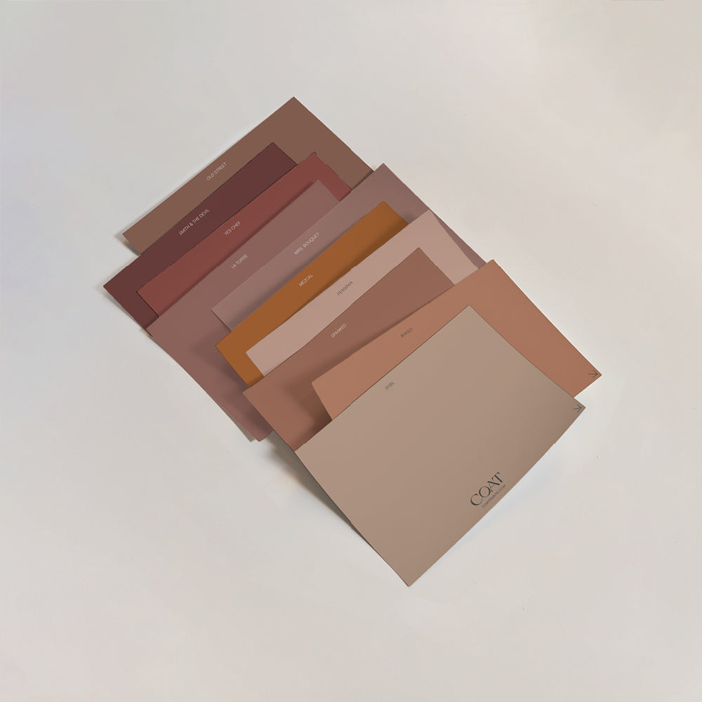
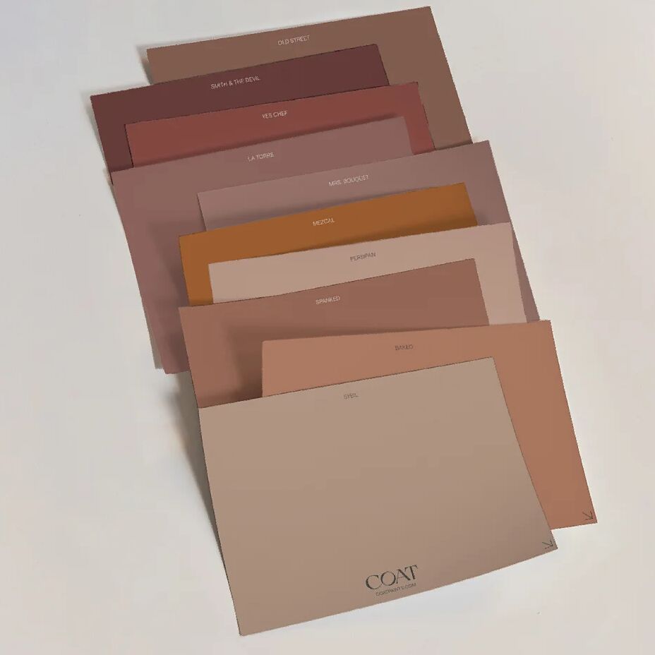
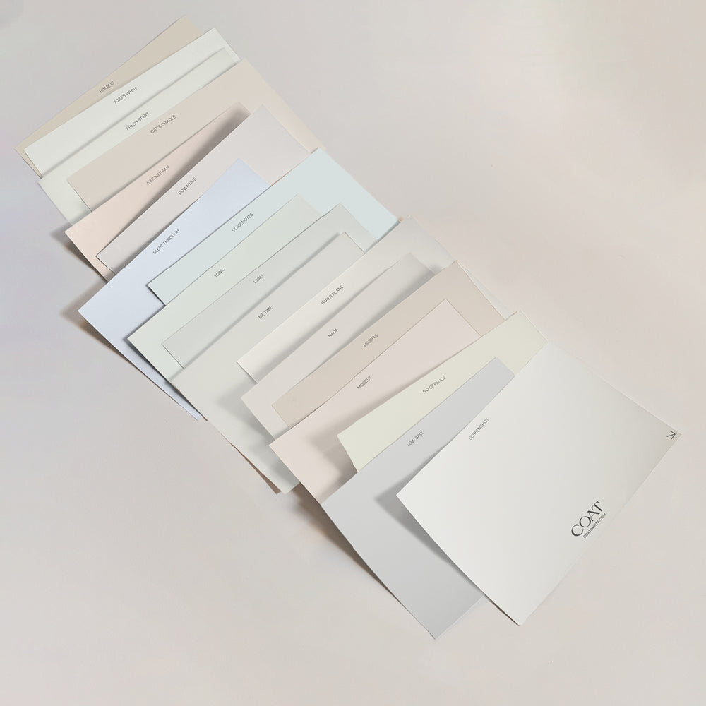
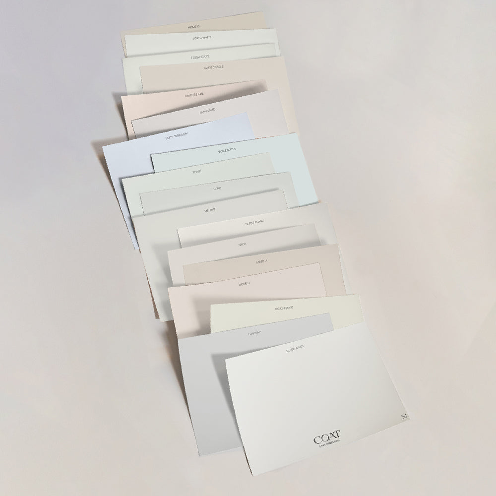
At COAT we’re all about making the choice of colours easier for our clients. We’re introducing 13 new colours to our palette that will make it even easier to choose colours that work together. The colour card is split into columns to make it easy for you to pick schemes that work effortlessly together.
Our Colour Curator, Aaron Markwell, is going to introduce you to our new shades and give you some advice on how to pair them. Grab a cuppa, there’s something here for everyone.
Neutrals
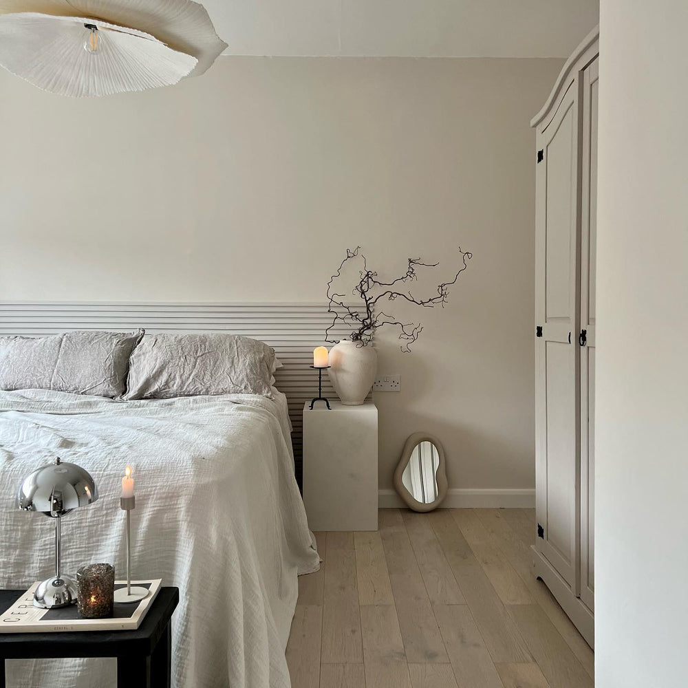
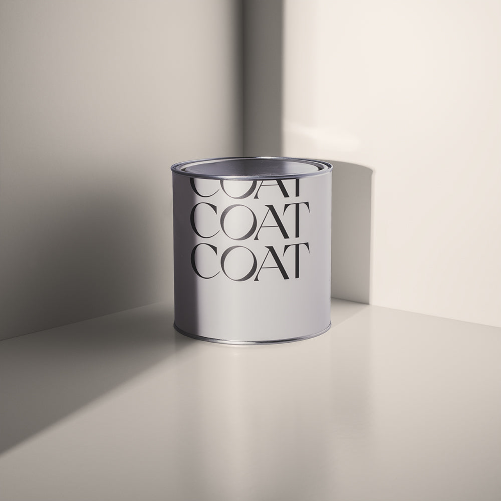
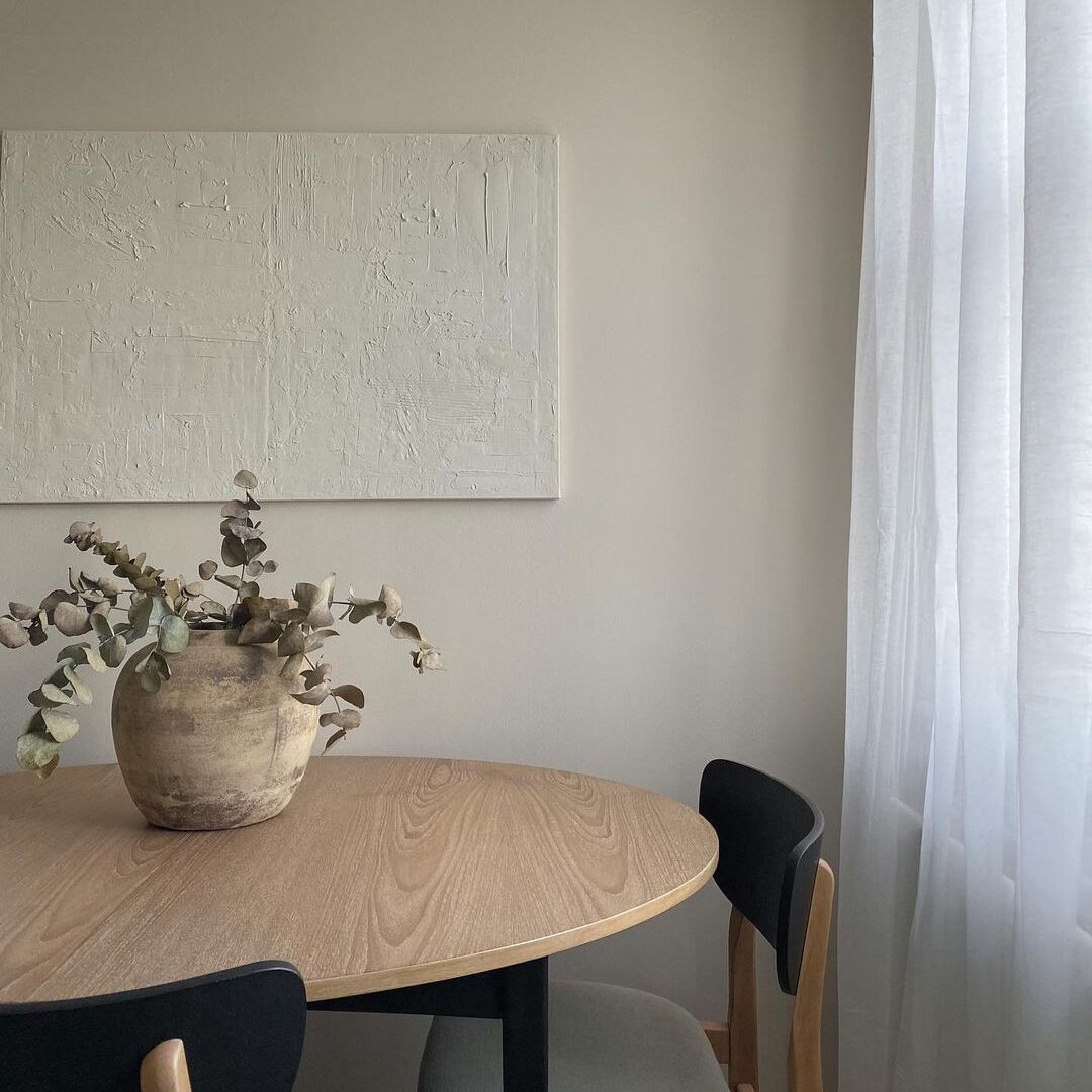
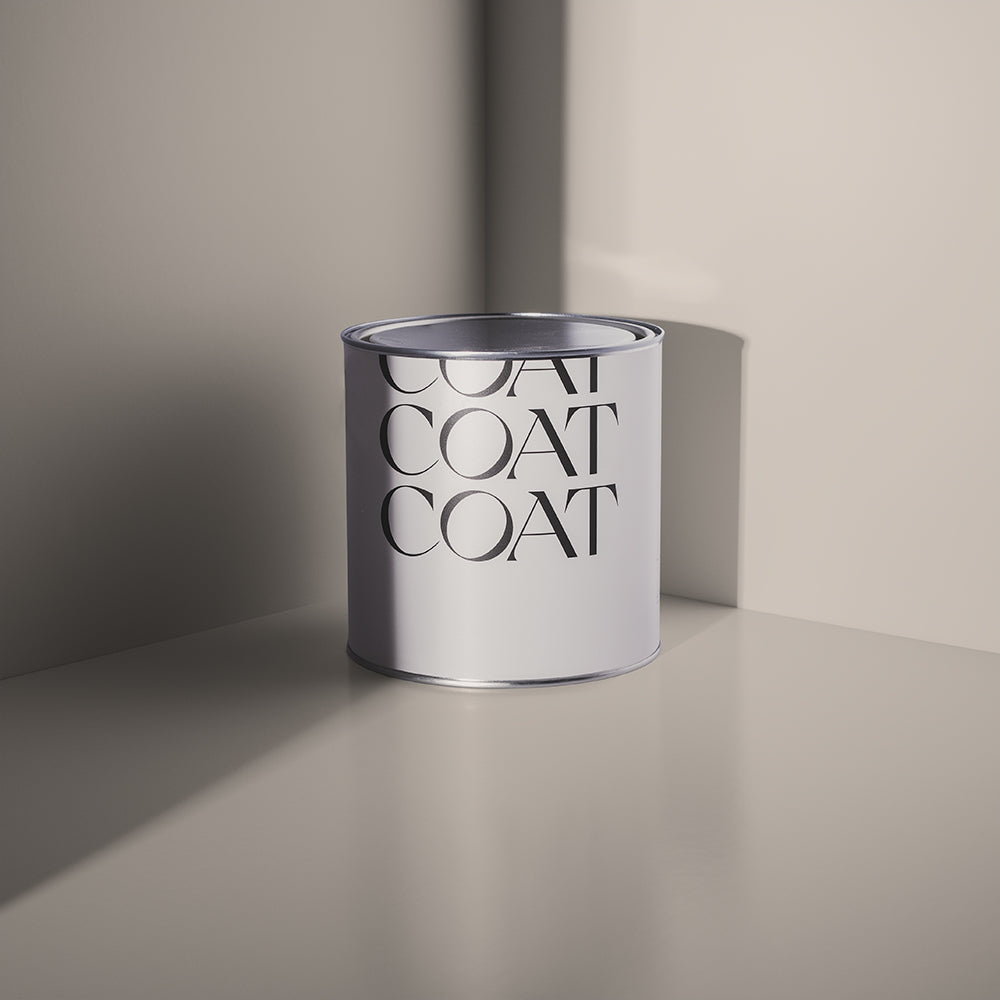
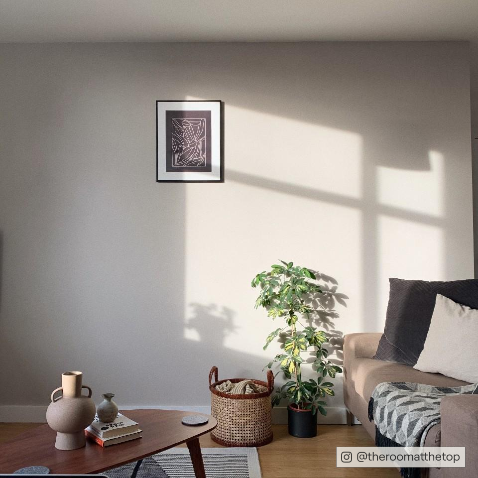
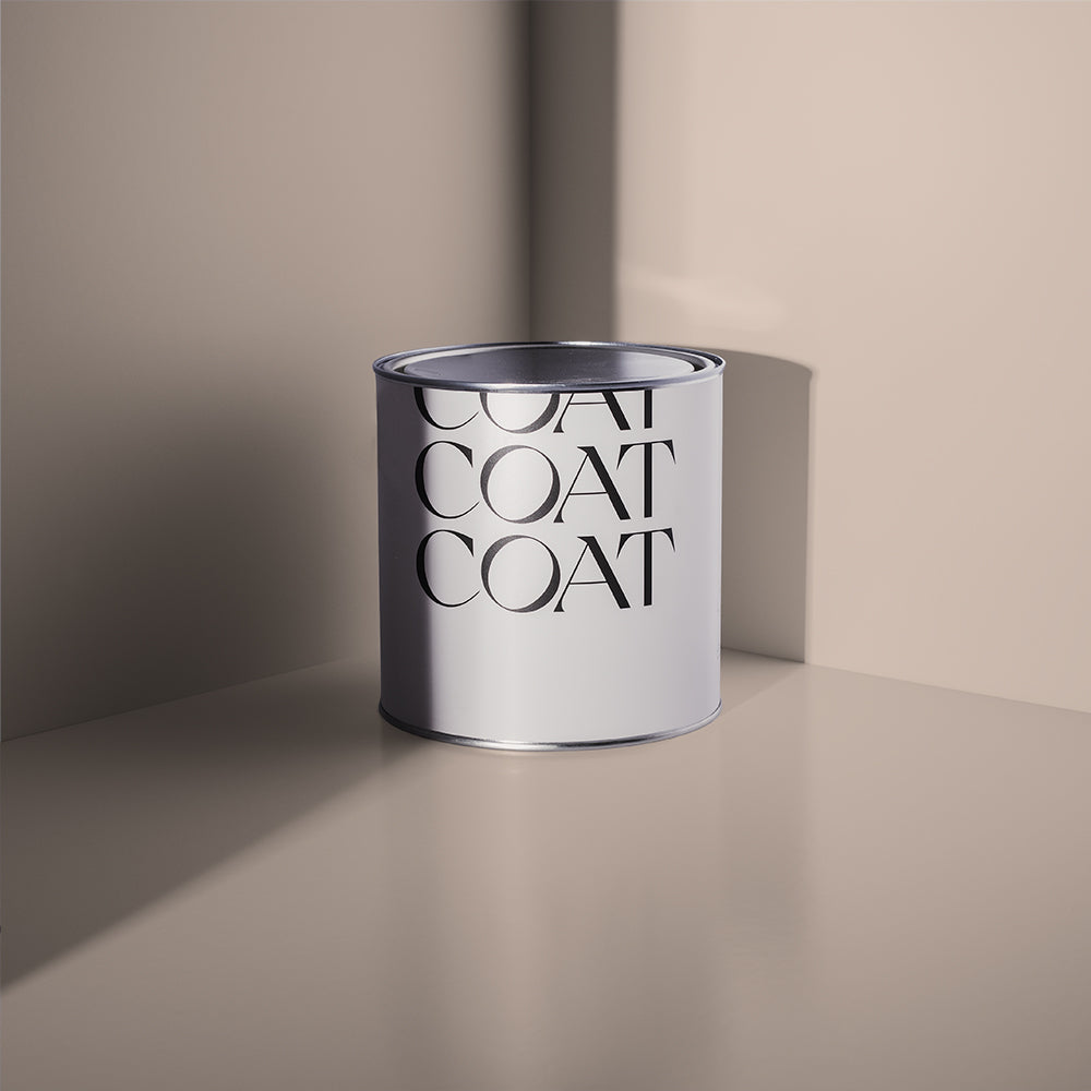
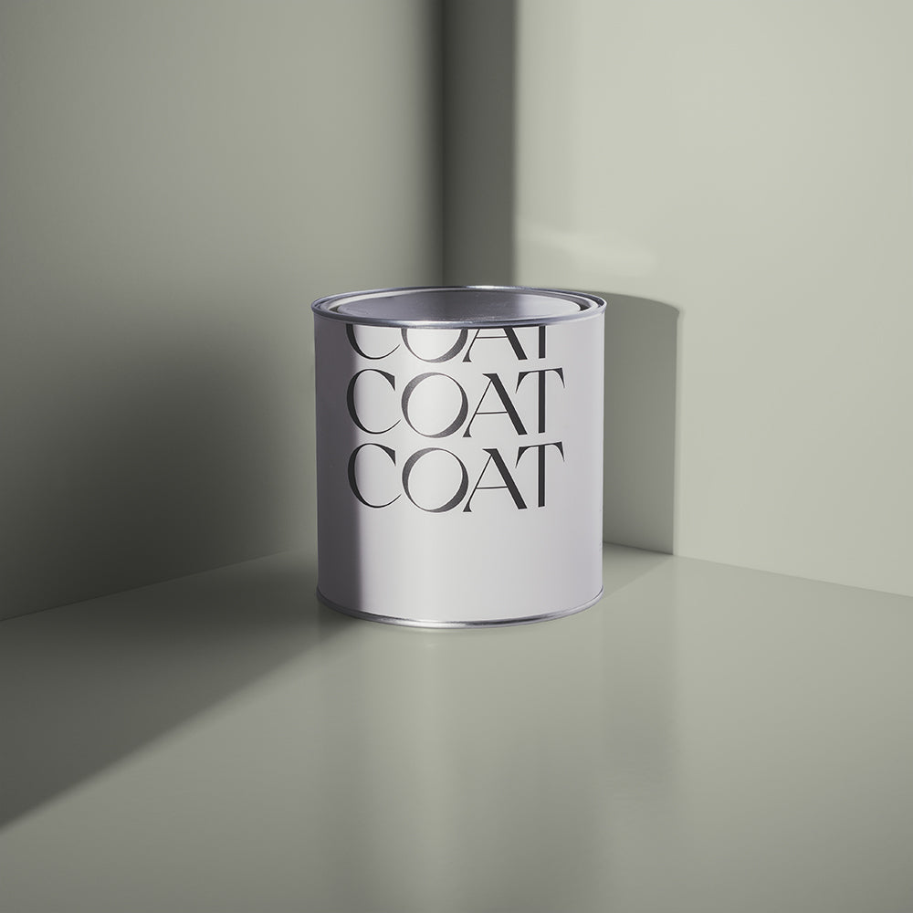
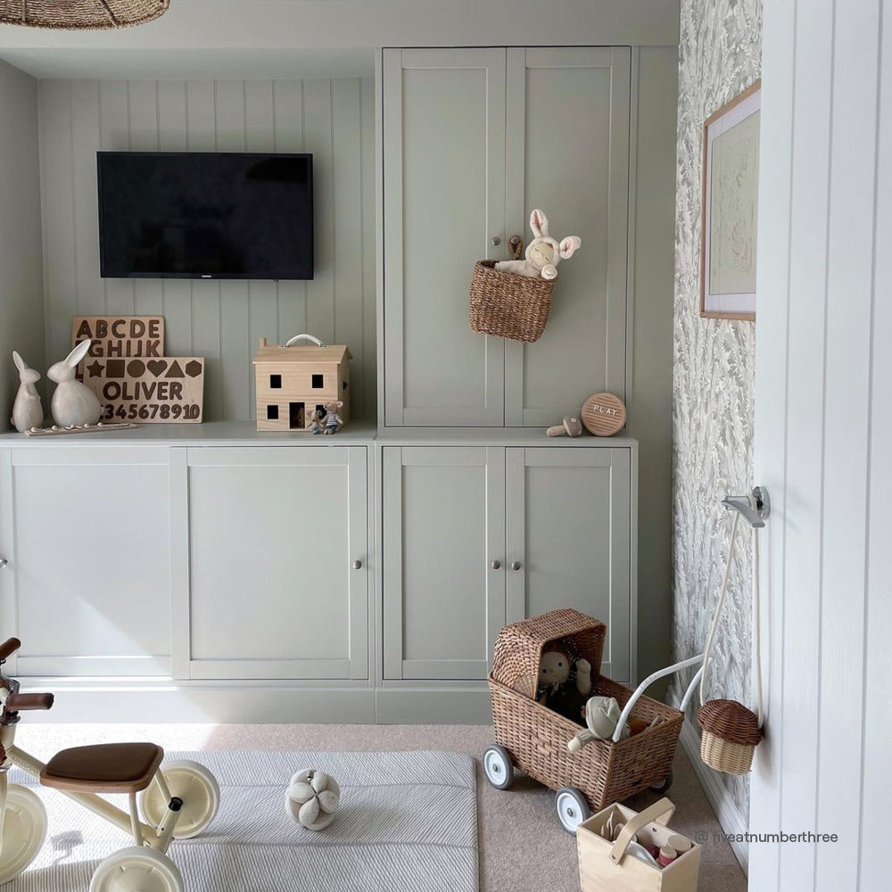
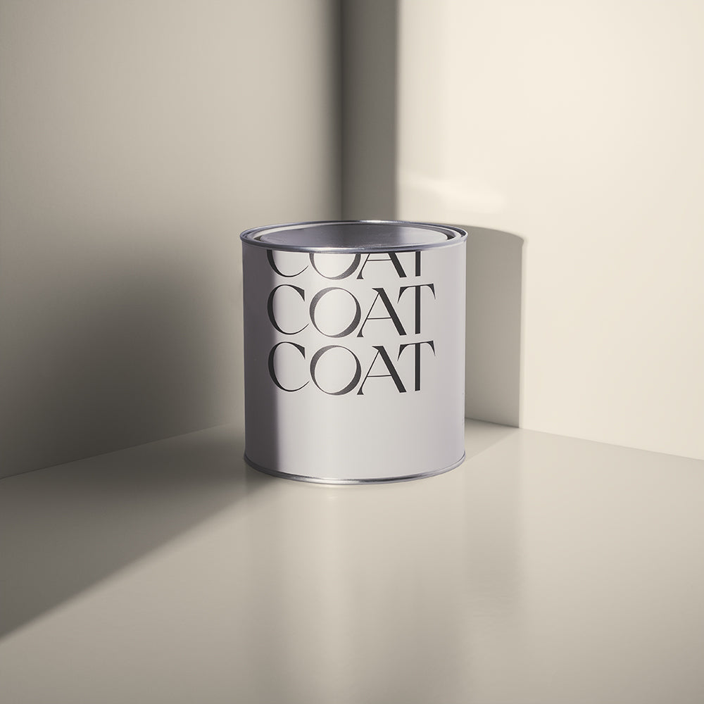
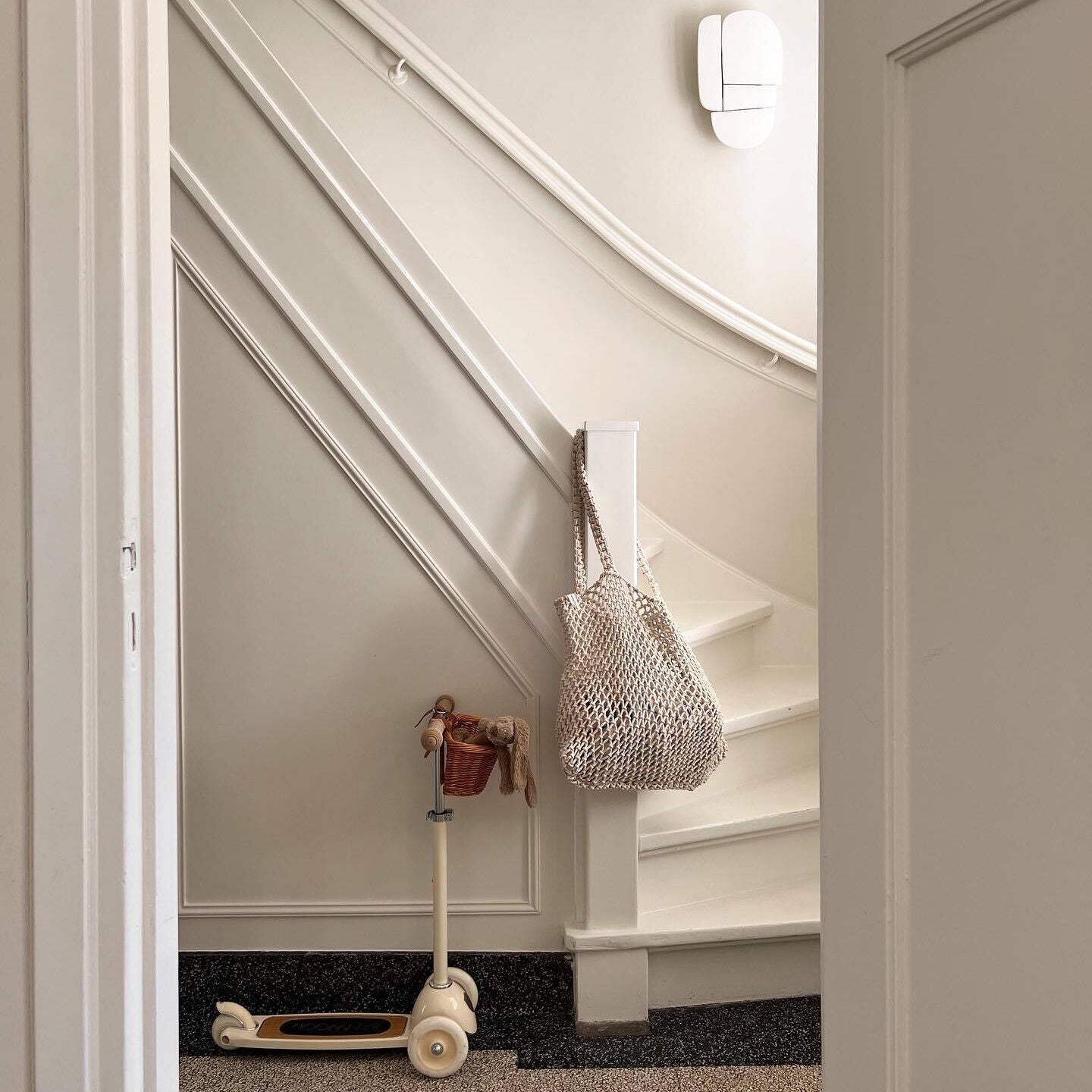
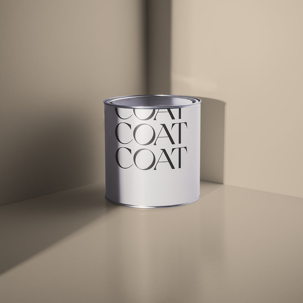
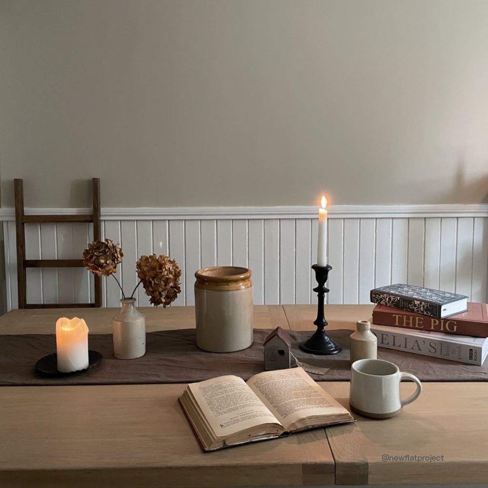
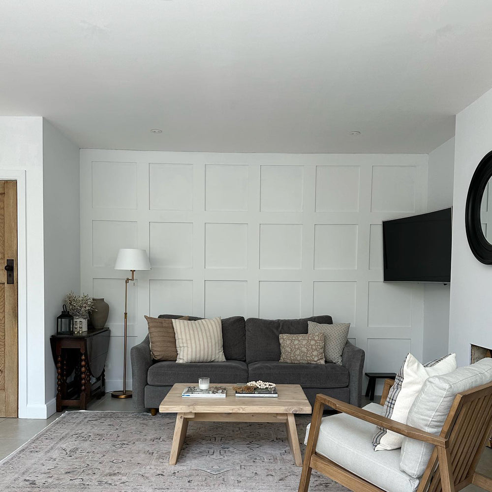
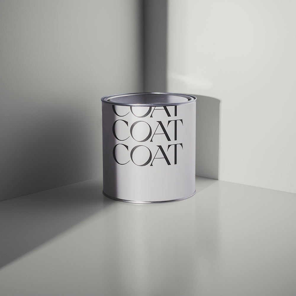
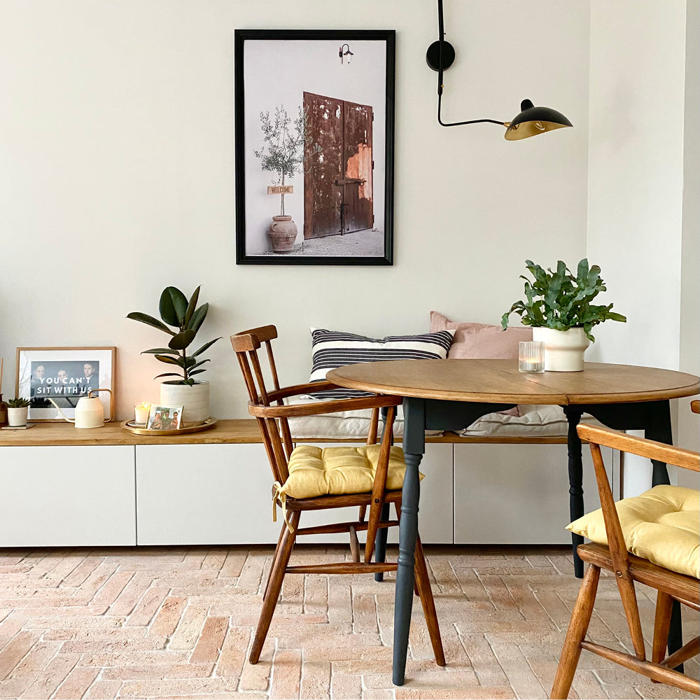
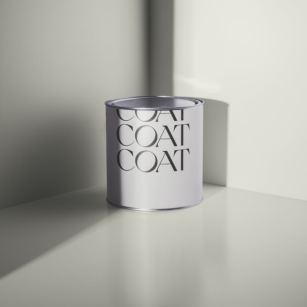
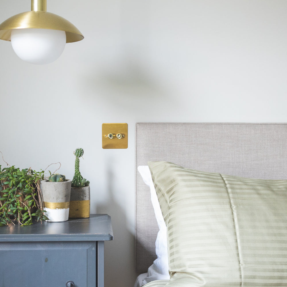
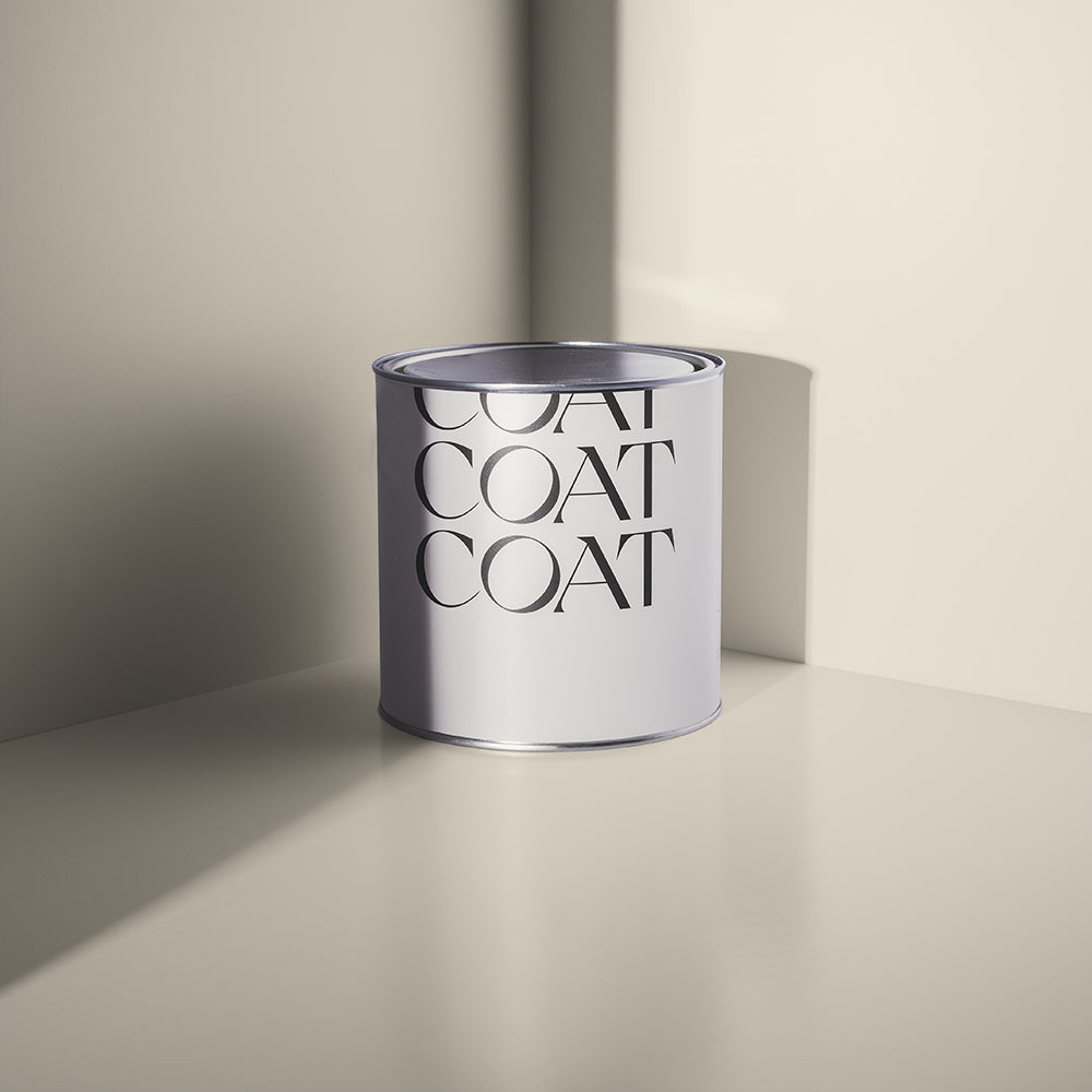
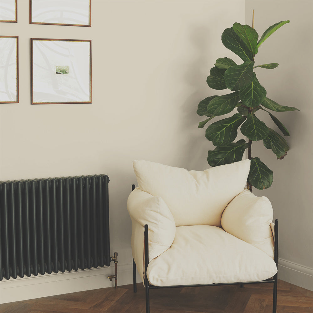
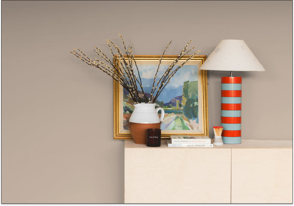
The new super-hero of our neutral colour palette is Tuesday’s Child. Created to pair with one of our best selling neutrals, Cargo, this light greige is full of grace. A slightly green greige, this neutral offers a pale greige that is full of warmth and charm. It has a slightly green undertone, which makes it the perfect off-white to pair with some of our green tones like our new saturated green, Pan as well as with the legendary Nomad.

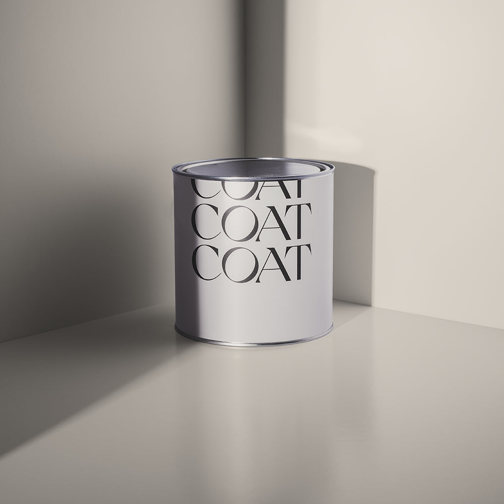
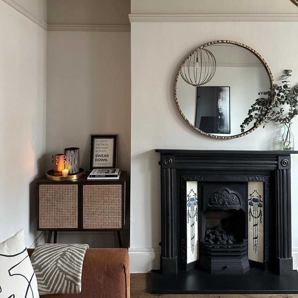
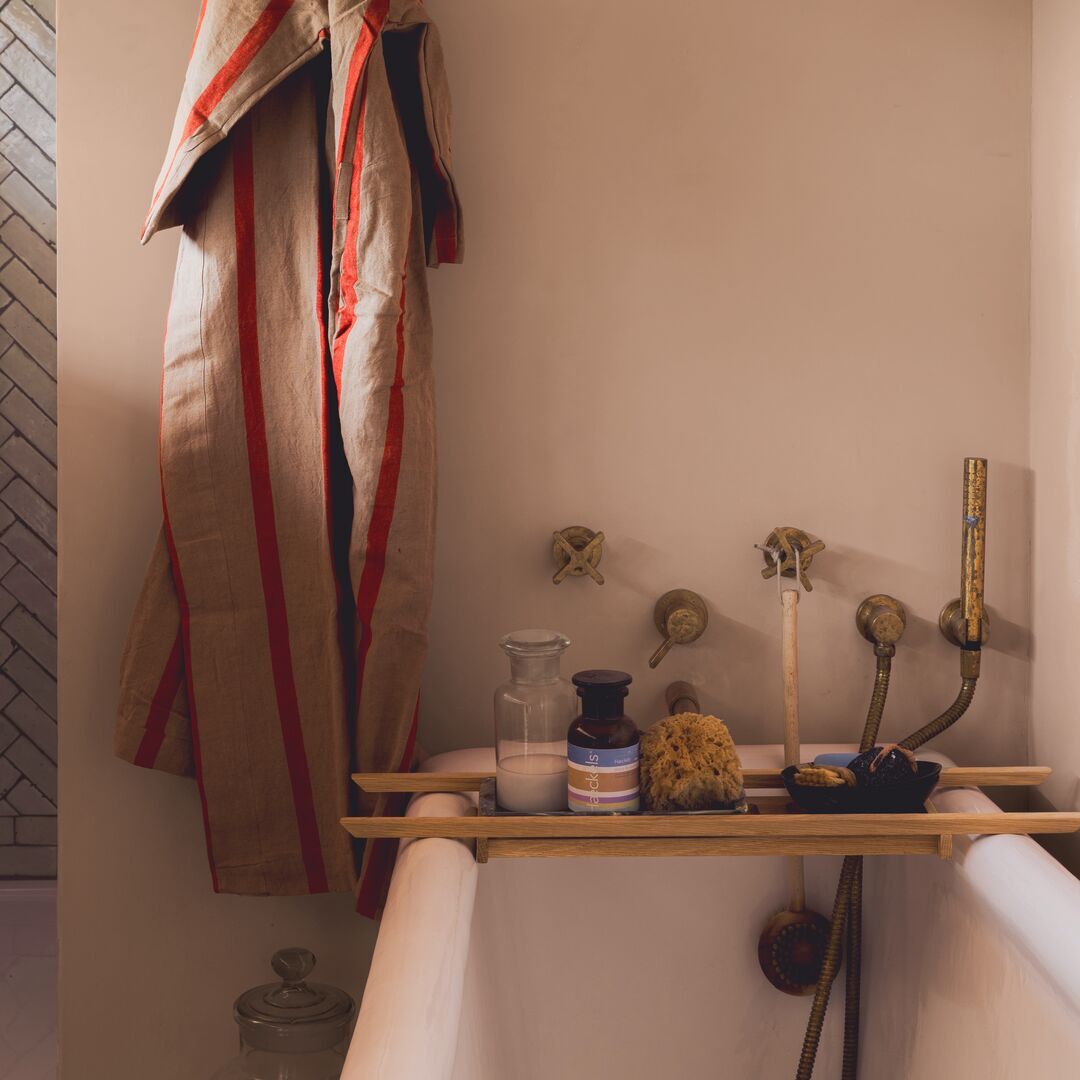
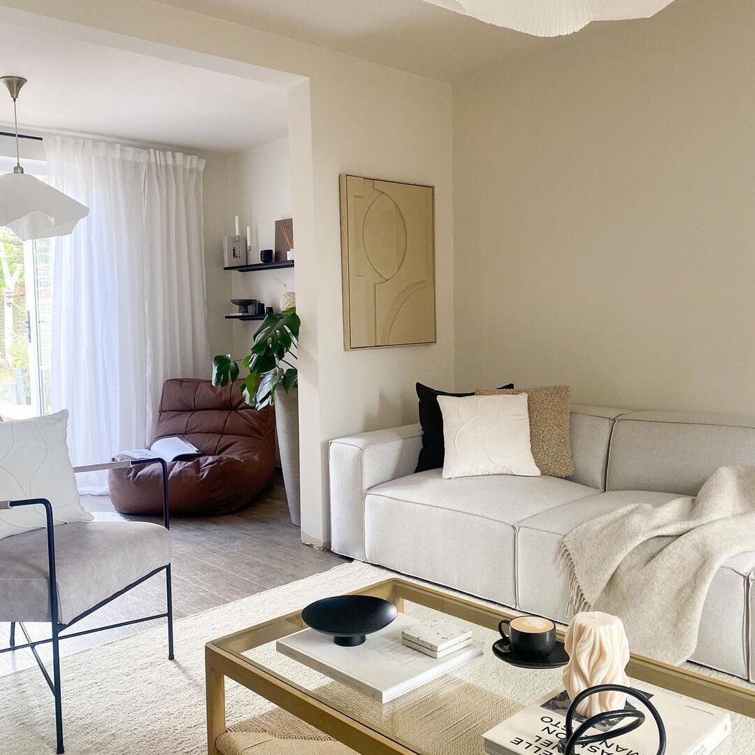
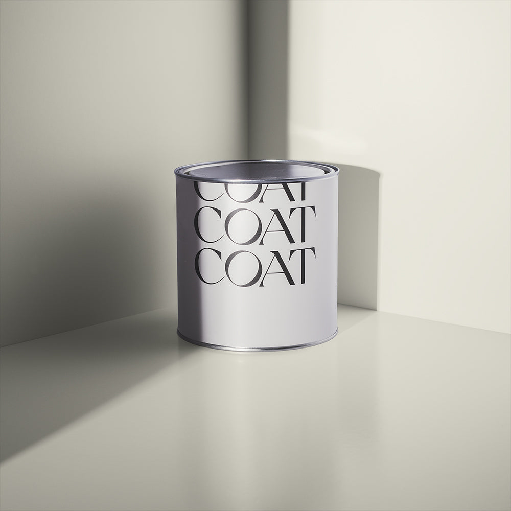
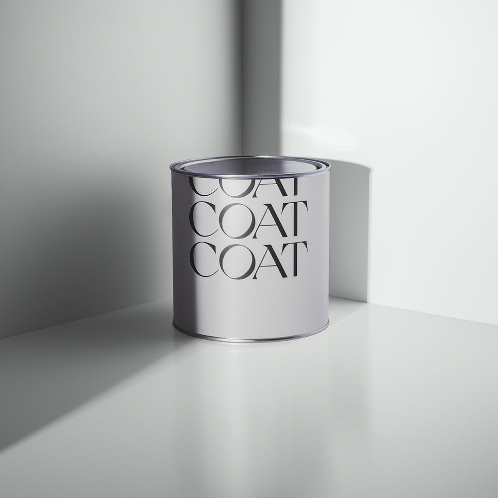
Warm whites are always on-trend, so COAT have introduced No Offence, a yellow based white that is guaranteed to make your space feel serene. Whites with yellow undertones are inviting, but often also have grey undertones, and in some lighting conditions these can look a little drab. So: we’ve created a white that has no black pigment. No Offence is sure to provide light and warmth to any room. Combine with Humble and Well Grounded for an effortless neutral scheme.
Want to check these new shades out in real life? Order our Peel & Stick swatches which use 100% real paint and are recyclable too.

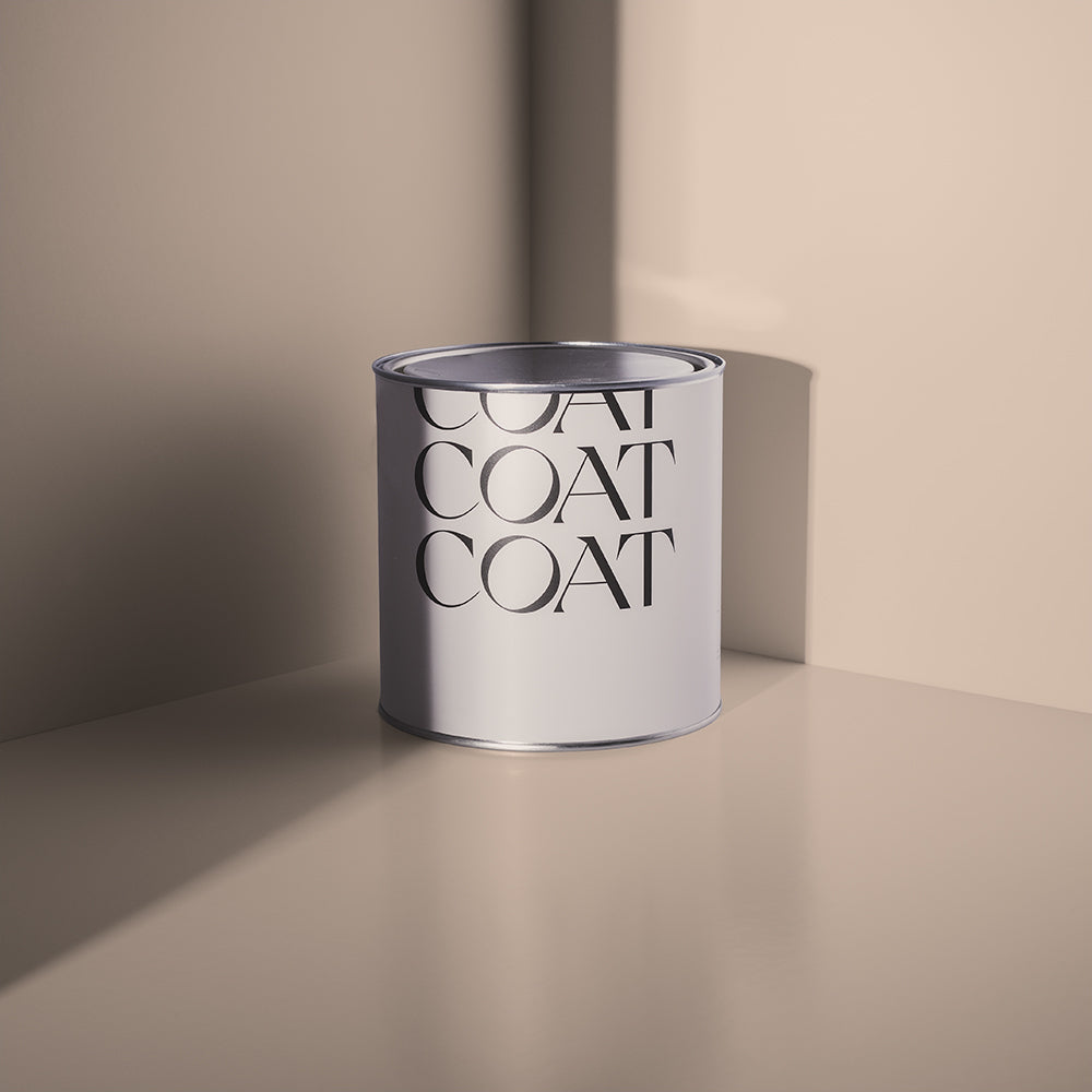
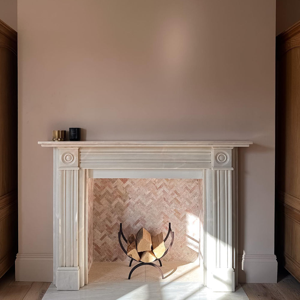
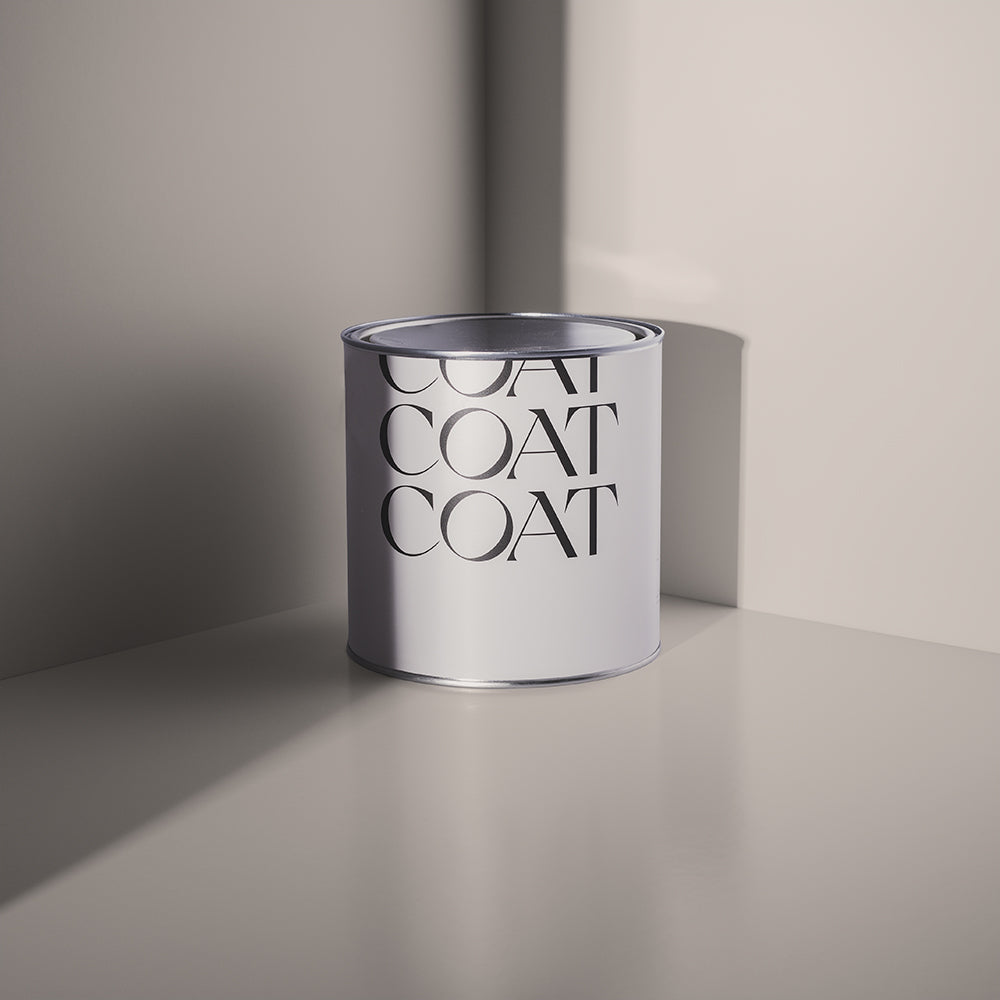
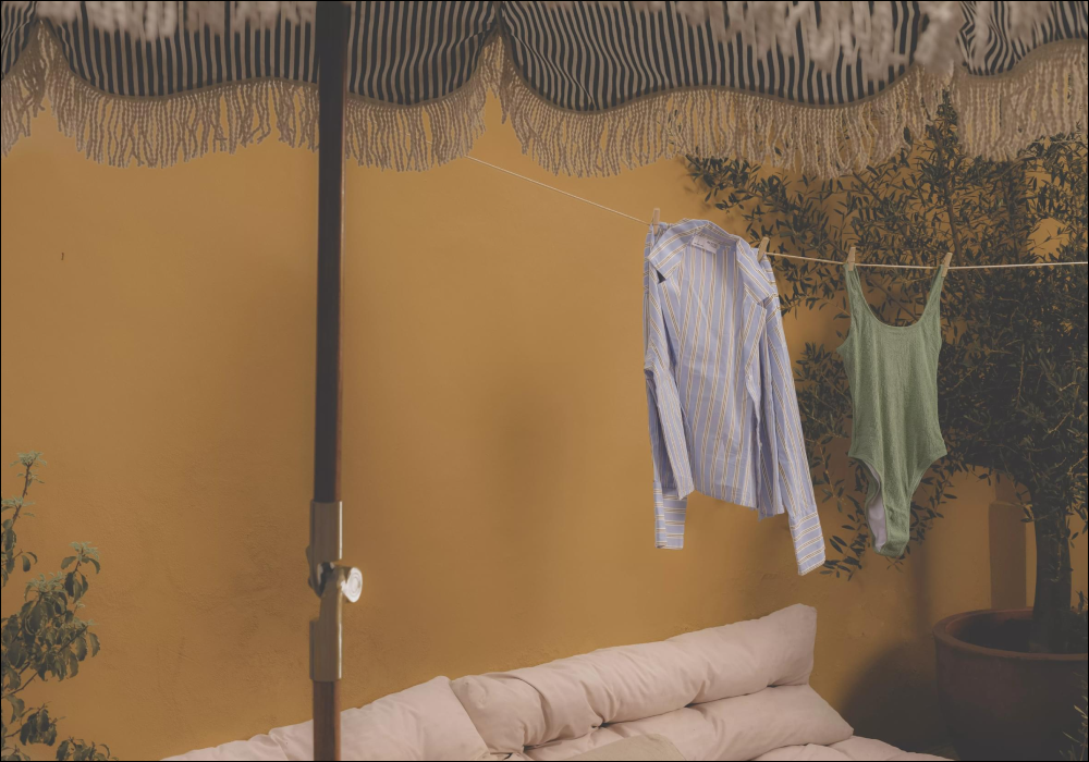
Jane is a yellow neutral, a welcoming edition to any space. This colour might be an obvious beige, but doesn’t have the orangey harshness of magnolia, and so feels much more relaxed. This bright beige was a custom colour for a North-East facing room in one of our colour consultation customers homes, and the customer remarked that his Mum, Jane, would love this colour. We did too and so, brought Jane into the fold. Pair with No Offence and Humble for an effortless scheme.

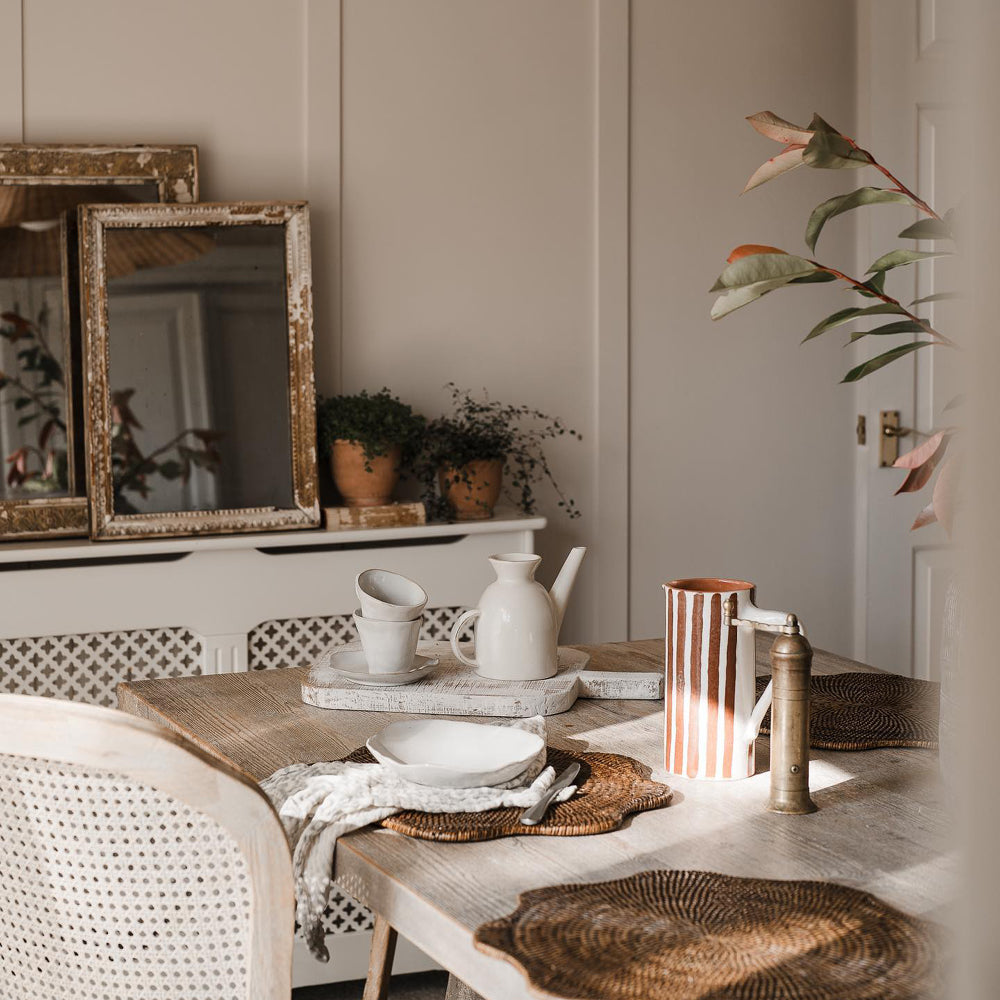
Beige is often a colour associated with the status quo. We’ve introduced a deep beige for those of you that want just a hint of drama. Moving Day is an effortlessly warm beige that welcomes you home. Slightly less red than existing deep beige, Well Grounded, this colour was created to compliment Safe Play and Duvet Day, which are both slightly grey beiges.

Got all the neutral feels? Grab a warm neutral swatch pack to find your perfect neutral shade.
Pales

Nostalgia has been huge in 2022, and we’re bringing back an all time favourite. Arctic Roll is a cool, sunny yellow. Bright and pretty, this yellow isn’t sickly. Use excessively for an instant smile and combine with No Offence and Jane for a warm, modern scheme, or contrast with Sheldon, our new brown, for a more traditional look.

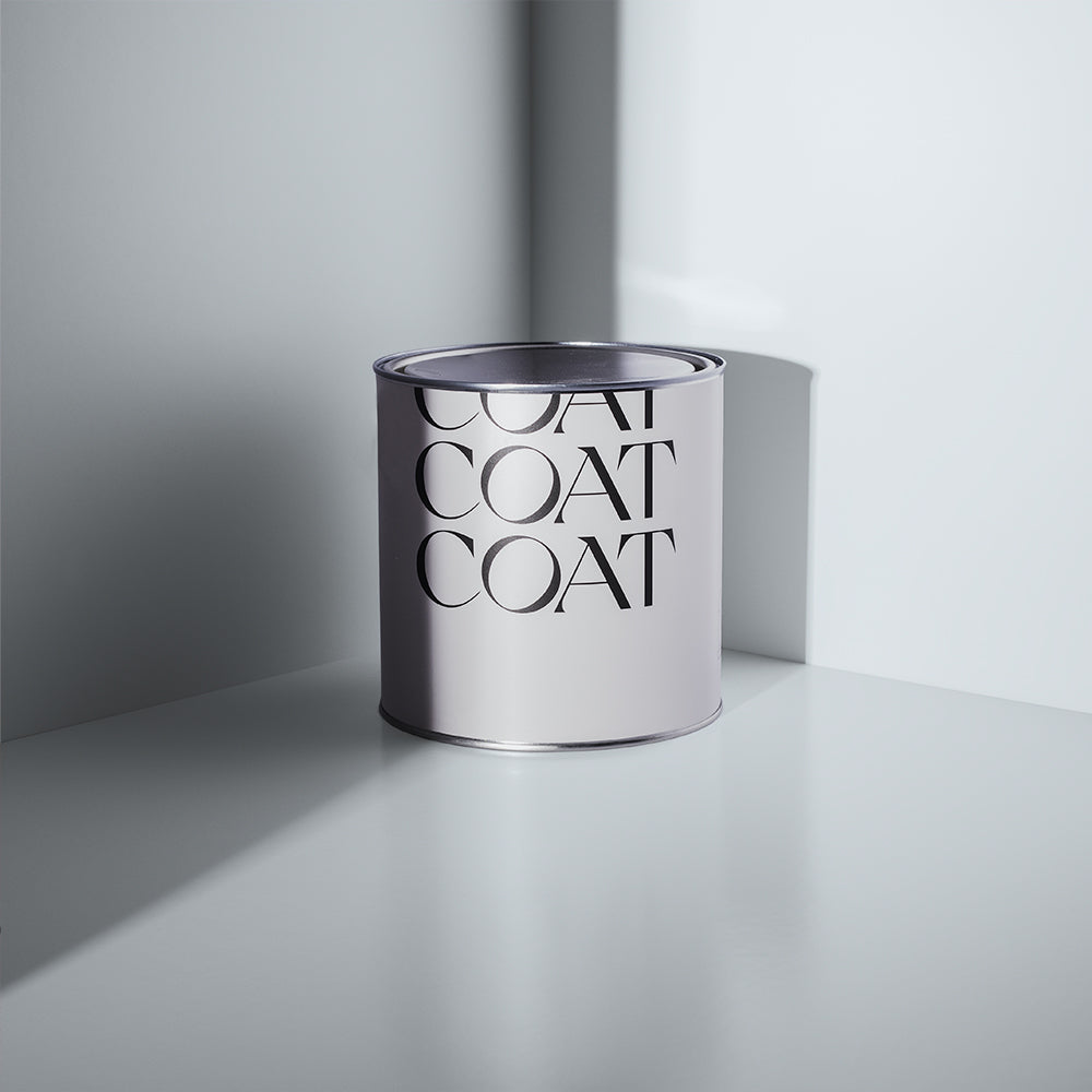
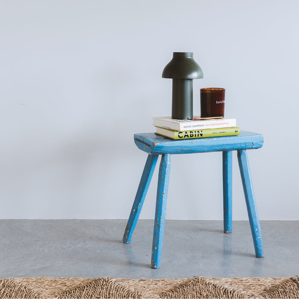
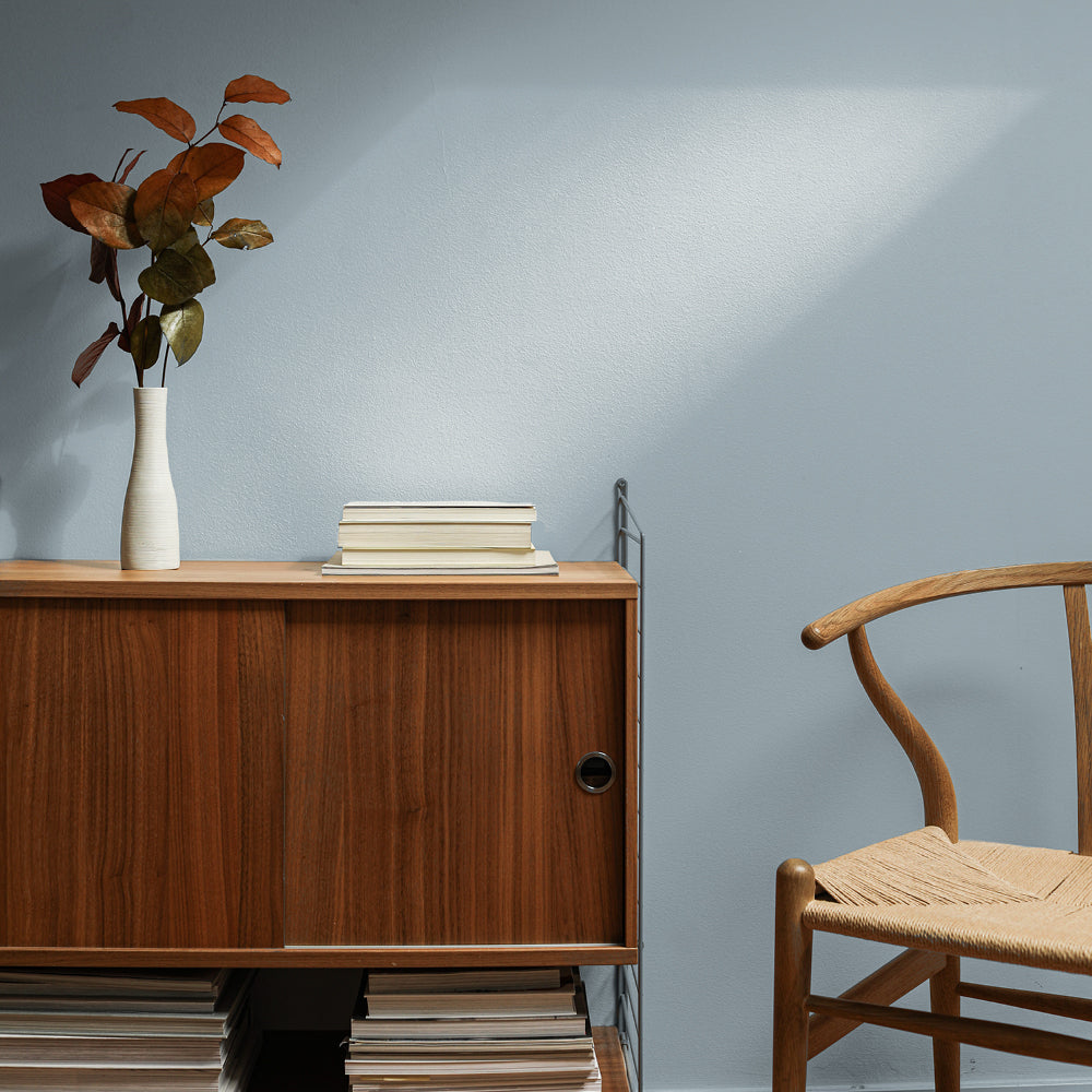
Porcelain blue is a great pick, especially if you’re looking for a serene bedroom colour. It’s time to bring out The Good China, an elegant and timeless pale blue that will make your room feel as though you’ve saved it “for best” everyday. For traditional simplicity, pair with Screenshot on ceilings and woodwork, or can be used as an off-white with deeper tones like new blue, All Inclusive. Stunning when combined with an upcycled sideboard or chest of drawers in Artic Roll.

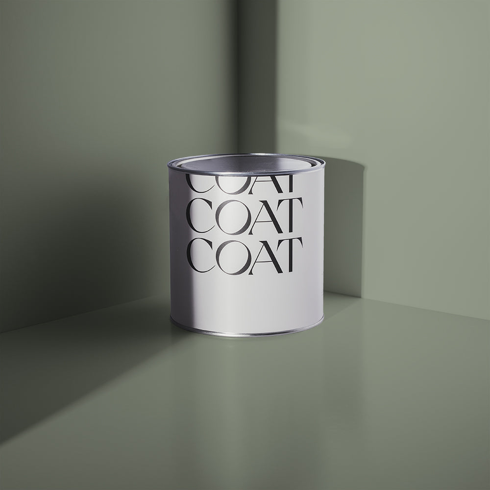
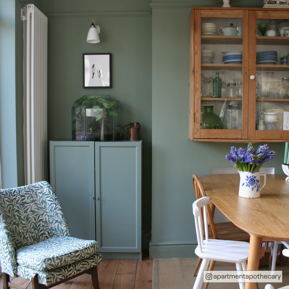
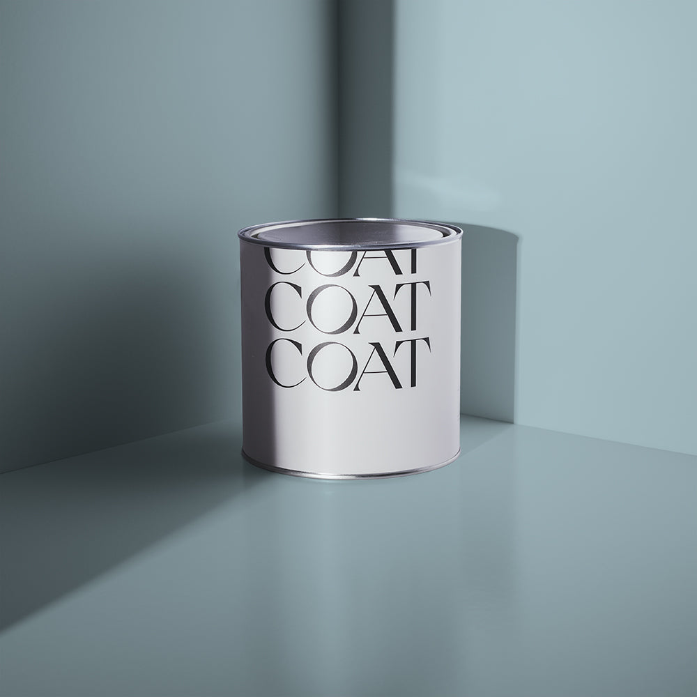
For years, Duck Egg Blue paint has been at the top of Google searches when it comes to paint colours, but it’s such a hard colour to get right. Finally, we’ve made a delicious looking Duck Egg blue that will drive this colour's audience quackers… Free Range is a clean greenish blue with a subtle grey undertone and can be used everywhere. Pairs beautifully with COAT heavy hitters like Hamilton and Adulting. Add some brown furniture or upcycle old heirlooms in Sheldon Eggshell for a warming influence in these cooler schemes.
Mid Tones
Mid tones are definite colours, they’re not super bold so they’re easy to live with, but also create atmosphere and nurture a feeling of intimacy. Use these colours to great effect with colours that compliment them from the colour card.
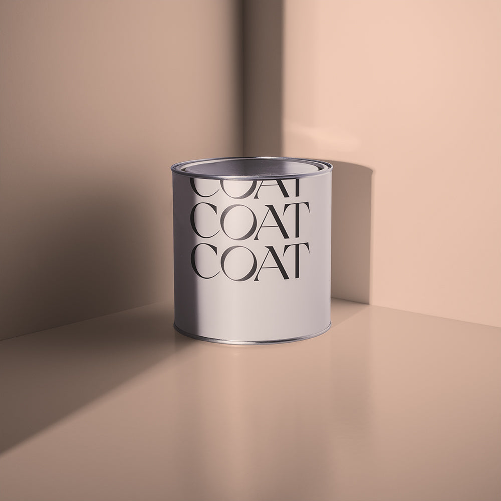
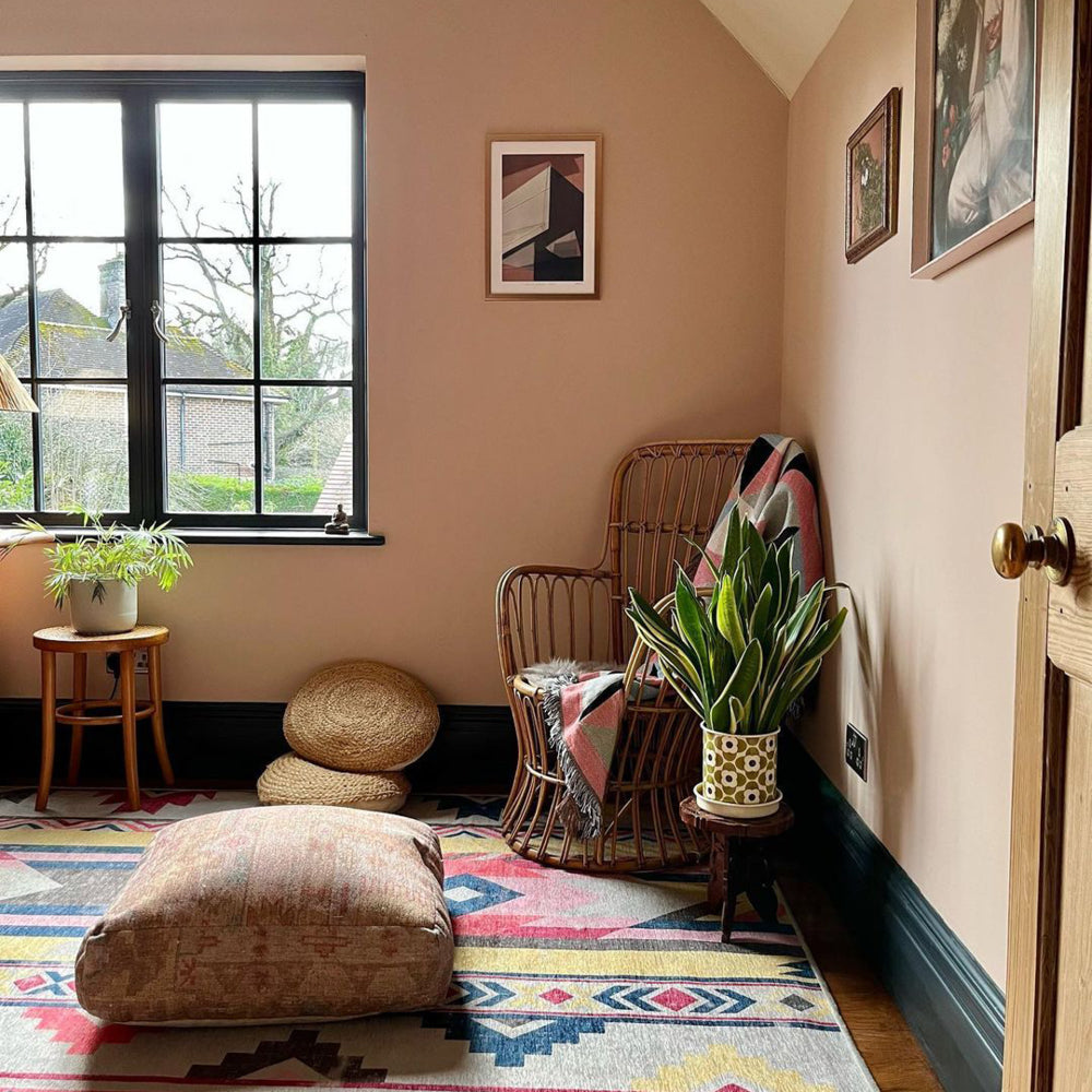
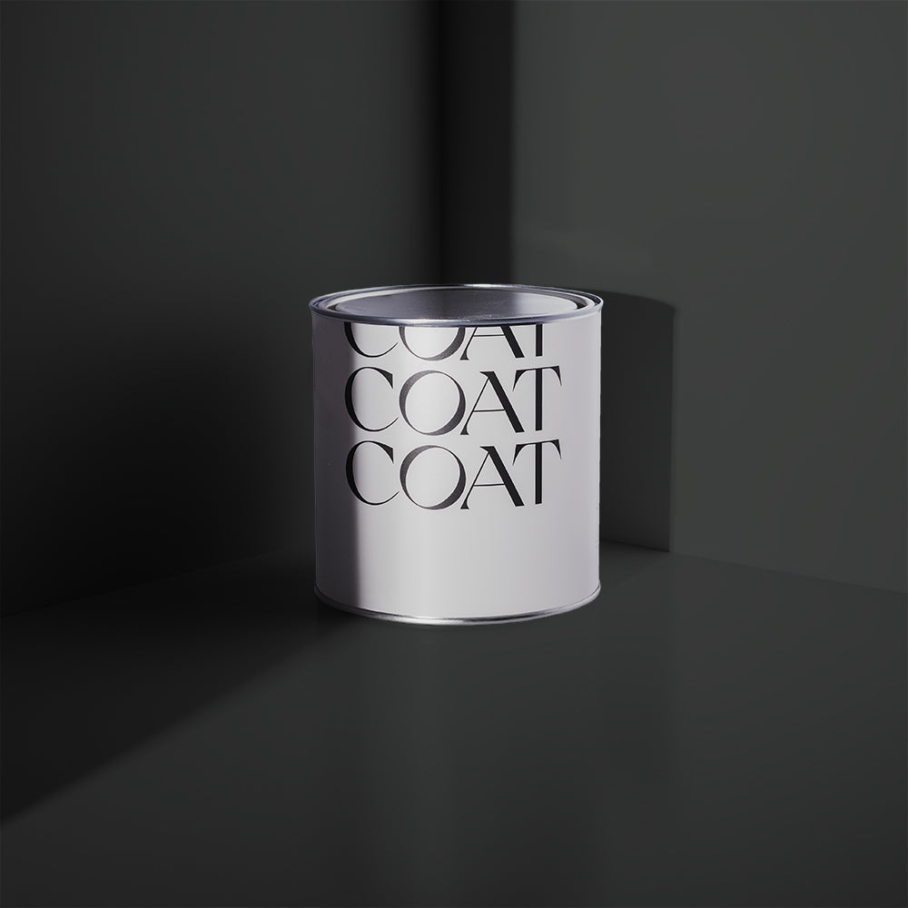
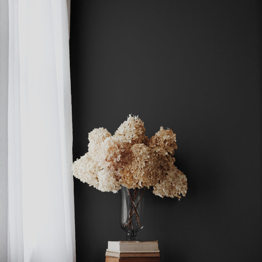
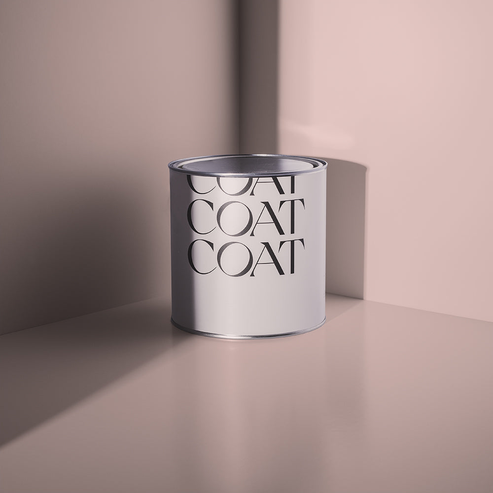
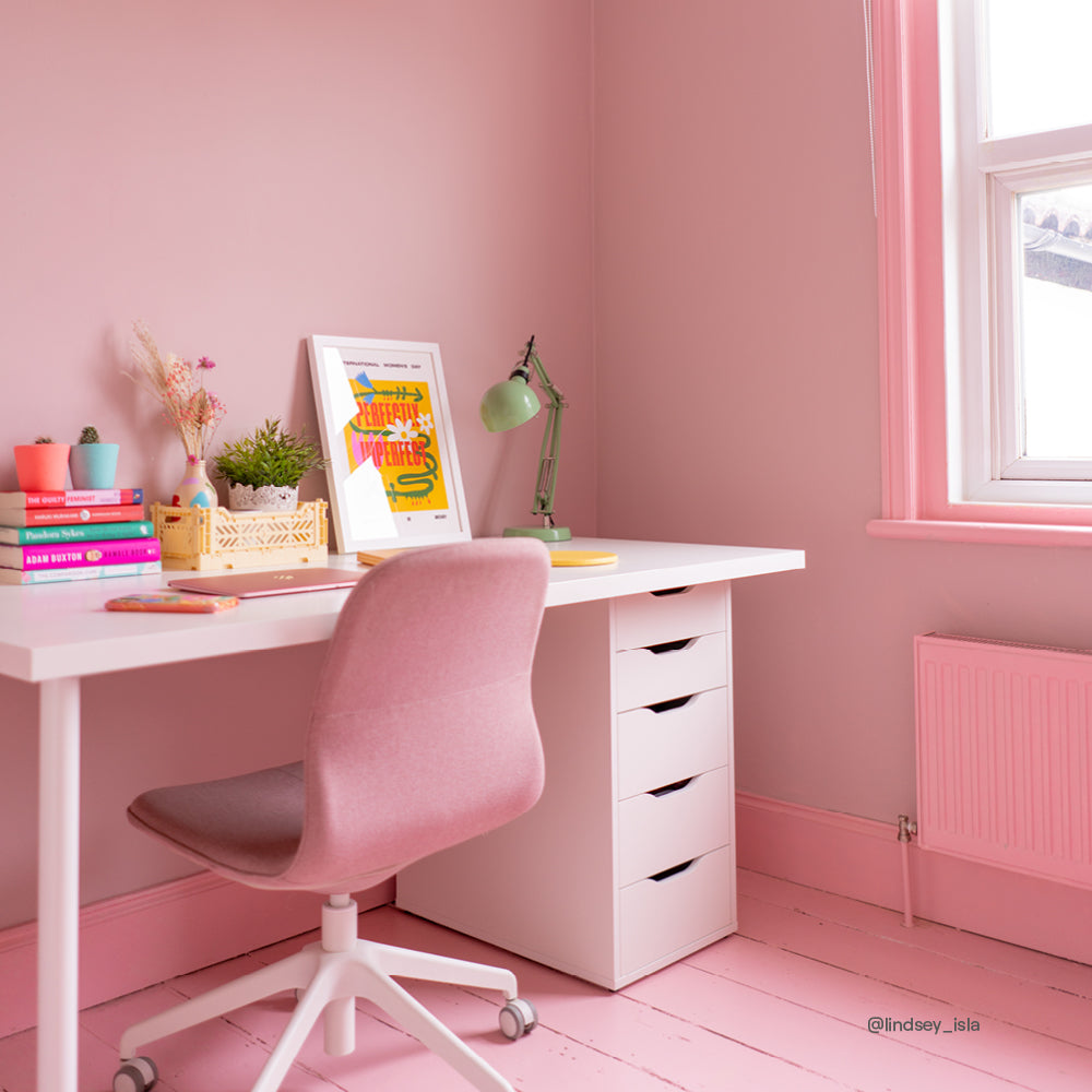
Inspired by Patricia Routledge’s “subtlely” dramatic character, Mrs Bouquet is an elegant and sophisticated deep pink with a fun yellowish undertone. Most effective when paired with beige pink, Pudding, or compliment with No Offence as a warm white. Mrs Bouquet also looks fantastic when combined with a warm black like The Record Store.

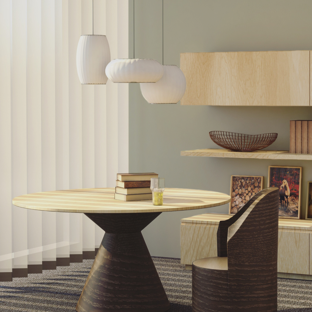
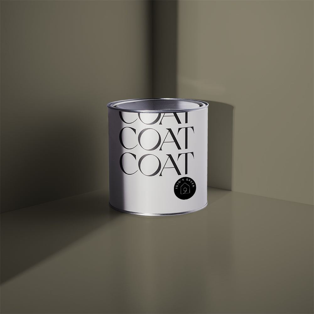
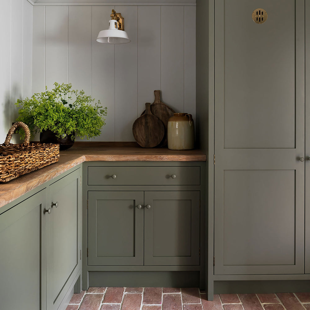
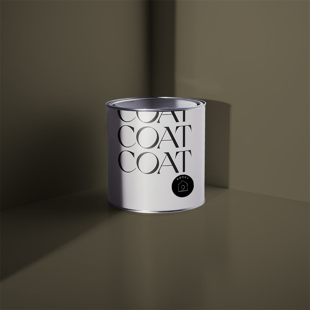
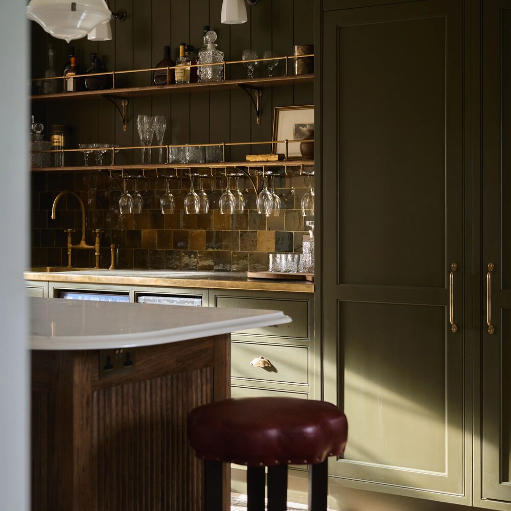
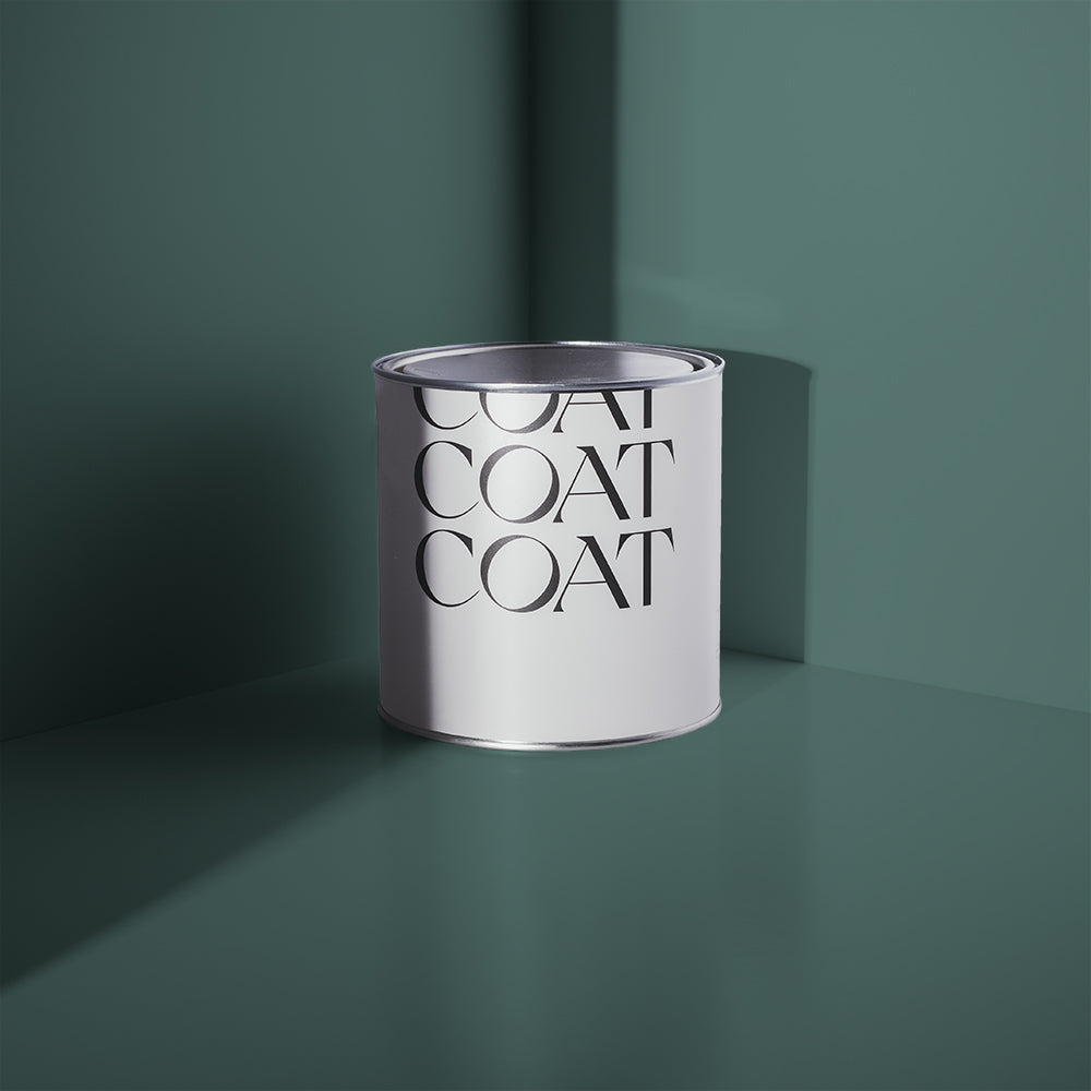
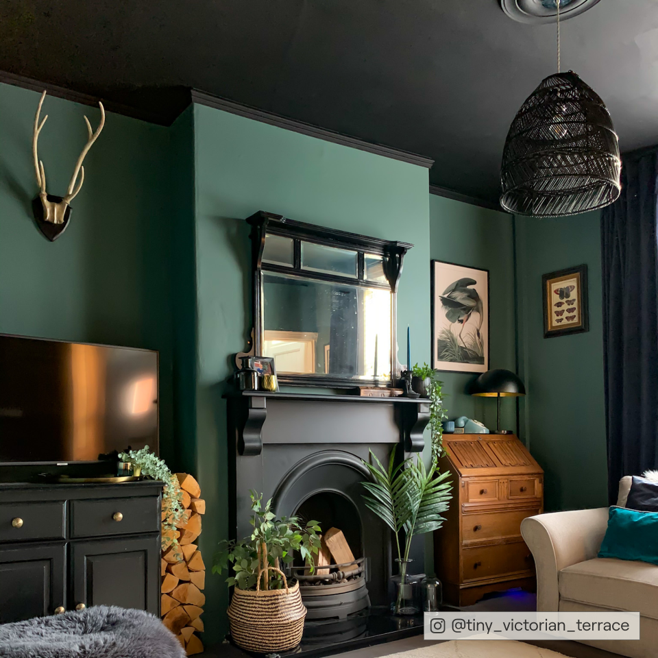
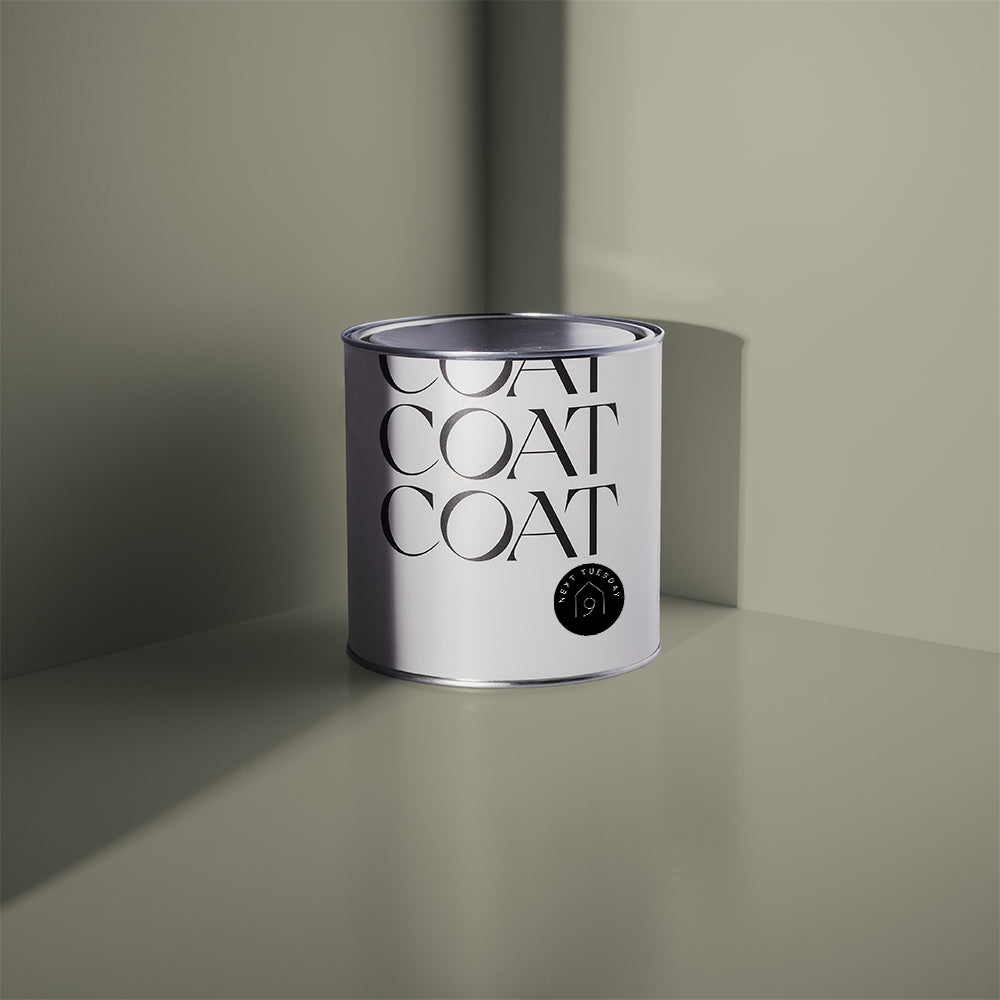
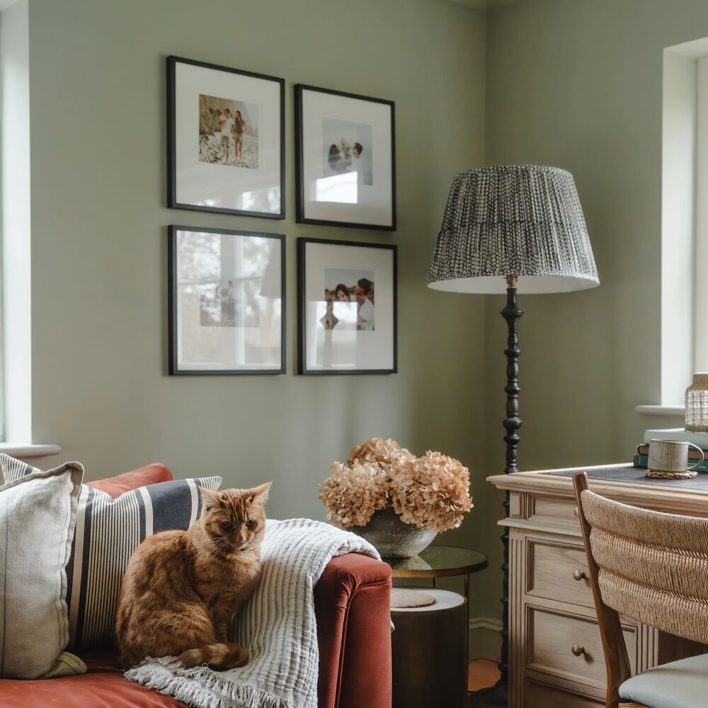
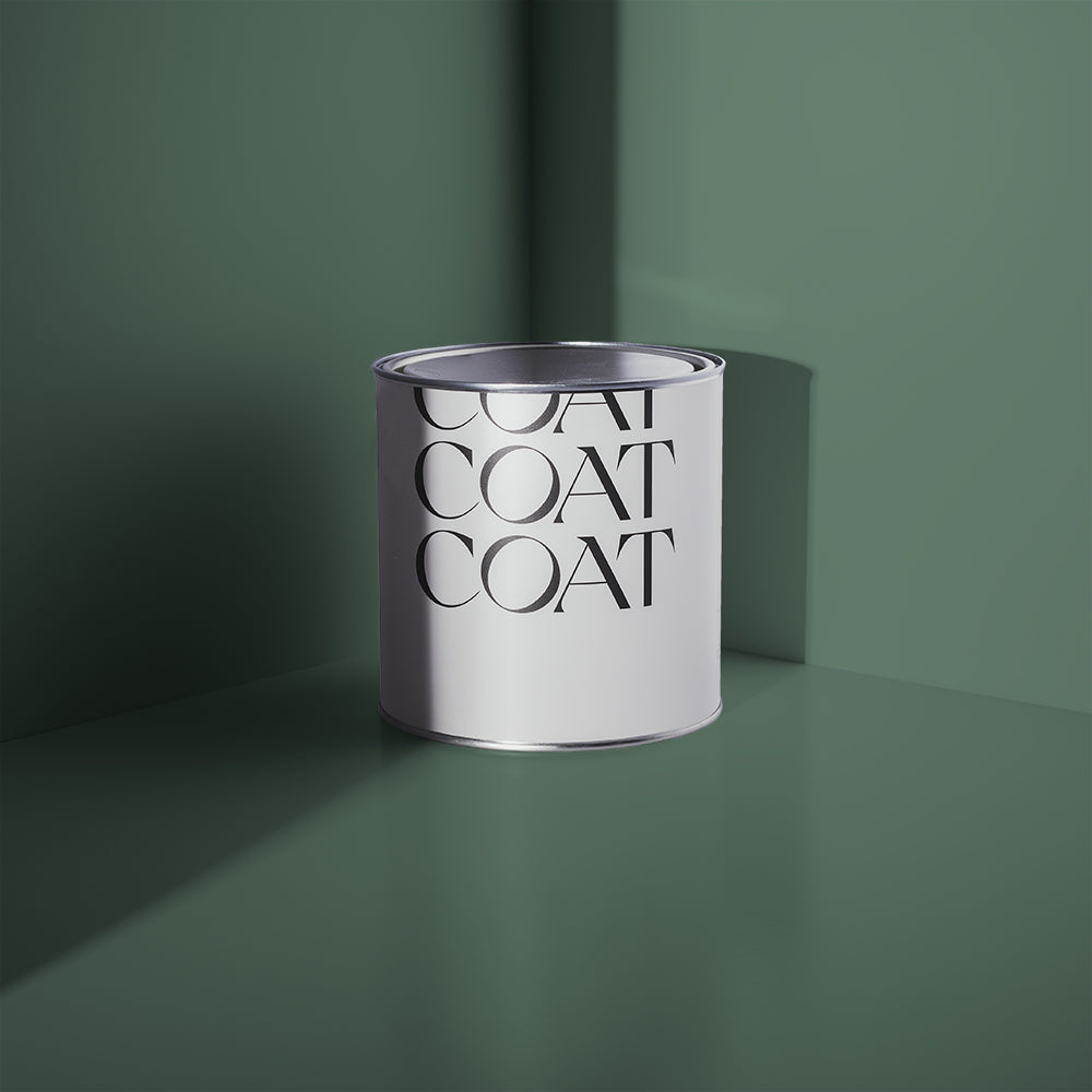
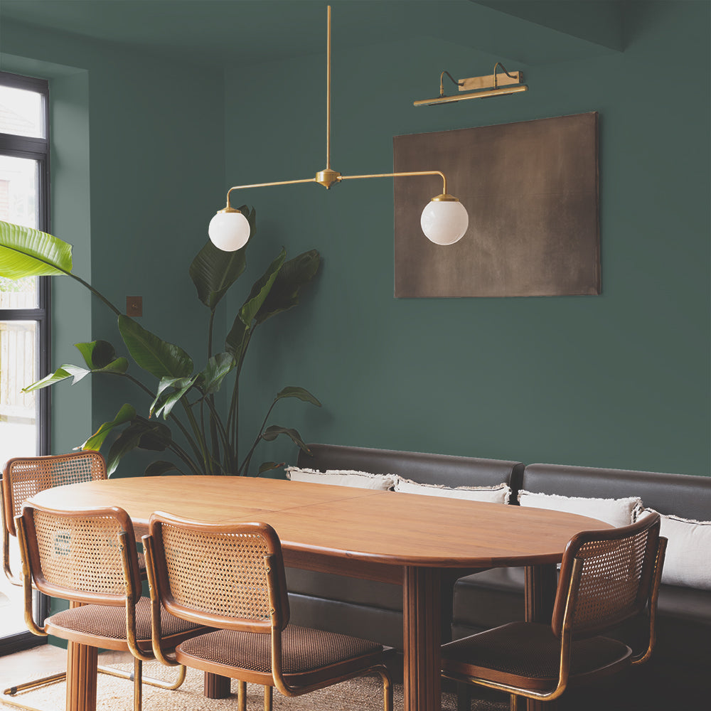
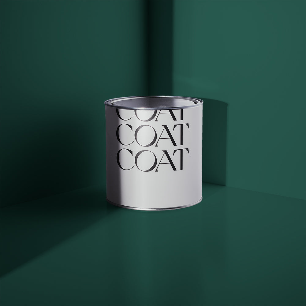
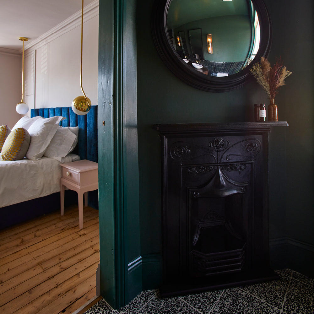
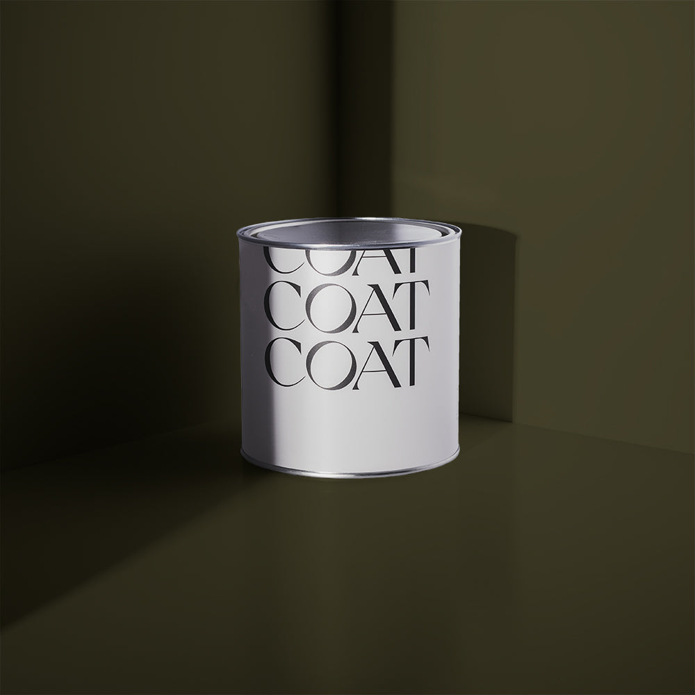
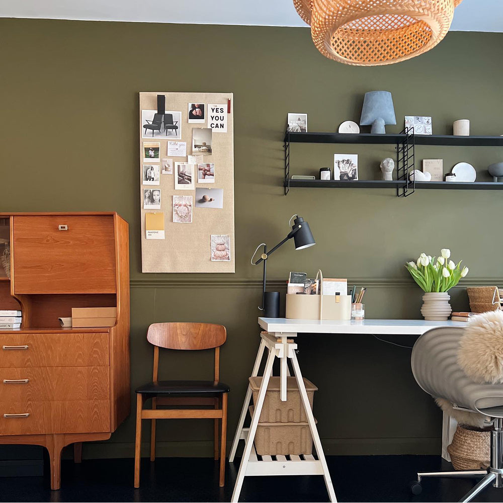
Pan is a rebellious, natural green that’s deeply saturated and has yellow undertones. If you’re looking for a statement colour that will get you hooked… this is the one for you. Use everywhere and anywhere. Combine with Tuesday’s Child or Cargo in more neutral schemes. Or use with And Breathe on ceilings and Nomad woodwork for a scheme that will leaf your friends green with envy.

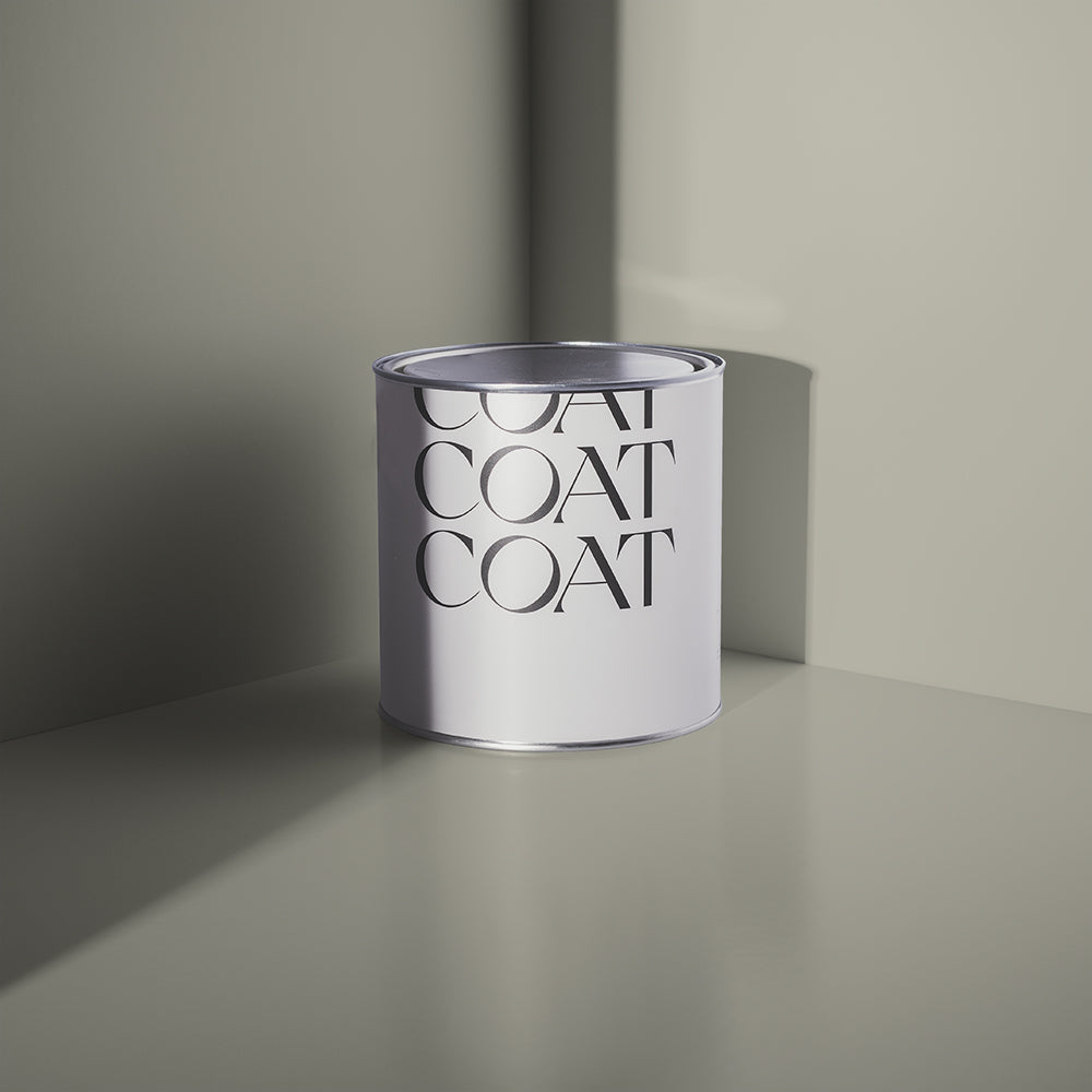
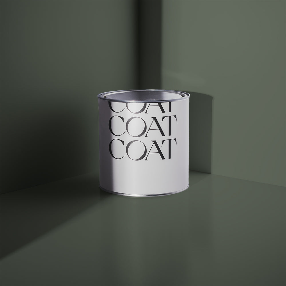
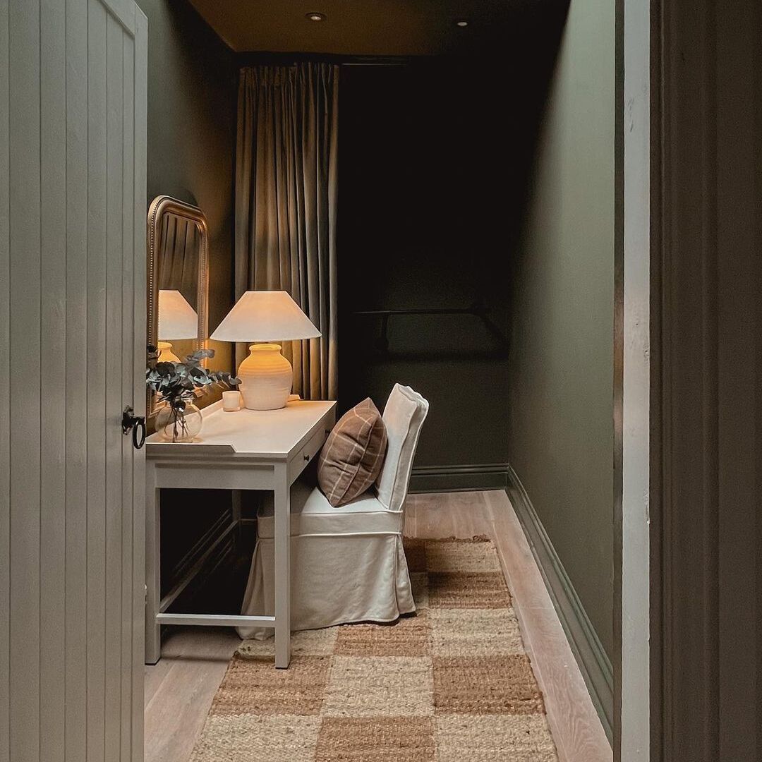
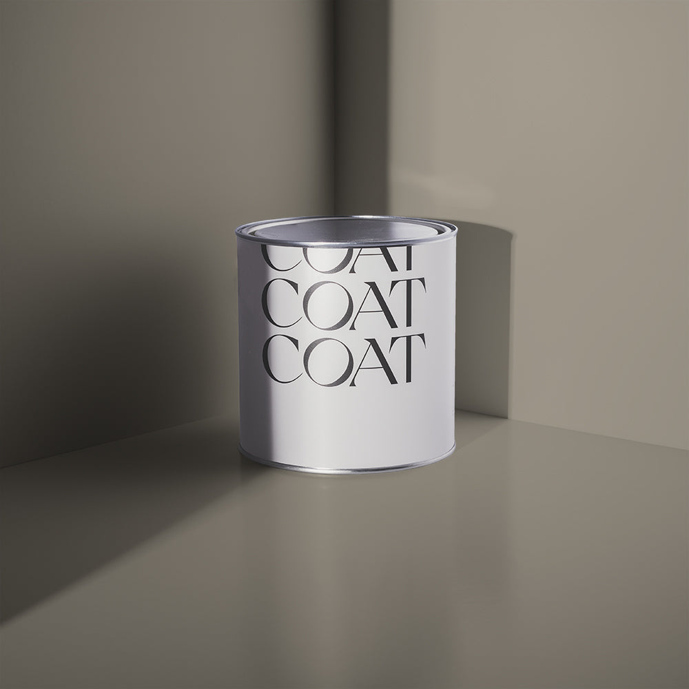
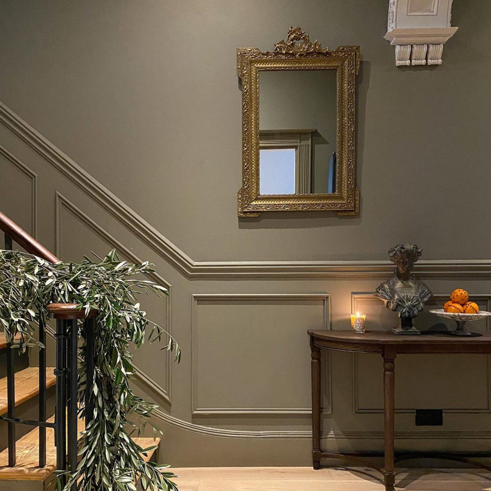
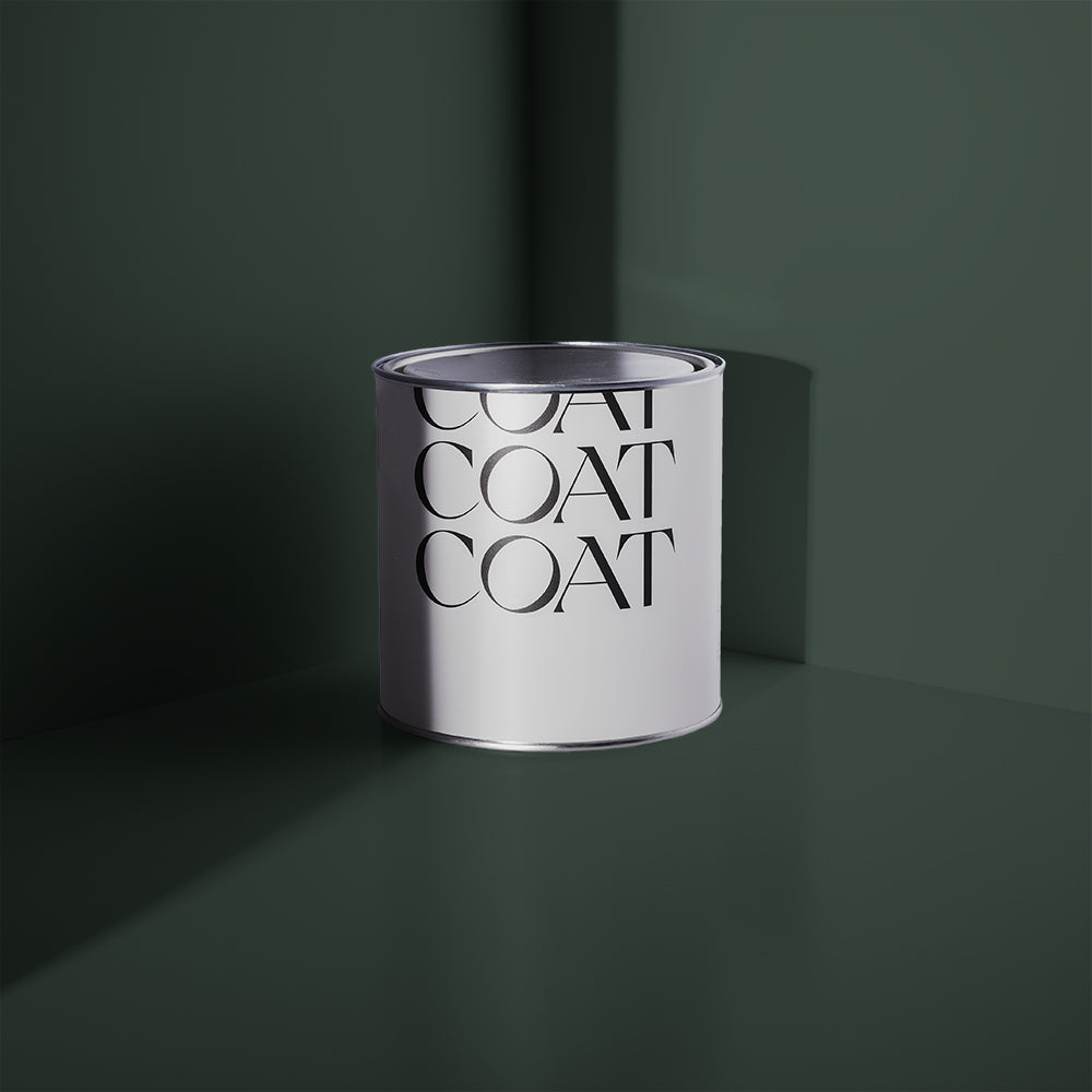
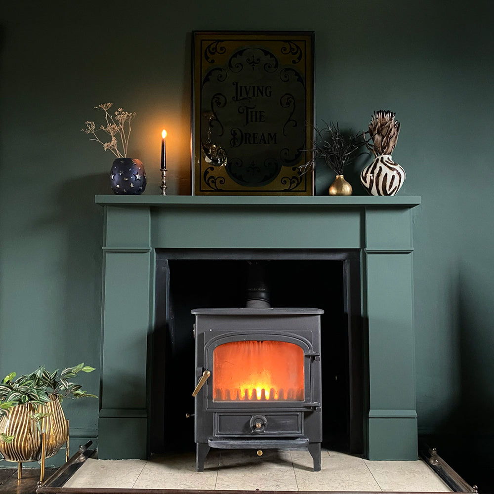
The last mid tone colour we’re adding to the collection is going to cause quite the stir. Debate Club is a touch dramatic but remains humble thanks to the natural nature of this neutral. This colour fights for all corners as it’s a little yellow, green, brown and grey. Pair with Cargo and Tuesday’s Child for an effortless, traditional greige colour scheme.

Bolds
Bold tones are the colours that define spaces, make them exciting, individual and enticing, We’re bringing in three new bold colours, that will make a dramatic impact on your home.
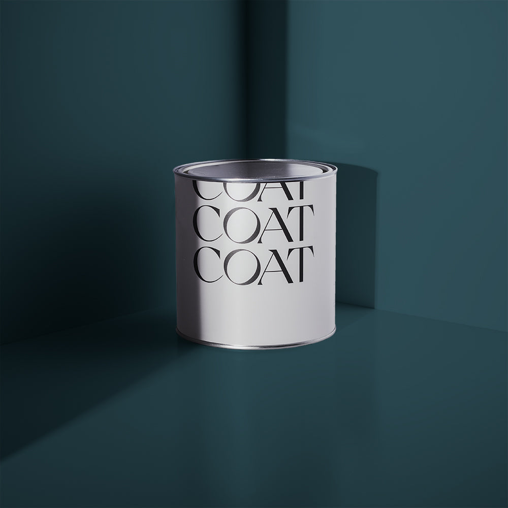
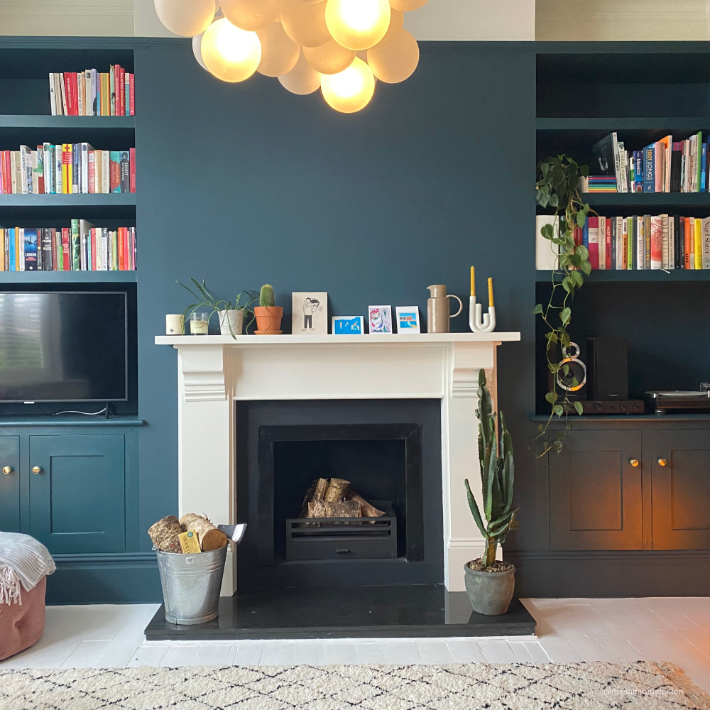
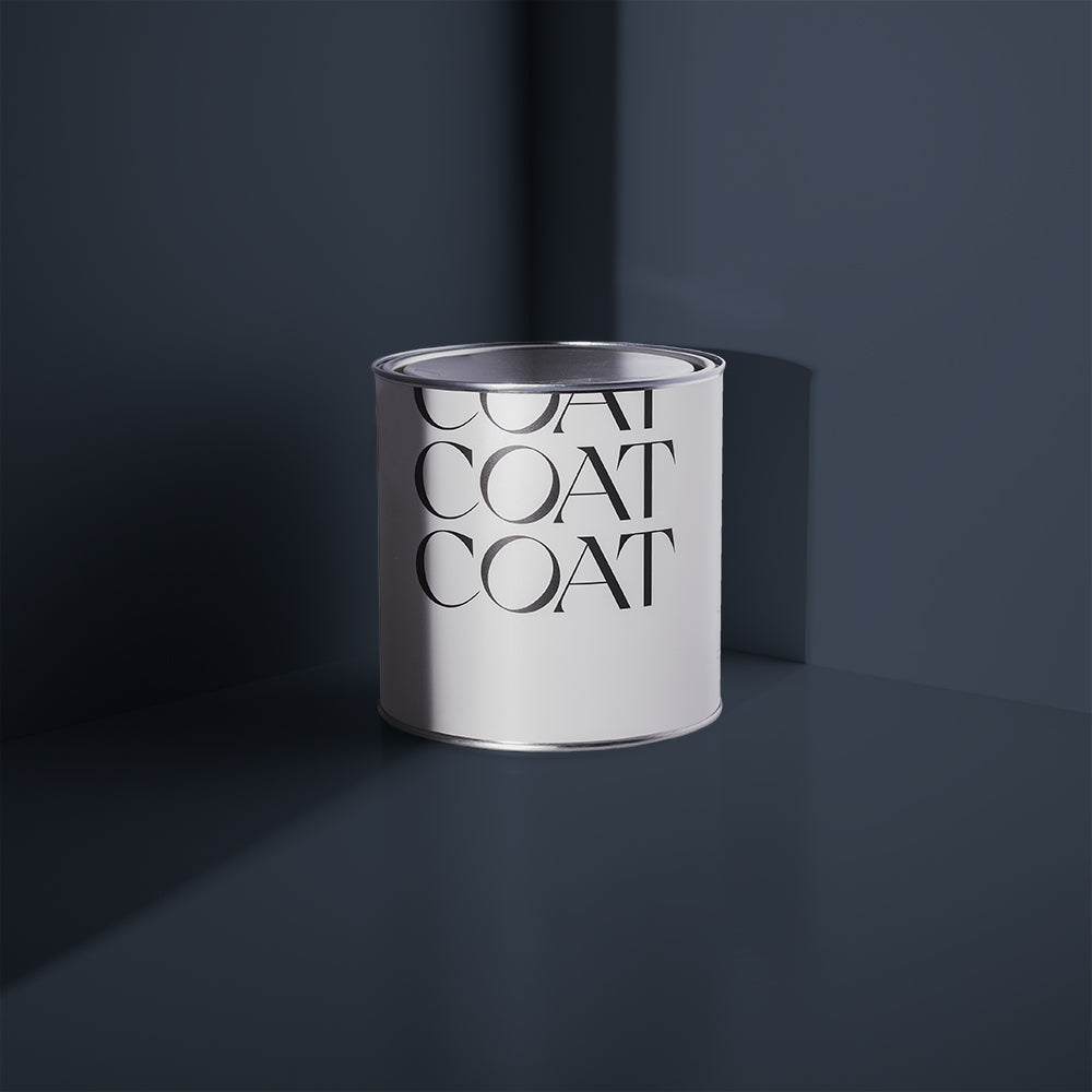
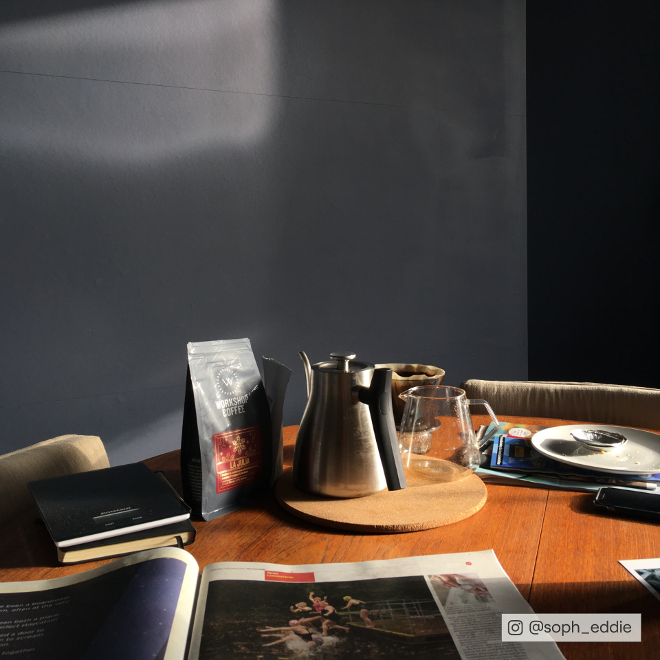
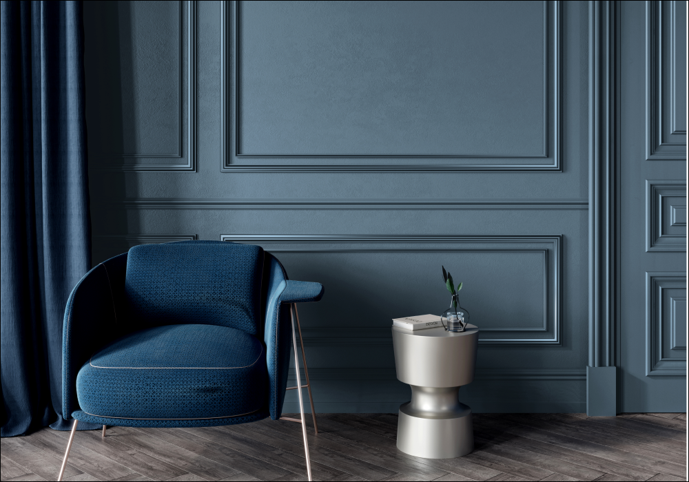
All Inclusive is a cool and refined, greyed blue. Neither as dark as The Establishment and without the maritime connotations of Below Deck, this tone is finely balanced to give your home everything that it needs. This overstated, timeless blue looks great in combination with our new porcelain blue, The Good China, but also looks delightful next to our greys and creates an electrifying contrast with our soft terracotta, Baked.
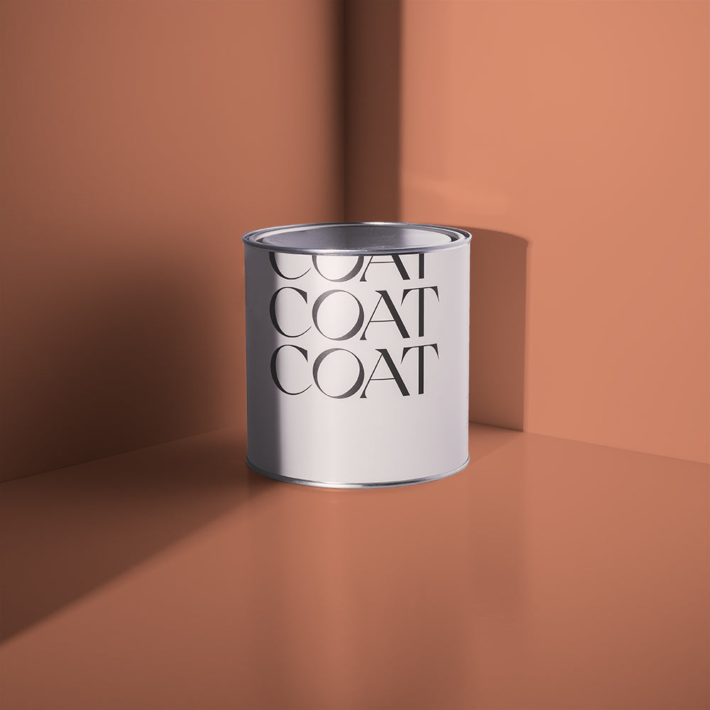
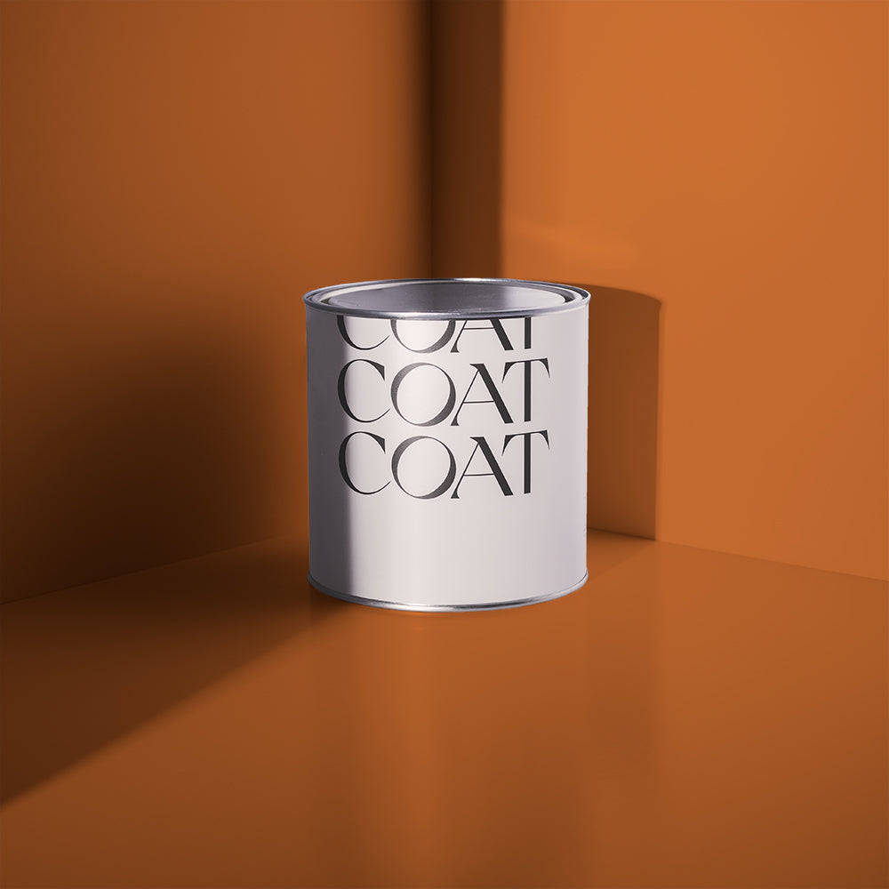
Have you been looking for an intoxicating new colour for your interior? We’ve got a fresh shot of colour for you in our new, rich, blackened orange- Mezcal. Providing an effortless pop of heat to your interior schemes, this colour is at home with beiges like Jane and Well Grounded and provides great contrast to deep taupes like Cold Brew. For maximum effect, use in a scheme with our new brown…
Our new earthy tones pair well with our warm neutrals, grab your swatch pack to check them out for yourself.

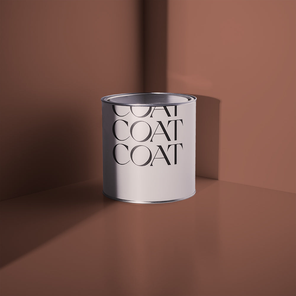
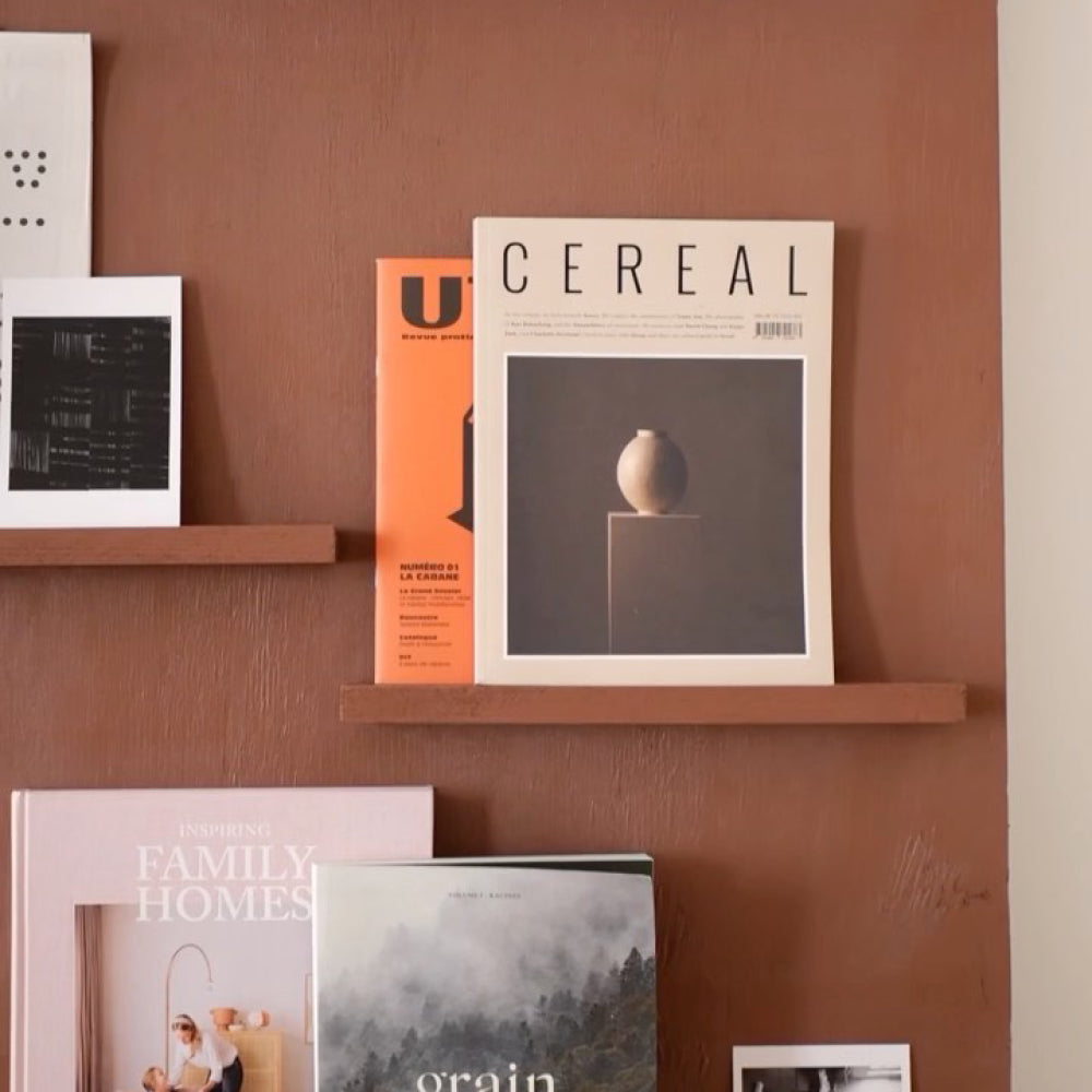
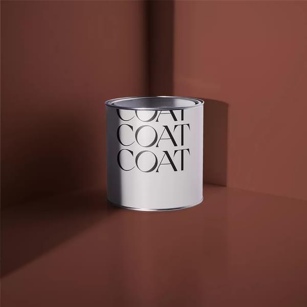
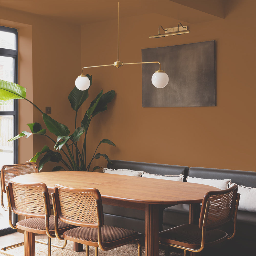
Sheldon. Saturated, friendly and misunderstood. A great accent for taupe and greige and green schemes where it provides depth. Try pairing with Tuesday’s Child, Debate Club or Pan. This genius, rich brown is saturated and generates warmth in cooler schemes too, so works wonders with Free Range.

Need help picking a scheme for your home? Book a Colour Consultation, where our colour experts will provide you with colour options, free peel and stick swatches and a slick specification of all the paint you’ll need.
Feeling inspired? Check out our entire NEW Summer '22 Palette Drop and order your Peel & Stick swatches so find the perfect colour for your pad.
Publish Date
Author
