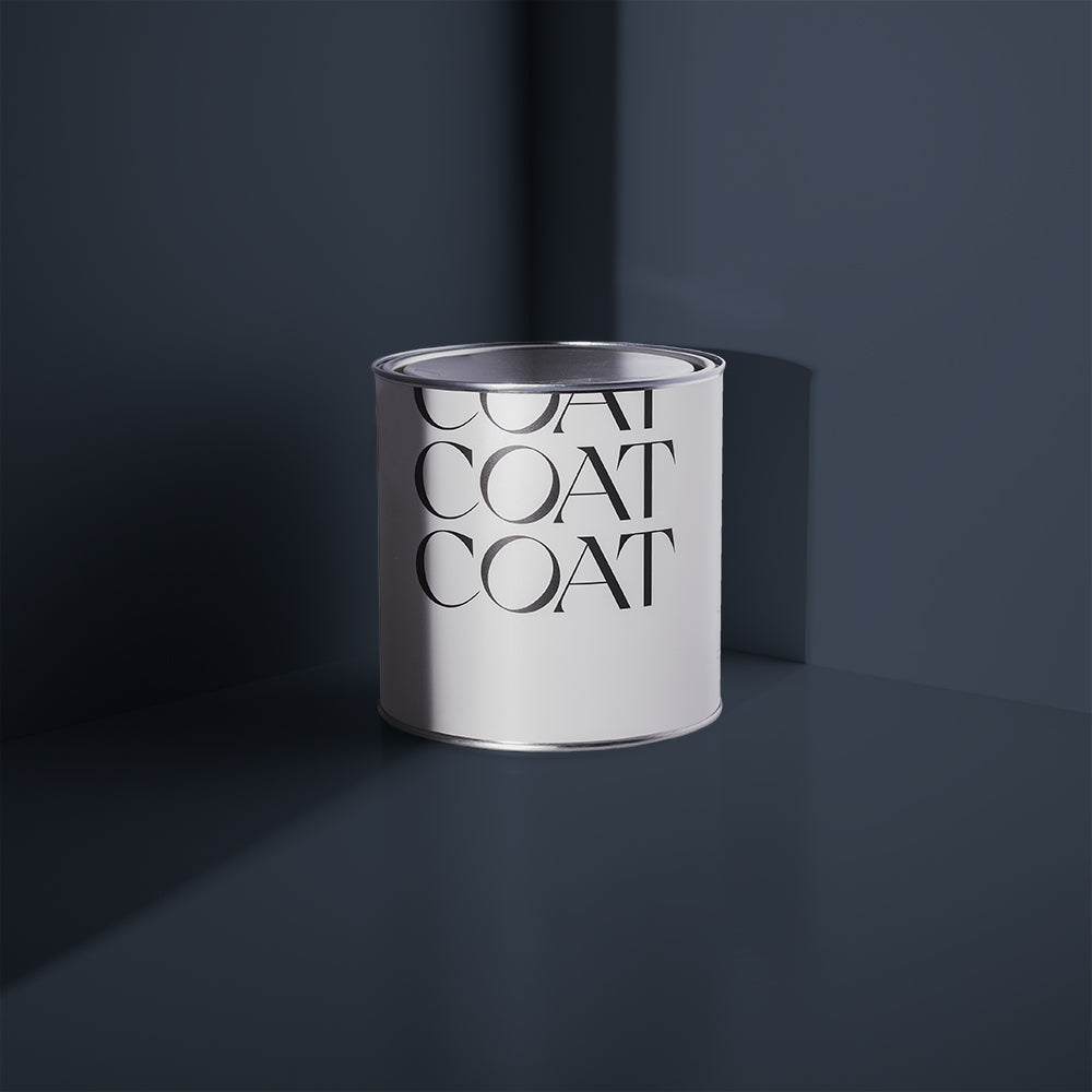
Introducing Our Brand New Colour Palette For 2022.
They're here. New shades to die for.
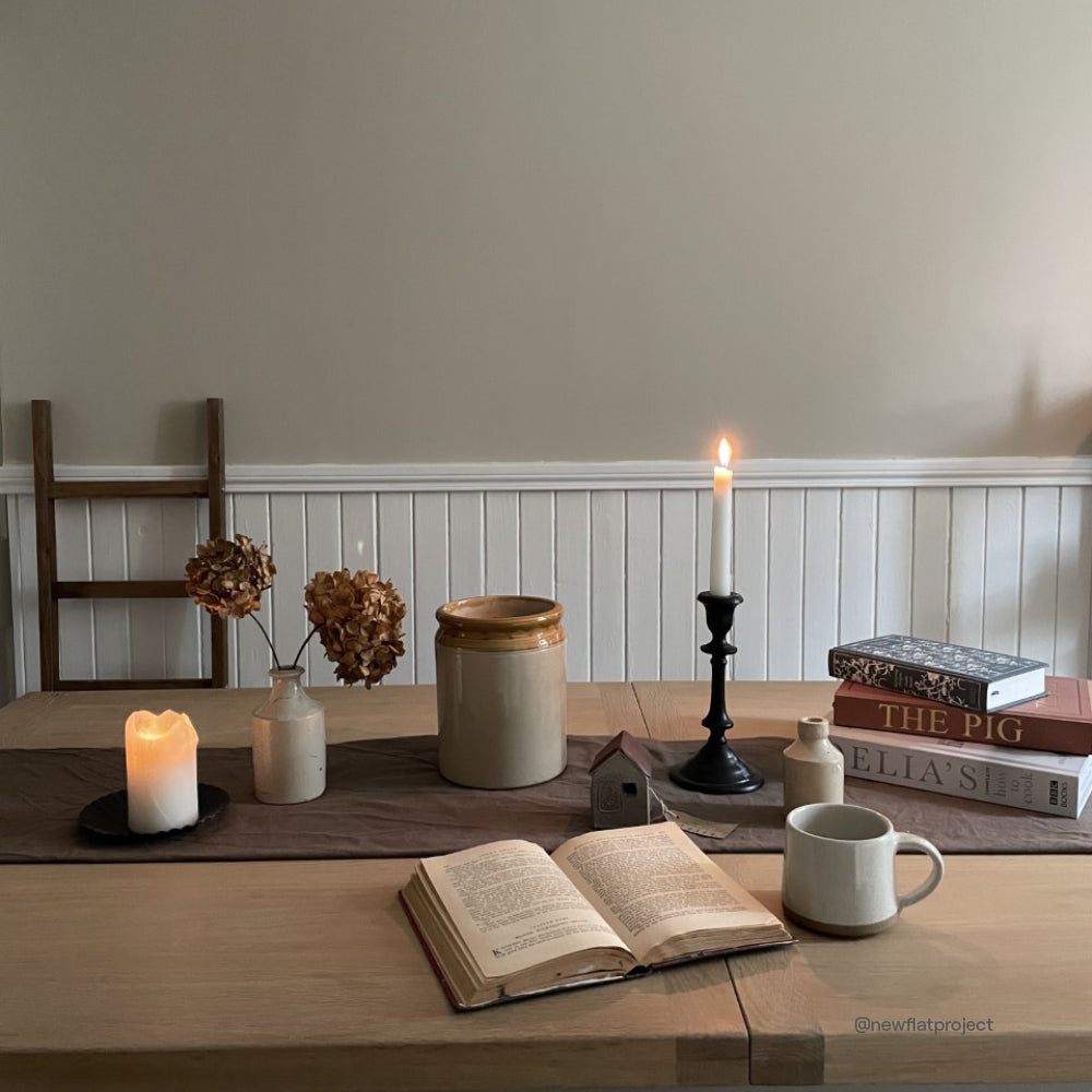
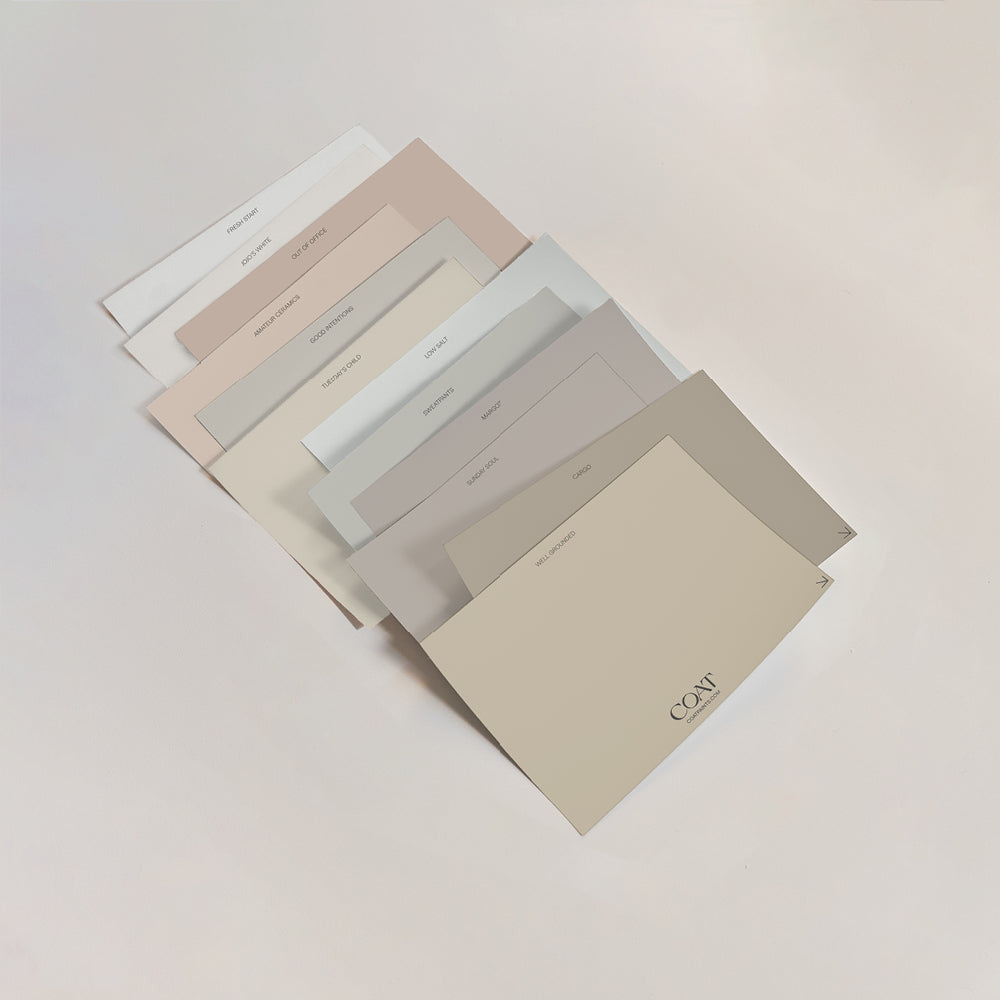
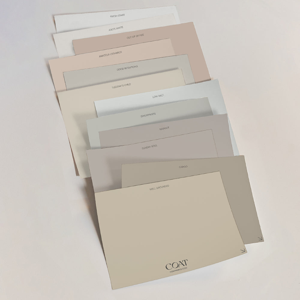
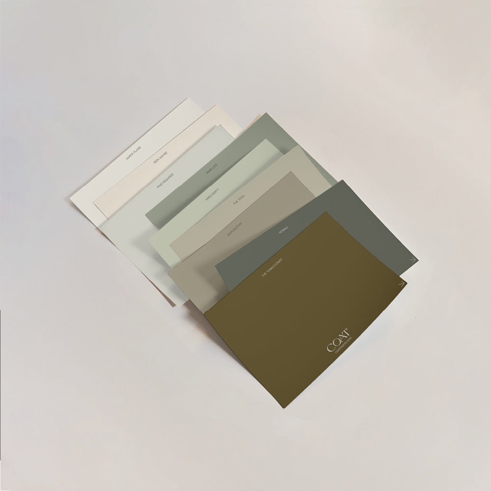
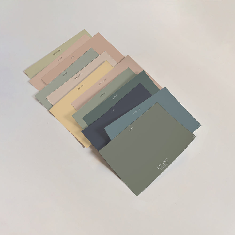
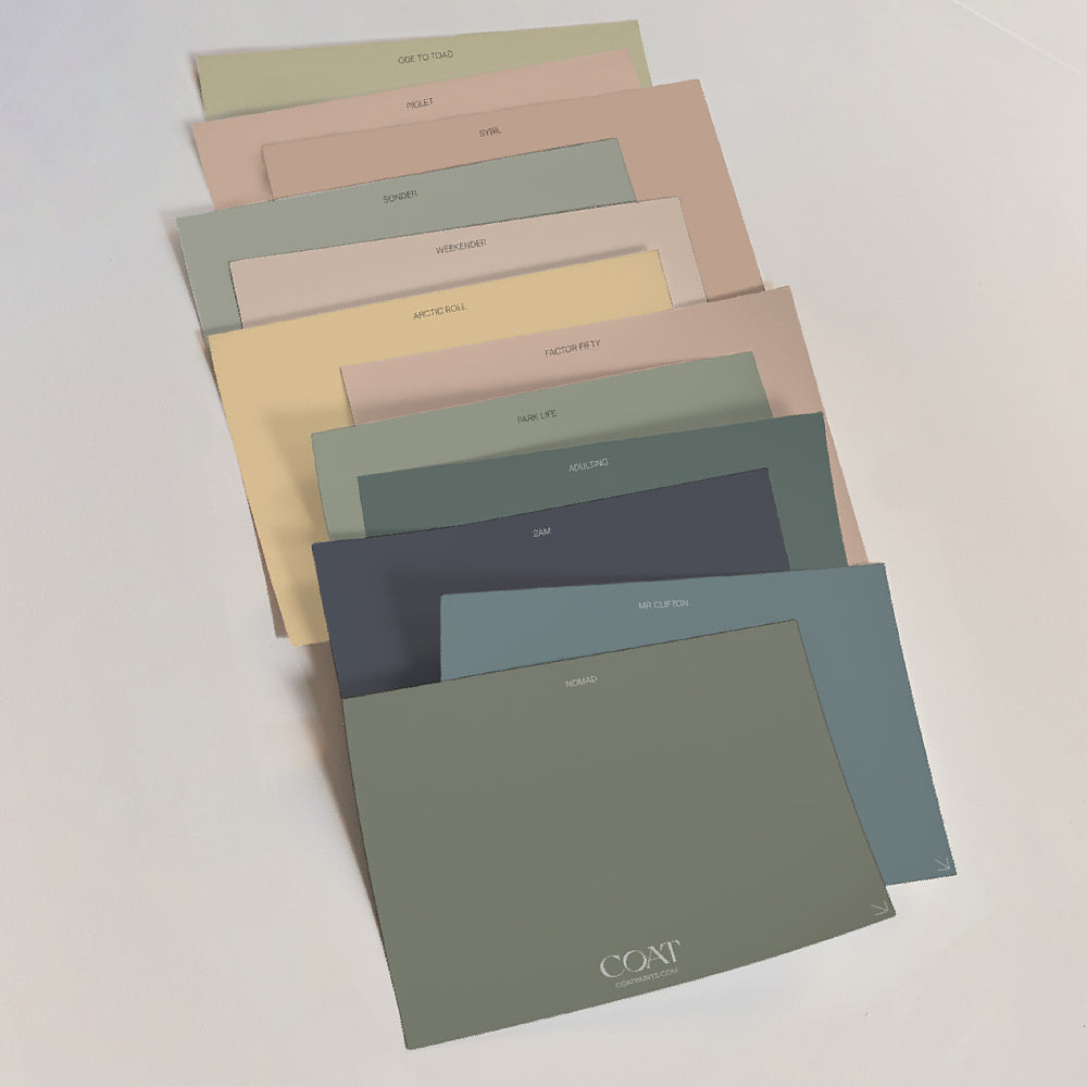
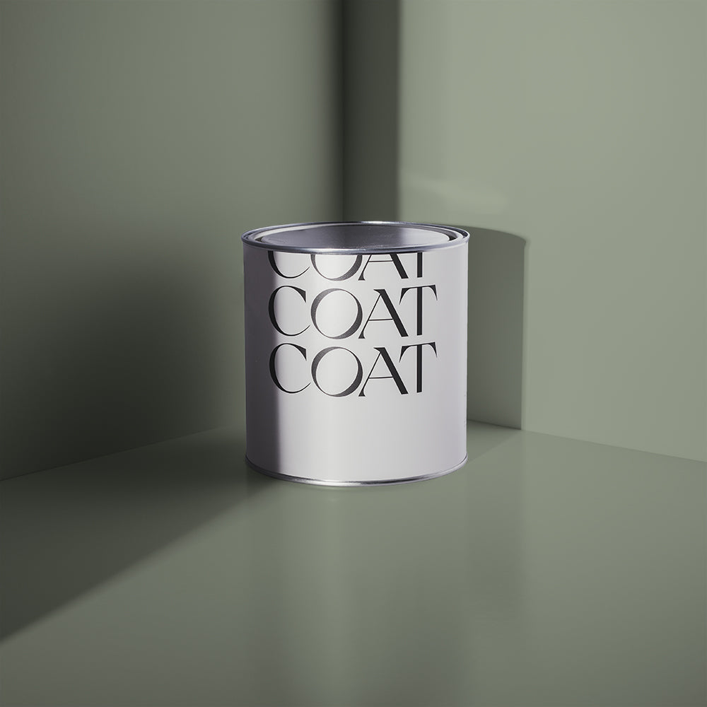
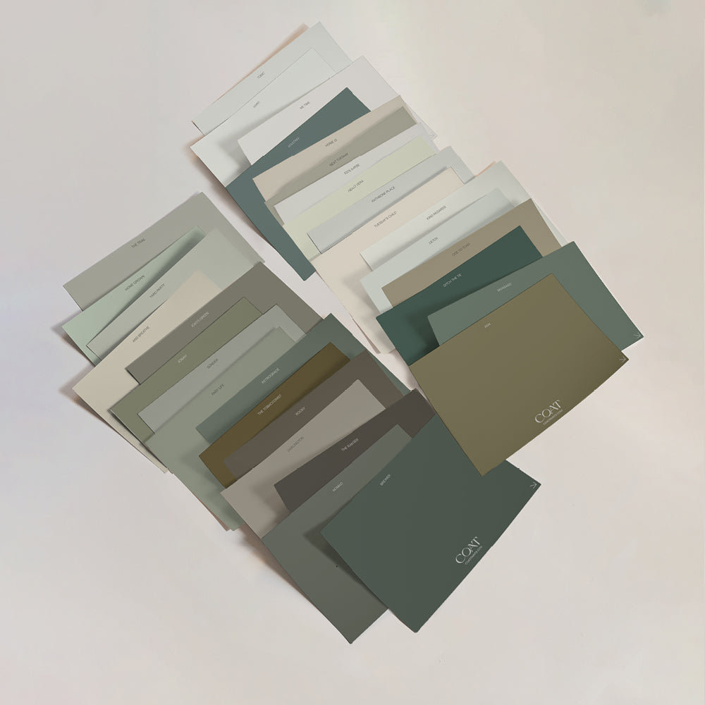
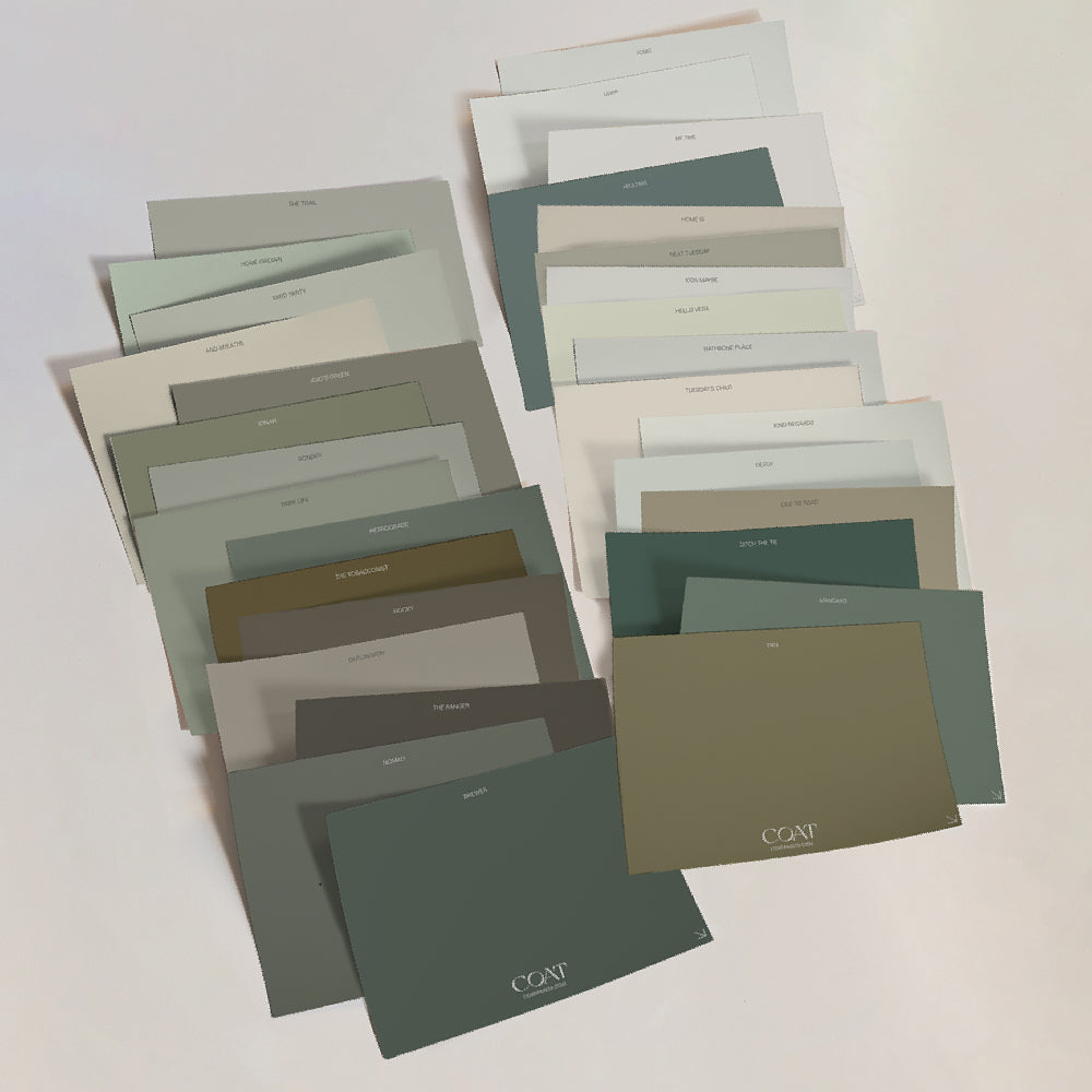
Using a combo of customer feedback, industry know-how and trends analysis, we've developed a dazzling new range of colours to inspire you on your decorating journey for 2022. Our new season palette includes fresh new greens, greys, taupes, neutrals and pinks – all made to order in our planet-friendly, low-toxin paint formulas.
Ready to find out what we've got in store for you? Let's dive straight in and take a look …
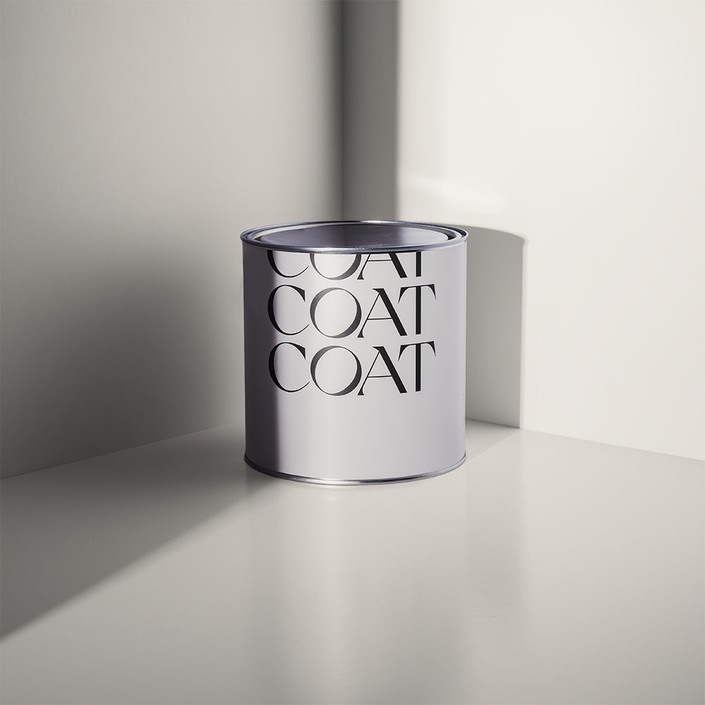
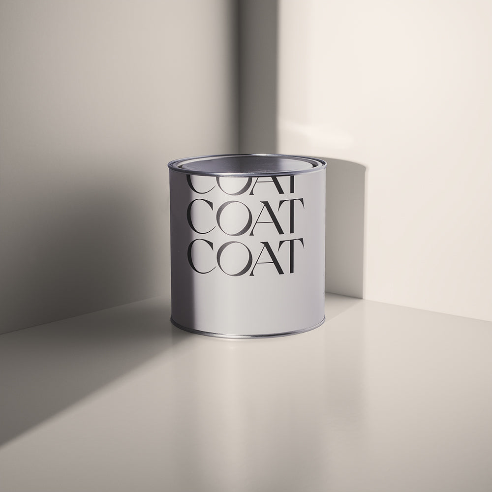
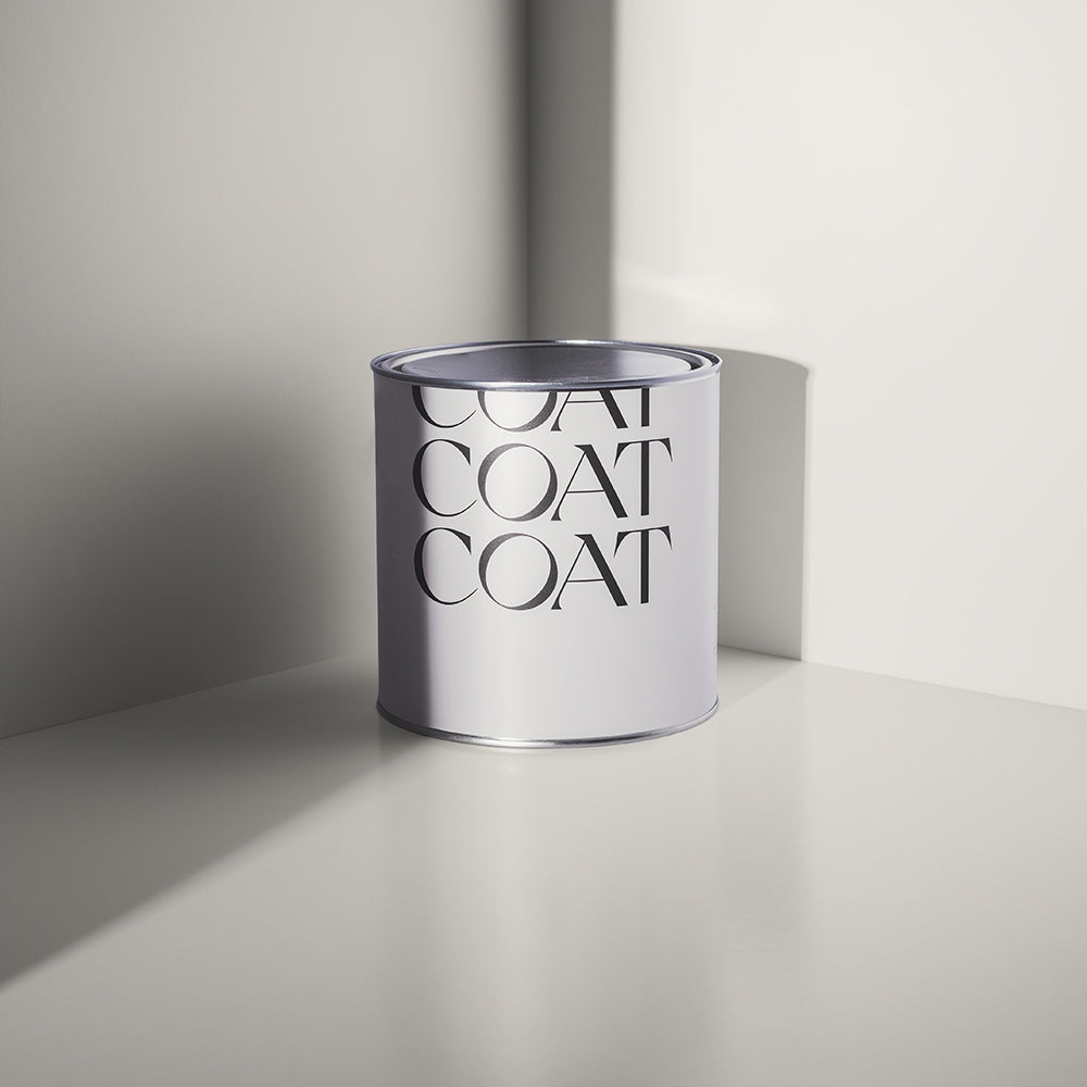
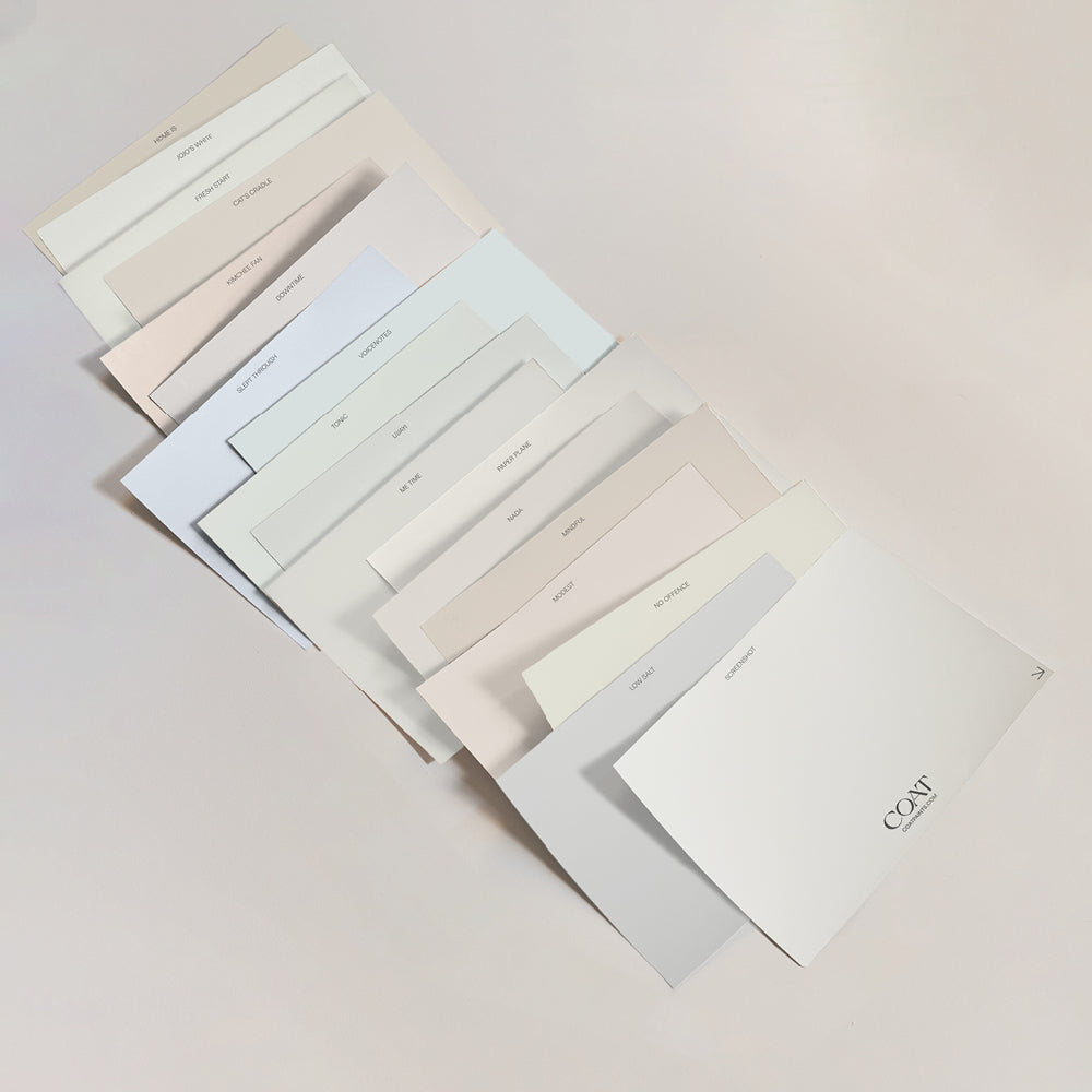
TL?DR? Check out the Collection and Grab a Swatch Now.
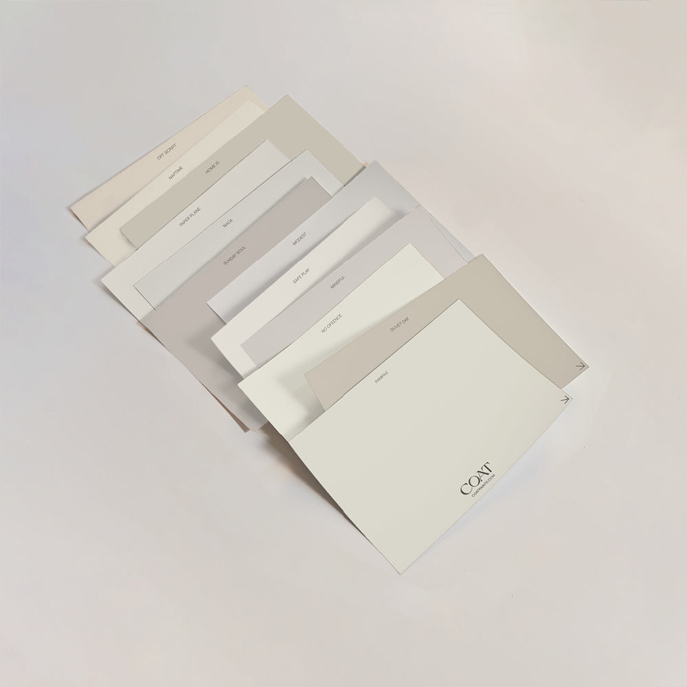
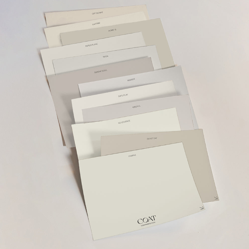
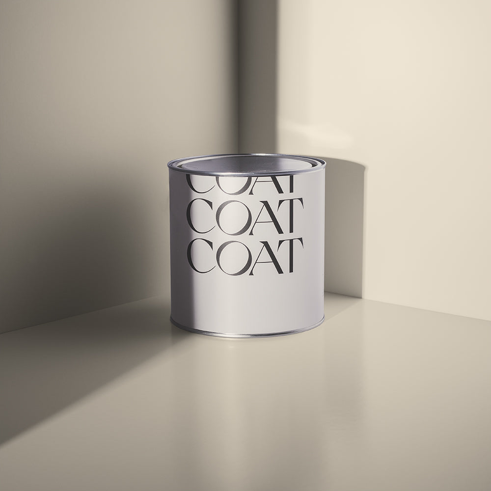
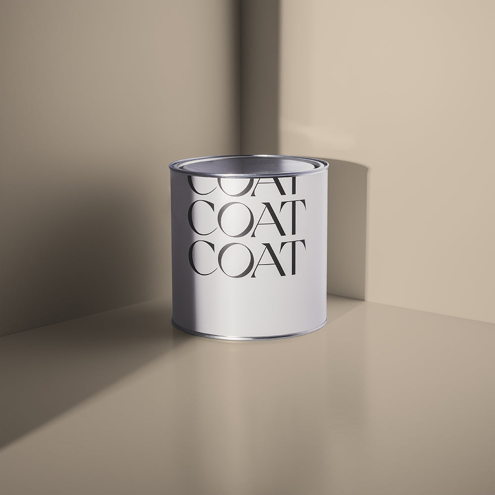
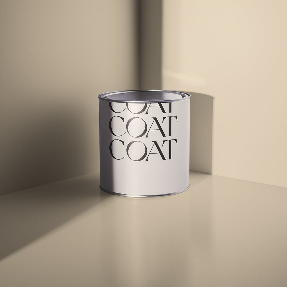
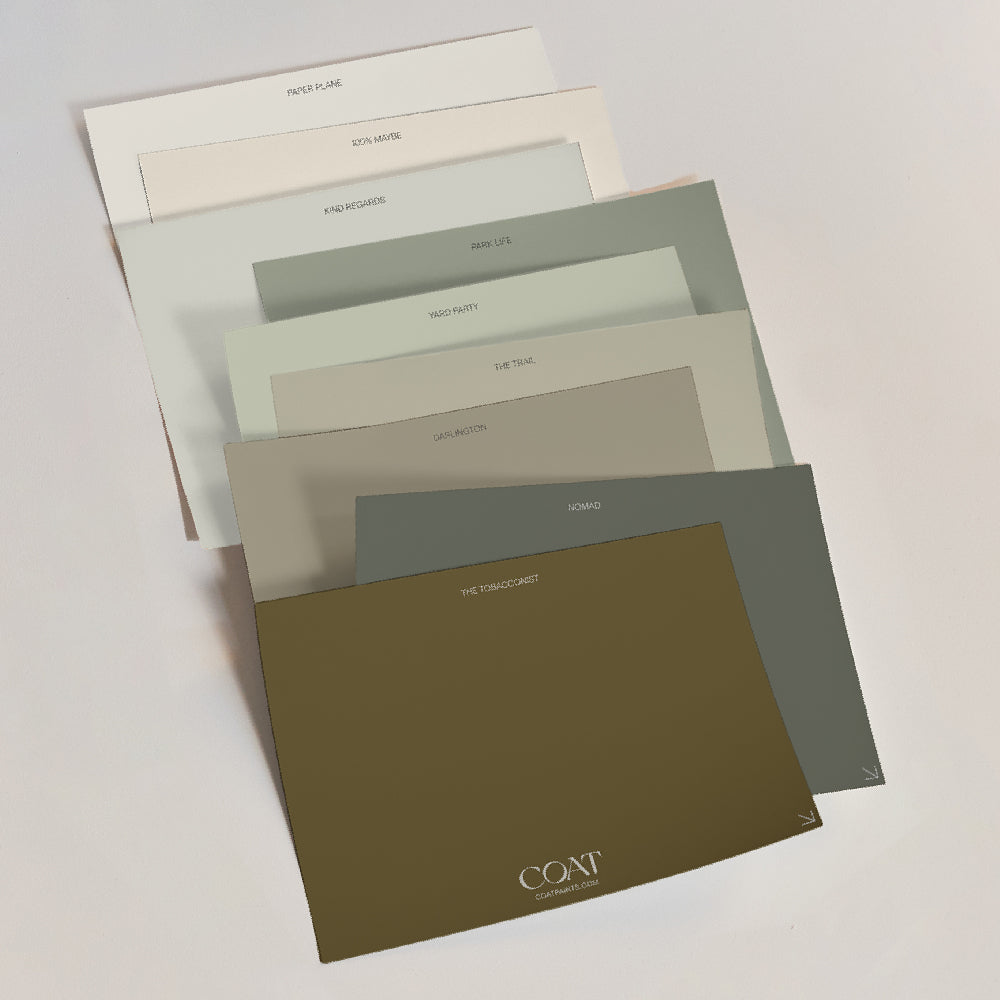
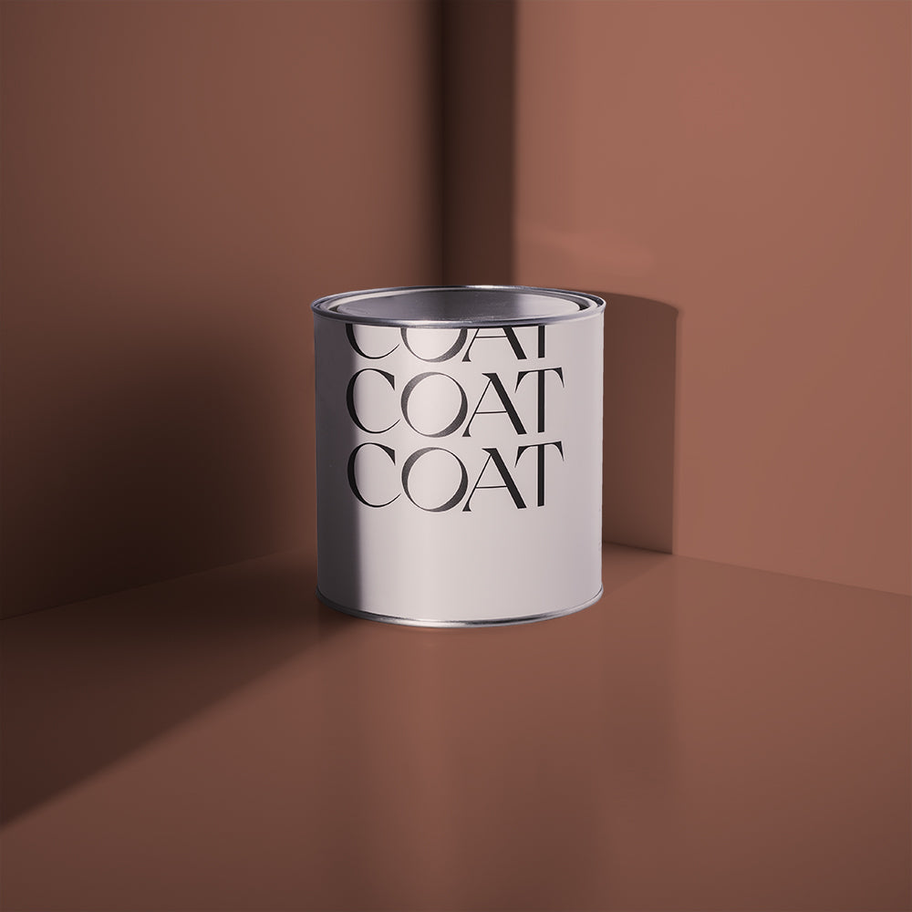
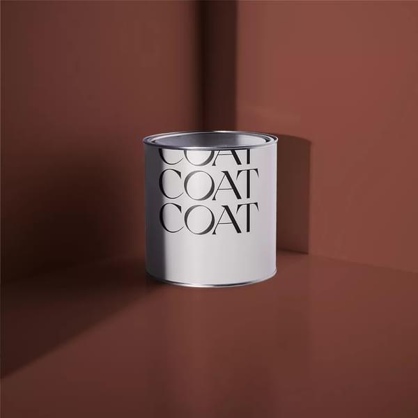
AN EXCITING NEW COLOUR COLLECTION
Our hot new palette brings you a fresh range of on-trend colours to transform your home and bring it bang up to date. But, don't worry, we haven't gone overboard with a gazillion shades. We know just how overwhelming choosing paint colours can be. It's one of the main reasons we set up COAT in the first place! So our new colours have been carefully edited down to bring you all the good stuff without the overwhelm 🙌

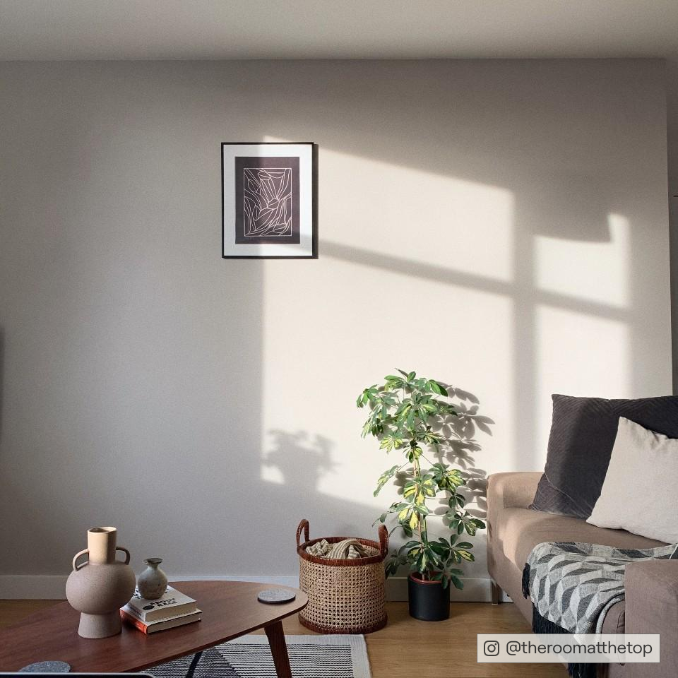
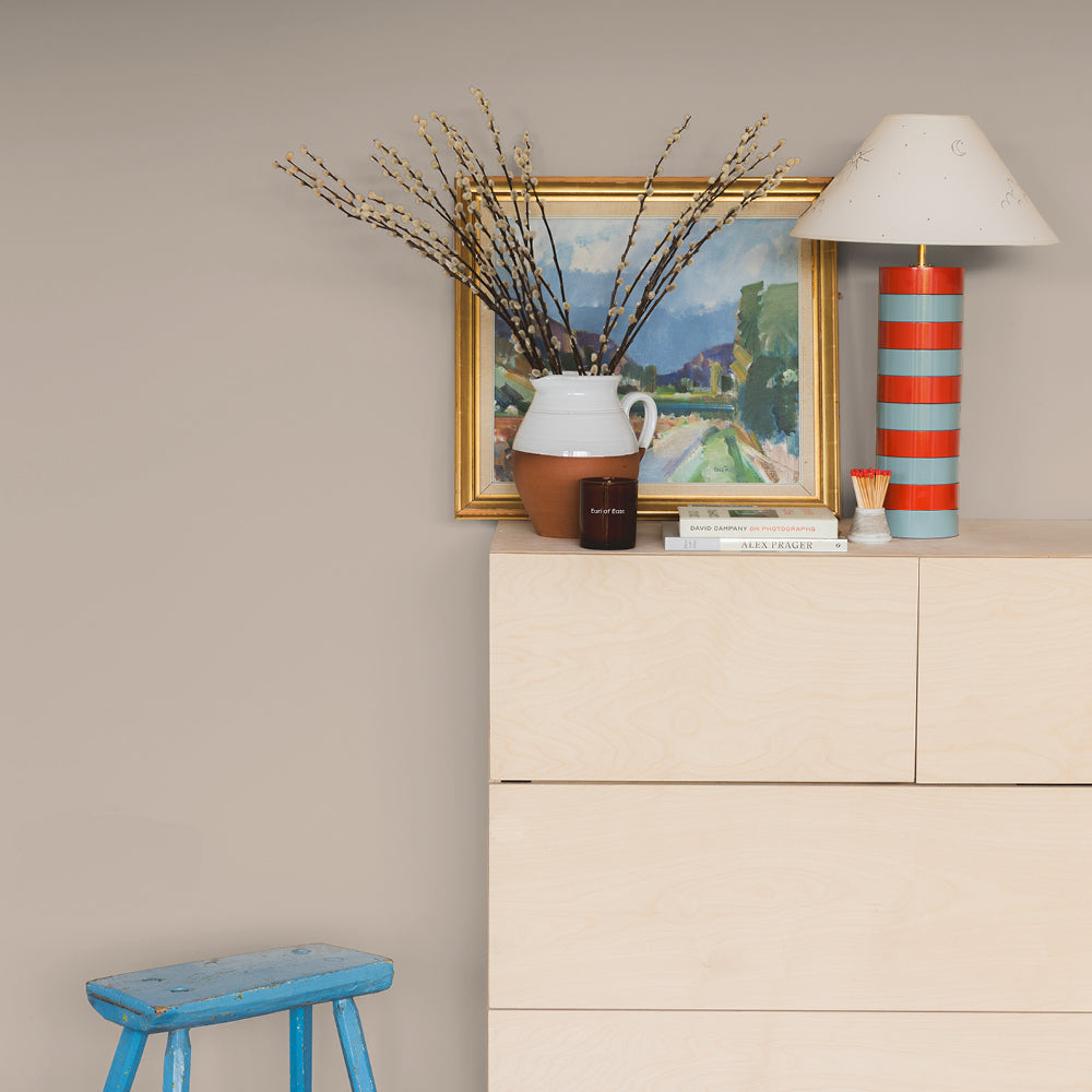
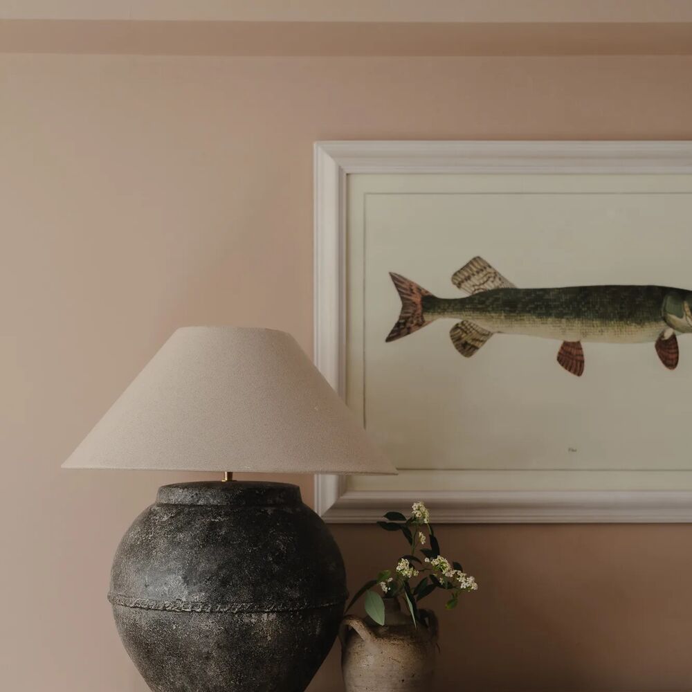
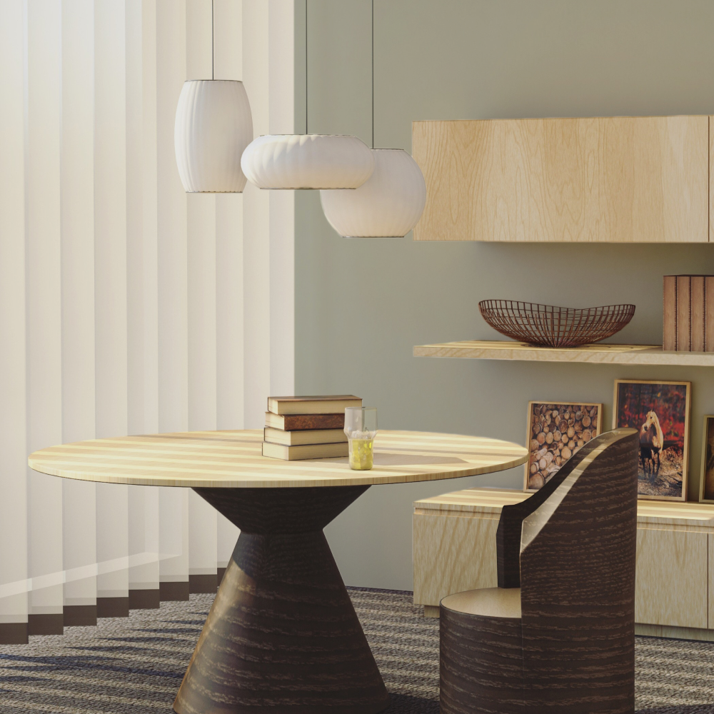
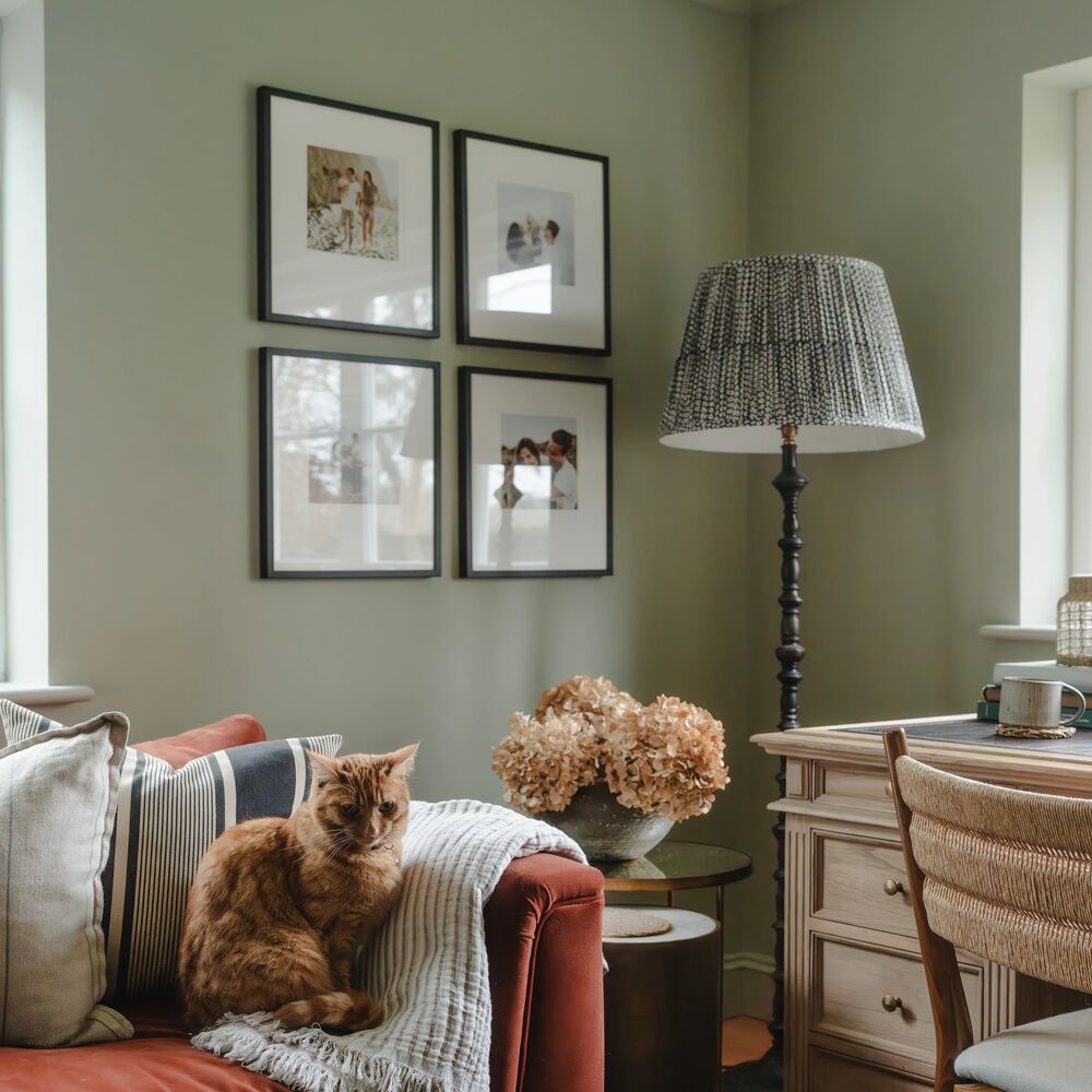
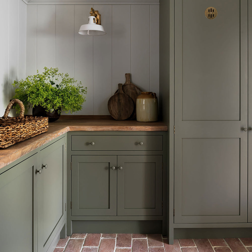
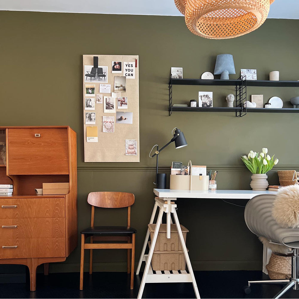
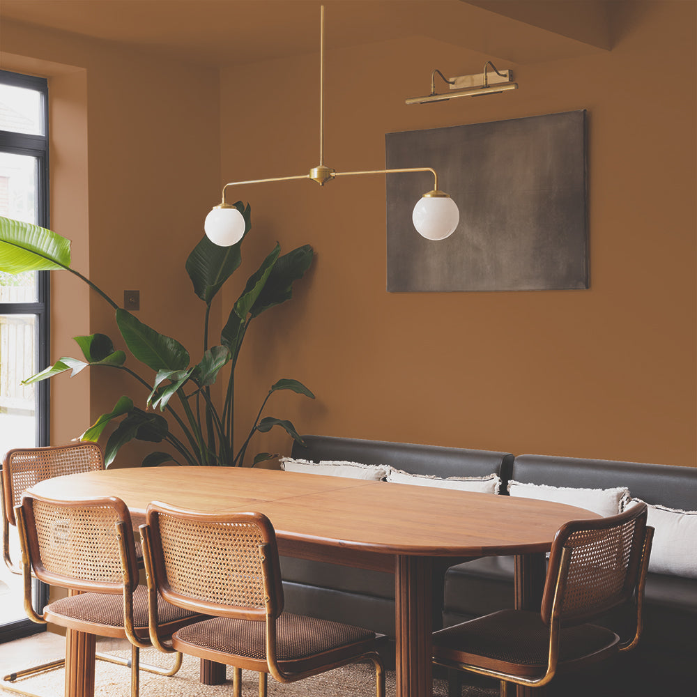
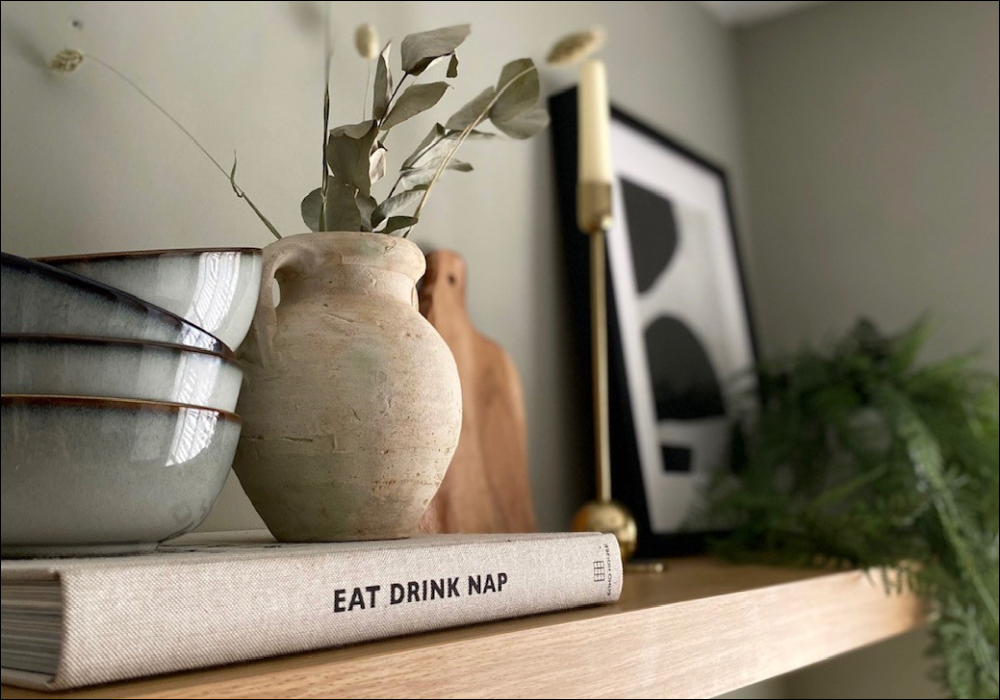
'Yard Party' An uplifting hazy grey green.
"I'm so excited about the additions to our colour palatte for 2022," says COAT's Colour Lead, Aaron Markwell. "We've created some wonderful new shades that are not only bang-on trend, but also really easy to use. We've introduced colour families for the first time which makes it really easy for you to choose colours that work together in the same tonal range.
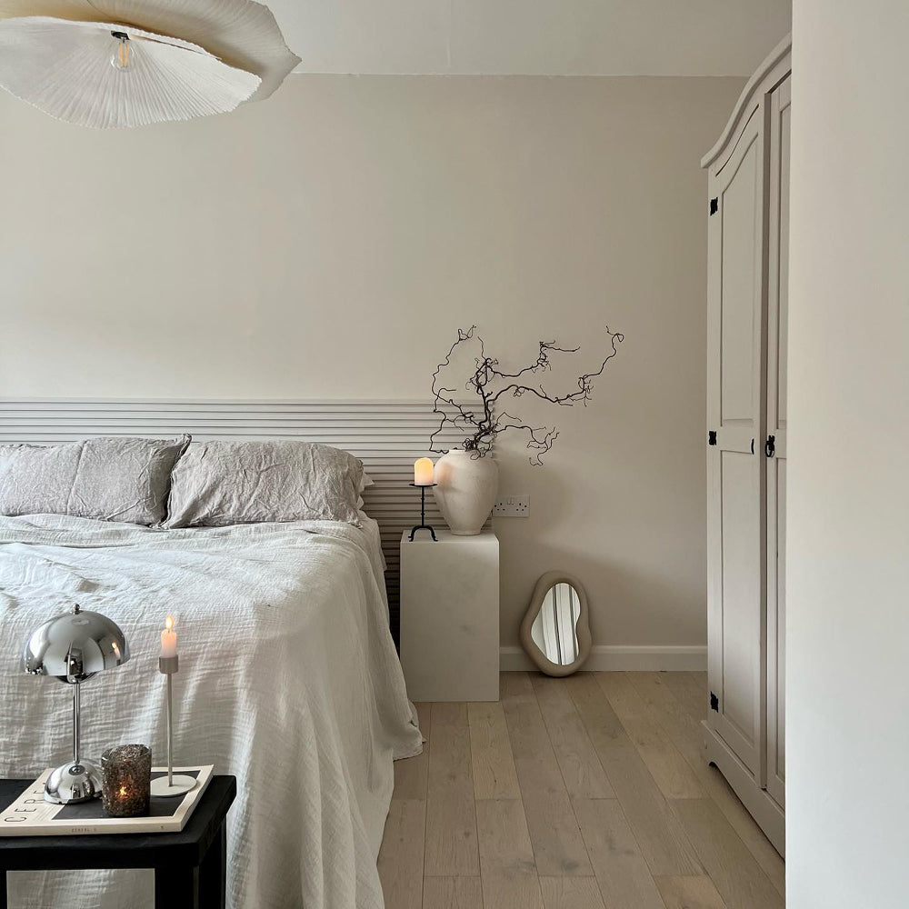
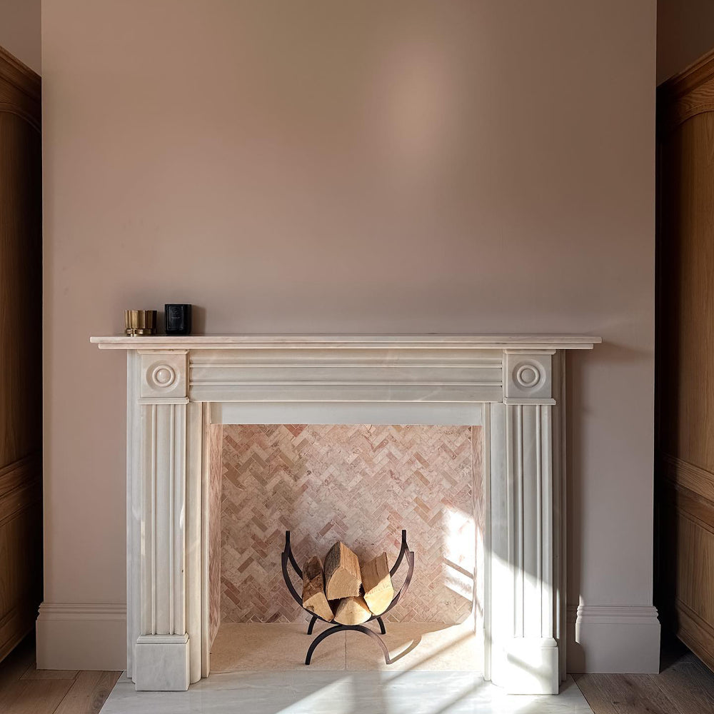
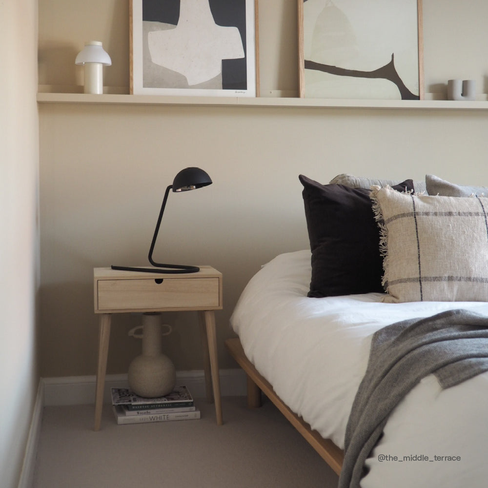
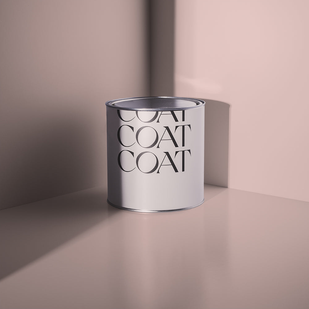
"Our new grey-pink Percy, for example, works really well alongside our existing pink Granny Chic, and our new grey taupes Hooley and Margot also pair up well. This relationship between the colours allows you to create high and lowlights, which really help open a space up, and create focal points. If you've got a pillar in the kitchen, for instance, you could paint it a deeper colour than the walls, but in a similar tonal range, to make the rest of the space appear lighter and brighter. You could also achieve the same effect with an alcove. Paint it in a darker, tonal shade from the same colour family, and it will work brilliantly because there's a relationship between the two colours rather than a complete contrast."
Can't wait to just see them all > Head to the Collection.
NEW GREENS
You love green. We love green. So, guess what? We've added some new greens to our range! 💚
"We really wanted to expand the number of greens, and not just because we know you love them, but because green is such a versatile colour," says Aaron. "When you combine green with a yellow or blue undertone, it creates such a difference in the resulting aesthetic – one that you don't get with a lot of the other colours. I also love the way greens reflect the natural world, so it gives you the chance to bring life and growth into your home.

New and fresh, 'Yard Party' is guaranteed to turn heads.
"One of my favourite greens in the new collection is Yard Party. This greyed-out green is perfect for a south-facing space, but you could literally put it anywhere and it would look magical. There's something really familiar about the tone of this colour. I absolutely love it!"
Aaron is also a big fan of new sage green Park Life. "It's great to have so many new greens to play with for our colour consultation service," says Aaron. "Park Life is a deeper green than Yard Party. It works brilliantly as a base for a maximalist scheme. I would recommend using Park Life for the walls and pairing it with even darker shades such as Heal's x COAT shade Brewer or COAT OG Ditch The Tie for your woodwork."

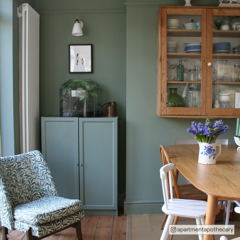
@apartmentapothecary diner is stealing the show using our freshest green 'Park Life'
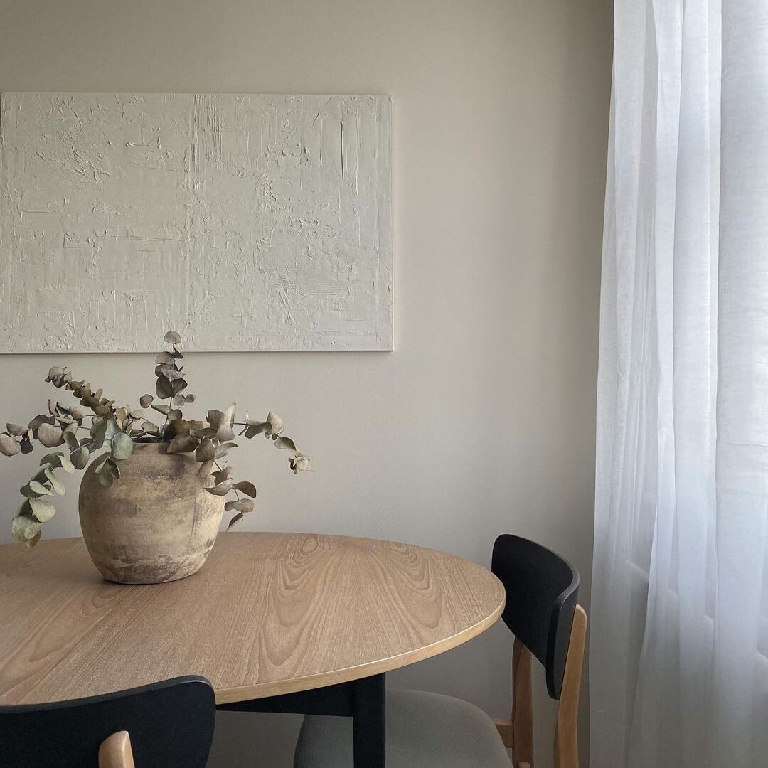
If you love green, but don’t wanna live in a green room, we’ve got a colour you’ll love to wander into. Restful green grey, The Trail is a clean neutral with a green undertone, making it a calm and lifting addition to your space. Create your very own country lane with lots of lush plants around the room, which will be great for you and the environment.

'The Trail' doing it's thing in @emilyswalwell kitchen.
NEW NEUTRALS
Our new beige Cargo is an absolute corker and brings a much-needed yellow-toned neutral into our range. In the paint industry, this grey-green tone is known as a 'drab', and although that might sound dull, 'drab' actually only means that a colour has a light brown tone in it. And sometimes that's exactly what you need to create a harmonious decorating scheme.

@the18thhouseonthestreet opting for a neutral dining area, we're obsessed with 'Cargo' here.
"Oh no, drab isn't a negative thing at all," says Aaron. "Drabs are actually some of the most interesting colours and Cargo is my absolute favourite from the new colour palette. It's like a greige, but stonier, and it creates a really flattering backdrop for more vibrant colours. Sometimes you need something a little flat to sit behind bolder colours to make them look more enticing. This is prominent in the Japandi movement which features colours with green and yellow based undertones.
"Colours like Cargo and Pudding are also great for pairing with natural materials such as bamboo, teak and brass. Textural finishes such as natural linens and leather are quite mattifying, so a drab background allows them to pop."

Say no more, the perfect grey is here. 'Hooley'.
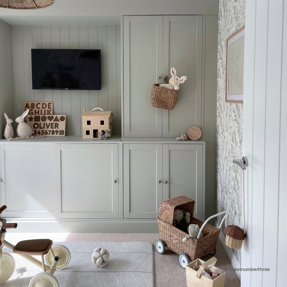
Looking for a neutral scheme that is really easy on the eye, Margot will be your best supporting actor. It’s a grey that has a yellow undertone, keeping it warm and friendly, and works great with strong colour pops like Festival Eve. For a stand out colour palette, pair with Big Timer on woodwork, for a strong but gentle colour scheme that will always get a standing ovation.

The only 'Big Timer' you'll need.
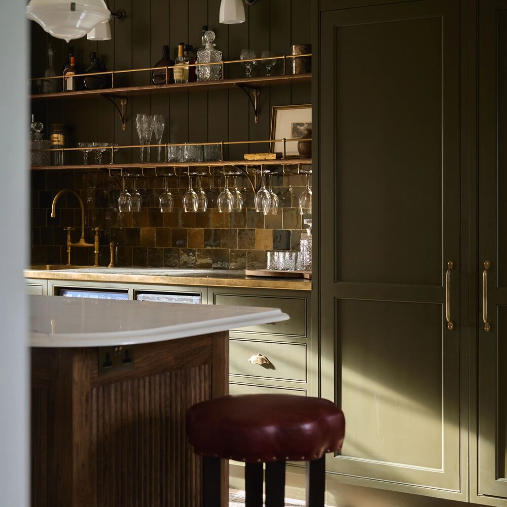
We’ve got another new grey that’s bound to cause a storm too. For a moody bedroom, or dramatic cabinetry in a lighter grey scheme, we’re introducing Hooley. It’s a dark grey, like brooding clouds, with a soft blue undertone. It works really well when combined with The Establishment (a new blue we’ll get onto later) and popular existing grey, On Mute.
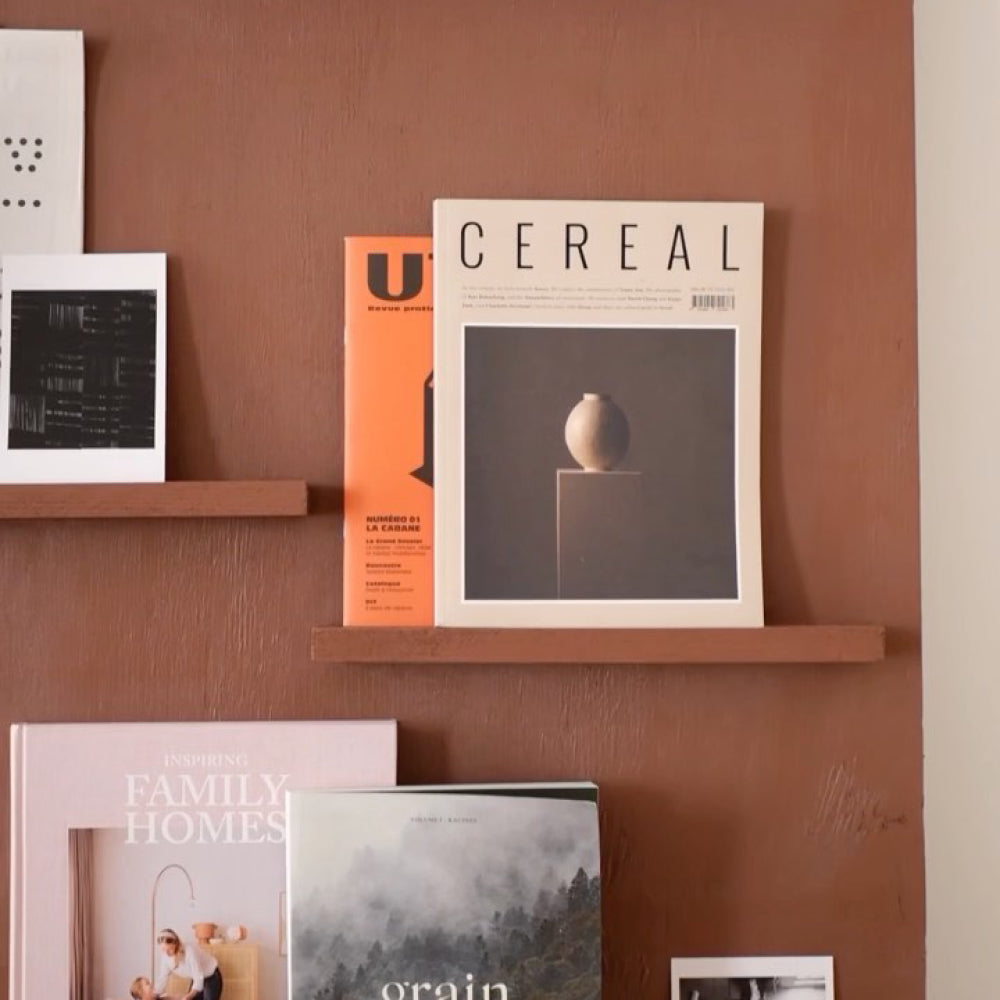
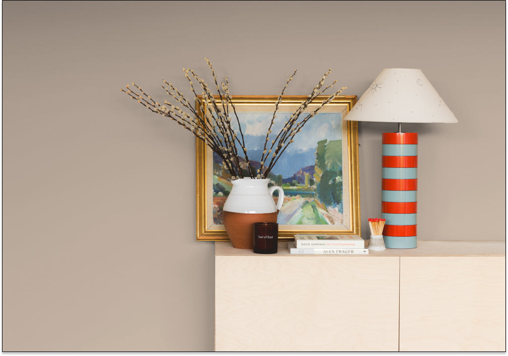
NEW TAUPES
Taupes are big news this season and our new hero colour Cold Brew is an absolute classic in the making. A full-bodied taupe grey, Cold Brew works well with some of our most popular neutrals Sunday Soul and Mindful, and it also makes an excellent bed fellow for a deep red such as Old Street.

In need of a full bodied taupe grey? 'Cold Brew' is the one for you.
"Taupes are always going to be popular because they work with everything," says Aaron. "Cold Brew is a really inviting colour that's easy to live with. You can use it all around a room, or alternatively pick out bits of interesting architecture with it when using it alongside paler neutrals. Let's face it, that Kelly Hoppen look is never going to go out of fashion. Taupes are here to stay."

'Margot' is just always a winner, a straight vibe.
NEW PINKS
You lot sure do love your pinks 💕 So when you told us you wanted more of the pink stuff we were only happy to oblige! The hero colour in the new range is our wonderful plaster pink Factor Fifty. Combine it with our new terracotta Baked or new earthy pink Persipan. Or create a bold contrast with dark royal blue 2AM.

@melanieamccrindle transforming her spare bedroom using our new pink on the block, 'Percy.'
"Factor Fifty is a great choice for bathrooms because this plastery pink works really well with all skin tones," says Aaron. "It's also a really good accent colour for our paler pinks Pudding or Felt Cute."

Spoling you for choice with our new pinks. 'Persipan' is stealing the show.
Check out our other new pink for 2022 – a lovely grey baby pink called Percy which pairs perfectly with our new grey-greens Yard Party and Park Life.

@katiejane_opted for our newest pink, 'Factor Fifty' for this gorg living room reno.
NEW BOLDS
To compliment our new plastery pinks, we’re introducing a new bold to help get your colour scheme sizzling. Baked is an earthy, mediterranean terracotta, hot out of the COAT oven and being served straight to you. Looks great as an accent colour on upcycled cabinets, with Factor Fifty or Persipan walls. Let’s get Cooking Mama.
Yellows are super hot in the interiors world right now, so we're confident our punchy new yellow House Points is going to be a big hit 👍 "We wanted to come up with a deep yellow shade that would work well with our existing colours," explains Aaron. "This golden saffron shade is very saturated which means it pairs really well with our new drab colours Cargo or Margot."

Go bold, we dare you. @janeshomejournal working wonders on her stairs using 'House Points.'
House Points would also create an amazing contrast alongside our gorgeous new blue The Establishment. "Tonally they are completely opposite, but because these are both highly saturated colours, they balance each other because they have a similar weight," says Aaron.
"The Establishment is the first dark blue we've released that doesn't contain any green pigment. It's the most stable blue in our palette because it doesn't have any undertones apart from grey. This means it will work under any lighting conditions, so it's a really versatile colour." 💙

Sometimes, only a bold will do. 'The Establishment' doing it's thing in @raisingtheregans kids room.
This reliable, grounding shade is the perfect choice for kitchen cabinetry. The Establishment would also work well in a downstairs loo in which the colour is used to wrap around the entire space, including the ceiling, to create a reassuring, cocooning effect.

'Old Street' is a bold and beautiful deep tone.
For a braver among our decorating fans that want a blue, we have another corker of a blue in the new palette. The Posh Seats is an indulgent peacock blue. It’s slight green undertone allows some warmth, allowing you to live your best life. It’s brazen and regal, helping you show off!

'The Establishment' doing it's thing. It's big, bold and beautiful.
Still with us? Bravo 👏
Ready to get decorating? Grab your swatches now. 🌈
Publish Date
Author