Ceiling Paint Colours: Why Your Ceiling Doesn't Need To Be White
Walk into almost any home in the UK and look up. Brilliant white. It's the default - not because it's the right choice, but because most people don't really question it.
But we're questioning it.
Your ceiling makes up a significant portion of the visual space in any room. Leaving it pure white while the rest of your scheme is carefully considered is a bit like choosing the perfect outfit and then forgetting to think about the shoes. The room never quite lands the way it should.
"Even a slight shift from pure white, to something with obvious undertones can make a huge difference. It'll make the room feel inexplicably more designer, and considered - and it's so easy to do" - Rob A, Co-Founder COAT Paints.
Here's what choosing a ceiling paint colour actually does for a room.

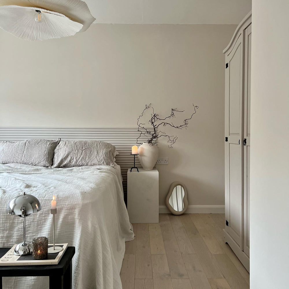
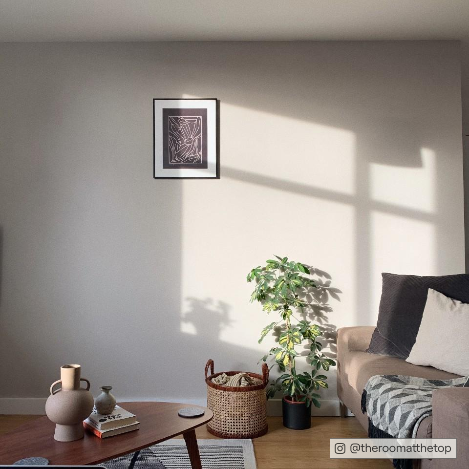
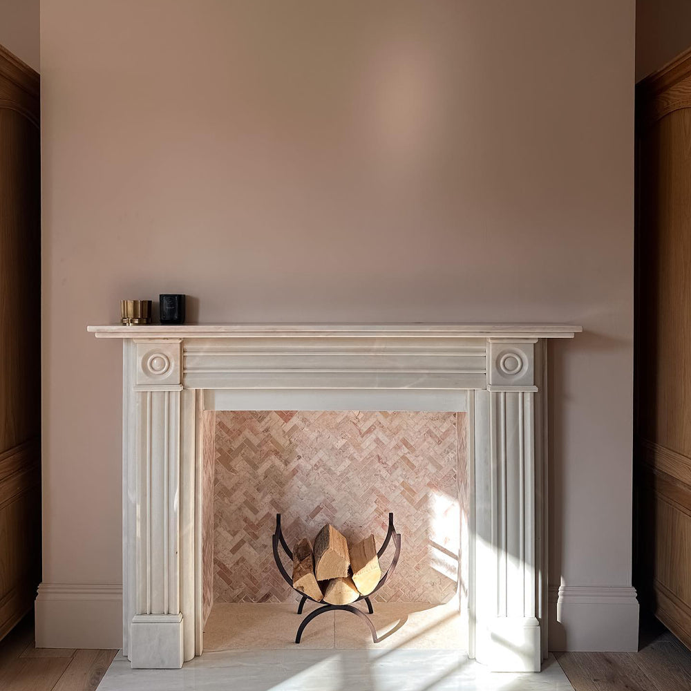
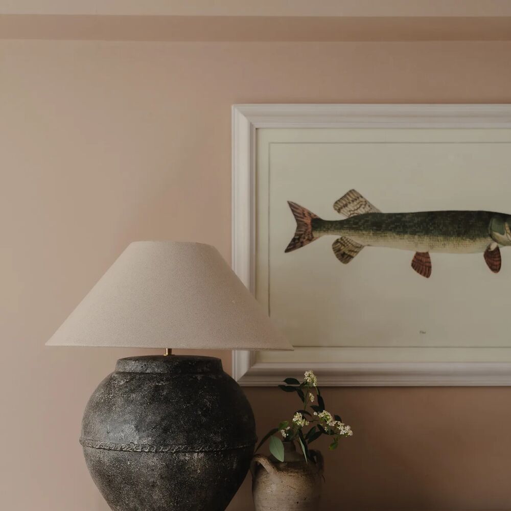
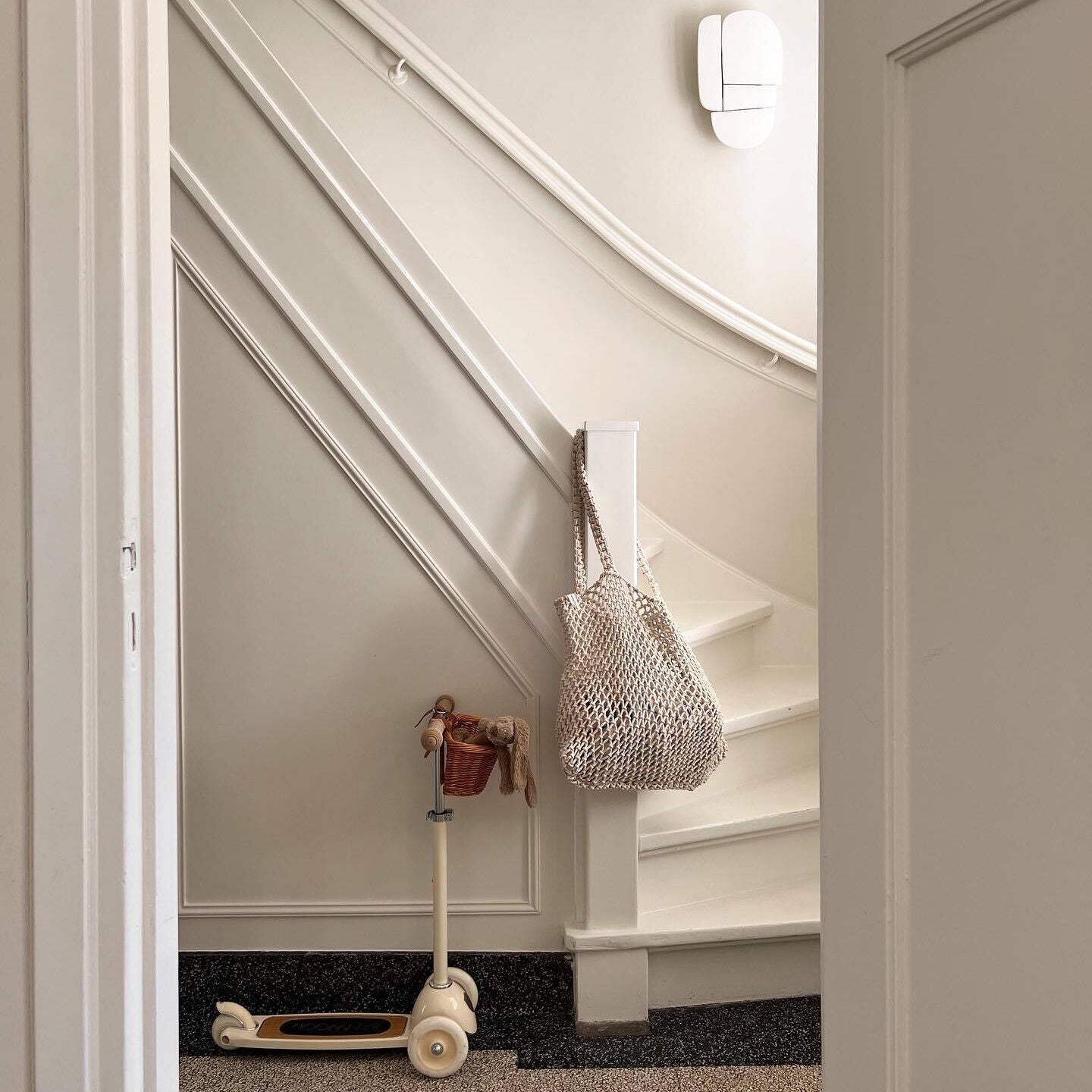
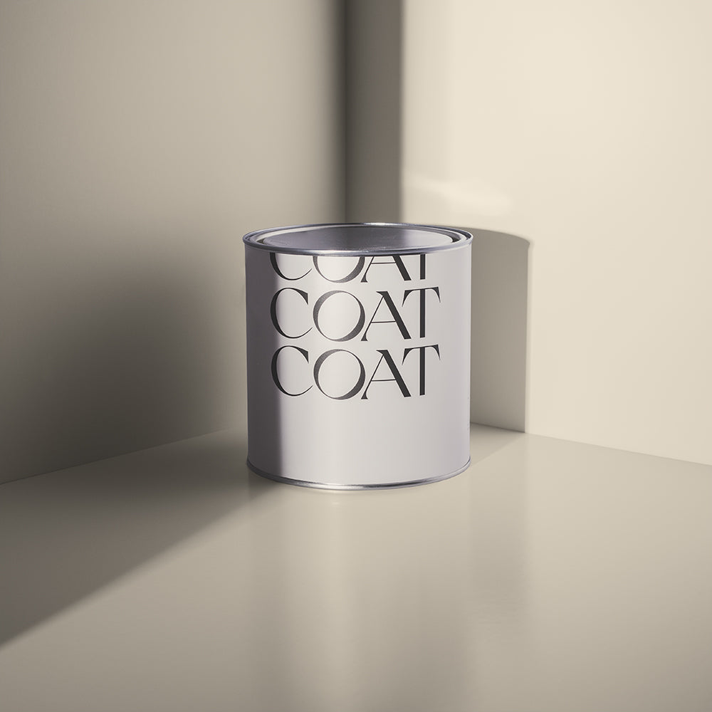
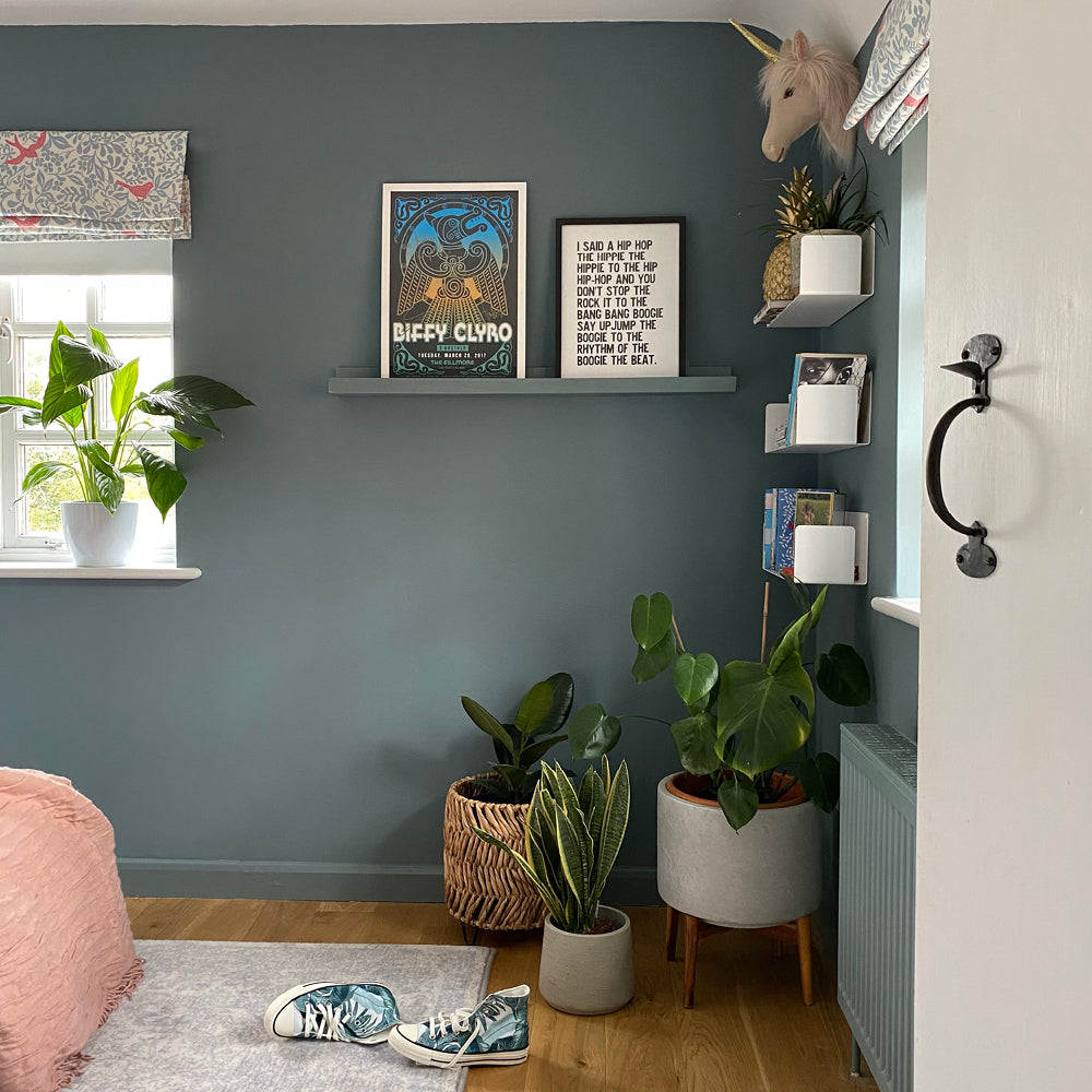
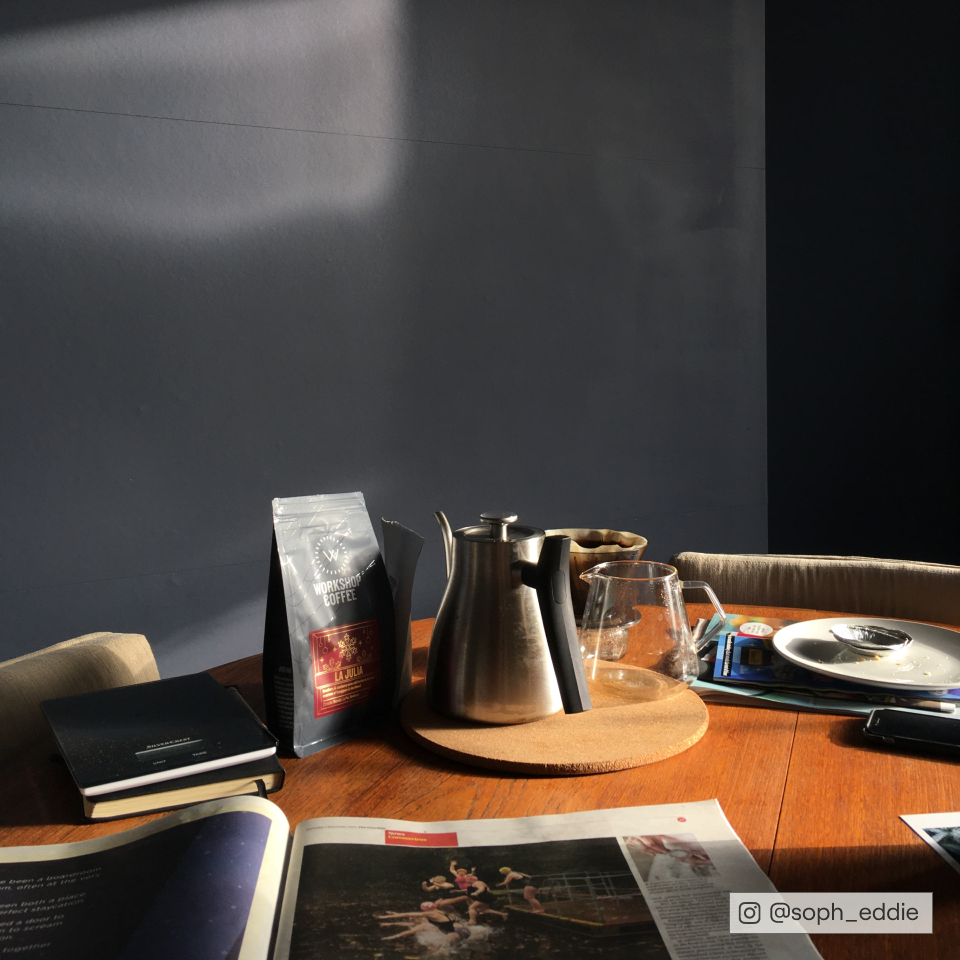
Ceiling in The Tobacconist. Walls in Lie-in.
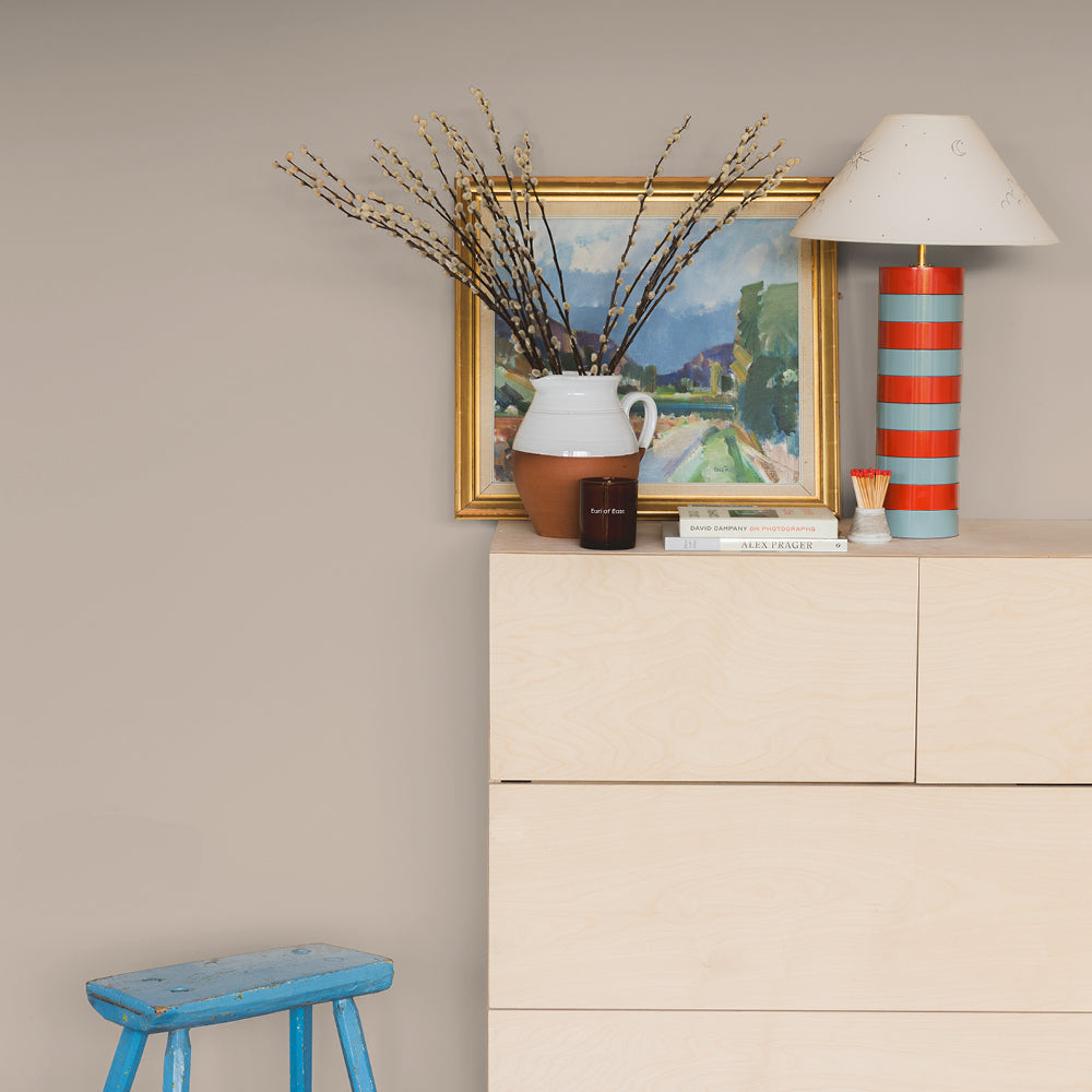
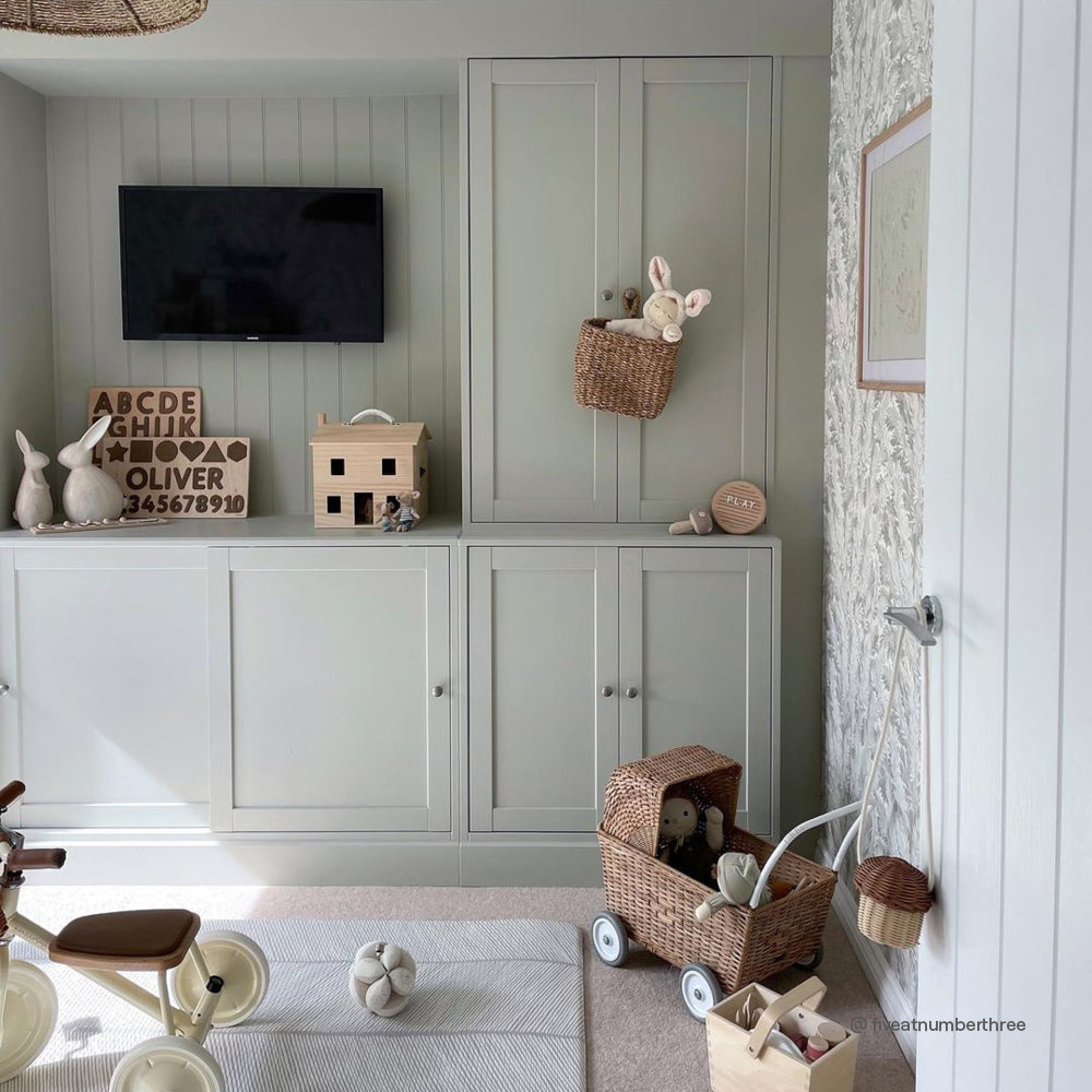
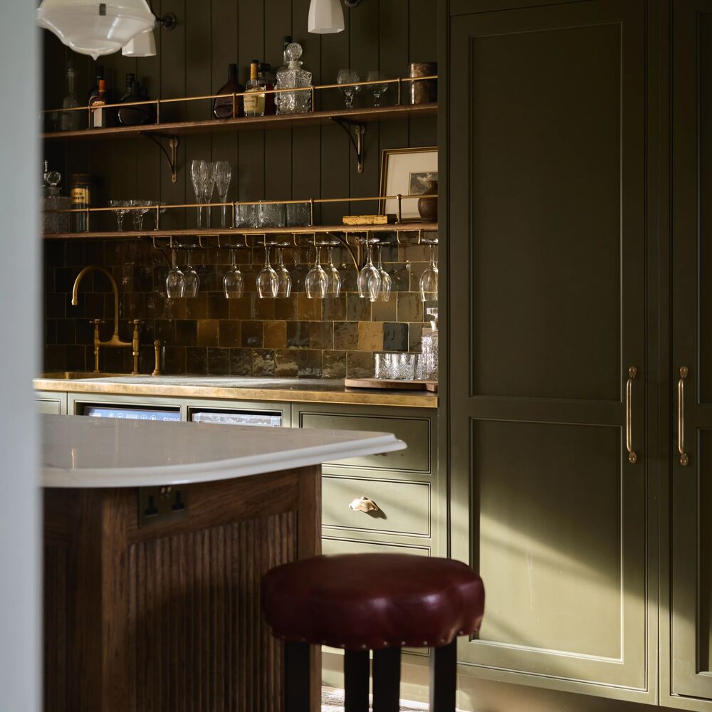
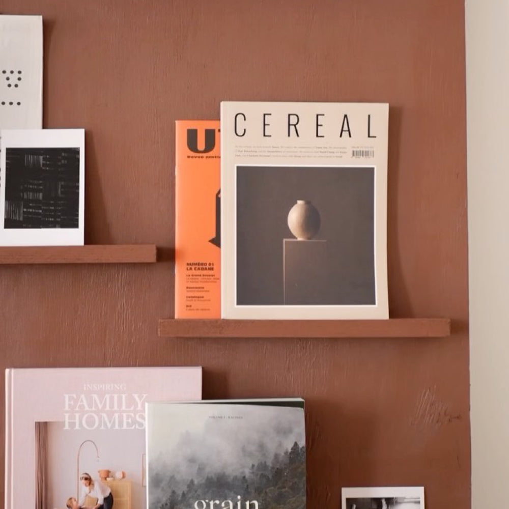
Coloured Ceilings Make Your Walls Look Better
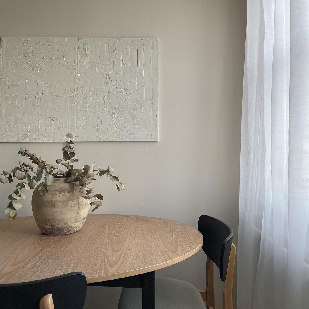
When your ceiling has character - boldly, or even subtly - the whole room reads as more intentional and well put together. The colours aren't fighting each other. They're in conversation. Warm, barely-there shades like Nada, Just Barely and Good Intentions work beautifully overhead, adding depth and warmth without announcing themselves. Pair any of them with a richer taupe on the walls - Sunday Soul or Cold Brew - and the room feels complete in a way that brilliant white never quite achieves.

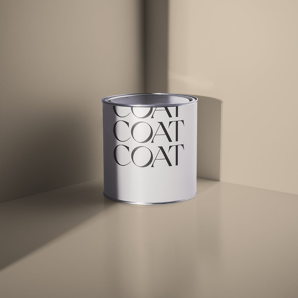
Ceiling in Dirty Sherbet.
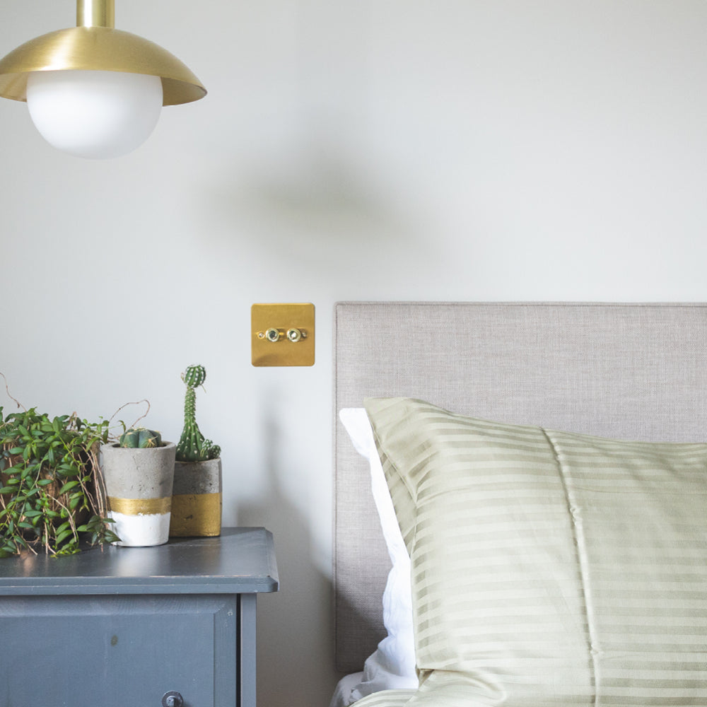
The Right Ceiling Colour Changes How Light Feels
Brilliant white reflects light back hard and flat. A muted ceiling colour absorbs it slightly, which softens it and helps it feel more gentle in the room. In north-facing rooms especially, a ceiling with warm undertones can make the whole space feel less grey and more alive. Mindful is a particularly good choice here - a brighter warm pale taupe with just enough pigment to counteract cool northern light without feeling like a colour choice at all. Paper Plane and Pampas work similarly, bringing an organic warmth that brilliant white simply can't replicate. This is why choosing ceiling paint colours formulated for UK lighting conditions matters - the way light hits is specific, and your ceiling colour should be a deliberate choice to work with it.

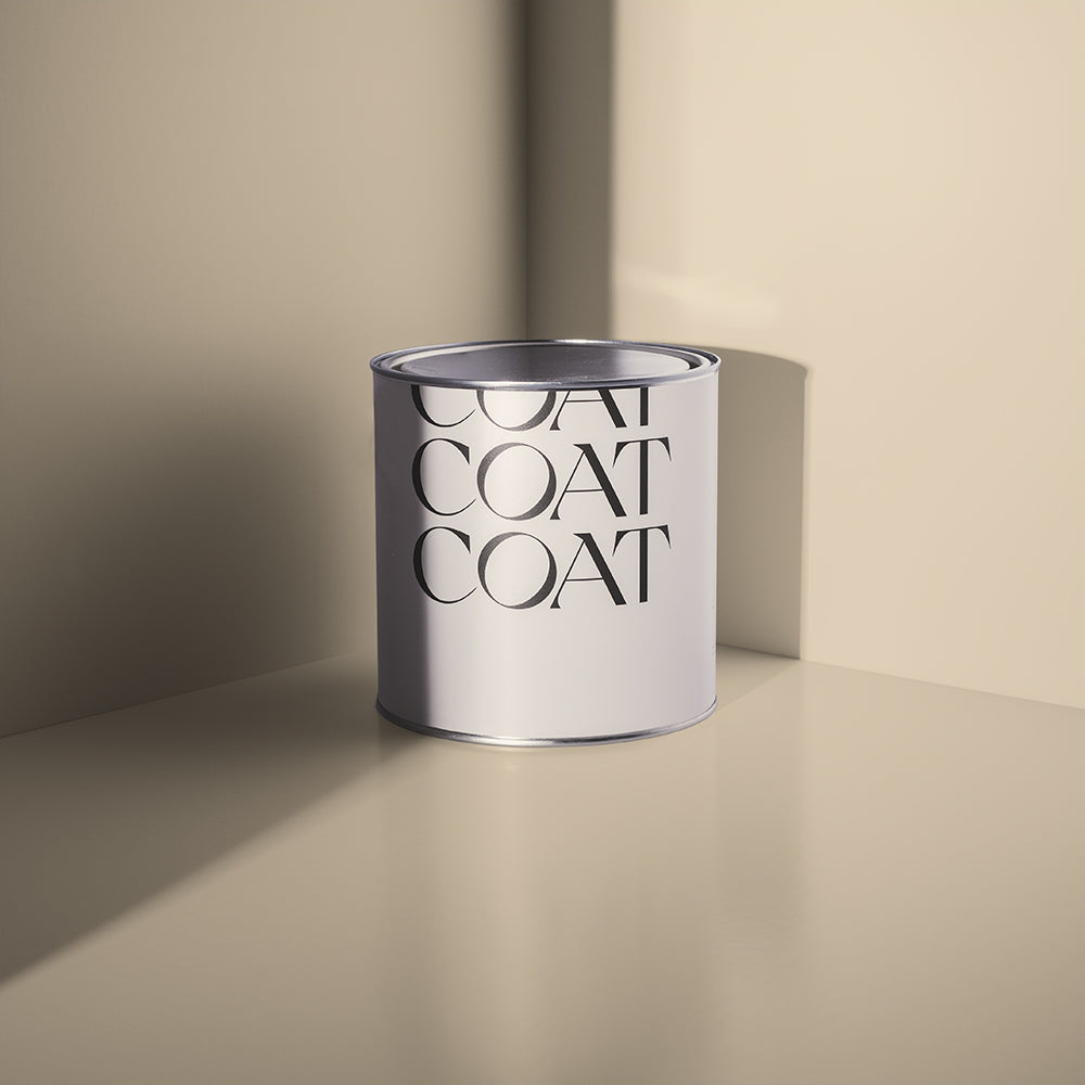
Ceiling in Northdown Drift.
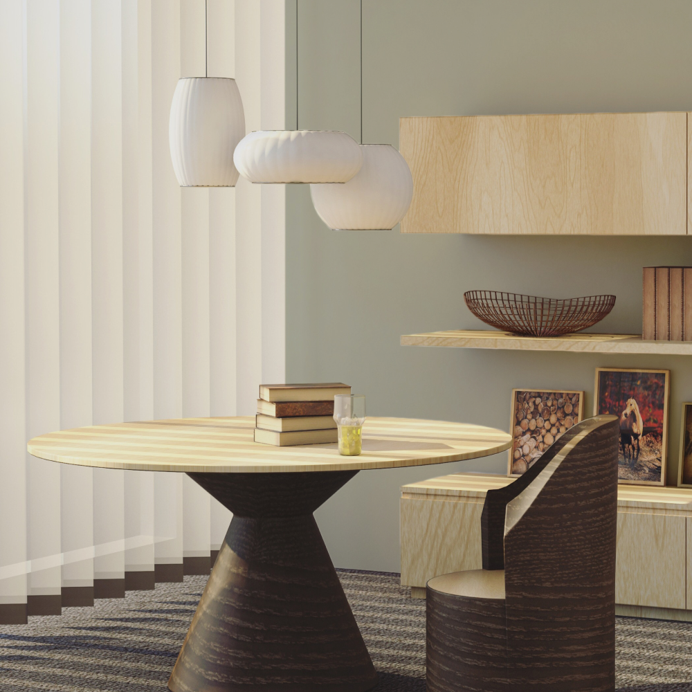
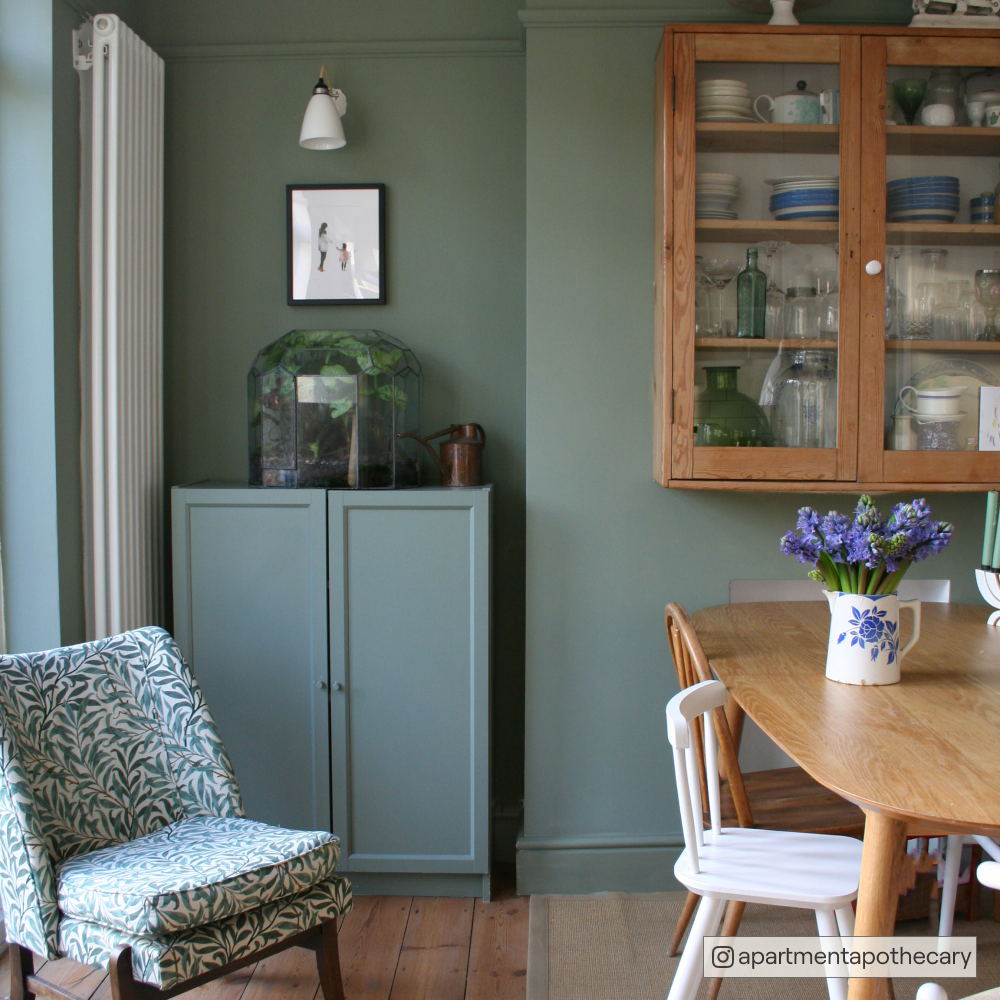
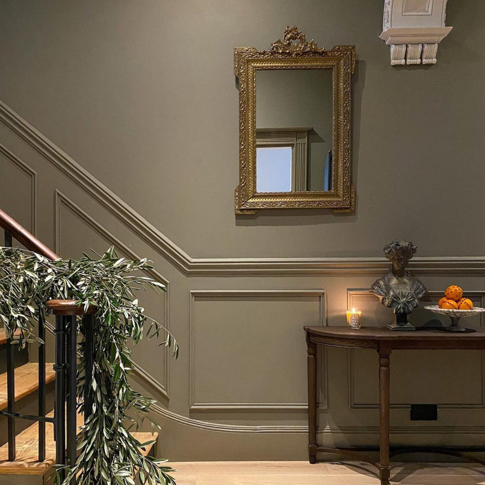
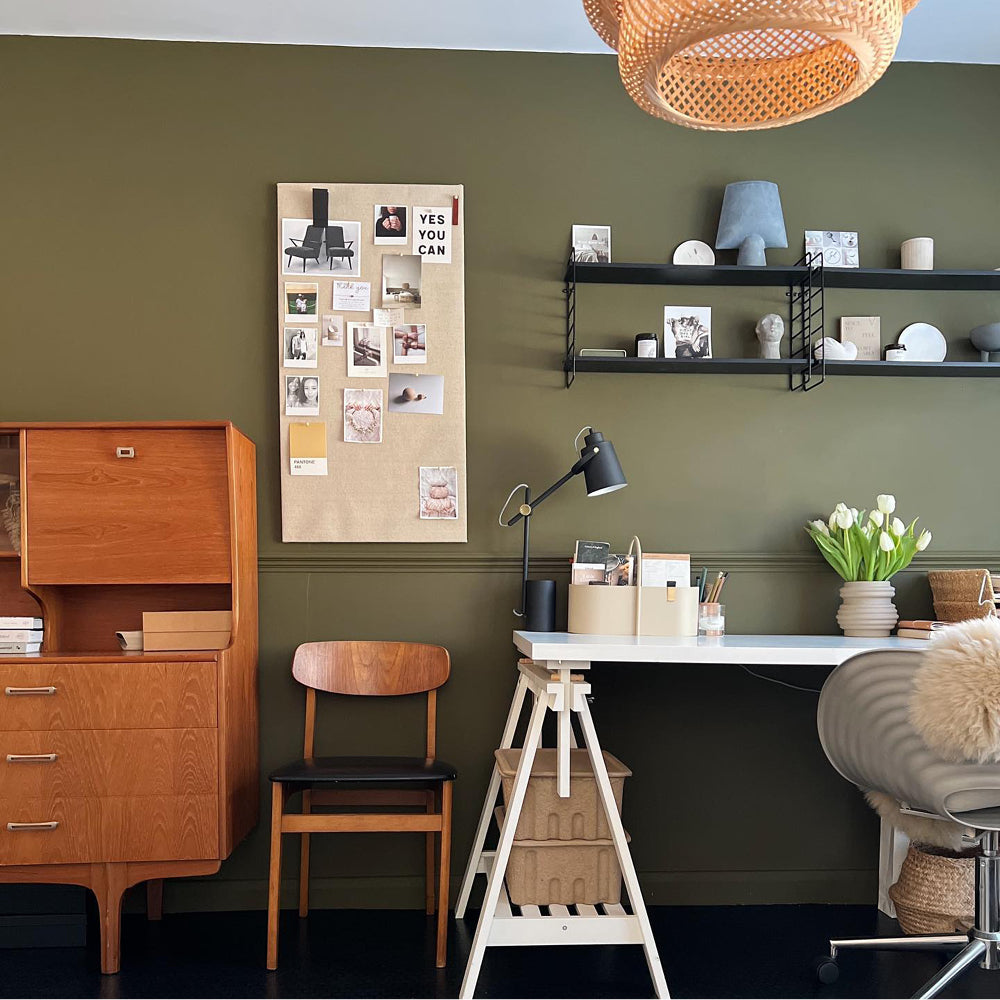
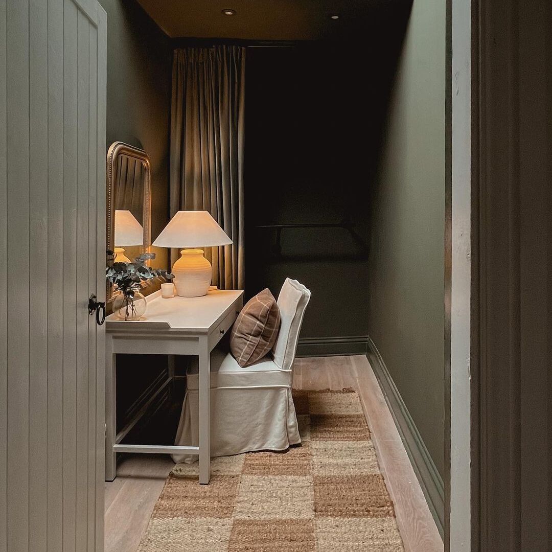
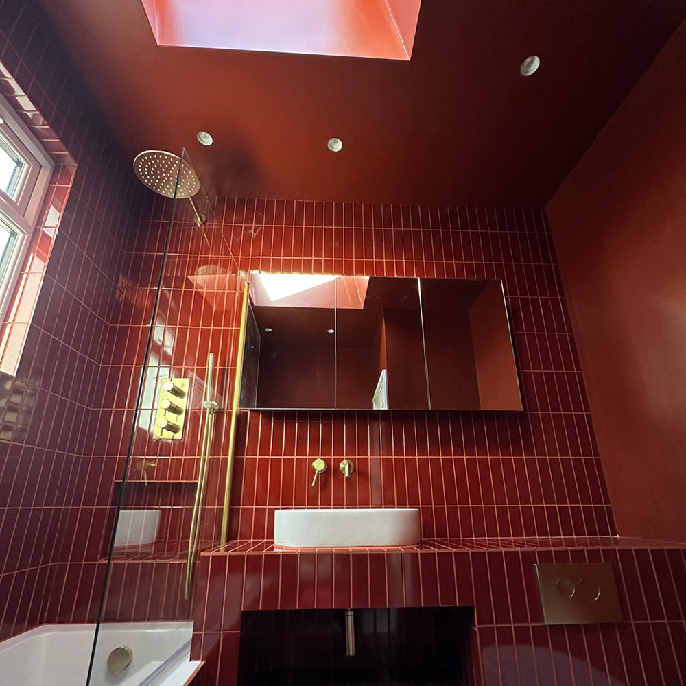
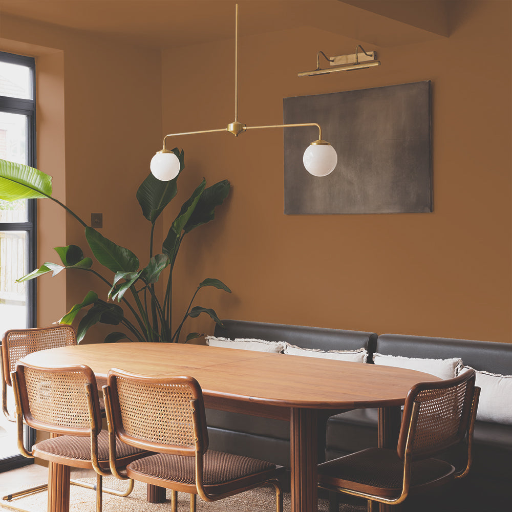
Your Ceiling Colour Doesn't Need To Match Your Walls
This isn't always about painting your ceiling the same colour as your walls - though that (colour drenching) can be a bold and brilliant move too. It's about choosing something that belongs in the same family. Something that feels considered rather than default. Northdown Drift overhead with Dirty Sherbet on the walls. Brewer on the ceiling with Ode to Toad below. These shifts make the whole scheme feel designed, not assembled.
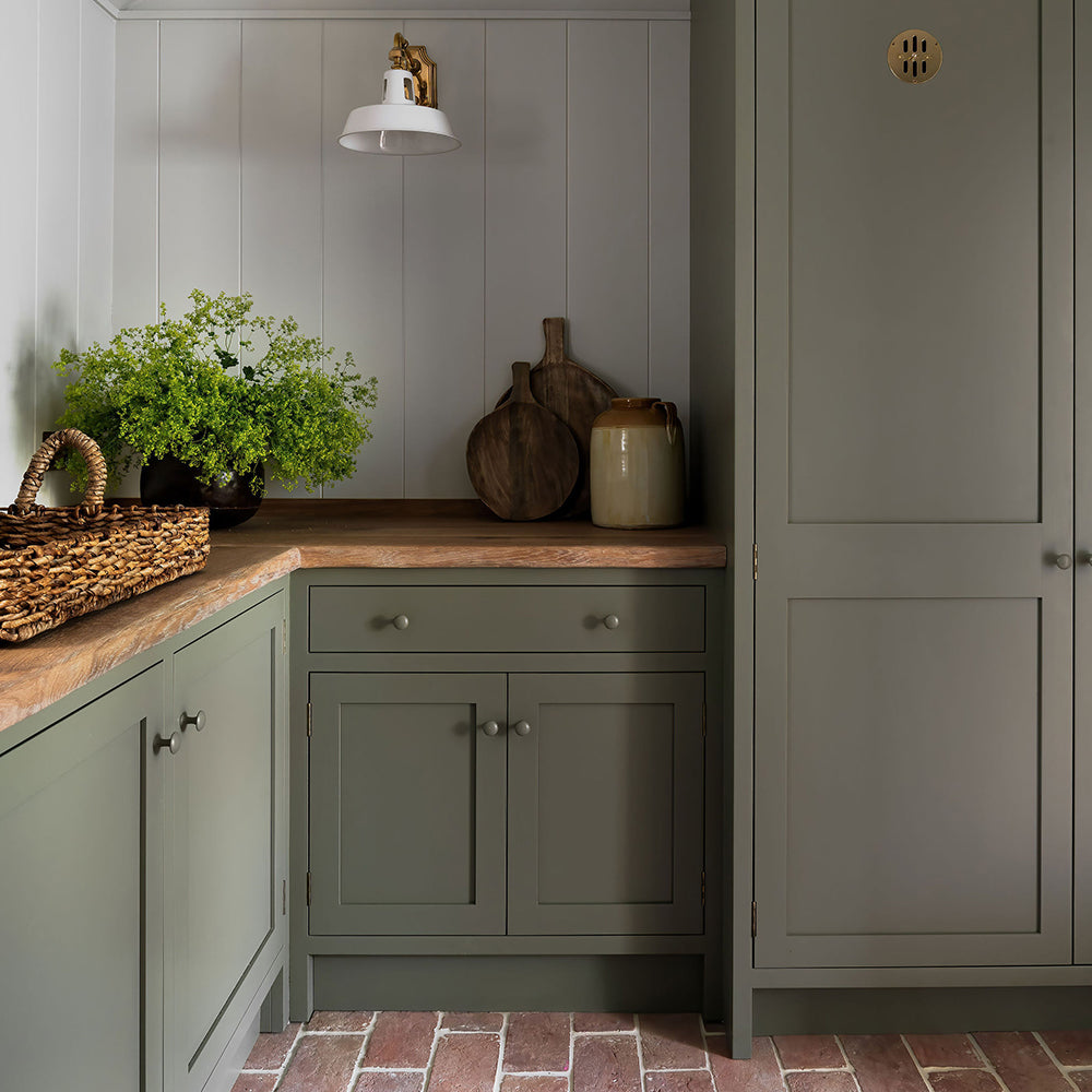
For something more committed (and frankly, easier to paint too...), colour drenching - using the same shade on walls and ceiling - is one of the most effective ways to create an immersive feel. Pudding and Naptime are popular for this approach.

Ceiling in Dirty Sherbet
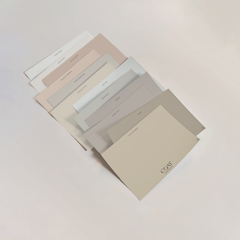
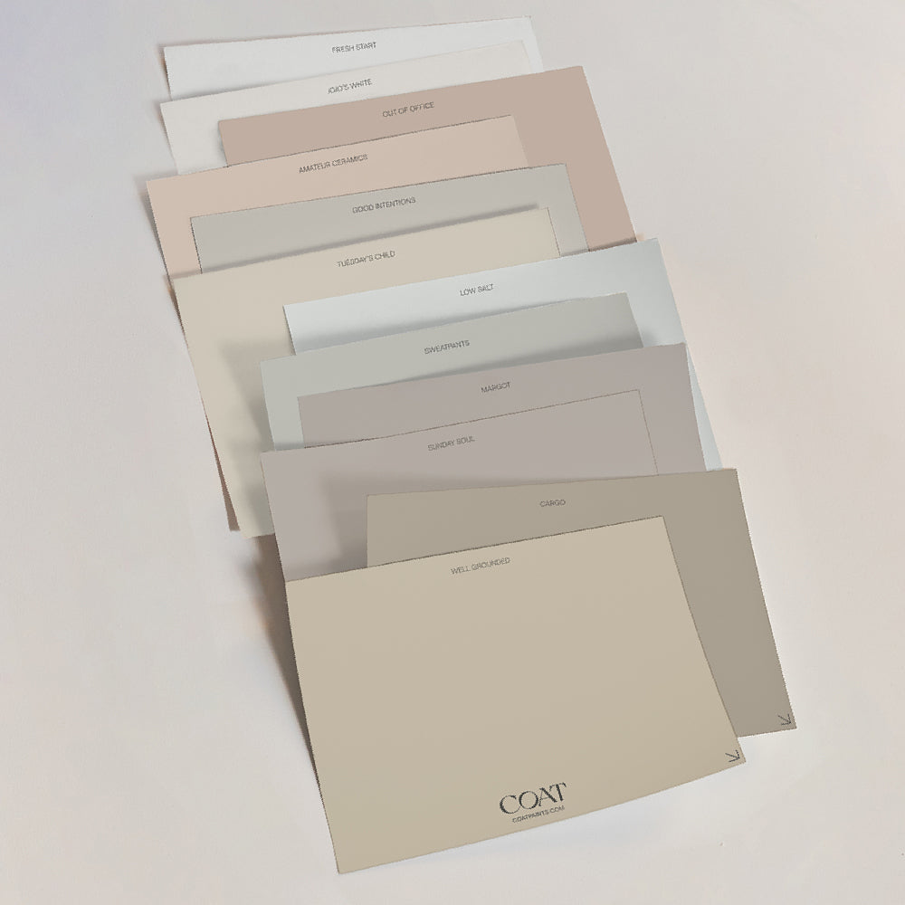
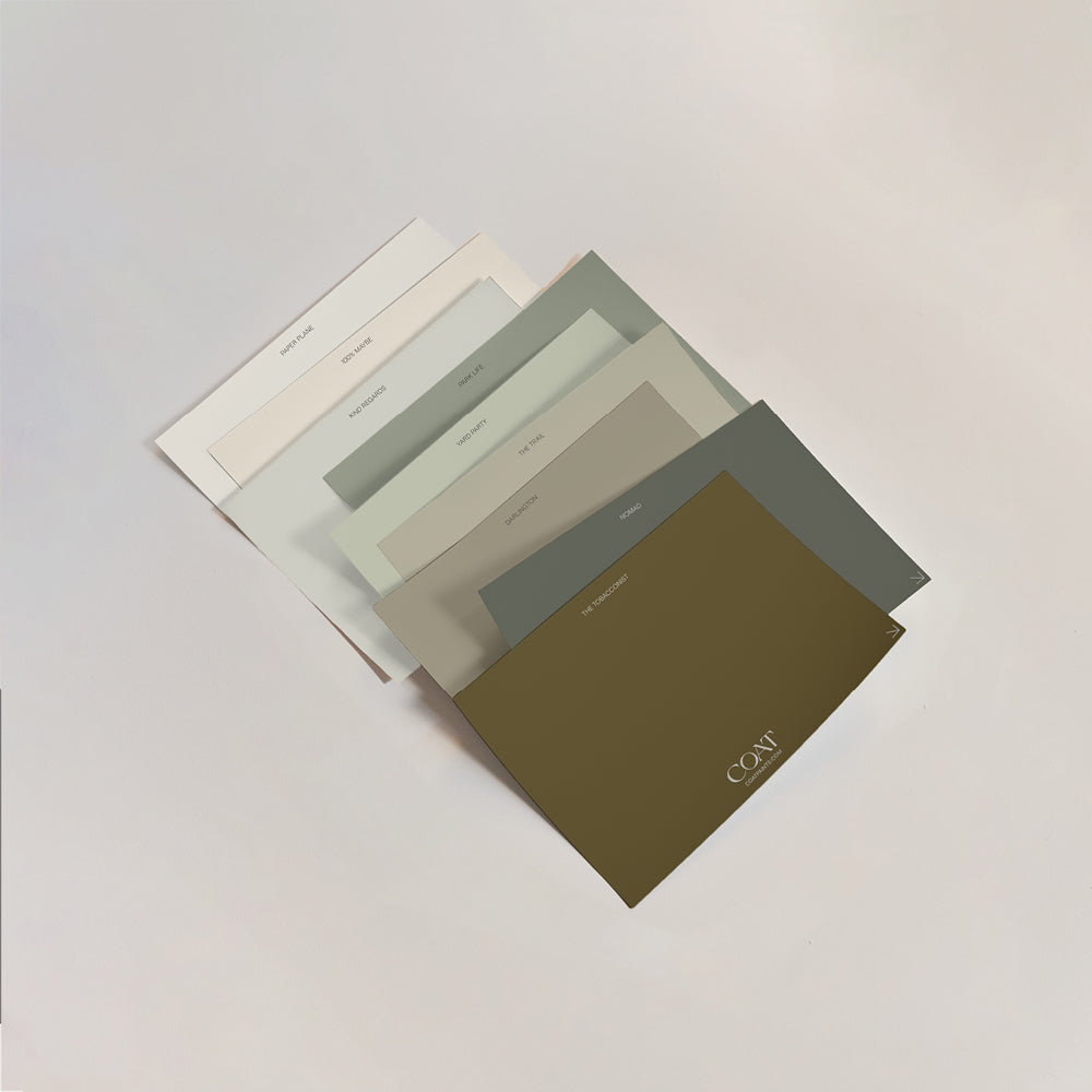
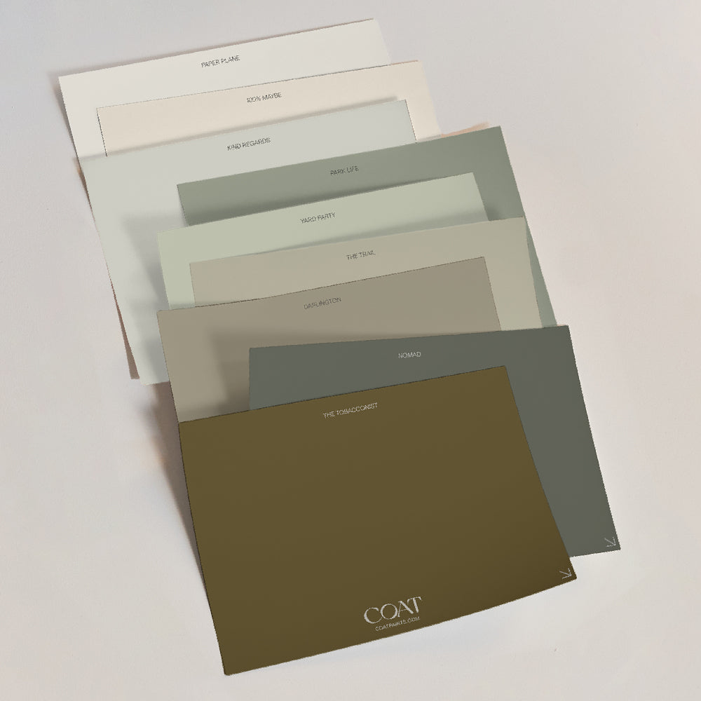
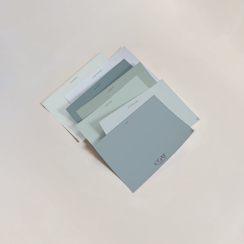
What Colour Should I Paint My Ceiling?
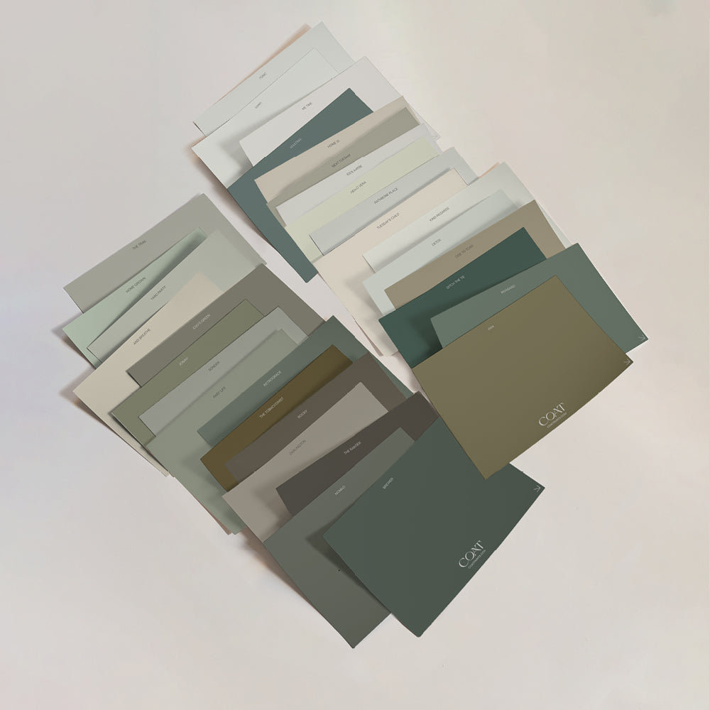
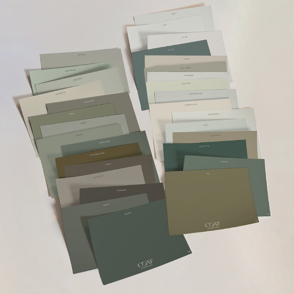
This is our most asked question - and the most honest answer is that it depends on your walls, your light, and your room. But as a general rule, muted shades with warm or neutral undertones work best for ceilings in most UK homes. Avoid anything too stark unless you're looking to create real drama in the space - which is also, totally fine.
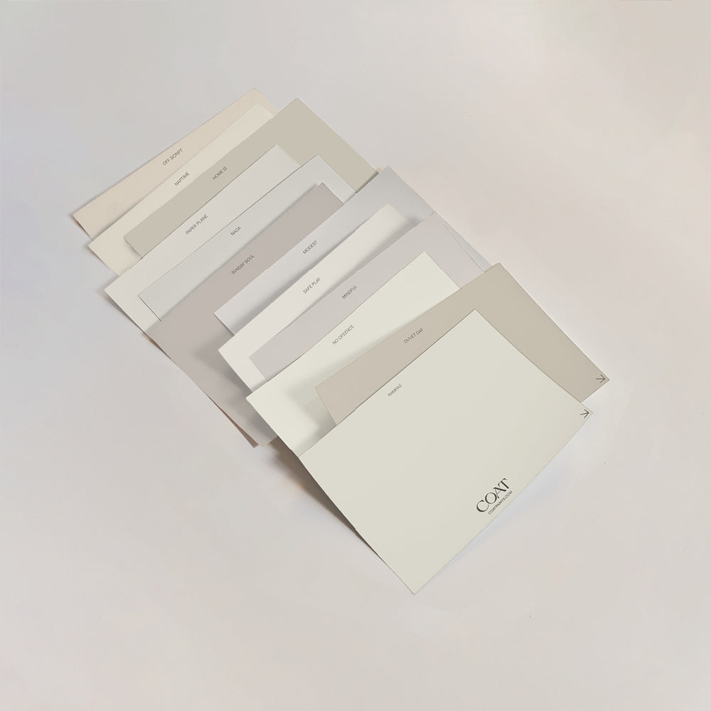
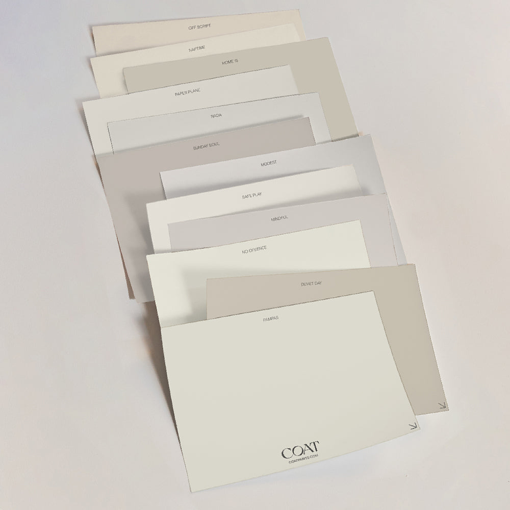
For a failsafe warm white option that is a million times better than brilliant white - try Nada, Modest or Cat's Cradle. If you want to go further, choose a shade in the same colour scale as your walls. Going lighter is typical, as most people want to expand the feeling of height in the room. But going for a darker shade on the ceiling, especially when ceilings are nice and high, can create a real focal point and sense of drama.

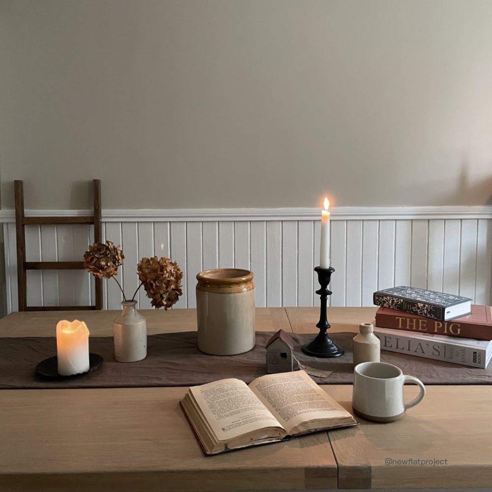
Ceiling in Love Lane. Walls in Dirty Sherbet.
It's The Detail That Separates A Room From A Scheme
Interior designers have known this for years. The ceiling is where an amateur stops and a considered eye keeps going. It's not a drastic change. It doesn't require a complete rethink. It's one decision, made deliberately, that pulls everything else together.
Brilliant white isn't wrong. It's just not always right. And once you've lived in a room with a ceiling that was actually chosen, it's hard to go back to the default.
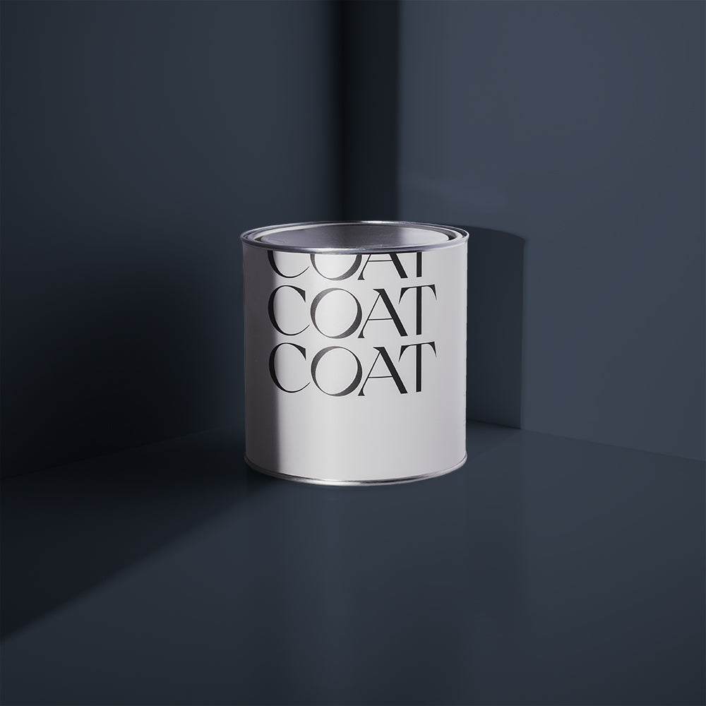
All COAT paints are made freshly to order in the UK, in our Flat Matt finish — the only finish worth considering for ceilings. Every shade is perfected for UK lighting conditions, so what you choose will behave exactly as it should, overhead and in your home.
Frequently Asked Questions
Is it a good idea to paint your ceiling a colour? Yes - for most rooms, a considered ceiling colour creates more depth, warmth, and cohesion than brilliant white. It doesn't need to be dramatic. Even a very pale muted shade like Just Barely or Nada makes a noticeable difference to how a room feels.
What is the best paint finish for ceilings? Flat matt is the best finish for ceilings. It absorbs light rather than reflecting it, which hides imperfections and creates a more sophisticated result. COAT's Flat Matt is specifically formulated for UK lighting and works beautifully overhead.
Should ceiling paint be lighter or darker than walls? Traditionally, ceilings are painted slightly lighter than walls to give the maximum sense of height. A ceiling shade that shares an undertone with your wall colour - but sits one or two tones lighter - is usually the most successful approach. Naptime on the ceiling with Off Script on the walls is a strong and frequently-seen example of this approach working well.
What are the best ceiling paint colours for UK homes? Muted warm whites, soft taupes, pale plaster shades and earthy greens tend to work best - where natural light is cooler and more diffused.
Can you use the same paint on walls and ceilings? Yes. Using the same colour on walls and ceiling - known as colour drenching - is one of the most effective ways to create a cocooning, immersive feel in a room. It works particularly well with deeper, more saturated shades.
Publish Date
Author