How To Decorate With Blues
Blue has been in vogue for as long as there’s been a word for it.
Fun fact: because blue pigments rarely exist naturally, as humanity was developing we didn’t really use it as a colour. It was the last colour to be given its own name in most languages. So when blue pigments were discovered in rare materials they were madly expensive and so usually only used by the very wealthy.

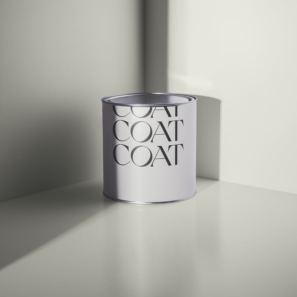
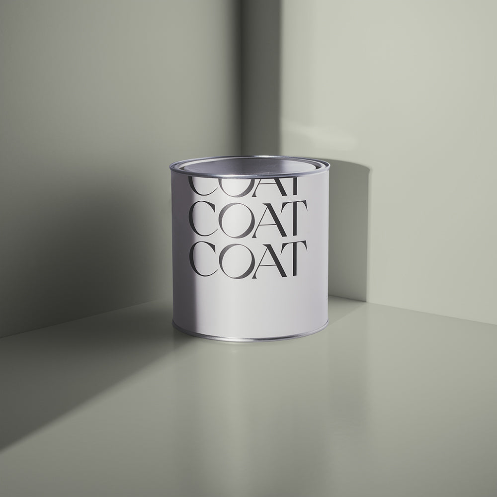
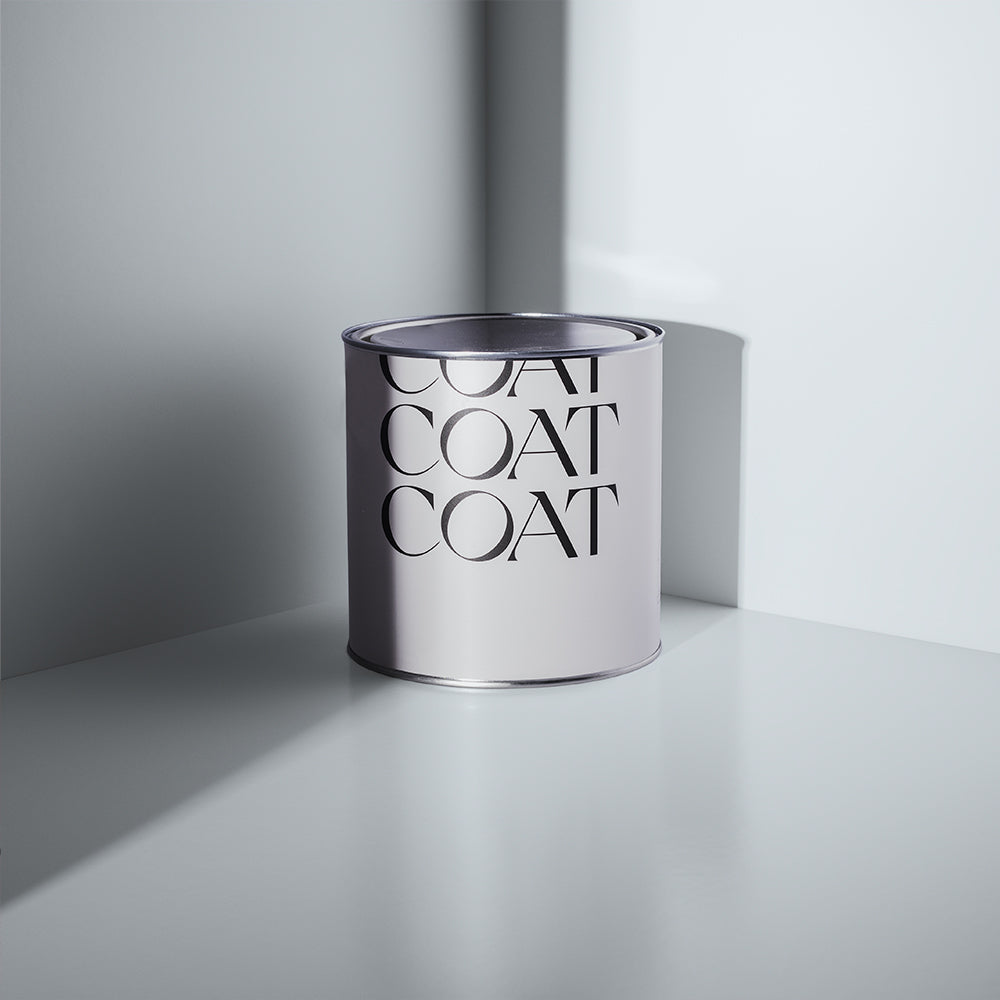
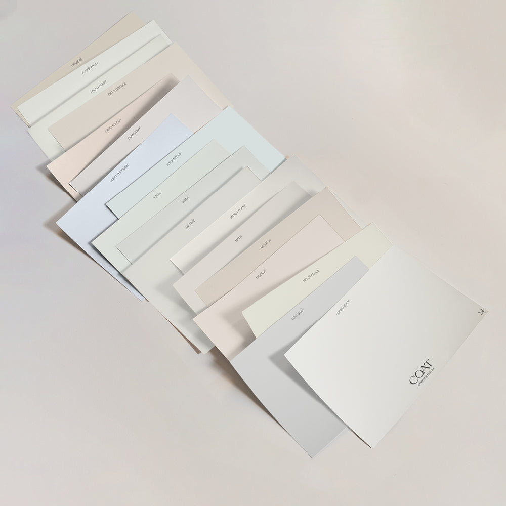
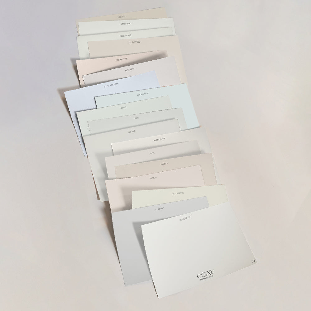
Beat those winter blues and order our light blue sample pack to brighten your mood (and home)
No elitism here though. We’re strong believers that blue is now for everyone.
Lighter blues remind us of the open expanse of the sky, or soothing streams and so make rooms feel airy and free. Dark blues are grounding and reliable, particularly when used at low level. This (literally) rich pigment can be used in so many ways, so let’s dive into how COATing your home can leave your guests gasping til they’re blue in the face… breathtaking.
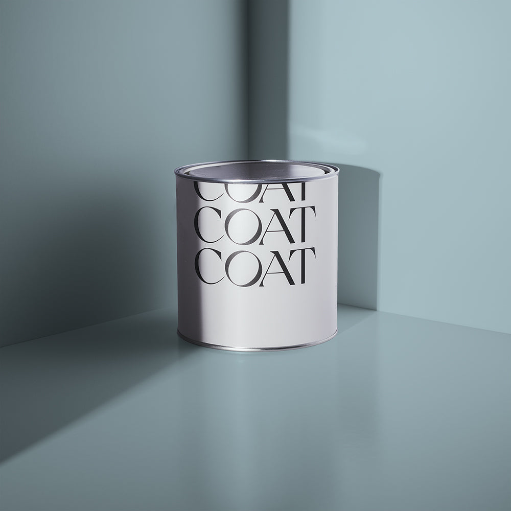
Bringing a whole new meaning to January Blues. Tempted? Grab our samples ✌🏼
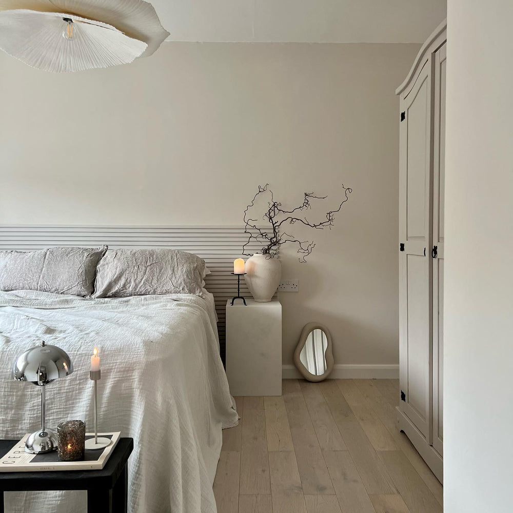
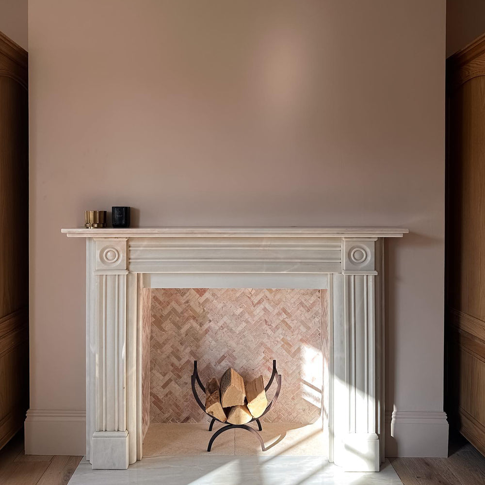
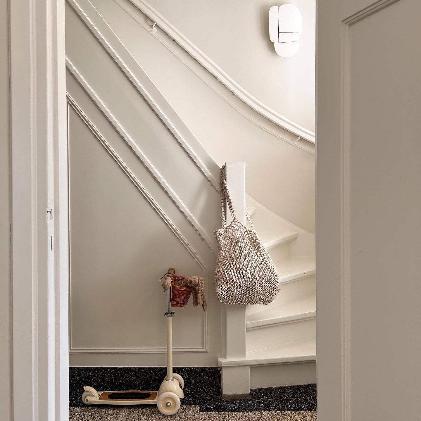
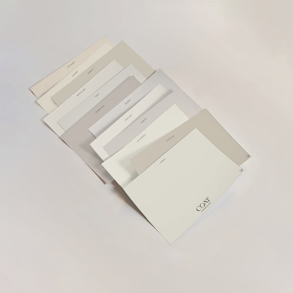
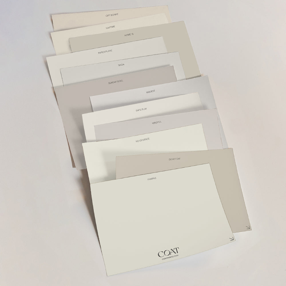
Pale Blues
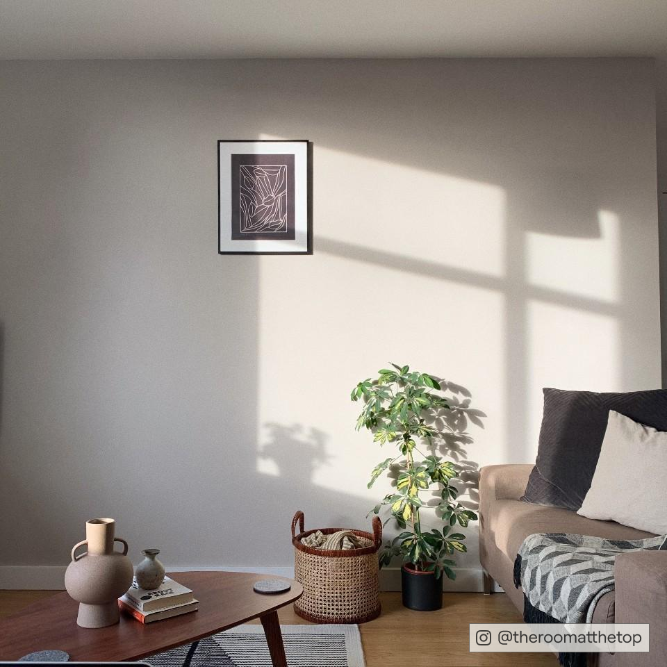
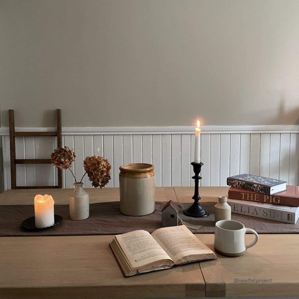
The Regency period saw pale blues become fashionable in interiors, which has continued on to today. Pale blues like The Good China are restful and serene, pretty much perfect for both nurseries and large airy bedrooms. Combine with a pale grey like Margot on ceilings and woodwork to add a sense of warmth. By adding painted furniture in deep blue All Inclusive, you can make Good China look even fresher and bluer.
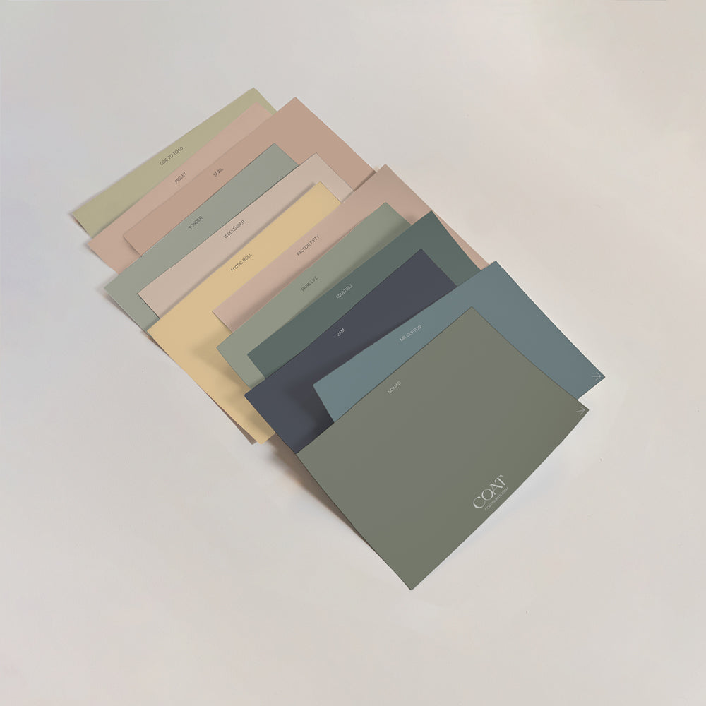
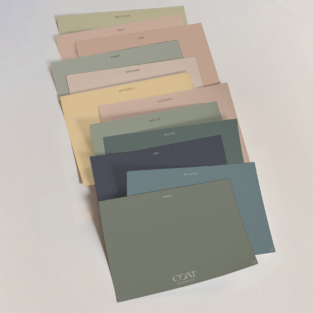
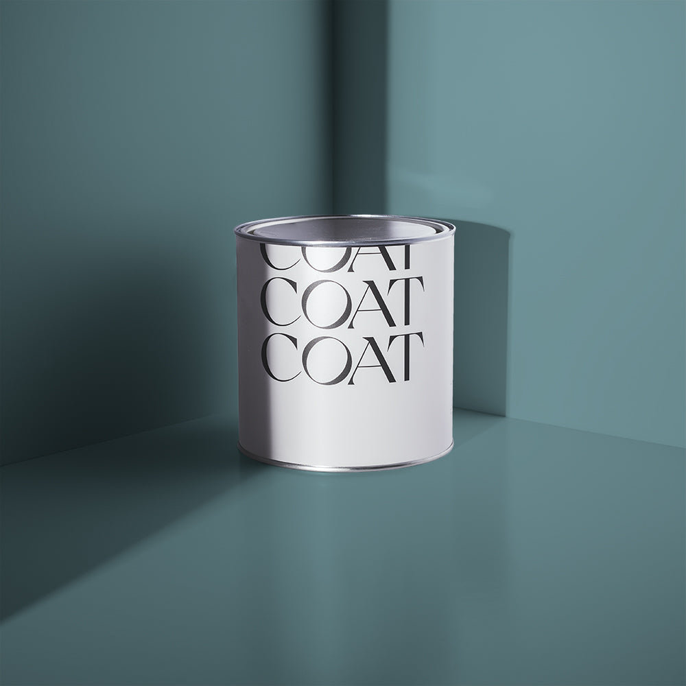
Colours like The Good China can also become a calming but bright neutral for our mid blue colours, such as Below Deck. Grab a sample pack to see the full range.

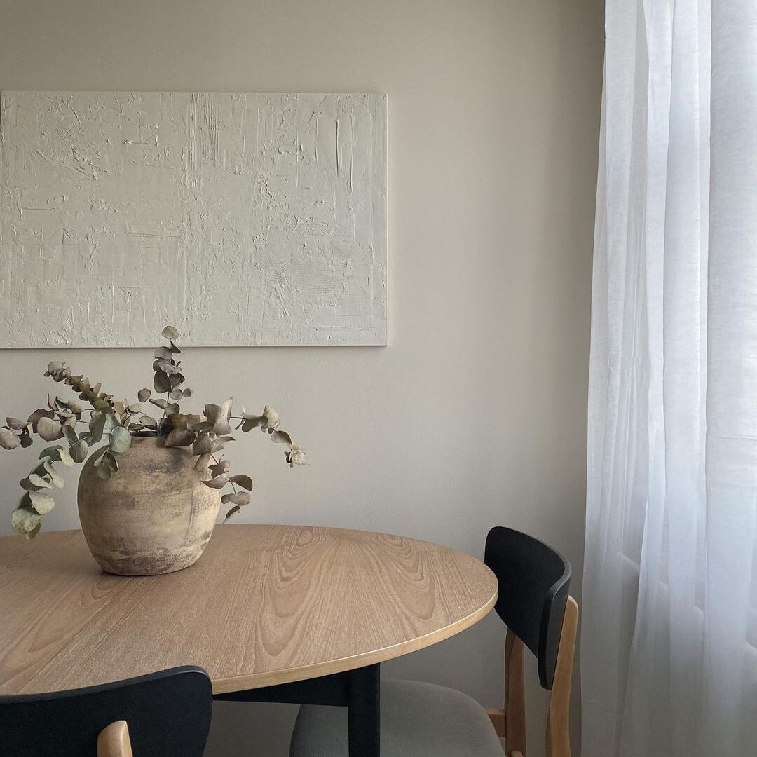
@melaniemccrindle created the perfect calming kid's room using The Good China
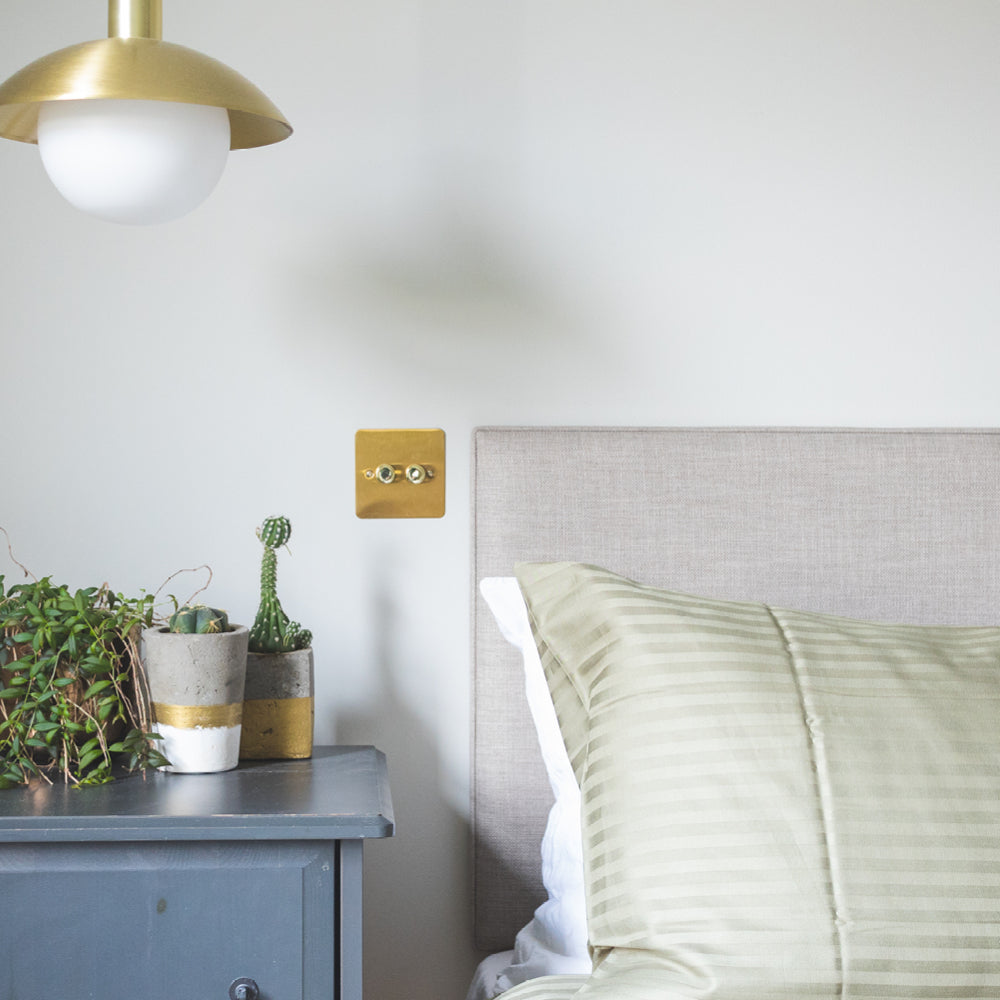
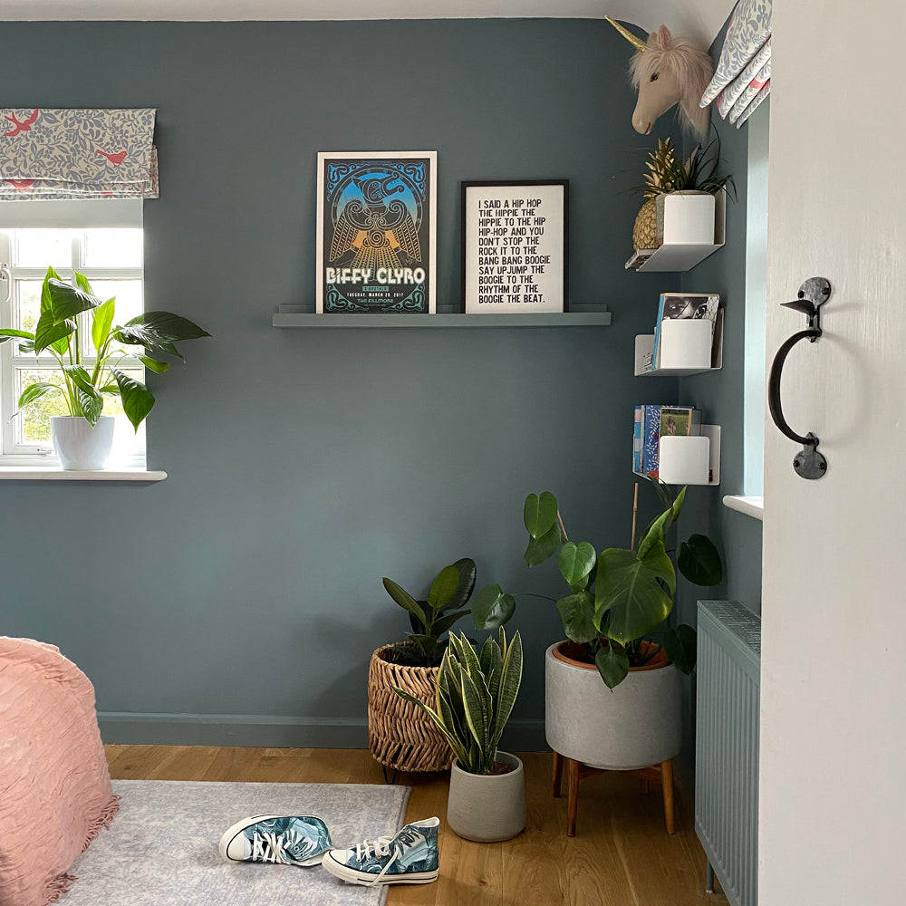
Mid Blues
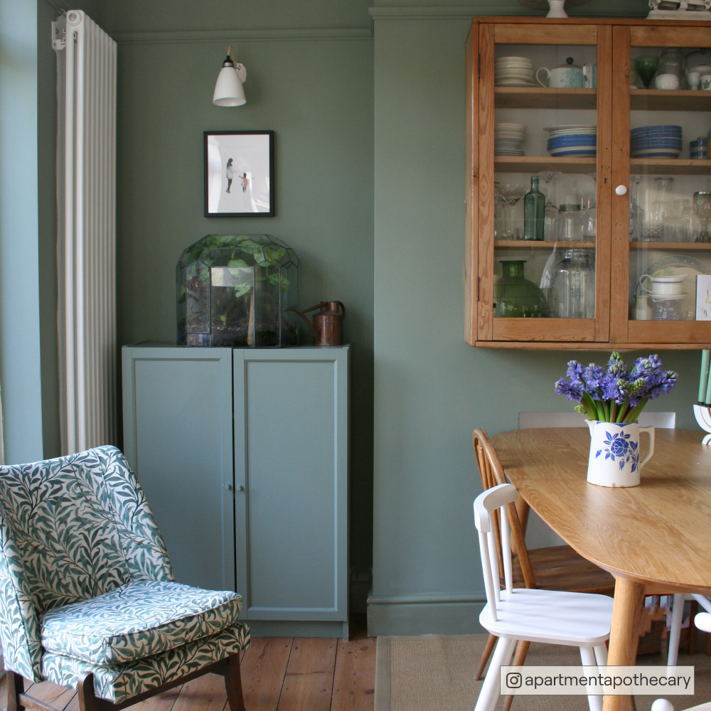
Mid blues are dependable, and really easy to balance with lighter and darker shades. Take this Mr. Clifton feature wall as a prime example:

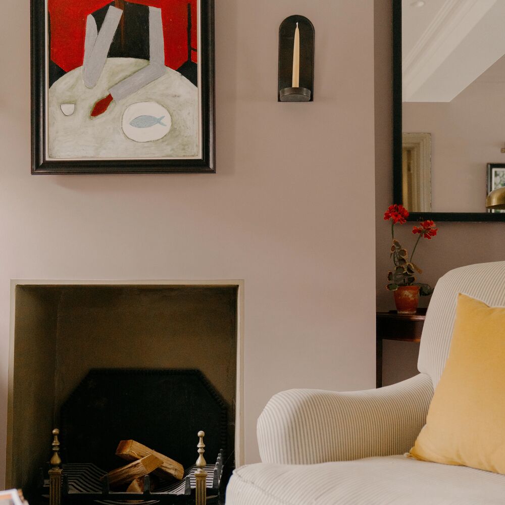
It can also be used in combination with pale taupe Good Intentions, creating a warm inviting living space. This palette is soft and welcoming due to the shot of grey that both of these colours have. This high-brow blue would also be great in a downstairs loo - paired with Dodie woodwork for just a pop of drama.

Like the look of Home Grown? Go on...order a sample...
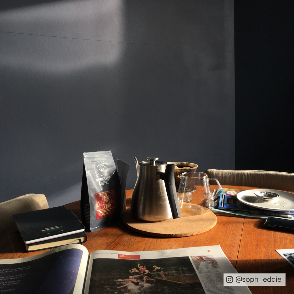
For a boat load of maritime realness, try Below Deck. As mentioned before, it’s great when it’s paired with Lie-In. It’s also a great colour to use for beachy wall graphics. Head to the tropics with a background of warm white sands like Mindful, and them throw some shapes in Below Deck, Home Grown and My Island for the beachiest of vibes
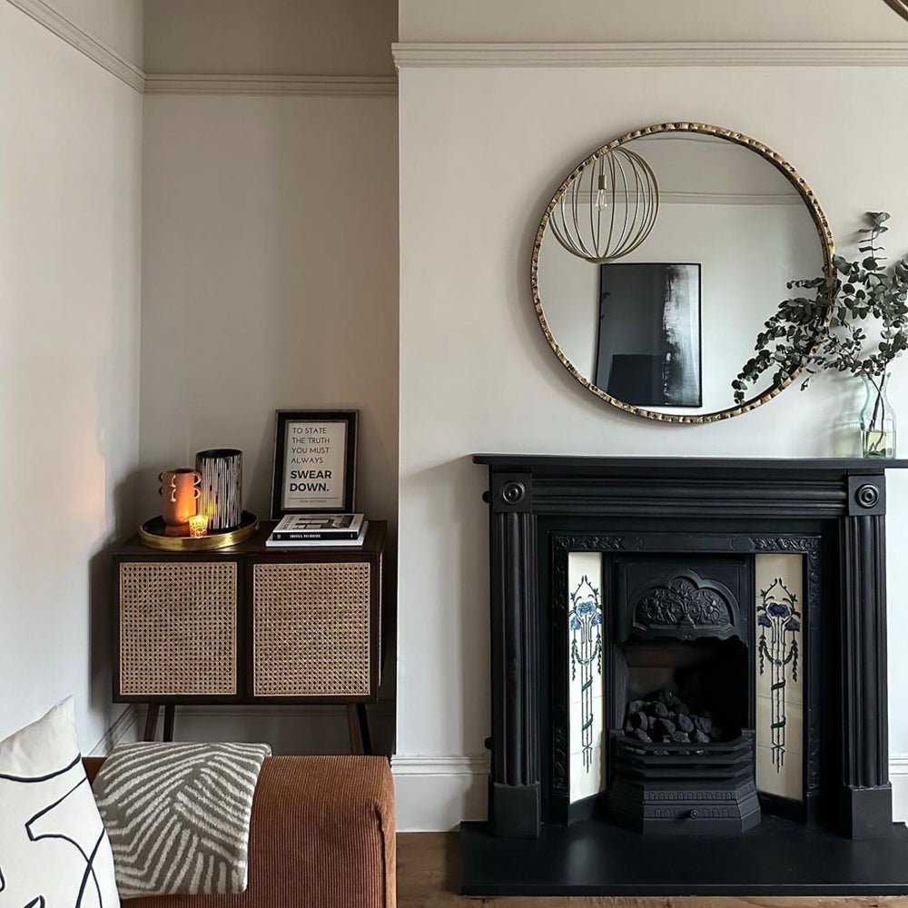
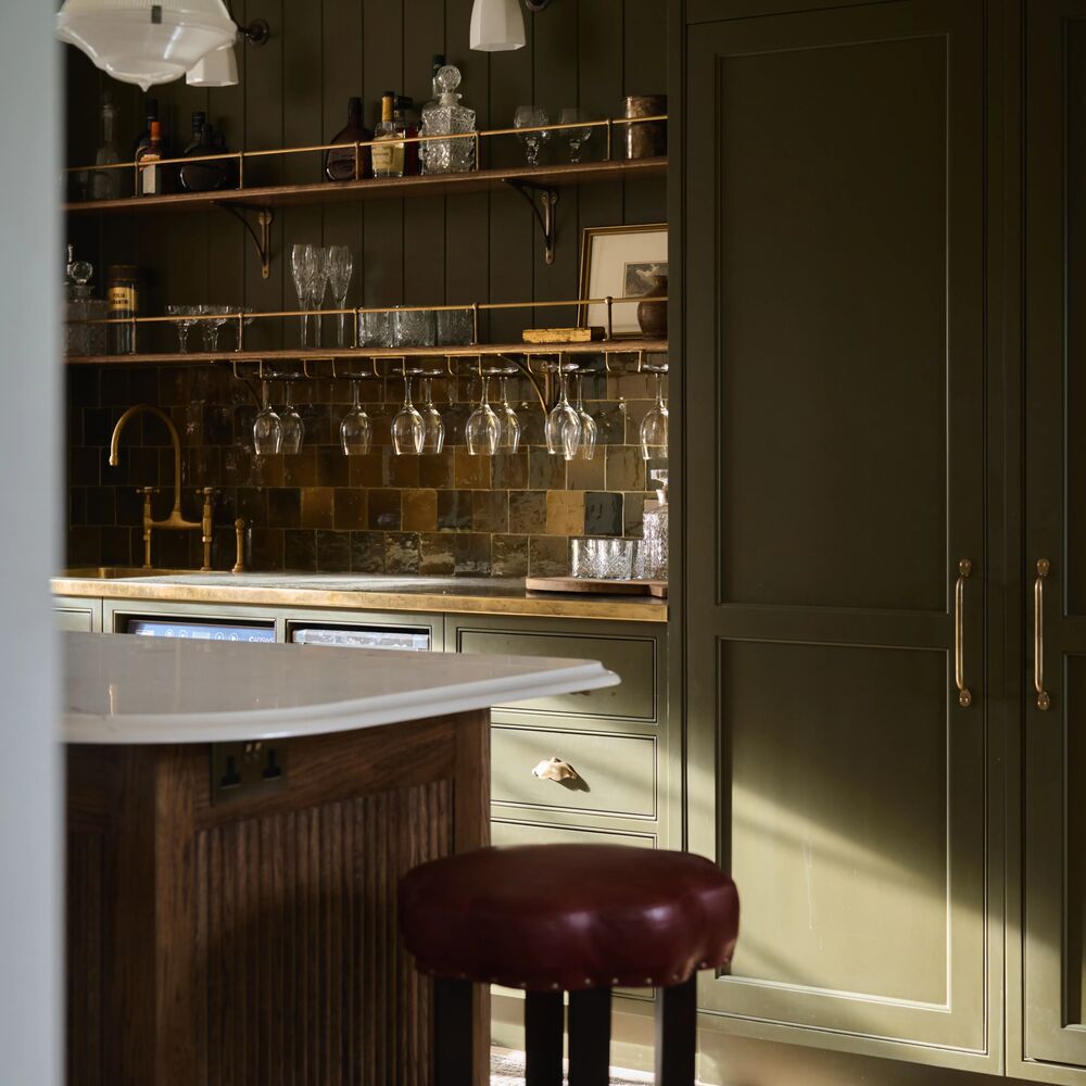
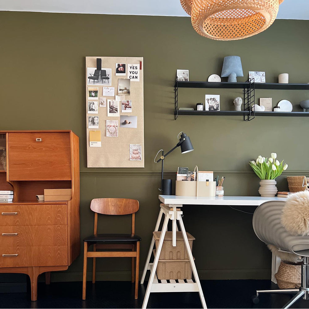
Dark Blue
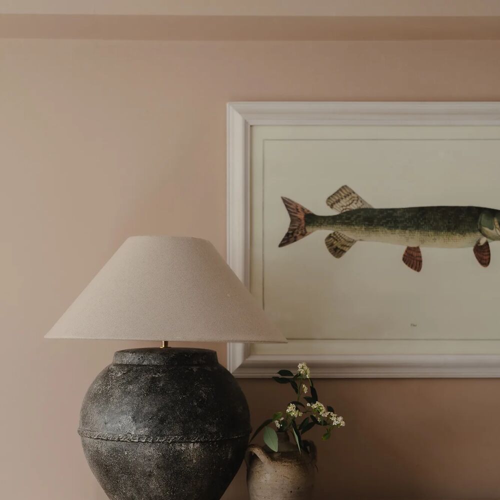
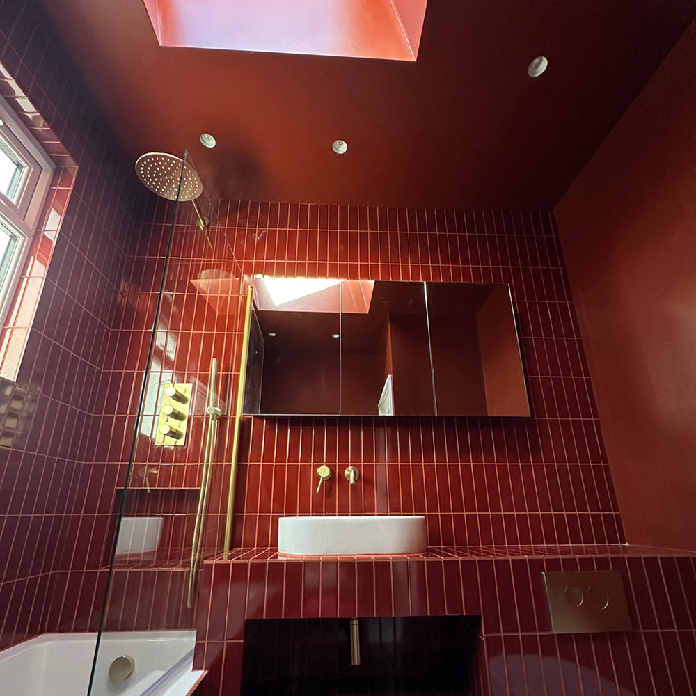
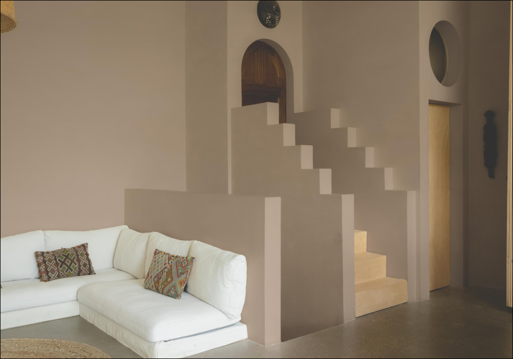
Want a corner of your home to be super handsome? Then look no further. Make a room a tall (The) Drink of water, by painting your ceilings, walls and woodwork all the same colour. This works particularly well in small, dark spaces, helping the eye to lose the proportions of the space. This dark marine will make you think of an infinity pool at midnight vibes and provides the best backdrop for loads of artwork and plush velvets.

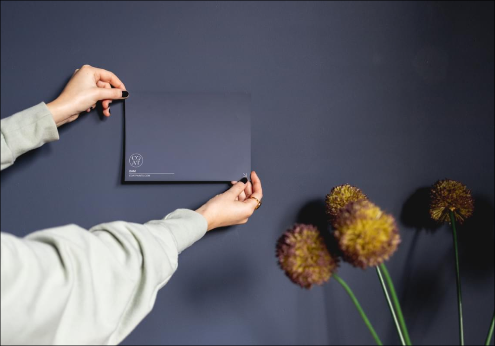
If 2AM (pictured above) and Dodie are a bit of you, grab a Dark Blue Sample Pack to check out the palette
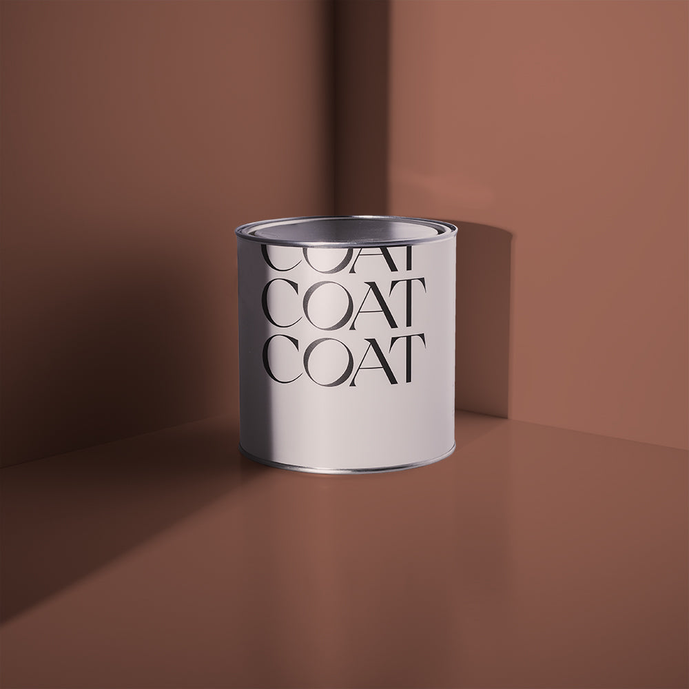
Now, we know most of your prayers have already been answered in the dark blue department. If they haven’t though, you should definitely place a wish on our new deep blue from the COAT x Heal's palette.

Dodie manages to look bright and airy in @coloursofnumberone's home, paired with Screenshot to open up the space.
“Dodie is a luxe dark blue with a hefty grey overtone. Use as an off-black for furniture with existing COAT favourite, the ever so refined Mr. Clifton, to create a calm and inviting bedroom space.” says COAT Colour Consultant, Aaron. “For a darker, sexier space COAT your walls and woodwork in Dodie, ceilings in Rathbone Place and finish off this lavish vibe with a cocktail cabinet in The Four Poster.”
Still being kept up by the choices dark blues offer? Us too.
Consider that a thing of the past. Paint your bedroom in 2AM and retire to your mysteriously meditative nest. It’s distinctive inky overtone feels comforting but combined with its royal purplish undertone, it’s impossible not to feel regally magical while in its presence.
Bringing a whole new meaning to January Blues. Tempted? Grab our samples ✌🏼
Teals
COAT’s teals are still mad popular, and there’s now some new additions including COAT x Heal’s superstar The Four Poster. You’ll be diving into bed every day with this fully saturated teal. “Fab as a highlight colour in alcoves with off-black colour schemes, like Dodie, making sophisticated, underground bar vibes.” our colour guru, Aaron, says, “The Four Poster would also make for an energising dining room wall colour when combined with Detox woodwork.
Dark teal Adulting is still flying off the shelves at COAT HQ, and we’re not surprised. Treading the line of being both bold and soothing. (How is that even possible?)

Adulting paired against this beaut honey velvet sofa in @brickdustbaby's home. Grab your sample.
If you just want a splash of colour but don’t wanna dive straight in, try pale teal Hamilton. It’s blue green overtones are great for East facing rooms because they’re that are bright in the morning and need a bit of depth in the evening.

Feeling blue yet? We are. Go to the store to browse the most beaut blues.
Publish Date
Author