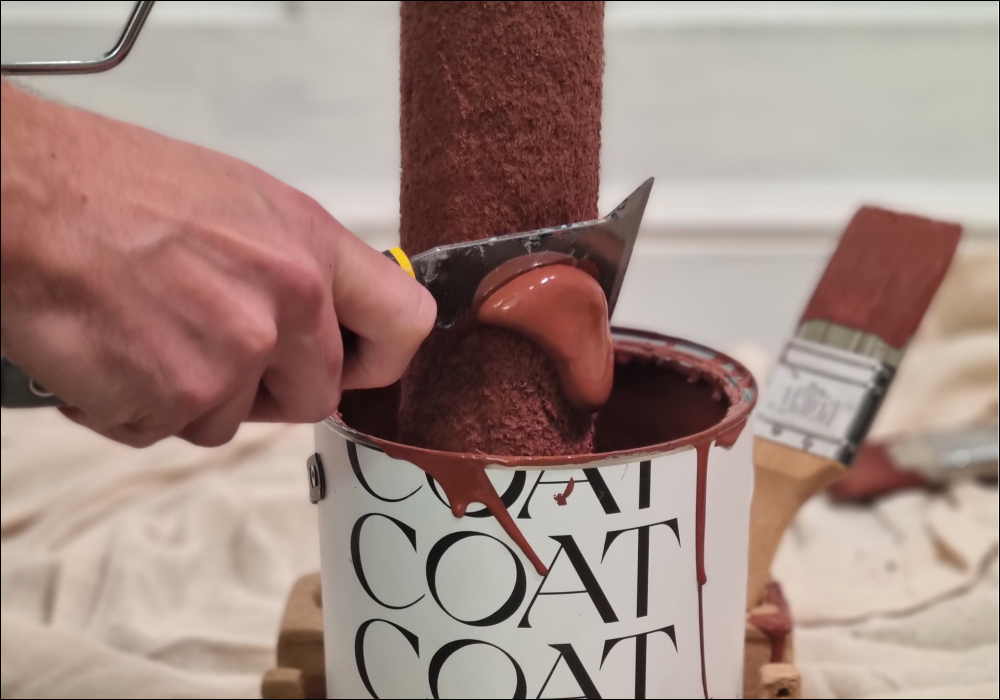
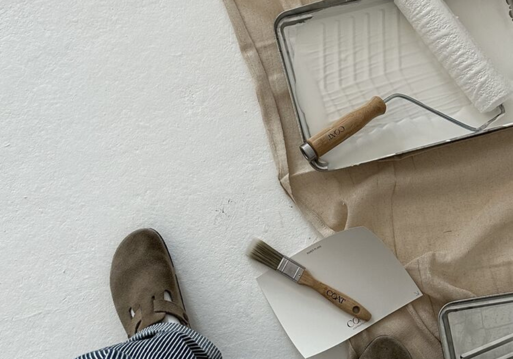
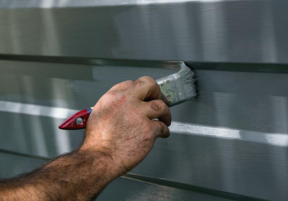
How To Paint
LIKE A PRO
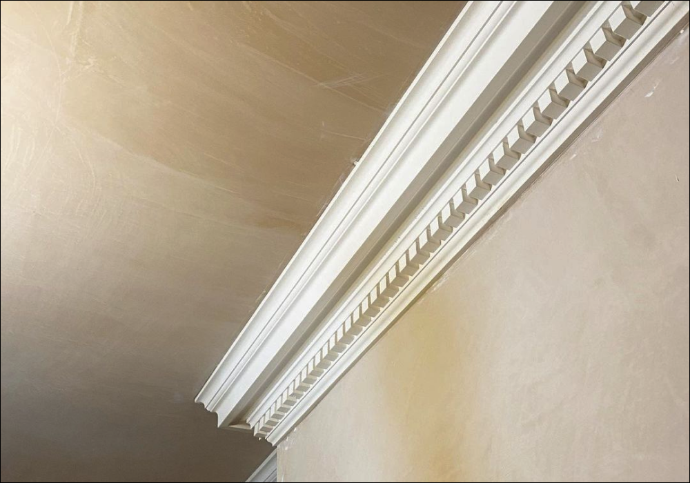
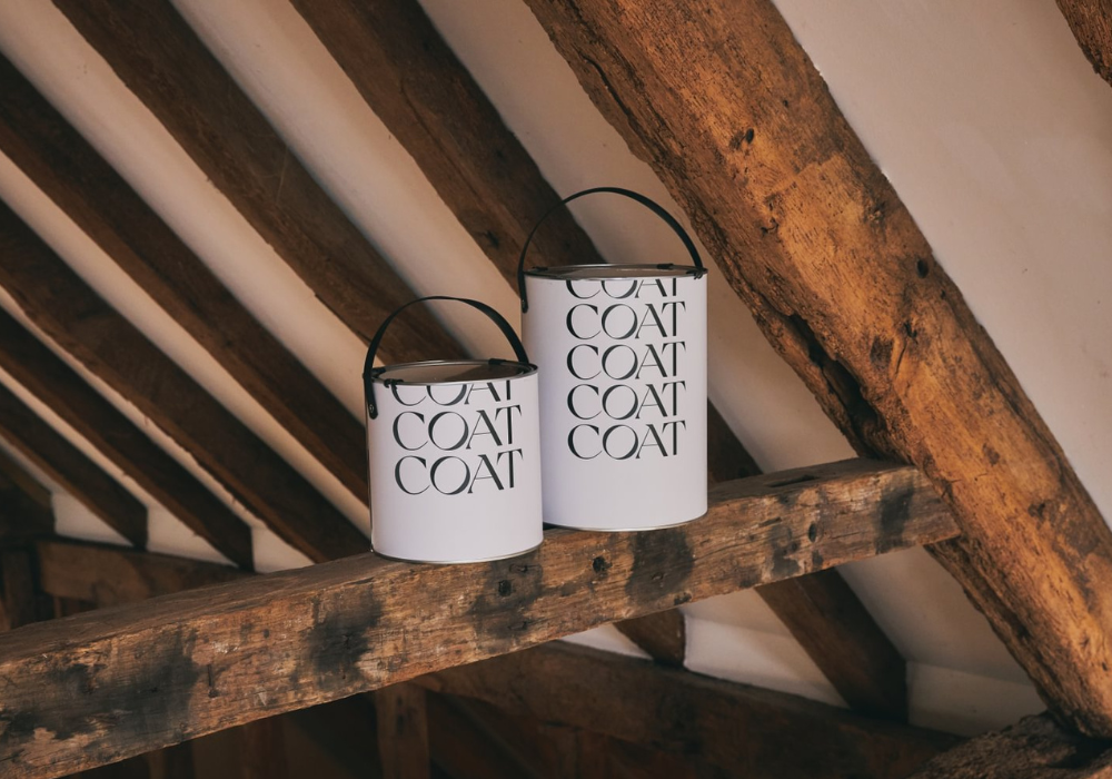
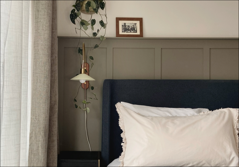
Whether you're reimagining your living space, experimenting with a new styles, or tackling a furniture up-cycle - our step-by-step guides, tips, and expert advice are all yours. We're here with full respect for anyone that want's to give it a go themselves - and it doesn't come much easier than with COAT.


Recently Viewed