Time for a Refresh: Get Inspired with our New Year Decorating Ideas
As months go, January gets a pretty bad rap and it's not hard to see why. The tinsel's long gone, the Quality Street tin is empty, and God forbid, you're probably on yet another new diet and exercise regime 🤯
So how to cheer yourself up amongst all this dreariness? The answer is to have a little refresh. Nothing too demanding. Pick a room and give it a simple makeover.
Don't know where to start? That's where we come in. Just take a look at our inspirational ideas for a quick and easy update. Choose the one that floats your boat, get decorating, and in a jiffy you'll be falling in love with your home all over again. Simples! 👍
LIVING ROOM INSPO
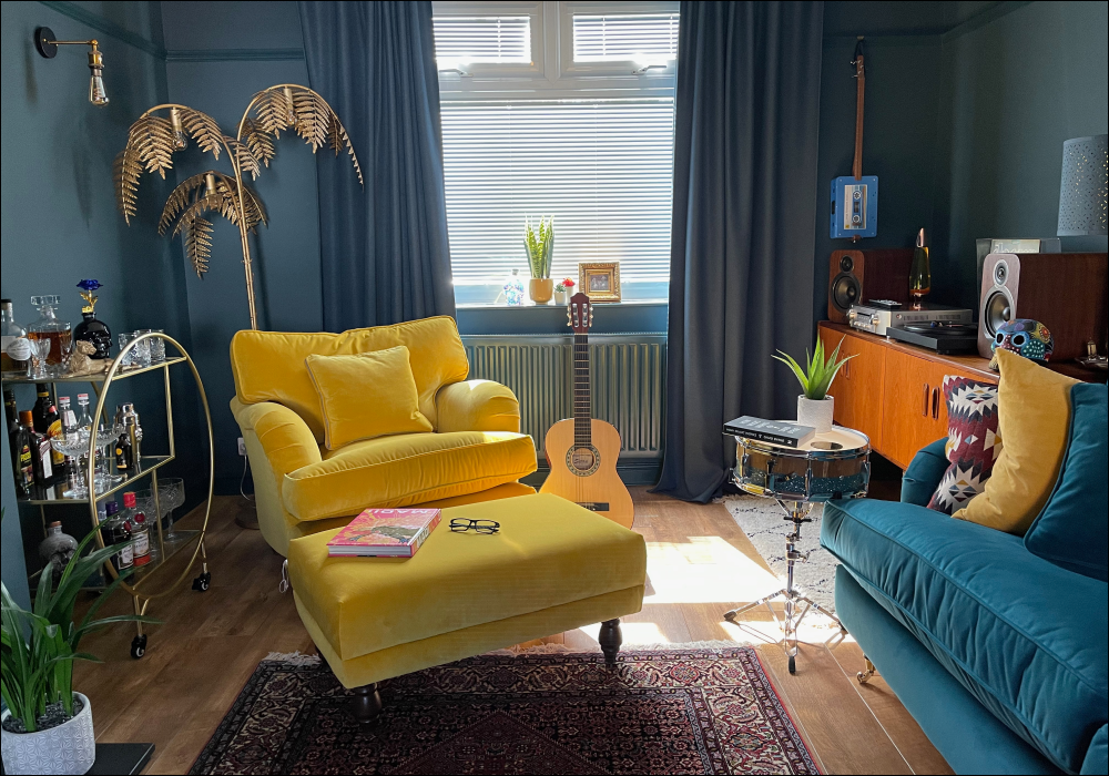
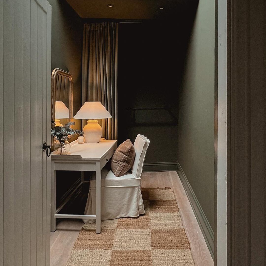
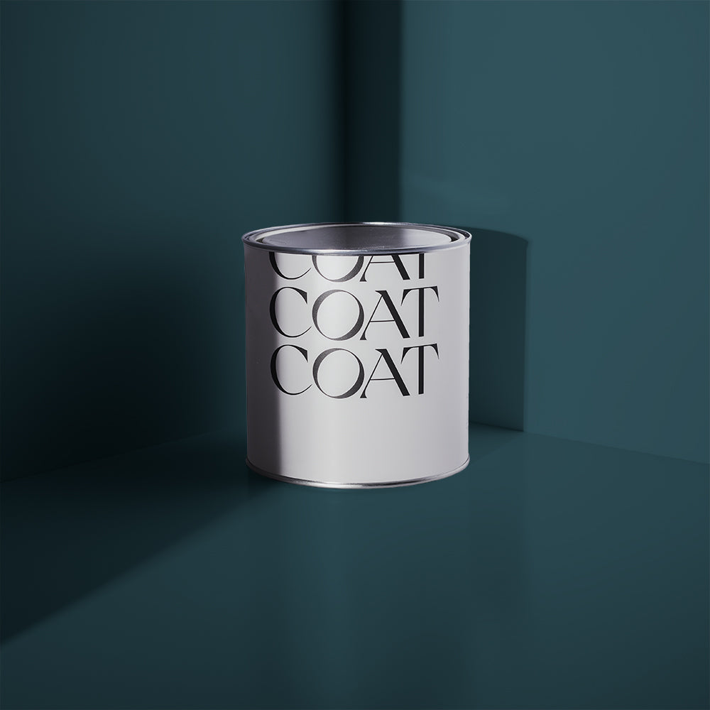
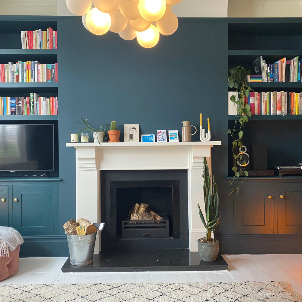
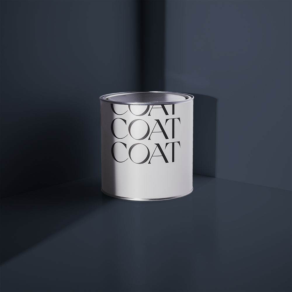
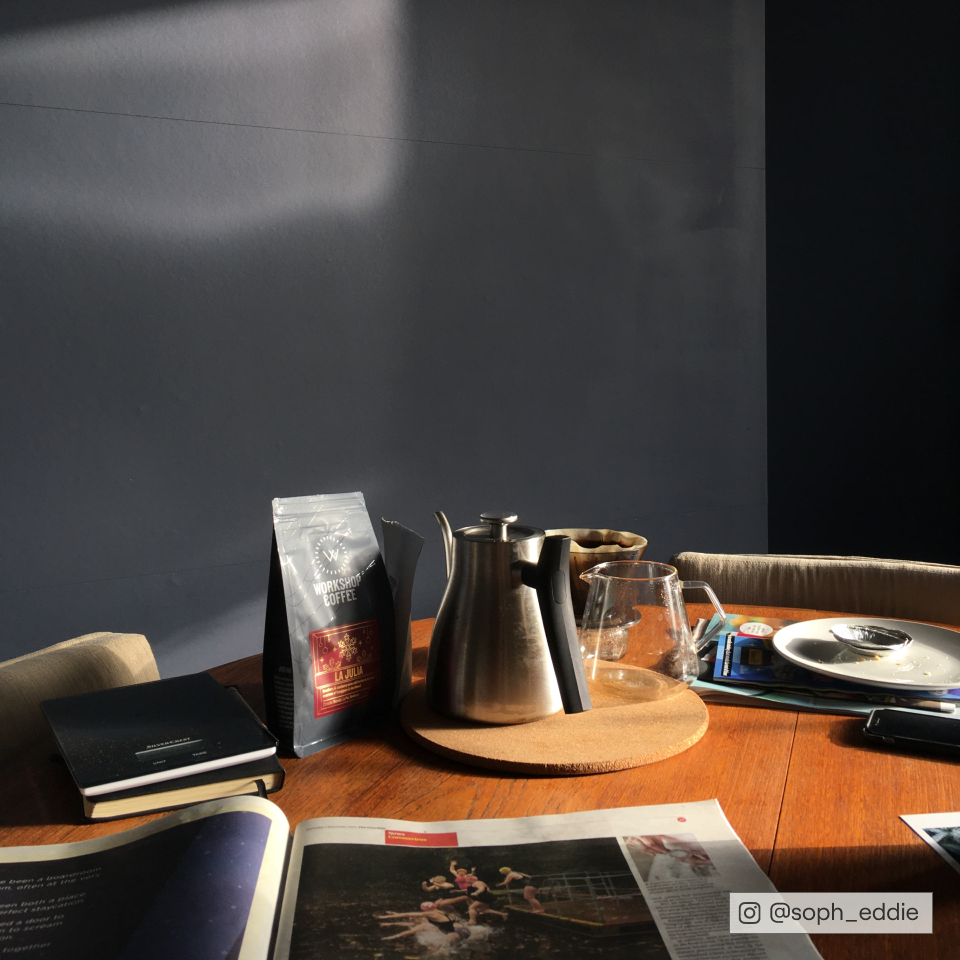
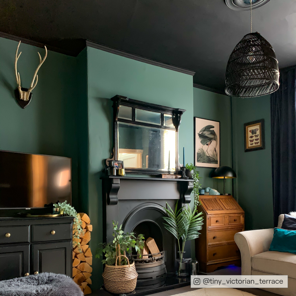
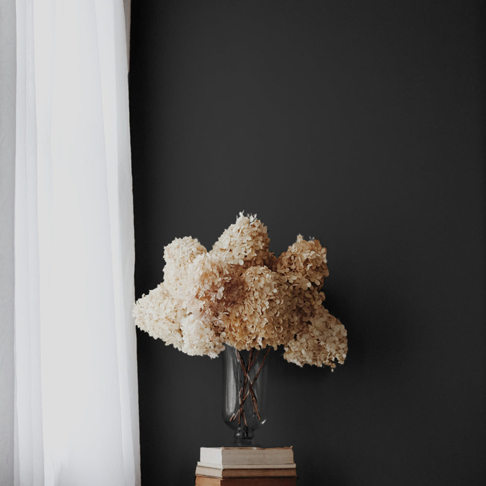
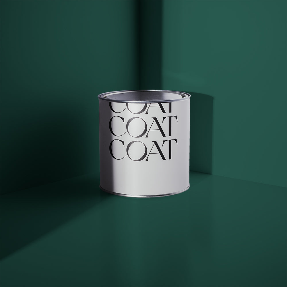
Maximalism is here to stay for 2022. So if big and bold is your thing, why not drench your living room in one of our highly-saturated colours such as 2AM or The Drink? These inky beauties look amazing on walls or panelling, and provide the perfect backdrop for artwork and other accessories, particularly those with metallic finishes such as bronze or brass ✨
Ever fancied creating a gallery wall? Now could be the time. A foundation of dark, luxurious colour forms the ideal base for your art collection. Colours pop beautifully against a dark wall, and you can have lots of fun with fancy frames. Just remember to lay out all your artworks on the floor to plan your layout before you start hammering.

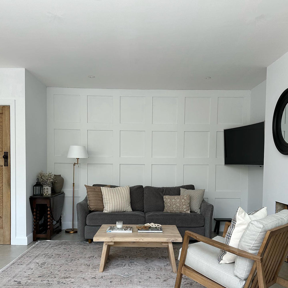
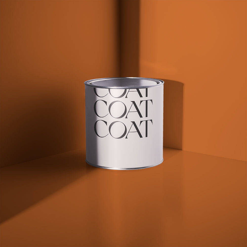
If you want something restful and relaxing for your living room, how about a stony colour like Rathbone Place or Ambrose? Launched as part of our recent collaboration with iconic retailer Heal's, these gorgeous heritage shades are the perfect partner for on-trend Mid Century Modern furniture such as a teak sideboard or an Eames lounge chair 😎. You could then bring some excitement into the room by painting an alcove, dado rail or window frame with one of our bolder shades such as vivid turquoise The Four Poster or tangerine-toned My Island. These jewel-like tones bring a dose of joyous optimism into a space which is spot on for the maximalist trend.

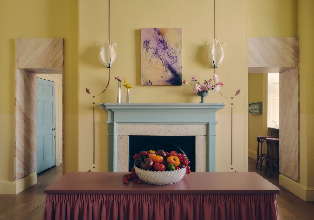
We know that yellow is going to be huge in 2022, so keep 'em peeled for a new colour baby who'll be joining our paint family later this month. It's all a bit hush-hush right now, but watch this space because we have a feeling you're going to love it! 💛
BATHROOM INSPO
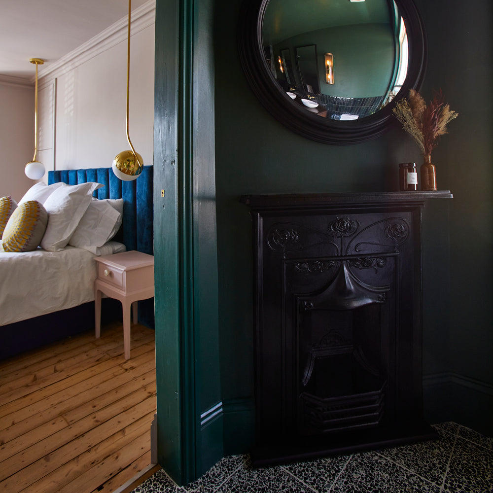
When it comes to the smallest room in the house, it's worth thinking about creating a cocoon of colour for those private moments 💩 Use one of our dark blues such as Dodie or David Rose and wrap it around the whole room.
"It works well to repurpose familiar colours in unexpected ways" says COAT's Lead Colour Consultant, Aaron Markwell. "By using a dark blue in the downstairs loo and wrapping it around the entire room including the ceiling, you can create a reassuring, cocooning feeling for our most vulnerable moments."
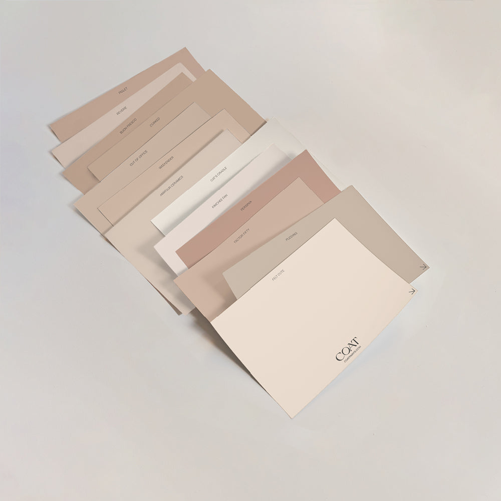
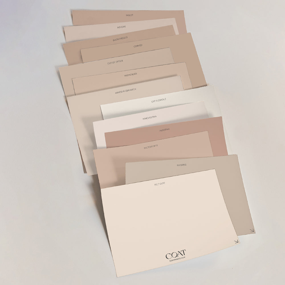
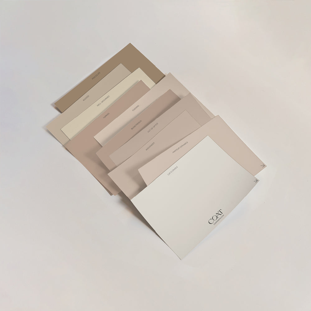
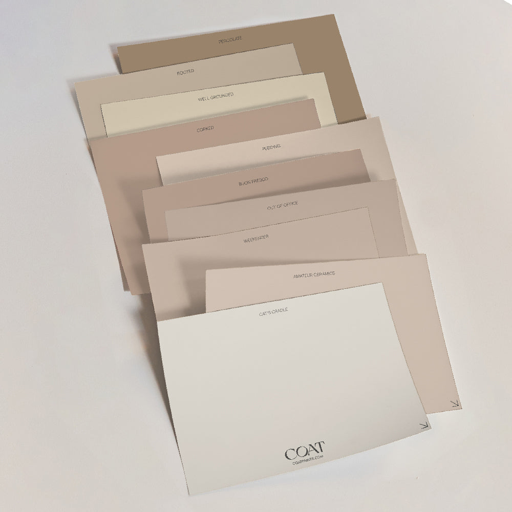
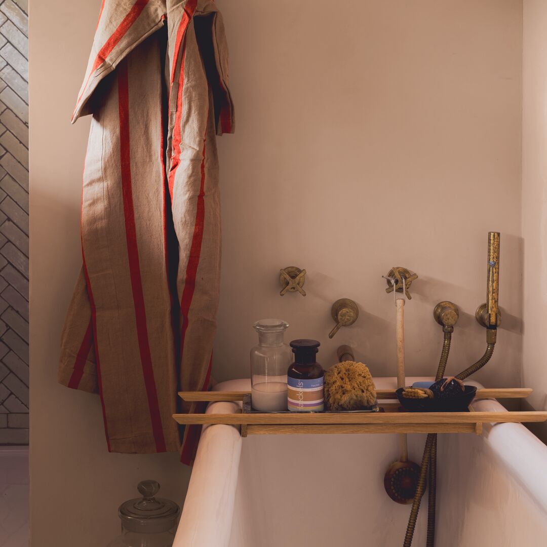
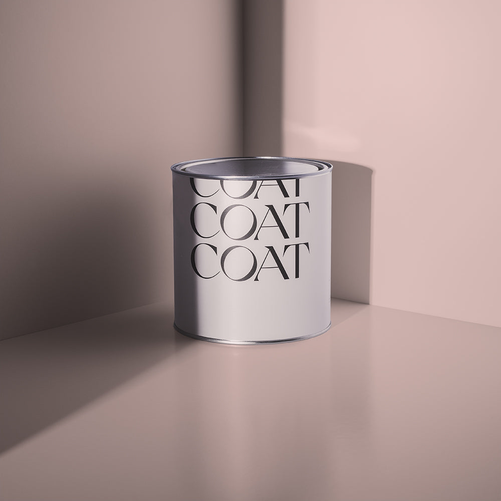
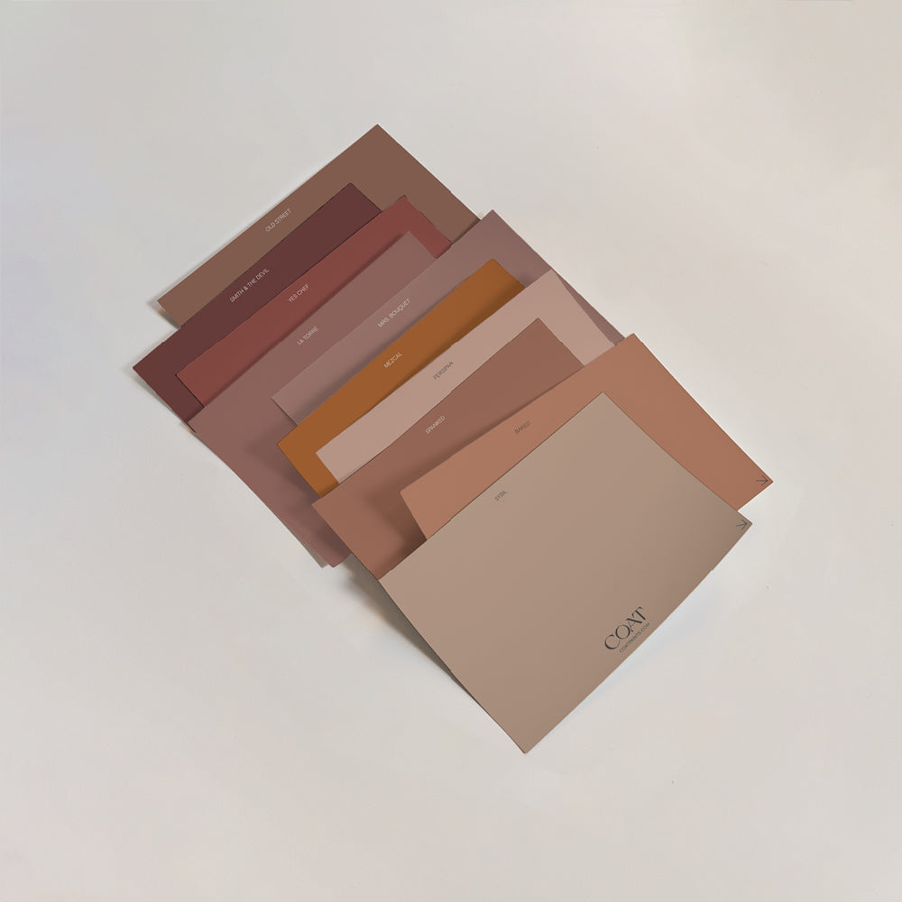
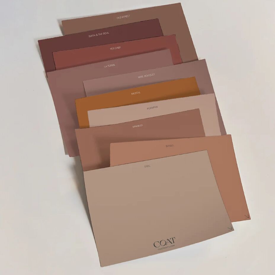
Pinks are also big news for bathrooms this season, so why not try one of our pale pink shades such as Ciao, Sofia or Granny Chic? Add in a complementary neutral such as Pudding to really bring the space to life.

"Fleshy shades are perfect for bathrooms because they sit wonderfully against all skin tones" says Aaron. "Any of our pink colours work really well against our actual naked bodies – whether they are pale-skinned or darker toned – because these paint colours have red and yellow undertones in them."
Make sure you introduce lots of greenery to the bathroom as per the 'outside in' trend, and you're good to go for a spot-on New Year update 🌱
BEDROOM INSPO
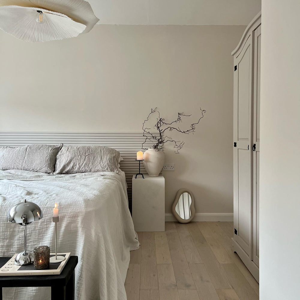
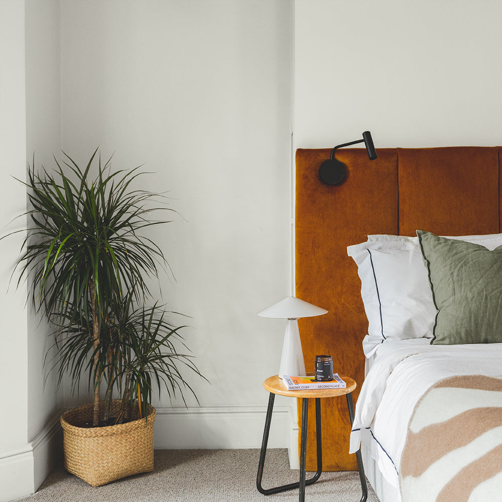
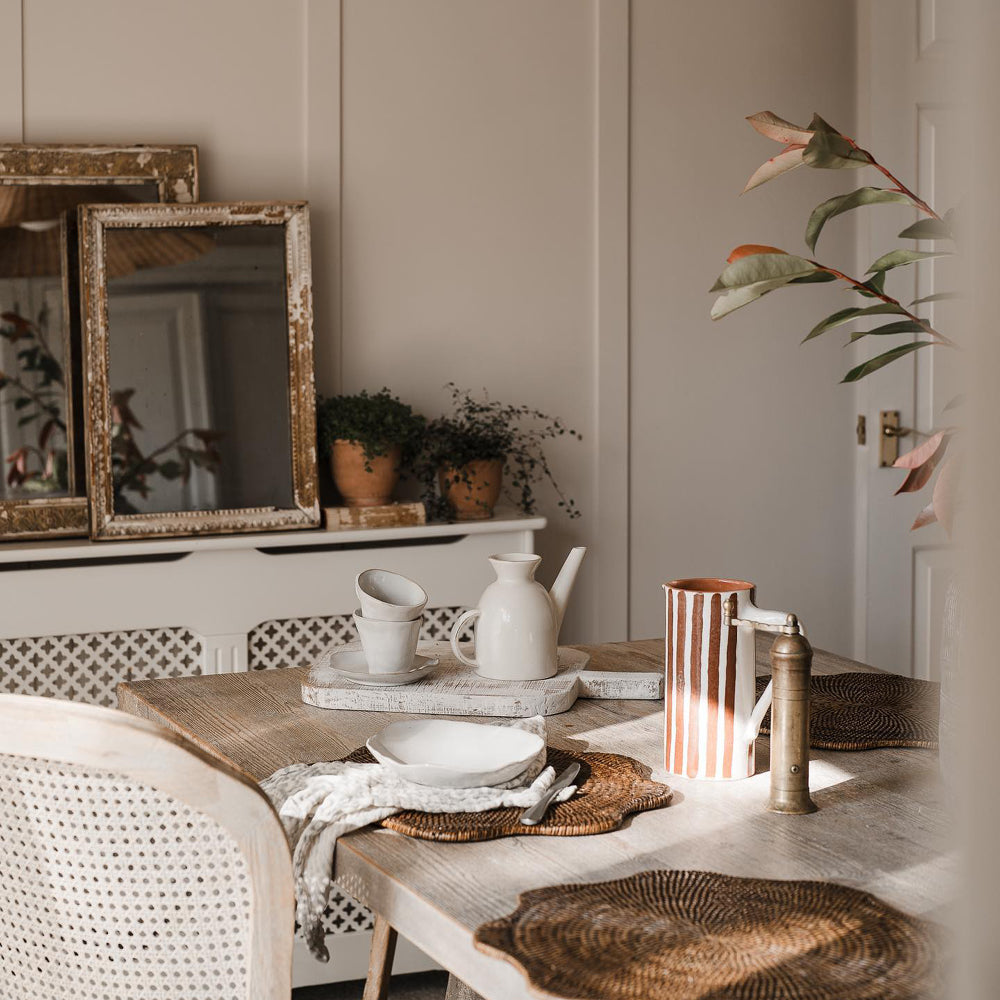
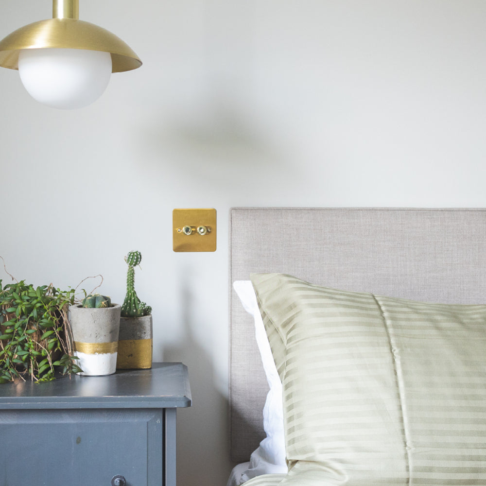
So you want a restful colour for your bedroom that will encourage relaxation and sleep? Look no further than one of our highly versatile neutrals.
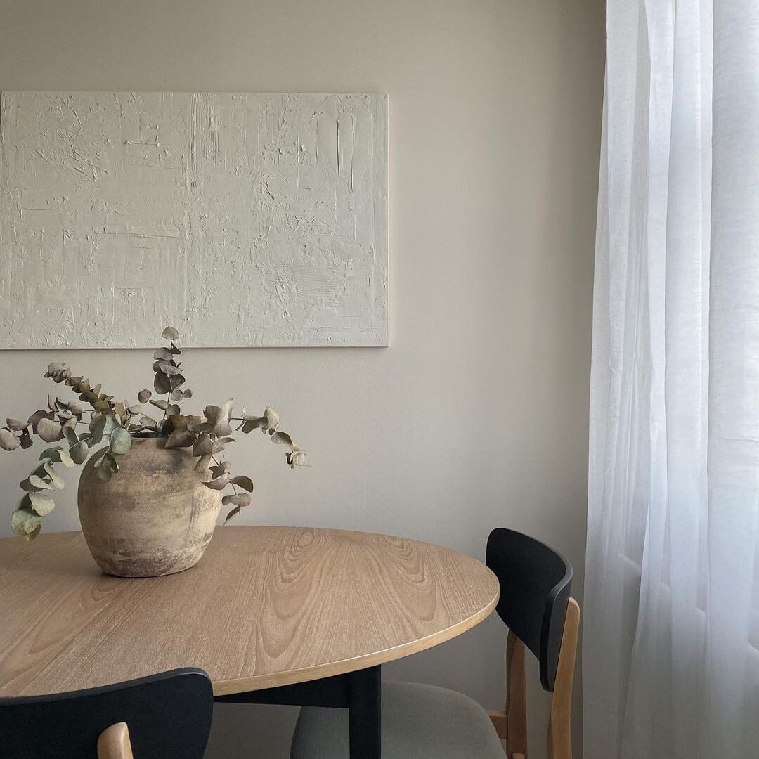
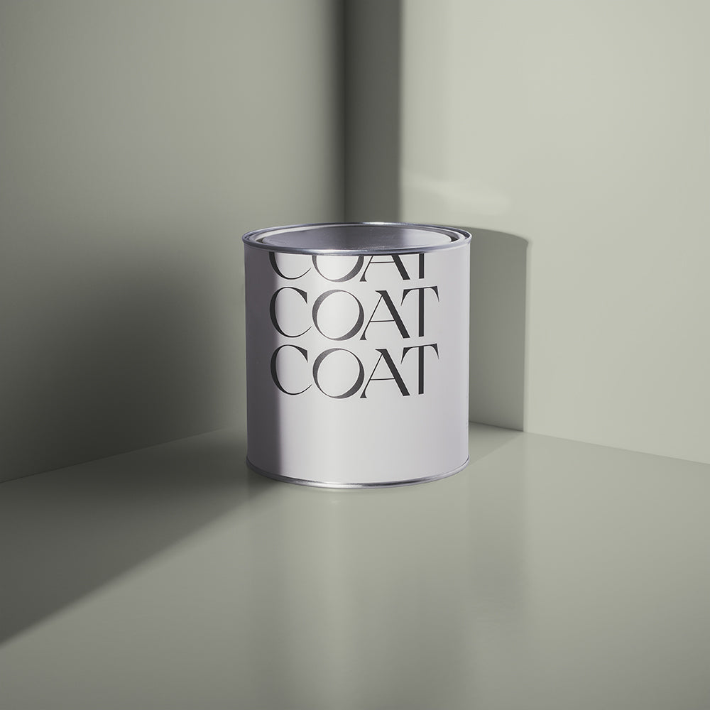
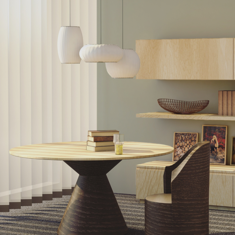
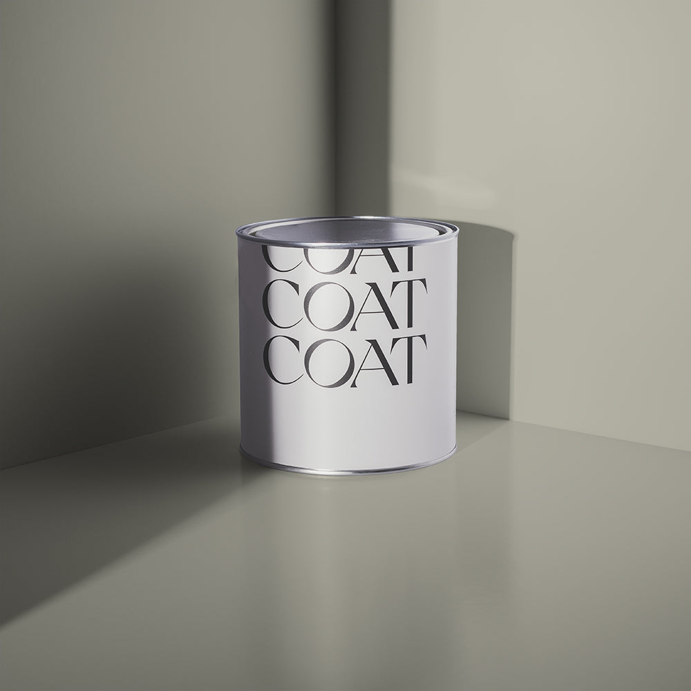
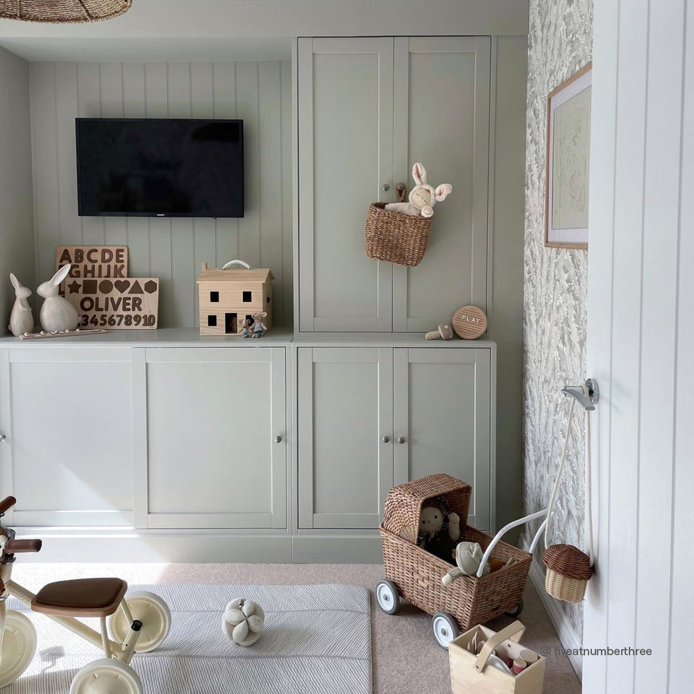
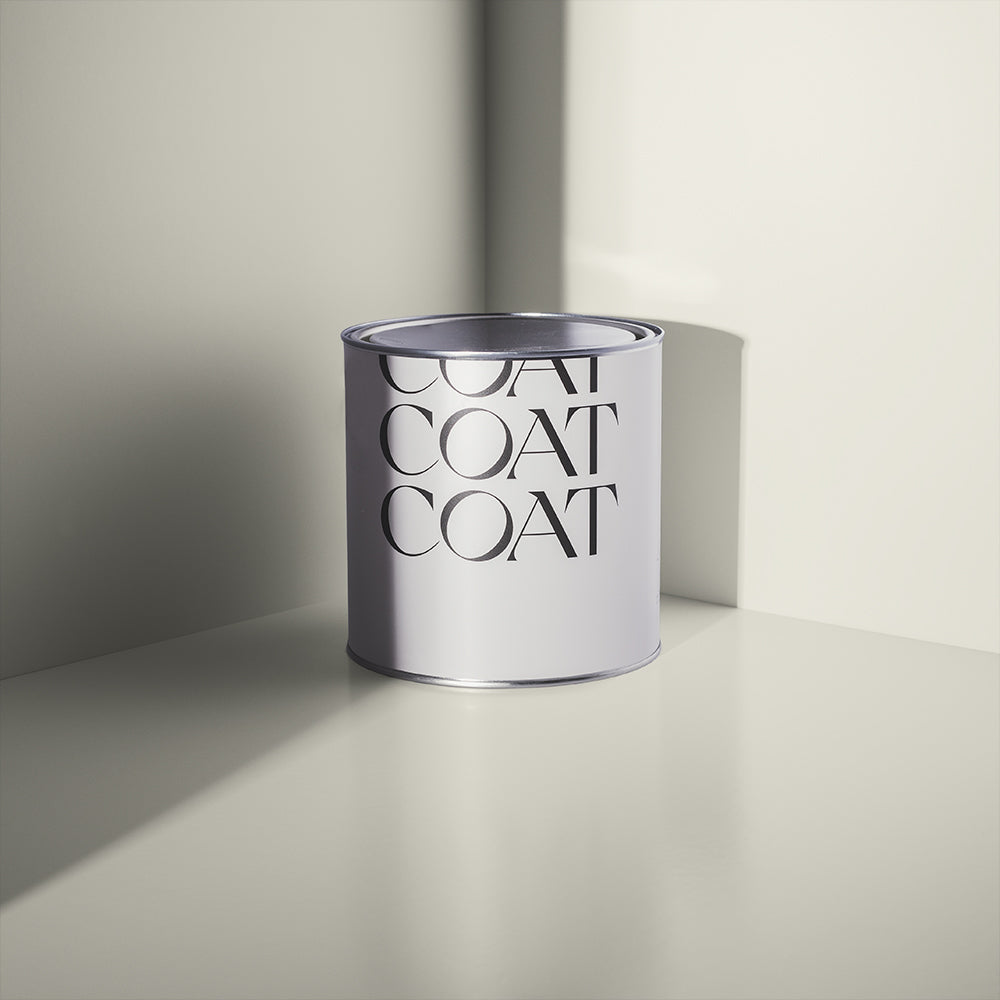
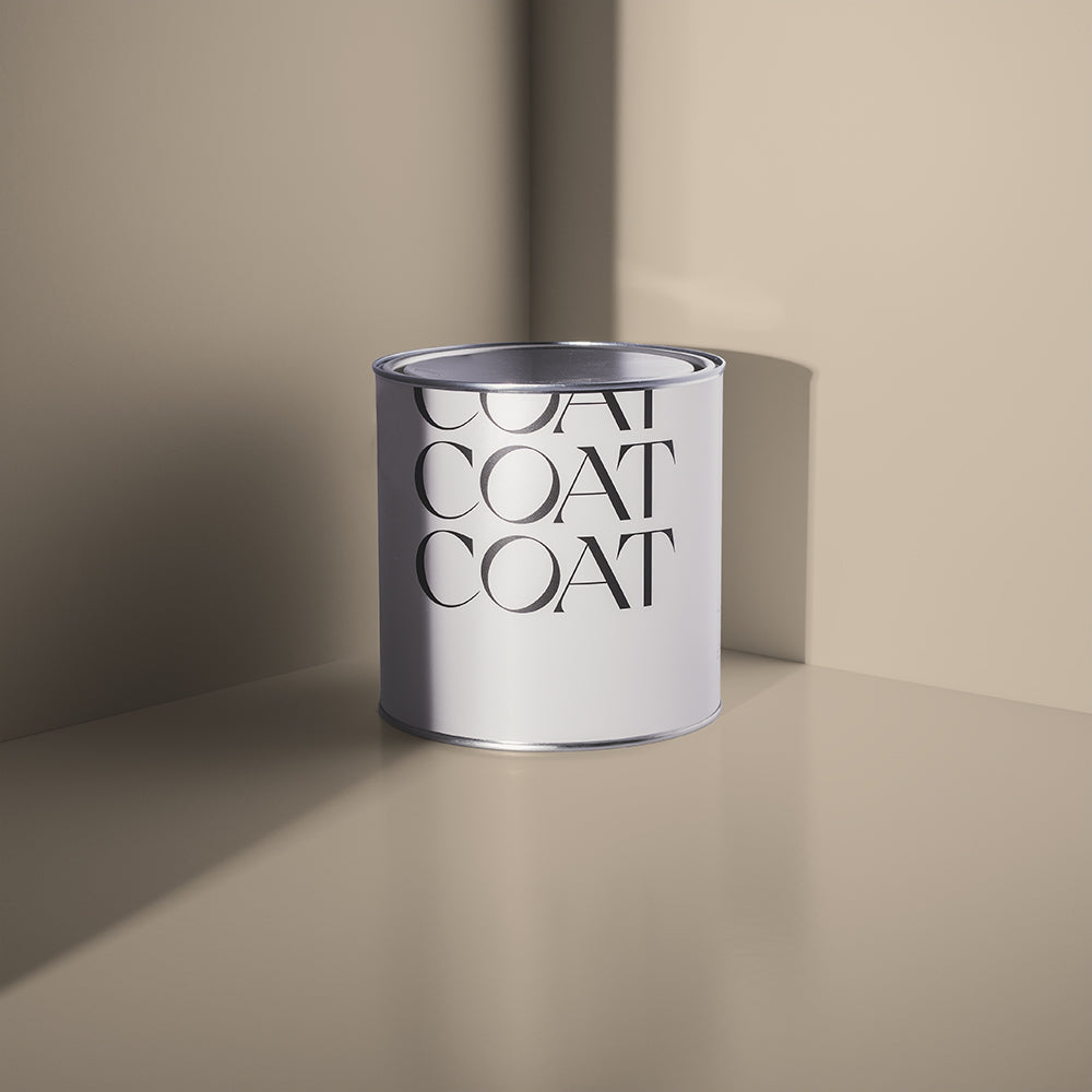
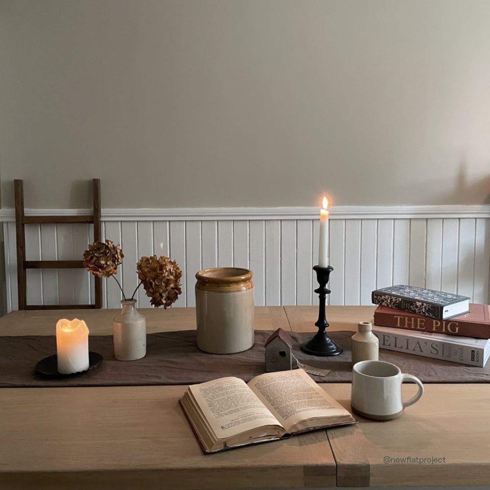
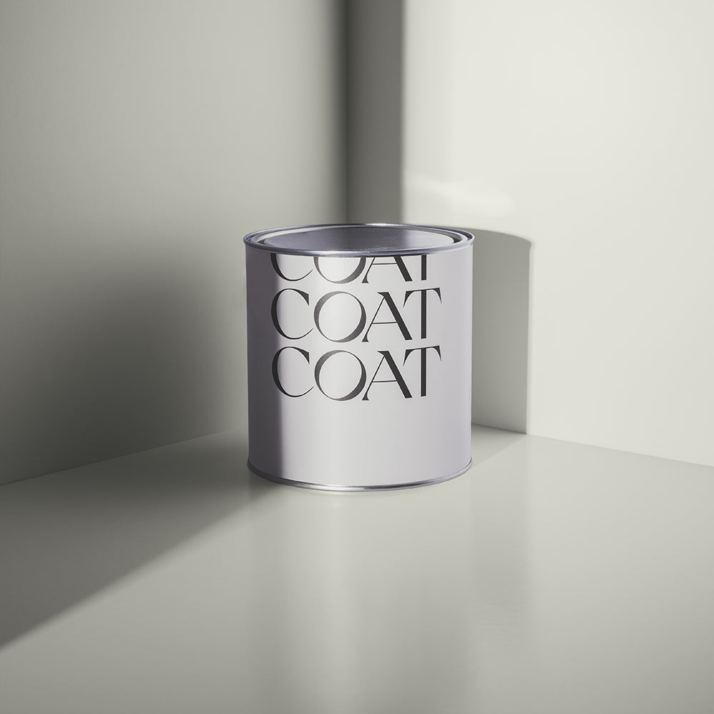
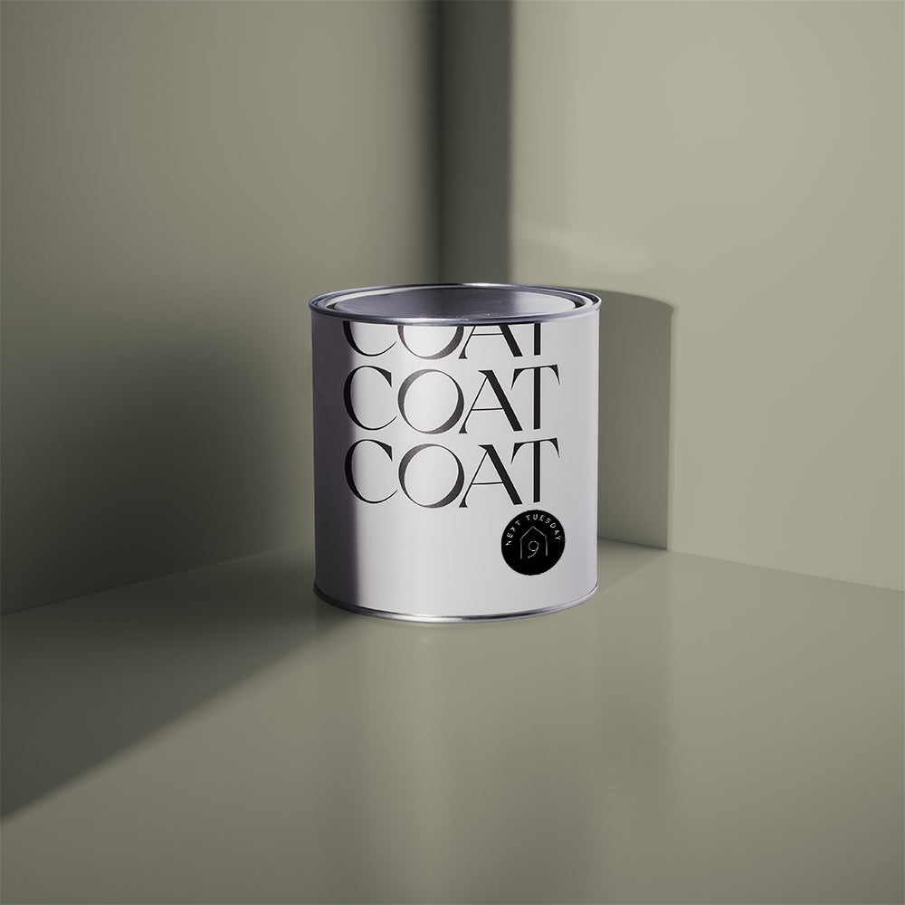
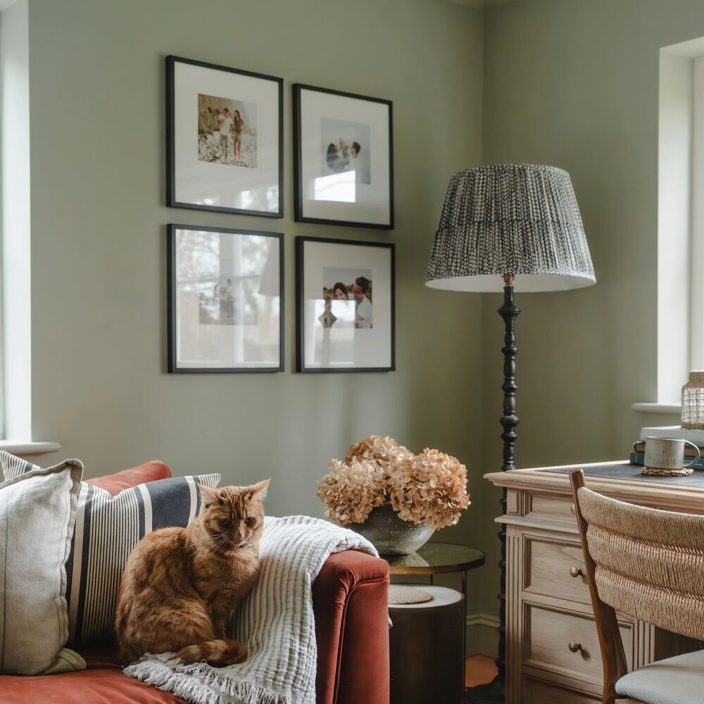
Our easy-going pale green And Breathe is like your oldest BFF. It has a calm and reliable nature and will never let you down 😍 Created by interior designer Katie Seidler of @hello_haus, this warm greige pairs perfectly with wood finishes and other natural materials.

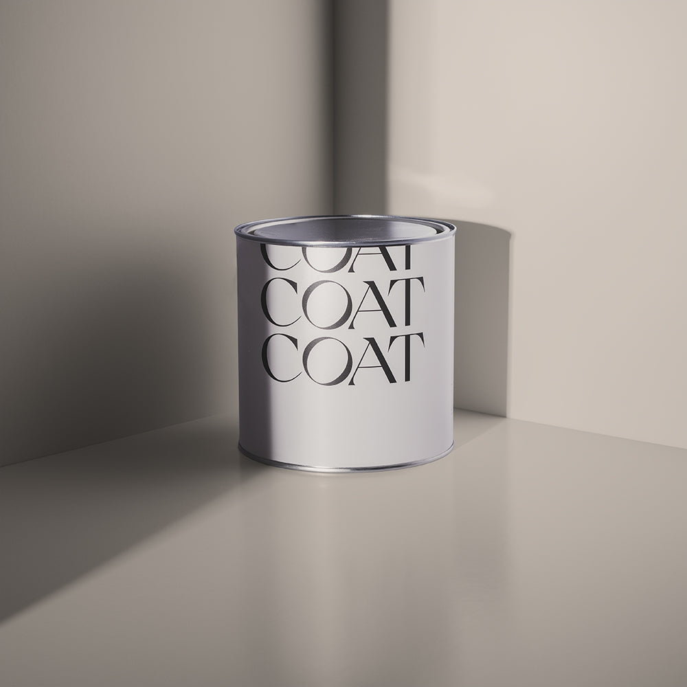
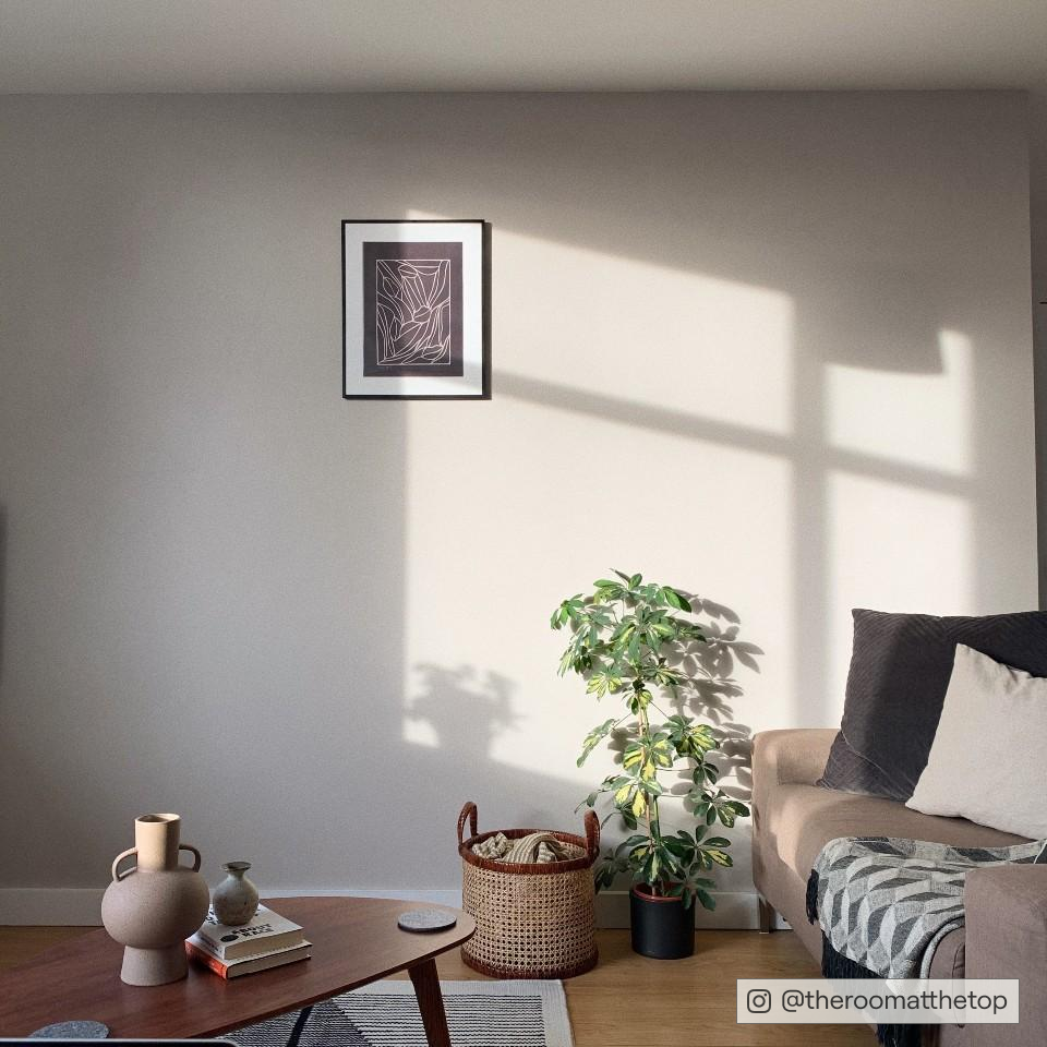
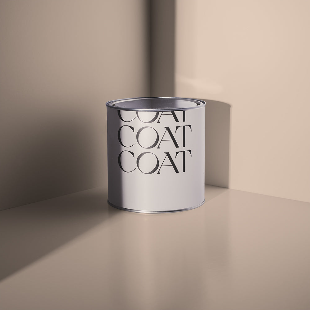
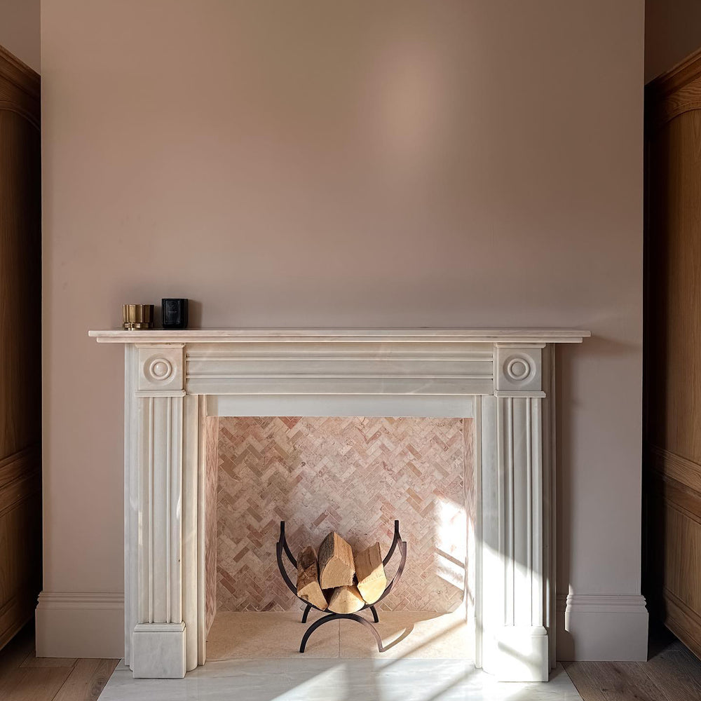
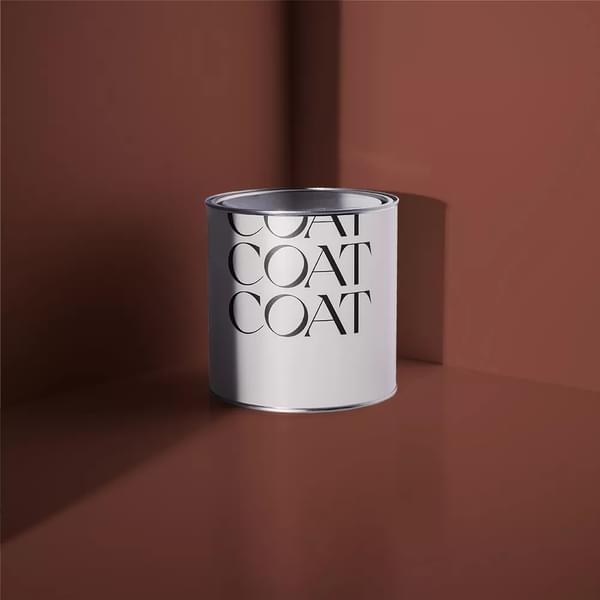
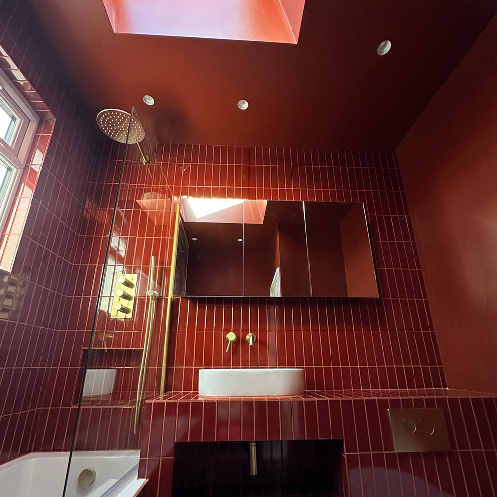
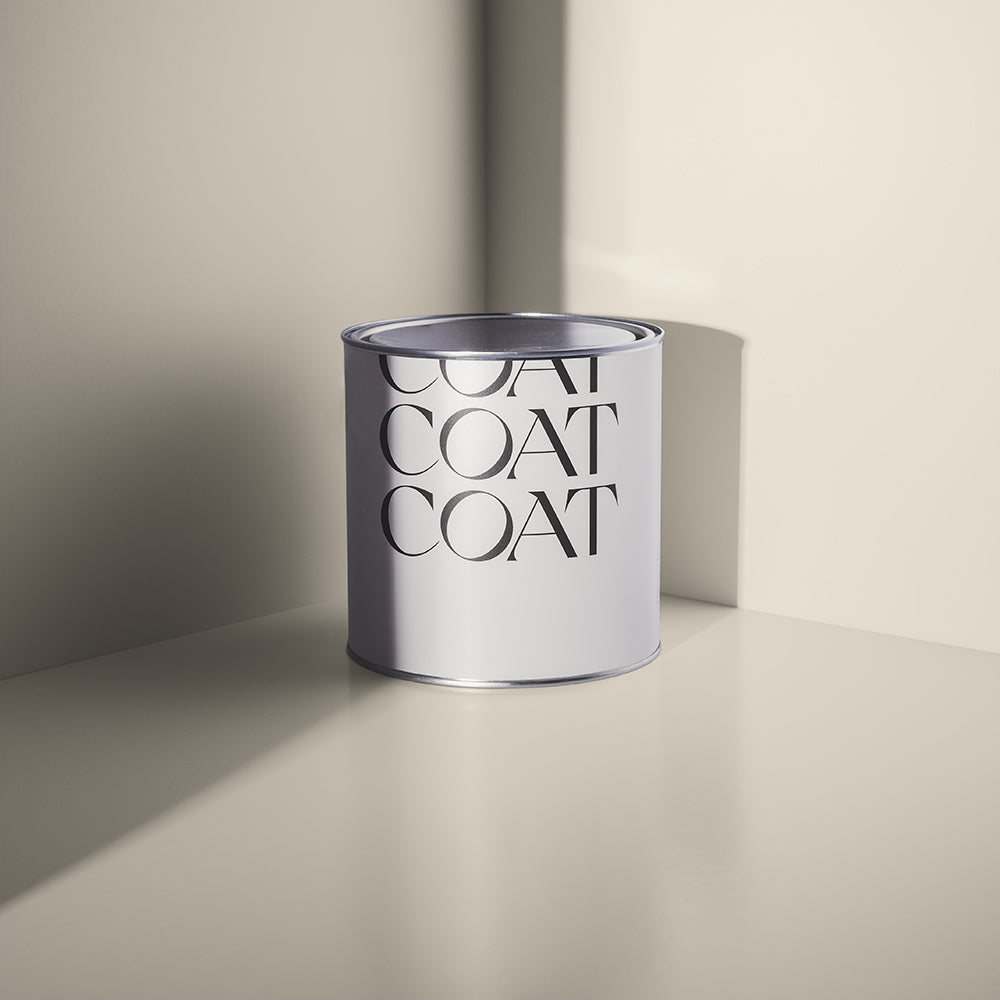
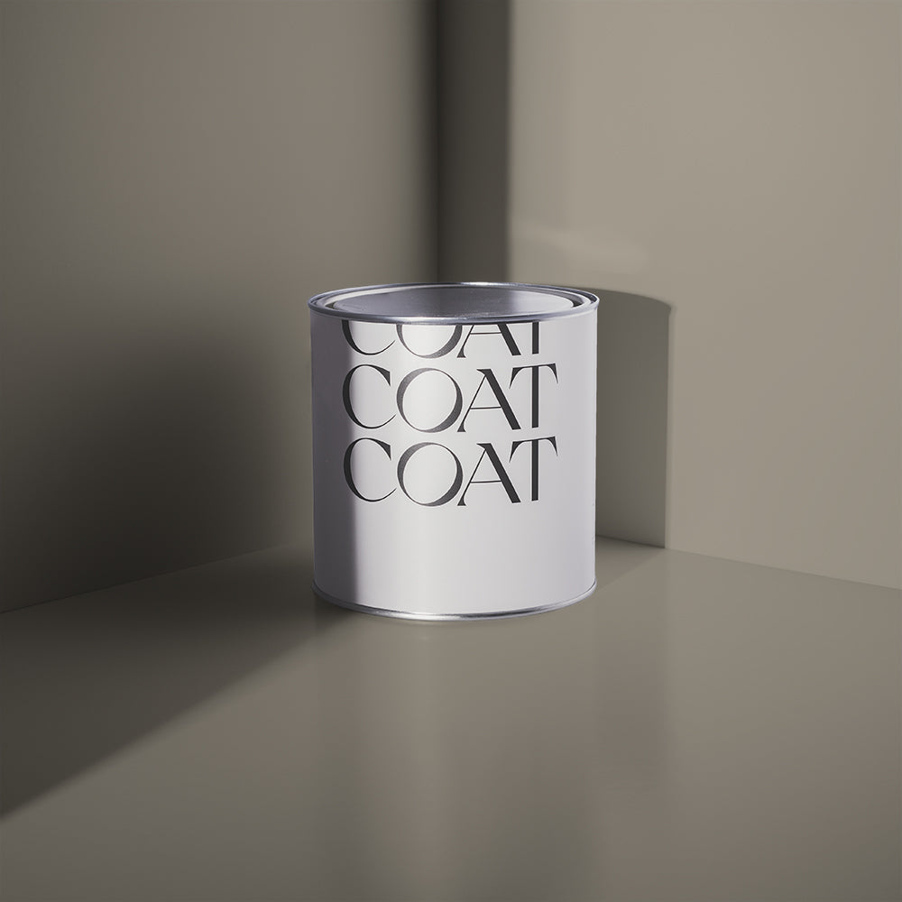
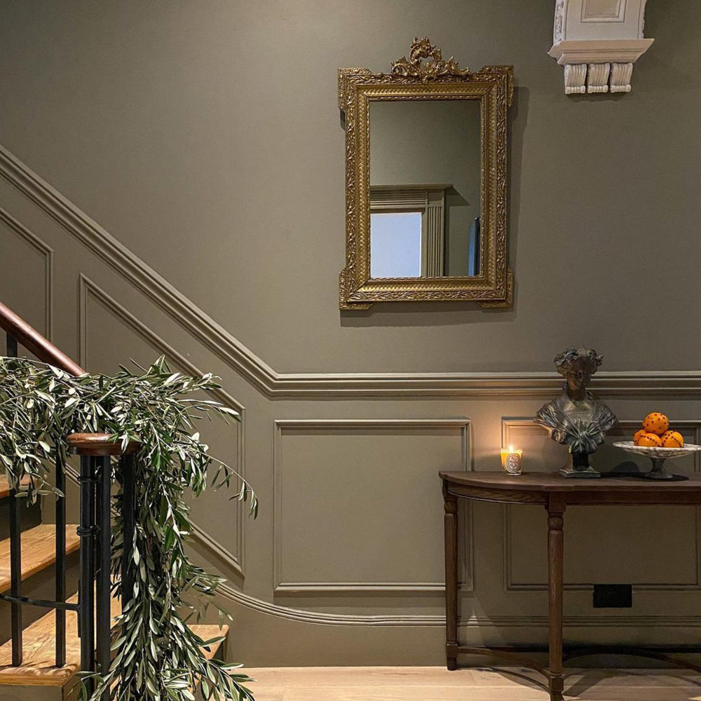
Kind Regards is a muted greige. More grey than green, this restful neutral is a joy to wake up to and combines really well with darker colours with grey and green tones. Our taupe neutral Ambrose is another good bedroom choice, particularly if you want to pair it with something more characterful such as dark red The Old Corset Factory or dusty purple Festival Eve.
Remember, if you're stuck for ideas, our colour consultation service is here to help. Book a 30-minute video call with one of our in-house colour gurus, and you'll get bespoke suggestions, ordering advice, and your own personalised mood board 🌈
"We do a virtual walkthrough with you and talk about what you want for your space" explains Aaron. "For example, we'll ask you about how you're going to use the rooms, what colours you love and what the lighting conditions are like. Then we bring all those factors into play as we pick out the perfect paint colours for you."
KITCHEN INSPO
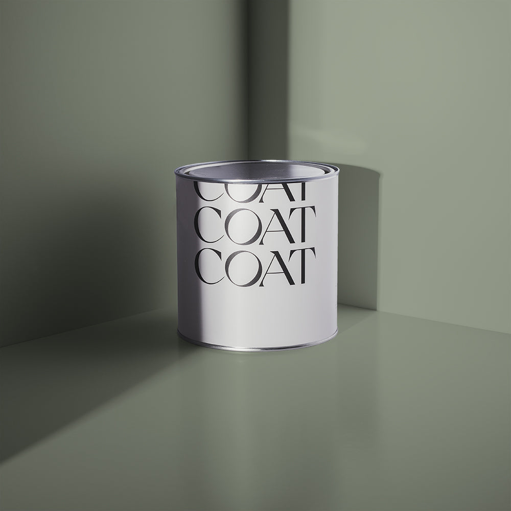
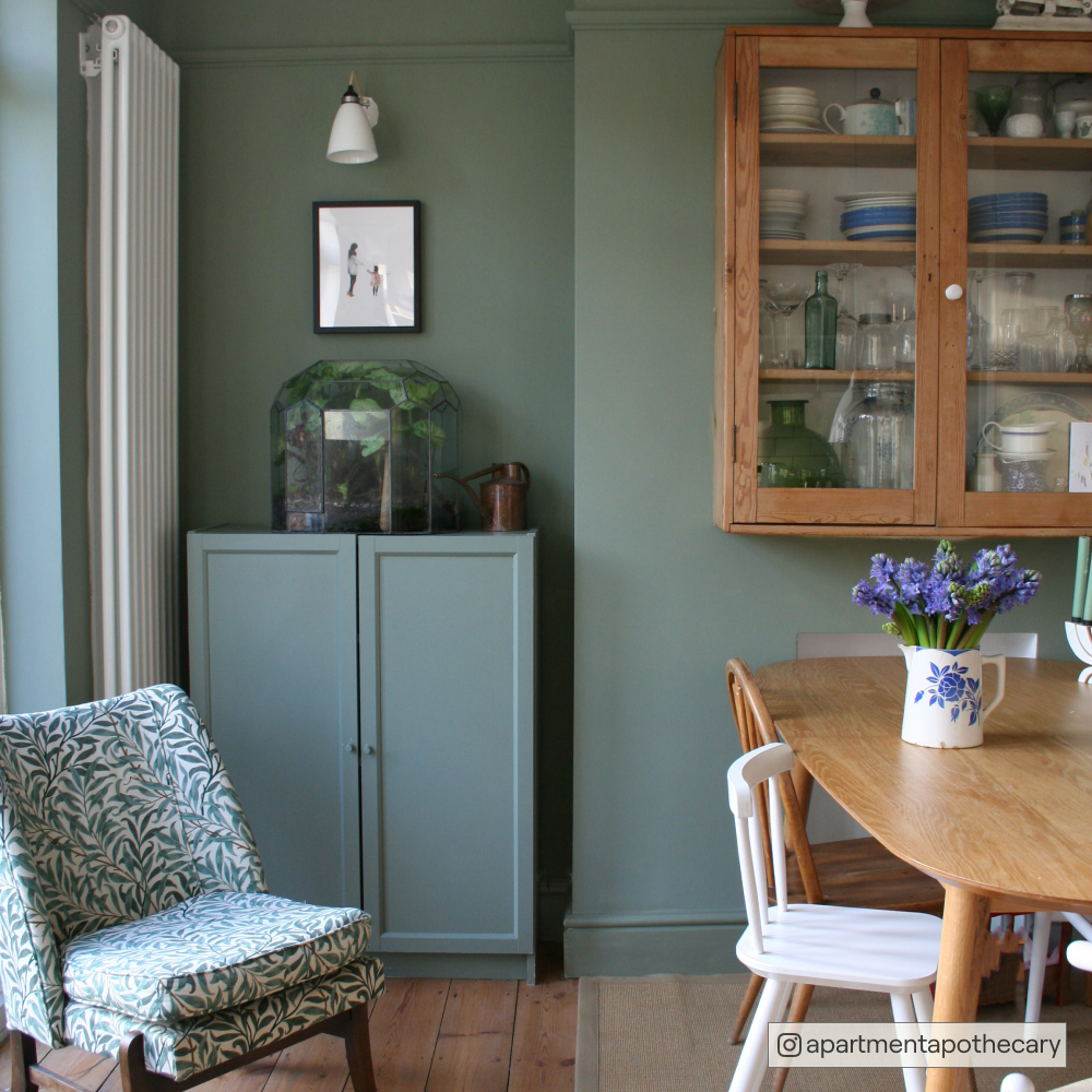
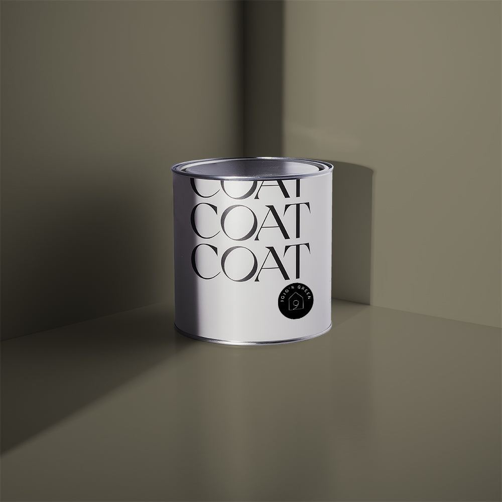
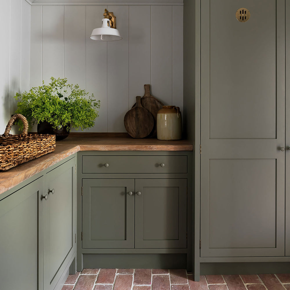
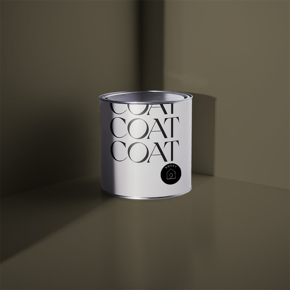
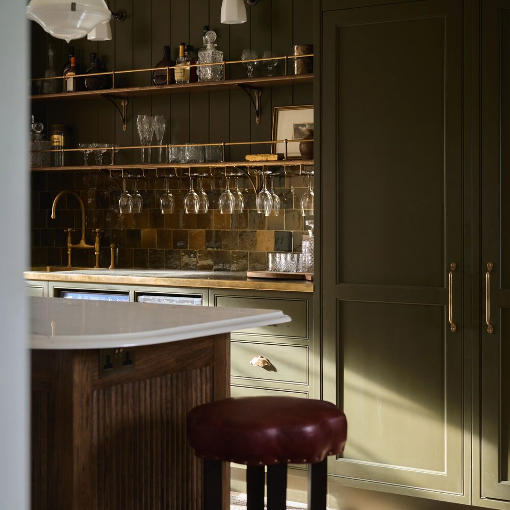
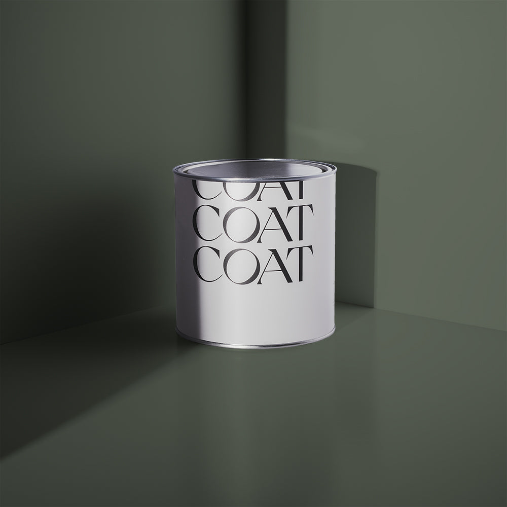
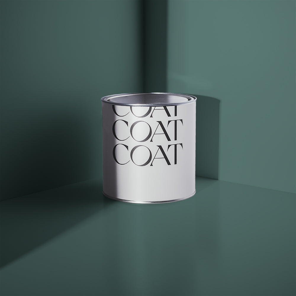
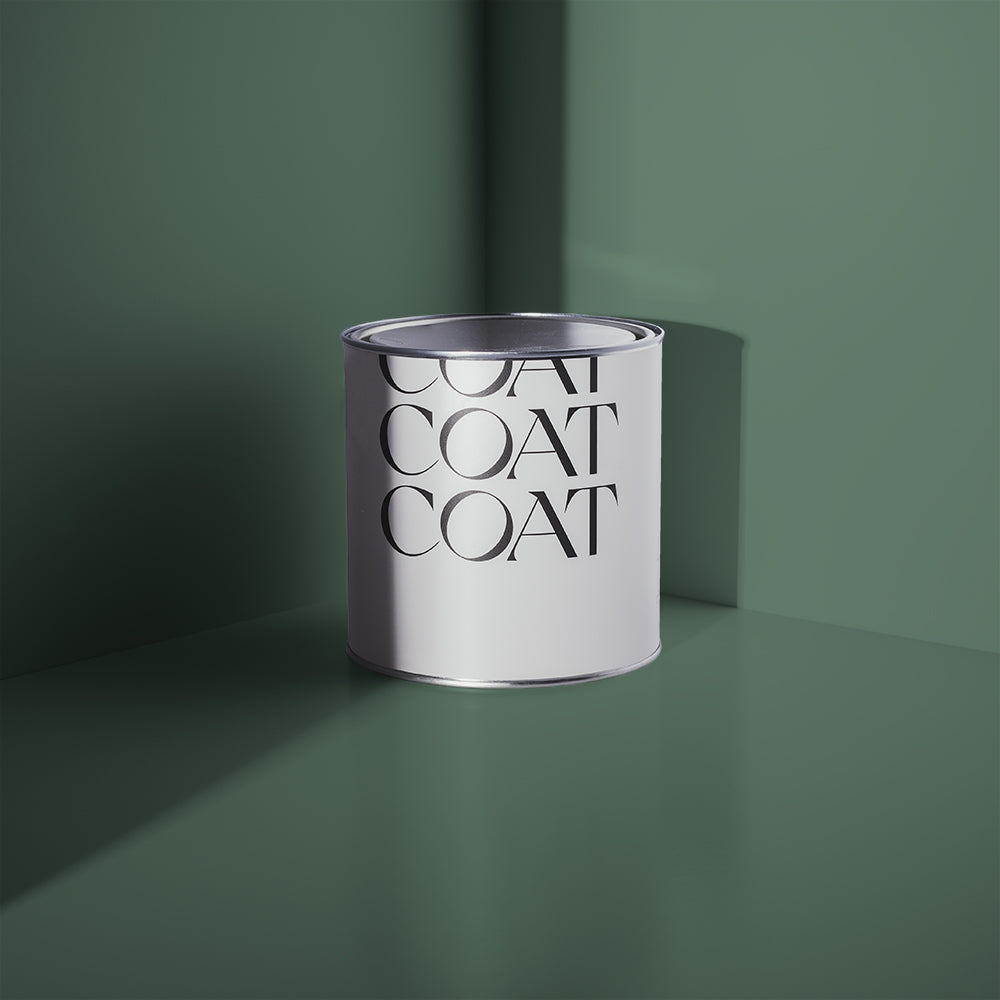
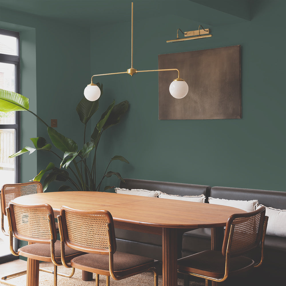
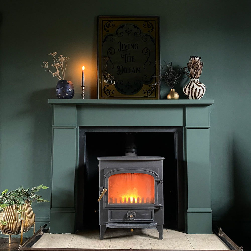
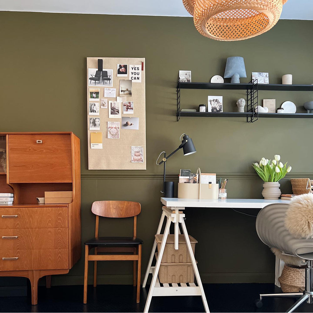
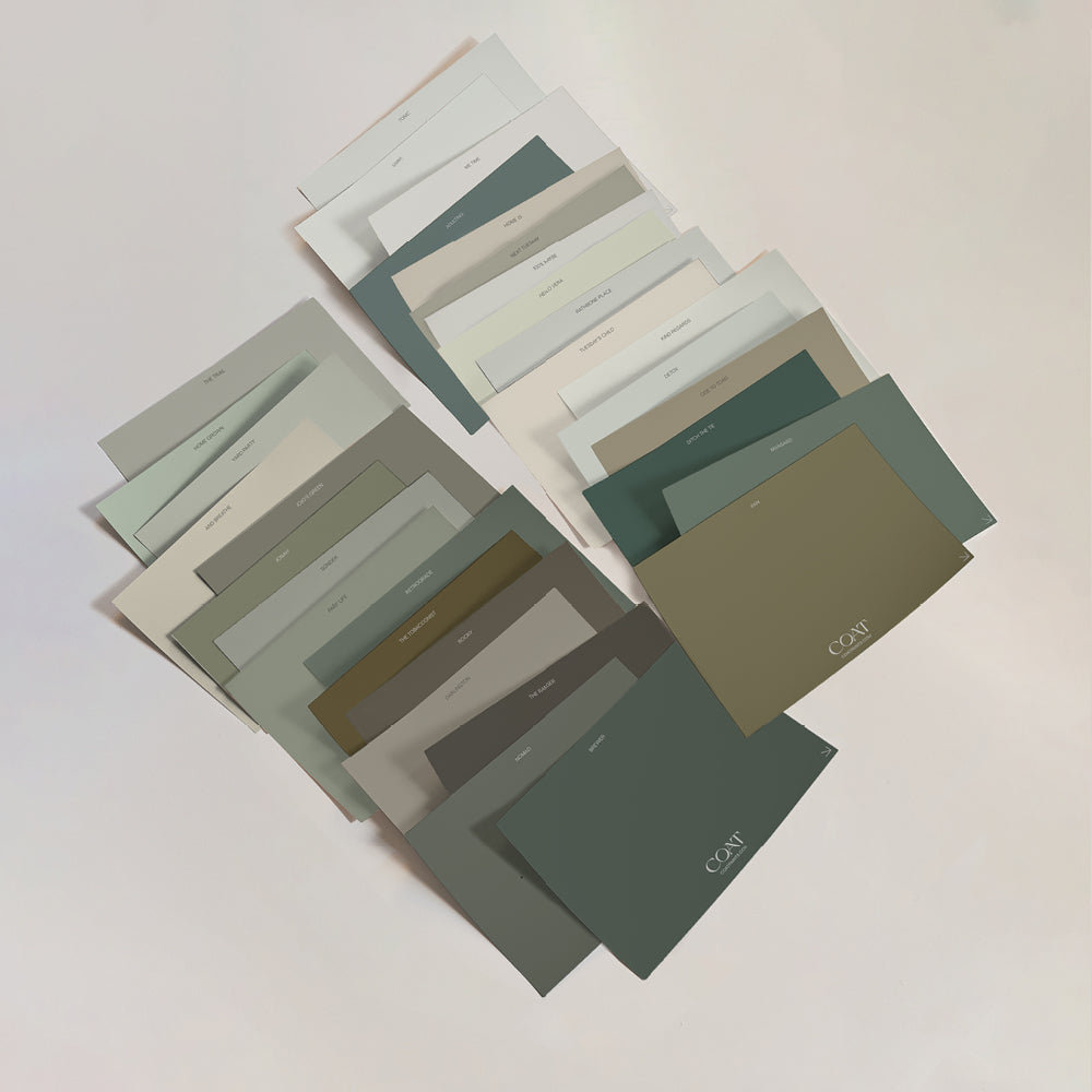
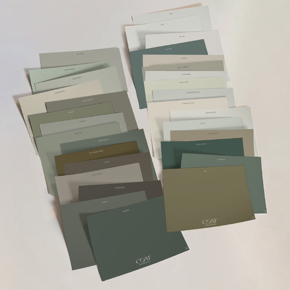
We know you guys love and we mean LOVE a green kitchen! The good news is this massive trend is going nowhere for 2022. Coat your kitchen cupboards in one of our luscious greens such as Nomad, Brewer or Darlington and let those earthy, natural tones help you cook up a storm.

Choose an Eggshell finish for cabinetry and a Soft Sheen for the walls and our paints will stand up to as much coconut oil and avocado as you can throw at them!
Simply give your kitchen cupboards a quick sand down, followed by a couple of coats of our Eggshell paint, and it'll look like you've got a whole new kitchen 💫
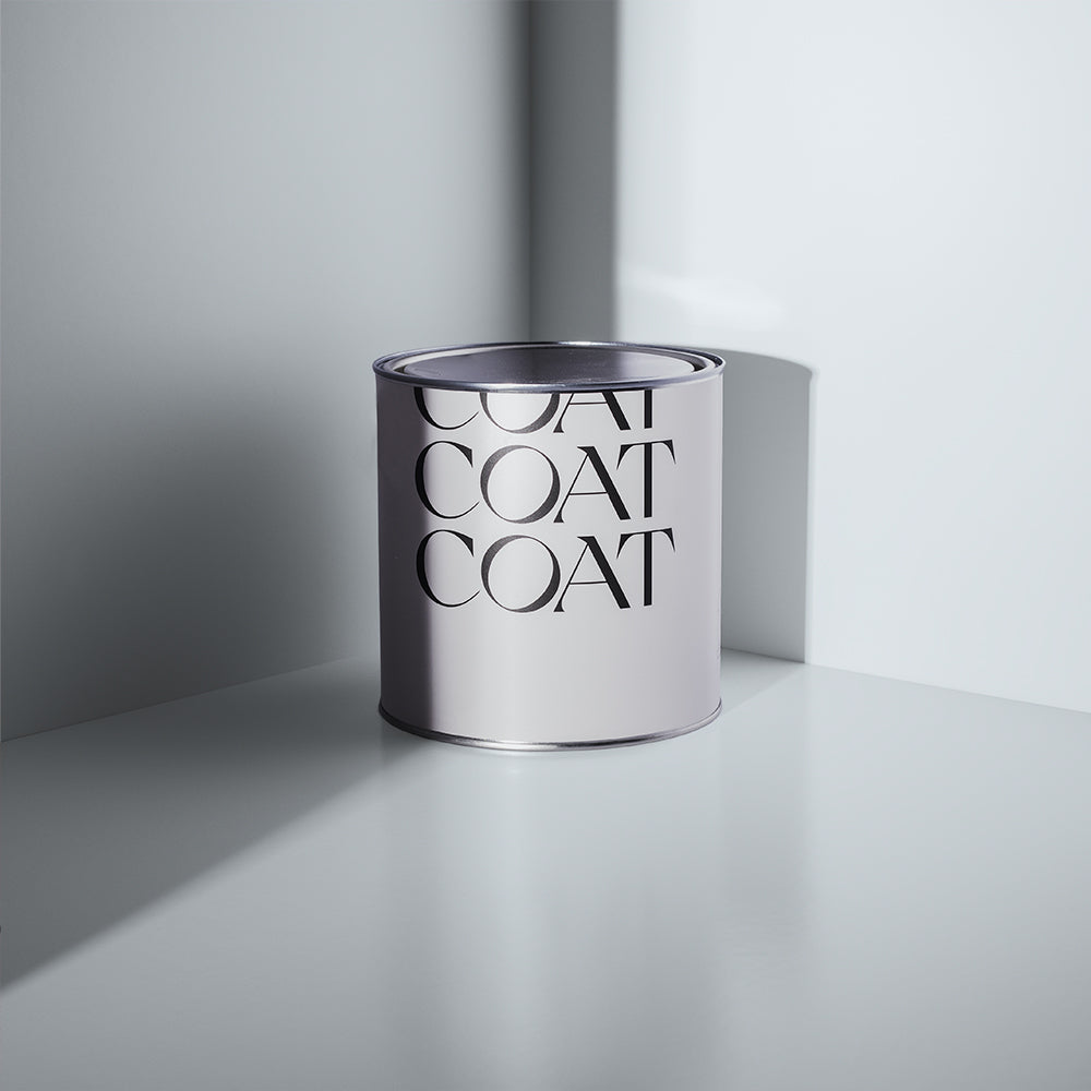
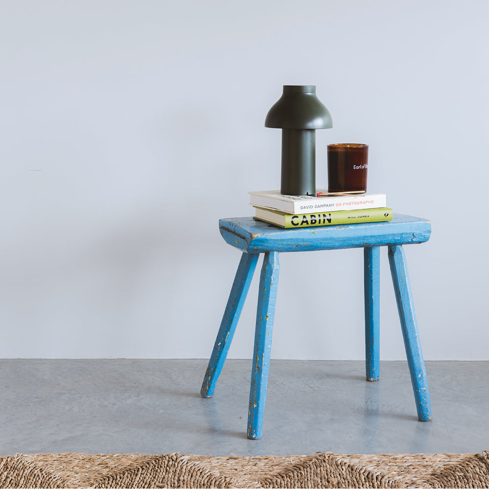
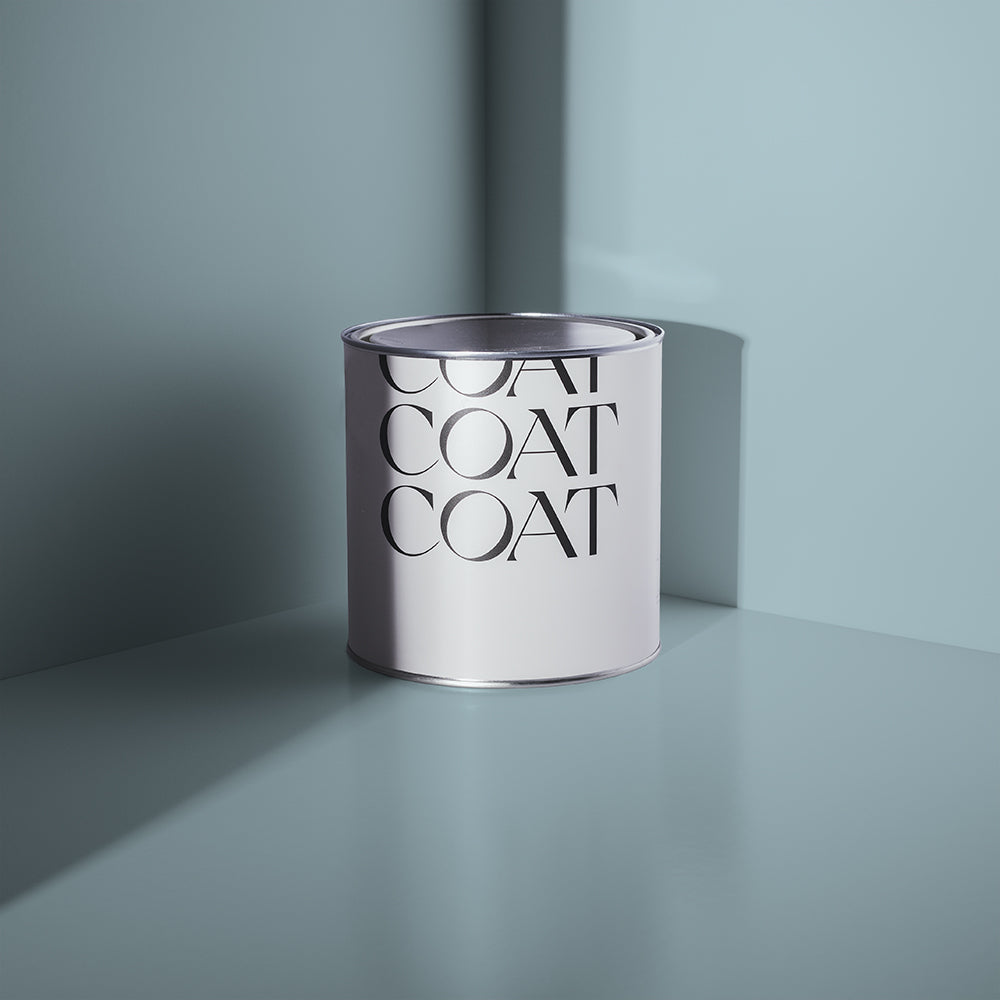
We know you're all about the greens, but blues are also a great way to go for a kitchen that packs a punch. Our dark blues 2AM and The Drink are brilliant for bold kitchen cabinets. Or why not try one of our light and airy blues such as Lie In or Below Deck? They create a lovely, fresh look in a kitchen, especially when paired with natural, sustainable materials such as wood, rattan or bamboo 🐼
HALLWAY INSPO
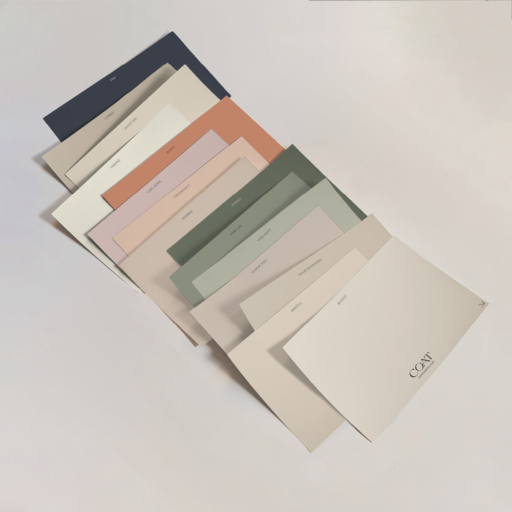
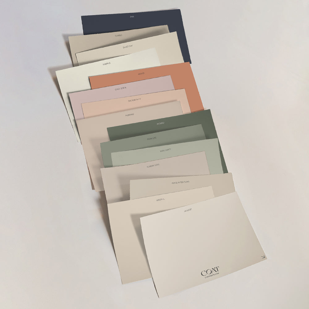
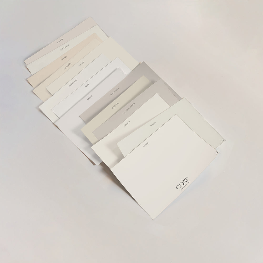
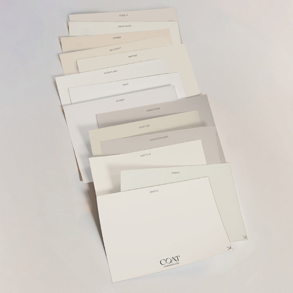
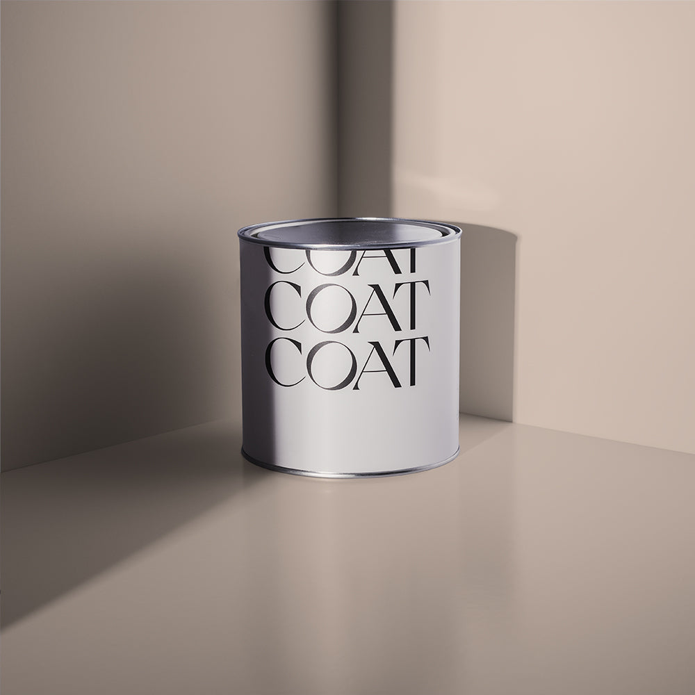
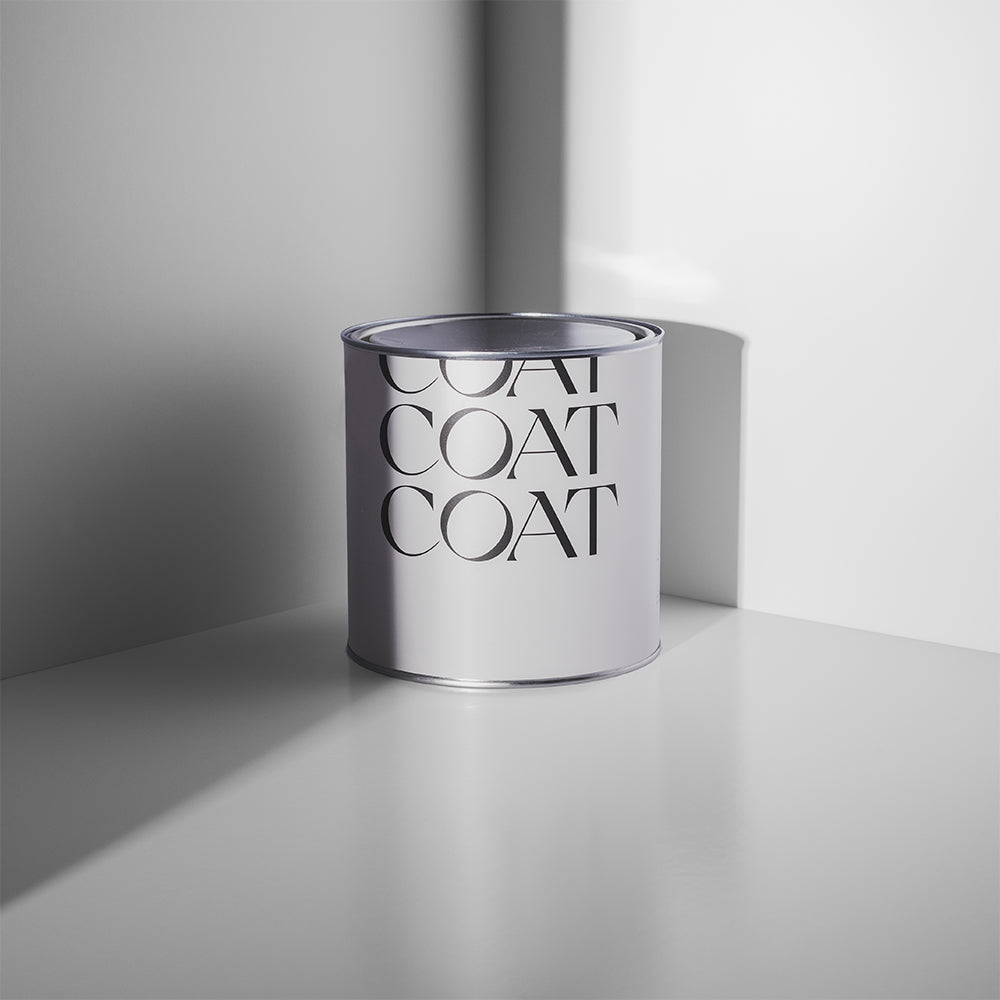
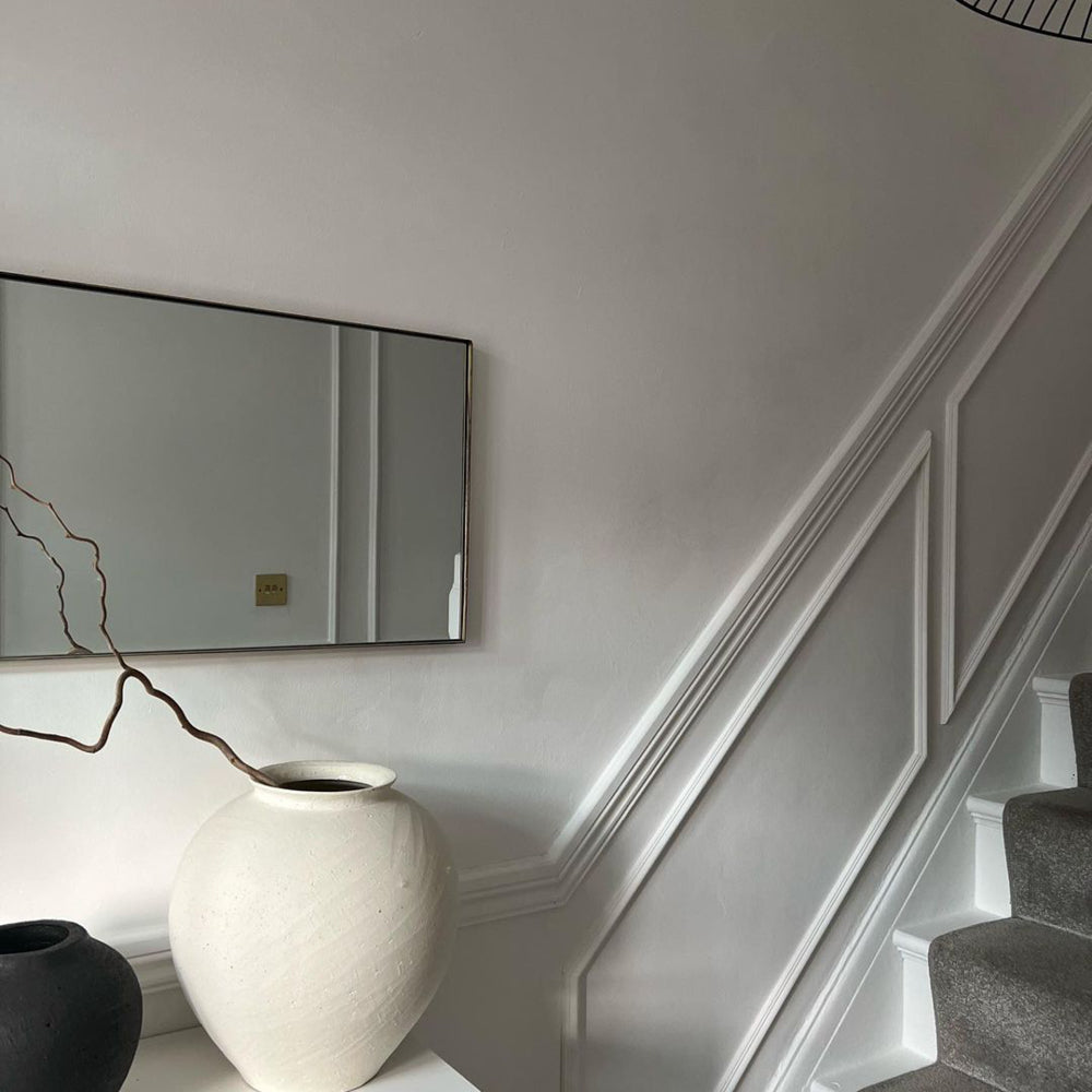
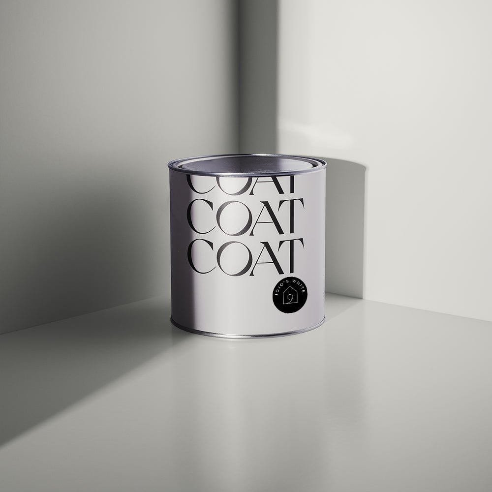
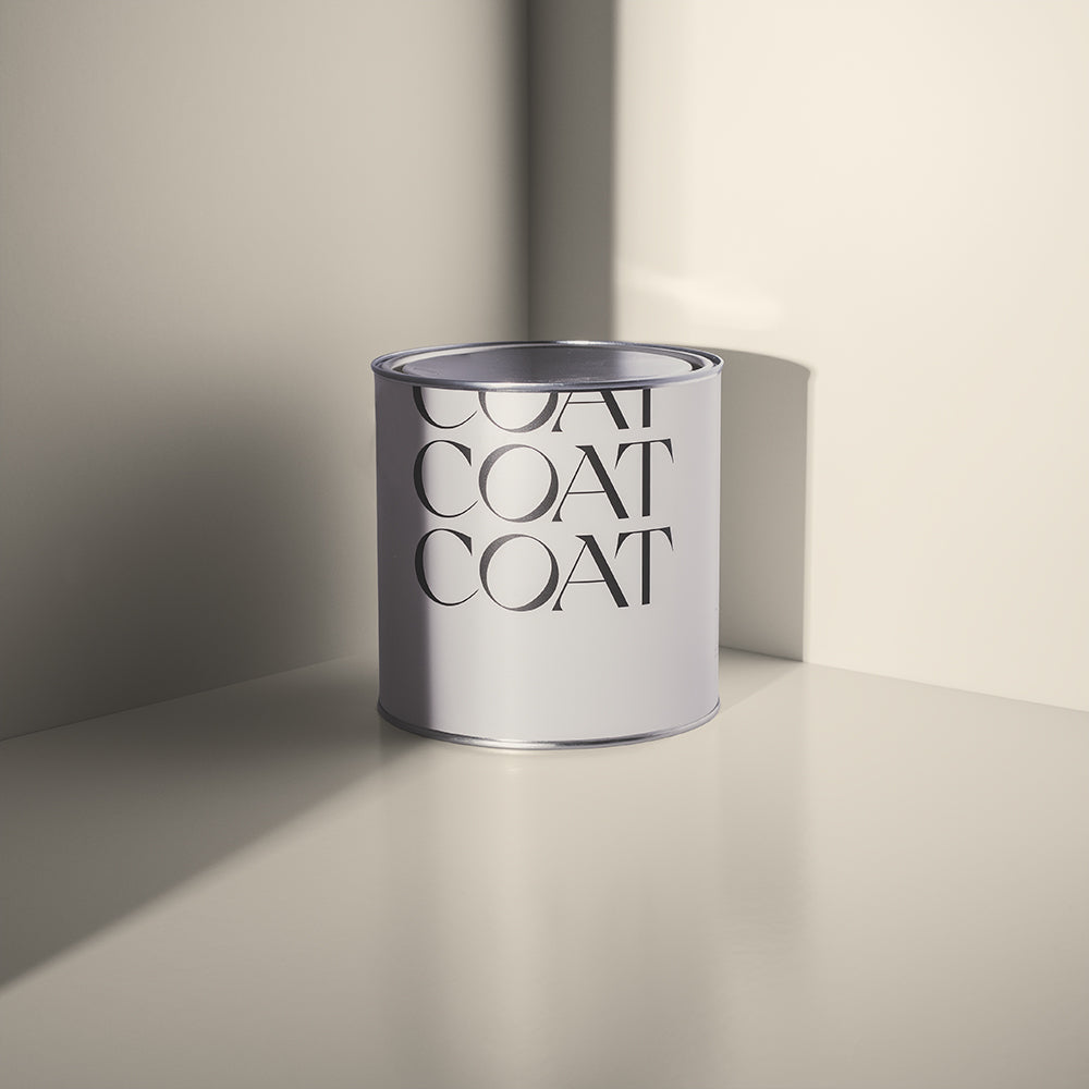
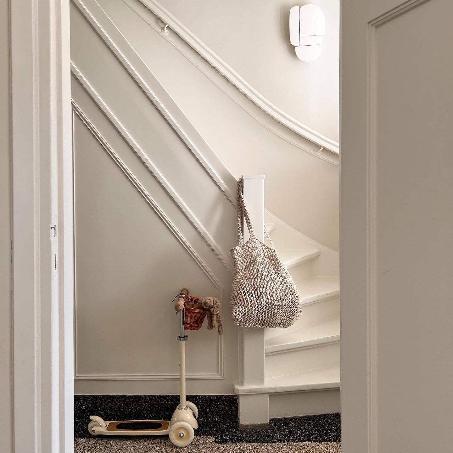
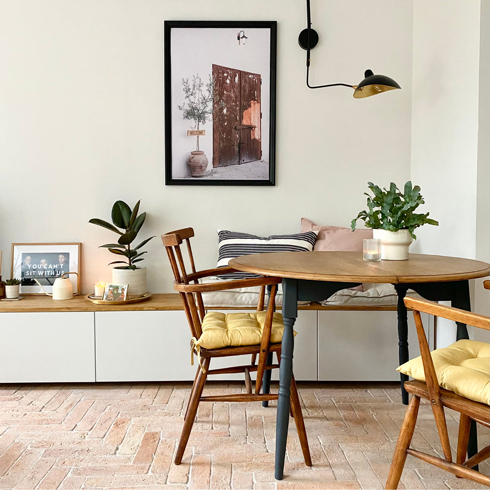
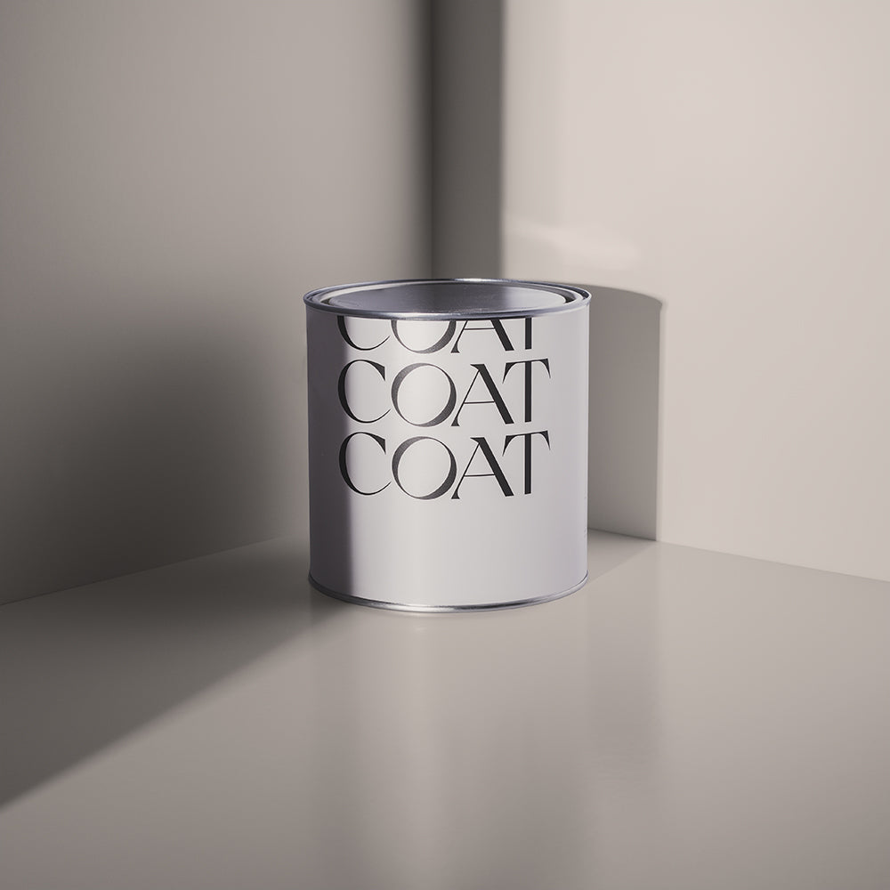
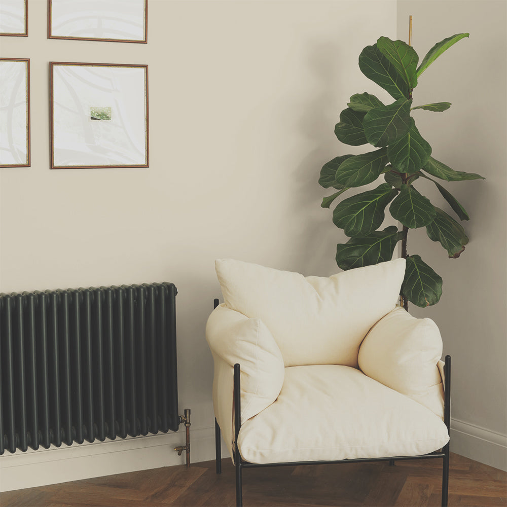
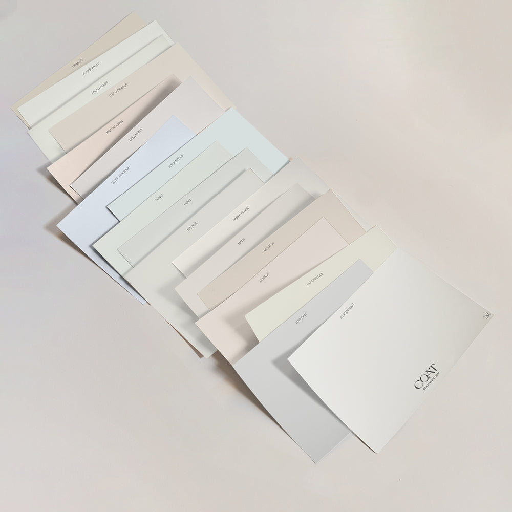
For the warmest of welcomes, why not go for one of our reliable, warm neutrals such as Duvet Day, Mindful, or our whitest white Low Salt? These timeless, calming shades bring a warmth to a space and provide the perfect, neutral backdrop upon which you can express your personality via artwork, furniture and accessories.

Pro Tip: Choose a neutral colour for your walls, and a bolder accent for artwork and accessories. It’s easier to change these over time
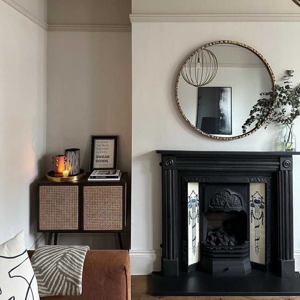
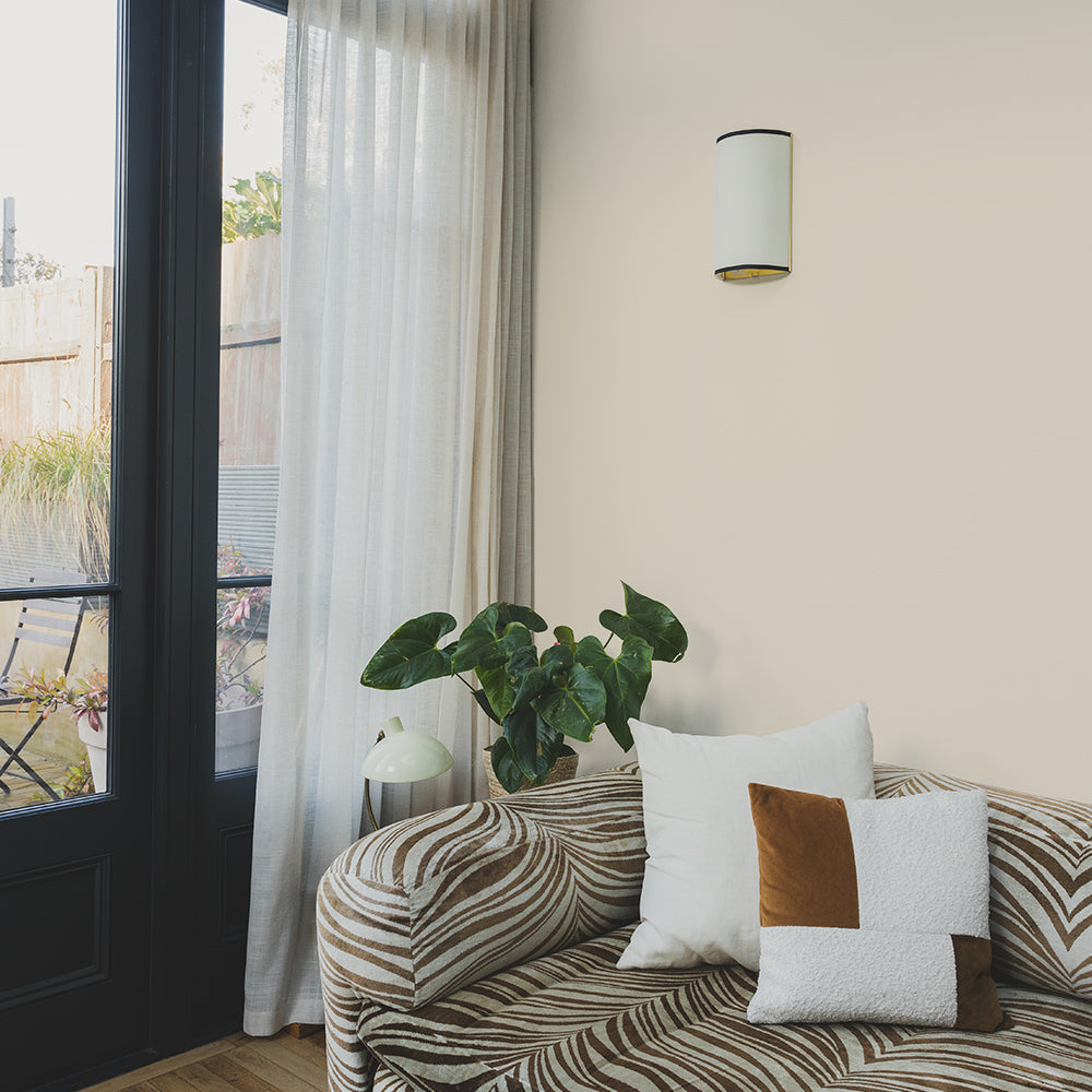
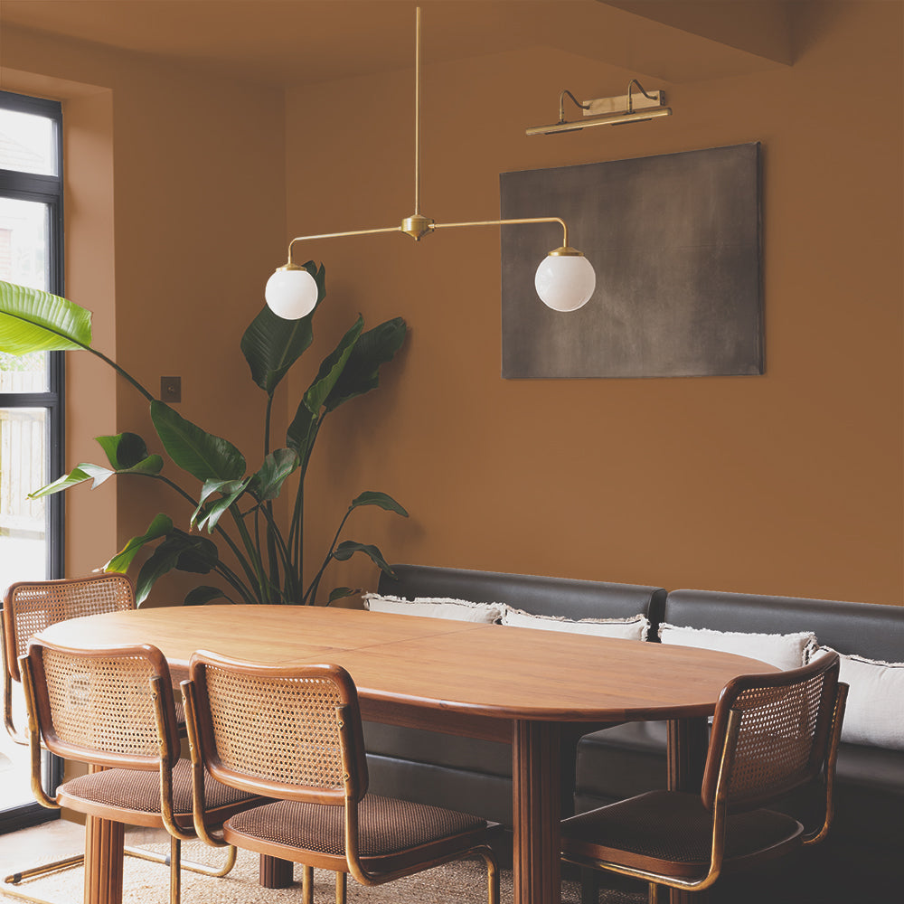
Our yellow-toned neutrals such as Pampas and And Breathe are also just the ticket for creating an elegant first impression. "These tones are prominent in the Japandi movement" says Aaron. "They create the perfect, flattering backdrop for more vibrant colours. And they're also great for pairing with textural finishes such as bamboo, rattan and brass because they help them to pop."
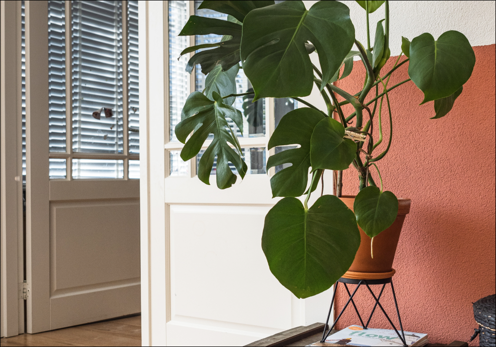
If you're embracing the minimalist Japandi look for your hallway, the first step is to paint the walls in one of our lovely neutrals. Then simply add in a vintage console table, some monochrome artwork and an oversized monstera plant to create the ultimate entrance! 🌟
Ready to get decorating? Take your pick from our collection of carefully curated, planet-friendly paint colours 🌈
Publish Date
Author







Leave a comment