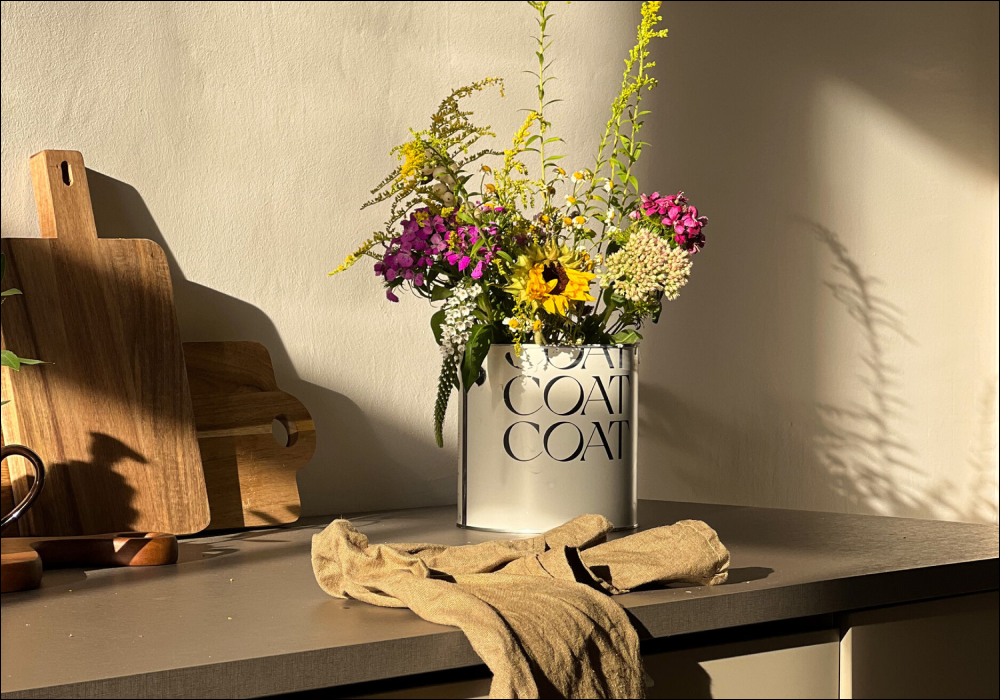
Spring Into Colour
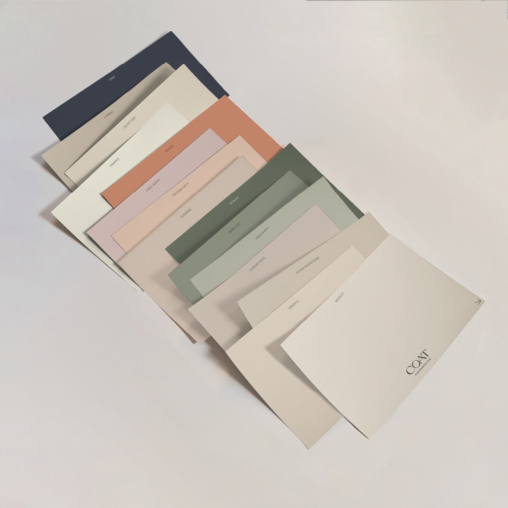
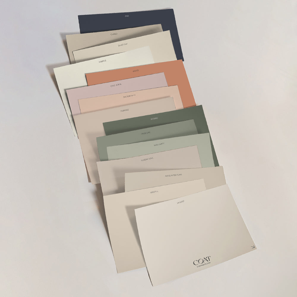
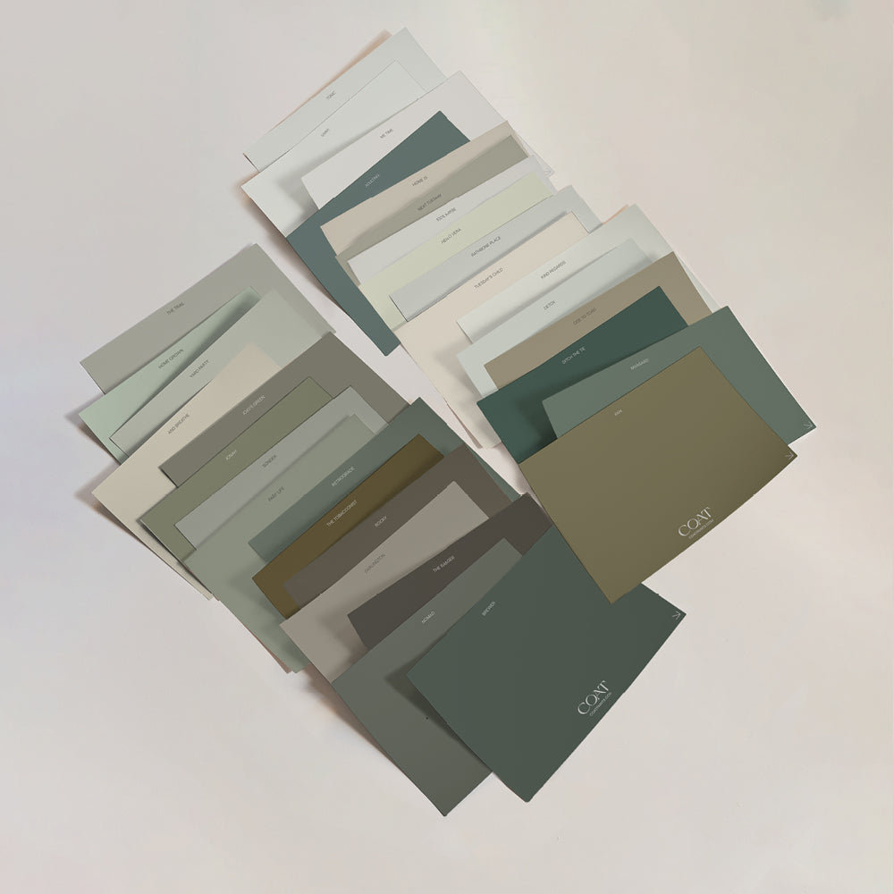
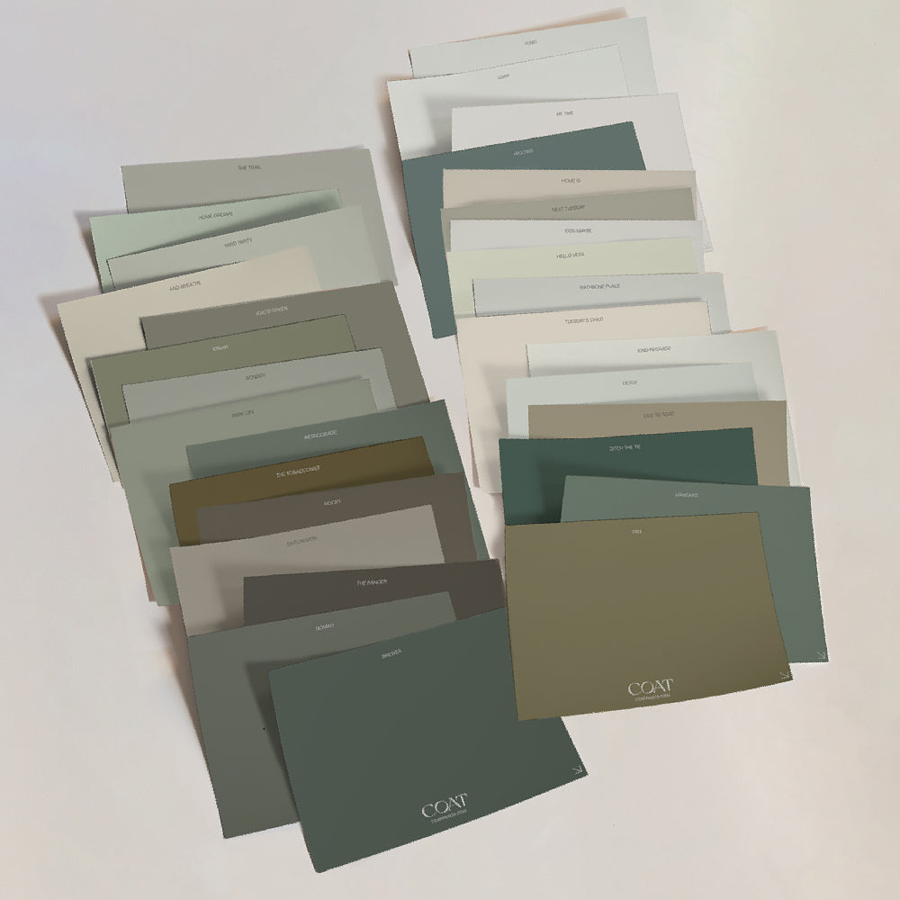
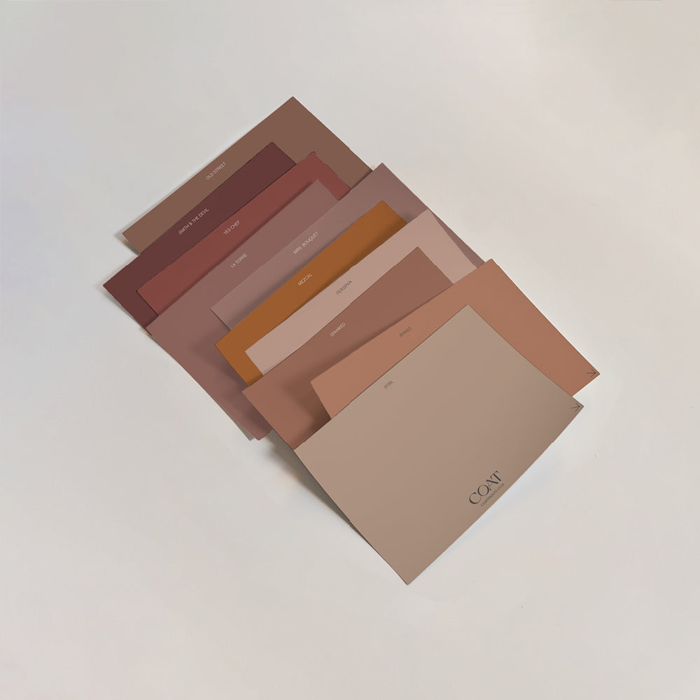
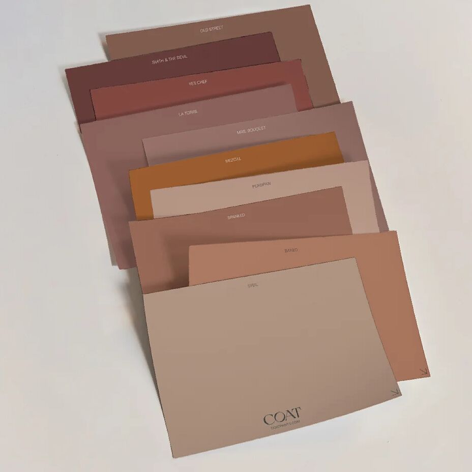
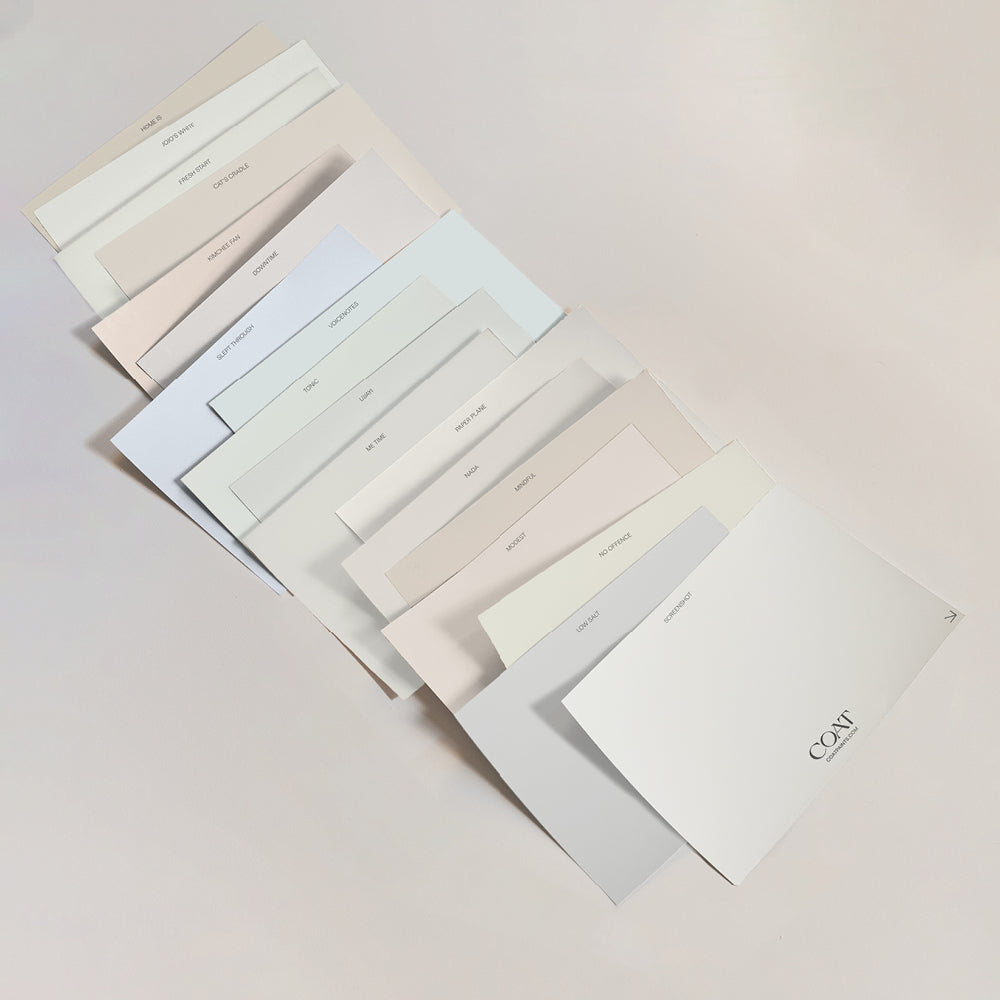
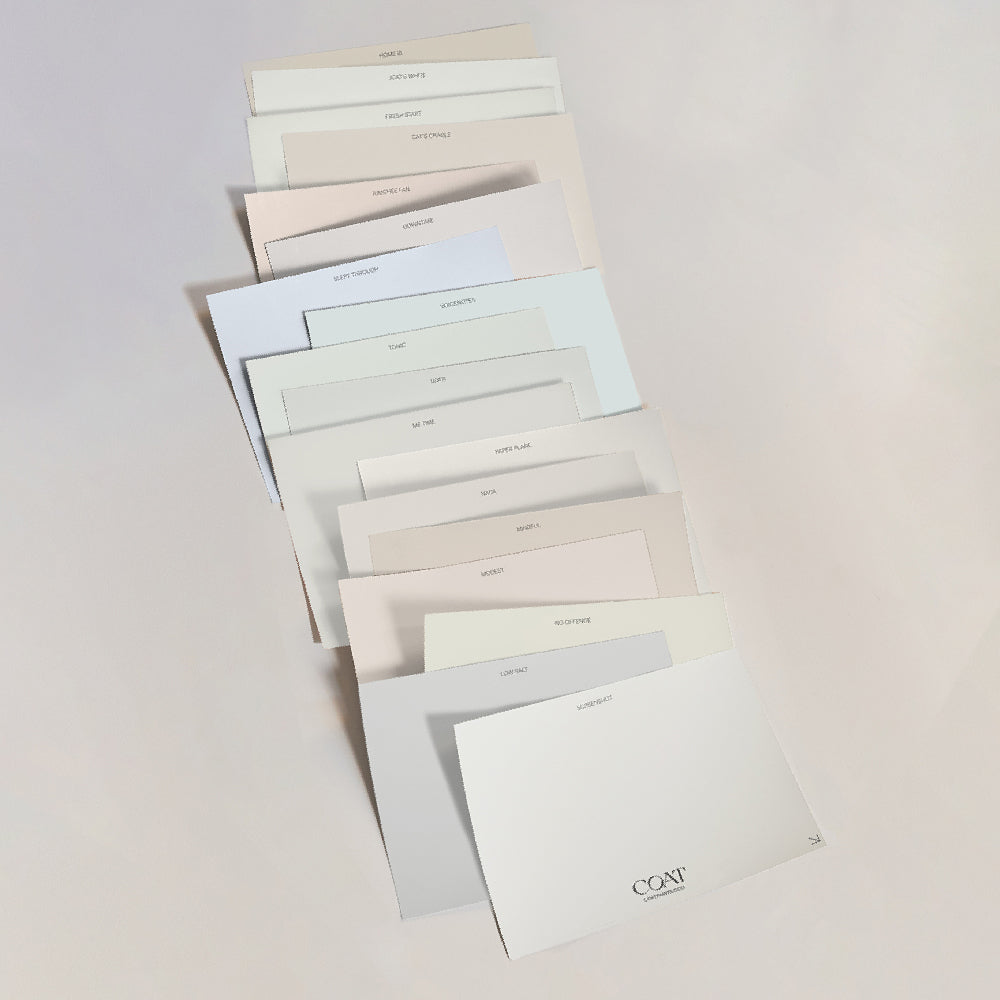
It’s the time of year to come out of hibernation. 2023 trends are a mixed bag, with strong Magentas leading the way and elements of modern lavenders, yellows and sage greens. We’ve curated a collection of colours that are perfect as background colours for these trends. Shop the Spring Edit here.
Safe Play

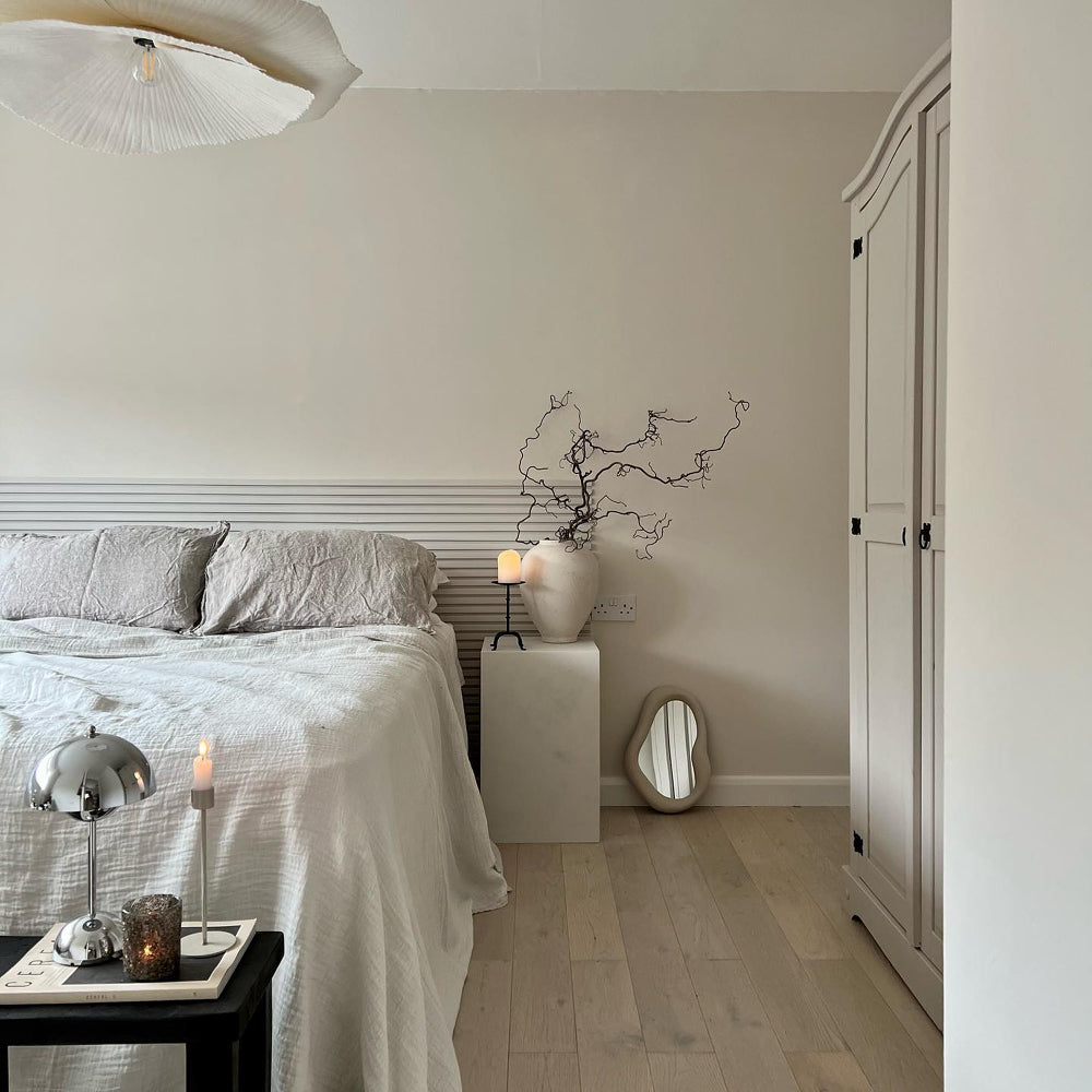
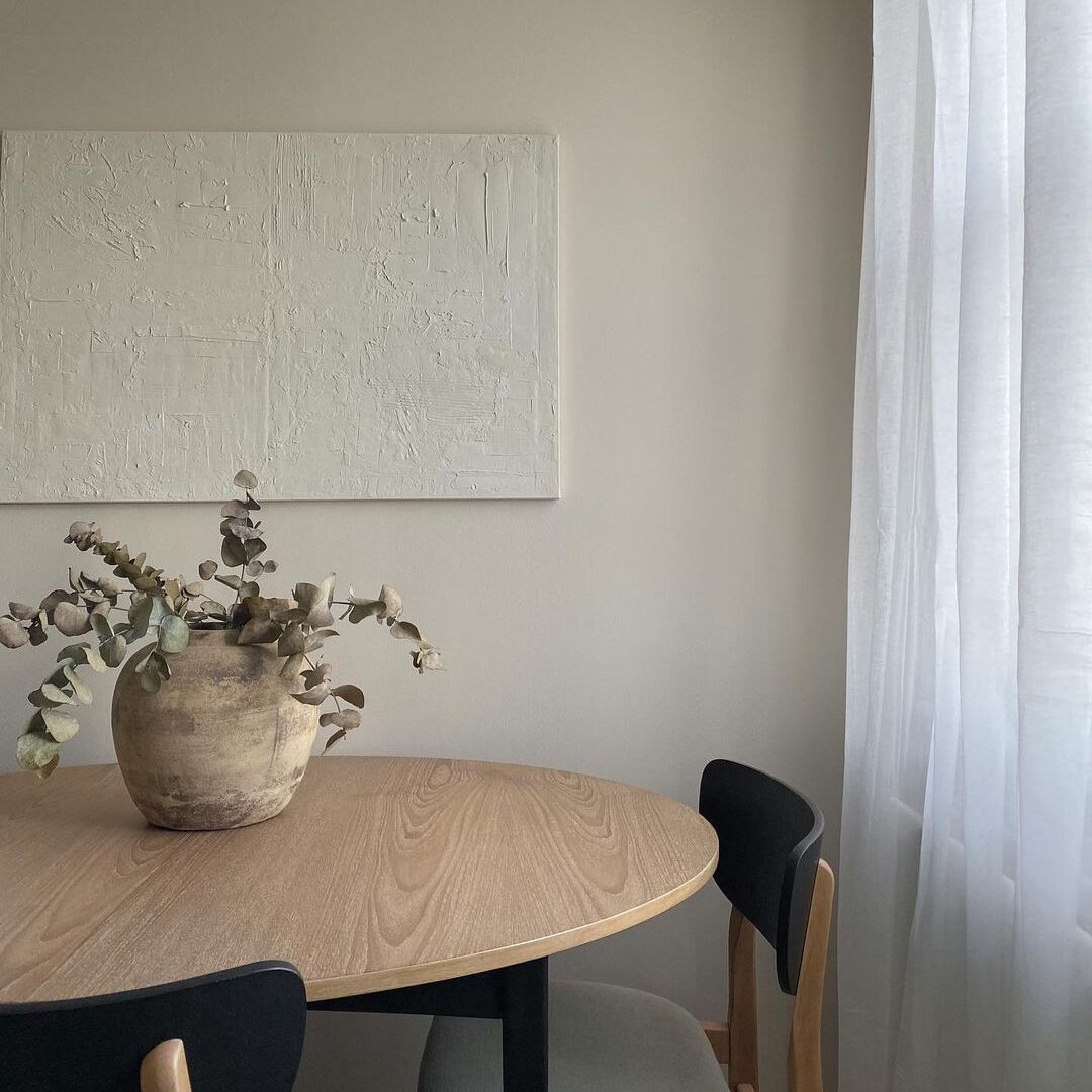
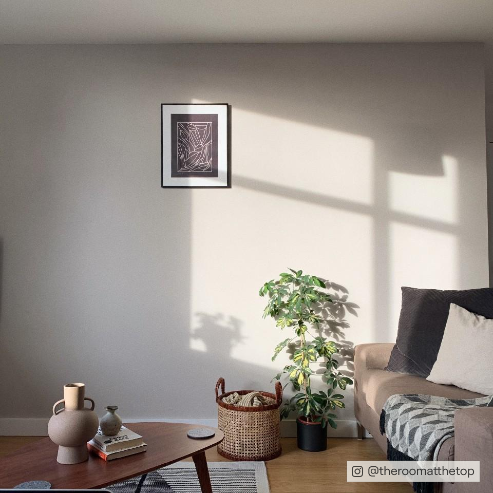
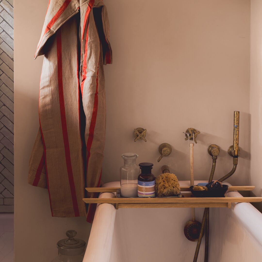
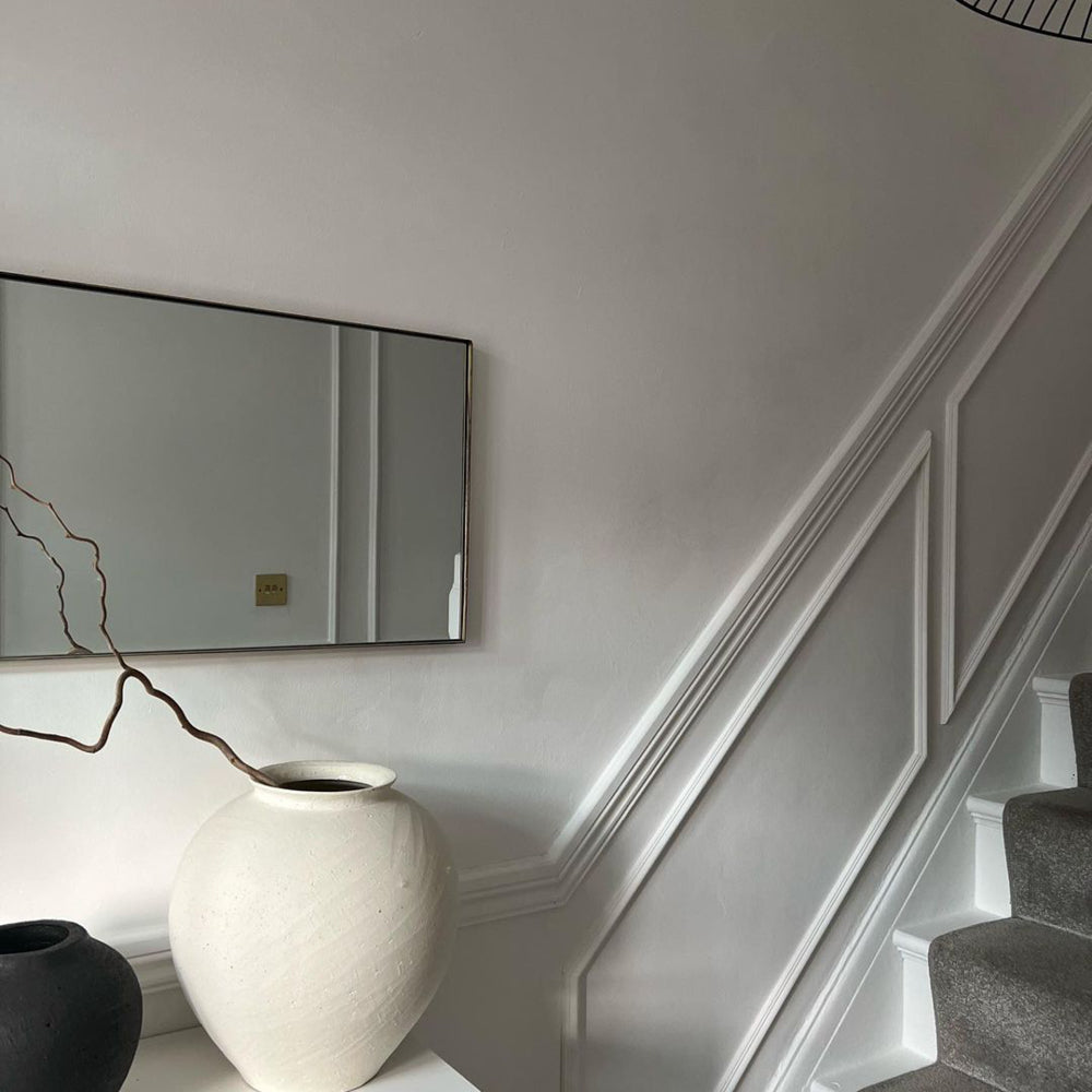
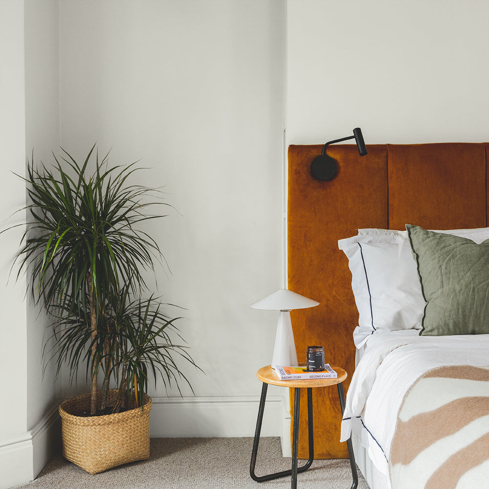
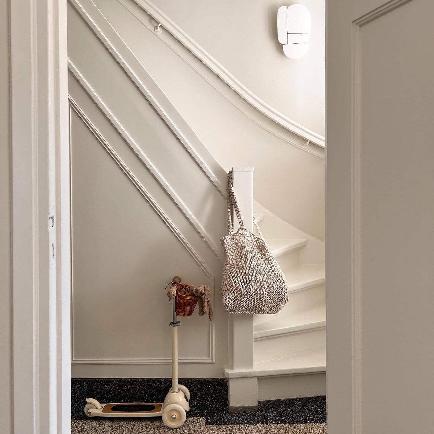
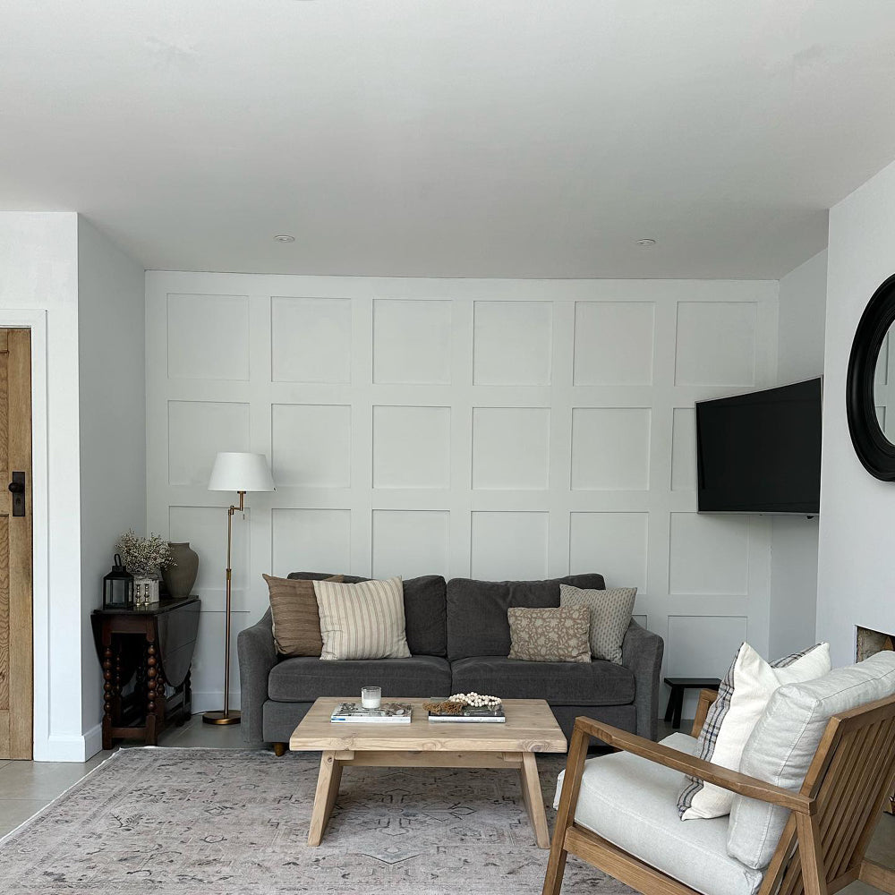
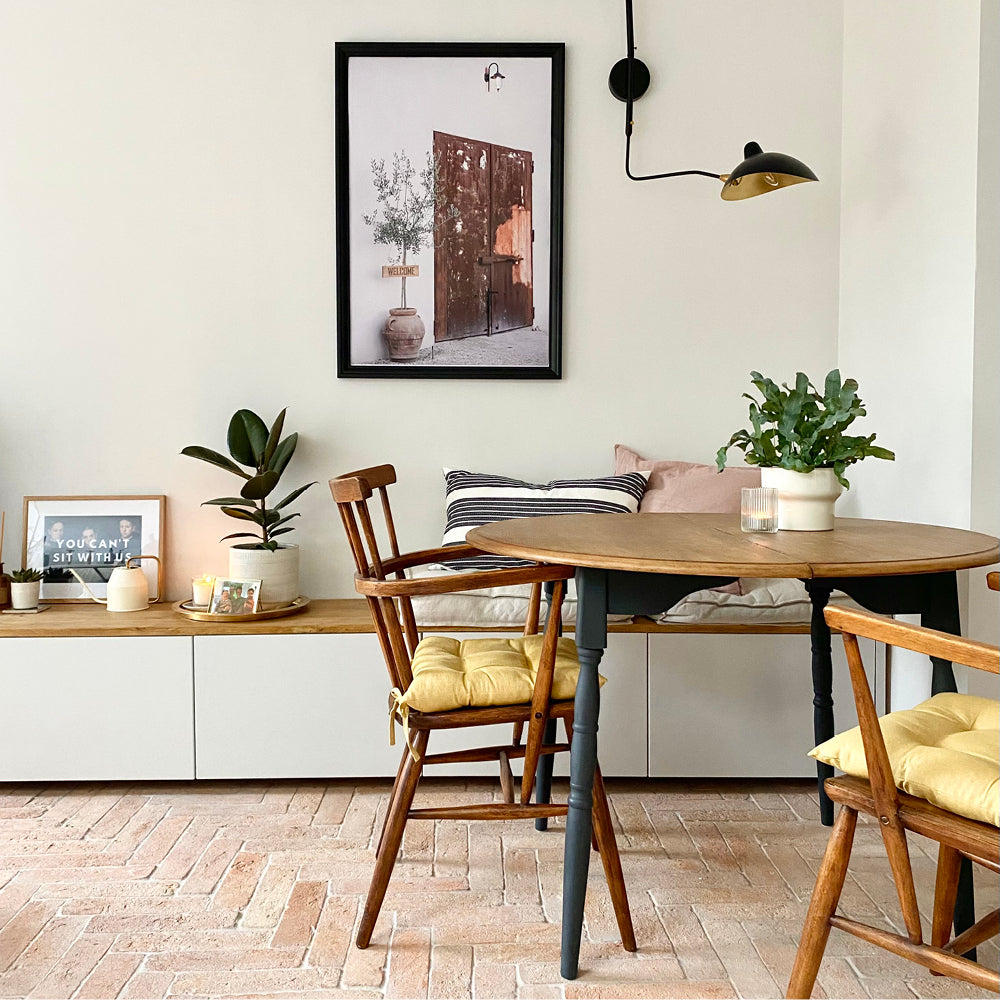
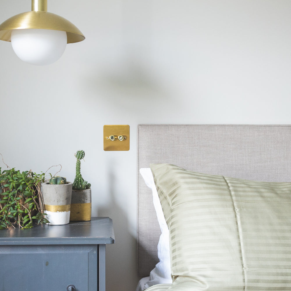
@yas.wyatt.home is the queen of light neutrals, using Safe Play in most of her home.
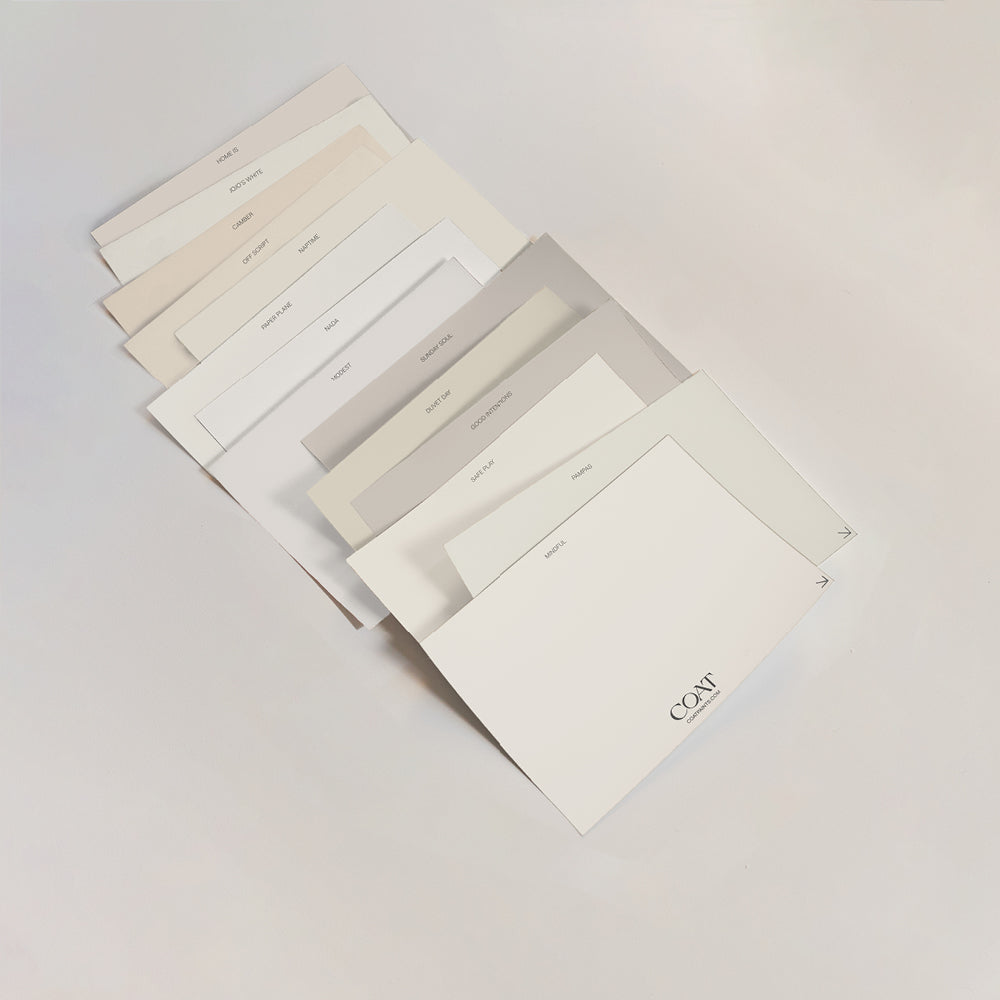
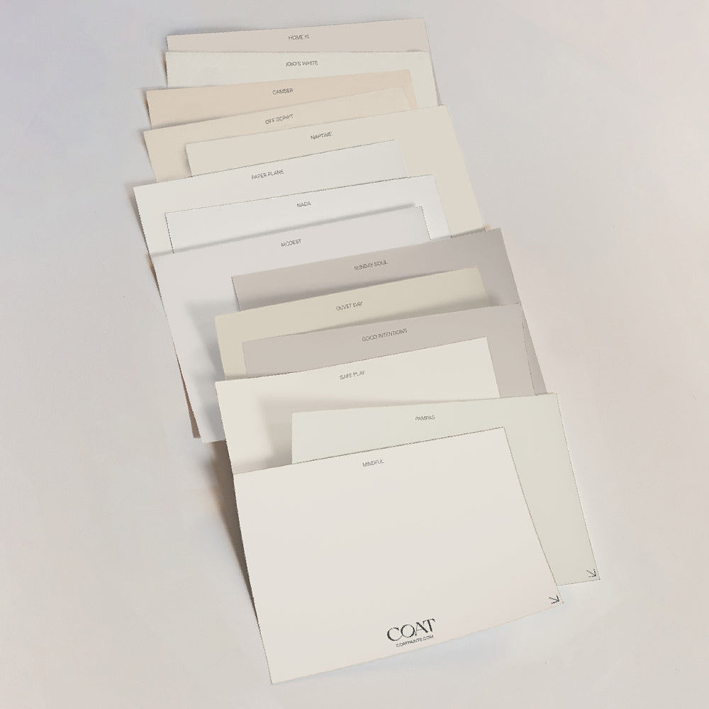
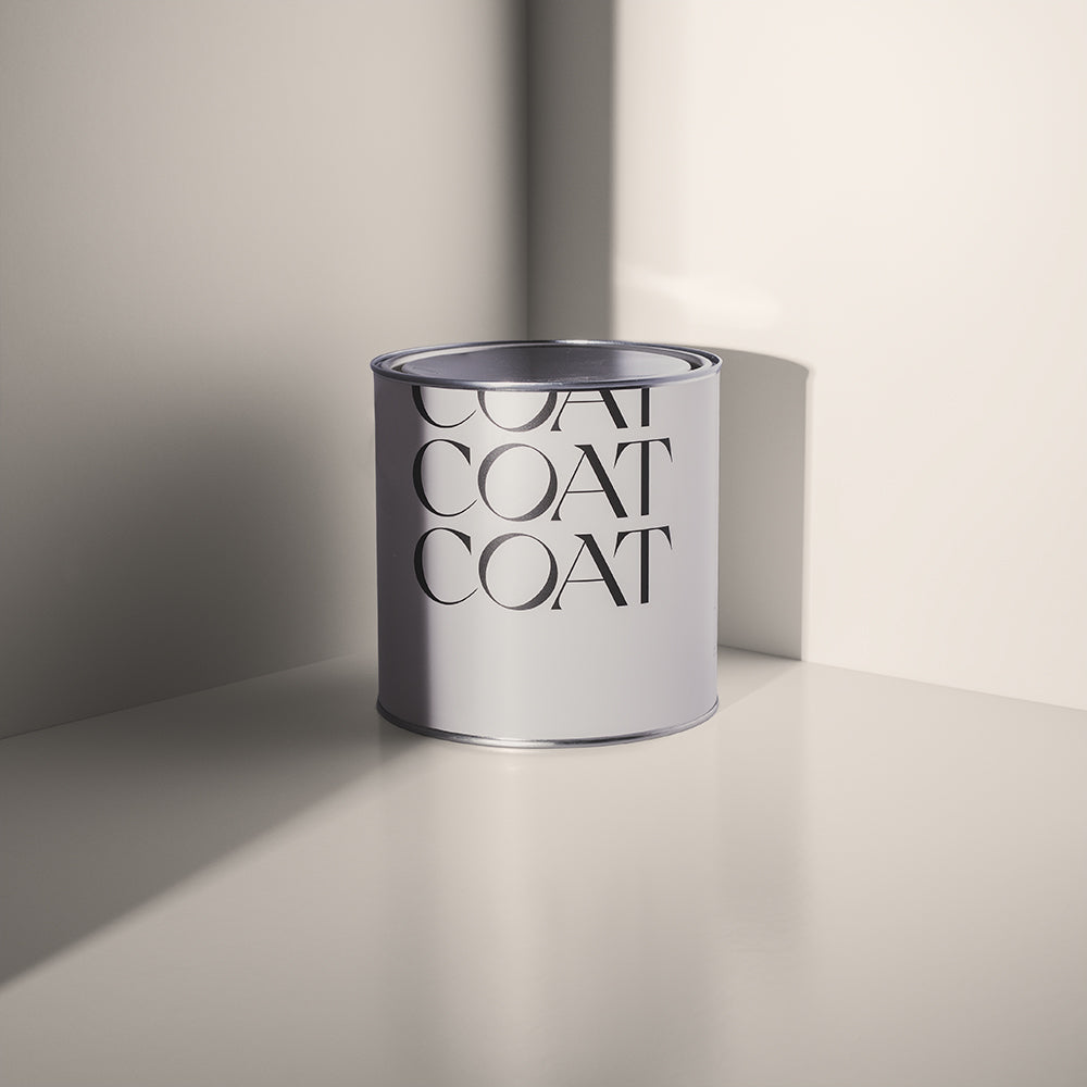
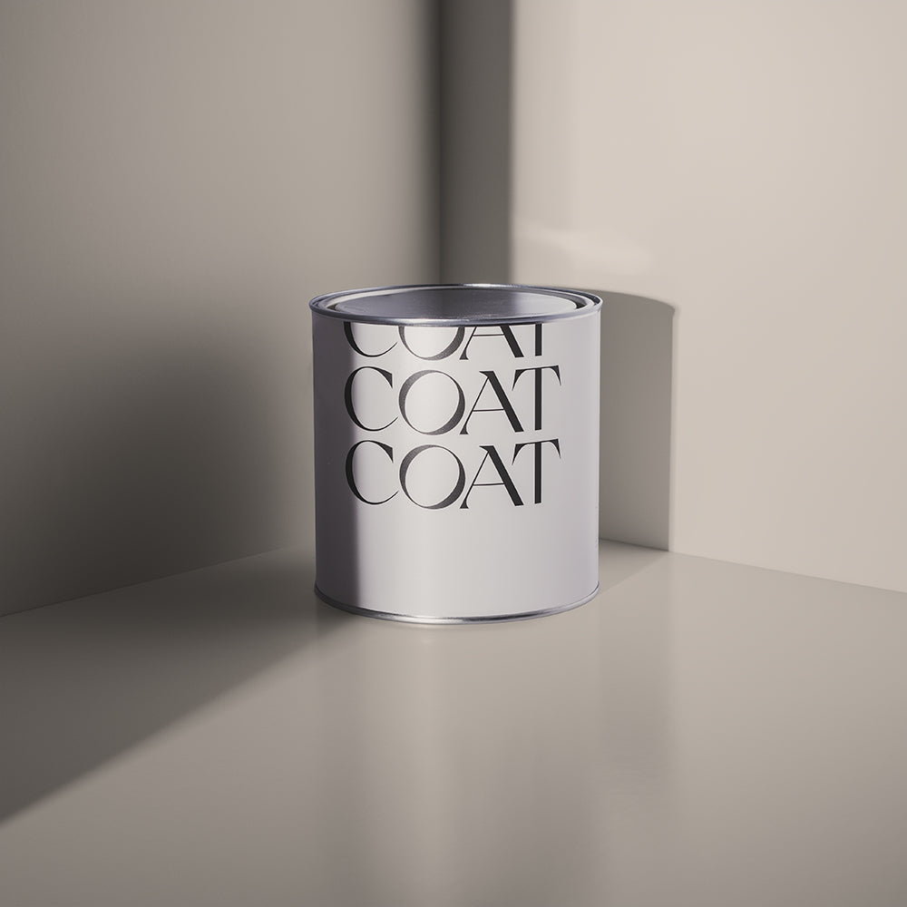
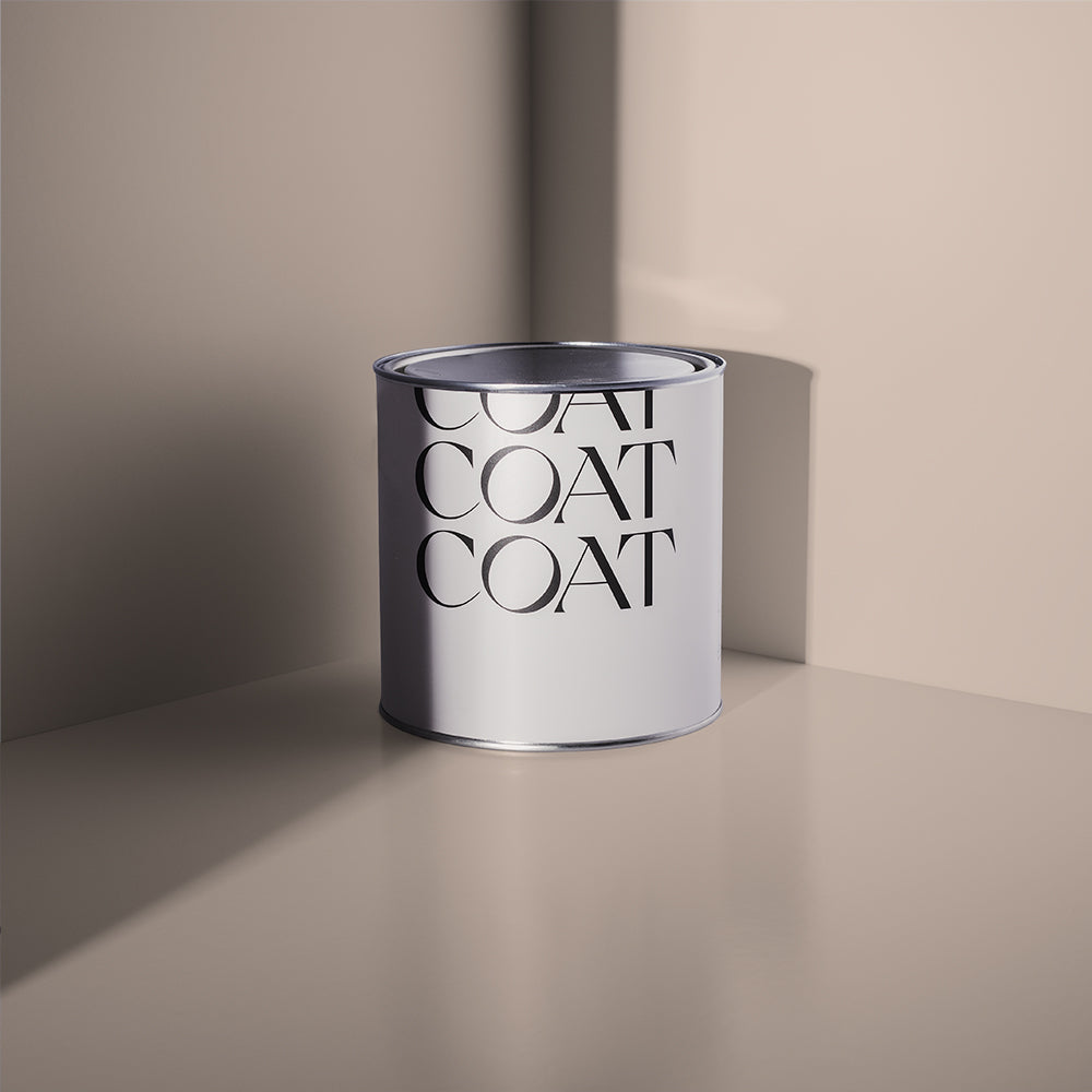
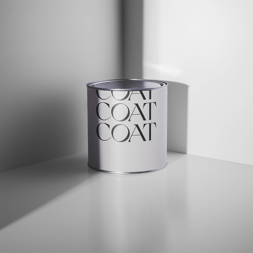
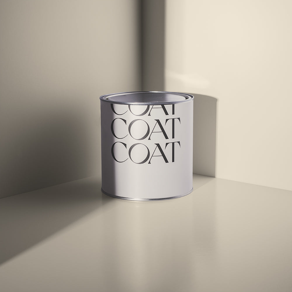
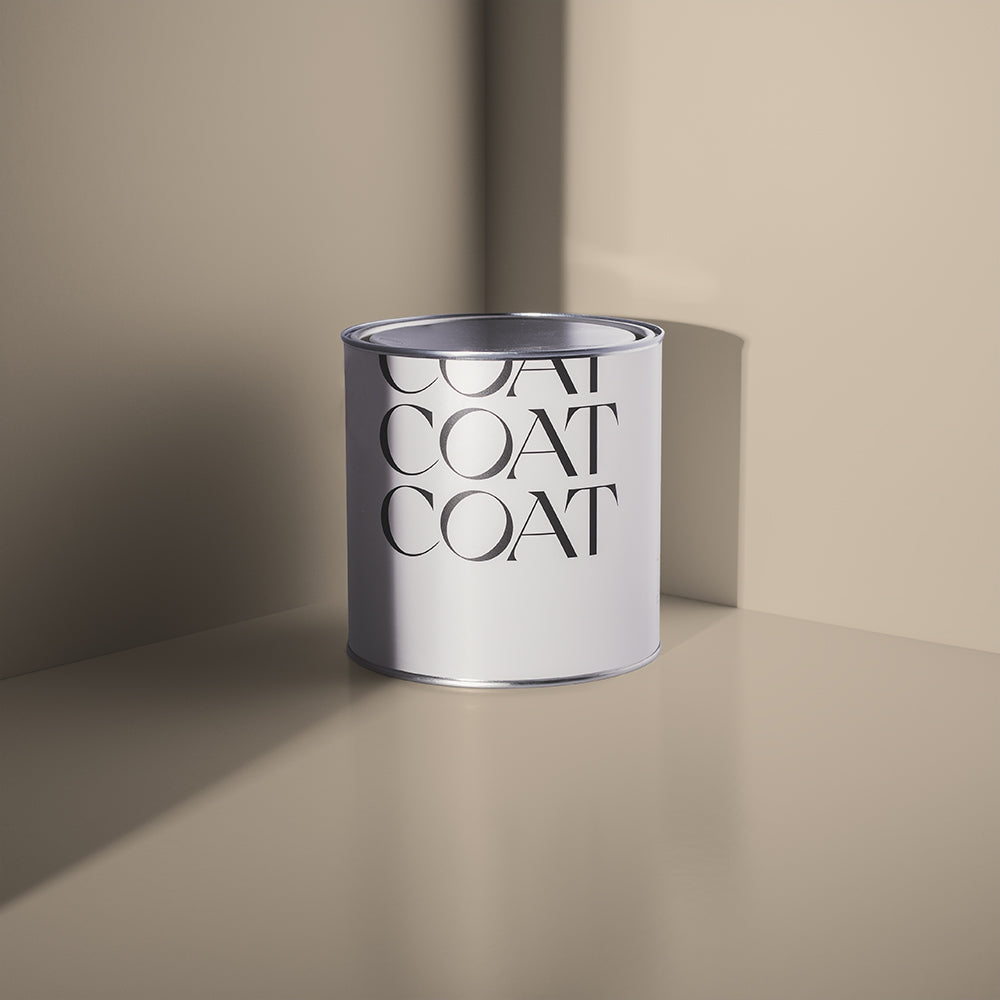
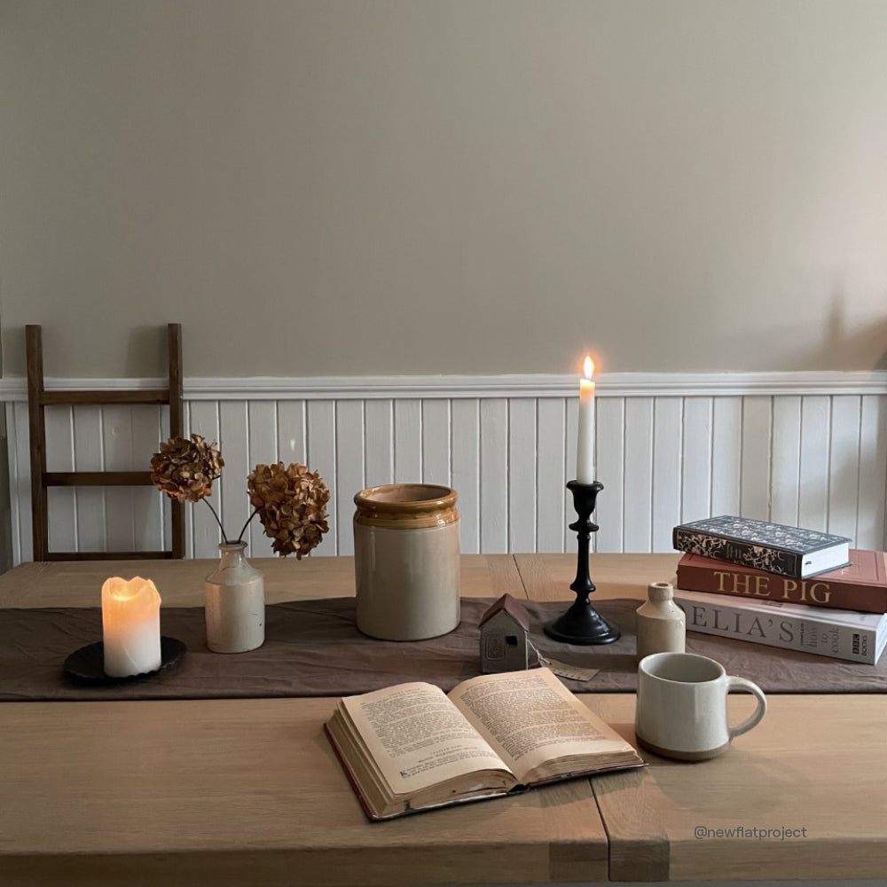
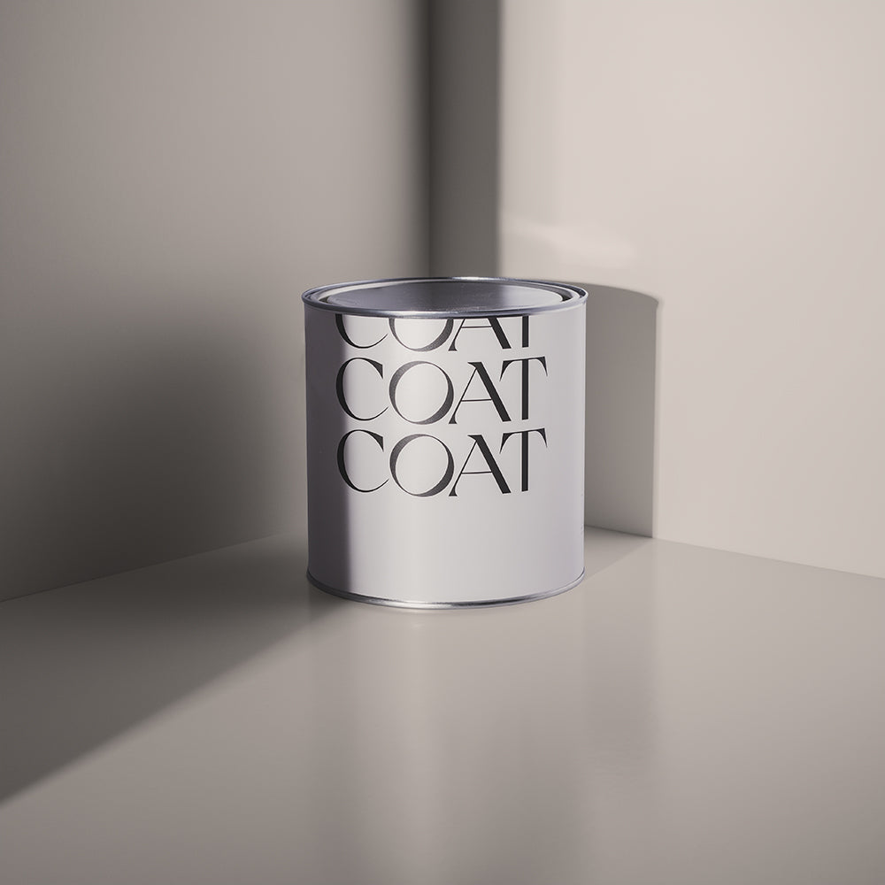
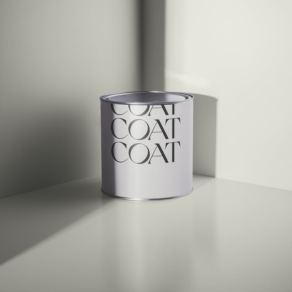
This neutral is the perfect background for most colours. A pale beige that has a slightly grey note to it, it pairs with everything for effortlessly scan looking schemes that can evolve with the fashions and cycling of home accessories. This is the perfect ceiling and woodwork colour for some of our deeper beiges like Biscuits For Breakfast but also works perfectly with darker, more saturated colours like Adulting, Mr. Clifton and Nomad.
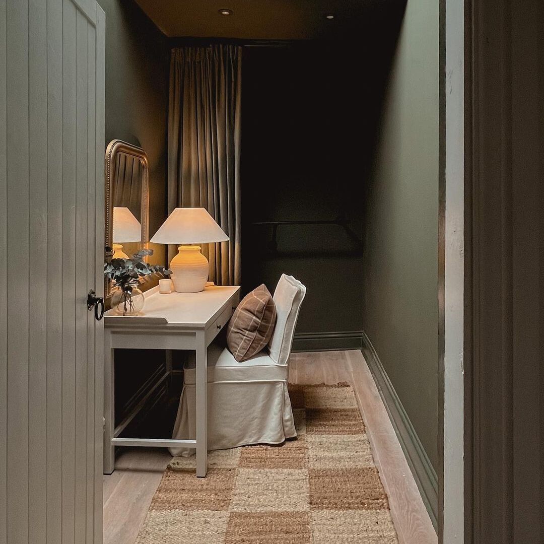
For a more organic pairing, try walls in Safe Play and then complete with woodwork in an easy grey-green like The Trail.
Biscuits For Breakfast

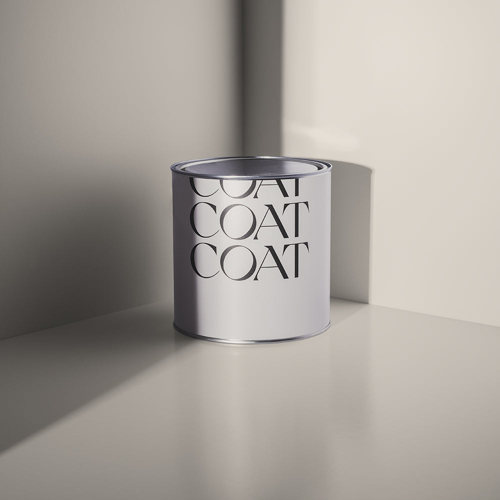
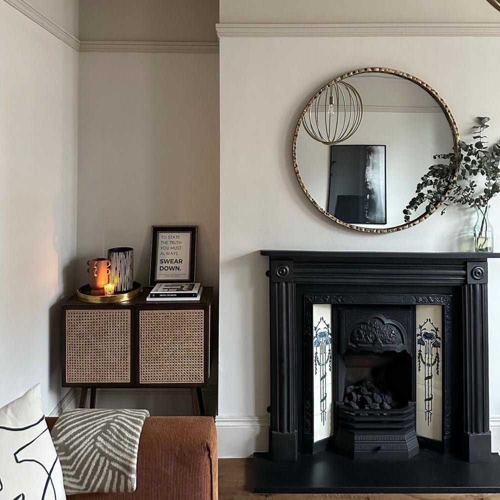
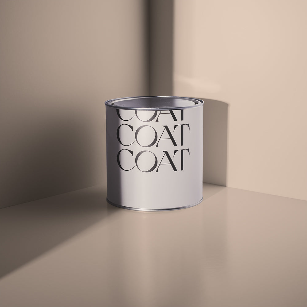
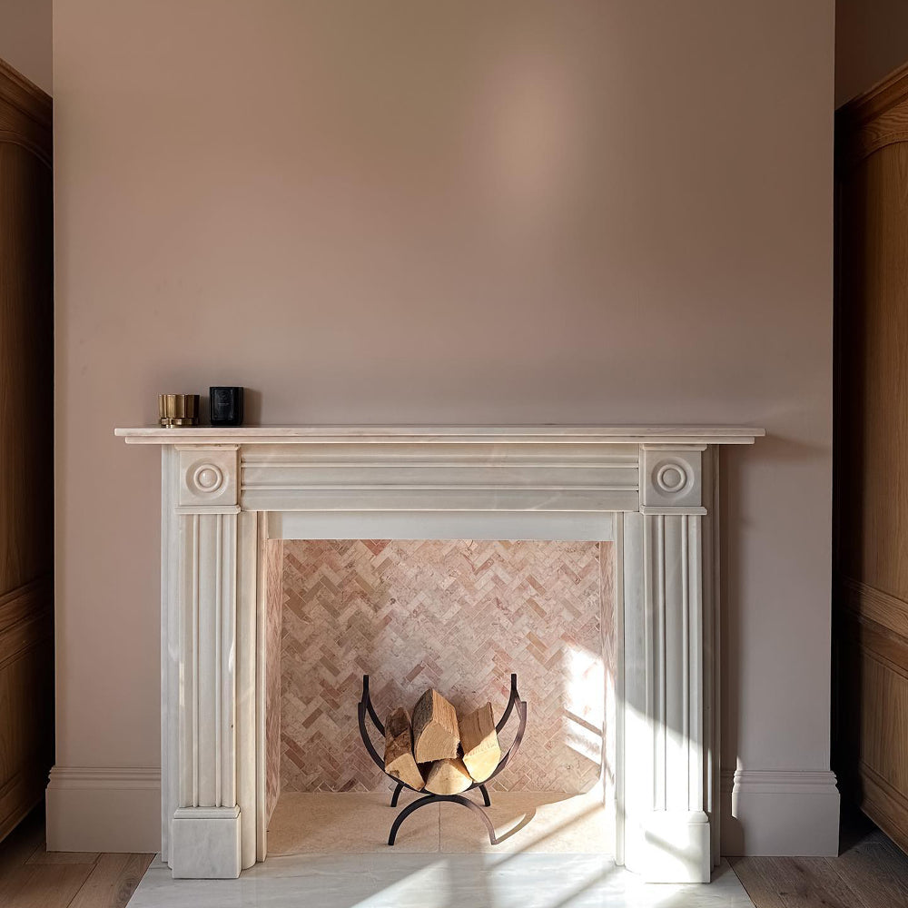
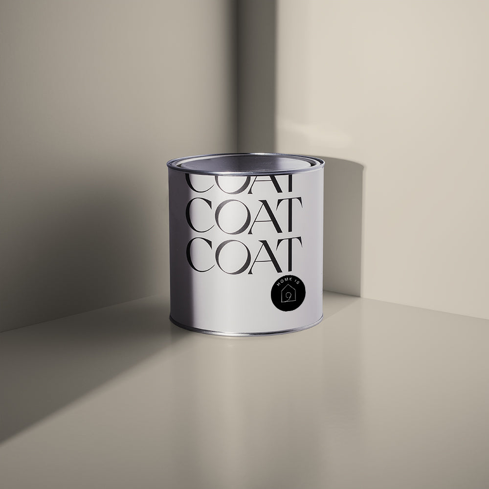
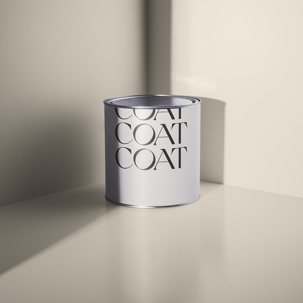
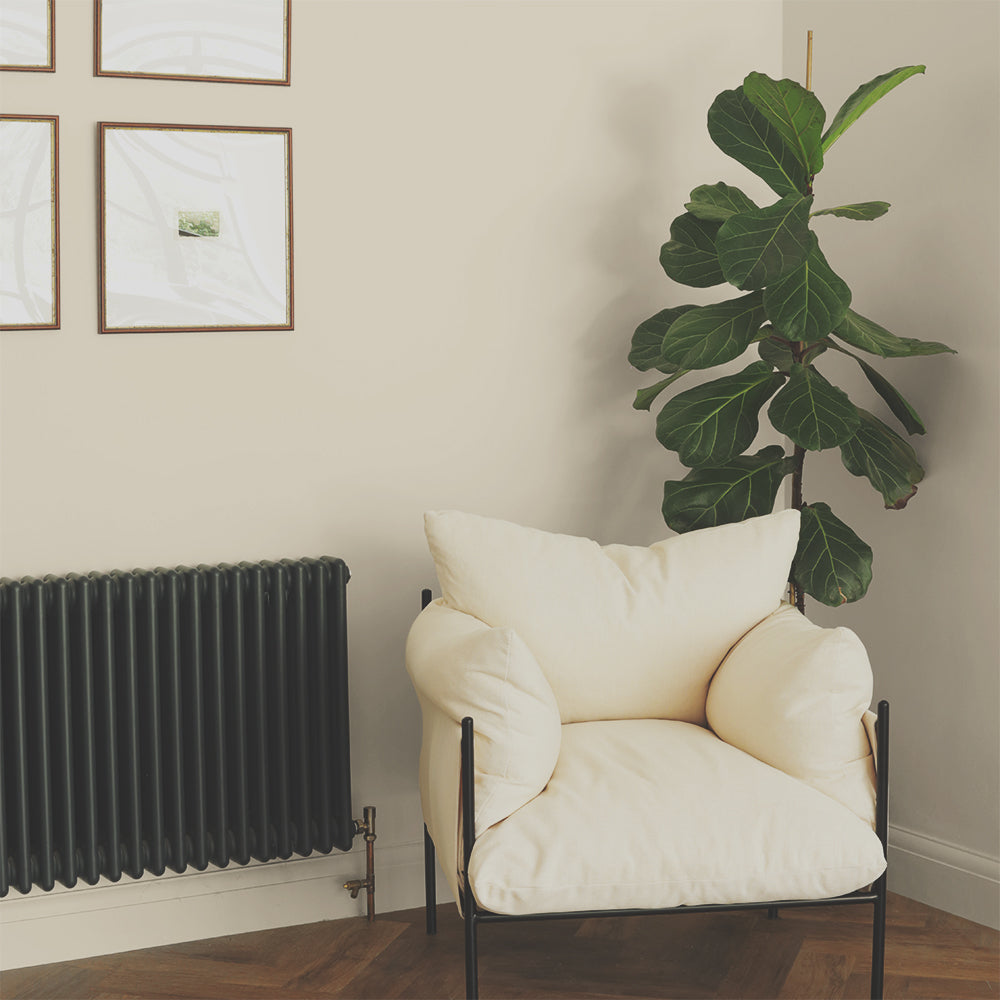
Deeper neutrals have become more popular again in the last year. This need for a touch more warmth and depth is still needed on chilly, spring mornings. Colours like, COAT fave, Biscuits for Breakfast are perfect because they look earthy and cosy without feeling overly dramatic. This deep beige’s subtle grey undertone really helps to make it feel modern, and inviting.
Safe Play on ceiling and woodwork is this colours best partner-in-crime and then add travertine tiling or accents for a really relaxed, ultra modern scheme. For something a little braver this Spring, pair walls in Biscuits with woodwork in dark bronze, Hardback.
Modest

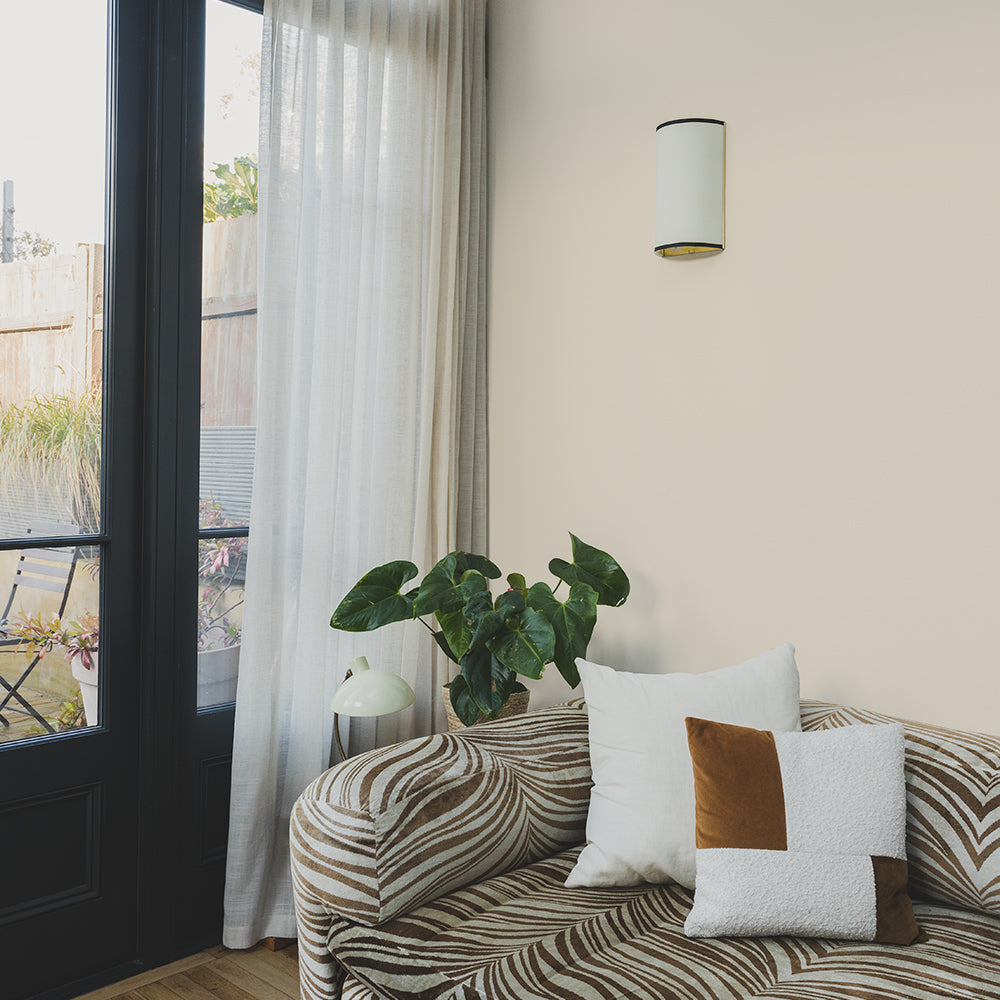
This off-white is everything, except basic. Slightly taupe, Modest, is the white designed to work with all the best-selling COAT colours (like Mindful and Sunday Soul). It’s the warm, vibrant and friendly superhero colour of our colour palette in 2023 This colour is sure to be a firm favourite too. Use as a ceiling and woodwork colour with Mindful or Sunday Soul for a warm and inviting scheme. For those looking for a warm white on walls, Modest is a great option. Pair with Good Intentions woodwork, for a relaxed scheme that feels bright and airy.
As we’re moving to the time of year to think about doing any exterior painting too, this off-white fits in well with the Greek and Mediterranean themes we’re seeing come through in exterior trends for this year. Perfect for trim, windows, or as an exterior wall colour. Modest won’t be eye blisteringly white in the high summer, but also fits well with the hot reds and yellows that will be in for Spring & Summer.
Sunday Soul

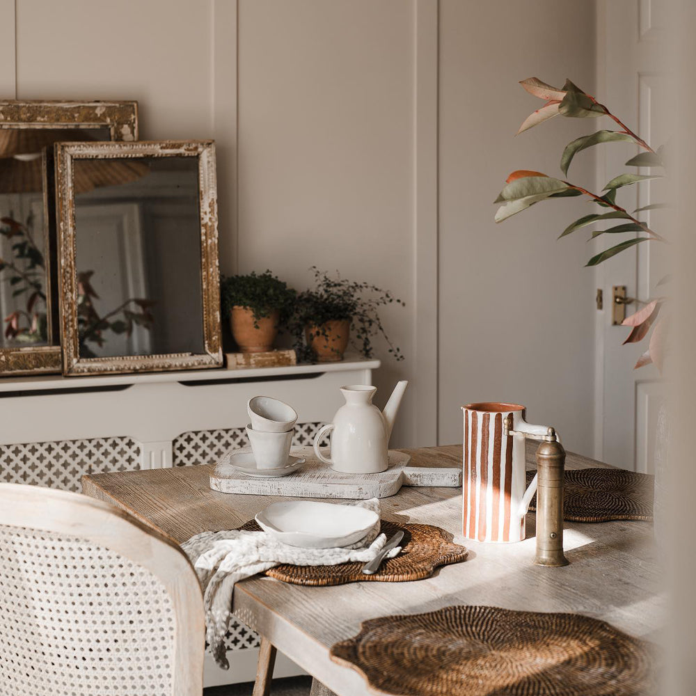
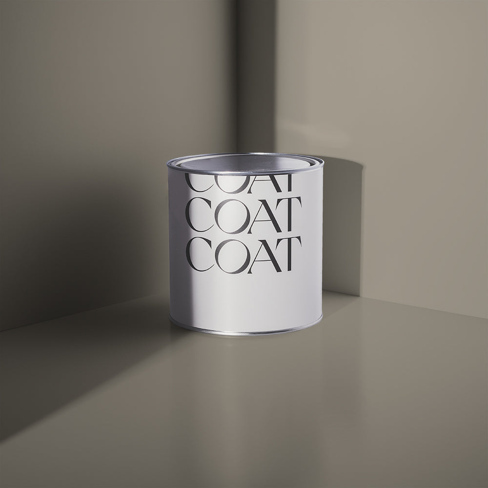
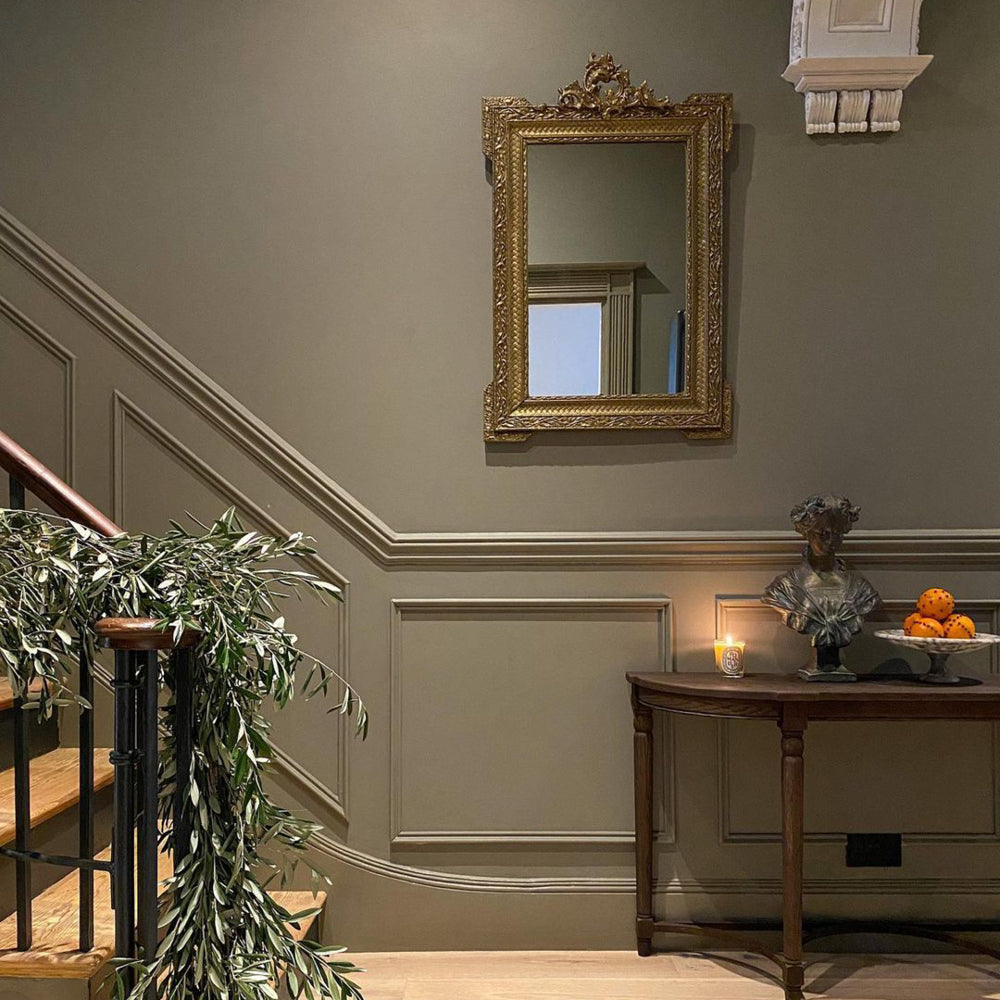
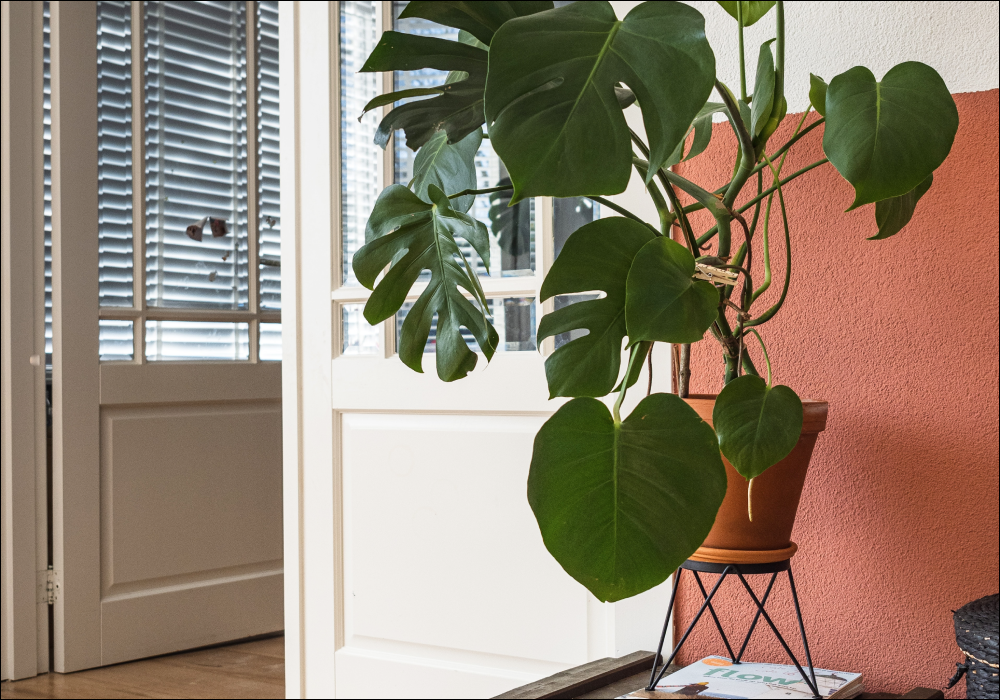
This timeless COAT taupe is an all rounder for the whole year. A bit grey and a bit brown, this mole-like colour is perfect for those looking for earthy neutrals for interiors or exteriors. The perfect partner for red brick masonry or for your growing terracotta plant pot collection, Sunday Soul makes every day feel like a day off. It’s just a really laid back, effortless neutral.
For interiors, use on walls with Modest woodwork and ceilings and if you’re looking to add some drama, use Cold Brew or Gumption on any bookcases or built-in furniture. It’ll look really classy.
Feeling inspired by these calming neutrals, check out the entire Spring Edit here.
Hello Vera

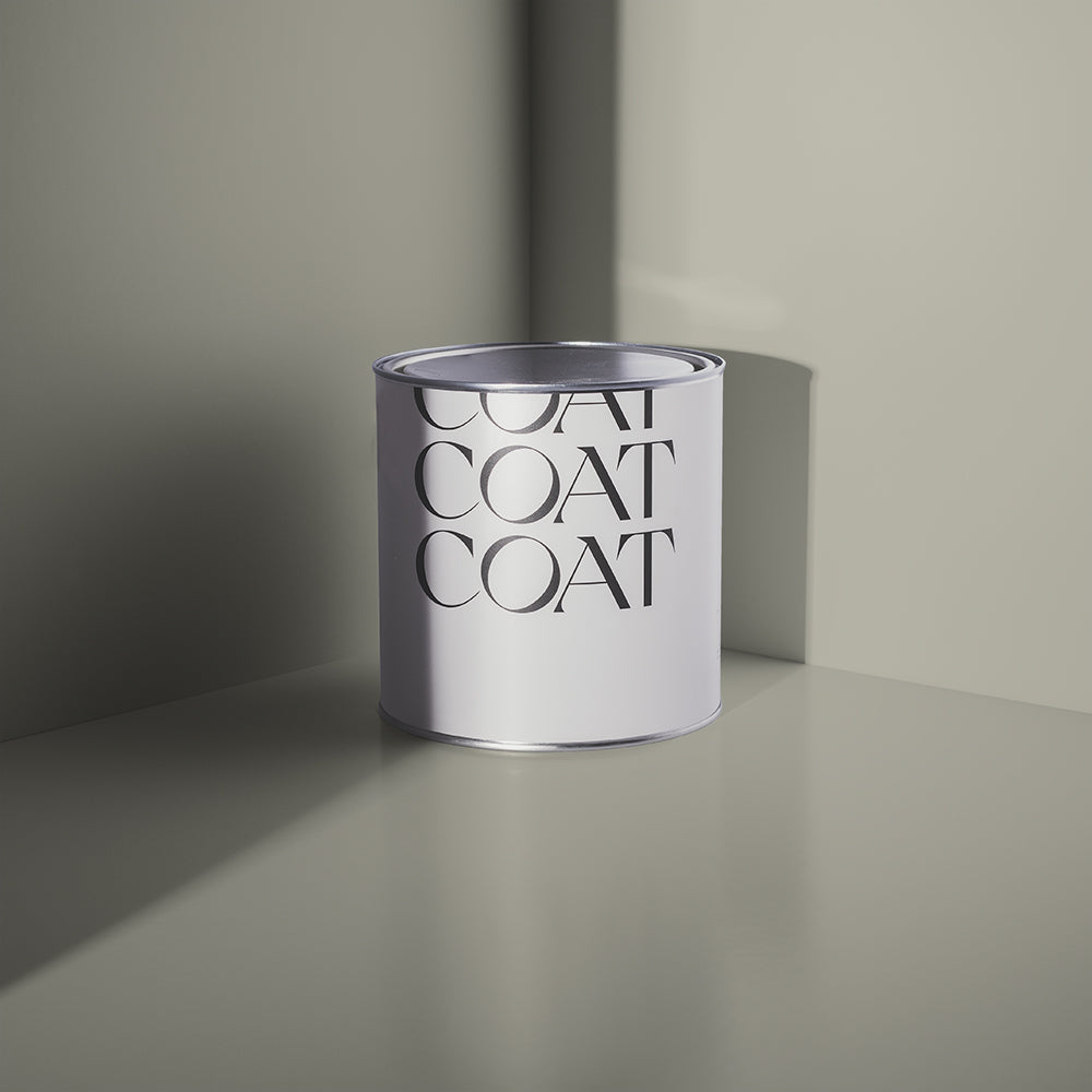
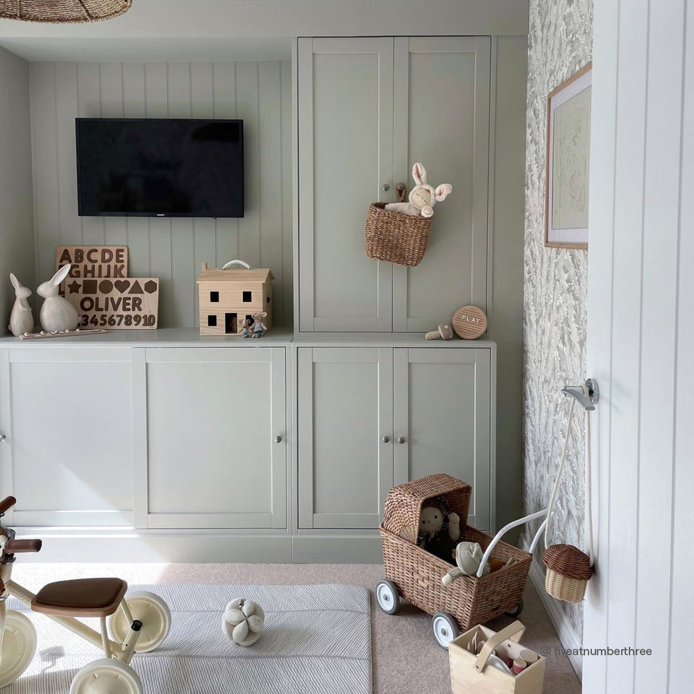
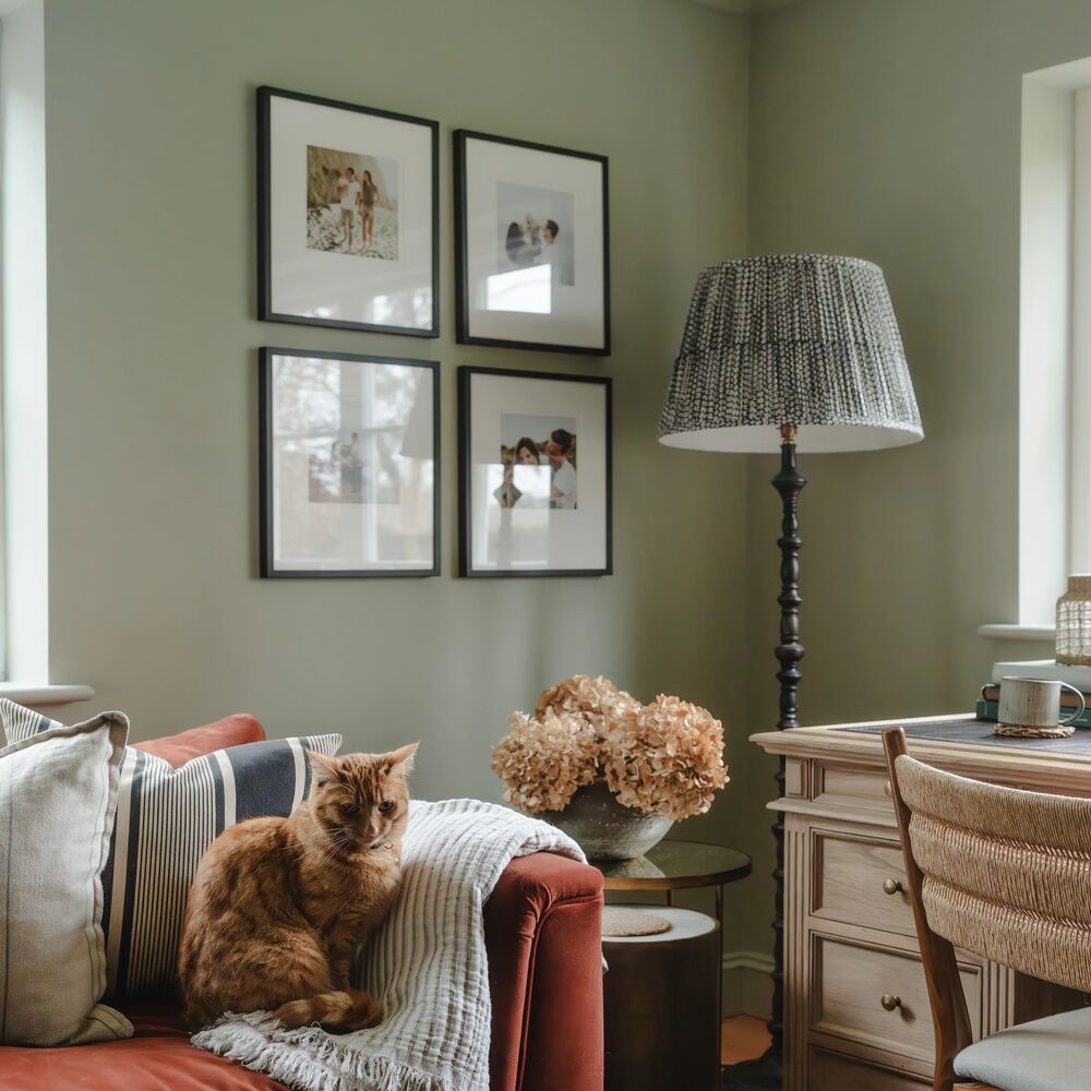
Hello Vera is a pretty unique light green. It’s quite traditional because of its beige undertone. It’s the perfect Spring colour because it’s uniquely balanced between warm and fresh. Works as a pale light green when paired with ceilings and woodwork in 100% Maybe, for a super relaxed, Japandi scheme with a vintage feel.
For a more modern approach, use as a ceiling colour when paired with more saturated yellow greens, like Pan or Nomad. This will help to keep some brightness in the room, without creating eye-watering contrast lines with a brilliant white.
Park Life

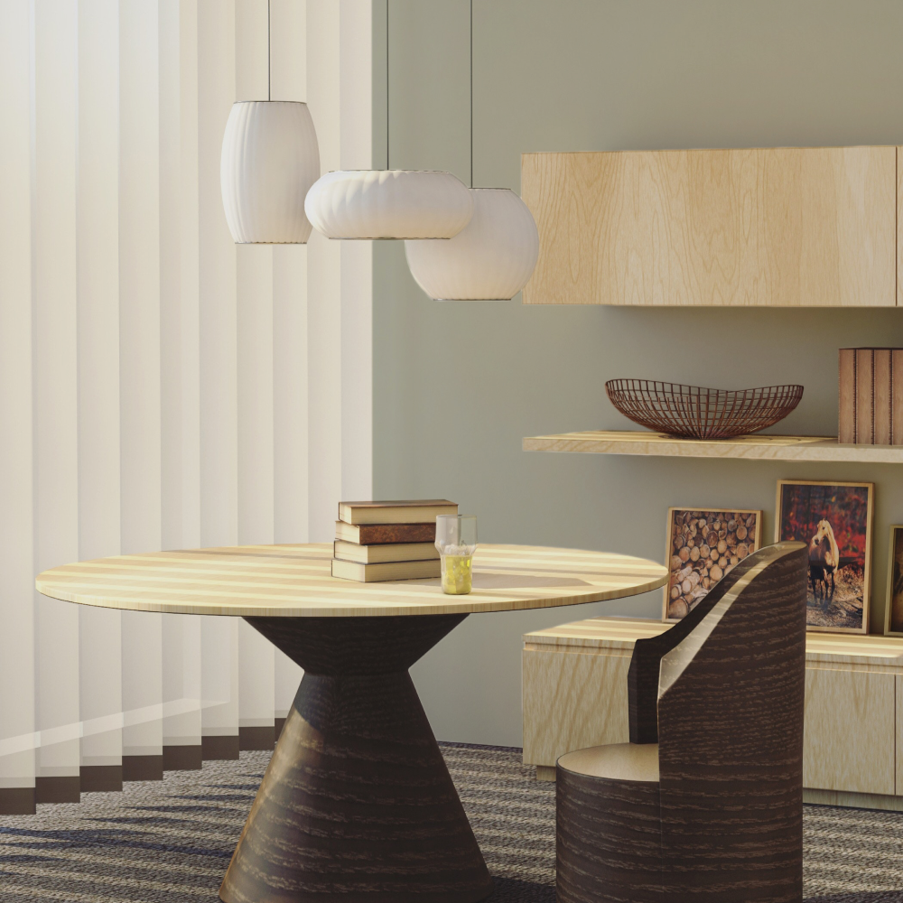
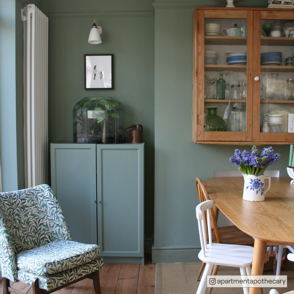
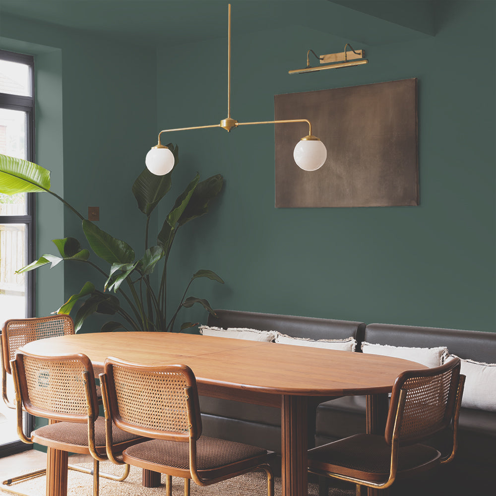
Green screams spring, @katyormeinteriors colour drenched her dining room in sage green Park Life.
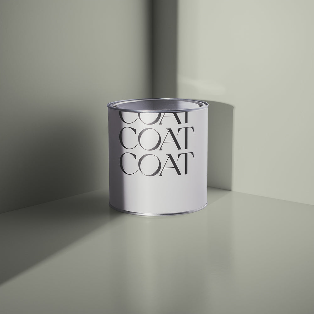
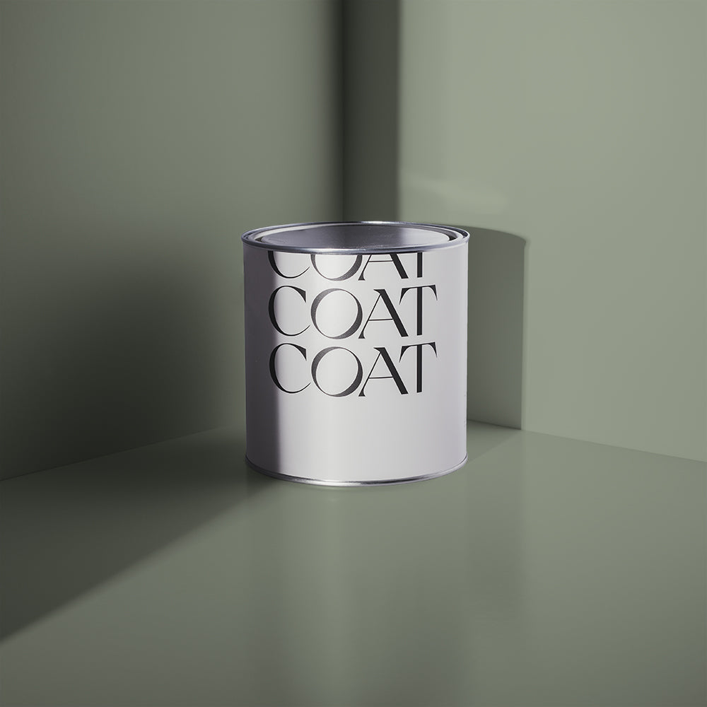
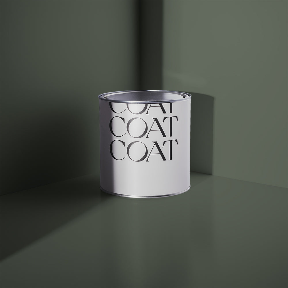
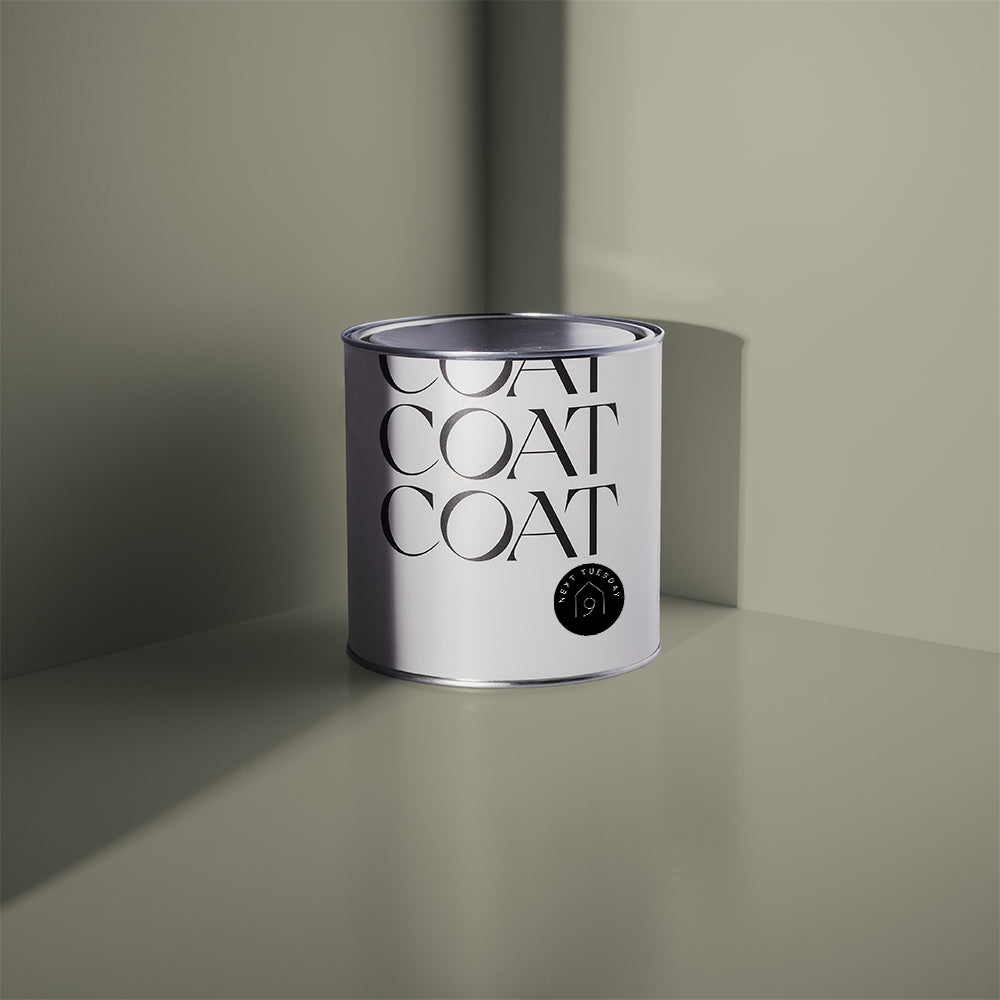
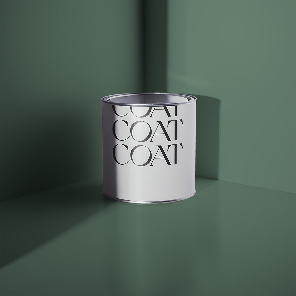
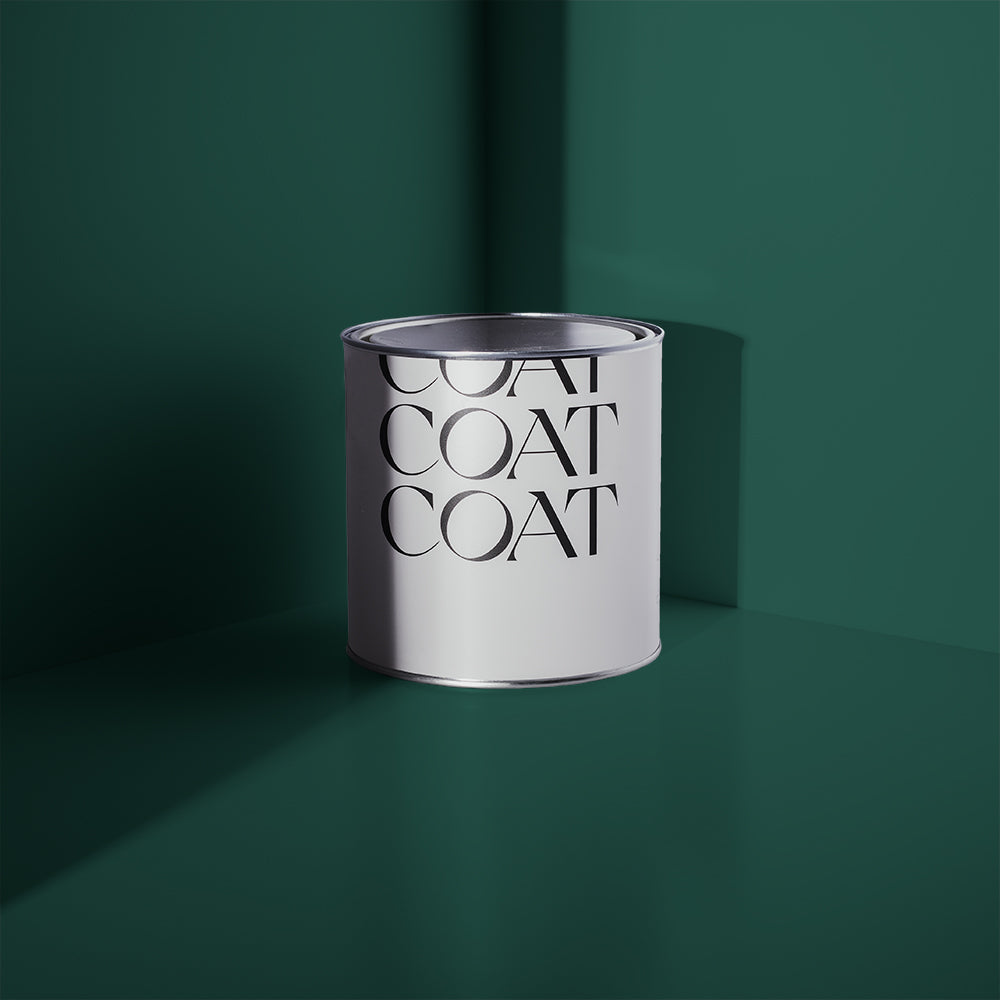
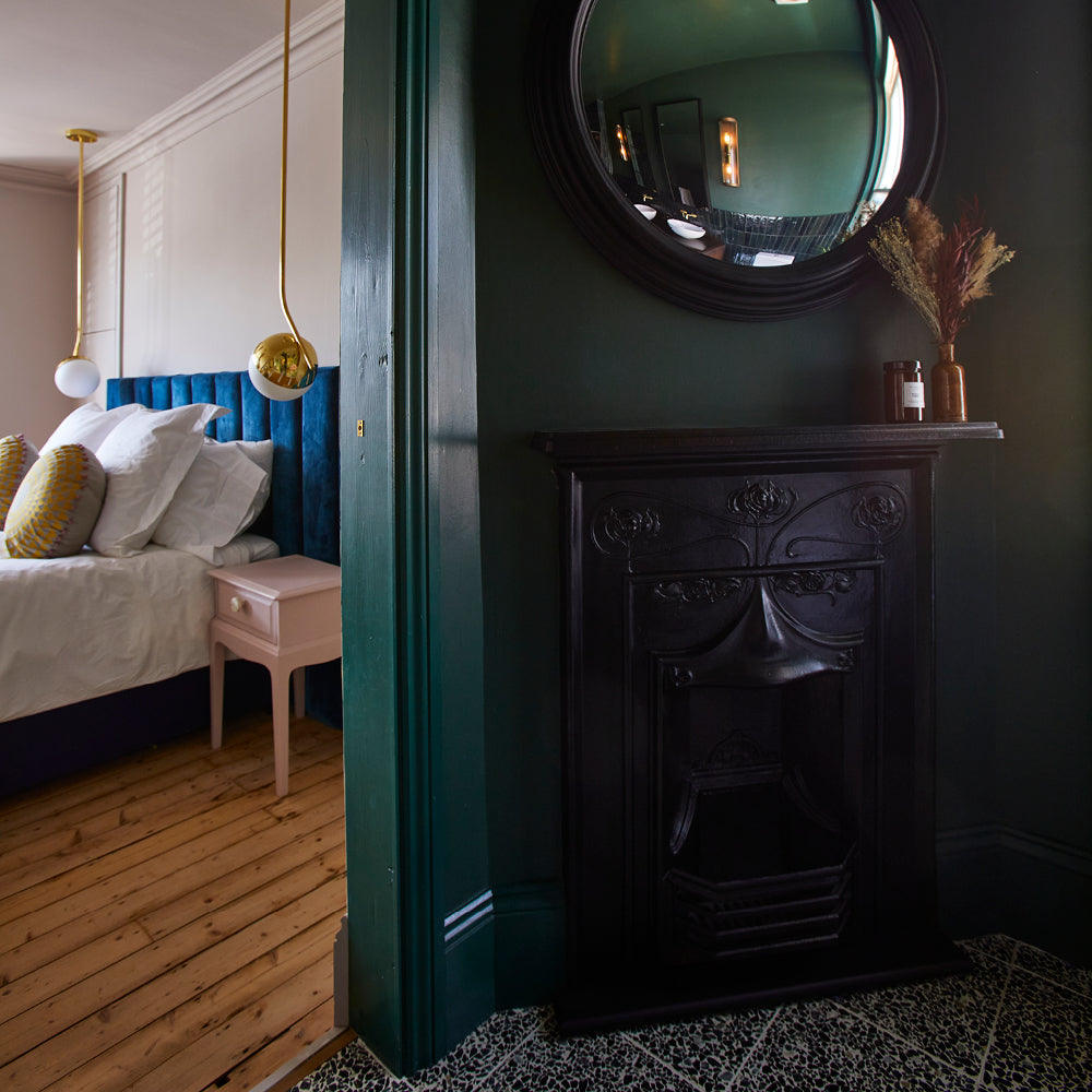
Our sage green, Park Life, is a reminder that it’s time to get back outside again. Grab your mates and some tinnies and get your chill on. Park Life is a relaxed and saturated green, but does have just a tinge of greyness to it. Pair with darker woodwork in Brewer, a dramatic, dark emerald green for a Spring makeover that will make your mates green with envy.
Park Life also looks great with Safe Play, try a half and half wall divide in a nursery for a calming, natural space. This biophilic design works really well with warm woods and lots of natural materials that are currently trending in environmentally friendly parenting designs.
Loving these fresh green shades? Check out the full Spring Edit here and shop the look.
Axolotl

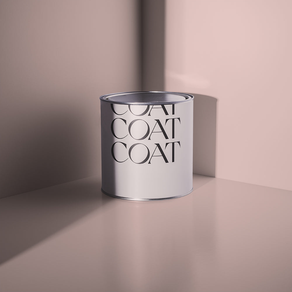
Google search Axolotl and you’ll instantly know how this colour got its name. We’ll stay right here… Now that you’re back from your hour long axolotl detour, hopefully you’re encouraged to look at pinks. This sophisticated pink is our palest pink, with a delicate greyness to it. The ideal off-white for use with our darker pinks like Ciao, Sofia or Mrs Bouquet but makes for a stunning contrast against royal blue, 2AM. If you’re looking for a bright, warming neutral then consider Axolotl, but pair with Algorithm woodwork. Pairing with a cold, pale grey will warm up the Axolotl and make it feel more inviting.
Shampoo & Set

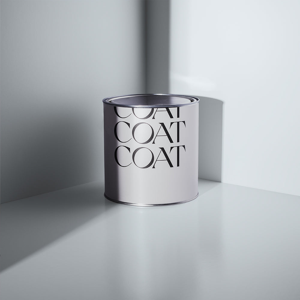
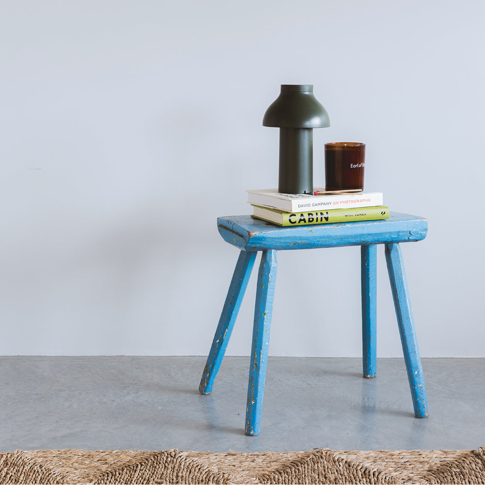
For Spring, leaning into this year's signature colour Digital Lavender should definitely be a consideration. Our more muted version, Shampoo & Set creates a sleek look that adds a shot of subtle colour. Try Algorithm on the walls with Shampoo & Set woodwork. This look will create subtle vibrancy that feels cool and modern and light on drama. If you’re looking for lavender toned walls, use this colour with complimentary off-white, Pablo (a putty-ish white that has a lilac undertone) to add just a touch more warmth.
Are pink and purple tones a bit of you? We don't blame you...check out the full Spring Edit here.
Feeling inspired but need a little more help? Book a colour consultation to get more tips and advice.
Publish Date
Author







Leave a comment