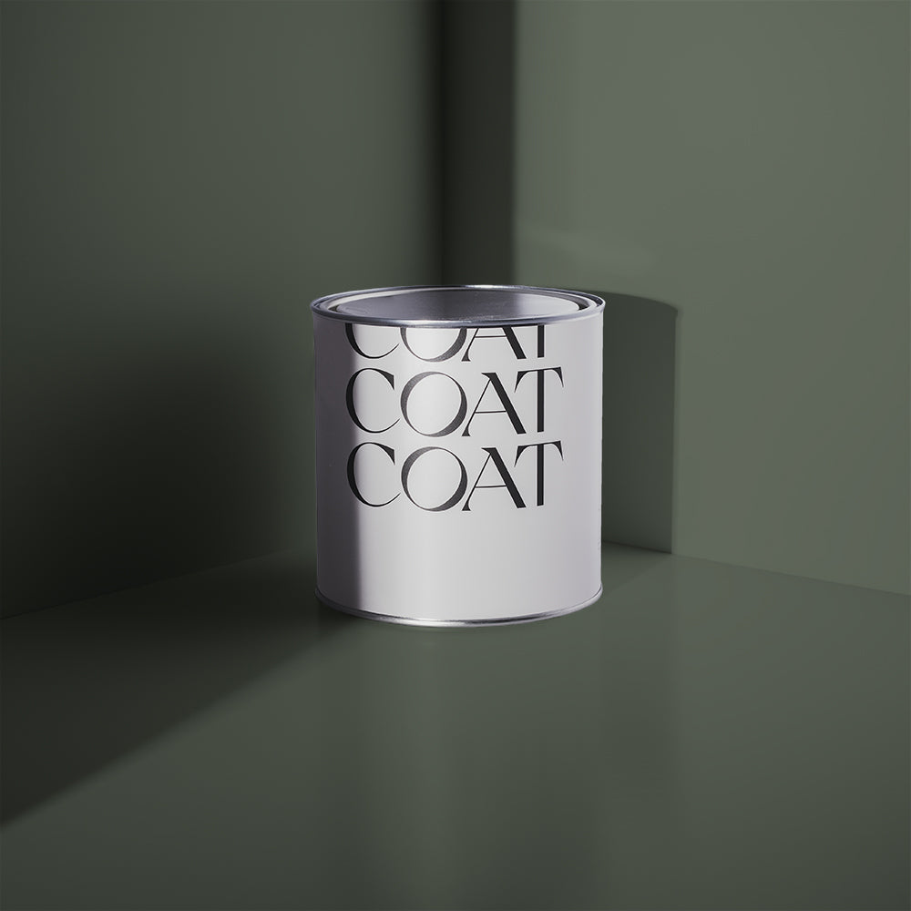
New Greens, A Walk in the Park
We’re celebrating all things green as part of the release of our new 2022 colour palette. We’re gonna take a look at some of the green spaces that have inspired the COAT team when creating our colours and how they can be used in your home too 🍃
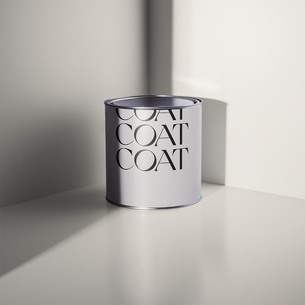
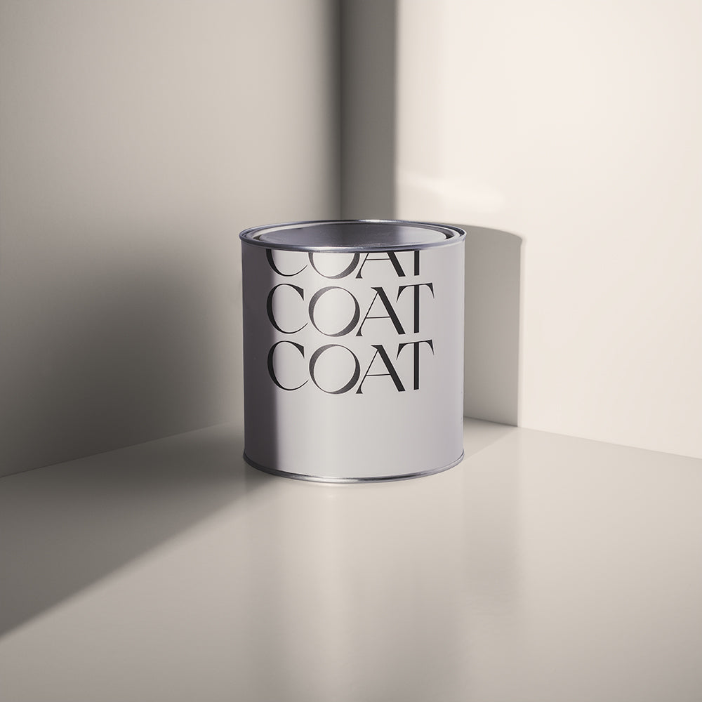
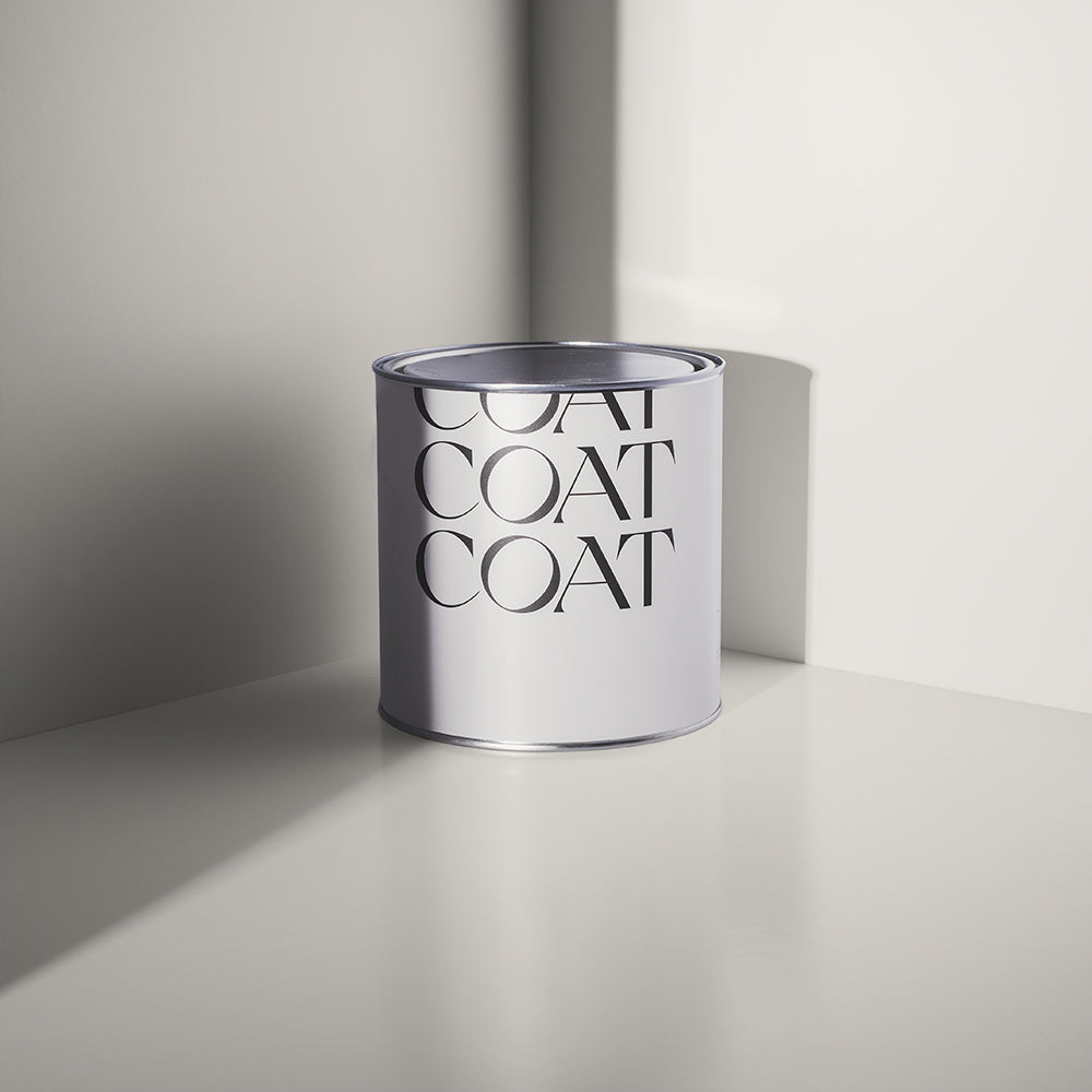
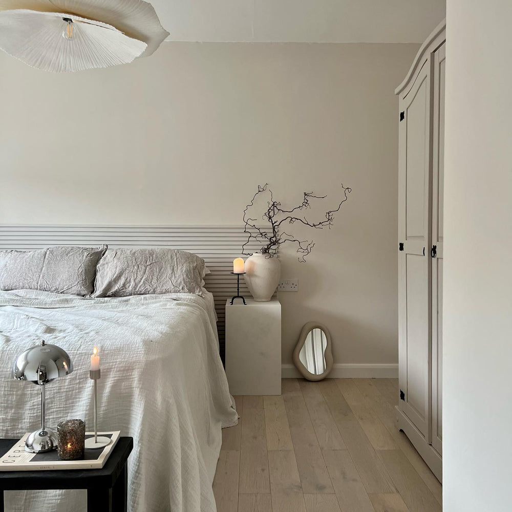
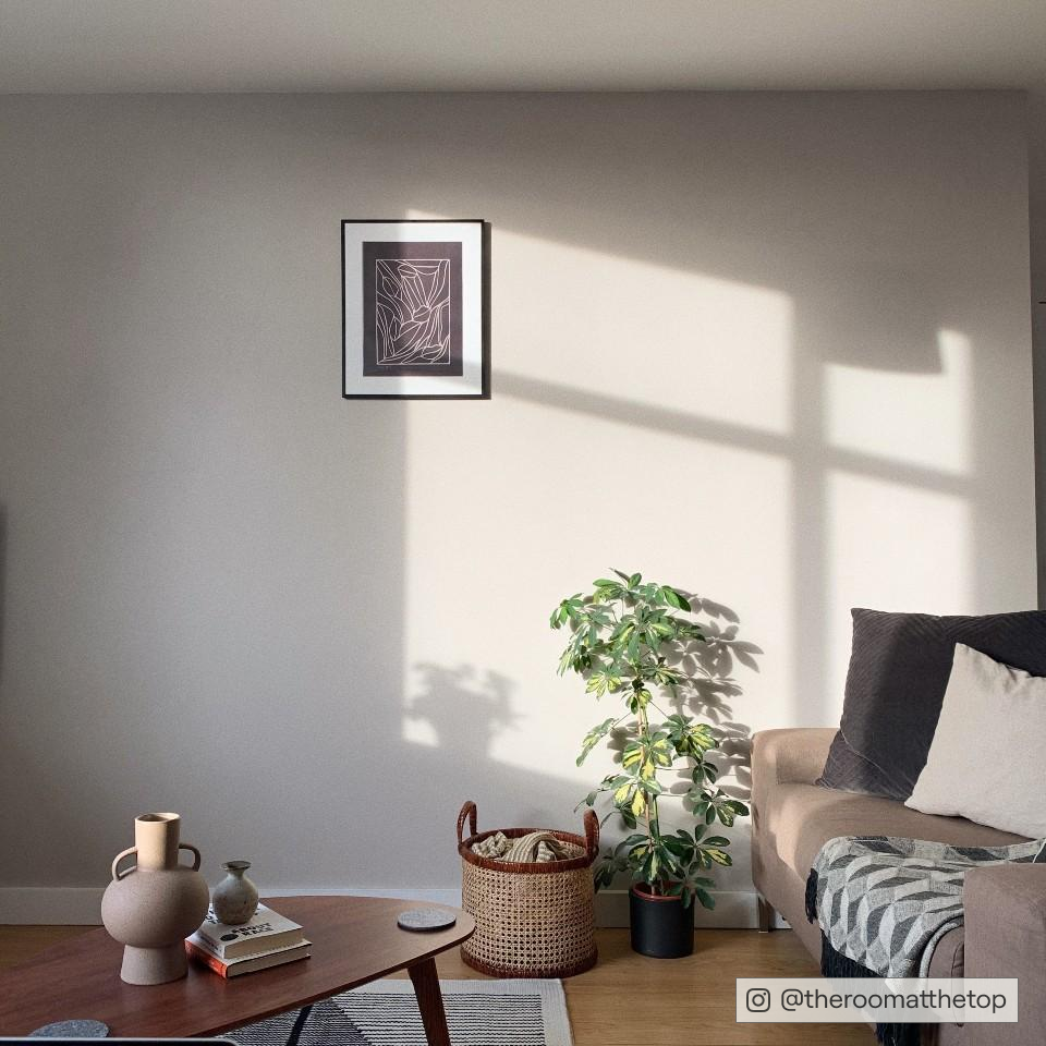
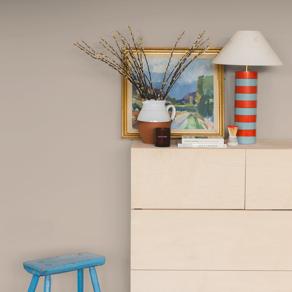
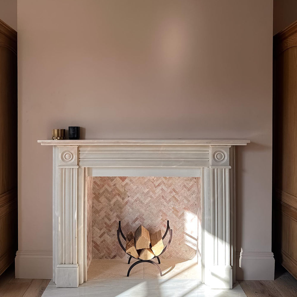
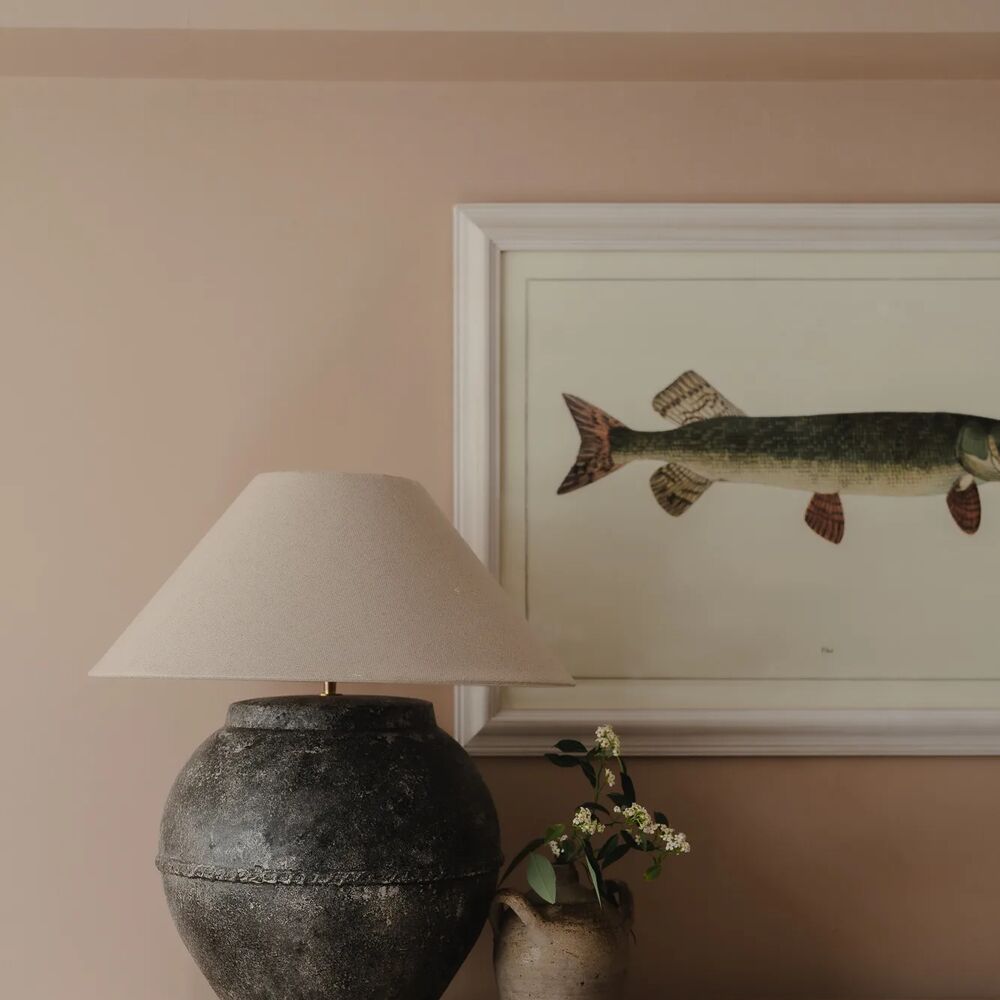
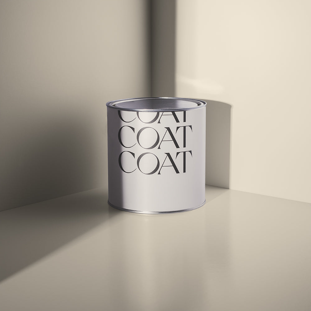
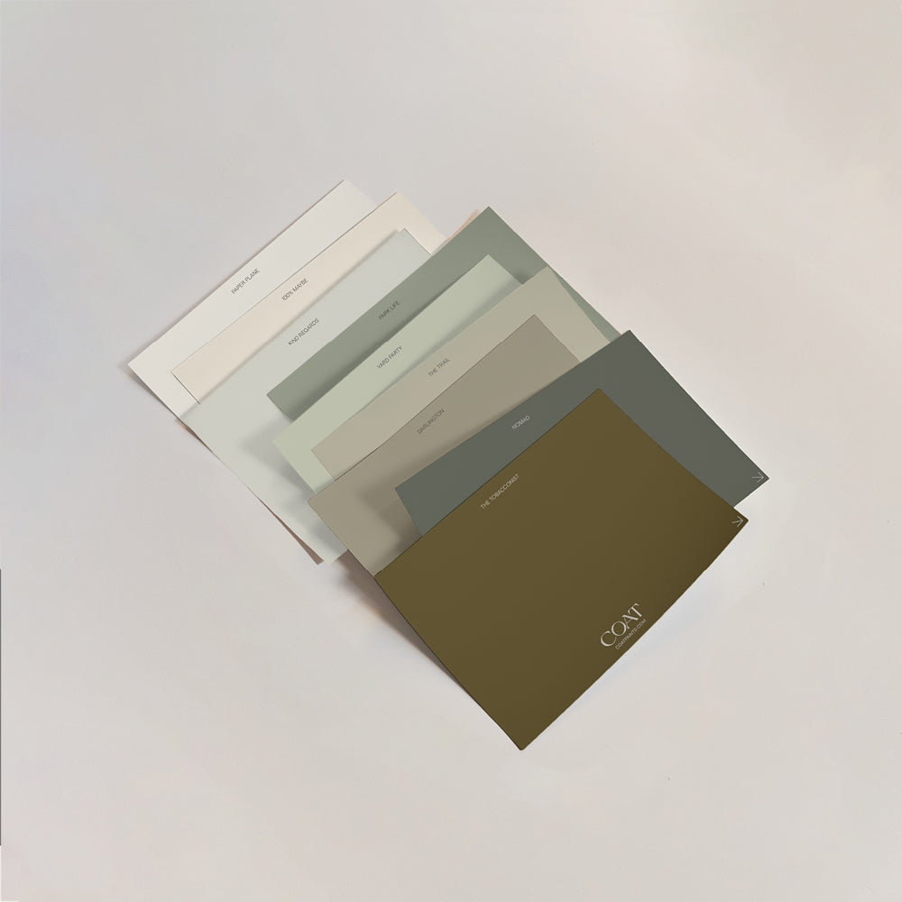
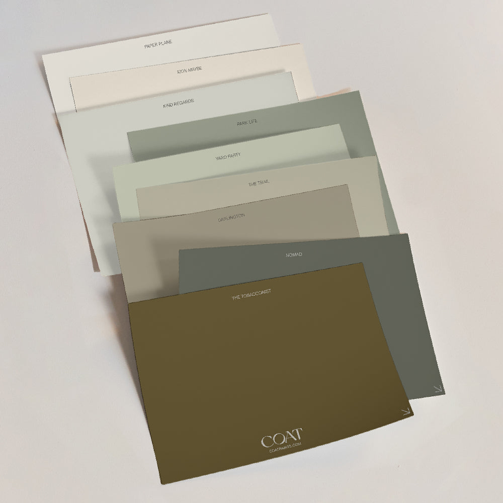
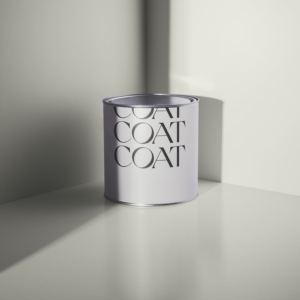
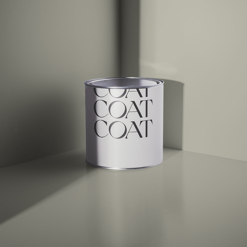
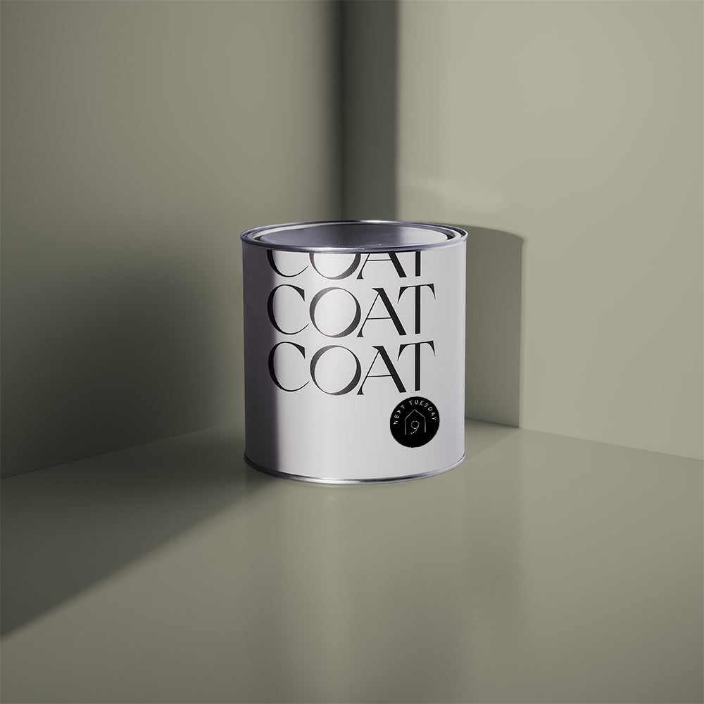
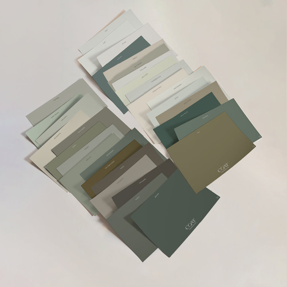
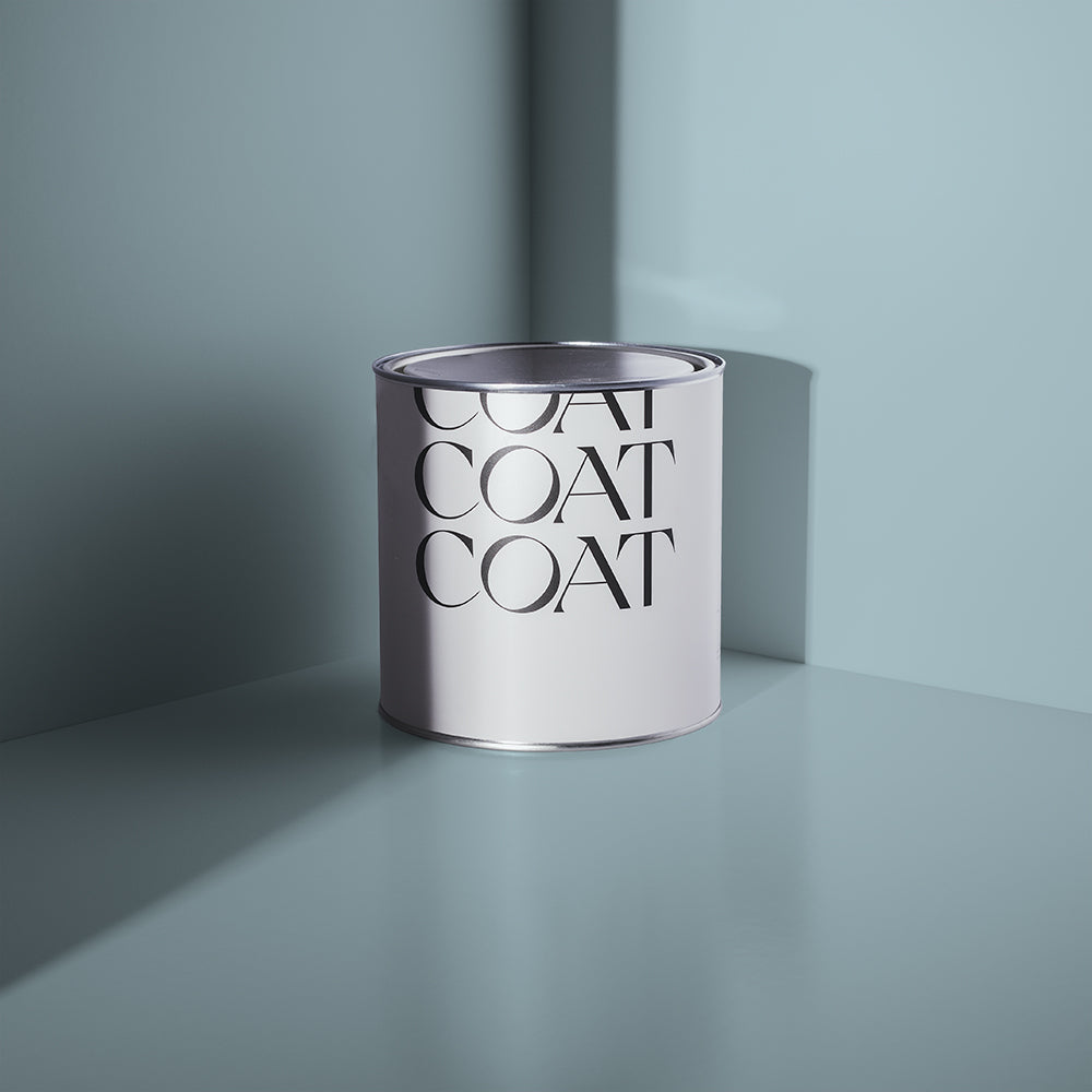
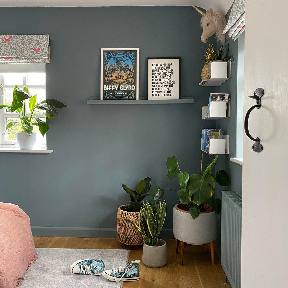
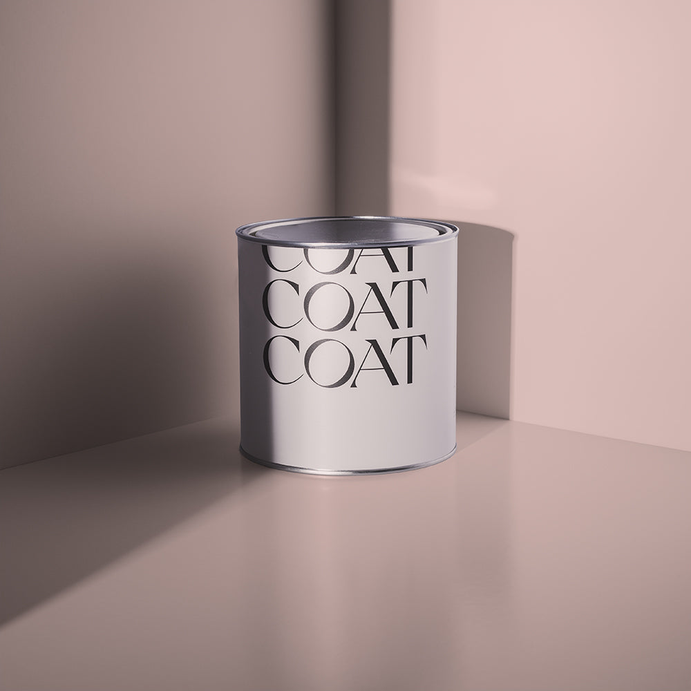
With Spring nearing, it’s time to get back outside again. Grab your mates and some tinnies and get to London Fields, a great space for a little sun (and shade on those particularly hot days). Park Life is our newest green, and is a relaxed but saturated with a shaded, grey undertone that reminds us to bring the outdoors in with us.

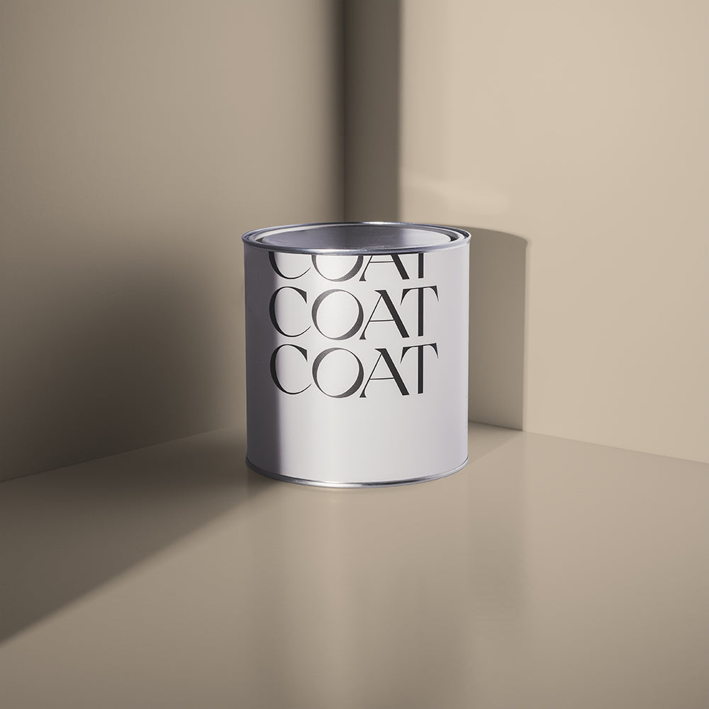
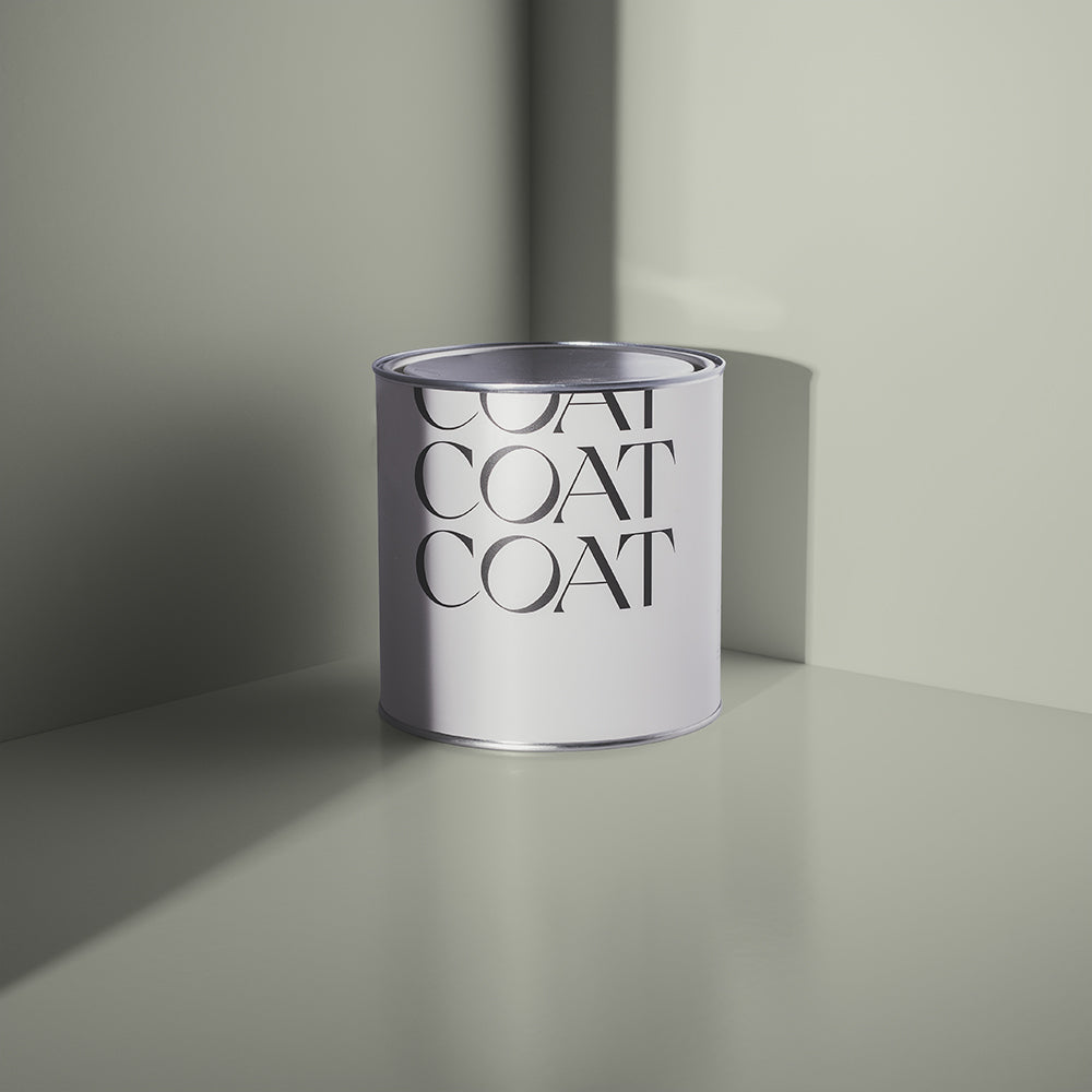
Yard Party is another brand new green for the COAT palette. It’s a misty, grey green, refreshing and uplifting like a mojito. This bright mixture of green and grey pigments reminds us of the contrast of the city skyline with the plants growing at The Culpeper Rooftop Garden on Commercial Street, London. A pretty, clean colour, garnish with houseplants and you have the perfect cocktail…

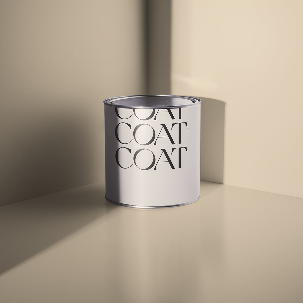
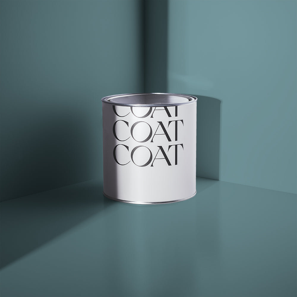
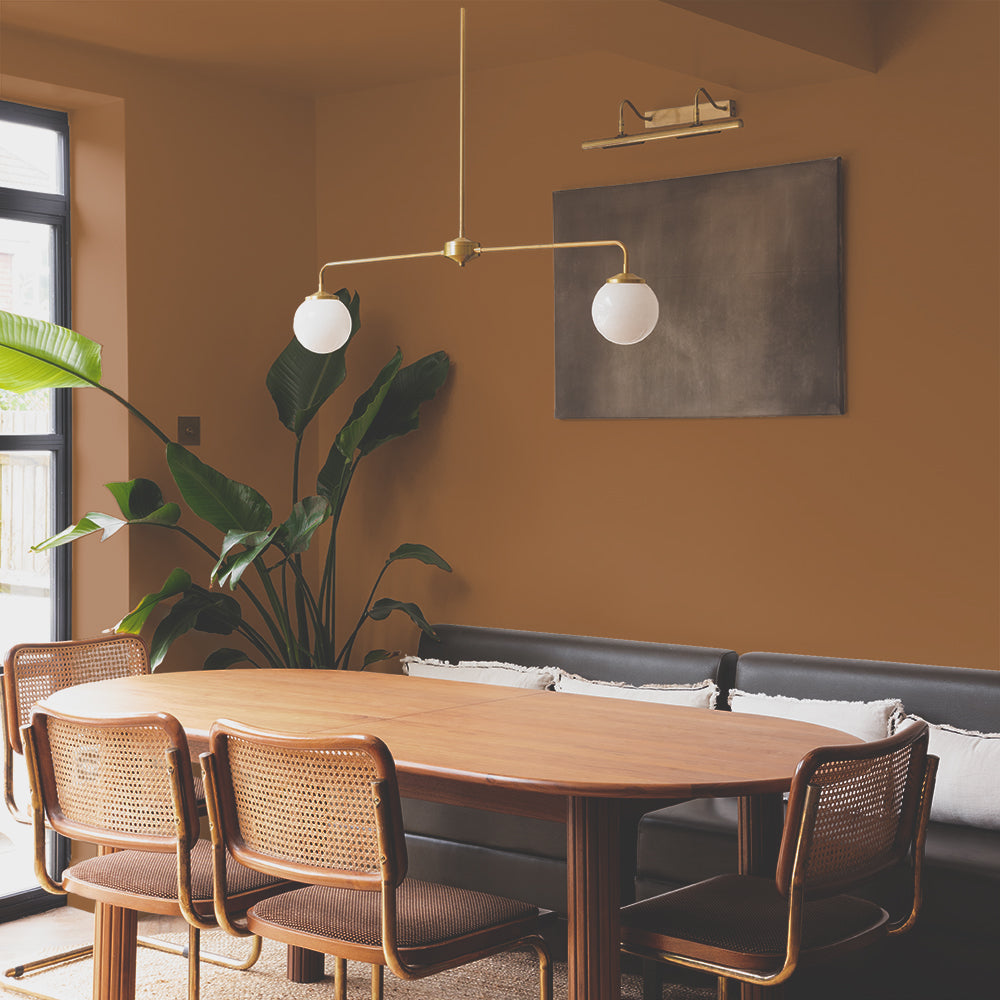
Brewer is COAT’s deepest green, with a soft grey pigment with surprising depth. This depth is from its additional blue undertone that is reminiscent of the lake outside the Wylam Brewery in Newcastle. A great spot for hanging out and at the south side of Newcastle’s Town Moor is a beautiful spot for a bevvie and also provides a great hike for you to go and look over the city afterwards... wear some hiking boots though, the footing isn’t quite as stable as this gorge colour.
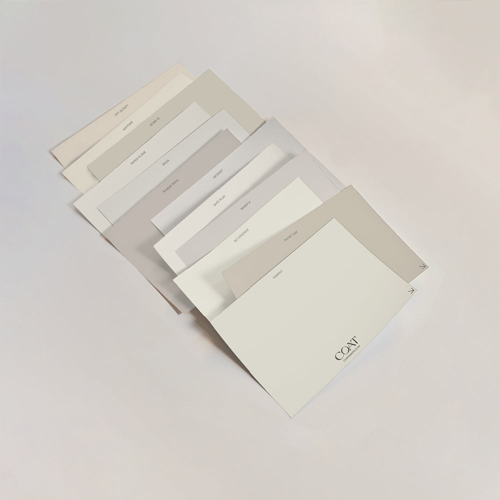
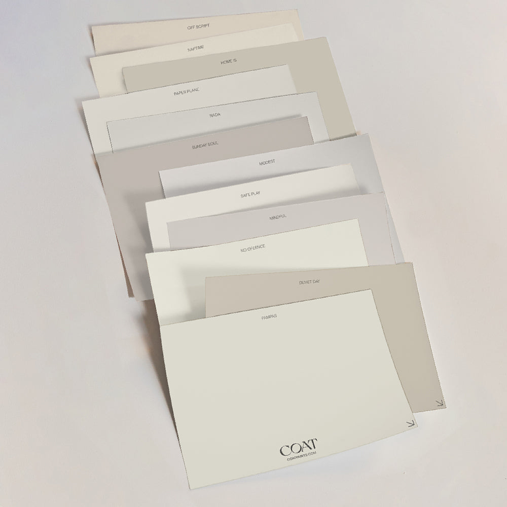
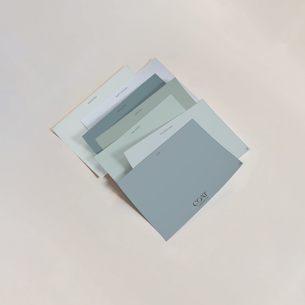
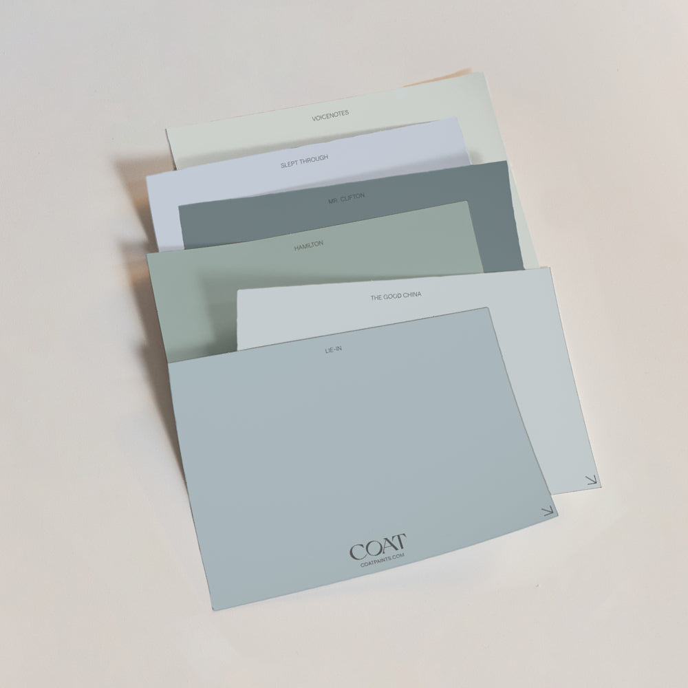
Need some help on how to pick the perfect green? Check out our blog.

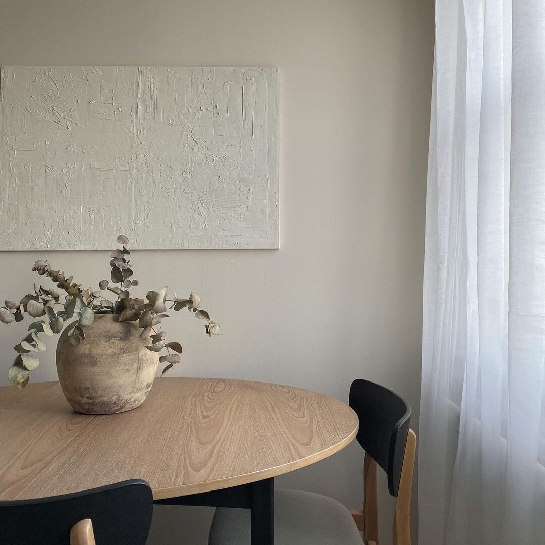
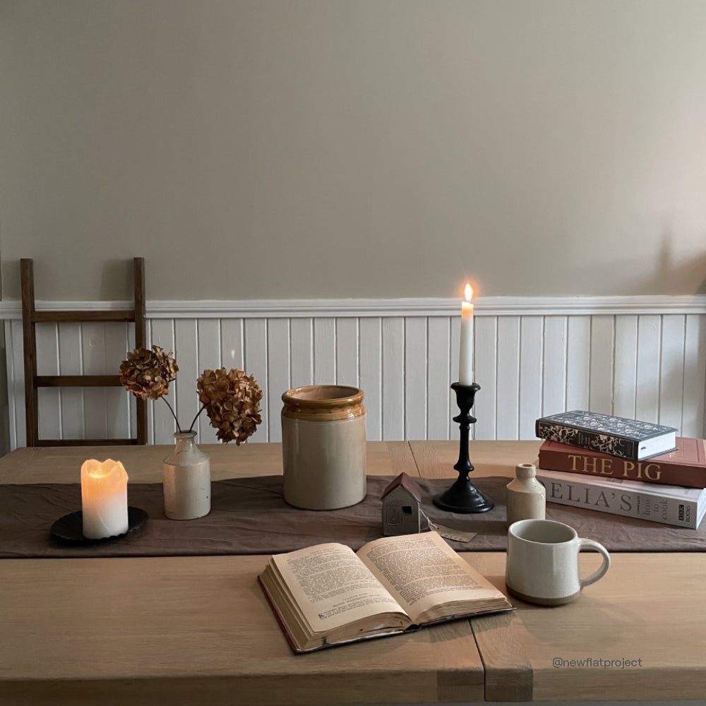
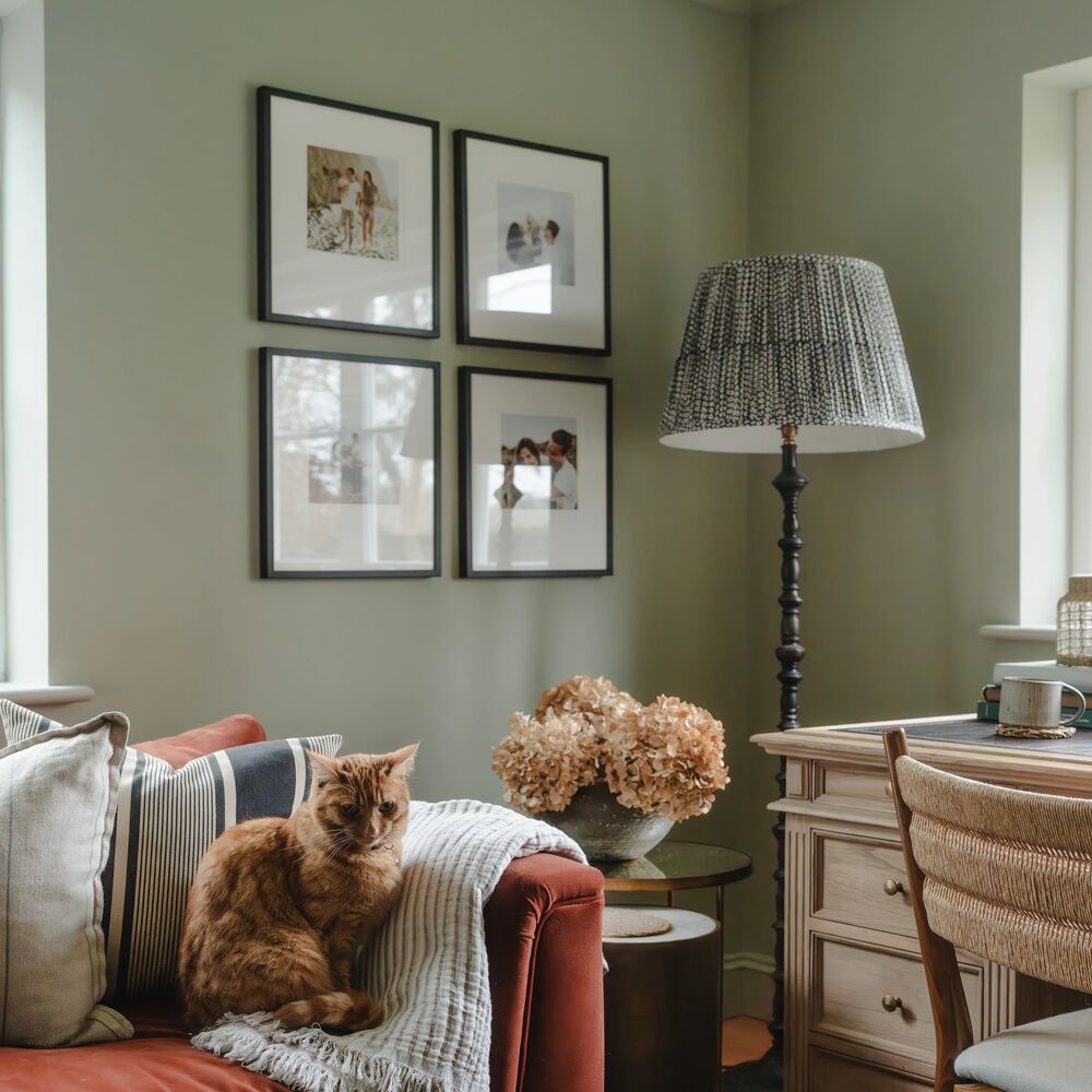
And Breathe is a yellow based green that is super popular at the moment due to its relaxed, peaceful nature. The perfect backdrop for japandi minimalist vibes, for a better idea of how this works in practice, the Kyoto Gardens in London’s Holland Park is particularly stun in early autumn. As the foliage surrounding the waterfall and lake begin to yellow, you get a great idea of how this minimal interior trend became popular. Explore nature at its finest and most zen from the comfort of your sofa.
Take some inspiration from Biophilic design and find out how to connect with nature in your interiors here.

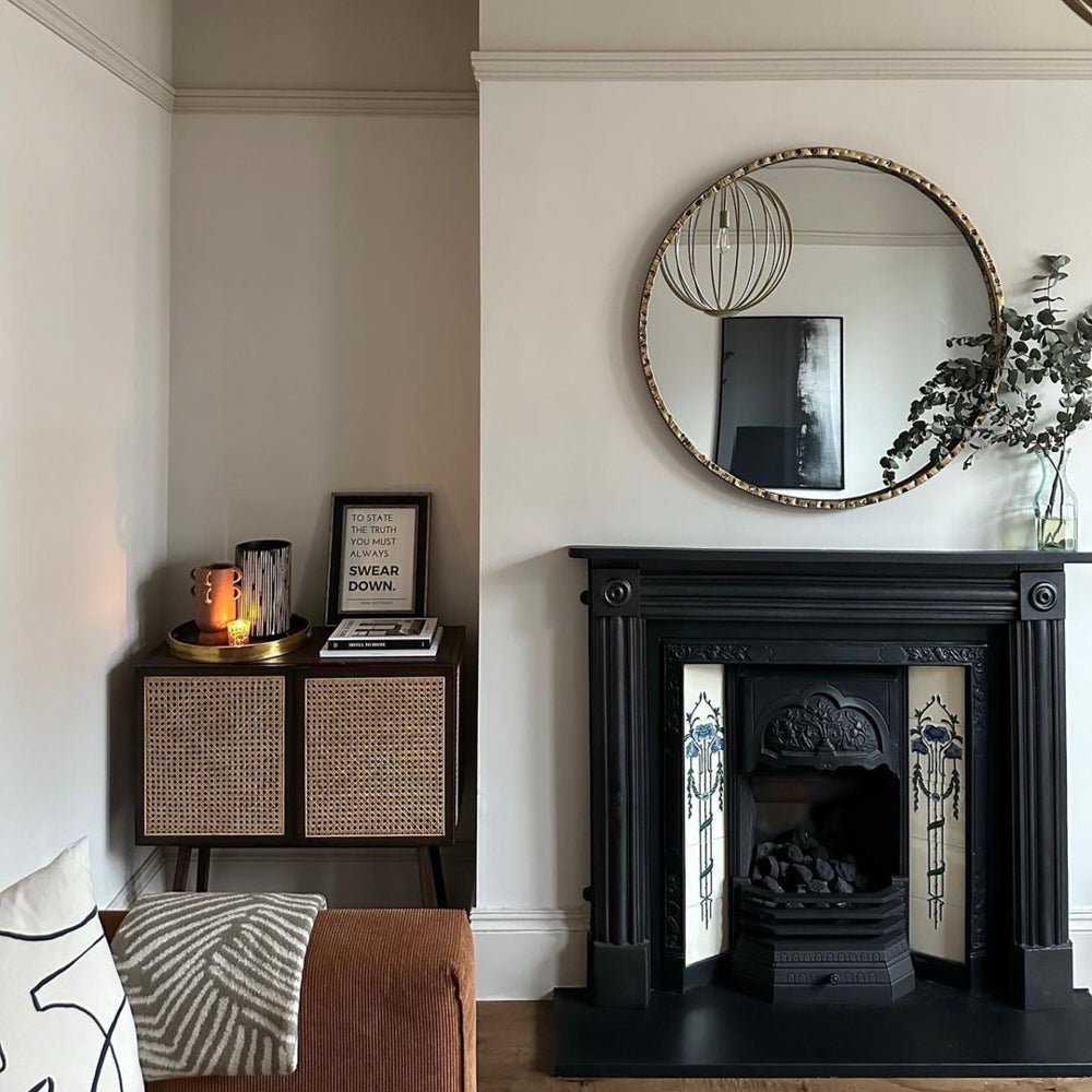
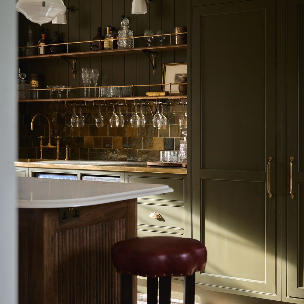
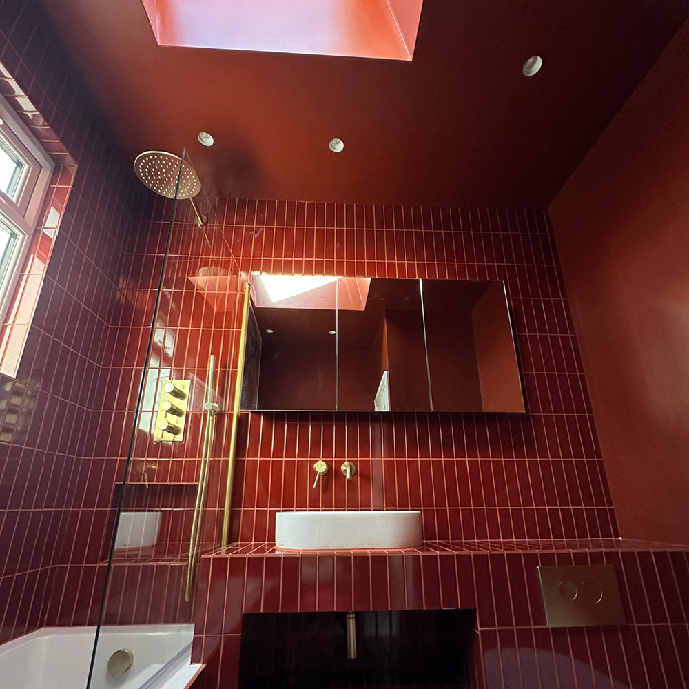
The Hauser & Wirth Gallery in Somerset in Summer 2022 will be showing the work of seminal sculpture, Henry Moore. This exhibition will be held across all 5 exhibition spaces, as well as some open-air displays too. To create a statuesque interior, inspired by the Mansard gallery that used to dominate the top floor of Heal's, use Mansard. our saturated duck green. Very slightly greyed, it creates the perfect backdrop for artwork. Pair with grey stone or cement sculptures and get inspired by Stonehenge in the same way Moore was.

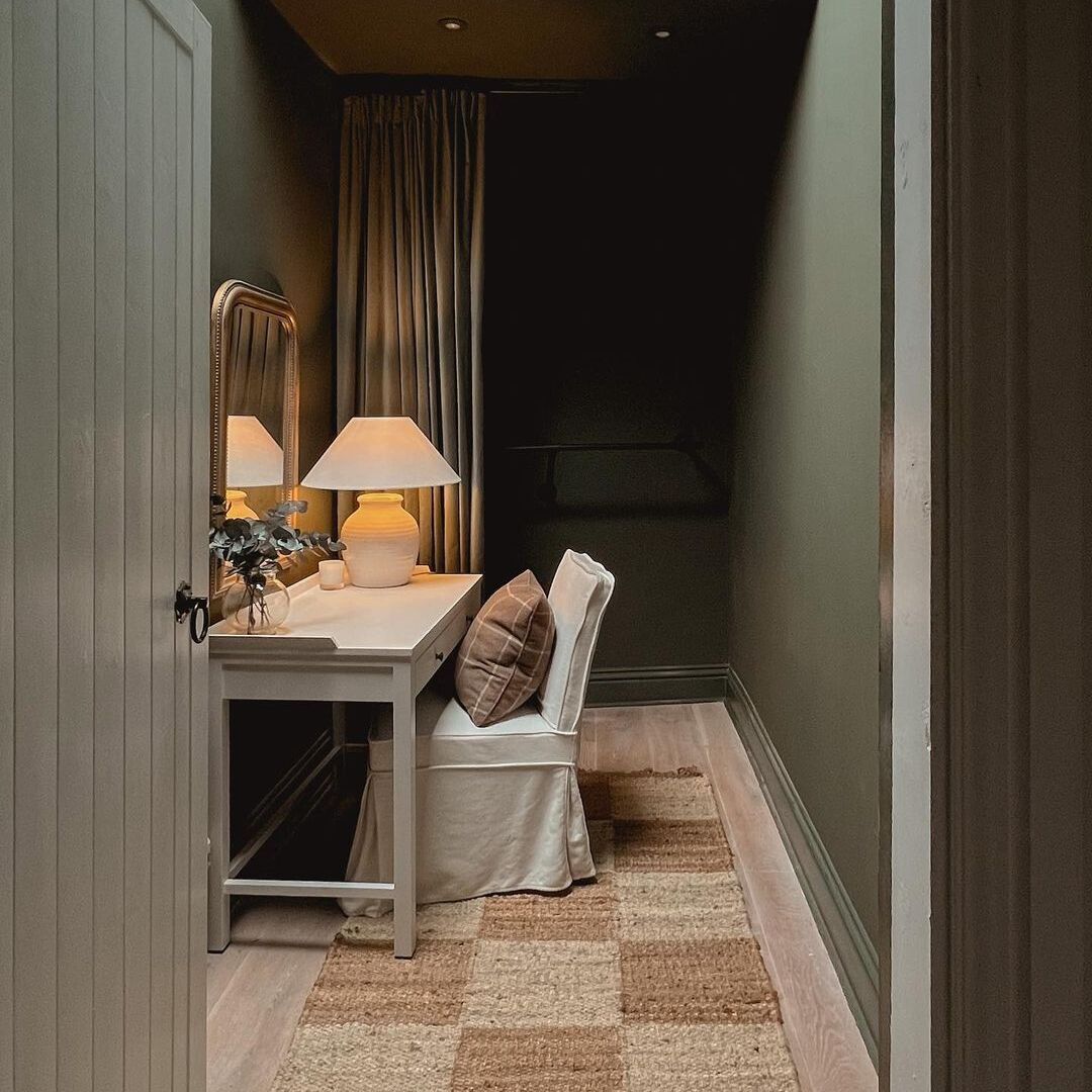
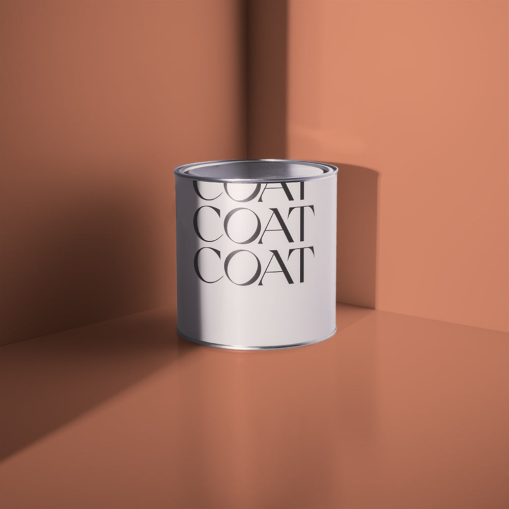
The white cliffs along the South Downs are a spectacular site. For those of you that are looking for a proper hike, this 79.2 mile adventure will have you exploring all nature has to offer. The clean white of the cliffs, the green of rolling hills, and the grey blue of the English Channel. To bring all of these elements together in your own home try using Rathbone Place. A bright, chalky, grey neutral with green and yellow undertones that reflects the nuances of nature.

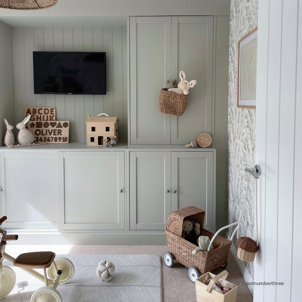
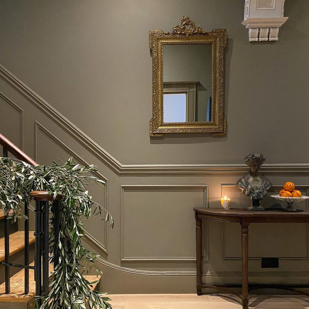
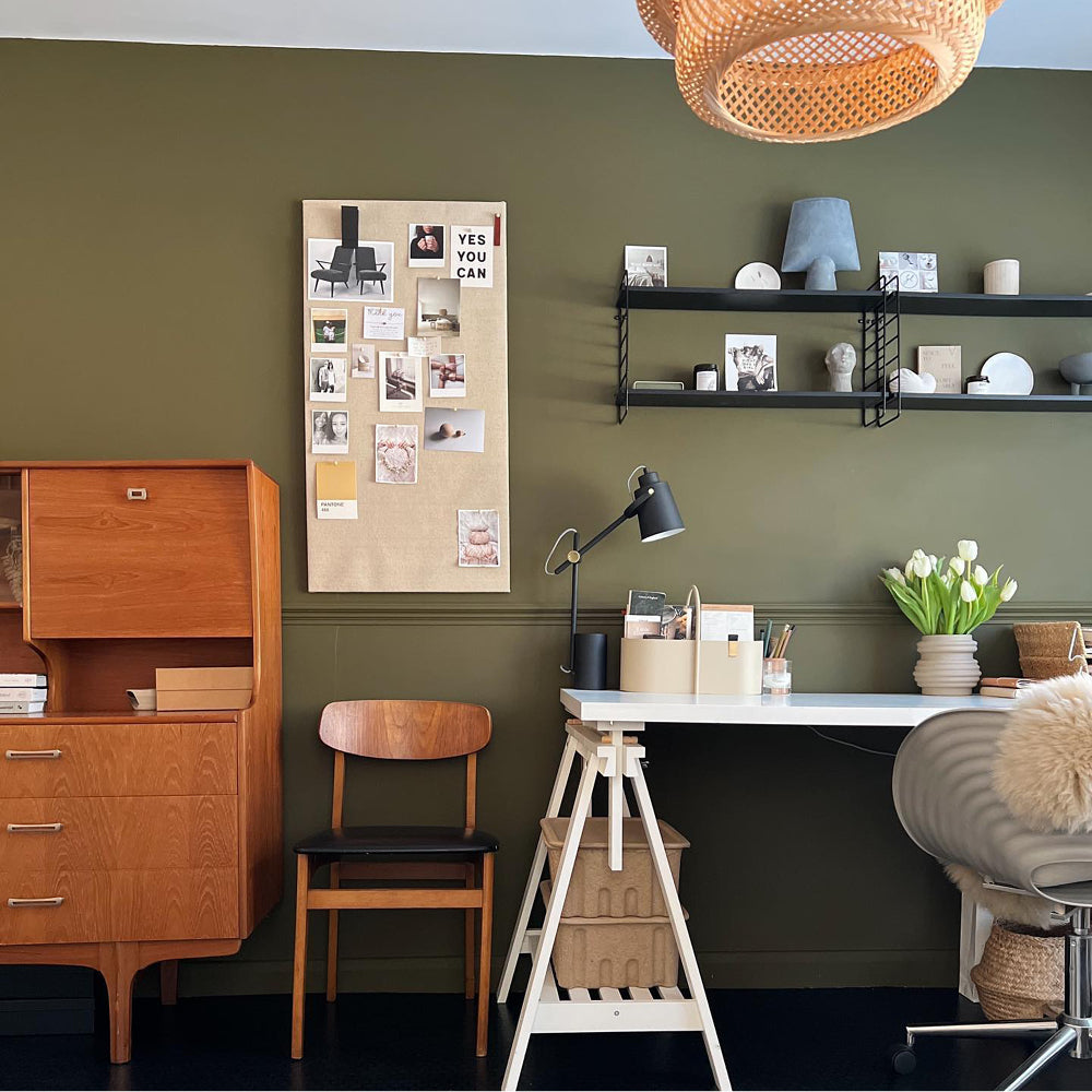
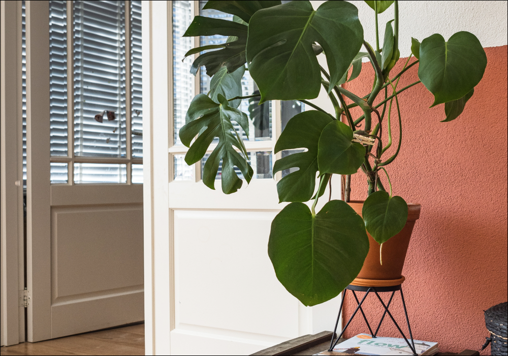
Darlington is a rather traditional green, shadowy and greyed, this colour feels antiqued and is particularly at home in period properties where it provides a great modern background for your plant collection. It’s regal appearance reminds us of the bountiful botanicals of Blenheim Palace, which has a fantastical hedge maze. Go get lost in the greenery...

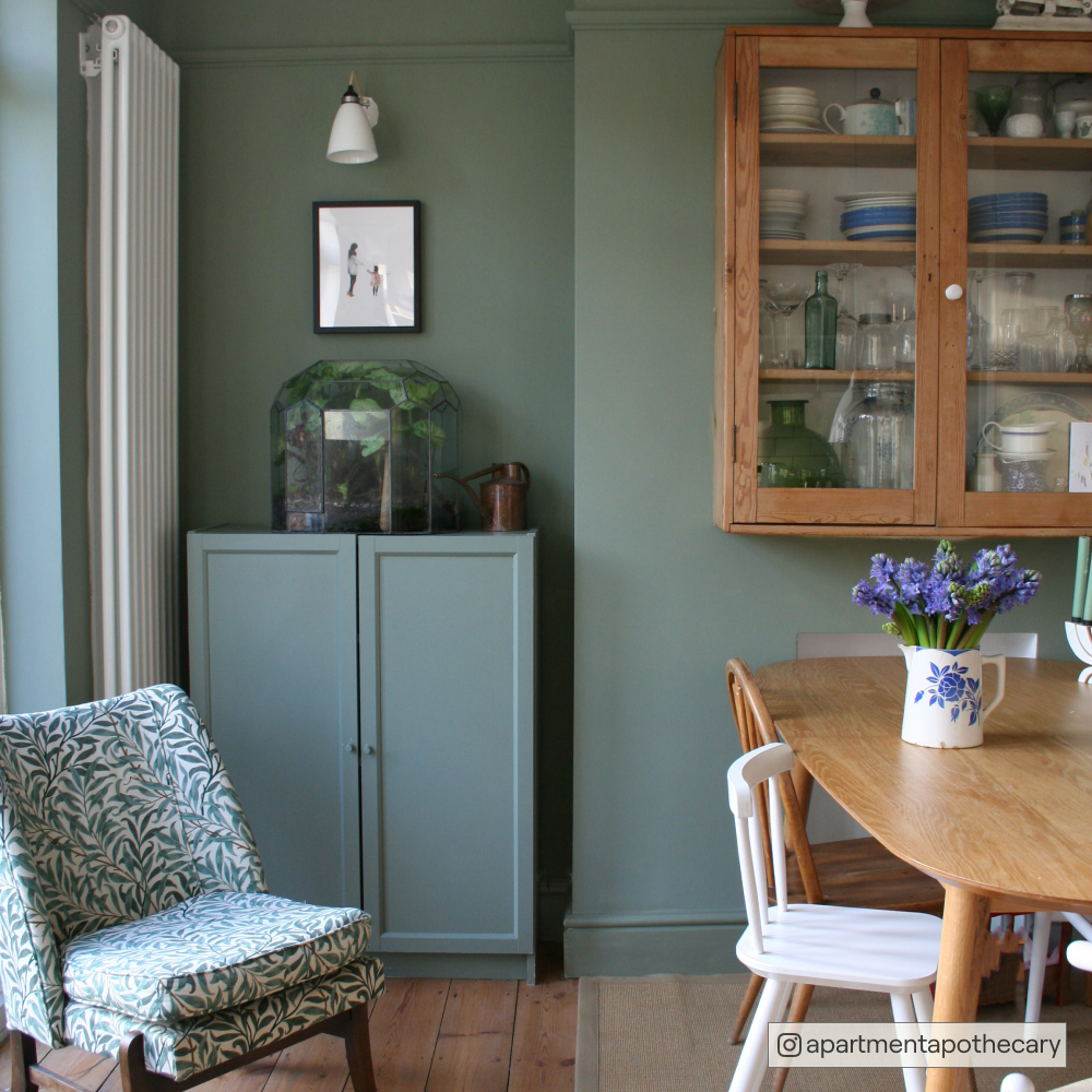
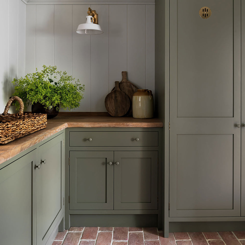
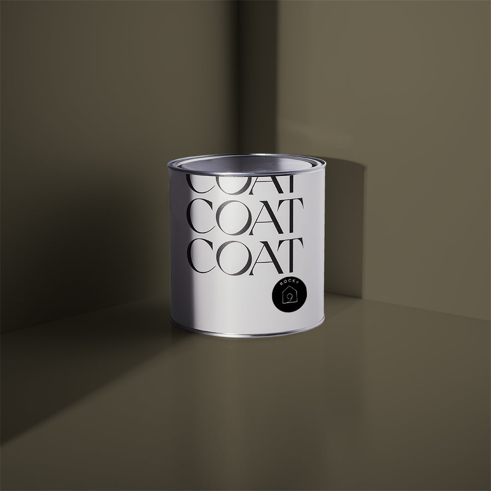
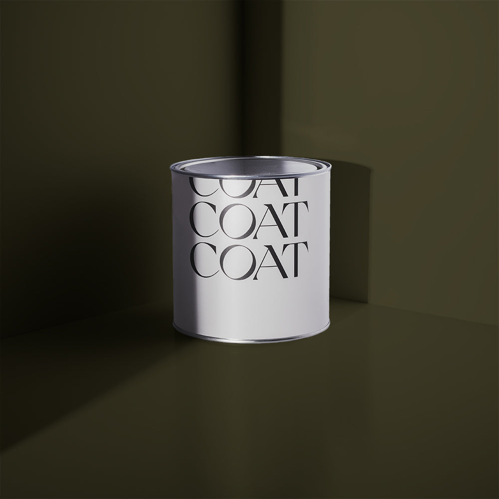
Winnats Pass is a wonderful wander. 350 million years ago it was submerged under tropical seas, and subsequently was carved into the windy Peak district valley, that it is now, by a melting glacier. The valley is a Site of Special Scientific Interest as it’s home to many rare plants and the fossilised remains of sea creatures. The valley creates deep shadows, allowing the green among the limestone to appear deep and enticing, just like our deep olive Nomad. Ever so slightly greyed, Nomad may initially seem like an isolated colour, but looks fantastic with most of the COAT neutrals. Use on woodwork or furniture for a dramatic, solitary lowlight.

Stourhead in Wiltshire has a world-famous garden designed by Henry Hoare, where the blue water meets greenery in a sophisticated manner. Much like the beloved COAT fave, Adulting. A deeply dramatic, grey, green blue. This colour has too much going on, so it’s naming is pretty apt. The view of the Pantheon from the Palladian Bridge on the Stourhead Estate is guaranteed to impress, and in the autumn is even more arresting as the planting erupts into scarlet reds.

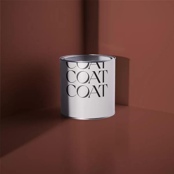
You know the brief by now, go to the Co-Op, grab a suitcase of wine and a babybel and head back to number 10. Remember though, it’s a work event until you “Ditch The Tie”. A traditional, deep green that’s reliable, due to its blue undertone, and means this colour is stable in most lighting conditions, unlike the current cabinet. For all of our political pettifogging, we can’t deny the Downing Street Gardens do look beautiful, and there are sometimes ballots for you to enter to go and have a nose.

For the adventurous, Grizedale Forest in the Lake District offers a huge variety of cycling and mountain biking routes. The blurring of surrounding greenery with sun shining through inspired our new green grey - The Trail. It’s a mid toned neutral that looks at home with deep, more saturated greens, but also is a dramatic accent for fresher colours like Yard Party. Now you’ve got the low-down on how to bring the outdoors in, it’s time for you to get on your bike and to paraphrase RuPaul, “walk children, in nature.”

Publish Date
Author