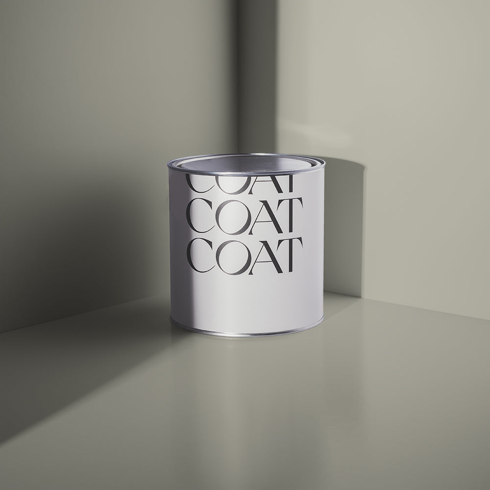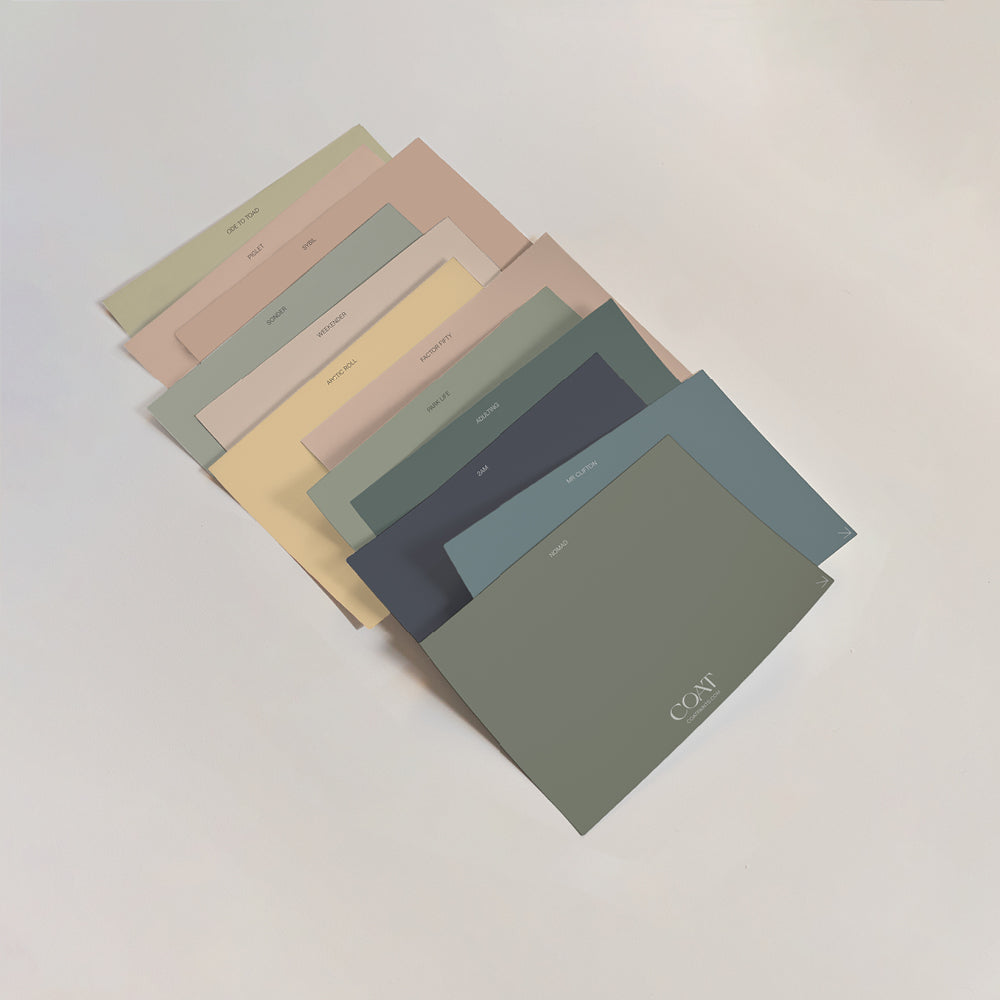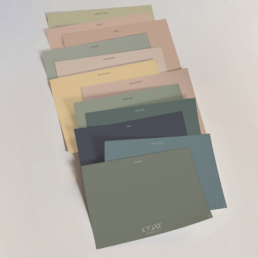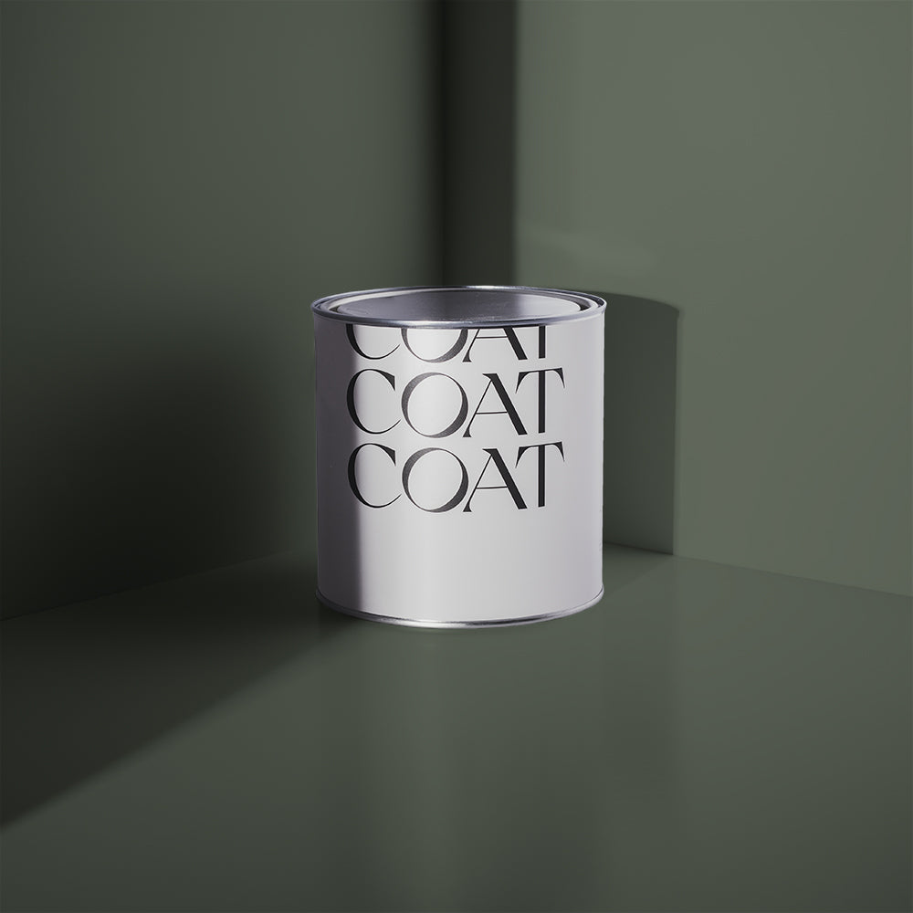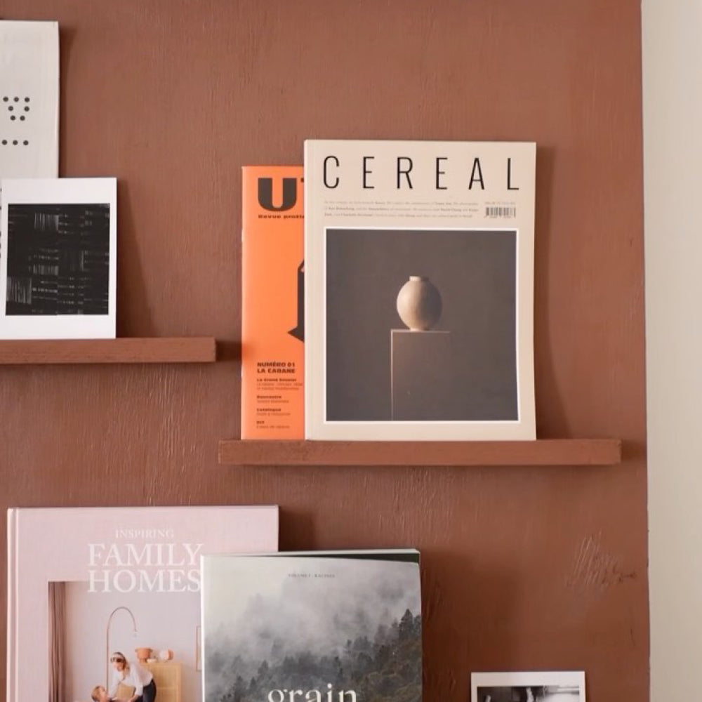
2023 Accent Colours & Top Tips On How To Use Them
Feeling like a new COAT but feel like neutrals are for noobs and you’re feeling whited out from all those minimalist homes on Pinterest and the gram? Well, we’re introducing 7 new colours that could be part of your technicolour dreamCOAT. The problem with accent colours is that it can be difficult to figure out how to use them, so we’ve got some tips to help demystify them and give you some fail safe schemes to add a punch of colour to your home.
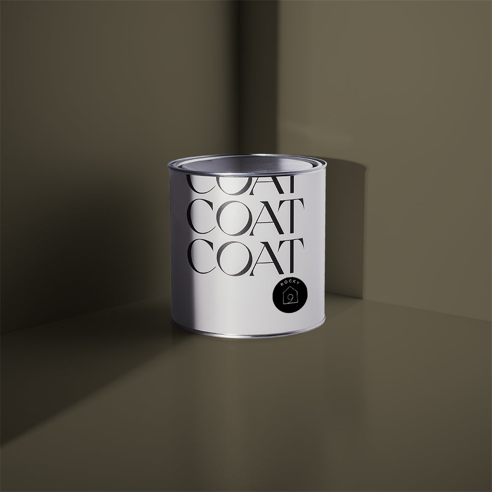
The Ranger

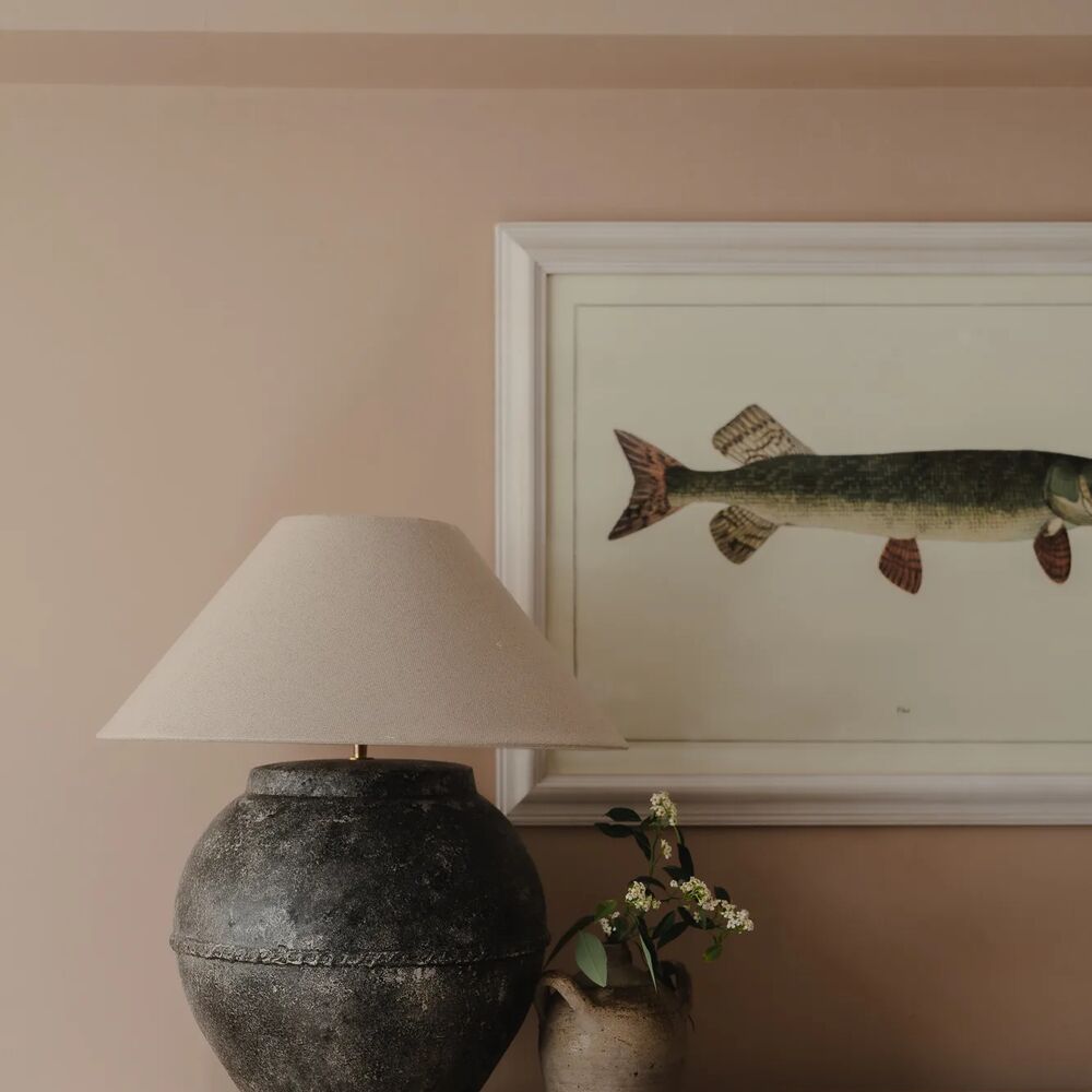
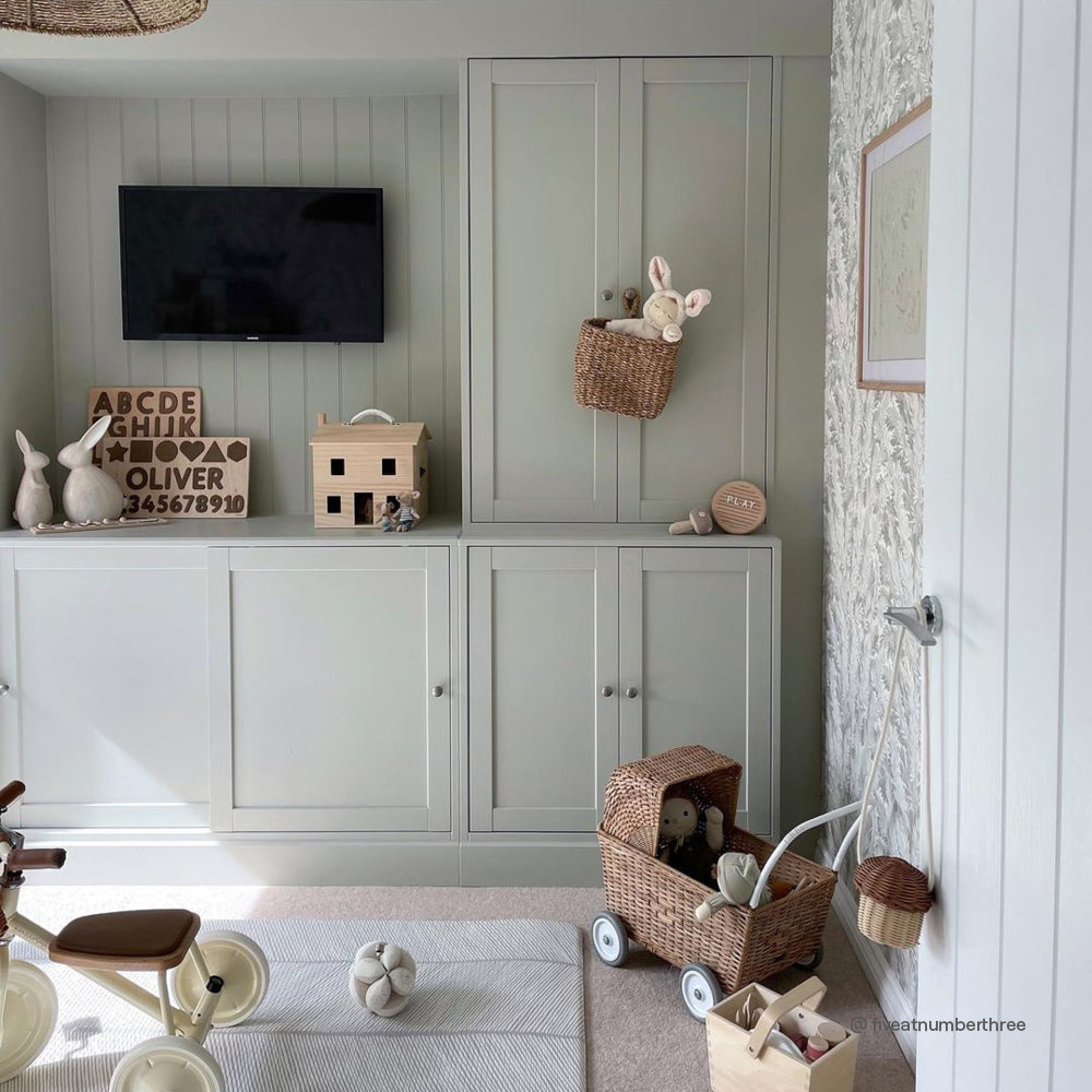
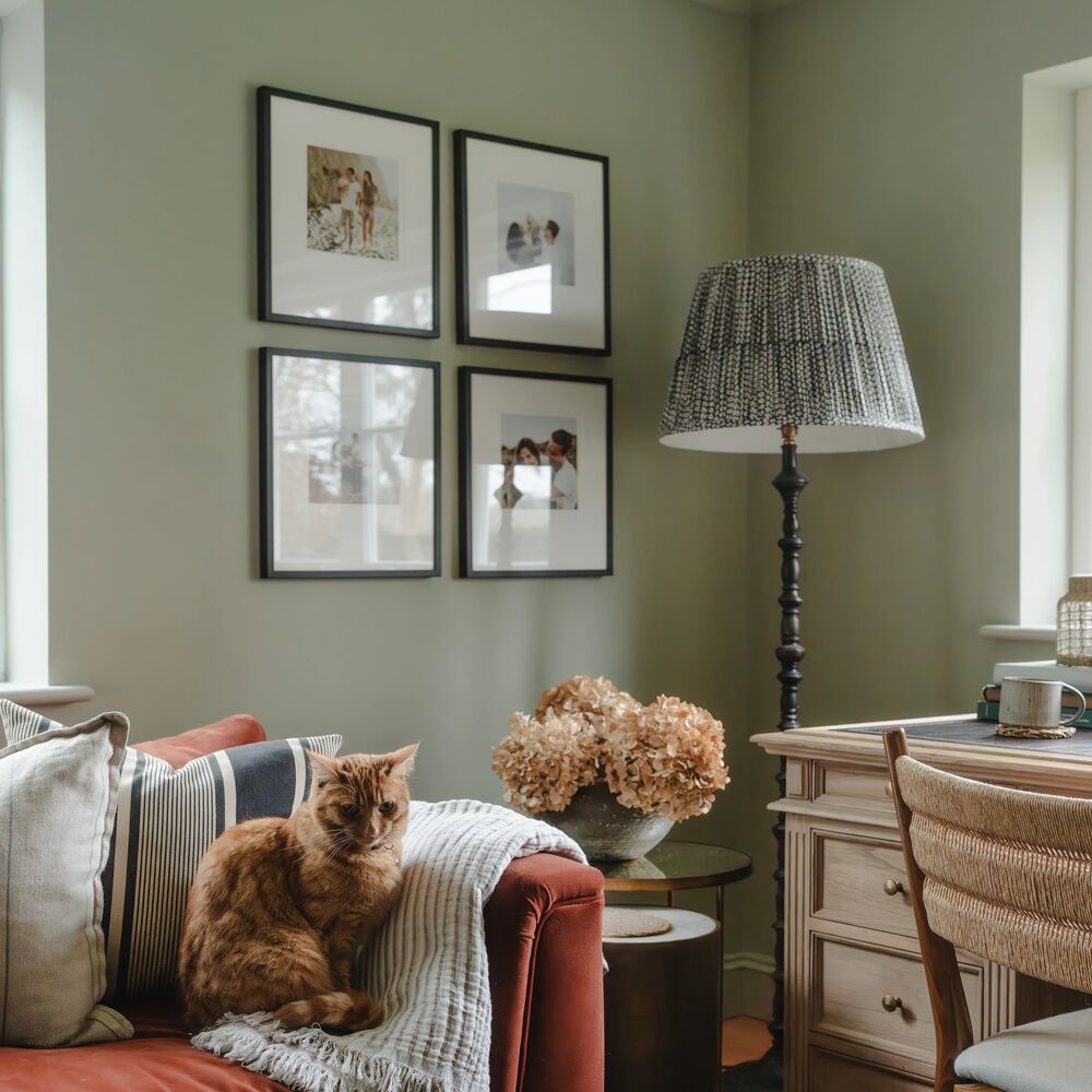
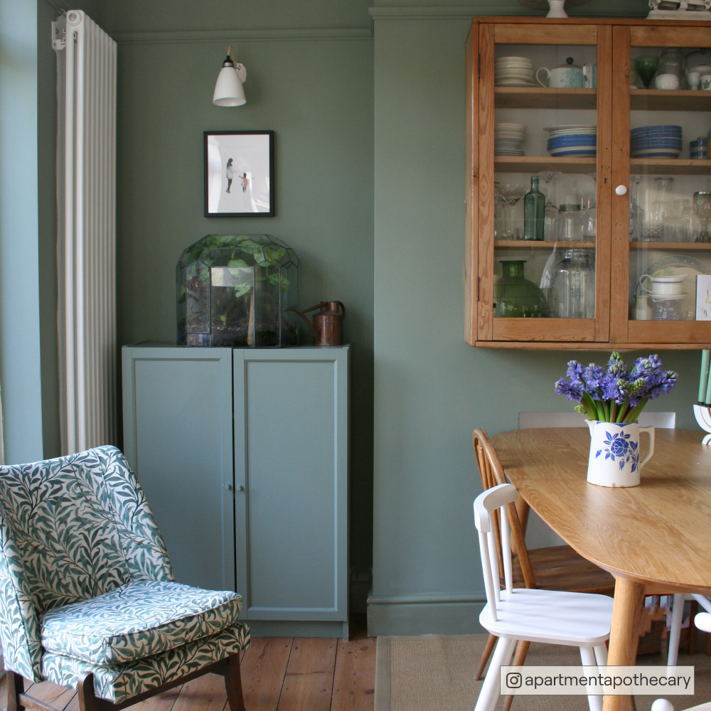
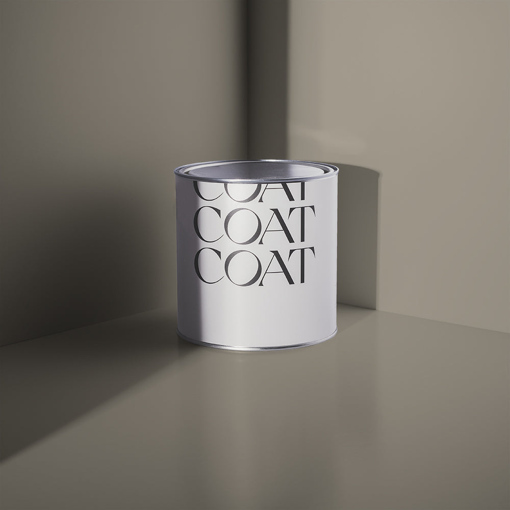
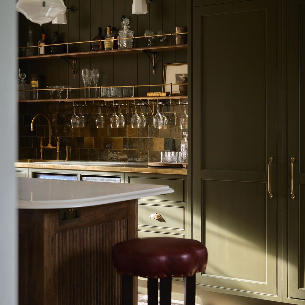
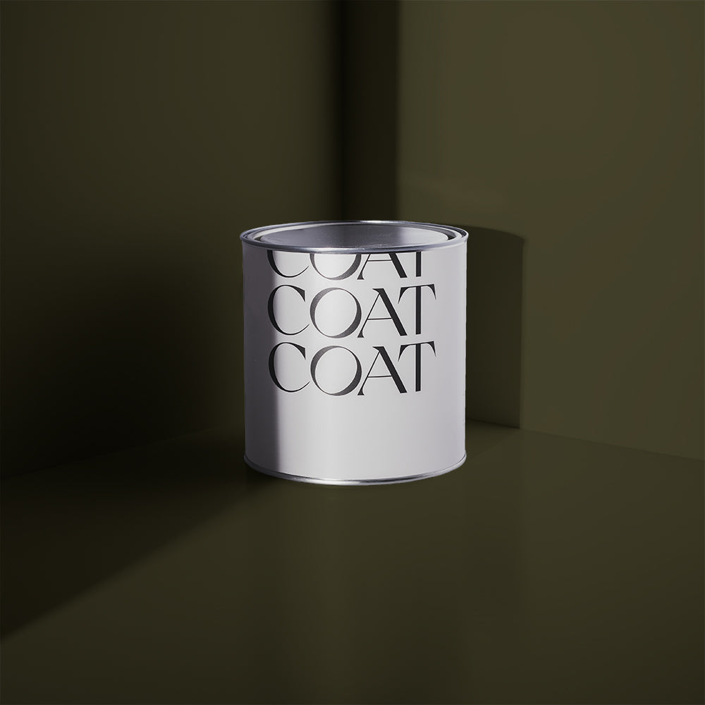
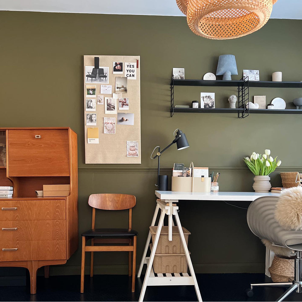
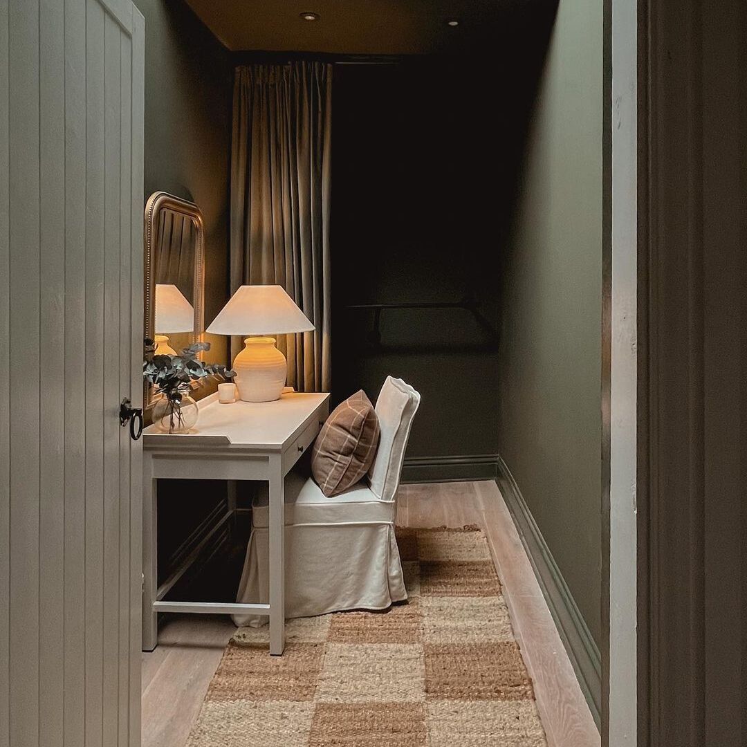
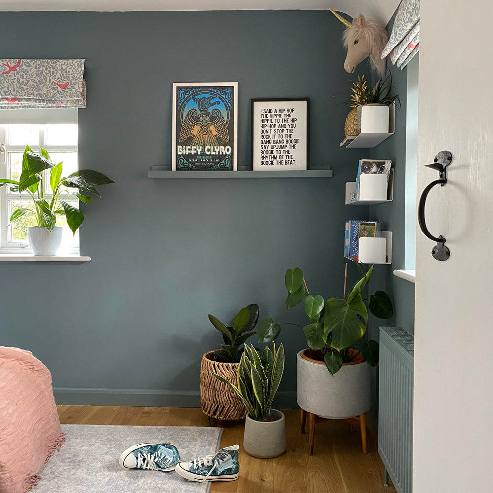
This dramatic dark green was made to work as an off-black with some of our most popular grey greens. The Ranger makes for a great bookcase or furniture accent in rooms painted in grey green, The Trail, or the muddier, Darlington. As a wall colour, The Ranger gives has more of an idea if it’s true nature. A daringly seductive grey-green with warm undertones. For a moody monochromatic scheme pair with 100% Maybe or for something a little more lively, add accents in burnt orange, Mezcal.
Like the dark and moody colours? Check out full range here.
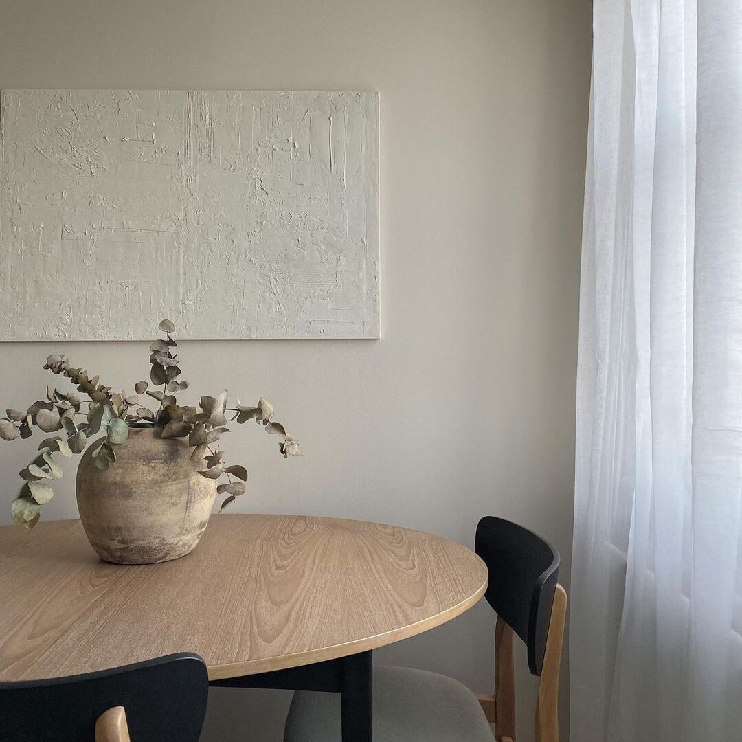
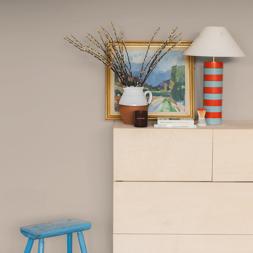
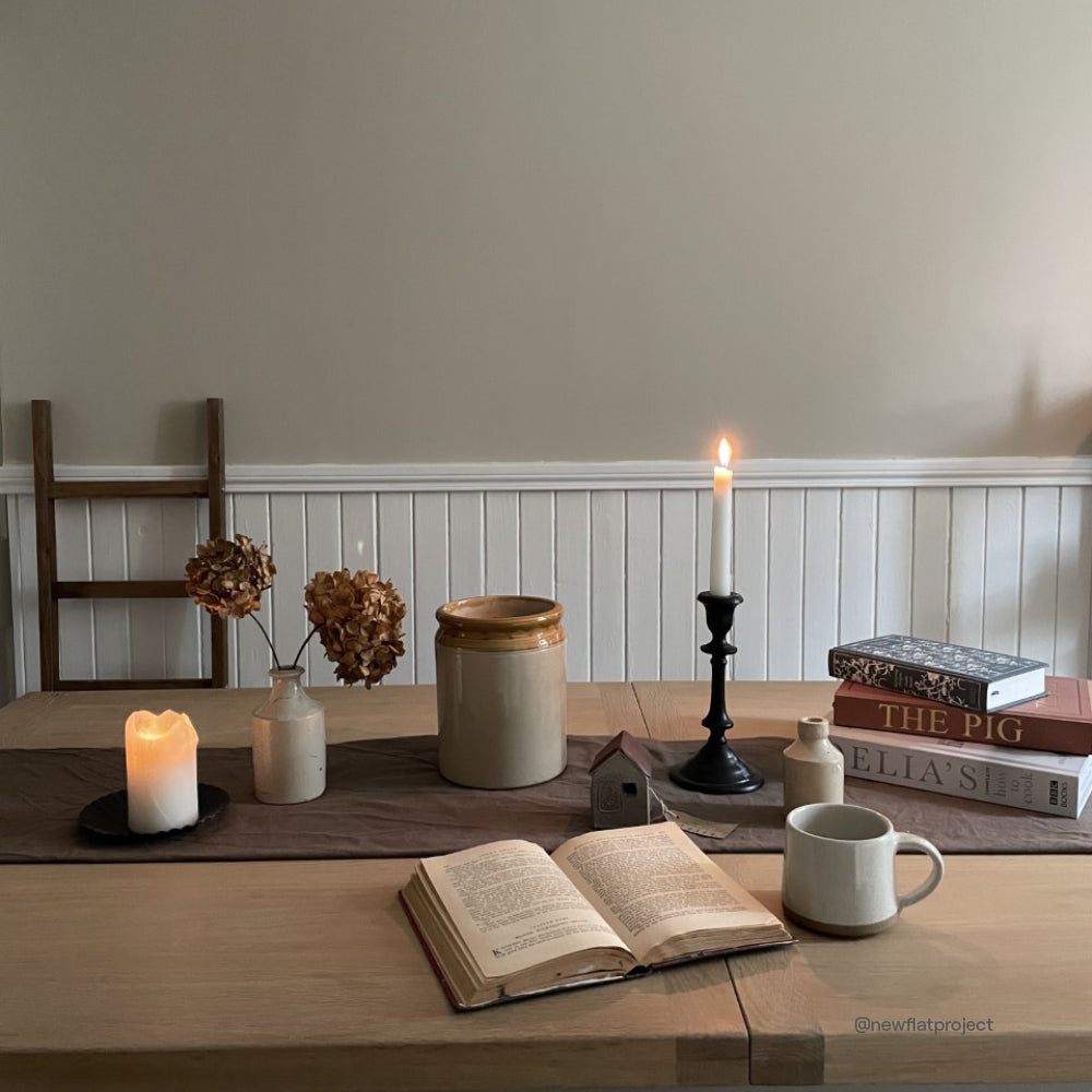
Biscuits For Breakfast

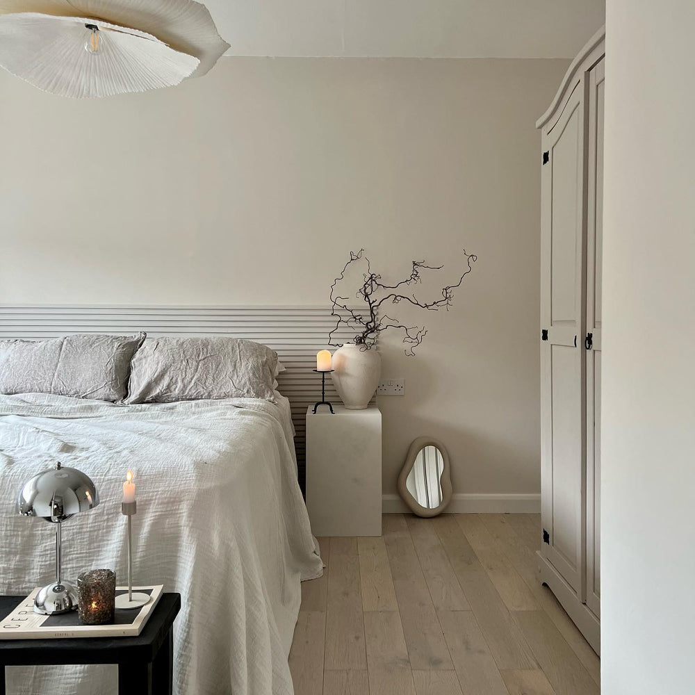
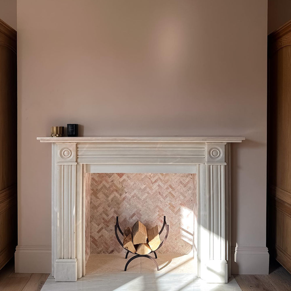
Deep beiges are difficult colours to get right, but we made one so naughty, it must be fattening. Biscuits For Breakfast was made as a complimentary darker tone for our modern beiges, Safe Play and Duvet Day. It adds warmth and depth to cold, flat, North facing spaces, and brightens up in South facing rooms; making it incredibly versatile. Use on walls with Safe Play ceilings and woodwork. To make it more of an accent, try Biscuits on trim with Duvet Day walls. It also makes an excellent neutral for kitchen cabinets when combined with Modest walls, for an effortless mid-century style.
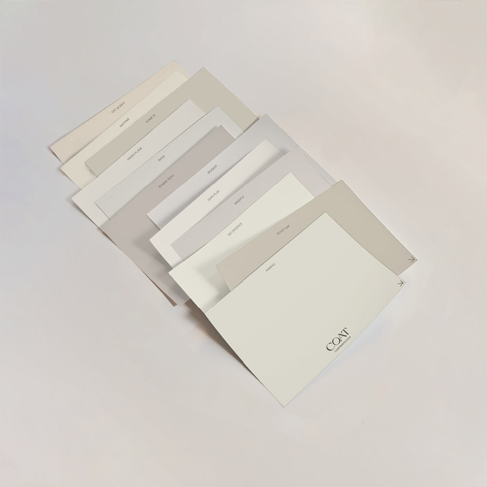
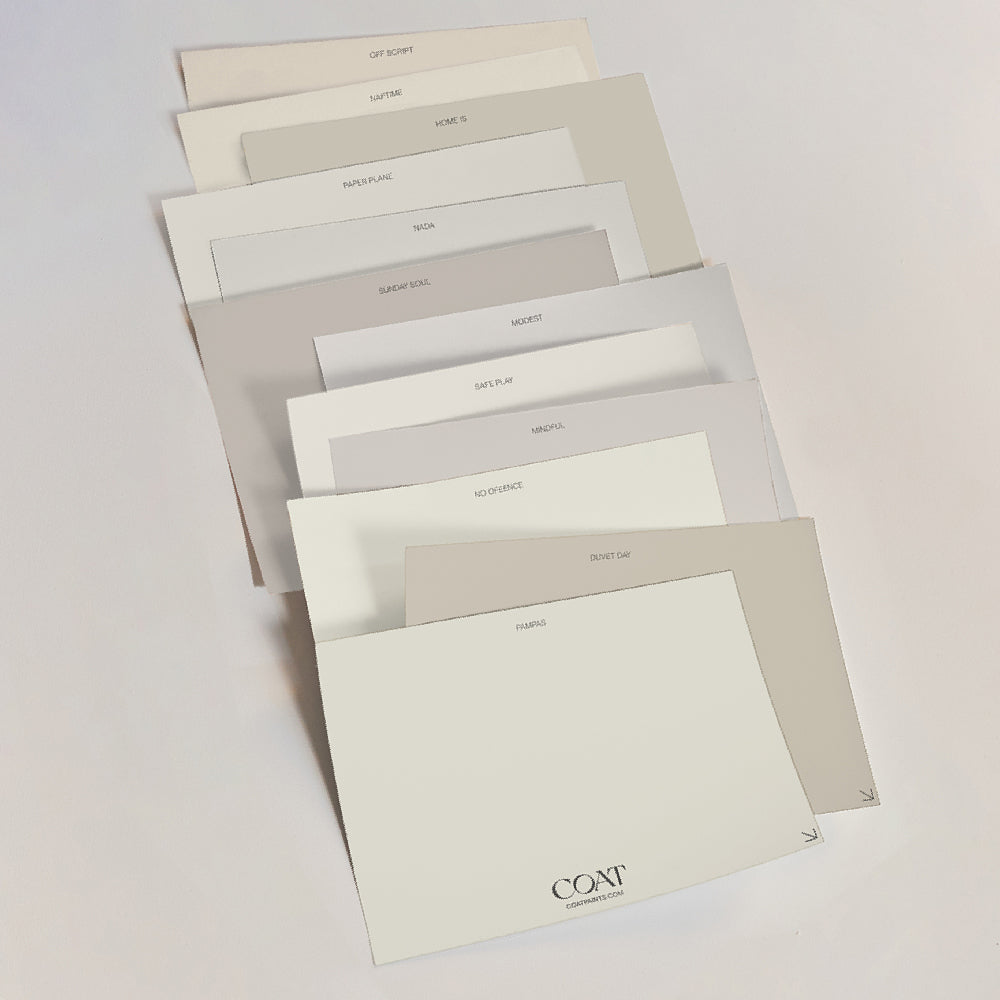
Stuck for choice? Order our complete Neutral Pack to trying our samples all over your home.
East For Trees

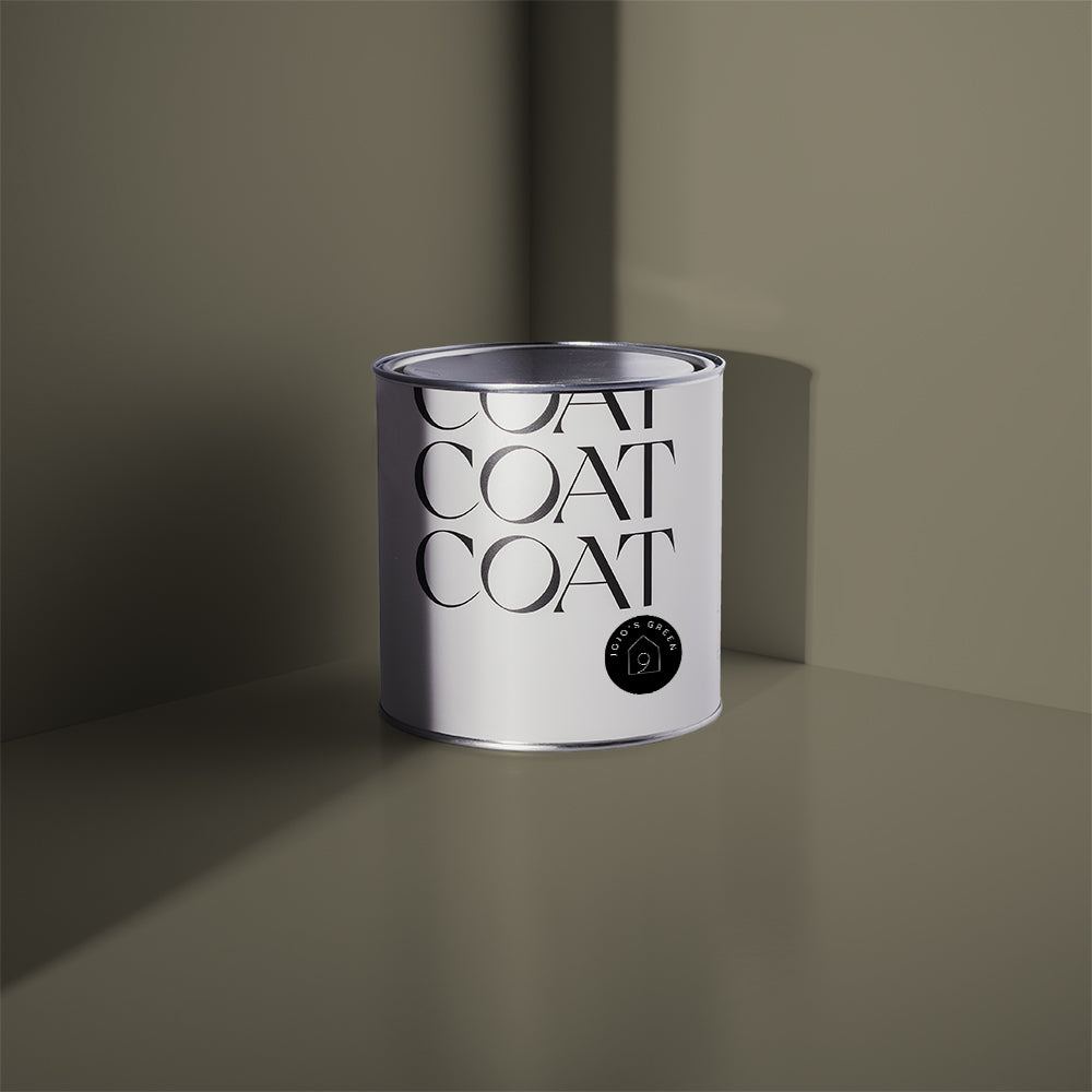
It’s just green. A vibrant and punch accent colour that feels quite traditional, East For Trees has been designed to help our customers create statement rooms that feel organic yet energised. Use on the walls and pair with either Hello Vera or 100% Maybe on ceilings and woodwork for a classic look. For something a little more modern, try using The Ranger on woodwork instead. East For Trees is also the perfect bold for those that are looking for a statement green while creating schemes with colour blocking. Try just a shot of this gregarious green with And Breathe and Factor Fifty on a base of Duvet Day for a bright scheme that feels warm and inviting.
Grab a East For Trees sample to get that fresh and energised look.
Shampoo & Set

Nan’s purple rinse finally got an upgrade and this light pastel lilac is a great colour for Y2K or ultra-modern colour schemes. For a sleek look that adds a shot of subtle colour, try Algorithm on the walls with Shampoo & Set woodwork. This addition of this grey lavender tone will add a neutrality to an otherwise cool colour palette that is particularly stunning in south facing spaces. Shampoo & Set is also light enough to be used as an off-white on ceilings and woodwork when paired with 2AM or Trinket. Finally, if you’re looking for lavender toned walls, use this colour with complimentary off-white, Pablo (a putty-ish white that has a lilac undertone) to add just a touch more warmth.
Trinket

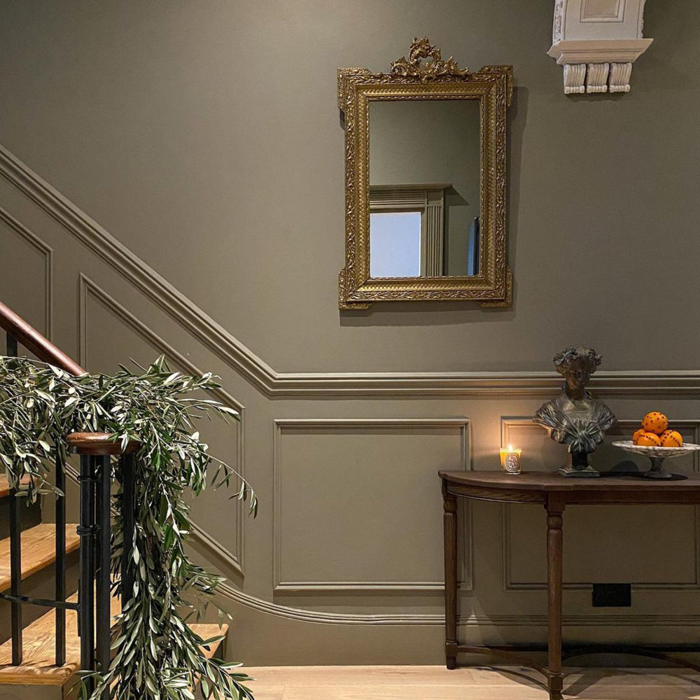
Regal and sumptuous, this deep purple is a great way to add a feeling of decadence to dining rooms. Pair with Shampoo & Set (a greyish lavender), as an off white for the ceiling. The key to using dark colours like Trinket is to paint walls and woodwork the same colour. This draws the eyes attention to the objects in the rooms and minimises architectural contrasts. This also helps create a feeling of grandeur. Trinket also pairs wonderfully with off-blacks like David Rose or The Record Store, for a stylish, maximalist vibe. Try using this dark tone in North facing spaces for a touch of drama, or in West facing spaces that you use in the evening. Turns out, a little Trinket can make a room feel that much more exciting.
Gumption

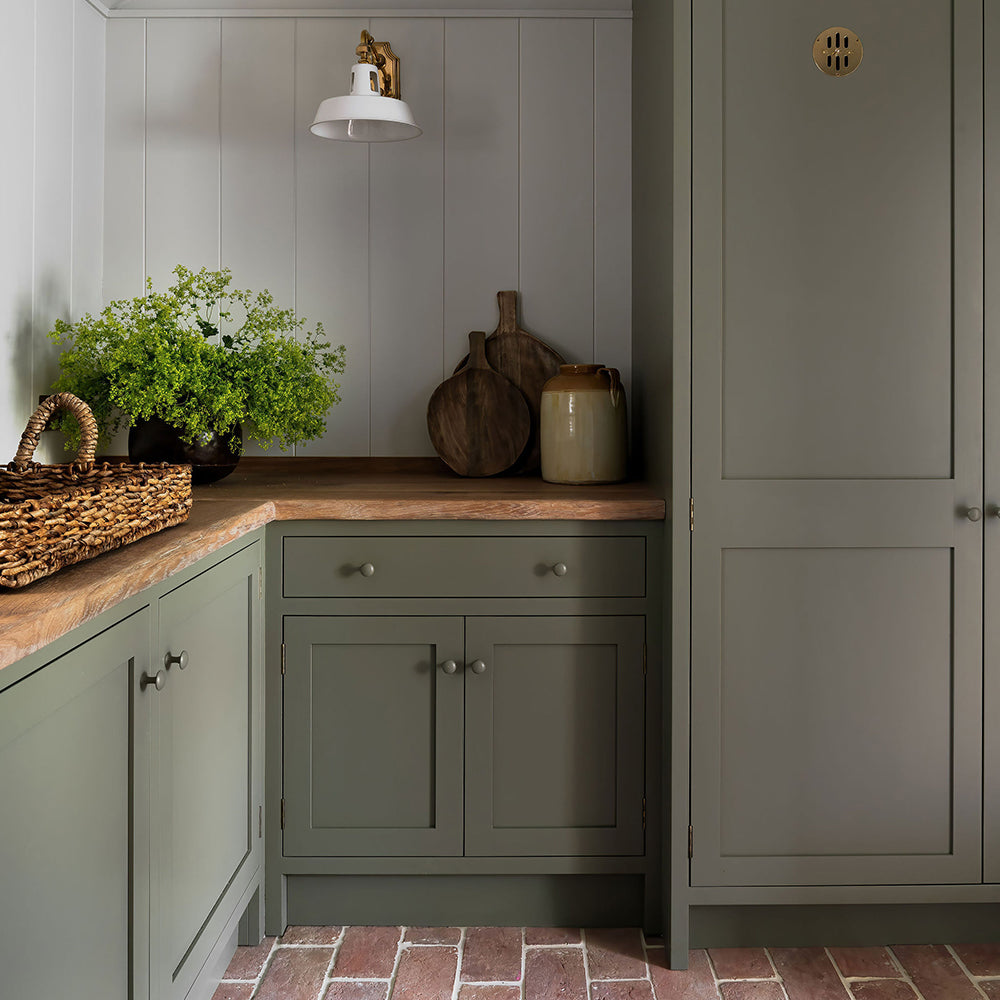
Gumption is a colour that puts the work in. It’s effortlessly versatile, but isn’t necessarily a colour that people would immediately think to reach for. It’s essentially a really dark brown, but is a natural progression from our best selling colours, Mindful, Good Intentions and Sunday Soul. Gumption is the perfect dark to pair with these taupe colours. It has the brooding allure of a black without that cool edge, making it ideal for bookcases or statement woodwork with Sunday Soul walls - try this in a West facing room to make it warm and inviting throughout the day. Alternatively, create a modern monochromatic palette when combining with Modest or Mindful, taking that traditional black and white look and dragging it into 2023.
Hardback

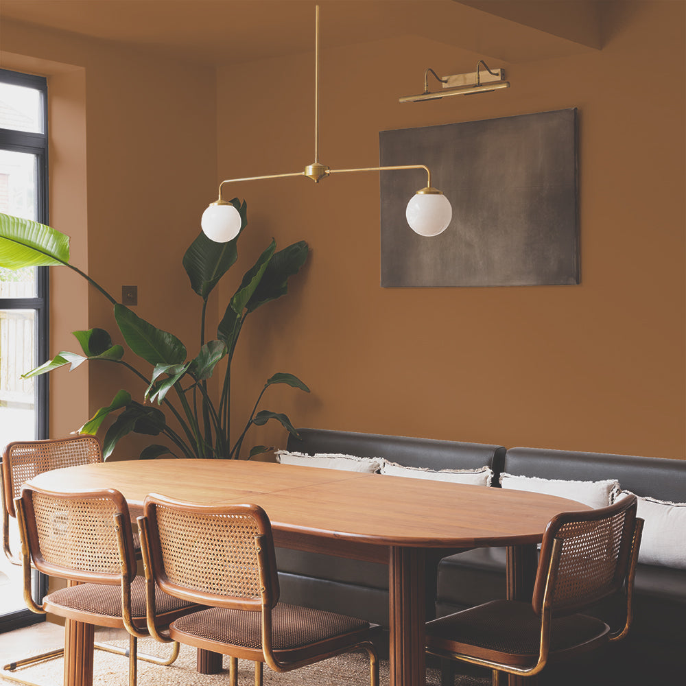
Think of that really beautiful bronze colour you’d get on ancient leather bound bibles. That’s Hardback. Introduced to pair with some of our more traditional greige colours, like Tuesday’s Child, Cargo and Debate Club, this does a similar job to Gumption but for more period homes. Perfect for bookcases or statement woodwork, in a way that’s less brown and more deep bronze, particularly when paired with Debate Club walls. These drab colours look fantastic in East & West facing spaces because of their green and yellow undertones, helping them stay really balanced. For the adventurers among you, try painting walls and woodwork in Hardback and pair with a Mezcal ceiling. Bonkers? Absolutely, but then sit back, crack open your fave hardback and indulge.
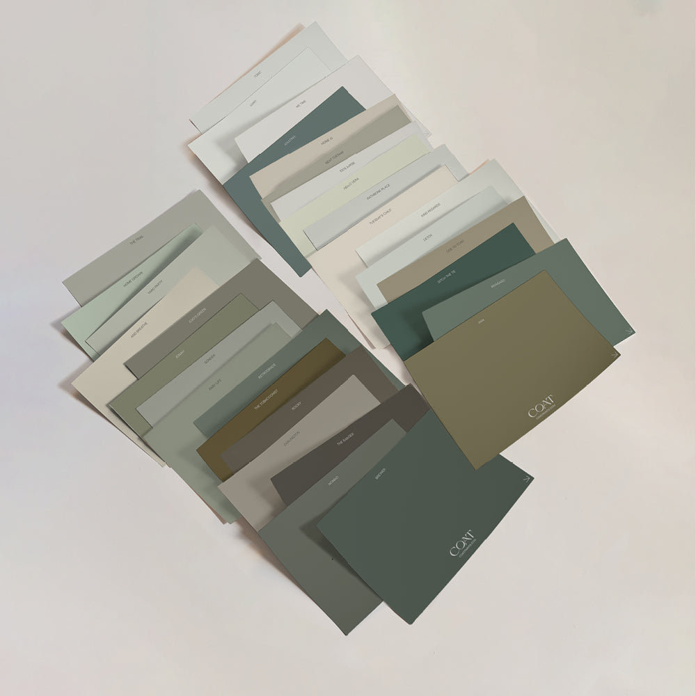
Like what you see? Check out all of our new colours for 2023 and order some samples, go on...
Publish Date
Author