Made For Each Other: Celebrating Our Favourite Colour Combos
They say that opposites attract and that's certainly true in the land of colour. Something magical happens when a grubby green rubs up against the perfect pink, or when an acidic yellow hooks up with a dark and moody pal 🔥
But how do you choose which two contrasting colours to bring together for the ultimate love match? Well, one option is to book a consultation with our in-house colour guru to get bespoke advice on your colour conundrum. Or alternatively, you can grab a cuppa and read on as we take a deep dive into some of our most popular colour combos 🌈
A MINIMALIST APPROACH
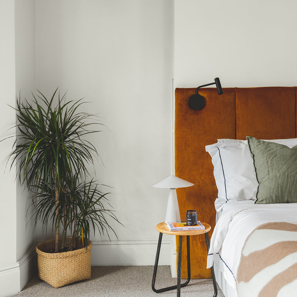
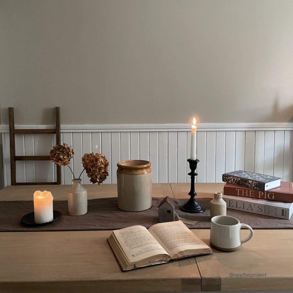
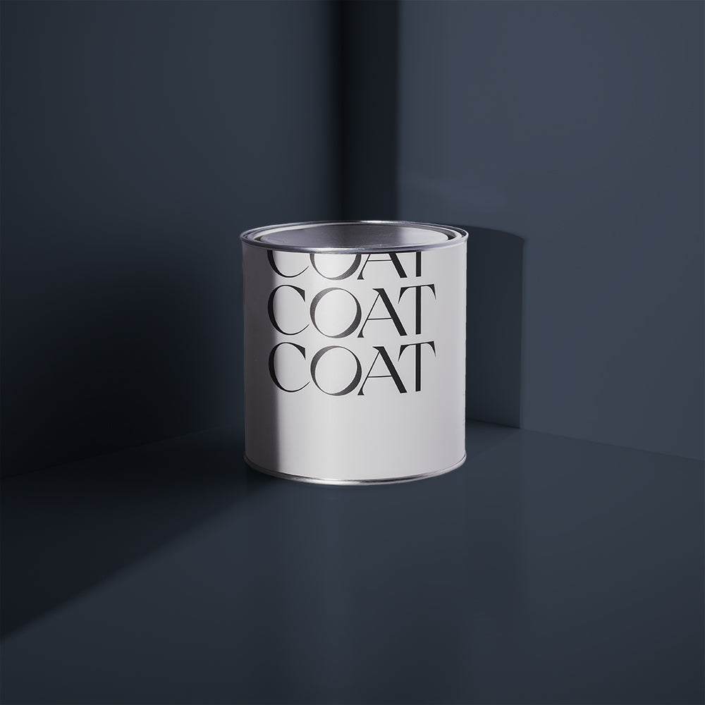
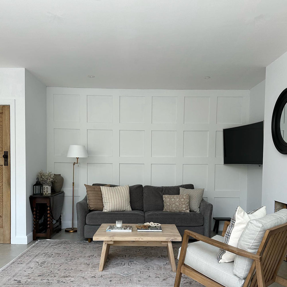
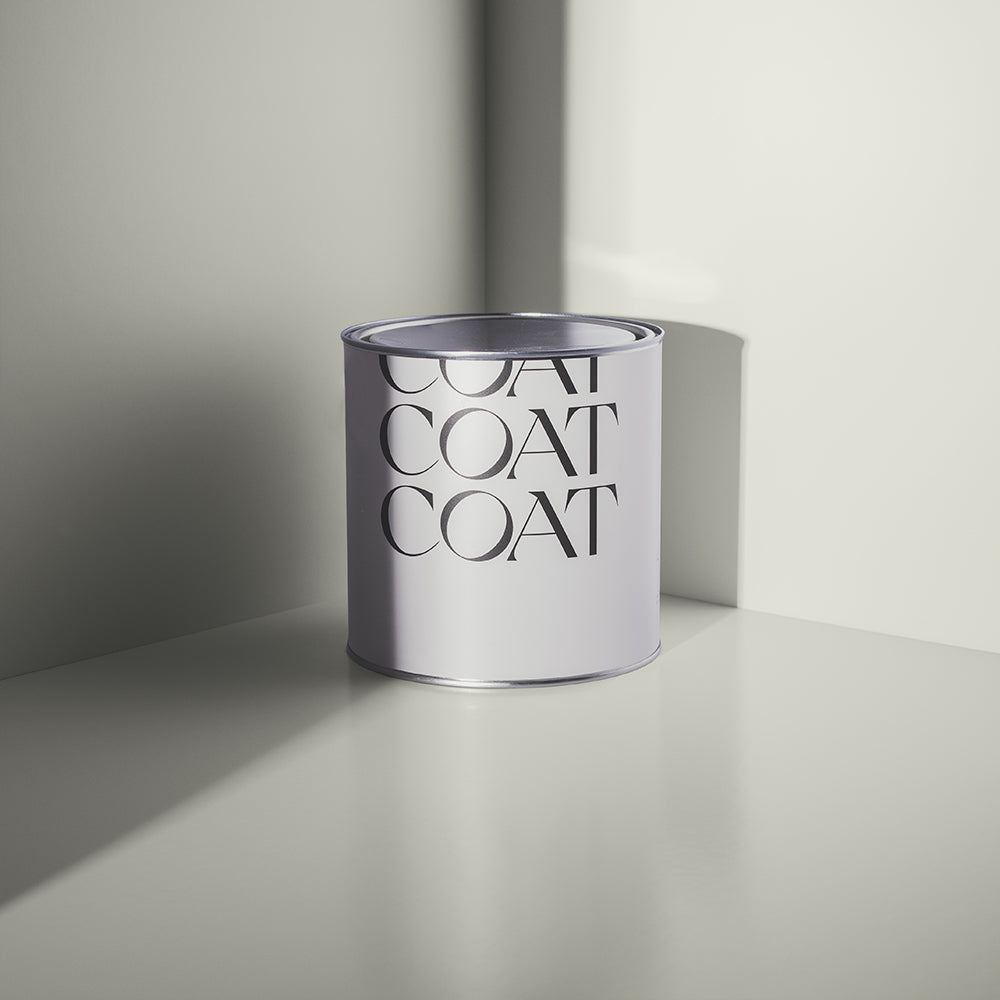
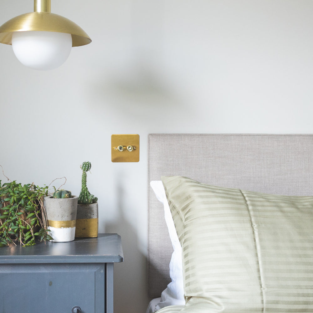
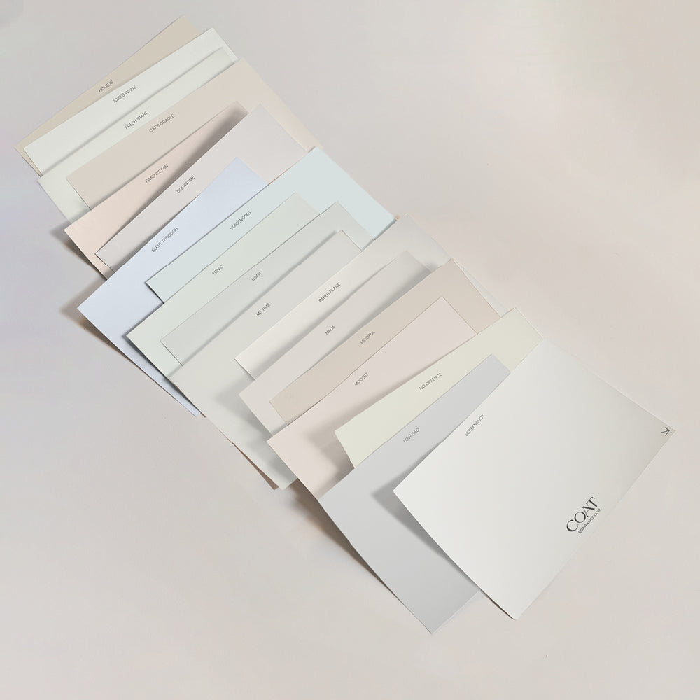
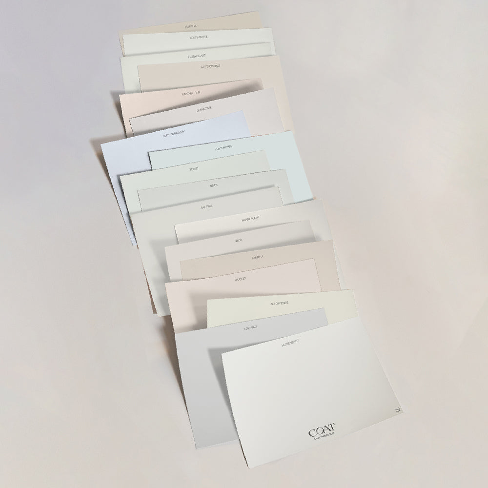
If the Japandi/minimalist vibe is your bag, you can't go wrong with a classic 'black-and-white' pairing. Why not use 2AM on half height panelling and then go pale above with our off-white Low salt? Looks great, right?

"These two colours work really well together because Low Salt has a tiny bit of black pigment in it which softens the white," says COAT's Lead Colour Consultant, Aaron Markwell. "This eases the scheme away from being too high contrast and makes it gentler on the eye. And although 2AM is actually a deep royal blue, it also has black pigment in it which makes it feel clean even though you're using a dark colour."
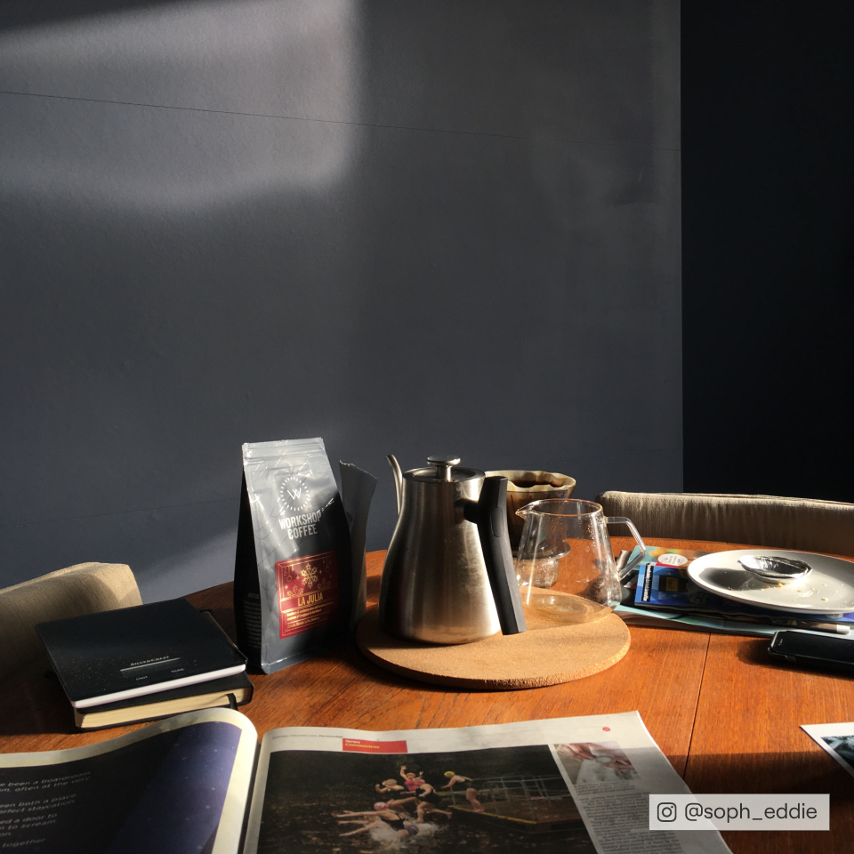
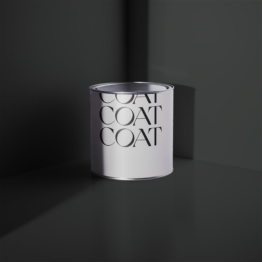
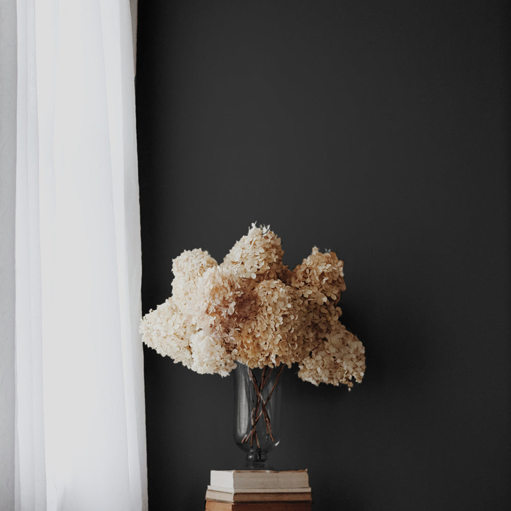
David Rose (dark, blueish black) and our purest white Screen Shot are another popular colour combo when it comes to a monochromatic look. Use these alongside each other in a hallway or kitchen to create a sleek and moody contrast 😎

GO BIG & BOLD
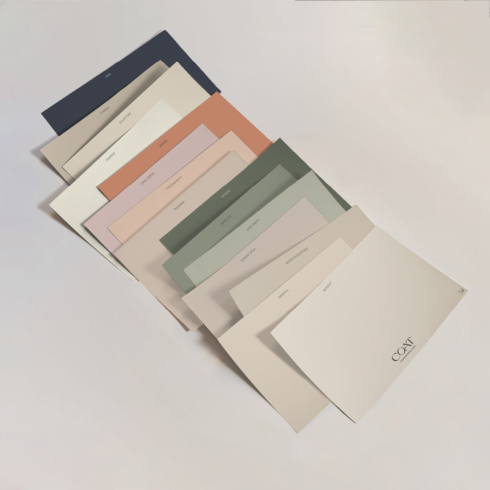
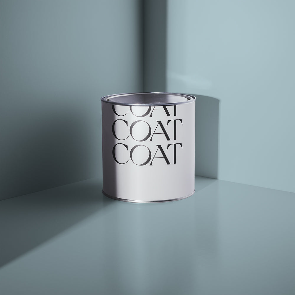
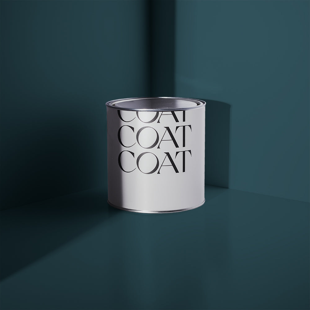
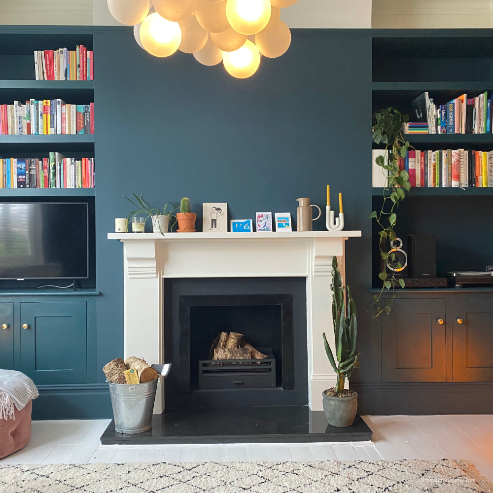
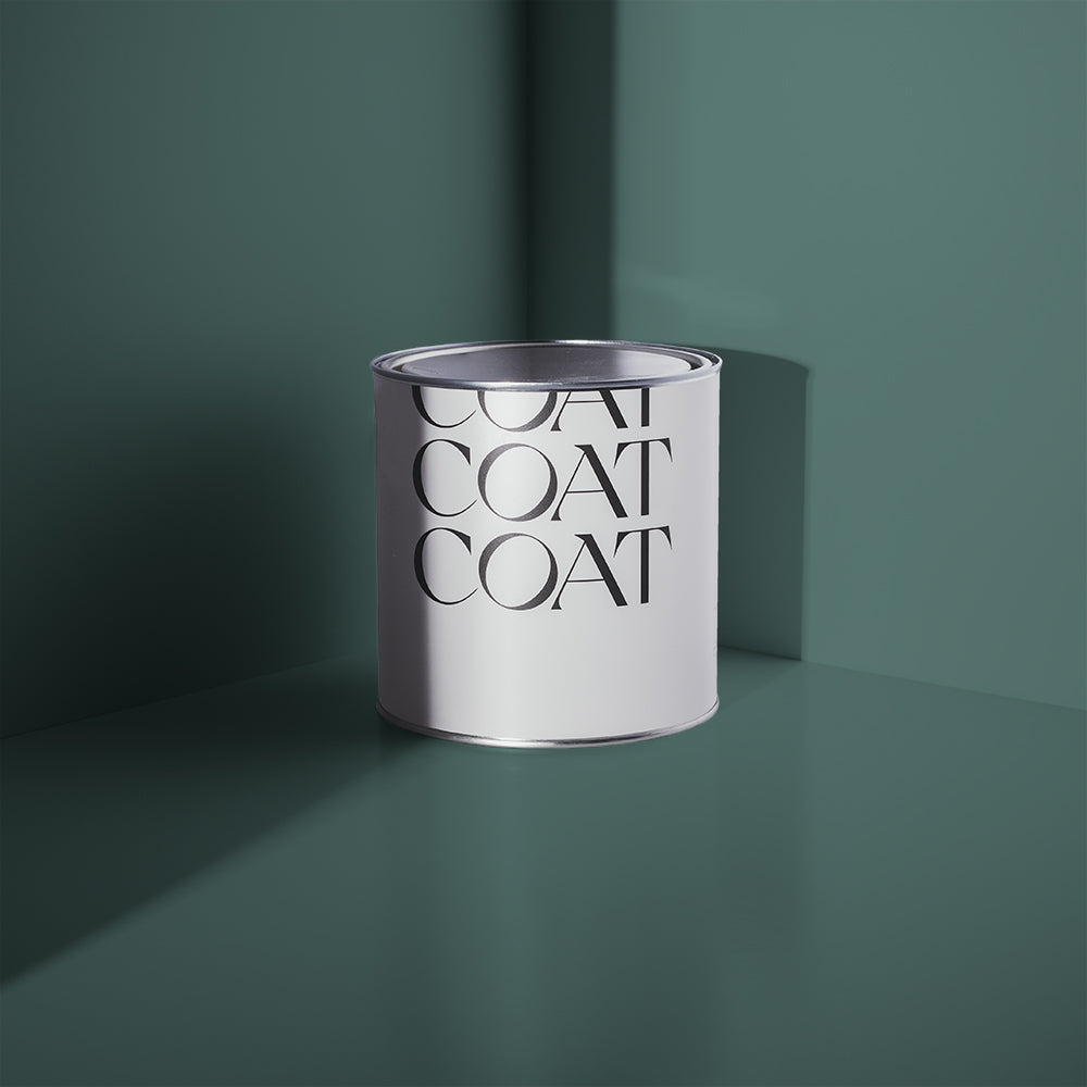
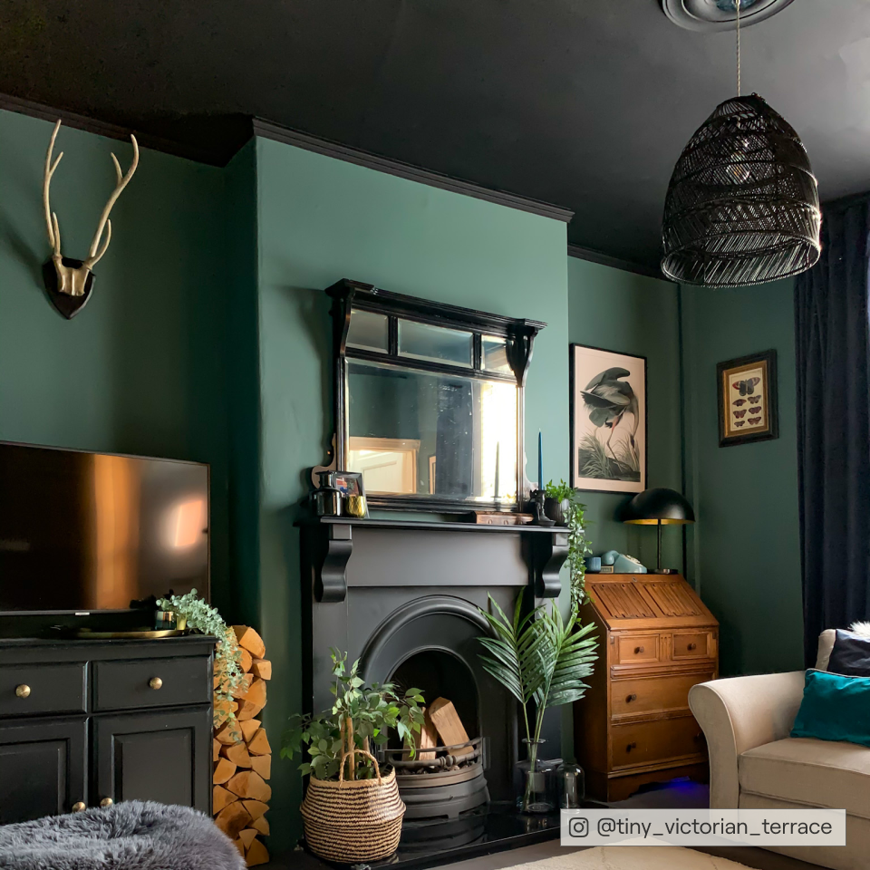
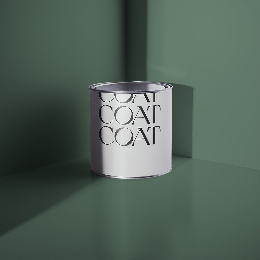
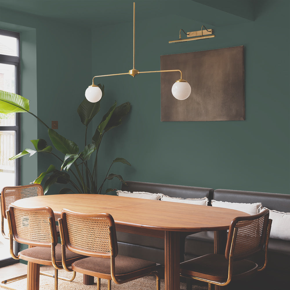
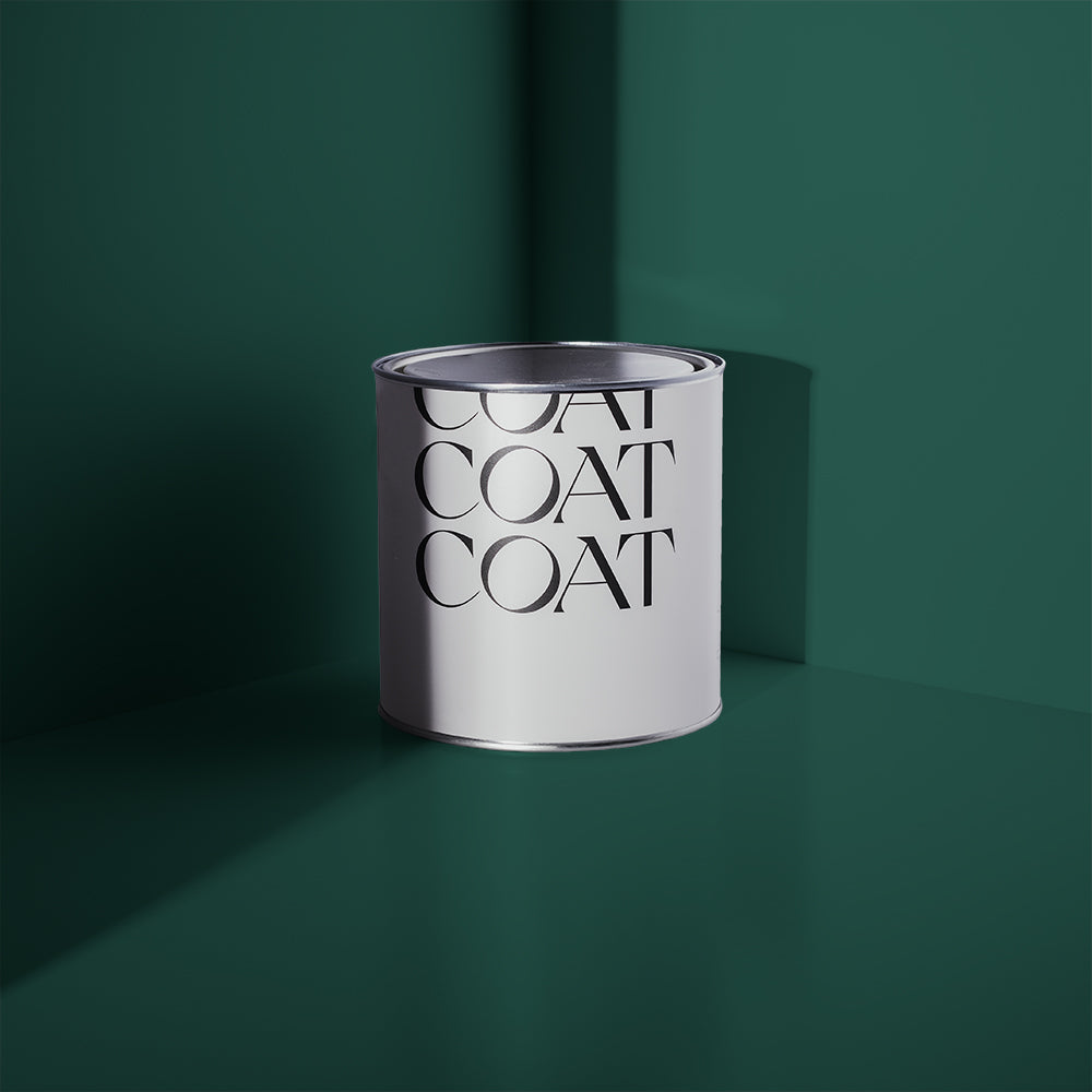
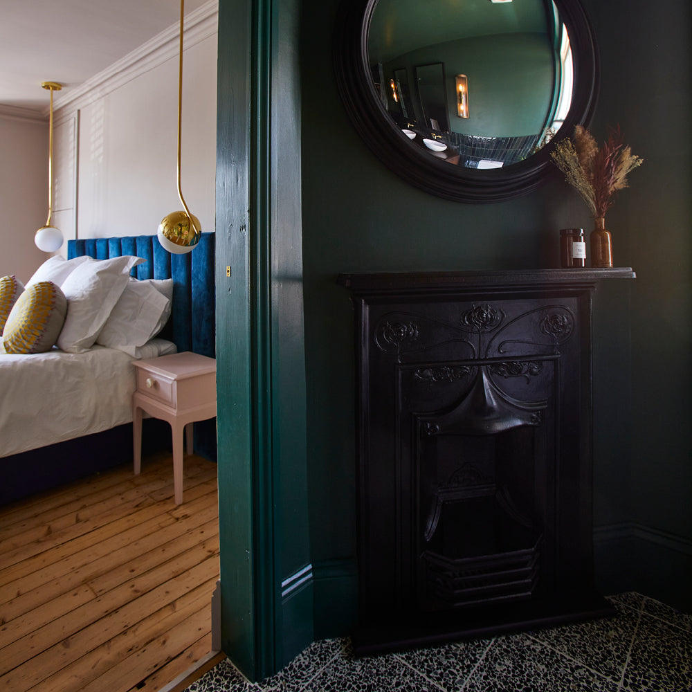
Lots of you have jumped on the combo of dusty pink Ciao, Sofia with dark jewel tones such as blue-green The Drink or traditional green Ditch The Tie. "Adding Ciao, Sofia to the mix warms up these dark shades," says Aaron. "The softness of the pink helps to create a warmer and more inviting space."

Pink and green is another classic pairing that makes us do a little happy dance here at COAT Paints! If you get the tones right, these two colours are absolutely made for each other 💕 🥑
"Blush pink is the perfect partner for green – a striking emerald for a modern look, or a chalky sage for a restful vibe," says interior designer Sophie Robinson. "Pink also works well with dark colours such as navy and burgundy, softening an otherwise bold scheme. Imagine the drama of wraparound walls in dark blue with the ceiling painted in a soft pink to warm it all up? Pair with brushed-gold details and the combination is exquisite.
GREEN COMBOS
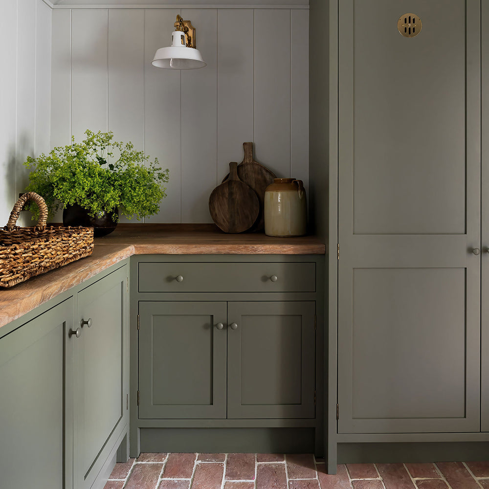
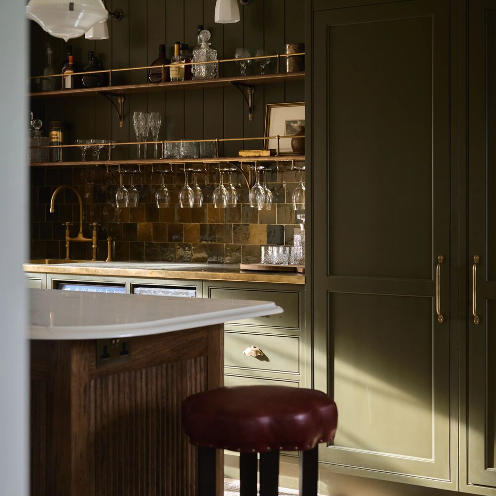
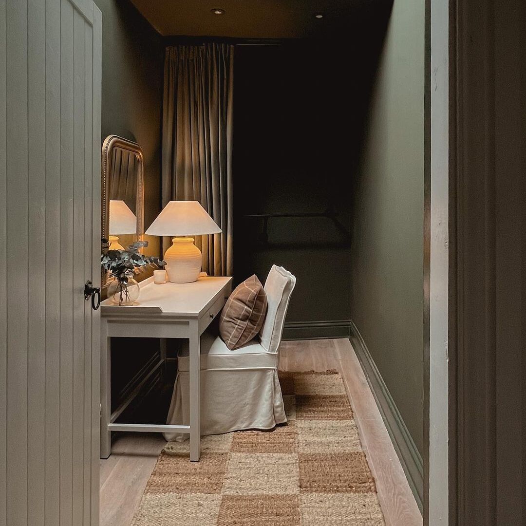
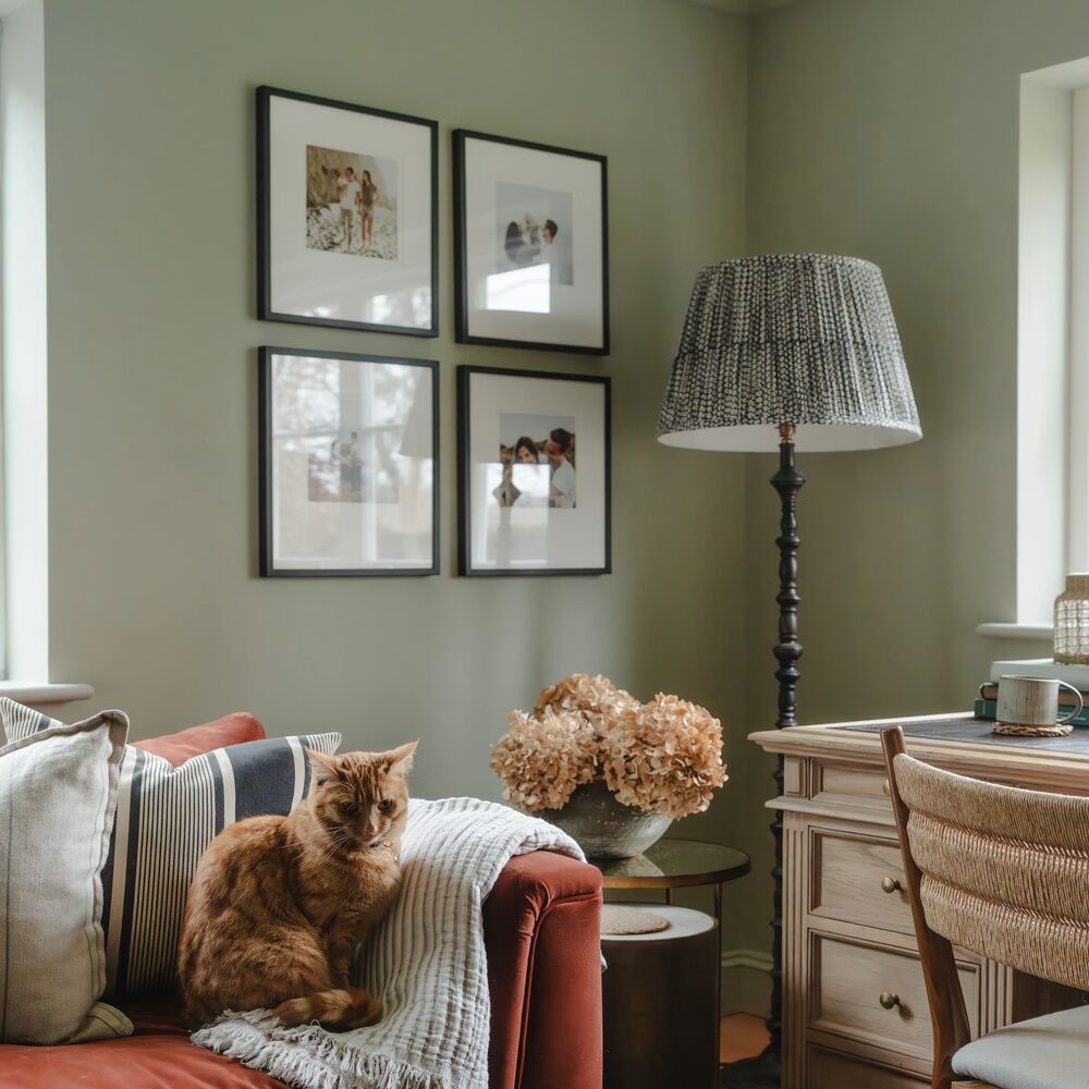
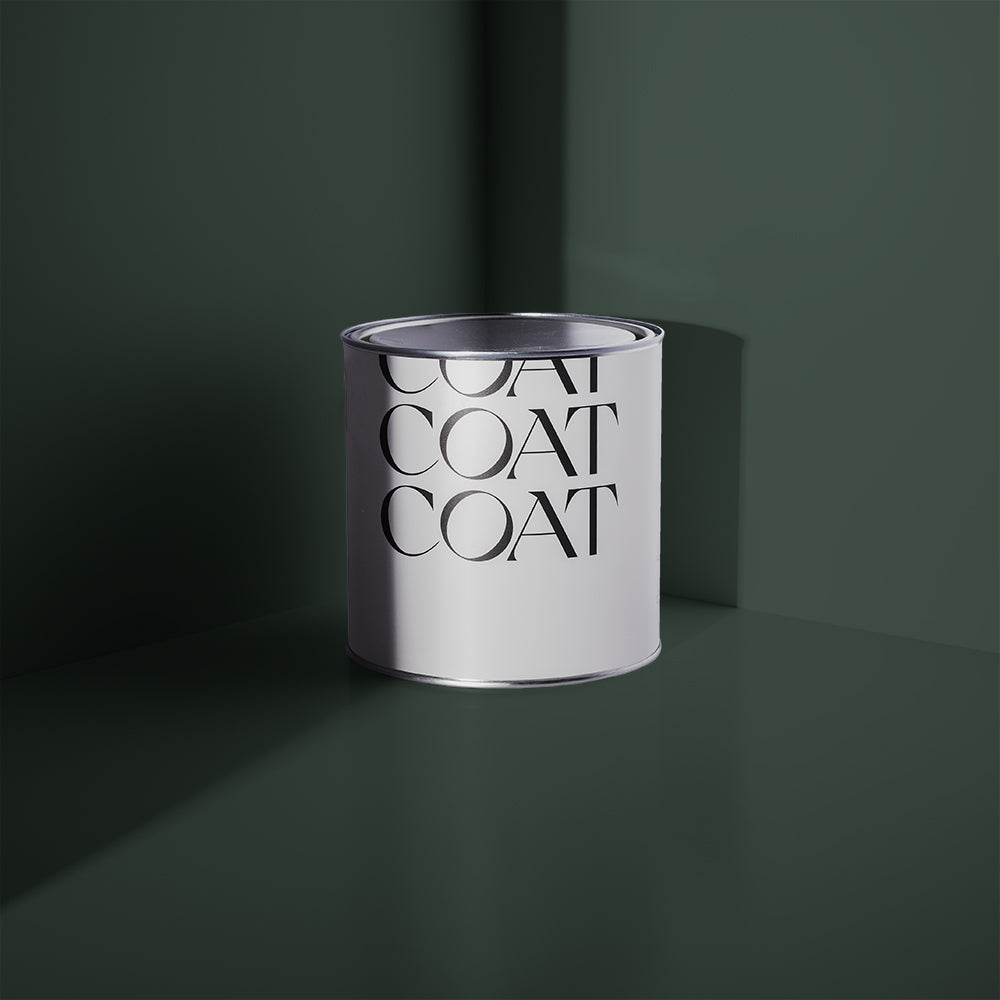
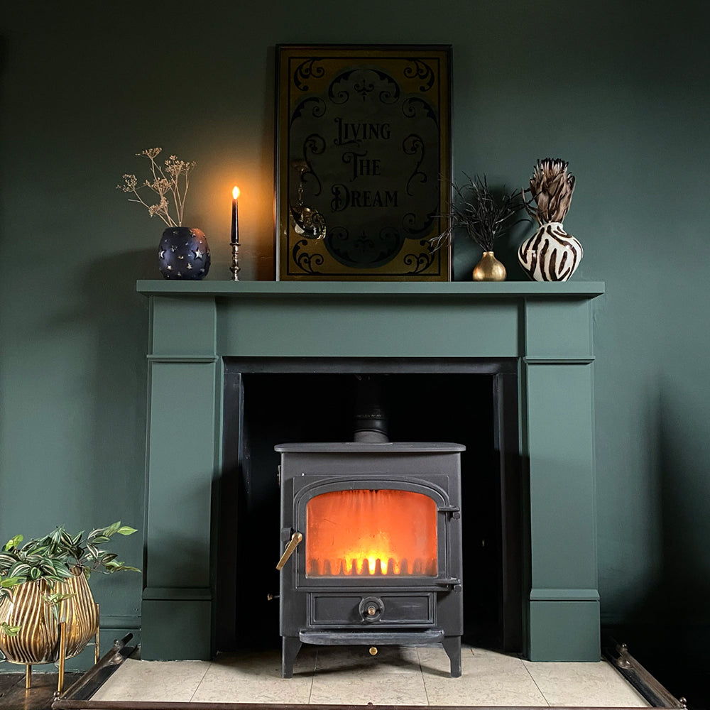
You love greens. We love greens. So why not layer greens on greens? If the tonal relationship between the two shades works, you have a match made in mossy heaven 💚
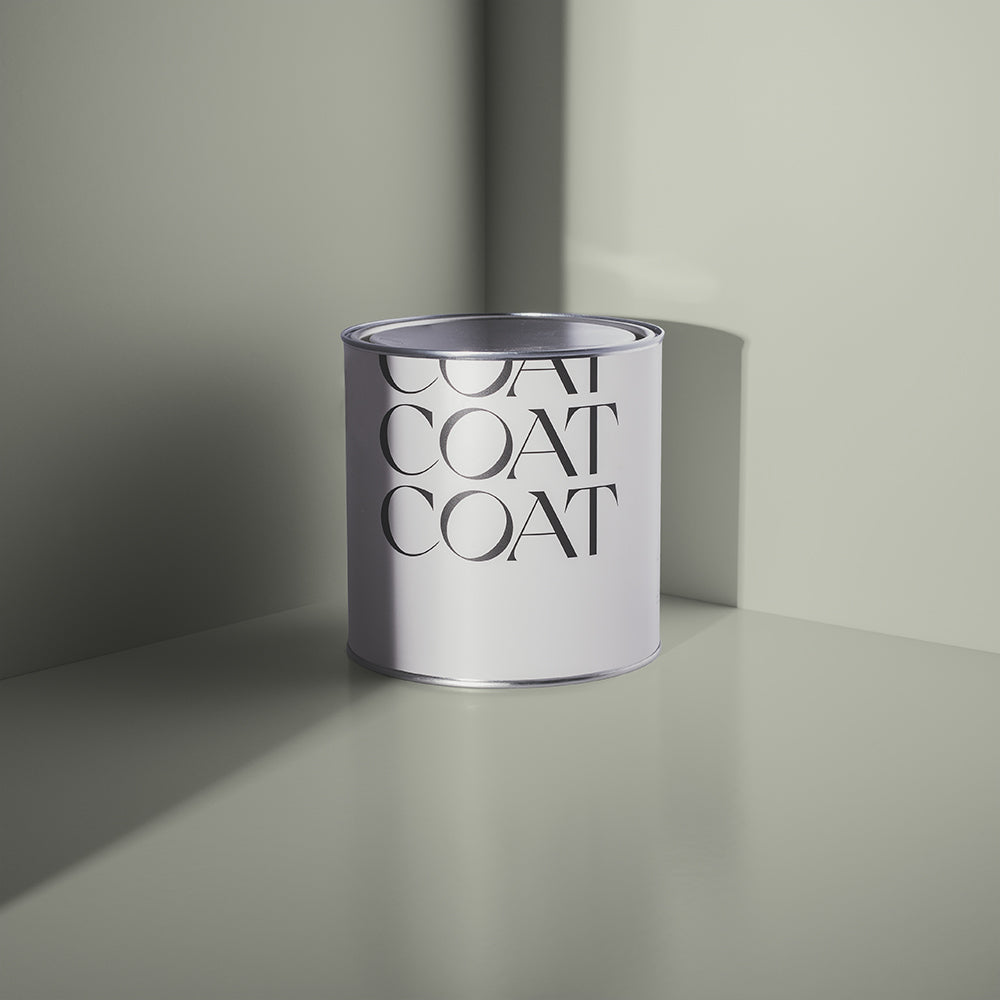
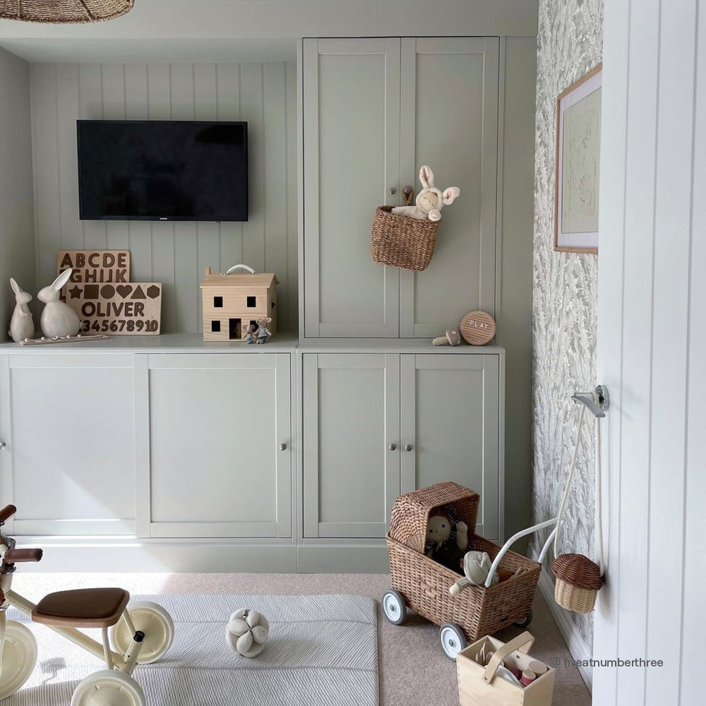
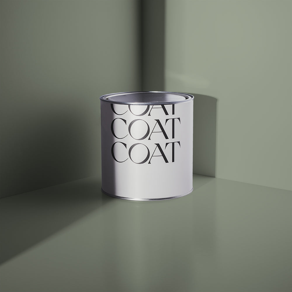
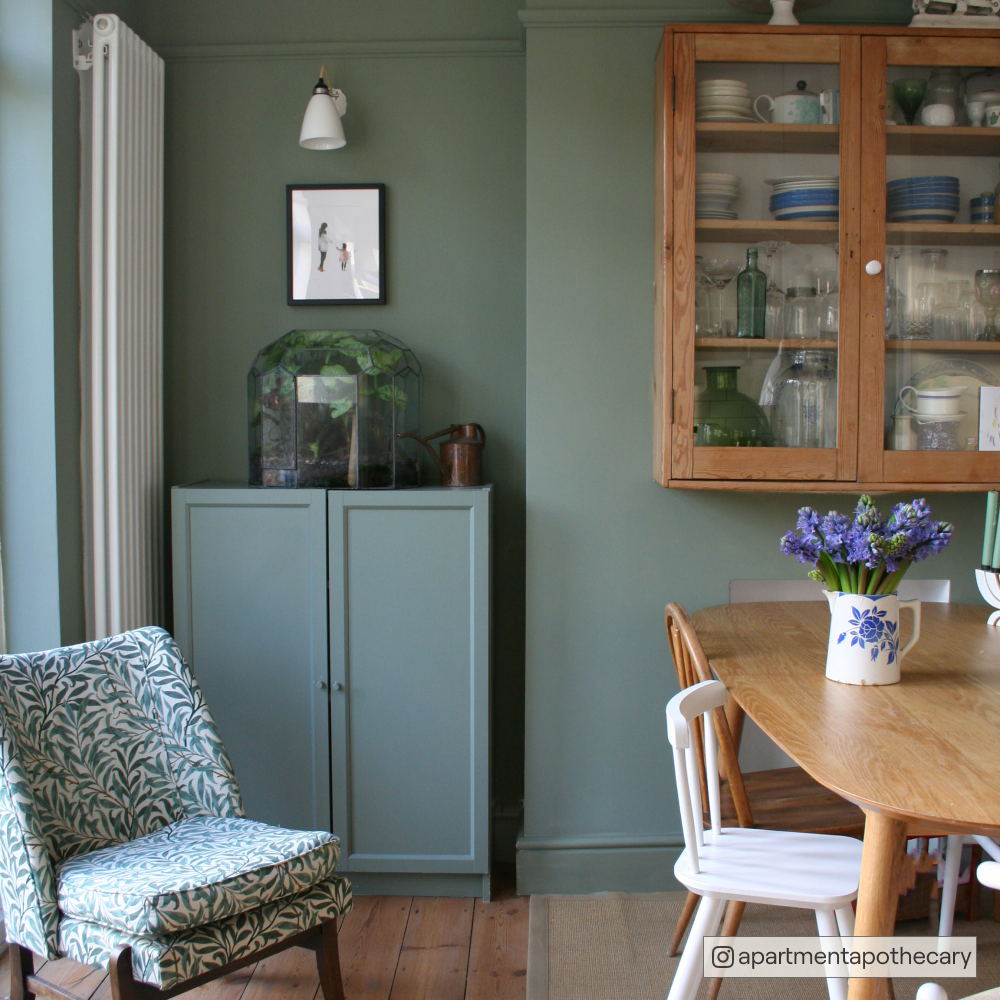
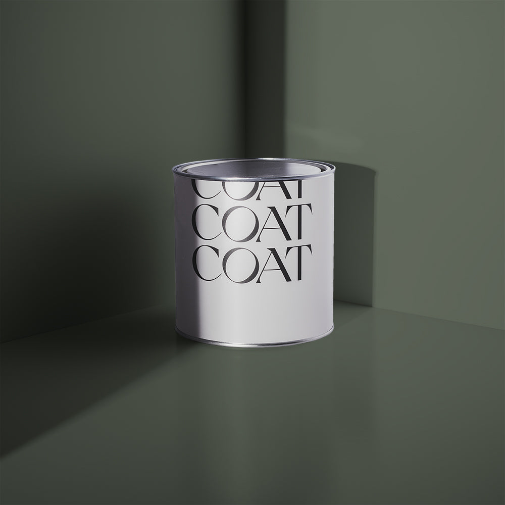
"From our new greens palette, Yard Party and Park Life make a great pairing," says Aaron. "Yard Party is a really versatile, greyed-out green, and Park Life is a sage green which makes a brilliant base for a maximalist scheme. If you go for Yard Party on the walls with Park Life on the panelling and skirting boards it will look absolutely fantastic."
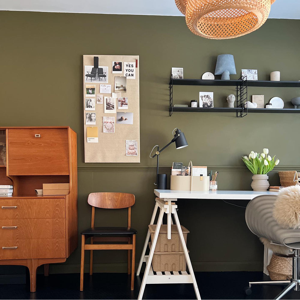
Green combos also work really well in an office or work from home space.
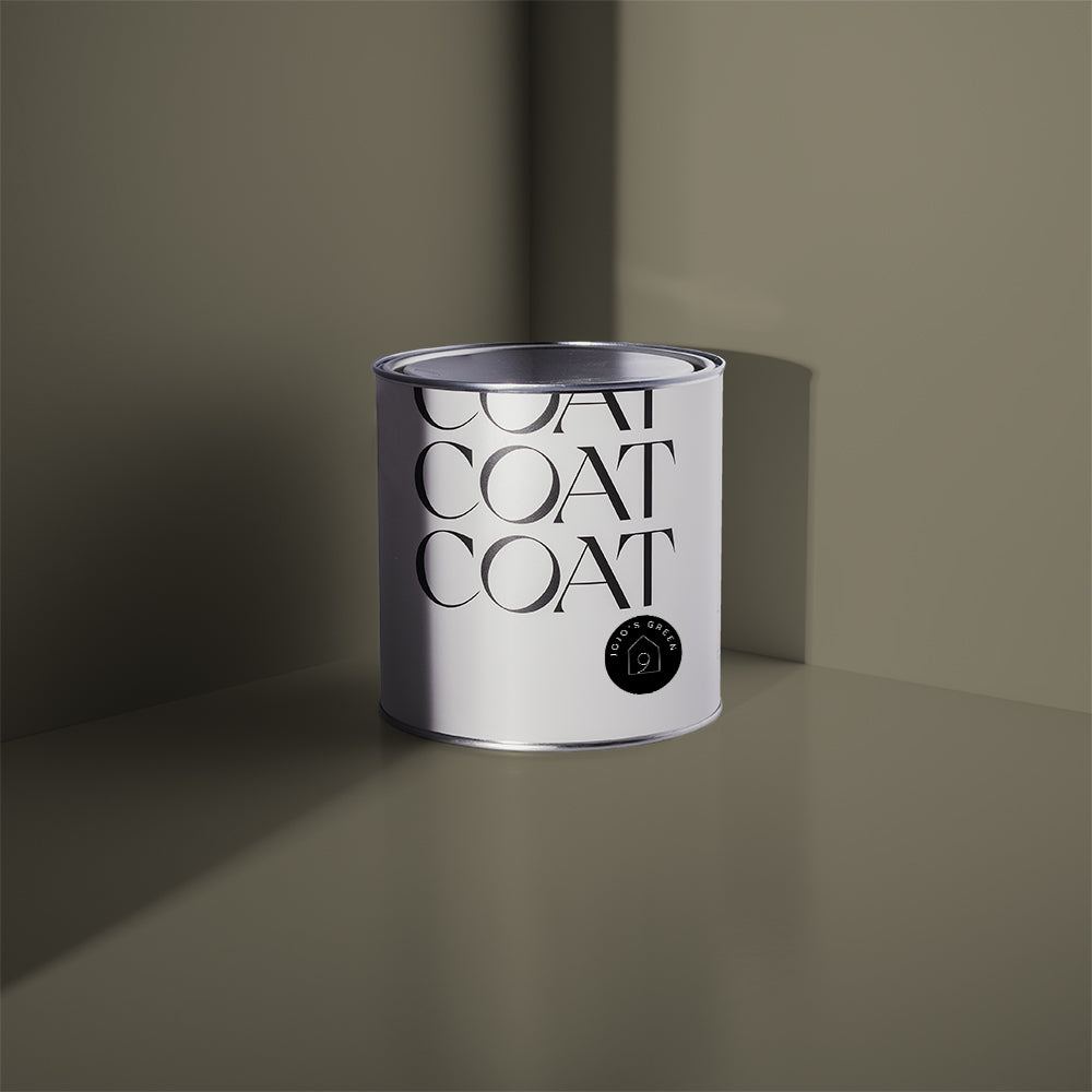
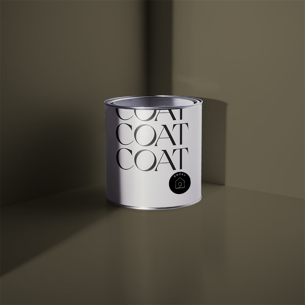
"I love greens, so for me it feels like the natural colour choice for my work space," says Aaron. "I have a combo of olive green Nomad and Kind Regards in my office at home. I've used Nomad to create a block of colour as a frame around my artwork, and then I've got Kind Regards on the rest of the wall.
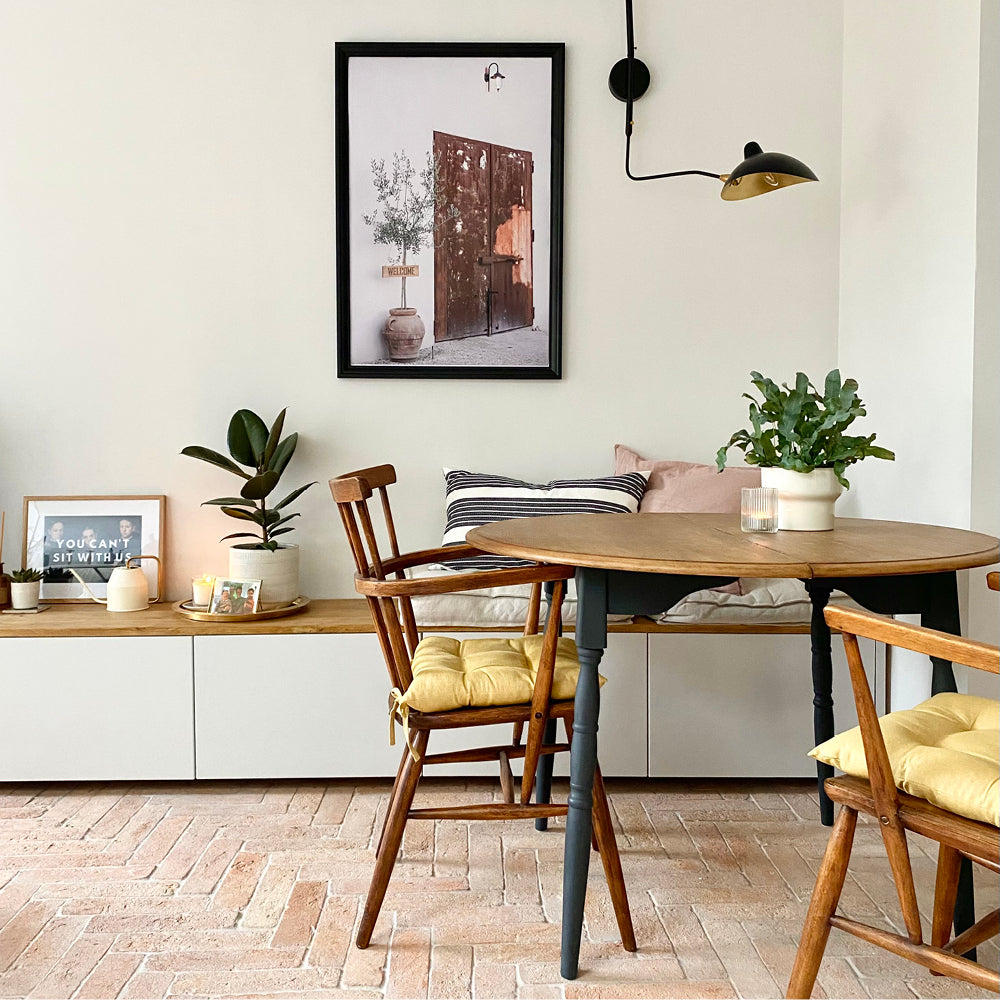
"One of the important things to remember is that you have a choice of whites when you're decorating," continues Aaron. "So when you're pairing a white with a bolder colour, make sure you use a complementary shade. Alongside greens you should use green-based whites such as Pampas or Kind Regards. These whites add a softness to make things feel more relaxed and cohesive. They also have the effect of making bold colours feel less aggressive."
ACID POP
"Our vivid lime green Plant Power is bang on trend this season with other acid pop colours such as chartreuse, lemon and violet," says Aaron. "For more traditional properties, use a dark colour like The Record Store for the skirting, lower half of the wall and the picture rail. Then you could use a vibrant colour like Plant Power on the coving and ceiling to create a bold highlight. An unexpected choice like this lifts the eye and helps to bring light and freshness into the room." 🌿

If bold colours are your thing, keep your eyes peeled 👀 for our gorgeous new mustard yellow, House Points which pairs brilliantly with black The Record Store, warm grey Margot or beige Cargo.
PLASTERY PINKS
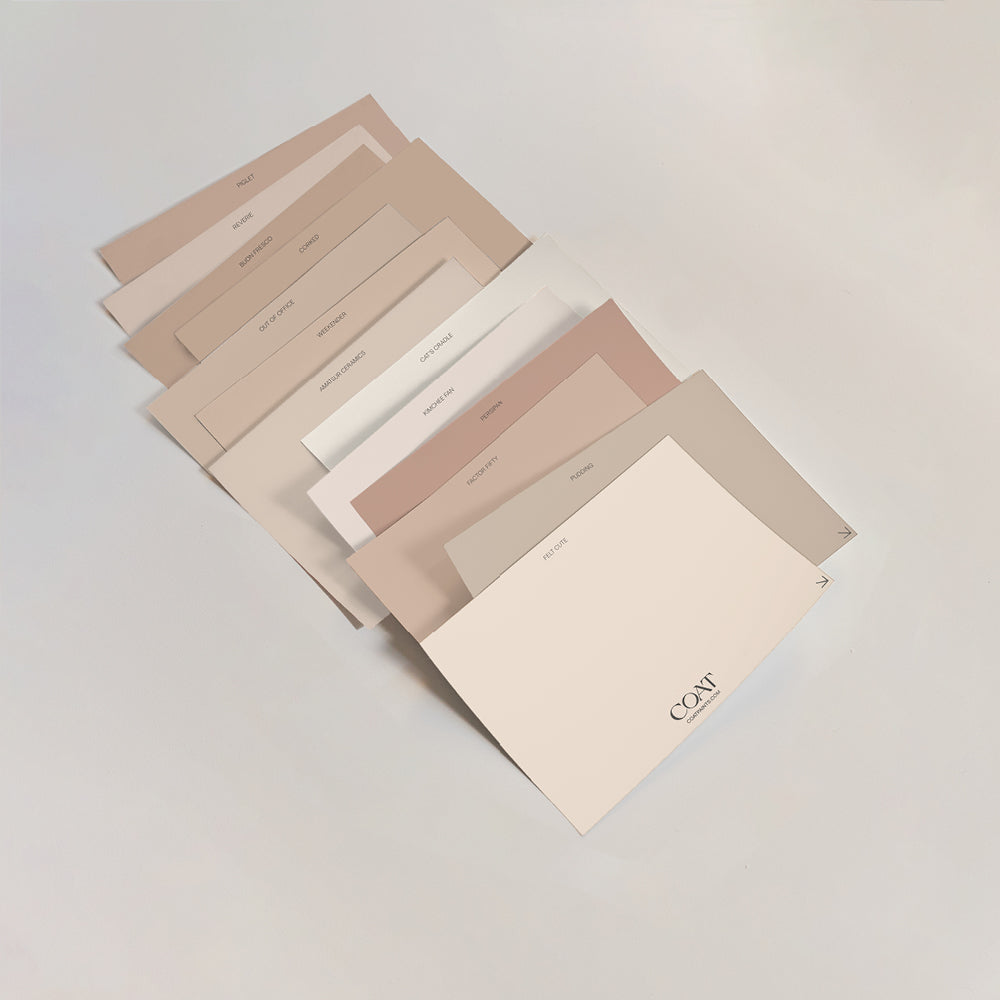
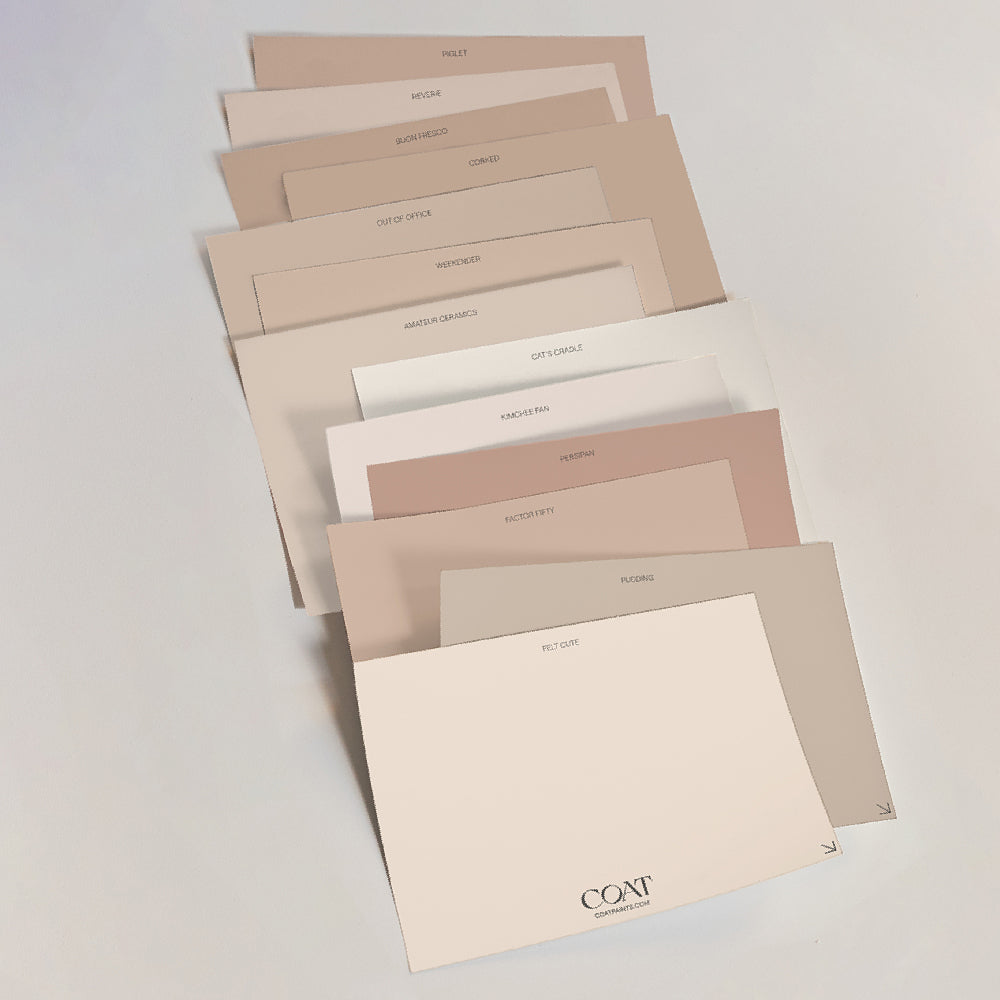
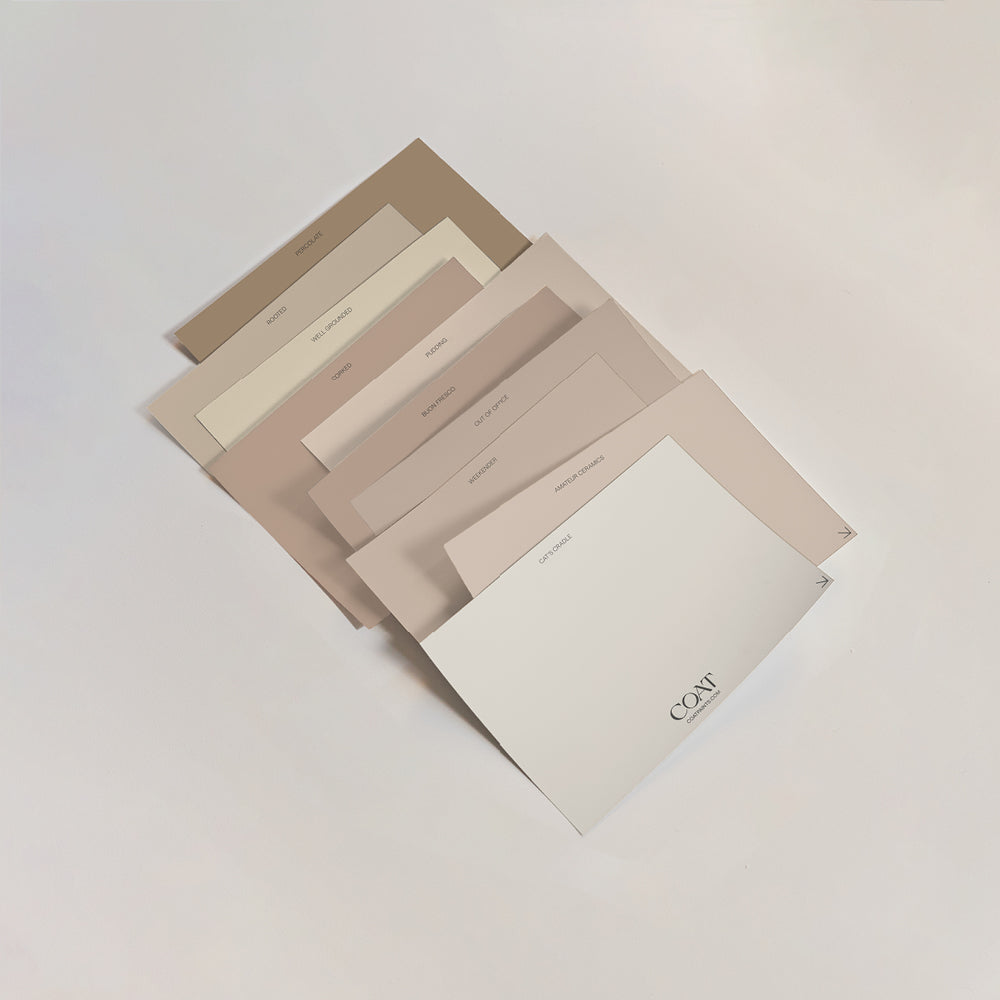
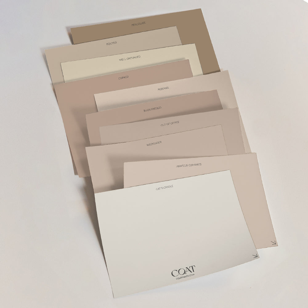
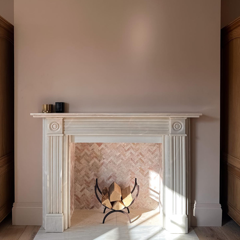
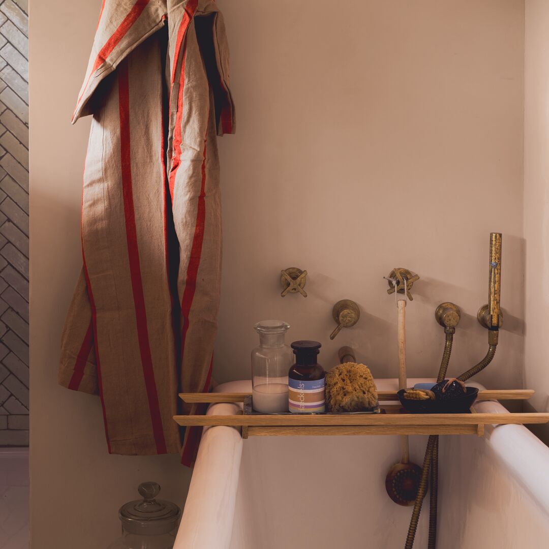
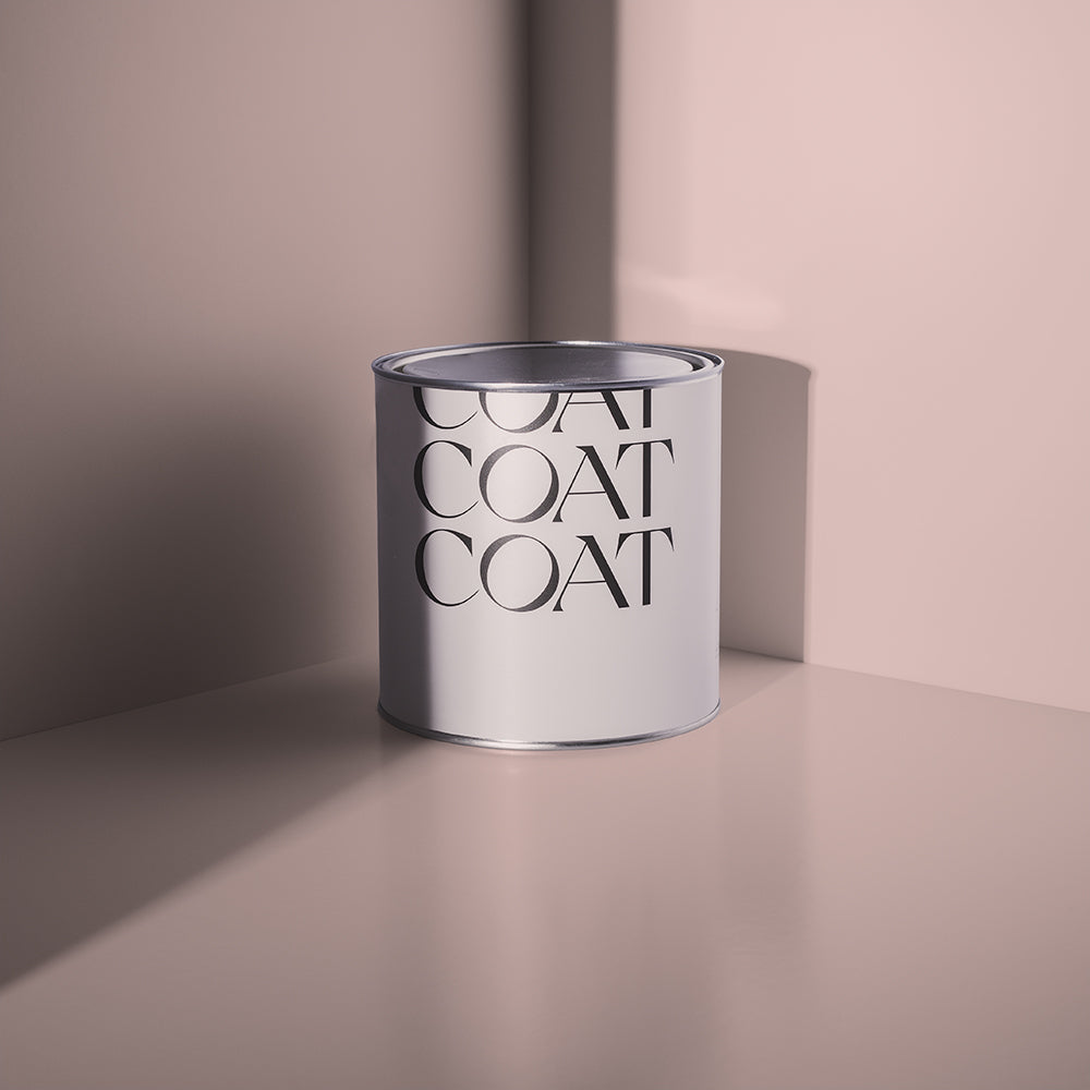
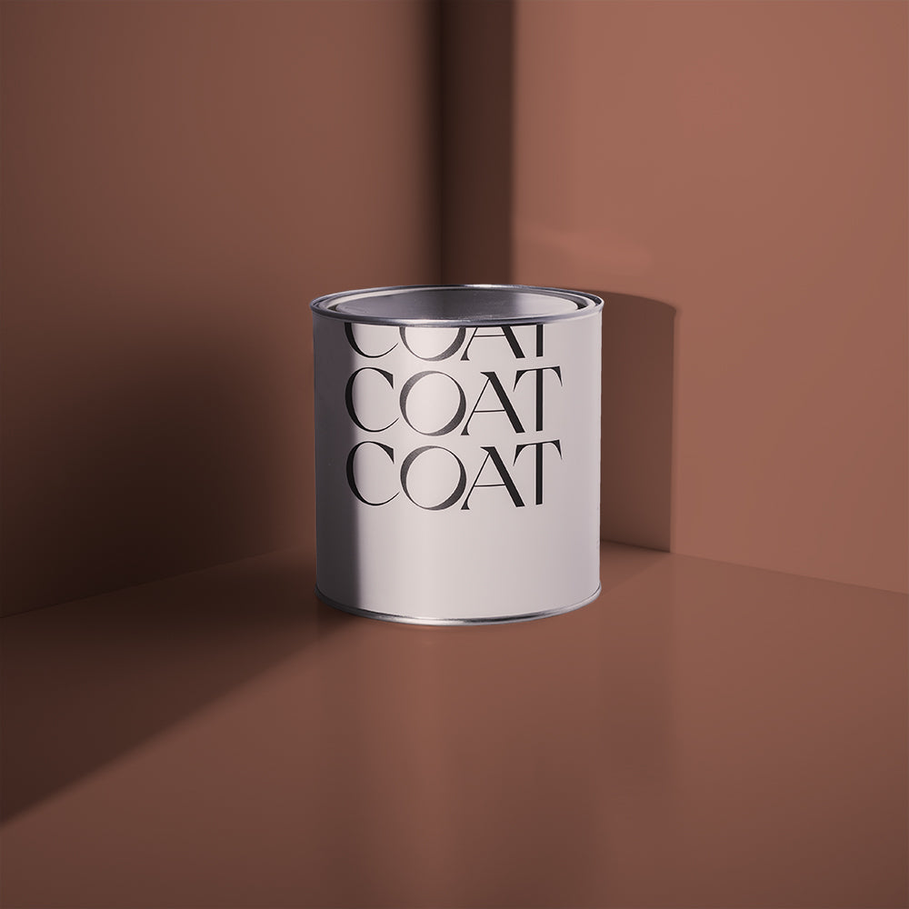
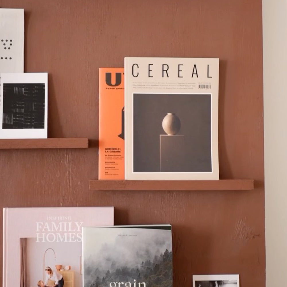
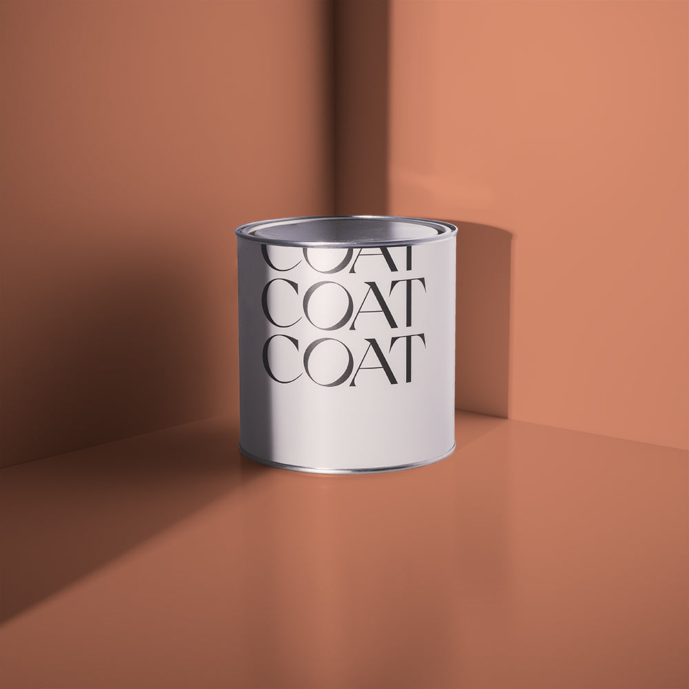
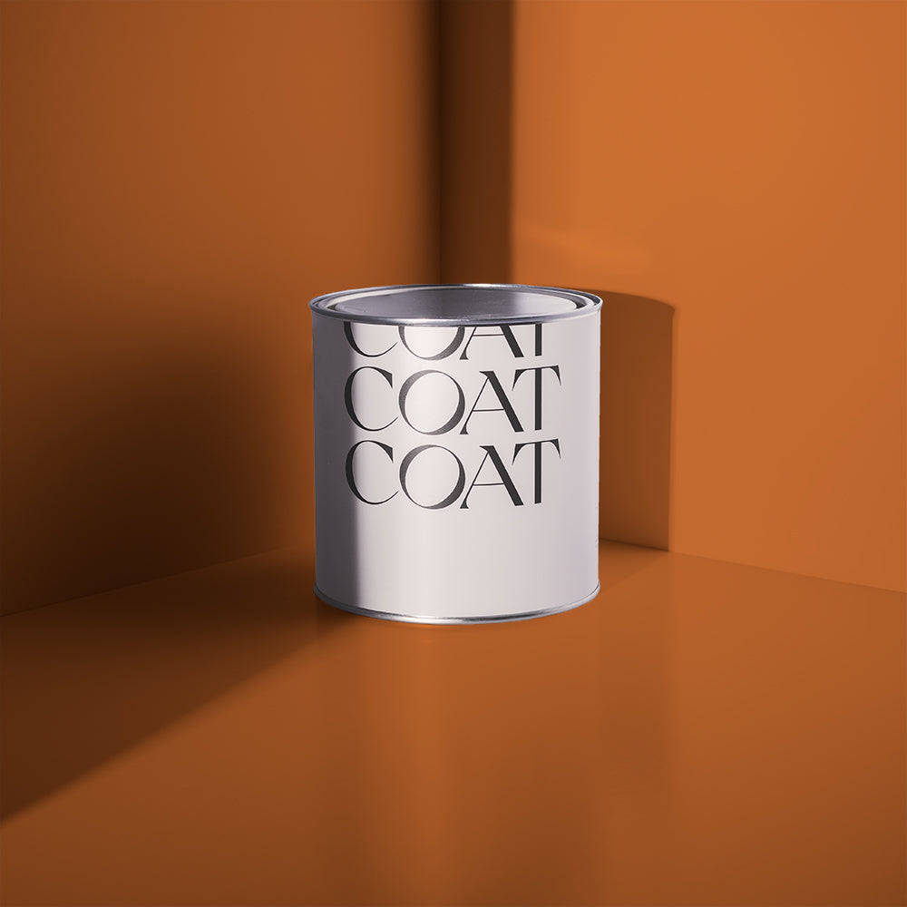
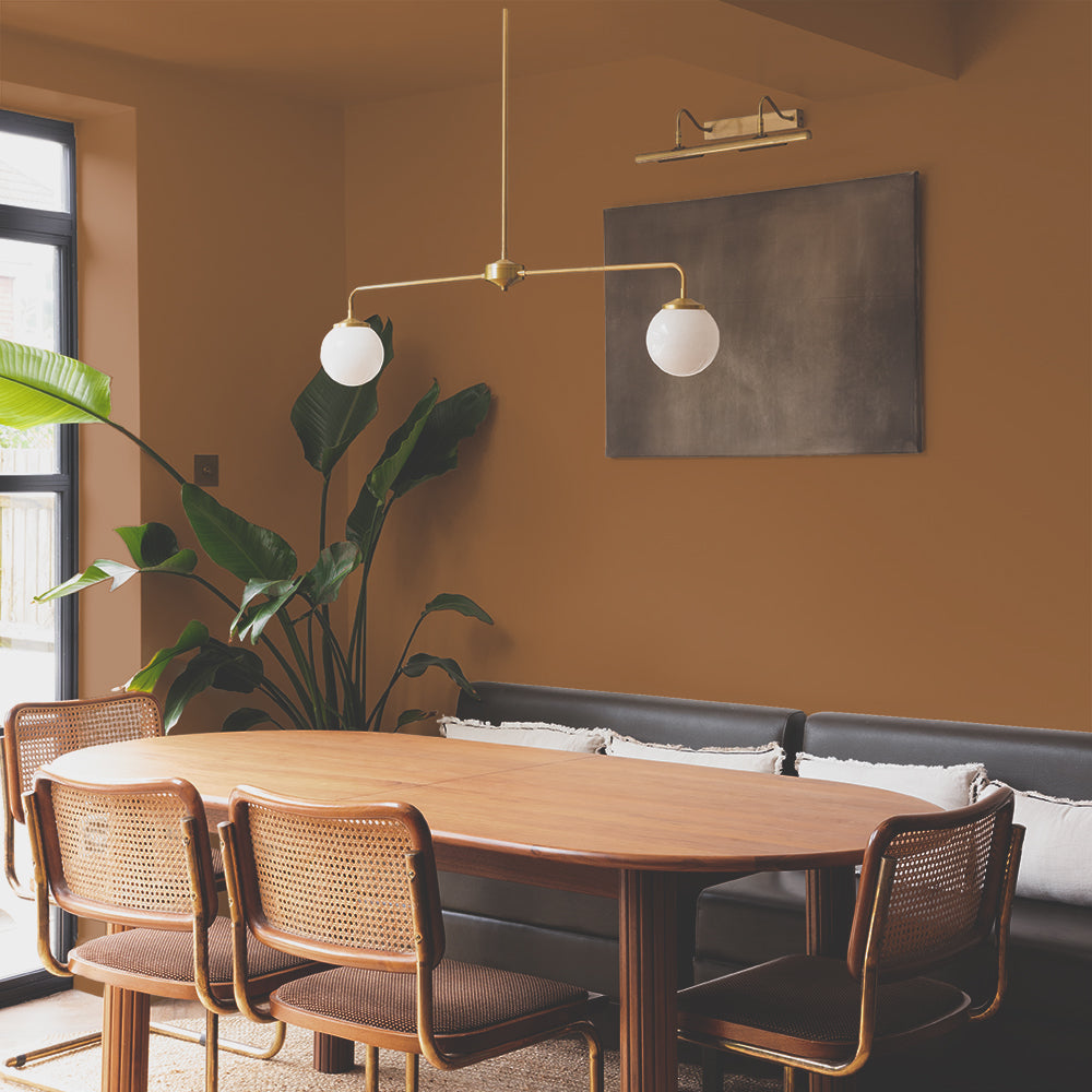
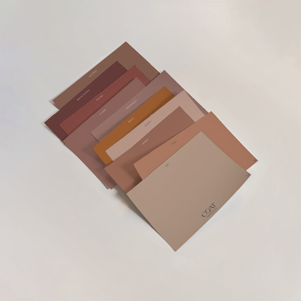
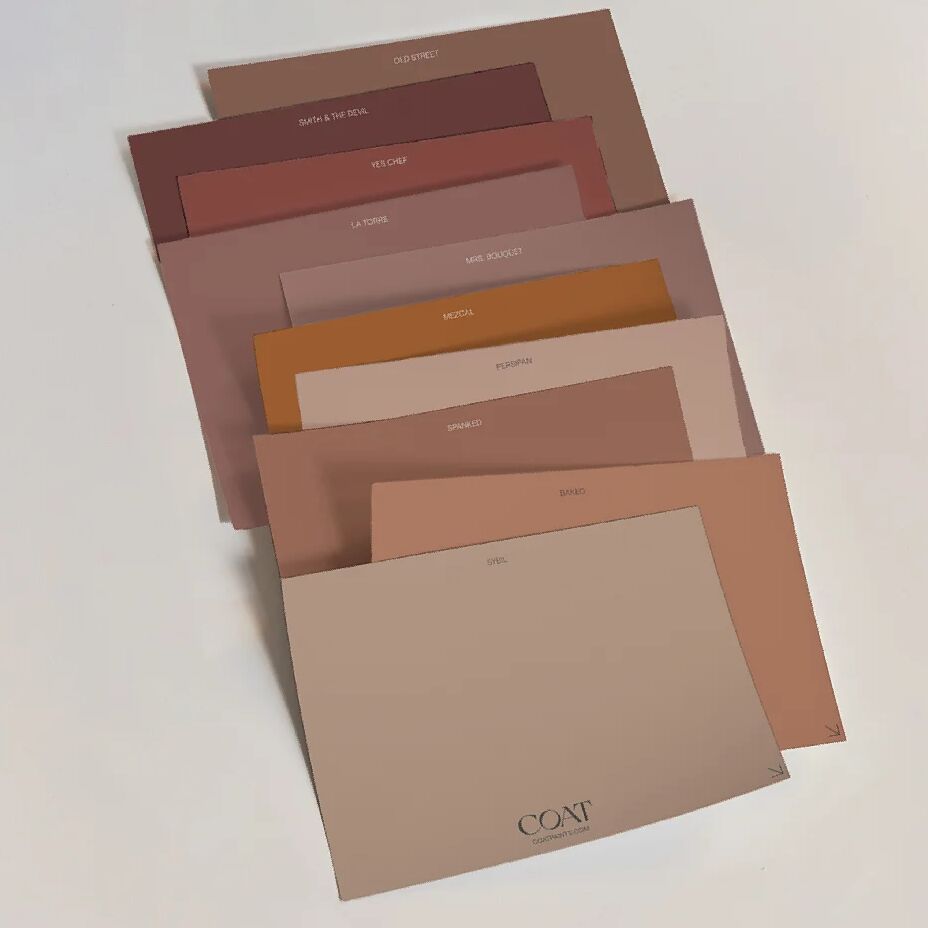
Pinks are huge news for homes this year, and we've got some lovely new combinations up our sleeve thanks to our newly-launched colour collection. Rocking the plaster-pink look is our fabulously fleshy Factor 50 which is a natural BFF with either earthy pink Persipan or rich terracotta Baked 💕
"The plastery aesthetic is hugely popular and layering more vibrant terracottas on a base of pale plaster colours is a really nice way to create a boho scheme," says Aaron. "These pinks are perfect for bathrooms or kitchens – in particular Factor Fifty which looks great in our soft sheen finish because of its low levels of black pigment."
GREYS ARE BACK
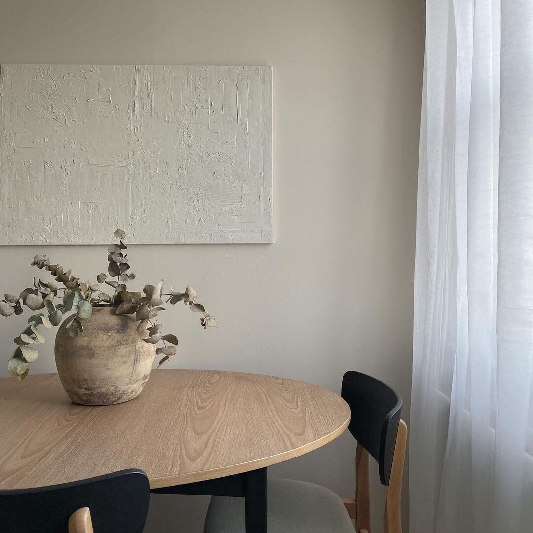
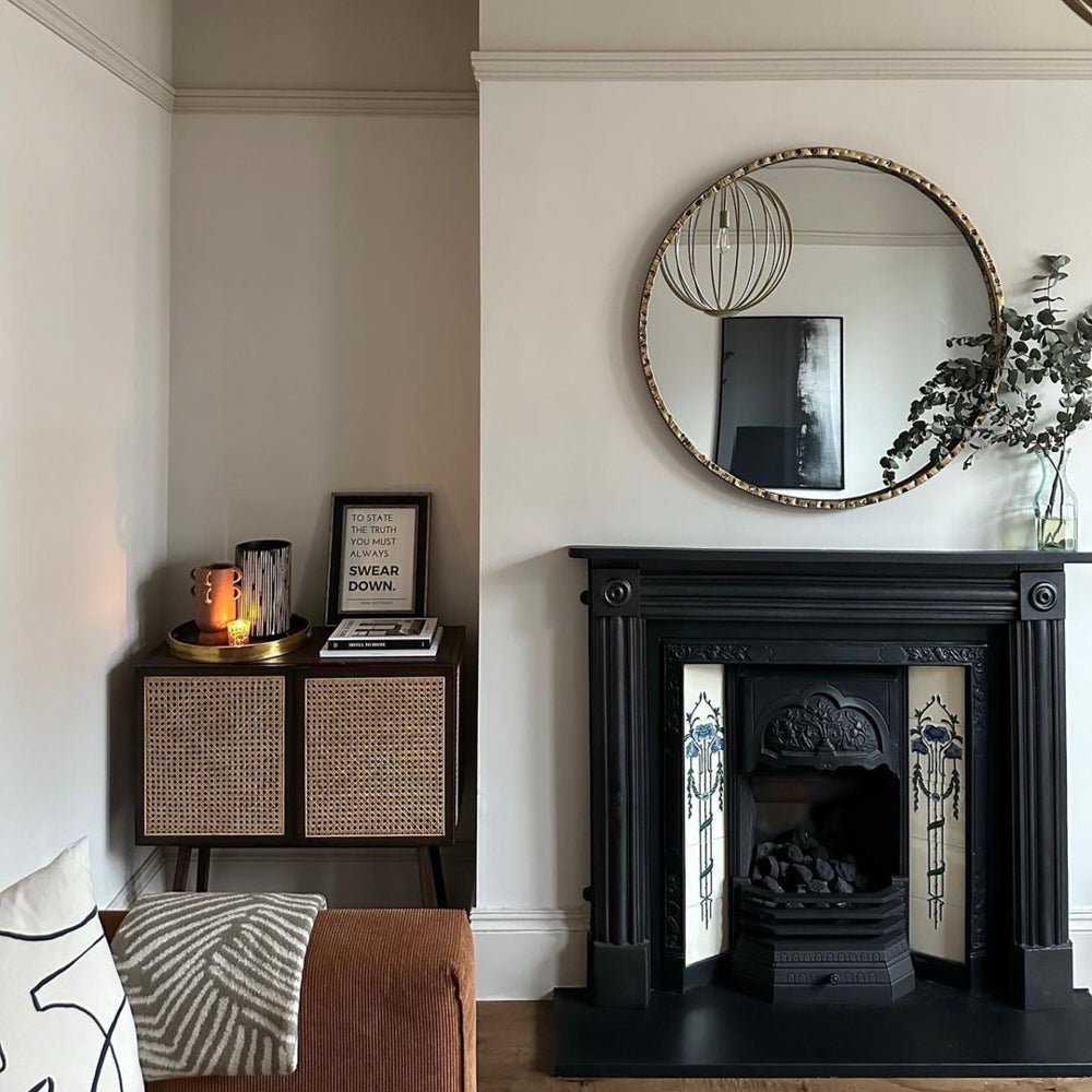
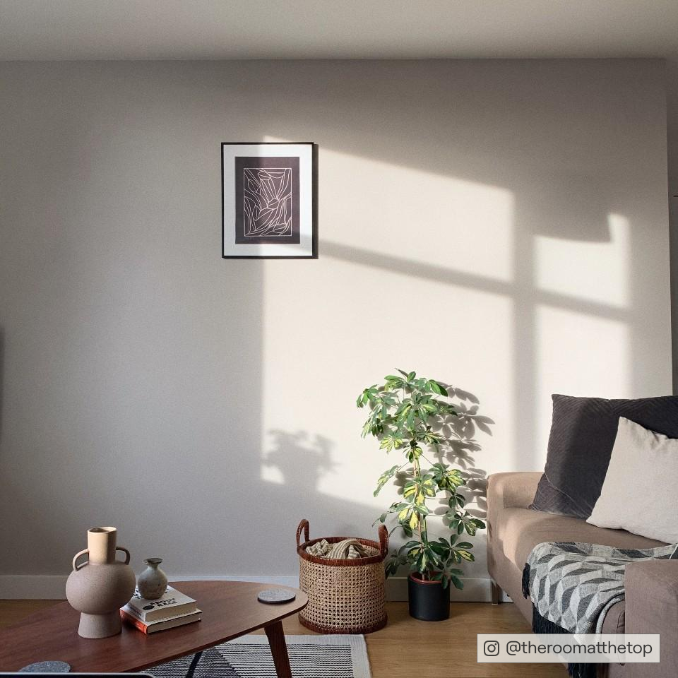
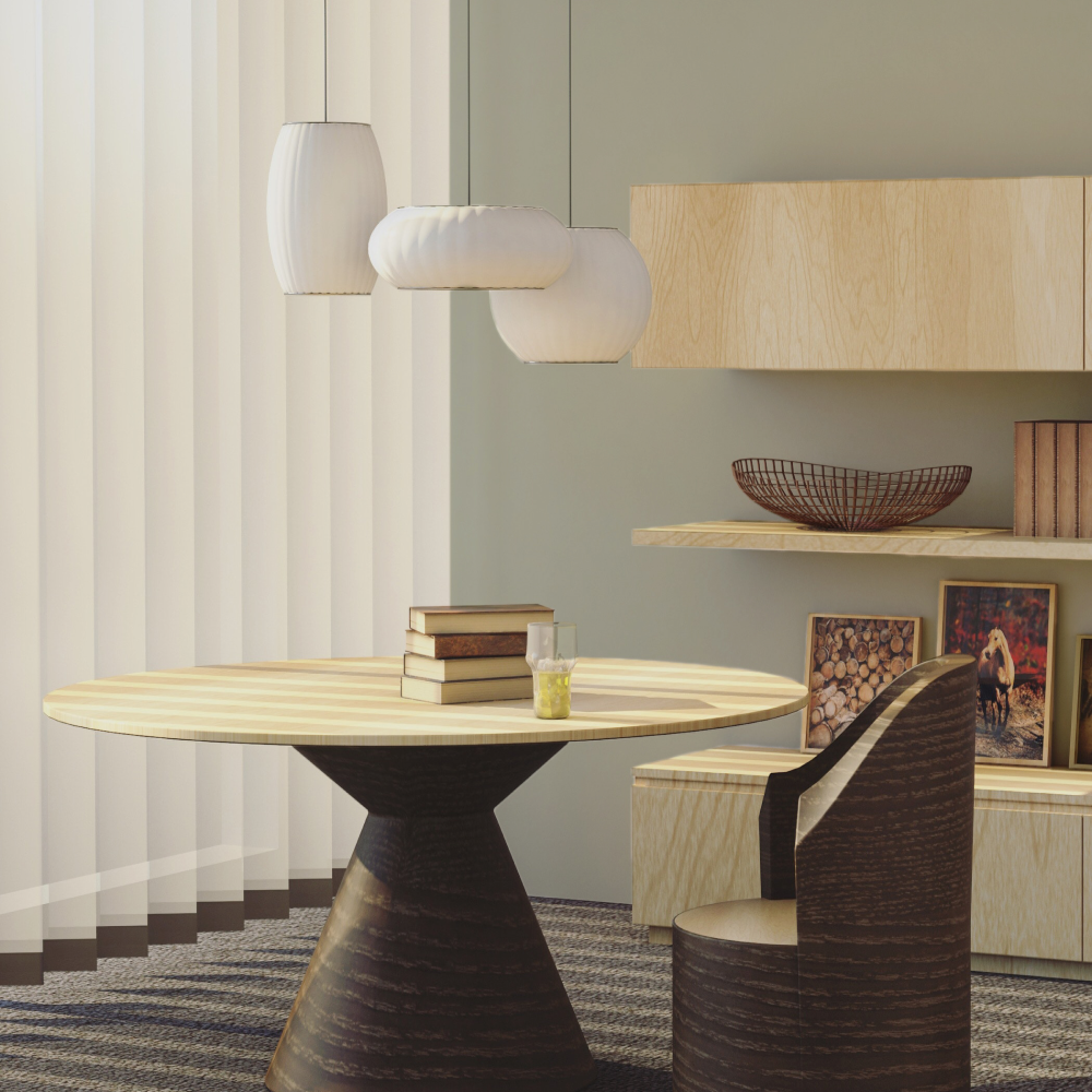
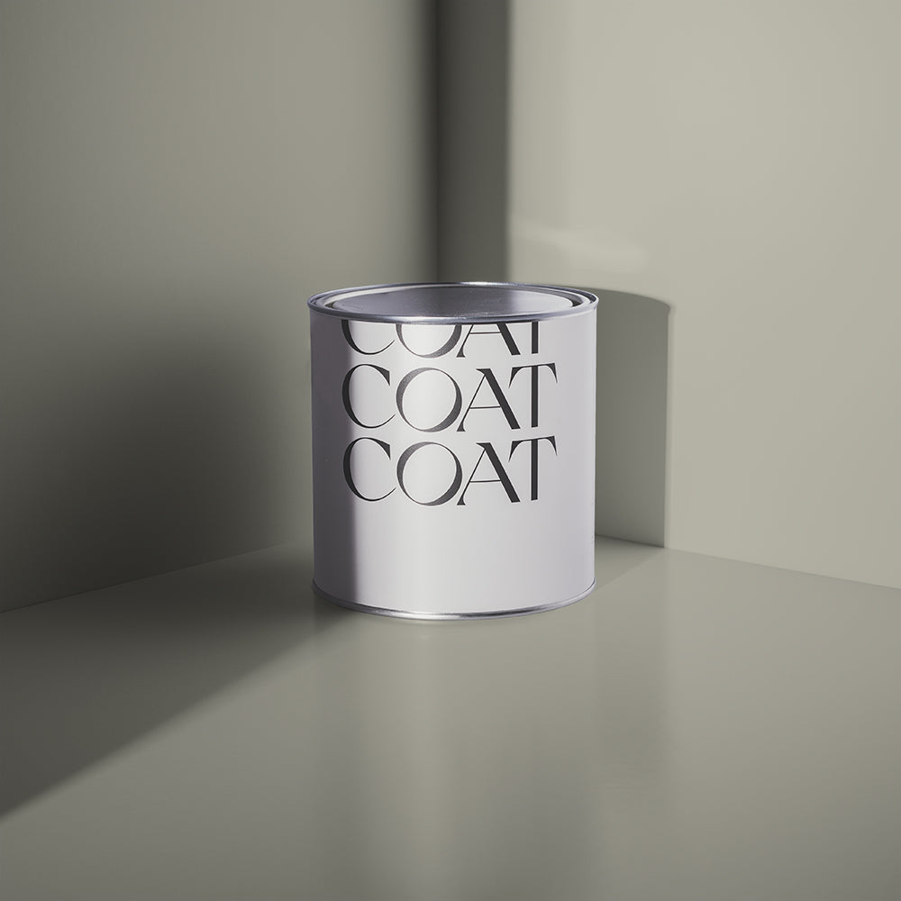
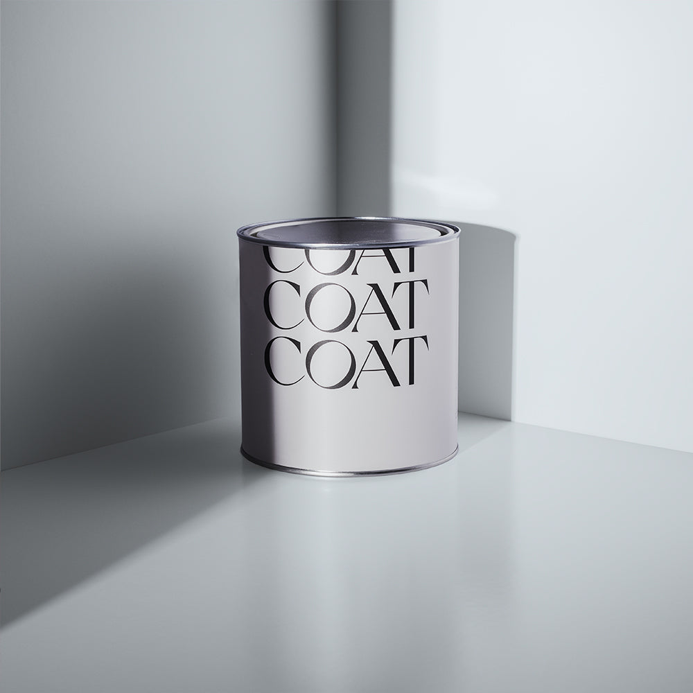
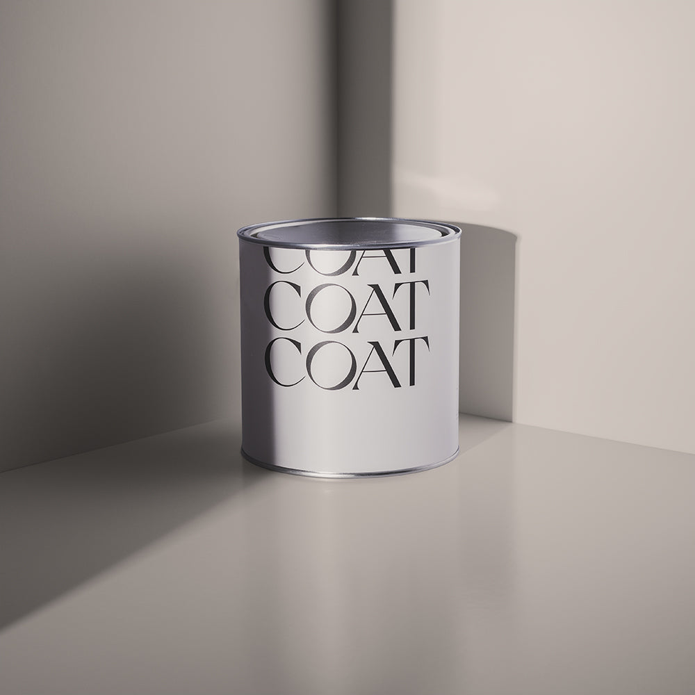
Greys are set to make a major comeback this year, and the star of the show from our newly-launched palette is our charming mid-grey Margot. "Margot works well with everything. My favourite way to use it is to combine it with our warm, dark grey Big Timer. Both these new greys have a yellow undertone which means they complement one another really well." says Aaron.
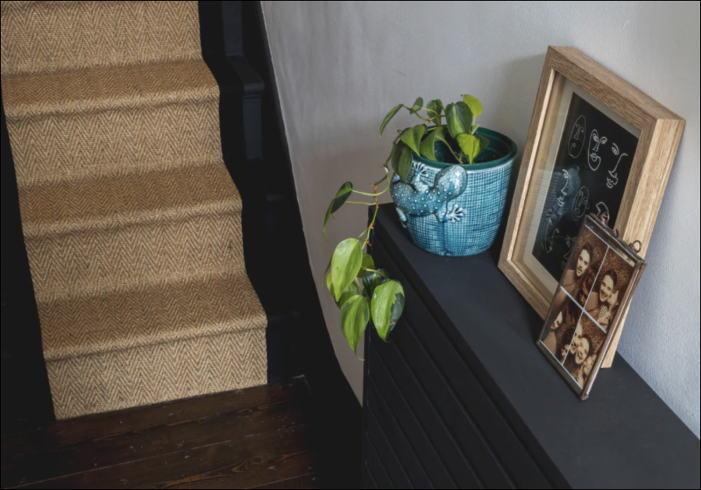
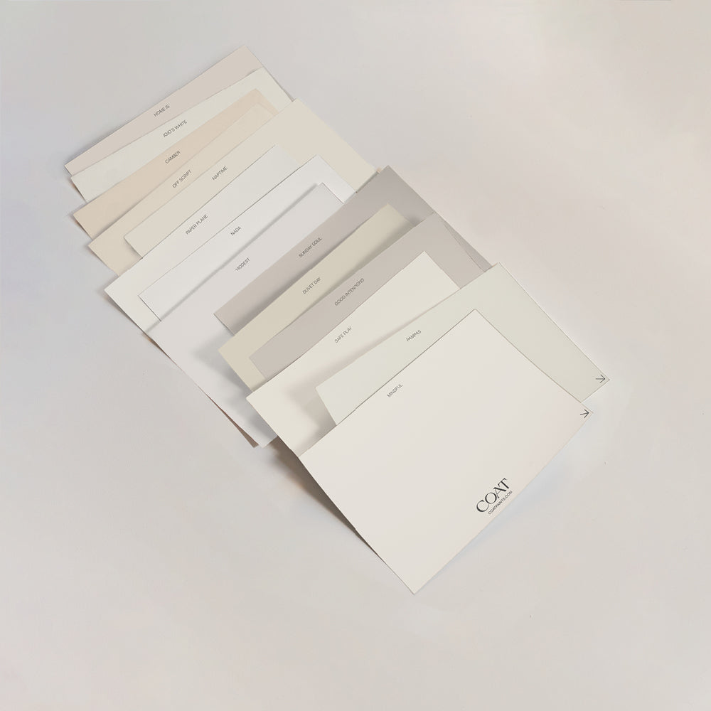
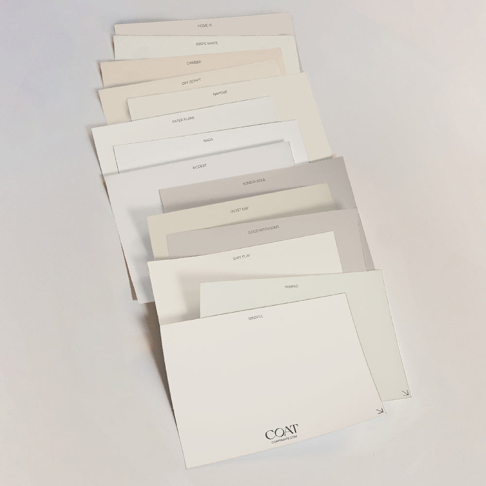
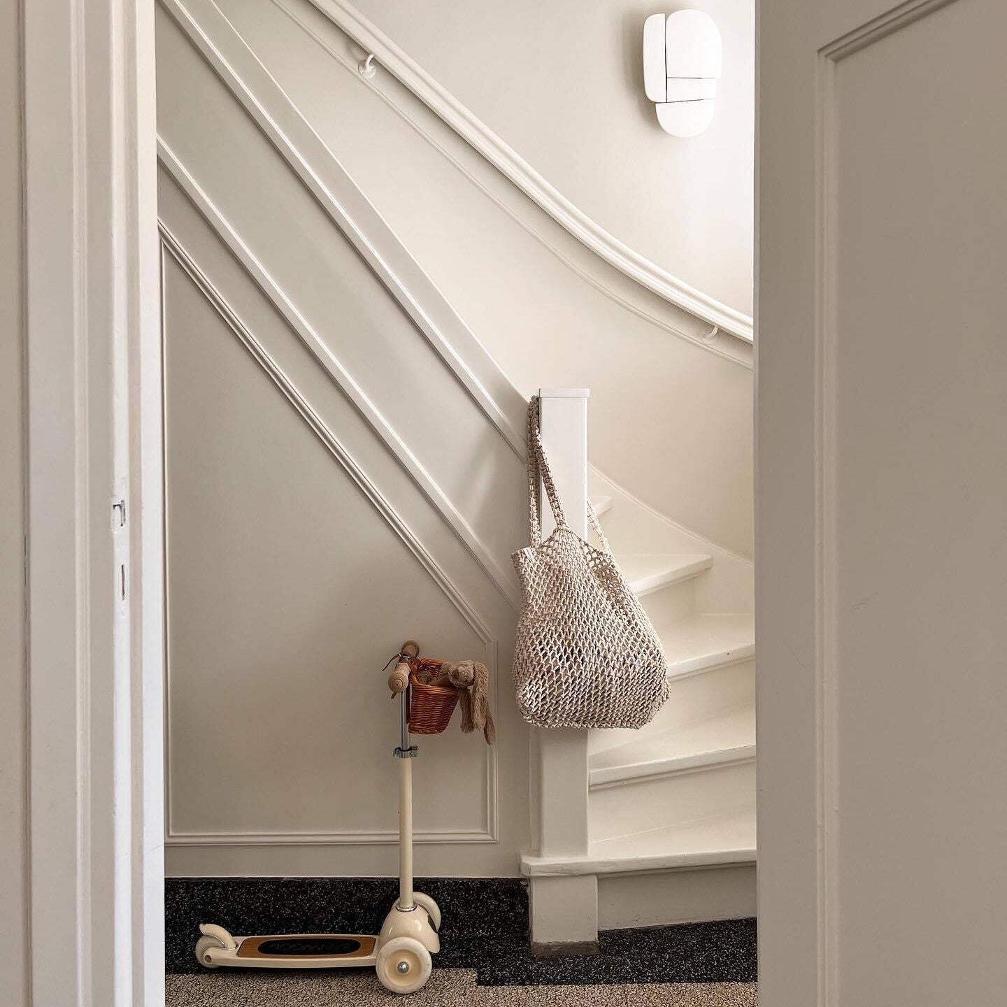
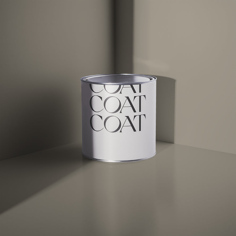
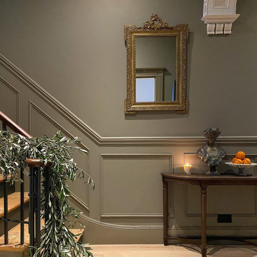
Nestling up nicely with the greys are our lovely range of taupe shades, including our newest kid on the block Cold Brew. "This deep taupe pairs beautifully with our pale greyed taupe, Good Intentions," says Aaron. "This combination brings a warmth and cosiness to a space which makes it perfect for stairs or other woodwork areas. The addition of Cold Brew creates a moodier element which is wonderfully grounding and earthy."
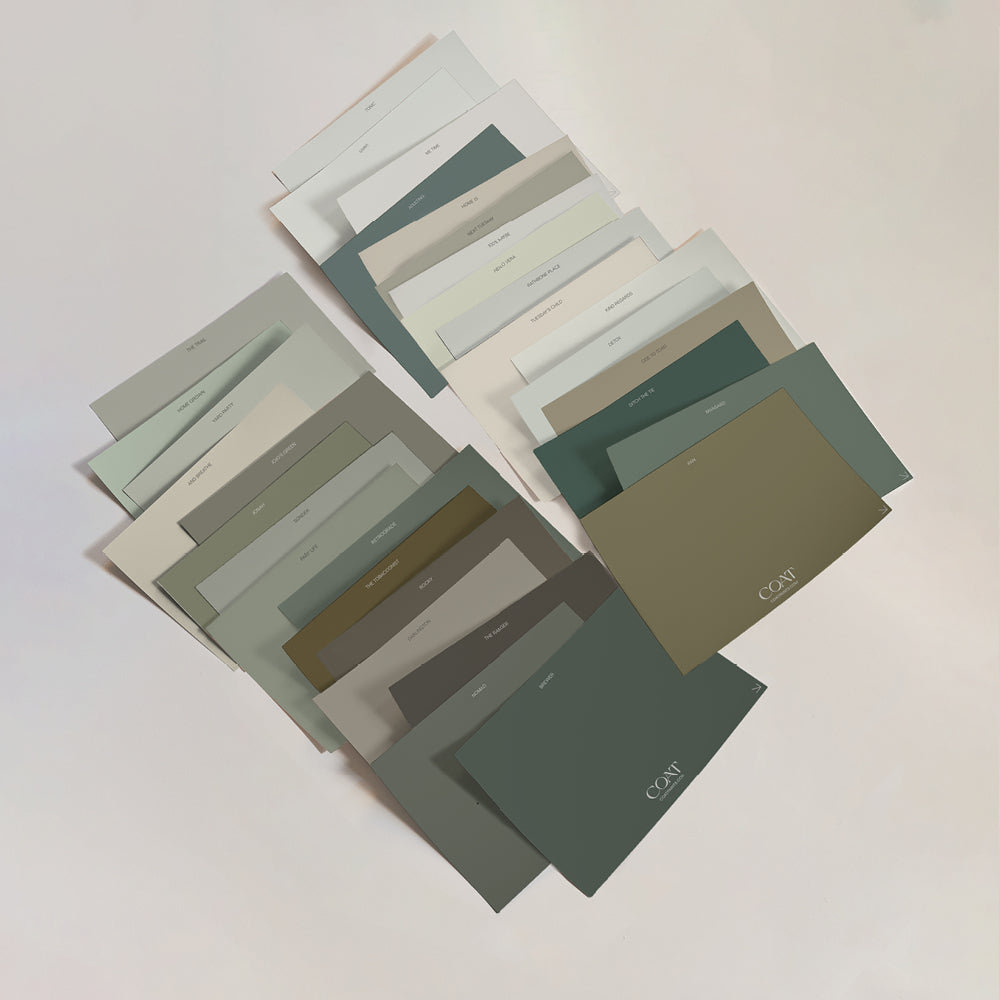
Fancy finding your perfect colour combo? Take your pick from our collection of carefully curated, planet-friendly paint colours 🌈
Publish Date
Author









Leave a comment