Living Room Colour Schemes
For most of us, our living room is pretty essential. They’re for entertaining, Netflix & chilling or hibernating with a good book. The multi-purpose nature of the space means that your living room decor ideas will need to incorporate the right backdrop for your life. Modern colour schemes for living rooms pull us towards nurturing colours, that encourage relaxed engagement in the day, and under lamp light are cosy and inviting.
Here’s a run down of our fave living room paint ideas to create a living room colour scheme that works for how you use this room in your own habitat.

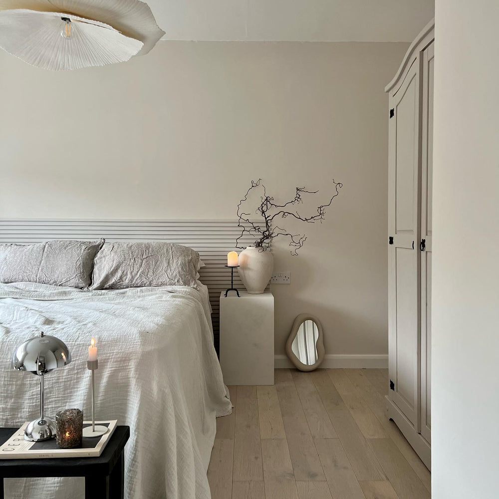
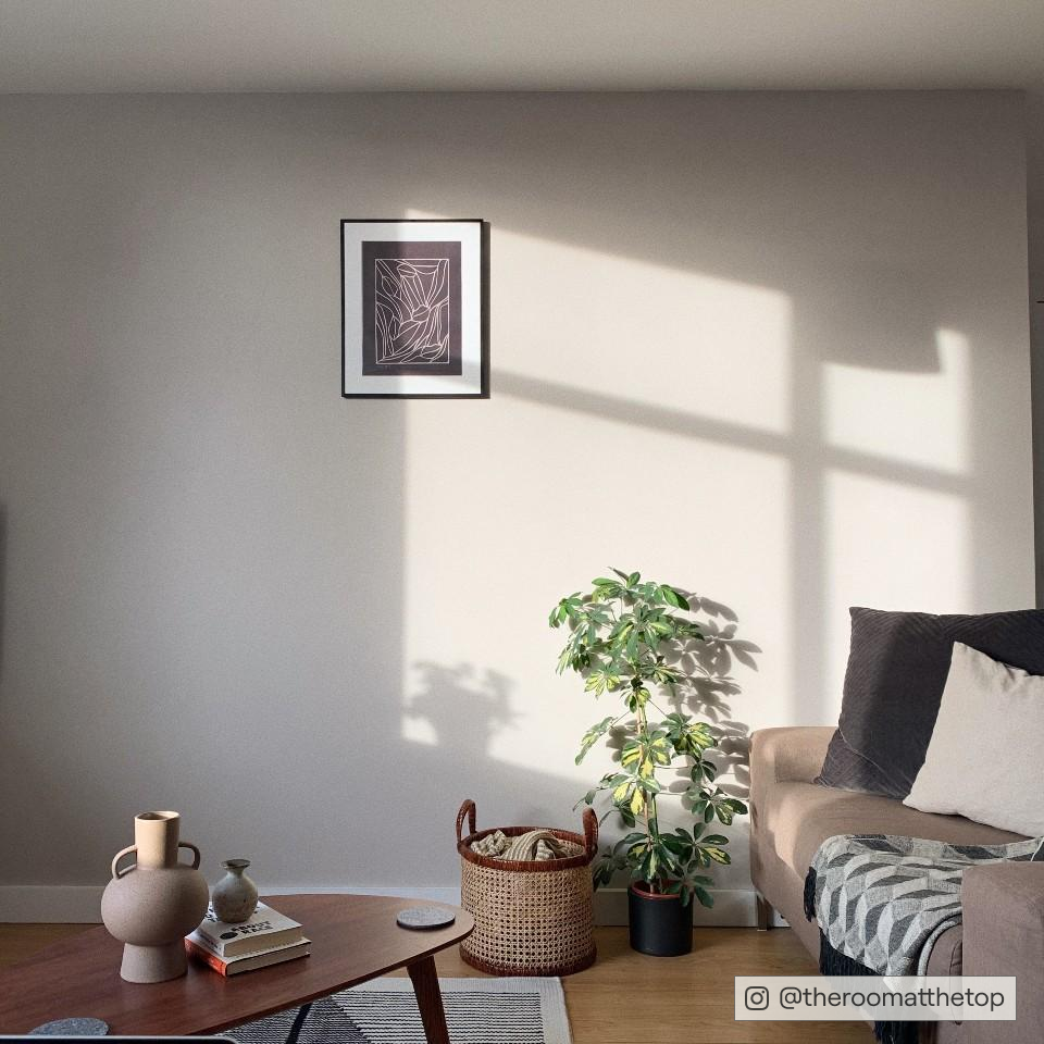
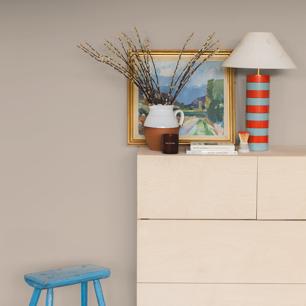
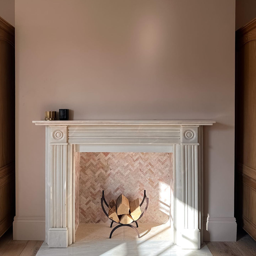
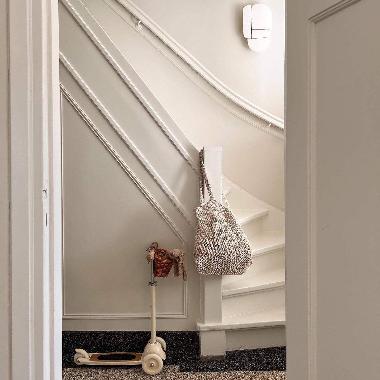
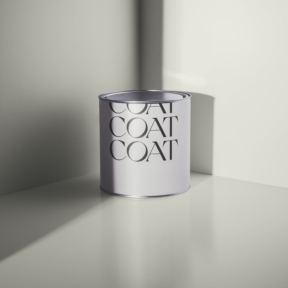
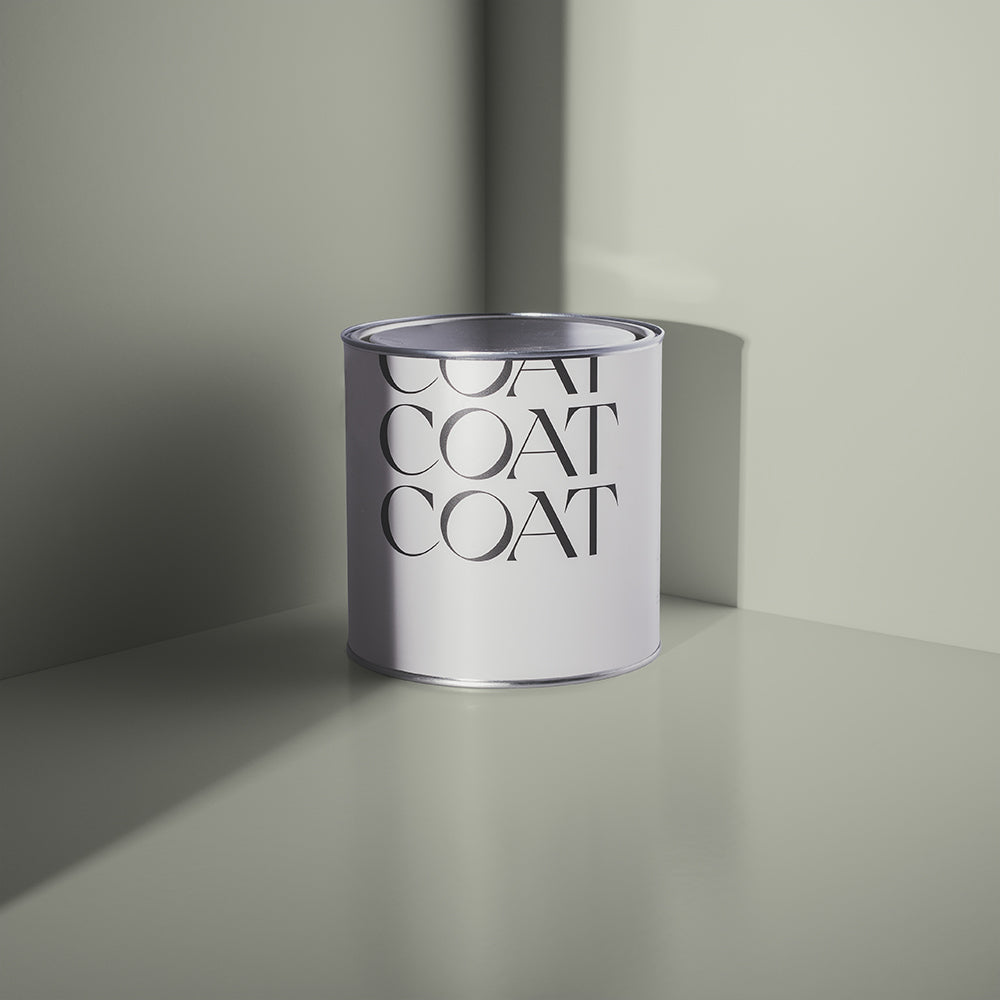
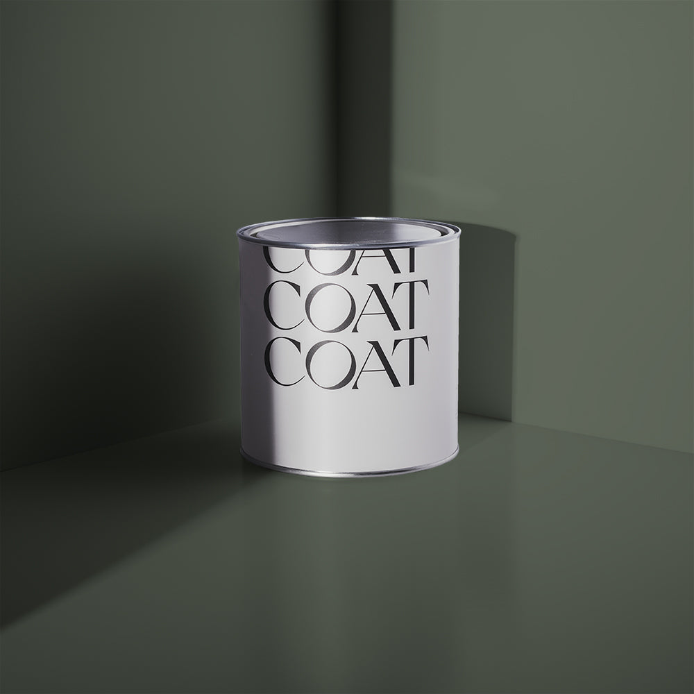
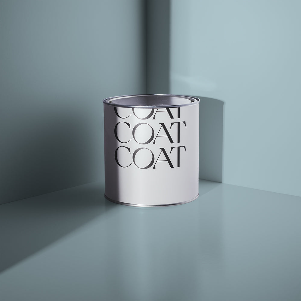
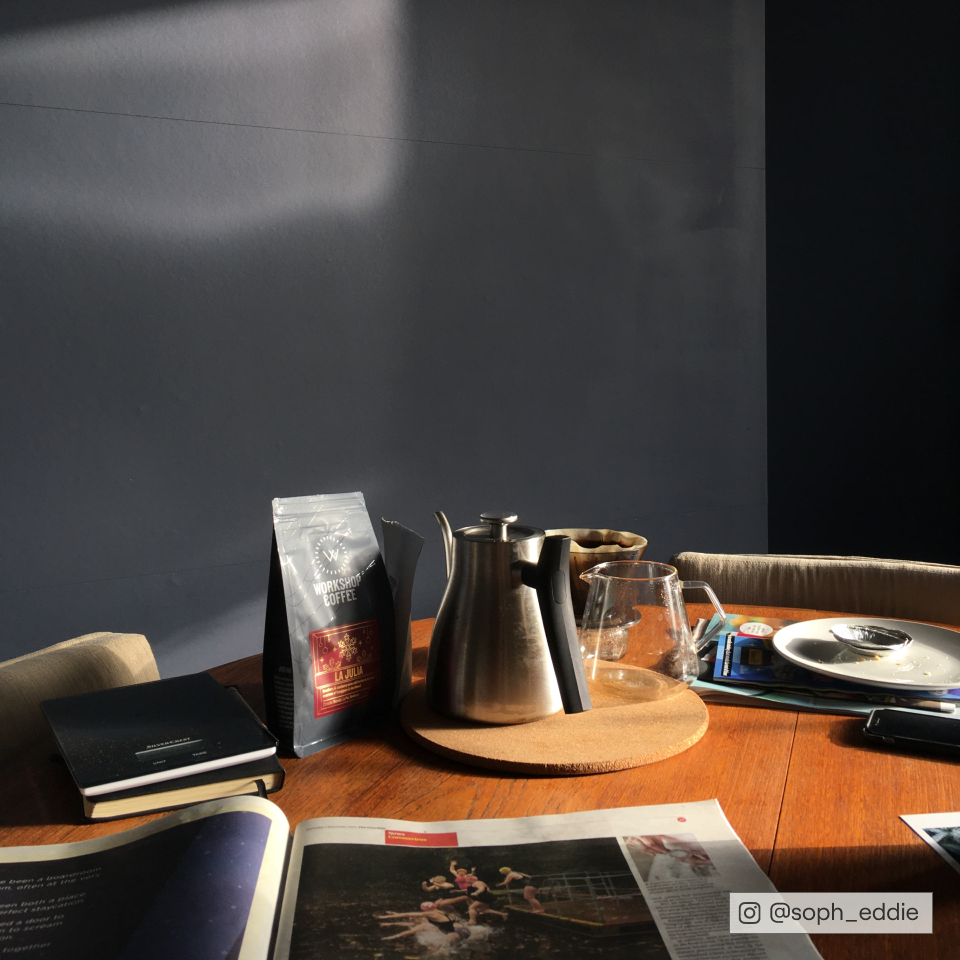
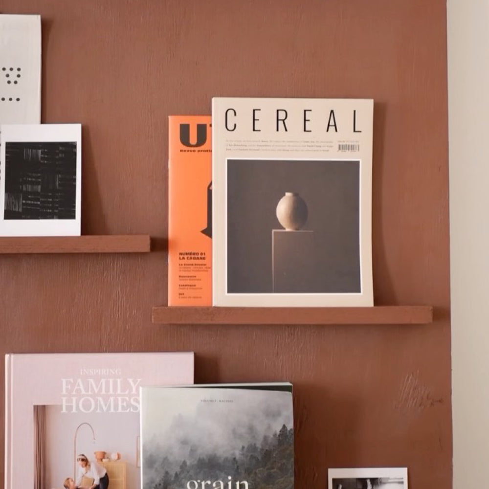
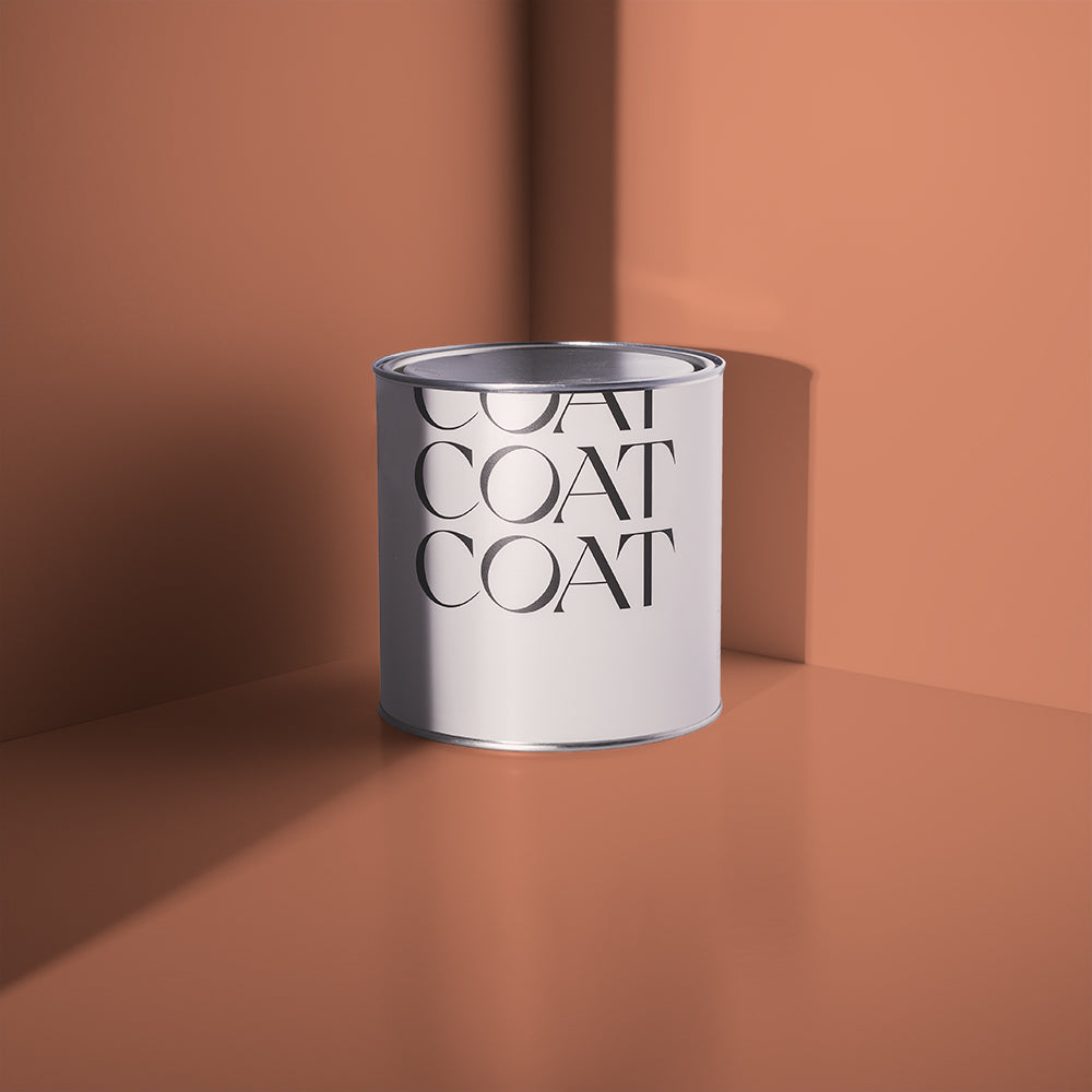
@molecule.designs used Darlington in this living room space.
Calming Neutrals
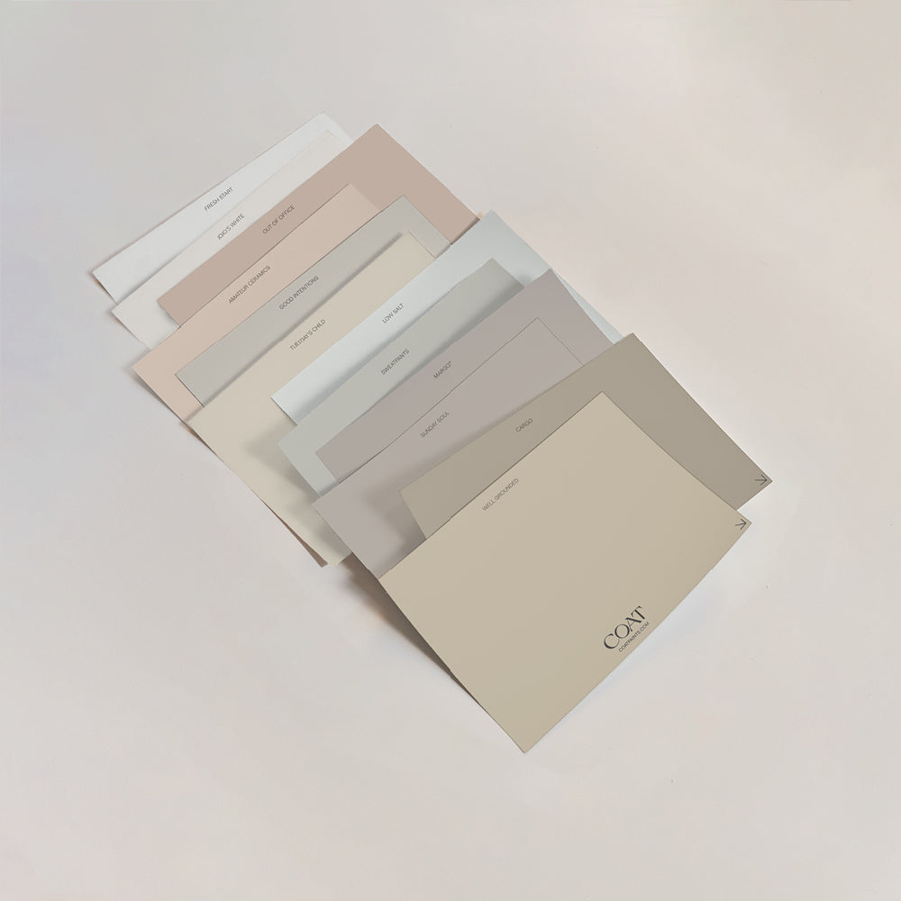
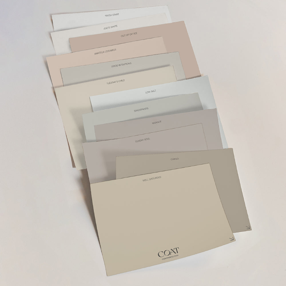
We shouldn’t underestimate a neutral colour palette for a living room, they’re inviting, and if they’re deep enough make for a seductive snug. For calming neutral living room colour ideas, when using a palette of stones, beiges and greiges in different textures creates a cohesive space. The considered use of white is also really important to the neutral colour scheme. Keep your white to the highest plane of your ceiling, and your room will feel taller and airier. For those of you needing a durable living room paint, stick to brighter neutrals in our Soft Sheen finish. The brightness of the colour will negate some of the additional sheen and mean that you can clear up after the mucky pups in your family.
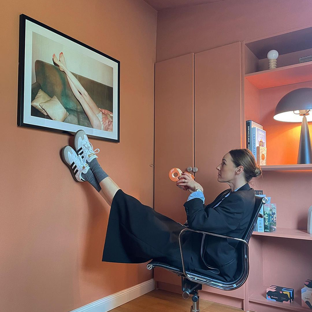
Oatmeal colours, taupes and beiges work well with black furniture and artwork. Used either low down, or in small proportions, these black accessories make the rest of the space feel welcoming and bright. See this masterclass in transcendent taupes by @ourhome_upnorth, who has used Good Intentions to make their neutral colour palette look great:

@ourhome_upnorth x 'Duvet Day' is a match made in heaven.
A great place to start when working on your living room colour ideas is with your fabric choices. A mustard or deep olive velvet works wonders paired with natural linens, rattan and ebonised furniture. Use yellow based, beige neutrals like Duvet Day on walls, with woodwork in Well Grounded for a subtly warming lowlight.
Timeless Greys
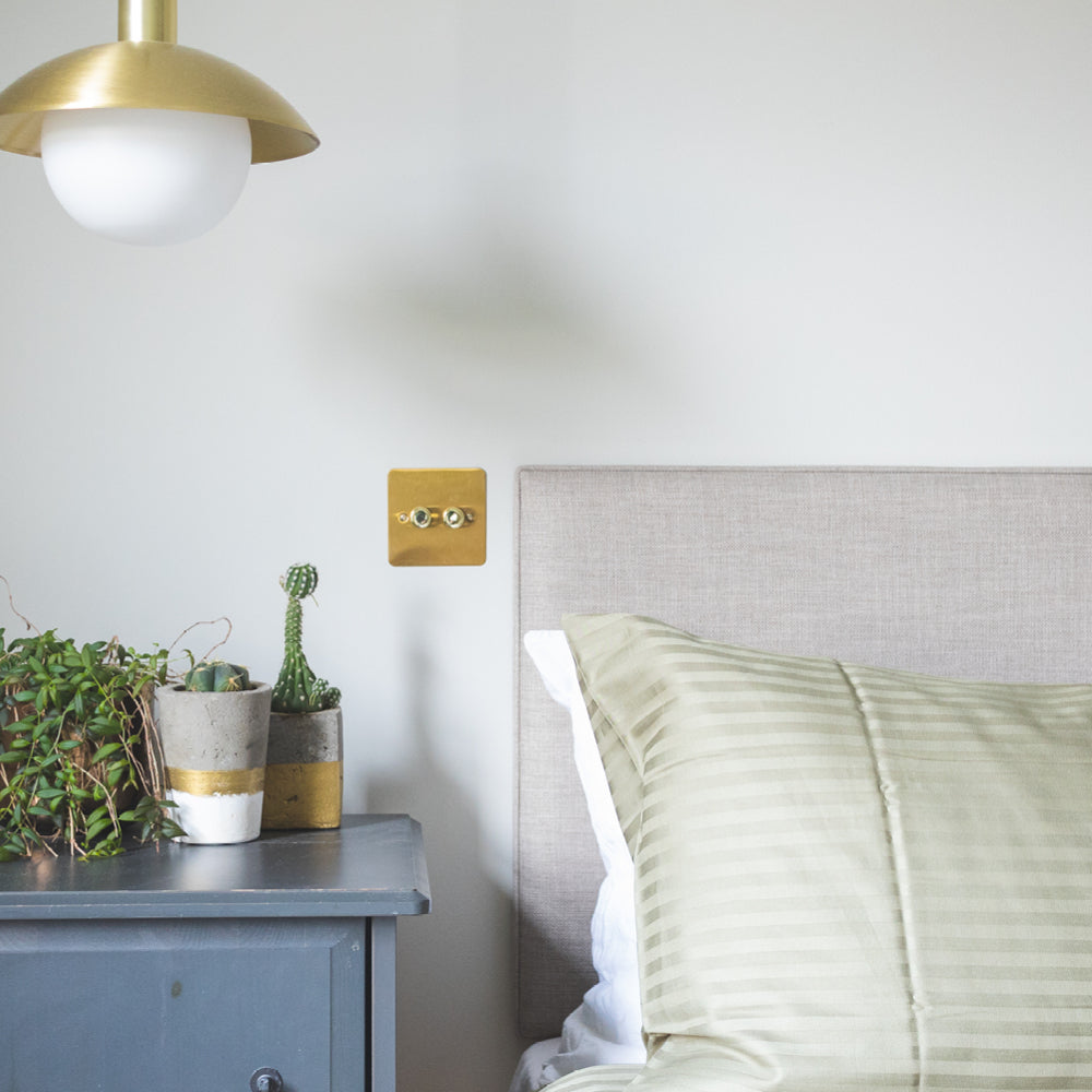
One of the safest paint colours for living rooms is grey. It’s been fashionable for centuries as a parlour and living room colour because they’re easy to live with and pair easily with most other colours as accents. Each grey will have a subtle undertone which makes this group of colours extremely versatile in different lighting conditions. Yellower greys, like Margot, are great paint colours for living rooms that are North or East facing as they provide a subtle warmth. South facing living rooms usually have warmer light; if you want your living room to feel properly grey then you can opt for cooler tones. On Mute has a blue undertone, so provides a softer, cleaner look in these brightly lit spaces.

A wam-grey can really brighten up you space, take inspiration from @asouthlondonhome and grab a swatch ✌️
To create some contrast, paint in-built cabinetry in deeper tones like Big Timer and The Coal Drop (remember to use Primer if you have unpainted MDF too). These will bring some energy and grounding to the space and add some drama to an otherwise safe scheme. For a truly timeless grey scheme, choose a softer white like Low Salt for ceilings and woodwork. The addition of a black pigment in this white creates a gossamer effect which pairs effortlessly with all of our greys.
Primary Colours
Sometimes a neutral scheme can be a little injection of colour, and primary colours are often the most obvious, and fun ways of doing this. Curating your colour ideas for a living room when working with primary colours can be tricky, but having different living room paint finishes at your disposal is really useful in doing this. Upcycling an old sideboard or some bookshelves with a primary colour is a great way of instilling your living room with a touch of drama.
Let’s say you have a typical Victorian living room: mid-century stony neutral, Ambrose, on your walls with in-built bookcases in deep rusty red, The Old Corset Factory, will add warmth to the space. This is a modern take on a typically Victorian colour palette, where a stony colour would have been used as a woodwork colour for dark red walls.

Sometimes you've gotta make a statement. @baking_a_home doing just that with 'Old Corset Factory'
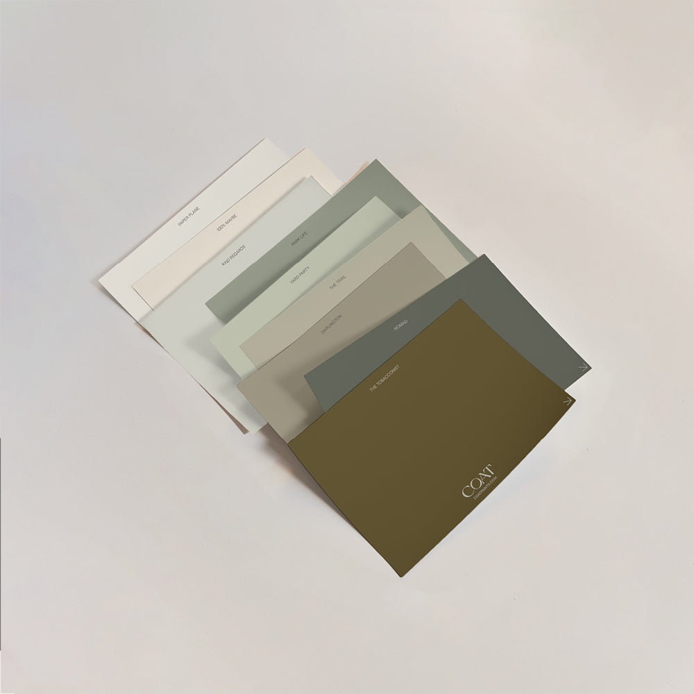
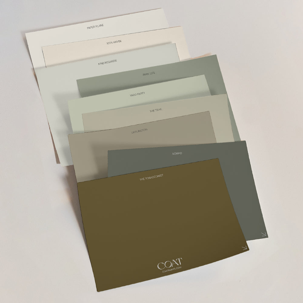
If you’re more of a feature wall person, dark blues have been a reliable staple for a while now, and that’s because they’re familiar and rich. Combine green greige, Kind Regards with The Drink (a dark marine blue) as a feature wall for a perfect pairing of luxury living room paint colours. They relate through their green undertones, and work great most rooms, as Kind Regards also has yellow pigment that keeps it inviting. Remember to mix up your living room paint finishes too, as this would be an awesome pair for that upcycled sideboard we mentioned earlier.

@thenorthernterrace keepin' it cool with 'The Drink' to create a cosy corner.
Deep Darks
Some of the most loved design ideas for colourful living rooms come from the depths (literally). Shades with black pigment are naturally restful for the eyes, and so no wonder dark greens, blues and reds have become such popular living room colours. It’s like dark chocolate, it’s not for everyone but it’s (a little bit) healthier for you, and makes you feel way more sophisticated.

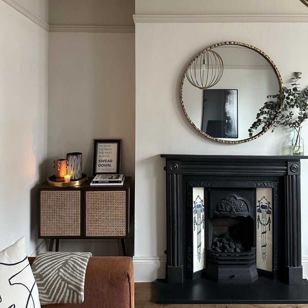
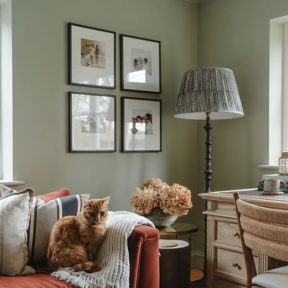
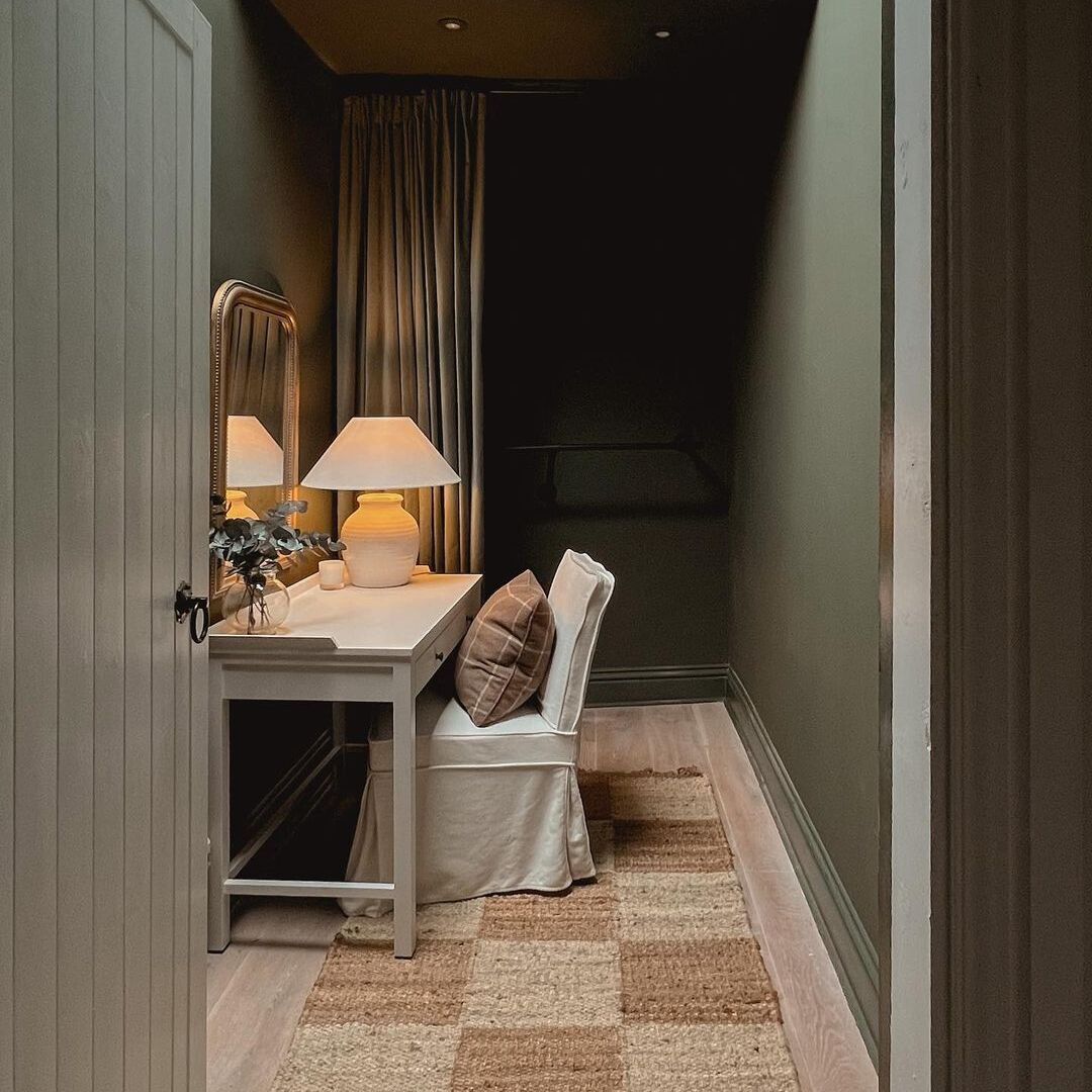
@Tiny_victorian_home stunning living space using 'Adulting'.
Interested in two hot colour combinations for living rooms? Well,
Adulting, our deep, greyed teal has been one of COAT’s most popular living room colours since it’s release, and for good reason. It’s a very grown up decision to make. Bringing out the complexity of Adulting is a tough job, but creating a two colour combination for living rooms with this colour is best when combined with soft neutrals like Detox & Pampas. Inky blacks seem to do the job too though, as seen from this stunning Victorian living room above by @tiny_victorian_home. One of our fave design ideas for colourful living rooms over the last year.
Sometimes, dark isn’t dark enough. Walls and ceilings in shadowy blacks produce a foolproof backdrop to art work, where they then become the highlight of the room. This works particularly well in small spaces with little natural light. Try blue blacks like David Rose and Forever & Ever to make brasses, bronzes and mid-century furniture look particularly luxe.

@zephys_home living room is just such a cozy vibe. We're obsessed. 'Forever & Ever' used here.
Feeling confident? Grab your dark and moody swatches to try them out at home.
Classic Blues
One of the most popular ideas for colours in living room schemes in blue. Blues are usually stable colours in all lighting conditions so are easy options to pick as they’ll usually look decent. Deeper blues, like The Drink and Adulting, have been all the rage for several years where these marine tones have starred as the jewels in modern colour palettes. Use these tones excessively across walls and woodwork for a dramatic look.

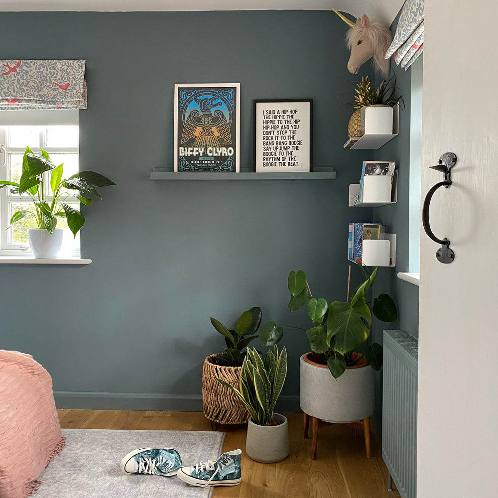
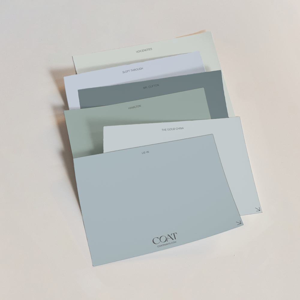
Traditionally, porcelain blues would be used in day rooms, to echo the colour of the sky and evoke a sense of airiness and grandeur. Also, blue pigments were very expensive. Having these colours in your home usually implied that you were a bit flush. When you’re coming up with ideas for colours in living room schemes that you want to feel bright and pretty, these pale blues are worth considering. The Good China is a porcelain blue that's slightly grey, meaning that it feels pretty and bright but a bit more modern than a proper wedgewood blue. Lie-In makes for the perfect partner on skirting and architrave in this scheme, just to add some subtlety and deeper tones.
Heat It Up
Colours that are typically thought of as hot are often ideal for living rooms, these colours provide a visual warmth, much like those 6 hour long fire videos that your aunt puts on her tv during the festive season. You’re not sure why it works, but it does. Reds, oranges and yellows are the ideal companion for a winter evening.

Why not mix two tones of the same colour together like @aswoonworthblog has done in her, pairing Persipan and Factor Fifty in the same space.
Hot colours are often the most difficult to decorate with, and a little goes a long way, think about proportions. Often an orangey pine coffee table in a room is enough to create a warm glow about the room. Colours like Sima infuse your home with some volcanic energy, but alone can be a touch aggro. Relax these shades with black accessories and picture frames, and paint ceiling, woodwork and bits of furniture in plastery pink, Felt Cute.
My Island is another awesome colour for living rooms, a tropical, acidic punch that’s right on trend for 2022. Like all drinks out of the tropics though, it needs a little sweetness.. Use My Island as a feature wall colour, and combine with the other walls in Pudding, and if you’re thinking a passionfruit cheesecake room would be your vibe; you’ll be in paradise sooner than you think.
Bring The Outdoors In
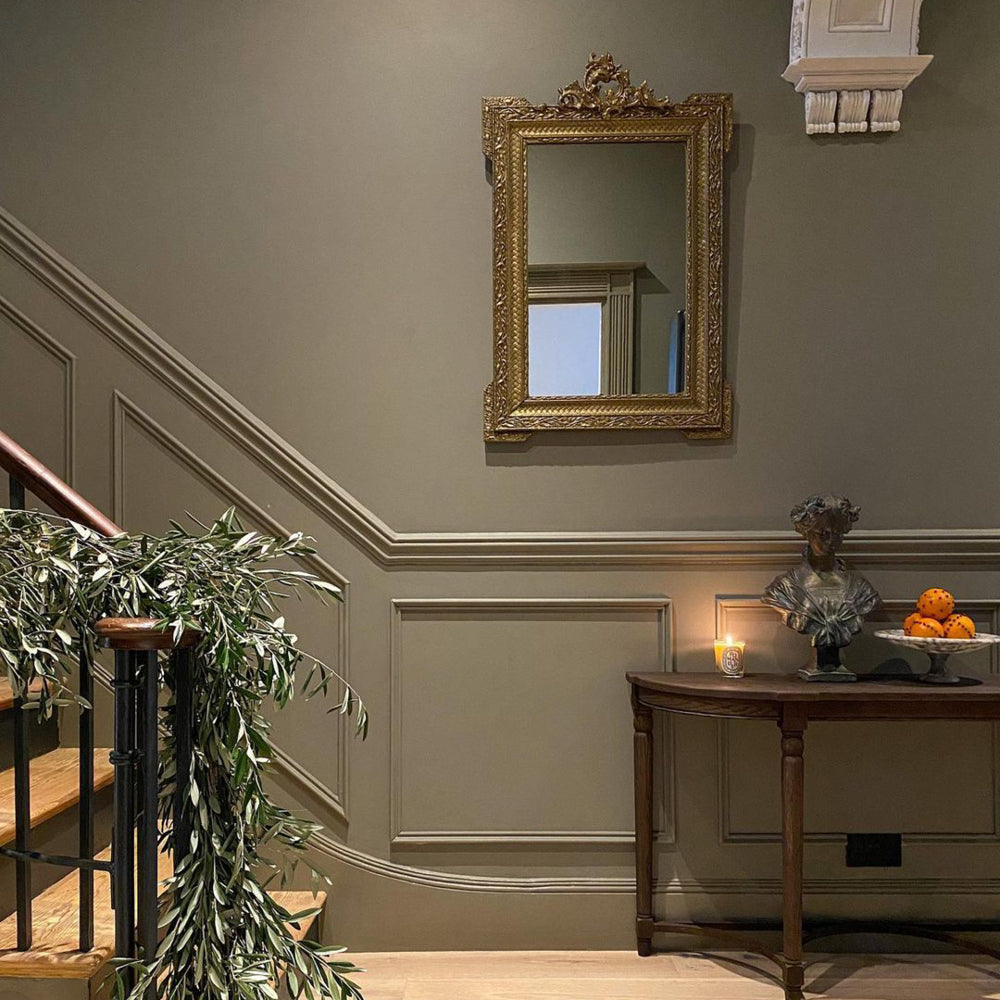
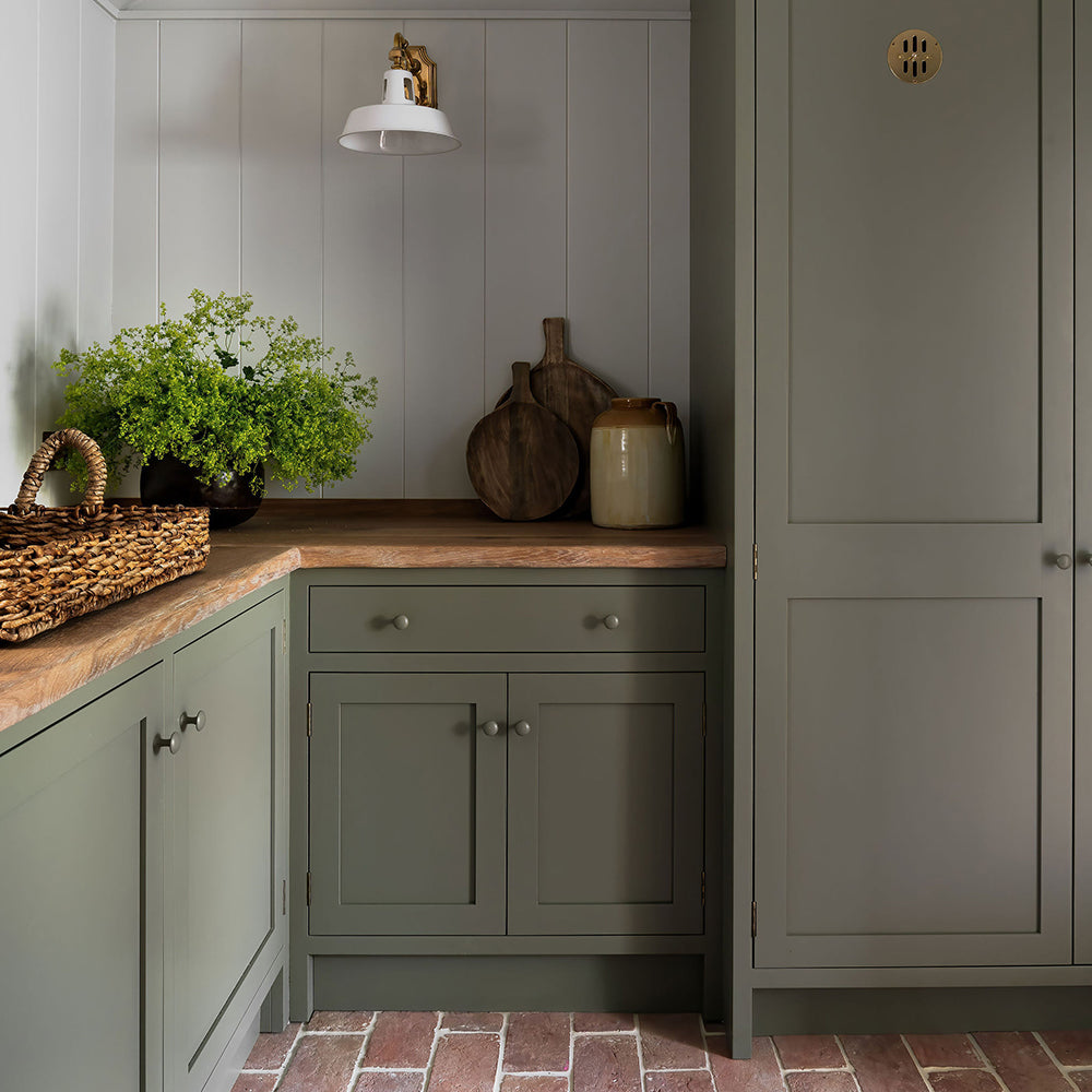
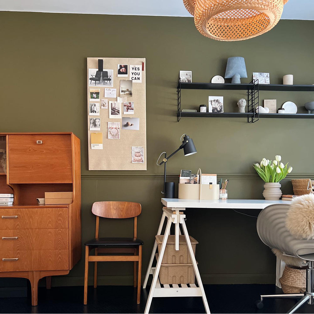
Now let’s talk straight, we’ve saved the best till last. Green and earthy tones are here to stay, and we’re here for it. Using these tones is calming and really helps you feel at one with the world around you. Using a green colour to paint the living room when it looks out onto hedges or your garden will really exaggerate the outside-in aesthetic.

@homefromhole giving the 'Adulting' green something to shout about. It's a classic.
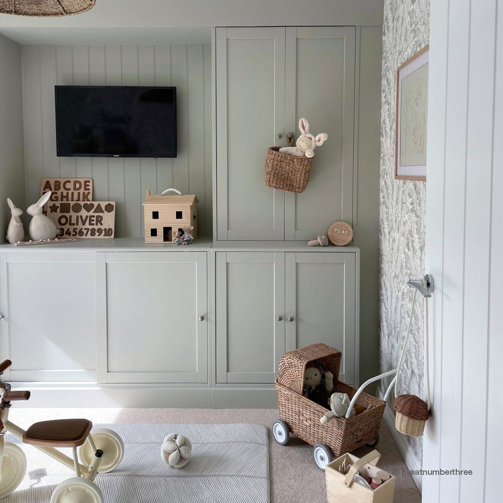
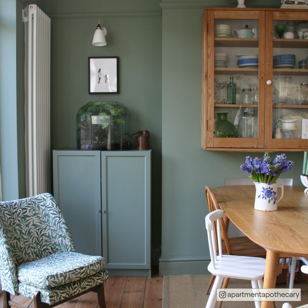
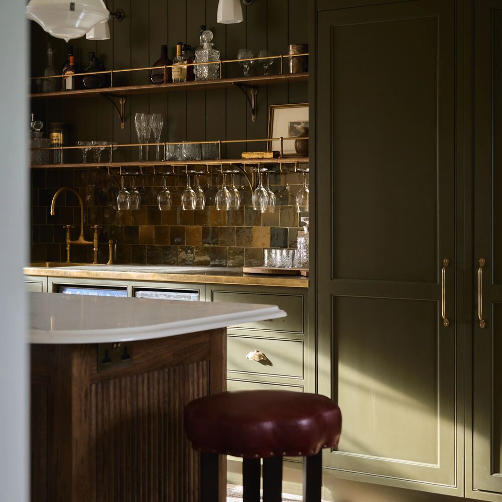
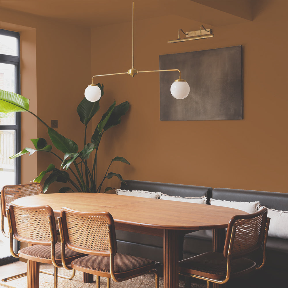
Rich olives communicate abundance and give reference to deep botanical colours in nature. These colours pair perfectly with dark woods like teak and wenge. Use Nomad all over on walls, ceiling and woodwork for arguably the best living room paint scheme. If you do require a little bit of brightness though, combine with beige green And Breathe on the ceiling for a slightly more formal aesthetic.
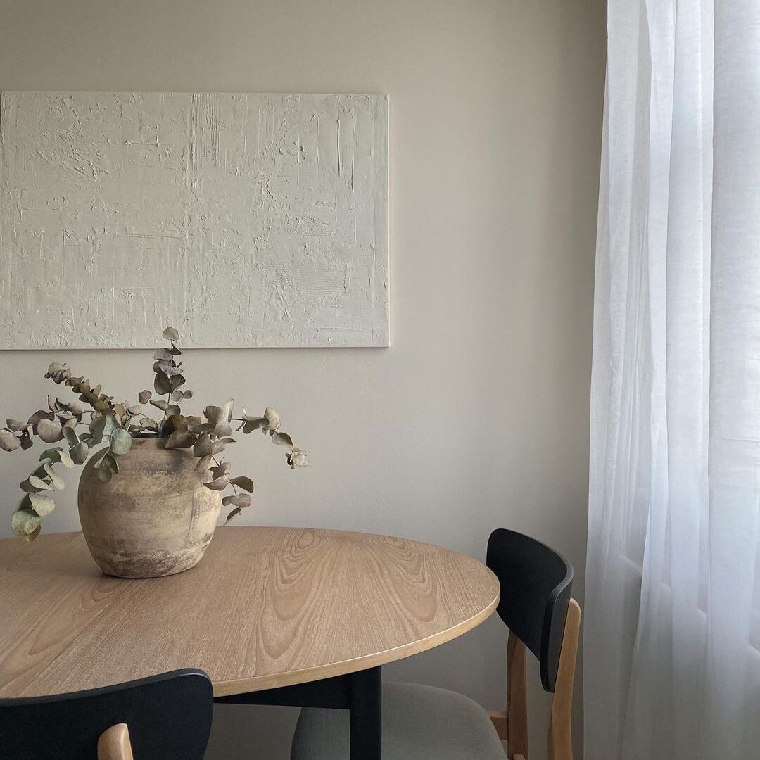
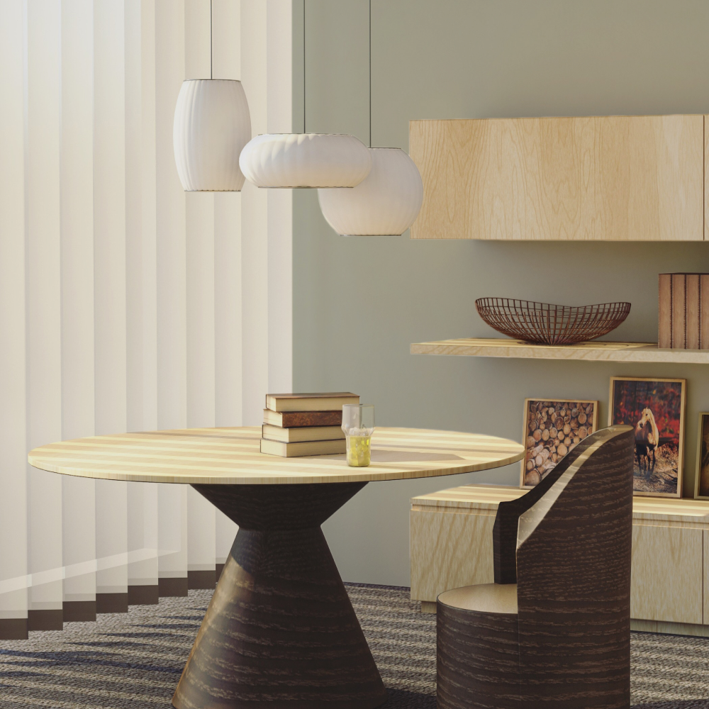
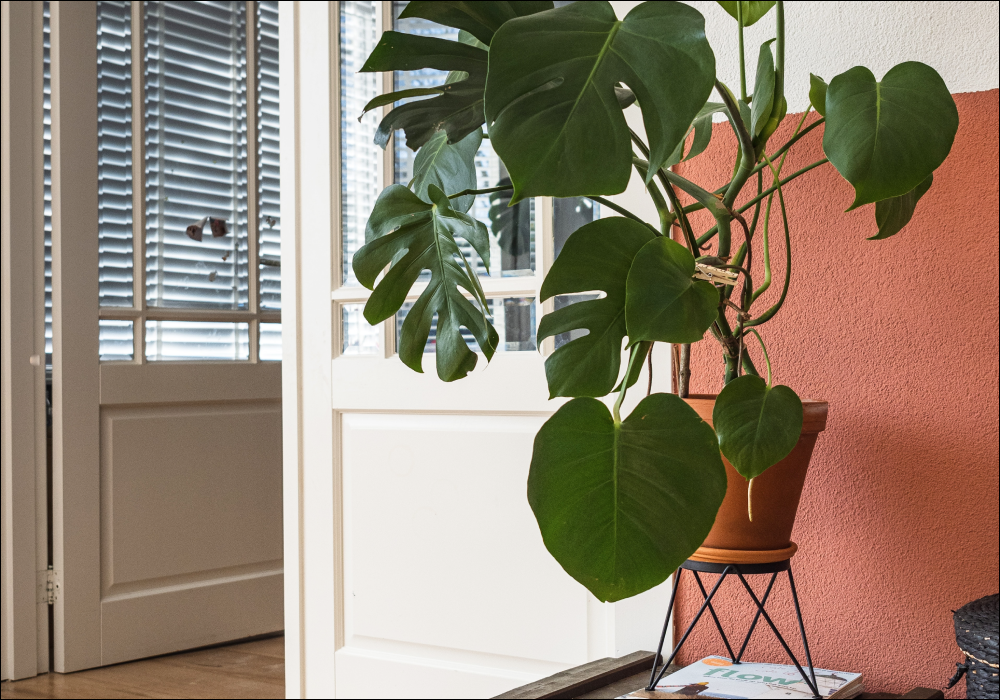
For those budding botanists out there, if you want your new (insert latin plant name here) to look radiant, you’re probably looking for a more demure background colour. Darlington is a grubby greyed green, perfect for because it’s not as direct as the other greens in our palette, and so, makes plants that are next to it look even more vibrant. Paired with woodwork and ceilings in Rathbone Place, a greige with a subtle green undertone, this is the best living room colour scheme for an understated scheme to bring the outside in. You’ll be the proudest plant parent ont’ block.

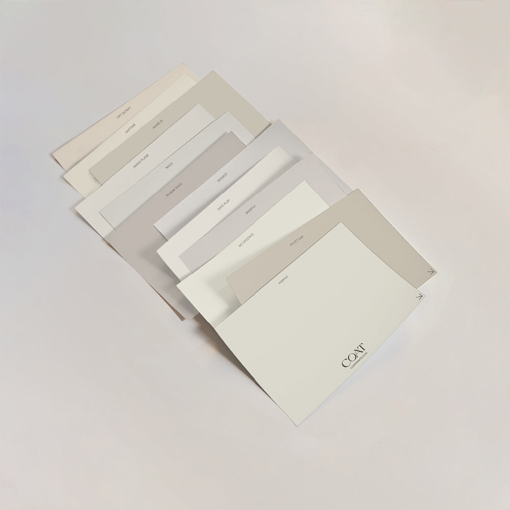
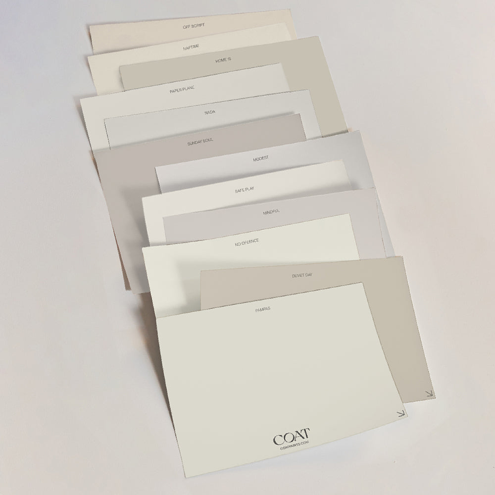
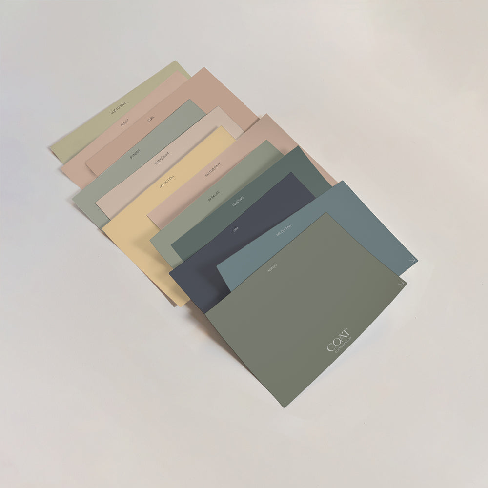
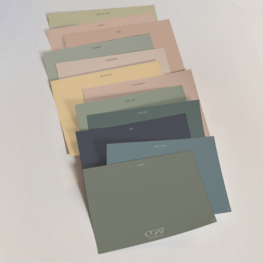
If you’re still unsure about what colour to choose, book a video colour consultation with one of our specialists to find out what suits you or order our ‘Peel & Stick’ swatches.
Publish Date
Author