Traditional with a Twist, At Home with Katherine
COAT fans, here’s another beautiful home to kick back and have a nosey around. Don’t say we aren’t good to you…😉
This 1912 Edwardian semi-detached is home to Katherine, her husband, and their two young children, aged seven and four. Katherine works from home as an epidemiologist, so the house needed to be multifunctional: practical, family-driven and a space to wind down.
In her spare time, Katherine uses interiors as a creative outlet, especially alongside a super technical job and a busy Mum schedule.
They bought their Chester home seven years ago, which required a lot of work to get it to how you see it today. The bigger, painful jobs kicked off the renovation, with the house needing upgraded central heating, electrics and a new kitchen. They quickly modernised the property in order for it to become liveable, and chose (in Katherine’s words), a “fairly bland” décor to live with for a couple of years; mainly, until the renovation money pot filled itself back up again. Something we can all relate to!

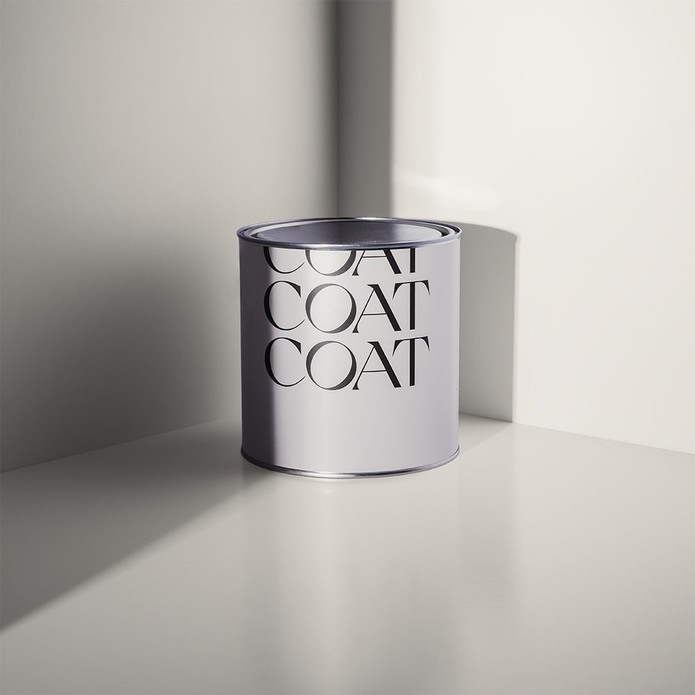
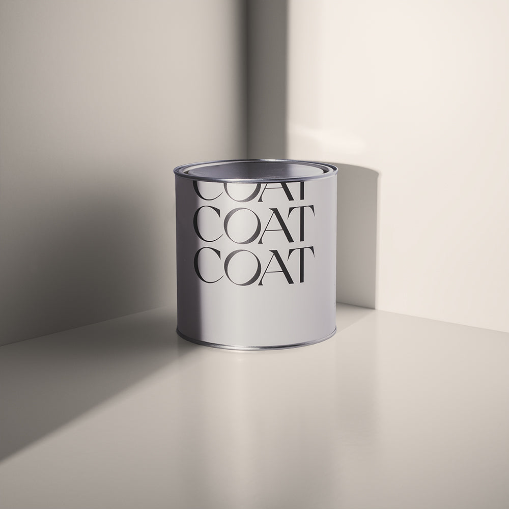
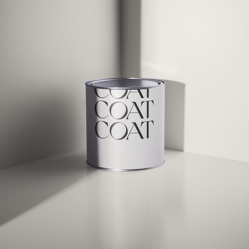
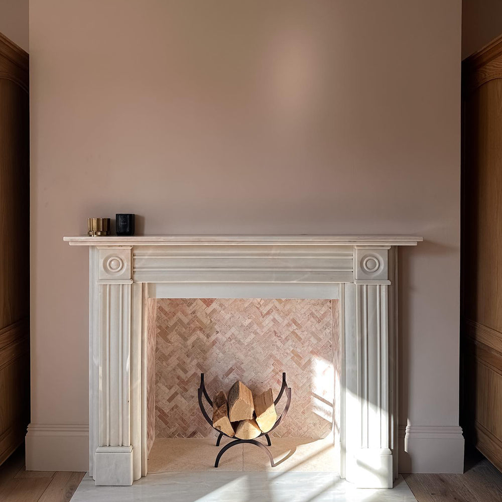
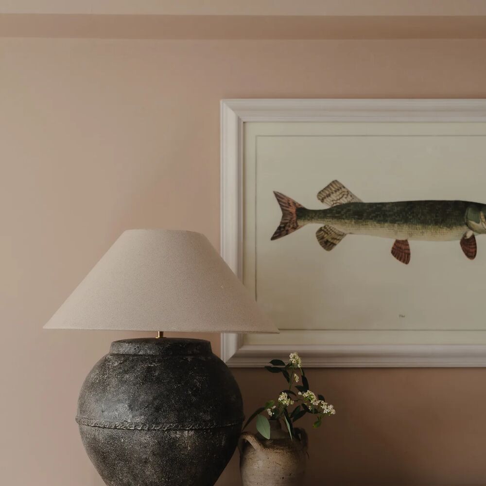
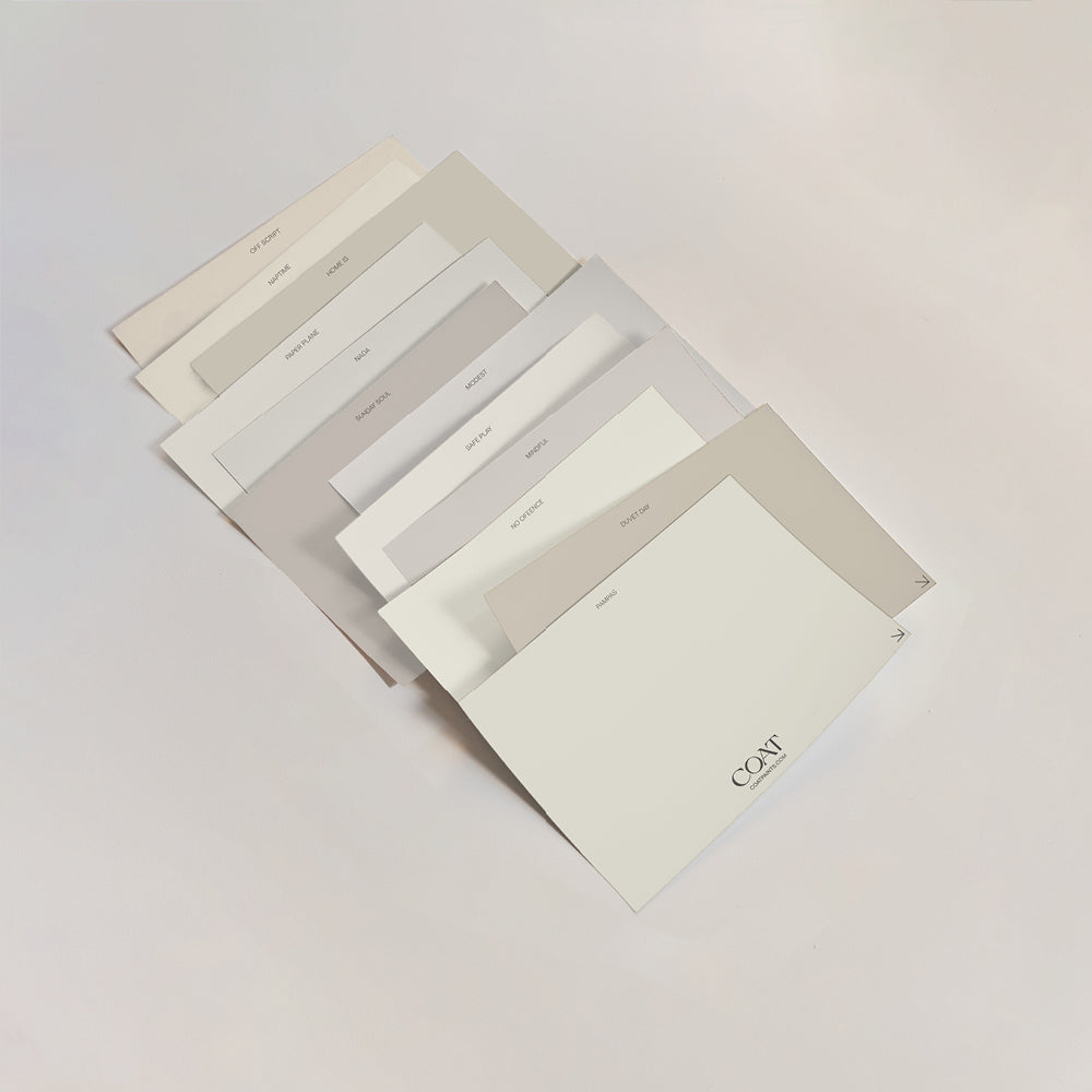
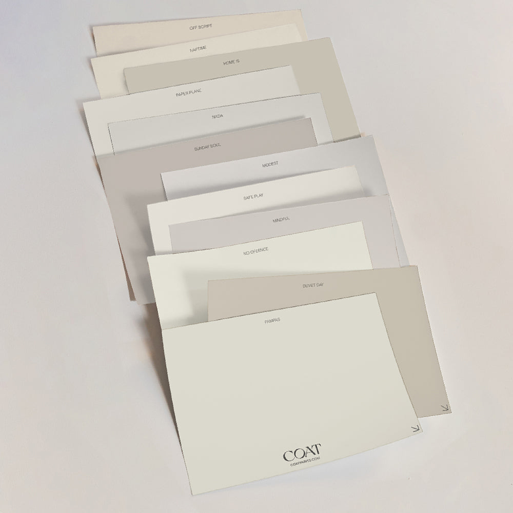
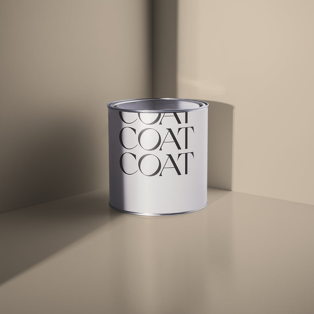
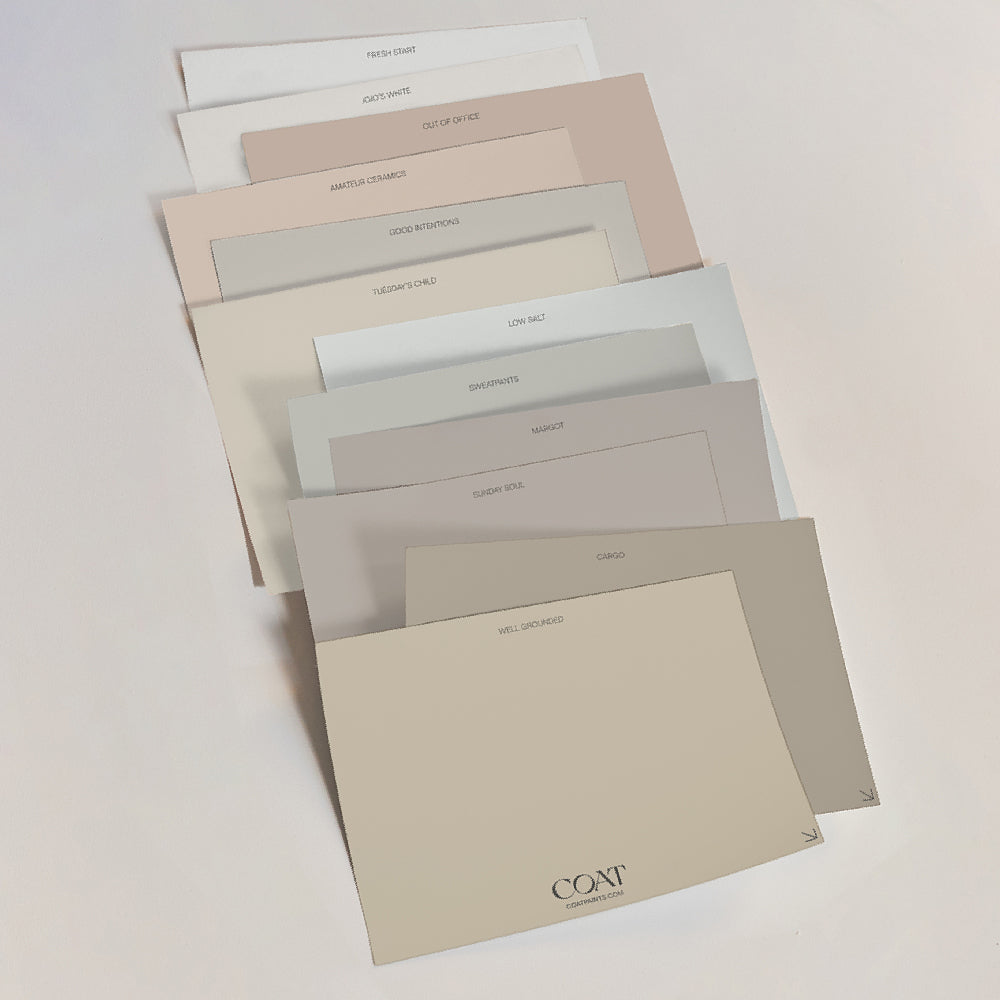
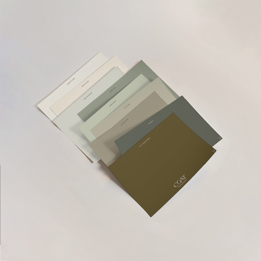
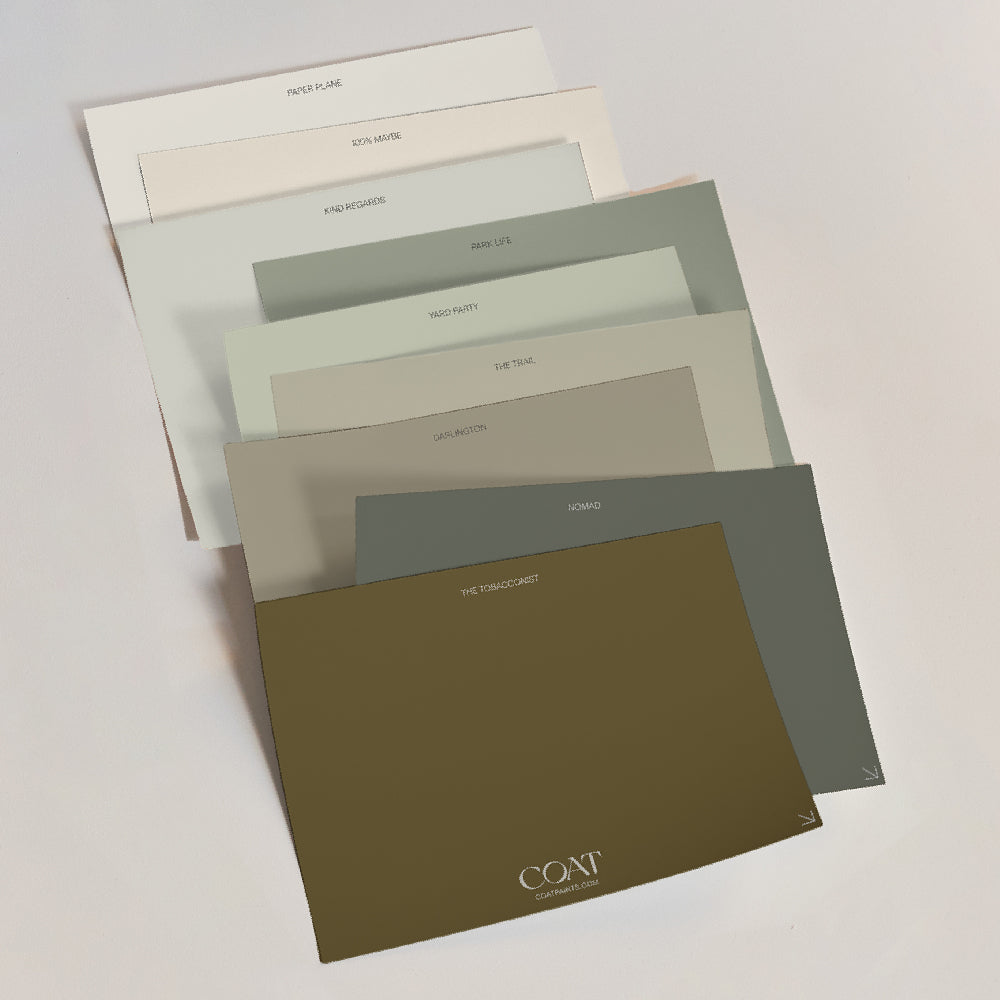
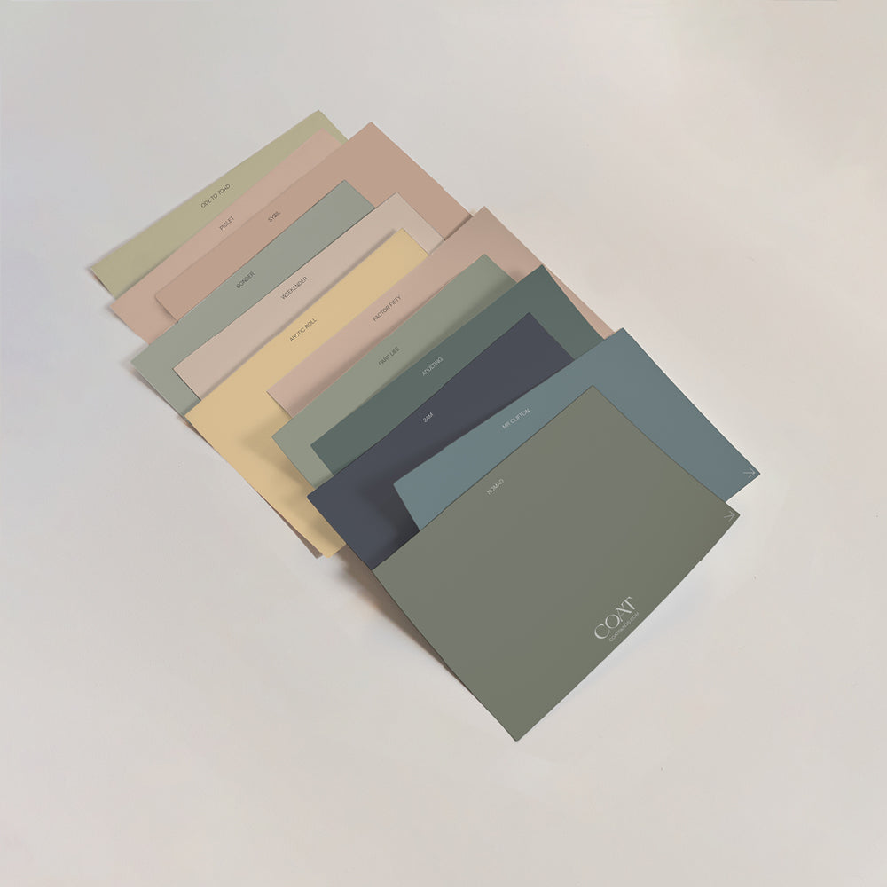
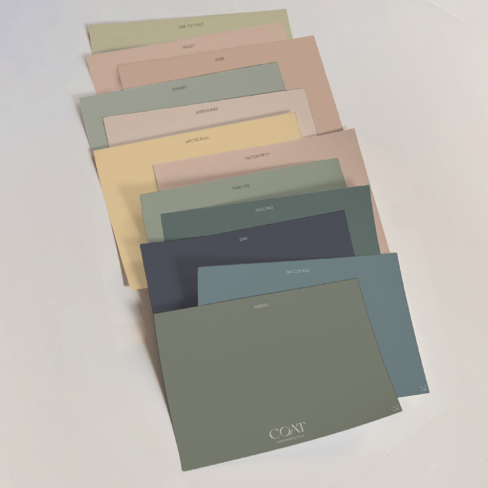
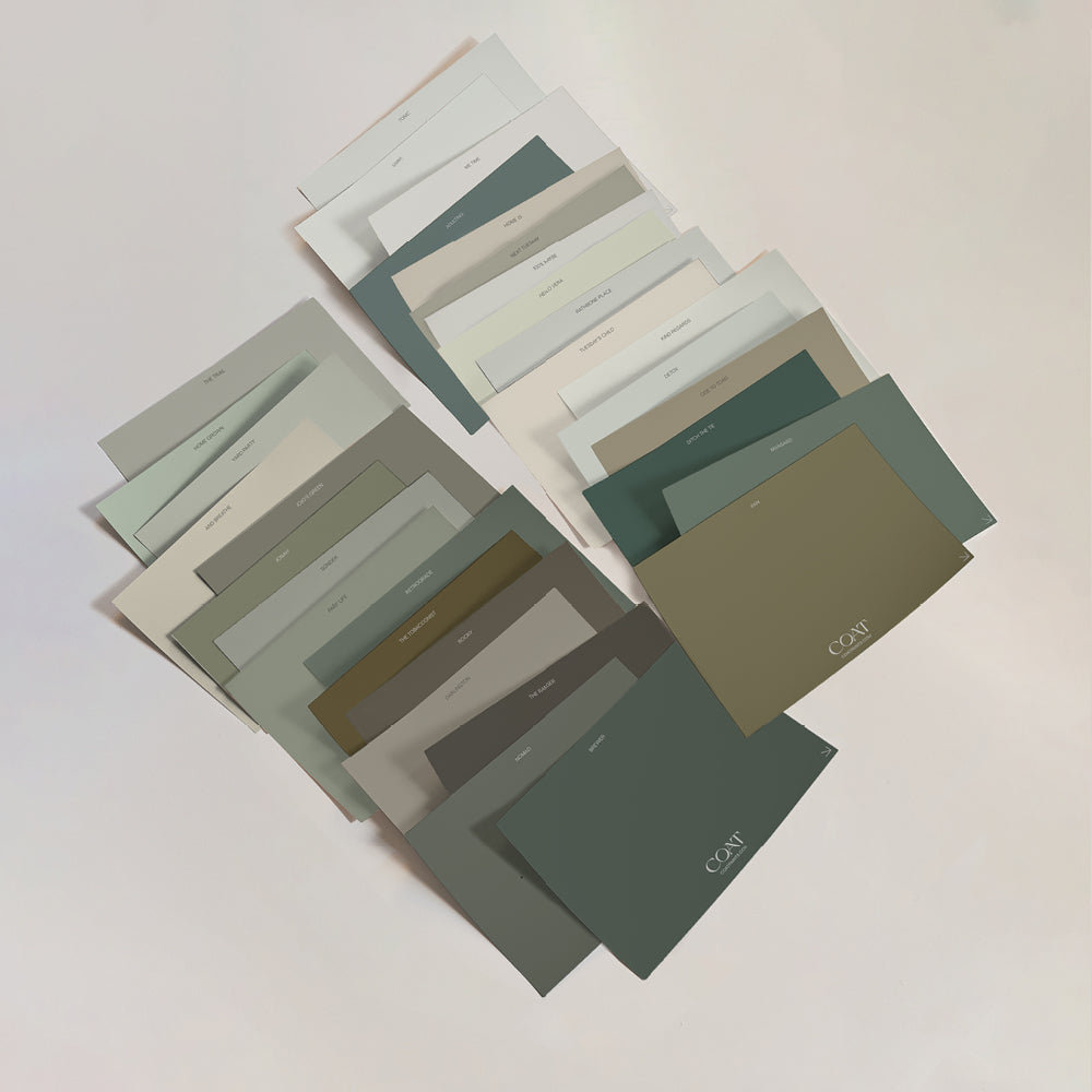
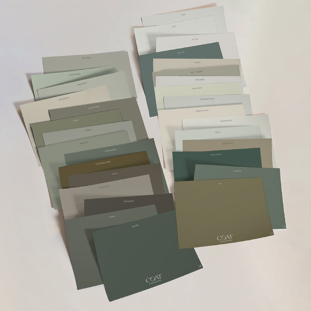
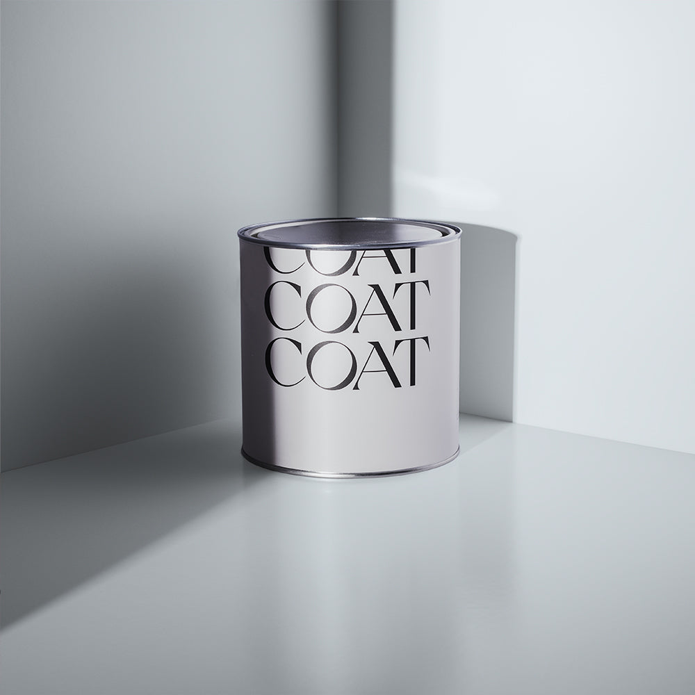
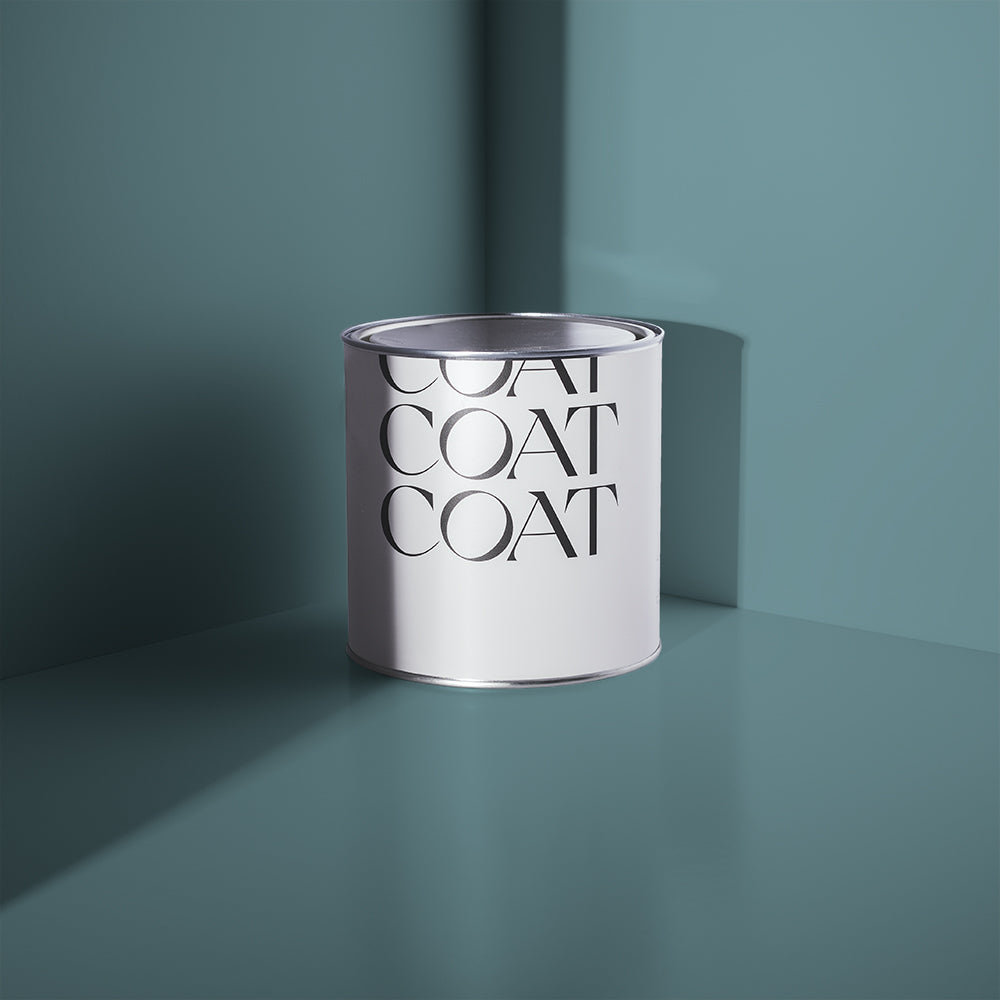
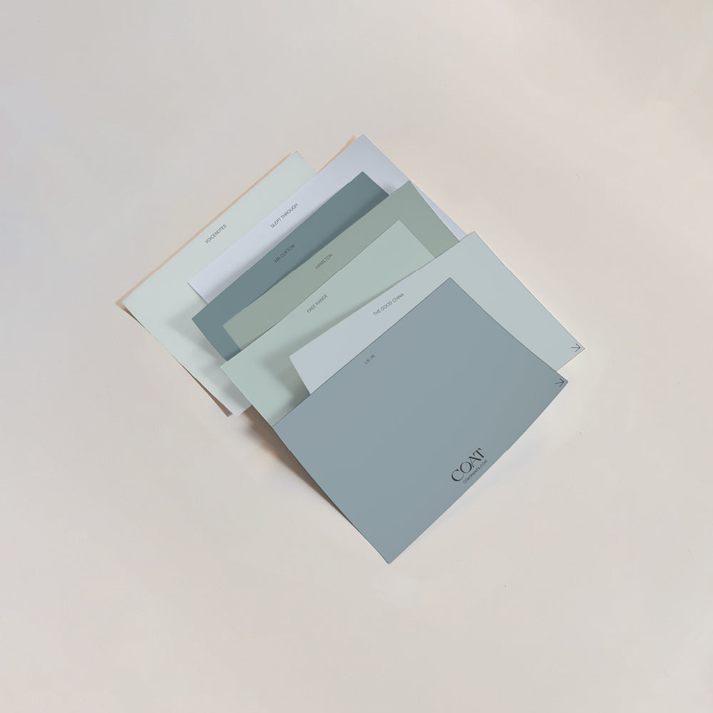
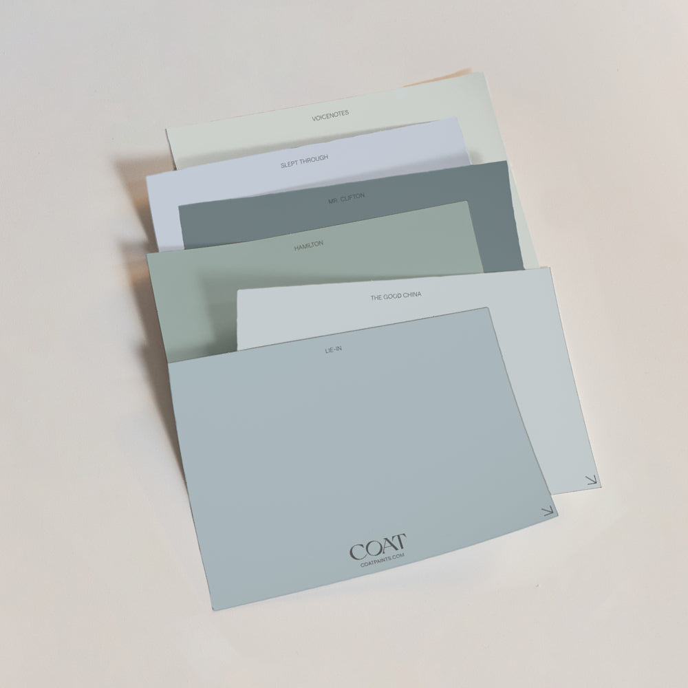
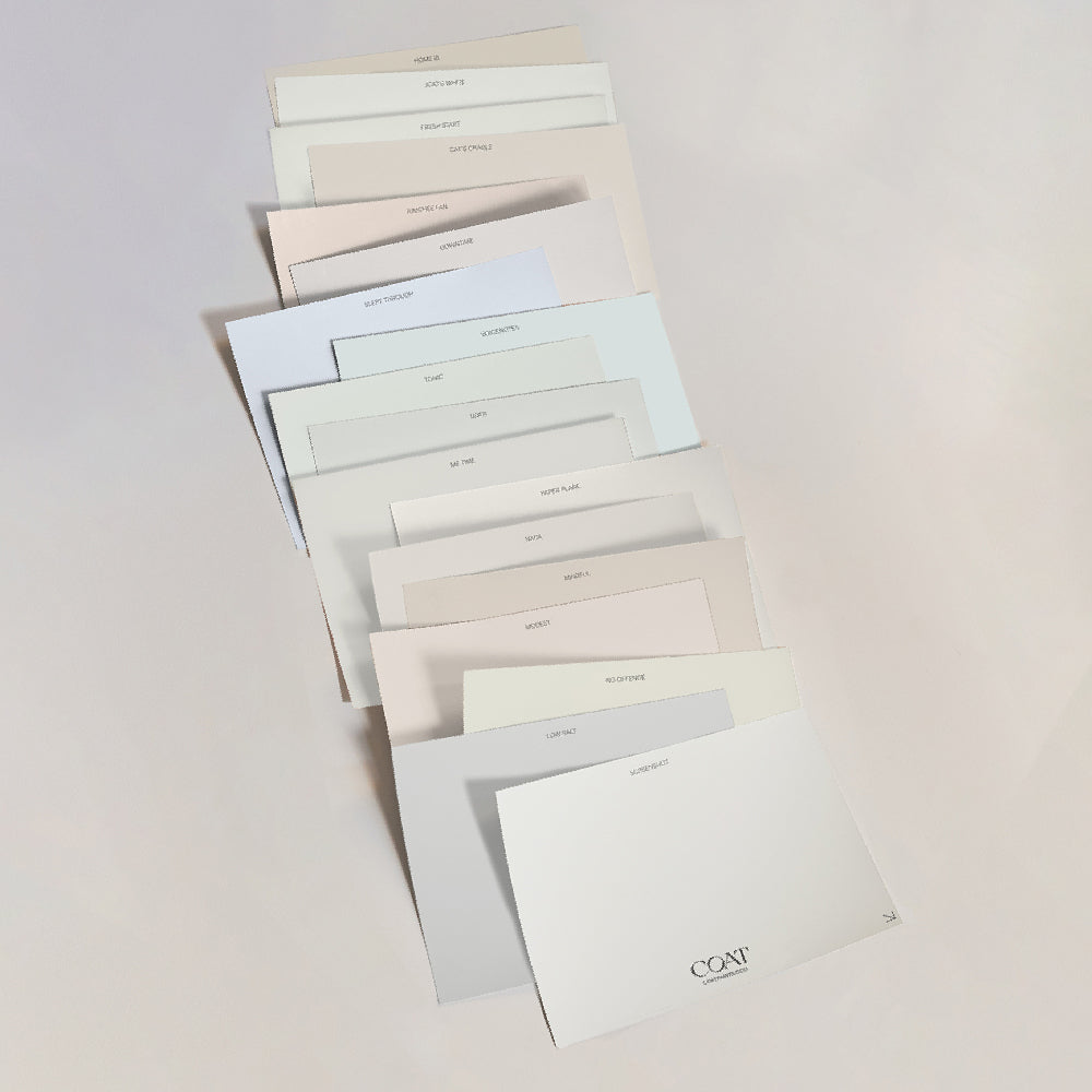
Feeling inspired? Check out our bold swatches to try out at home!
“We have spent the last year taking on decorating and renovation projects, with a bit more thought and planning to really bring the house back to its former glory. Myself and my husband are the dream team – I come up with the ideas, and he takes on a lot of the hard work with sanding, building furniture and the general practicalities. I then swoop back in at the end to paint and accessorise! He is a designer in his day job, so definitely has a creative eye, but luckily, doesn’t get too bored with my constant interiors chat!”
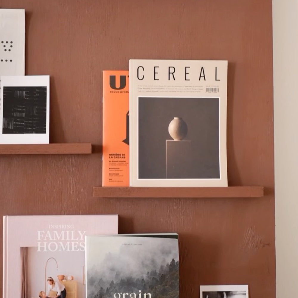
Katherine prefers a statement period décor, so restoring the original features to their Edwardian home was pretty high on the to-do list. She loves mixing traditional with modern, helping to provide a quirky, trendy edge – whether it’s using graphic artwork, or splashes of cheerful colour, each space has its own story to tell.
“I definitely gravitate towards deep, rich, inky colours to make an interior statement, but I like to soften or contrast them with soft pinks, plants and plenty of textiles. I am also partial to a neon pink!”
A COAT LOVE AFFAIR…
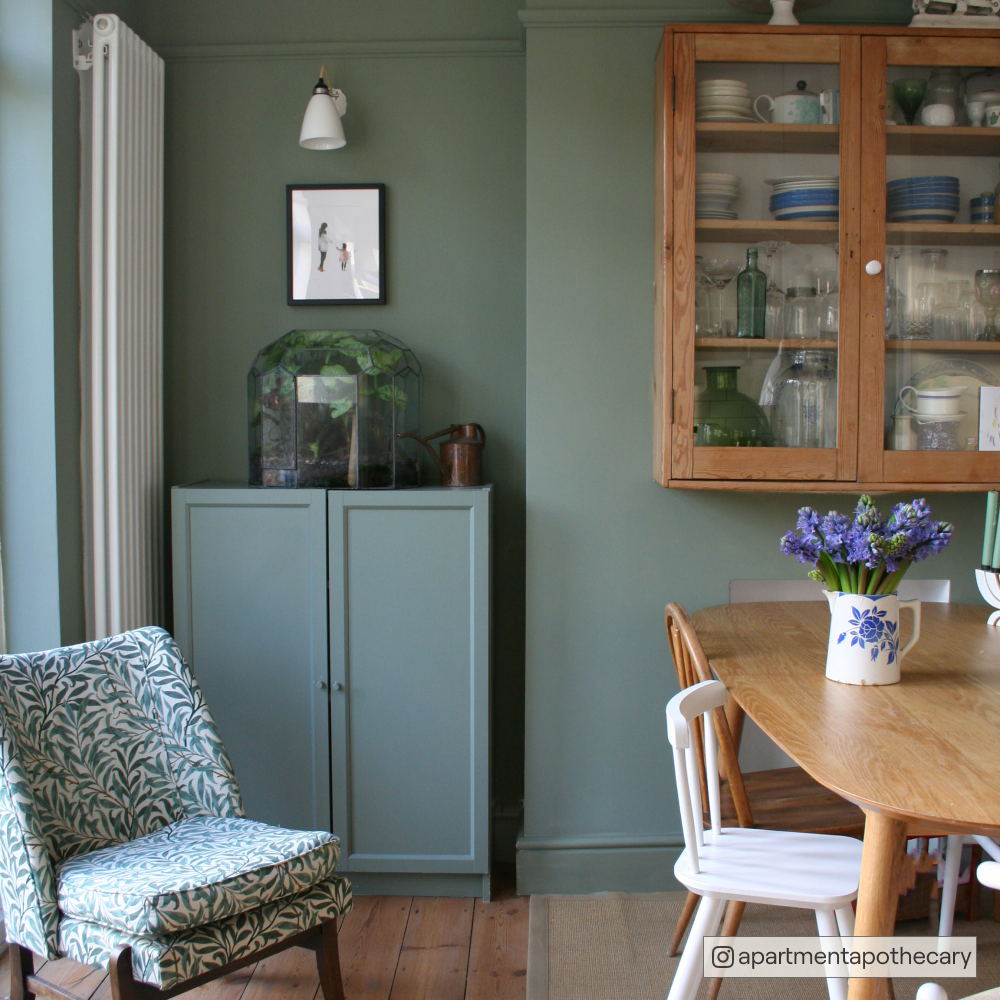
Our paint colours is what first attracted Katherine to our brand, in particular, our selection of greens!
“…then I saw they were an eco-brand, and it was an added bonus. Their website and Instagram looks so stylish and I always enjoy browsing their content.”
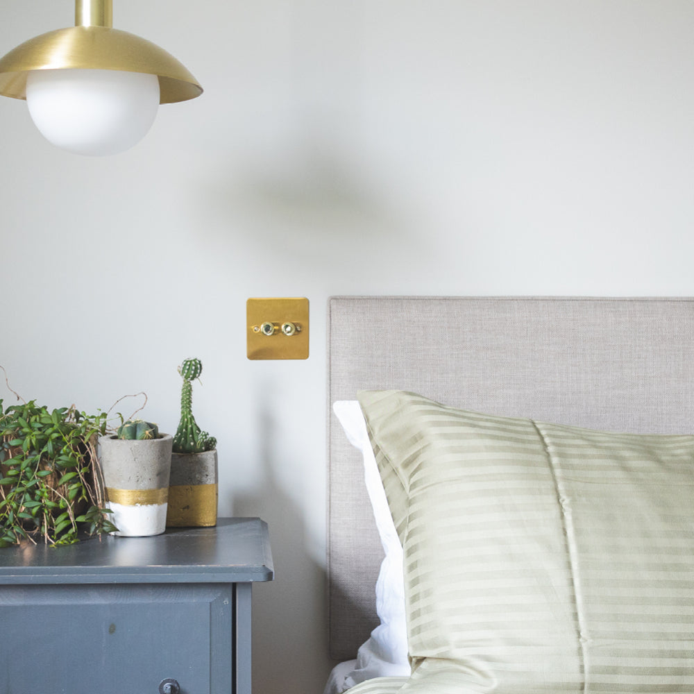
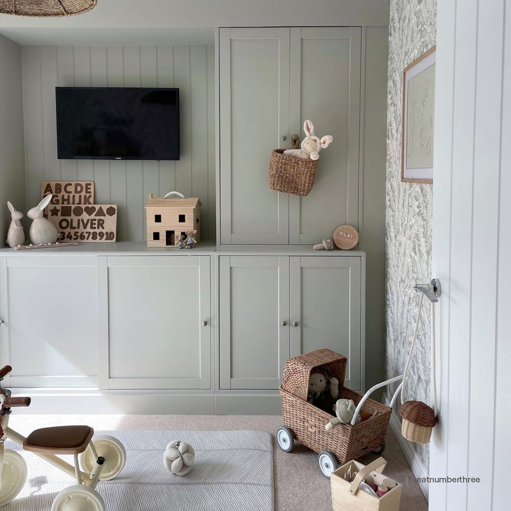
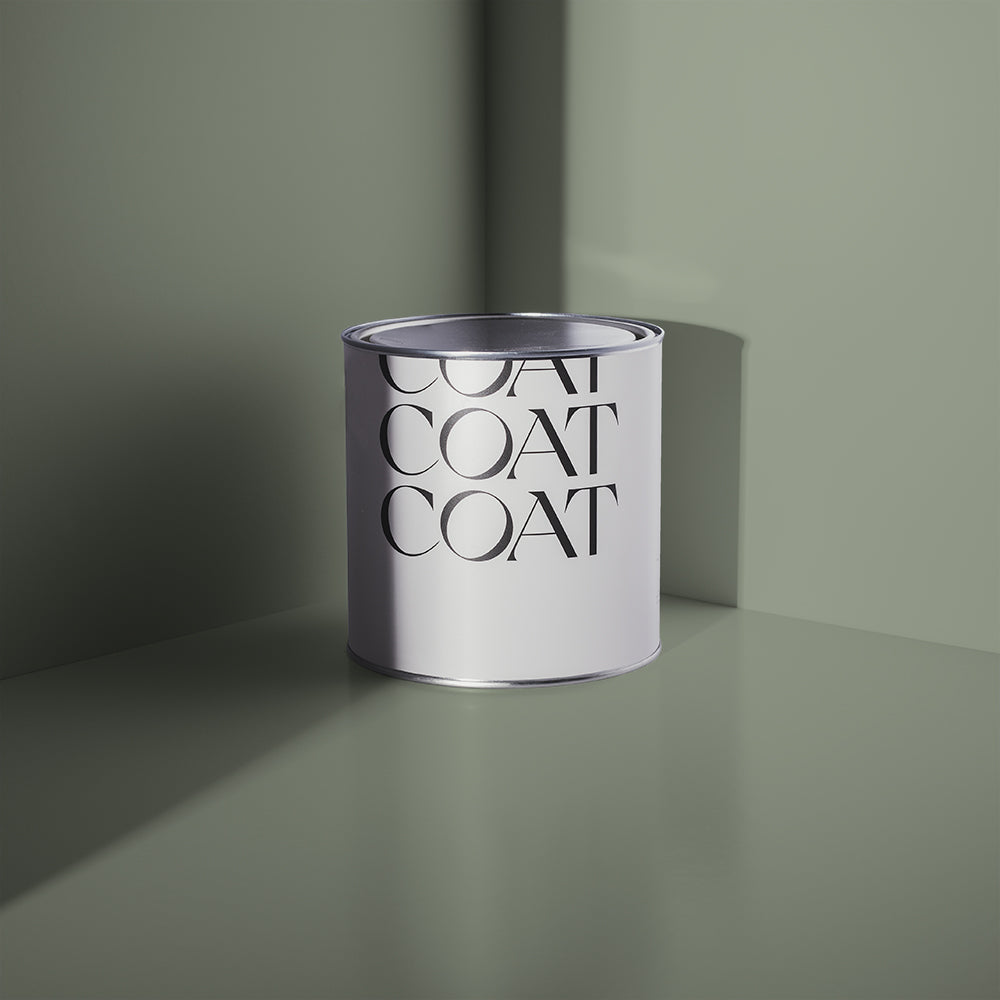
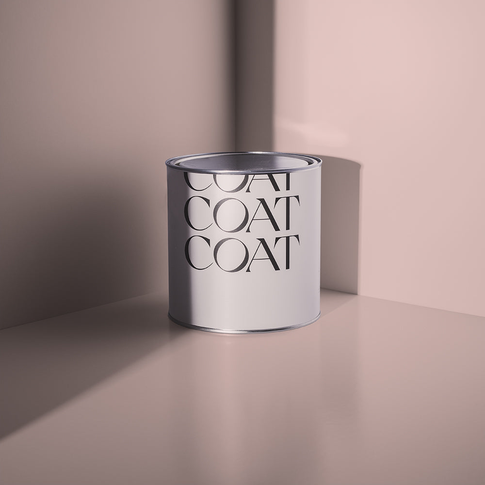
Katherine has used our paint in two rooms of the house; firstly, with ‘Adulting’, which graced her son’s bedroom to give him a more grown-up feel…
“It’s a small room, so painting it all in the same colour really gives a seamless look. I love the fact the wood and green paint pick up on natural colours and textures, which promotes wellbeing and provides a calm space for our son.”
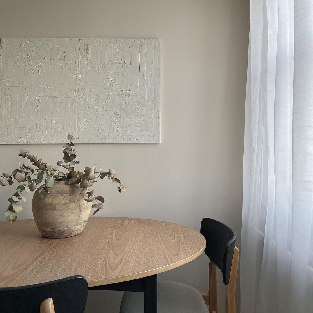
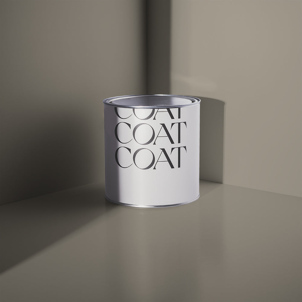
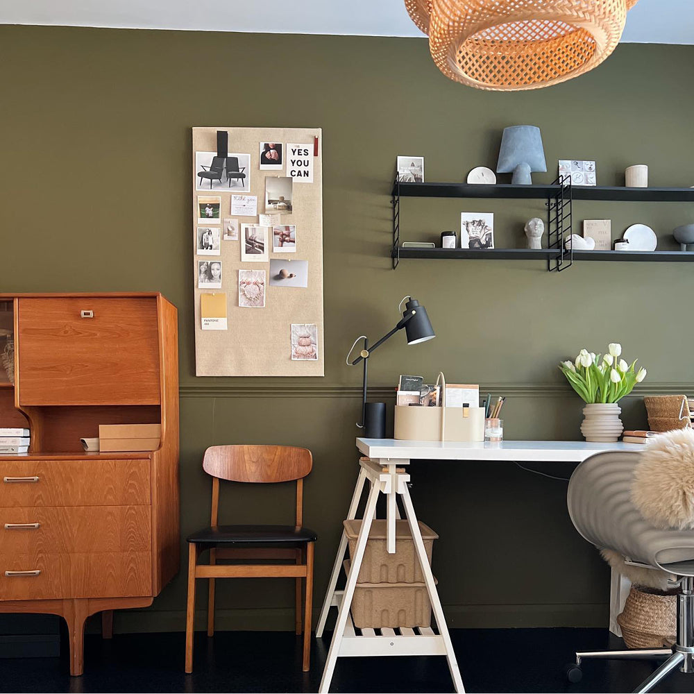
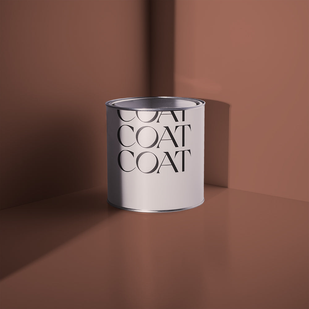
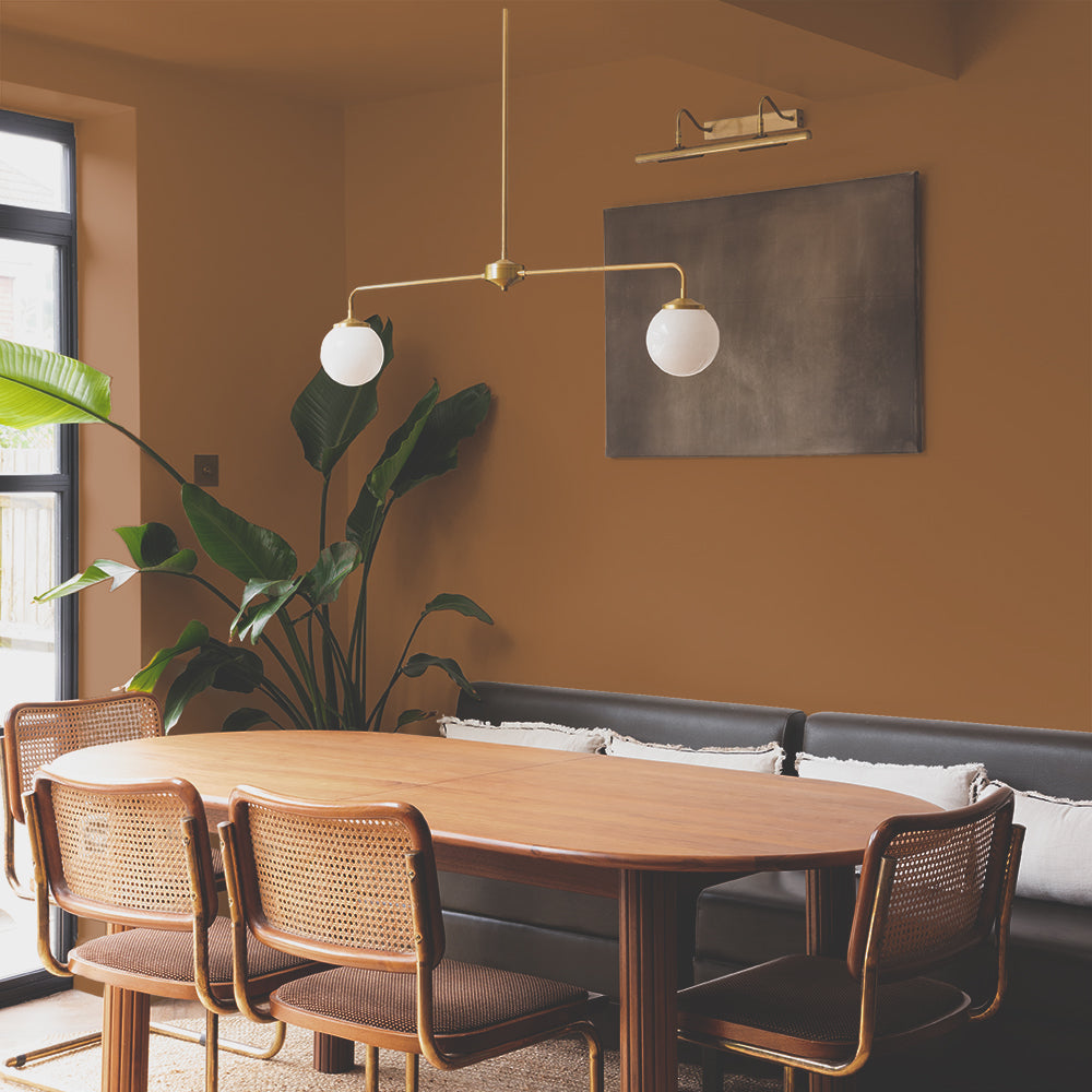
Secondly, she used ‘The Drink’ and ‘Good Intentions’ in the office space, colours which suited this south-facing room perfectly.
“I am obsessed with inky colours, so the deep bluey-green of ‘The Drink’ was a must. ’Good Intentions’ is a pale taupe and so much more interesting than plain white! I’m so glad I went for these two colours, as it provides some visual interest for me while I’m working. I love the way they change throughout the day, and in different lights, too!”
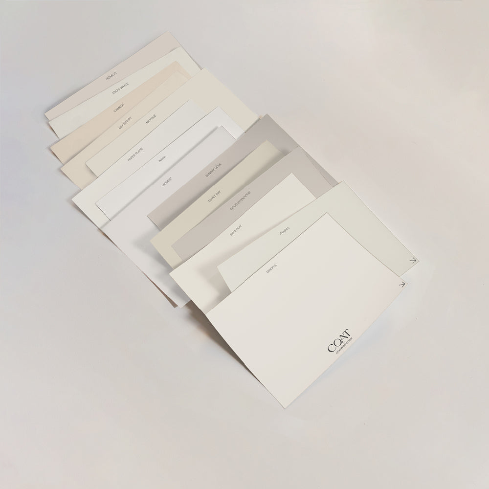
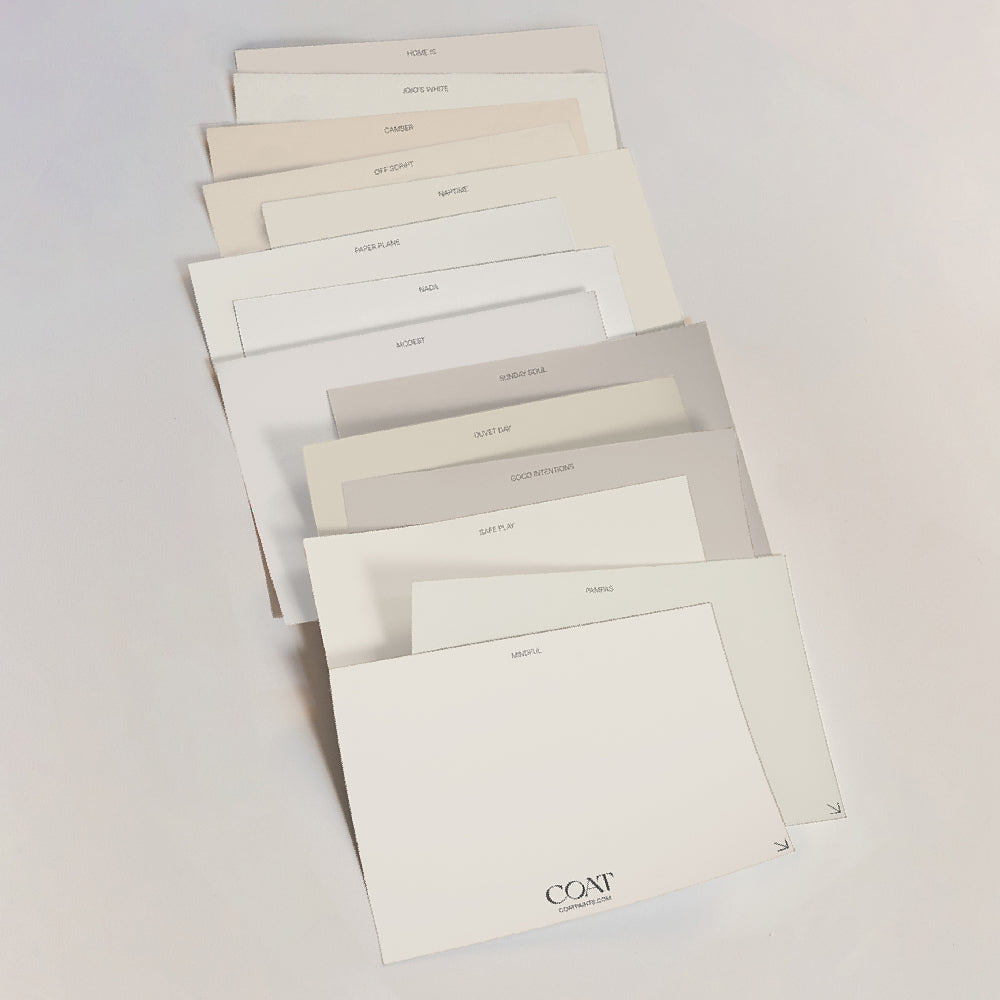
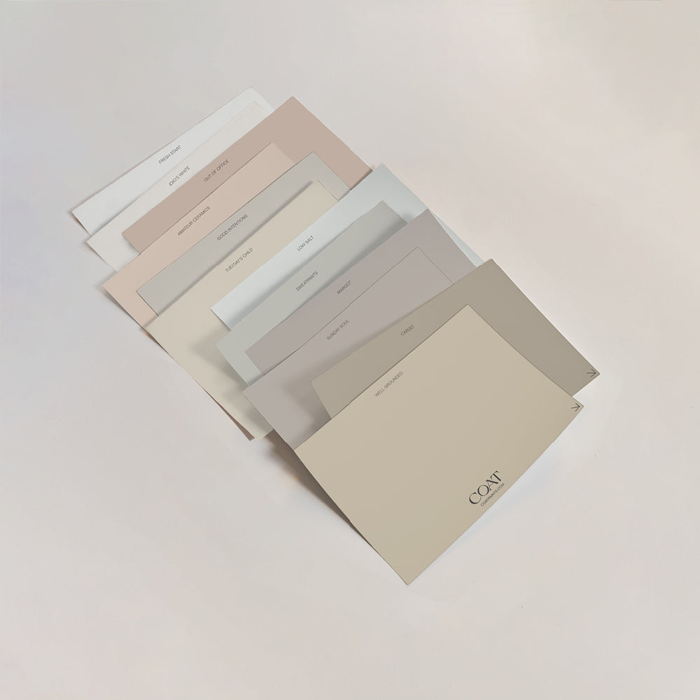
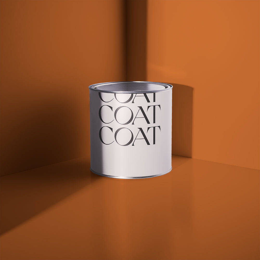
Our ‘Peel and Stick’ swatches were a game changer for Katherine, allowing her to ensure the colours were perfectly suited before taking that leap of faith. We take huge pride in the accuracy of our swatches, and this was reflected in her experience…
“The coverage and depth of colour was fantastic, and it was a pleasure to paint with. The finished result is exactly the same as the peel and stick samples, so you can be confident it will look as you intended. I love the flat matt finish of the wall paint, it looks so sophisticated. I used eggshell finish on the woodwork and radiator, which went on like a dream and was an excellent match to the walls.”
TAKE A LOOK INSIDE…

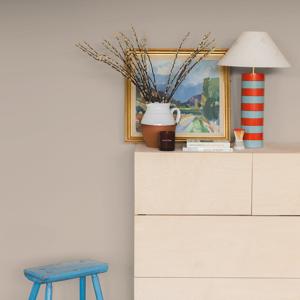
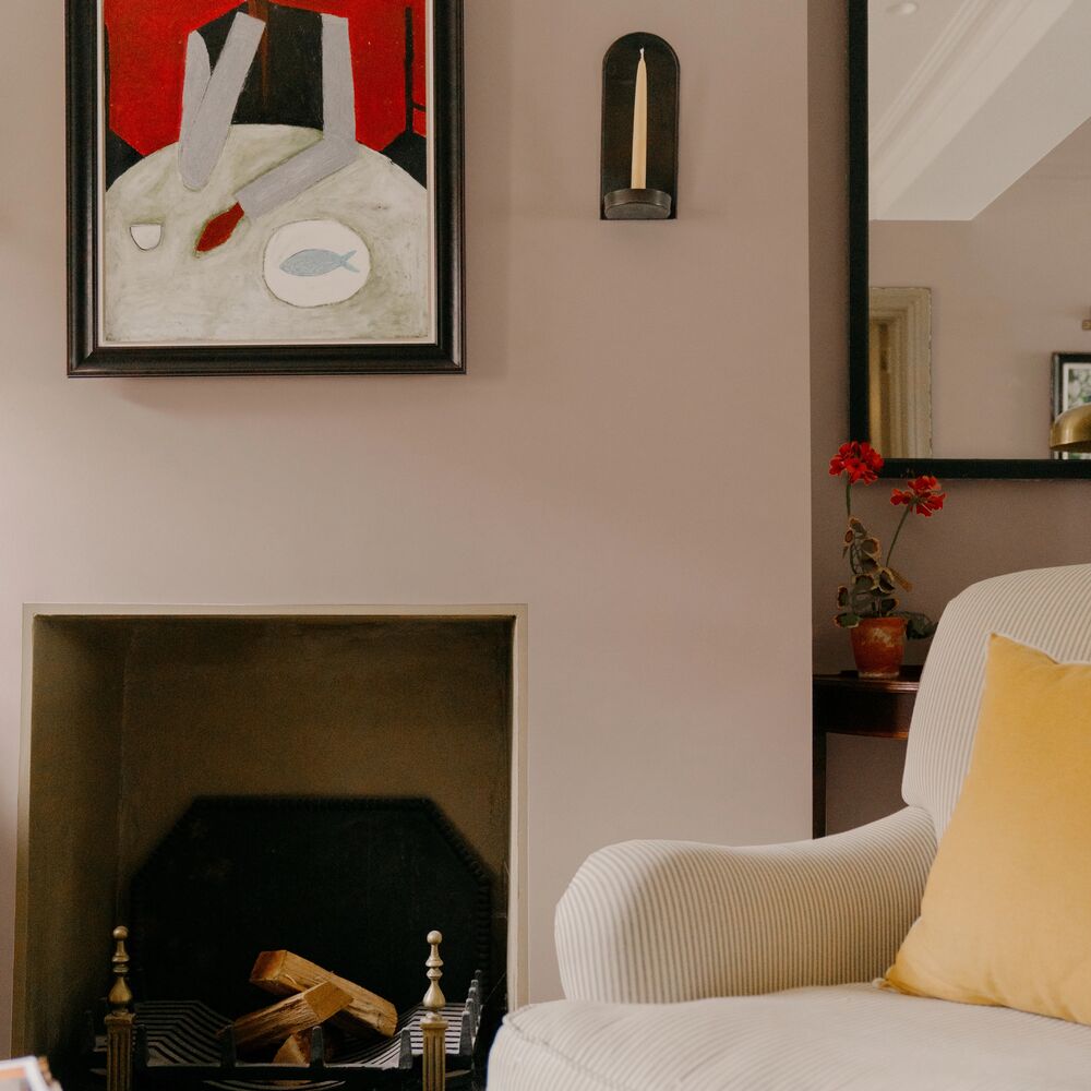
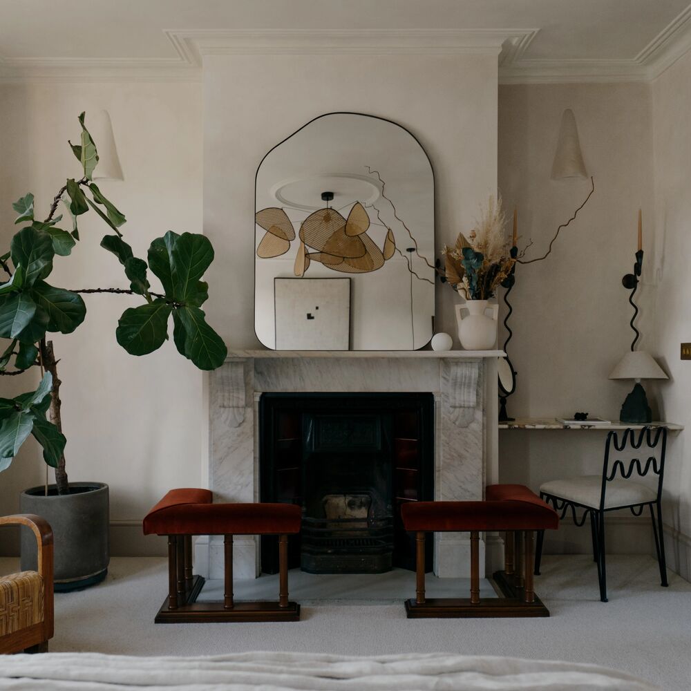
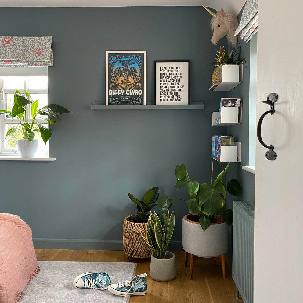
Katherine loves dark colours like 'The Drink' to make a statement
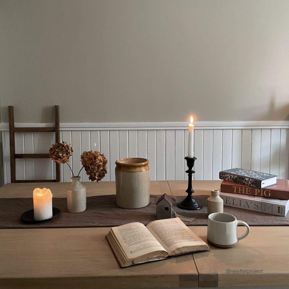
Katherine’s living room was transformed during lockdown 2020, a time where pretty much every household decided to get stuck into some form of DIY, baking or Netflix series!
She wanted to create a solid statement, and a style that would match the period in which this Edwardian property was built. Dark colours have her heart, so upon discovering the ideal deep, vivid blue – the decision was made. This room quickly became her favourite in the house, and we can totally see why! We adore the neon pink accents and array of green house plants.
“The décor is striking so always gives me that wow feeling when I come into the room. Because the colour is so deep, it’s really cocooning in the evenings when relaxing after work. It was the first room in the house that we went to town on, and properly planned the colours and accessories.”

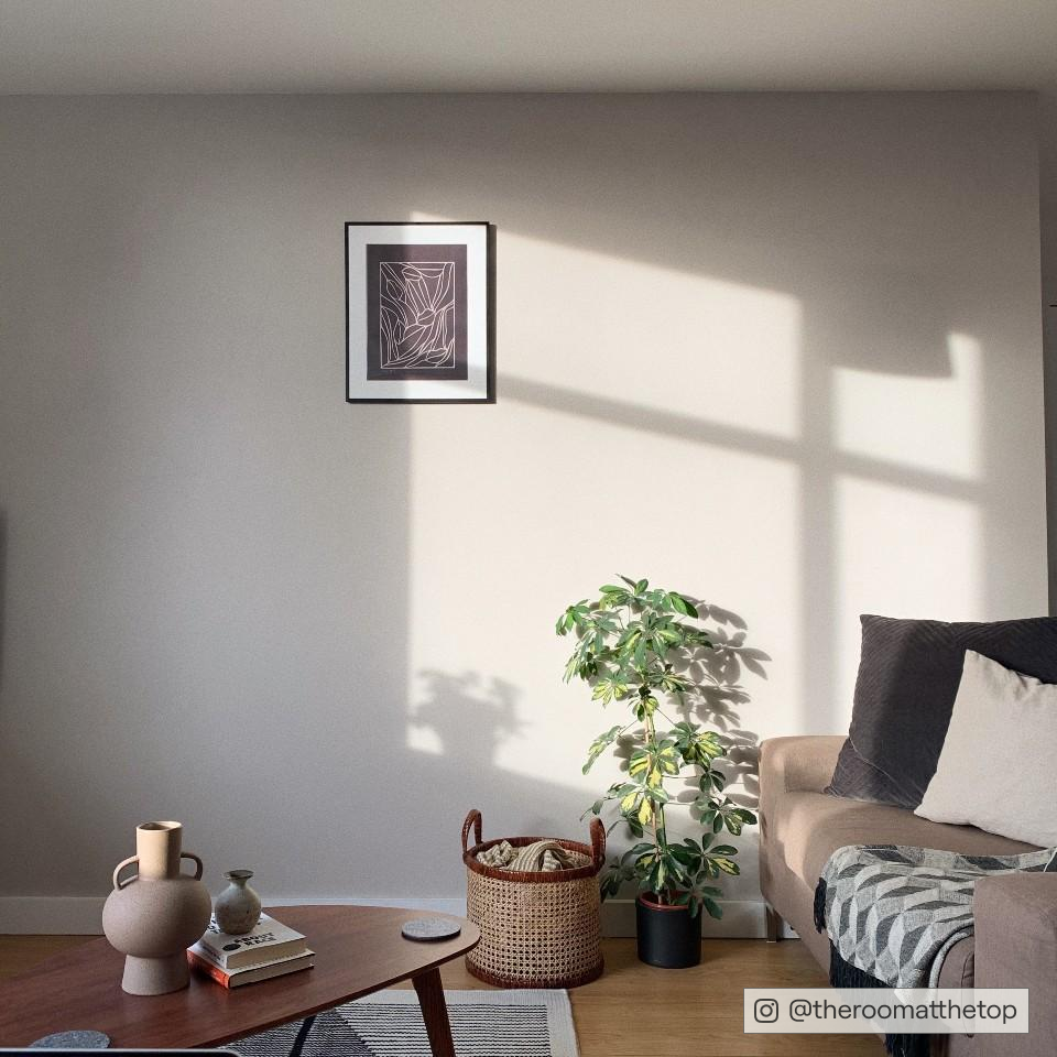
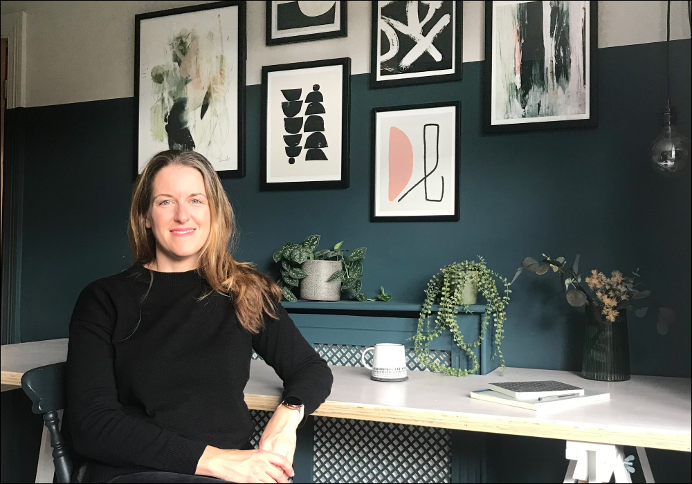
Katherine's colour-blocked stimulating office space in ‘The Drink’ and ‘Good Intentions’
Next up, the office – which basks in ‘The Drink’ and ‘Good Intentions’. Katherine has been working from home since March 2020, so it was important to create a space that would be stimulating and refreshing.
“I didn’t want it to be an overpowering space, so I colour-blocked some of the wall in a neutral (Good Intentions). I love abstract art, so added some pieces to the wall to give me something to look at while I am pondering work. I also added a few plants, a throw, and some cushions to soften the area, and make it a comfy and tranquil place to work.”

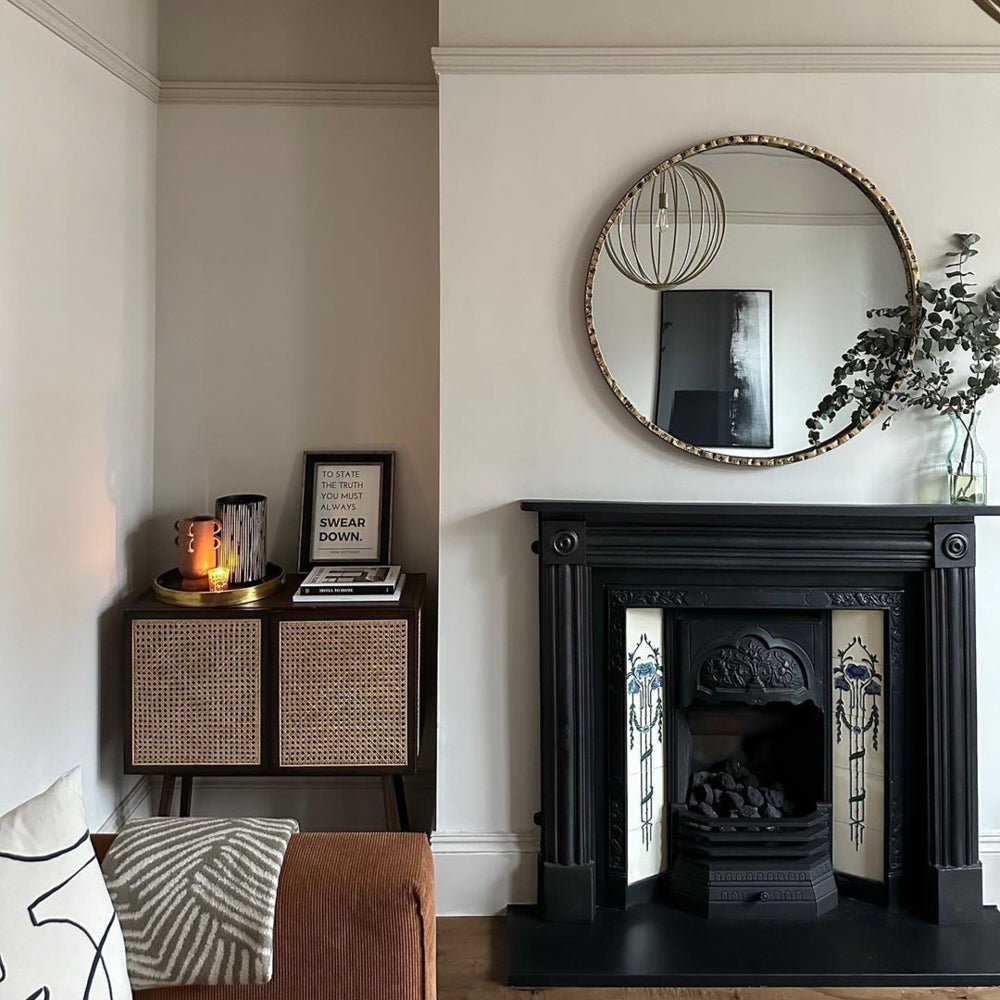
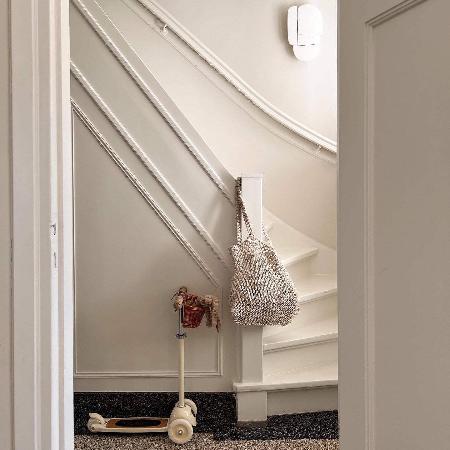
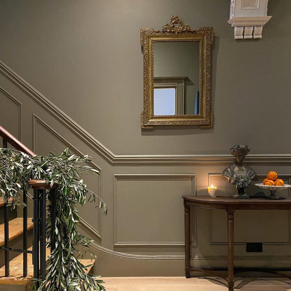
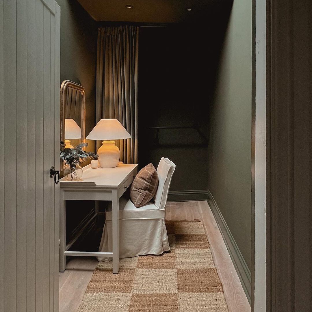
The third space Katherine was eager to showcase, was their hallway and stairs. After having a new front door fitted earlier this year, as well as revamping their staircase, it helped to restore some of the period charm to the front of the house.

A monochrome staircase in colours like 'The Record Store' and ‘Good Intentions’ creates a grand entrance
“We wanted to tie the main thoroughfare of the house together, so chose to use one colour on the front door, hallway, landing door frames and stairs. We kept the walls neutral, but I love the monochrome look, which makes a classic statement. However, as I am partial to splashes of colour, I painted the hallway plant stand in neon pink, which ties nicely into the living room.”
BRANDED FAVOURITES…
Browsing homeware brings such delight to so many of us, and there are now more shops to choose from than ever before. Whether it’s a weekend trip to Ikea, or an online browse of independent and small businesses – there’s certainly something for everyone.
Katherine has a number of favourites, but her first stop is always Graham and Green…
“I love their blend of classic and eclectic, and you are always guaranteed to want the whole catalogue, as it is so well styled! I bought the large heron print for my living room from there – it looks so dramatic and it always gets a lot of compliments.”
She also has a soft spot for H&M Home, especially when it comes to styling accessories and kid’s bedroom décor…

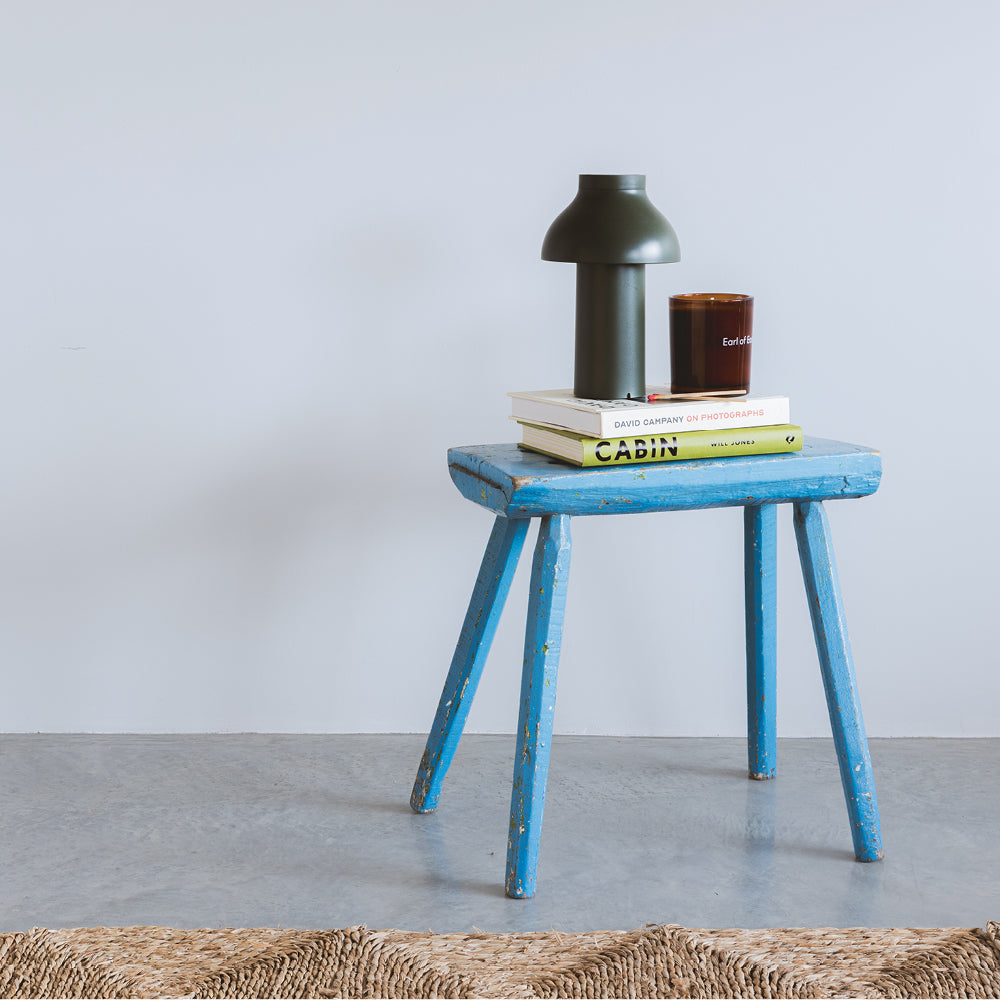
'Adulting' creating a grown up feel in Katherine's son's room, pardon the pun
“I have bought quite a few things from there for my daughter’s room, such as a peg rail and decorative storage baskets. It is good quality, reasonably priced and I like that they have a “conscious” ethical range too.”
WHAT THE FUTURE HOLDS…
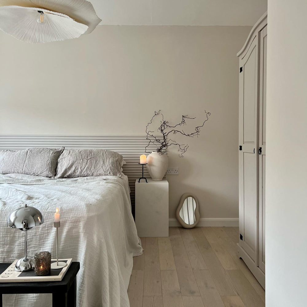
Katherine’s next big project is their principle bedroom, although she’s still undecided on the colour choices. Her mood board currently consists of panelling and built-in wardrobes, but taking a break from DIY is their number one priority, for now. Look out 2022, exciting things are coming!
KATHERINE FROM @EDWARDIAN_VIGNETTE LENDS SOME ADVICE…
“Start by thinking about what overall vibe you want to create, and then get mood boarding – Instagram and Pinterest are great sources of inspiration. Eventually, some key ideas will win through!
Don’t be afraid of dark colours – they don’t ways mean the room will feel smaller! Consider how the room will flow from the rest of the house; of course, not all rooms need to be the same, but I think having a common thread running through makes a home look so much more considered.
Finally, always keep some budget aside for the finish touches; such as art, plants and textiles; as I think these really make a space feel complete and cosy.”
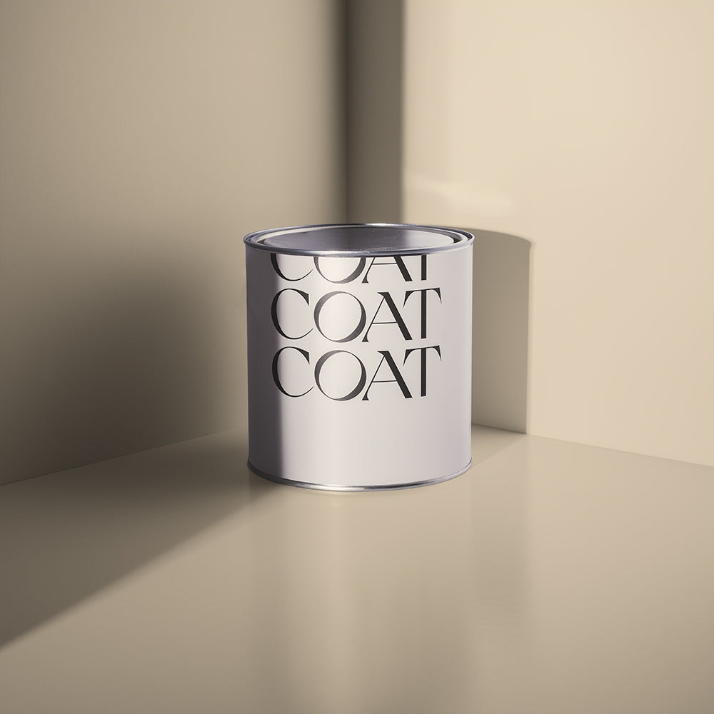
Ready for your DIY project? Check out our colours to try our swatches in your home!
Publish Date
Author