Interior Trends for 2023
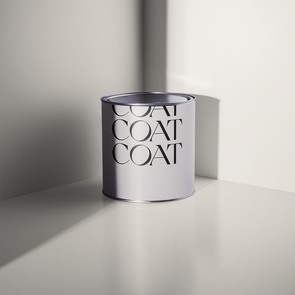
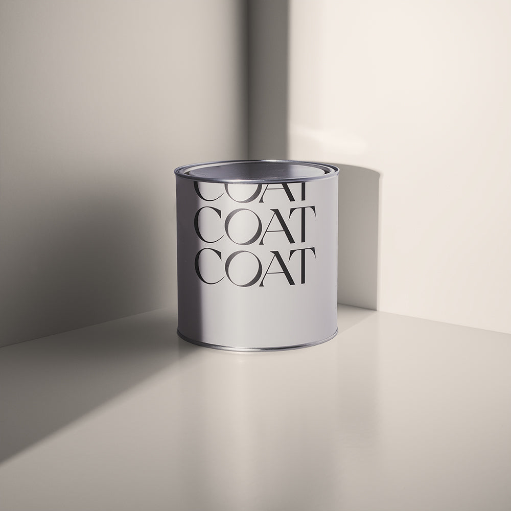
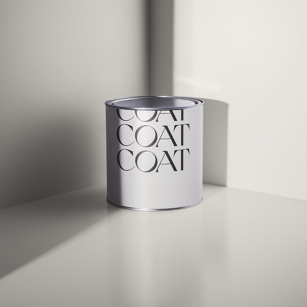
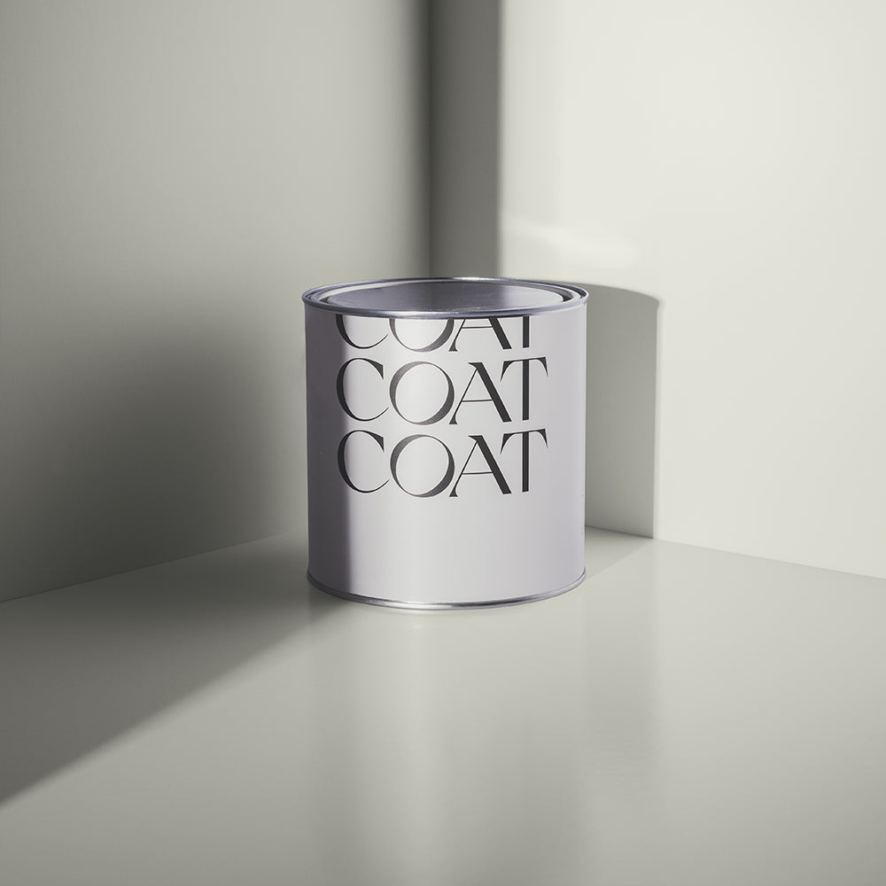
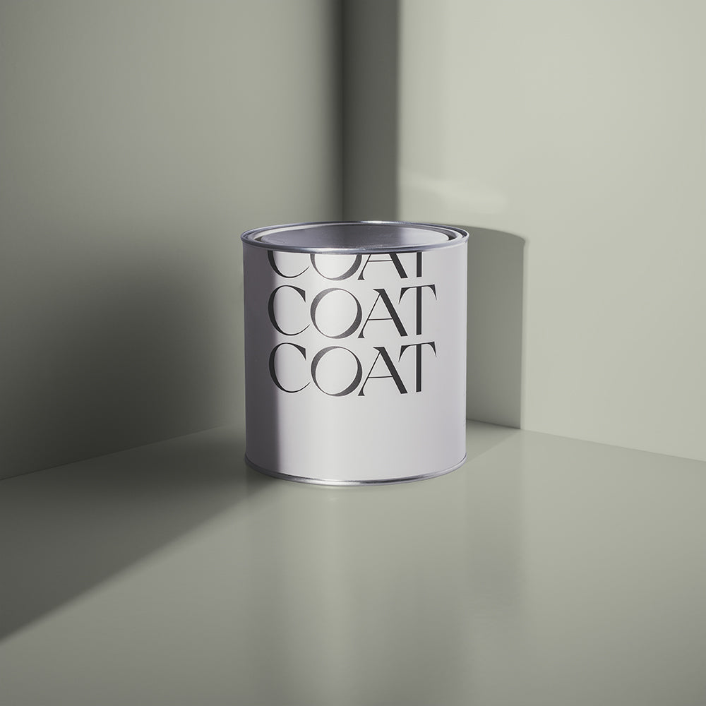
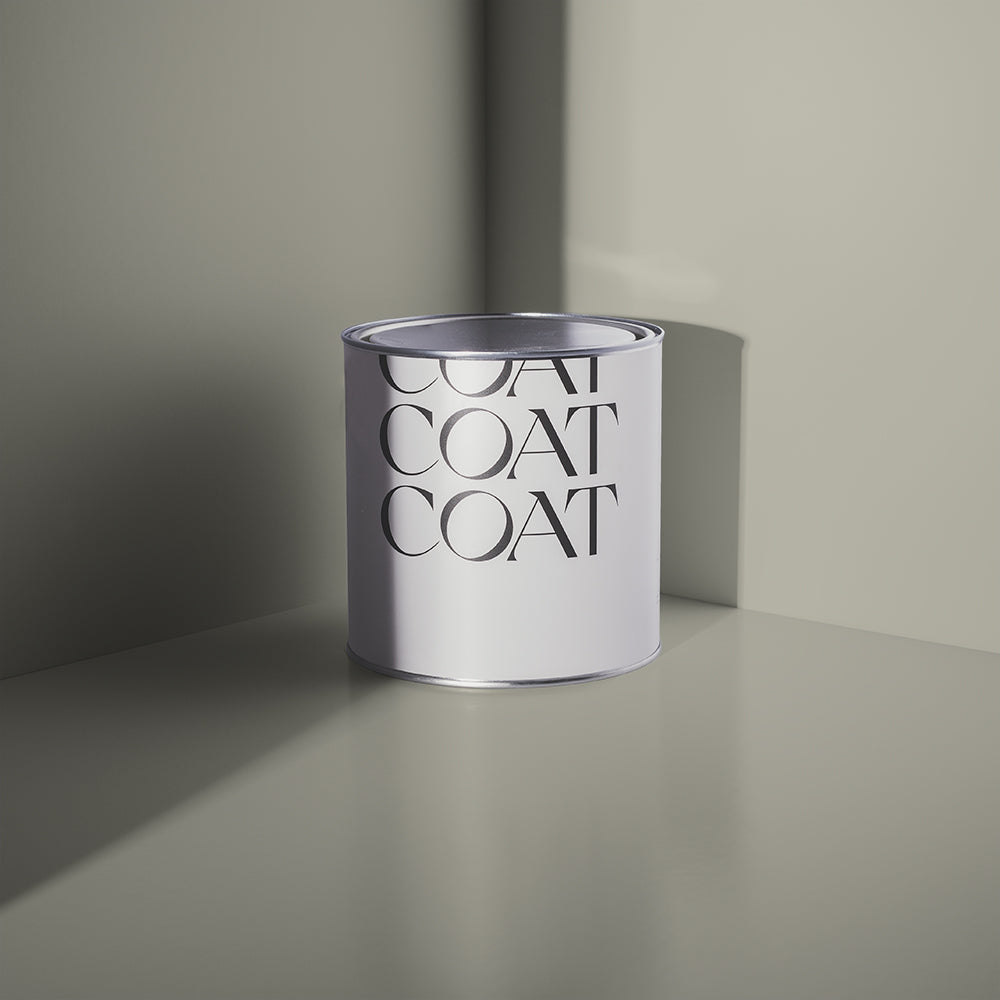
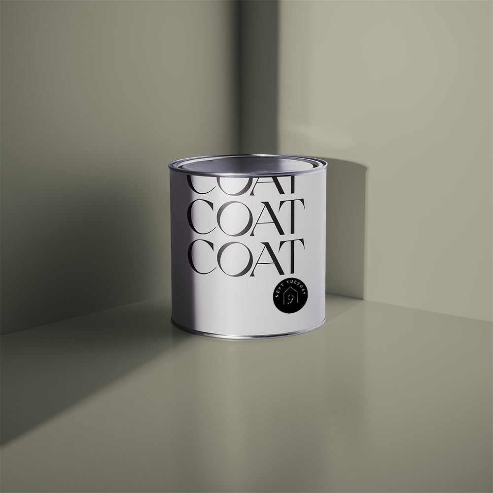
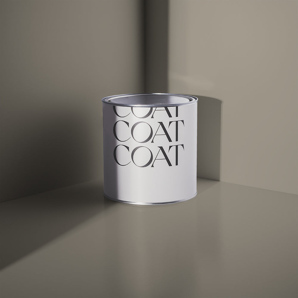
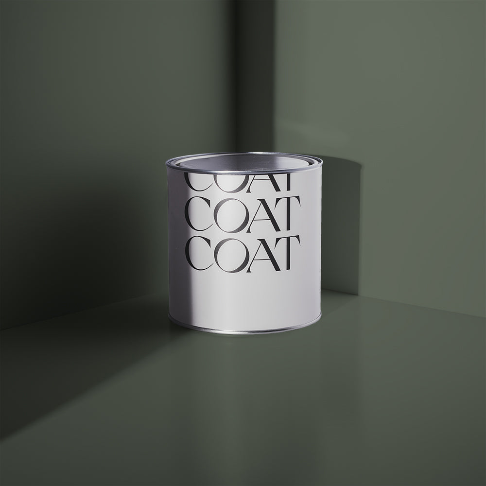
Interior decorating is about creating a space that you enjoy living in. You can make your home look the way you want, and it's easy to change things up when the mood strikes. A COAT of paint can dramatically change the feeling of a room. If you're looking for some inspiration on how to redesign your space, here are some of the most popular colours for interior design in 2023:
Warm Neutrals are still top of the pack
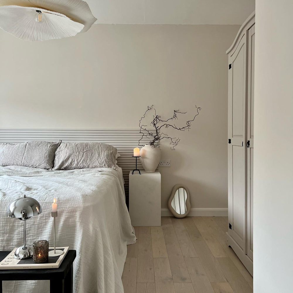
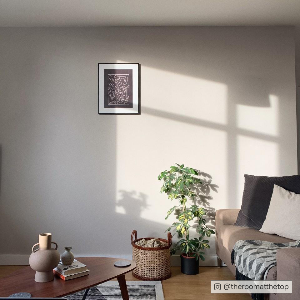
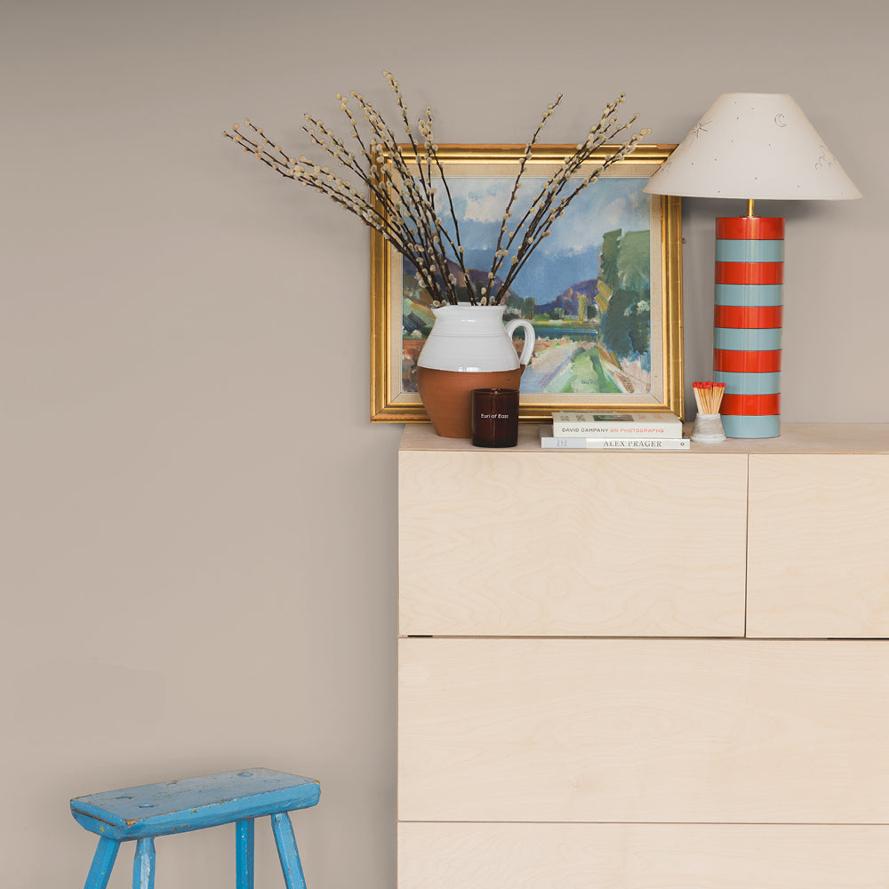
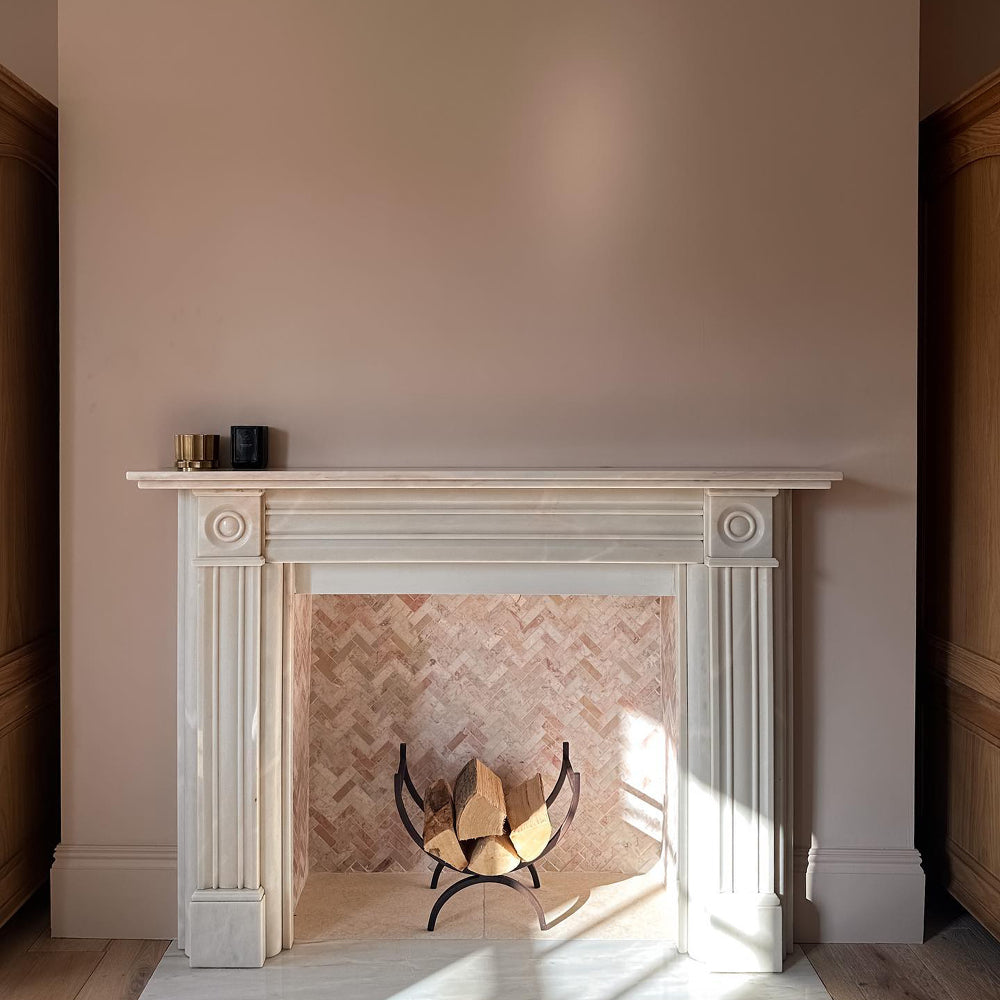
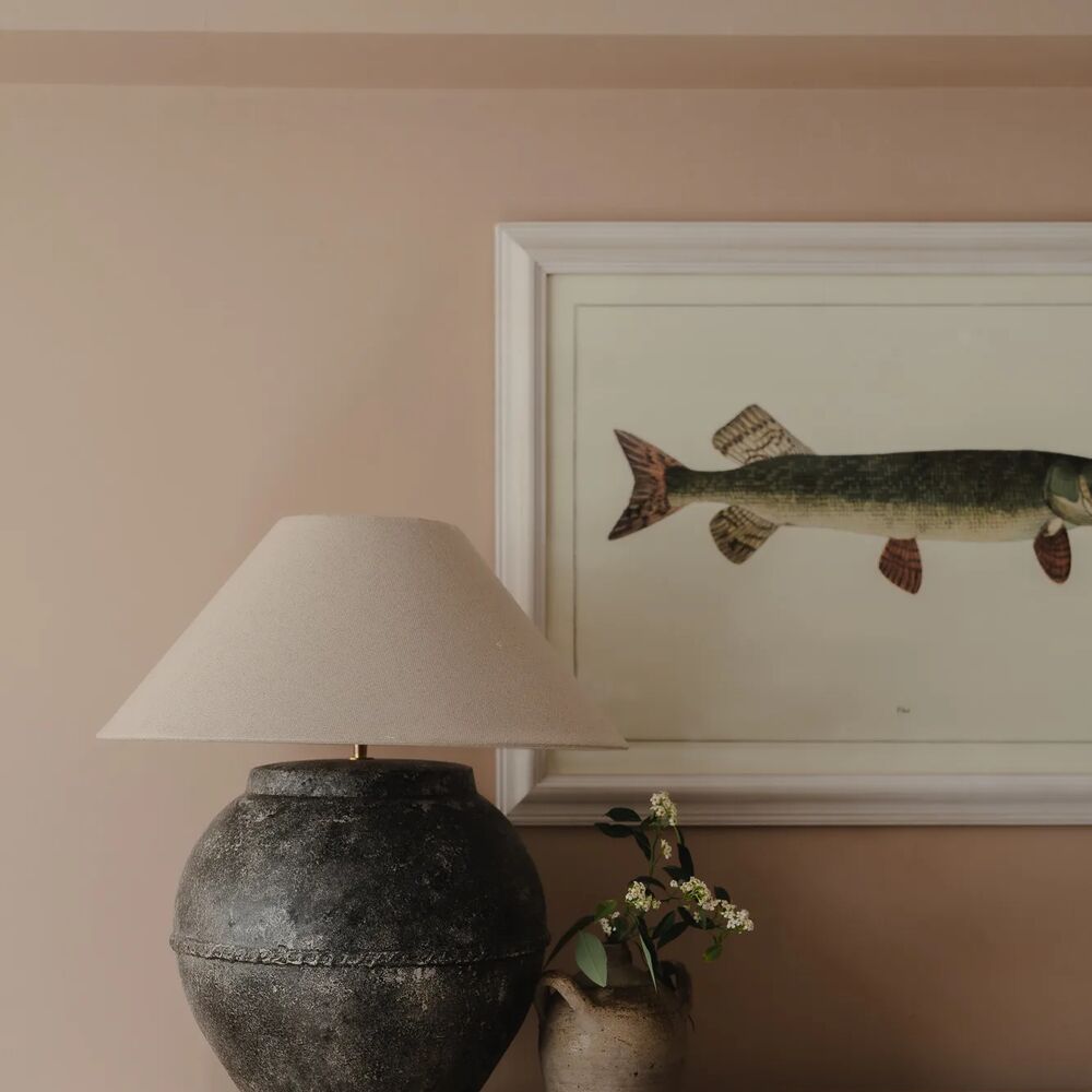
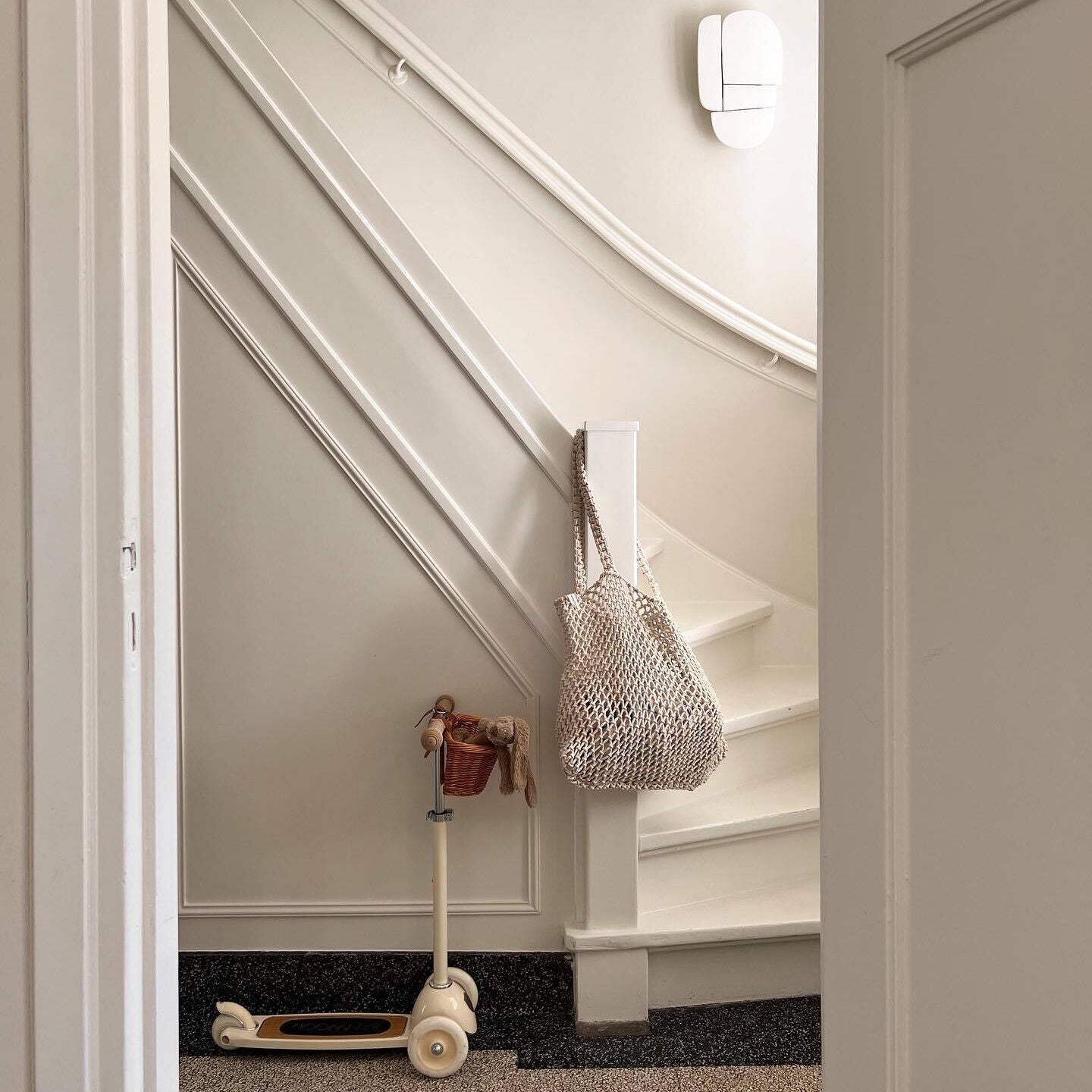
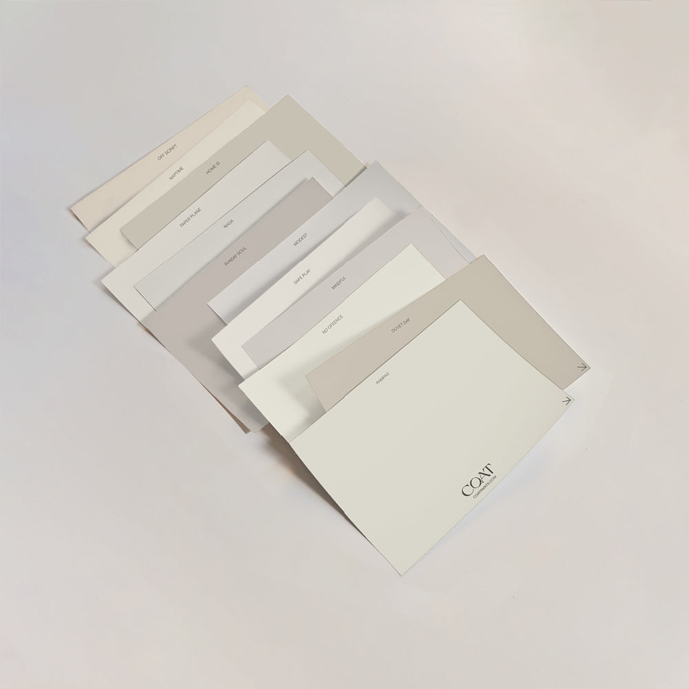
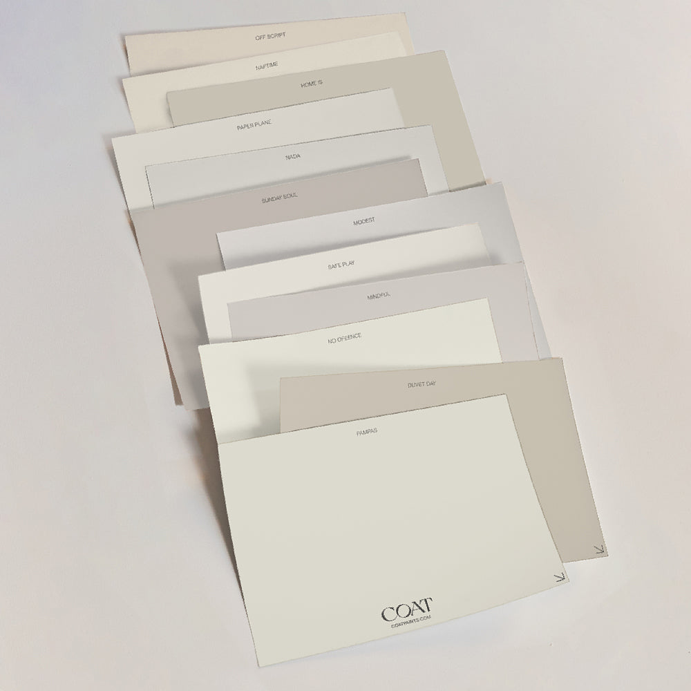
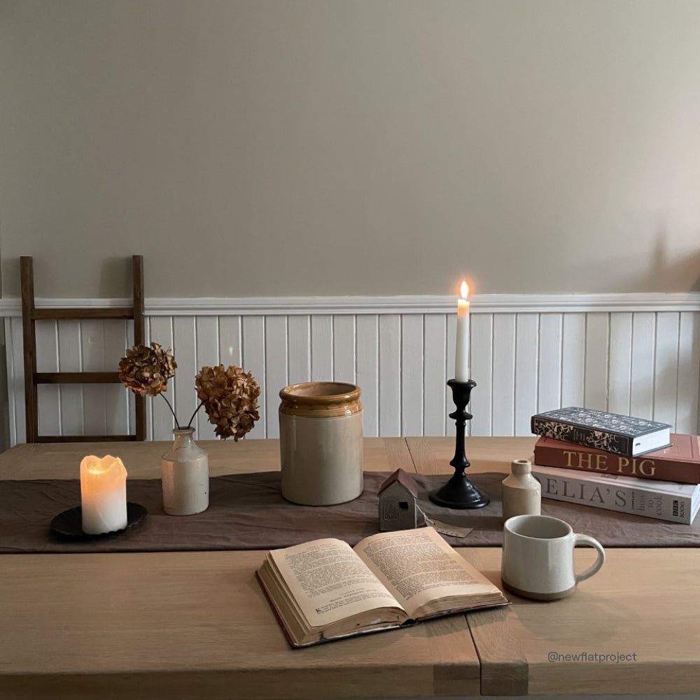
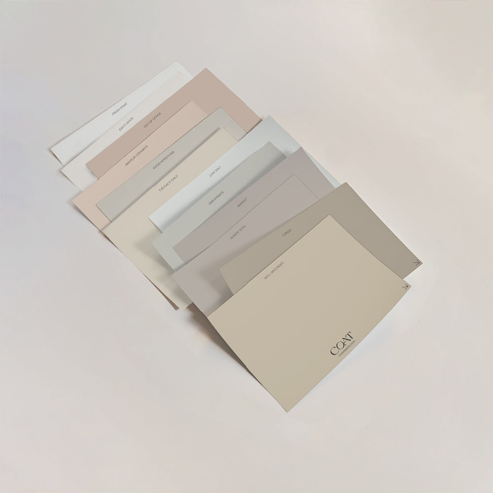
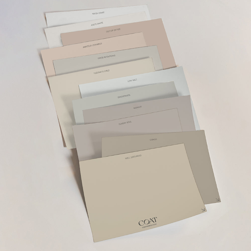
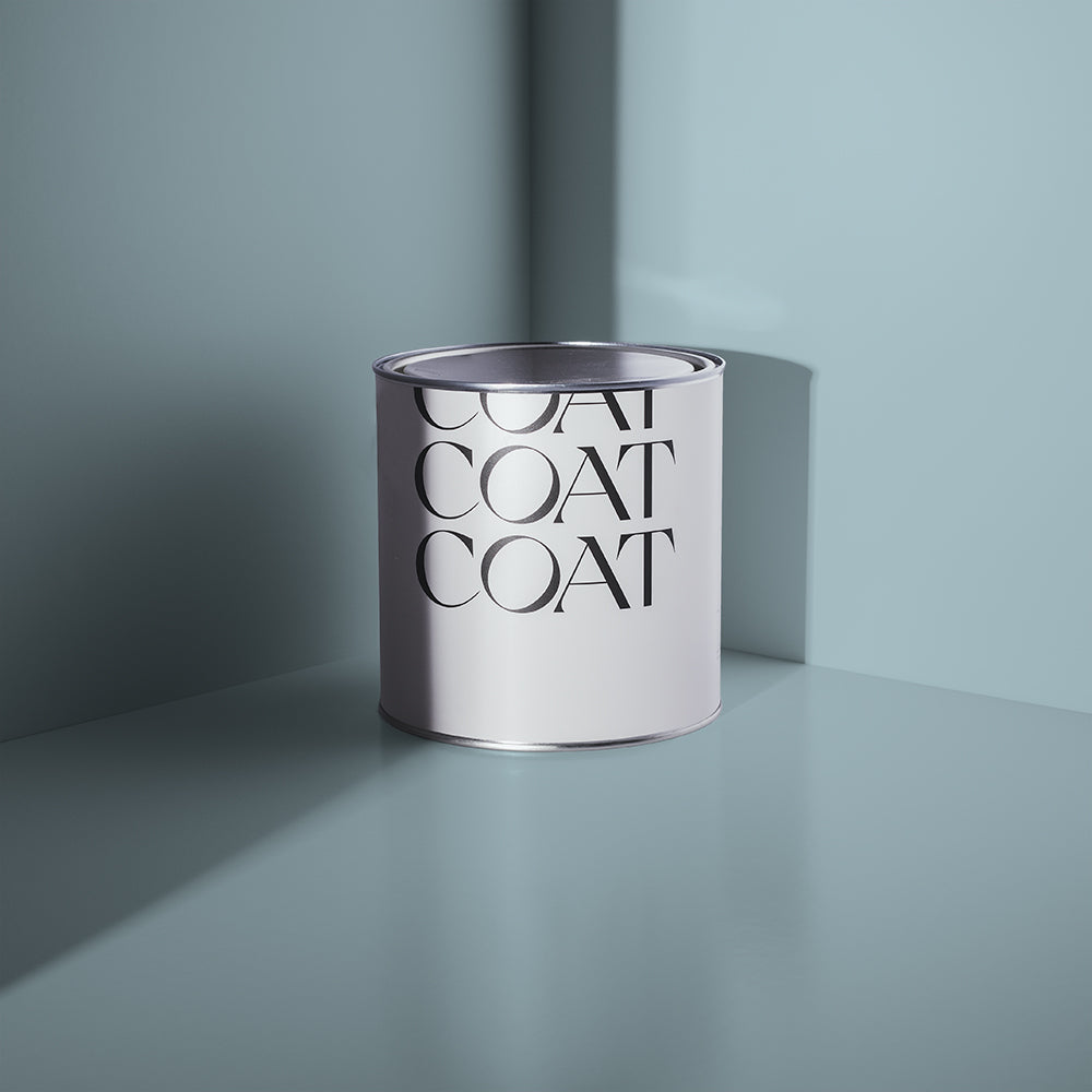
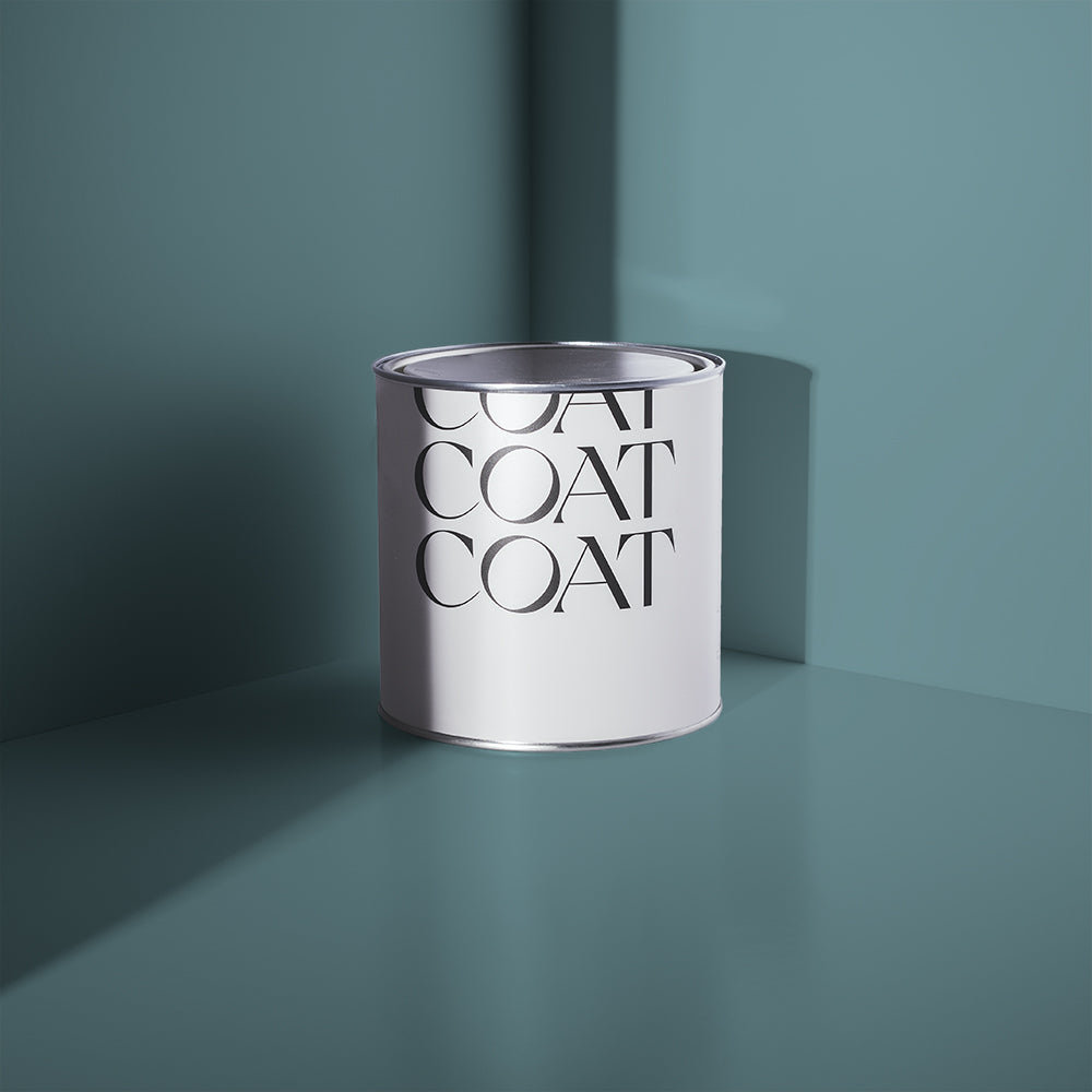
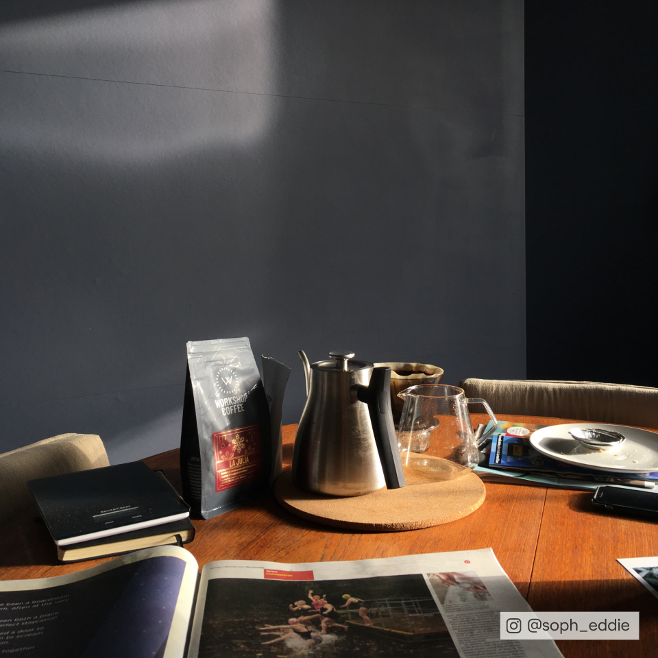
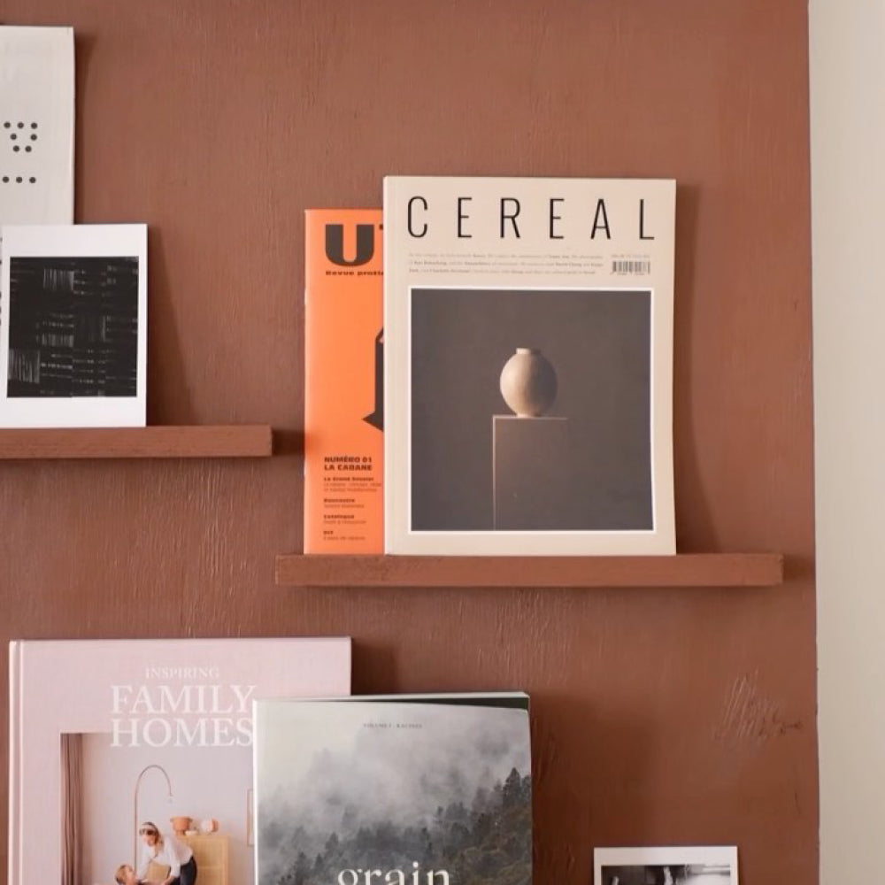
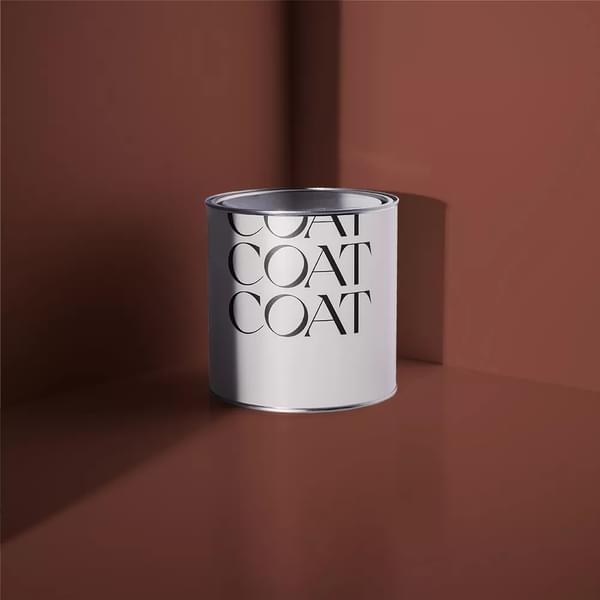
When it comes to colour, the hottest shades of the year are warm neutrals—a.k.a., soft browns, taupes and beiges that have a hint of red or orange in them. Taupes like Mindful and Sunday Soul have been the most popular colours at COAT for some time, but will continue to provide warmth and depth to otherwise minimal spaces. They are slightly greyed, so feel familiar and easy to live with, but have a more welcoming personality.

@northernstyling pairs two neutrals in her living room with a Sunday Soul ceiling and woodwork and Good Intentions walls.

Duvet Day helping @stefs.interieuradvies create a beautifully bright and airy kitchen area.
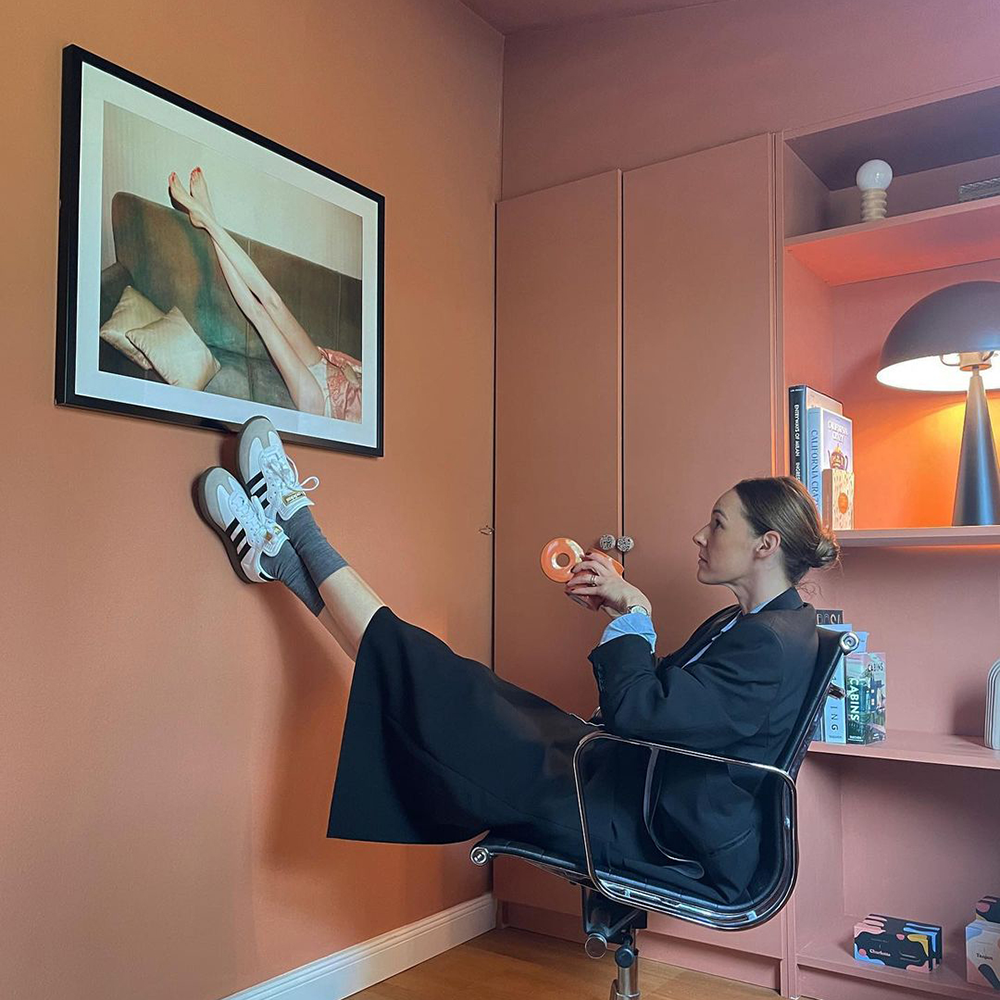
In the land of beige, more dramatic shades have becoming popular. Go for deep beiges like Biscuits For Breakfast for a refined, inviting feeling. For more biscuity tones like Well Grounded, which has a slightly redder look, pair with dark browns, orange or red accents in artwork and cushions for a little extra heat. Going bold with your furniture and accent colours when using these beige colours is a great way of adding character to your interior.

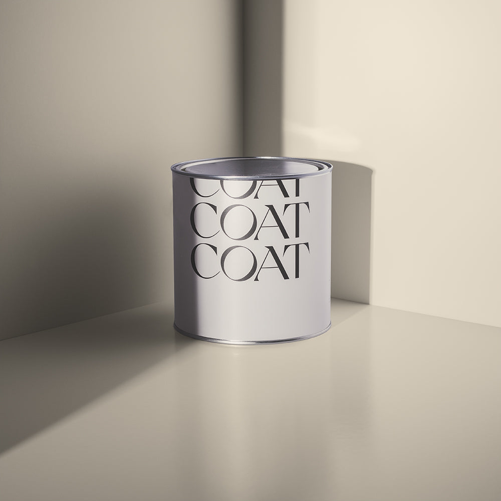
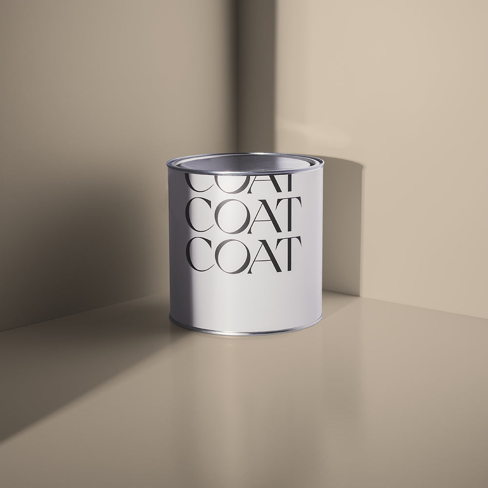
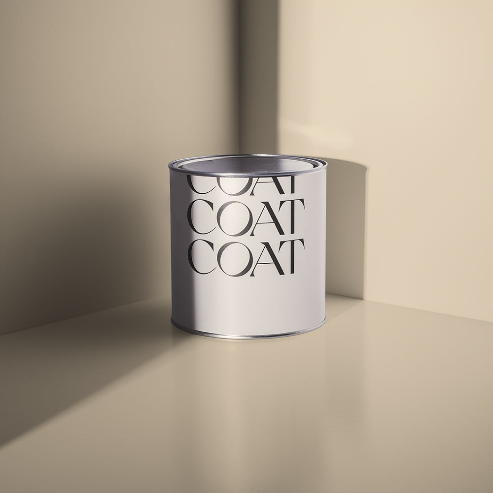
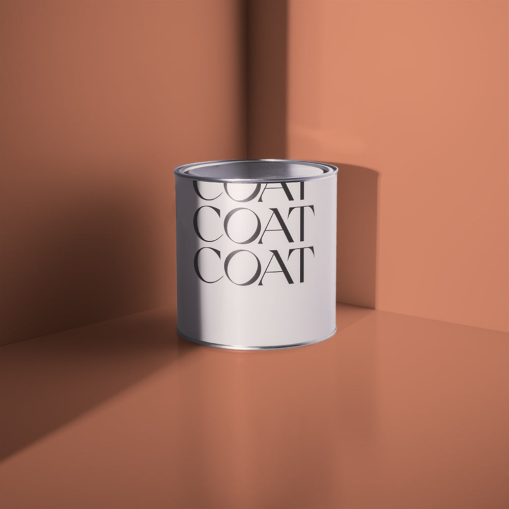
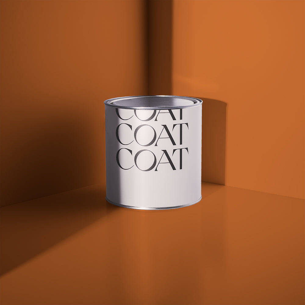
A new favourite, Biscuits For Breakfast, the perfect deep beige.
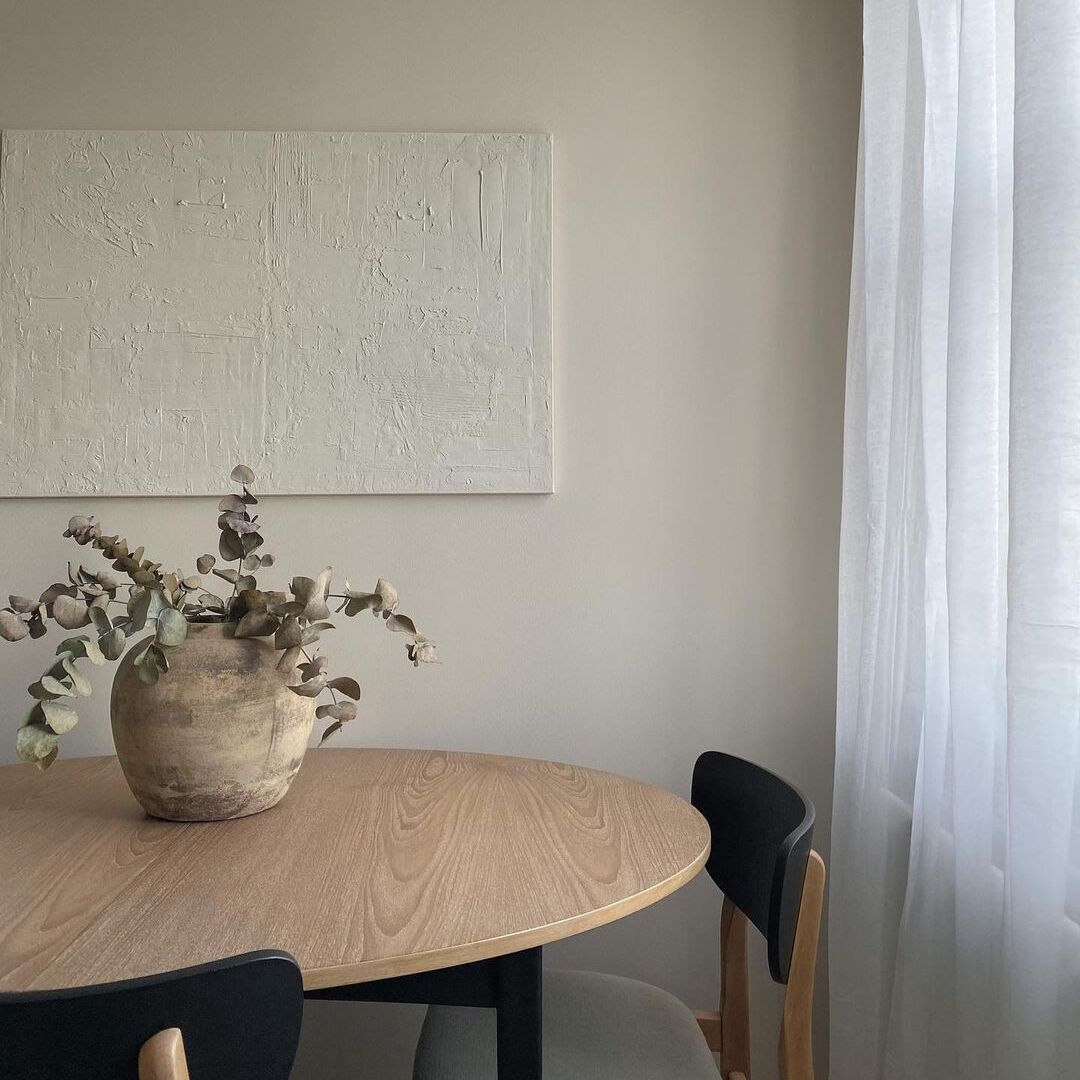
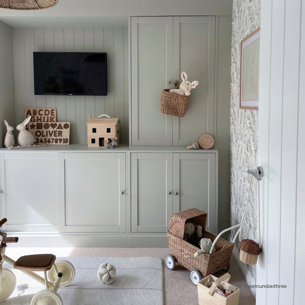
The most popular colours in 2023 will be taupes, browns and beiges. Depending on the colour, these neutrals can feel modern or traditional. For example, warmer darker colours like Cold Brew and Debate Club have a softness that is reminiscent of natural stone and wood finishes, and as a result feel traditional yet dramatic. Some of our more beige shades like Duvet Day or Good Intentions are bright and airy. They are becoming firm favourites in the design community for a modern take on interiors that feel timelessly familiar.
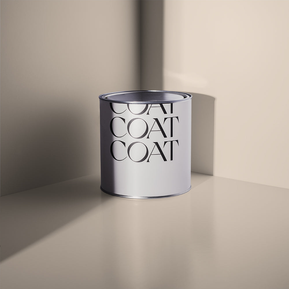
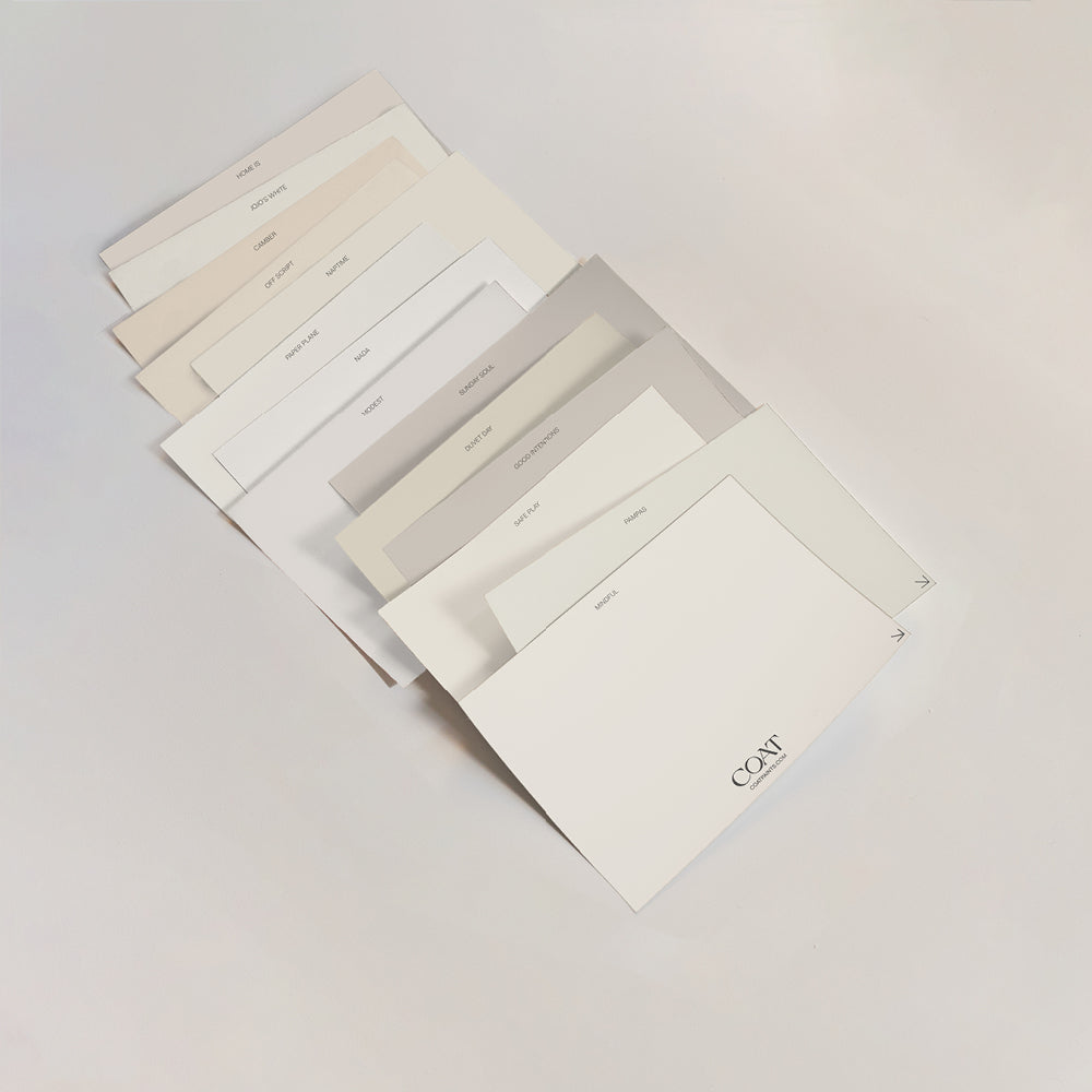
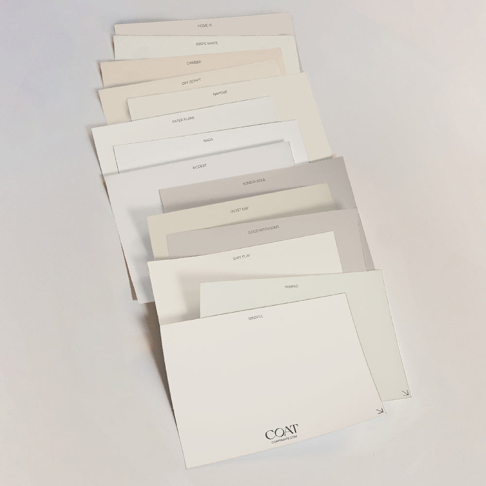
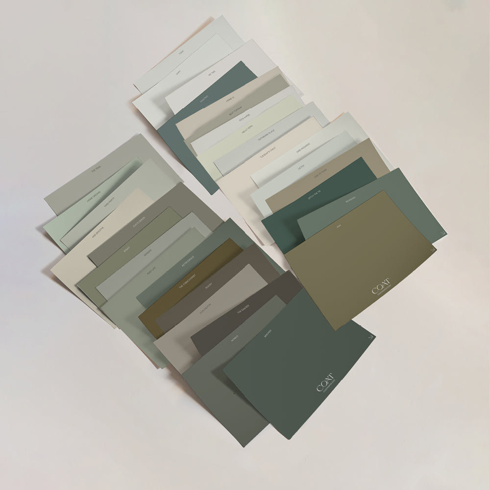
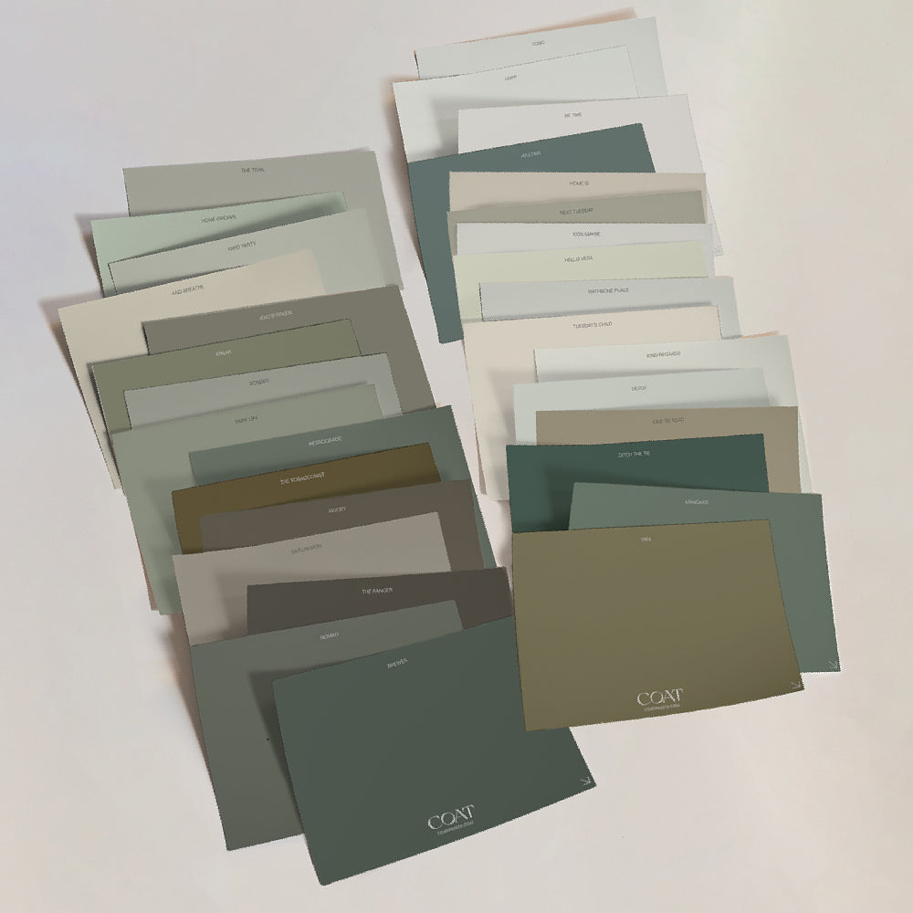
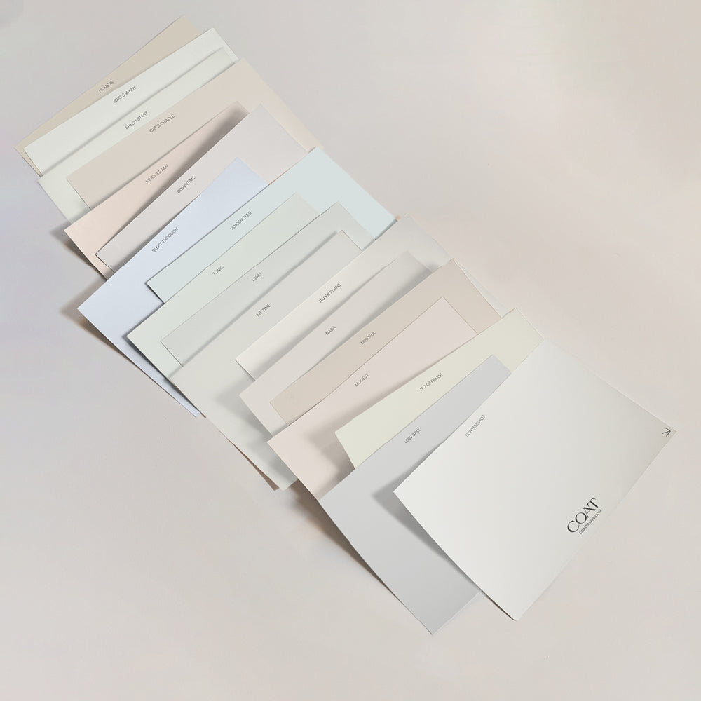
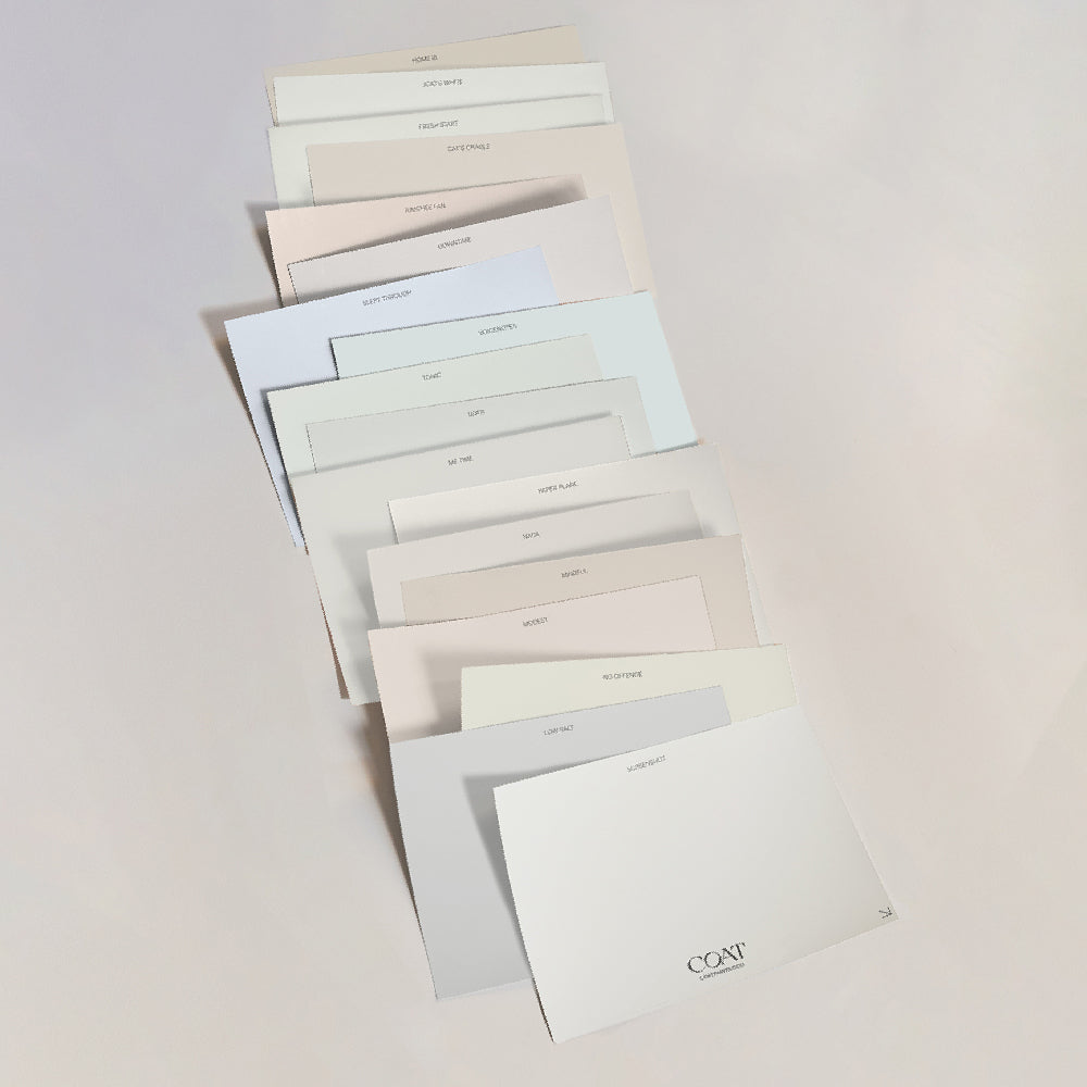
Feeling inspired? Grab a neutral sample pack and start your makeover planning.

Warmer dark neutrals like Cold Brew are perfect for creating cosy bedroom spaces.
Brutalism
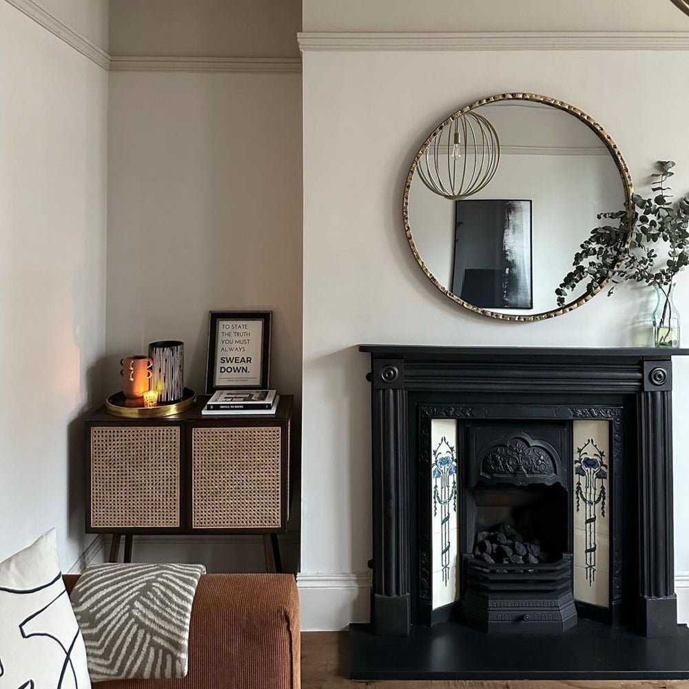
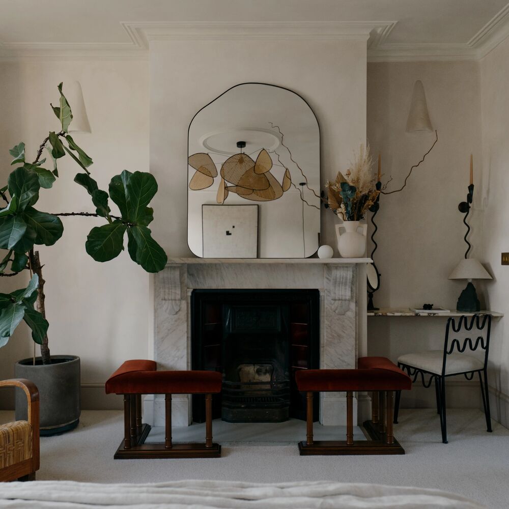
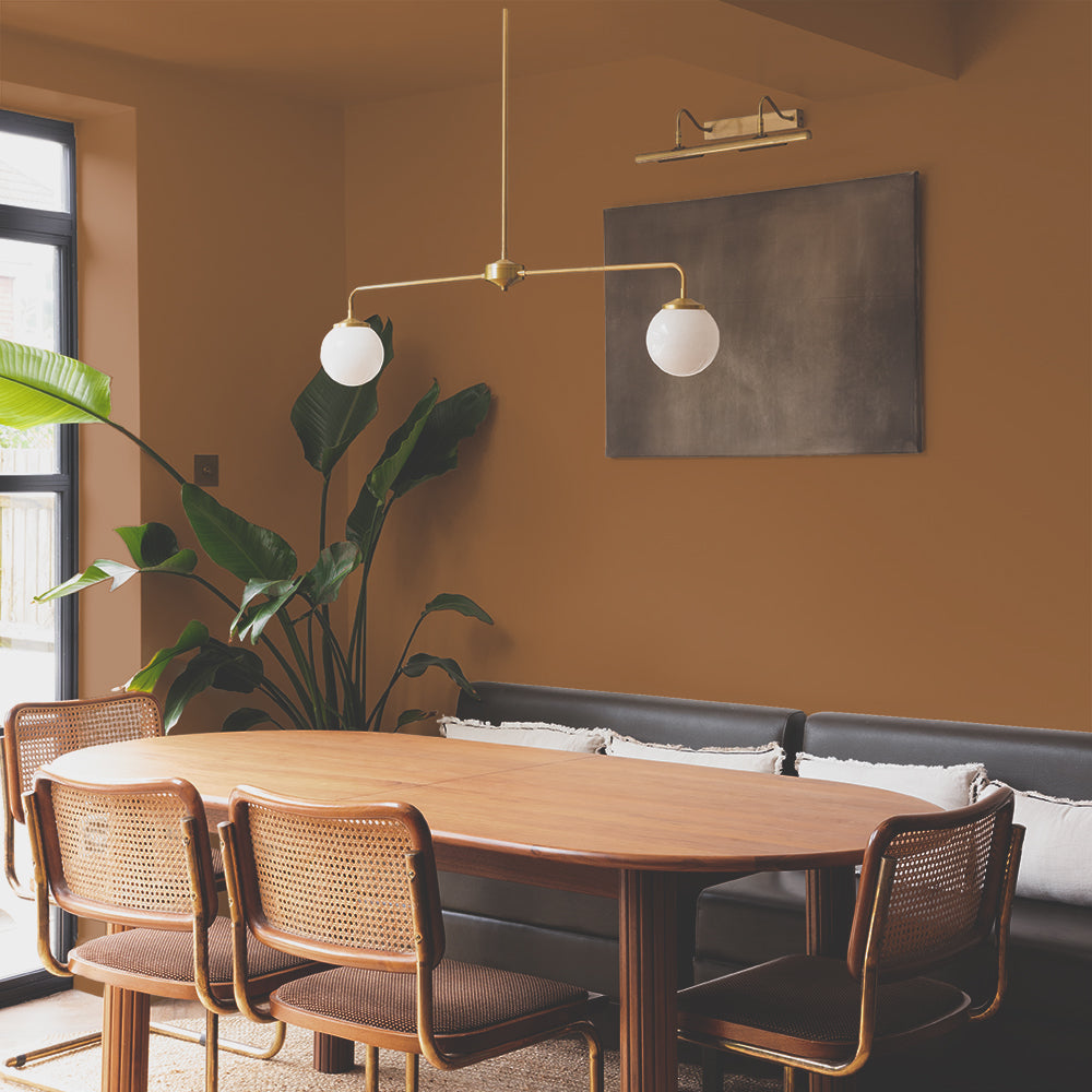
We’re thinking that the renewal of brutalist interiors is being massively underplayed this year. This interior design trend of 2023 and of the 50’s-70’s offers functional, simple construction using really tactile, beautiful materials. Expect to see more textural stones and stony paint colours to match (Ambrose), alongside anthracites, ultra-dark bronzes, like Hardback and deep, warming browns (Gumption).

Brutalist spaces are really characterised by immovable concrete walls, and generate patterns through the manipulation of light and shadow. The key to bringing this into your home is a clever mix of concrete, woods and brickwork alongside stony colours like Ambrose. This design trend is versatile, easily fitting into modern buildings, with their typically lower ceilings and small rooms, particularly when paired with low slung mid-century furniture. This will make the room feel more impressive than it actually is, when you’re sitting low down. It also suits cavernous spaces, drawing detail for the room from the materials rather than furniture and accessories.
White - a timeless classic
White paint is one of those timeless trends that always comes back around. It's the perfect base for adding colour, as it can be used in any room and on any surface. It also works well with other colours, as it helps to create a bright, clean space. Or you can go the opposite way and create a calm, serene space by using off-whites.
Pure white paint, like Screenshot, is a great way to make your space look bigger and brighter. It can be used on walls, ceilings, and woodwork, for a clean look that doesn't have that cold, harsh look you get from Brilliant Whites of the world.

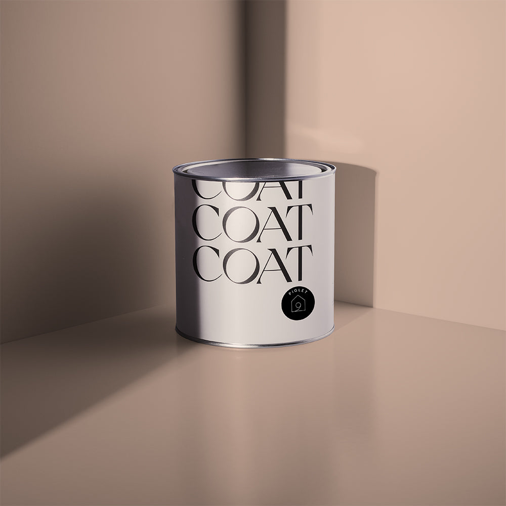
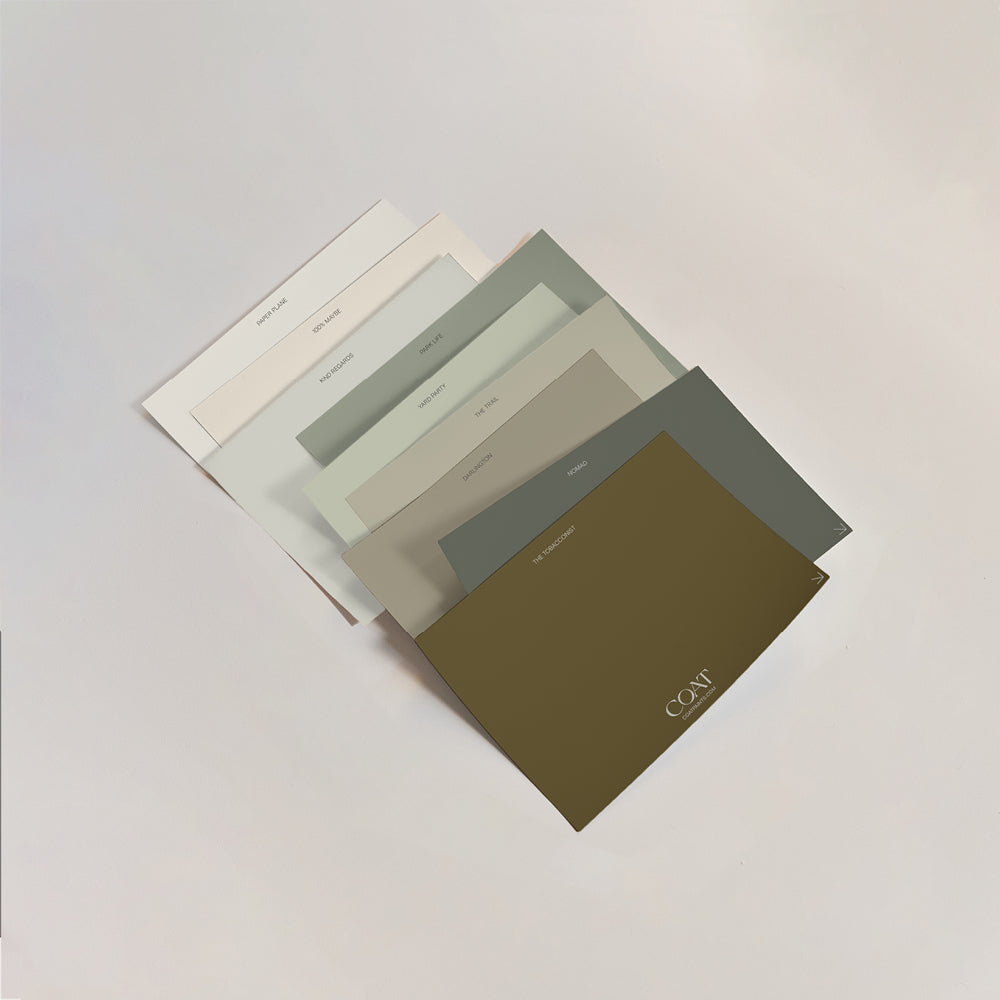
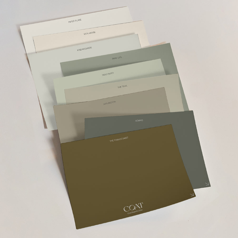
For warmer whites- try going for our new taupe off-white Modest. It’s got just a touch of red and greyness to it, perfect as a compliment to most modern interior design schemes for ceilings or walls. If you’re after something a little more refreshing, try our green based white, 100% Maybe. Pair with deeper greens or use as a wall colour with Screenshot ceiling and woodwork to pull out a biophilic inspired minimalist scheme.

Our new taupe off-white, Modest is a real crowd-pleaser, fitting perfectly in any room.
Picking a white can be difficult though. The amount of choice can make them quite difficult, and each has its own undertone, which means they can look different in different lighting. We can help you pick out the right paint and colour for your home. (Shameless plug for our Colour Consultation Services)
Unsure where to start? Grab our white sample pack to test our whites out for yourself.
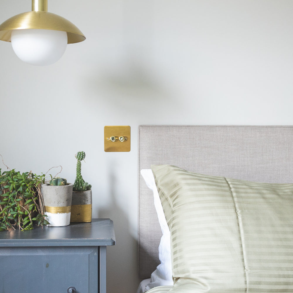
Sustainable lighting

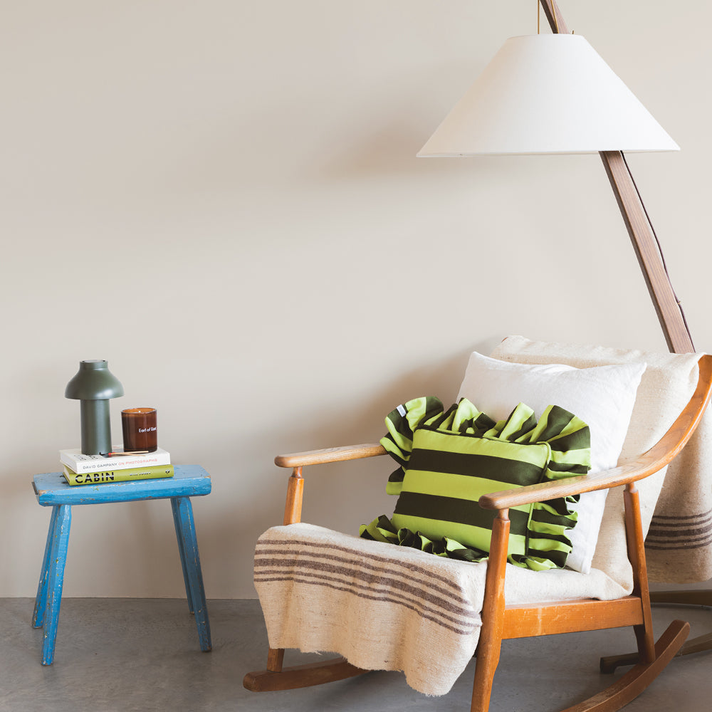
As a trend, and as people that work with colour everyday, we’re a fan of moving towards more sustainable lighting methods. Statement paper and fabric lighting can help create a softer, warmer look to your home. Table lamps have become more sculptural and abstract, using organic materials. These lighting methods also help give your paint colours a moodier, more shifting vibe, which makes your interior more interesting. This is particularly helpful for those of you that love a neutral look.
Ever had parents that always wanted you to turn the big light off? Now you know why.
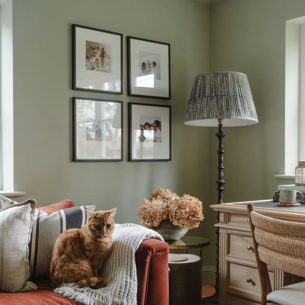
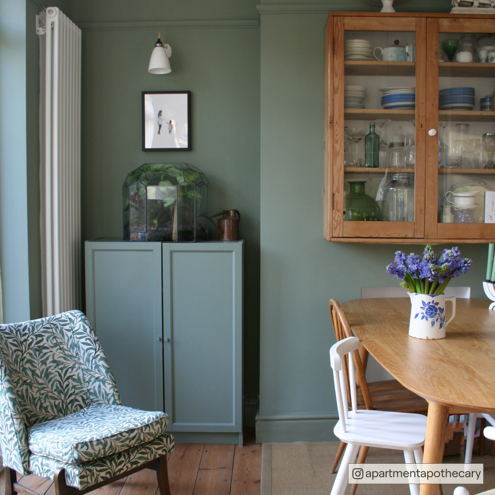
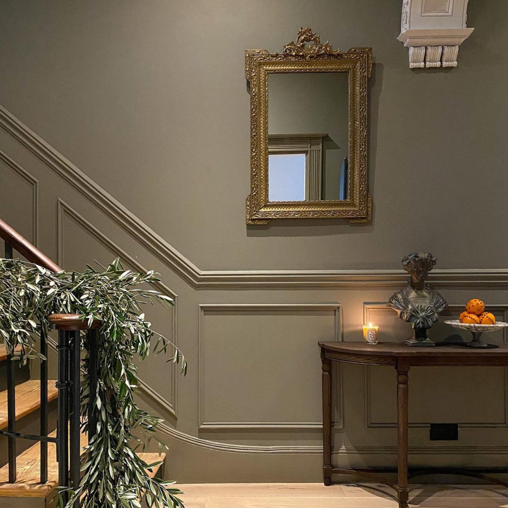
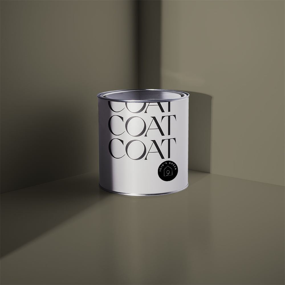
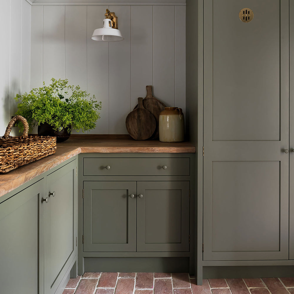
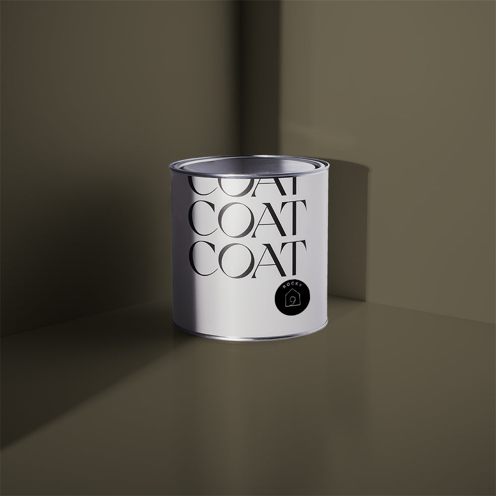
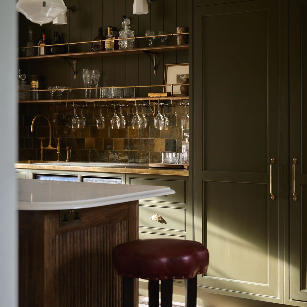
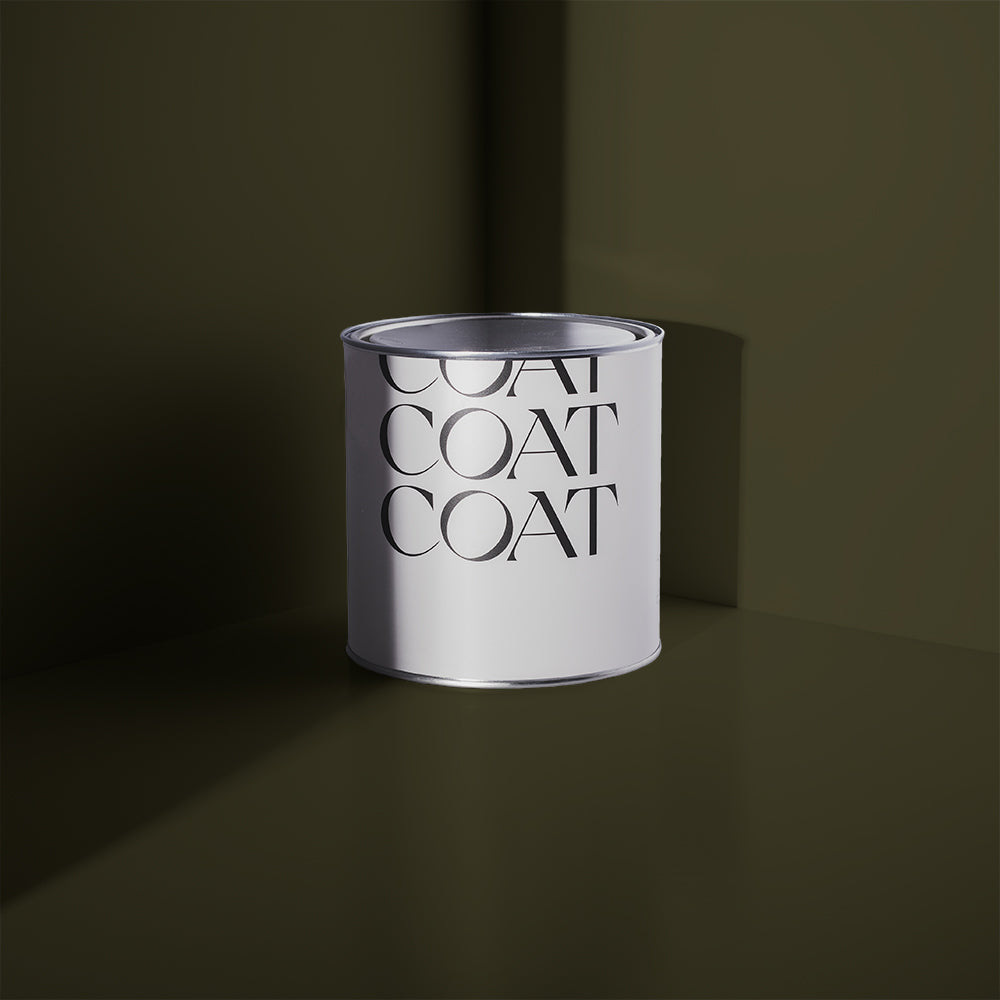
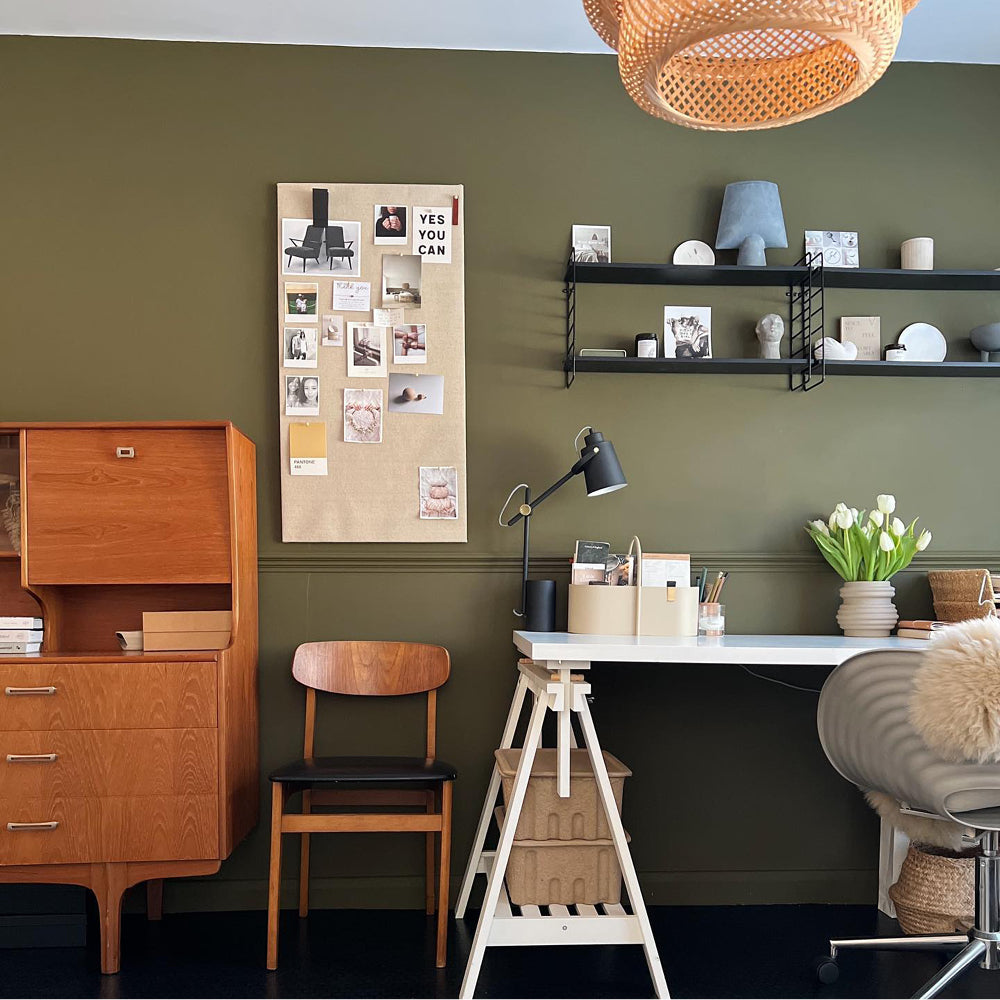
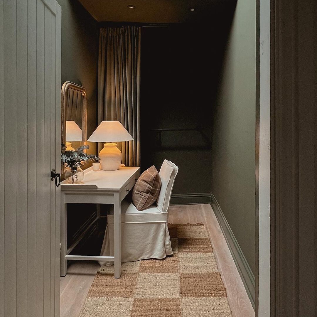
Green is still springing up
You’re probably thinking, “green?" Isn’t that the colour of nature and spring and health food?” And you would be right! Green has been associated with nature and spring for a long time. But there are so many greens that offer a refreshing natural approach to interiors, as well as some dramatic shades too.If you prefer something more sophisticated: grey-greens like Yard Party or The Trail will give your space an airy feel, while deeper greens can evoke images of lush forests and exotic rainforests - perfect if your home office needs some inspiration.

The Trail is one of our all time faves, it's paired with Safe Play in @thestylepad_uk's home.
For the third year running, Emerald Green is the colour of choice for interior designers. Instead of adding just statement cushions, use this clean, dark green for walls and pair it back with more neutral furniture. Ditch The Tie is particularly great for this, and for those of you wanting to embrace the Neo-classical maximalist vibe, go for our Soft Sheen finish. The extra sheen will bring opulence, especially when combined with large abstract sculpture, which is, according to the experts, the best art investment for 2023.
Pink- Plasters and deep tones
Pink is a colour that's linked to yellow, and it's also moving toward deep, dusky shades. We’re seeing them in paint colours such as Mrs Bouquet. These pinks are easy to live with; they add drama and warmth, but still look welcoming.

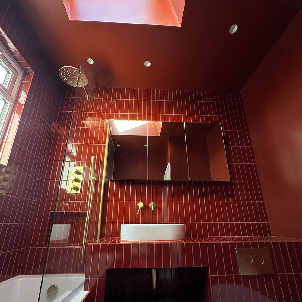
Plaster pinks are a good choice if you're thinking of painting your walls pink. Colours like Pudding and Factor Fifty are super versatile and can be used on any wall surface - even ceilings! This also feeds into the brutalist look that we’re obsessed with, creating warmth and a natural flow, presenting the look of natural materials. Particularly impressive when used in a bathroom with Emerald accents.
Loving these trends as much as we do? Check out our sampless to feel even more inspired and get in touch if you have any styling questions.
Publish Date
Author