How To Use Neutrals with Topology Interiors
Thought picking a neutral would be the ‘safe’ bet? Not going to lie, most do! Finding the perfect neutral paint colour is the holy grail of interior design, these tones can appear easy pickings at first but don’t mistake their versatility as a trouble-free choice.
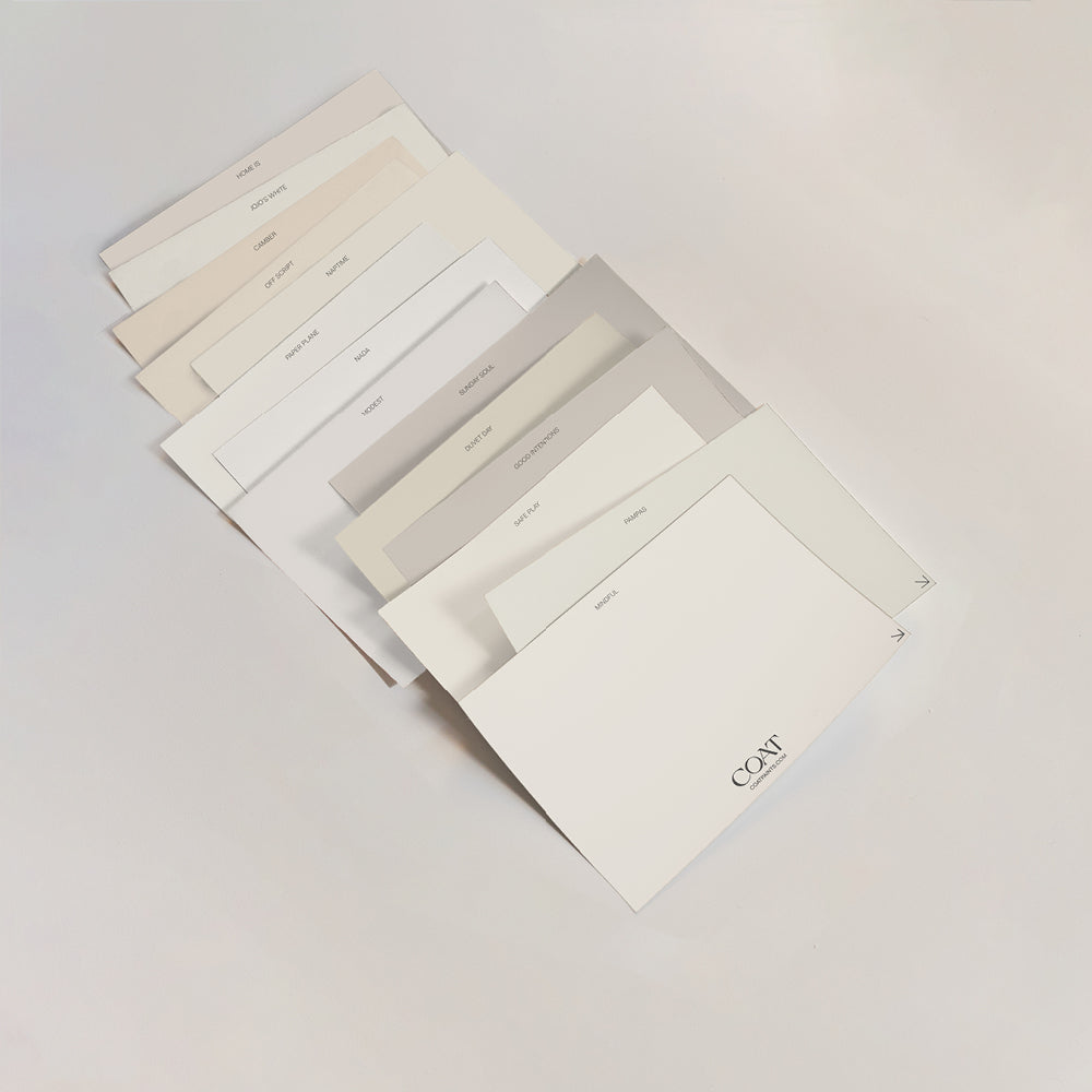
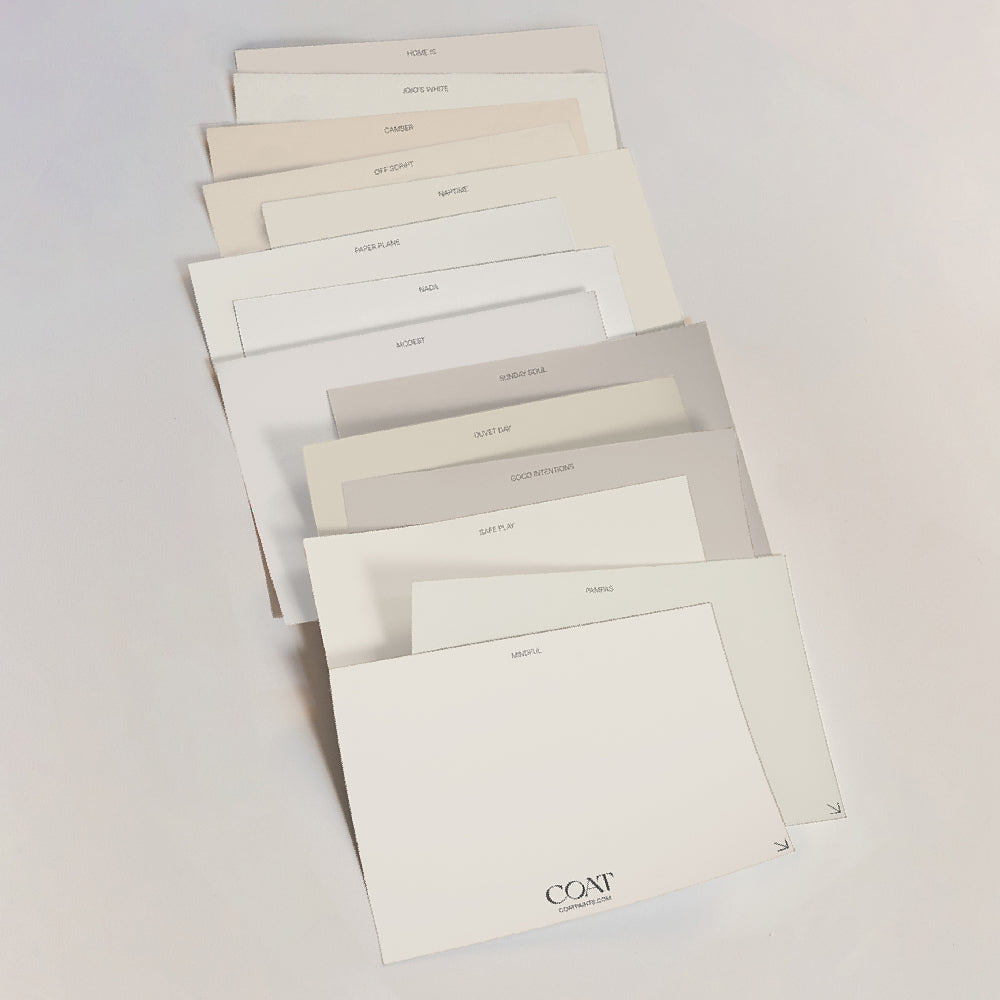
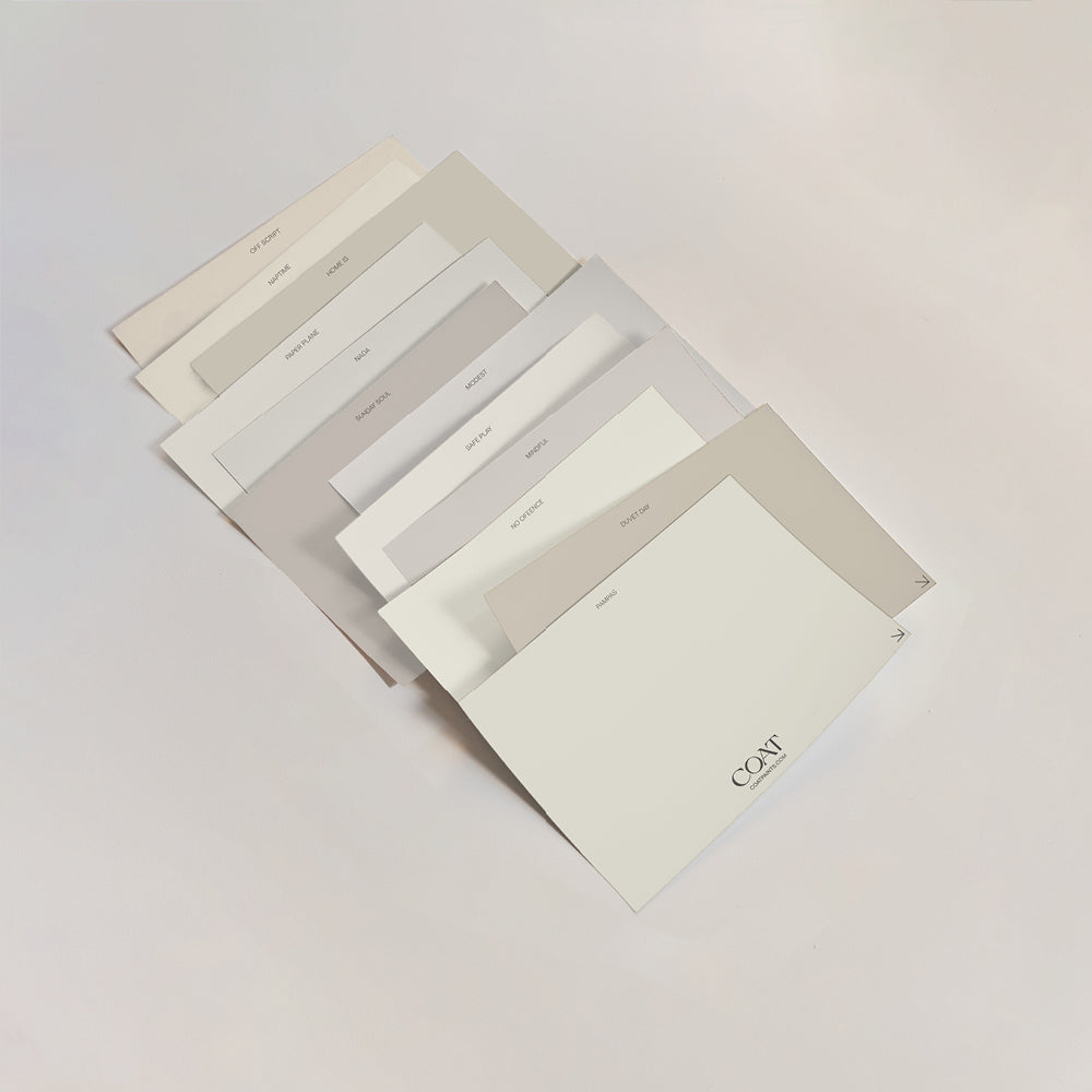
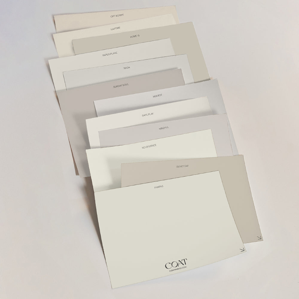
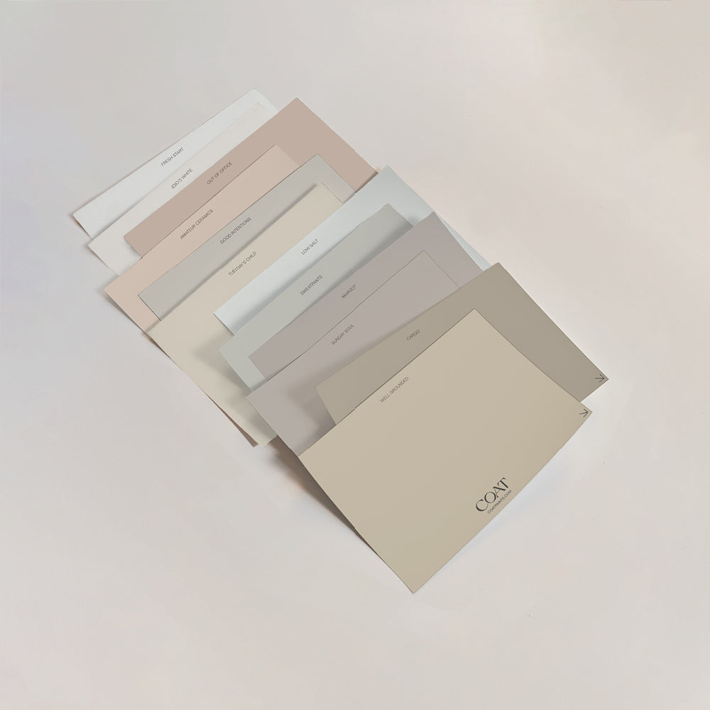
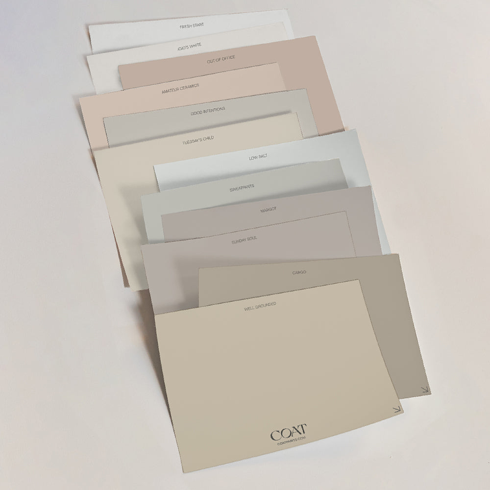
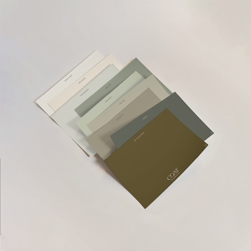
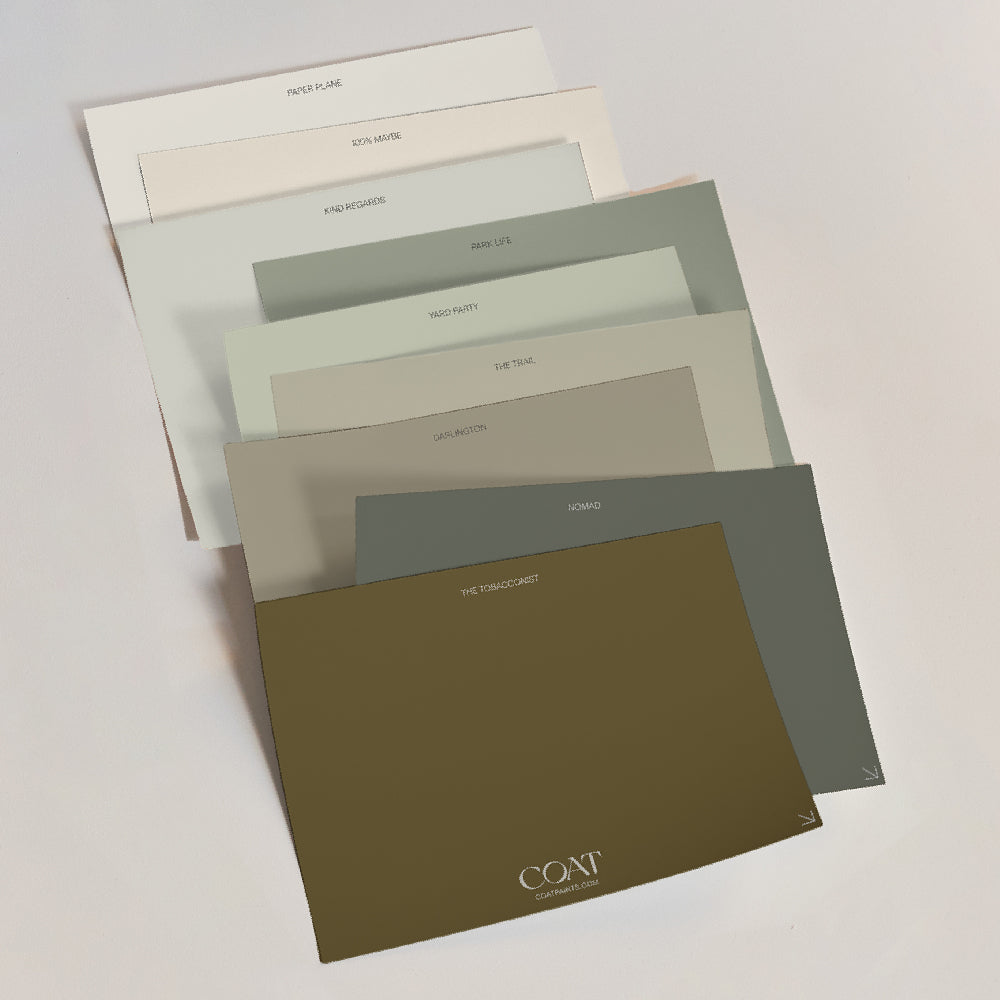
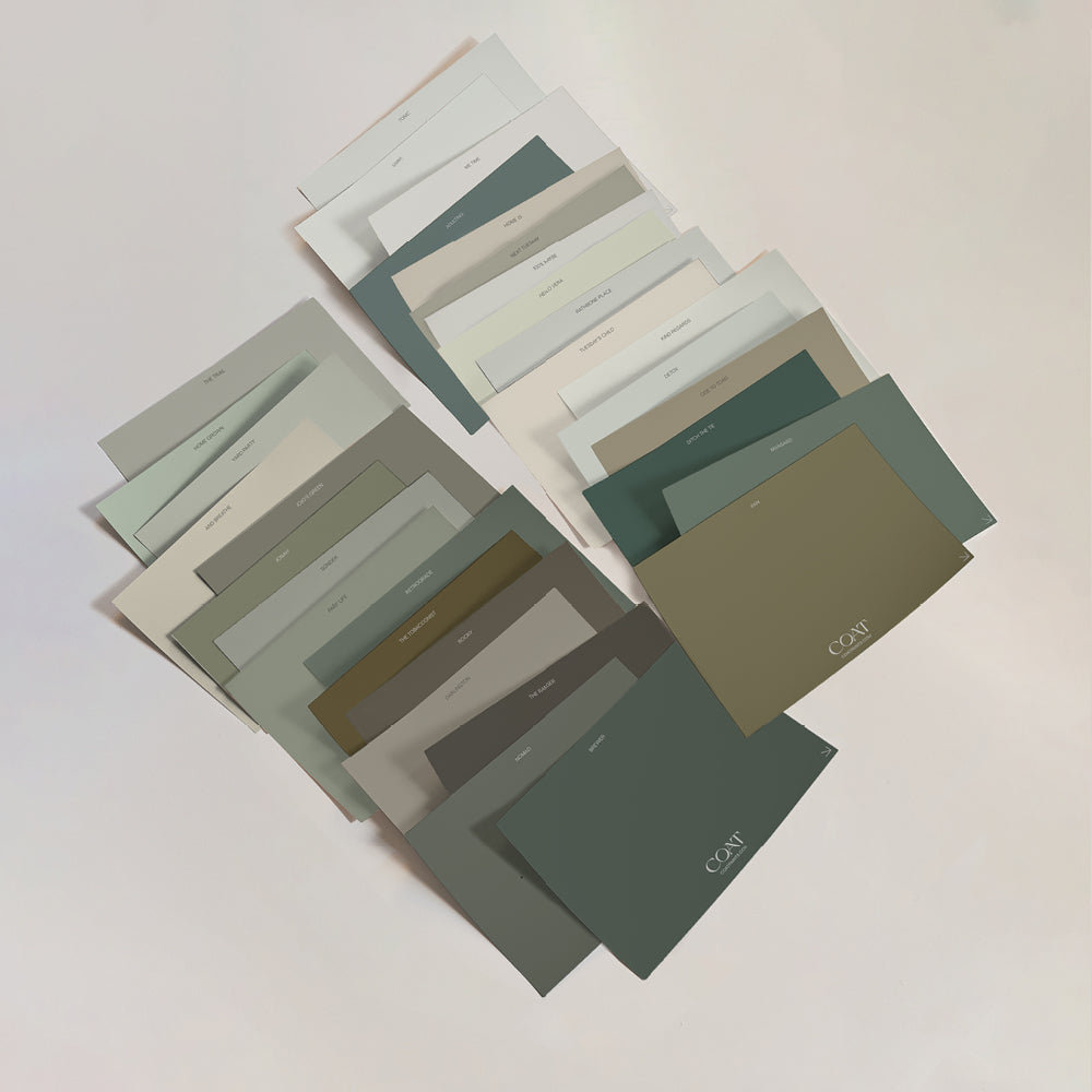
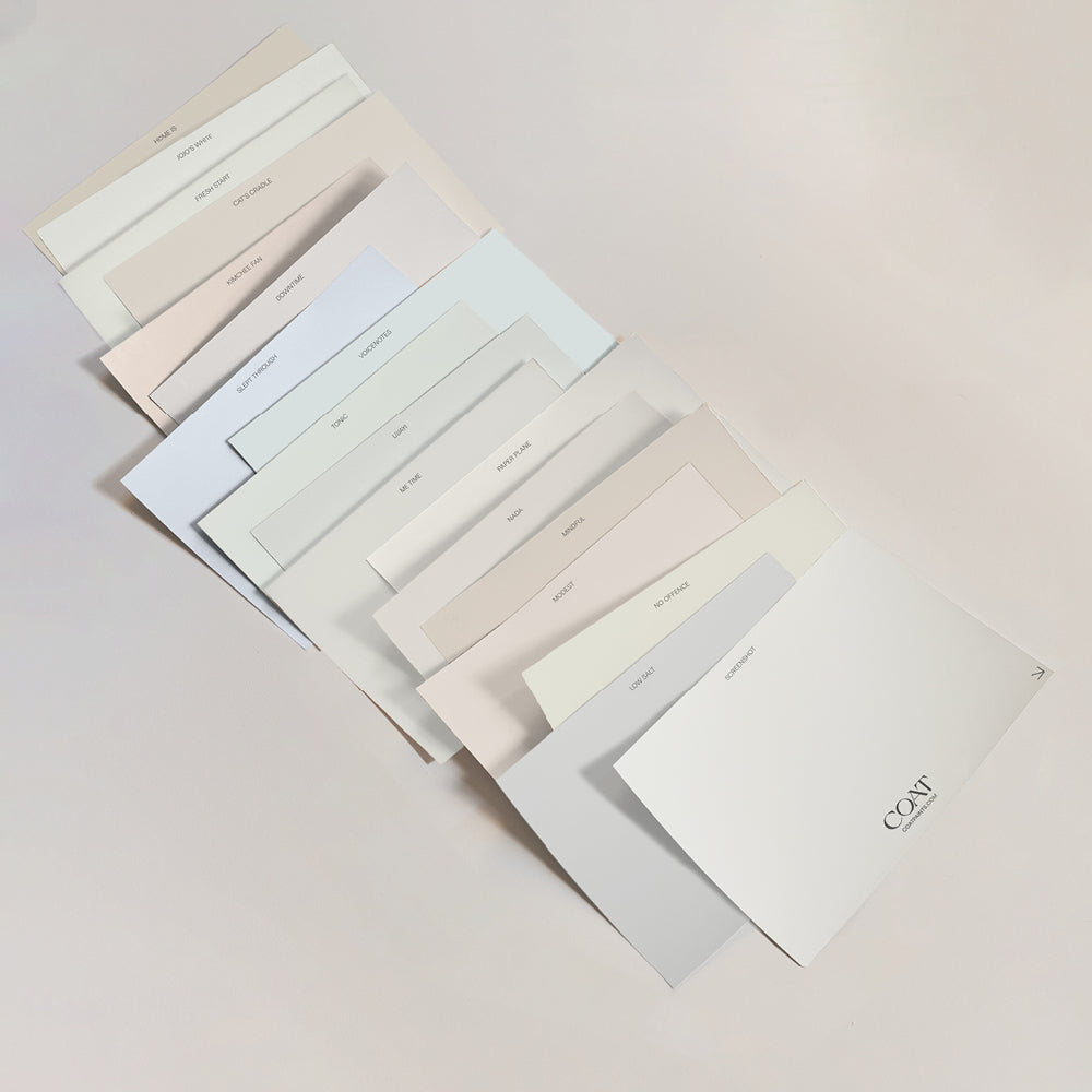
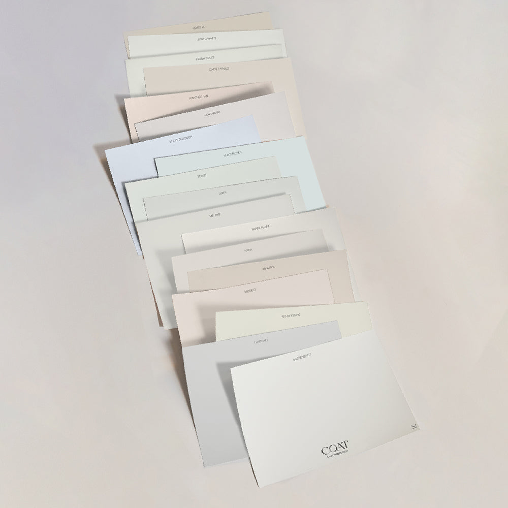
‘Neutrals’ has become a loosely used term, when in reality, a neutral palette sets a practical and harmonious background. Often referred to as boring 🙄, these tones are the opposite. They offer comfort, stability and balance and finding the perfect one can be overwhelming with so much choice out there. Don’t worry, we’ve done the hard work for you and chosen our favourites✌️
Want to find out more about the different kinds of neutrals out there? Read our blog here.

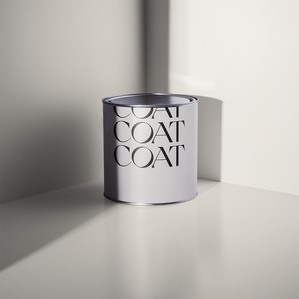
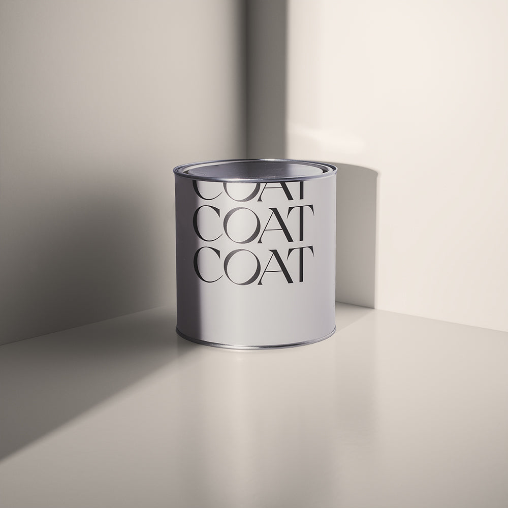
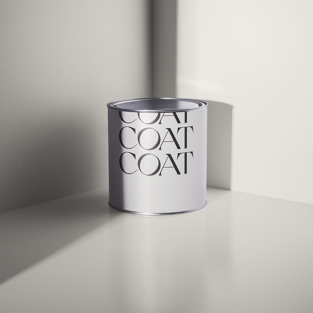
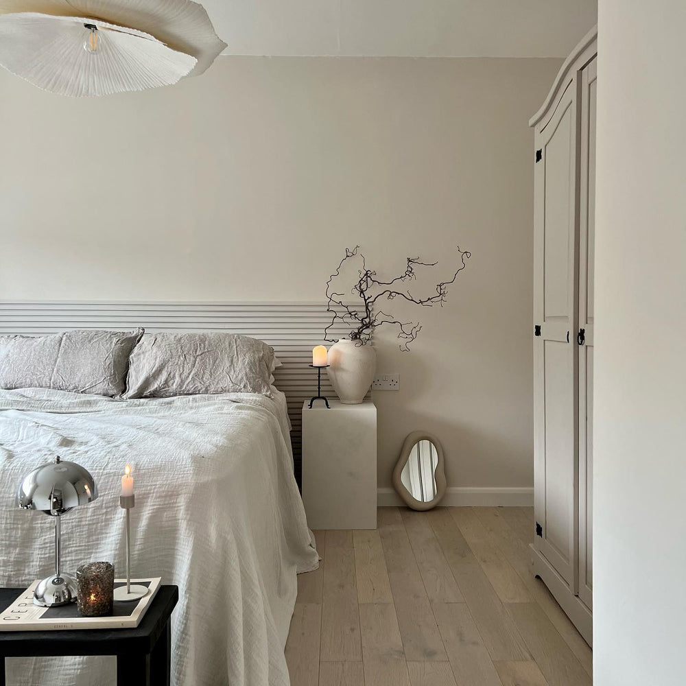
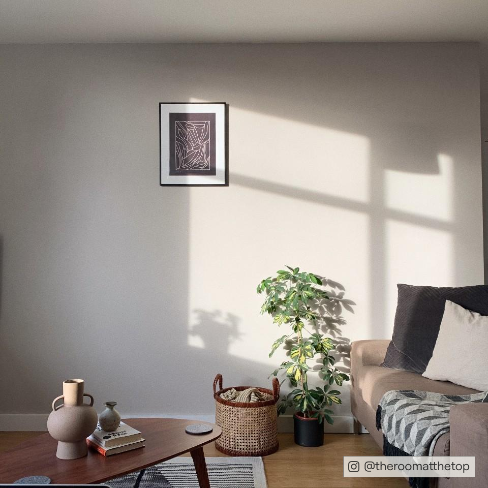
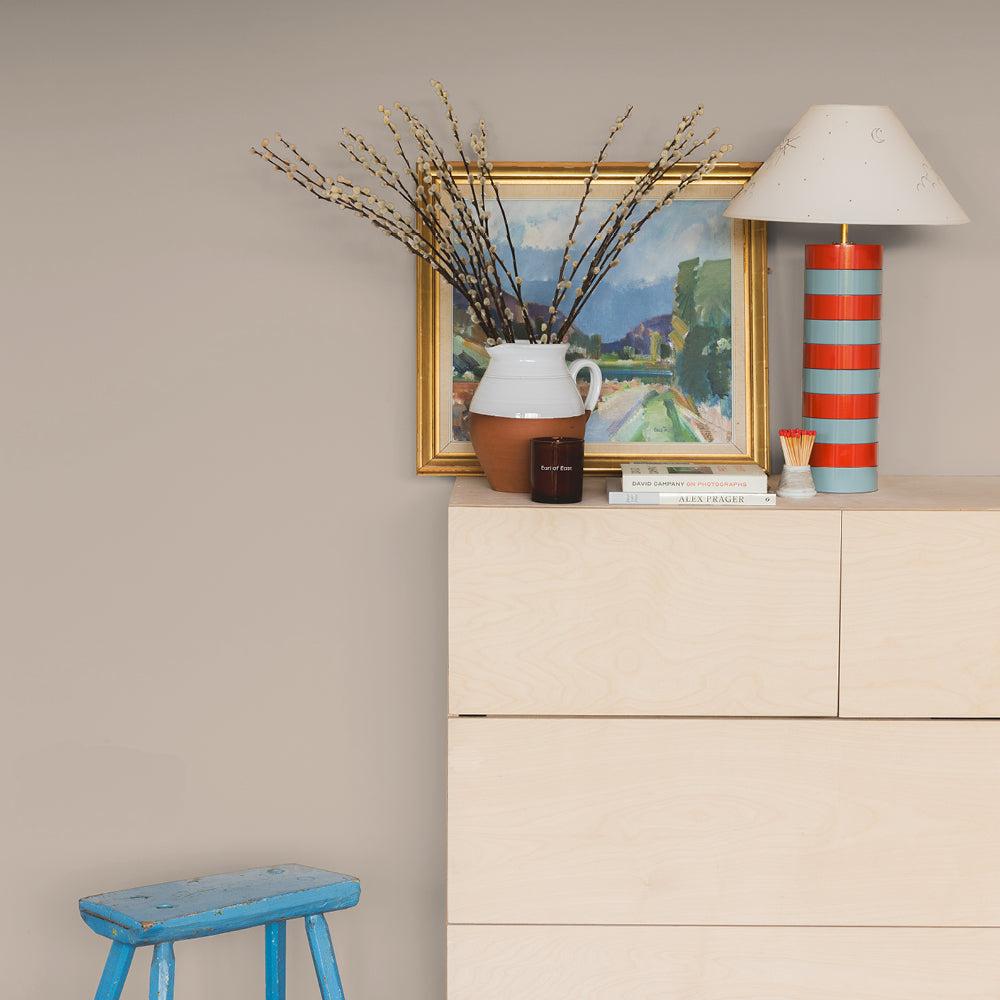
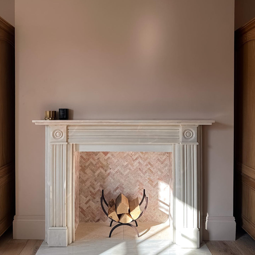
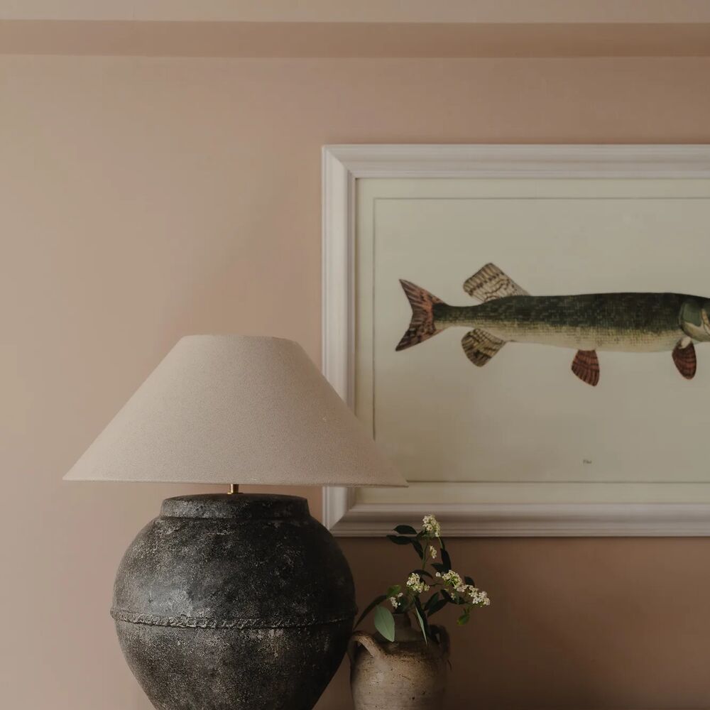
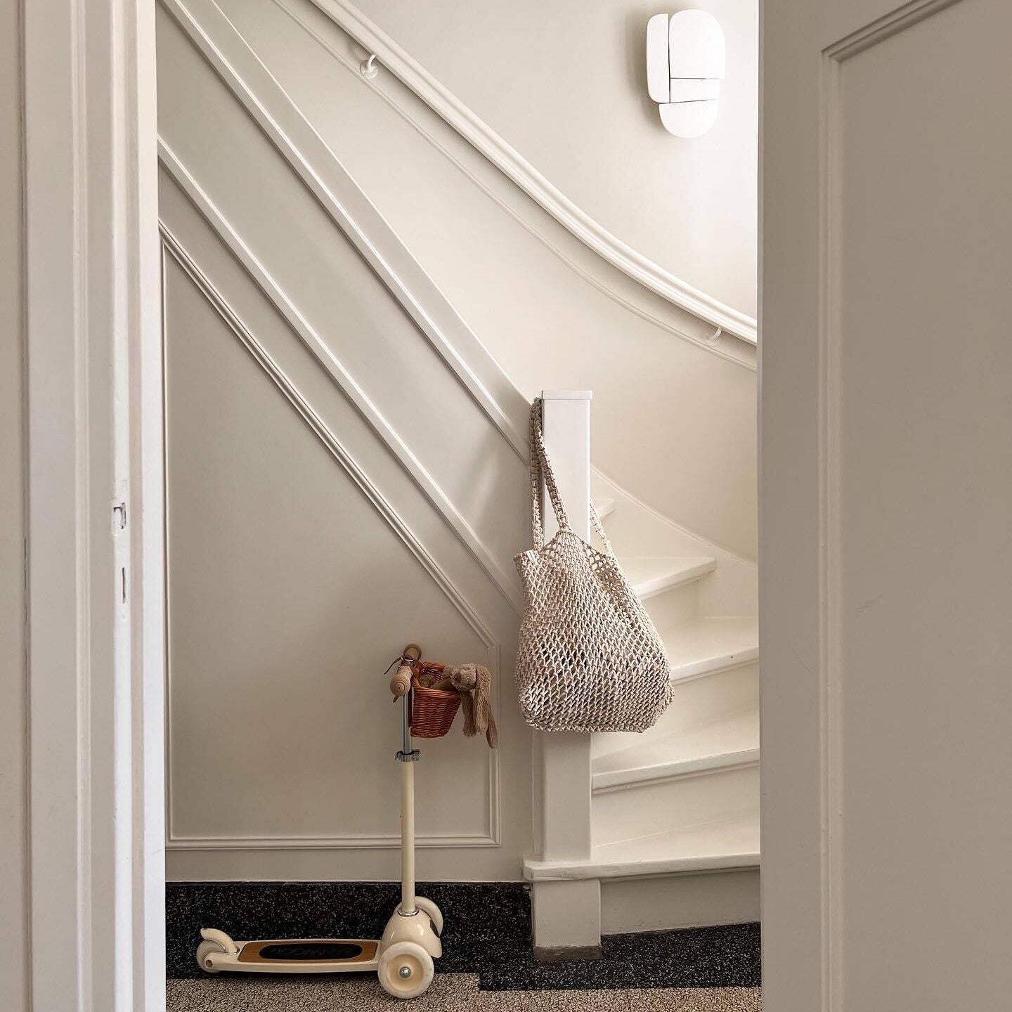
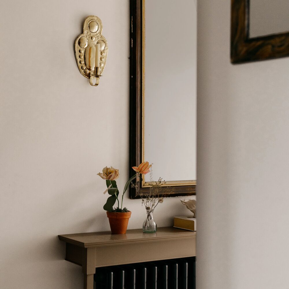
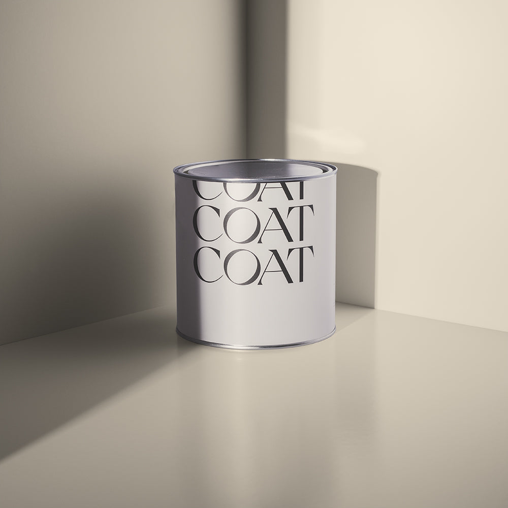
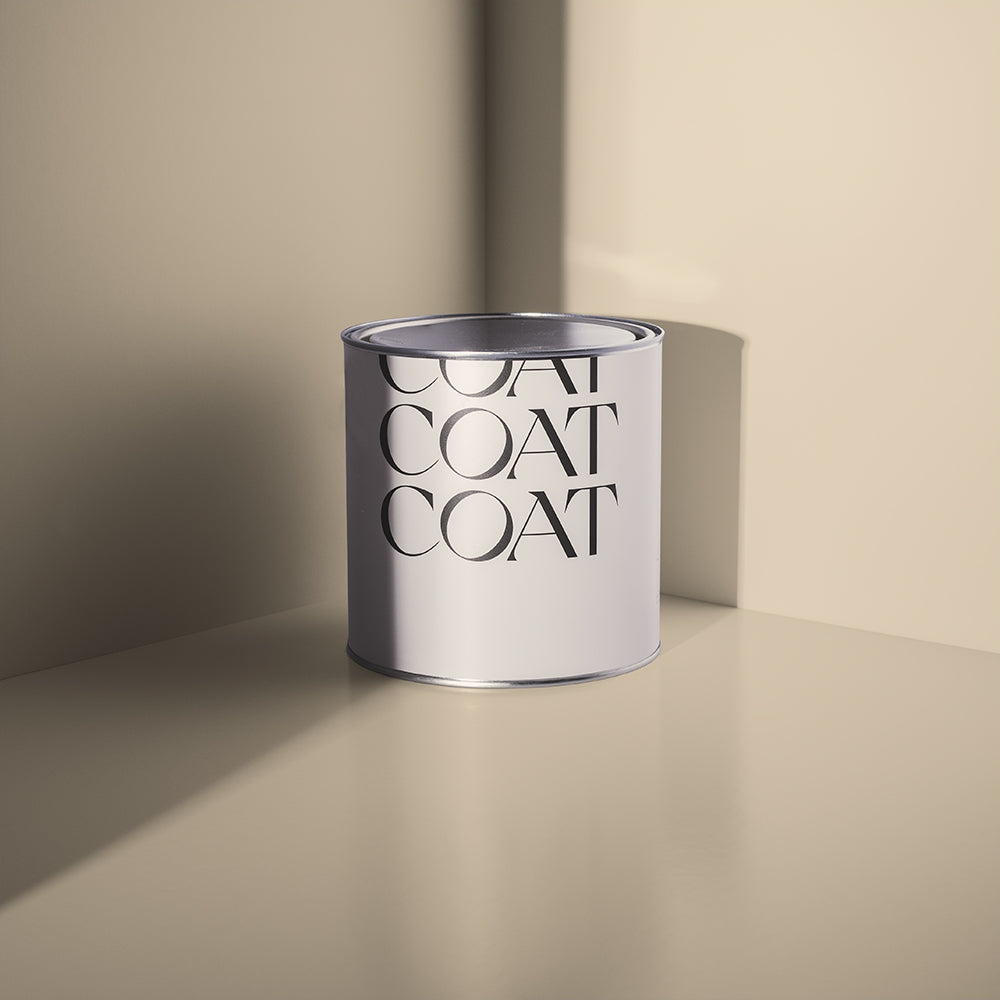
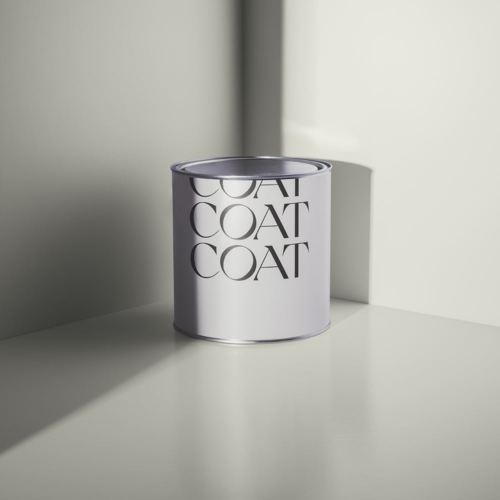
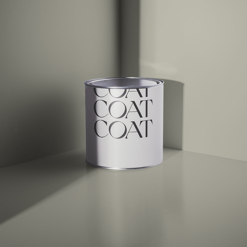
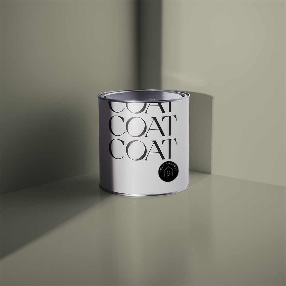
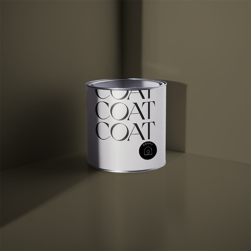
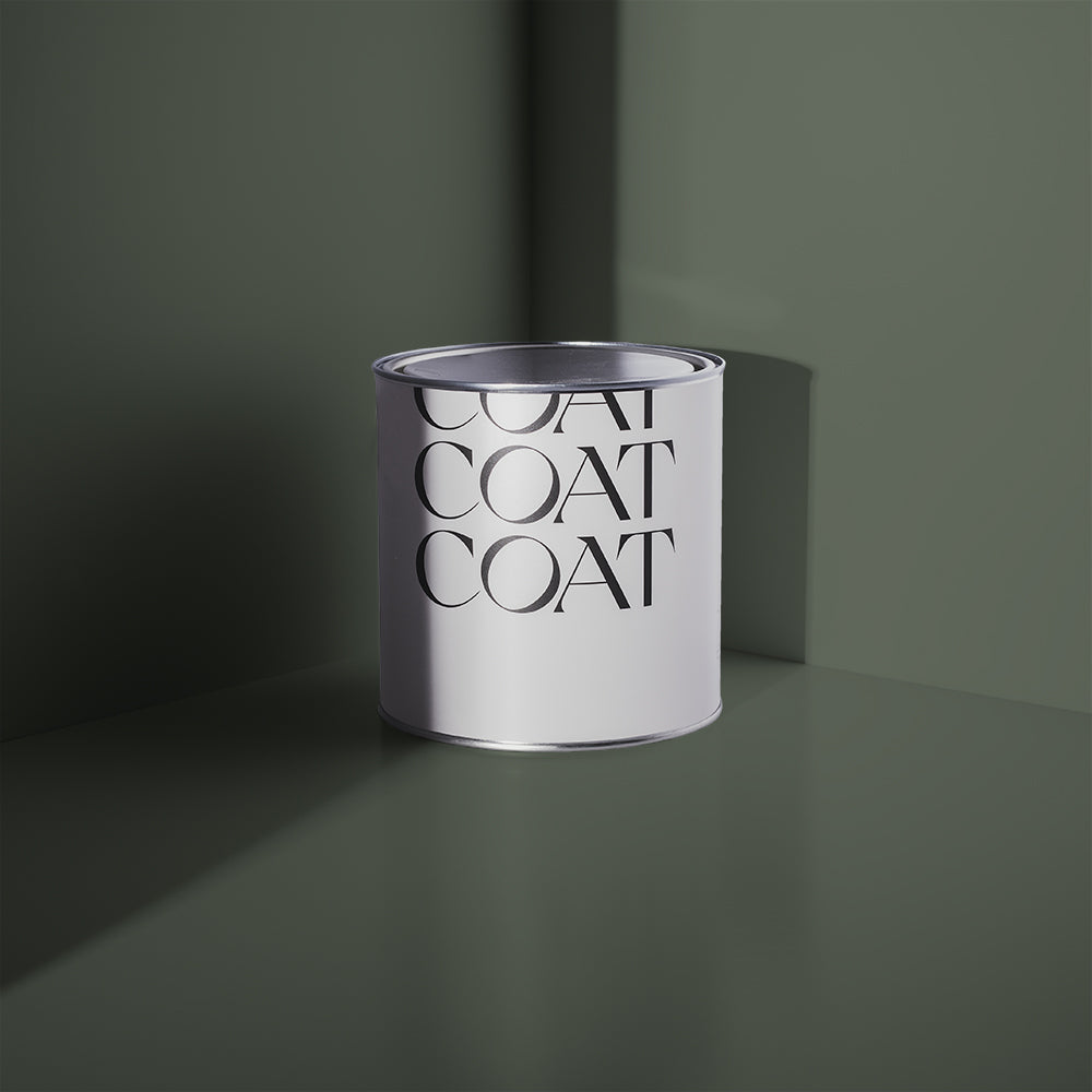
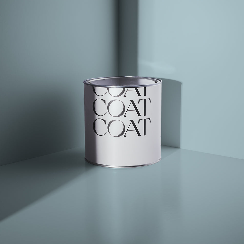
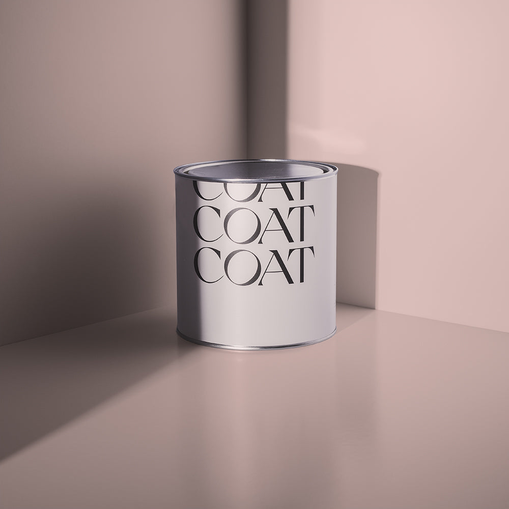
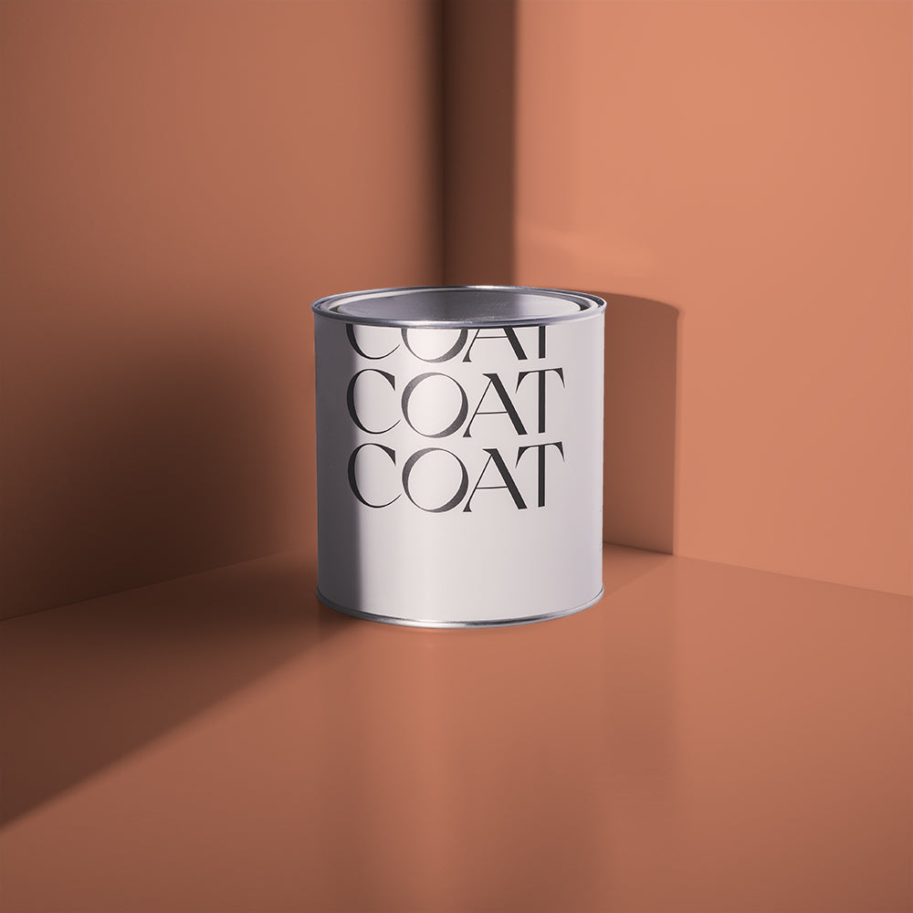
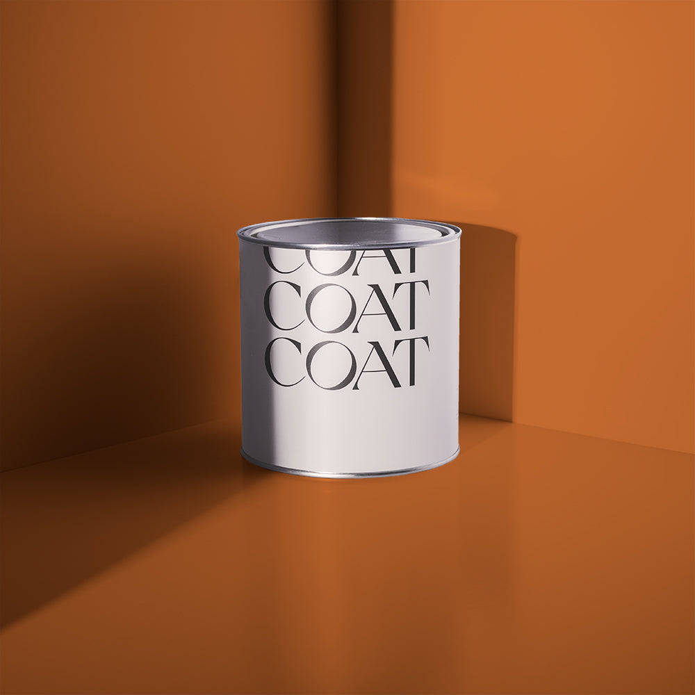
Topology Interior's classic neutral, 'Safe Play'
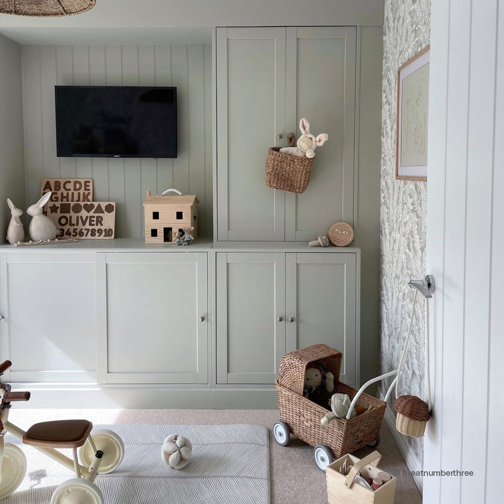
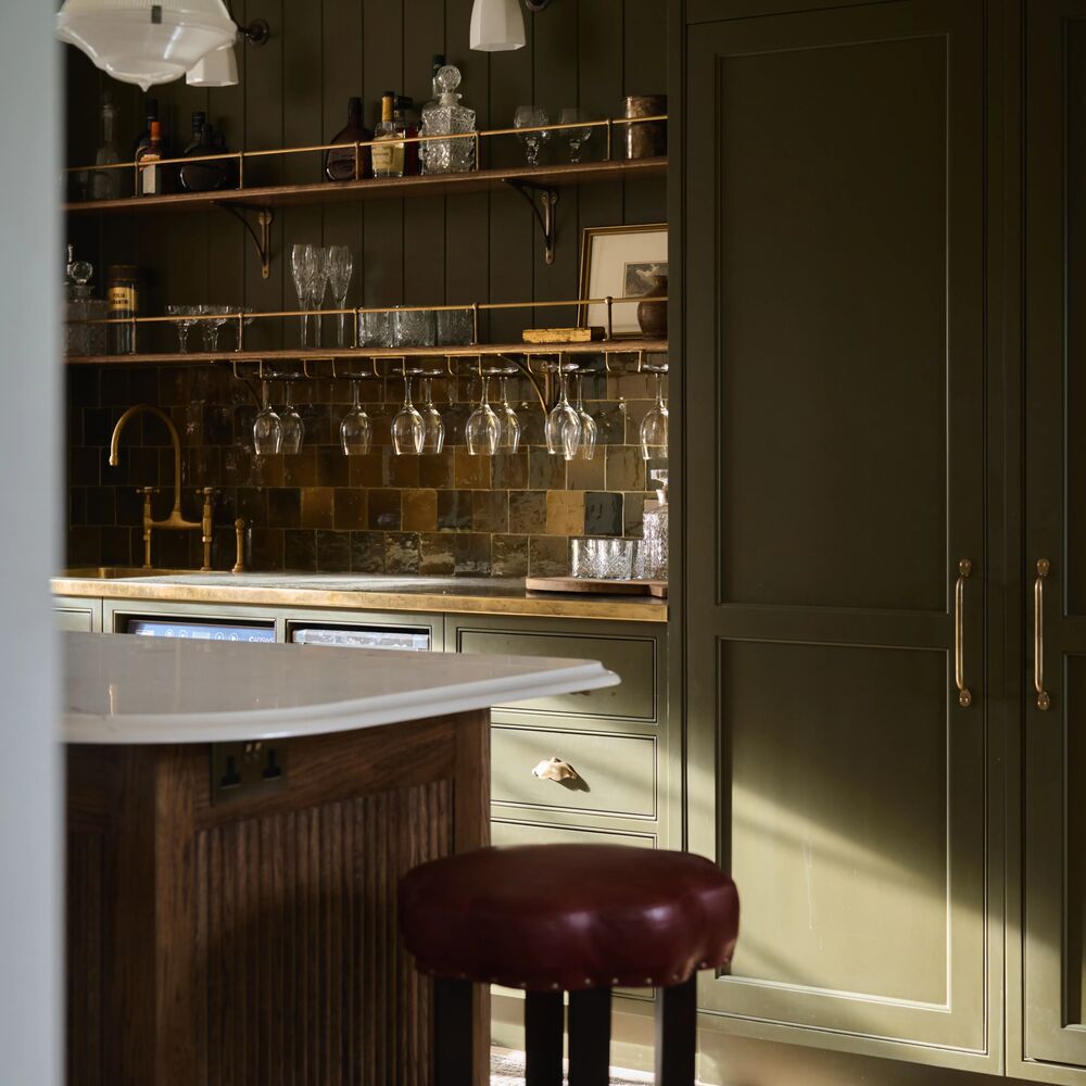
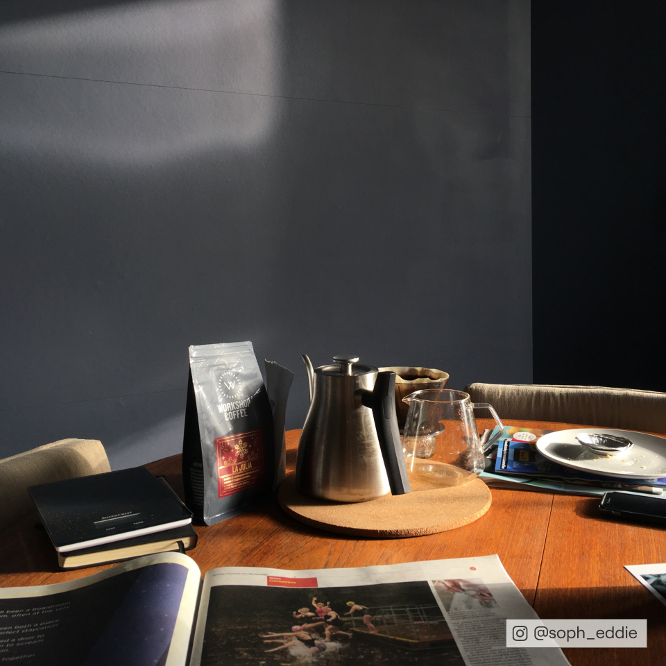
We caught up with Athina from Topology Interiors at her office in South London to get some expert advice about how to find the perfect neutral shade for your home. Having recently collaborated with us on a bespoke neutral ‘Safe Play’, Athina might be biased in saying that you don’t need to look any further when picking your neutral tone, but she’s shared a few useful tips to help find ‘the one’ just in case.
1. Light, undertones, action...
The key to determine what neutral route you want to go down is by looking at what way your room is facing.
“There’s such a large array of choice, as neutrals are timeless and go with everything. Neutrals fall into a section where they can be classed as any colour; white neutrals, grey neutrals, brown neutrals and then they go into colours with different undertones, light plays an important factor in choosing your undertone”, says Athina.

That's the beauty of our 'Peel & Stick' swatches, you can move the swatches around the room
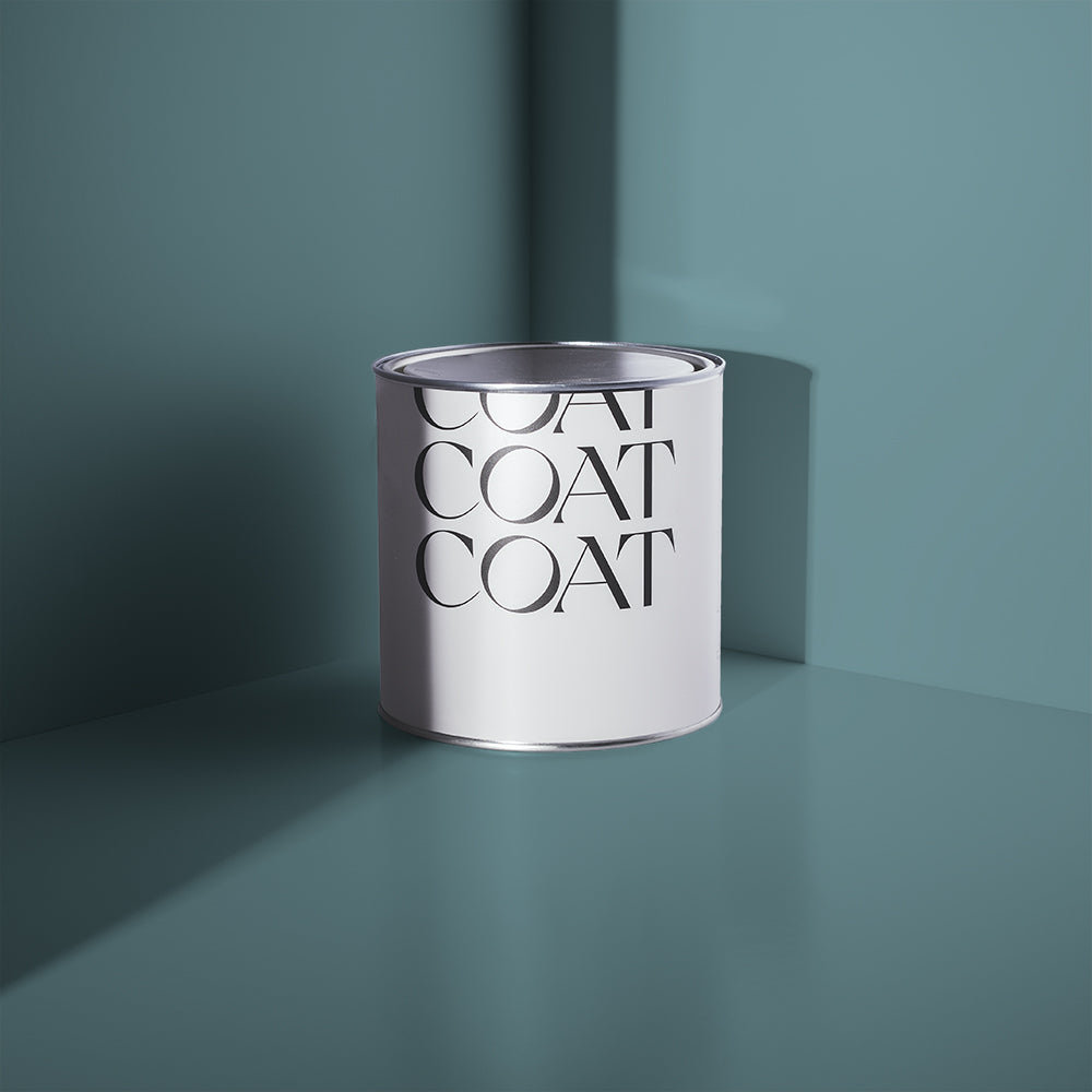
If you have a south facing room then we’re jealous...
“You’re really lucky because naturally you have a really bright space all day long, which means you can get away with any neutral colour. Word of warning though, lean towards one with a blue undertone rather than a yellow undertone as the light in the room will be naturally quite yellow.”
Want to find out more about how light affects colour? Read our guide here.

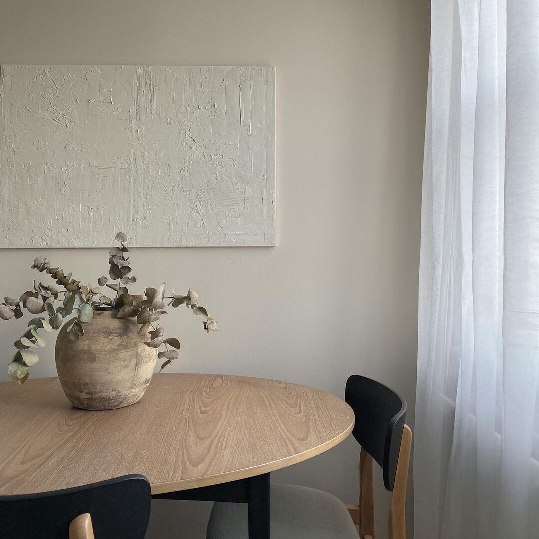
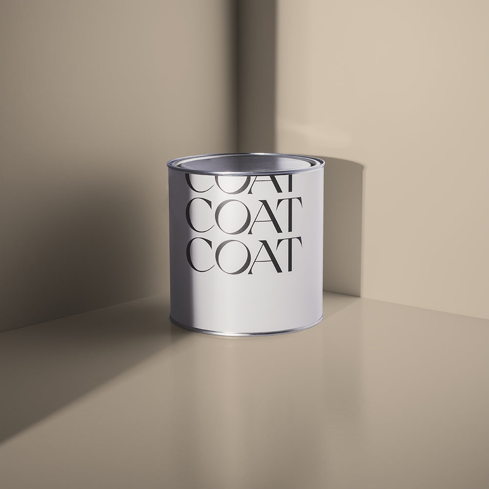
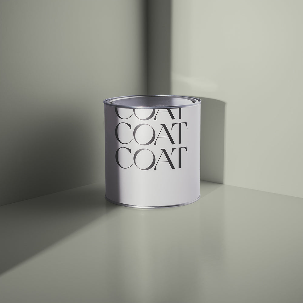
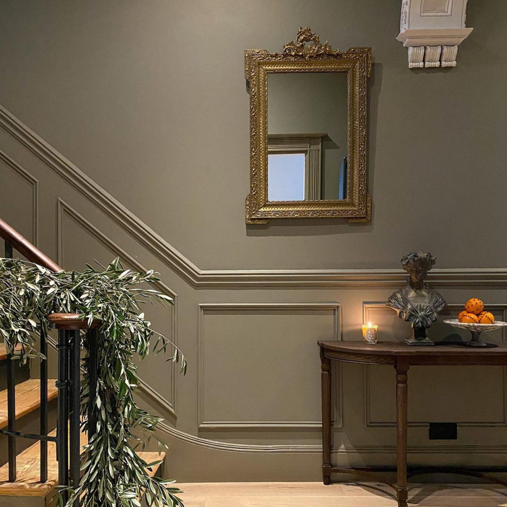
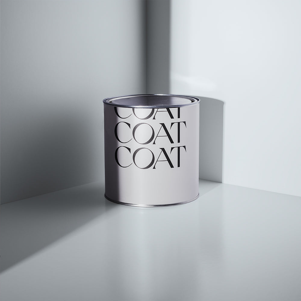
Neutrals like ‘Duvet Day’ work particularly well in north facing rooms.
“For north facing rooms, the light is naturally really cold, you might think that it looks quite blue and generally dark, so you want to use something with a warm undertone, a brown or a yellow as the base pigment like ‘Duvet Day’ or ‘Well Grounded’. The best thing to do is to take your samples at different times of the day and see how they look if you aren’t sure!”
Need to figure out your light situ? Good job our 'Peel and Stick' Swatches move around with no mess and no fuss 😉. Play with one!
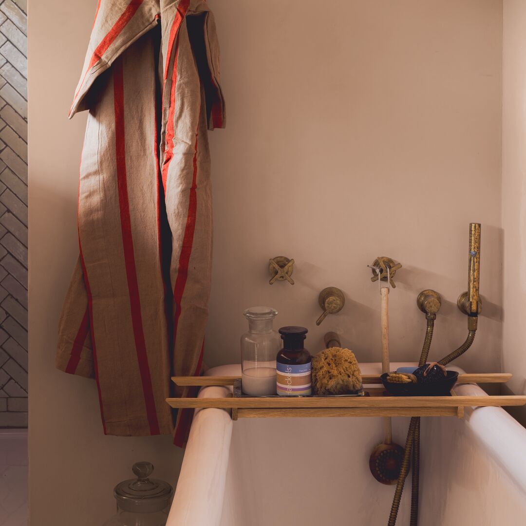
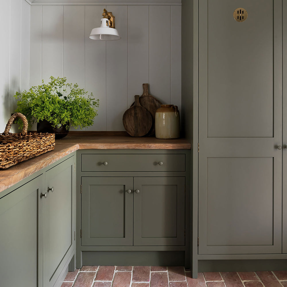
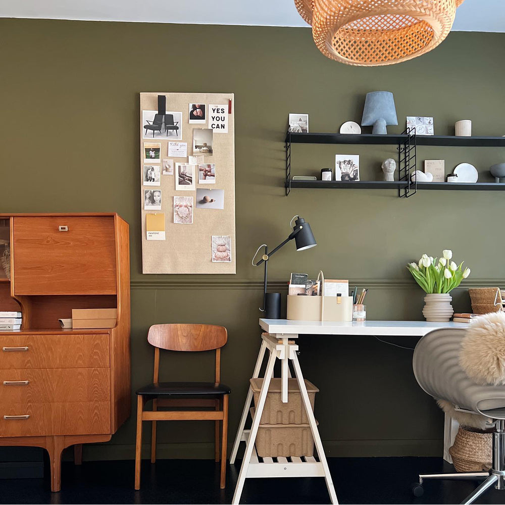
2. Texture & layering
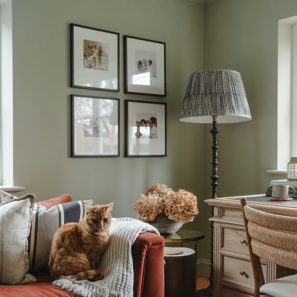
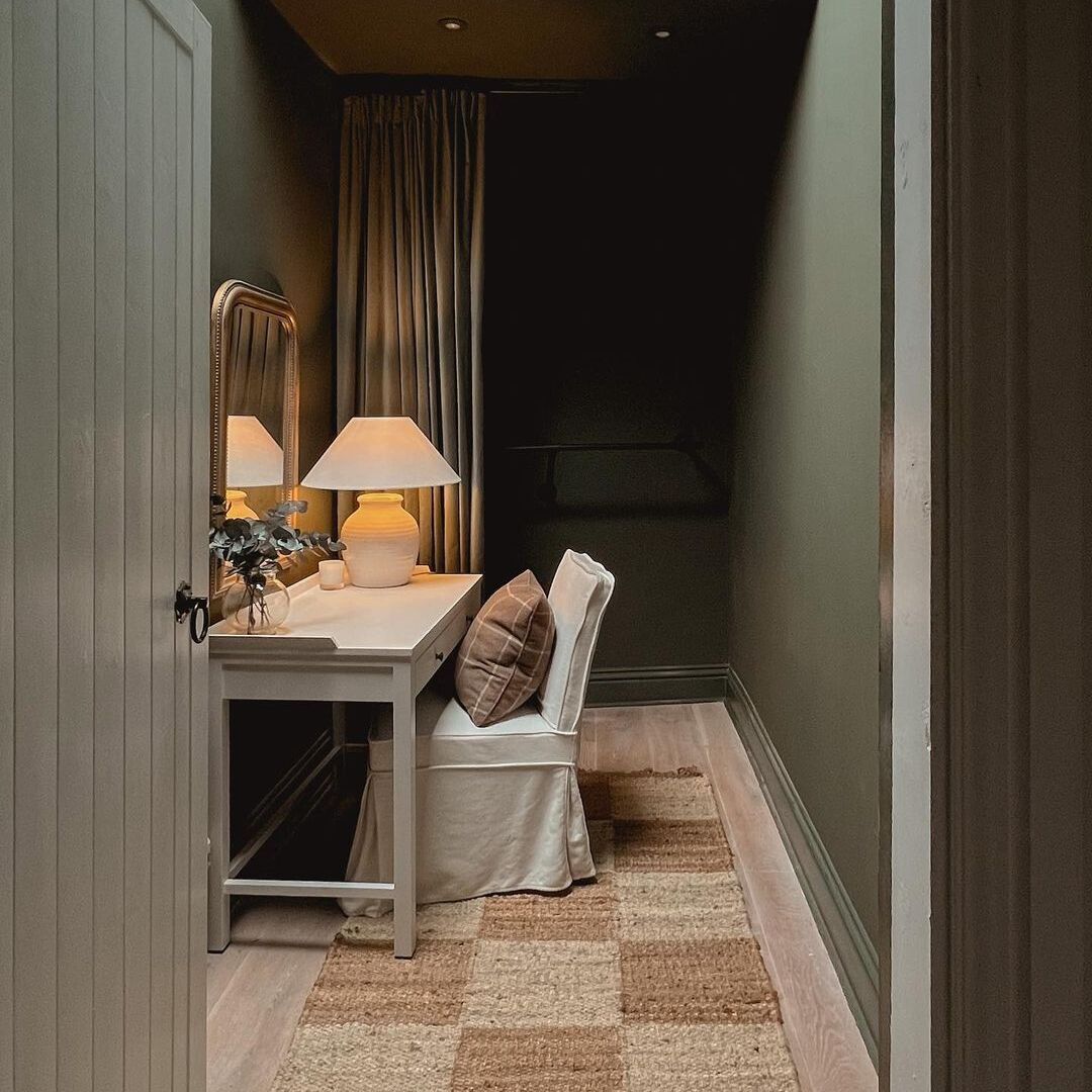
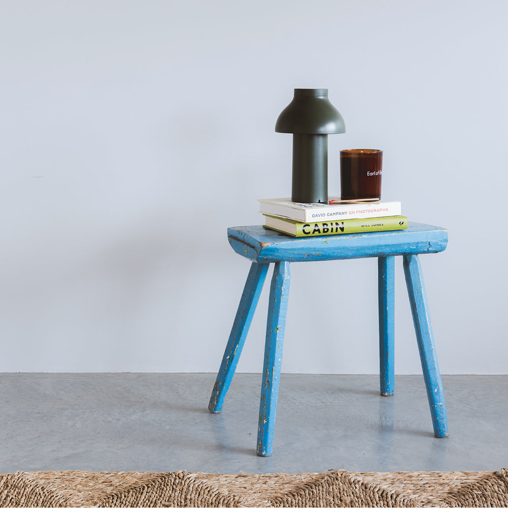
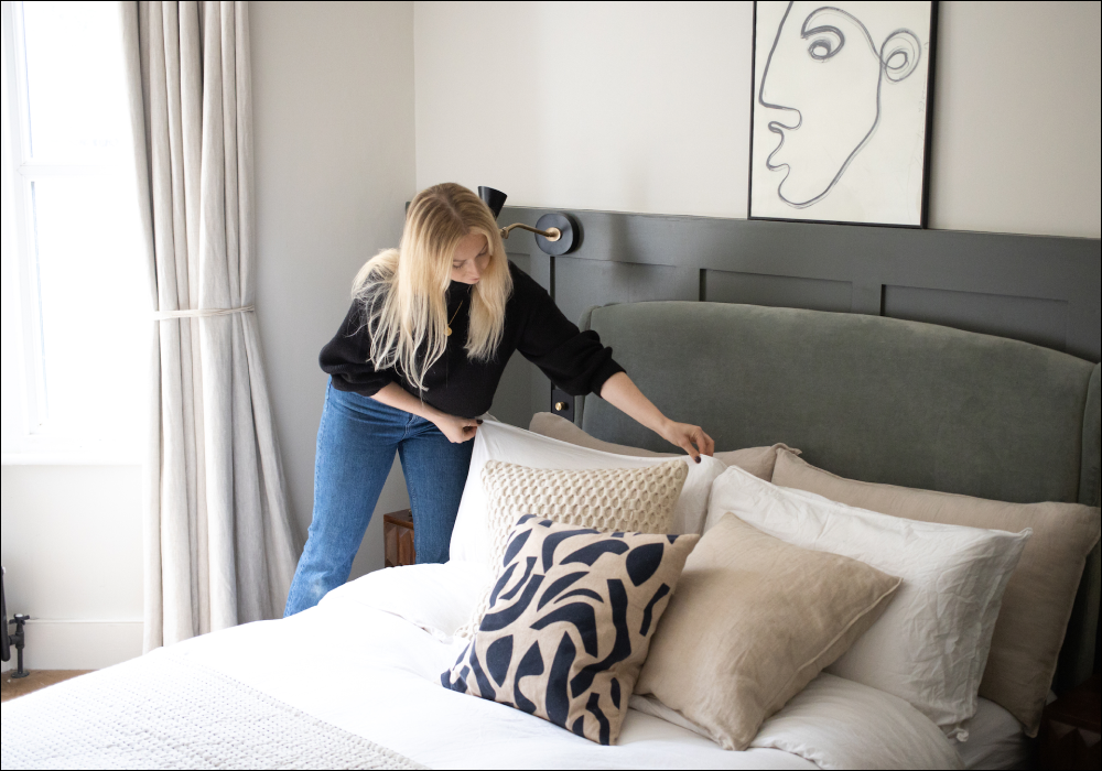
“Neutrals are often seen as colours that are hard to pull off because you don’t want your space to fall flat and seem cold. By layering in different materials and patterns through furniture and accessories, you can make your space really special and dynamic. There’s no such thing as too much texture!

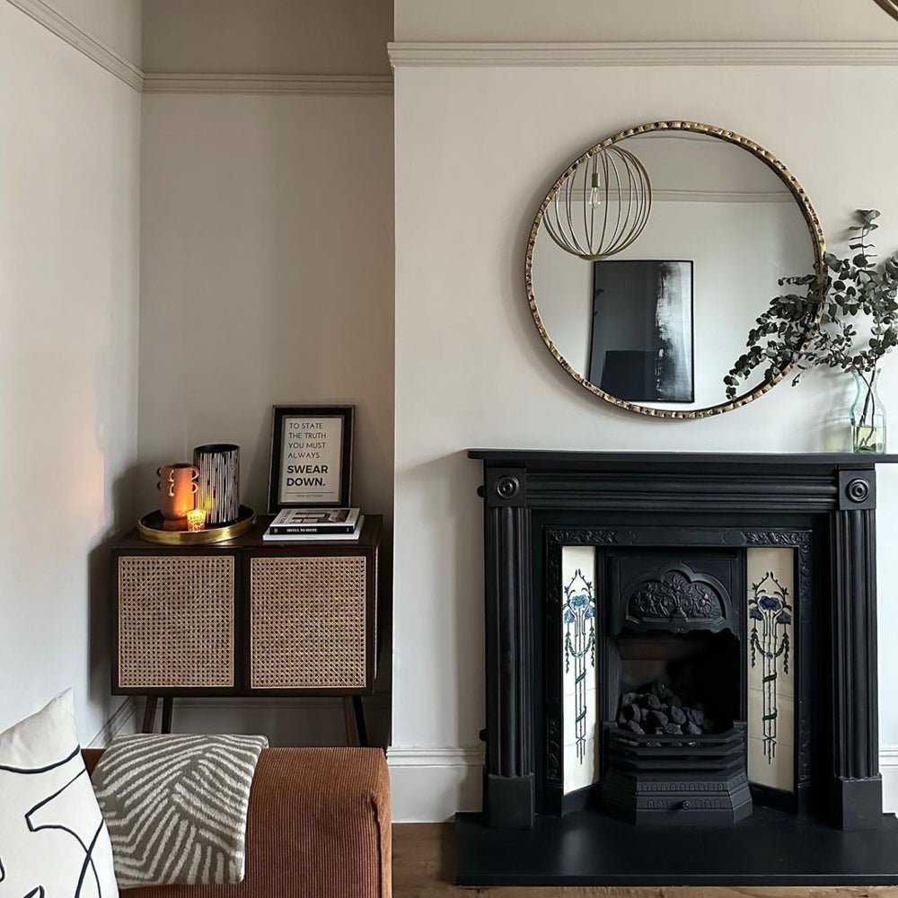
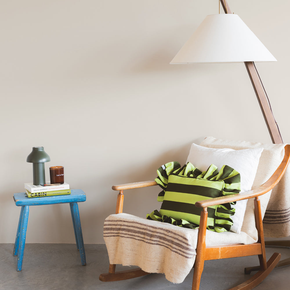
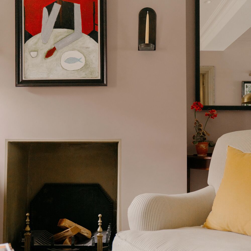
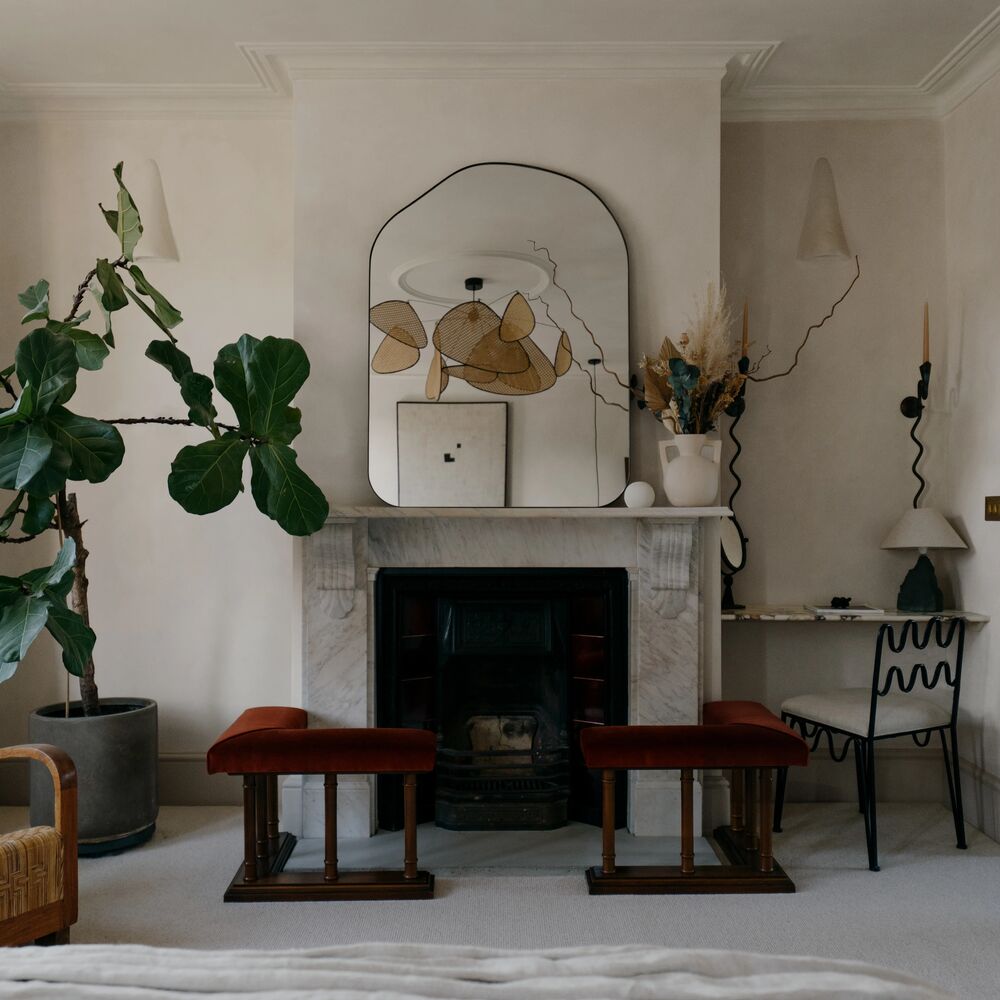
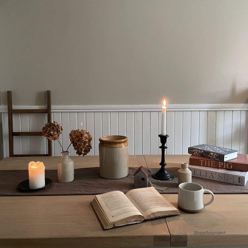
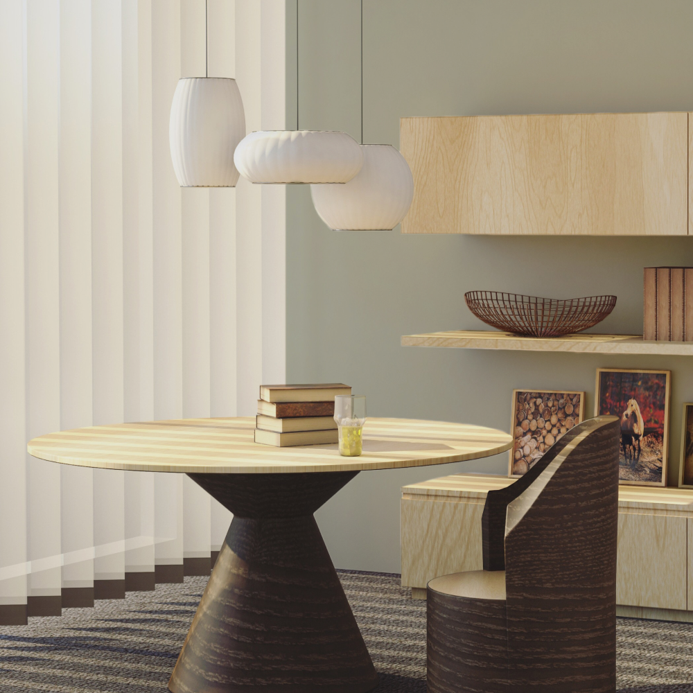
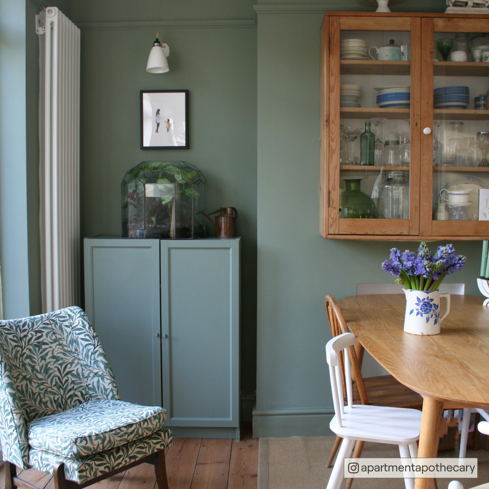
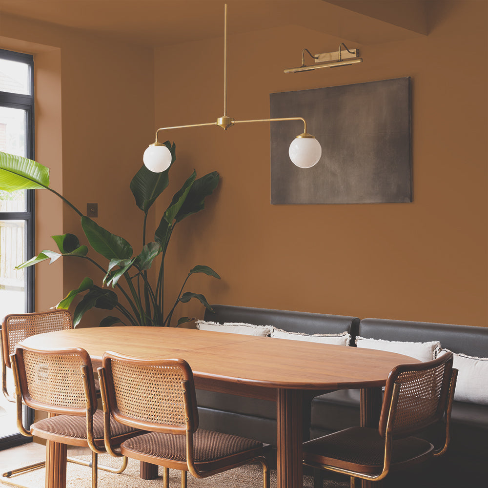
Playing with different fabrics and textures can add depth against a classic 'Mindful' painted backdrop.
You want to make sure that you use a mix of different fabrics that complement each other, like bouclés with velvets and linens, that way you get a really nice dynamic space that doesn’t fall flat. Layer your paint with natural materials like rattan furniture, jute rugs and natural woods, these will work really well with any neutral scheme.”
Want to step outside the neutral grey box? Check out our alternative neutrals blog here.
3. Play with pops of colour
“If you’re someone like me who appreciates colour but doesn’t know how to use it in their own home, using a neutral as a backdrop allows you to get a bit experimental with your soft furnishings, your art and plants, by introducing colour in those elements".

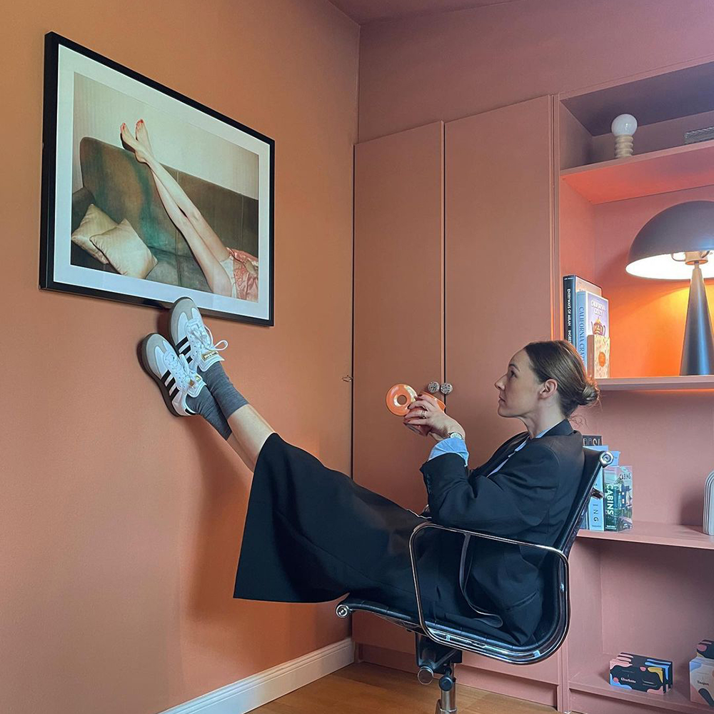
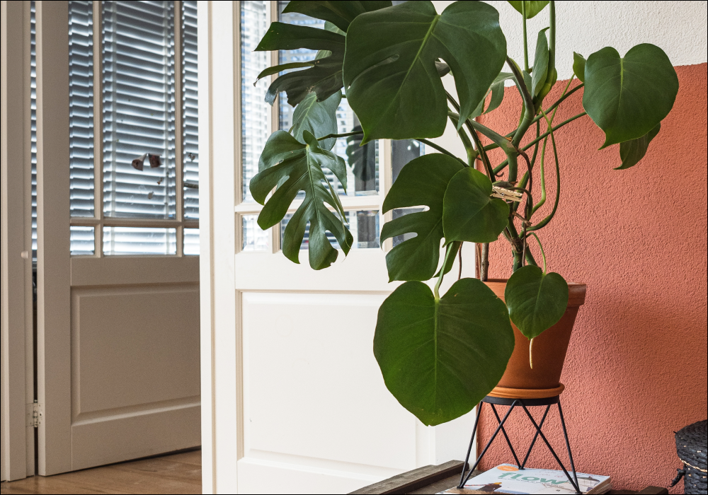
Be brave with your soft furnishings and woodwork by adding pops of colour
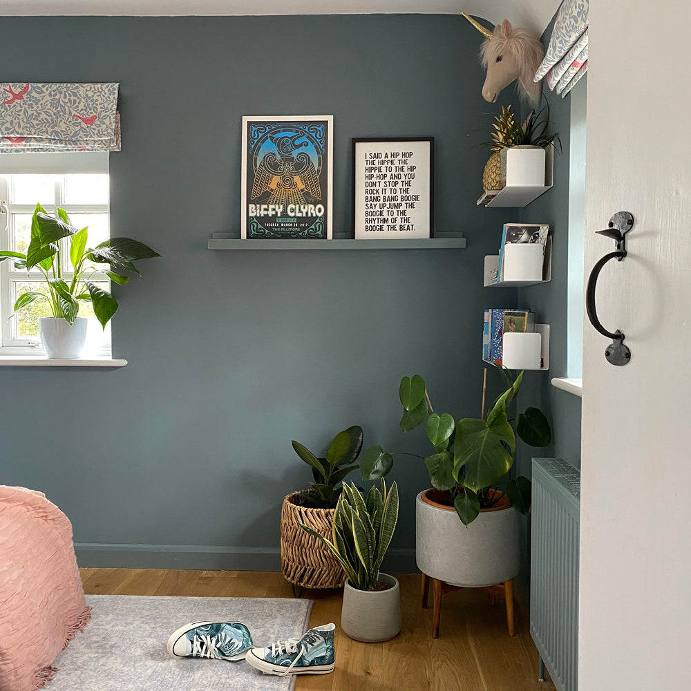
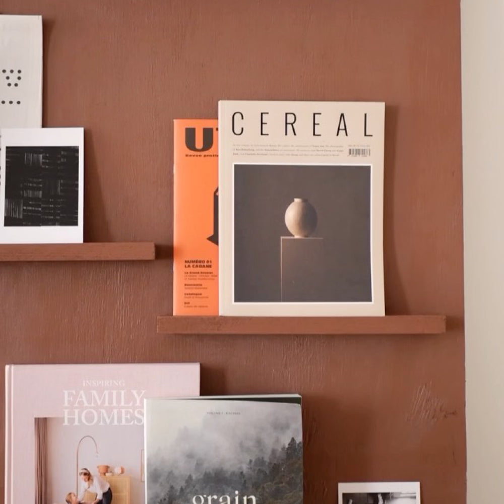
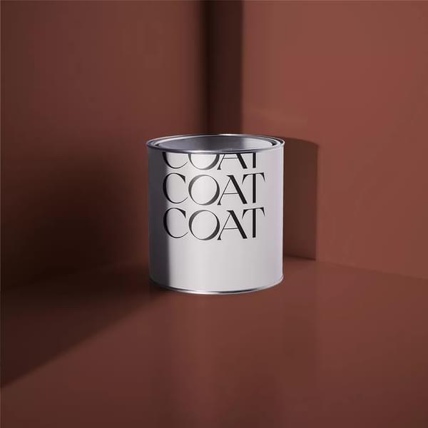
You may also want to introduce colour with a feature wall, your woodwork and skirtings or even your ceiling. The great thing about neutrals is that there are some many colours that complement them. ‘Safe Play’ works really well with ‘And Breathe’, ‘’Mr Clifton’, ‘Adulting’ - the quite rich and pigment colours balance and offset the neutral hue. You may also want to consider painting your skirting boards or a ceiling in a different colour if you’re scared of committing”.
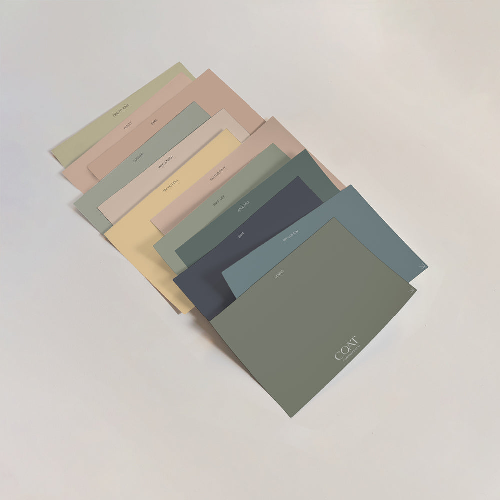
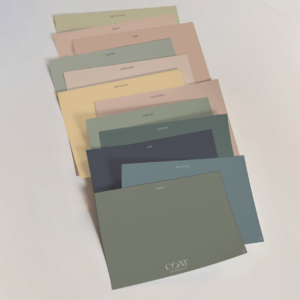
Feeling confident? You definitely will be once you’ve ordered our neutrals swatch pack to find your perfect match 👍
Publish Date
Author