Bright and Modern, At Home with Tara Scholes
We’ve been invited to step inside another picturesque Instagram abode, and this one is home to Tara; a part-time retail employee who lives with her partner, Joe, and their two children.
Their home is a two-bedroom maisonette situated in Surrey, which they have been renting for three years now.
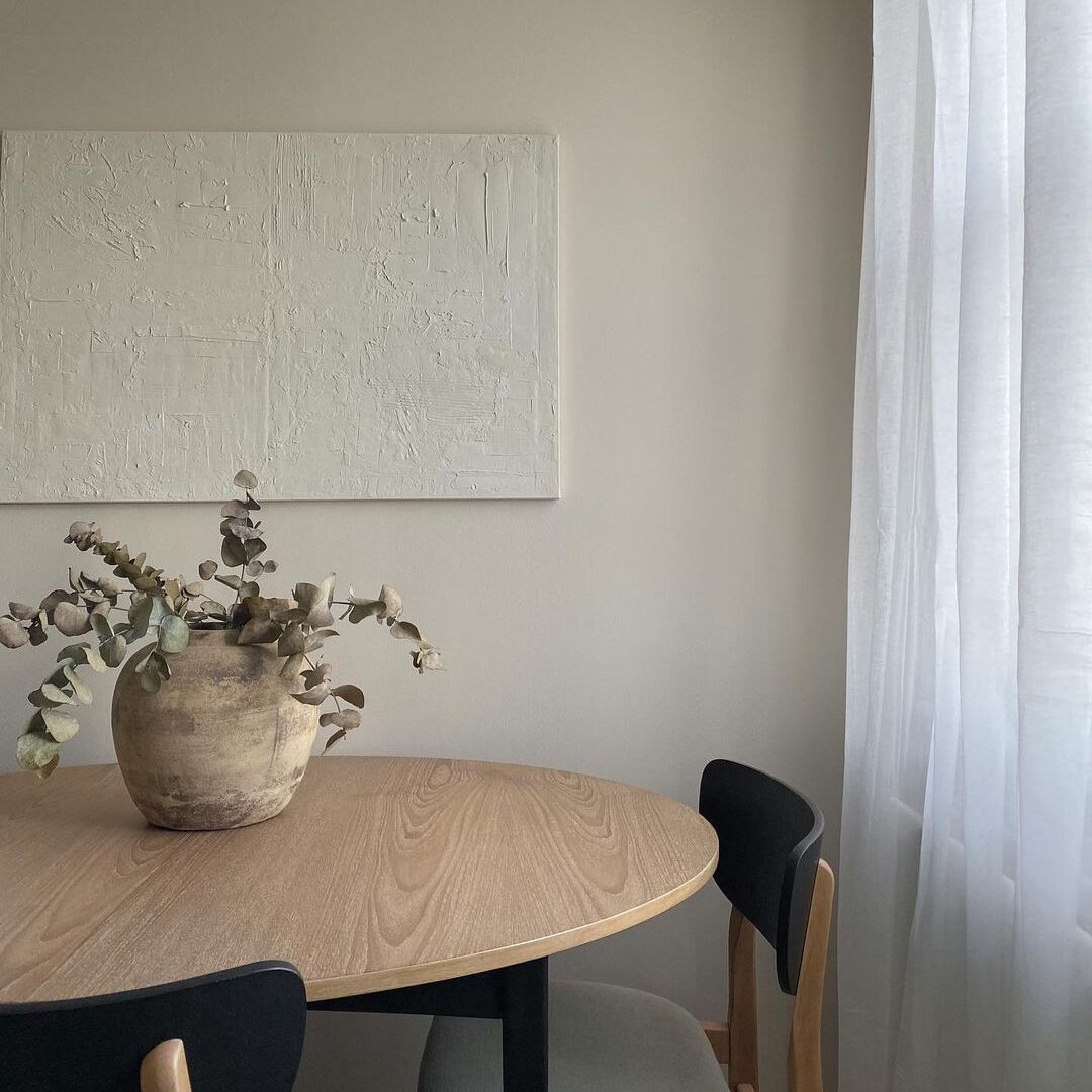
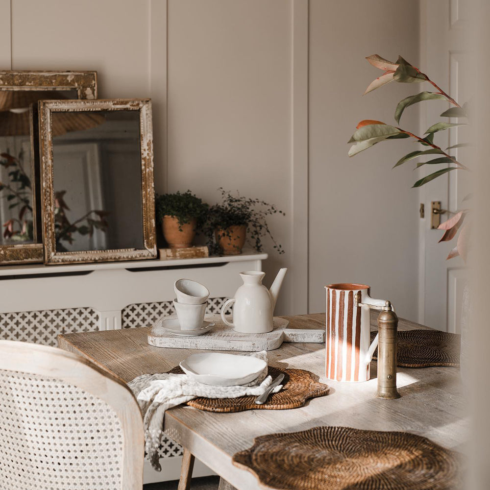
Tara likes their home to feel bright and modern, choosing to decorate and accessorise with primarily neutral colours. With permission from their landlady, they have been able to paint a few walls over the years but chosen to keep things minimal. This way, they can add colour within their furniture and trimmings instead.

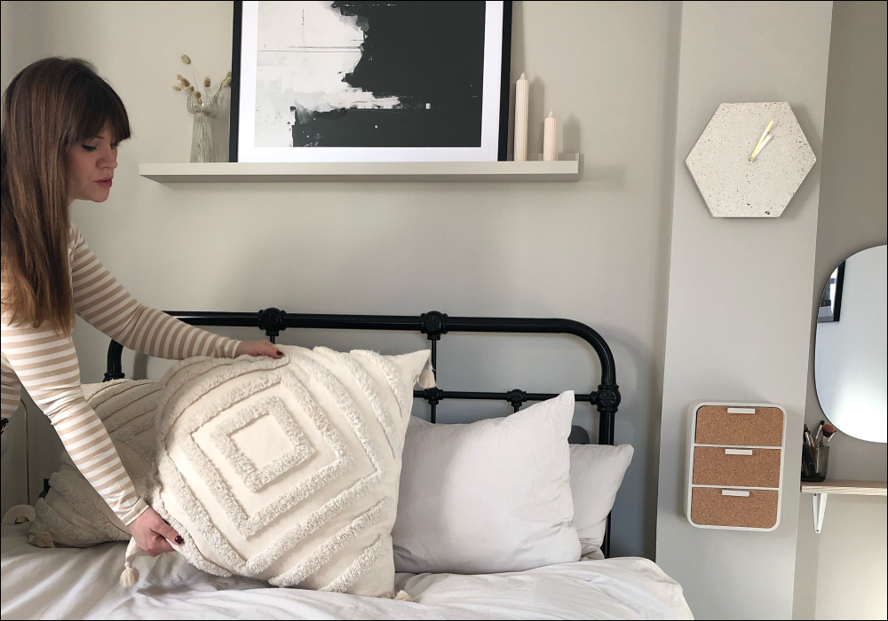
Tara opted for neutrals in her rented property to keep the space looking bright and modern.
Like most of us these days, Tara turns to social media for inspiration and brand discovery. One of the most helpful features of the online interiors community is the ability to share tips and tricks with others that live in similar properties. From smaller spaces that come with restrictions, to a larger open plan living; there is truly something for everyone. The rented homes community, in particular, is utterly inspiring; as most live under pretty firm limitations and struggle to know how to decorate without being able to add colour to the walls. The possibilities are endless, it’s just a case of going searching for the creativity in the homes of others.
A COAT LOVE AFFAIR…
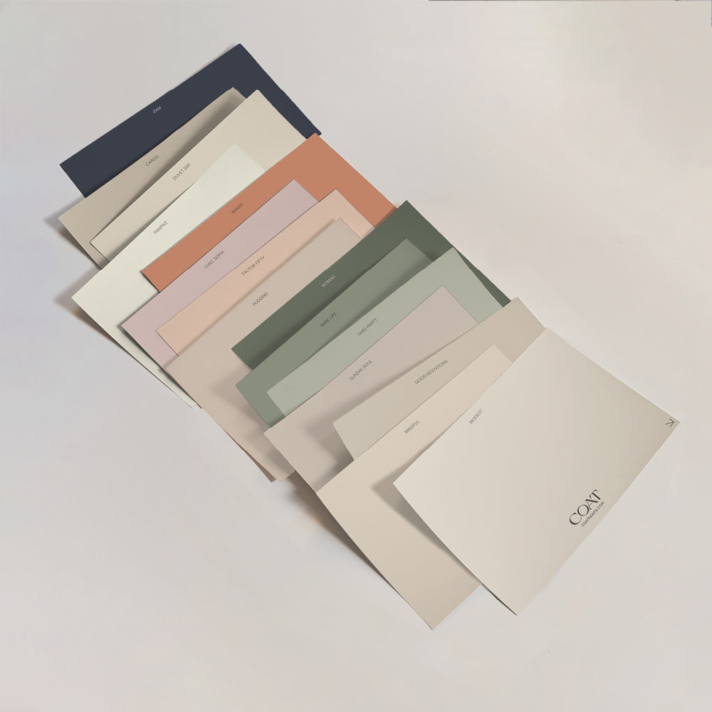
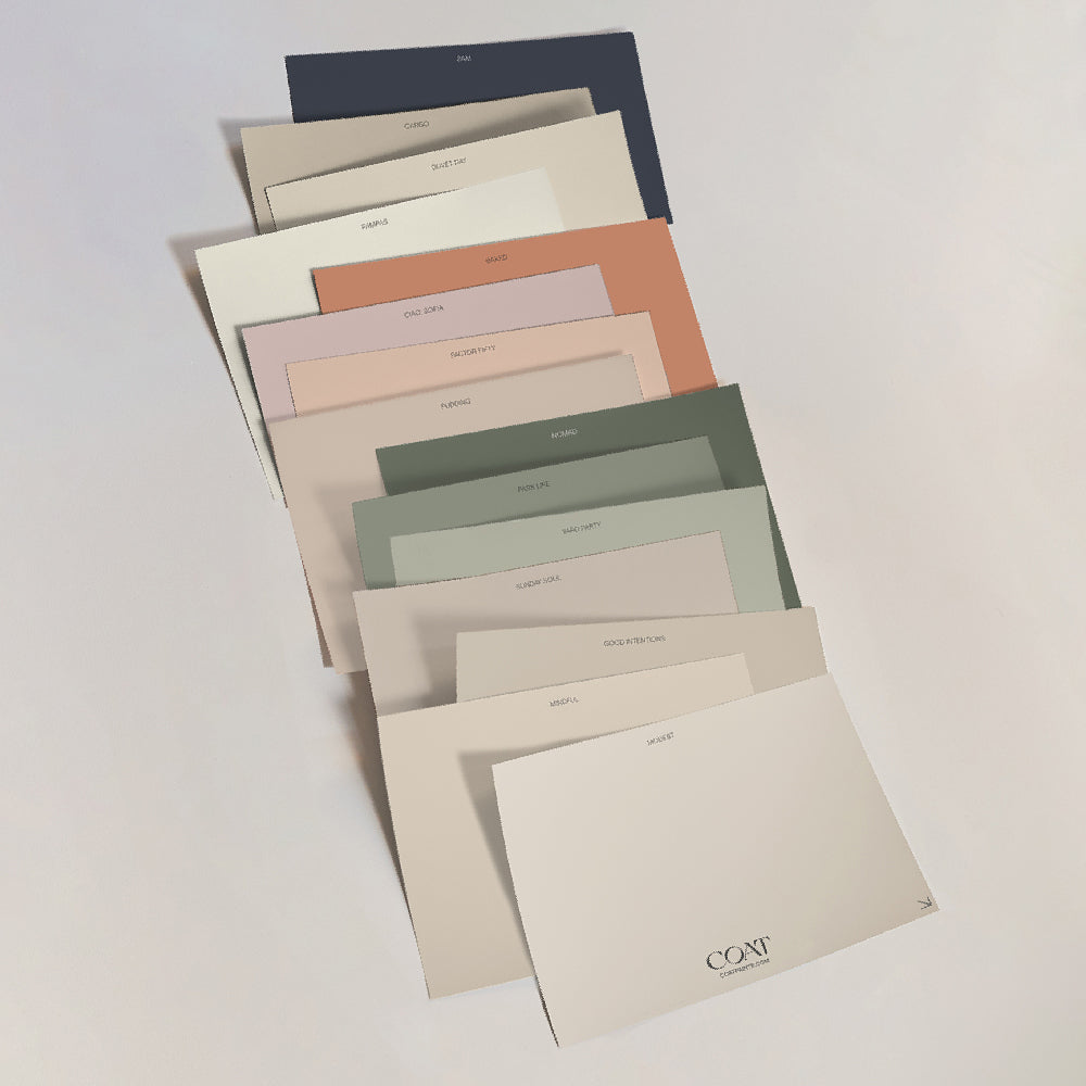
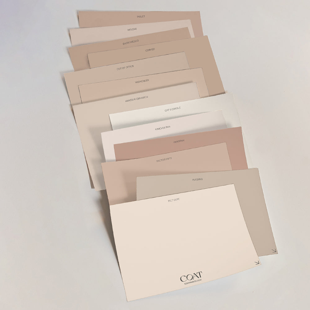
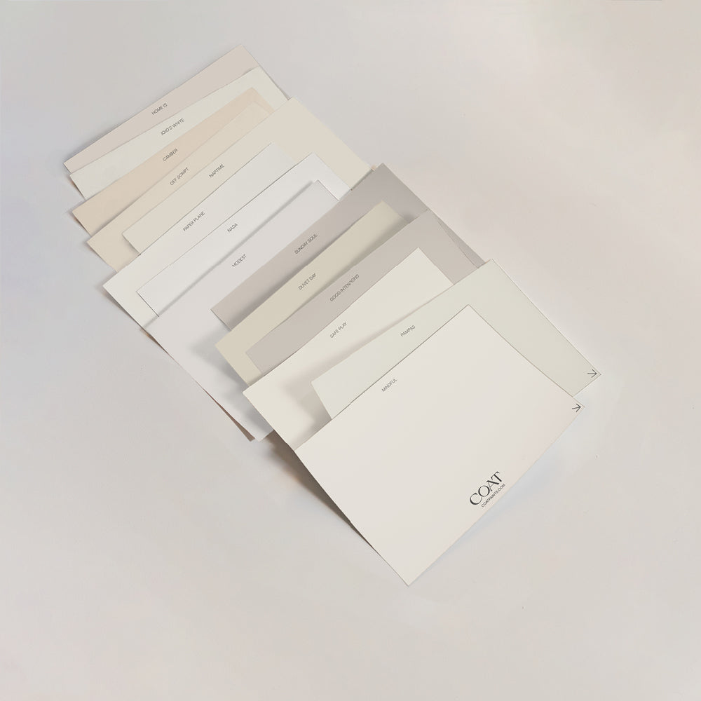
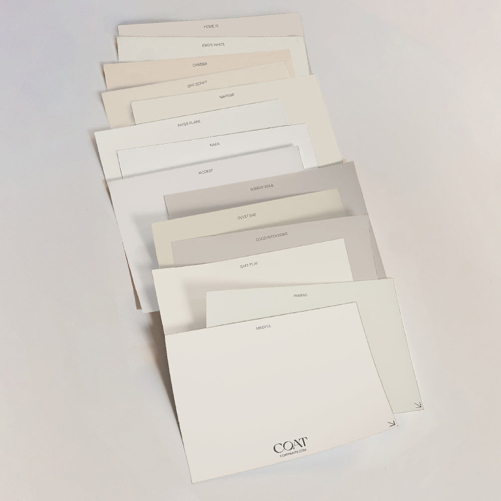
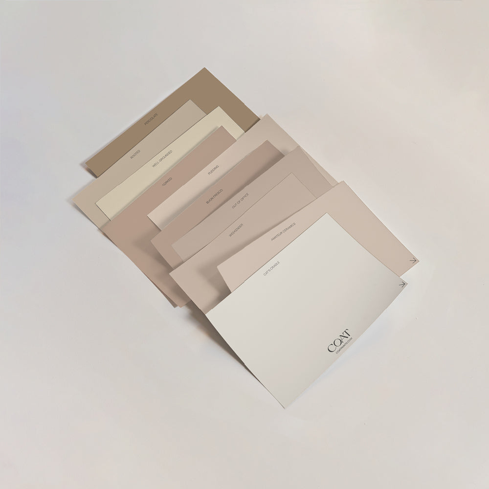
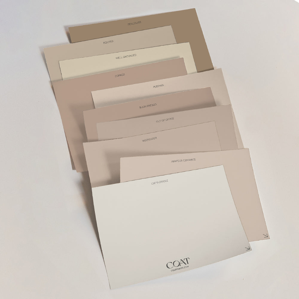
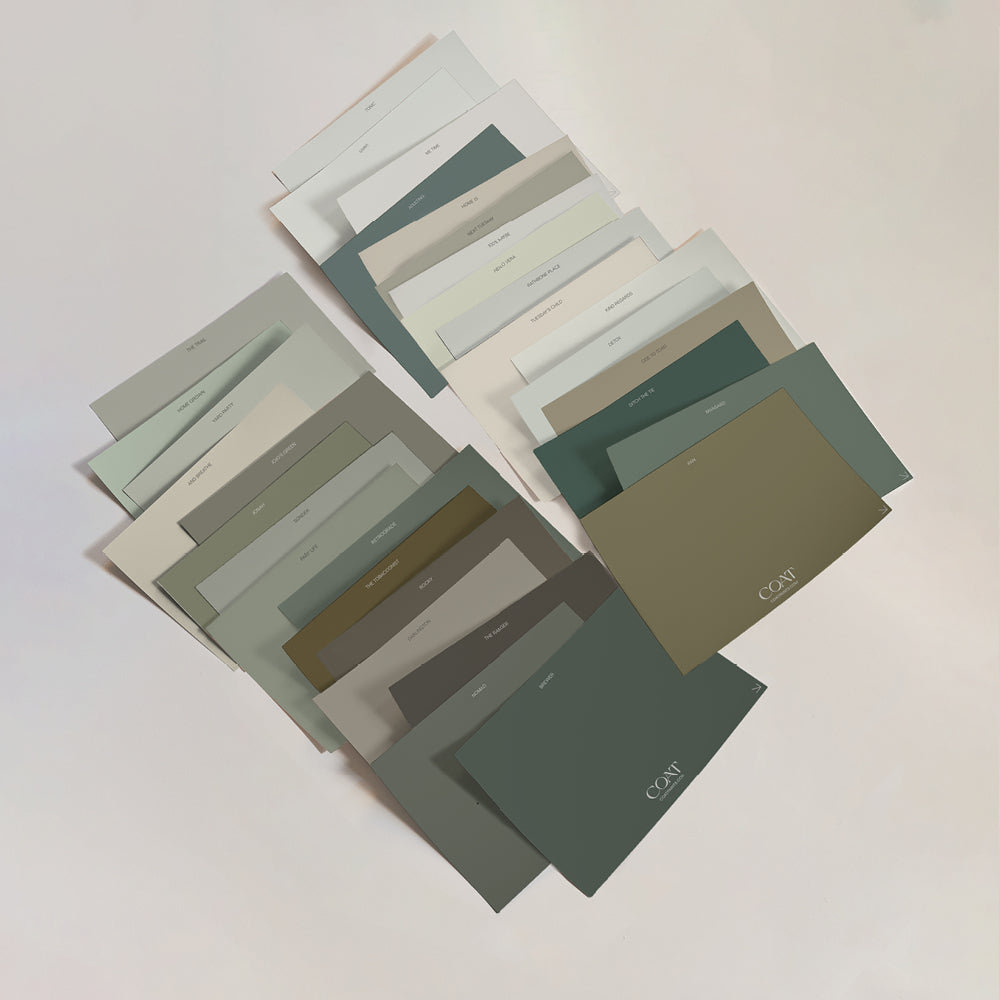
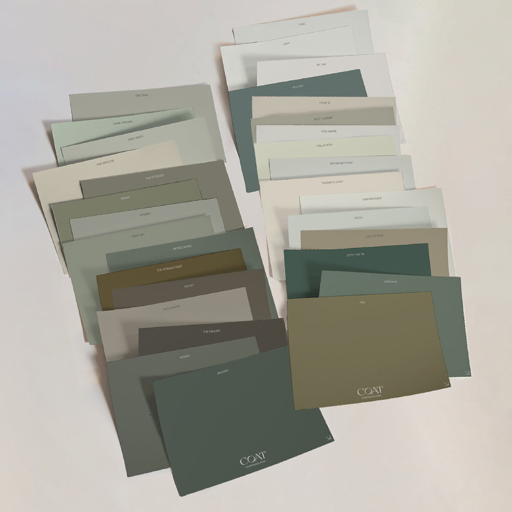
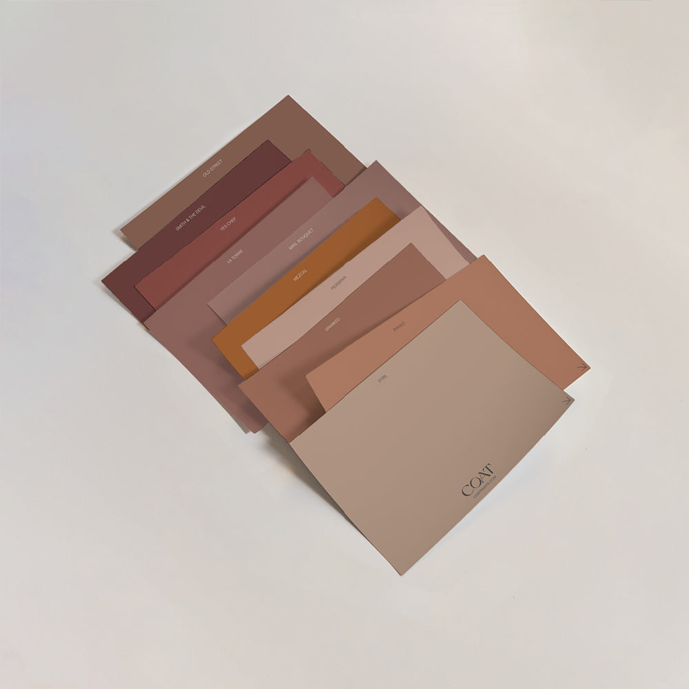
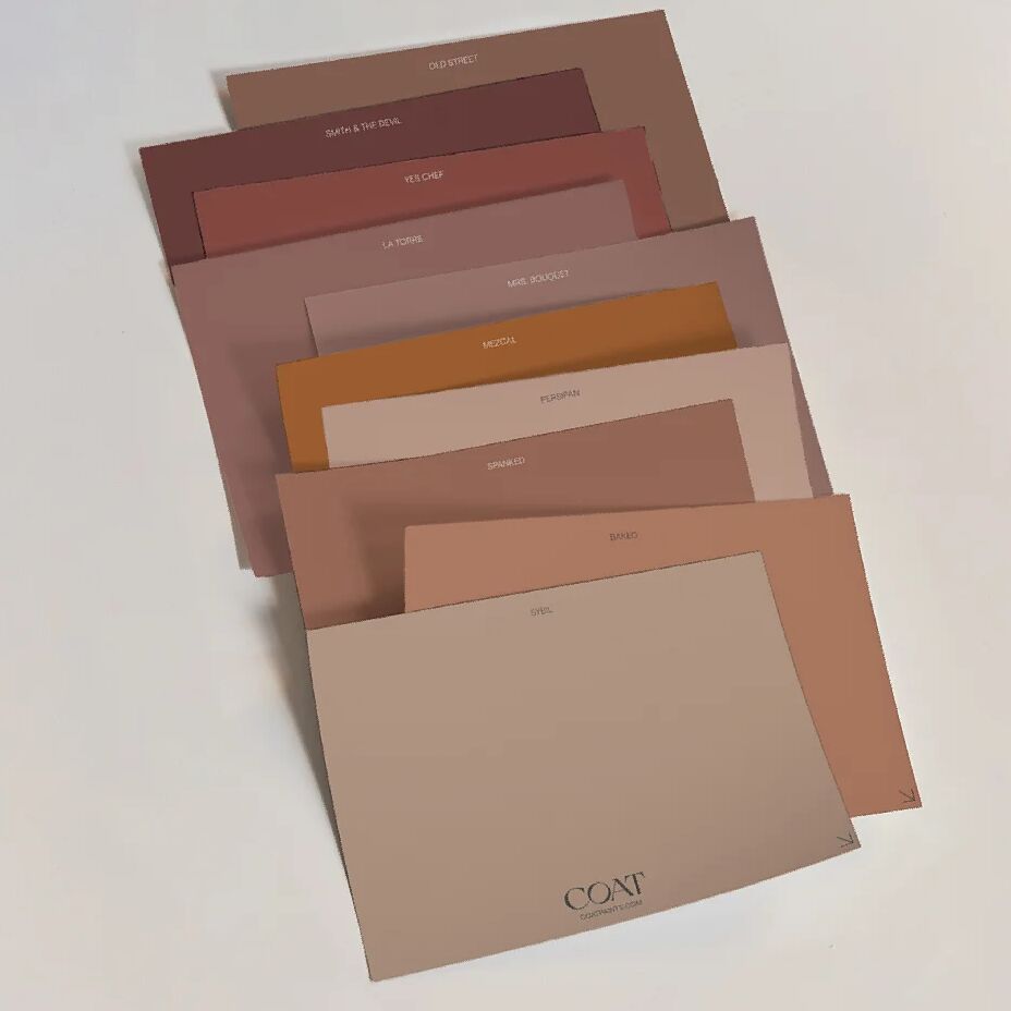
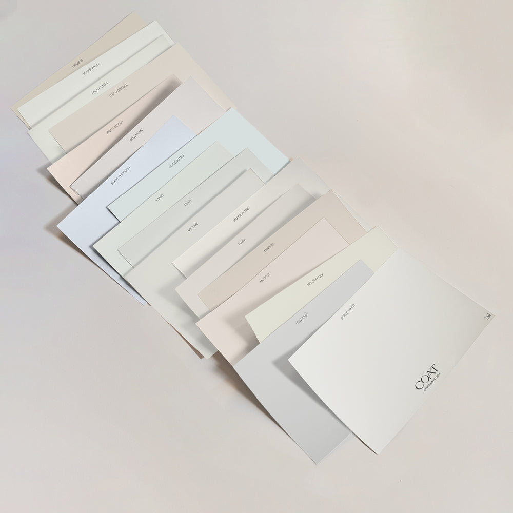
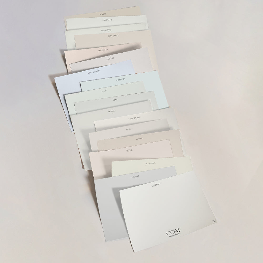
Our 'Peel & Stick' swatches are what caught Tara’s attention – because why wouldn’t you want a reusable, mess-free paint sample?!
“I was interested to see how well they represented the authentic colour, and it was actually spot on – I was very impressed! It also meant that I could move the swatch to different parts of the wall and see how it appears in different lights, rather than having lots of painted squares dotted about.”

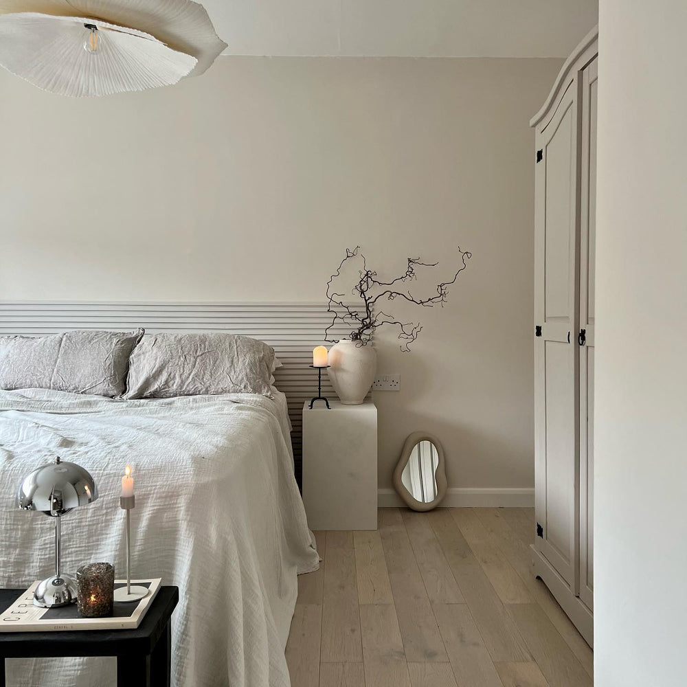
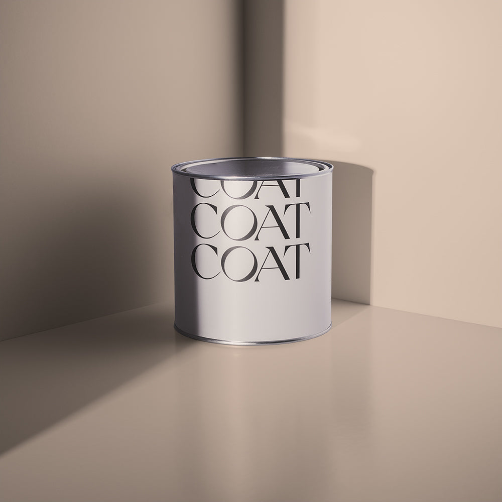
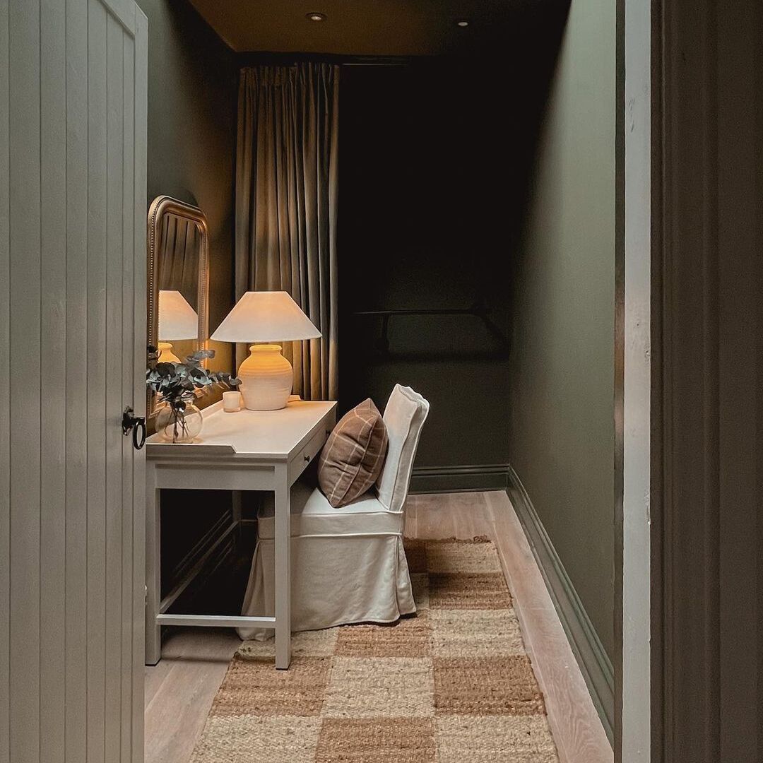
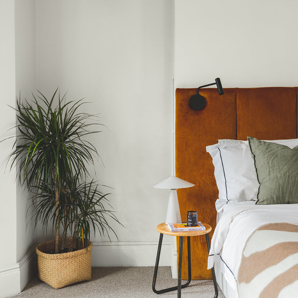
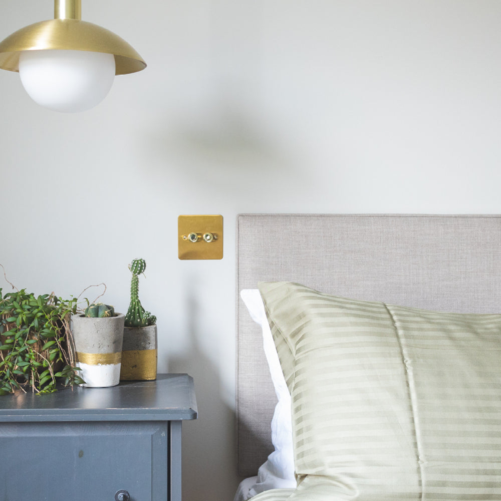
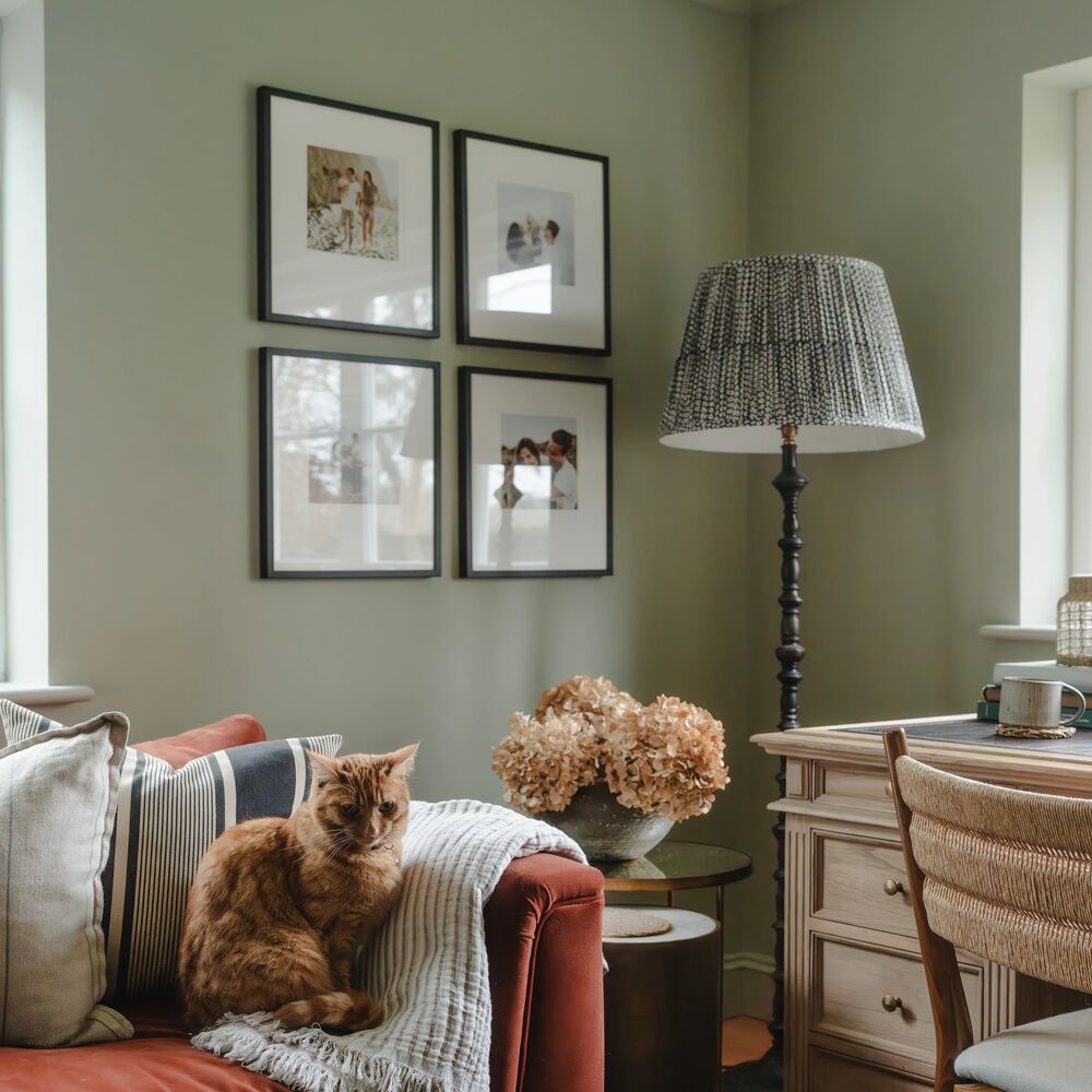
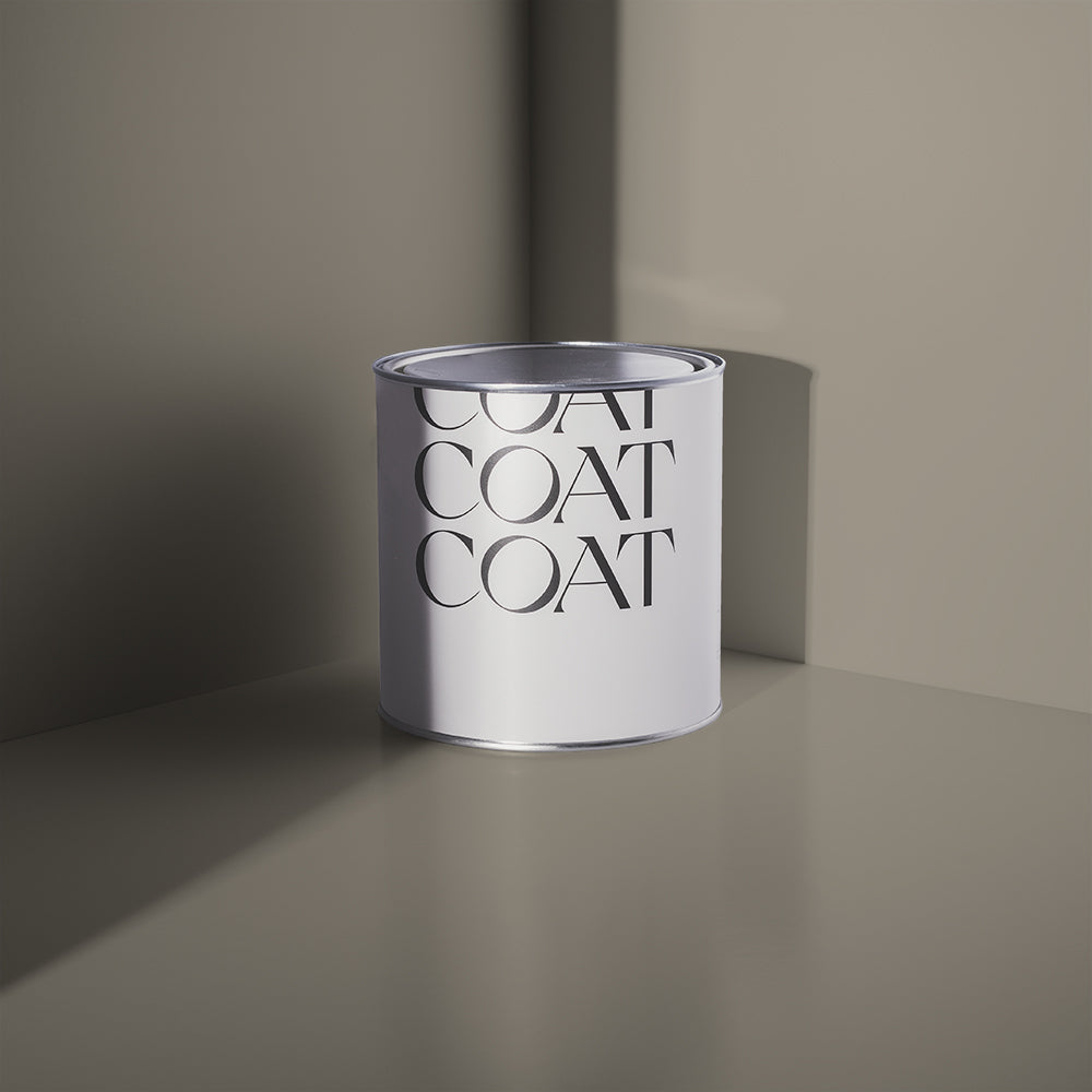
'Ambrose' was the winning colour for Tara's bedroom, paired beautifully with bouclé and linen cushions to add warmth and texture to the room.
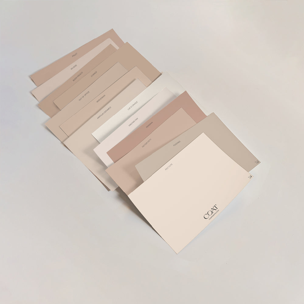
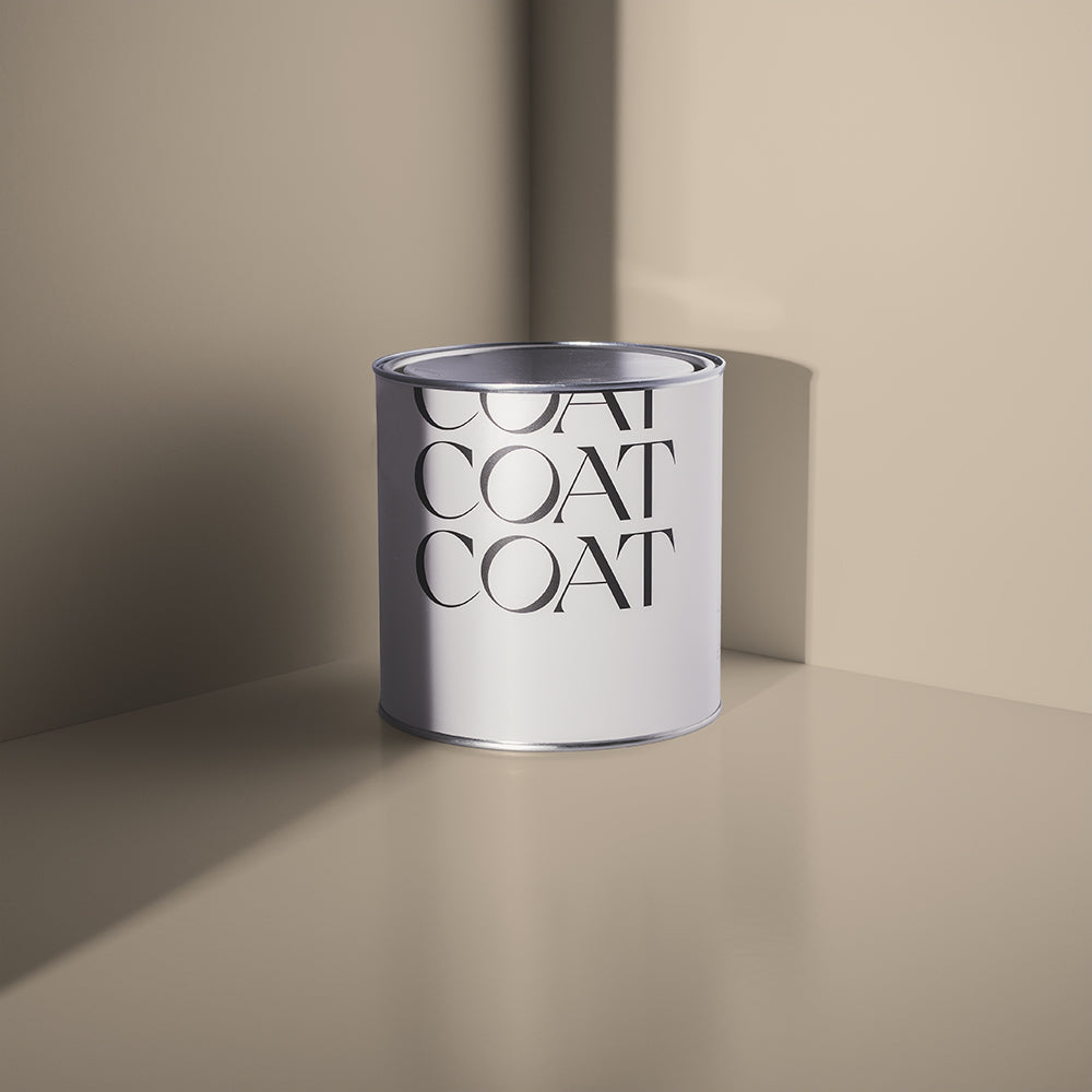
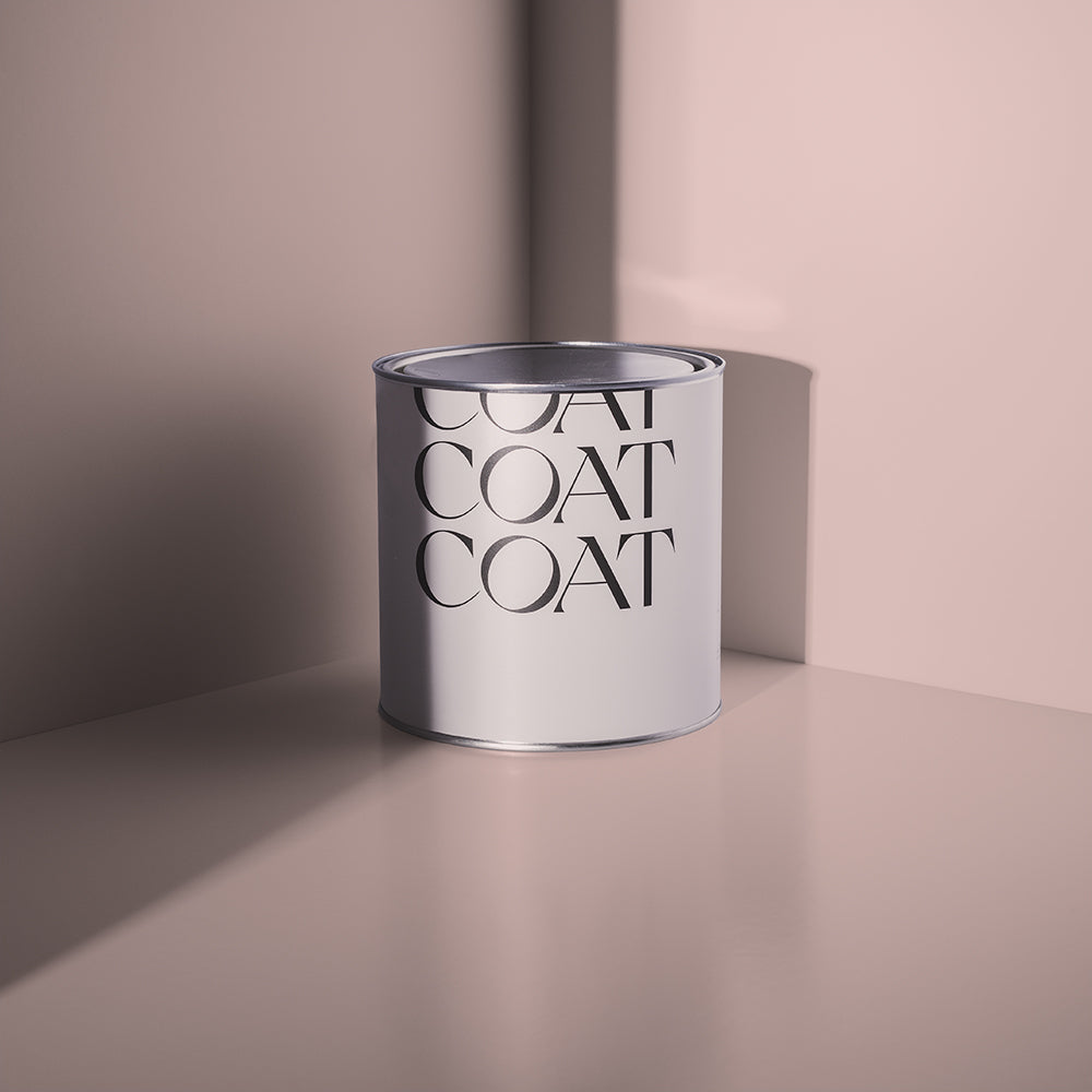
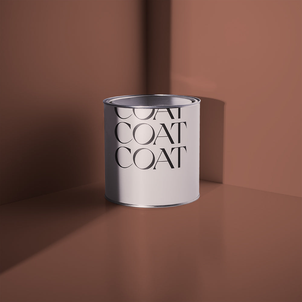
Tara chose six of our neutral colours, with an assortment of different undertones to see how they would work with the light in the room. Not many people are aware of the undertone variety in paint colours and how they can massively differ depending on a number of factors. For this reason, we would always advise a test patch before taking the plunge!
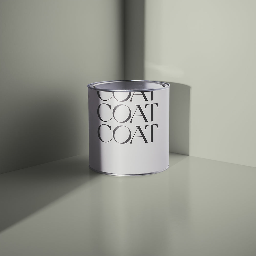
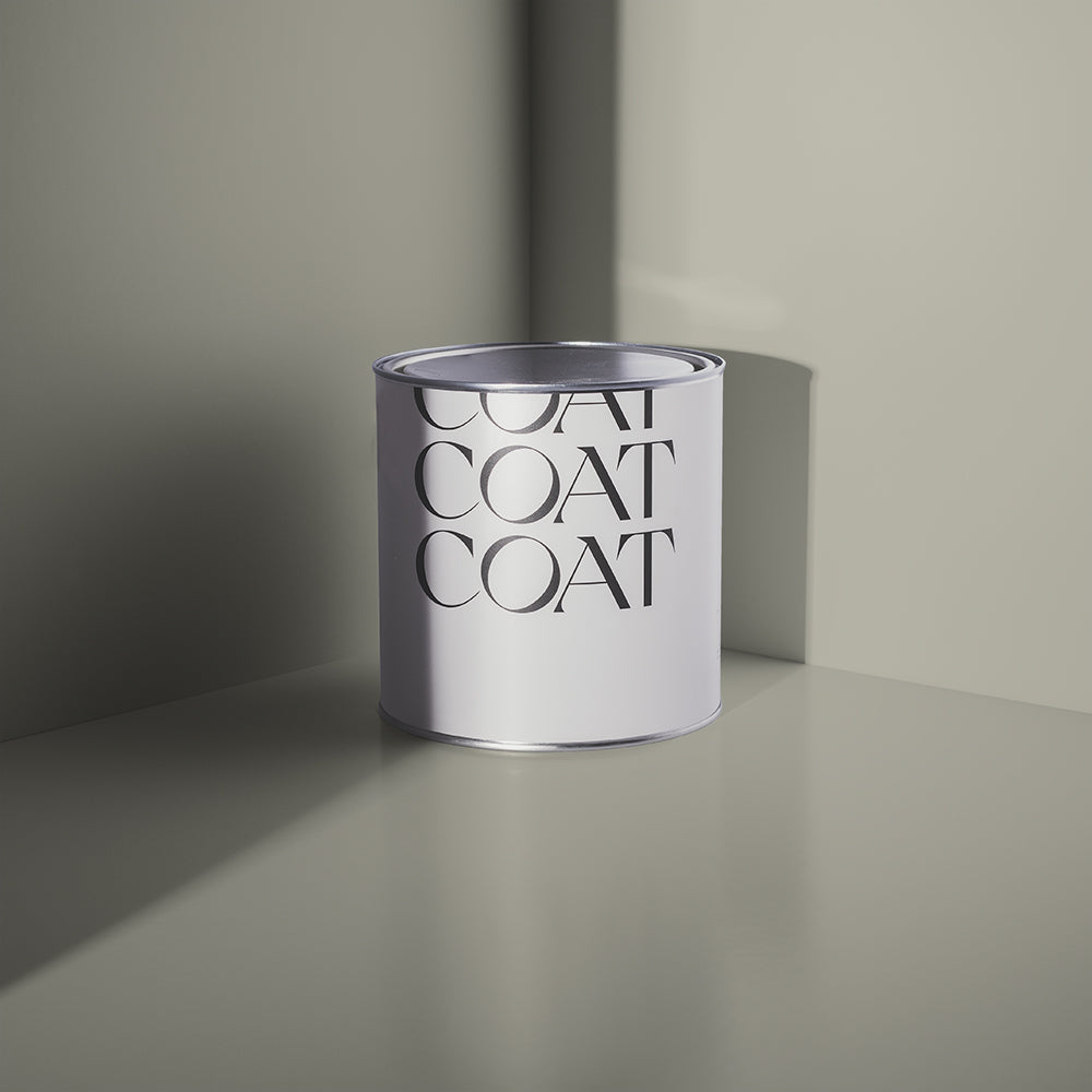
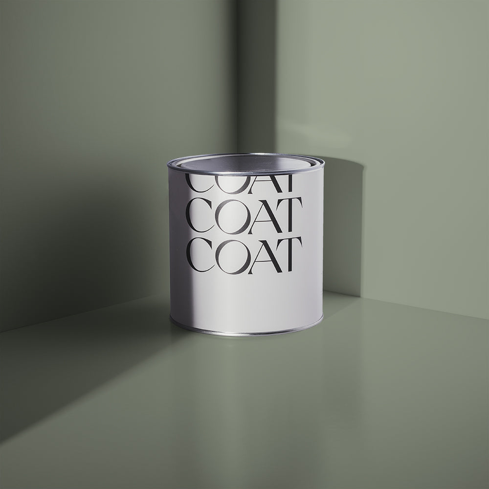
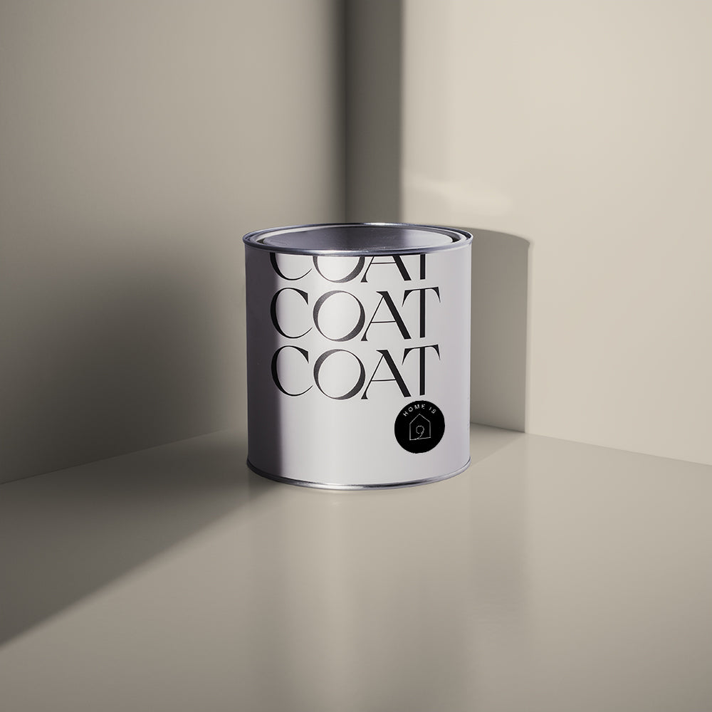
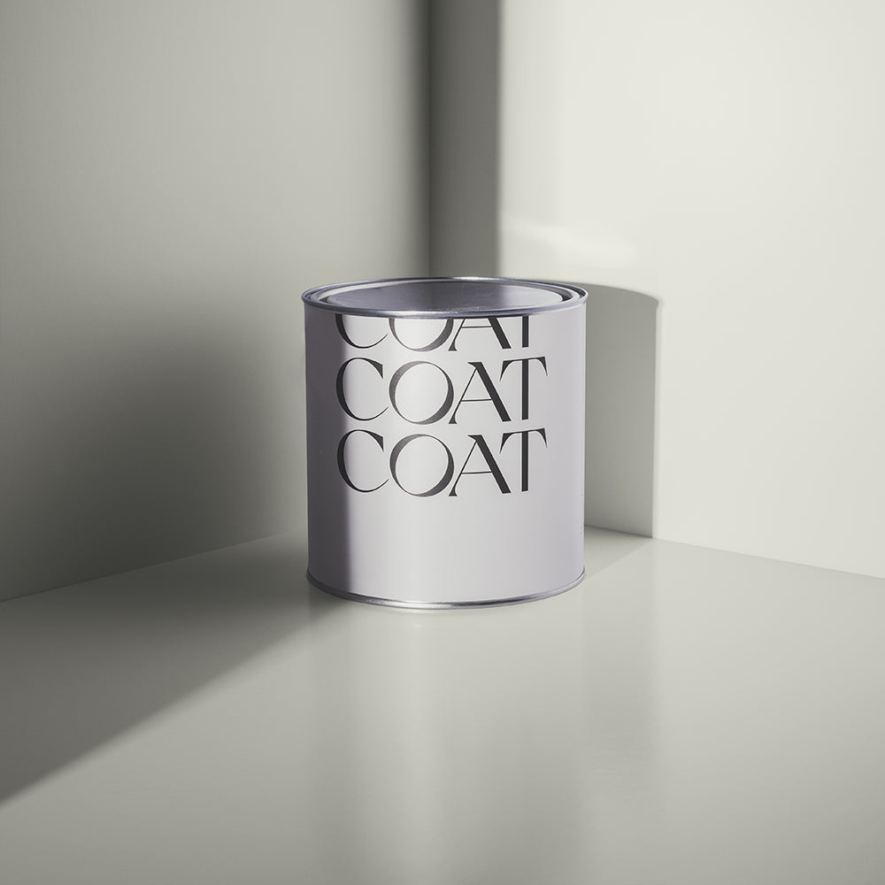
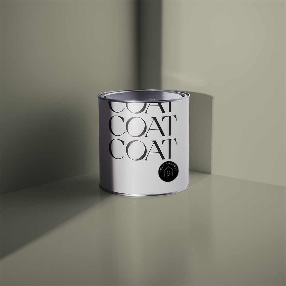
“I ended up choosing ‘Ambrose’, a collaboration with Heals that I absolutely love! It’s a gorgeous shade of grey-green, that appears slightly altered at different times of the day. It went on really well, with a very smooth, satisfying coverage.
TAKE A LOOK INSIDE…
Let’s venture around and take a nosey at all the details that make their house a home. Before Tara began decorating, the rooms were a basic white and cream canvas, awaiting some creative flare.

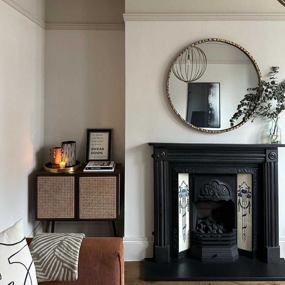
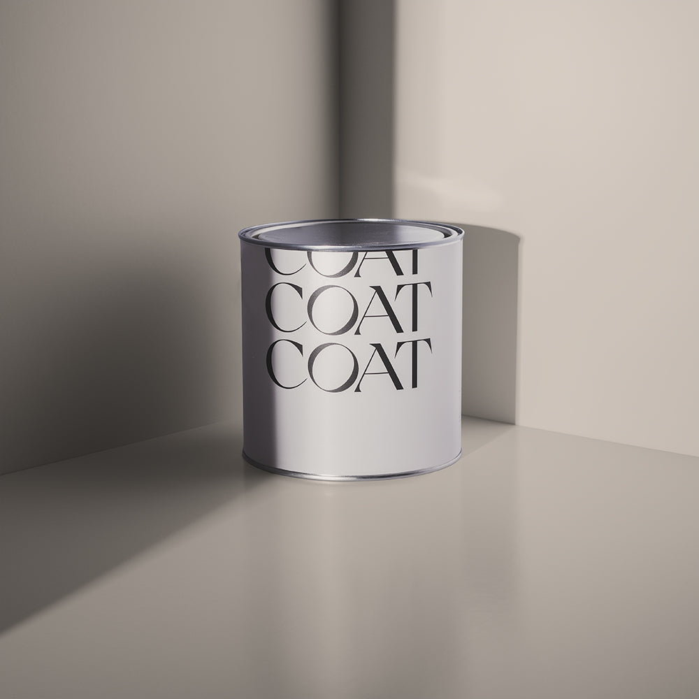
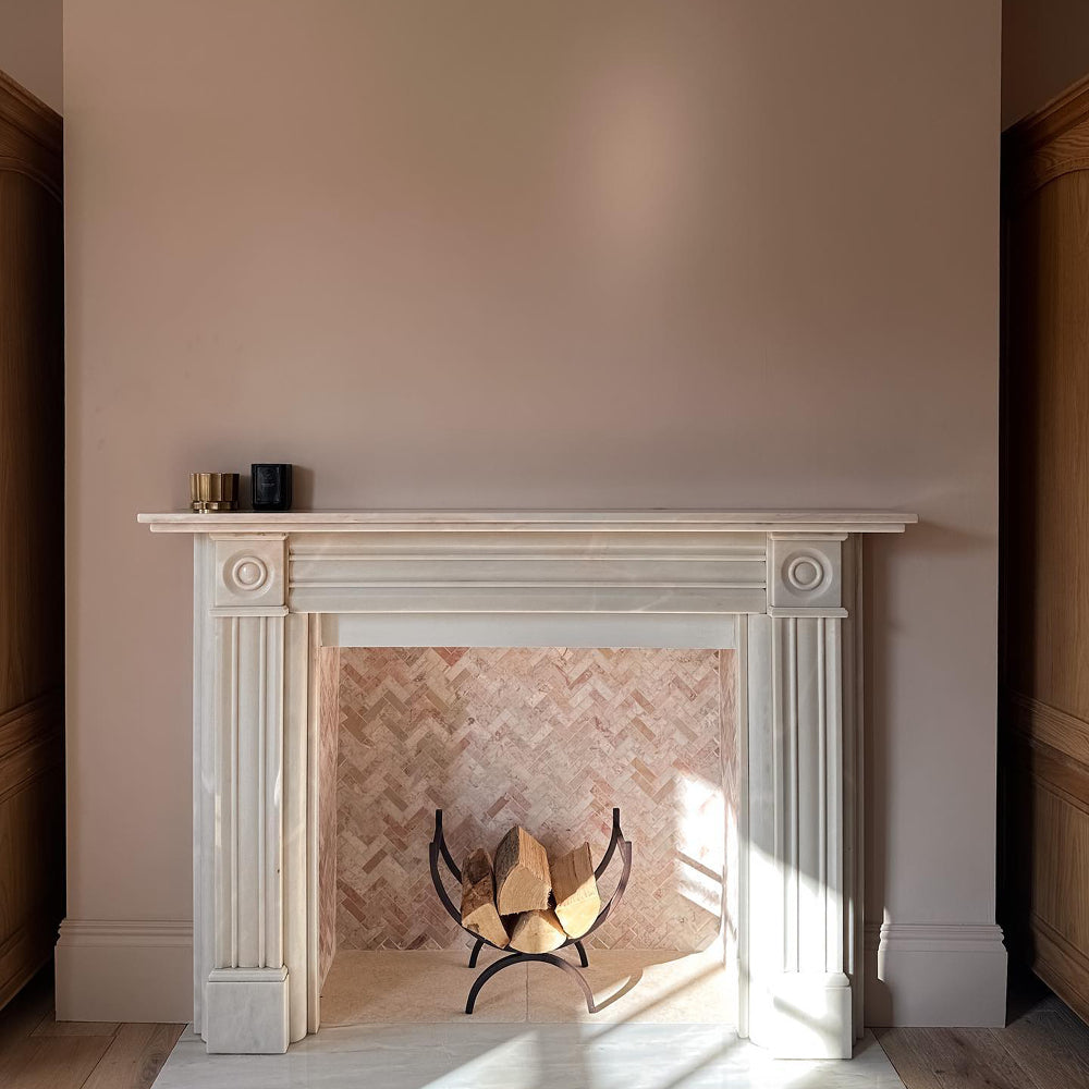
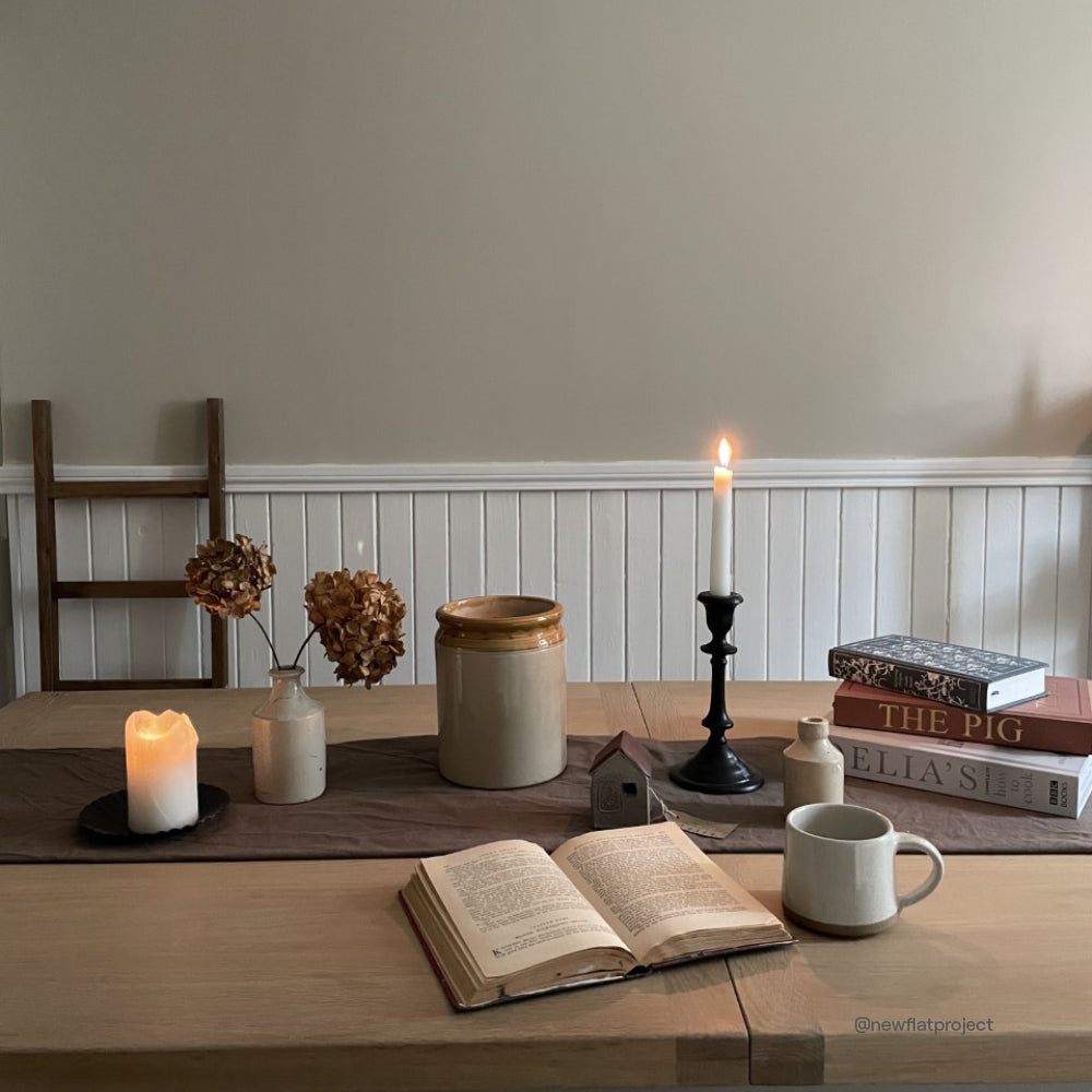
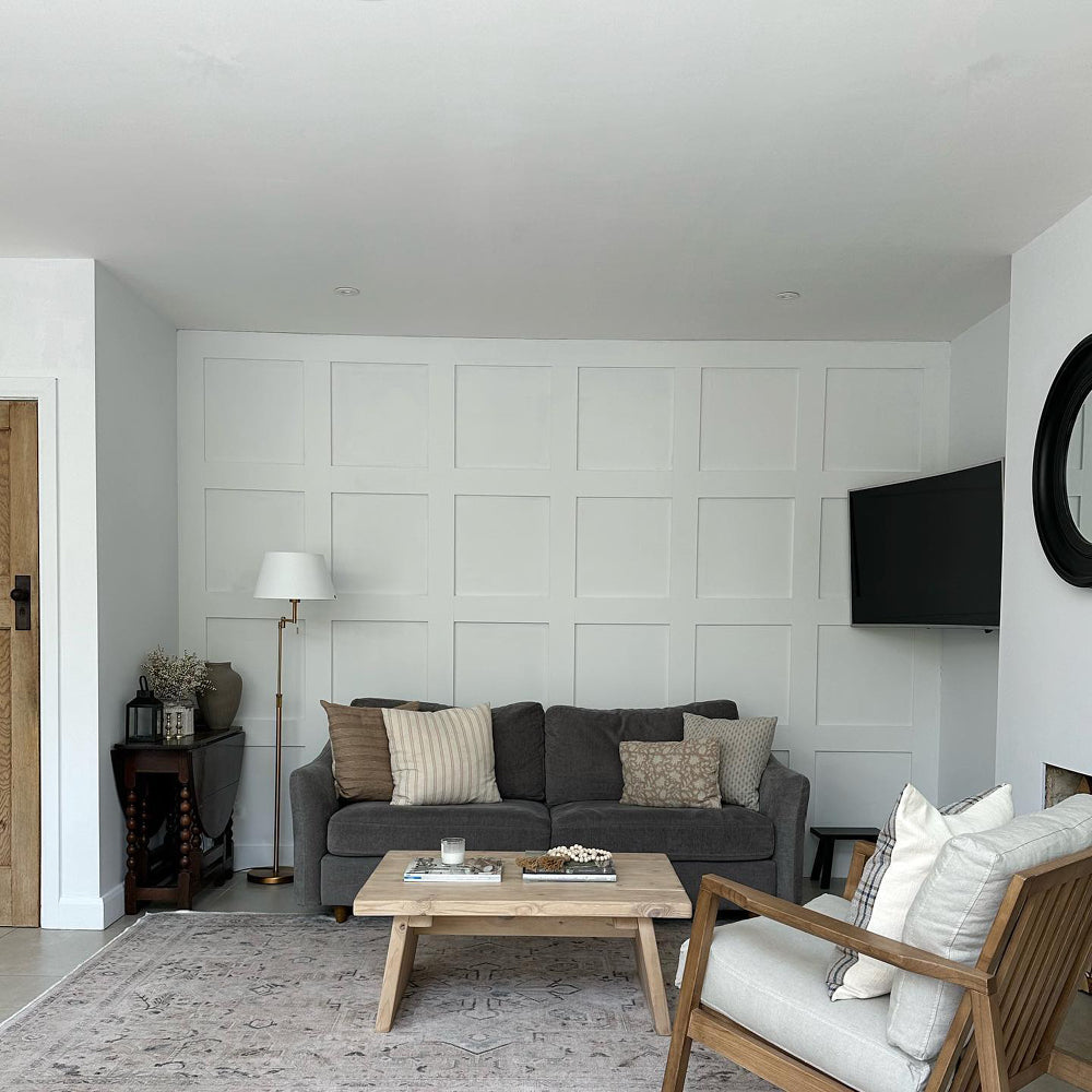
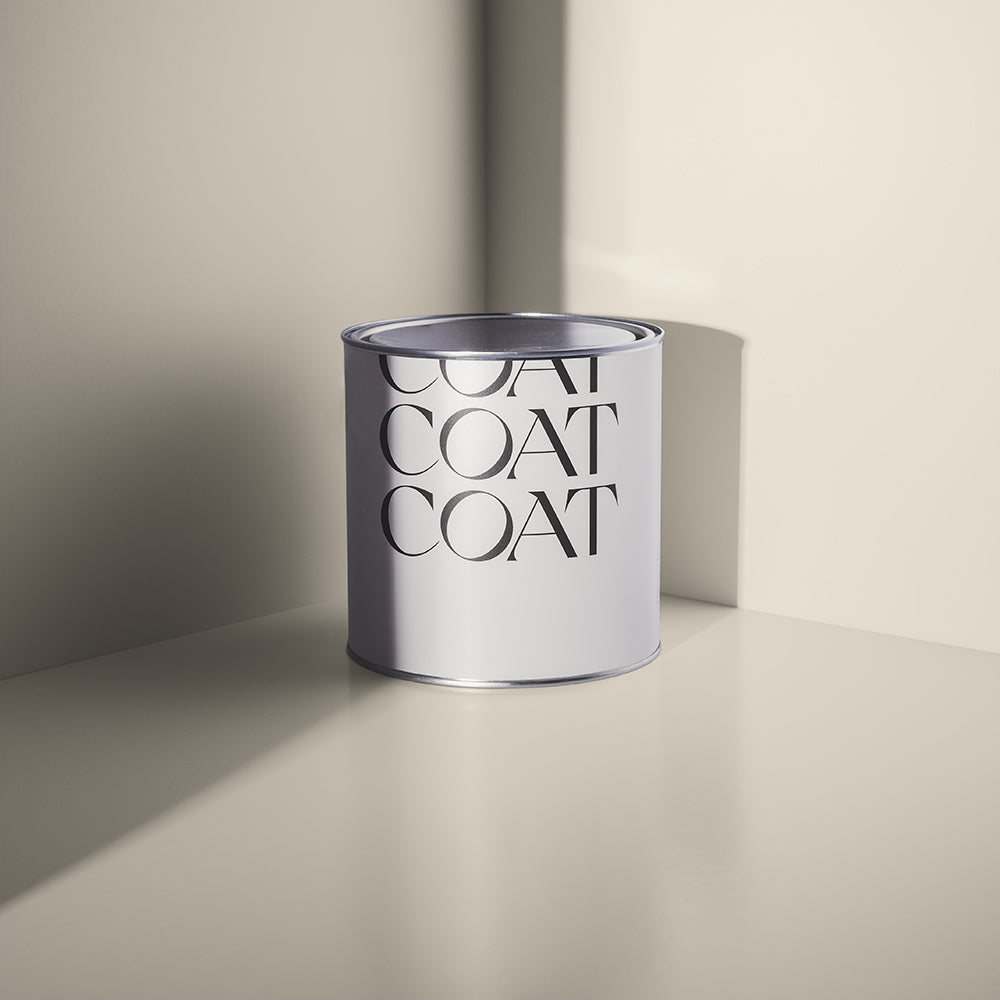
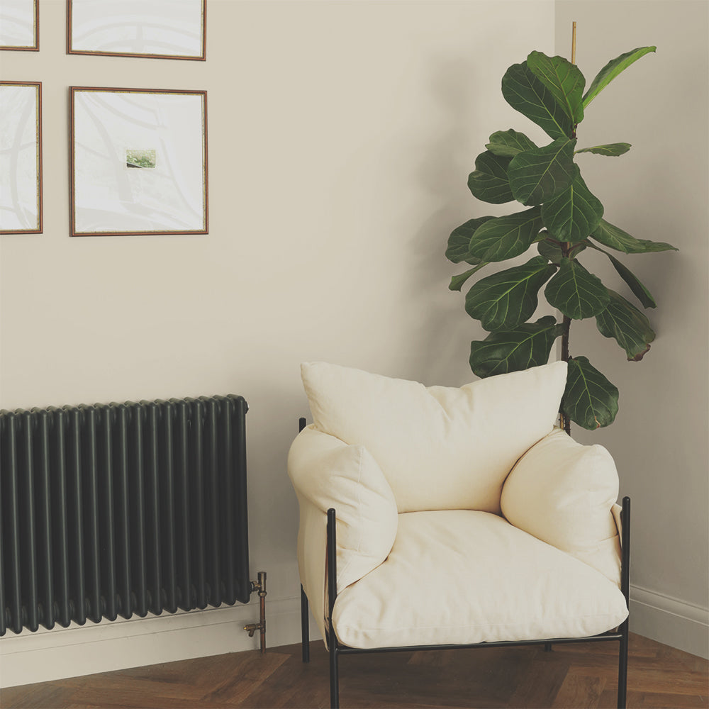
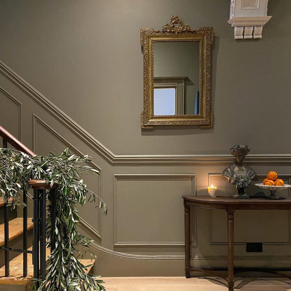
This mid-century stone works well with dark metals and woods as the warm undertones gives it a bit of character.
First stop, Tara & Joe’s bedroom; a cosy, minimal space which they have decorated in ‘Ambrose’ and styled with pops of monochrome. We are obsessed with how Tara has utilised all areas of the room, ensuring that this small space still remains functional.

Just look at that beautiful vanity shelf & stool – super handy and makes perfect use of that smaller corner nook. By attaching a small shelf & mirror to the wall, it allows for the appearance of more floor space. It’s really is no surprise that this room is her favourite!
SHOP TARA & JOE’S BEDROOM:
Bed linen - Cuddledown
Bed throw - Design Vintage
Linen curtains - H&M Home
Floating unit - Chickidee

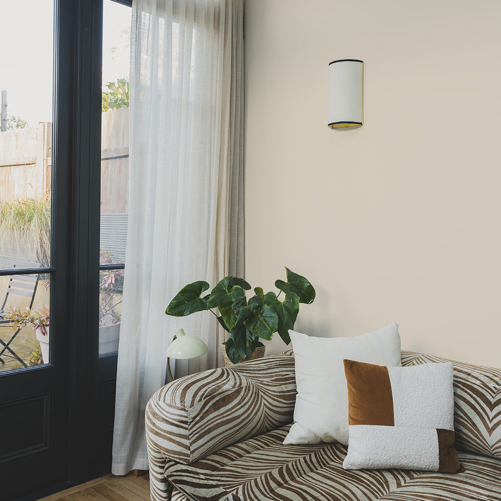
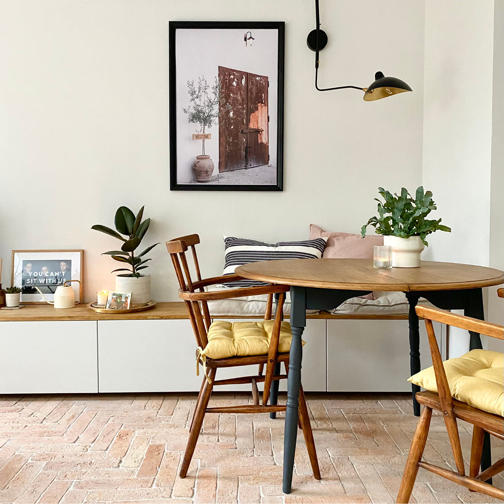
Next up, the living and dining space – a multifunctional area of the house. Bright and spacious, this room is laced in modern décor and a hint of the 1950s in some of the furniture. Tara likes to update her accessories in this space as the seasons change, which is a great and affordable way of keeping a home feeling renewed and interesting.
SHOP TARA’S LIVING SPACE:
Corner chaise sofa - DFS
Rug - La Redoute
Coffee Table - La Redoute
Side music table - Koble

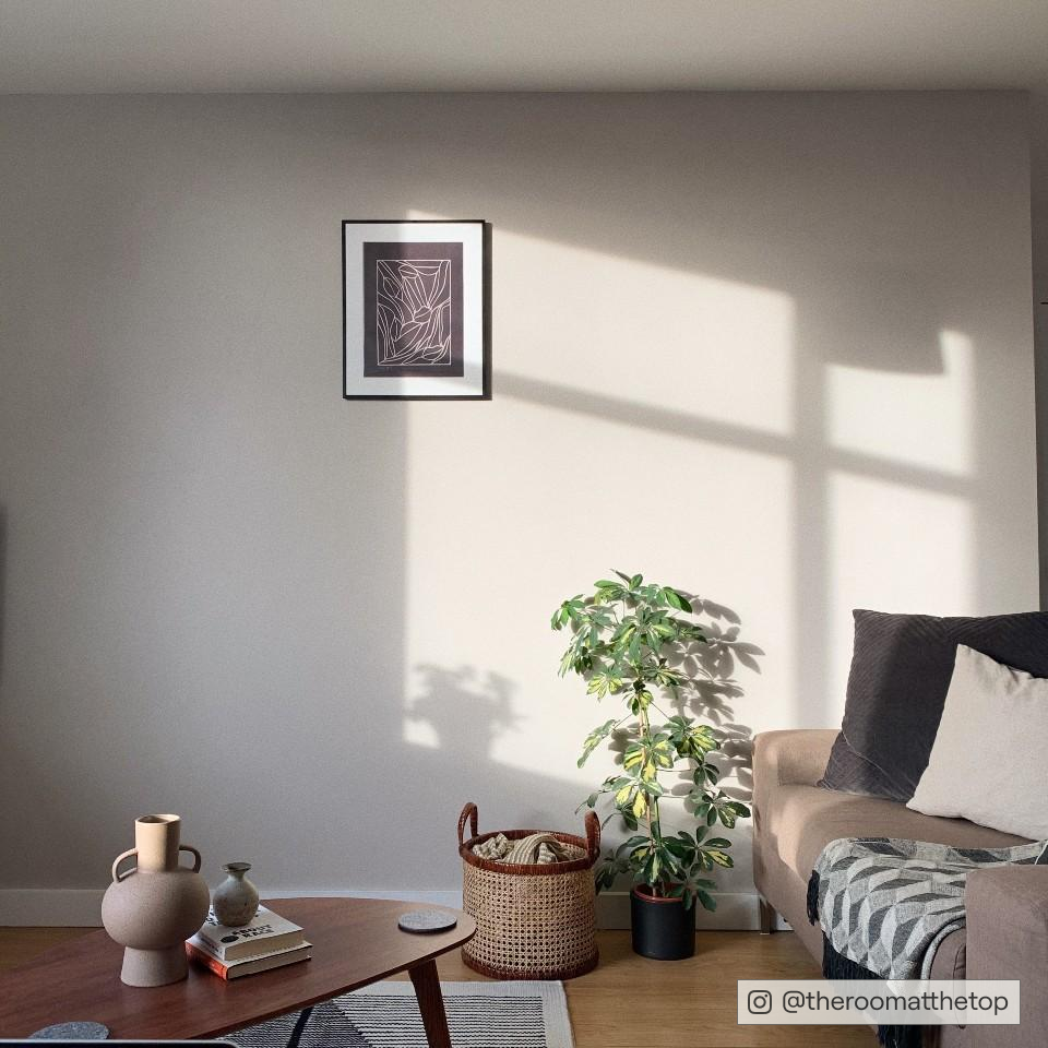
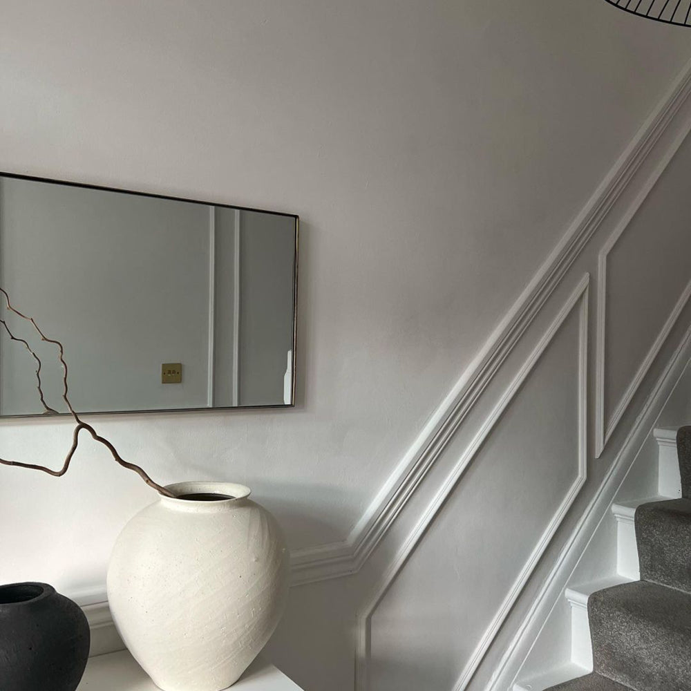
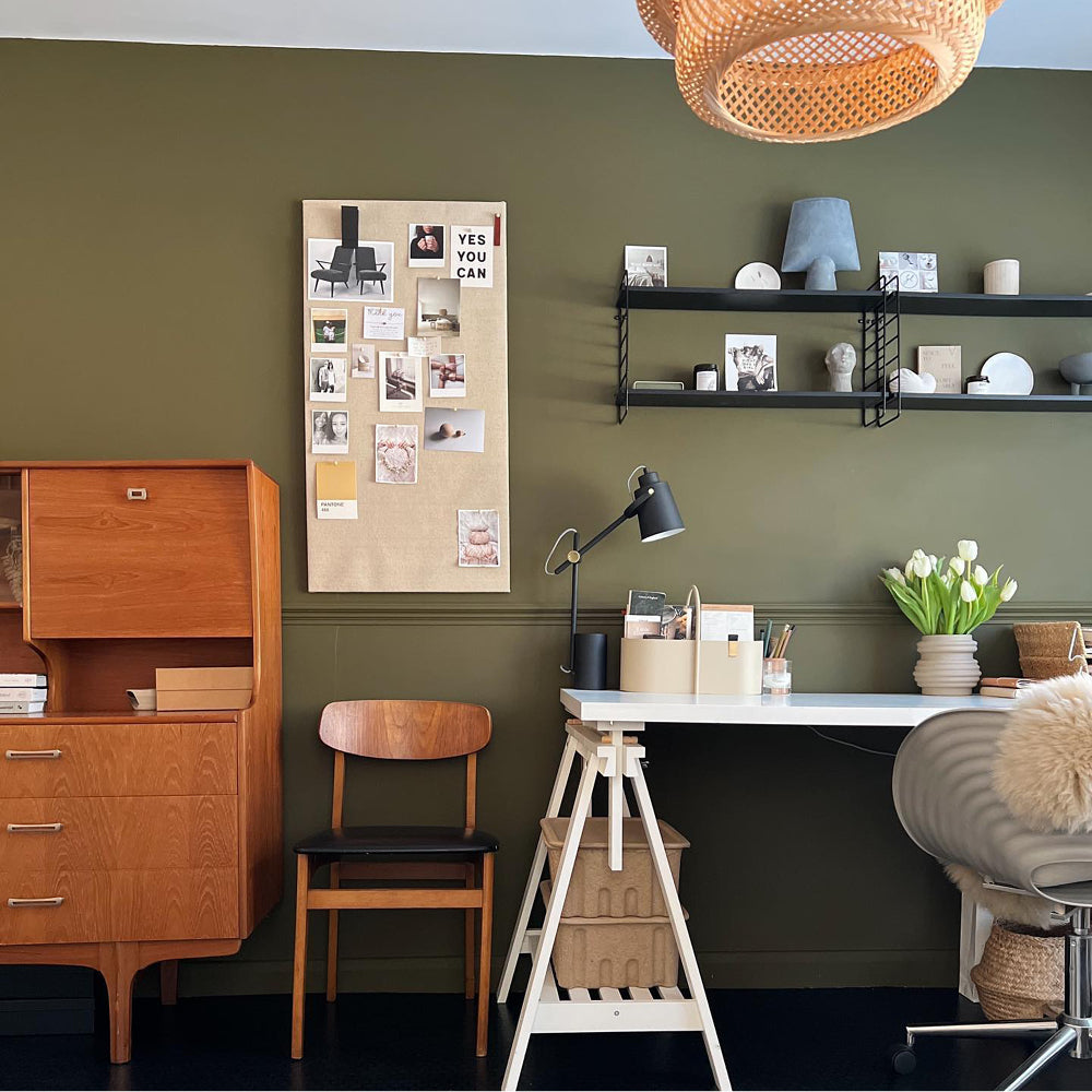
A tactical spot to Tara's home office, check out 'Low Salt' to get the look.
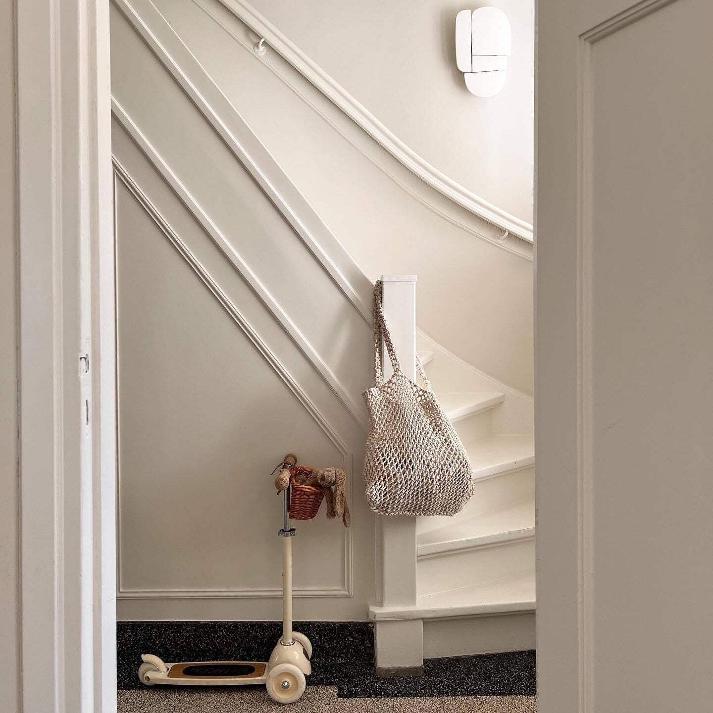
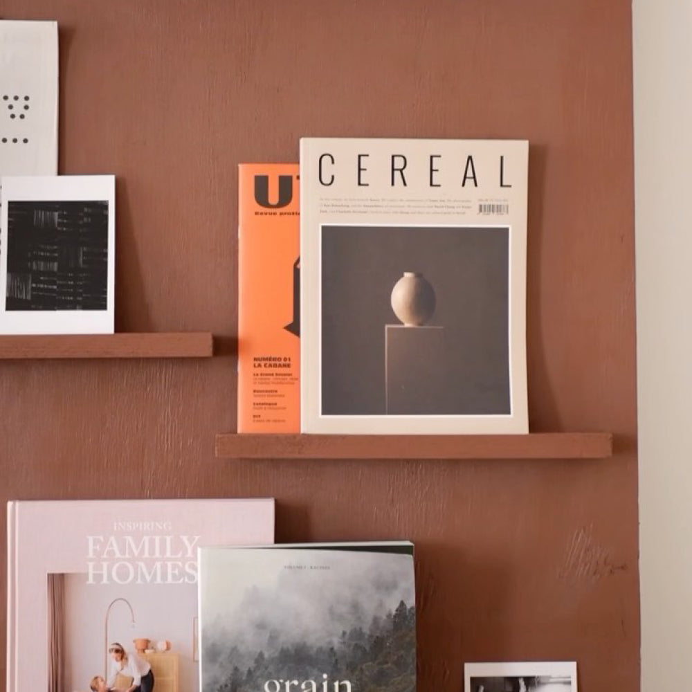
Finally, Tara shows us around her hallway office – the perfect introduction when the lockdowns hit and we all had to work from home.
“Never has this part of the house been used as much as it has in the last two years! The desk fits neatly into the space without compromising the use of the staircase, and we have accessorised it with a few prints and a picture shelf. A convenient work station for the whole family.”
Once again, another space-saving concept that won’t break the bank!
SHOP TARA’S HALLWAY OFFICE:
Desk - La Redoute
Picture shelf – Ikea
Wall art – The Poster Club
WHAT THE FUTURE HOLDS…
Tara is keen to give the children’s bedroom an update. As our little ones get older, their preferences and interests change pretty quickly, so it’s often a challenge to provide something that becomes adaptable as they grow.
“As my kids share a room, we have to try and incorporate a look that works for each of them – without it clashing too much. We will be sure to get a small wish list from both of them before getting to work.”

TARA FROM @STYLING_MY_HOME LENDS SOME ADVICE…
“Make sure you live in the space for a little while before you throw yourself into anything. It’s important to get a feel for the room and decide what you really want to get out of it.
I also love to create mood boards, as it helps me to put different looks together and overlap ideas to create the perfect space for yourself.”
Feeling inspired? Check out our blog on how to pick the perfect neutral and order your swatches here 🤍
Publish Date
Author











Leave a comment