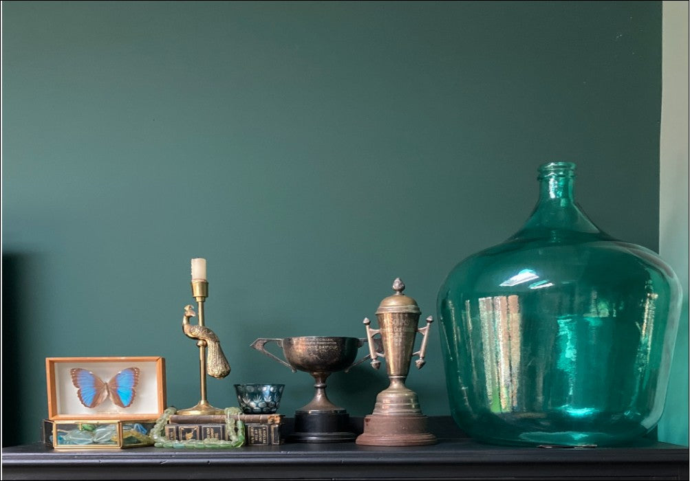
How To Paint With Greens
Greens are big news in the interiors world at the moment and it's easy to see why. Stylish and versatile, but never boring, green hues work brilliantly in any room of the house. We also tend to associate green with nature and the great outdoors, so as an added bonus it has a calming, stress-busting effect. And who doesn't want a piece of that? 💚
So, with Insta awash with every green under the sun, how do you decide which shade is the right one for you? With a little help from your friends at COAT, that's how! Here's our handy guide to glorious greens and how to use them in your home.
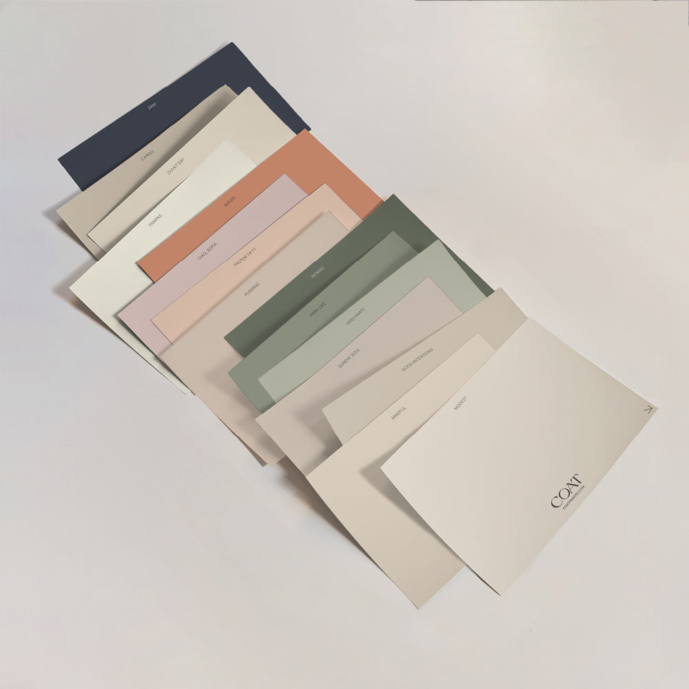
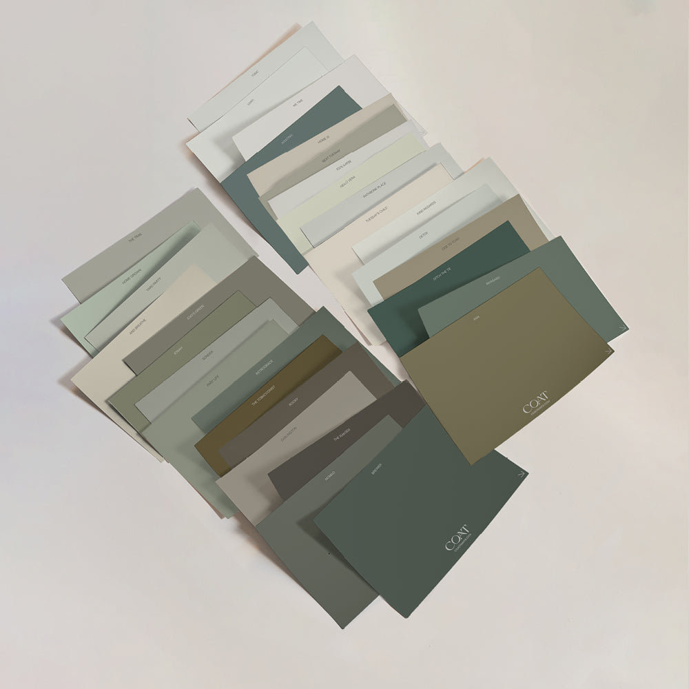
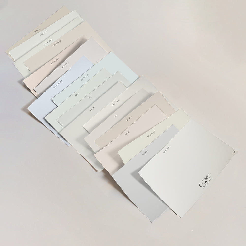
Grab yourself some green colour swatches
DARK GREEN
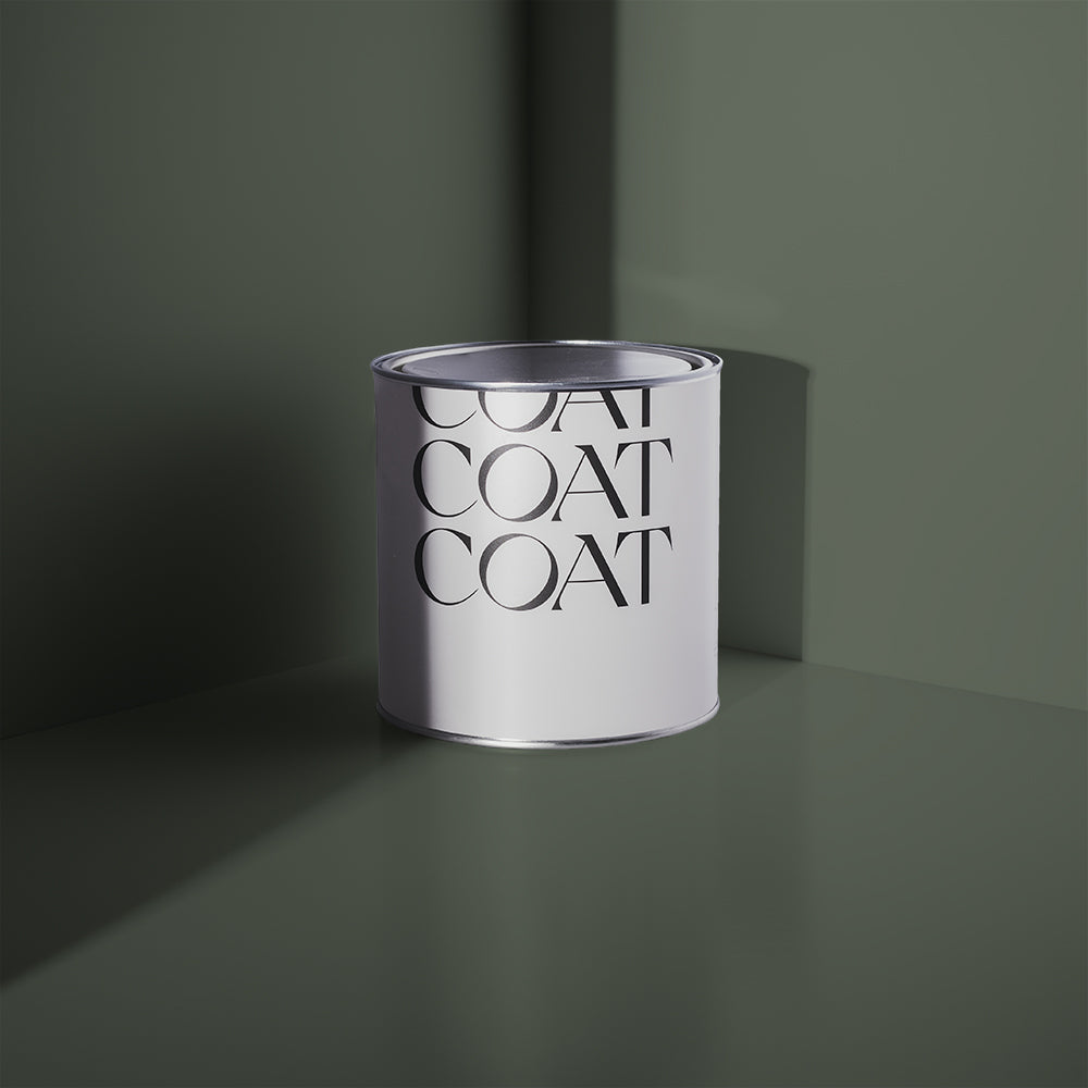
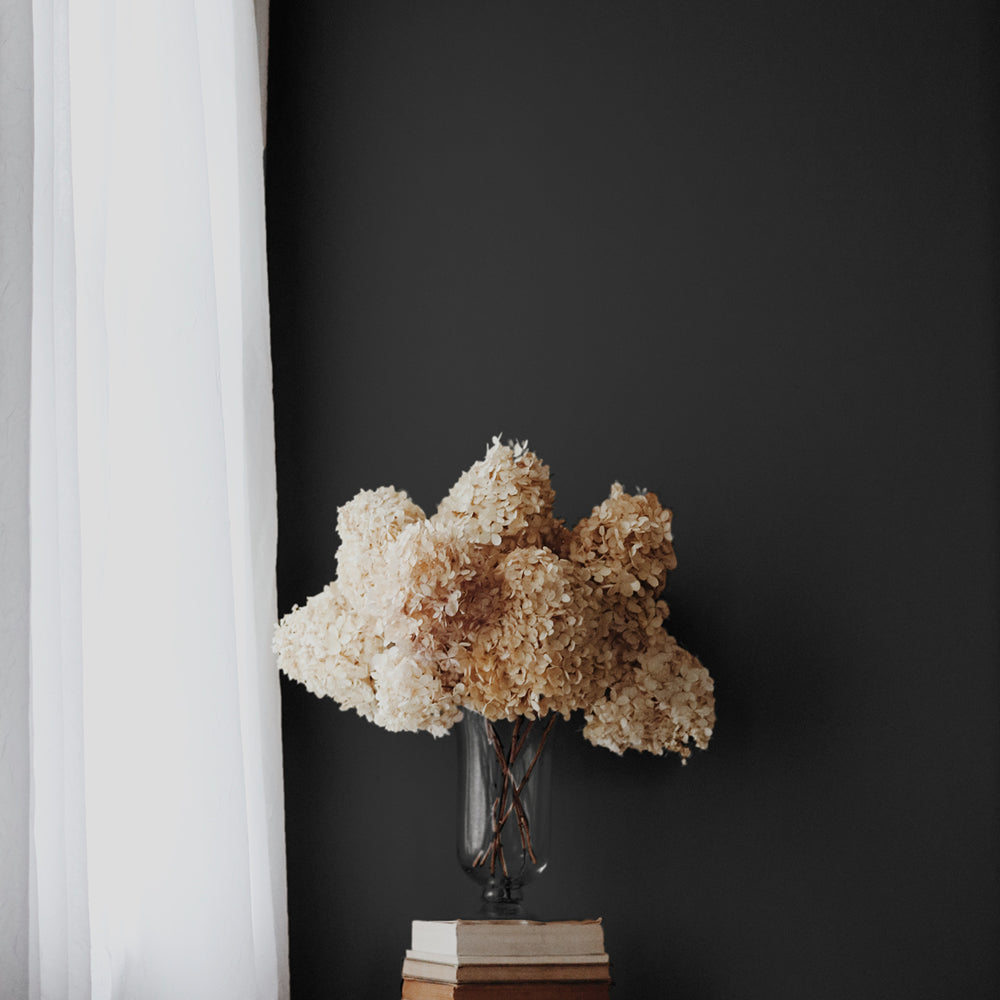
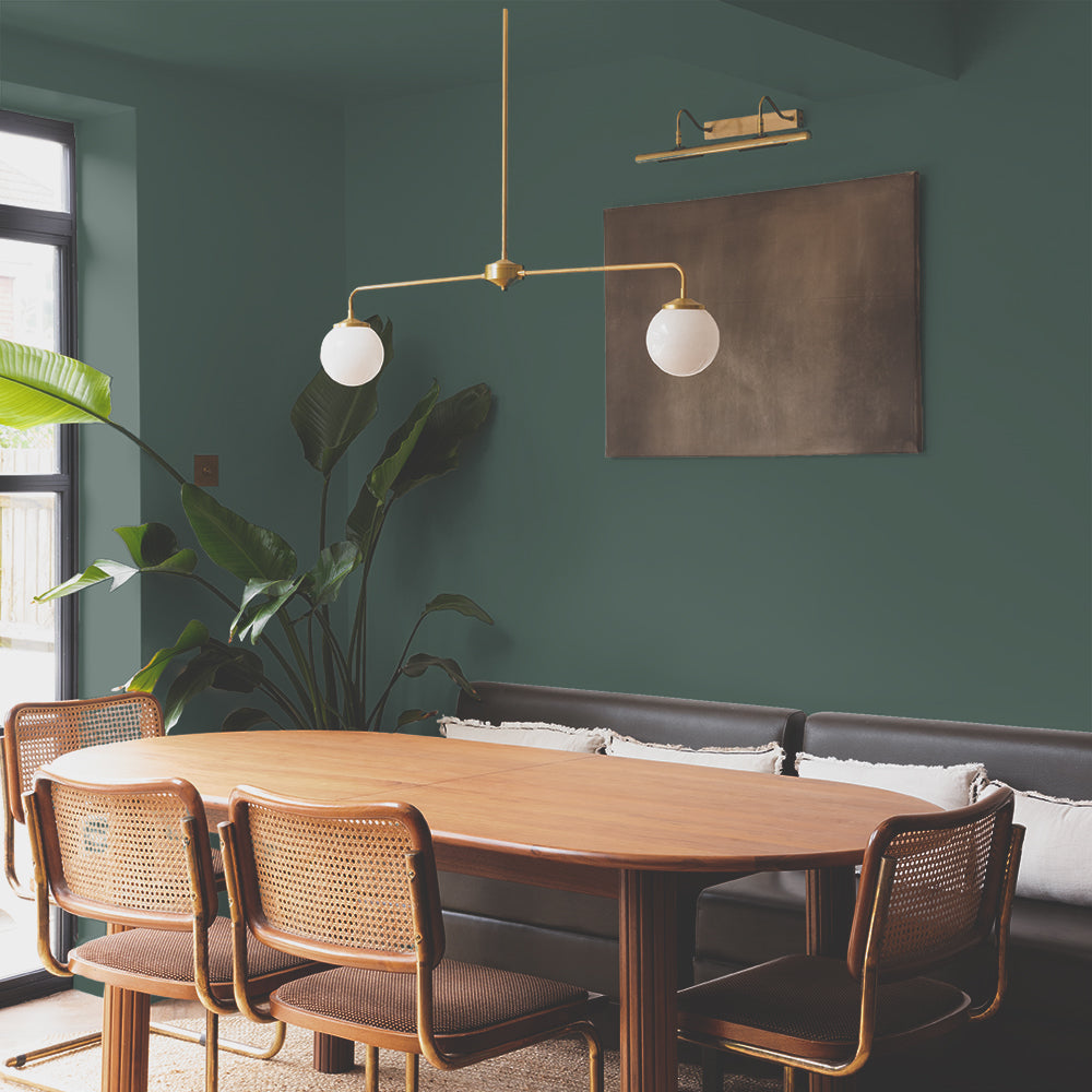
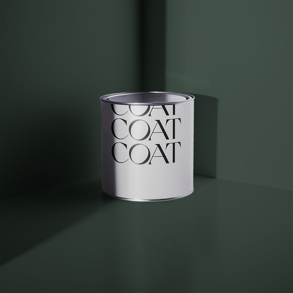
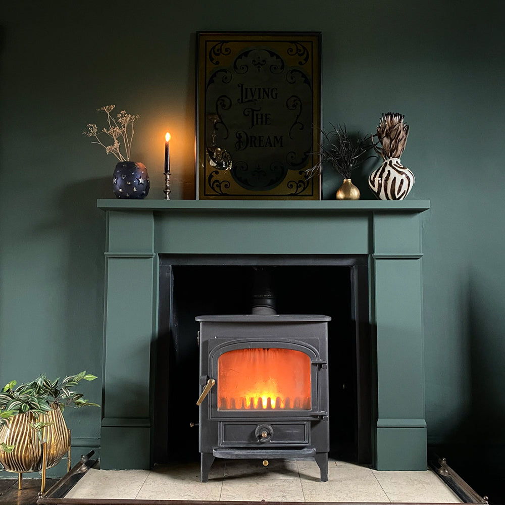
With its ability to inject an instant dose of grown-up sophistication, dark green is huge right now. Our stately green Ditch The Tie is perfect for creating a dark and moody living room. Combine it with furniture in walnut or teak along with brass accents for a cool, gentleman's club vibe.
Another great way to use dark green is to pair it with white for a clean, crisp look. Why not paint the ceiling and skirting boards in pure white Screenshot, and then use Ditch The Tie for the walls? Check out how @spantastichome on Insta has really nailed this look with white shelving set against that dreamy, rich green backdrop 👌

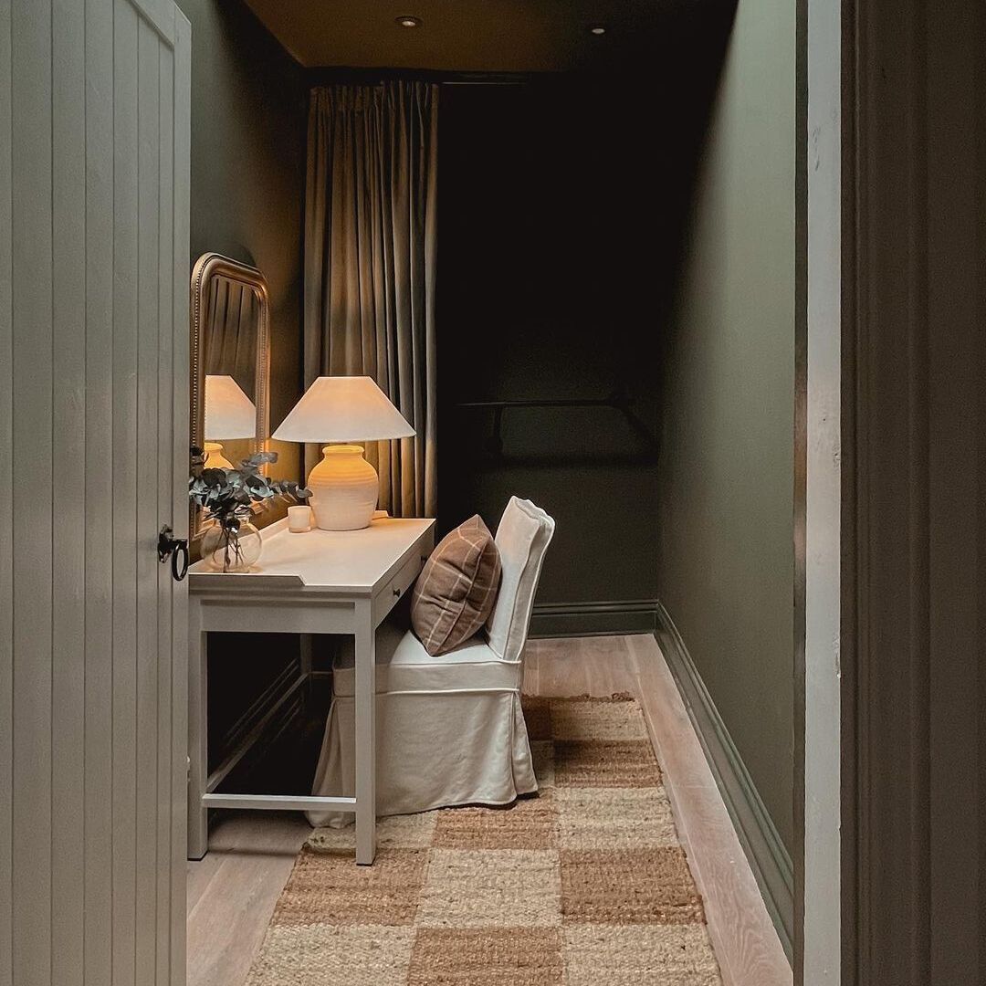
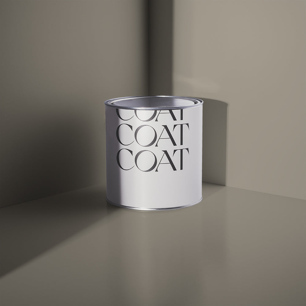
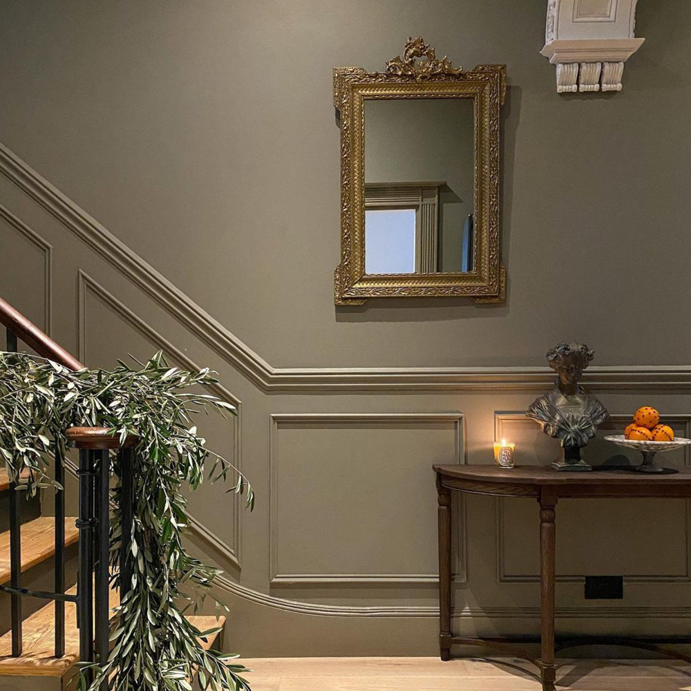
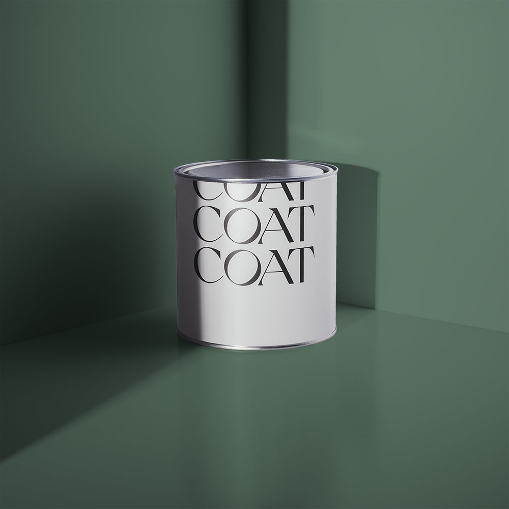
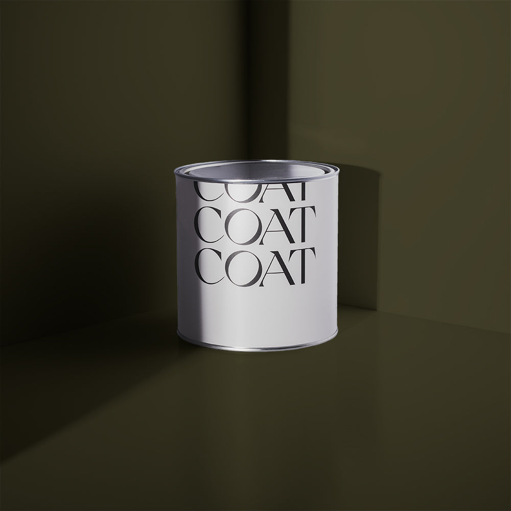
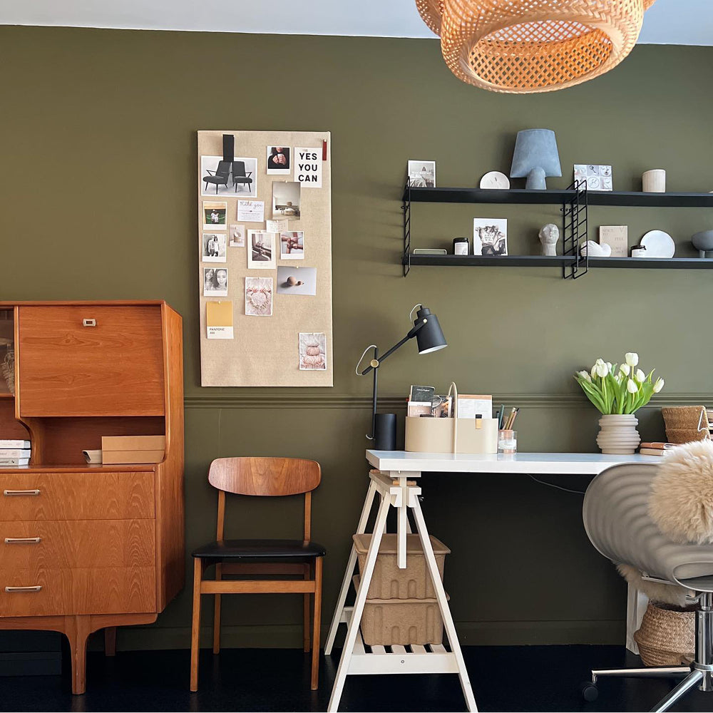
Our dark olive green, Nomad, is also a great choice for smaller spaces such as the downstairs loo or a narrow hallway. It might sound a bit cray cray to choose a dark shade for a small space, but sometimes you just have to embrace the cosiness. 🤗 With a small room it's best to slap one deep shade on the walls, skirting boards, ceilings, the lot. That way you'll soften the edges of the room, making it seem a whole lot bigger than it actually is. Genius, huh? 💡
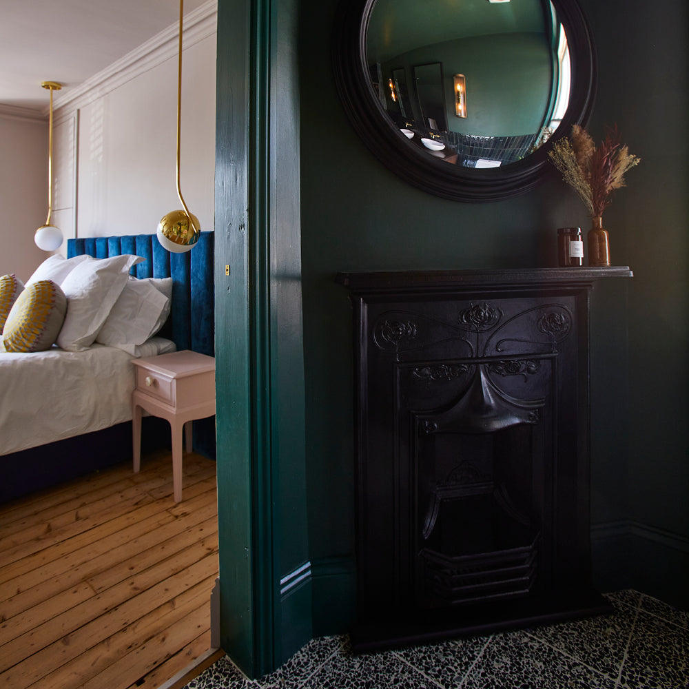
It's also worth remembering that dark greens look amazing AF in a bathroom. Get that luxe boutique hotel vibe by combining traditional dark green Ditch The Tie with a shiny white tub and some vintage tiling 🛁

TEAL GREEN
Our range of teal greens are particularly swoonsome and really do offer something for everyone from the subtle grey tones of Mr Clifton right through to the vivid joy of Pool House.
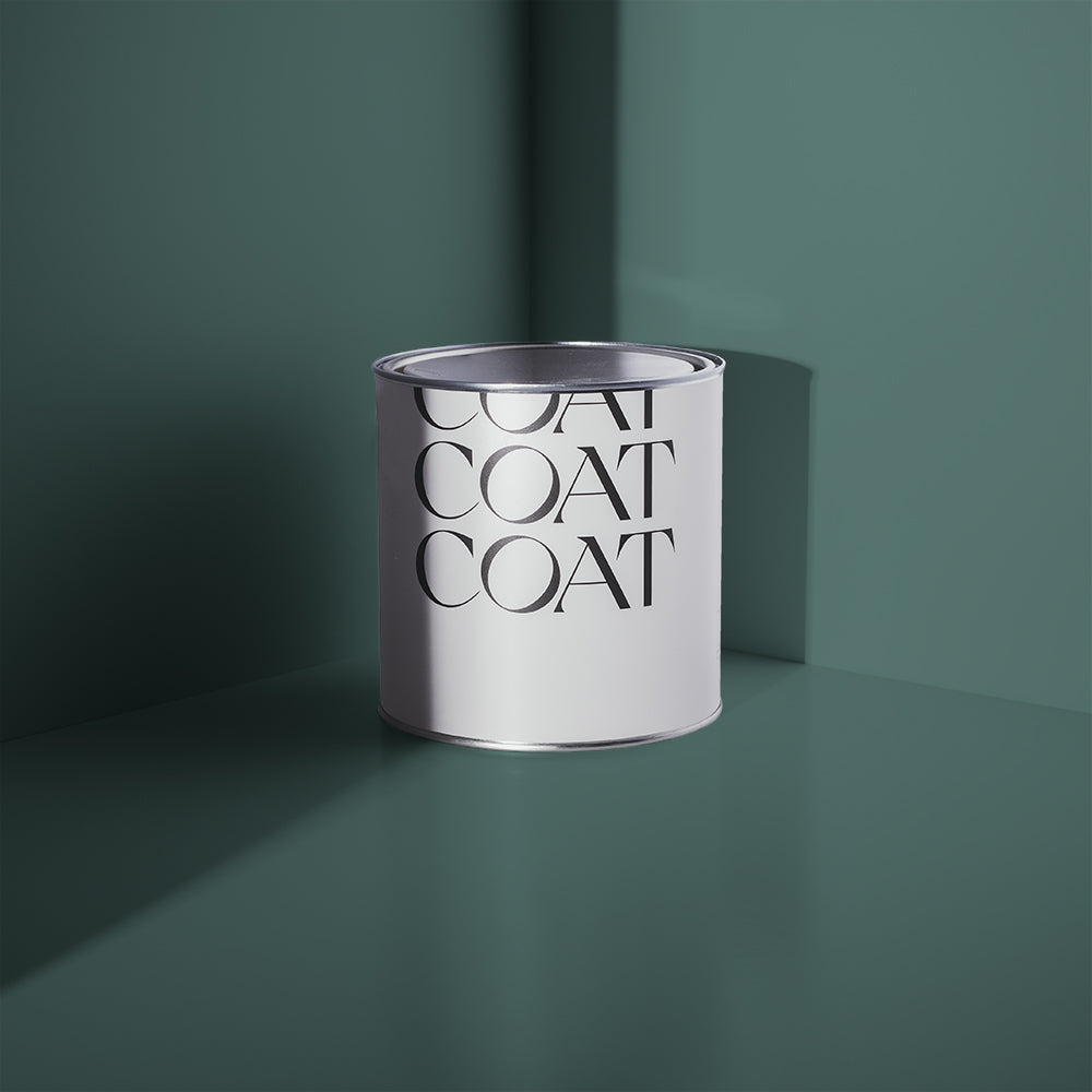
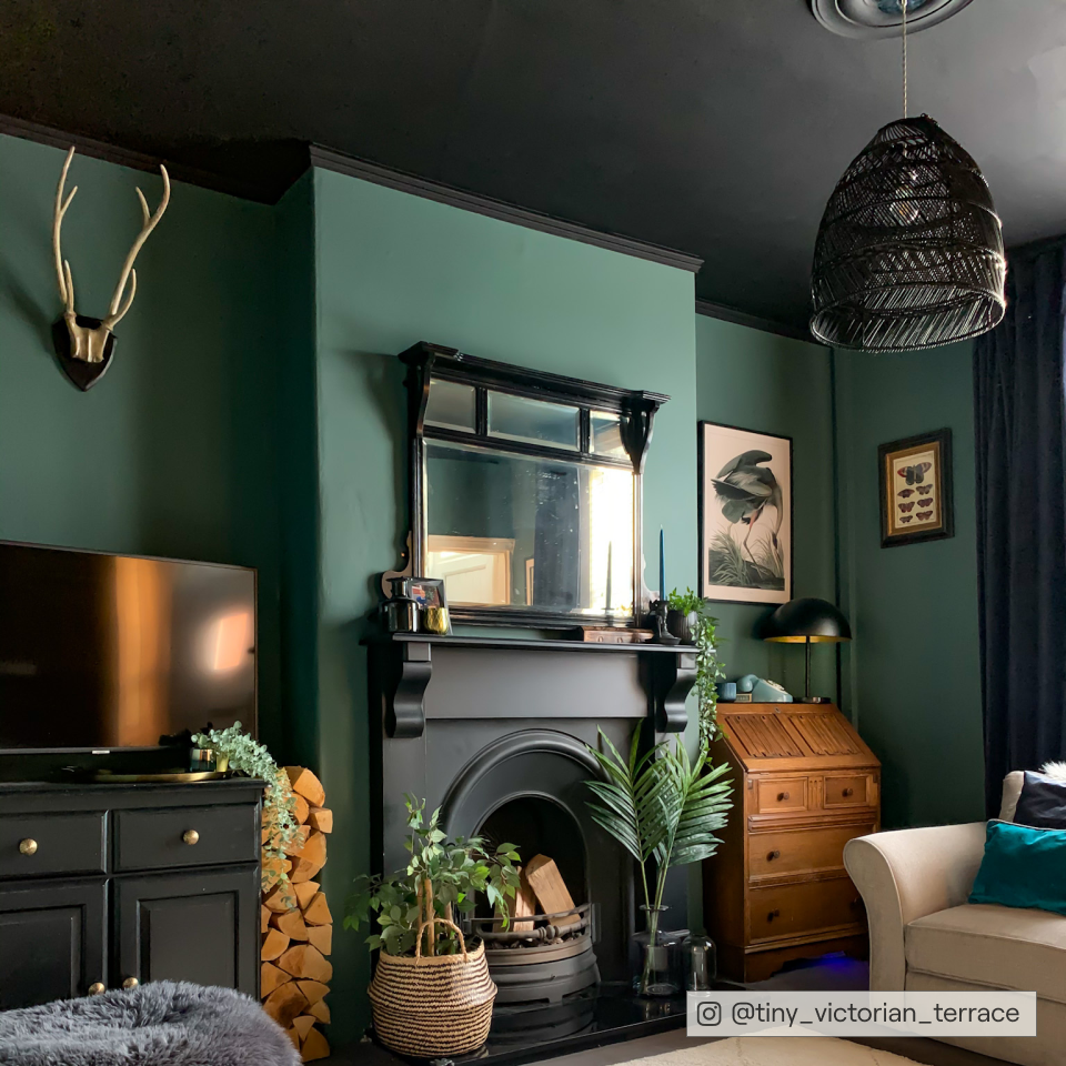
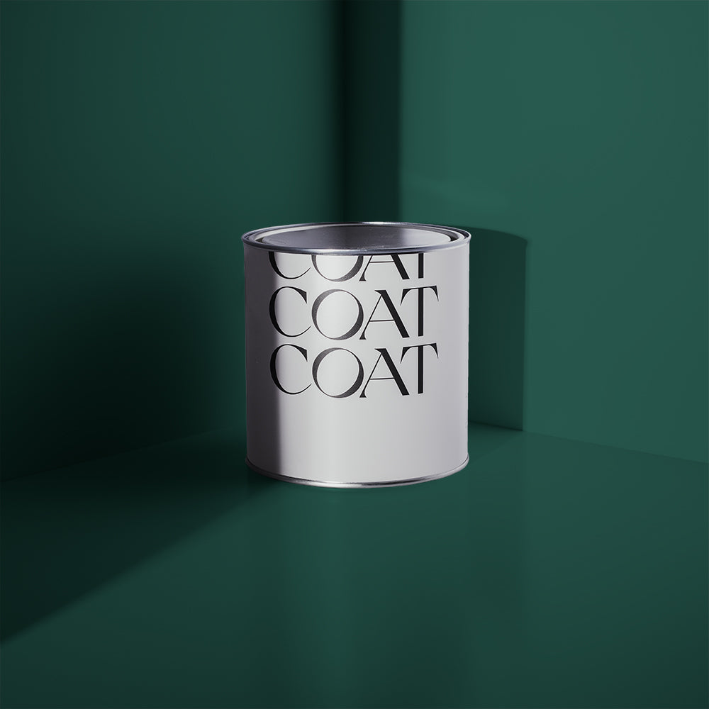
Dark teal Adulting is flying off the shelves at COAT HQ right now and with very good reason. It's a kick arse colour which manages to be both bold and soothing at the same time. (How is that even possible? 🤷♀️) Use it to create an elegant look in a large space or a cosy, cocooning effect in a little lounge.
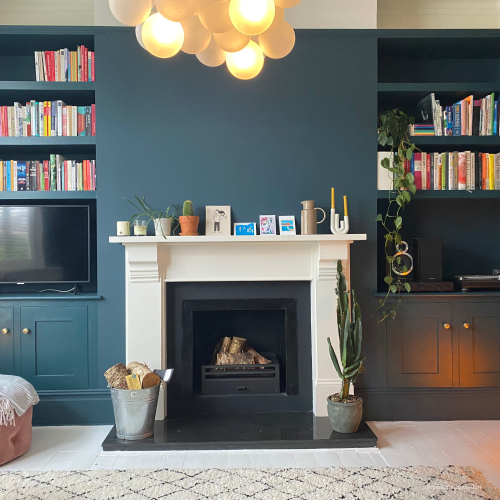
@tiny_victorian_home has done just that in her gorgeous living room. She's paired Adulting with black accents and lots of greenery. Looks great, right?

If you want a hint of colour without going overboard, dusty pale teal Hamilton is your friend, particularly for a North-facing bedroom. It brings warmth to a room while still bringing a fresh, modern vibe. What's not to love?

If you want to make a real statement, look no further than our vibrant teal The Four Poster.
He's the loud and proud member of the teal pack, bringing a jewel-like hit of colour that really packs a punch. Why not combine it with our dark denim blue, Dodie for a burst of colour? Or use as an accent of a piece of furniture for a bold, Mid-Century vibe when combined with new brown red, Old Street.

SAGE GREEN
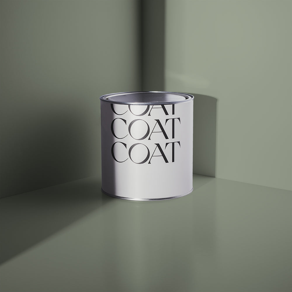
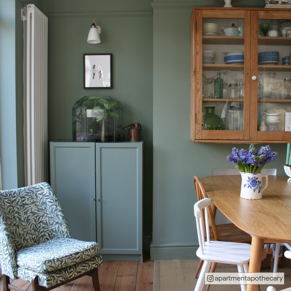
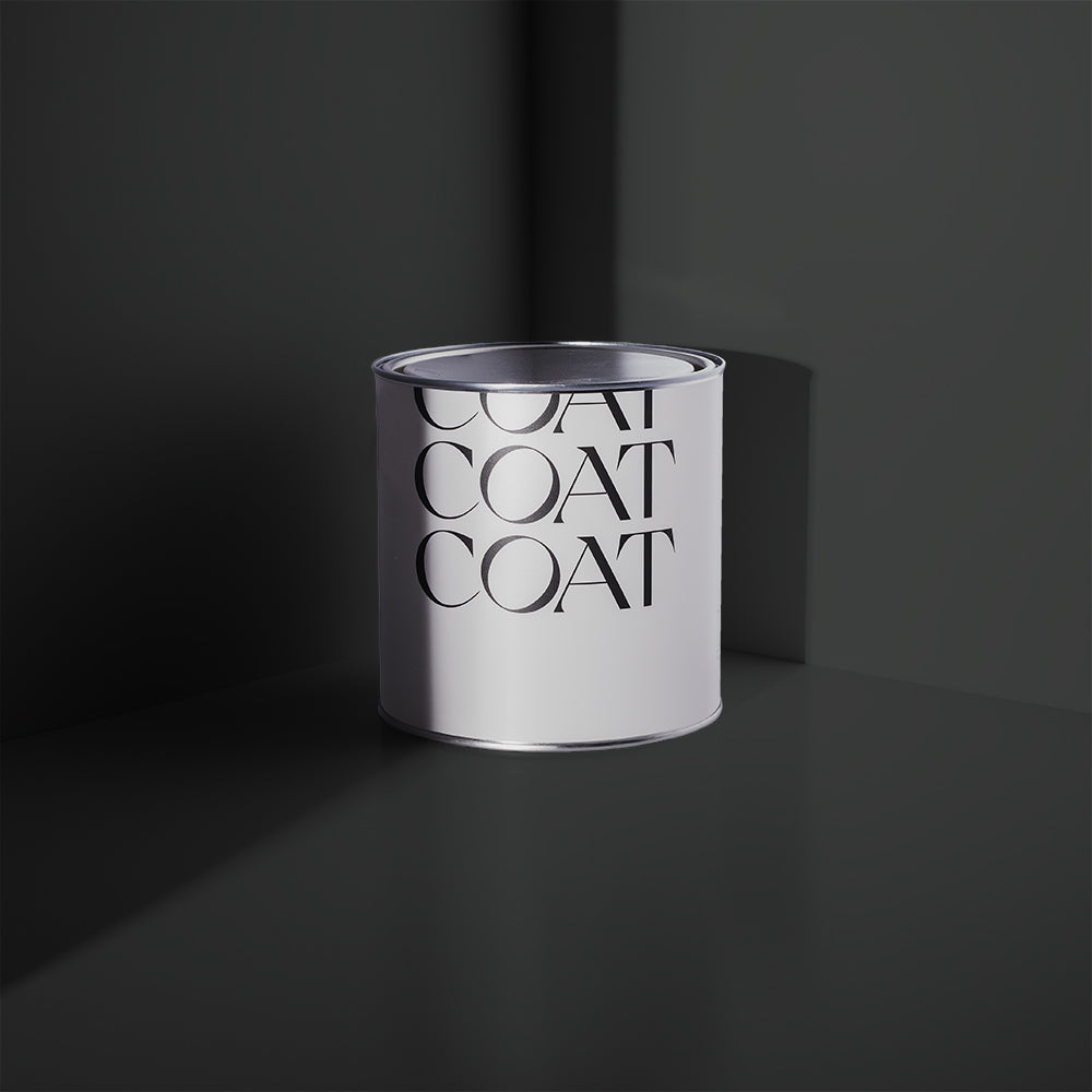
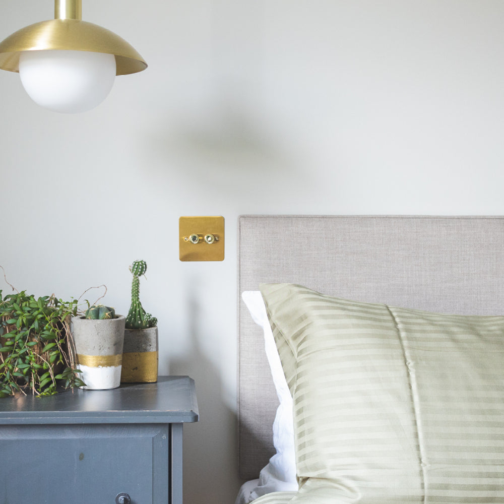
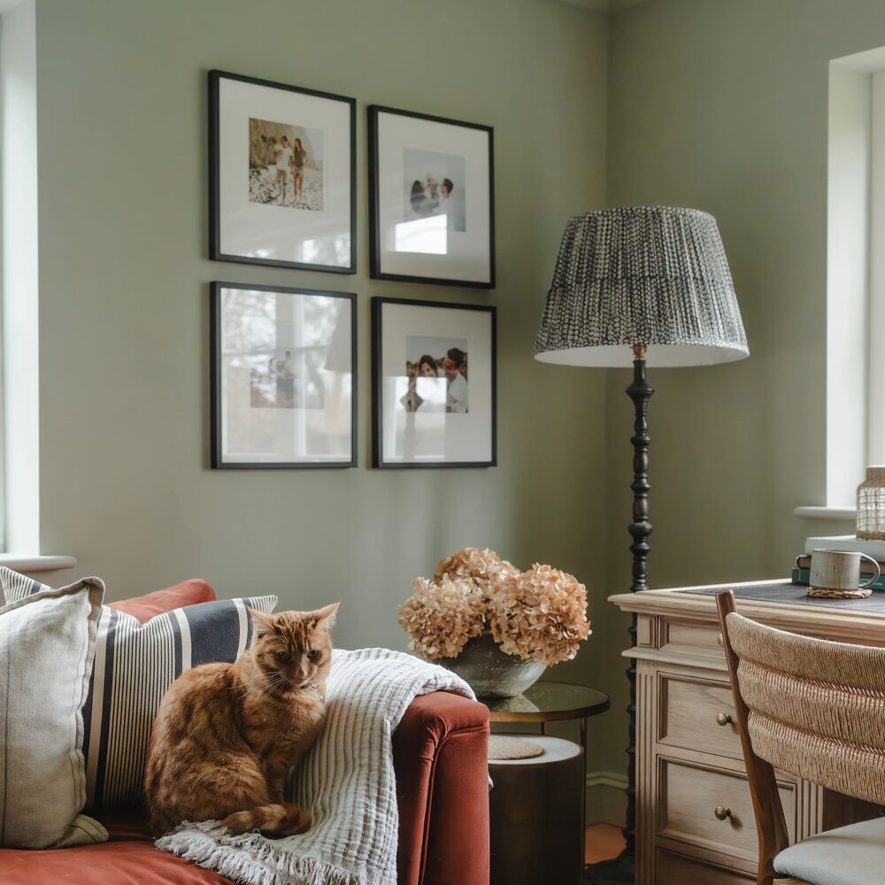
Detox is our super adaptable, gentle sage green. Inspired by nature, this reliable neutral pairs well with most colours, but it's particularly at home when cuddling up to dark accents such as black The Record Store or dark teal Adulting.
Layering Detox with other neutrals such as Low Salt or Kind Regards also works well to create a soothing aesthetic for a wonderfully restful office or bedroom.

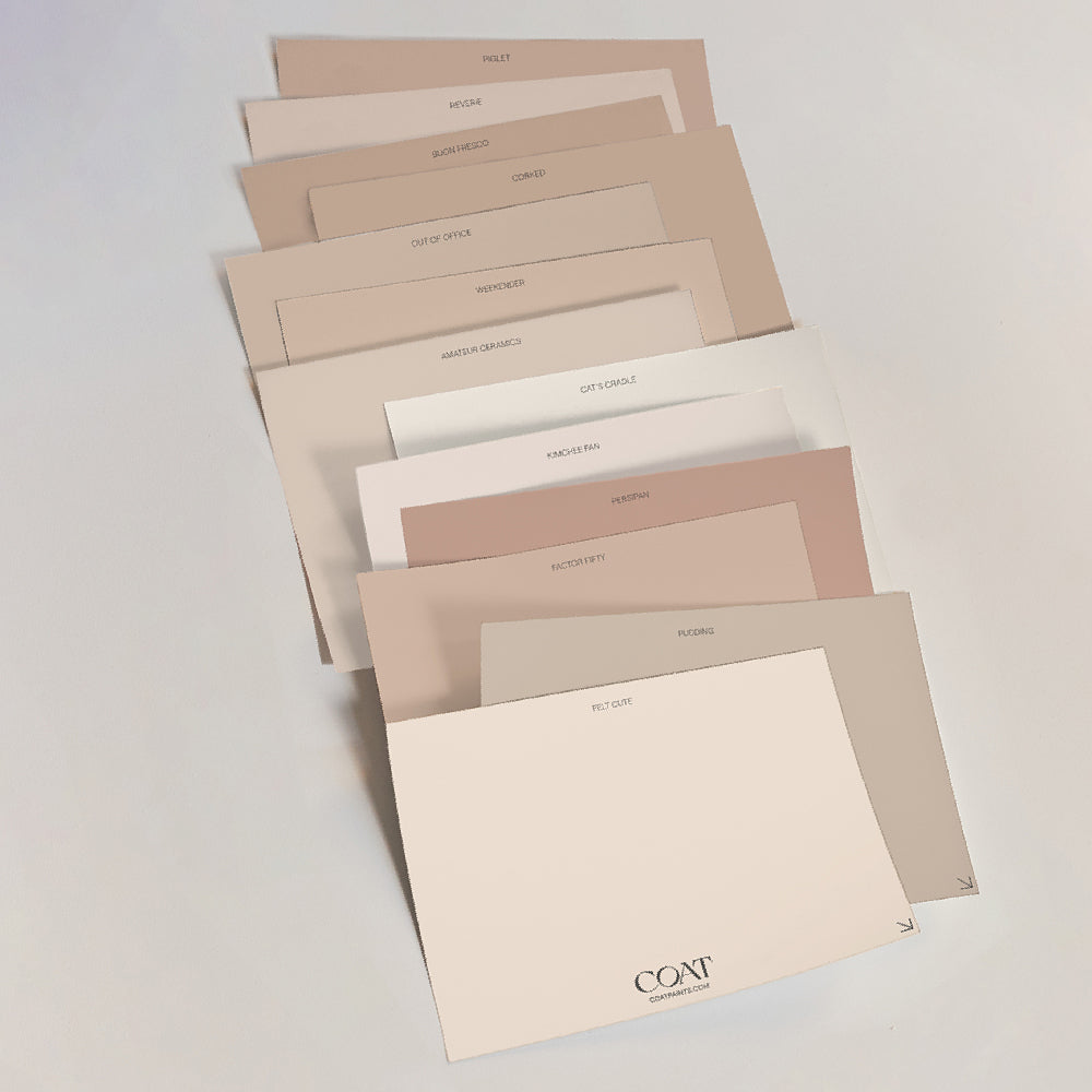
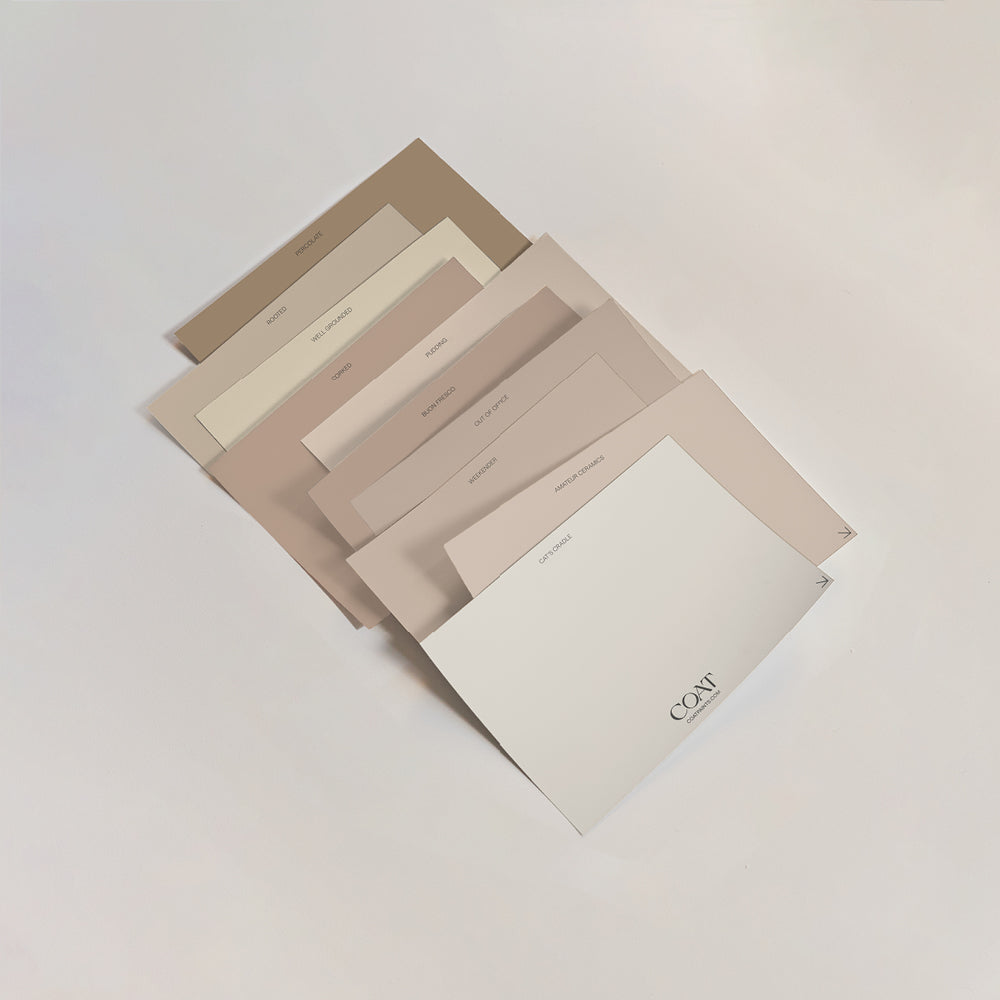
You could also team Detox with one of our pinky toned shades such as Ciao, Sofia or Pudding to create a lush sage and blush combo. A match made in heaven for a fabulously feminine bedroom scheme.
Another way to bring the blush to your boudoir is to use Detox as a backdrop for pale pink furniture and accessories. On our wish list at the mo is a scallop-edged velvet headboard. Check out Sofa.com, Swoon or Oliver Bonas for some tempting options 💕
Our new deep sage green, Park Life, is a reminder that it’s time to get back outside again. Grab your mates and some tinnies and get your chill on. Park Life is a relaxed, yet saturated green with a grey undertone, that encourages you take time, lay back and take it all in. Pair with darker woodwork in Brewer, a dramatic, dark green with a blue undertone for the ultimate green scheme.
PALE GREEN
Another great choice for a north-facing room because of its warm undertones, Home Grown is a calm and soothing pale avo colour. Pair it with Pudding or Granny Chic for a cheery neopolitan vibe, or combine it with Ditch The Tie or Nomad for some elegant, green-on-green action.
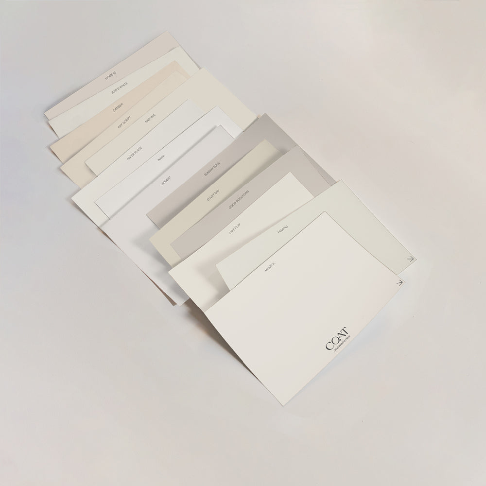
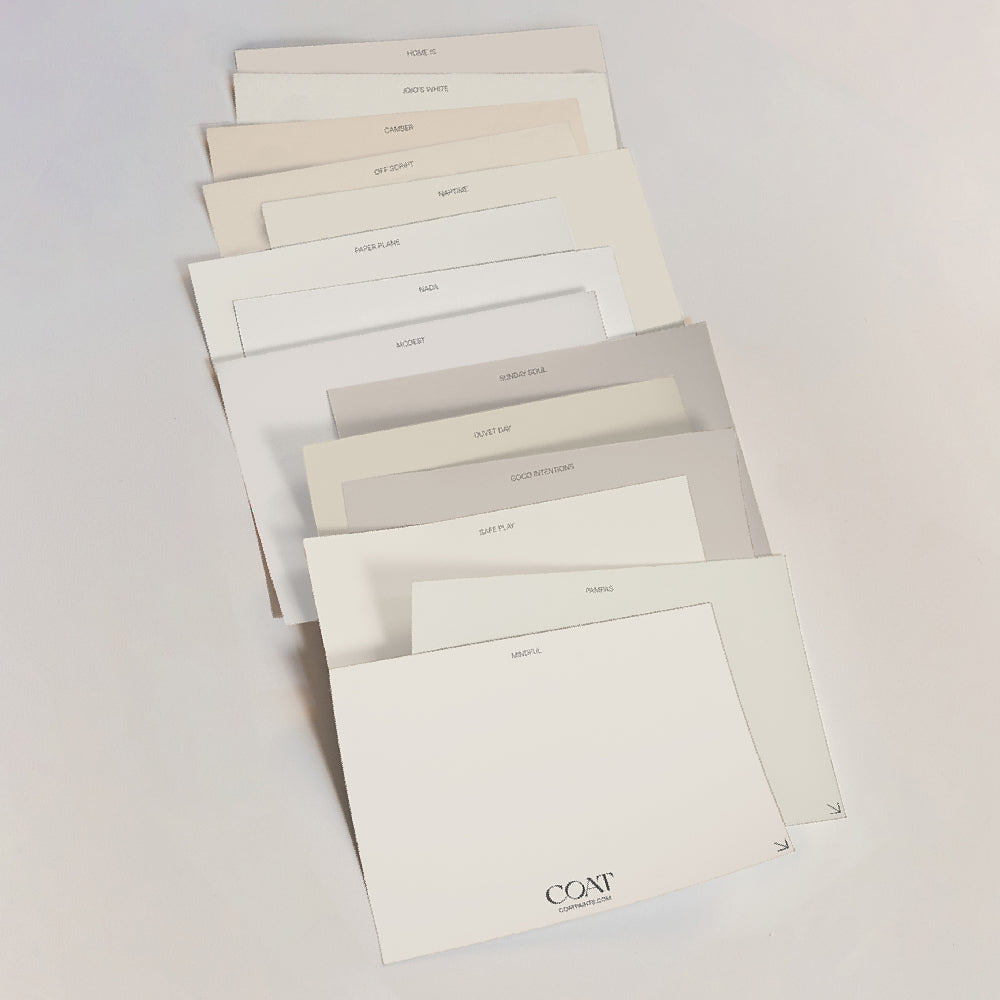
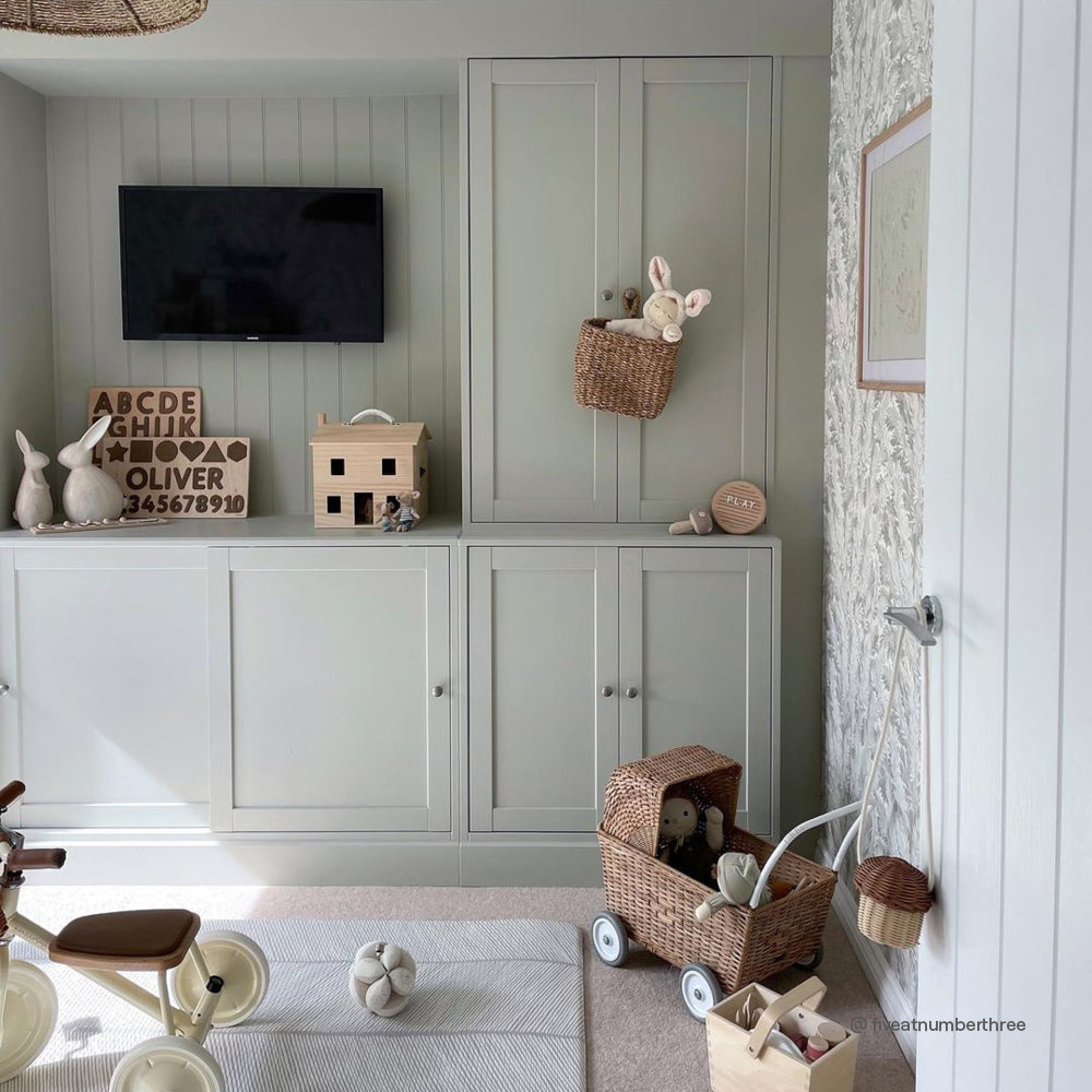
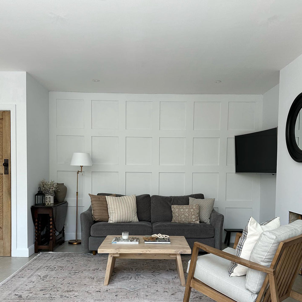
Home Grown also lends itself perfectly to panelling, as expertly demonstrated by Insta's @thenorthernhome Sarah used this shade as the star of the show when she created a gorgeous neutral nursery. She painted MDF panelling with our eggshell finish Home Grown. (Our eggshell paint is highly durable and perfect for windows, doors and any other woodwork 👍) And then she finished off the oh-so-stylish look by painting the rest of the walls with our greige off-white Mindful. A few tasteful accessories in natural textures finished off this elegant look 👌

Yard Party is a new pale, greyed green to the COAT palette. It’s giving us serious Mojito vibes. Garnish it with loads of plants for the freshest paint scheme. It also works really well with darker accents in new green grey, The Trail. This combo is perfect for creating a shadowed vibe in alcoves and built-in cabinetry.
GREY GREEN
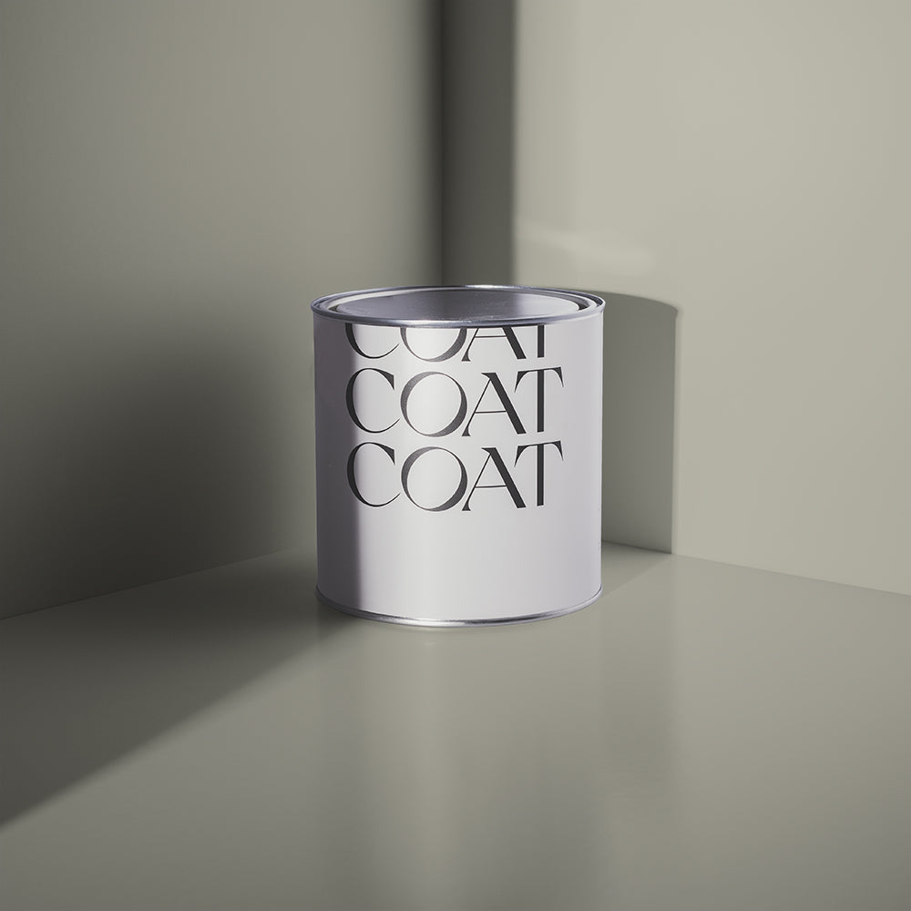
Grey-green neutrals are a bit like that favourite item in your wardrobe. They go with everything and are guaranteed to feel comfy and flattering!
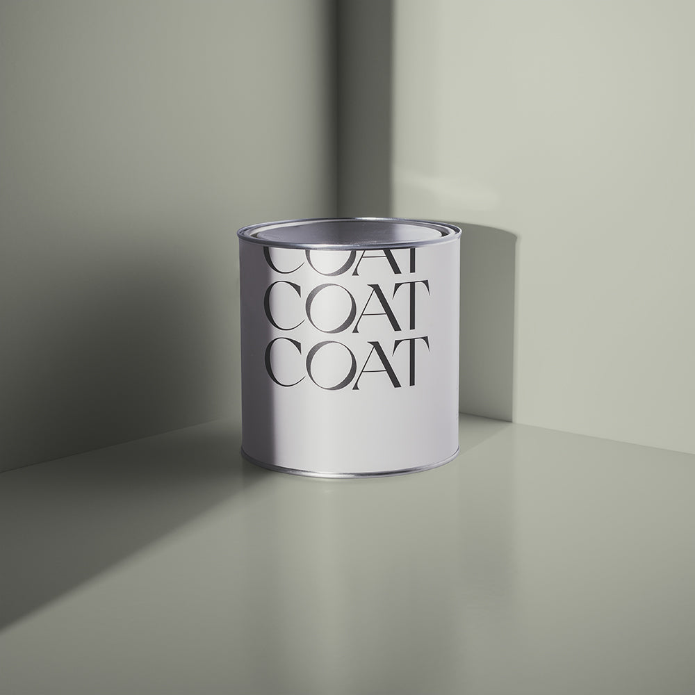
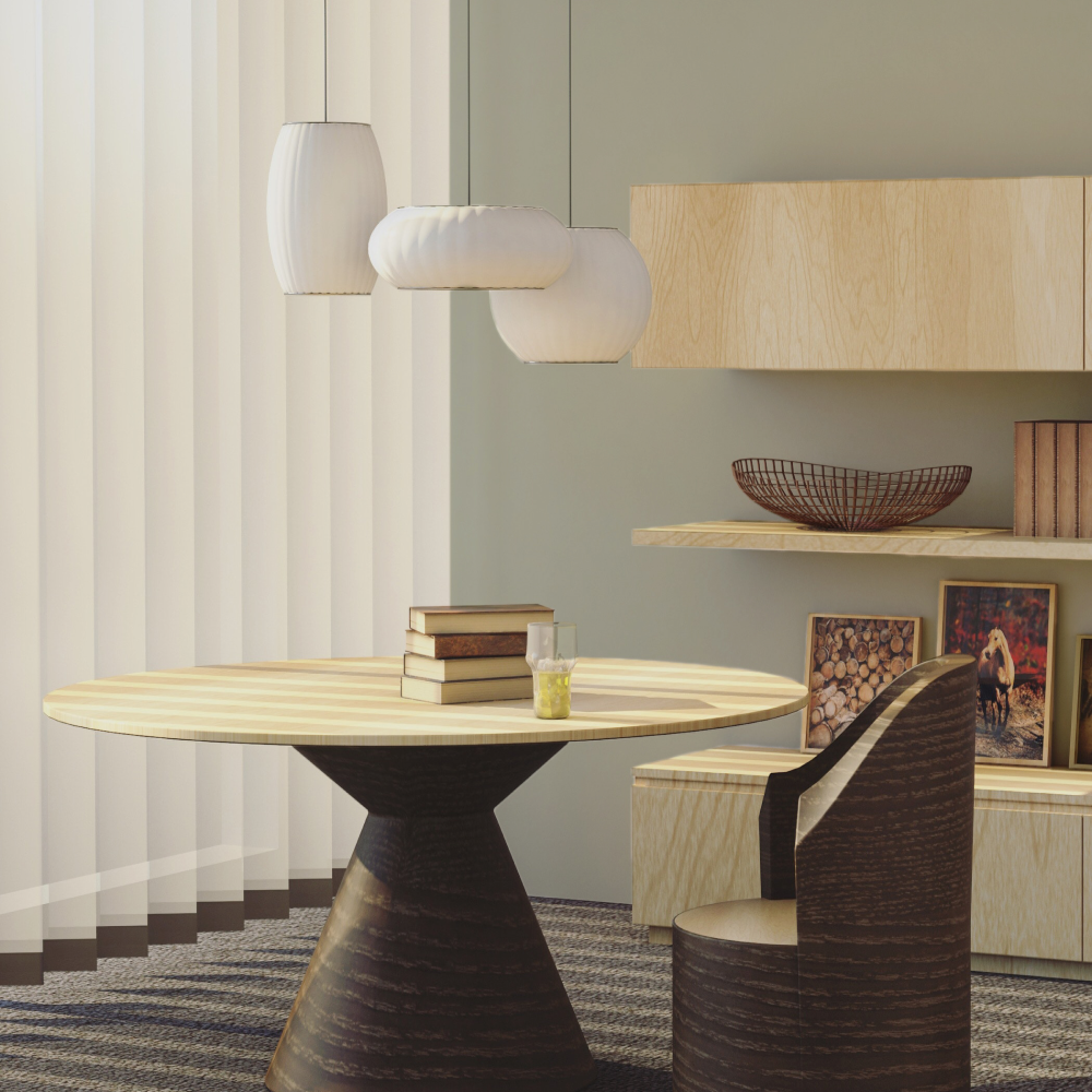
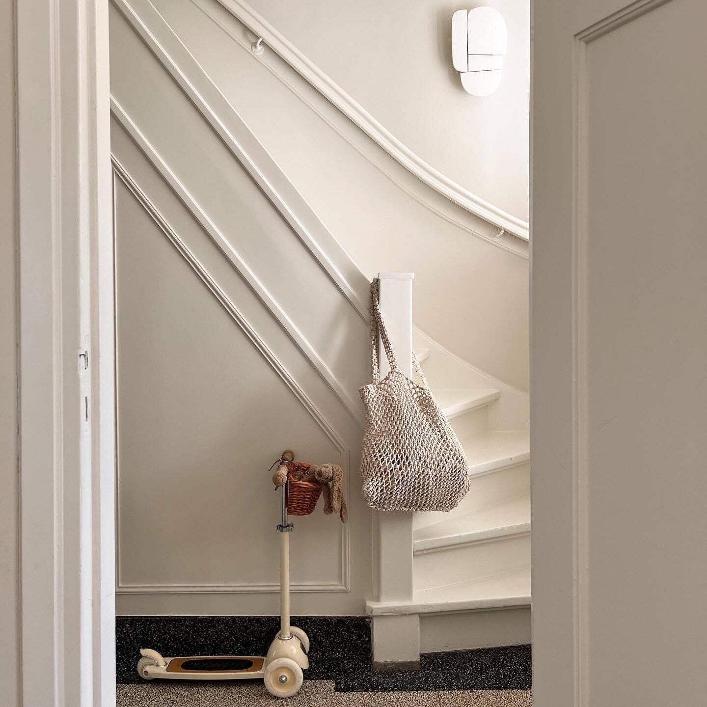
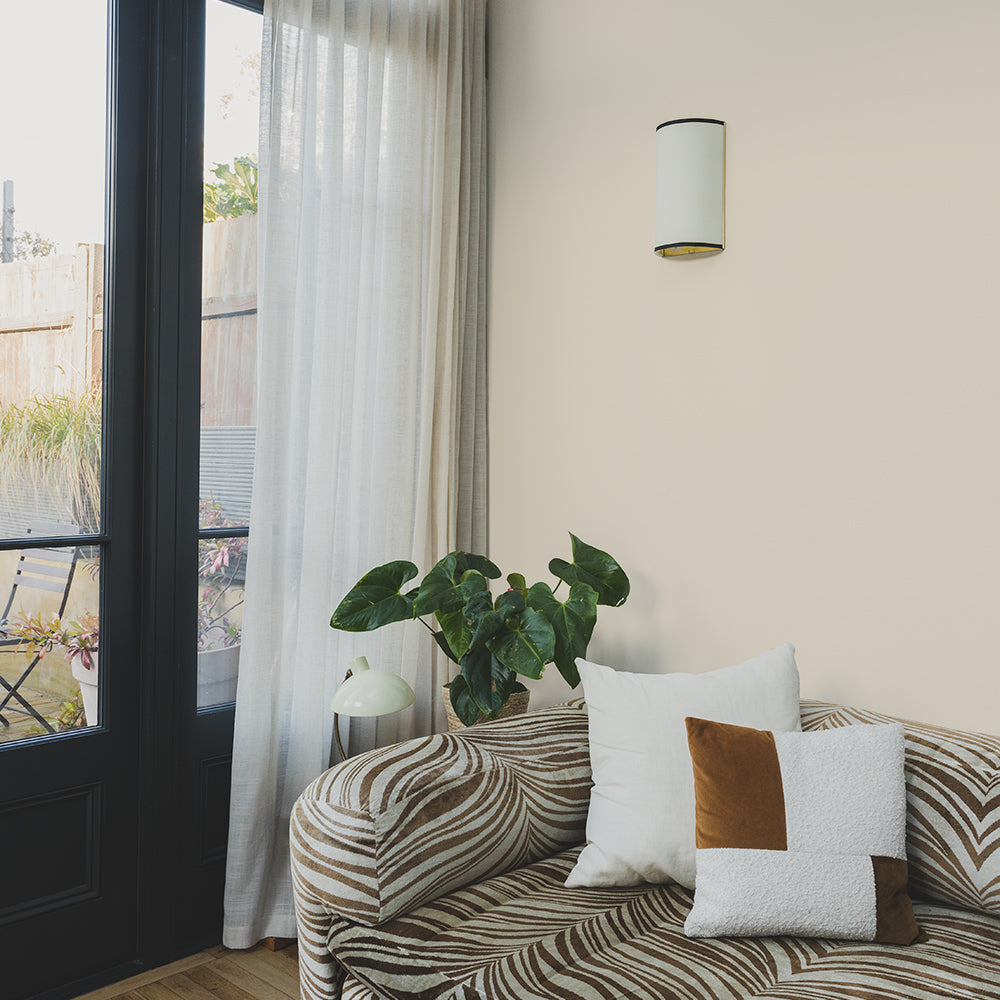
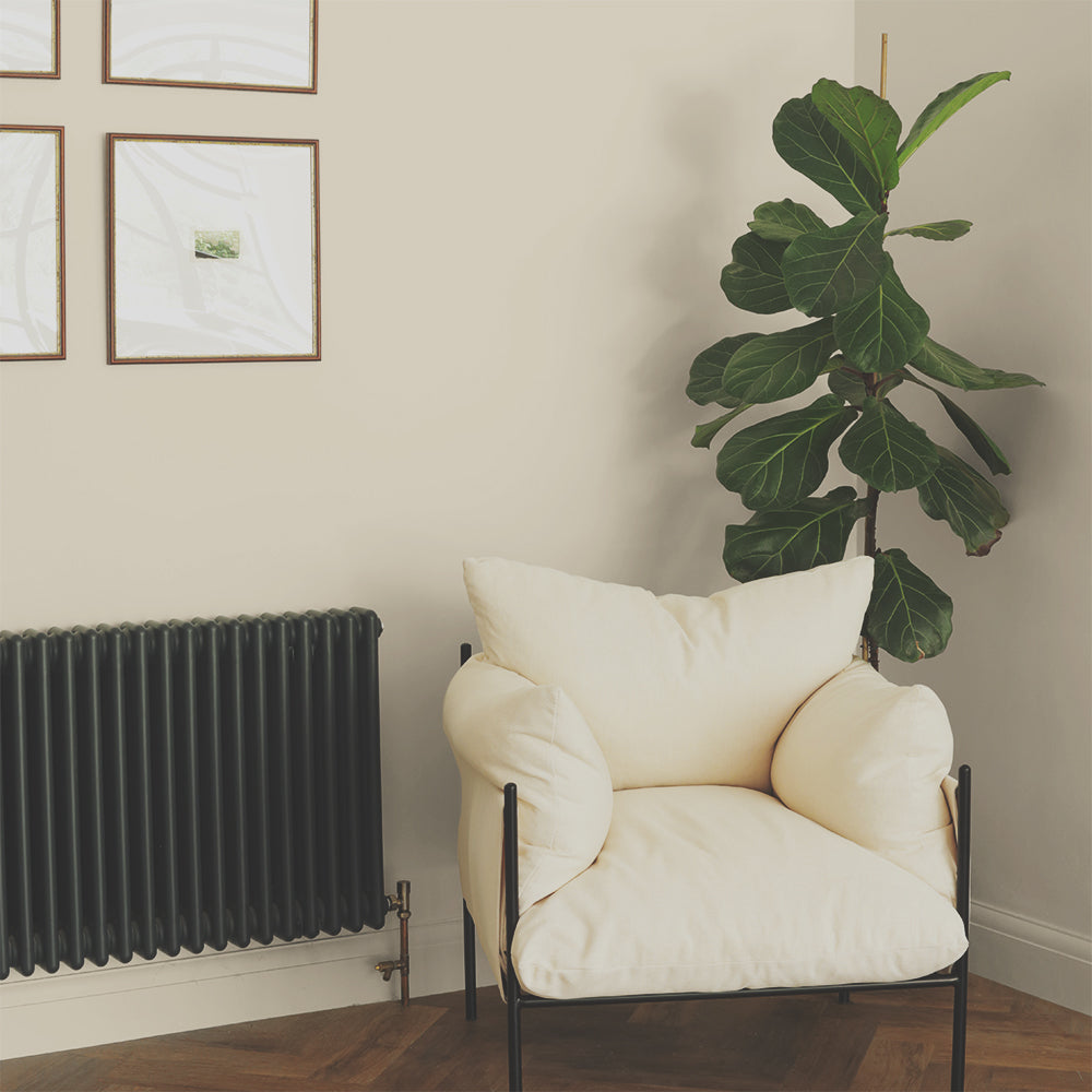
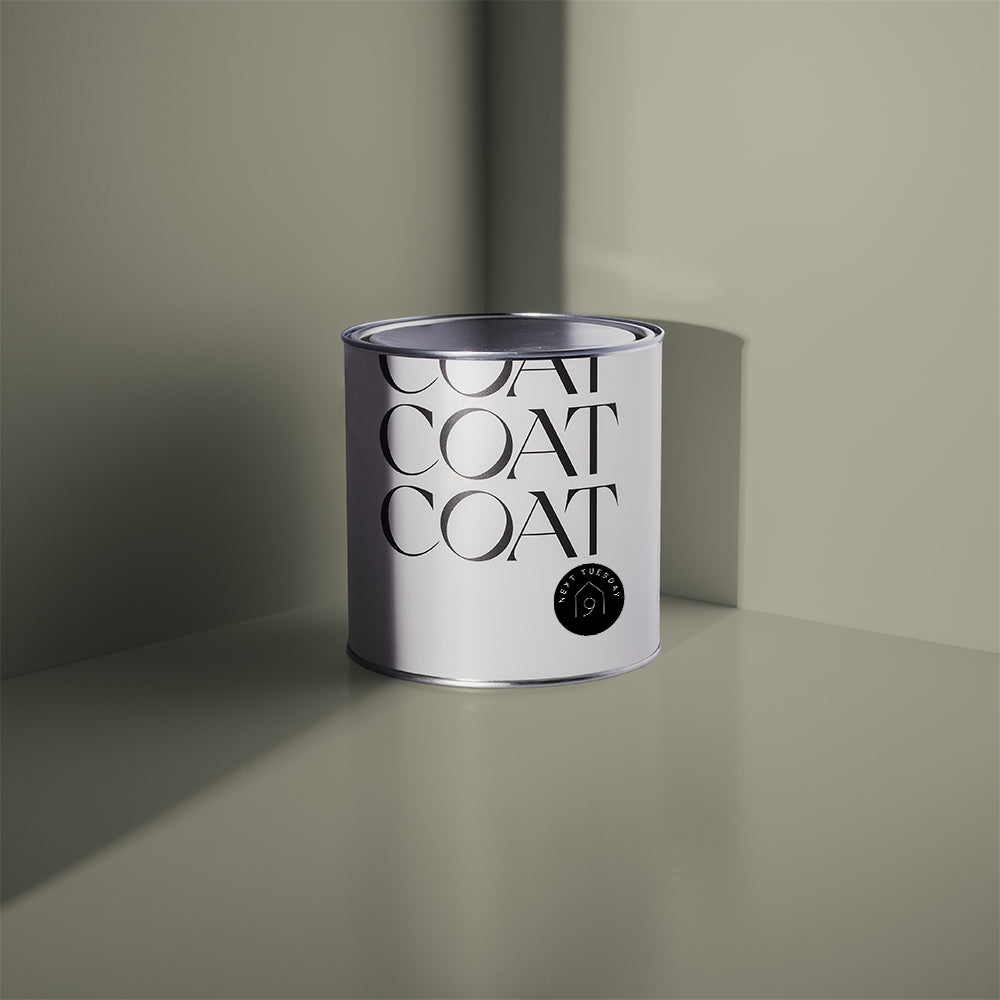
And Breathe is a great entry level green because of its subtle beigey beauty. It's the perfect way to introduce a touch of colour if you're not feeling super brave about going for it with a bolder shade. You can also layer And Breathe with other neutrals and natural textures such as pale wood and linens to create a really restful space.

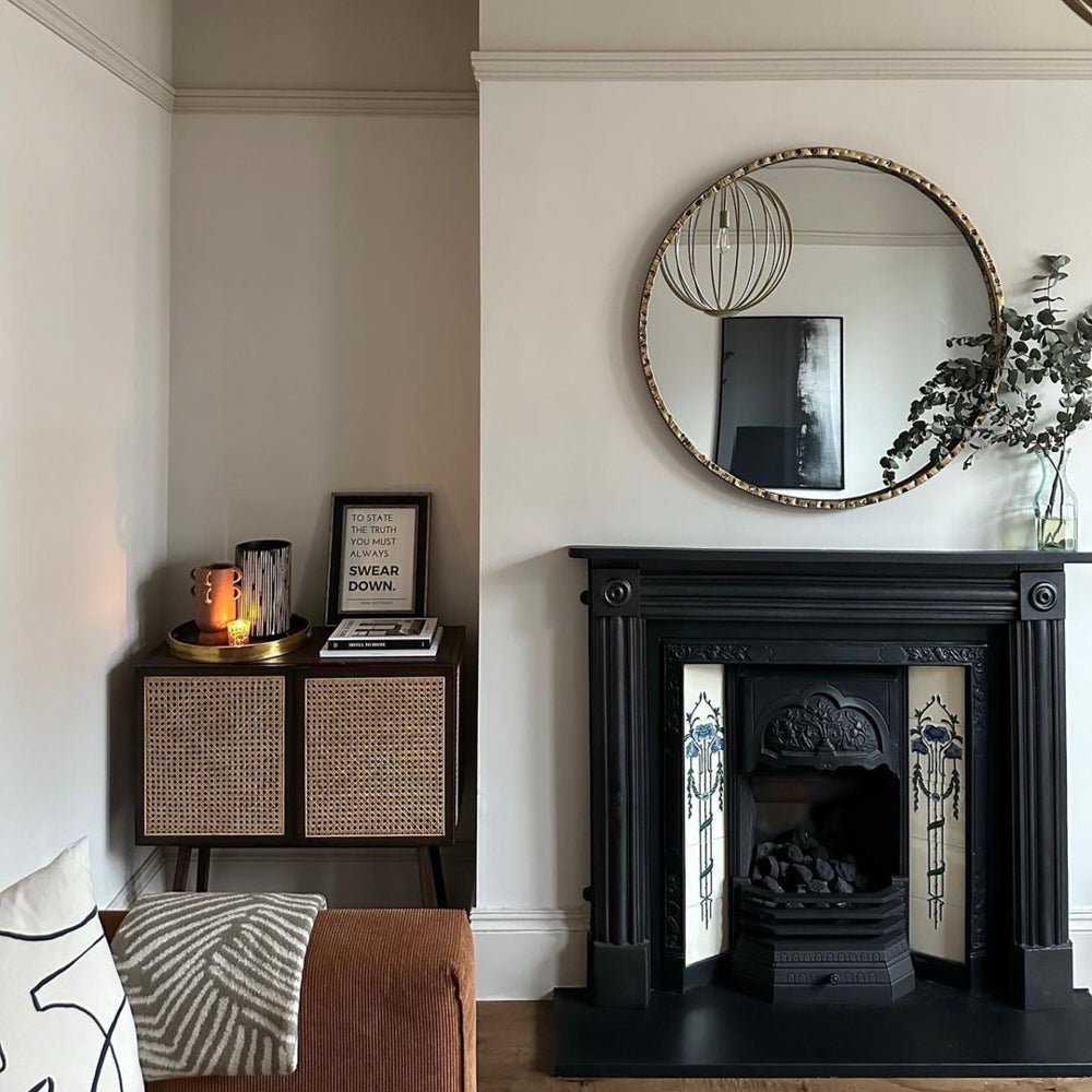
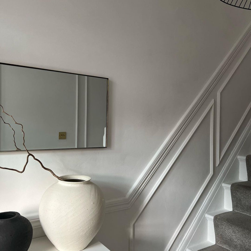
Kind Regards, with its gentle hint of green, is an even paler greige and works really well when combined with other green elements in a room to really make them pop. You could use this colour as a backdrop for dark green curtains, for example, or for an emerald green sofa, to create a really cohesive look 🙌
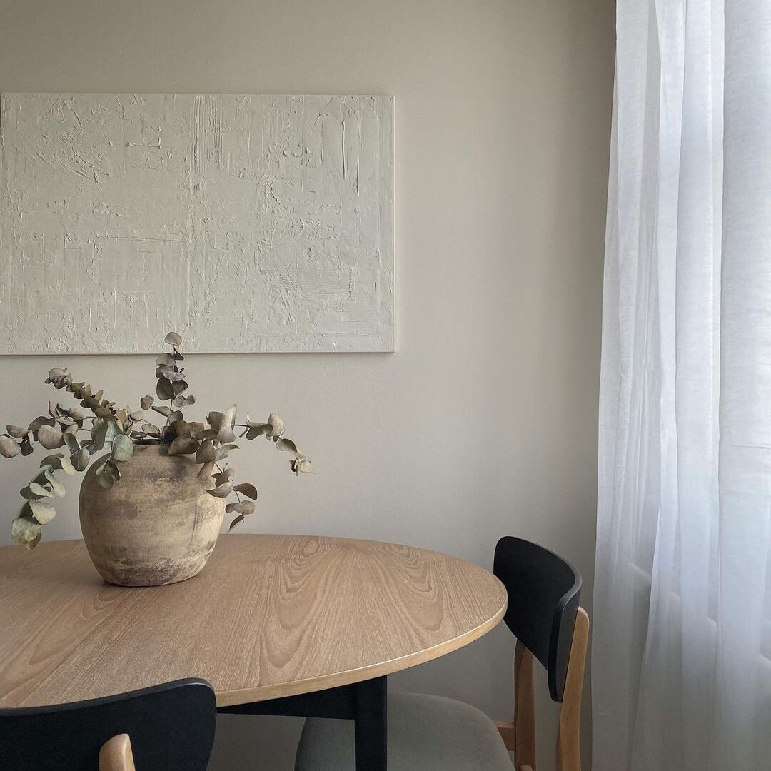
The boys at @chequerfield on Insta used Kind Regards to breathe new life into their tired dining room, teaming it with dark wood and house plants and to create a chilled out, calming vibe 🌱

And staying in our new palette, because of it’s huge popularity is August No.31 limited edition colour - Darlington, by @danlovattdesign. Bringing the heritage vibe but staying bang on trend, Darlington is great in the daylight, and cosy in the evening. With definite Bridgerton vibes, we're pinning it as the new 'Ton' in town.
Pro Tip: Pair a subtle grey green with black accents to nail the Japandi trend which is all about a streamlined, monochrome look. We recommend a striking combo of And Breathe and The Record Store
Green with envy and ready to get going? Find your perfect green paint now over in the store.
Publish Date
Author








Leave a comment