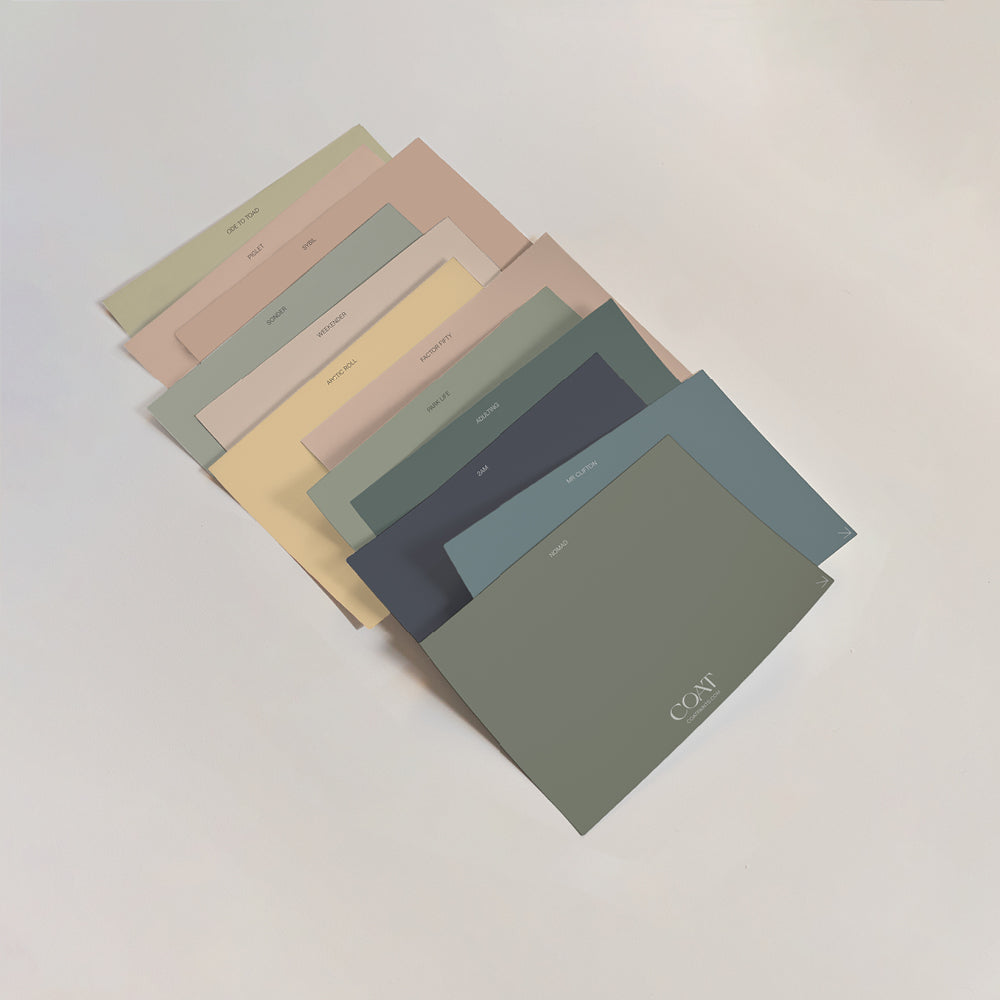
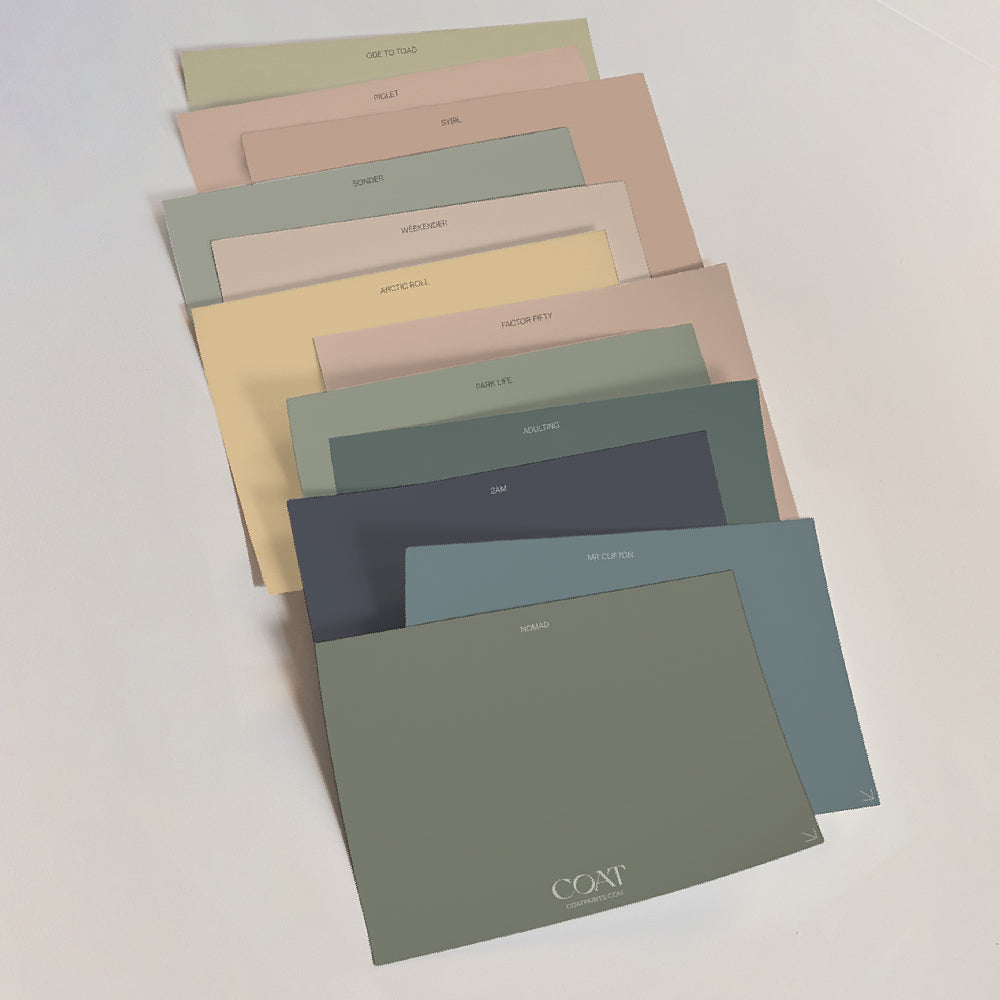
Best Taupe Paint For Interior Walls - Getting It Right
There are tons of options when it comes to taupe paint ideas for your home. The best taupe paint will create a warm backdrop to your interiors. Taupes have brown undertones, so carefully considering the direction of the room is important when using them.
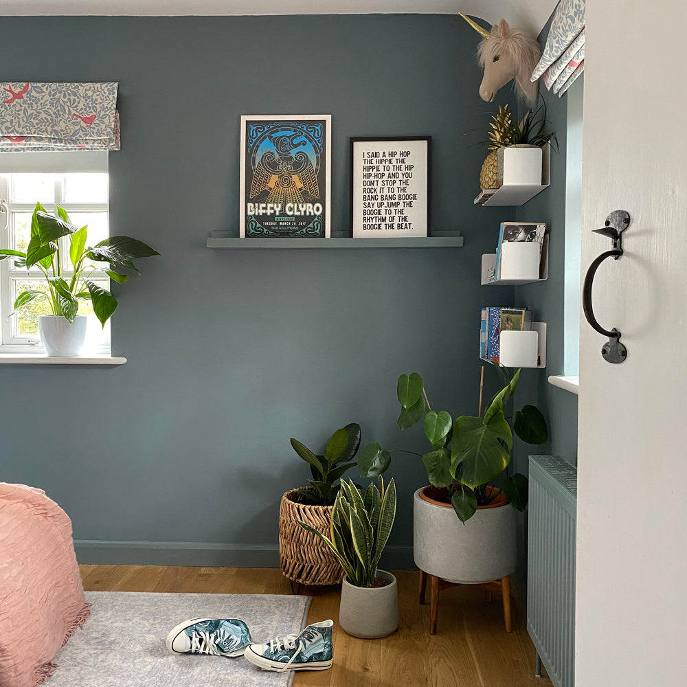
South and West facing spaces tend to be brighter and have more yellow light and so are great with deeper taupe colours. On the other hand, their brown undertone can be exaggerated in East facing spaces, due to the light being a little greener, so in these rooms it’s better to go for paler taupes.
Similarly, North facing spaces never really benefit from direct light, so naturally they appear more grey or blue in tone. For these rooms, avoiding taupes with greyer undertones is a better idea, turning to paler, warm taupes is usually the way to go.

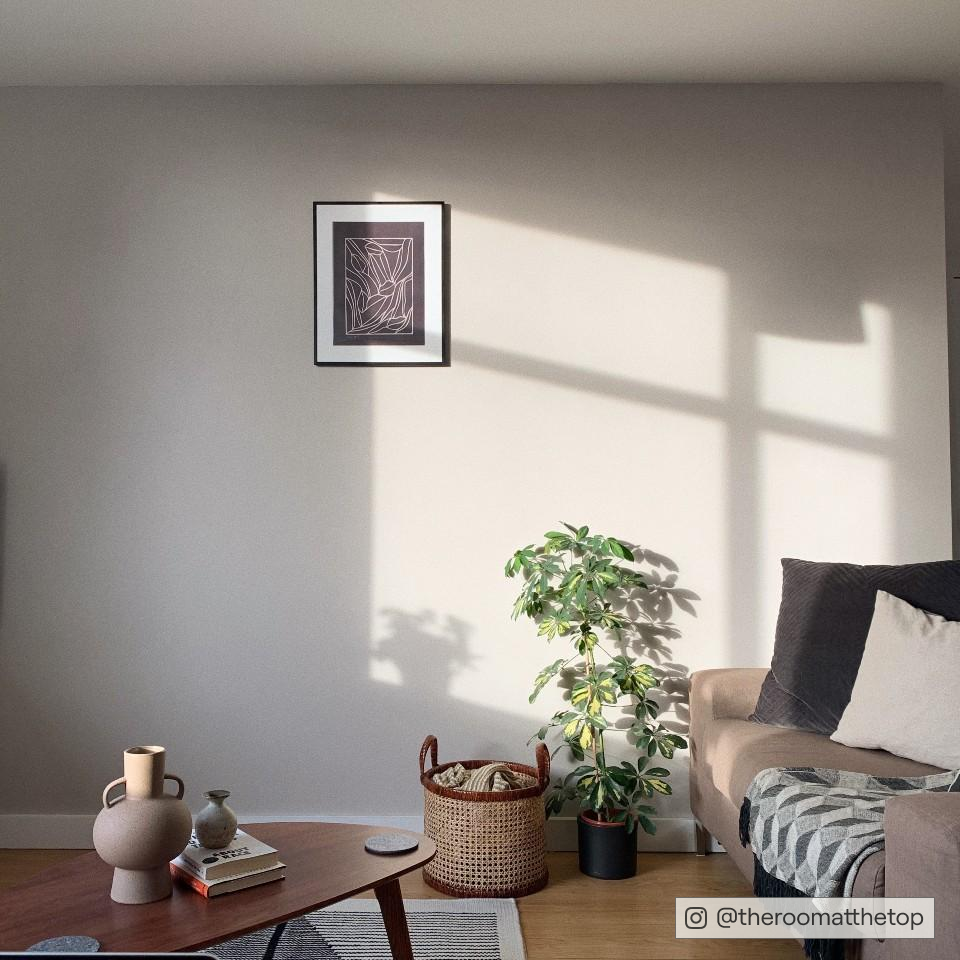
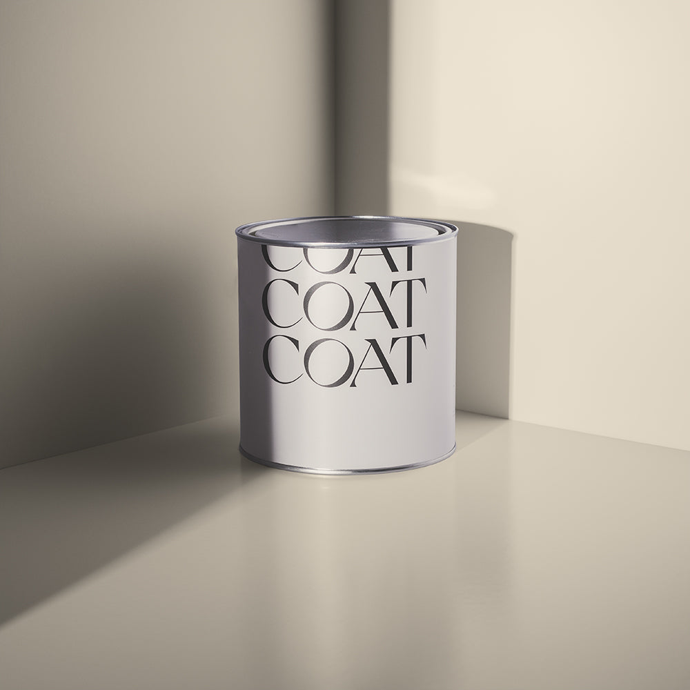
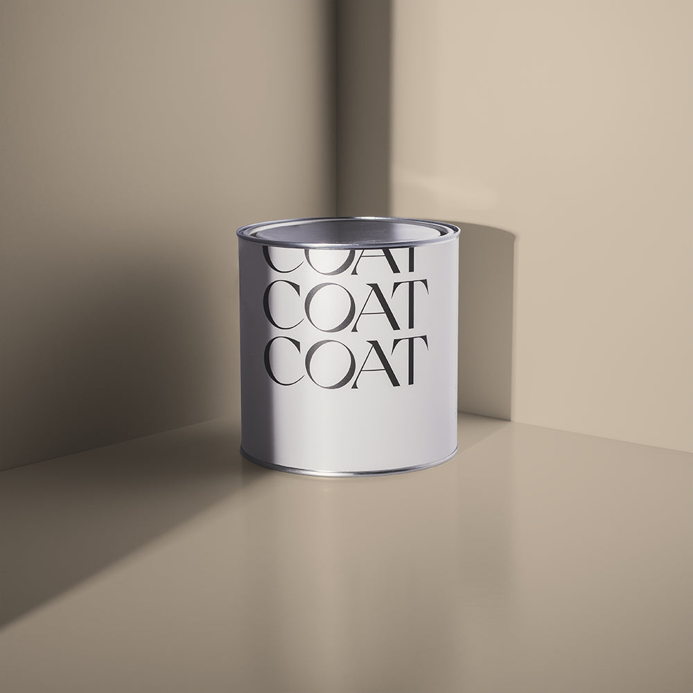
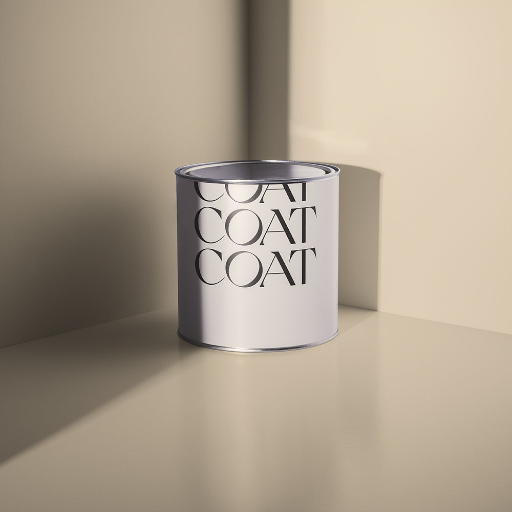
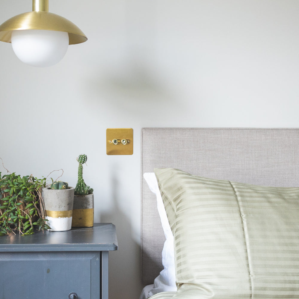
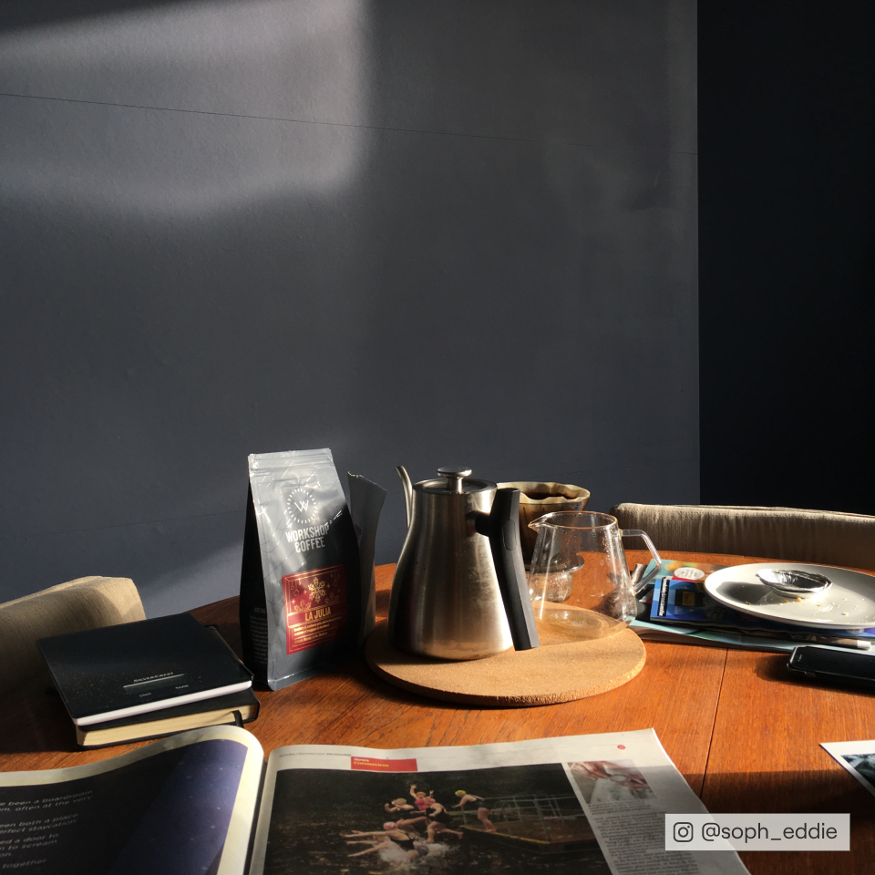
@aroomatthetop keeping it neutral with our OG greige, 'Sunday Soul'.
Key to taupe colour schemes is how they are paired with other materials, which will help determine the aesthetic that you create. For a luxe aesthetic use dark woods like walnut and wenge for flooring and furniture, brass accents and warm, off-white bouclé furniture. If you’re looking to create a more retro 70’s vibe, use vintage teak furniture, leathers and artwork, graphic fabrics and knick-knacks with rust, turquoise and warm white accents.
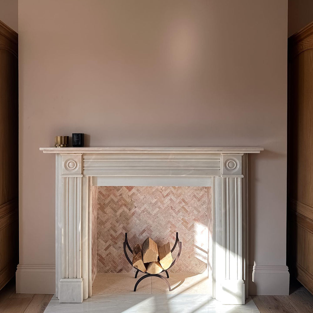
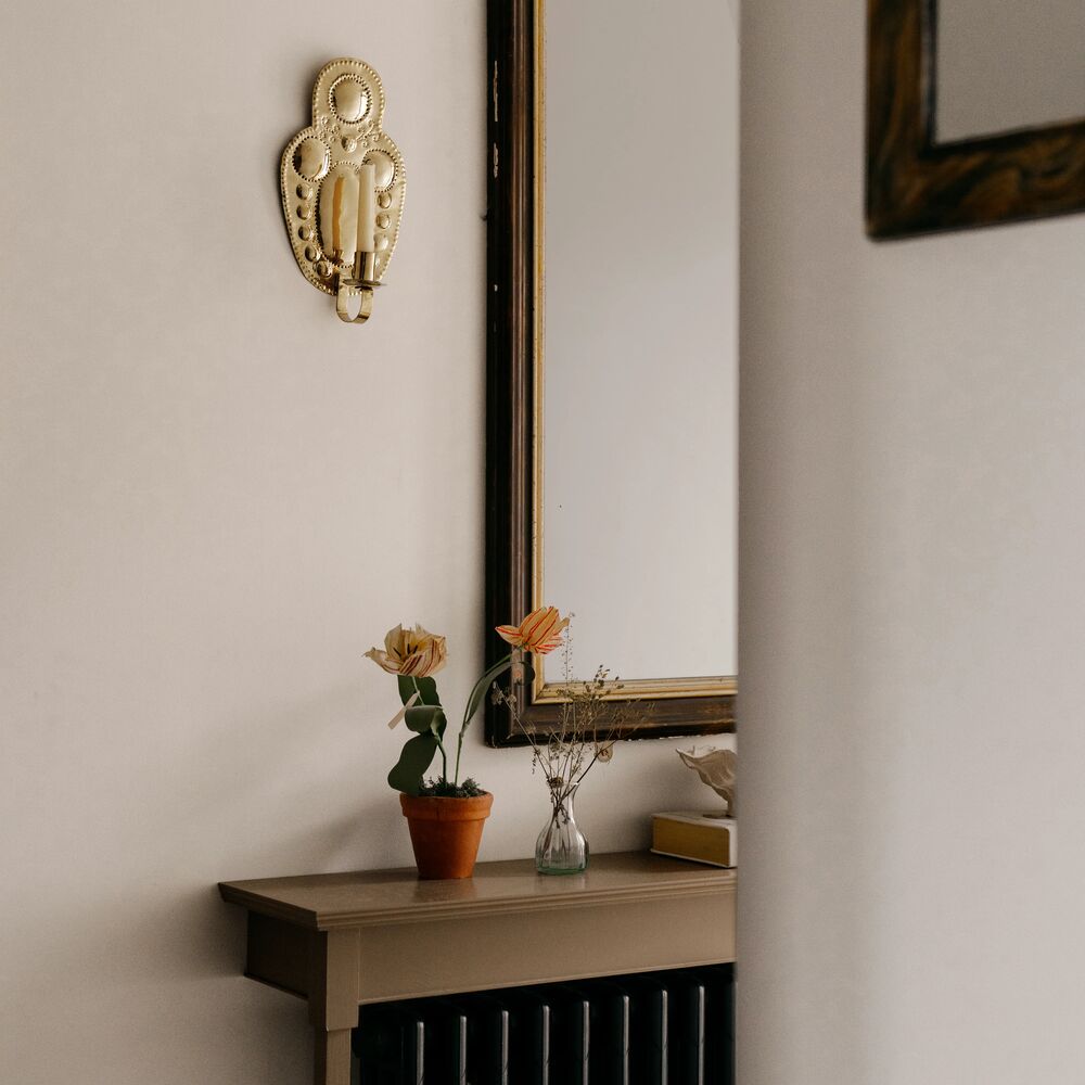
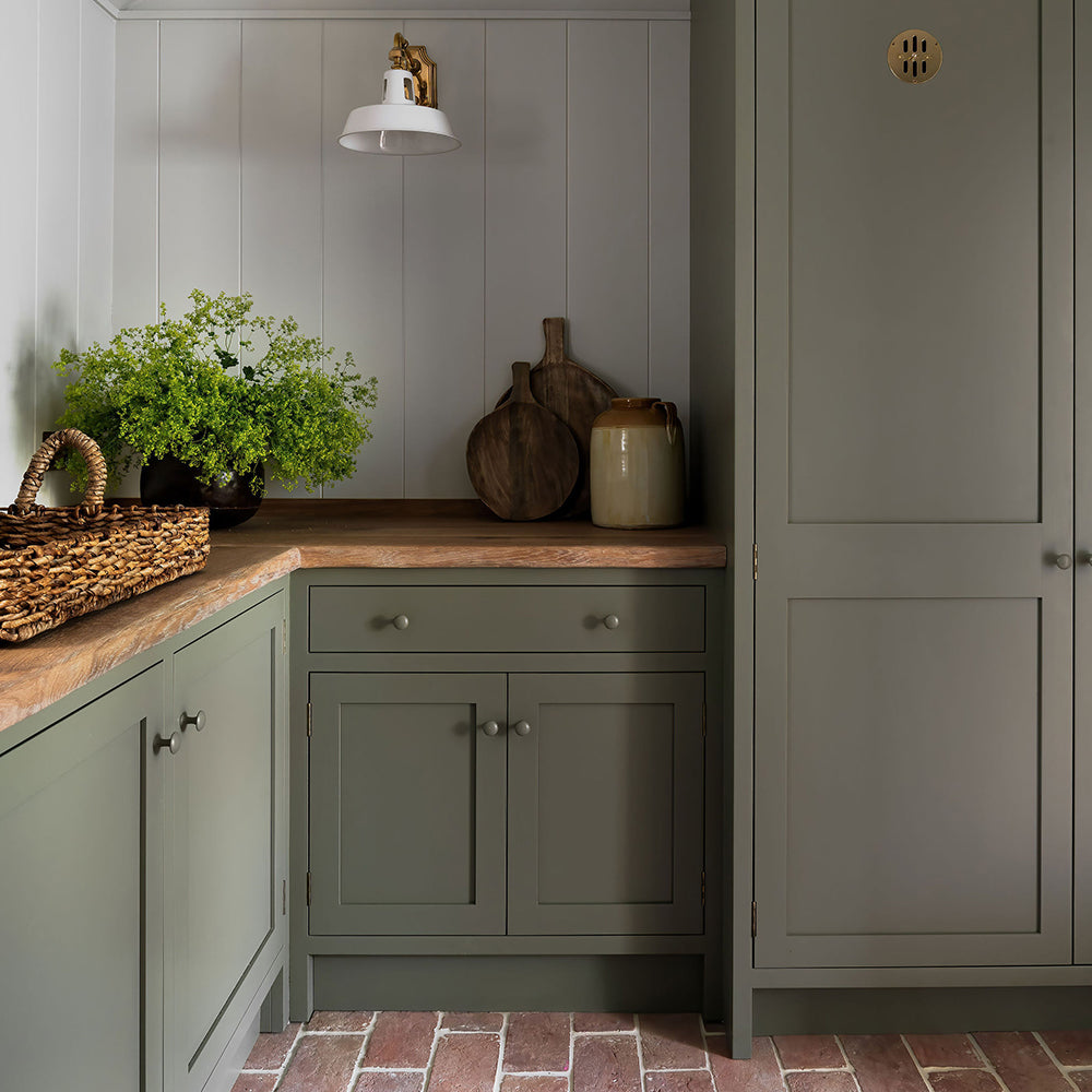
The best taupe paint also works great as a backdrop in Victorian properties, as these spaces were designed with drab colour tones in mind. Think grubby brown reds, earthy neutrals and whites with warm undertones for ceilings and skirting.
Want to find out more about how light affects colour? Read our guide here.
Pale Taupe
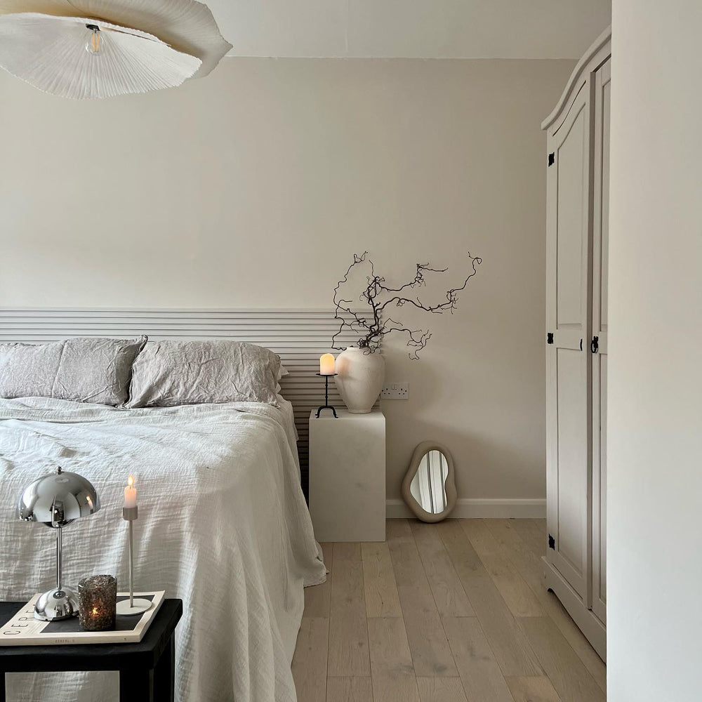
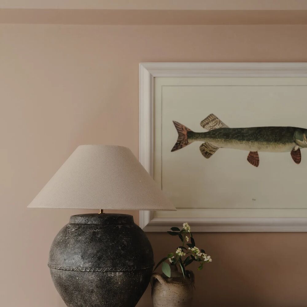
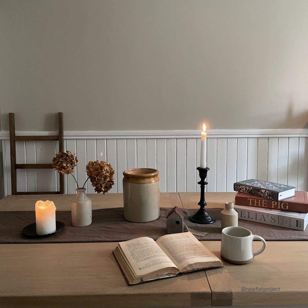
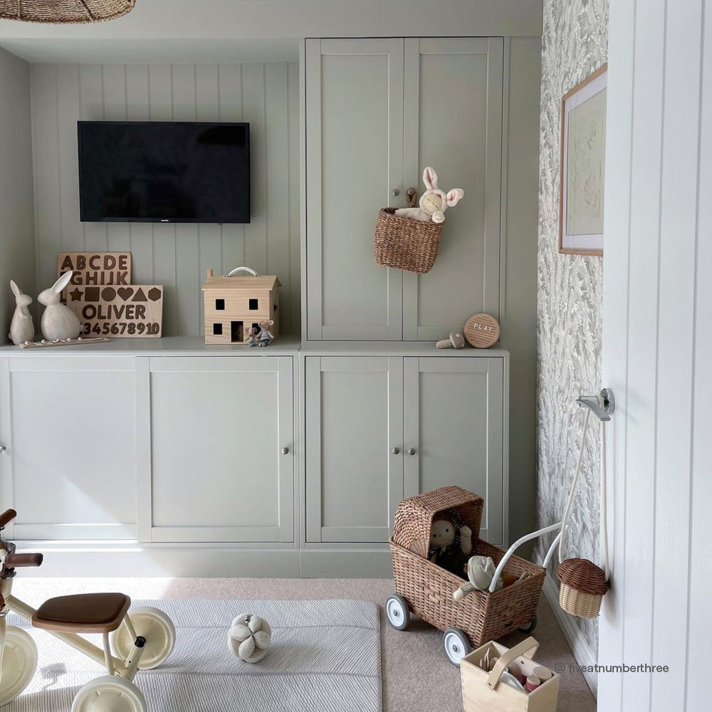
The best taupe for DIY is usually quite pale. They’re warm and inviting but easy to choose because they don’t look too imposing. Mindful is COAT’s answer to pale taupe that isn’t too greyed, making it perfect for those East and North facing rooms, with their cooler lighting conditions. Use this pale taupe colour for walls, and to make it look even brighter paint your skirting boards and door architraves darker.
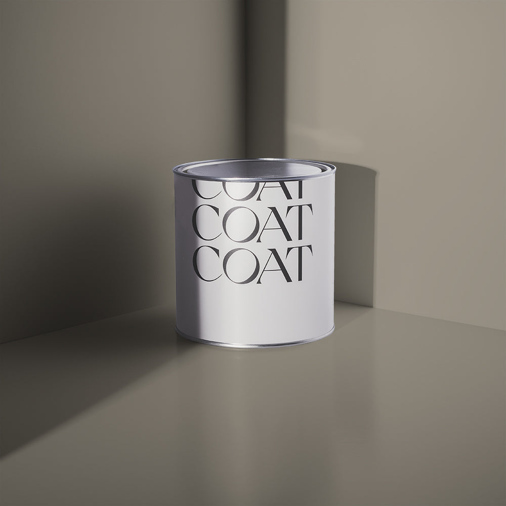
Sunday Soul makes a great accomplice in creating a complimentary taupe scheme. For those of you looking for some adventure, try Darlington, a grubby green co-created with interiors rising star, Dan Lovatt. These smaller proportions of darker colours actually make the wall colour look even more airy.

Honestly? We're obsessed. 'Darlington' and 'Mindful' creating magic in @joeykendalbrown living room.
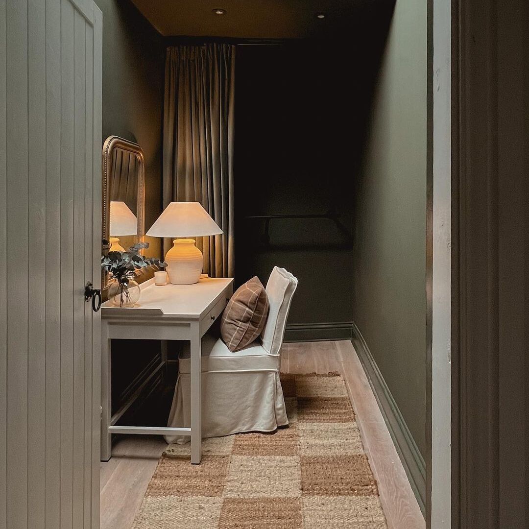
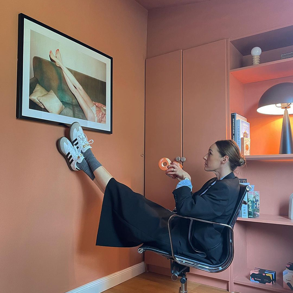
Home offices are particularly difficult rooms to decorate, the colour you choose should reduce visual glare. Creating a restful backdrop for your eyes in spaces you spend a large part of your day in is very important. Colours like Good Intentions are perfect for this. A pale, slightly greyed taupe, this colours warm undertone makes it enticing, and because it is neither vibrant nor dark makes it an optimum taupe colour for walls in offices.
Pair with natural materials, black and brass accents to create depth and added warmth. Note the Pampas grass in the corner of @thenorthernhome’s home office, which makes Good Intentions look less yellow in this bright room.
Need to figure out your light situ? Good job our 'Peel and Stick' Swatches move around with no mess and no fuss 😉. Play with one!

Still working from home? This is the inspiration you needed. Keeping that neutral and focused vibe with 'Good Intentions'. Credits to @thenorthernhome.
Grey Taupe
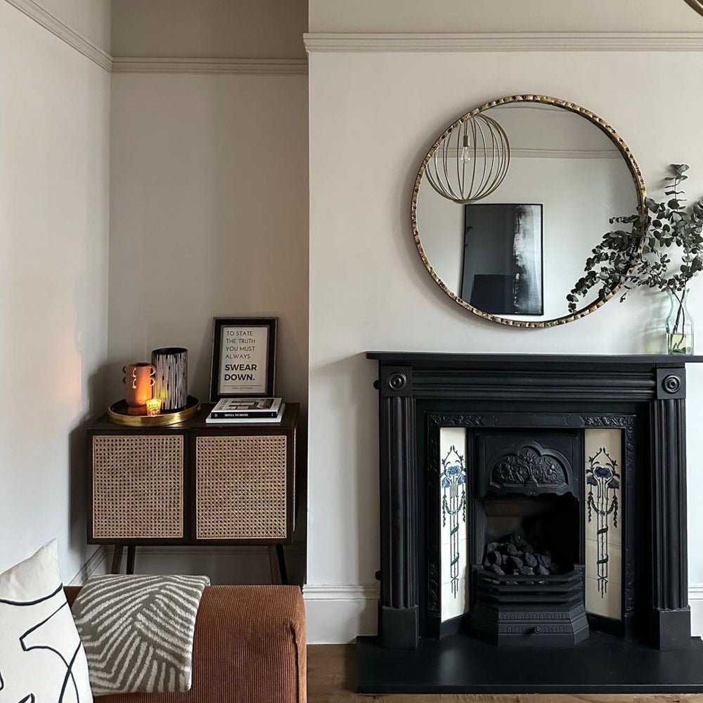
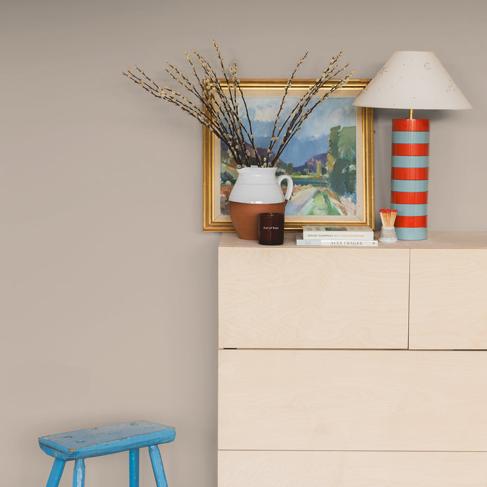
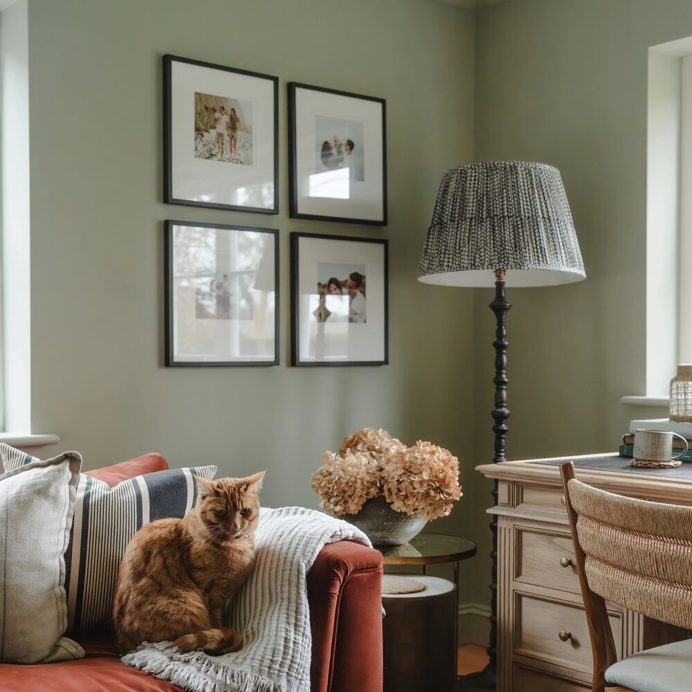
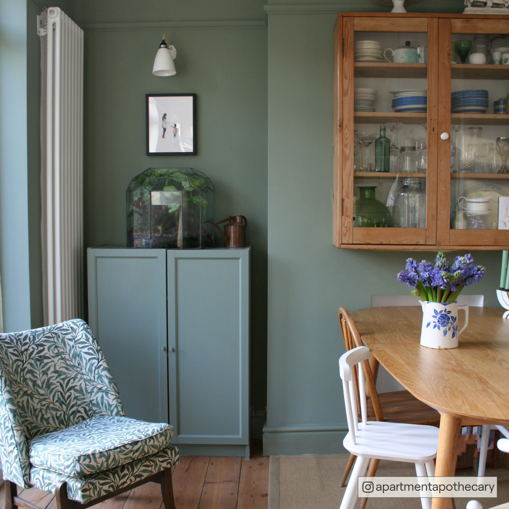
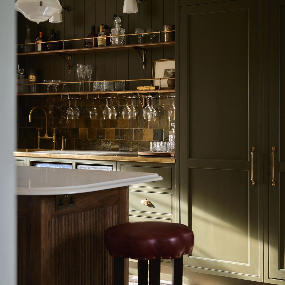
Grey taupes are perfect for brighter spaces, creating a deep, welcoming warmth. Use Sunday Soul for living rooms that you use mostly in the evening to provide an inviting, relaxed vibe. This grey taupe is relaxed, providing a perfect retreat for wine and cheese evenings with friends. Sunday Soul is the ideal taupe for more luxurious schemes, with walnut or wenge furniture and flooring, brown cushions, and artwork with dark wood frames.
It’s also a great accent for more Japandi inspired schemes like, with lots of natural materials. Use Pale taupe, Mindful, on the walls and woodwork in Sunday Soul for a more Japandi inspired scheme that is uplifting and goes with most natural materials.
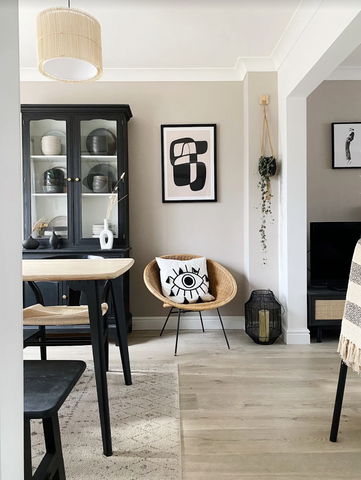
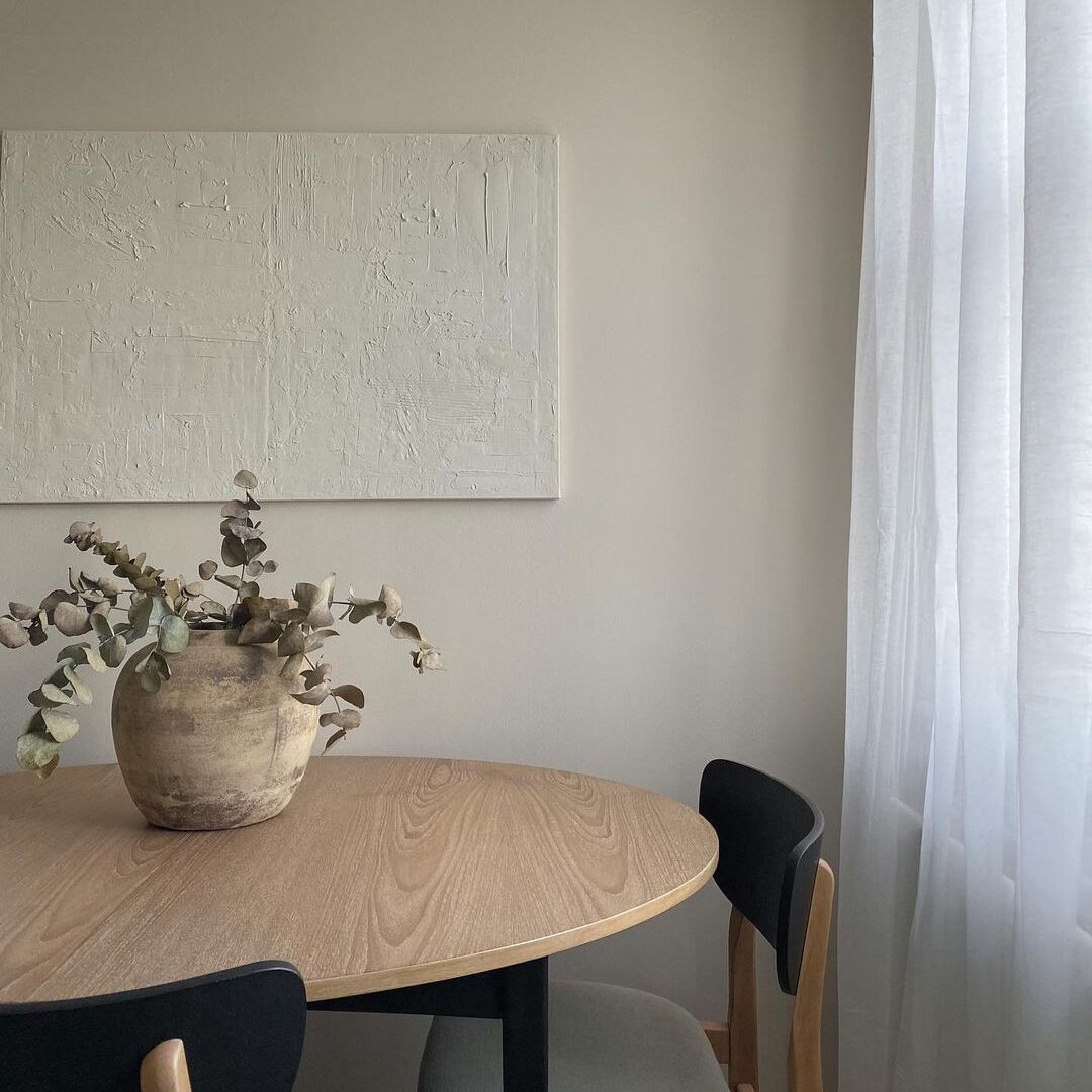
That japandi trend isn't going anywhere anytime soon. 'Sunday Soul' is the perfect backdrop for this minimalist vibe. Credit: @my_grey_place.
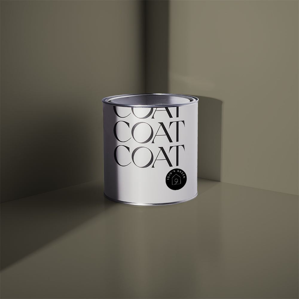
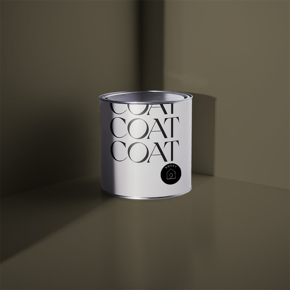
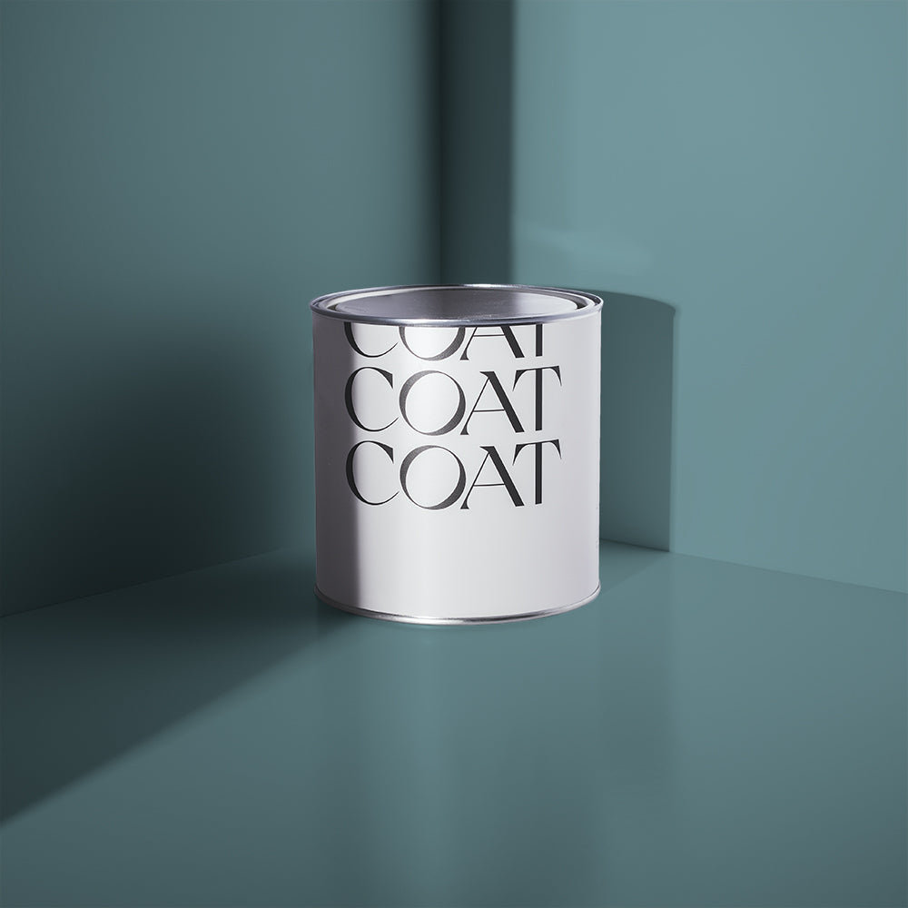
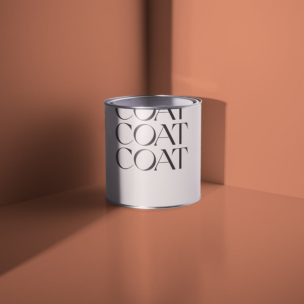
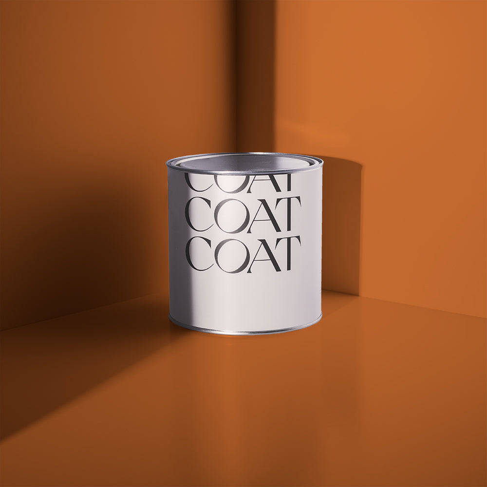
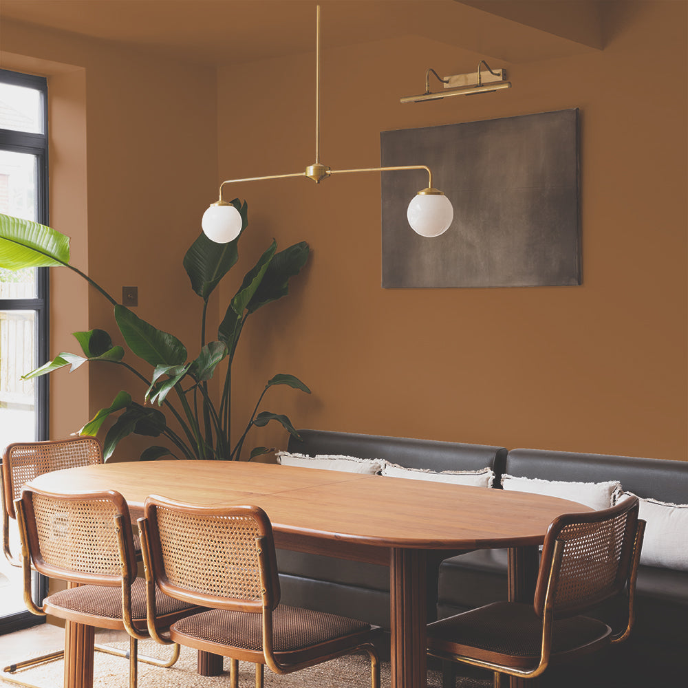
Cold Brew is COAT’s newest taupe. Deep, warm and inviting, it has coffee and grey undertones. Cold Brew is the darkest taupe in our palette, it’s the perfect colour for inbuilt cabinetry in brighter schemes, where it will add depth and interest. It’s also a fab wall colour when combined with woodwork and ceilings in Good Intentions, which will behave like a softened white, creating a cocooning effect.
Use rich velvets in hotter colours like red or maroon, compliment with dark wood furniture, and frame pictures in black frames. Use this scheme in north facing Victorian living rooms, where it will be a modern reinvention of a colour palette, which would traditionally incorporate more dramatic colours and more drab off-whites.

It's our newest taupe here. 'Cold Brew', deep, warm and inviting. Tick Tick Tick. Credits: @raisingtheregans
Colours To Compliment Your Taupe Paint
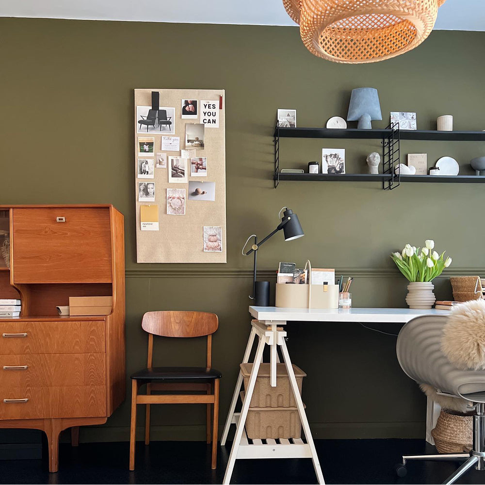
Taupe paint is the ultimate warm neutral, it’s super flattering for most properties, but also works great with other colours because of their earthy undertones. For paler taupes, like Mindful and Good Intentions, compliment these colours with darker greens that have warm undertones like Darlington. This traditional, grubby grey green has a yellow undertone that matches the warmth of these paler taupes. Use Darlington as a feature wall, or as the bottom half of your hallway, with your pale taupe above.

'Darlington', that grubby green that's got you all fallin' in love. Credits: @joeykendalbrown
Aged reds perfectly compliment deeper grey taupes like Cold Brew and Sunday Soul. Try upcycling an old sideboard with Old Street and placing this next to your taupe walls to add a subtle pop of colour. Compliment with brass accents and sculptural accessories.

'Old Street' is pretty new around here. This rusty red is such a complimentary shade to our neutral and taupe shades.
Mustard yellows are the perfect accent with warm taupes like Cold Brew. Use House Points to add a bold colour into the mix that shouts luxury. Revitalising some old dining chairs in this deep yellow will add interest in a subtle way.

@janeshomejournal opted for our mustard shade which just ties the various woodworks together so beautifully.
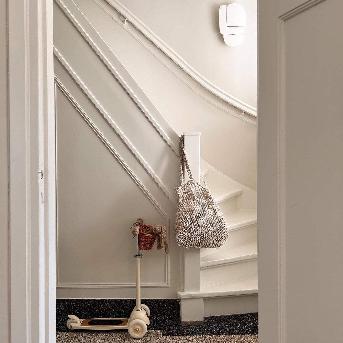
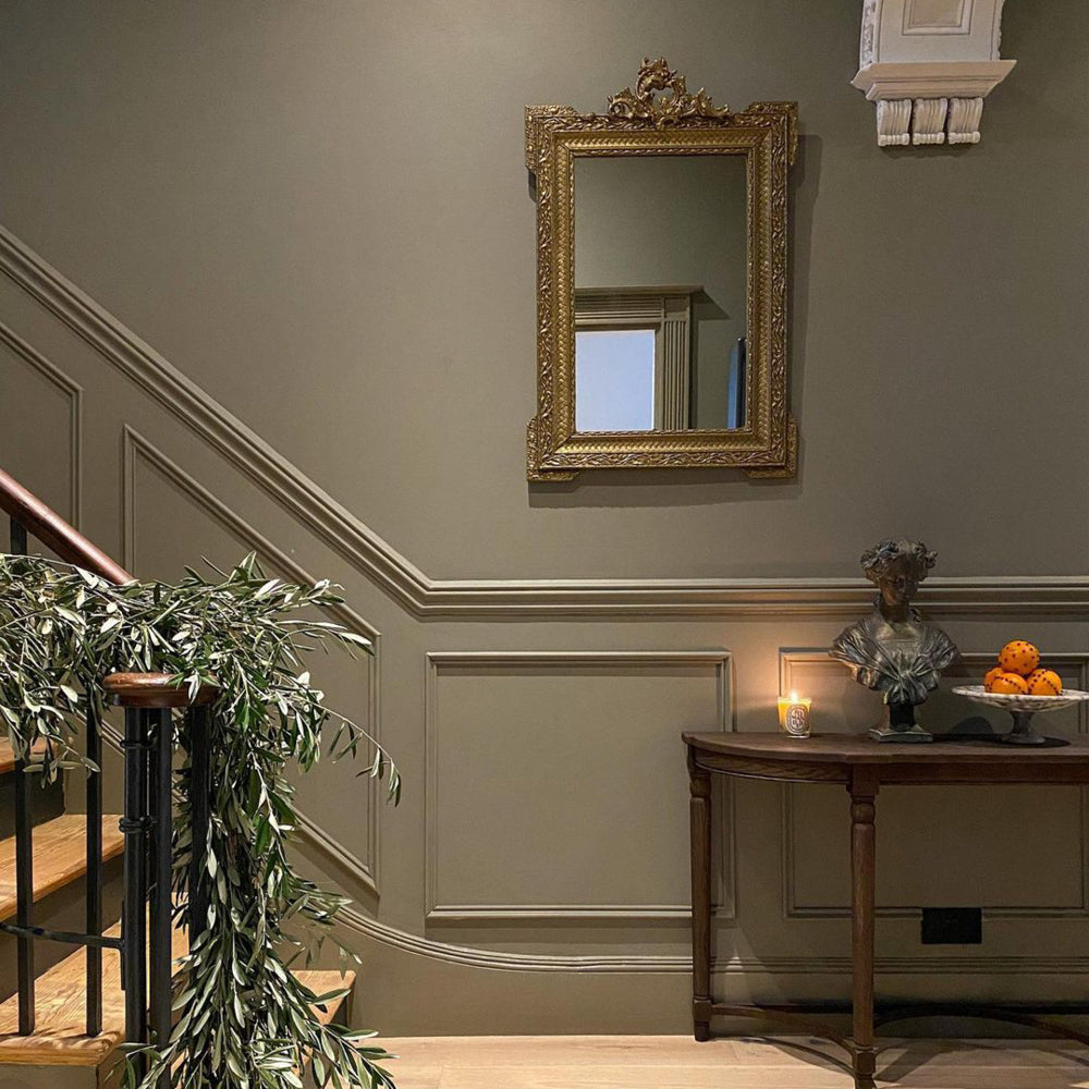
Black goes with everything, so if you’re doing a hallway in a taupe, add an accent of black on spindles and handrails to add a sense of grandeur. An off-black like David Rose is a great choice for this, as it has a chocolatey undertone that ties in with the warmth of taupe walls. You could also use a black on your door architraves to frame the rooms coming off of the hallway, adding a touch of drama and tricking the eye into thinking that the rooms you’re walking into are brighter and airier.
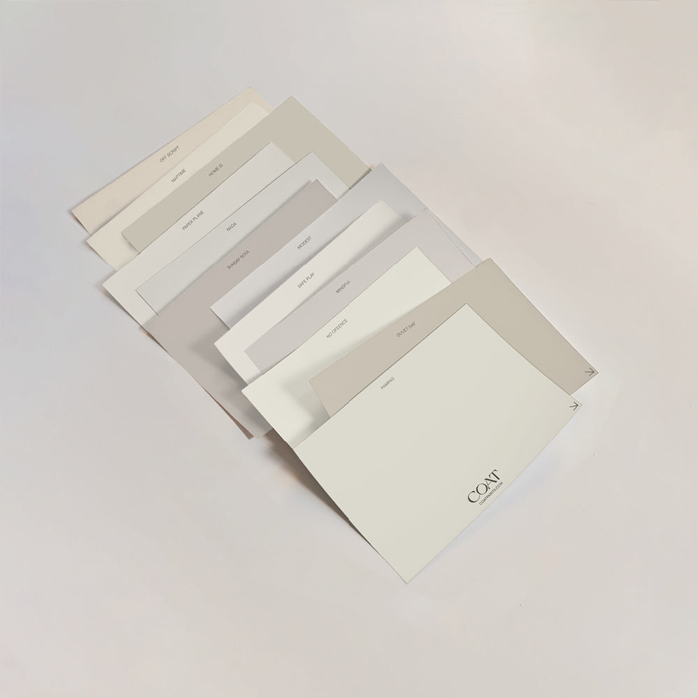
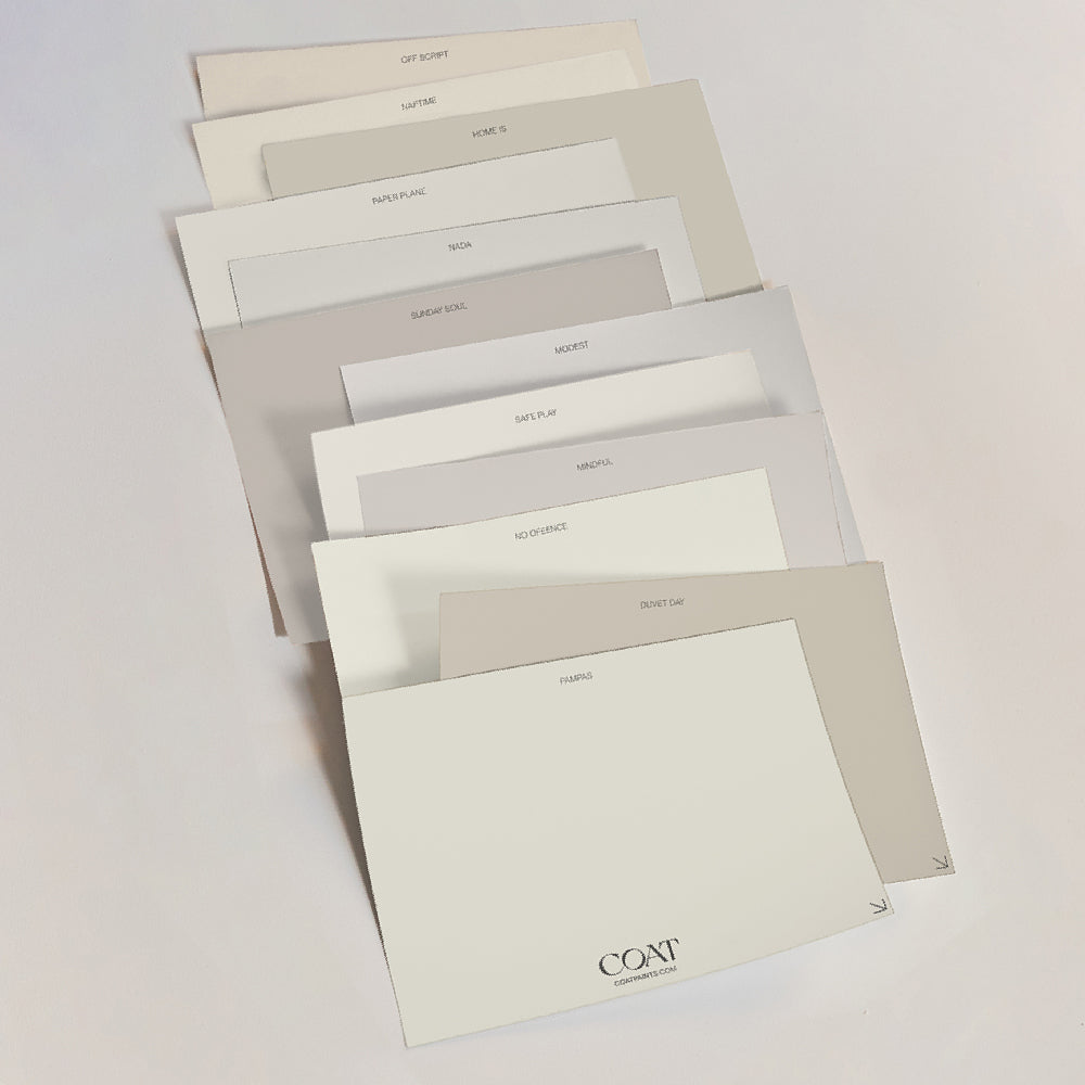
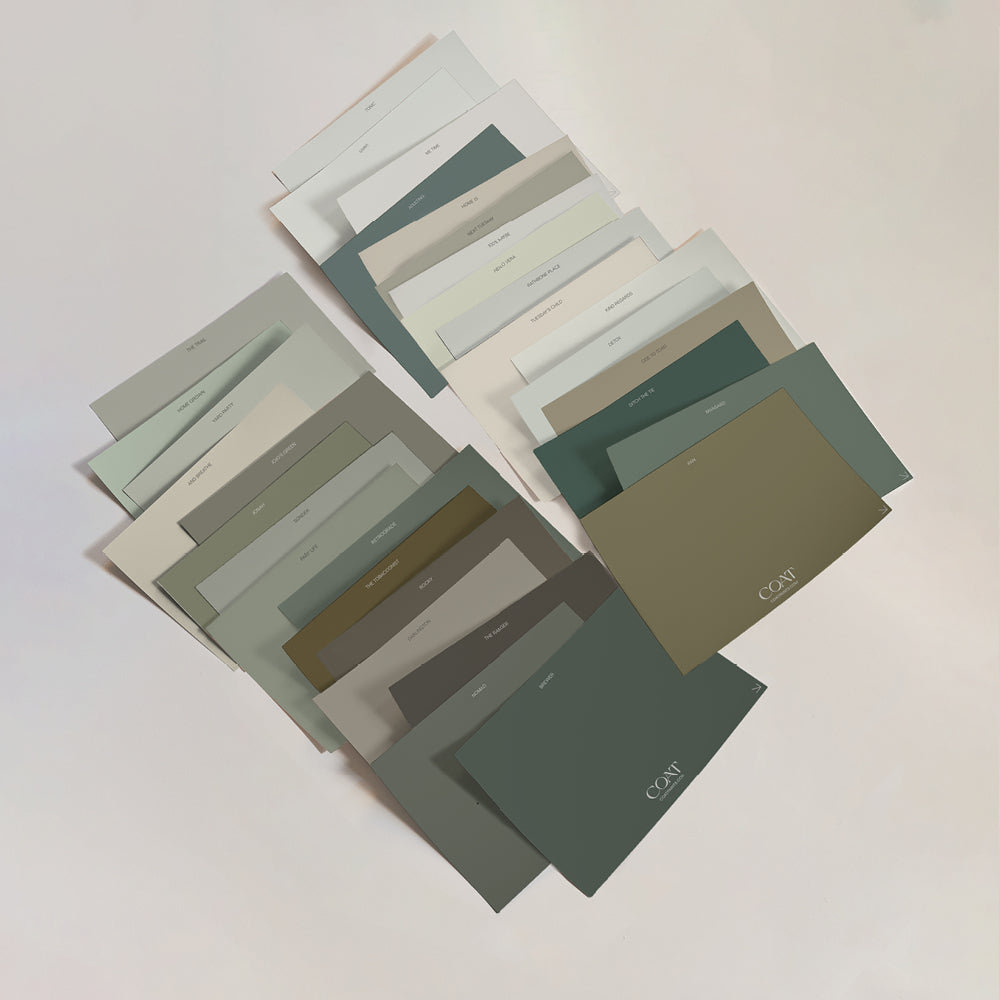
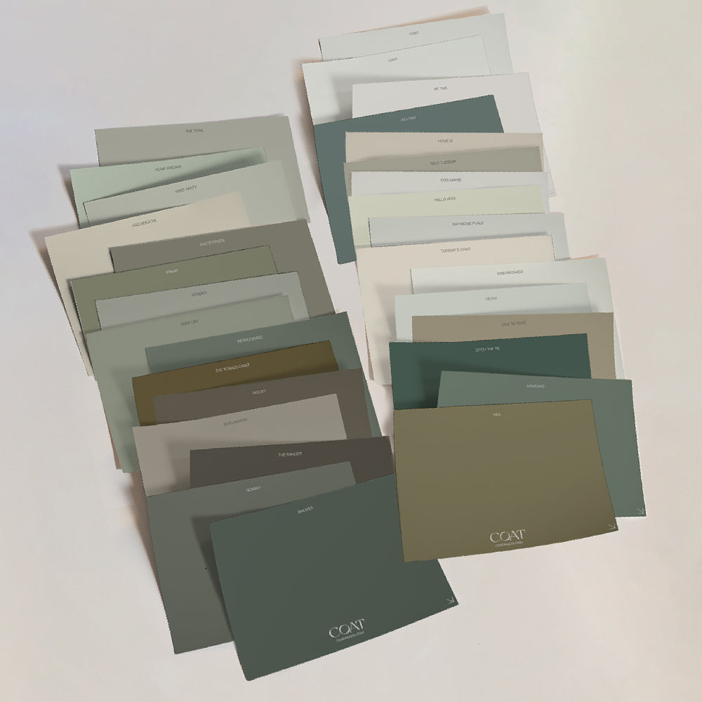
Feeling confident? You definitely will be once you’ve ordered our swatch packs to find your perfect match 👍

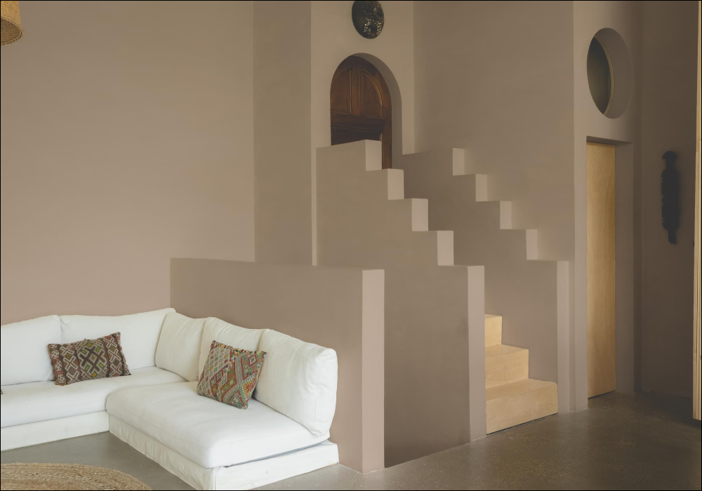
@altyrenovation defines her staircase using our inky bold, 'David Rose'.
Taupe is one of those colours that rewards a little thought. When you consider light direction, undertones and how it will sit alongside other materials, it becomes an incredibly versatile and timeless choice.
Whether you lean towards pale, warm taupes for softer spaces or deeper grey taupes for a more dramatic feel, the key is to see how the colour behaves in your own home. Natural light, time of day and surrounding finishes will all play their part.
If you’re still narrowing things down, ordering peel and stick samples is the best place to start. Move them around the room, live with them for a few days and watch how they change. Taupe has a quiet confidence to it, and once you find the right one, it has a way of making a space feel instantly settled.
Publish Date
Author