The Neutral Colours of 2022
Right, so most of us have neutral colours in our homes somewhere. They’re easy to live with, but quite difficult to get right. That’s because neutrals that have subtle nuances, rather than being overt colours that we immediately can name, like orange. So we’re here to give you the lowdown on what’s tepid in the 2022 world of neutrals (because neutrals can’t really be described as hot). Think warm beiges, greeny grieges, plaster tones and taupes all making another round of the interiors gamut.

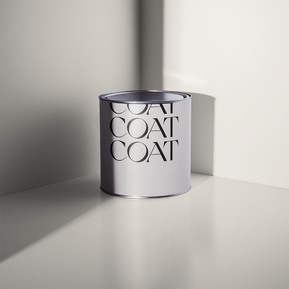
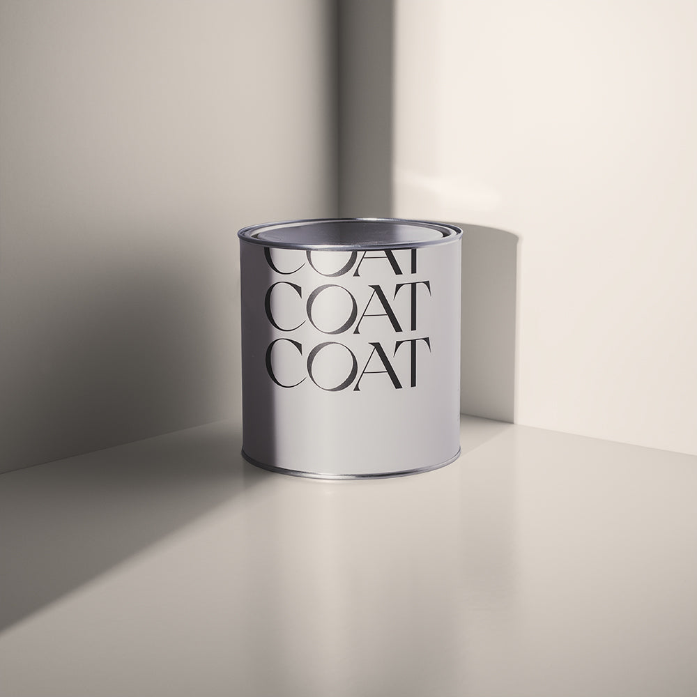
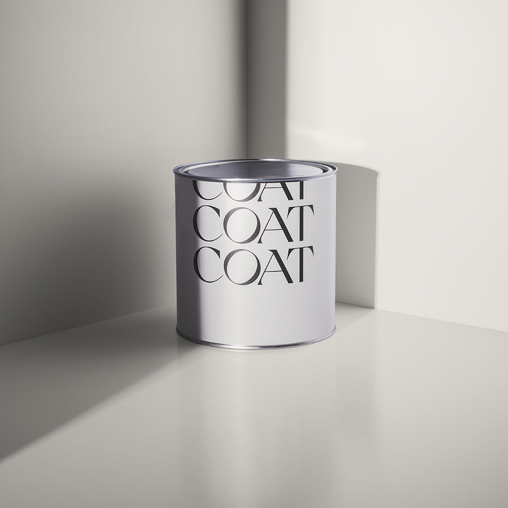
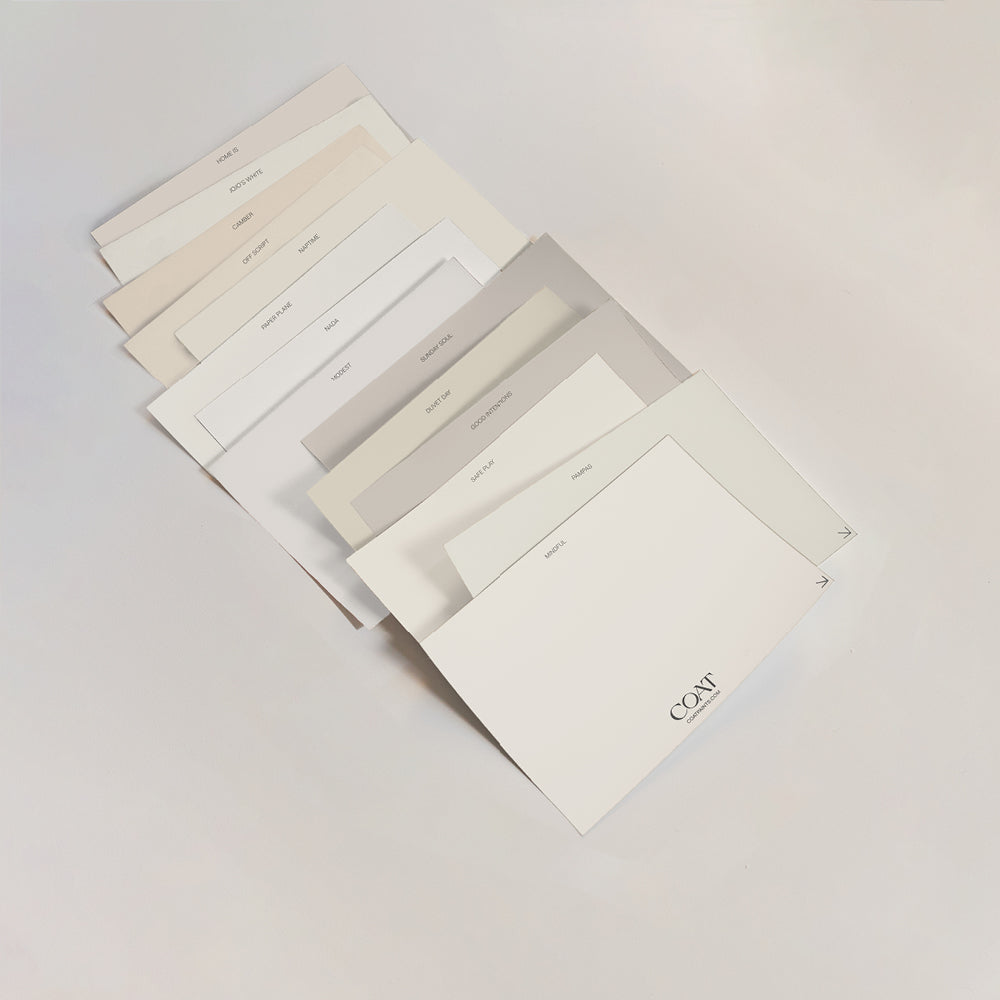
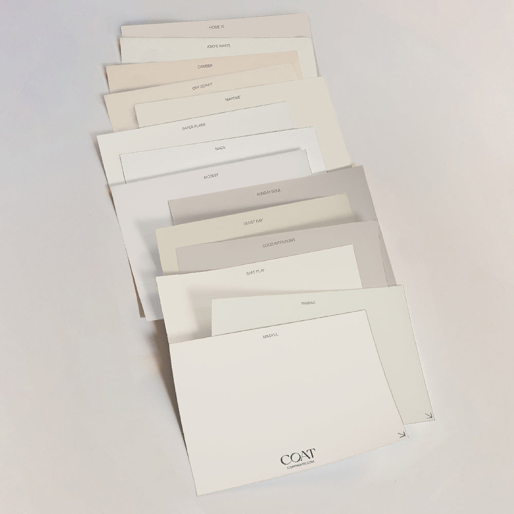
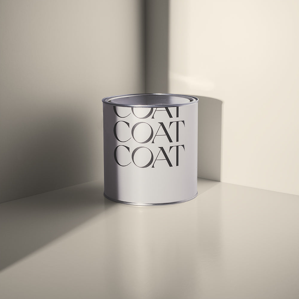
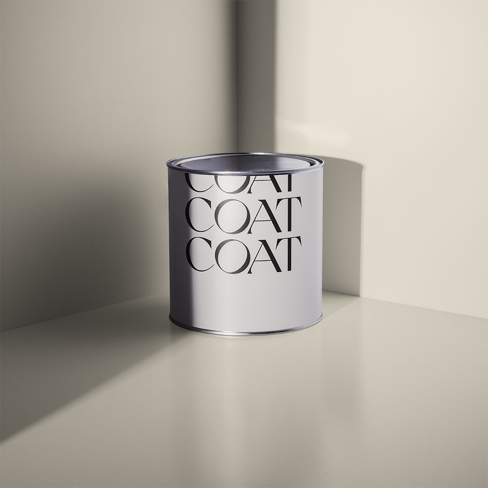
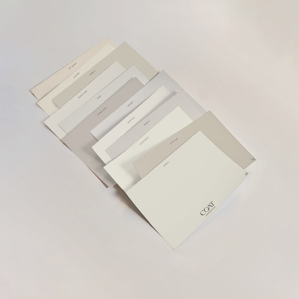
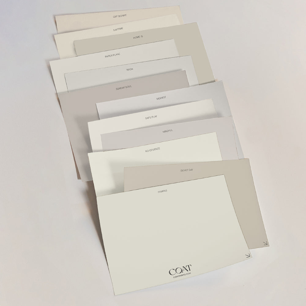
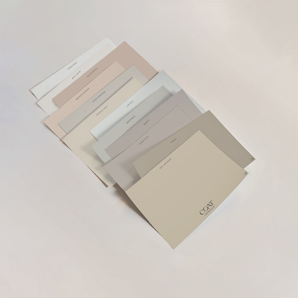
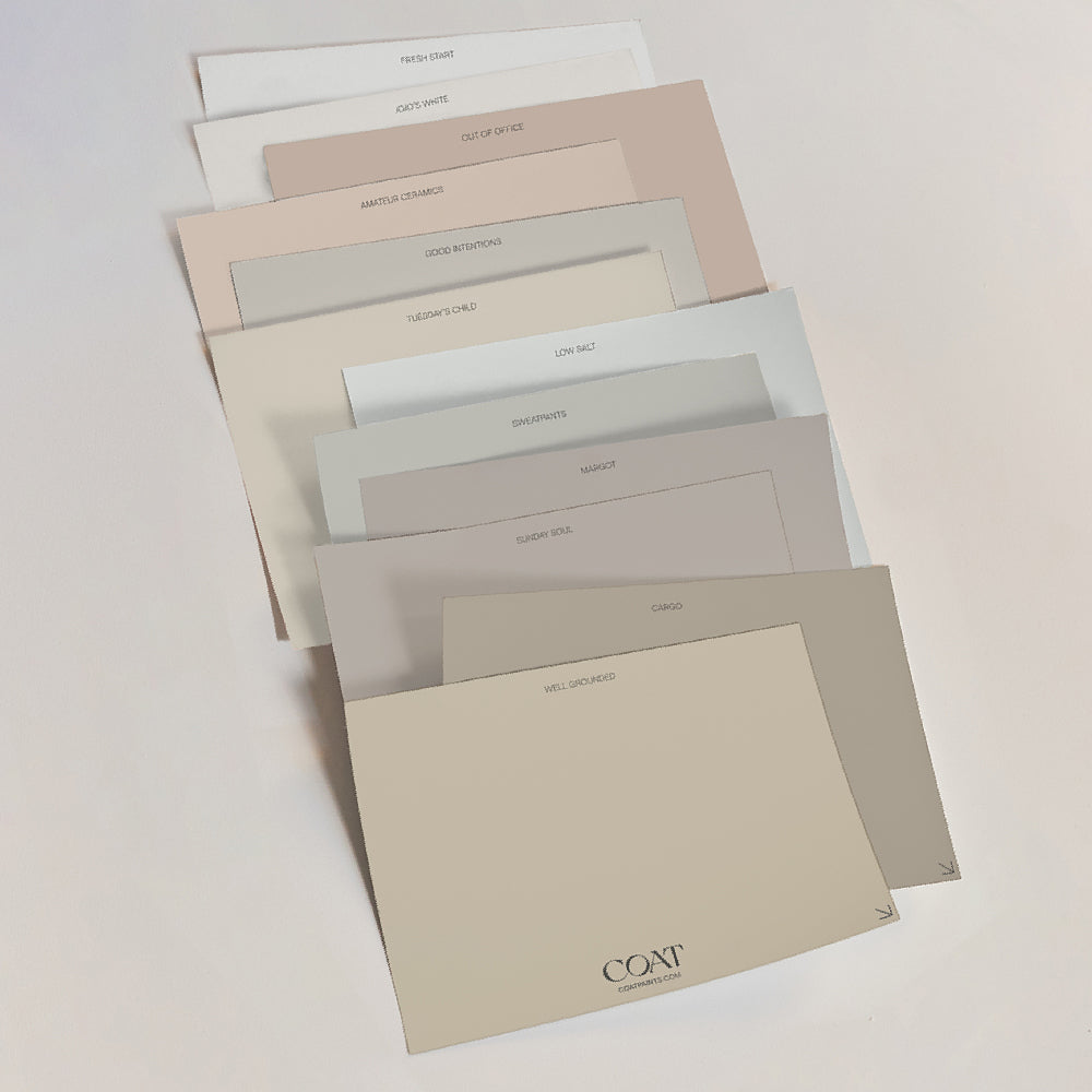
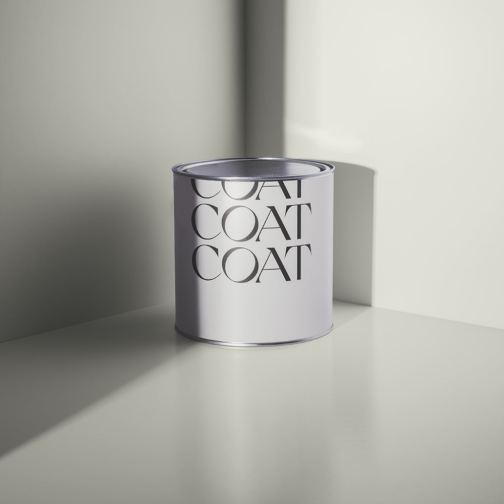
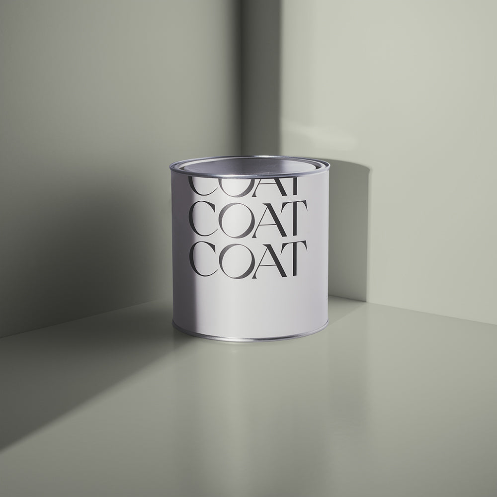
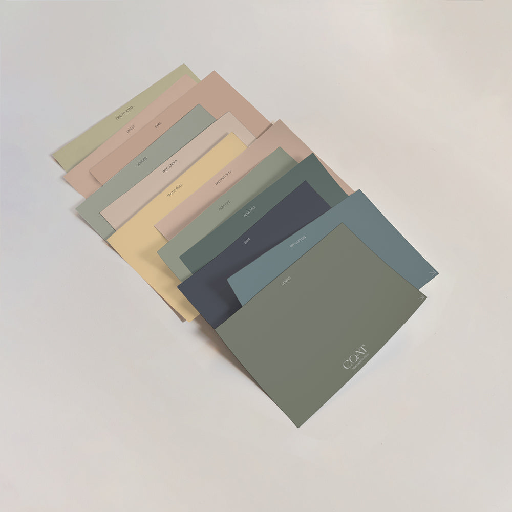
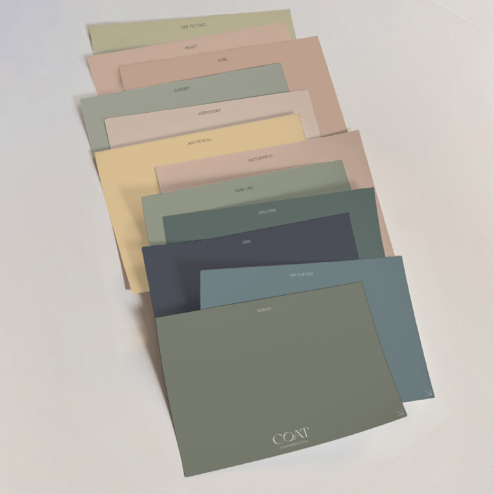
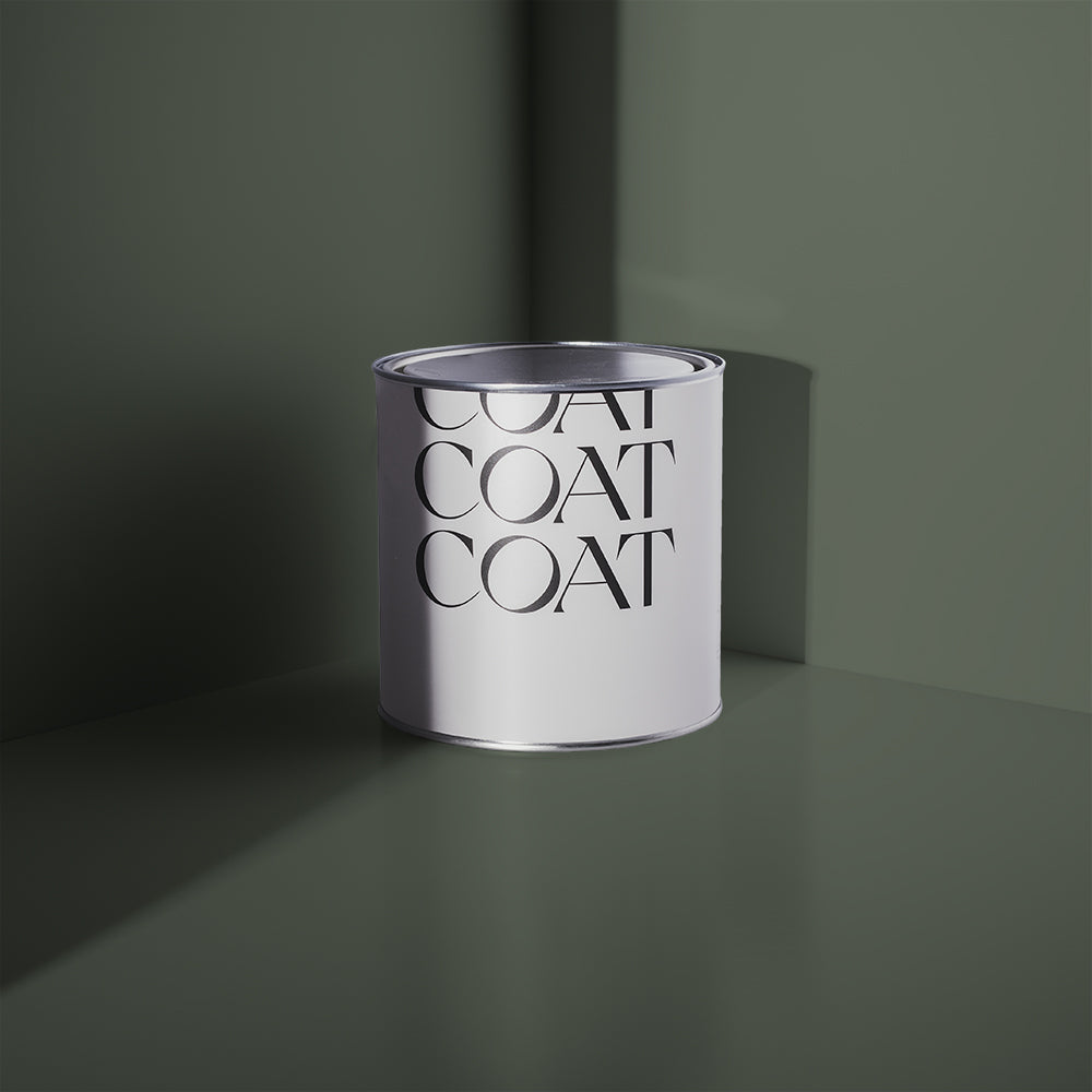
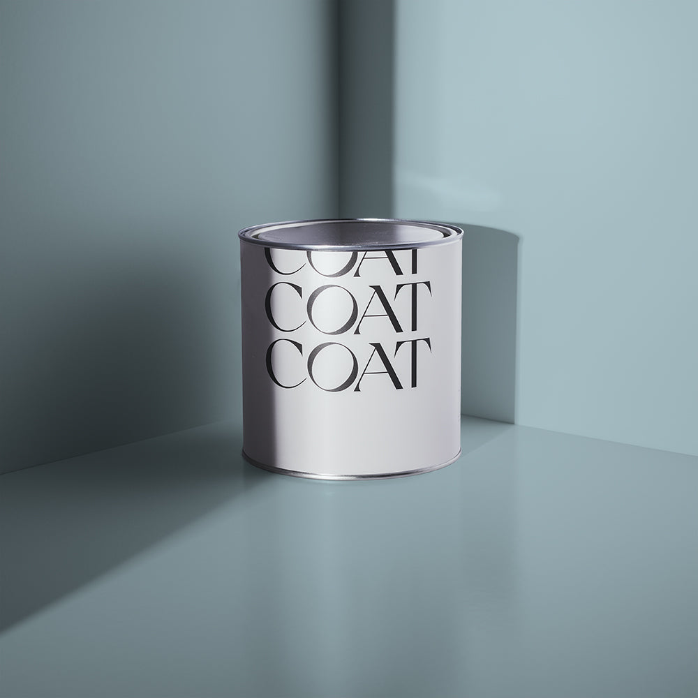
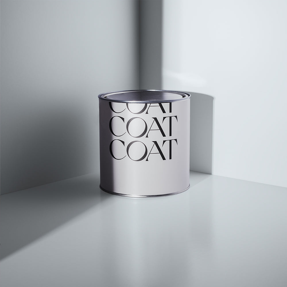
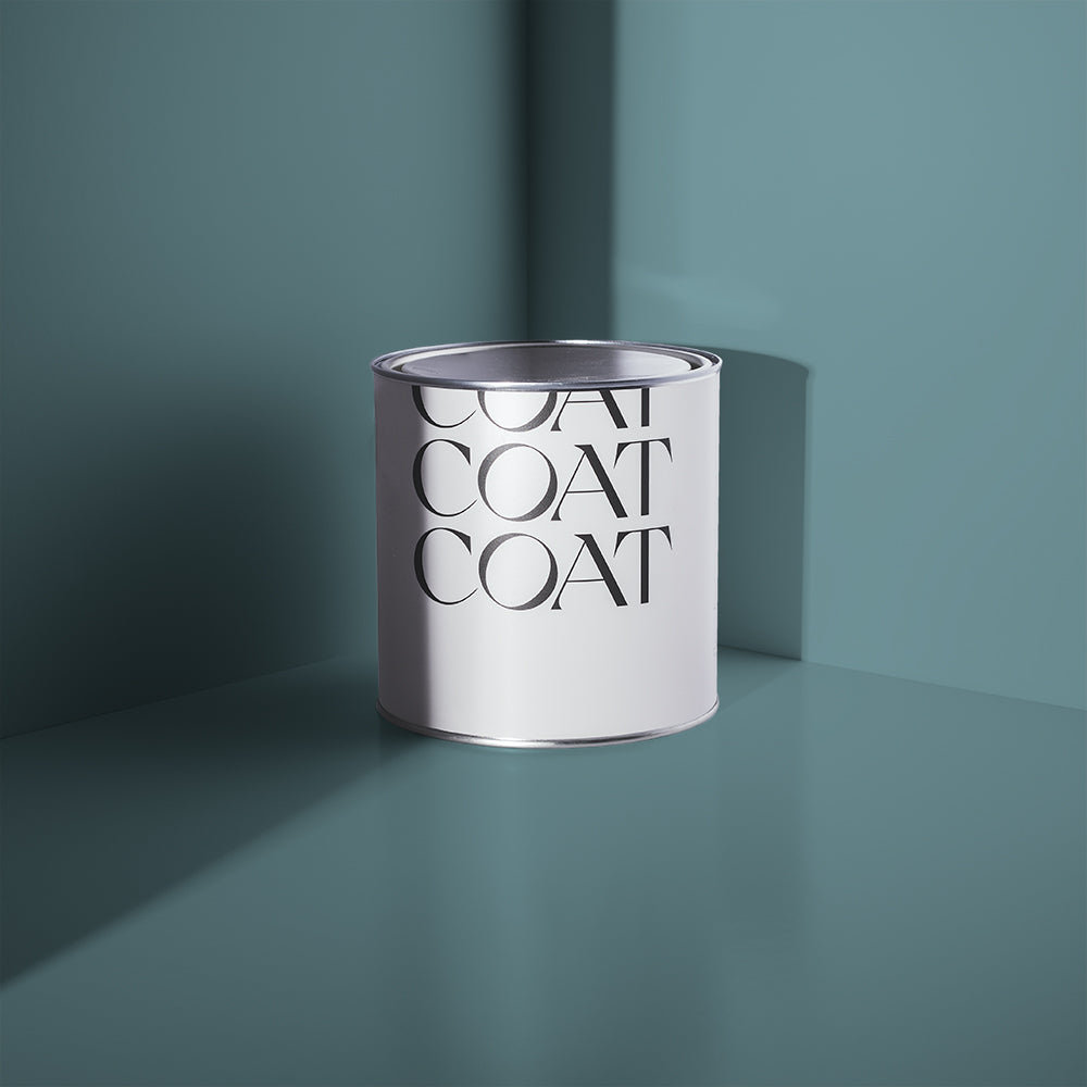
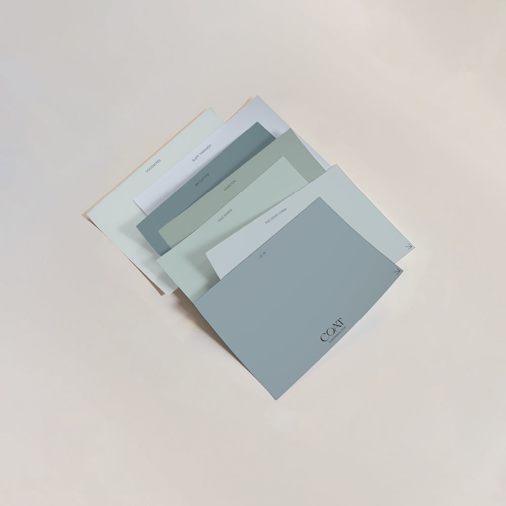
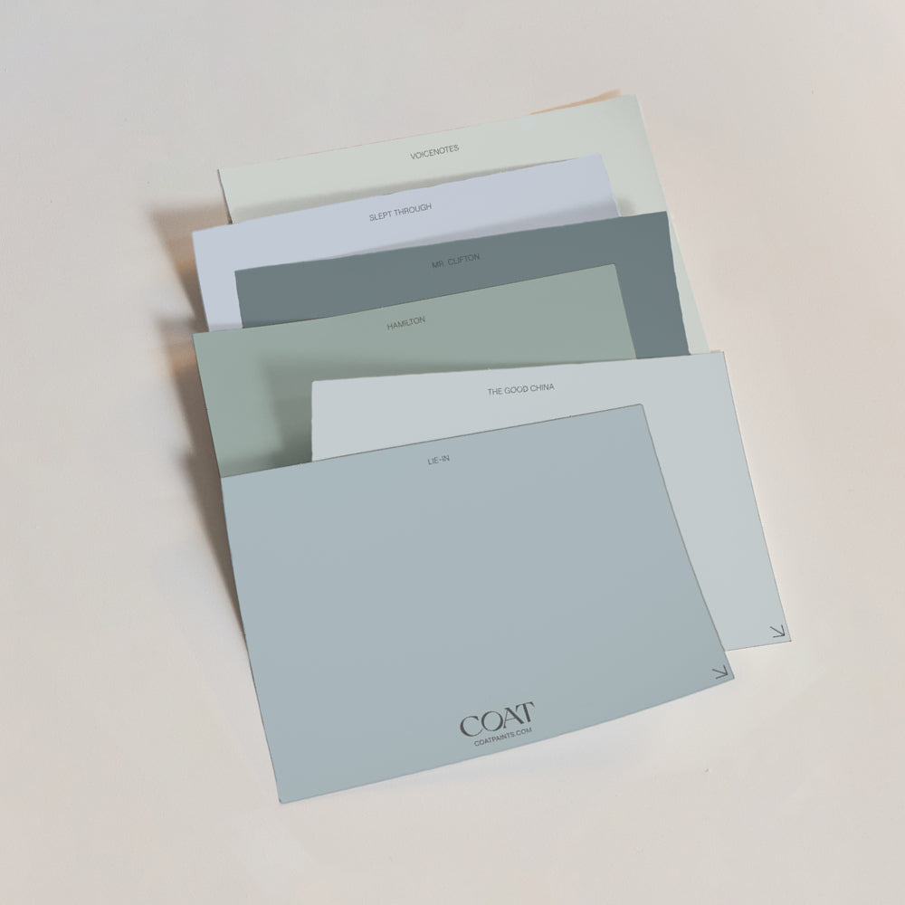
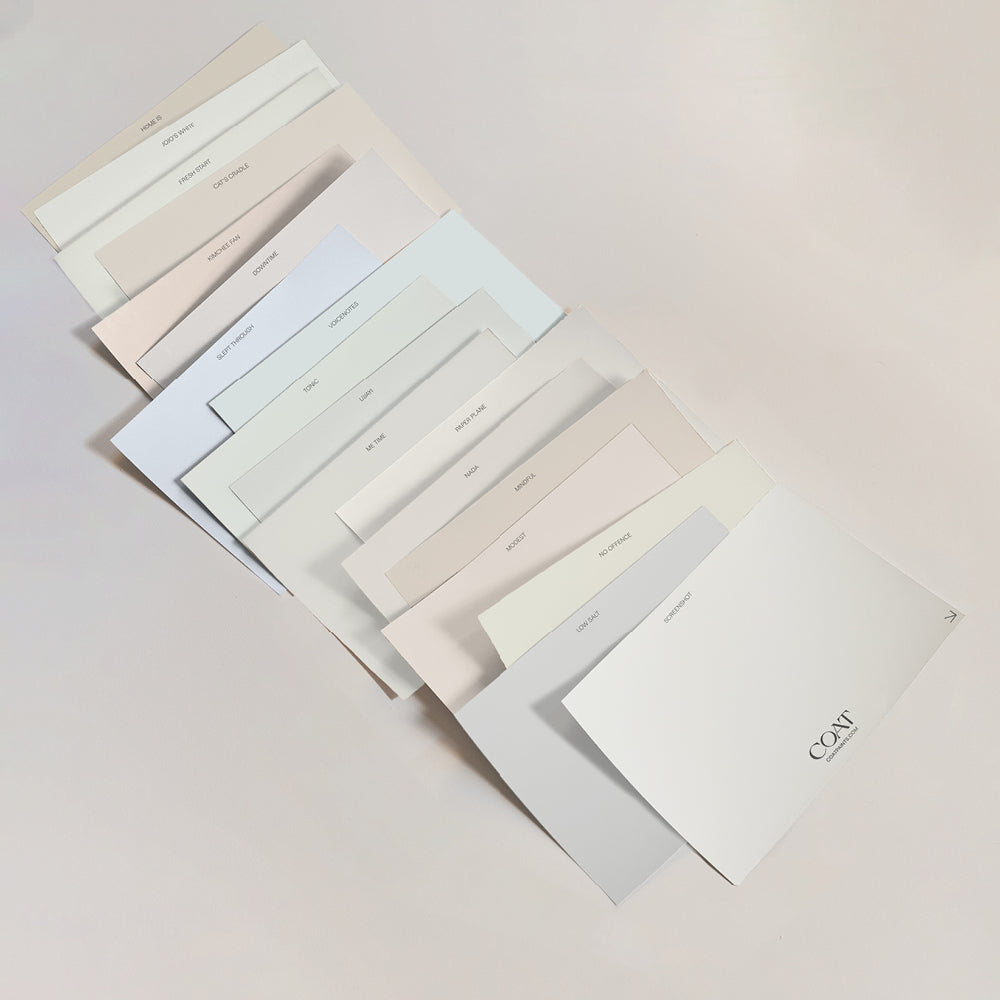
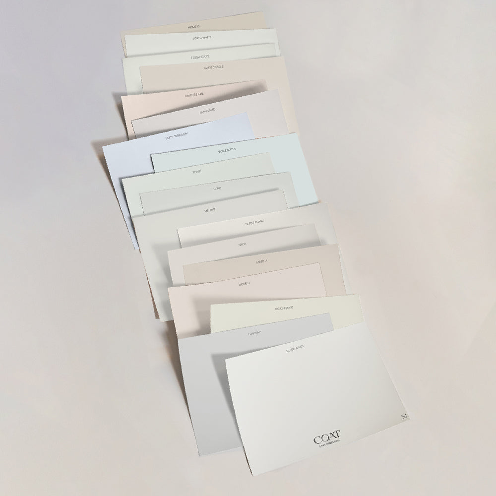
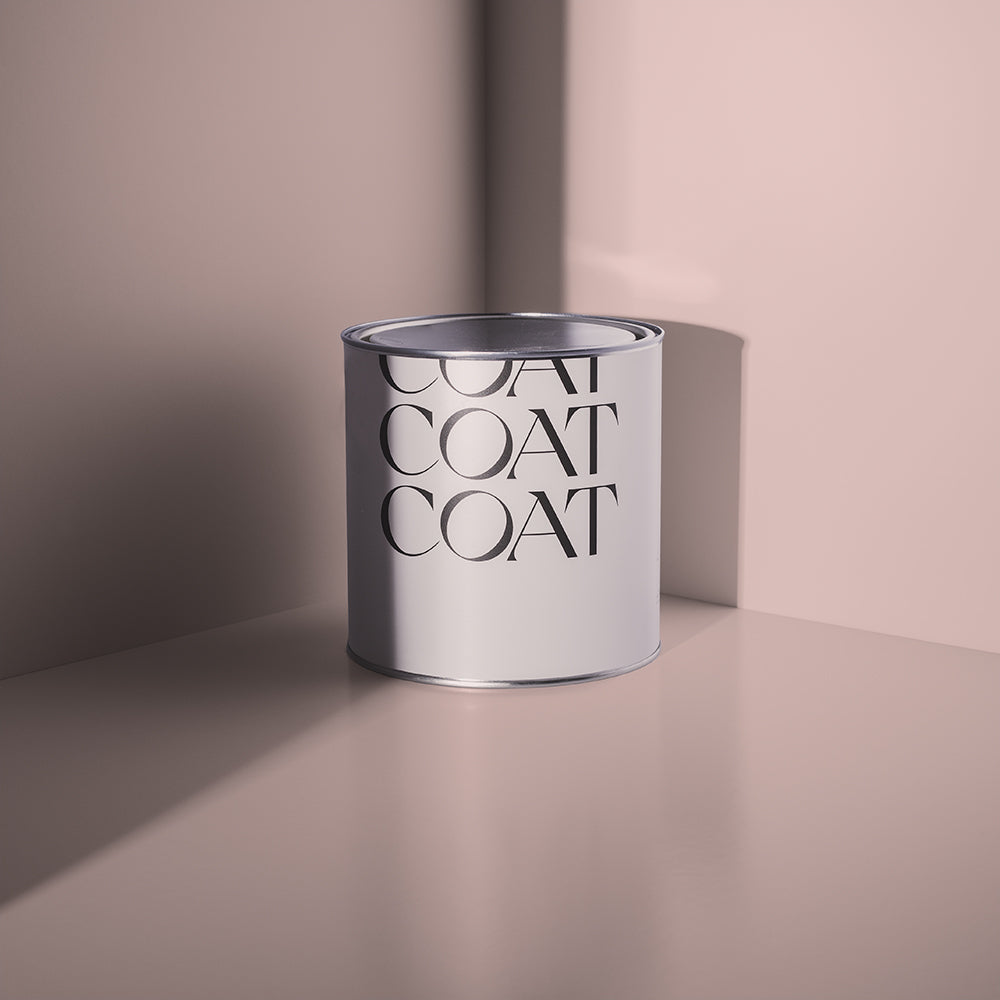
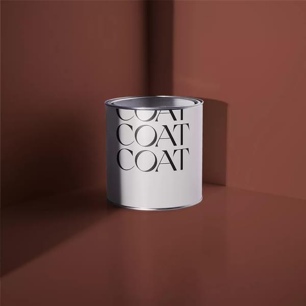
Grab our Greige Swatch Pack and find your perfect match.
2022 is seeing neutral palettes develop, adding warmth and depth to make our existing spaces feel cozier and more friendly. So if you’re already a COAT convert, there will be some tricks in here to make your Duvet Day or Sunday Soul look even more on trend…
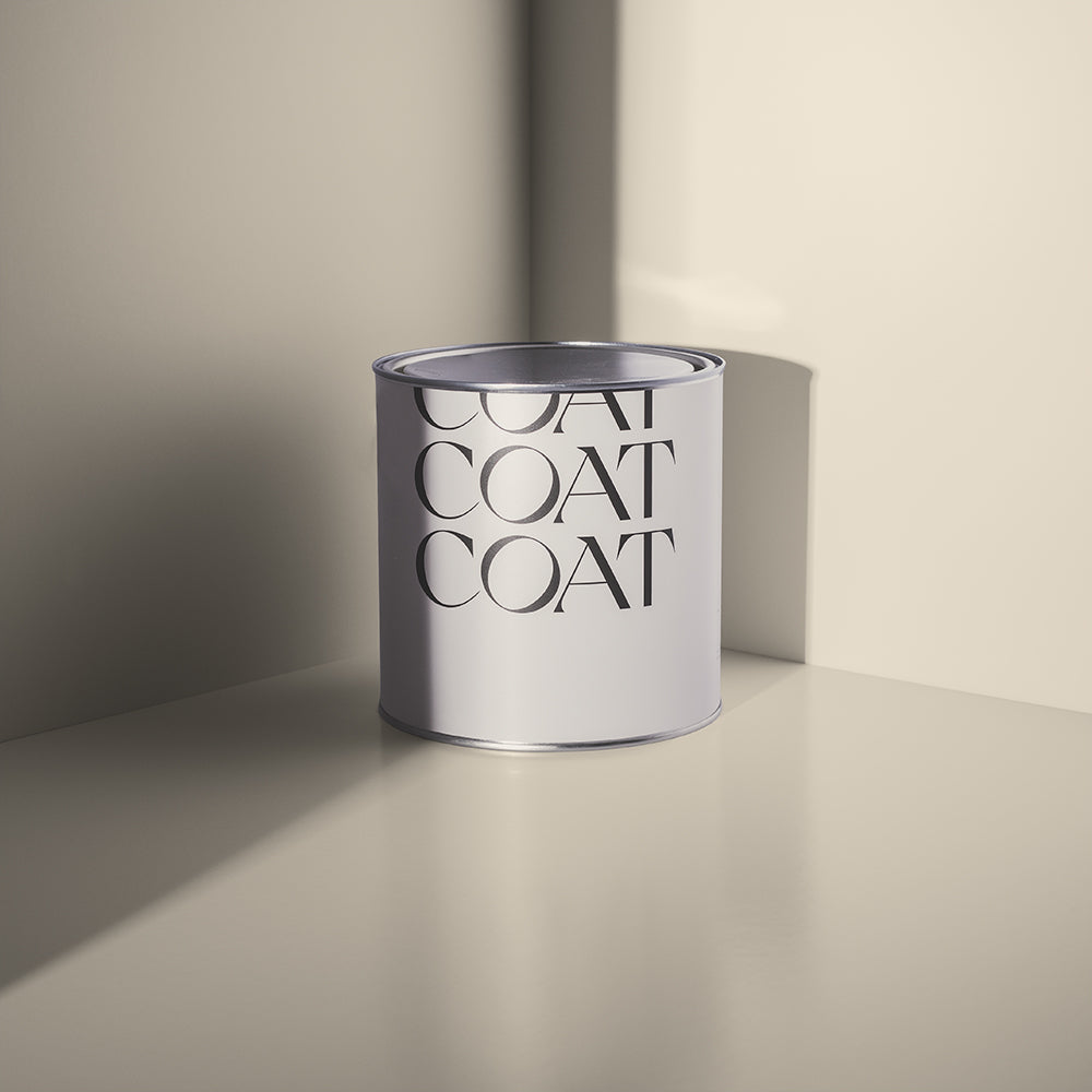
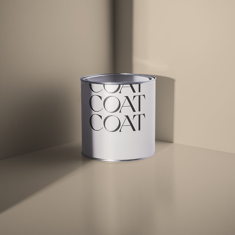
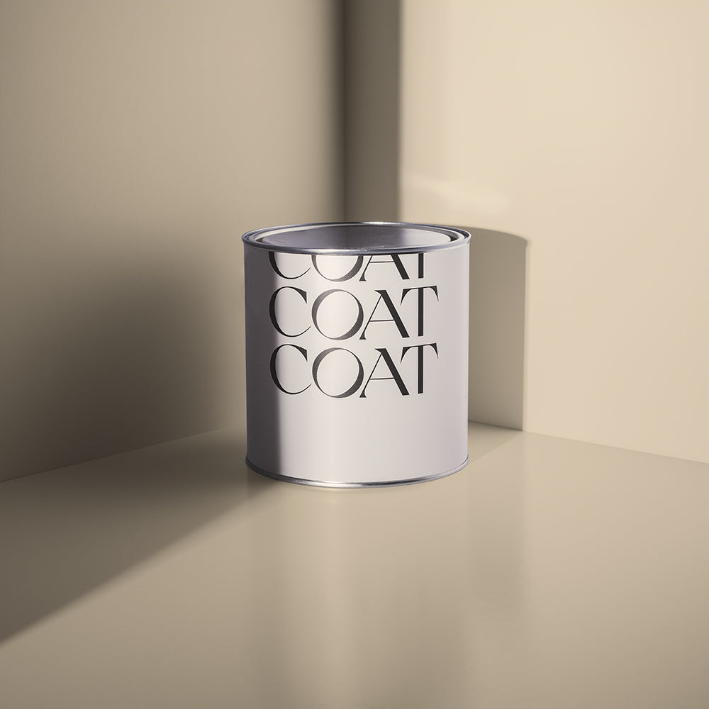
BEIGE
Terrifying word right? We’re all thinking of our parents home in the late 90’s to early noughties. The quintessential magnolia we’ve all grown to love to hate. Well, no more. COAT’s curated a new selection of beiges, that will stand the test of time, because they’re a little more complicated than the dreaded wall flower:
Humble is a beaut of a beige, it’s more orangey than a traditional beige, making it warmer and more inviting. The addition of a black pigment also gives it depth and is at it’s best when paired with its partner in crime, biscuity beige, Well Grounded. Use beige travertine tilings, tables, teak and tan leathers to add depth and texture.

@lukearthurwells using his exclusive COAT shade, 'Humble'.
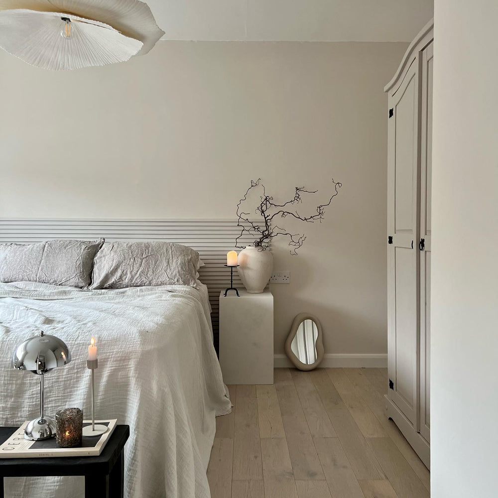
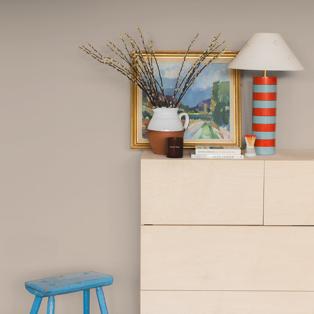
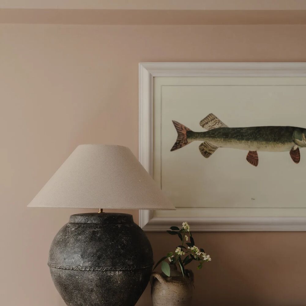
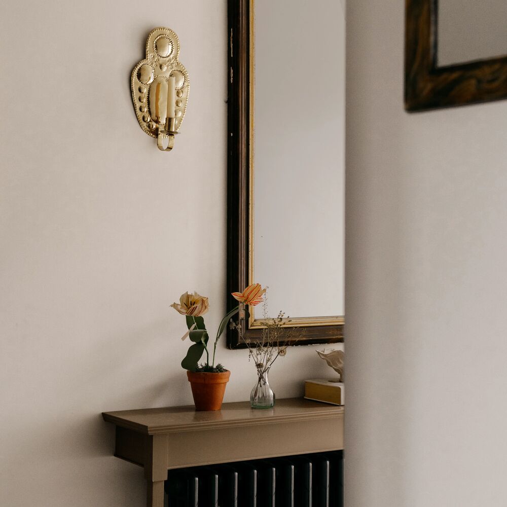
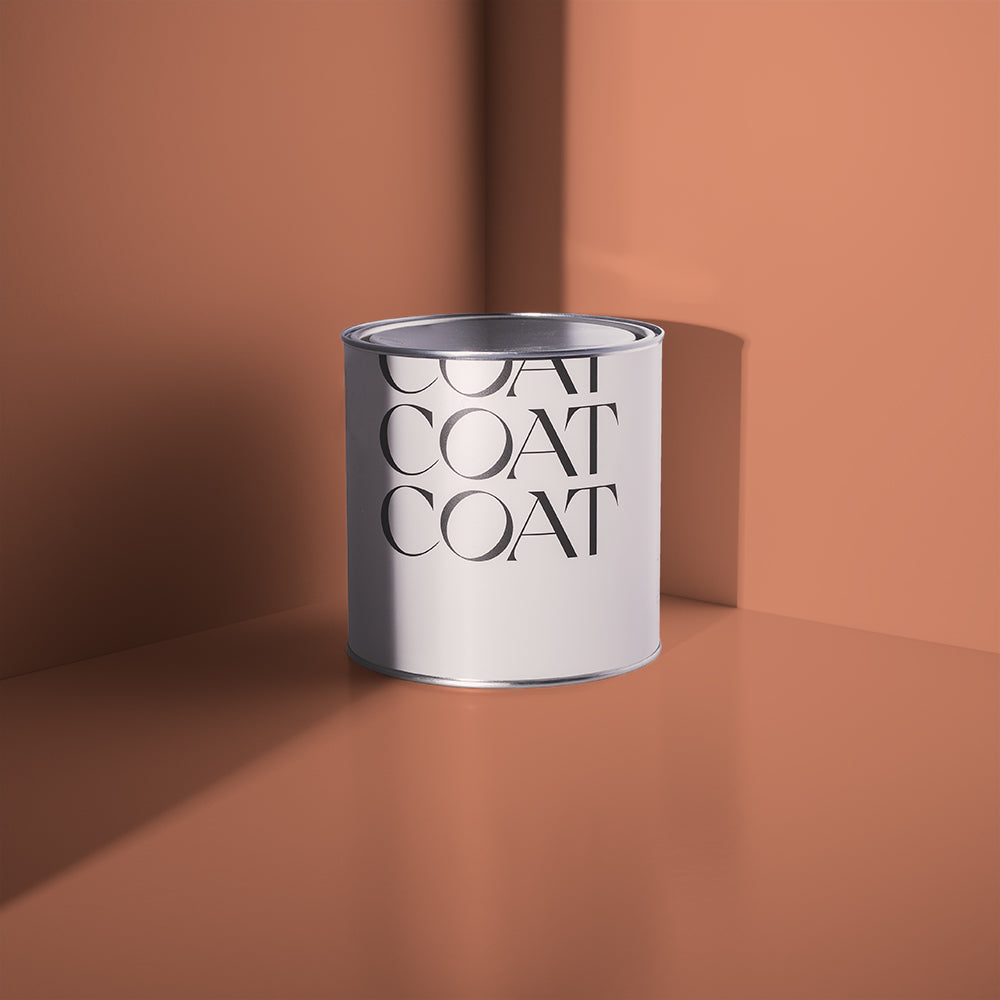
For those of you looking for a beige that’s just a little less obvious, there is always COAT’s legendary, perfect beige, Duvet Day. A bright, pretty beige, it has a shot of black, lending it depth and drama. It looks particularly striking when combined with soft black woodwork, courtesy of The Record Store!

@designatnineteen went for the beige of dreams, 'Duvet Day' for his bedroom.
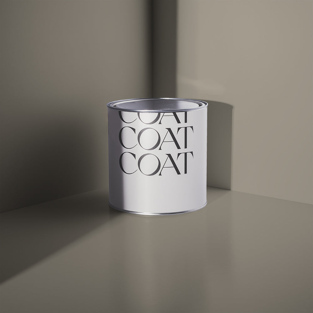
GREIGE
Becoming probably the most popular neutral of the last couple of years, due to the popularity of the Japandi and biophilic design movements, greige is here to stay. We’ve been working to dream up the best greiges for 2022, so that you can get all of the best
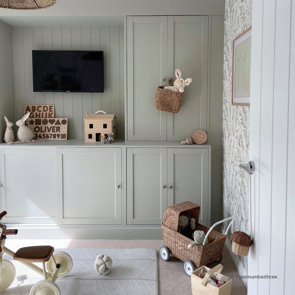
Sometimes you want a grey, sometimes a beige, but it’s tricky finding both at the same time. So we decided to split the difference this year and create a colour family that bridges this gap. Already madly popular, Sweatpants, is joined by best supporting actor, Margot and dark yellow grey, Big Timer. These colours are beautiful in combination together, because of that nurturing yellow undertone.

@asouthlondonhome using our newest greige, 'Margot'.
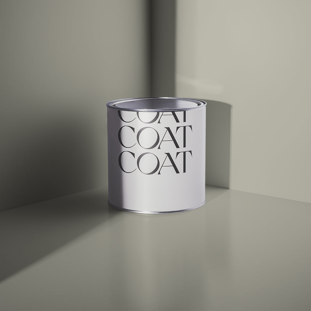
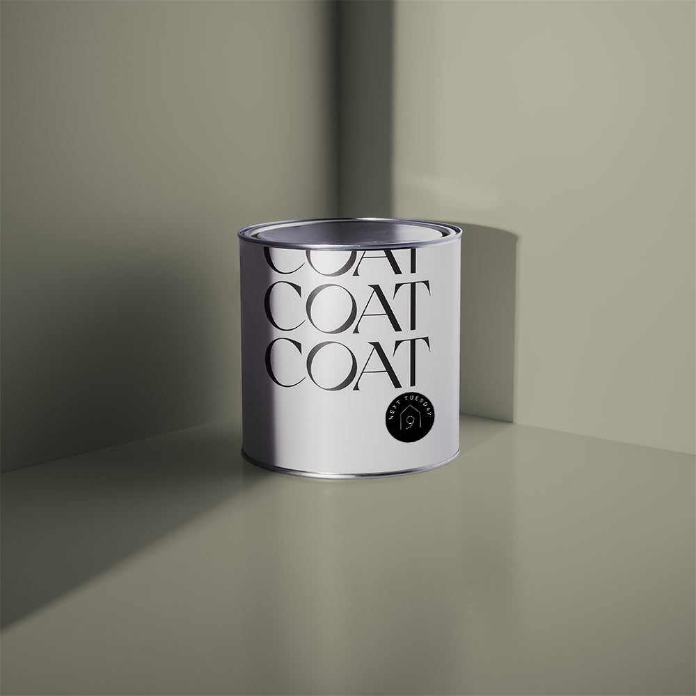
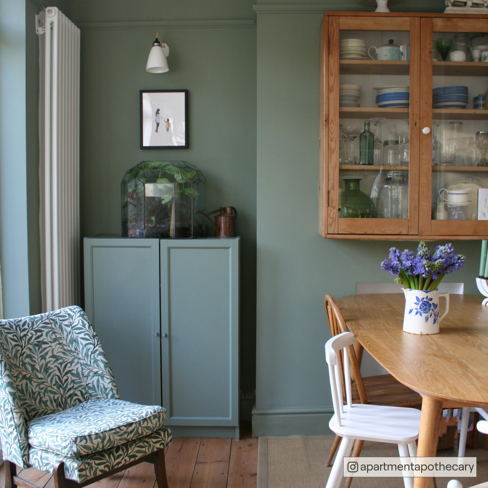
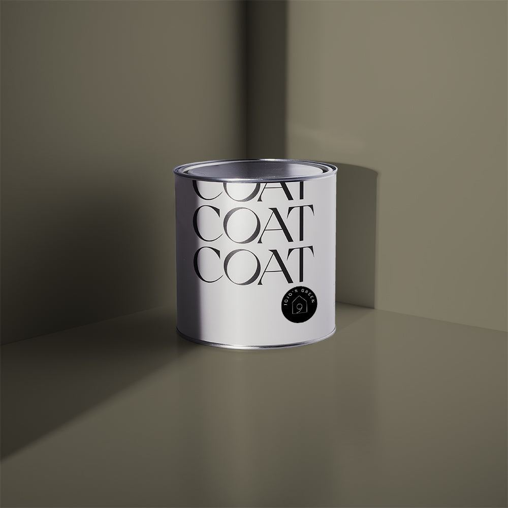
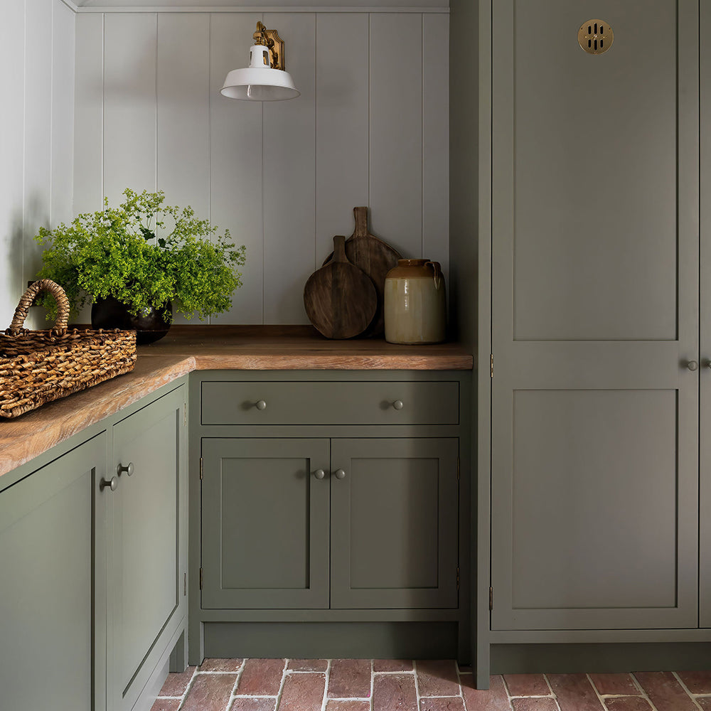
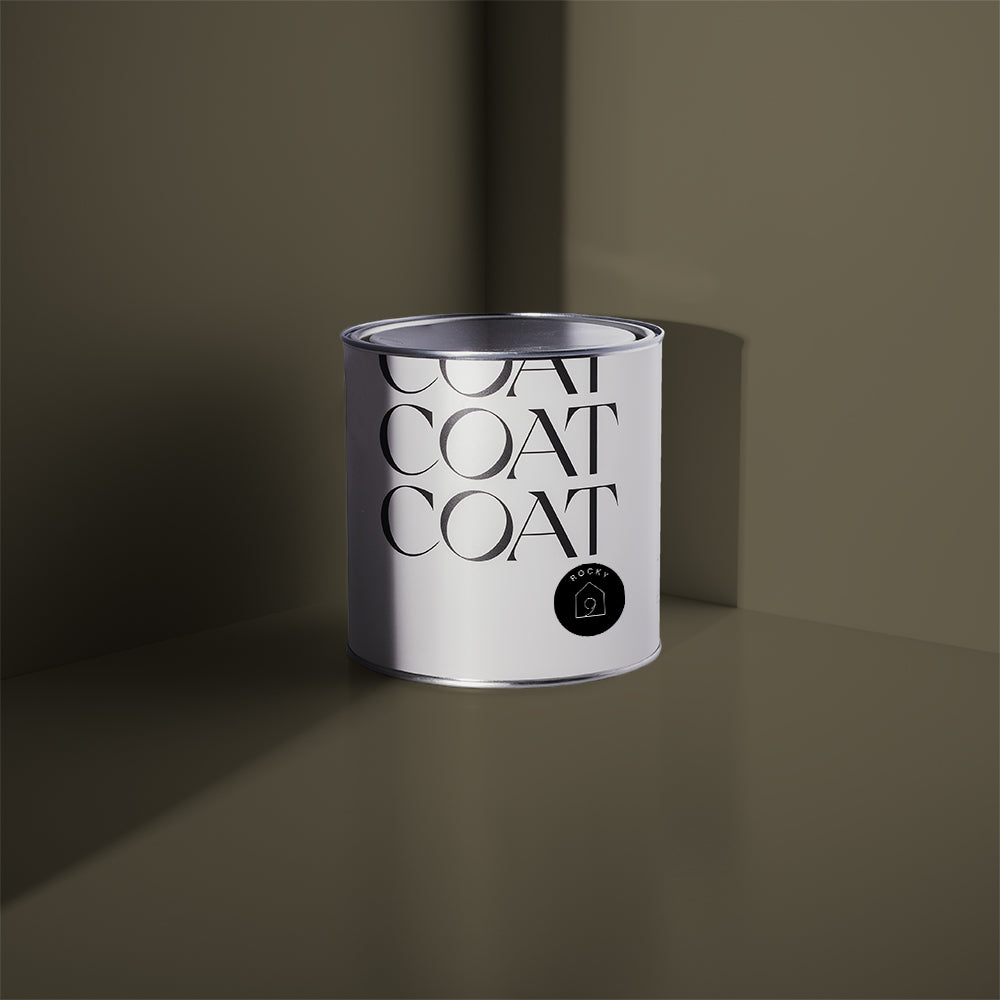
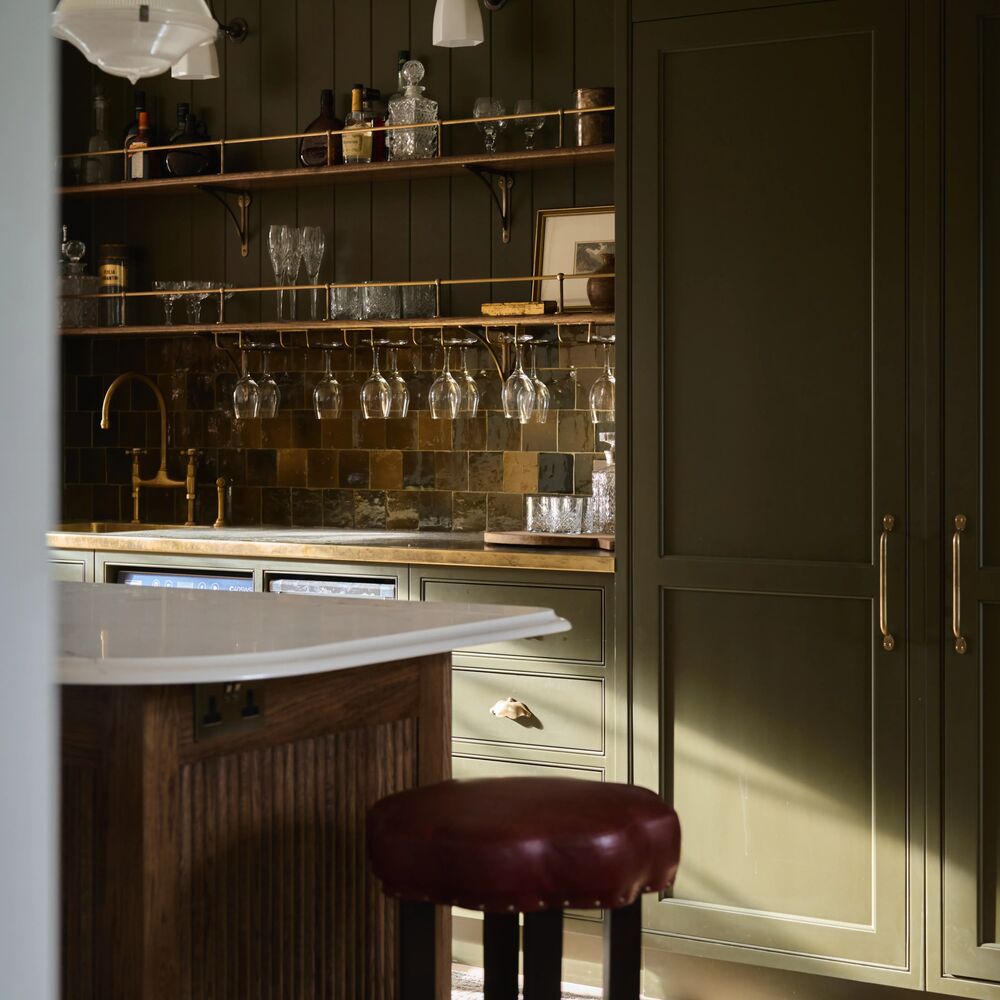
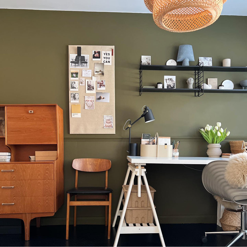
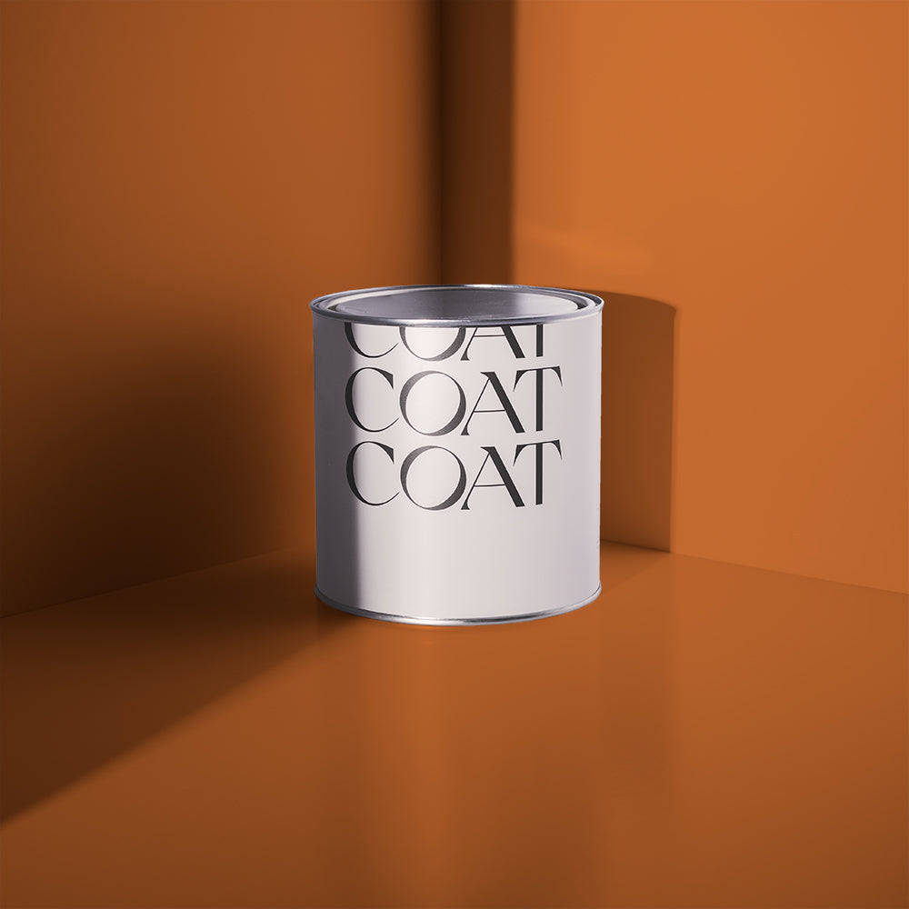
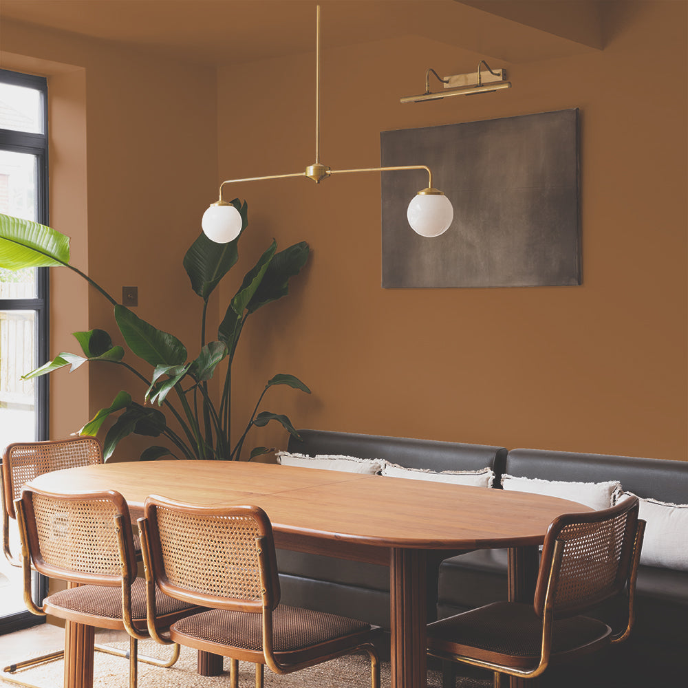
Cargo is a highly anticipated neutral, as it is a green and yellow undertoned greige. This versatile colour lends itself to both the japandi and biophliic design movements, and is a sure match for those of you that like green, but don’t want to commit to a saturated sage or deep, duck green. The best backdrop for all things nature inspired: think linens, tanned leathers, teak mid-century furniture. It also looks fab with Victorian inspired botanical prints, because of its timeless pigment combination. Yes, it might look a bit drab like your dad’s fave shorts, but we guarantee it’s practical and reliable.
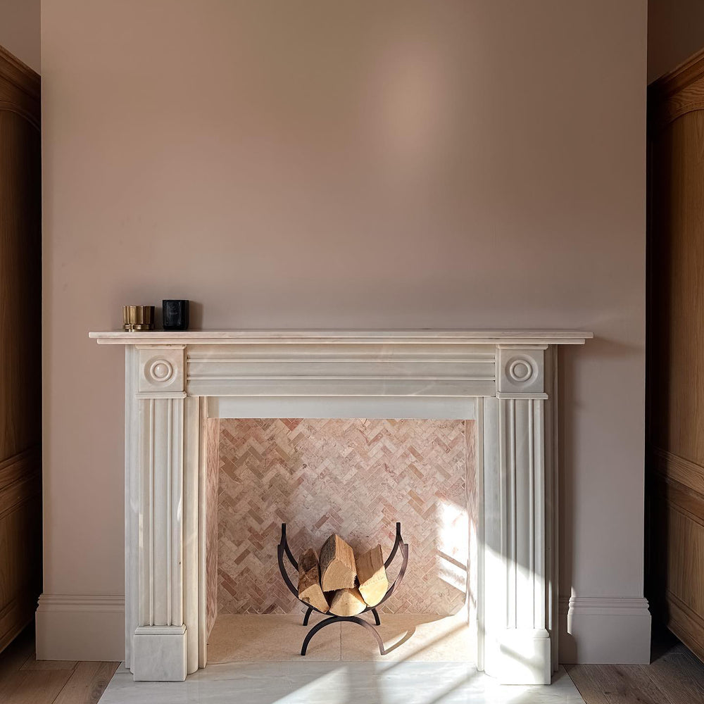
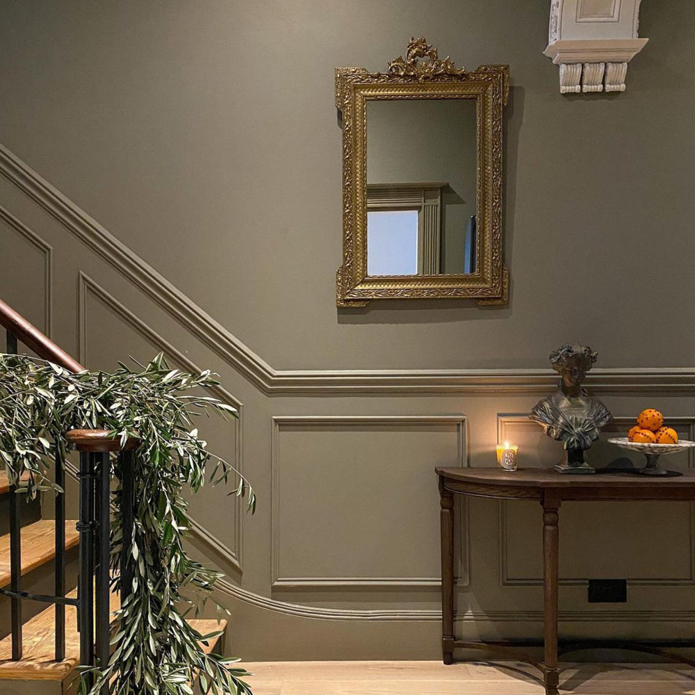
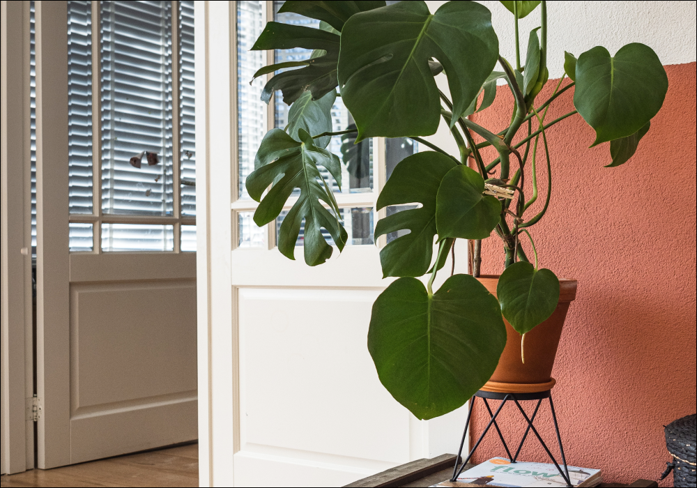
PLASTER PINK
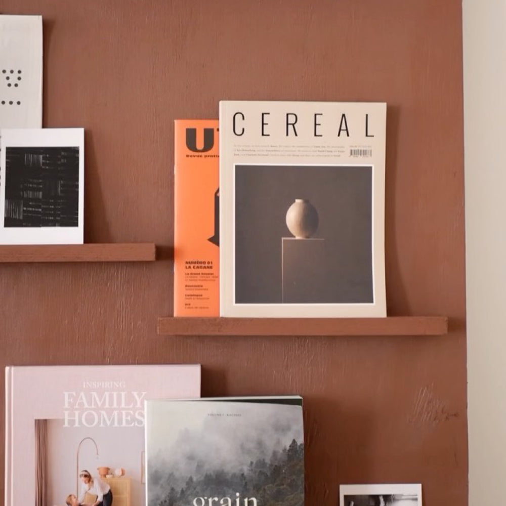
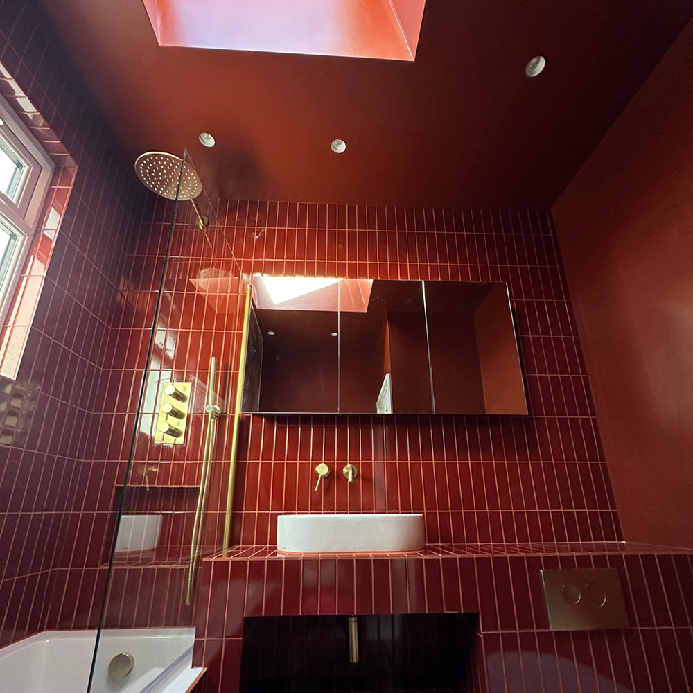
Ok, I know what it looks like. Pinks aren’t neutral because they’re associated with femininity… blah blah… enter misogynistic language here. But, traditionally pink was a masculine colour, due to it being a tinted red. In decorating, plaster-like colours used on walls have been popular, practically forever. This is because the earthy pigments that help create these colours have been used since early humans began cave paintings. The earthy tones in the iron oxide used to create these colours are naturally occurring and fairly common, making them practical and cheap.

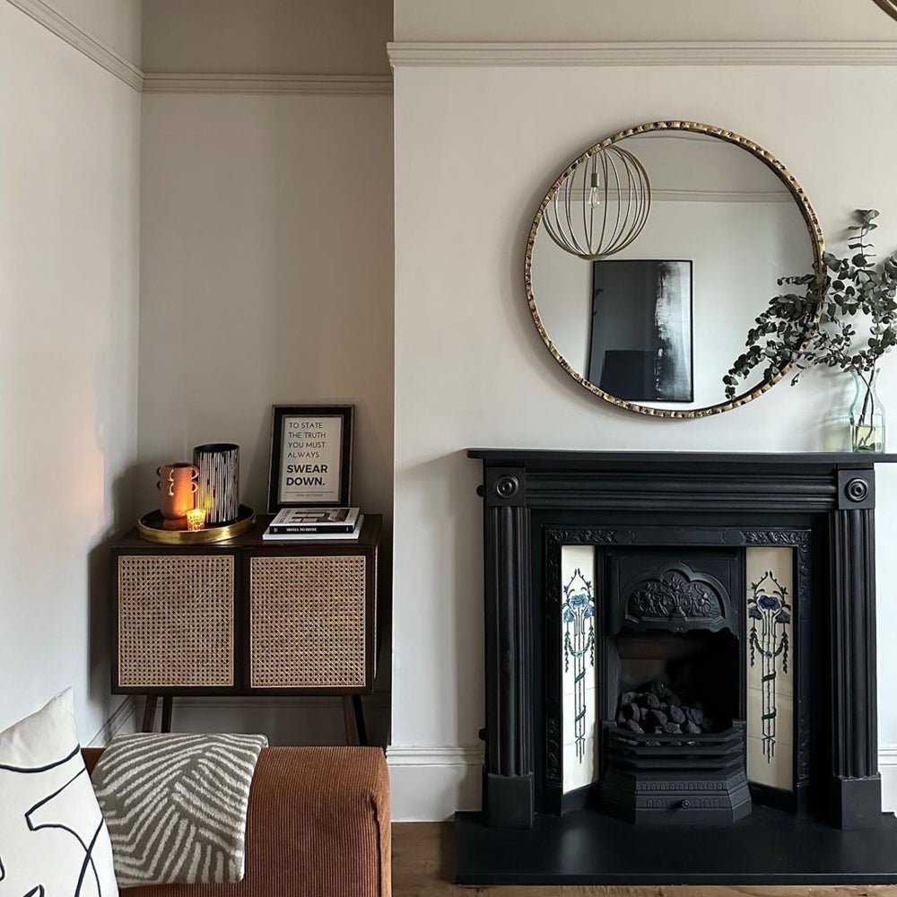
Percy and Persipan working their magic in @swoonworthyblog living room. We're obsessed.
Sounds pretty neutral to me… so we’ve been cooking up the hottest plastery tones for you to cherish in your homes. Factor 50 is a gorge yellow based pink with a grey undertone and partners beautifully with Persipan, an earthy, more orangey neutral (think dry and wet venetian plaster). For styling advice with these colours, make them look more neutral with deep reds, terracotta tones or blacks.

'Factor Fifty' is the perfect pink for @katyjane_o living space.
TAUPES
Still hanging on in there, taupes make a triumphant return in 2022, and we’re not surprised. They’re warm undertones make for tasteful neutrals that help us feel cozy and safe. We have some legendary taupes already in the COAT palette, and decided it was time to expand this offering a little; helping you make your tantalising taupe schemes even more exciting.
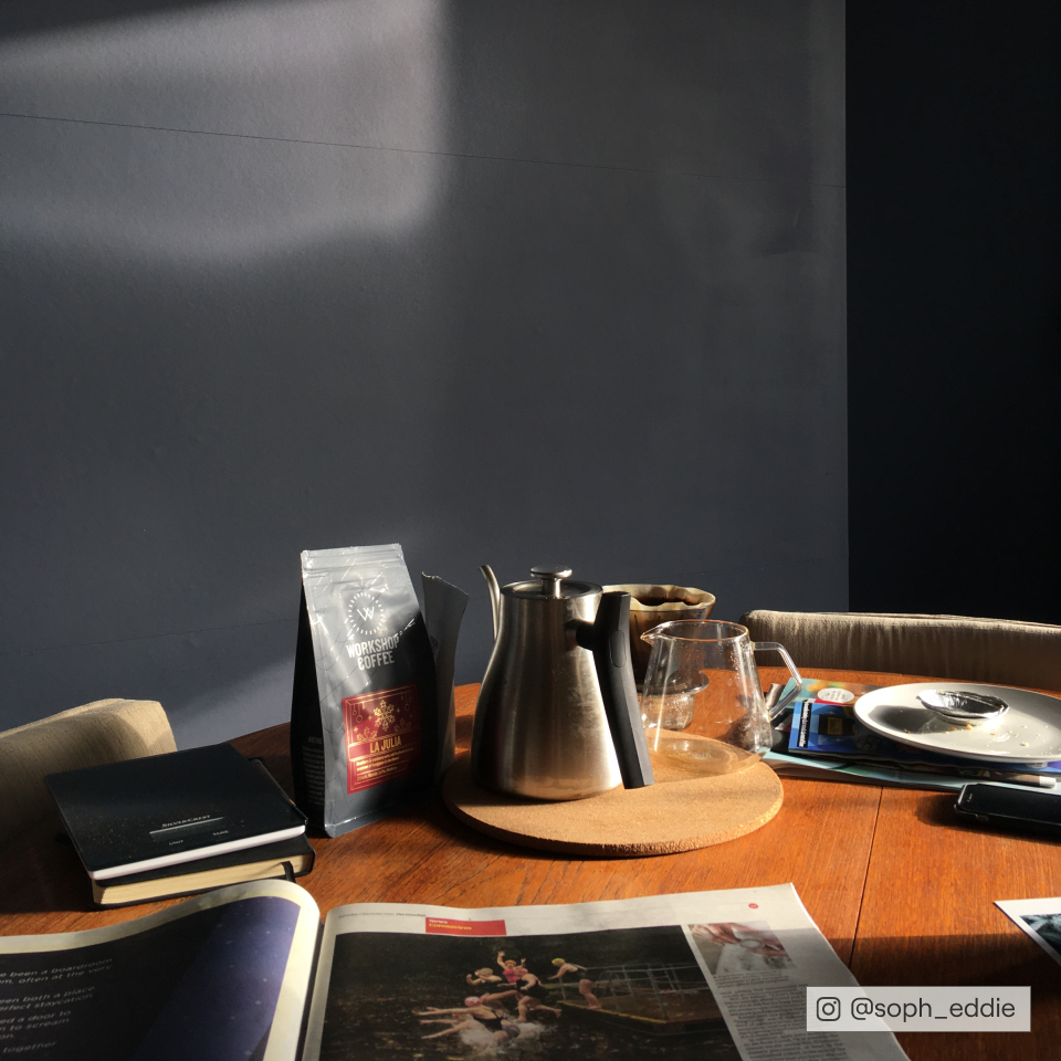
Cold Brew is our newest taupe, deep and dramatic, it has all the appeal of a deep grey with the charm and warmth of a brown too. It’s sure to be a cult classic, particularly for woodwork with walls in Sunday Soul or Good Intentions.

It's our newest Taupe, 'Cold Brew' doing it's thing in @raisingtheregans home.
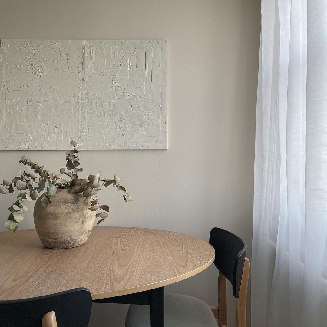
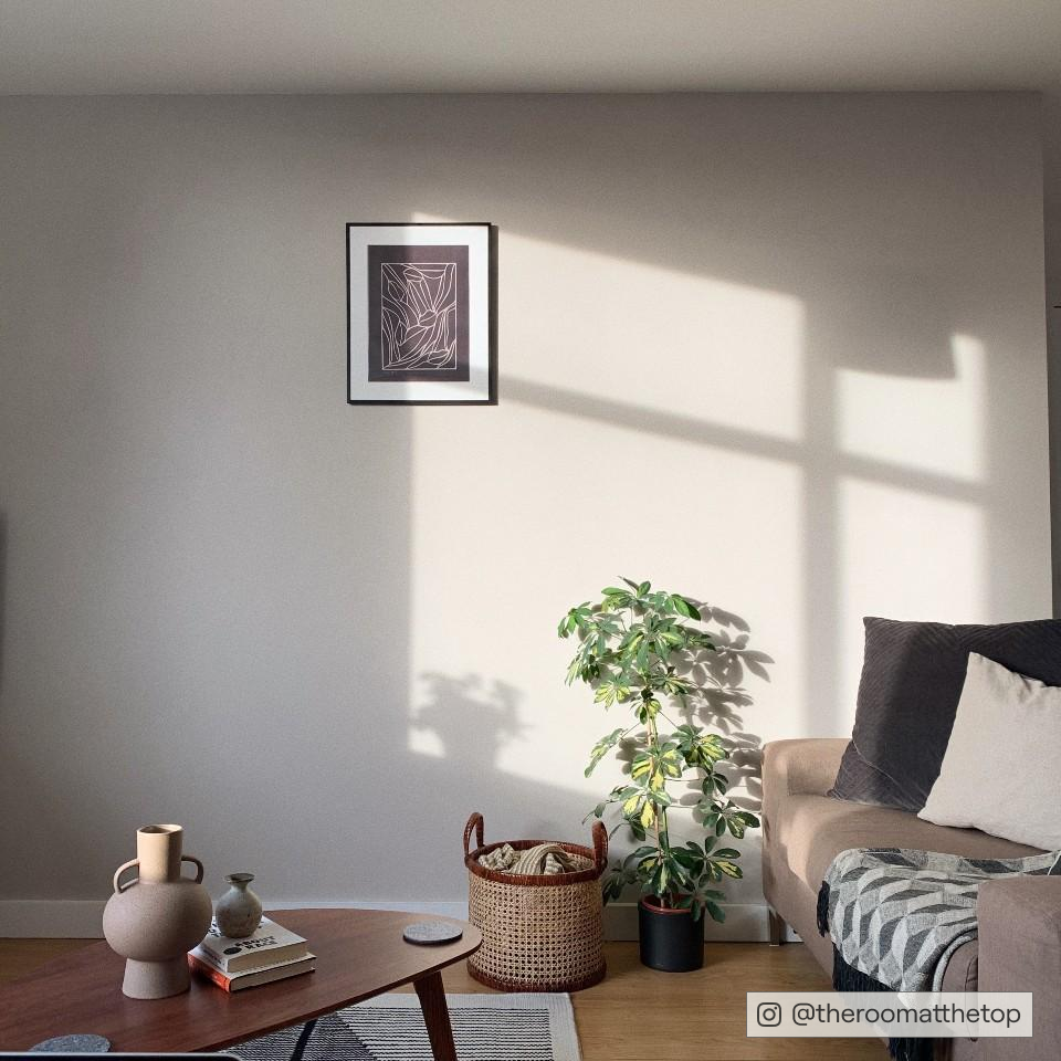
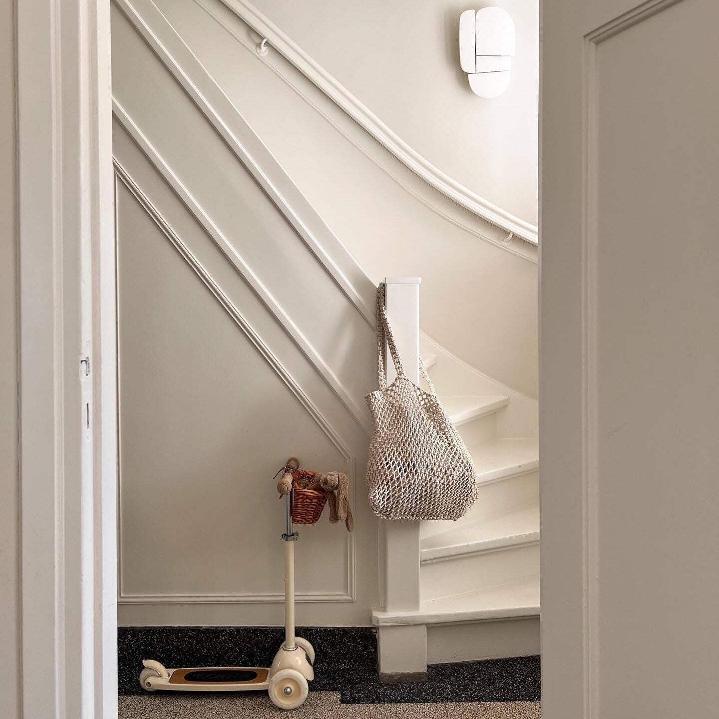
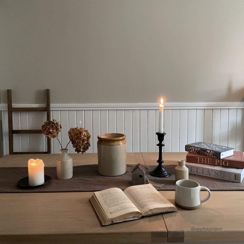
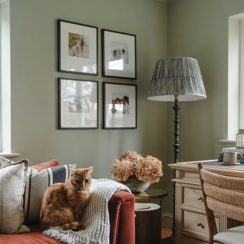
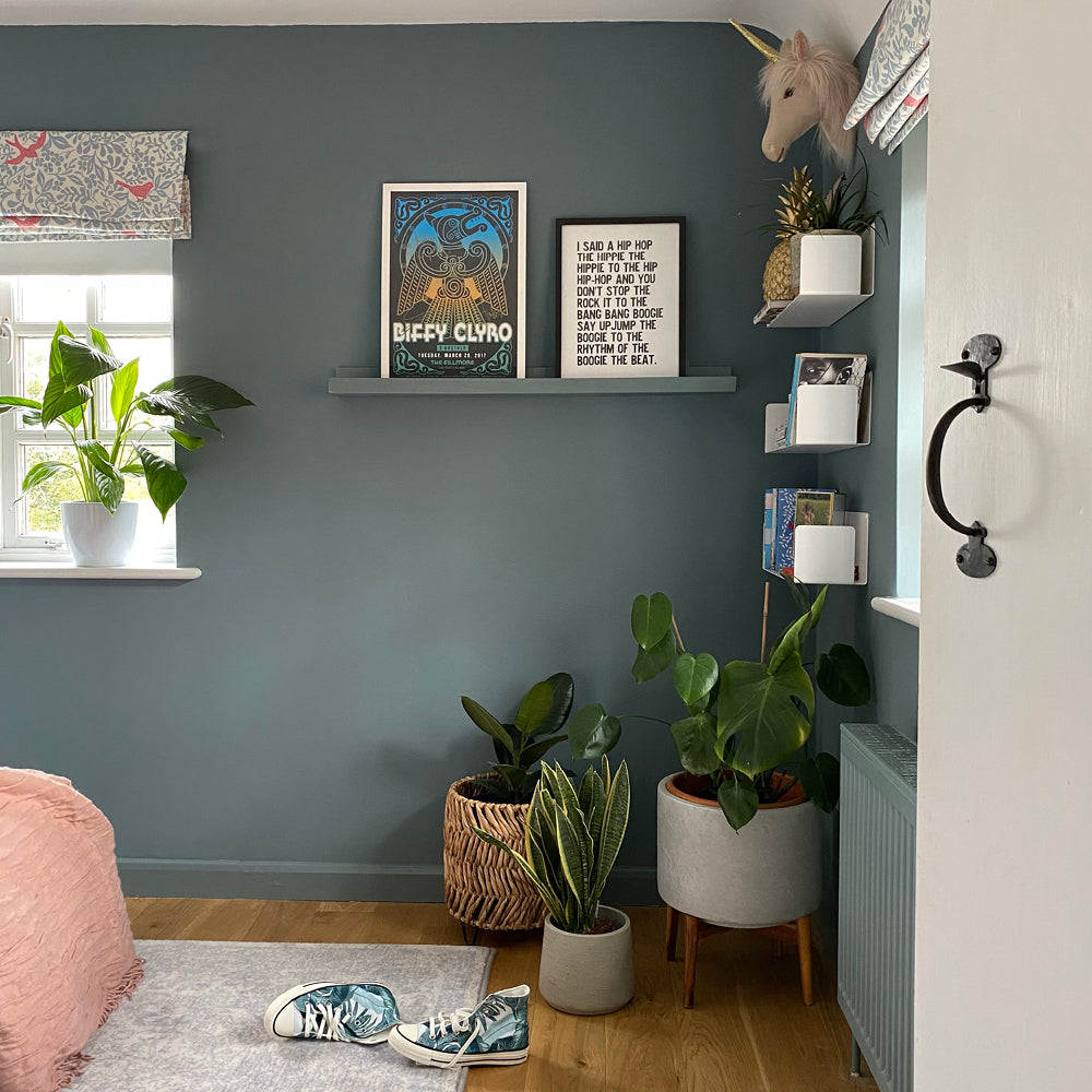
Sunday Soul is still a COAT best seller. A greyed off taupe, it’s super relaxed and works as the background for more or less anything. Expected to stay in vogue for 2022, because of how easy it is to use, pair with deeper woodwork and tactile fabrics and finishes on cabinets. The key to how to use taupes in 2022 is going to be about building schemes with these earthier neutrals combined with natural materials to create spaces with depth and texture.

'Sunday Soul' is a COAT Classic. It's stealing hearts in @theroomatthetop living area.
Publish Date
Author