The Bold Colours Of 2021
The Bold Colours of 2021
We’re ignoring your whites and neutrals here and talking about the colours that are popping, literally, headed into 2021. These trendy numbers aren’t just a flash in the pan though. These timeless shades have been hanging out on walls since the 1500’s (or something). Bold colours were considered a sign of wealth in the past, so you can rest assured they’re still classy af. Most of the time…
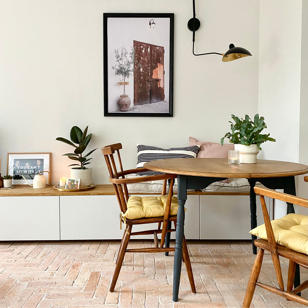
Grubby Yellow
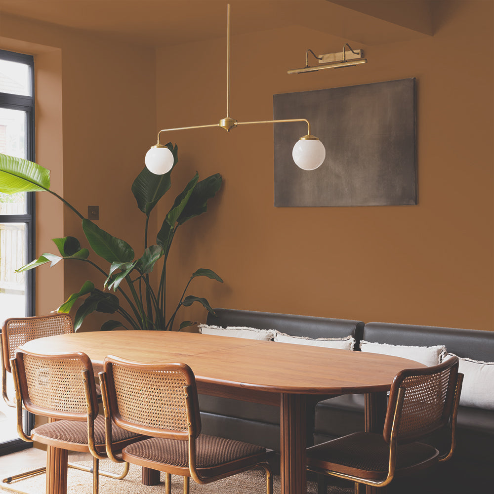
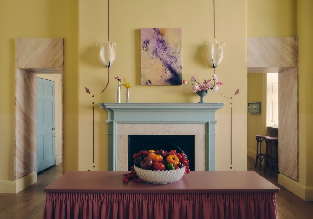
Starting strong, yellow is the OG feelgood colour. Pale has a place, but here we’re talking about the particularly dirty dark side of yellow. Use for a feature wall in a big bright room, or equally go all out in a dark hallway or box room. A good grubby yellow will look deliberate, but without shouting like primary colours. To get ahead of the trend, try Moritz.

Creds: Westonroadrenovation via Instagram

Purple
It’s happening again. The 90s are screaming back into view with all the purples - from your lilacs through to your dusty mid-shades. We’re huge fans of the mid-to-darker purples with a slightly grubby edge. But, the lilacs work well too. Oh heck, just embrace purple for 20201 and throw both into a couple of rooms. For a light dusty lilac straight from the 90s check out Montage, or for a more reddy purple, try Festival Eve.

Creds: Sunday Times Home via Instagram

Creds: sofacompanyofficial via Instagram
Teal
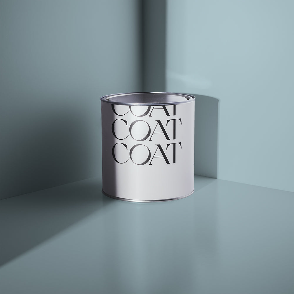
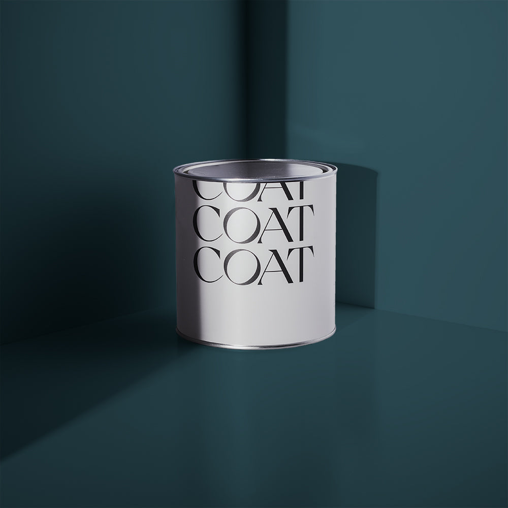
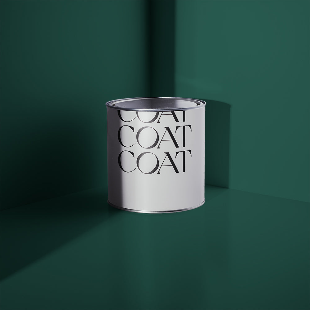
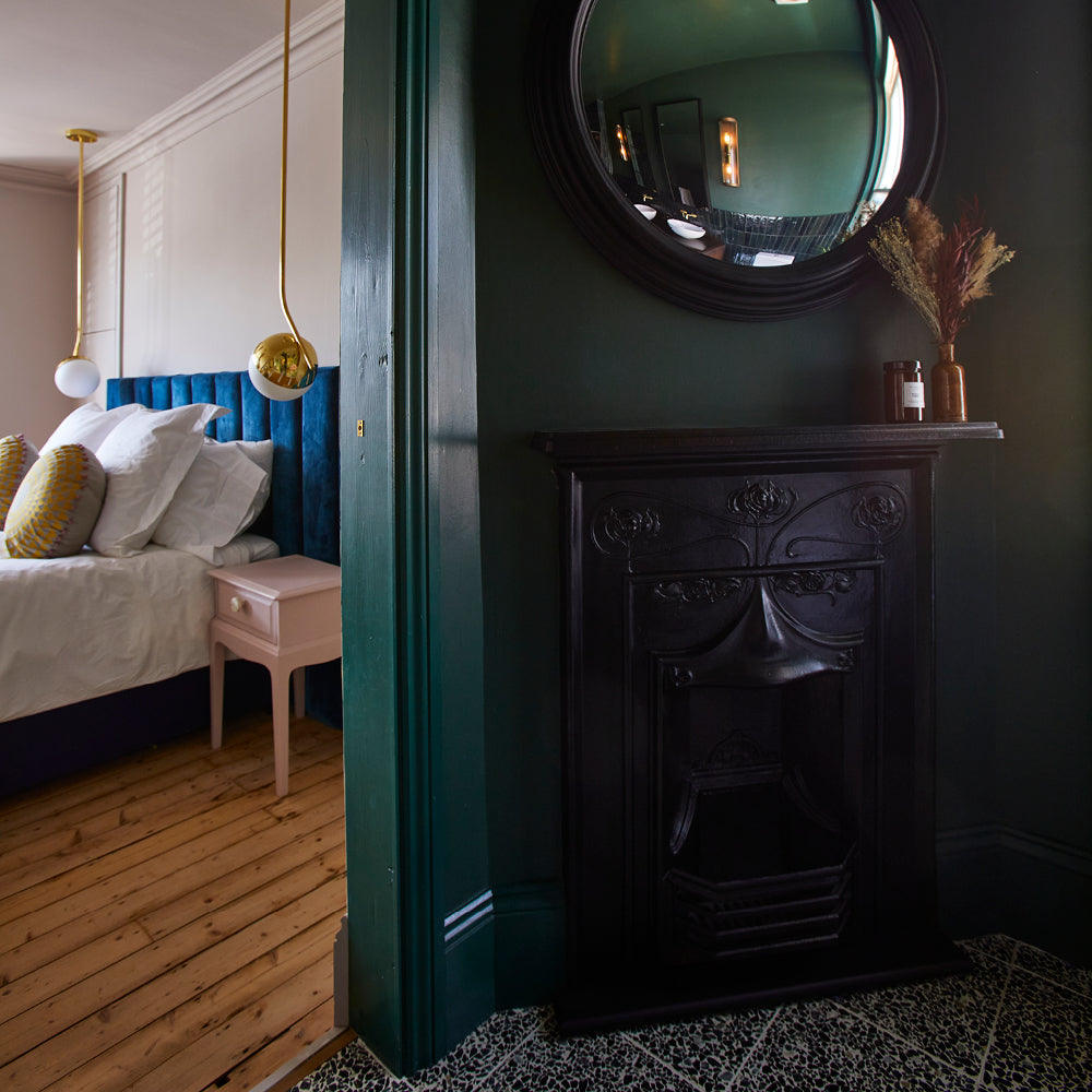
What even is Teal? Well it’s a blue-green colour that carries quite a few shades under its umbrella. Interestingly (we think) the name comes from a bird - The Common Teal - which carries a blaze of said colour on its head. Anyway, in it’s darkest guise Teal is a bang on-trend colour that looks great in all spaces from nurseries to grown-up dining rooms. Pair it with a pure white walls or pure white trim to make it really pop. We have a variety of teal shades to offer you, from vibrant Pool House, to the darker and more adult, Adulting.

Image from thespruce.com
Image from designrulz.com
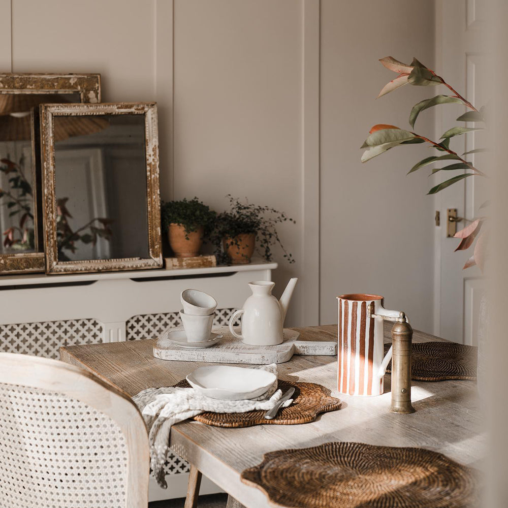
Pink
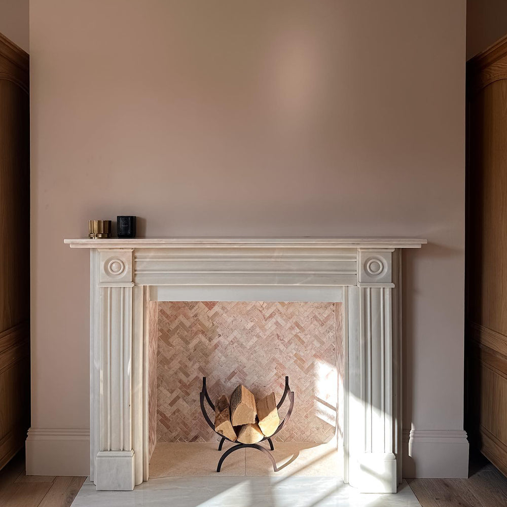
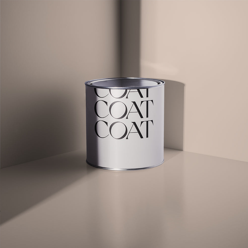
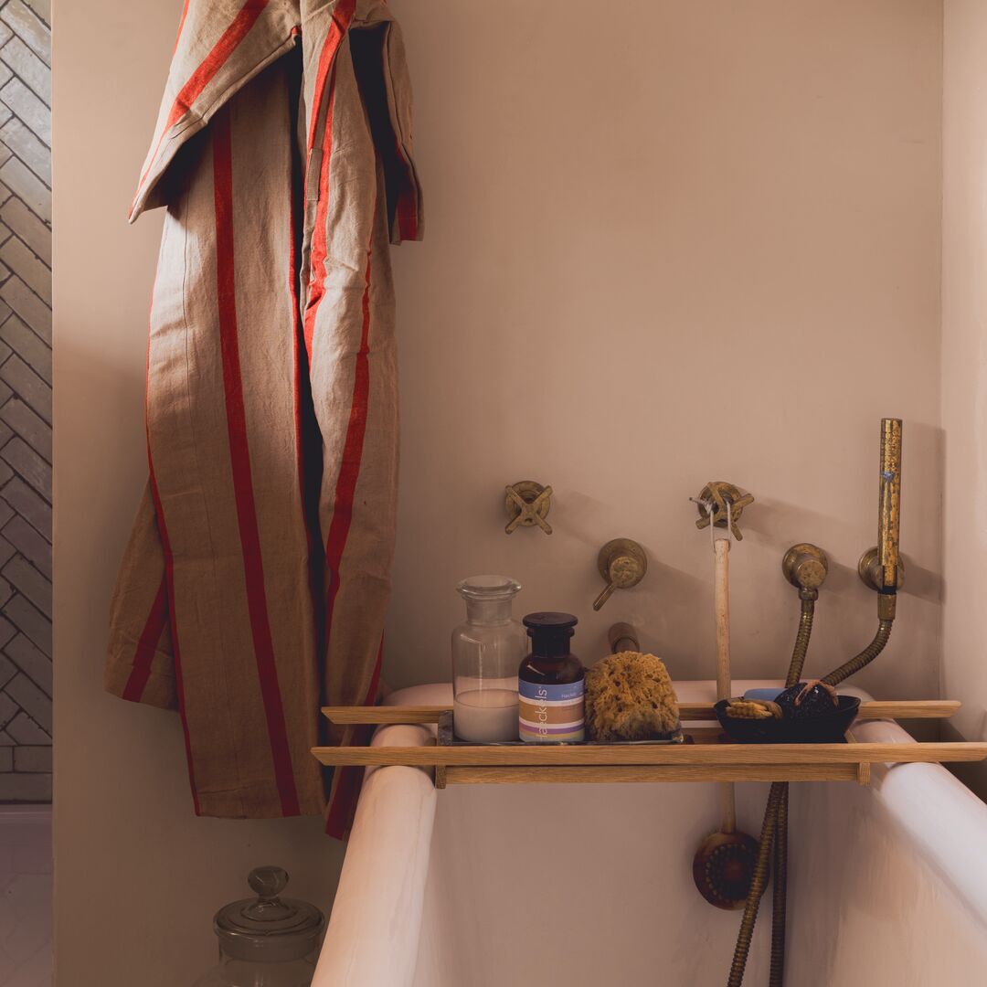
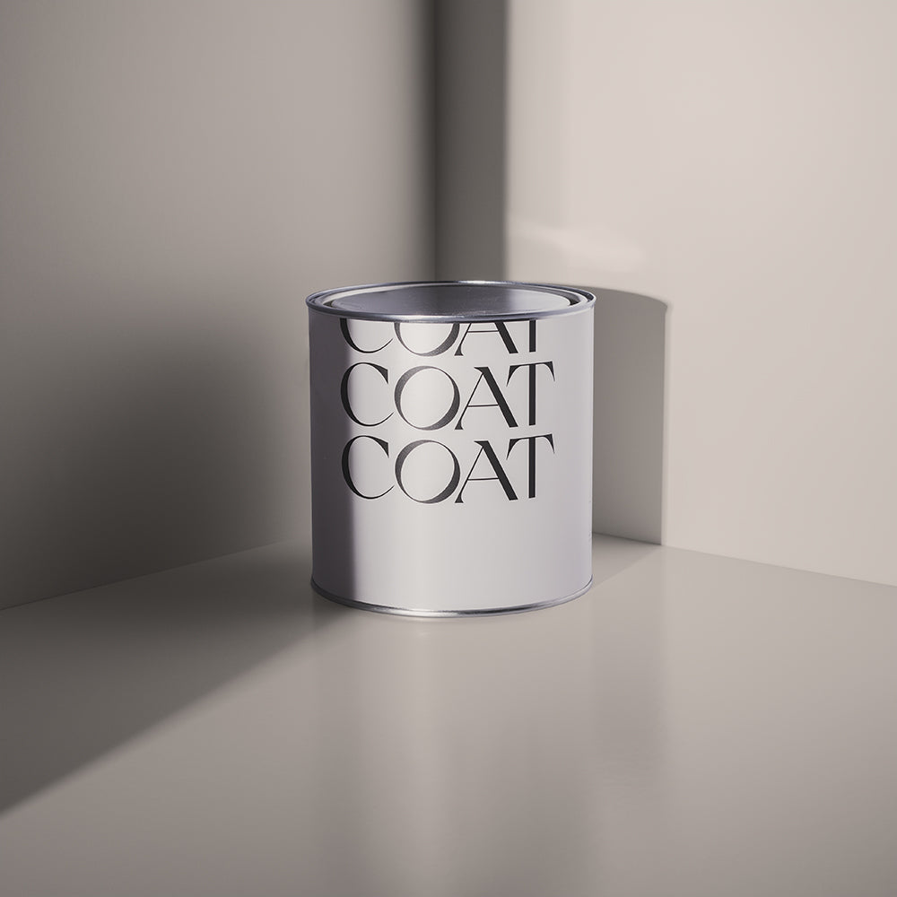
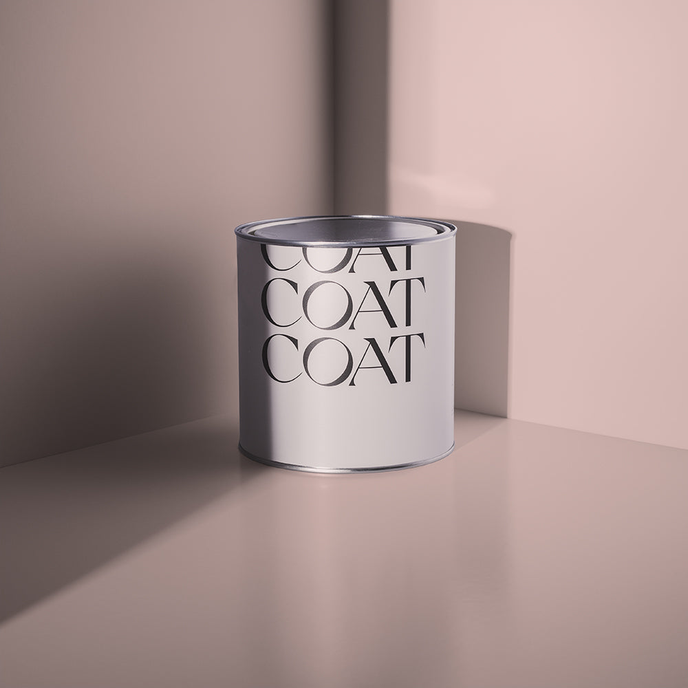
Overused in Millennial advertising since 2k16, pink is a colour that’s always on trend - and it’s here to stay. We’re particularly keen on a slightly grubby number, although the cute shades are still knockout. Go grubby in darker spaces for a classy feel, or pale in brighter bedrooms maybe. You could even pair a pale number with a dark blue feature wall. Imagine.
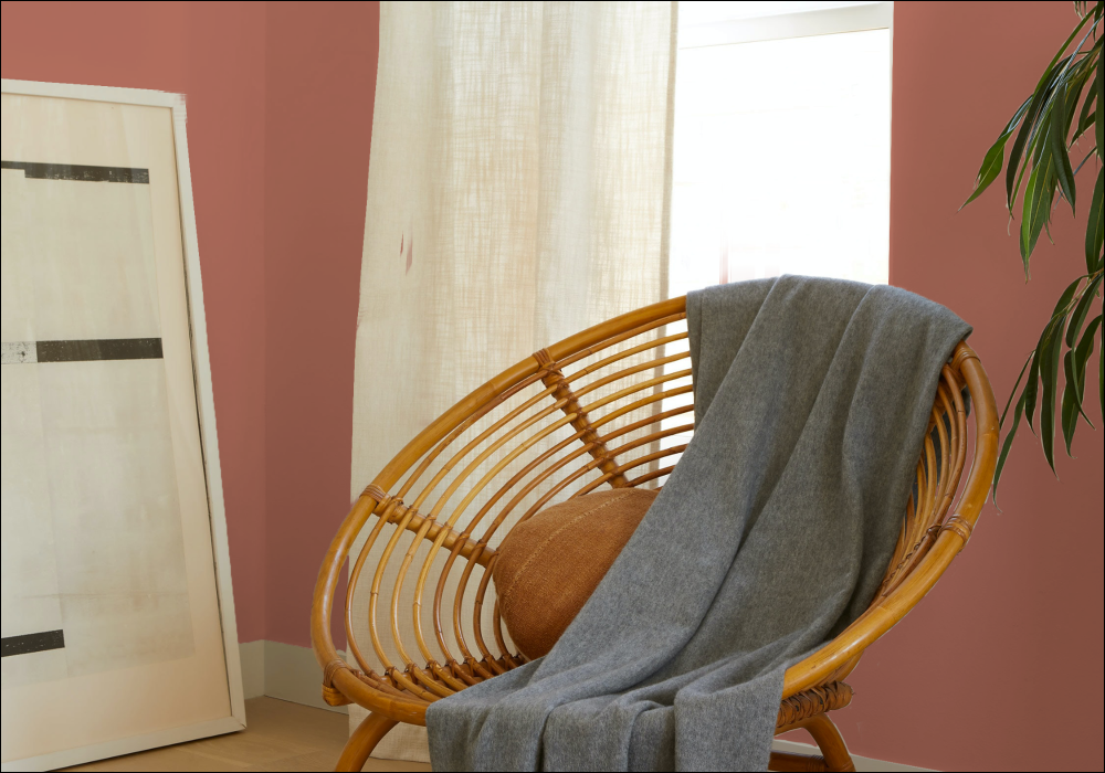
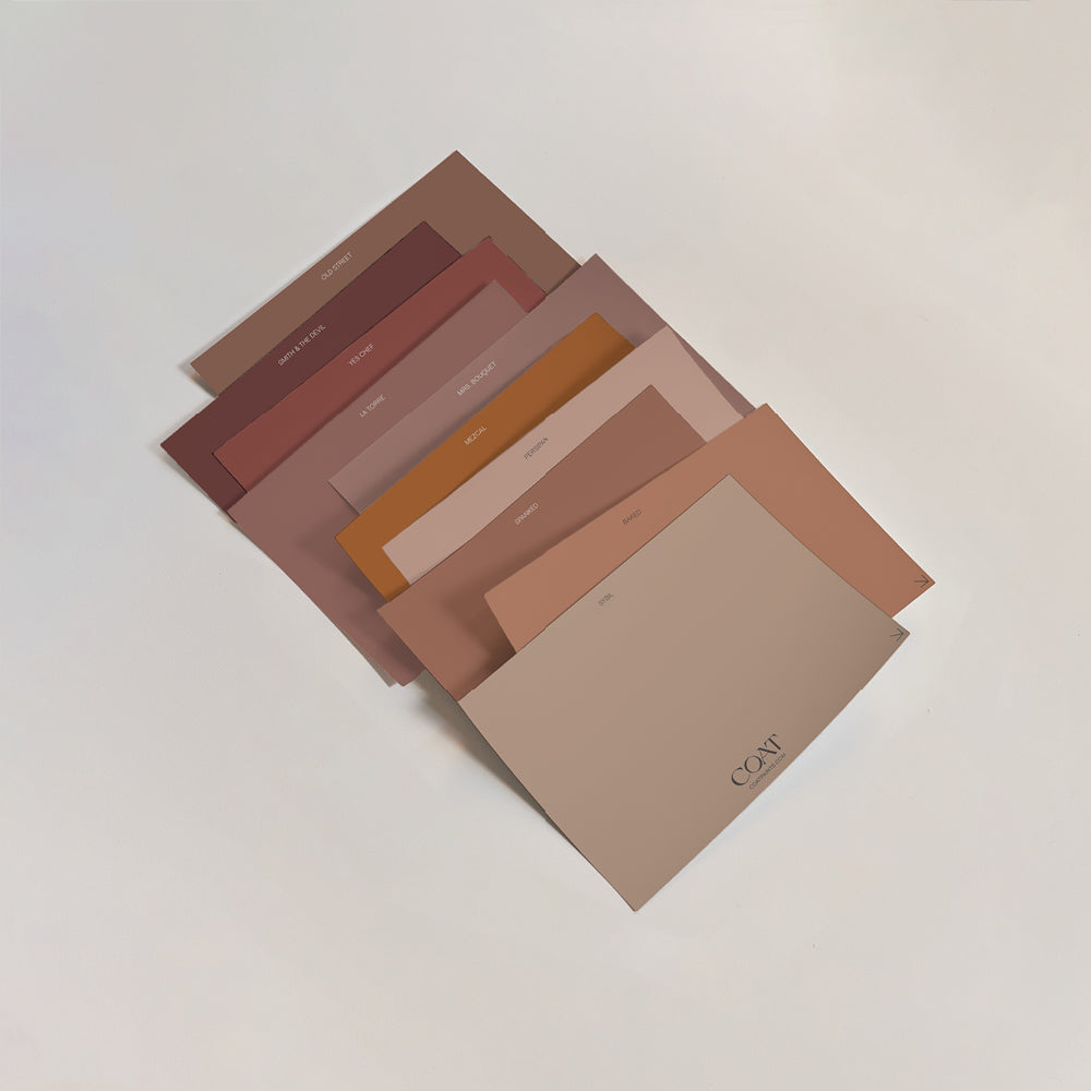
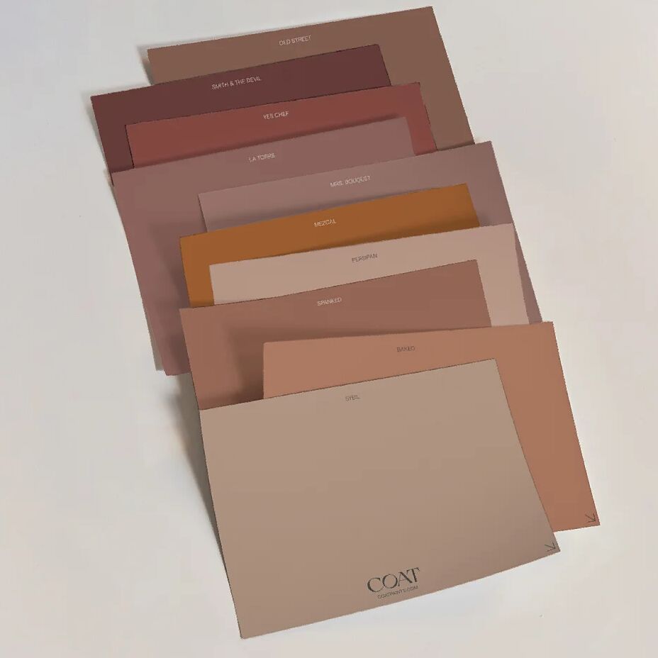
For the perfect grubby grey pink try Ciao, Sofia, or give Amoureuse a go if you're in need of a real statement wall.

Creds: ramseyresidence via Instagram

Image from Pinterest
Dark Blue
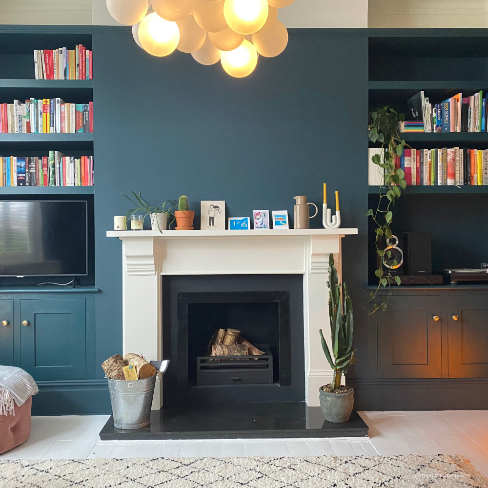
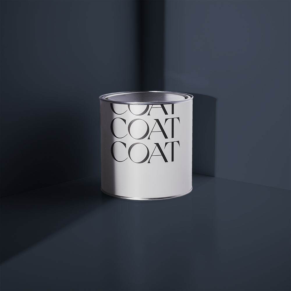
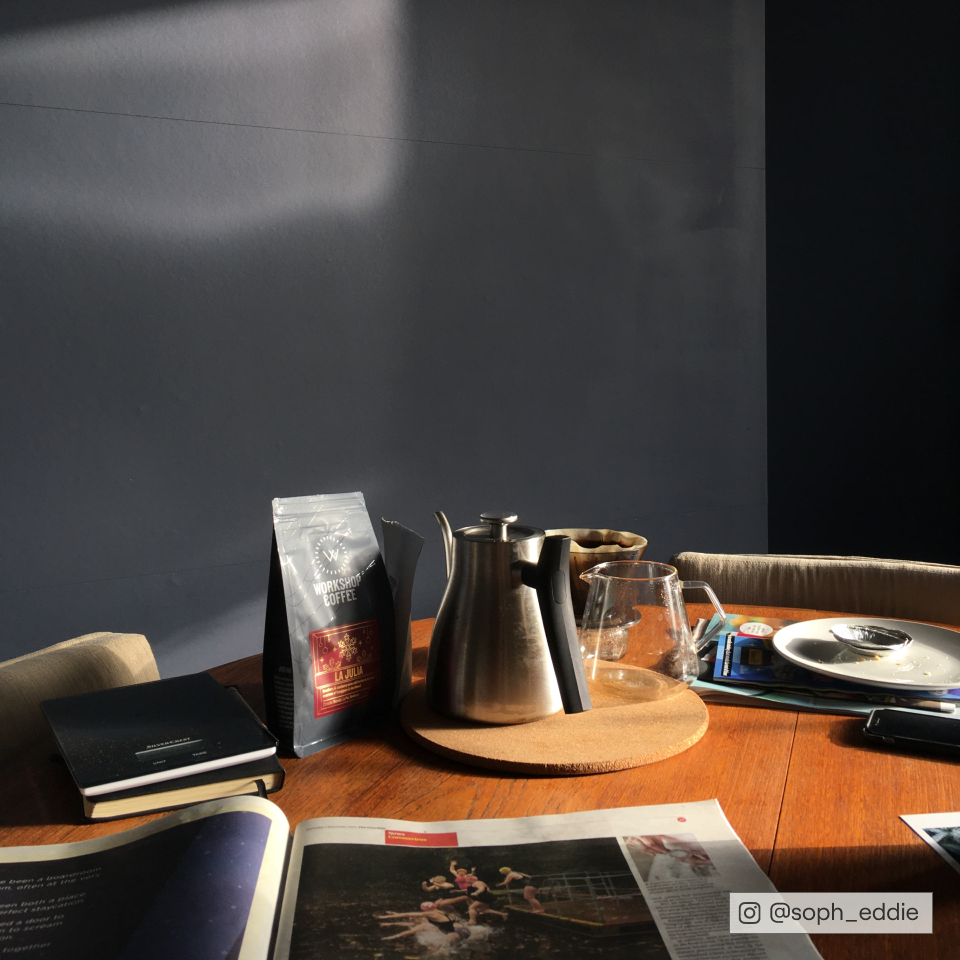
Blue spans a lot of shades admittedly, from pale Bebe Bleu through mid-Blues and right upto the darkest Blues that are almost black. The darkest Blues are both trendy and timeless, so you can use them confidently. Dark hallways will look epic, or tag-team a feature wall with off-white or neutrals in large bright rooms. However you use dark Blue, you’ll struggle to go wrong. For a classic dark blue, 2AM is the one.

Creds: reettapelli via Instagram

Creds atnumberfive via Instagram
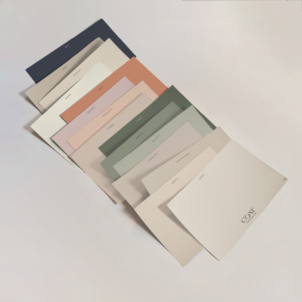
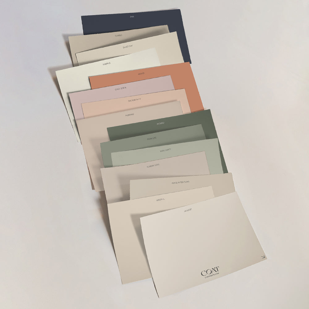
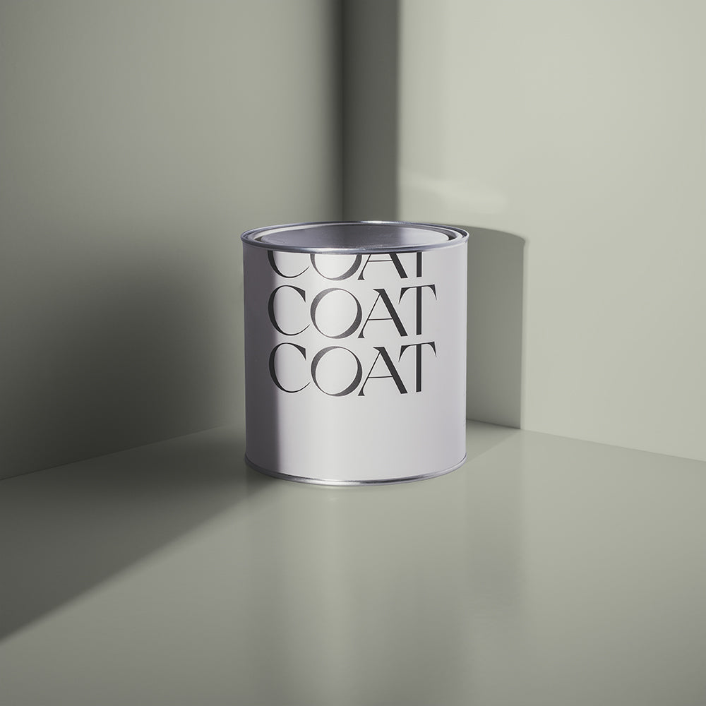
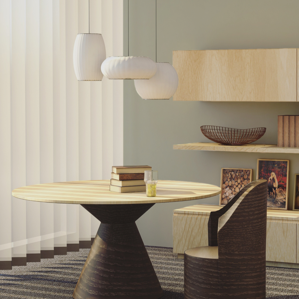
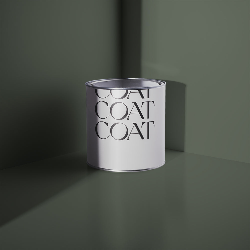
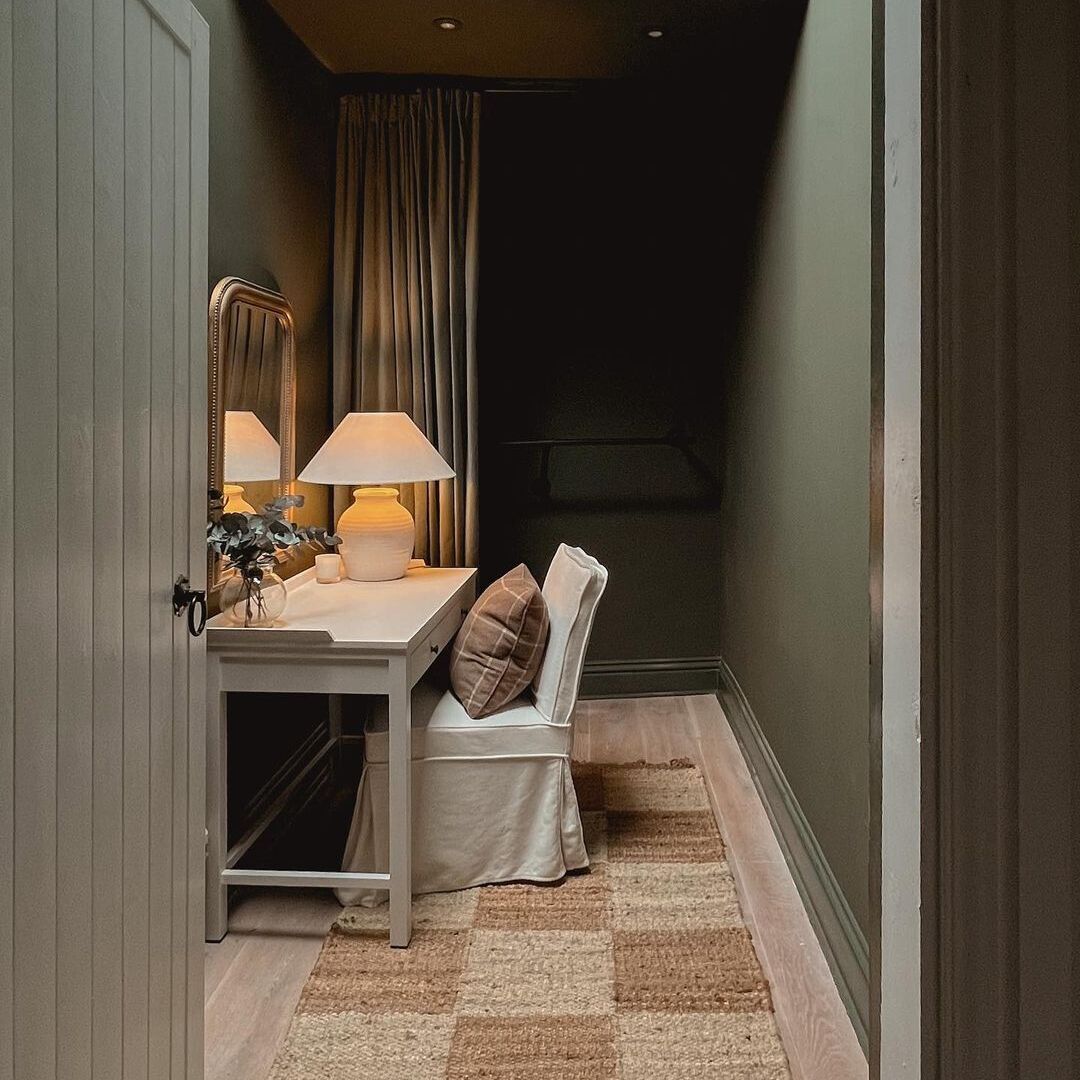
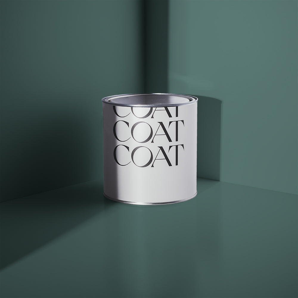
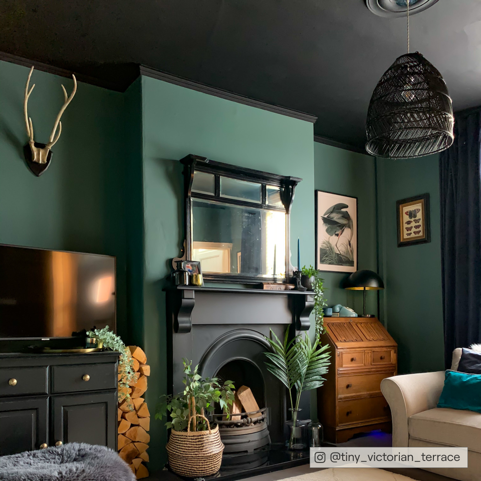
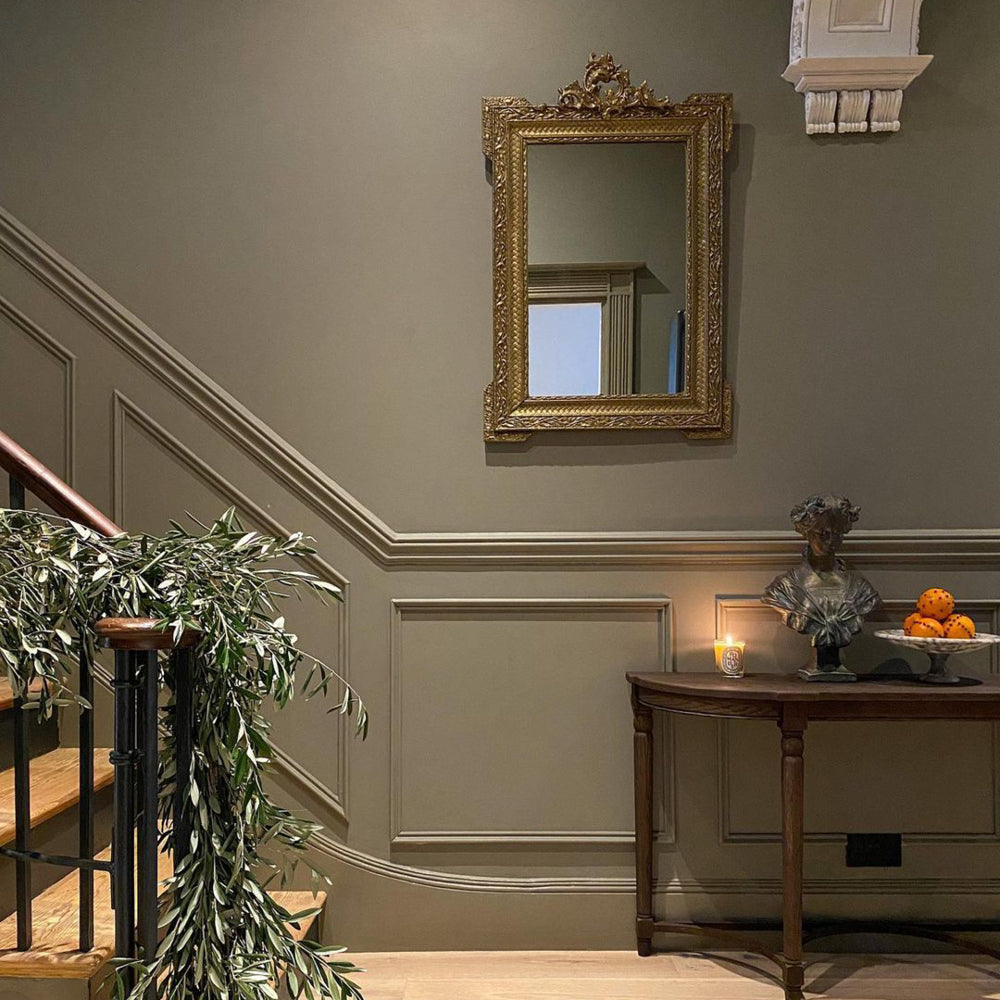
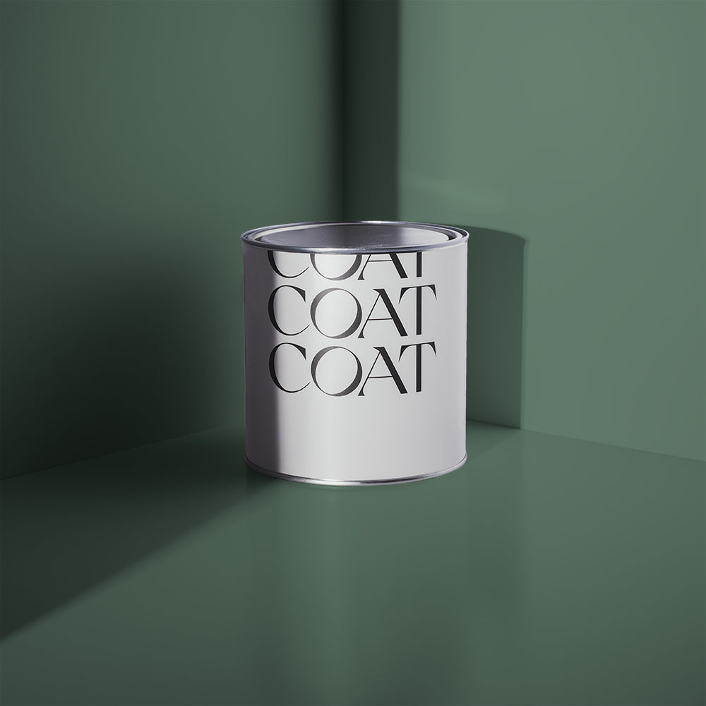
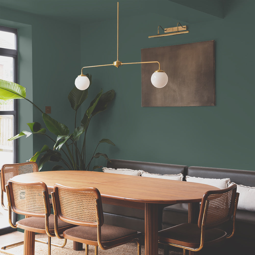
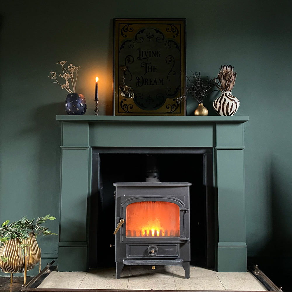
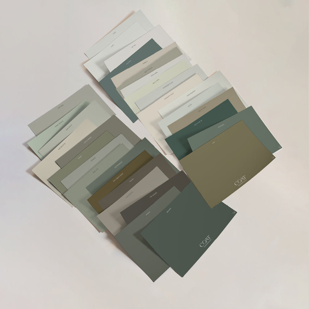
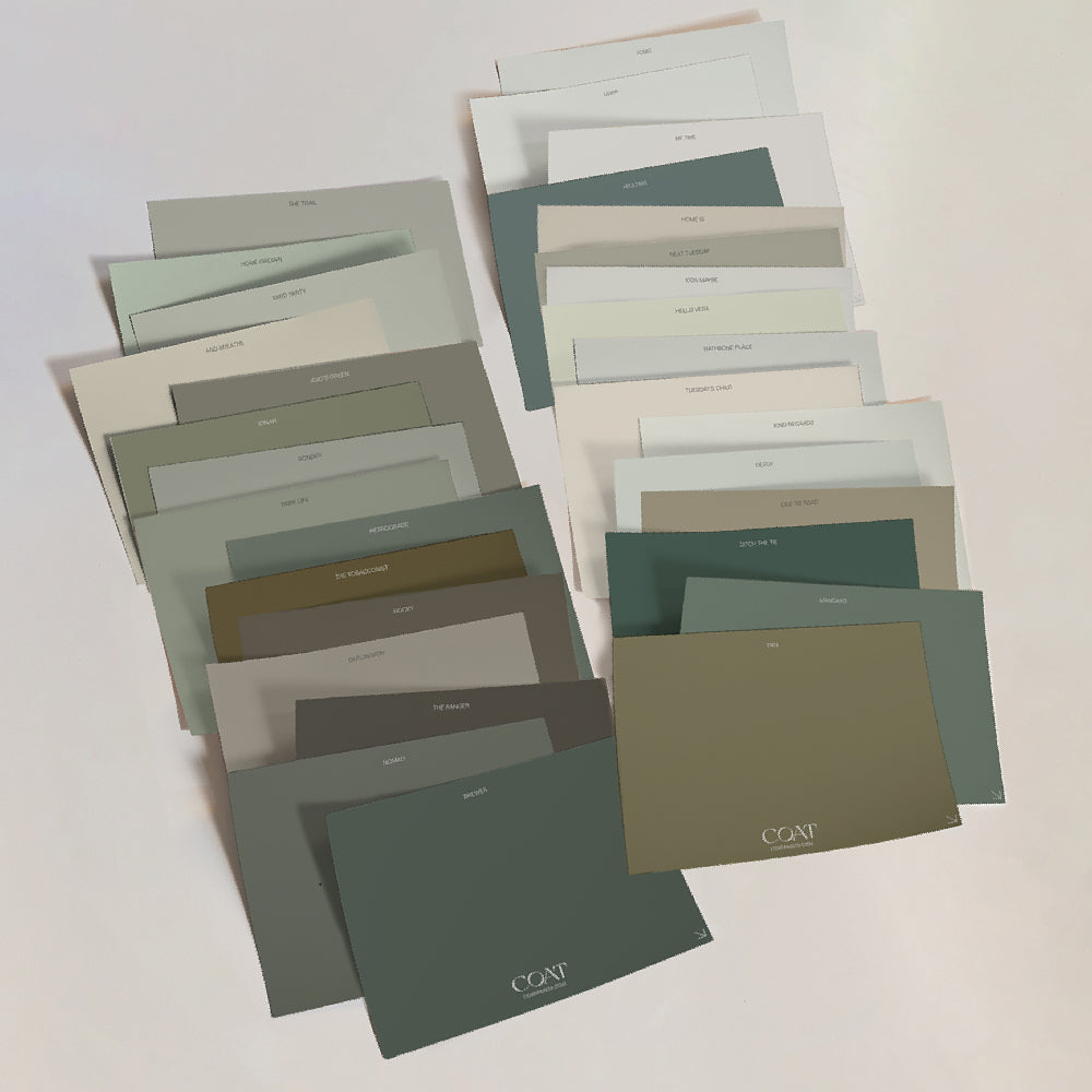
COAT doesn't offer every paint colour, just THE colours. You want a dark Green, Ditch The Tie is the one. Teal? Adulting - done. Forget scratching through thousands of colour cards in depressing DIY stores, or getting lost for hours in Instagram - we’ve got you covered.
Be part of a community that’s always on trend.
Publish Date
Author








Leave a comment