Shades of Grey: This Time They're Back and They Mean Business
Back in the Noughties, grey was THE colour of the decade when it came to decorating your home. Alongside a feature wall and some shabby chic furniture, grey reigned supreme as everyone's favourite neutral. But it wasn't long before those 'safe' greys were ditched in favour of bolder colours and more adventurous interior schemes.
However, as is often the case, what goes around comes around. The Sunday Times recently announced that greys are making a comeback, and now there's no stopping the little critters 🐭 So, if you were ever in doubt, now is the time to welcome in those greys and find some comfort in their warm embrace 🤗
Here at COAT Paints, we've always been big fans of grey. Put it this way, one of our founders, Rob Abrahams, has devoted several rooms in his house to shades of grey. Mindful and Darlington, we salute you! 🙌

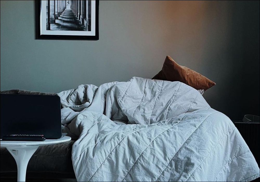
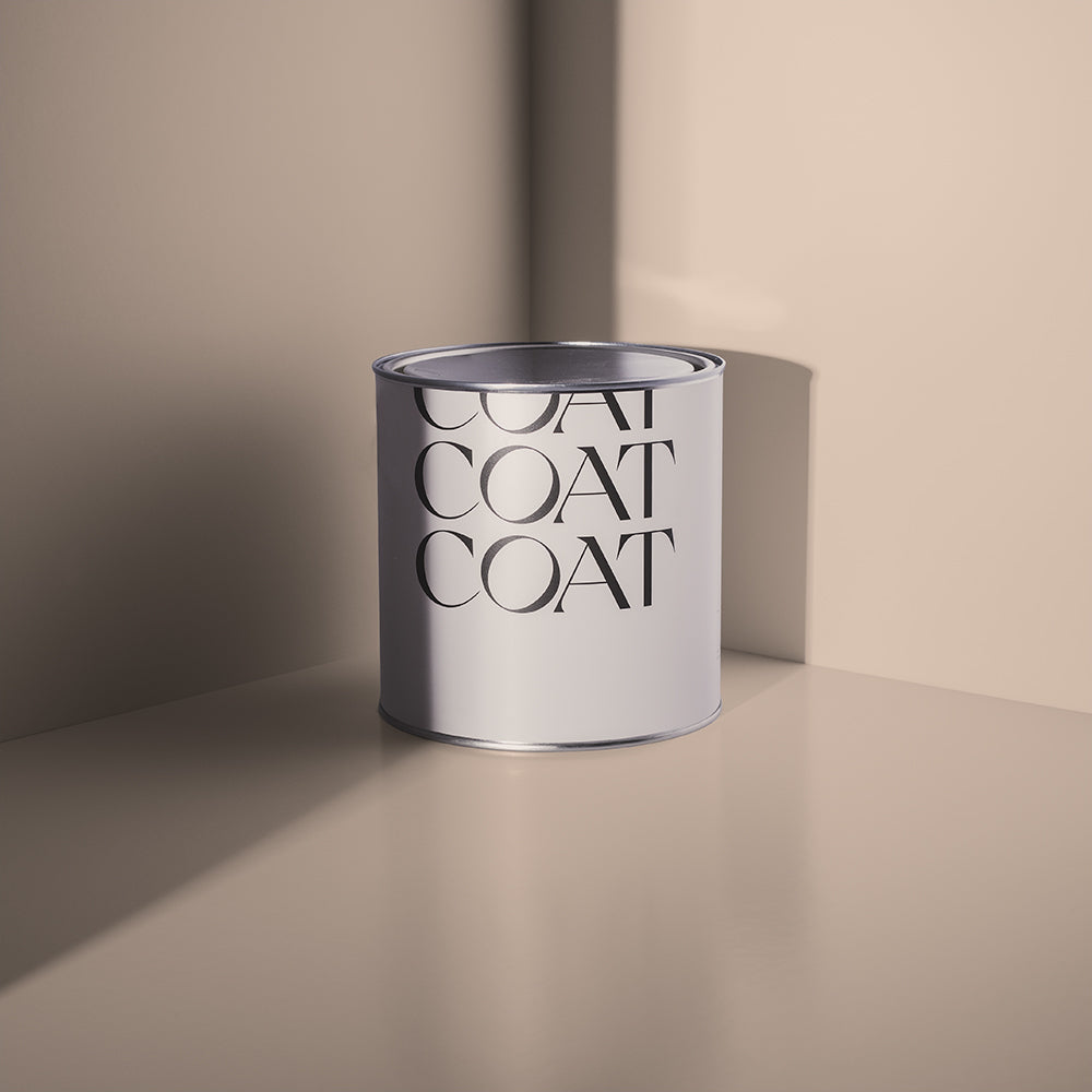
One of those days. 'Darlington' creates that cosy vibe so don't be surprised if you want to curl up in your duvet in your freshly painted room.
With this in mind, we decided to grab a coffee with Aaron Markwell, COAT's Lead Colour Consultant, to have a chat about how to use grey in your home…
ARE GREYS MAKING A COMEBACK?
"Absolutely. In fact, I'm not sure they ever went away," says Lead Colour Consultant Aaron. "I think greys have always been popular because they're so versatile and easy to use. You know what you're getting with a grey. And because it's essentially white paint with some black pigment, it's a really stable colour that works in lots of different interiors.
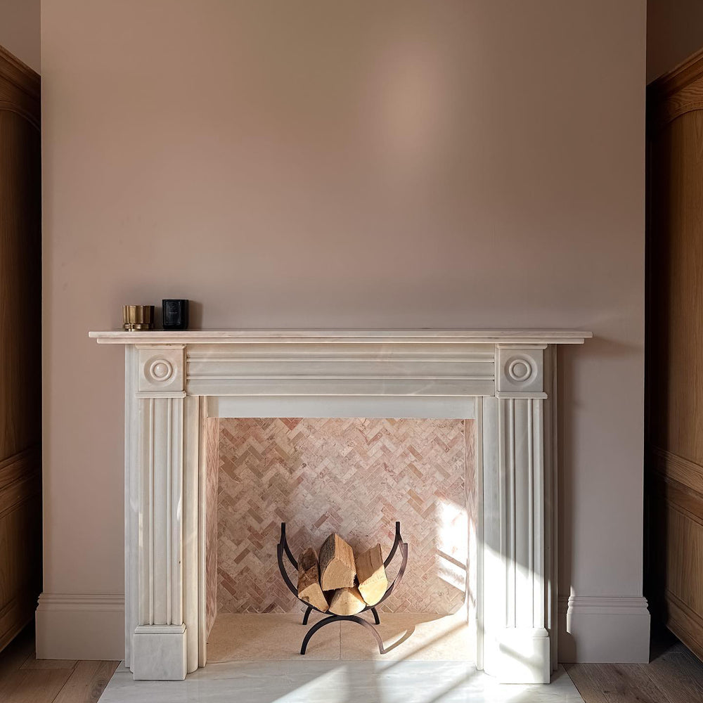
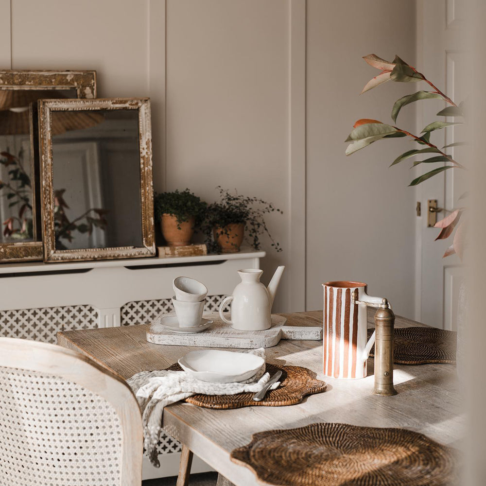
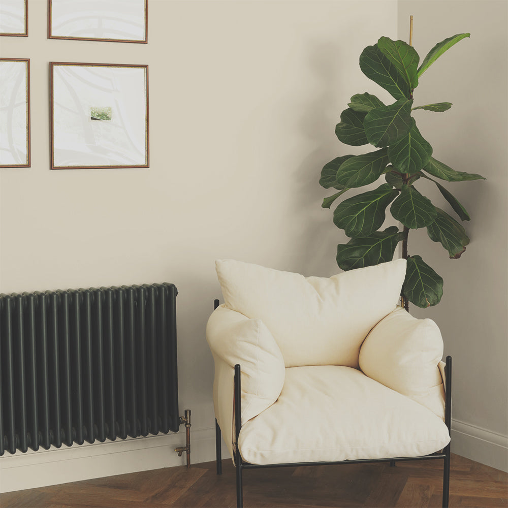
"Grey taupes are definitely making a comeback," says Aaron. "Colours like Sunday Soul are informing interiors at the moment because they feel more inviting than cool greys thanks to their brown undertones."

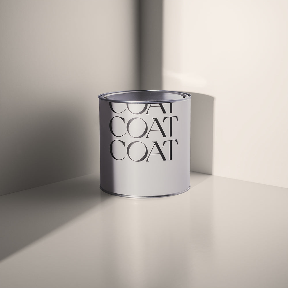
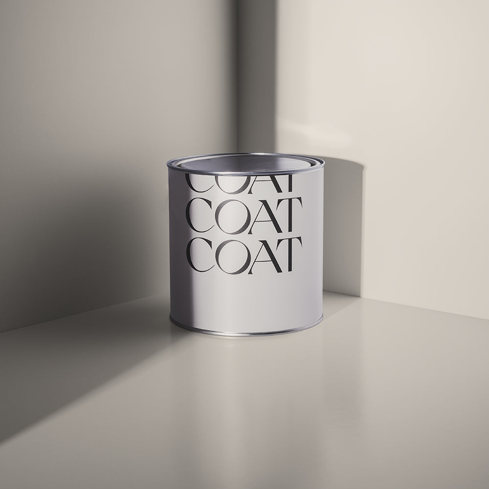
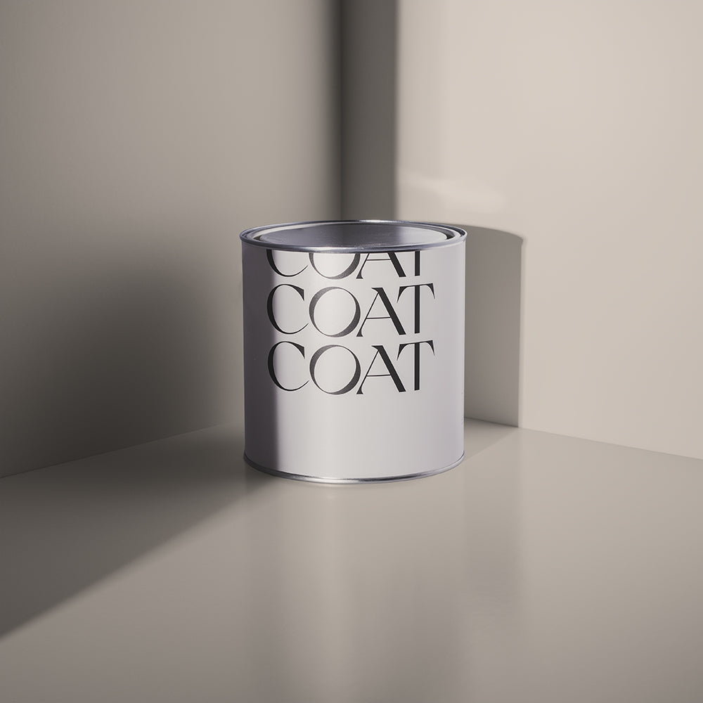
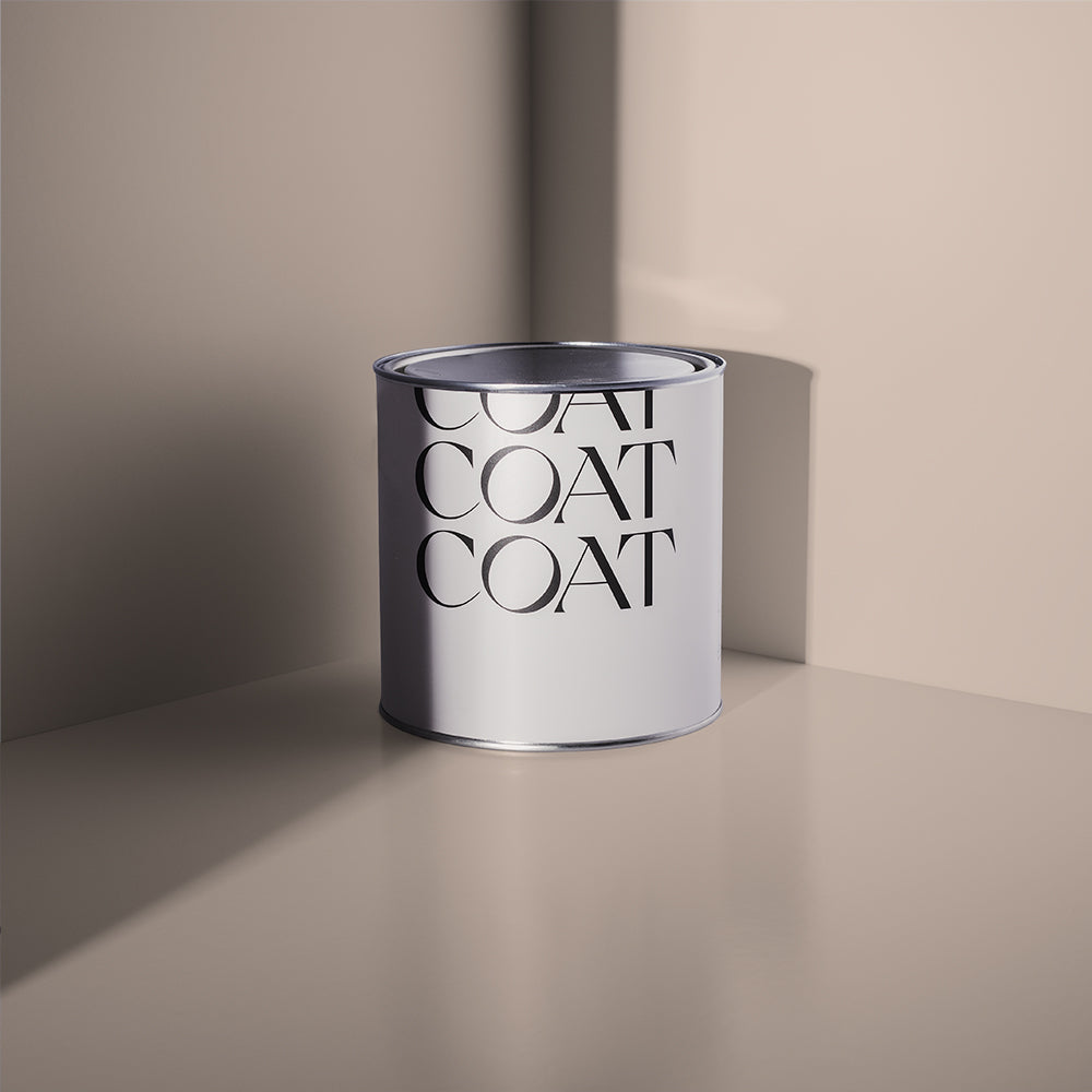
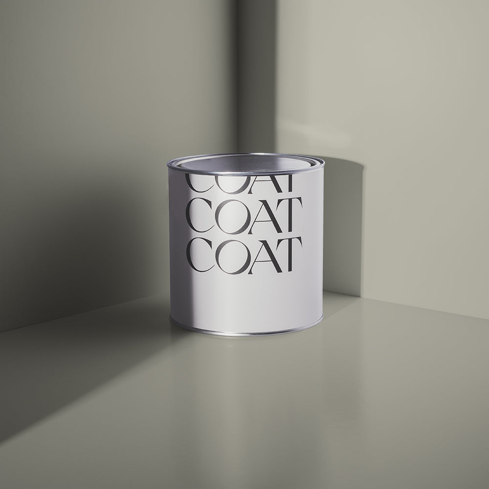
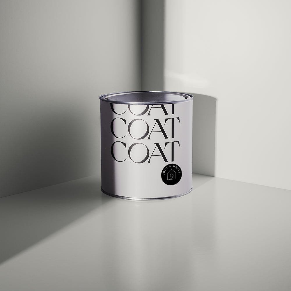
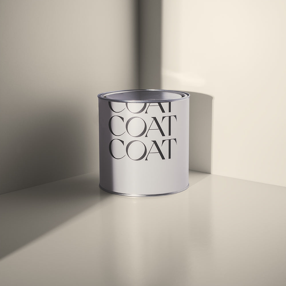
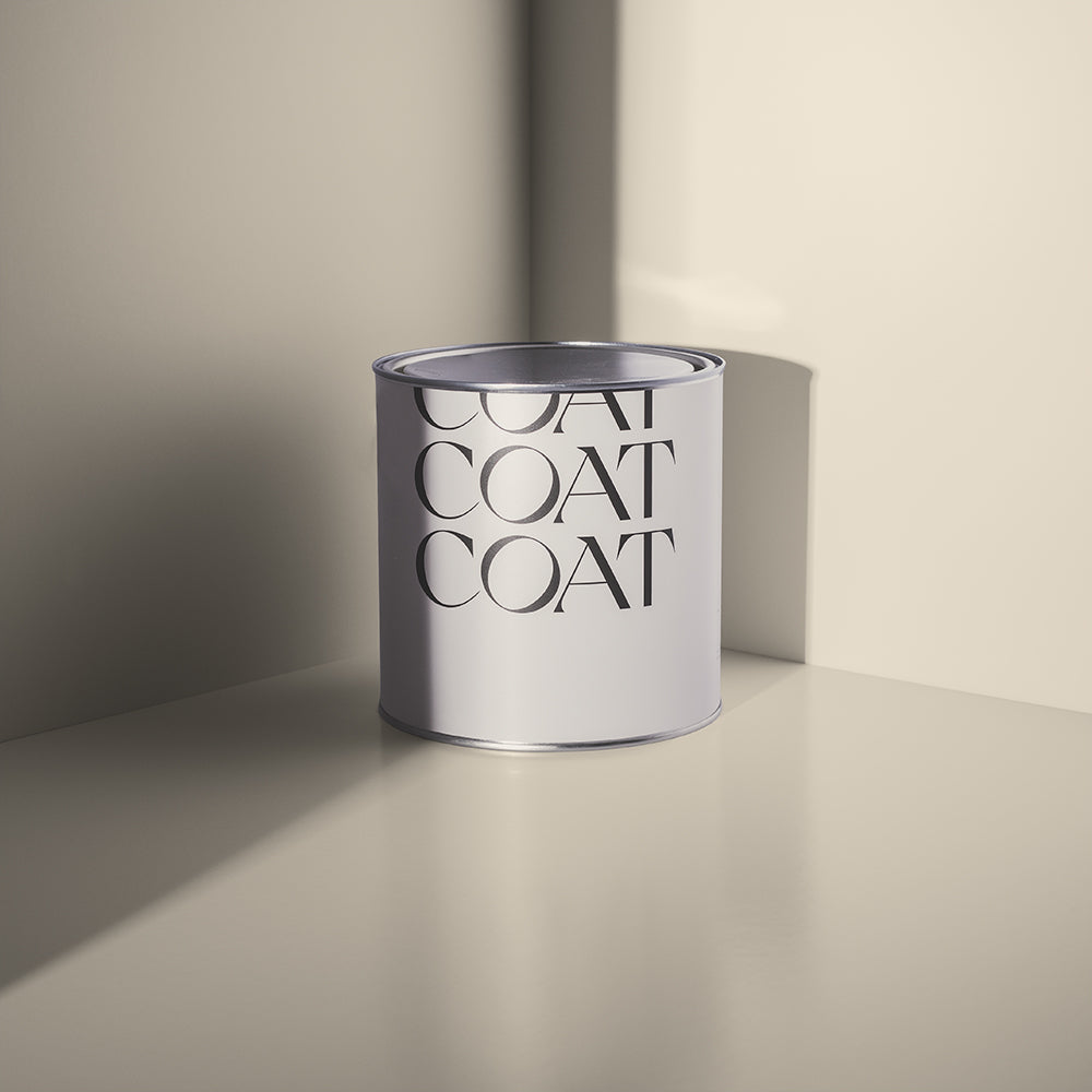
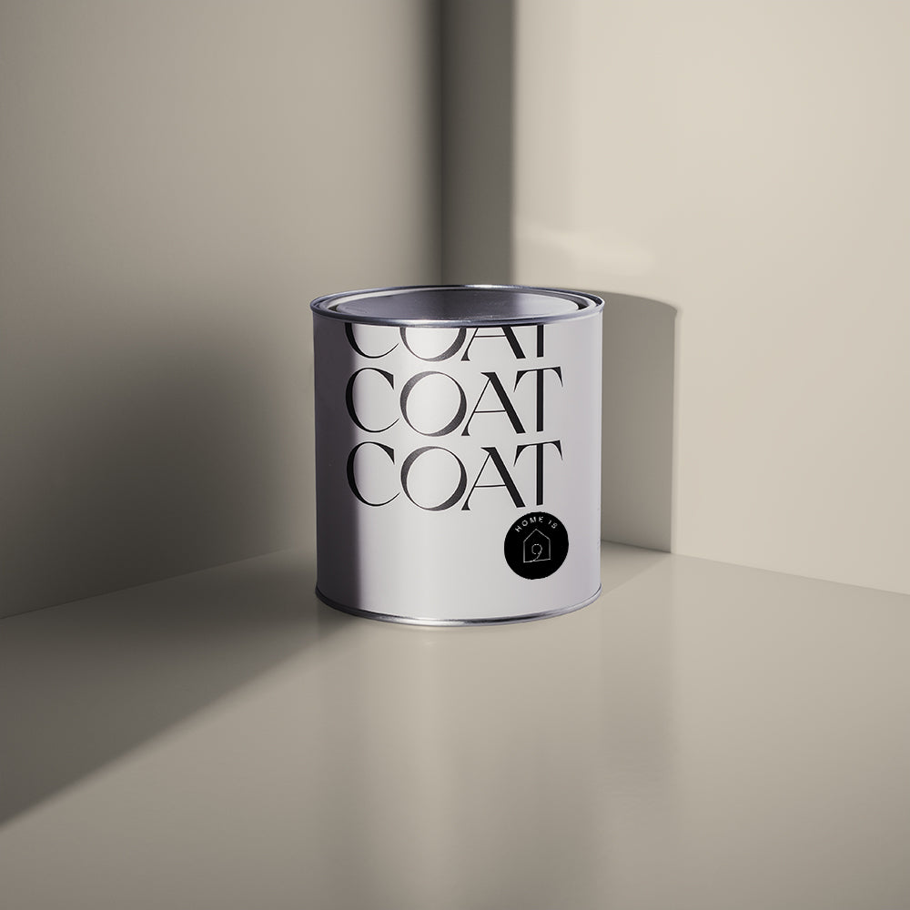
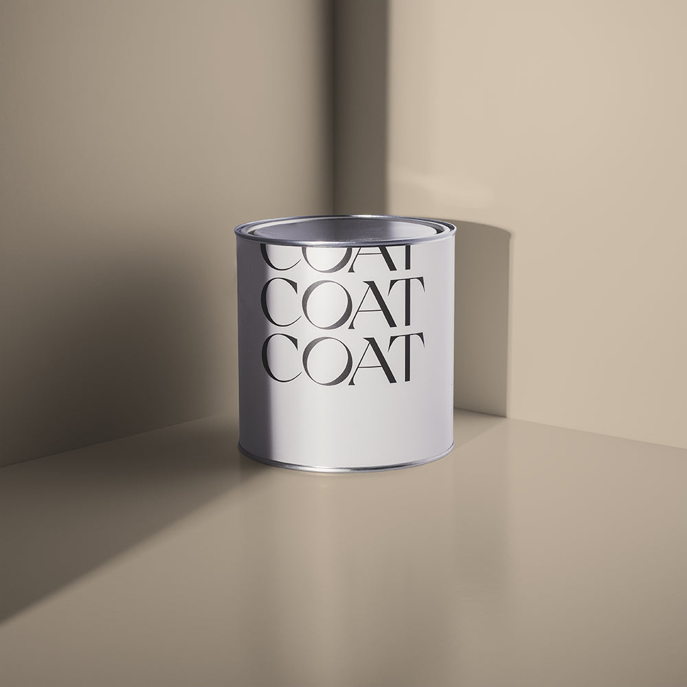
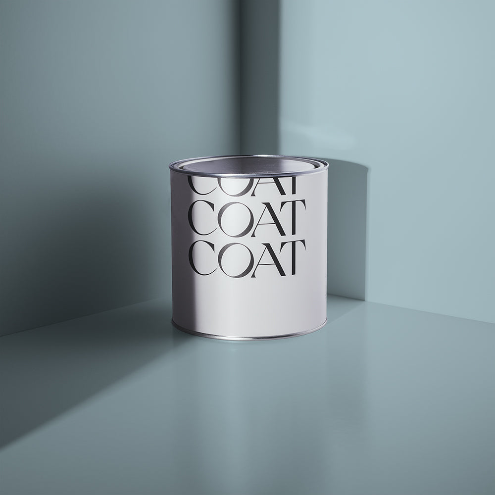
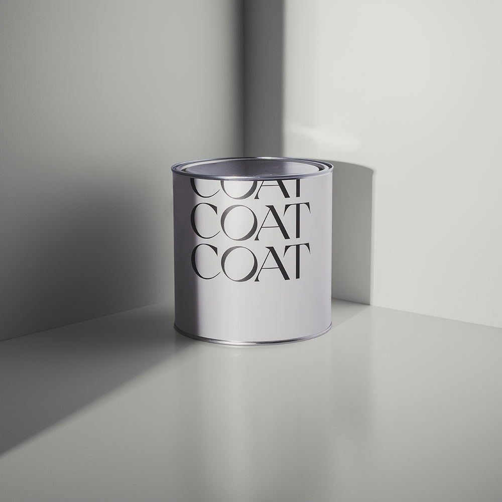
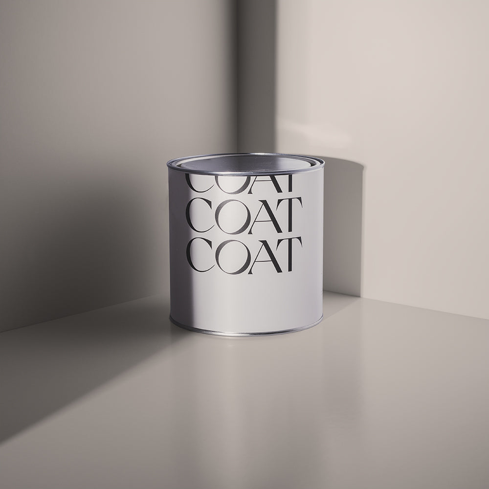
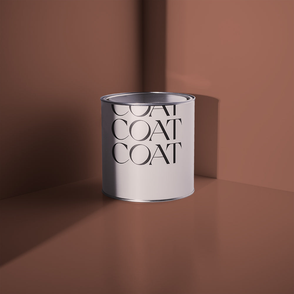
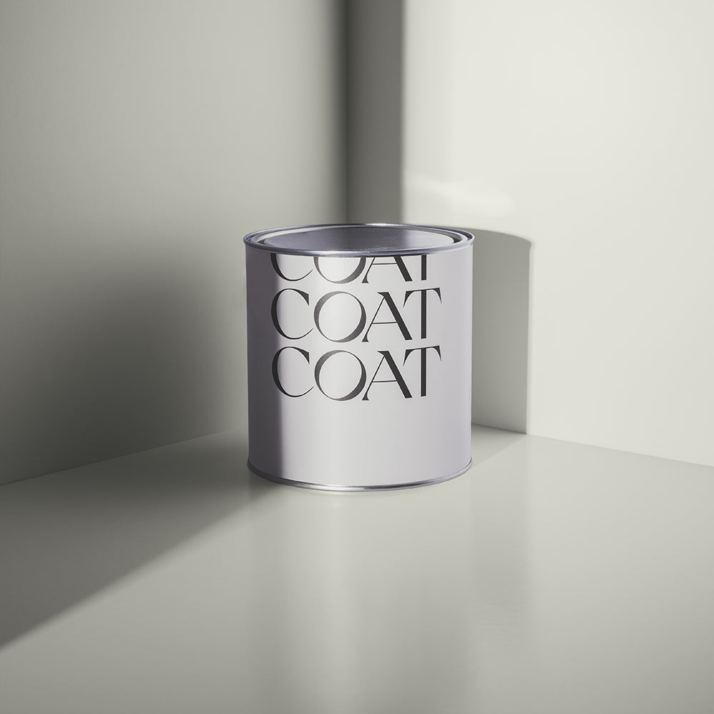
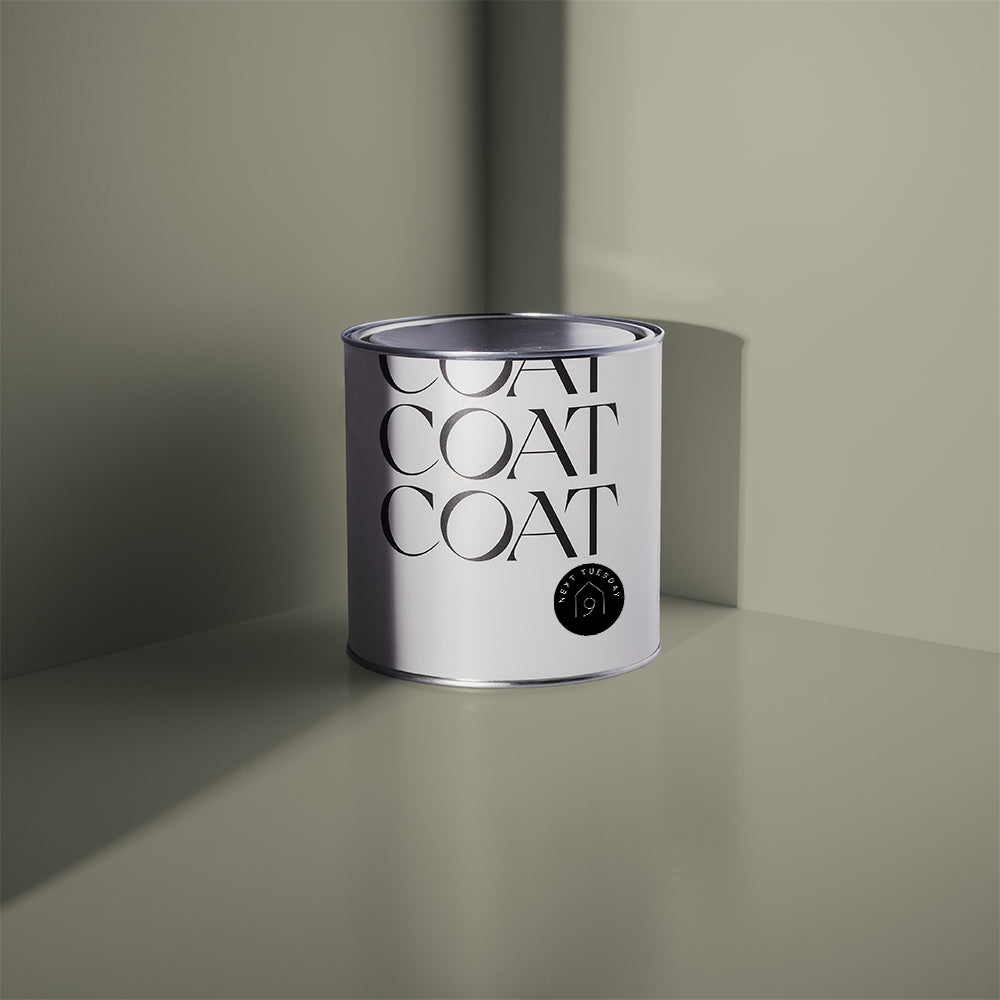
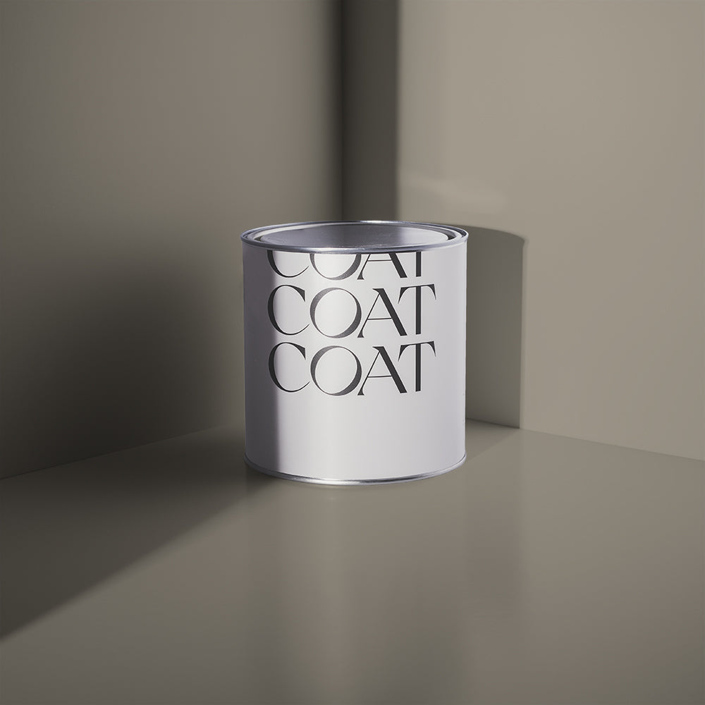
'Cold brew', oh isn't she a beauty. Tins not bad either ay.
We like to think of Sunday Soul as a hug in a pot. Use it in north-facing rooms, where the light is colder, to make them feel more welcoming. And why not pair it with Cold Brew on the woodwork? Using this darker taupe shade as an accent will make the whole room feel brighter because of the contrast ✨
WHAT IS IT ABOUT GREYS THAT MAKES THEM SO VERSATILE?
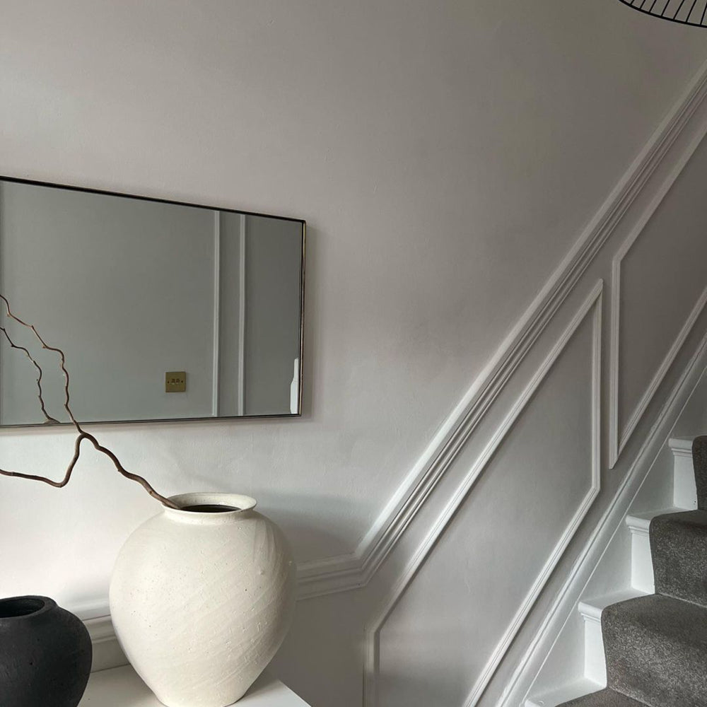
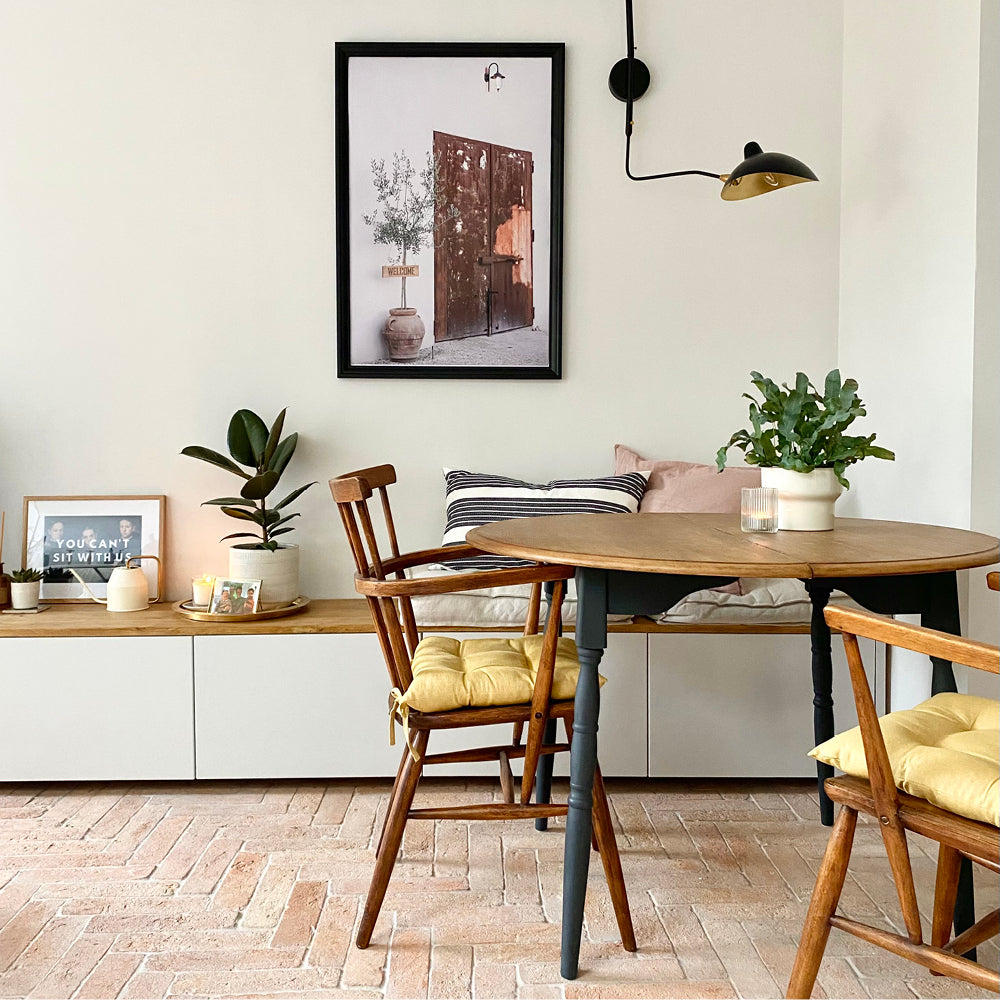
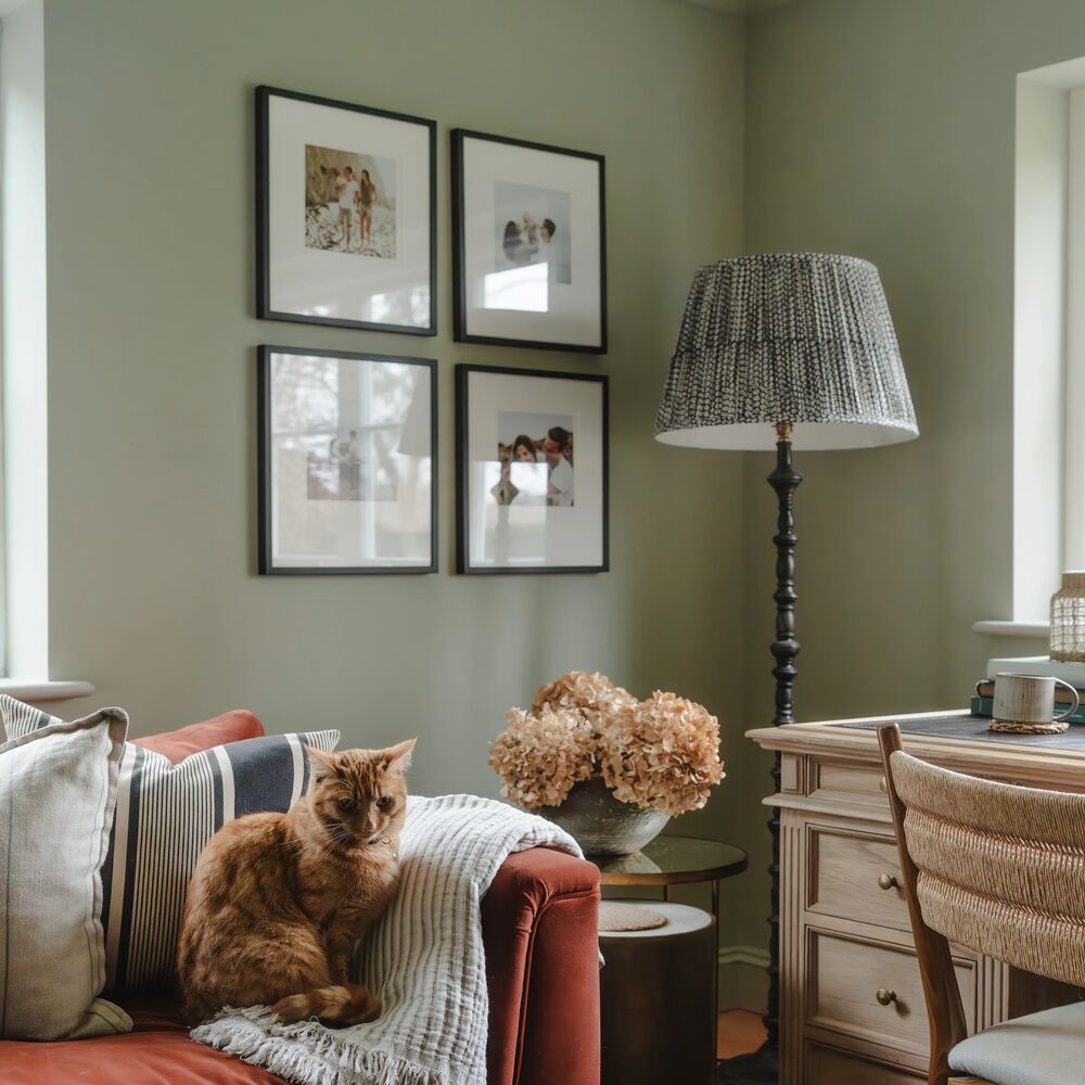
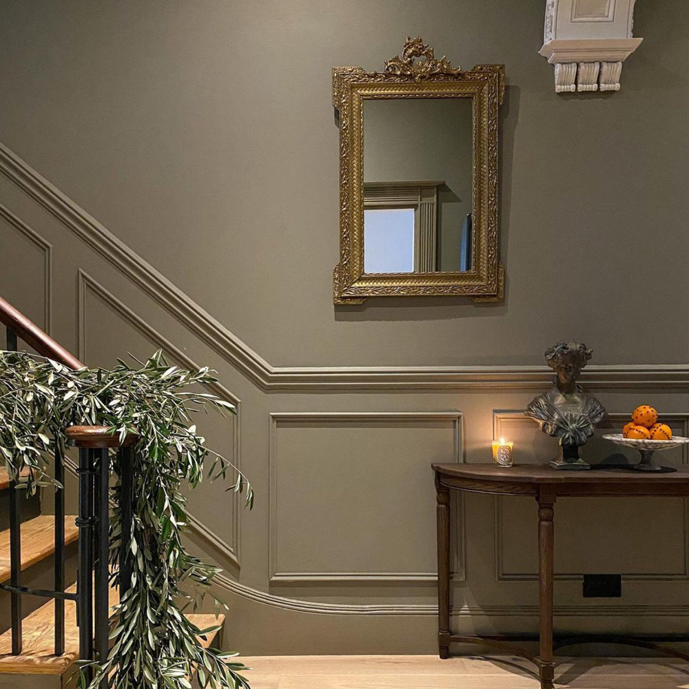
"You can get greys with lots of different undertones which means they can suit all kinds of schemes," says Aaron. "Our new taupe Margot, for example, has a yellow undertone which makes it really warm and inviting. It works well for hallways and is quite forgiving on scuffs, especially if you choose our durable soft sheen finish. I would advise using it alongside a complementary neutral such as pale taupe Mindful, or Sweatpants, our lighter, cleaner grey.

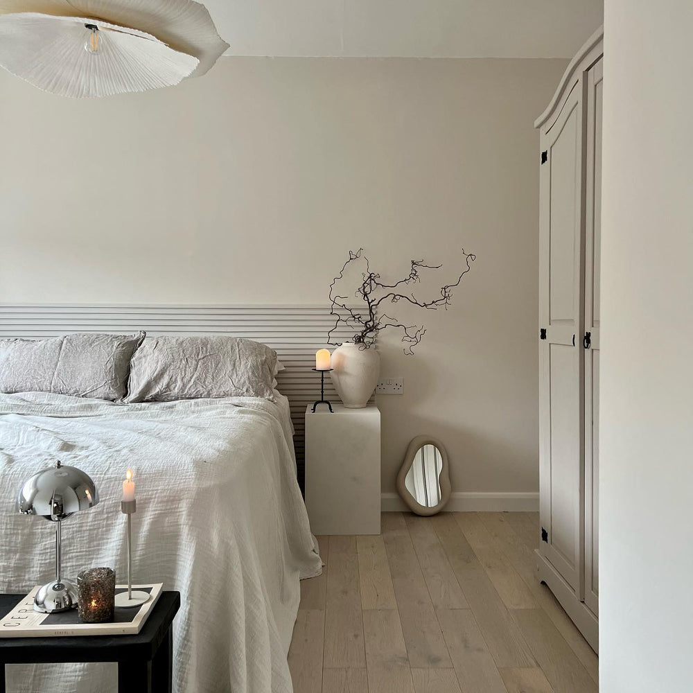
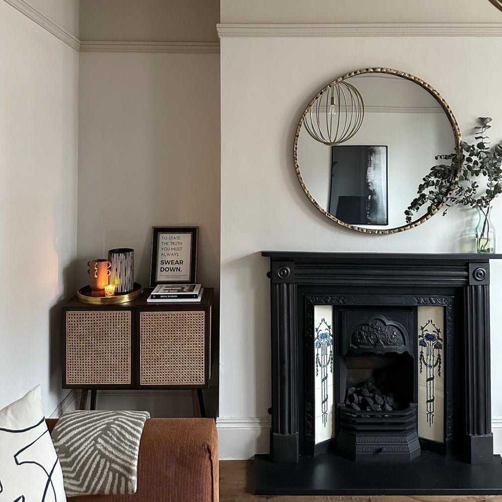
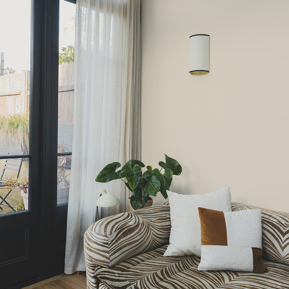
@asouthlondonhome opted for our newest grey on the block, 'Margot.'
"Grey also makes a great backdrop for other colours," continues Aaron. "It's easy to pair it with different colours and fabrics. If we think about current interiors trends, grey makes the perfect foil for pop art style chartreuse and violet colours. And On Mute is spot-on for the comeback of the Y2k trend. This cool grey has an icy blue undertone which ties in with the futuristic colours they used in the late Nineties." 😎

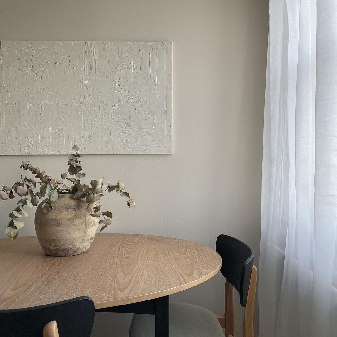
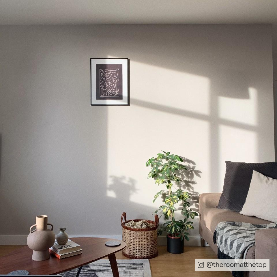
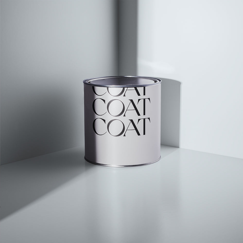
'On mute' is one of the COAT OGs. It's sophisticated, calming and oh so compatible with other colours. @sparkandbell
HANG ON A MINUTE. AREN'T GREYS GOING TO MAKE MY HOME FEEL COLD?
Nah. It all depends on how you use them. "The key is to avoid using cool greys in north-facing spaces," says Aaron. "Instead, use warmer greys with a yellow or red undertone in these rooms to to add warmth."

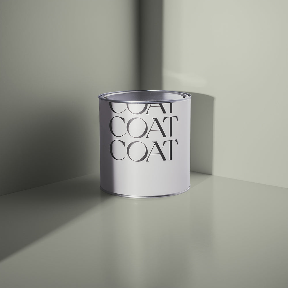
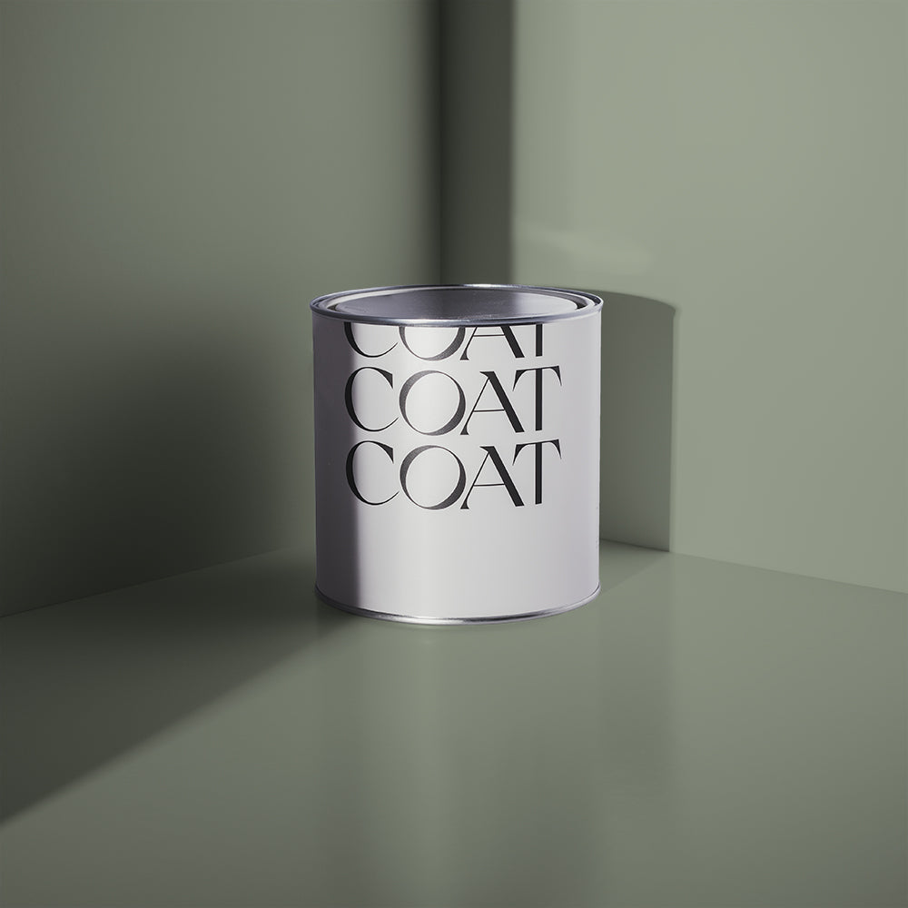
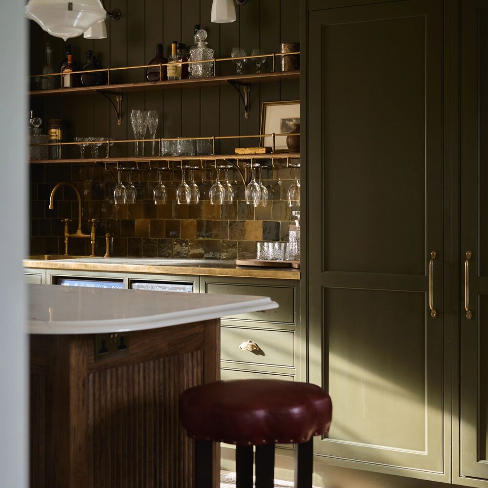
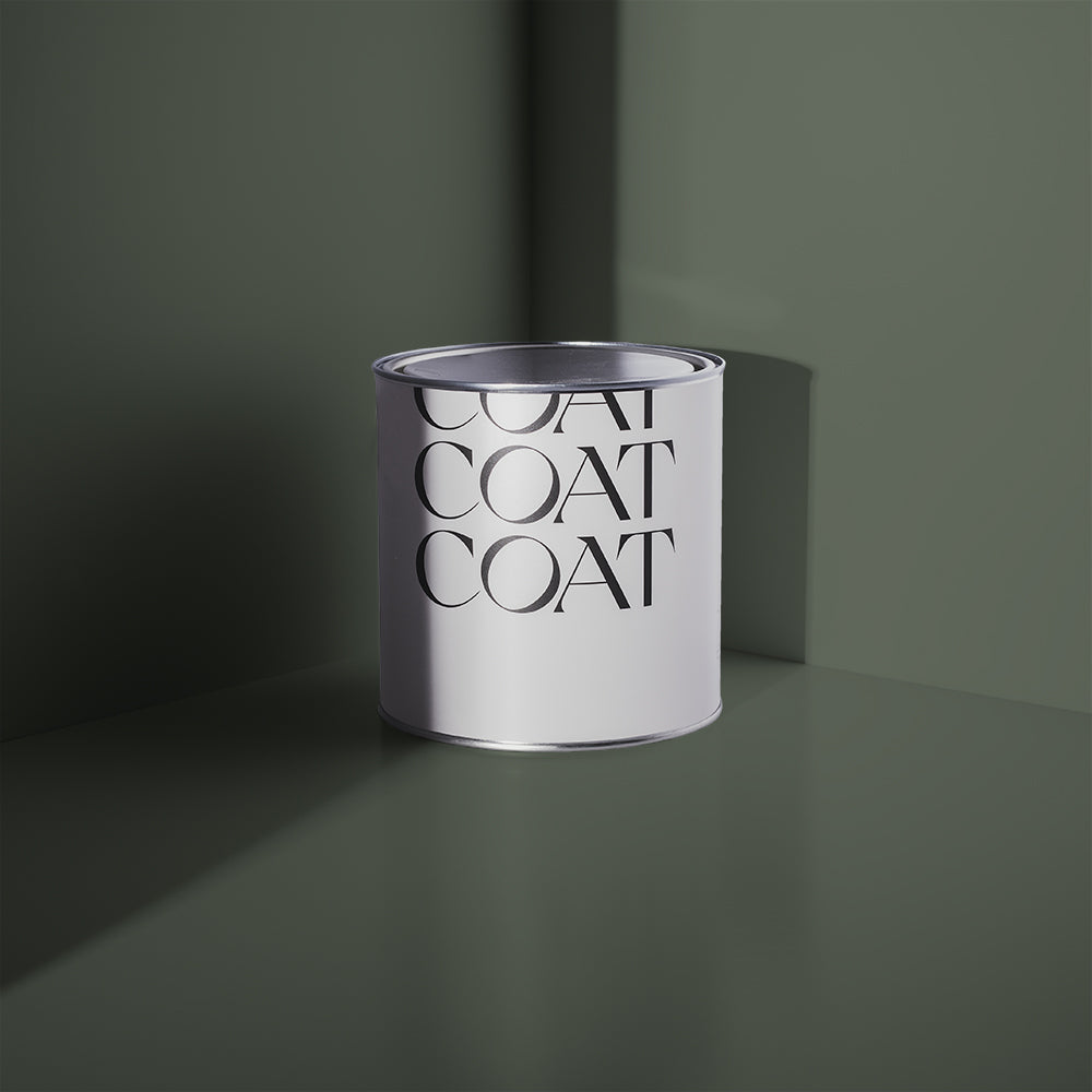
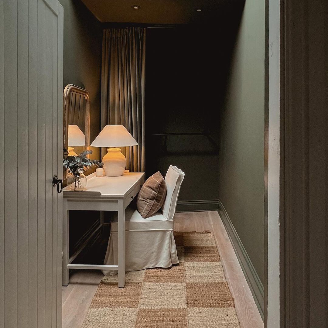
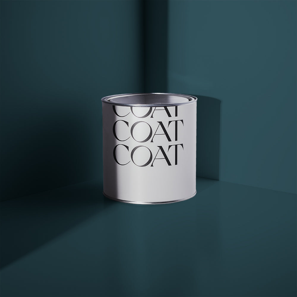
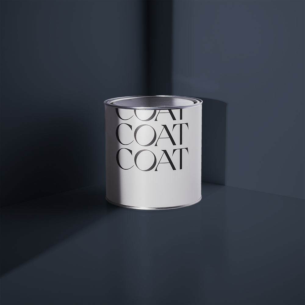
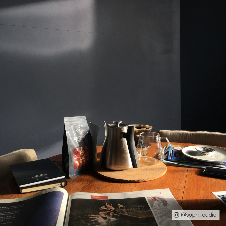
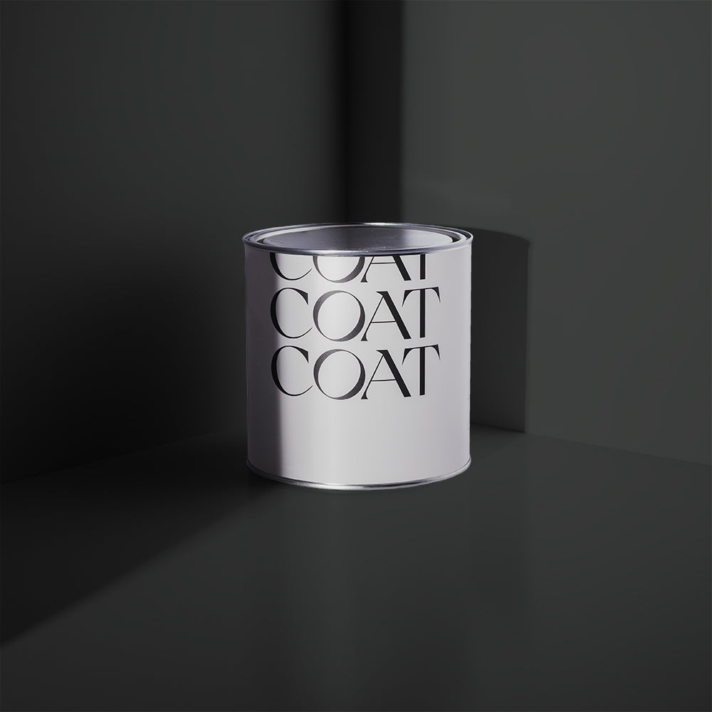
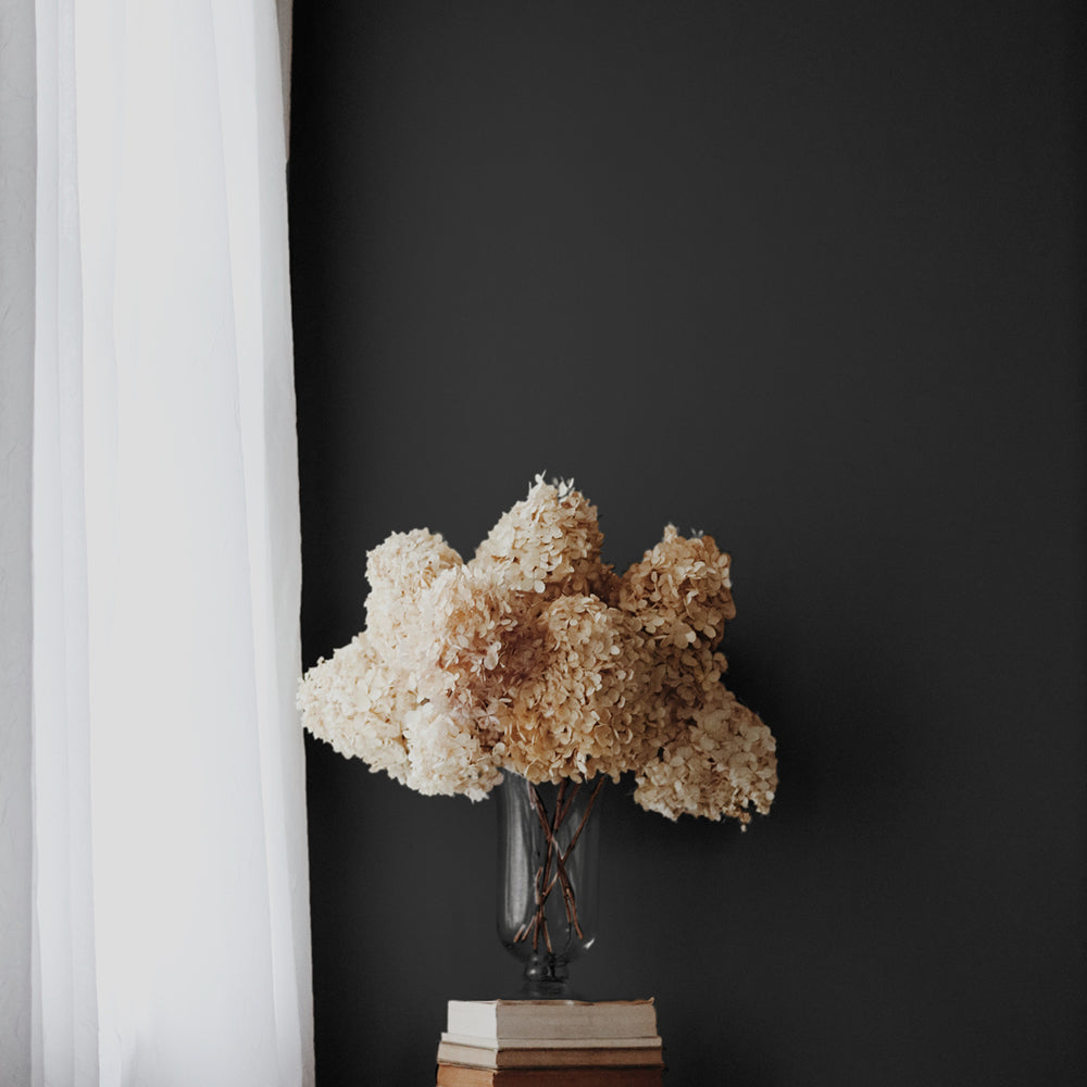
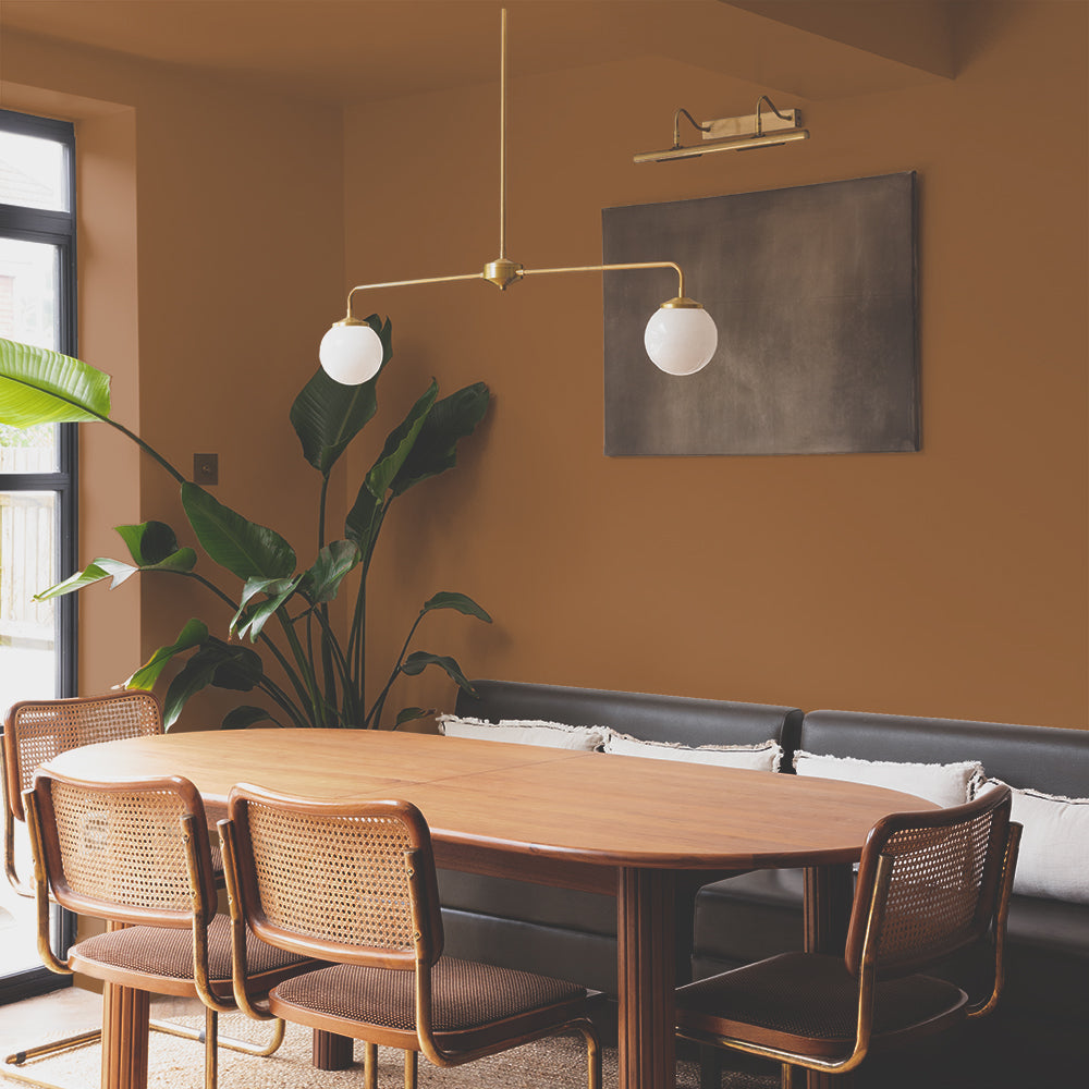
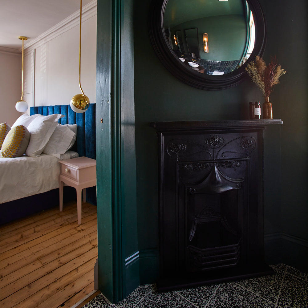
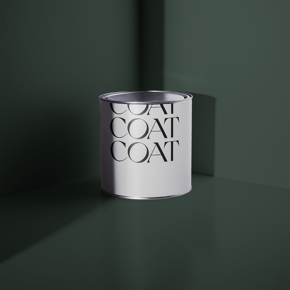
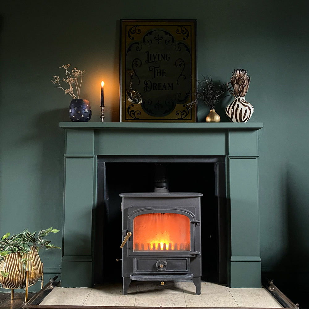
'Big Timer' is new around here, but it's a real show stopper!
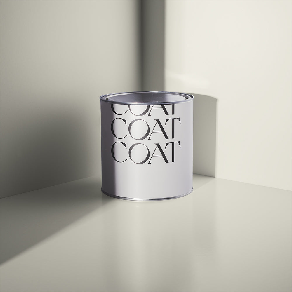
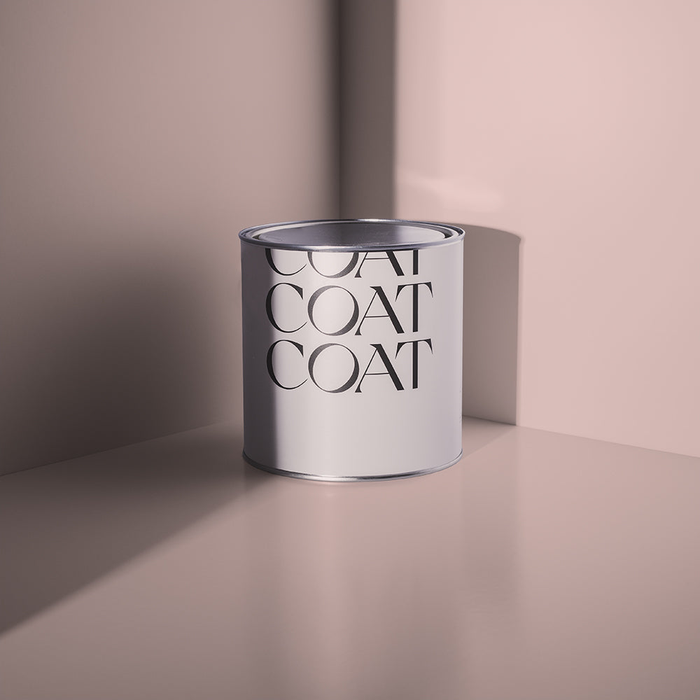
Mid-grey Margot and deep grey Big Timer have yellow undertones so they're spot-on for warming things up. And then over in the red-toned corner we have pale grey Good Intentions and warm greige Sunday Soul. Both of these easy-to-use neutrals are perfect when you want to create a warm and inviting vibe 🥰
WHICH GREY IS COAT'S BESTSELLER?
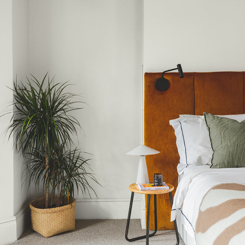
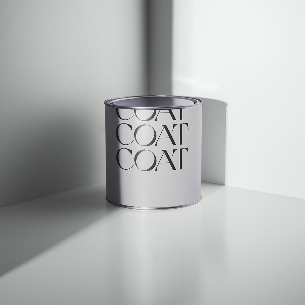
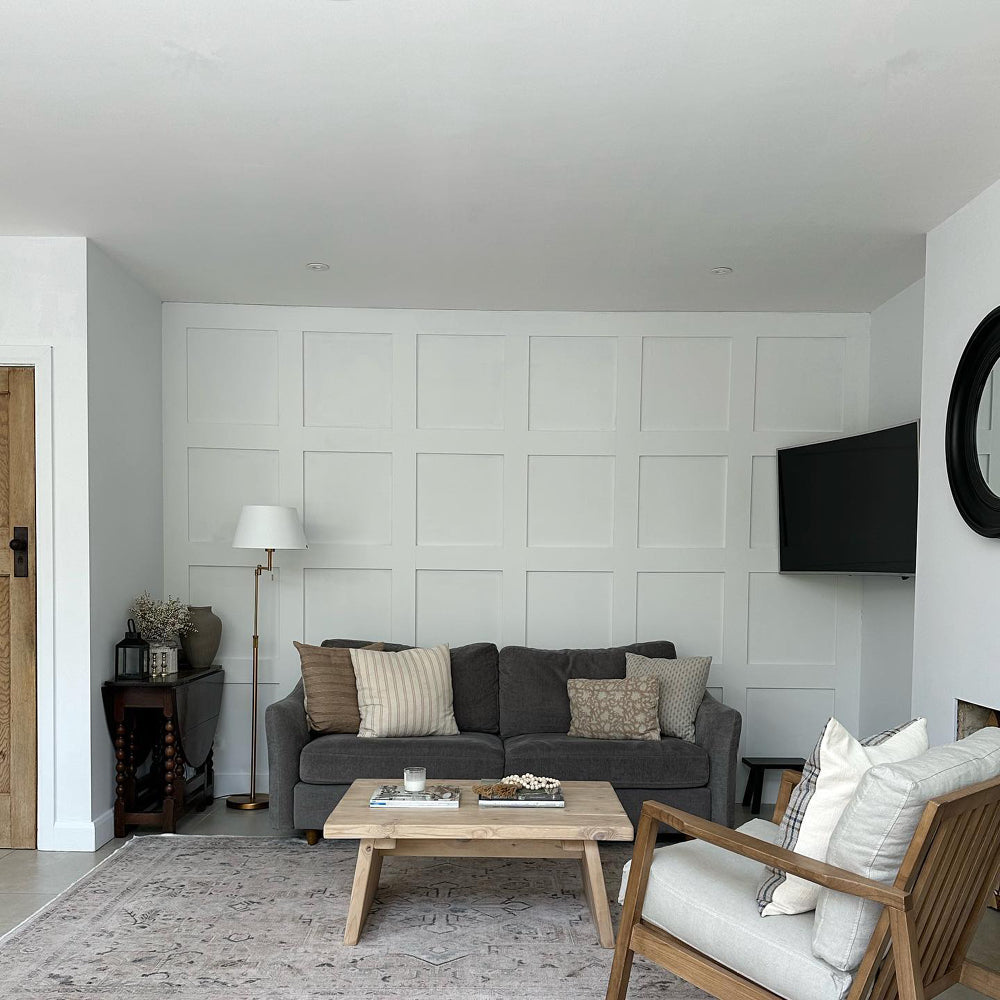
Our palest grey Sweatpants takes the crown here 🥇 It's our number one bestseller within our grey palette because it's so versatile. It goes with anything and helps to create an understated, reassuring feel. "People love Sweatpants because it's bright and clean," says Aaron, "plus it's got a little bit of yellow in it which gives it a lovely warmth."

'Sweatpants' was an obvious choice for The Brixton Boys, it's a timeless classic.
David from The Brixton Home Boys couldn't agree more. He and husband Andrew chose Sweatpants for their gorgeous kitchen extension and have never looked back. “We lived with paint samples up on the wall for a good couple of weeks before we took the plunge,” says David. “Sweatpants came out on top and we absolutely love it. It reflects light around the room and it always feels warm and relaxed in here, even though it’s a north-facing room.”
WHEN SHOULD I CONSIDER USING A GREIGE RATHER THAN A GREY?
"People who go for greige are probably looking for a bit more warmth than our more traditional grey colours can give," says Aaron. "Greige is slightly more forgiving than straight grey, and it's easier to pair with other colours."

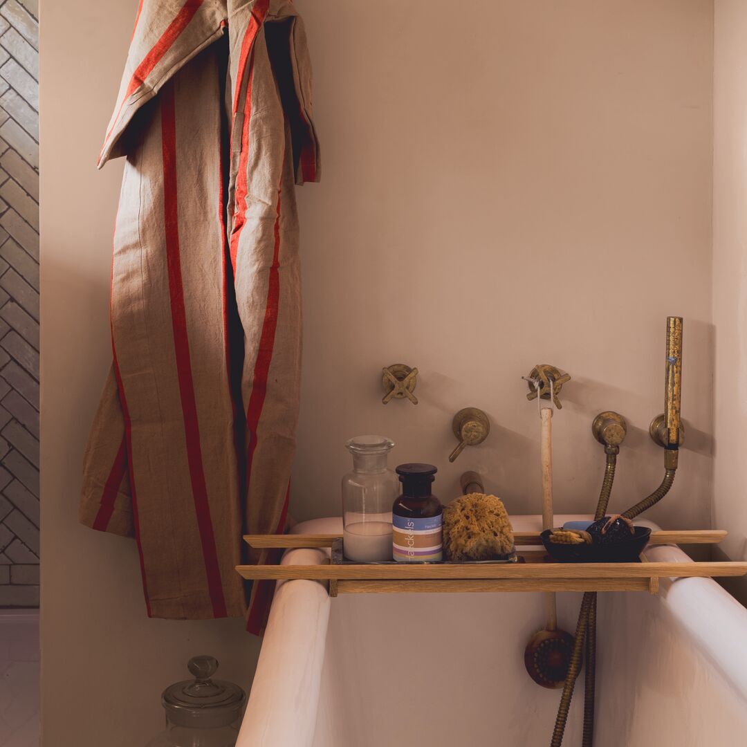
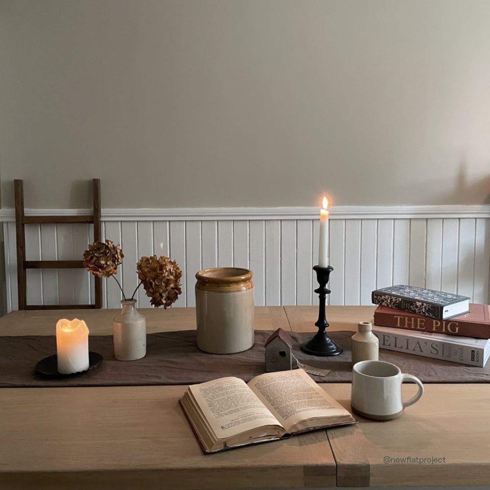
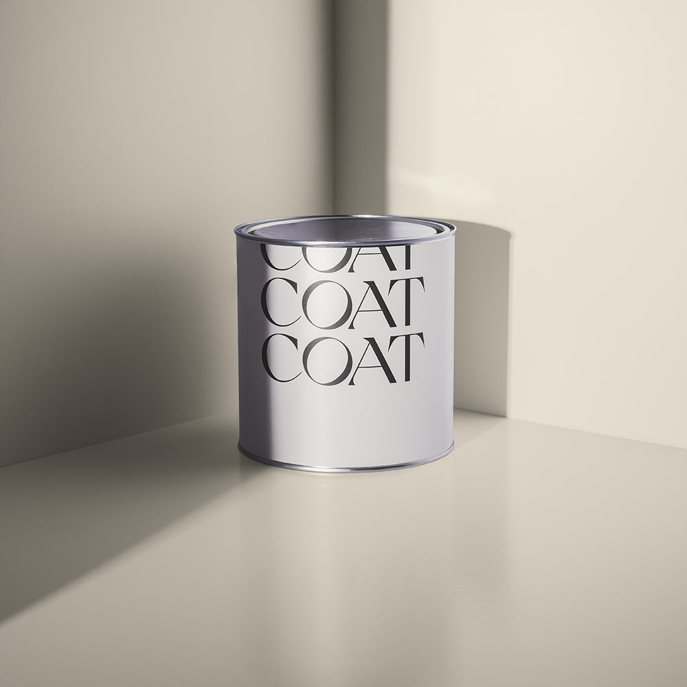
'Kind Regards', the OG Greige. @chequerfield
Greige, a cross between a grey and a beige, can provide the perfect balance of warmth and freshness. Neutral colours such as Sunday Soul, Kind Regards,
Mindful and Good Intentions work really well alongside stronger shades of green, blue and red 🌈

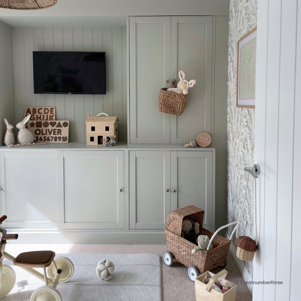
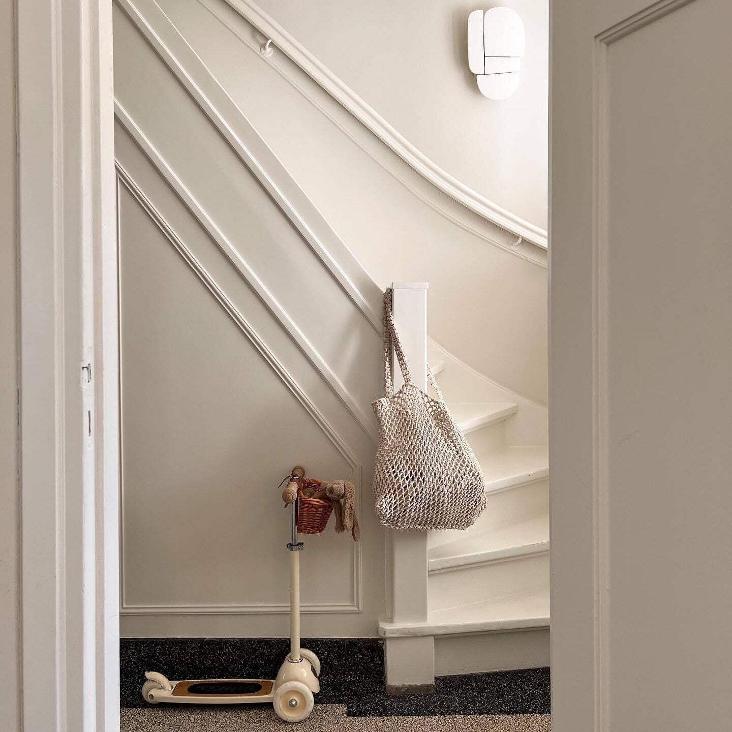
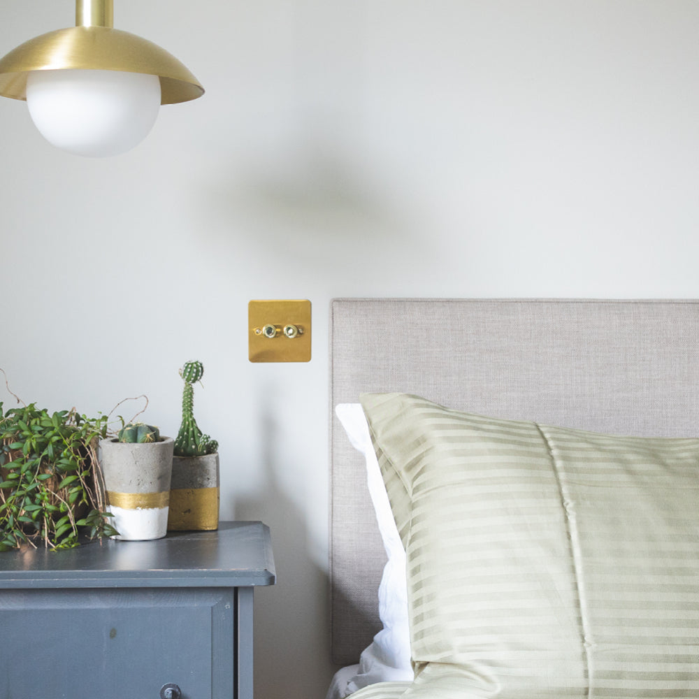
A neutral nursery is a trend that's not going anywhere. 'Good Intentions' here.
"Because greiges are more complicated than greys in terms of undertones, people sometimes find them harder to pick," says Aaron. "But the upside is they're easier to combine with other colours and they can create a really versatile backdrop.'
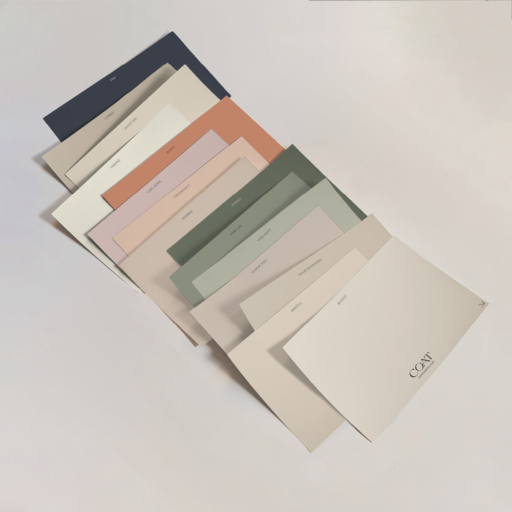
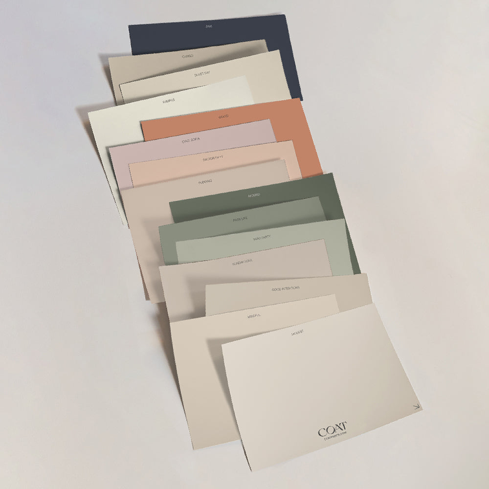
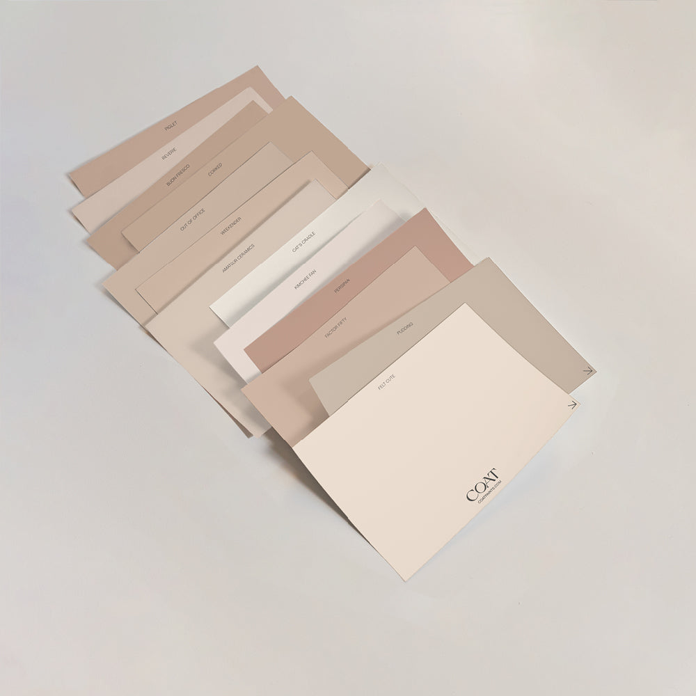
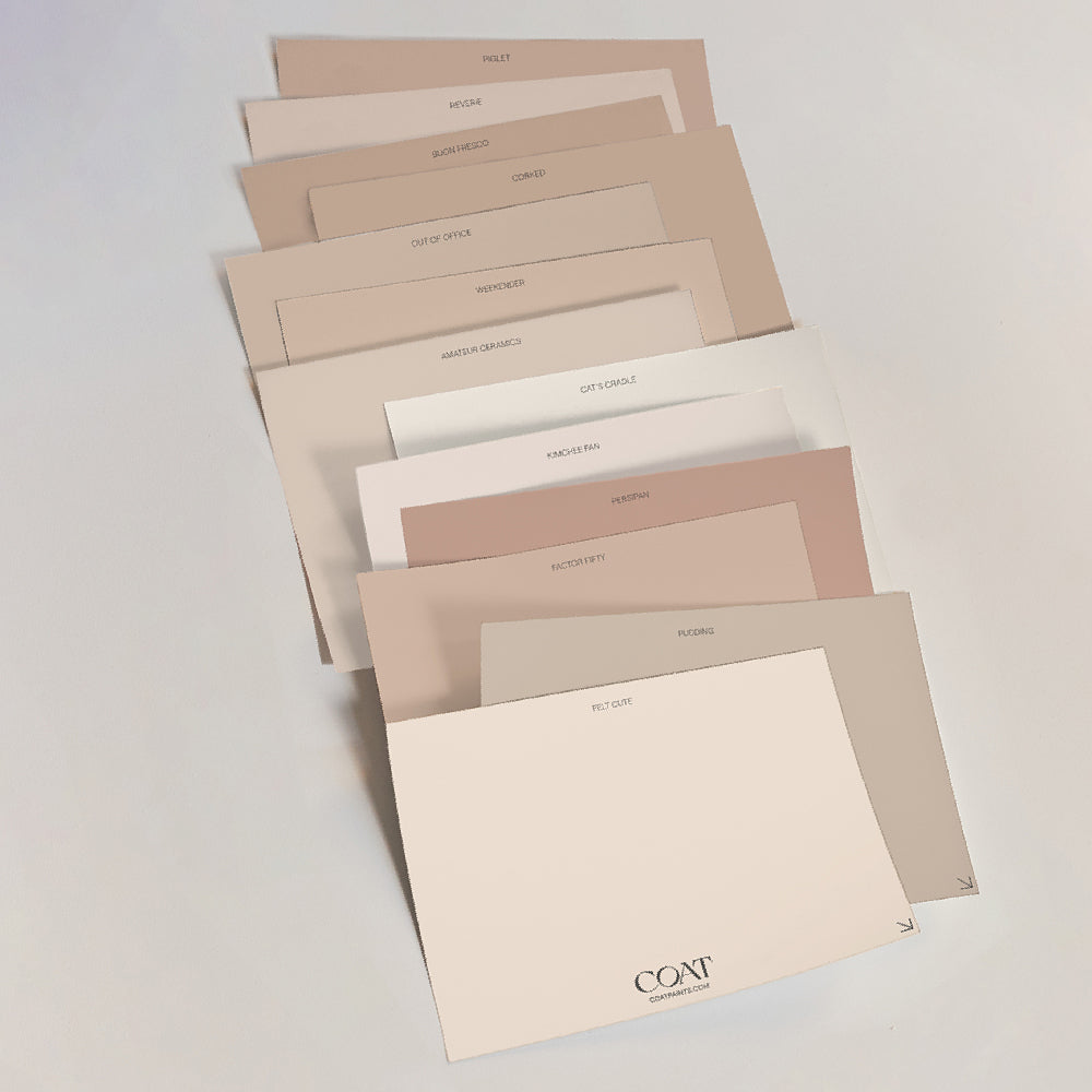
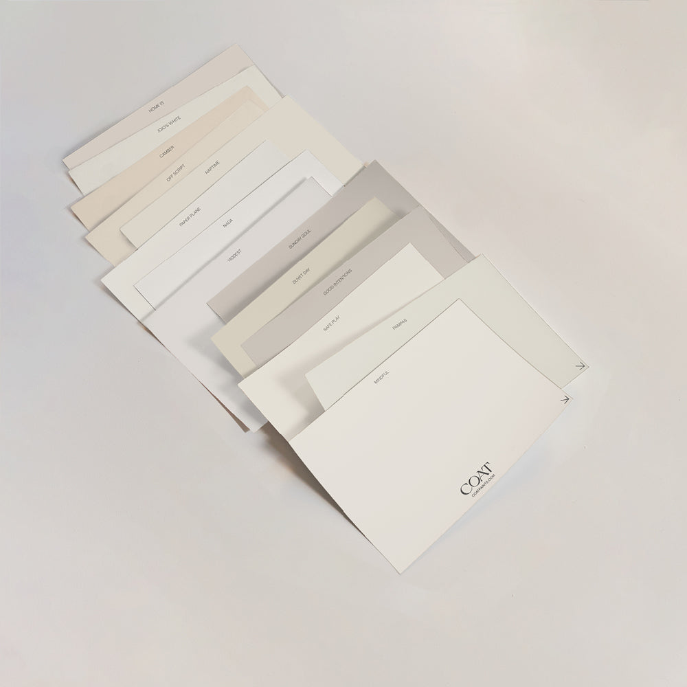
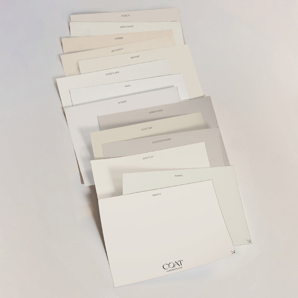
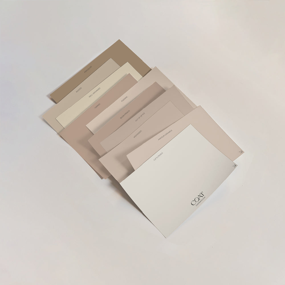
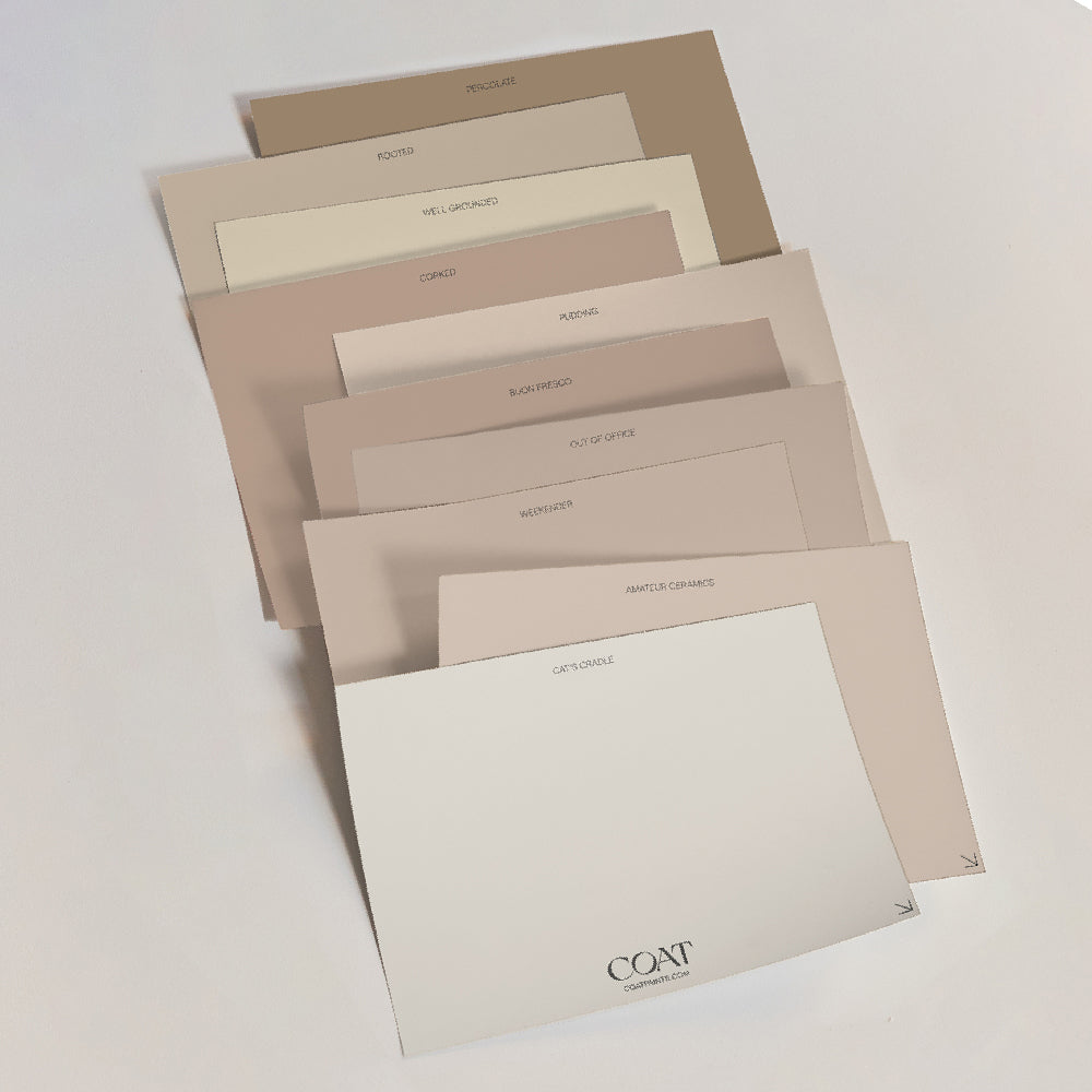
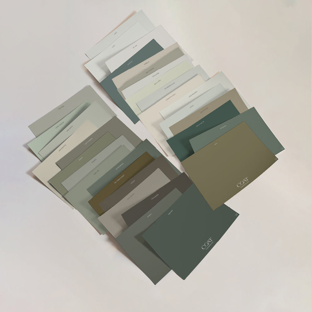
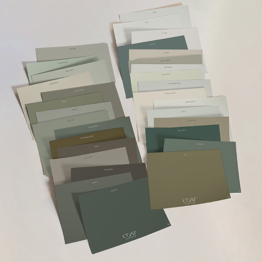
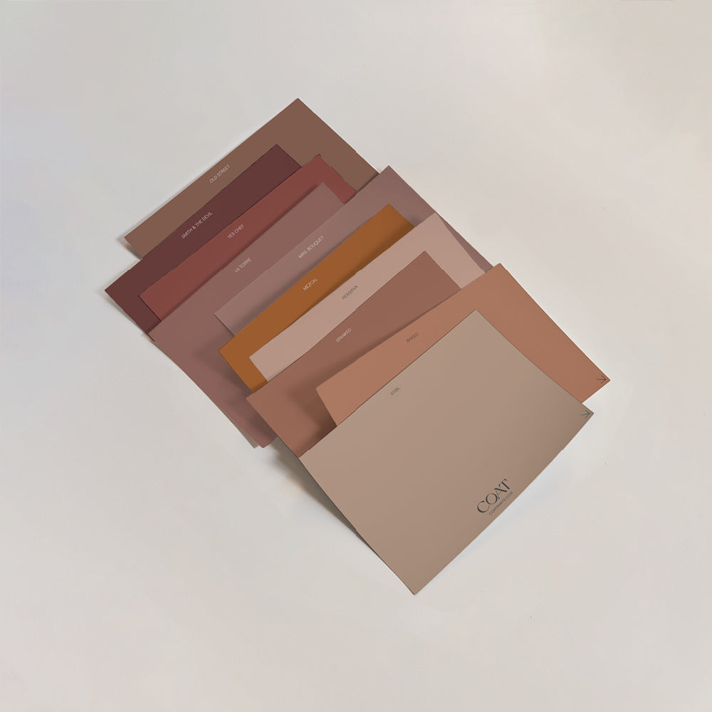
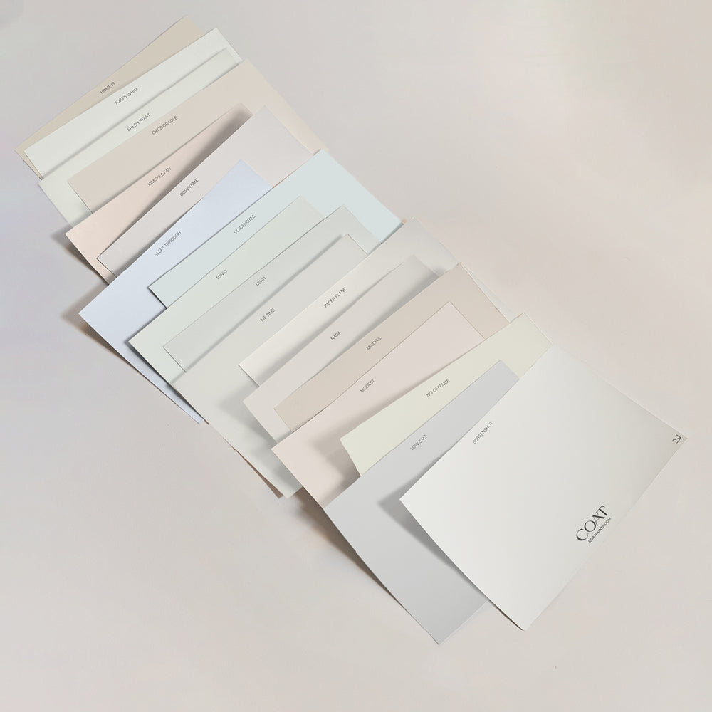
Grab our Pale Greys Swatch Pack or Greige Swatch Pack to find your perfect shade of grey
Publish Date
Author






Leave a comment