Kitchen Paint Colour Ideas
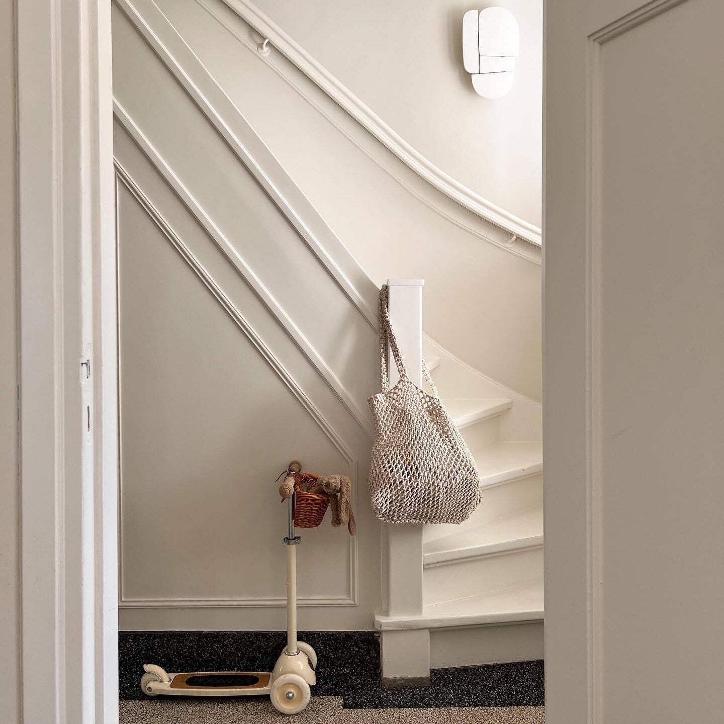
A Kitchen colour scheme is really important to get right, they’re messy spaces that need practical finishes. The best paint for kitchen walls allows you to wipe it down without it marking, streaking and staining for years to come. New age problems hey?
This requires a different kind of paint finish to the ones you would use in your living room, that is high quality so that it can be cleaned. You also want it to look great with any kitchen colour scheme you’re going to pick. If you’re painting woodwork, that’s another different finish, so we’re gonna illuminate a few ways you can use these colours and finishes in your mess room.
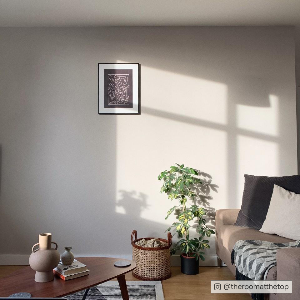
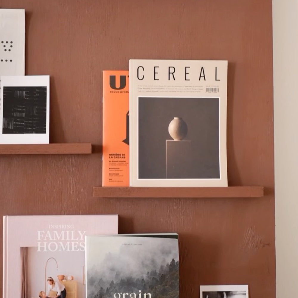
Cosy Neutrals
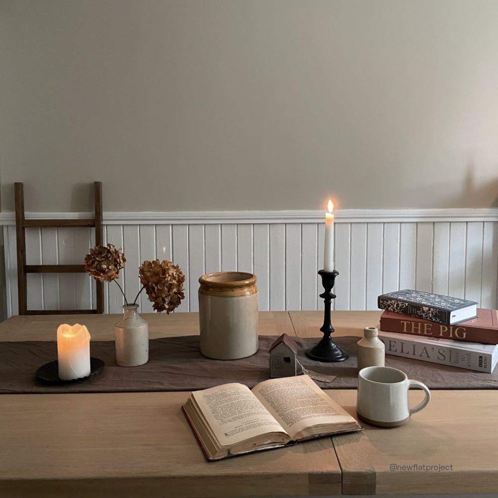
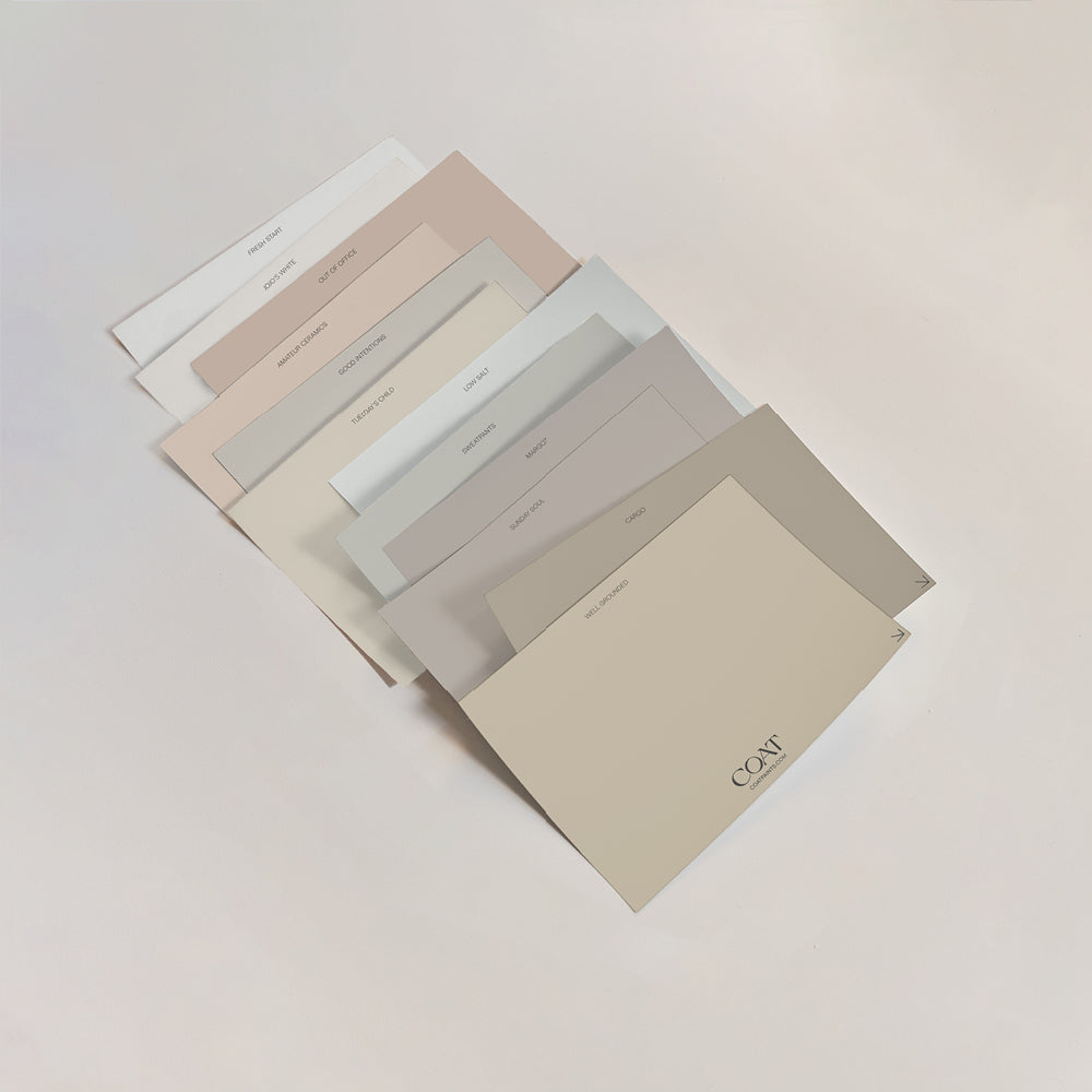
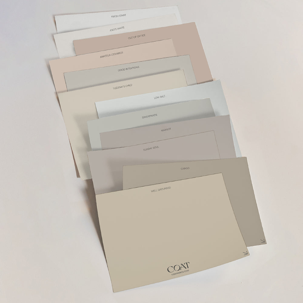
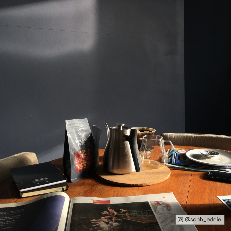
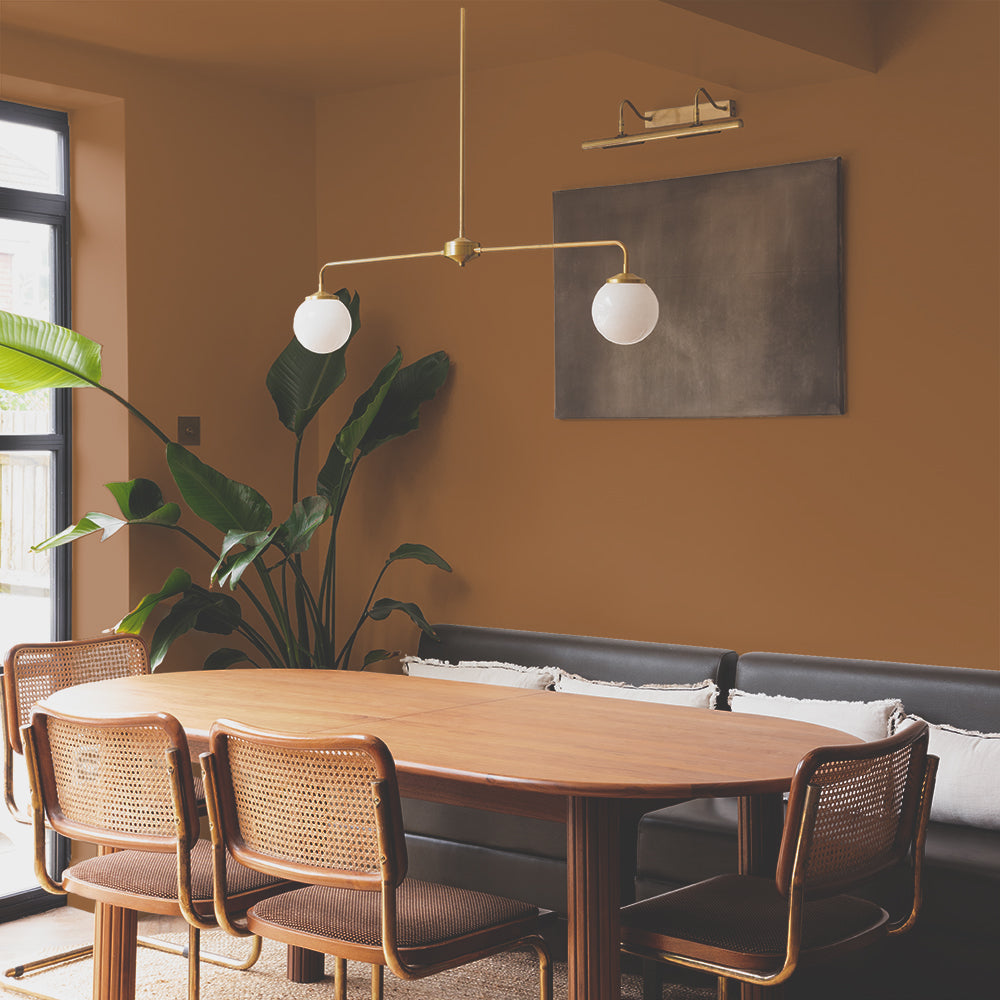
For most of us, the kitchen is the heart of the home, where we gather with our family and loved ones and usually the place where the most important conversations happen. This calls for a backdrop that is calm and relaxing. Warm neutral paint colours are the best way to create this soothing atmosphere. Biscuity colours like Well Grounded work really well for this, as @_housenumber7 has shown us here:

Coffee station goals. @_housenumber7 uses 'Well Grounded' in her kitchen.
It’s rich brown undertone means it pairs naturally with most woods, helping keep those more serious chats with the rents Well Grounded (see what we did there?).
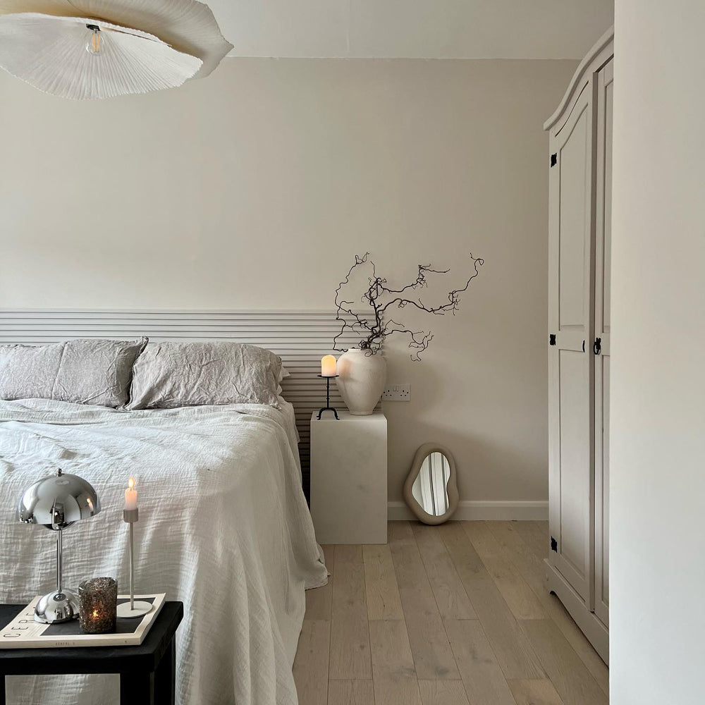
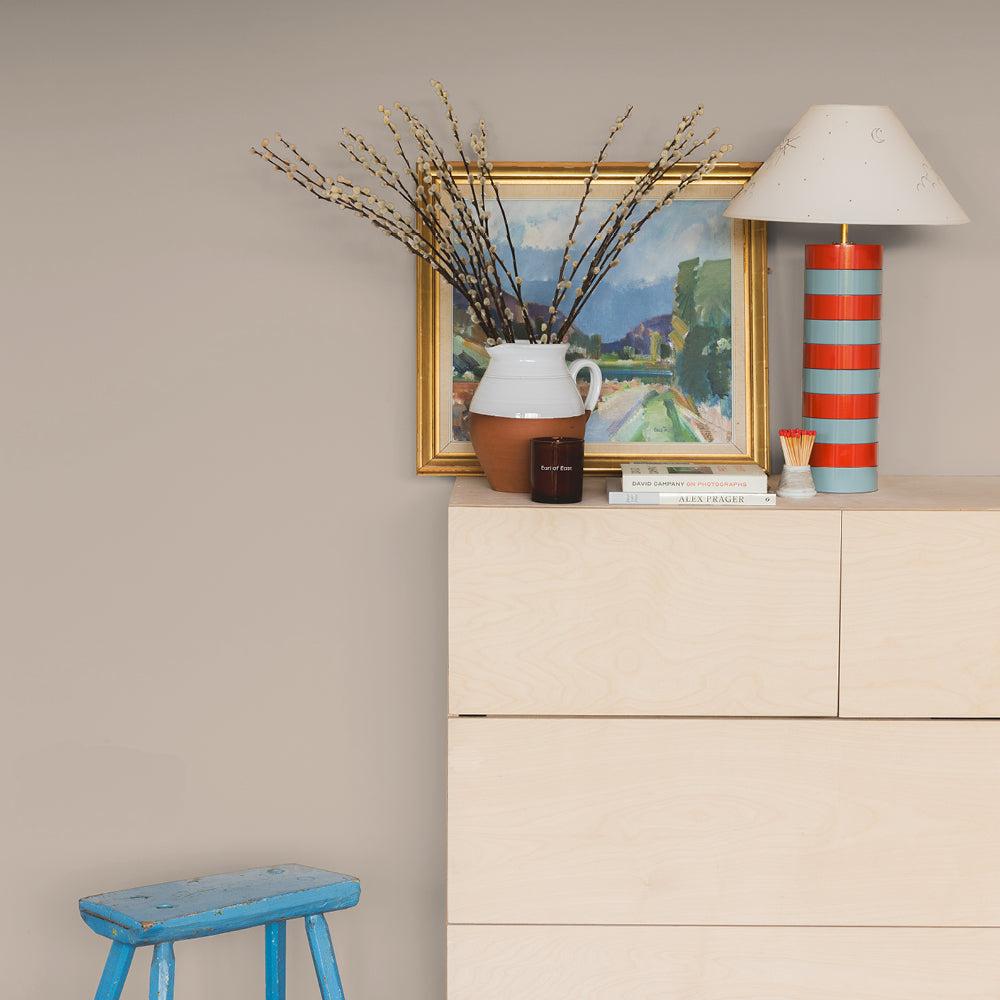
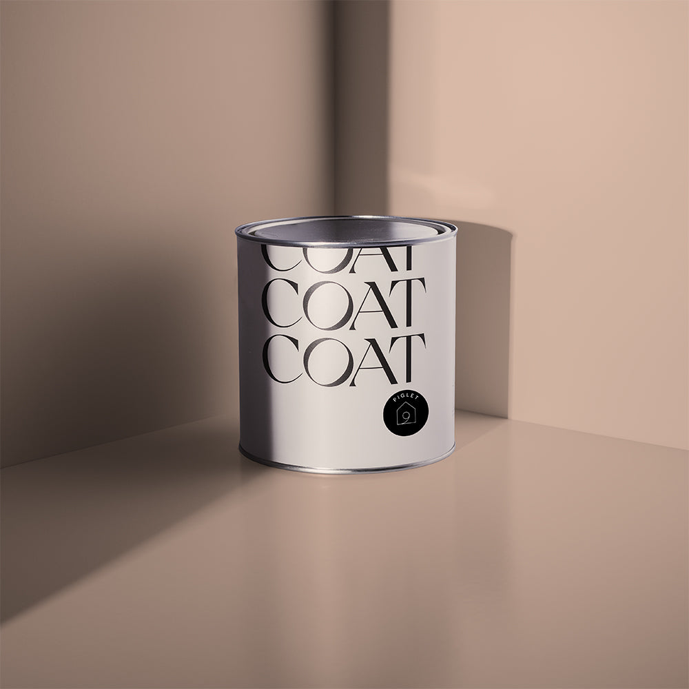
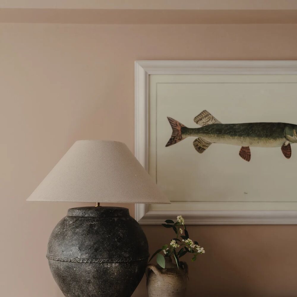
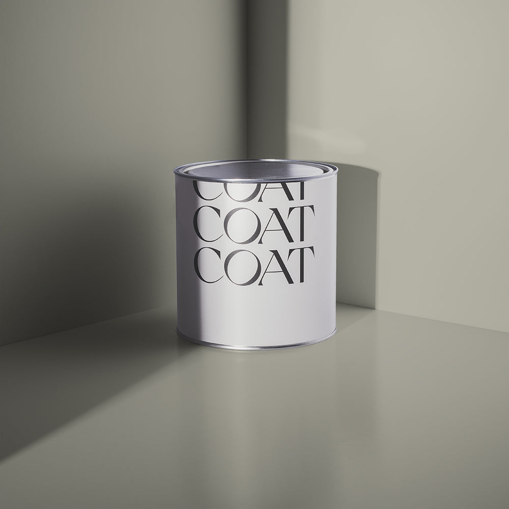
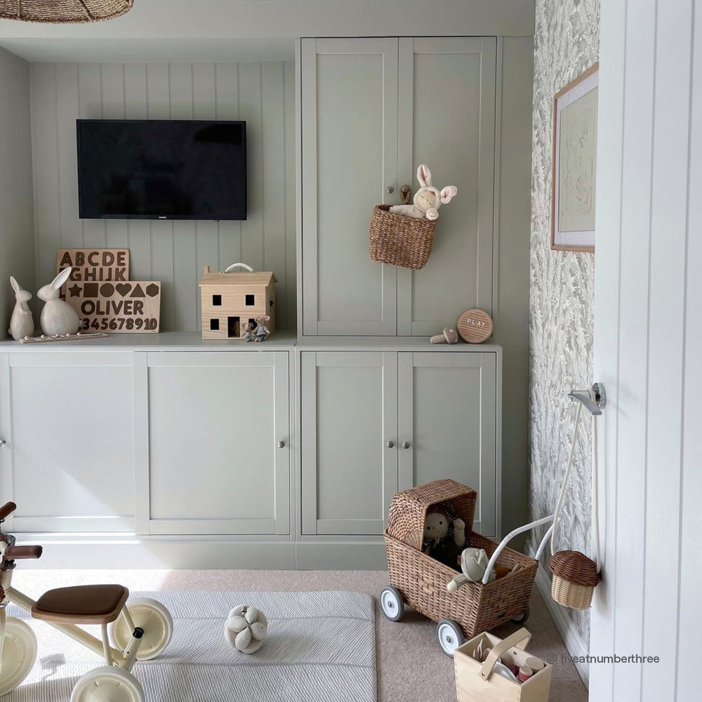
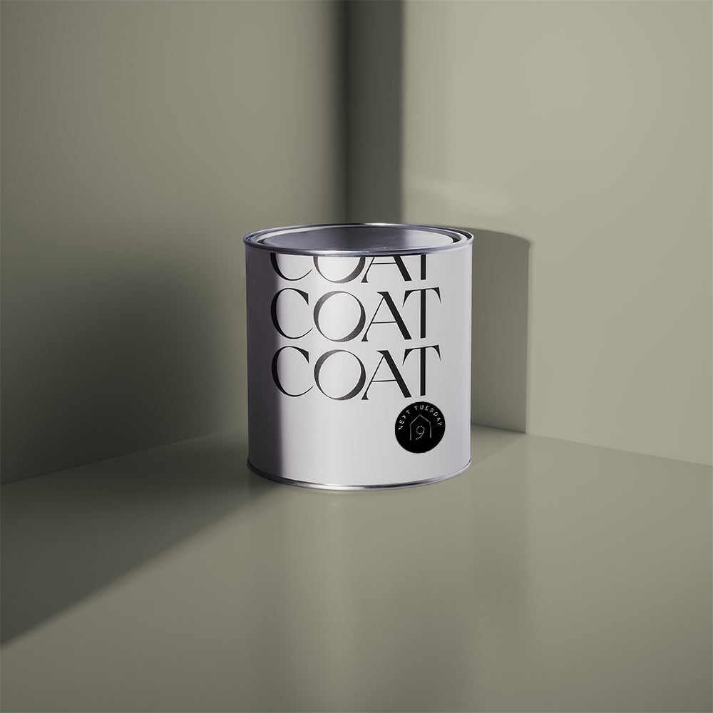
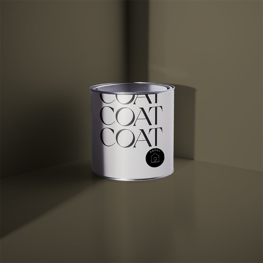
You can always show the fam that you have Good Intentions using this pale, greyed taupe. Painting your kitchen cabinetry with our Eggshell, a suitable, durable kitchen paint. Pair with walls & ceiling in Mindful, for a dream Japandi inspired kitchen. These complimentary warm neutral paint colours work best when combined with a deeper neutral, to make them look brighter and airier. Injecting a bit of Sunday Soul into a kitchen island using a durable kitchen paint is the best way to do this. Keeping your darker, earthy colours low down gives grounding to this heavenly colour combo.

A neutral delight. @aneditedlifestyle chose 'Good Intentions' for her kitchen makeover.
Bright White
White kitchen paint finishes need to be ultra durable as well as wipeable. For the walls you can use our superior Soft Sheen finish. The additional sheen created by our high quality resins means that you can wipe it down and that your bright white will maintain its lustre for years to come, making your kitchen redecorating far less frequent. *heart eyes emoji*
Bright whites can often look clinical, so adding subtly coloured whites can help make this look more relaxed and inviting. Pampas has both yellow and green undertones, like it’s grassy namesake. Used by @mummydoesdiy , it’s faint nuances add a delicate contrast to the white walls.
To compliment your new Pampas cabinetry, paint your walls and ceiling a pure white, and all your followers on insta will be taking a Screenshot.

@mummydoesdiy transforms her kitchen space using 'Pampas' for a bright and clean finish.
White is a very traditional kitchen colour, but the modern home has also embraced it, particularly in gloss cabinetry. White isn’t a particularly practical colour, it can look fairly clinical. Your kitchen paint finishes are super important for making sure there’s enough light in the space and also being as practical as possible. Use warming neutrals and natural materials for crockery and chopping boards etc. can help add a little warmth and texture to more sterile schemes.
Neutrals are always a winner? Grab your swatches to try them out at home.
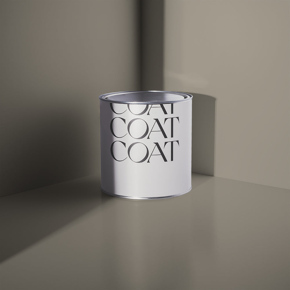
Bold Black
For several years kitchen colour schemes have been dictated by having either fairly dark bottom units, or a dark kitchen island. Usually a deep green or a blue. 2022 has us inviting some new home trends, the acidic colours of pop art in particular and these look their best with monochromatic schemes. Acid tones are particularly striking on black walls like The Record Store, in our kitchen suitable finish, Soft Sheen. It’s sheen will also allow the light to play off the walls, meaning that the room will look dramatic all day! For those of you wanting daring kitchen colour schemes, pair with kitchen cabinetry in bright grey, Sweatpants and add to the audacity with a kitchen island in new COAT fave: Plant Power. Finish with some famous Andy Warhol prints.
Black is also a great colour for dividing open plan spaces. A black kitchen island provides an outline to where your kitchen ends for, making it ideal for sectioning of more intimate spaces like the kitchen. Off black kitchen colour schemes have been one of the biggest home trends for the last few years, so painting your cabinets in dramatic blue black, David Rose, will definitely lure your loved ones into thinking that you do, in fact, know how to fold in the cheese (if you know, you know).
Statement Colour Pops
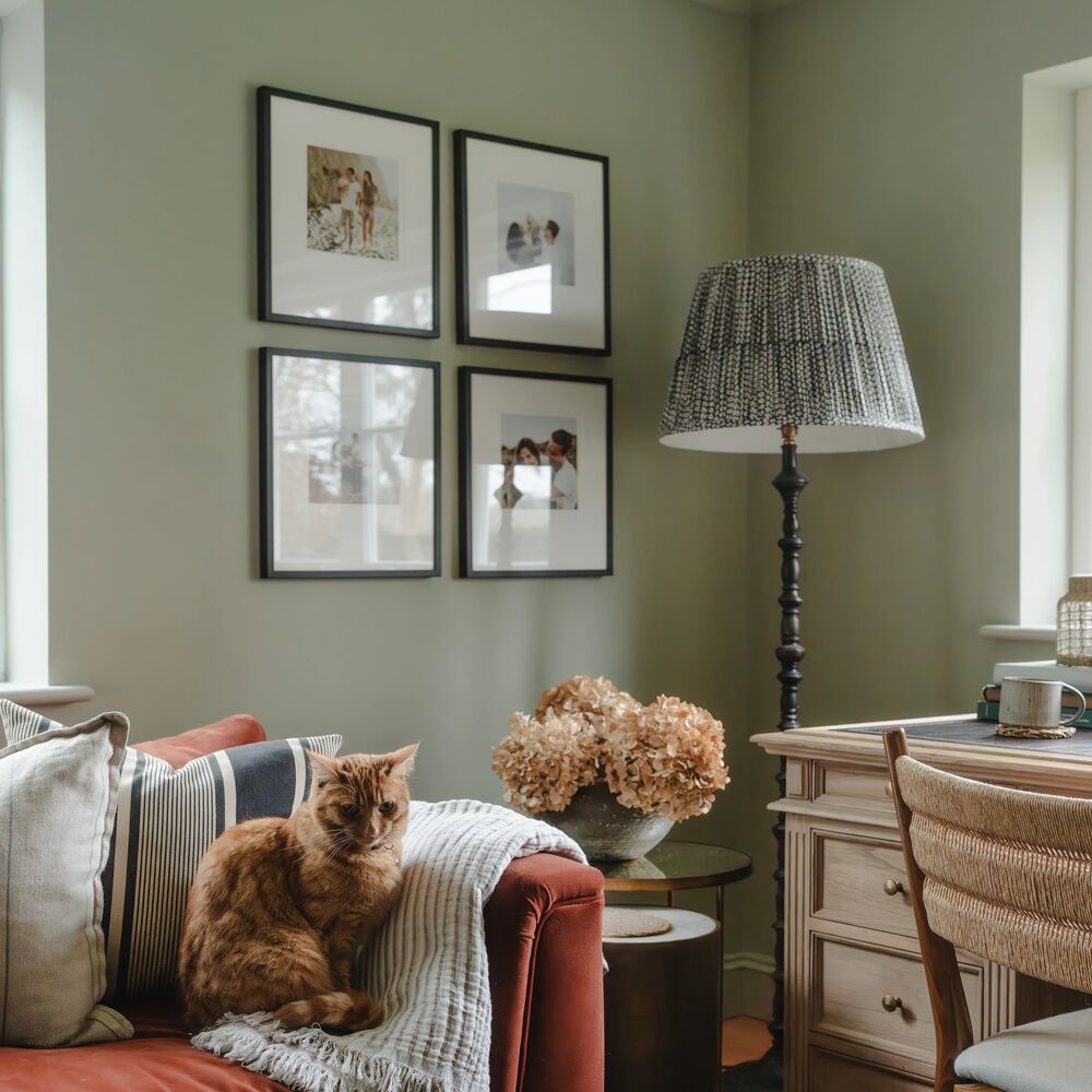
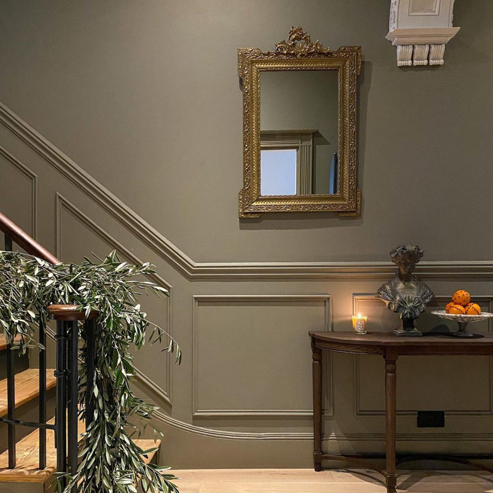
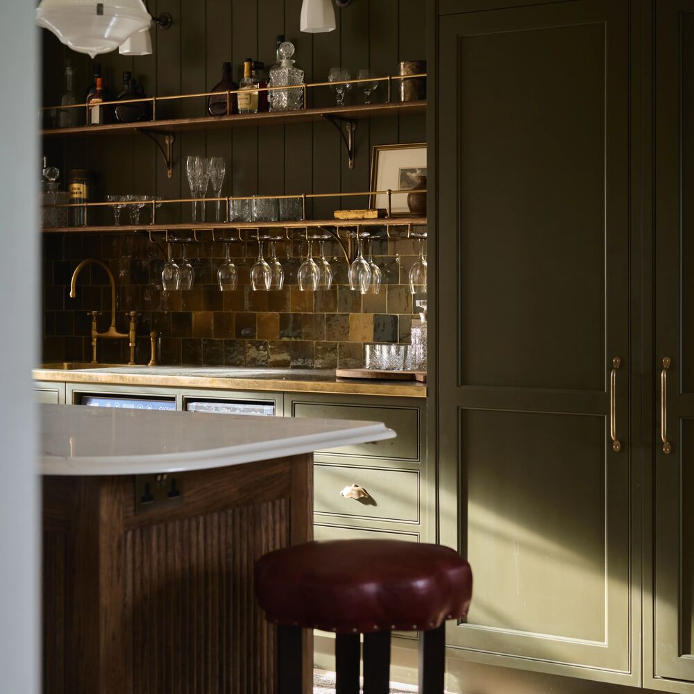
One of COAT’s most popular kitchen colours this year has been Darlington. It’s deep greyed undertones have made sure that it works with most neutral colour schemes, including greys and taupes, while it’s green overtones create a statement colour pop that is equally exciting and inviting. @my_neutral_place has created a kitchen that combines nuanced neutrals and tantalising textures. (dribble emoji)

@my_neutral_place uses our go to grubby green 'Darlington' for her kitchen refresh.
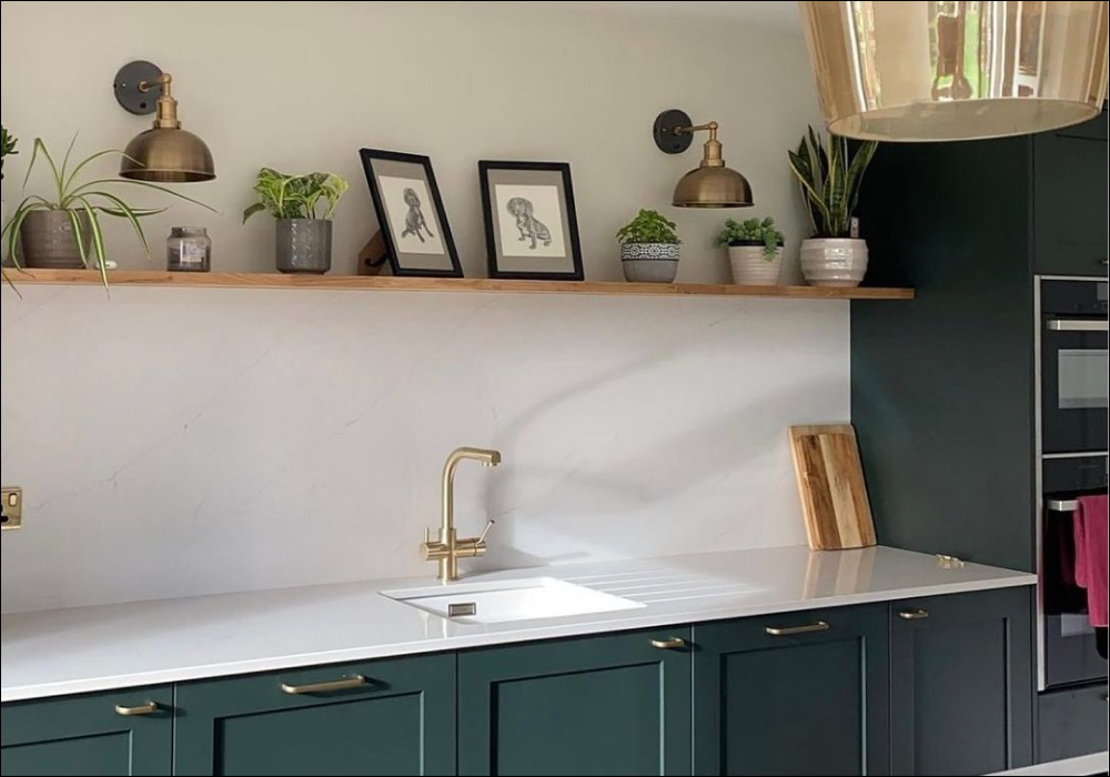
White glossy cabinets are a functional choice that can be made to feel alive and vibrant with carefully considered colour pops. Adulting is one of many popular kitchen colours in our palette and one of our fave design ideas for colourful kitchens is how @four_made_this_home uses Adulting as a deep accent. This greyed teal adds a receding depth to this scheme, making the counters look deeper. Oak flooring maintains some brightness in the space, and complete with the best textural accessory: a fluffy friend.

'Adulting' making itself right at home at @four_made_this_home. (Cat's not included with the purchase of Adulting, sorry)
On-trend Inky Shades
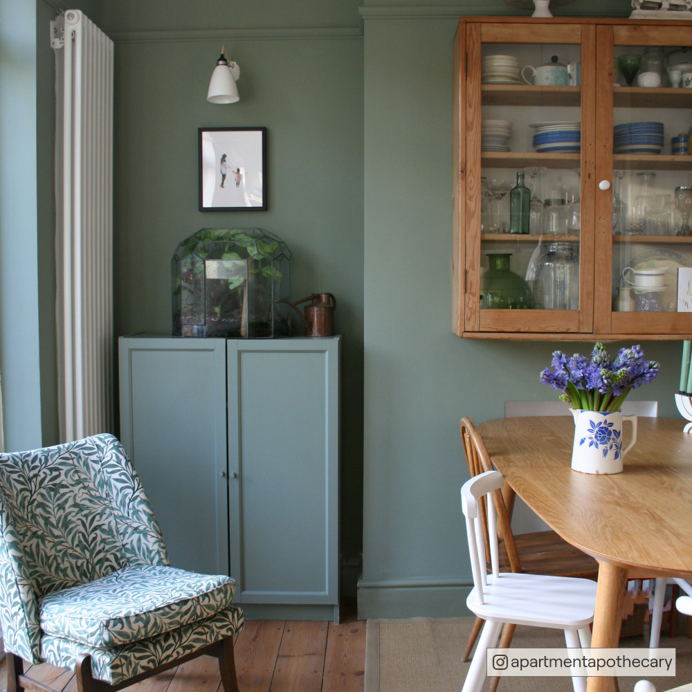
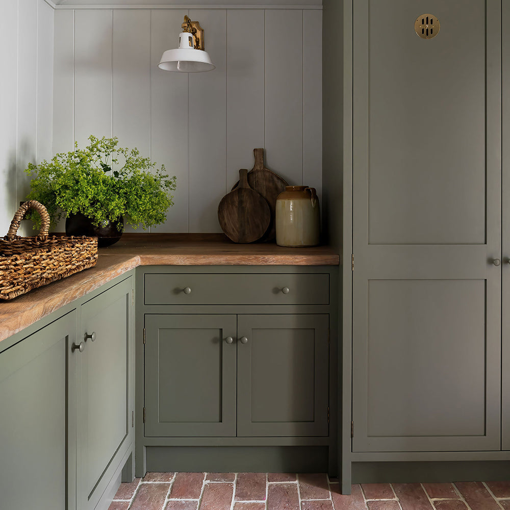
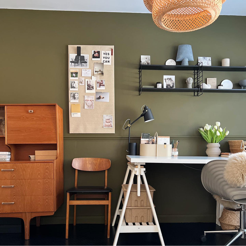
Traditional shaker style kitchens have had a revival, but the key to this resuscitation is through modern kitchen colour palettes. Clean, bold blues and greens are particularly effective at this, as they work with many different neutral colours. Shaker style kitchen units in deep greens like Ditch The Tie feel modern, while adding a touch of grandeur. Use these on-trend inky kitchen colour palettes with walls in balmy neutrals like Good Intentions.
Dark colours provide intimacy and depth to spaces that are small or dark. They also work great for flow through spaces like galley kitchens, particularly when paired with dramatically patterned wallpaper. This draws in the space creating an embrace that when you walk through makes adjoining spaces feel brighter and airier. Inky kitchen colour palettes that include jewel tones like 2AM used on walls and ceilings are particularly effective at doing this.
Feeling confident? Grab your dark and moody swatches to try them out at home.

@mysunderlandcottage goes for a bold transformation. '2am' is right at home here.
Mix & Match
Torn between two colours for your kitchen? There is a solution where you could have the best of both worlds. We’re pretty sure that Miley Cyrus would make the best kitchen paint colour scheme.
The best kitchen paint colour scheme combines colours in a way that is considered. Firstly, you have to consider the hue of your colour. If you’re using a blue for example, using other colours with blue in will help the space feel cohesive. However, let’s say you want to use colours with different hues. This is where the colour undertone and colour weight.
Undertone is the other pigments that sit inside a colour, making it more complex than the singular colour word that we use to describe it. Using two contrasting colours with the same grey undertone is particularly effective. Dark teal, Adulting on woodwork and walls in greyed pink Ciao, Sofia work really well together for this reason.
Still struggling, because you have two colours are both have the same brightness, or depth? This would imply that they are of a similar colour weight, and they probably look great next to one another right? Do one on cabinets and the other on a kitchen island. The Drink and Ditch The Tie are the best kitchen paint colour scheme for this particular aesthetic.
Publish Date
Author