Hallway Paint Colour Ideas
Hallways are hard. Finding hallway hall colour design inspiration is a long slog, and you need to consider all of the rooms that are coming off of it. So: here’s Colour Lead, Aaron’s take on how to curate your hallway colour scheme ideas. “My number one piece of advice is to decide on paint colours for the rest of your home before you even consider the hallway decoration. If you know what you’re doing with the rooms you actually live in, then how you decorate these transitional spaces should be far more obvious. The longest amount of time you will spend in your hallway is when you’re picking paint colours for it… or you’re a very drunk uni student sat on the stairs, clinging to a bannister.”
We’re gonna cover some of the best ways COAT Paints can be used to give you all the hallway decor inspiration you need. The hallway is the first thing that people see when they come into your home, so it sets the tone on what to expect too. Be bold in how this space works for you; first impressions are everything after all.
A Light Touch
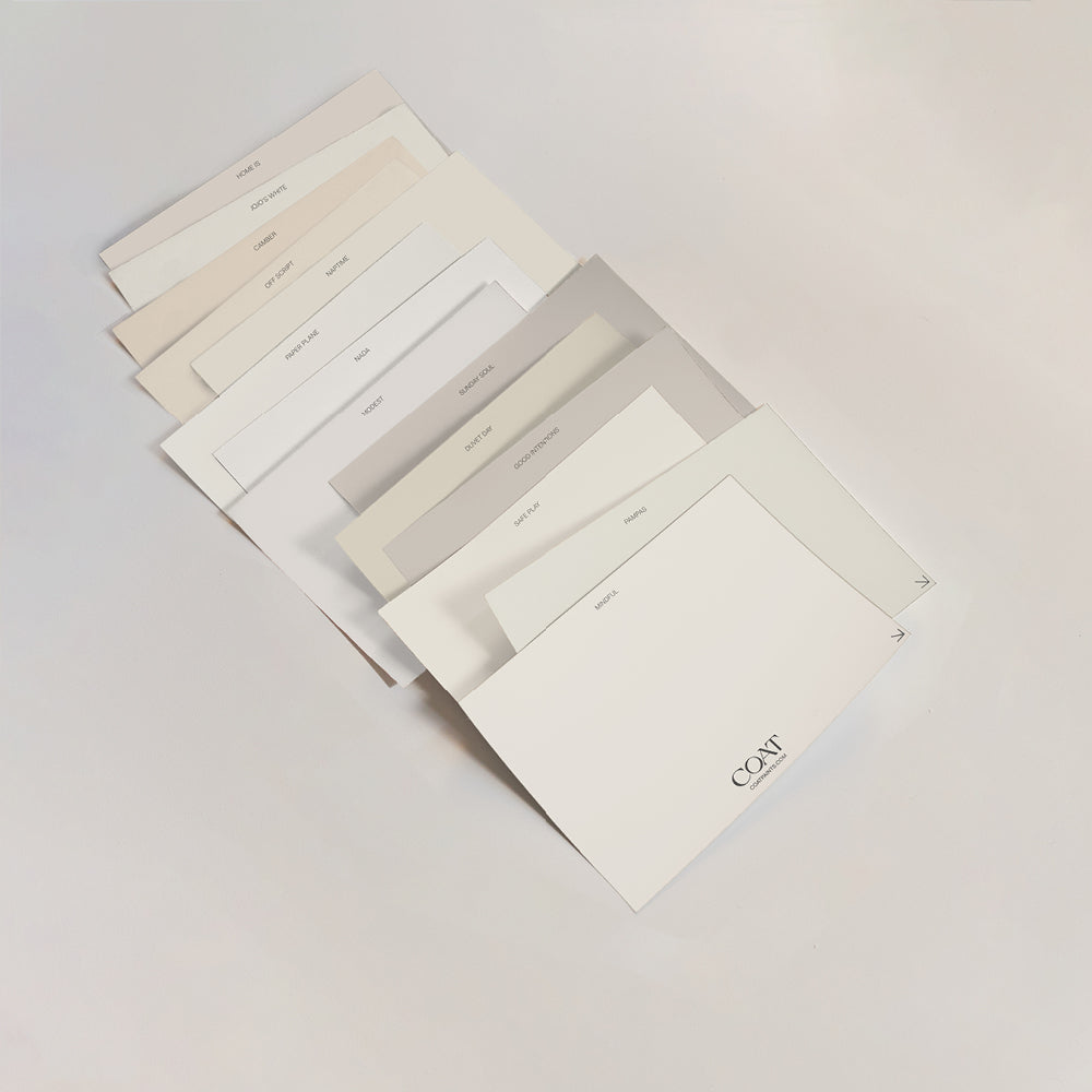
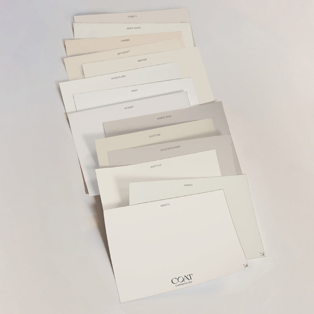
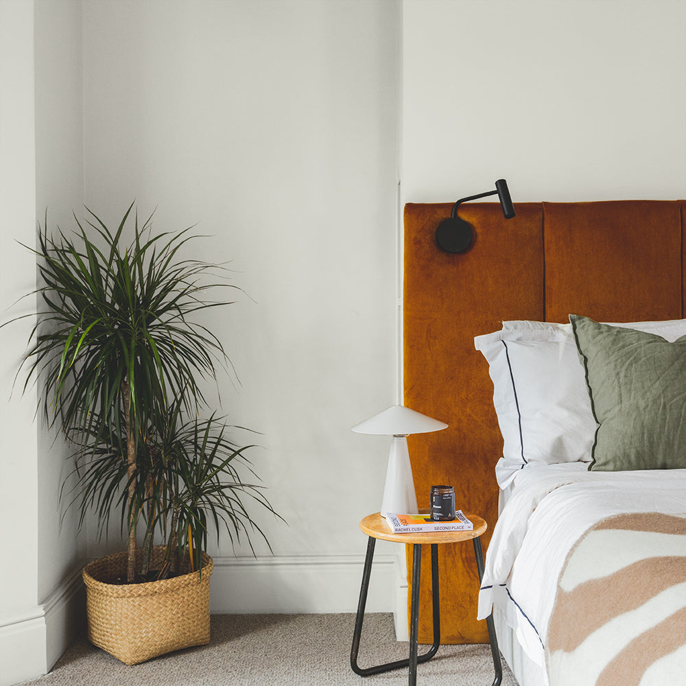
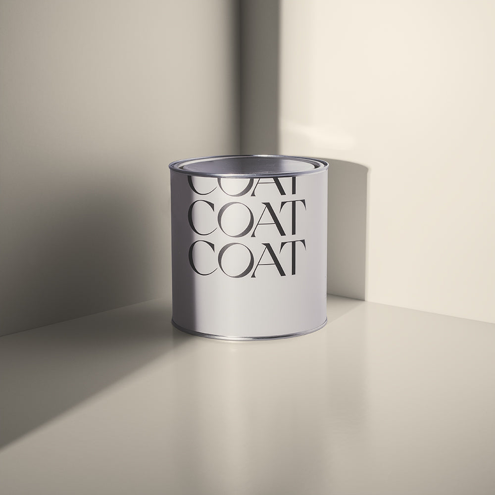
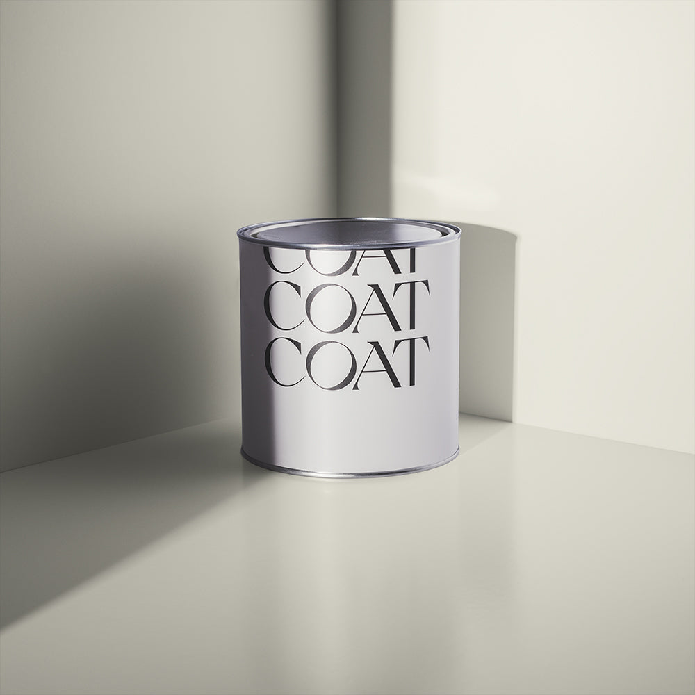
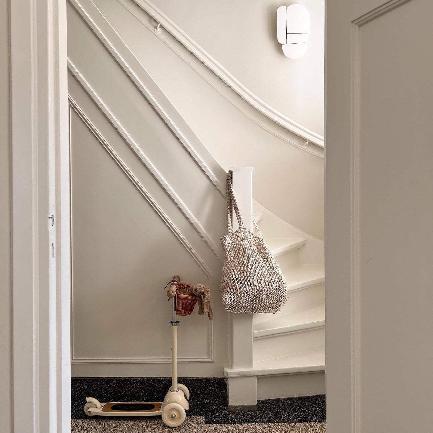
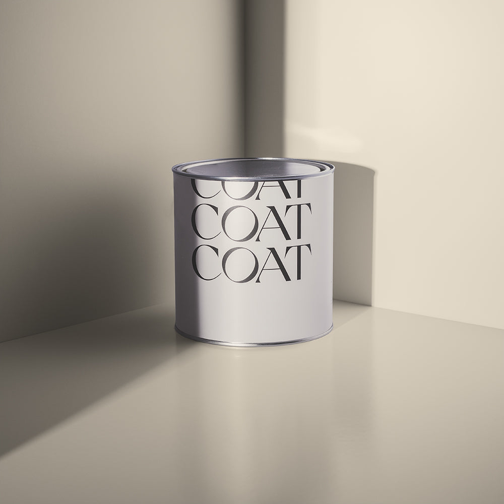
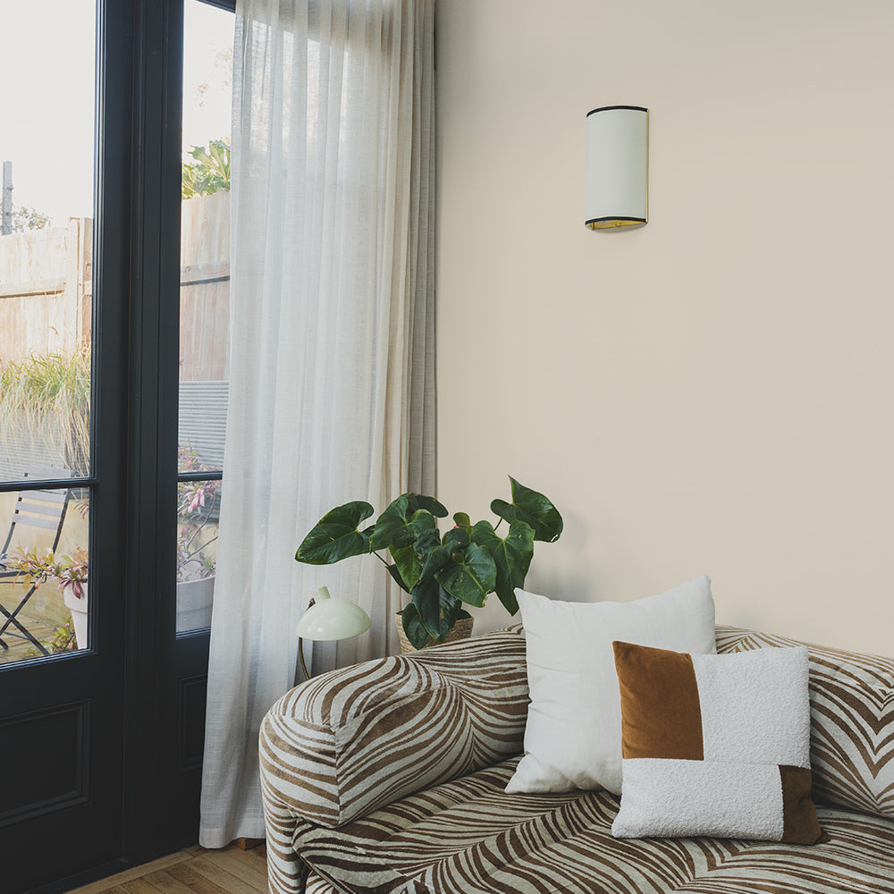
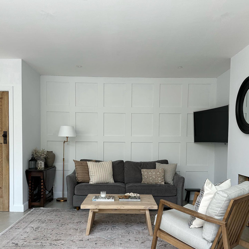
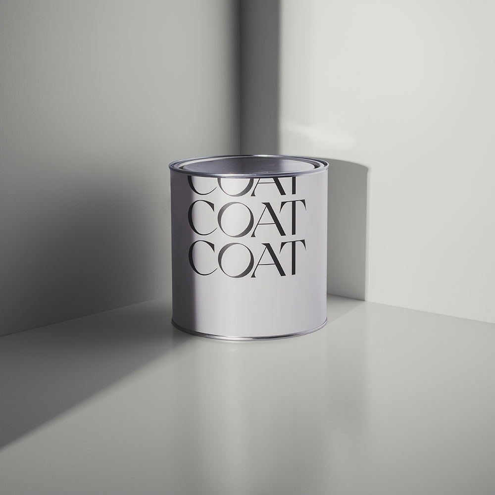
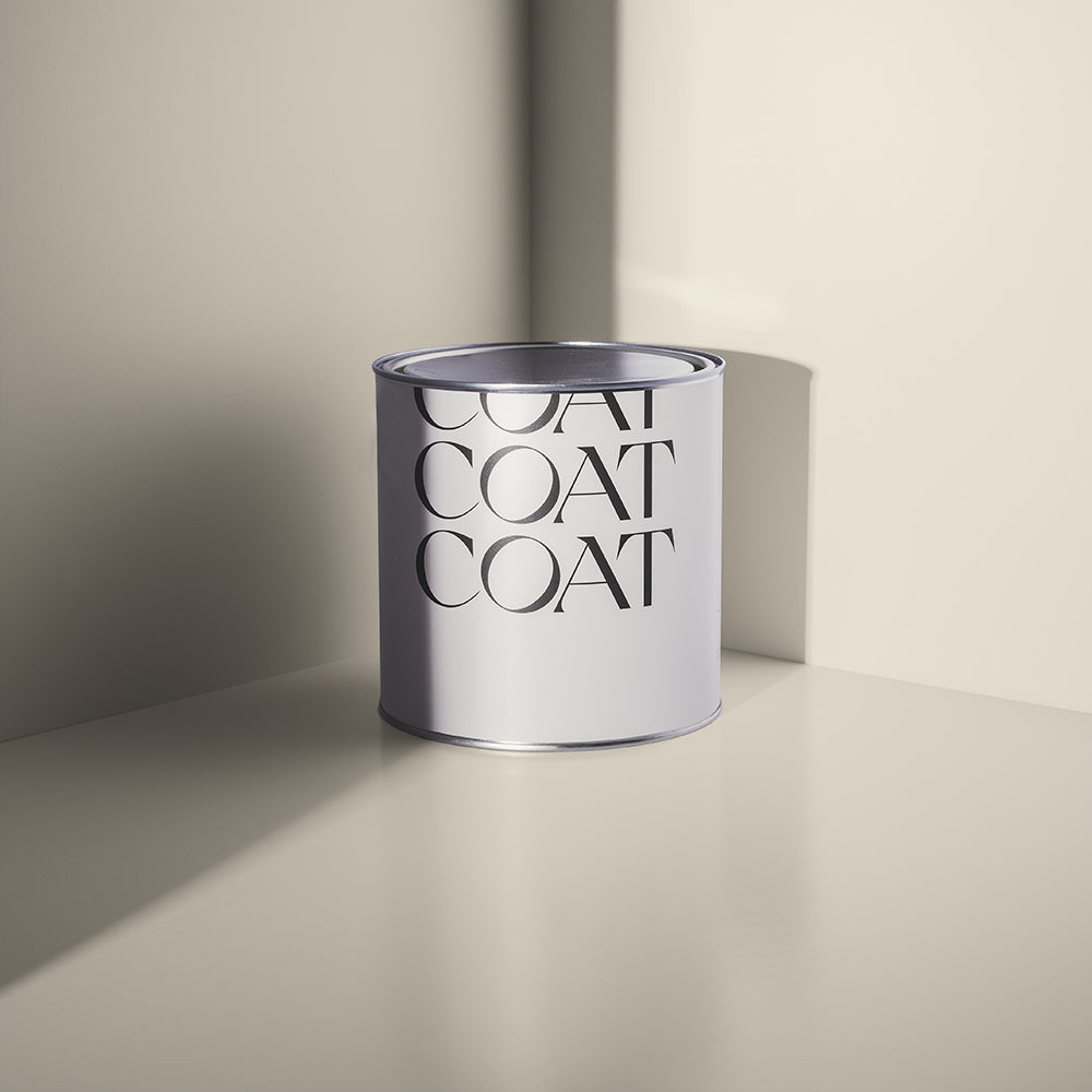
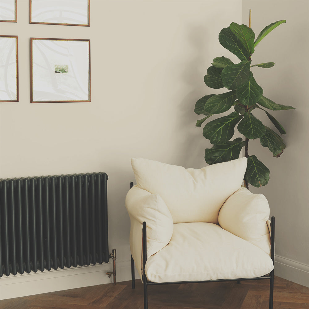
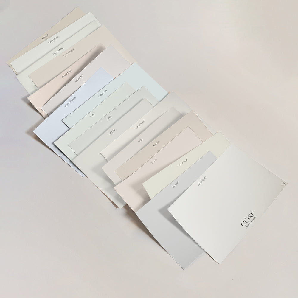
Neutral colour palettes are great in your hall wall paint colour, creating bright, airy spaces that are inviting and awe inspiring. The undertone of the neutral is key to the atmosphere you want to create. Using yellow-based neutrals like Pampas are great for hallways, they’re warm and welcoming to guests and provide a nurturing atmosphere after a long day in the office. Pampas also has a delicate green undertone, meaning it works great with house plants, and means that the rooms off of it can be deeper green tones or other beiges. Compliment with Duvet Day woodwork to create a bolder beige colour palette.

@gareth_at_31 opted for a classic 'Duvet Day' in their hallway.
Using a durable hallway paint is super important, so we advise using our Soft Sheen finish on any surfaces that might get scuffed or have mucky pup prints all over. That way, you can wipe it down with ease. The Soft Sheen works particularly well in brighter colours as these reflect more light, making it more difficult to see the sheen across the surface.
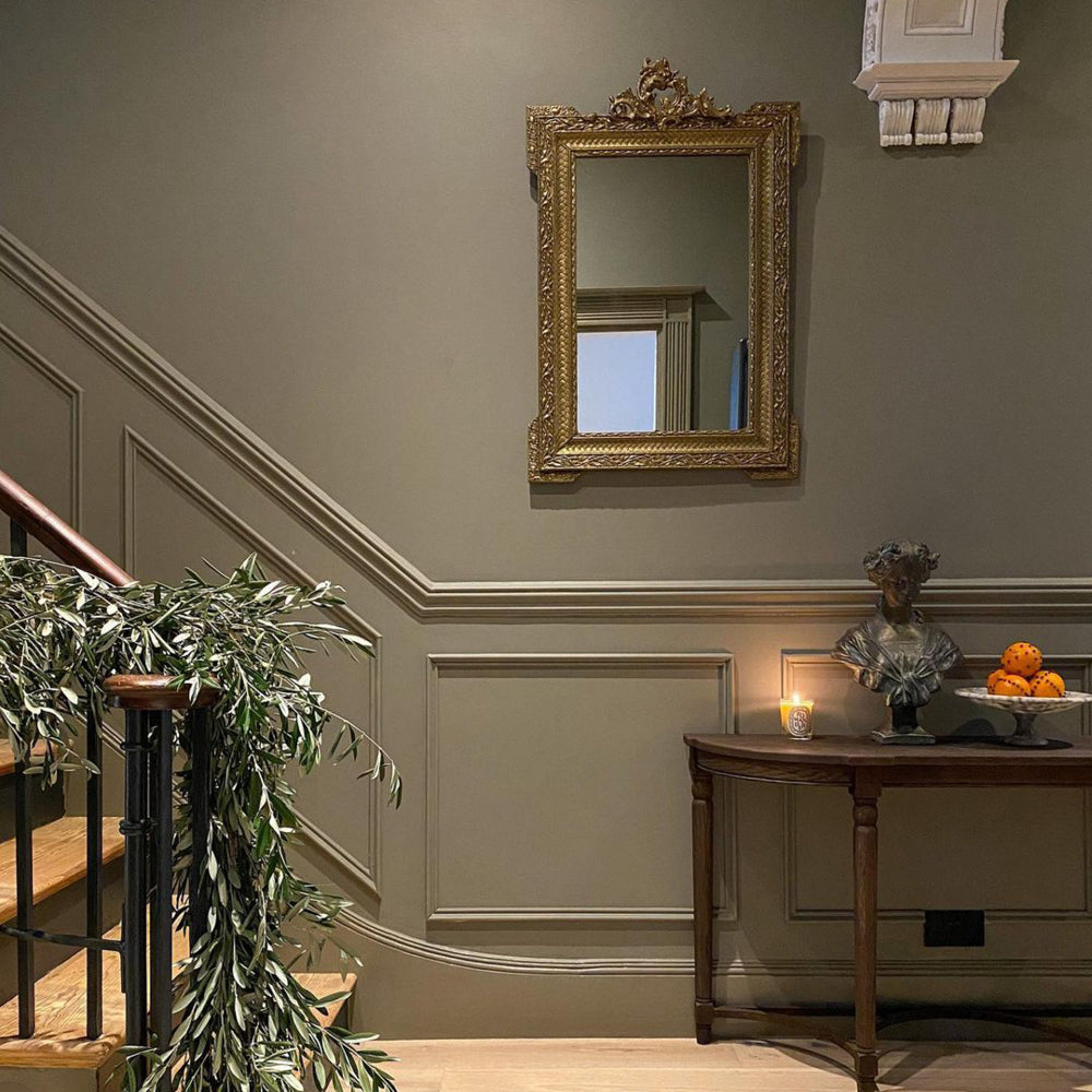
Panelling has also become a really popular way of creating some architectural interest in hallways. Having half height panelling in a deeper colour to the walls above keeps your neutral colour palettes Well Grounded, just like this hallway by @augustus.coop.

@augustus.coop creating definition in their hallway using 'Well Grounded'. Big Fans.
Warm Neutrals
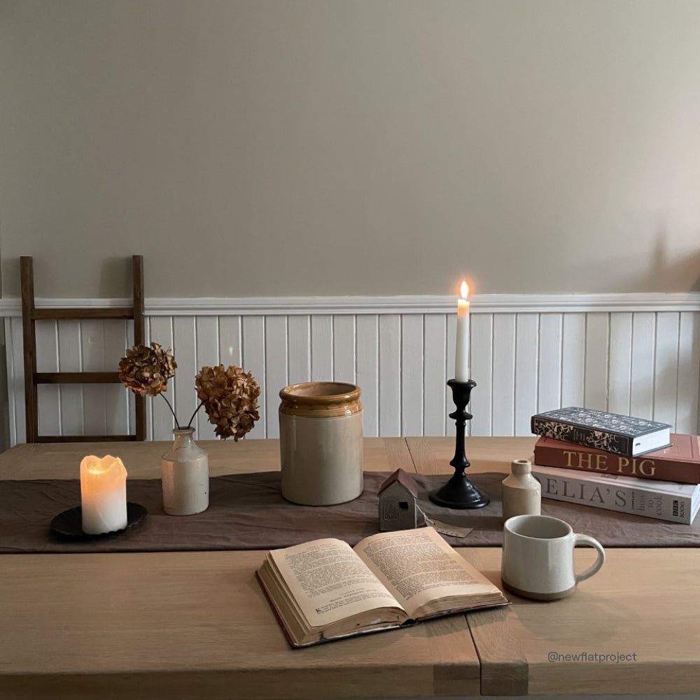
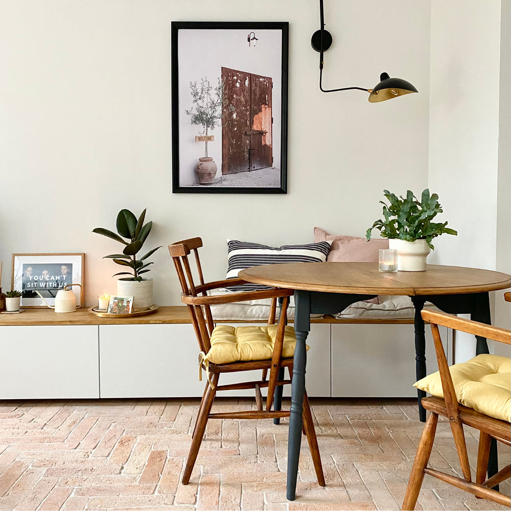
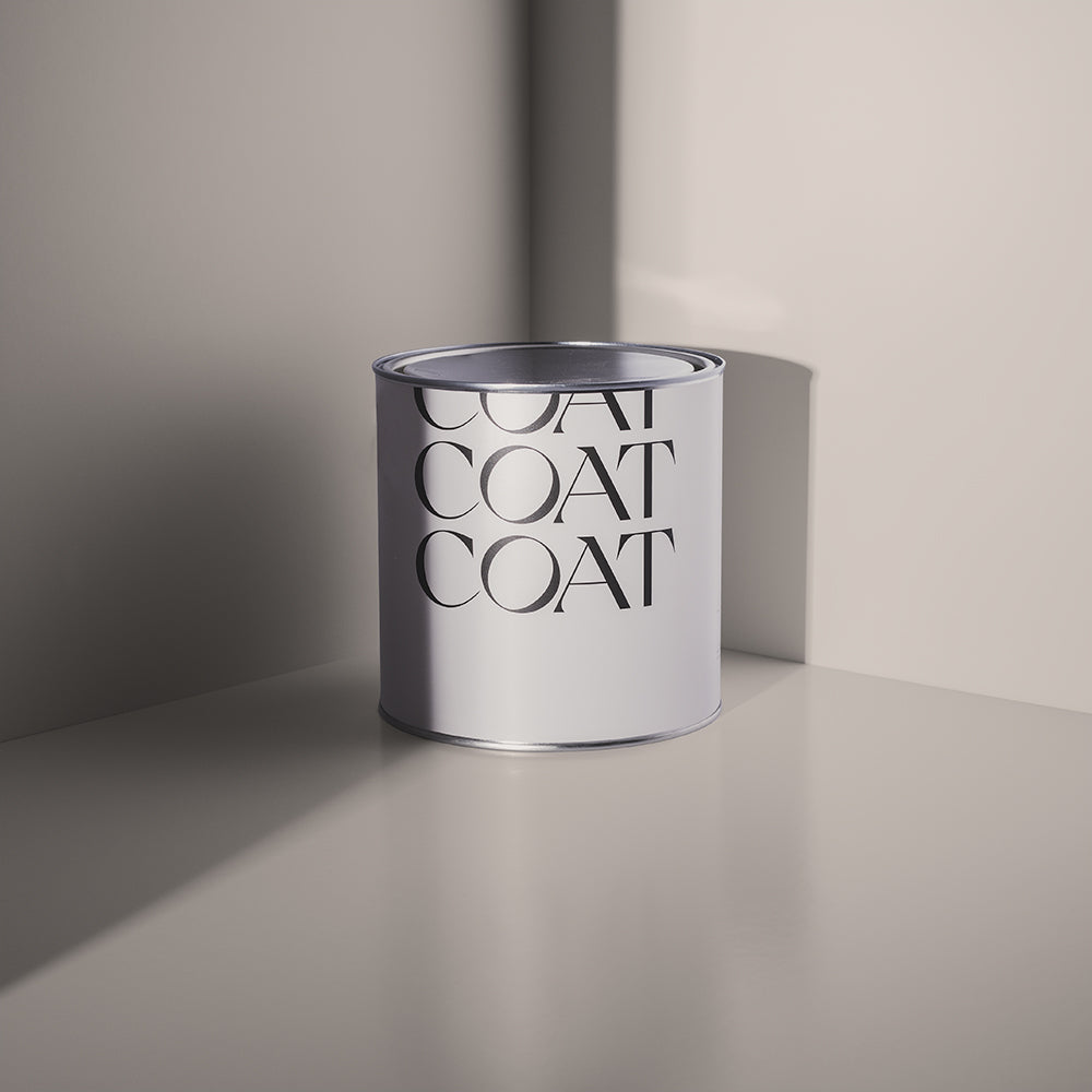
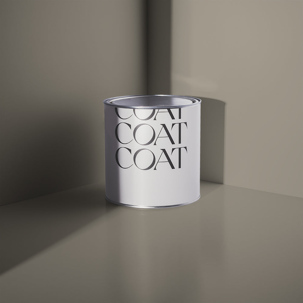
One of the more modern colours for hallways tends to be grey, but these can look a bit cool. Warm neutrals can help tie your rooms together, particularly if they’re different tones. Try using Ambrose, a stony, mid-century inspired neutral. It’s a grey that is a bit yellow, which tones well with greens, blues and other greys. These mid-tone colours are also more forgiving when they mark than light or dark colours, as well as making the spaces that come off of these hallways feel brighter and airier.
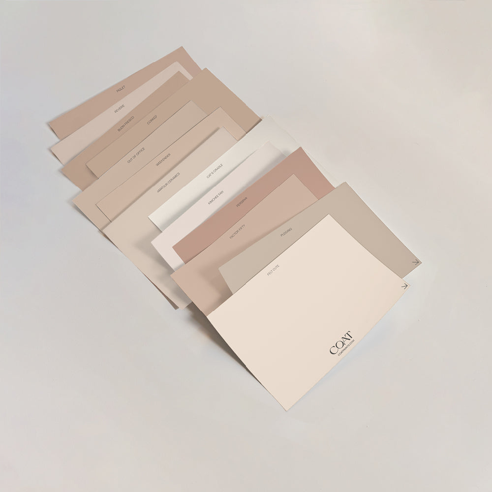
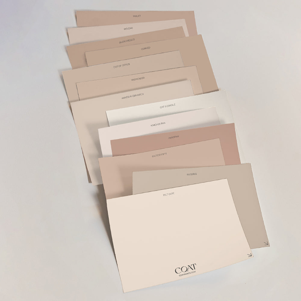
If you’re looking at a more beige colour scheme for your home, choosing darker, more modern colours for hallways is a great way to go. Moving Day is a hay coloured neutral, that is deeper than a traditional beige. It also has a bit of green in it, which makes it the perfect complimentary tone for some of our more daring greens. For a slightly warmer look, opt for Well Grounded, a biscuity beige that has a touch of red in. These will make your beige rooms feel bright and inviting. These modern colours for hallways will also help give a little nod to other colours in your home, helping to create a cohesive scheme.
Pretty Pinks
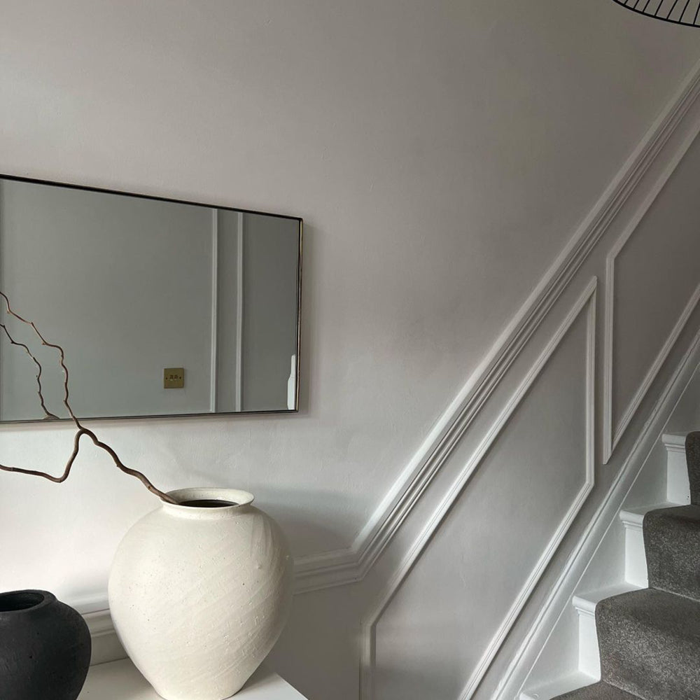
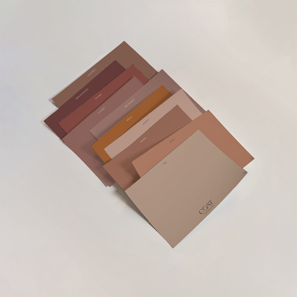
Pink paints have become one of the most popular hall painting ideas in contemporary interior trends. Pinks tend to either be quite sweet, or plastery, and both are great choices for your hallway. Ciao, Sofia is an excellent option for hallways as it has a greyness to it. This helps it work naturally with other neutrals coming off of the hallway. Painting your walls in Ciao, Sofia and a deeper pink like Festival Eve on woodwork helps your larger surfaces still feel bright.
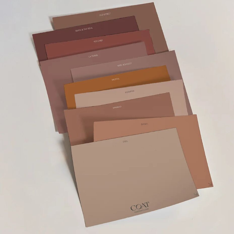
For a pink hallway scheme that skirts both sides of the gender binary paint walls in Mrs Bouquet, a deep, blush pink. This colour is slightly grey and yellowy, creating warmth and depth. Combine with spindles, skirting and door frames in a charcoal blue like Dodie that will be the to create frames around the entrances to your rooms.
Airy Greys
Maintaining their spot as some of the best paint colours for hallways are greys. They’re a fairly traditional choice at this point, and for good reason. They’re super reliable, and generally pretty stable. The key to picking a grey colour scheme is about the undertones in the grey. Cooler greys tend to look more dramatic or airy, depending on their depth. Whereas warm greys are more welcoming to walk into.
Dark grey woodwork is one of our fave modern hallway ideas, particularly when paired with lighter walls like On Mute. These brighter large surfaces create a cleanliness to the scheme, while the deeper woodwork adds drama and character, and let’s face it, everyone wants a David Rose at home (if you know, you know).

@claireschauhan making moves in her hallway.
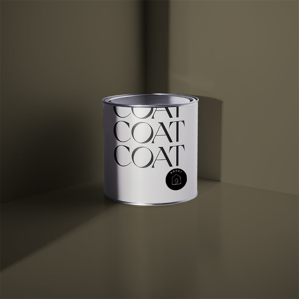
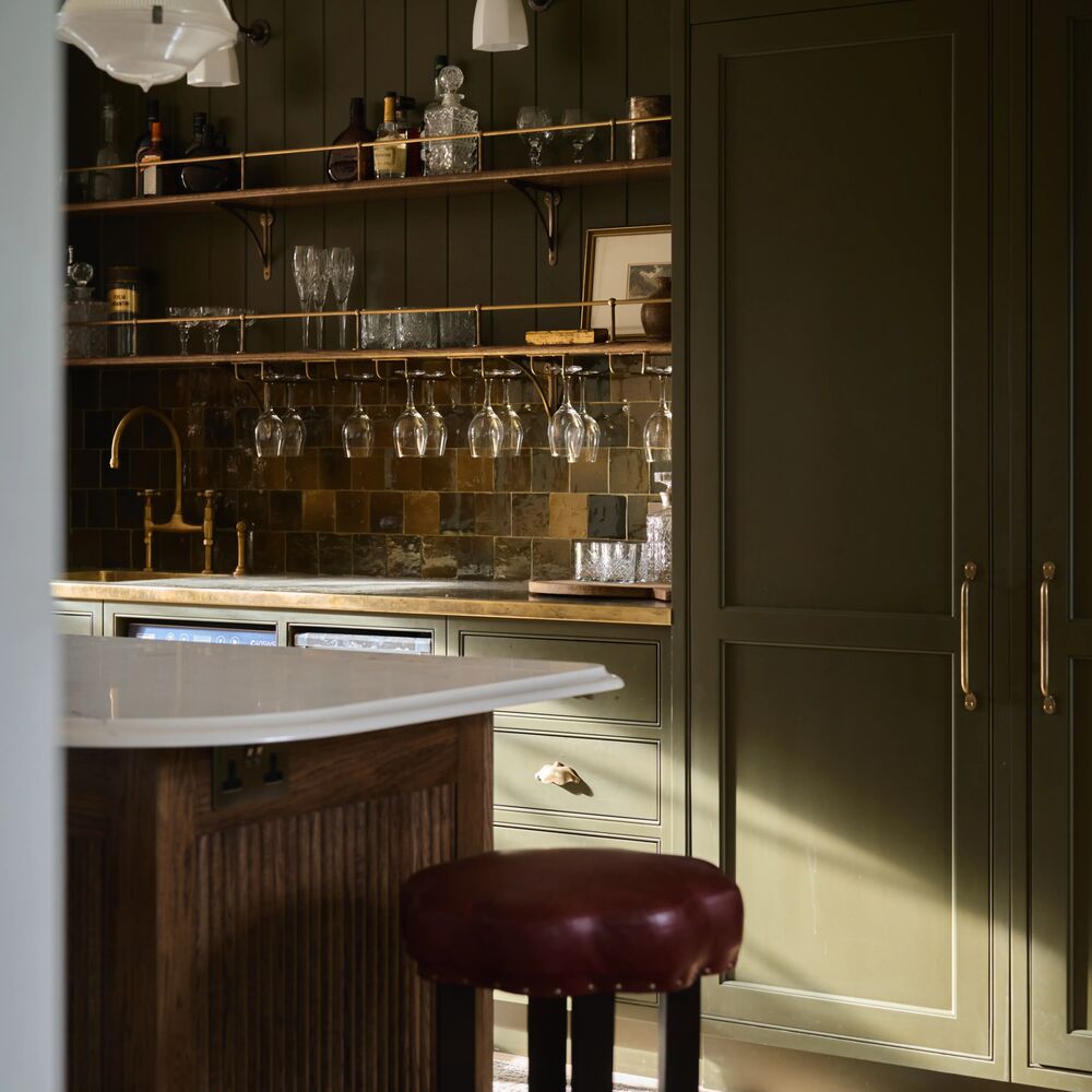
Some of the warmer greys are perfect for incorporating more modern hallway ideas, as they’re versatile and work with a larger range of colours. Good Intentions, for example, is a greyed taupe, and so with it’s warm undertone works great with most colours. The stairs in Nomad, everyone’s fave dark olive, and the spindles in pure black, The Record Store, have us falling, literally… danger zone.

@brickdustbaby going for the big triple. Nomad, Good Intentions and The Record Store.
Minty Fresh
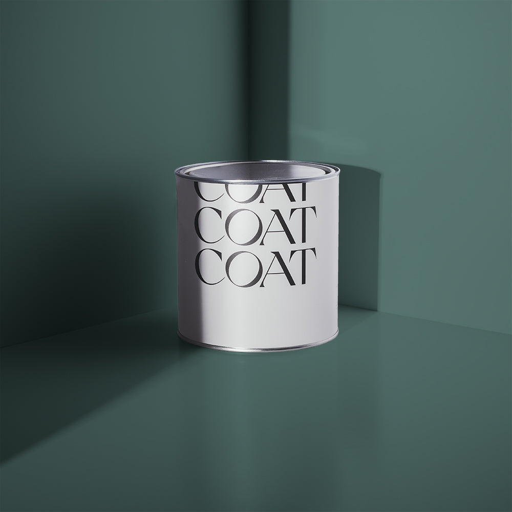
Hallway designs that include refreshing colour palettes provide an uplifting burst of colour that is perfect for inviting guests into. Clean, minty tones are clean and bright and make for a great first impression, much like a post-dentist smile. Colours like Detox work really well on walls, this blue-green tone feels pristine, but it’s added black pigment adds depth and intrigue. Very clean living… bliss.
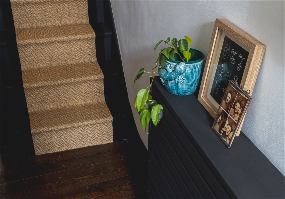
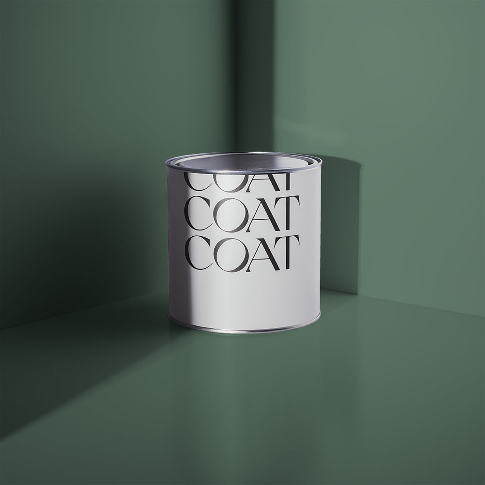
Not to harp on about a subject, but panelling is making a comeback, and for good reason. It’s super practical as it is usually painted in an Eggshell finish, a durable paint finish for wood and metal work. This means that you can also use it to hide ugly radiators by using the same colour, making it one of the best hall painting ideas for homes. This panelling looks naturally nurturing in soft, mid-greens like Home Grown. This curious green is both vibrant and soft due to it’s blue and grey undertones, perfect for picking out interesting architecture as shown here by @planetlucygram.

'Home Grown' on the stairs of @planetlucygram. Stunning.
Garden Greens
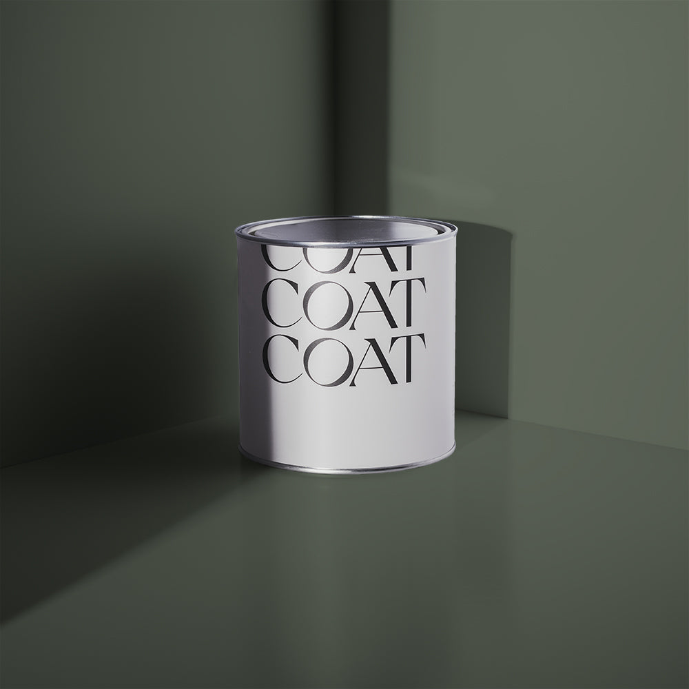
Green paint is one of the bolder hallway colour ideas. If you have a hallway with fairly traditional architecture, or you’re considering putting panelling into your property then greens are a no-brainer. Make sure that when you’re using bold colours on the bottom half of your walls that you paint the wall, dado rail and skirting board all in the same colour. This helps to create a colour block, rather than giving you lots of racing stripes up your hallway. For an organic, garden inspired scheme: paint the bottom half of your walls in Mansard, our cooler duck green, use Kind Regards (a light, greeny greige) on the top part of the wall and then compliment with spindles in our dark botanical green, Brewer.
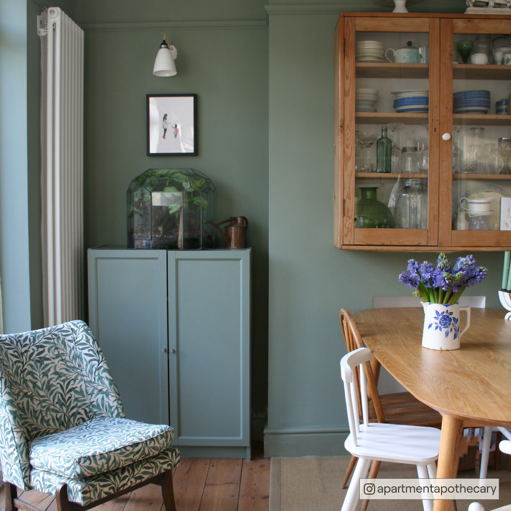
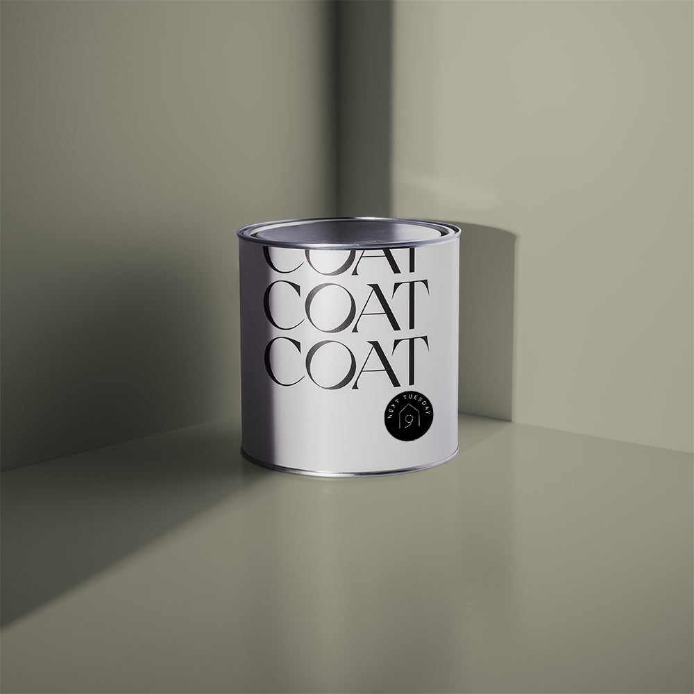
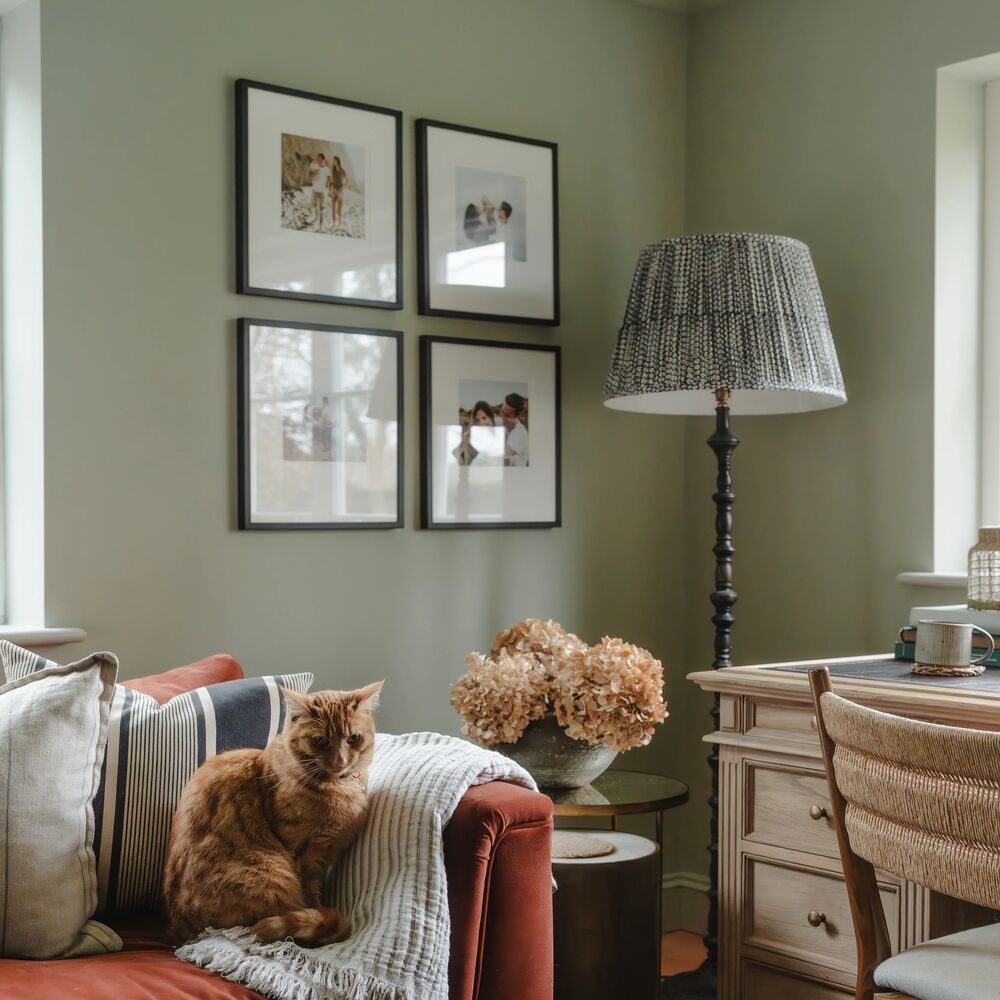
If your hallway is East facing, then greens are a great choice too. These spaces tend to have much greener light in them anyway. If you want to keep your woodwork white, then choose colours that are not too bold, but still look exciting. Park Life is a sage green that does a great job of connecting other neutral colours, but adds a pop of character into your home. If you’re looking for a more neutral green for your hallway, then try The Trail, which is much more relaxed and grey than many of our other greens.
Dusky Darks
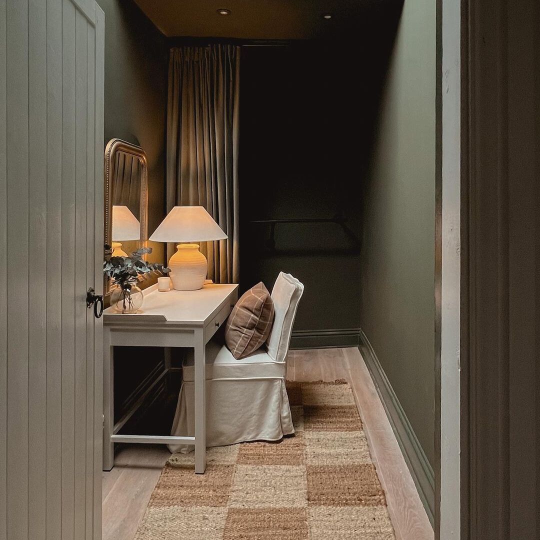
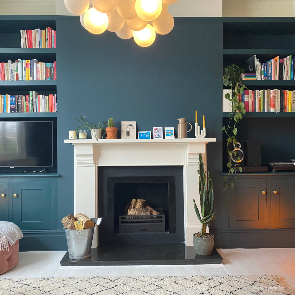
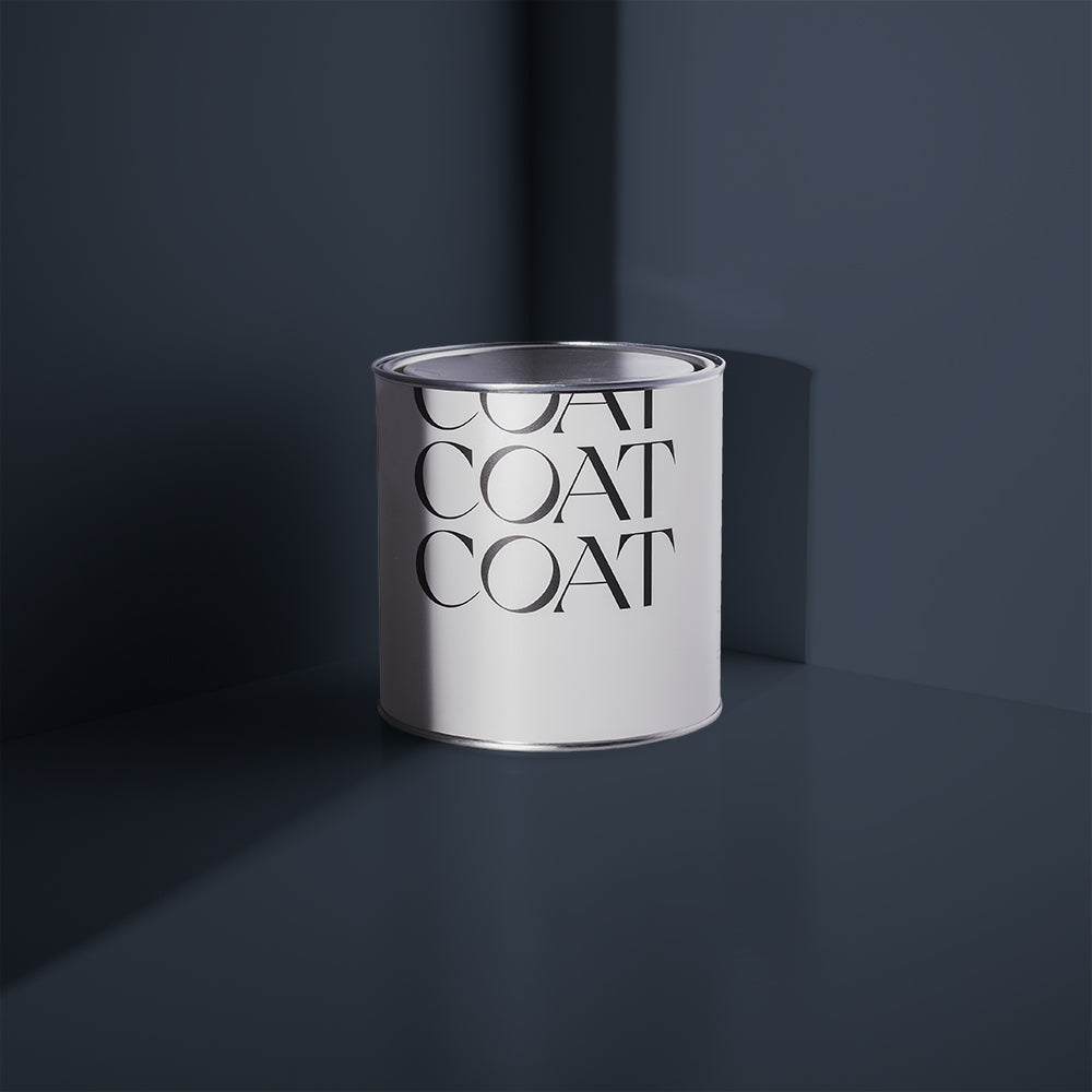
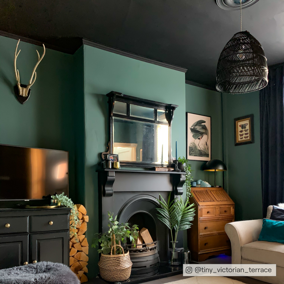
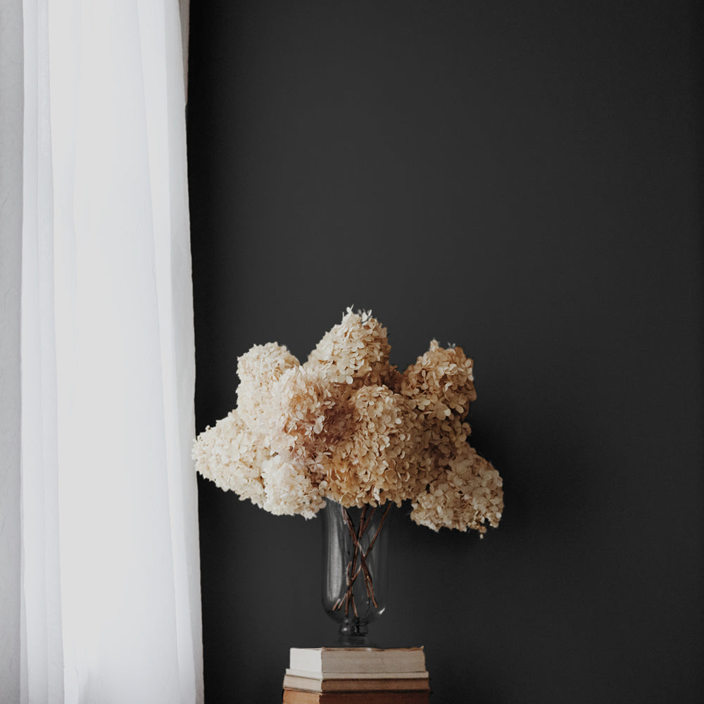
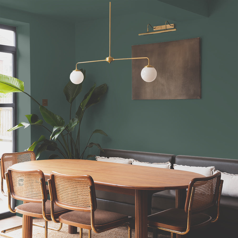
Dark colour palettes make for beautiful transitional spaces, that also make your living areas feel brighter and cleaner. By picking a dark colour for your hallway, you can also use greys, taupes and other deep colours, as their black pigments allow for a consistency in flow across your whole property. Deep blue paint tones on the walls, like Adulting (a universal COAT fave green blue with a grey undertone) is perfect for this, as it goes with everything.

@ourhome_a_r making moves with 'Adulting'. It's big, bold and we're obsessed.
Dark colour palettes can be a little intimidating for those of you that are yet to fully embrace the dark side. Fortunately, there are some cheap tricks to pulling darks into your hallway. Keeping the walls brighter, with darker trims is often a great way to invest in these dusky darks without the commitment to dramatic, dungeon vibes. Using pure blacks for this, such as The Record Store are great for adding a dark hallway paint idea to your home.

@moedington keepin' it classy with 'The Record Store'.
Darks don’t always have to be black and blue though! Using warmer colours, like deep, greyed pink, Festival Eve, is an awesome way to create an exciting focal point in your hallway. It also works really well with our taupe colour family, with colours like Sunday Soul and Good Intentions.
Mix It Up
Failed to grab your attention so far? Need more colour? Or just looking for more hall colour combination ideas? Look no further.
Mixing your colours up, and using them in interesting ways makes for a punchy palette that makes a confident statement about the colourful person you truly are. The first way you could do this is by using wallpaper. Bold wallpaper designs are great in hallways, and are also practical as nowadays they’re usually slightly glazed and can be wiped down. When doing woodwork, or lower walls with your wallpaper design, use a colour from the wallpaper to create harmony across the whole space. See this great example by @thegemdrewhouse.

@thegemdrewhouse being the most welcoming with 'Good Intentions', those colours though!
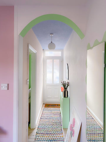
Wall graphics in vibrant colours are an awesome way to add intrigue. Highlight interesting architecture, such as traditional spindles, archs and the like with an acidic colour pop, like our new chartreuse, Plant Power, puts a punch into more subdued colour schemes. You can do the same thing with vibrant colours like Felt Cute, and combine with colours that are opposite on the colour wheel for a really vibrant colour contrast. Finding the best wall colour combination for hall or corridor spaces can be tricky but when it comes to colour, be brave, and act the fool… always. You’ll have a much more welcoming colour scheme for your hallway that way.
FAQs
How can I incorporate wallpaper into my hallway design to add visual interest?
Incorporating wallpaper into your hallway design can add an extra layer of visual interest and personality to the space. You could choose bold wallpaper designs that reflect a personal style and preferences - or opt for neutral tones and subtle patterns that add just a touch of texture. When incorporating wallpaper, you can also use a similar colour or choose a tone from the wallpaper to paint woodwork or lower walls, creating a cohesive look throughout the hallway.
What are some practical tips for using dark colours in a hallway without making the space feel too small or dark?
Using dark colours in a hallway can create a dramatic and sophisticated atmosphere. If you're worried about making the space feel too small or dark, think about keeping the walls lighter while using darker trims or accents. This approach allows you to embrace dusky dark colours without committing to a completely dark aesthetic. Additionally, using warm colours like deep, greyed pink can add excitement and depth to your hallway while still maintaining a welcoming ambiance.
Are there any specific paint finishes recommended for high-traffic areas like hallways to ensure durability and easy maintenance?
When painting high-traffic areas like hallways, it's important to choose paint finishes that offer durability and easy maintenance. Opting for a Soft Sheen finish is recommended for surfaces that might get more scuffs or stains, as it provides a wipeable surface that can withstand daily wear and tear. Soft Sheen is perfect for those parts around doors and stairs that take the brunt from dogs, prams, bikes and kids shoes all the time. This finish works particularly well in brighter colours, as it reflects more light, minimising the visibility of any sheen across the surface.
Publish Date
Author






Leave a comment