Getting The Best From Teal
There’s something about Teal at the minute. It’s just got the edge on either Blue or Green, as something a little special that can make a space feel really sophisticated. From true dark shades of Teal through to paler, softer ones - we’ve put together a few Teal palettes using killer COAT paints, to inspire your next room makeover.
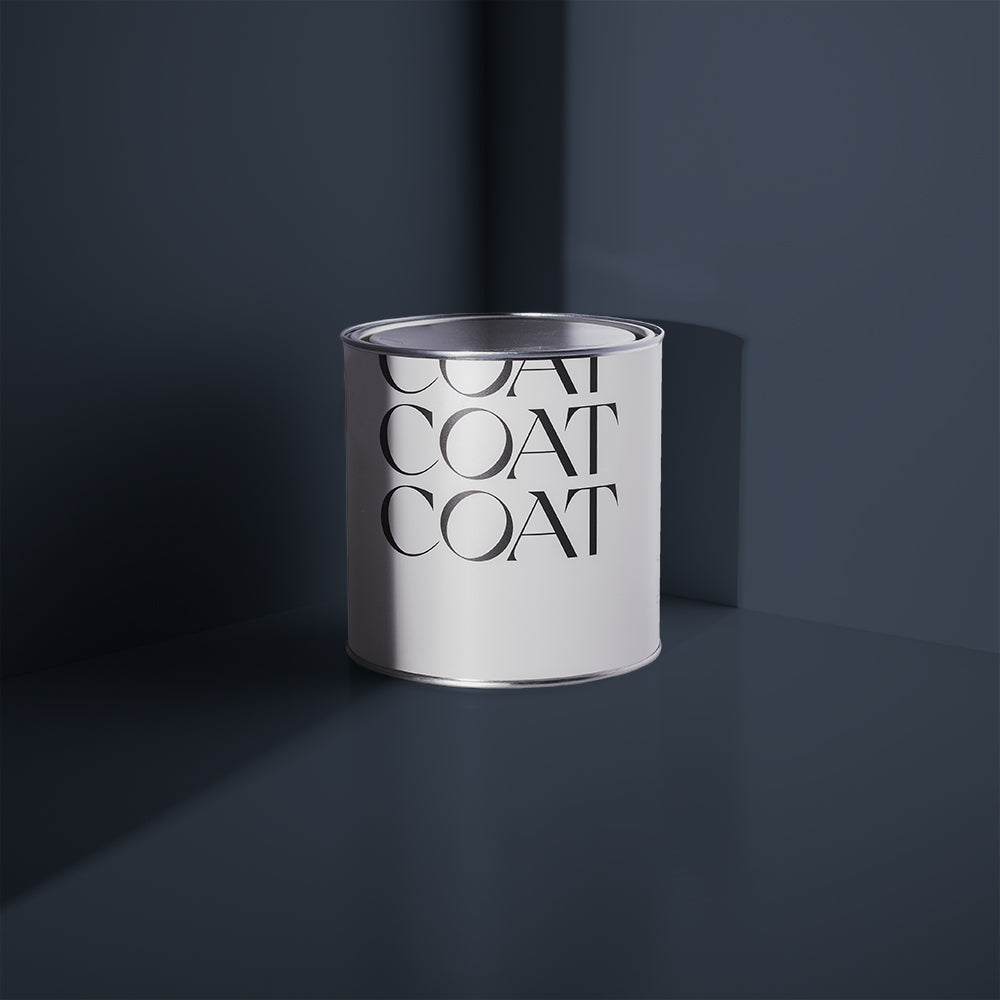
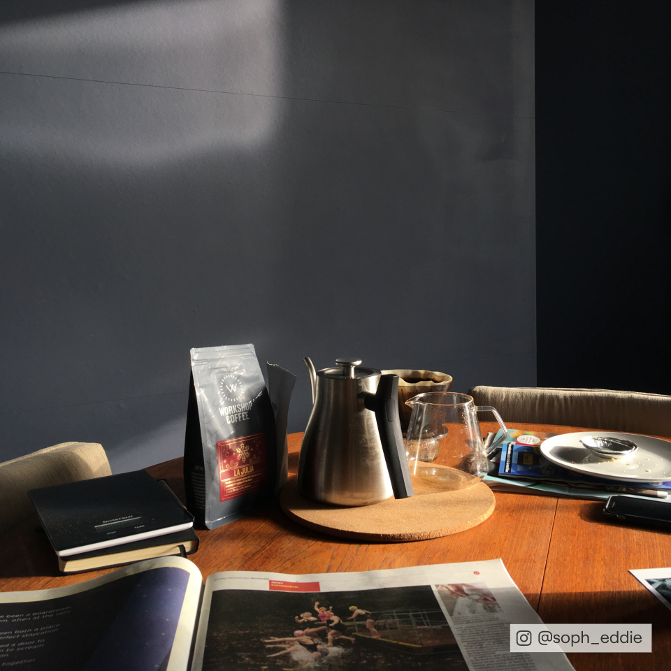
The Drink - A Very Dark Teal
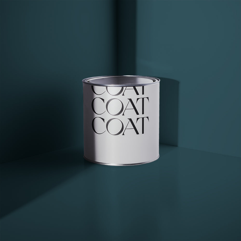
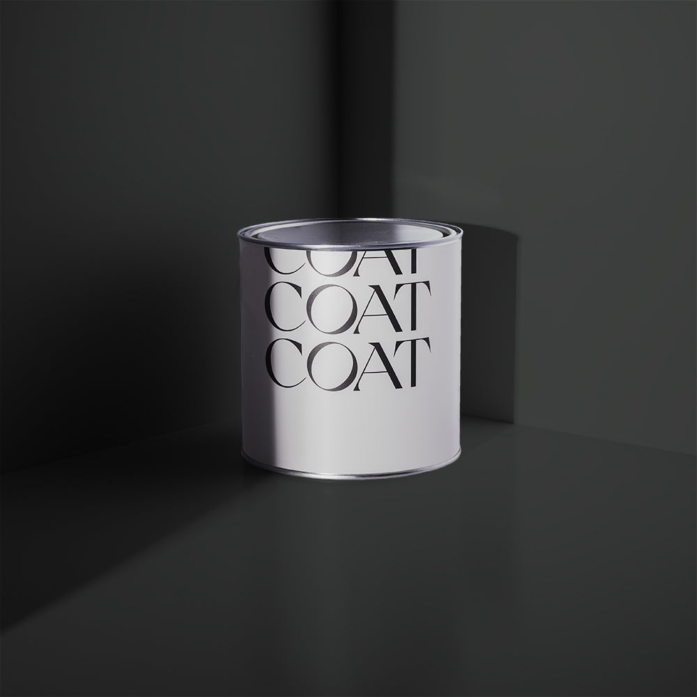
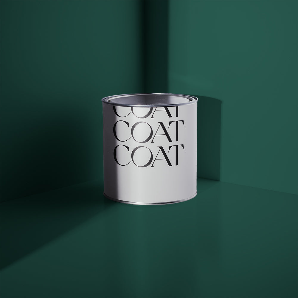
Inspired by the sea at night, this shade is the darkest of the Teals. Erring towards dark blue, it’s a dead cert for a dramatic feature wall (maybe for wood panelling), or as a dominant all-over shade.
The Drink + Good Intentions vs Pampas
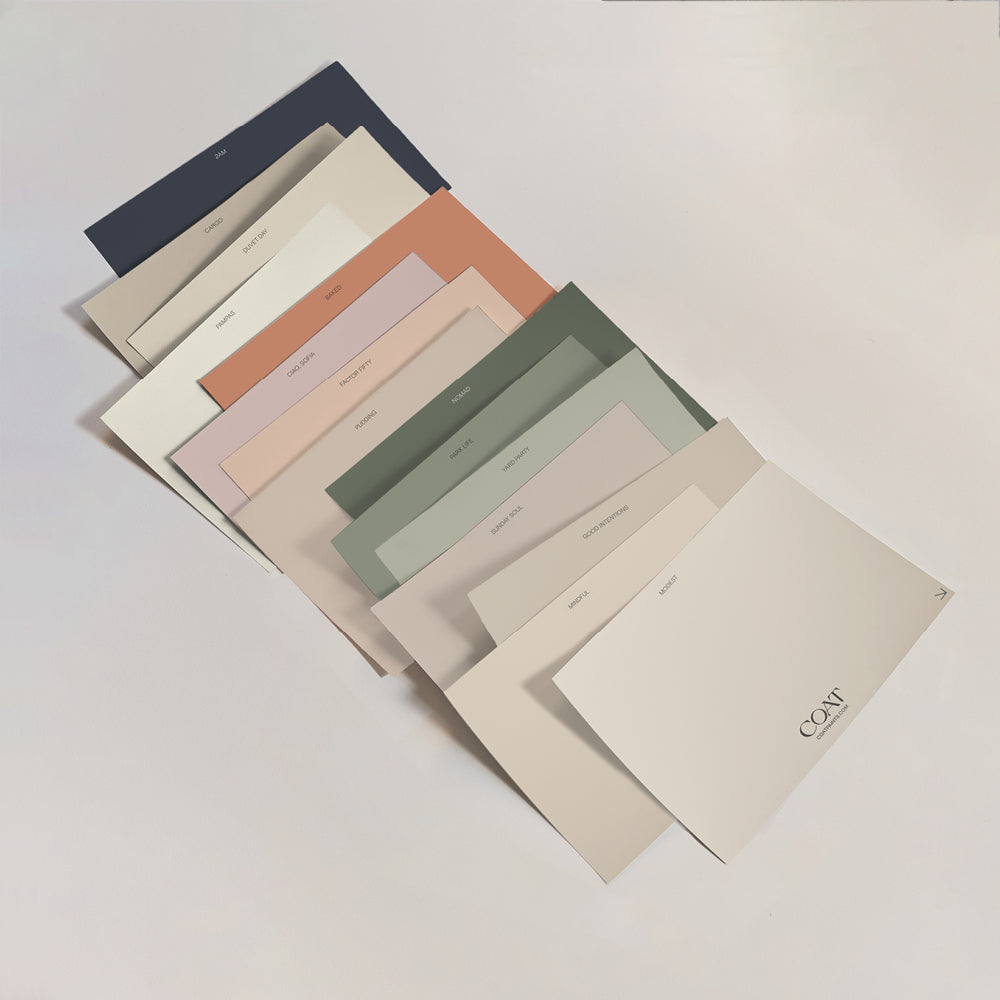
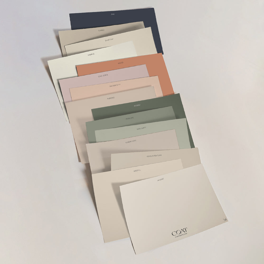
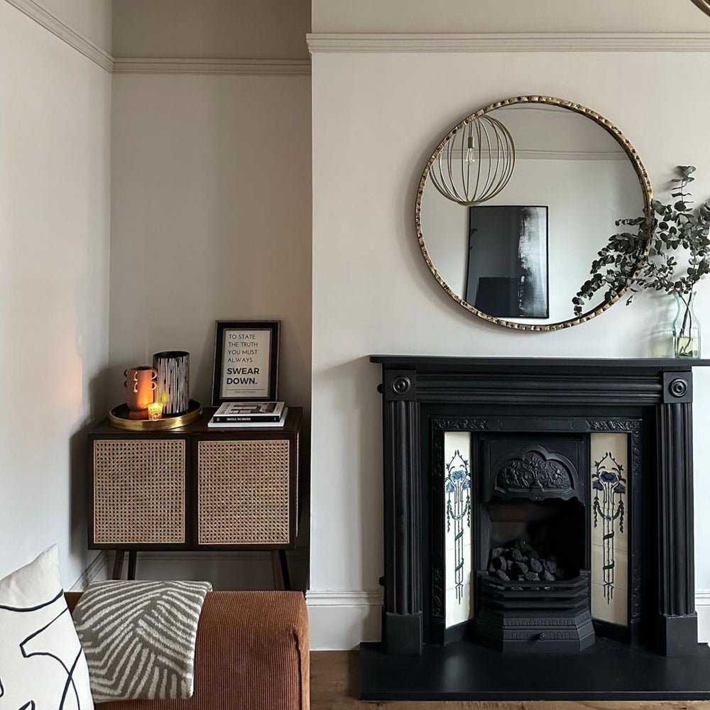
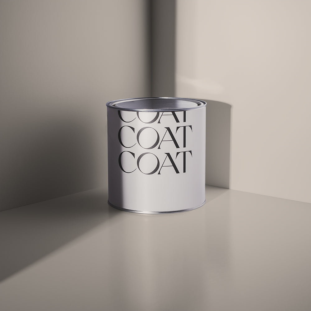
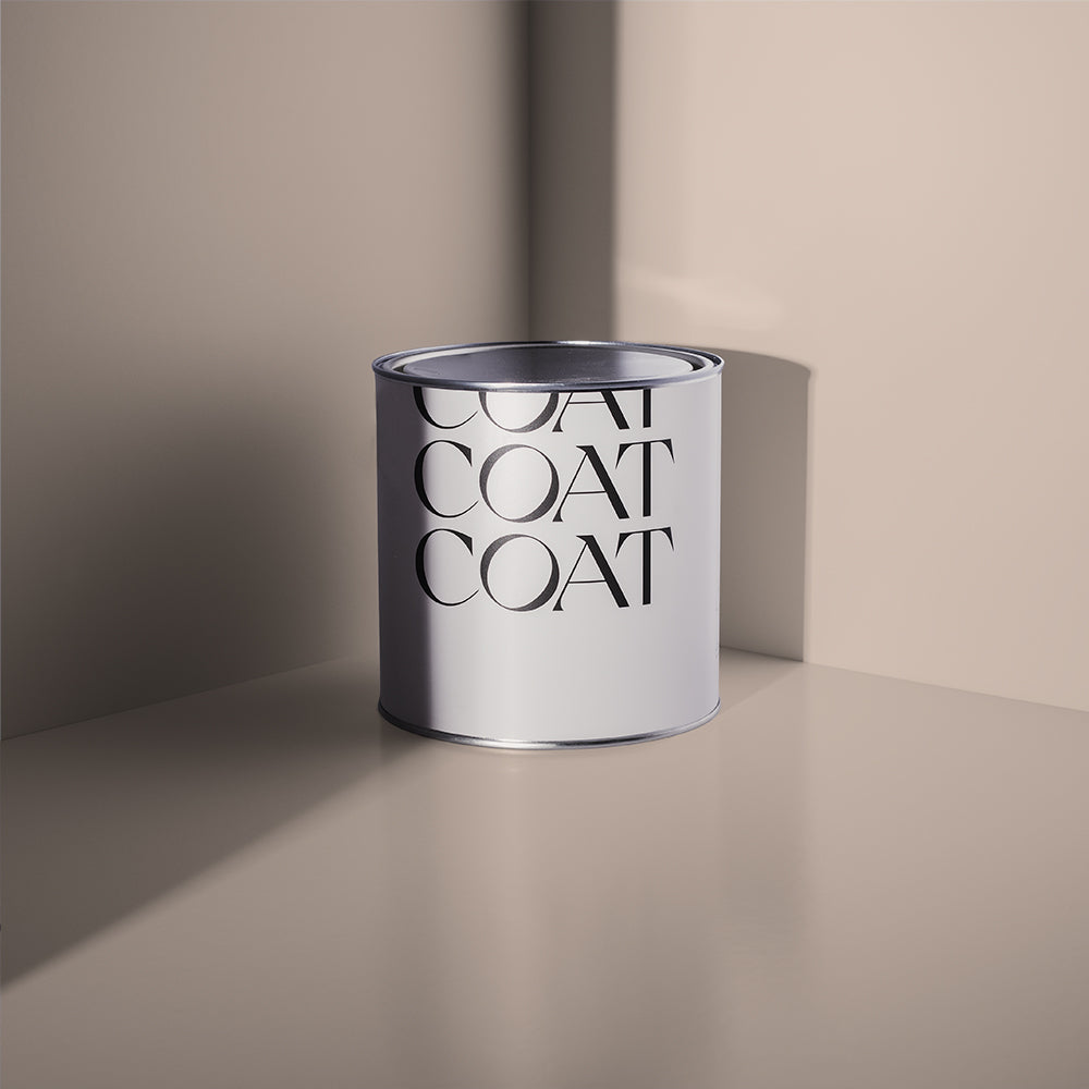
In this first palette, we’re using The Drink with a choice of warmer neutral shade on alternate walls, or woodwork and trim. The Taupe colour in Good Intentions pulls out a classy side, or Pampas as a warm off-white is a nice complimentary neutral.

The Drink + Ciao, Sofia vs Good Intentions
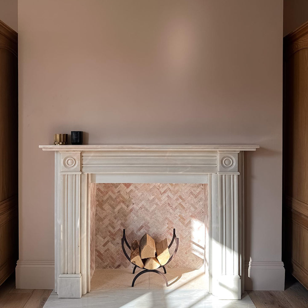
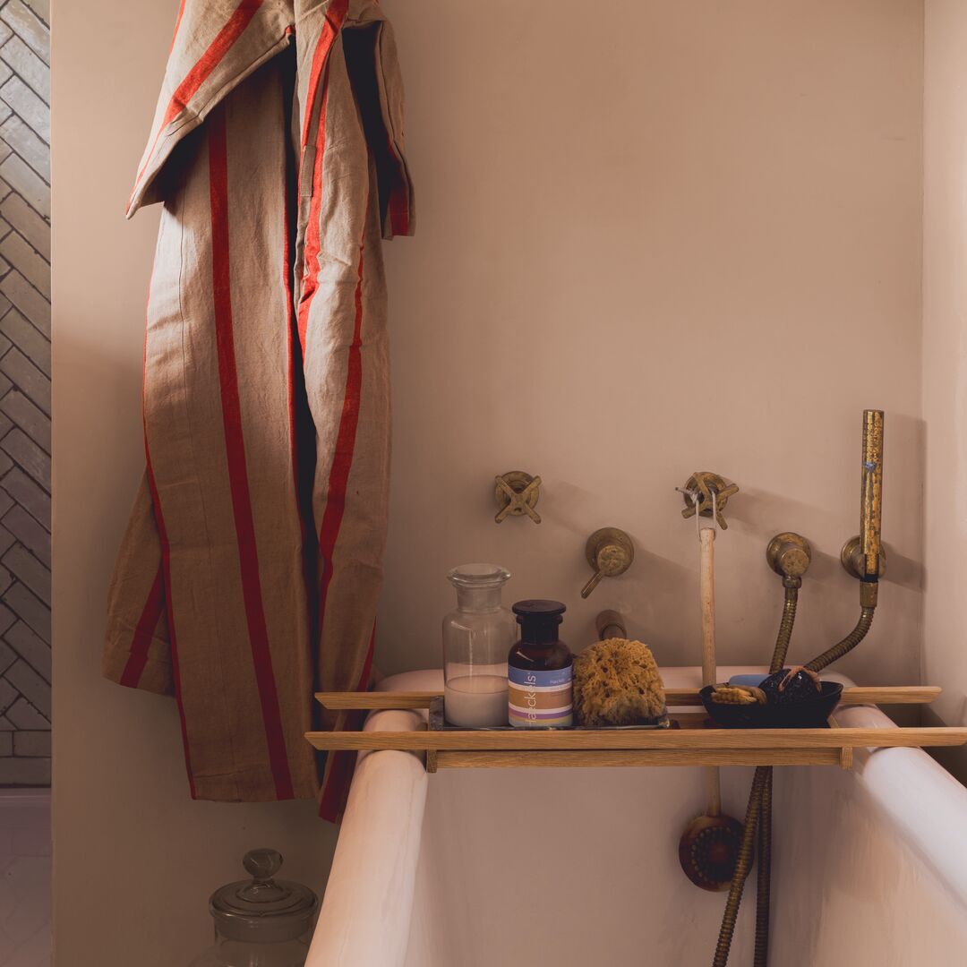
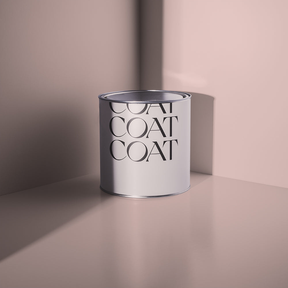
Using an accent colour doesn’t have to mean neutral. Don’t be scared! The Drink works ridiculously well with Ciao Sofia, a grubby pink. Alternatively, pair it up with Are you still watching? as a warm mid-grey. That’ll pull out the blue shades in The Drink.

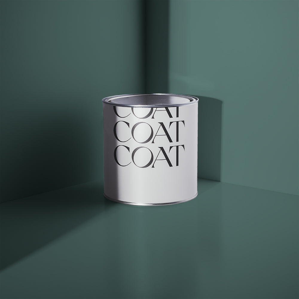
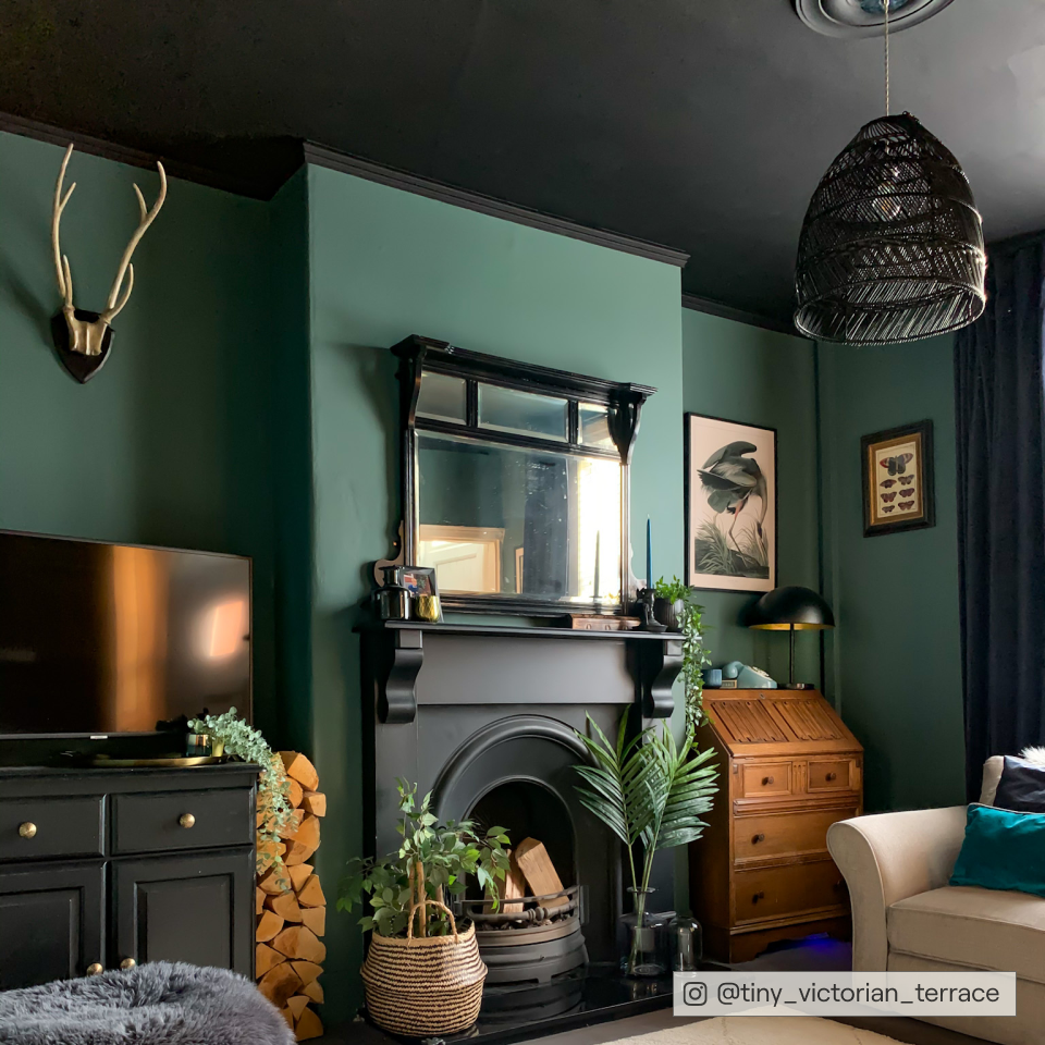
Adulting - A Dark Dusty Teal
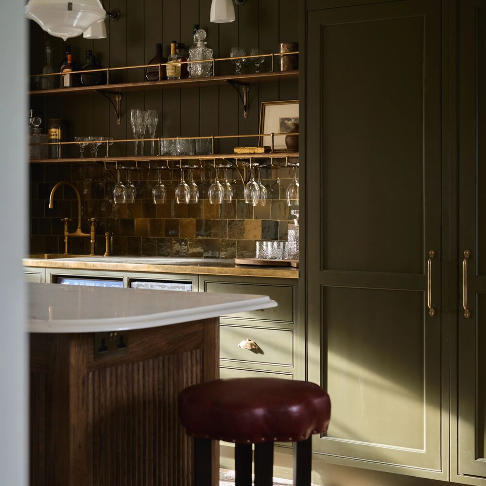
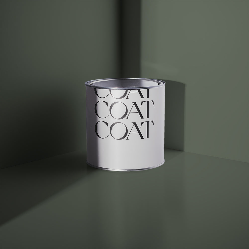
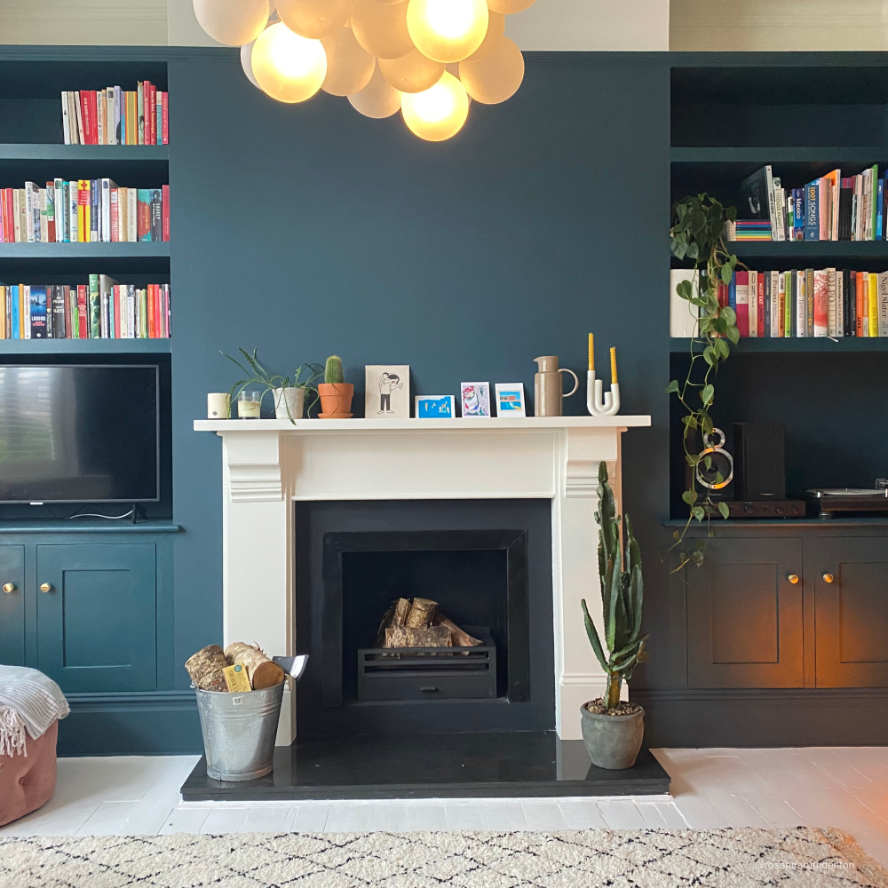
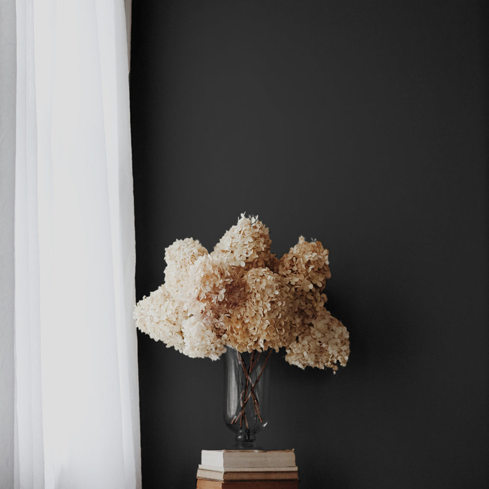
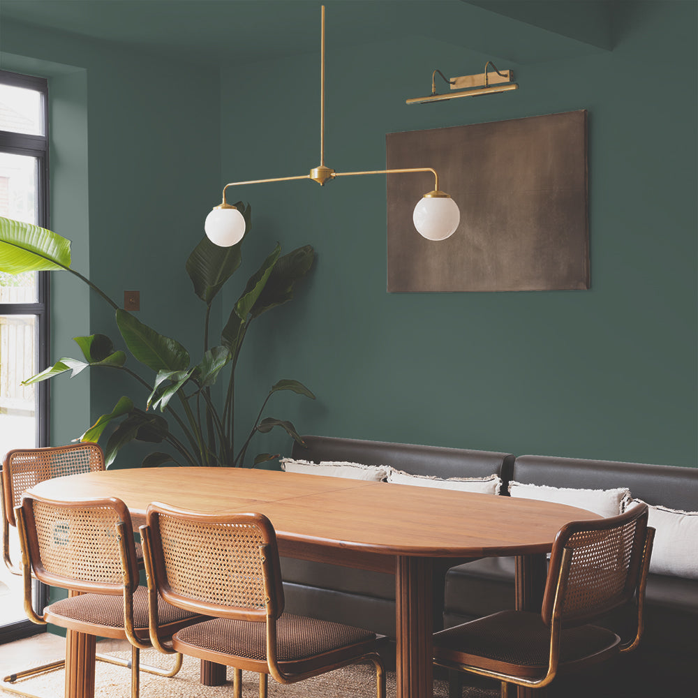
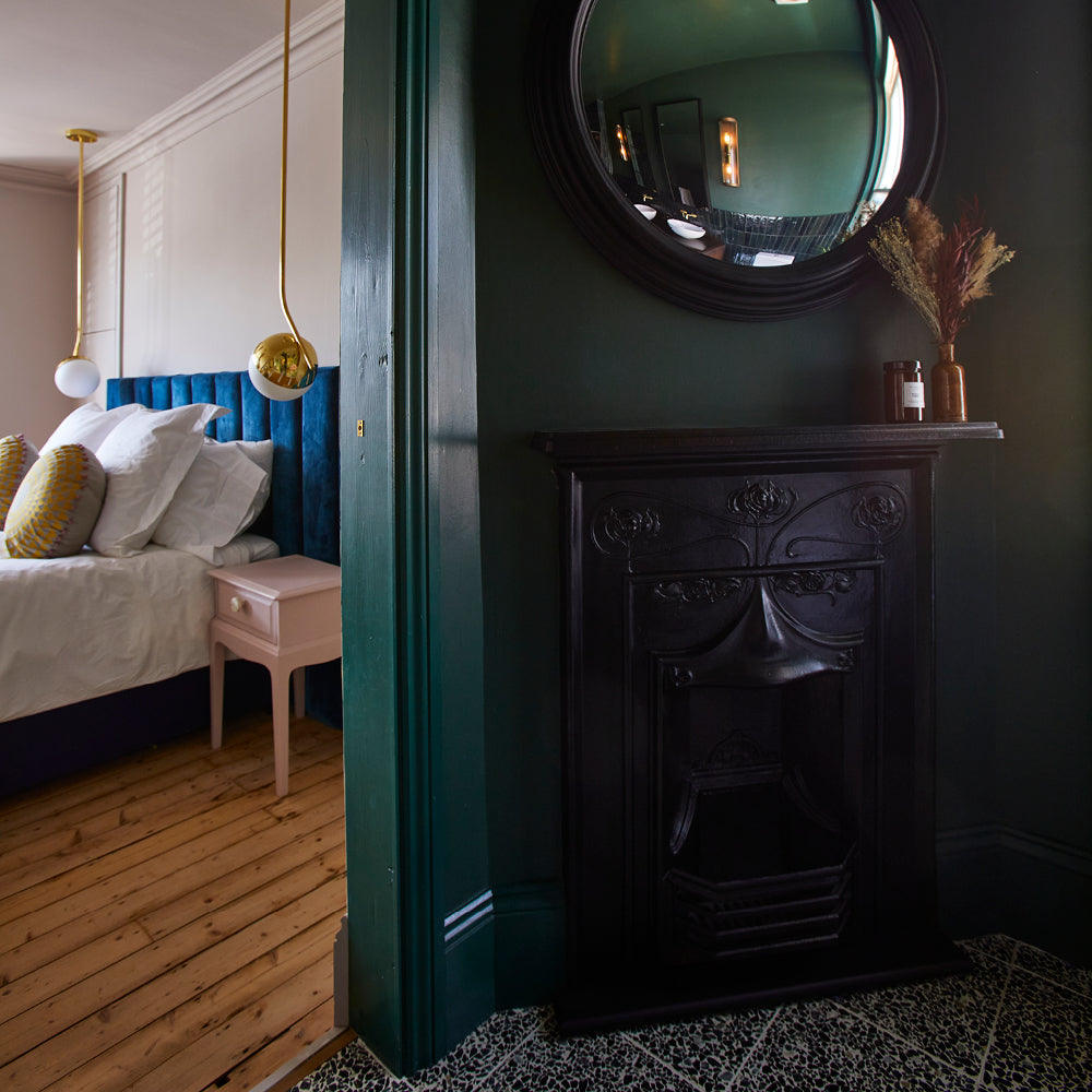
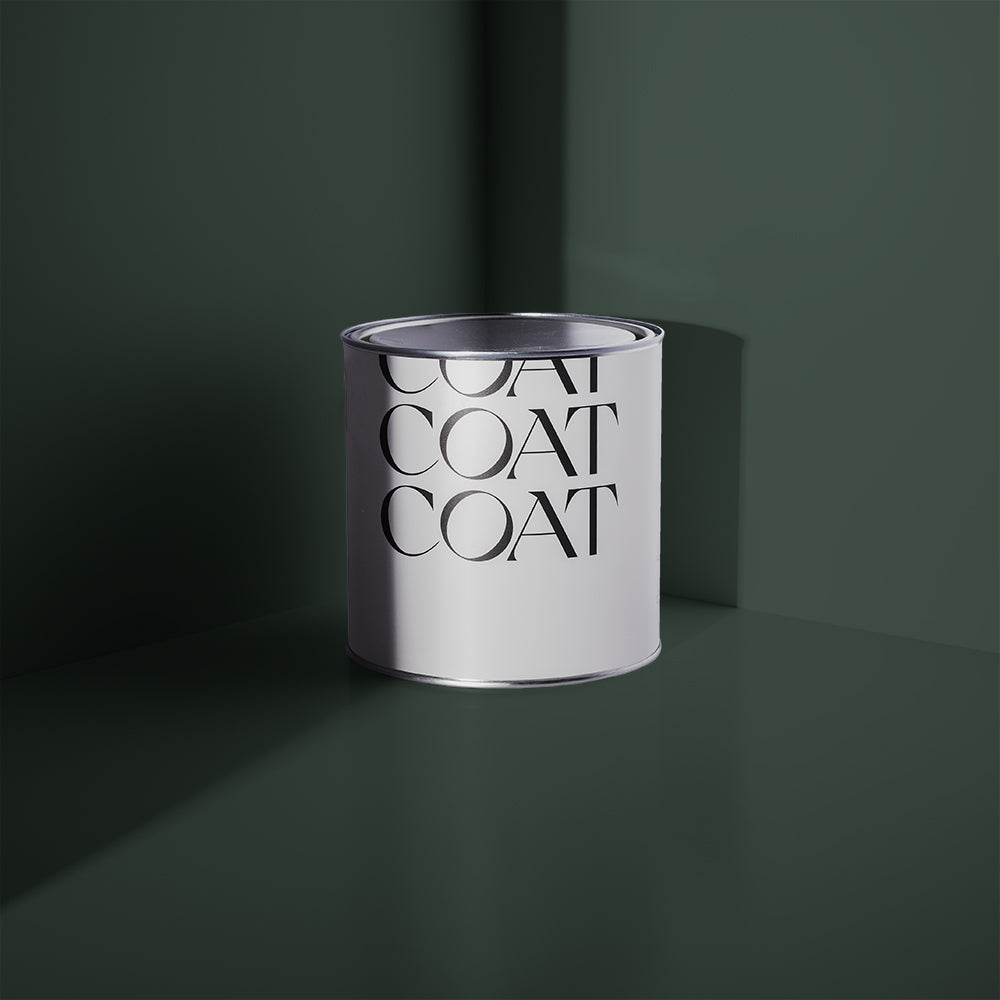
This shit just feels so grown up. A dark teal with a dusty lighter side, it skews super dark at night but has a bit of a calm dark green vibe in natural light. It’s the most popular colour COAT makes, right now. Paired with pure white woodwork, it’ll look amazing. But if you want to introduce some other colours to the mix, here are some great ideas.
Adulting + Detox vs Sweatpants
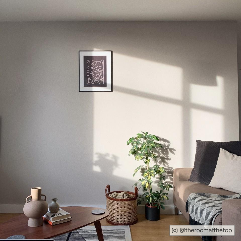
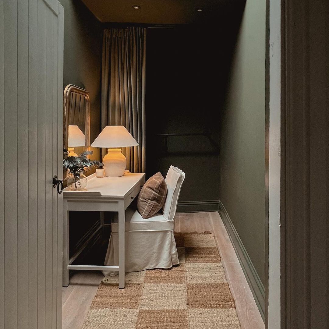
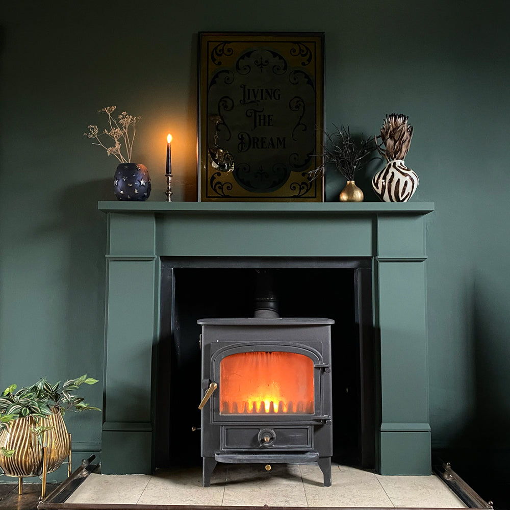
The green side of Adulting plays really nicely with Detox, as a very pale green shade. As a safer alternative, Sweatpants is a warm pale grey that pulls on the dusty side of Adulting and just looks amazing when used in combination. Using Sweatpants as your main colour, and Adulting for a wall or half-height wood panelling looks incred. If you don’t fancy either, use Adulting for the lot - walls, ceilings, woodwork. We promise that looks insanely good too.

Adulting + Hamilton vs Kind Regards
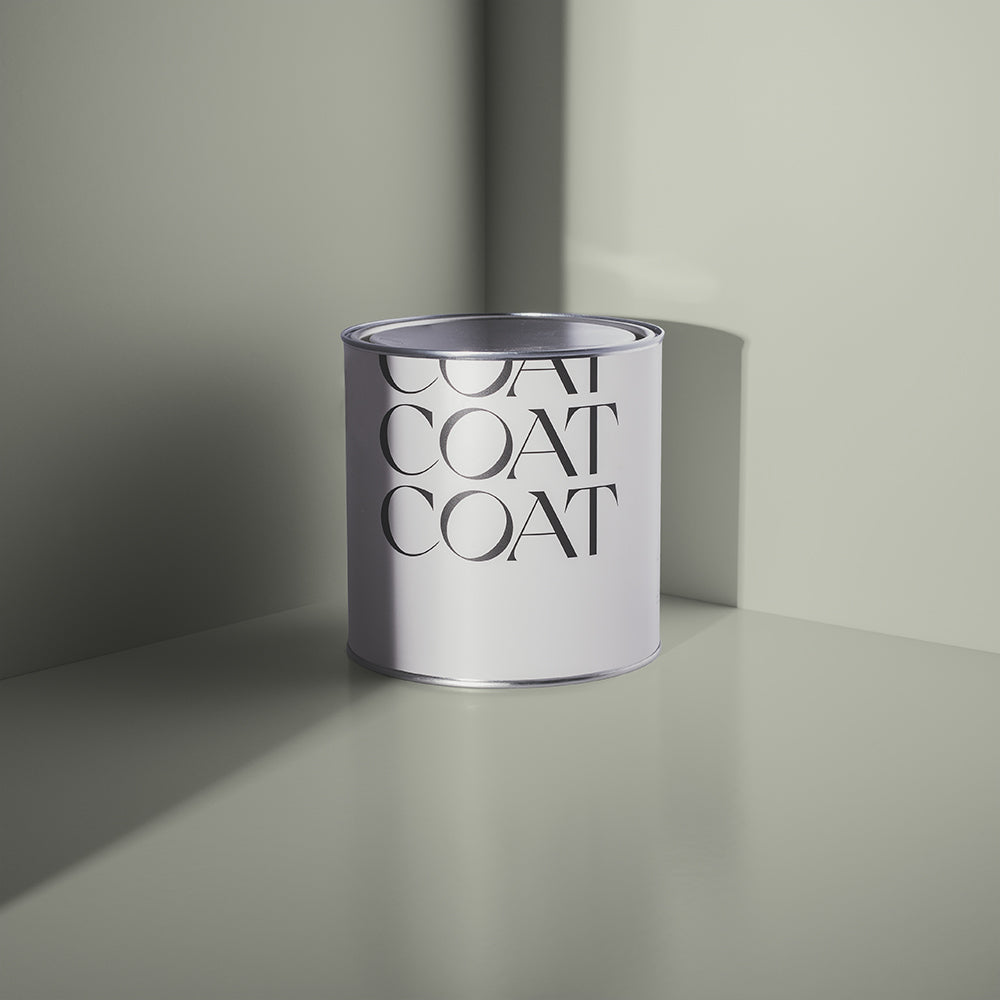
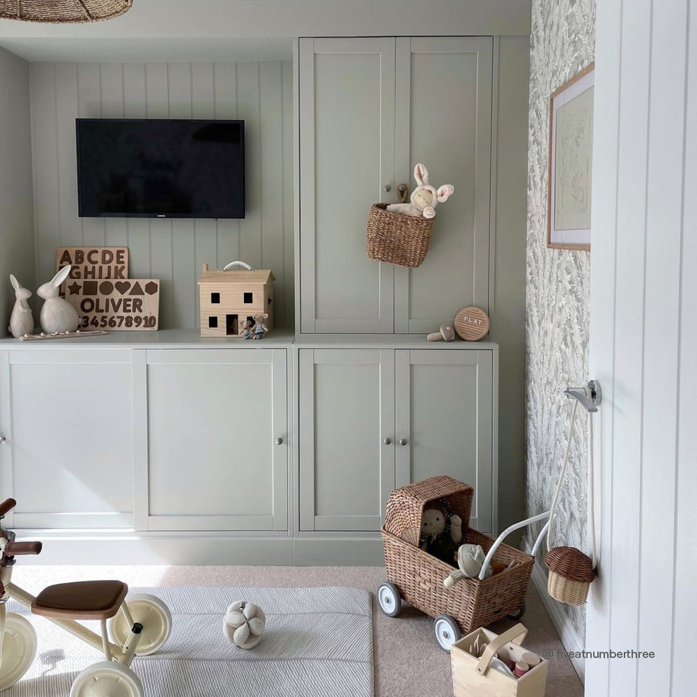
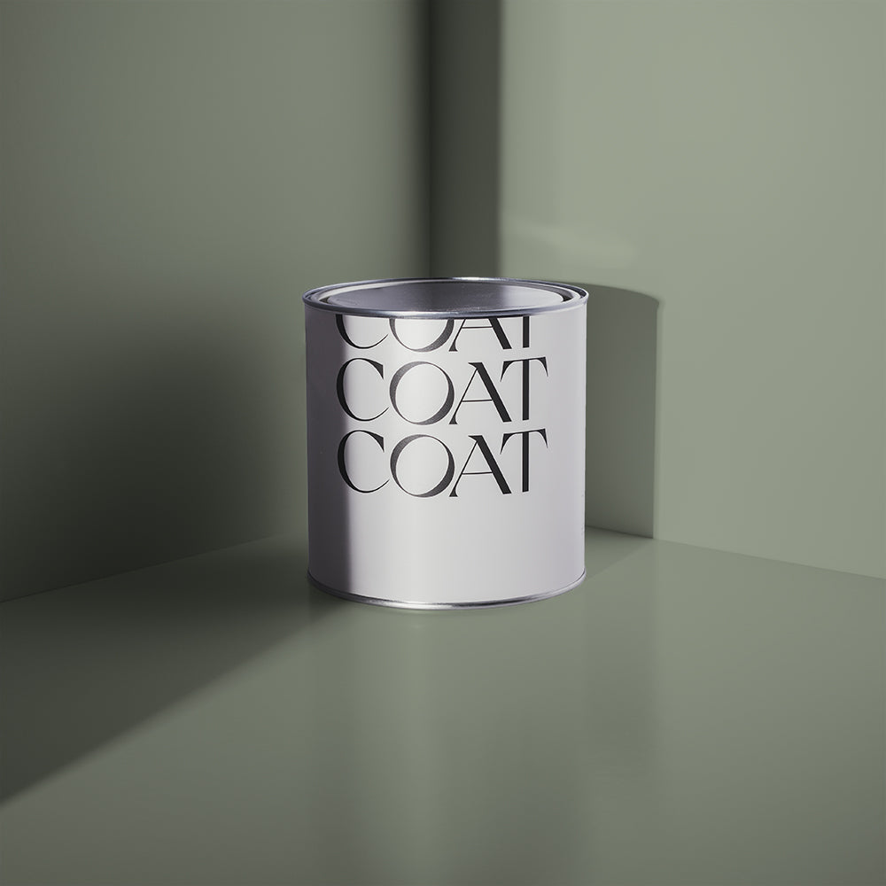
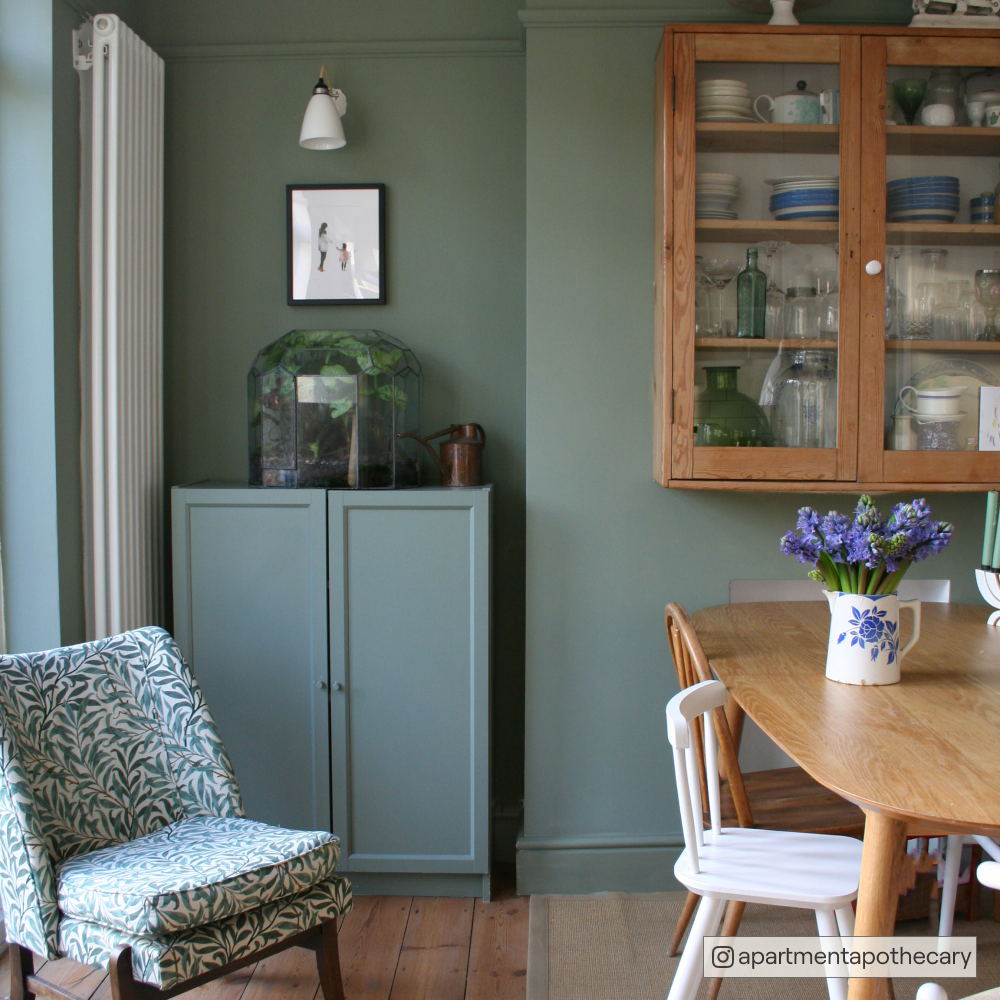
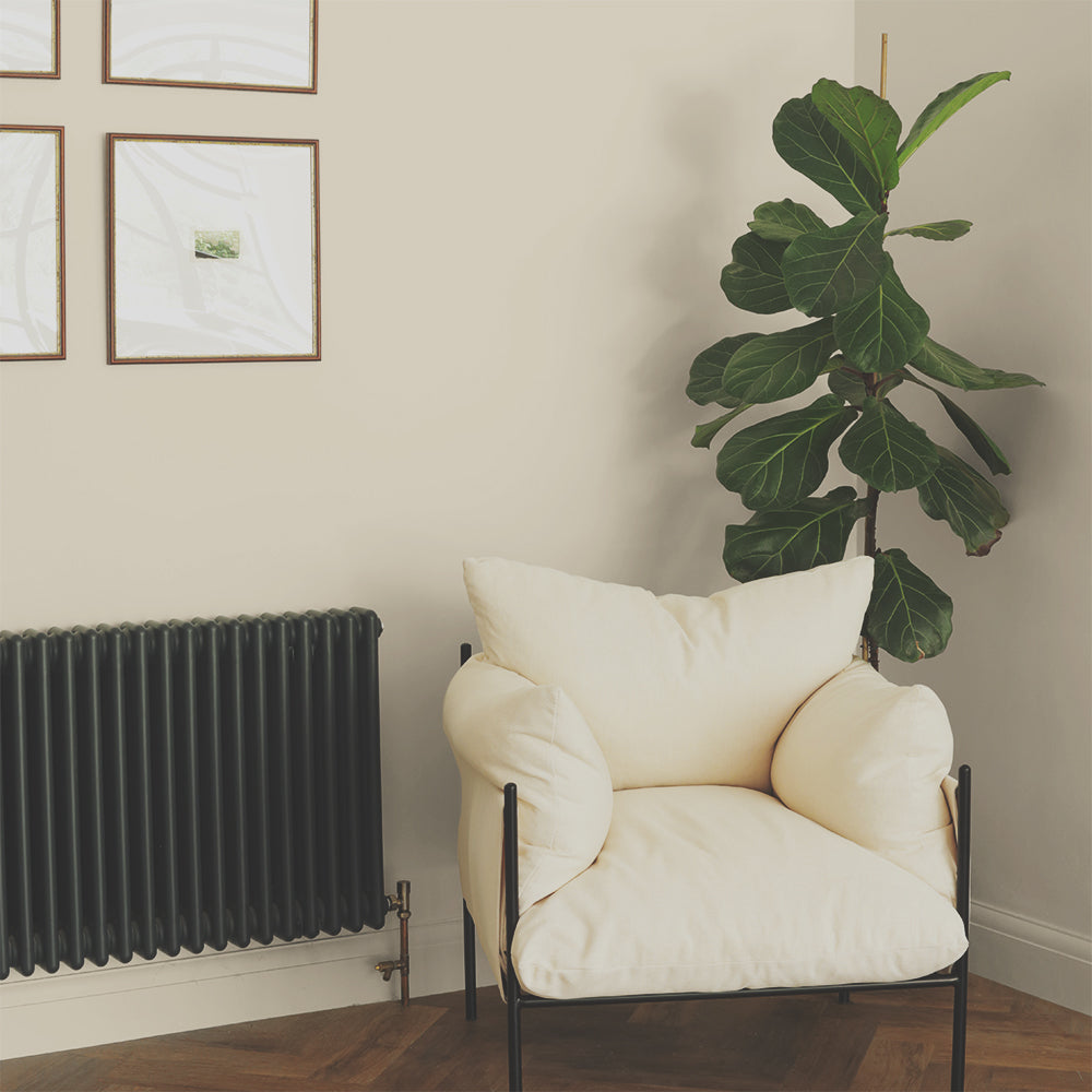
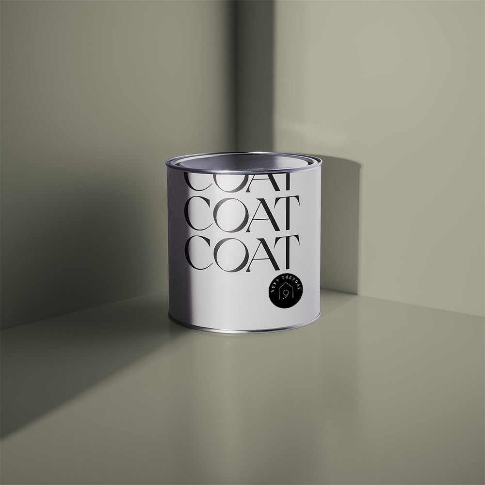
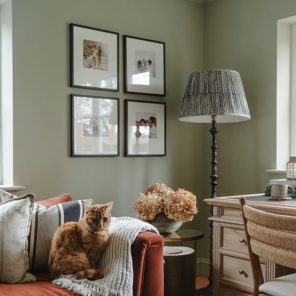
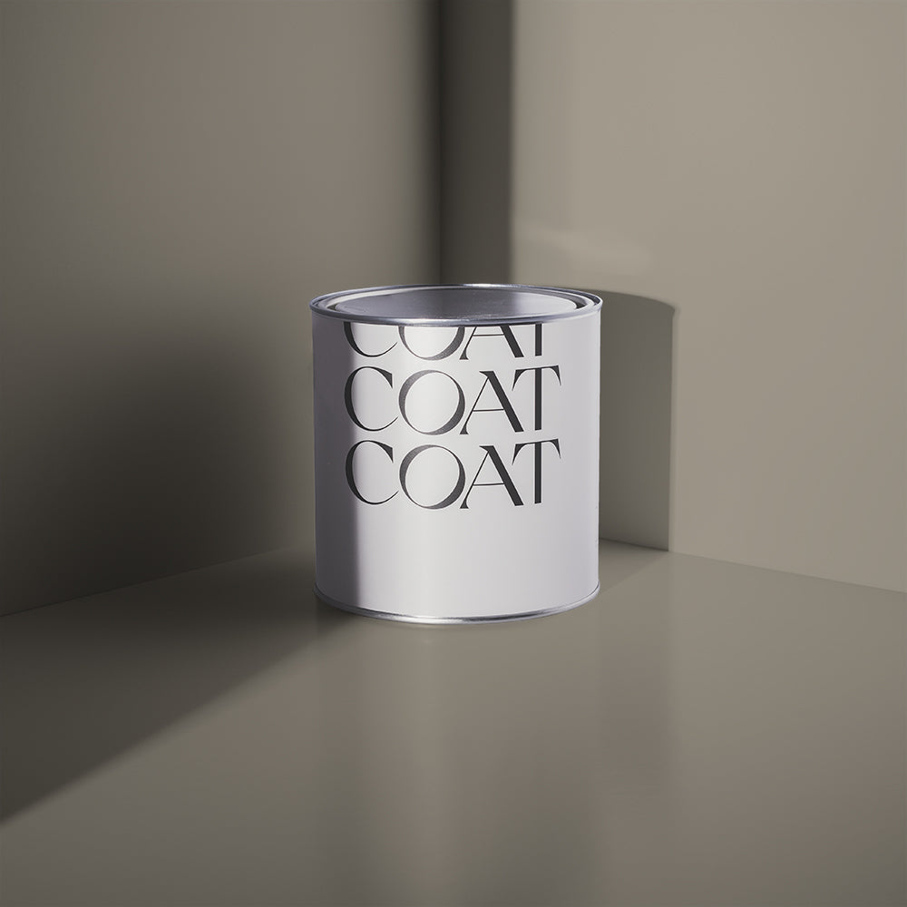
Teal on teal. Yep, we did it. Hamilton is a popular lighter shade of teal that errs on the green side. It’s a really beautiful, muted shade - and paired with Adulting as the more dramatic partner just looks immense. Alternatively, Kind Regards is a grey-ish neutral with a slight green tint (Greige, if you will).

Hamilton - A Foggy Light Teal
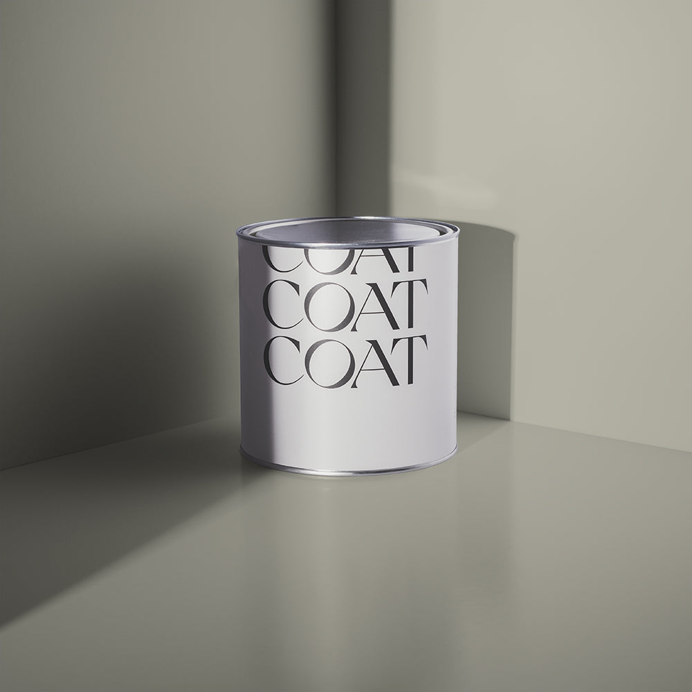
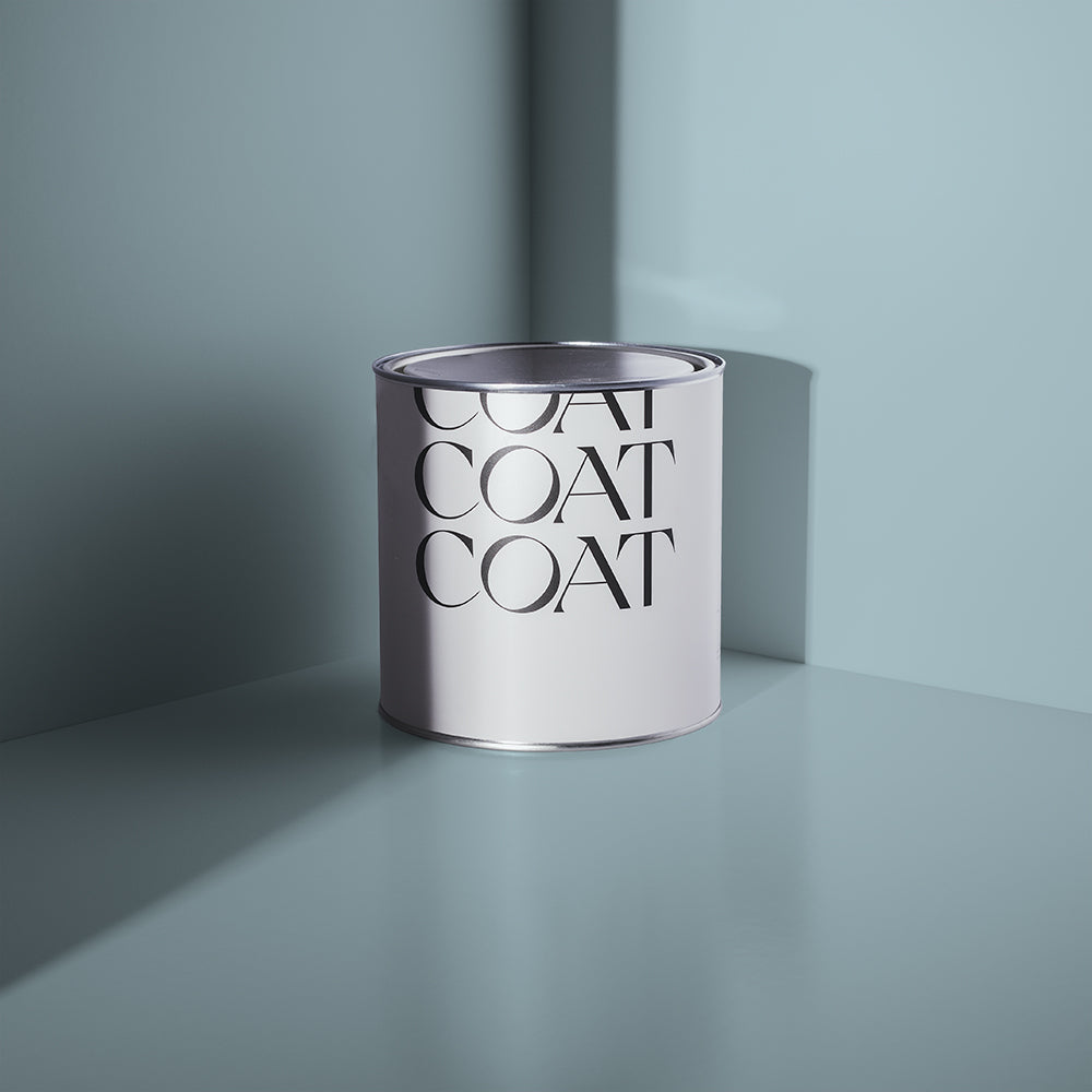
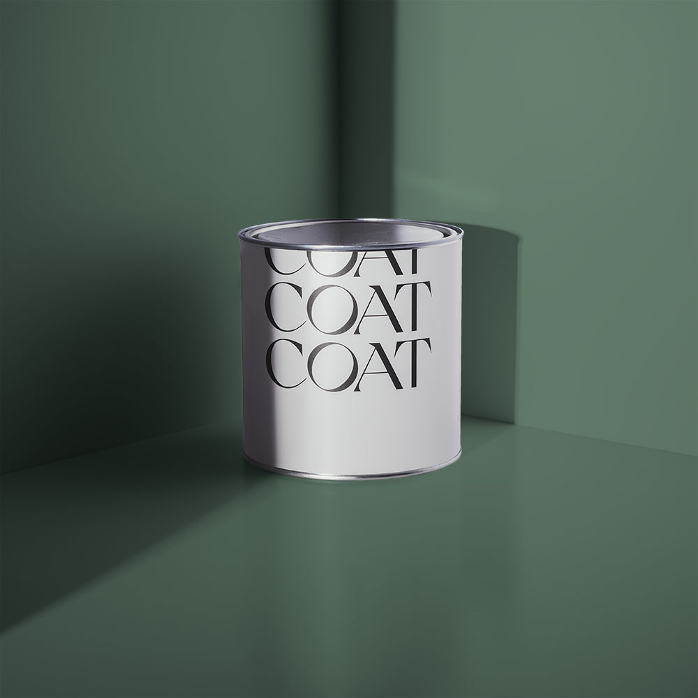
Named after Hamilton NZ, this is a nice foggy number. Understated but enough to be noticed, it’s a really subtle shade that reeks of class. A trait of Teal, it seems. Here’s how to use it with other colours.
Hamilton + Pampas vs Sunday Soul
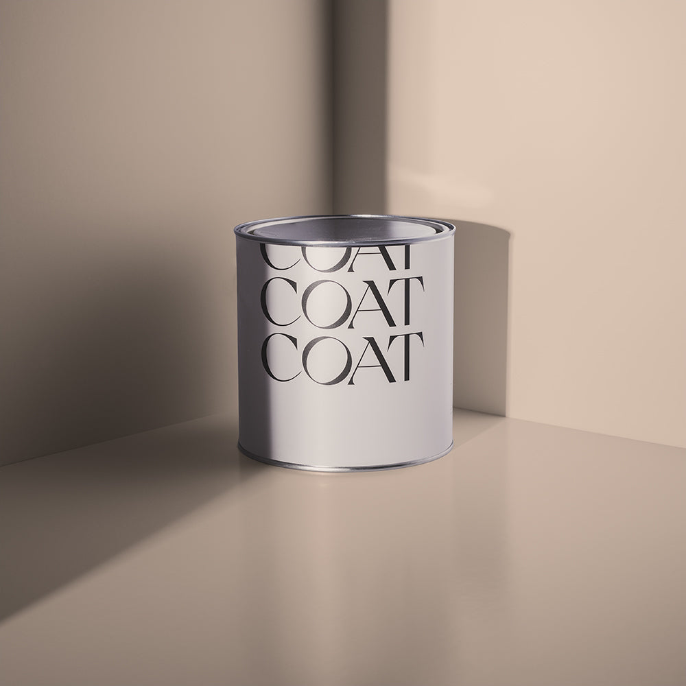
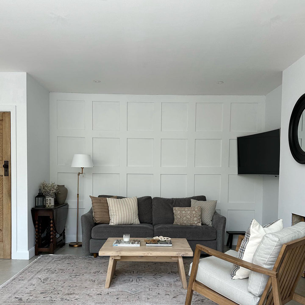
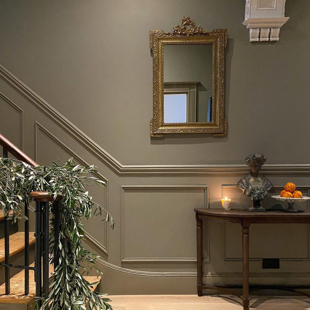
How could you not fall for this palette? A humble light Teal paired with a warm off-white in Pampas. Looks amazing. Or for something with an earthy edge, Sunday Soul offers the perfect Taupe to pair with Hamilton.

So, Teal then...
As a general rule, you can’t go wrong with Teal. From very dark Teal in The Drink, to a much lighter foggy number in Hamilton - whatever you choose, you’re in for a home that subtly reeks of class. So, what are you waiting for? Shop COAT Teal shades.
Publish Date
Author






Leave a comment