Modern Colour, At Home With Ben Peers
Another home, another nosey… you lucky bunch, you! This time, we take a step inside the home of Ben Peers – a graphic designer, creative and photographer.
After spending last year with family during the UK lockdown period, he finally moved into his very own place nine months ago. Based in South East London, Ben’s two-bedroom apartment is a contemporary haven; consisting of clean lines, blocks of colour, and aesthetically-pleasing contrasts. His interior styling is influenced by Scandinavian & Japanese design – super modern, spacious and minimally tailored.
A COAT LOVE AFFAIR...

Ben initially discovered our brand whilst searching for paint companies who had sustainability and eco-friendly credentials…
“I was instantly won over by their range of colours. There aren’t too many, that you’re overwhelmed, but there’s also something for everyone. They feel really contemporary and classy. And the names are fun, too!”
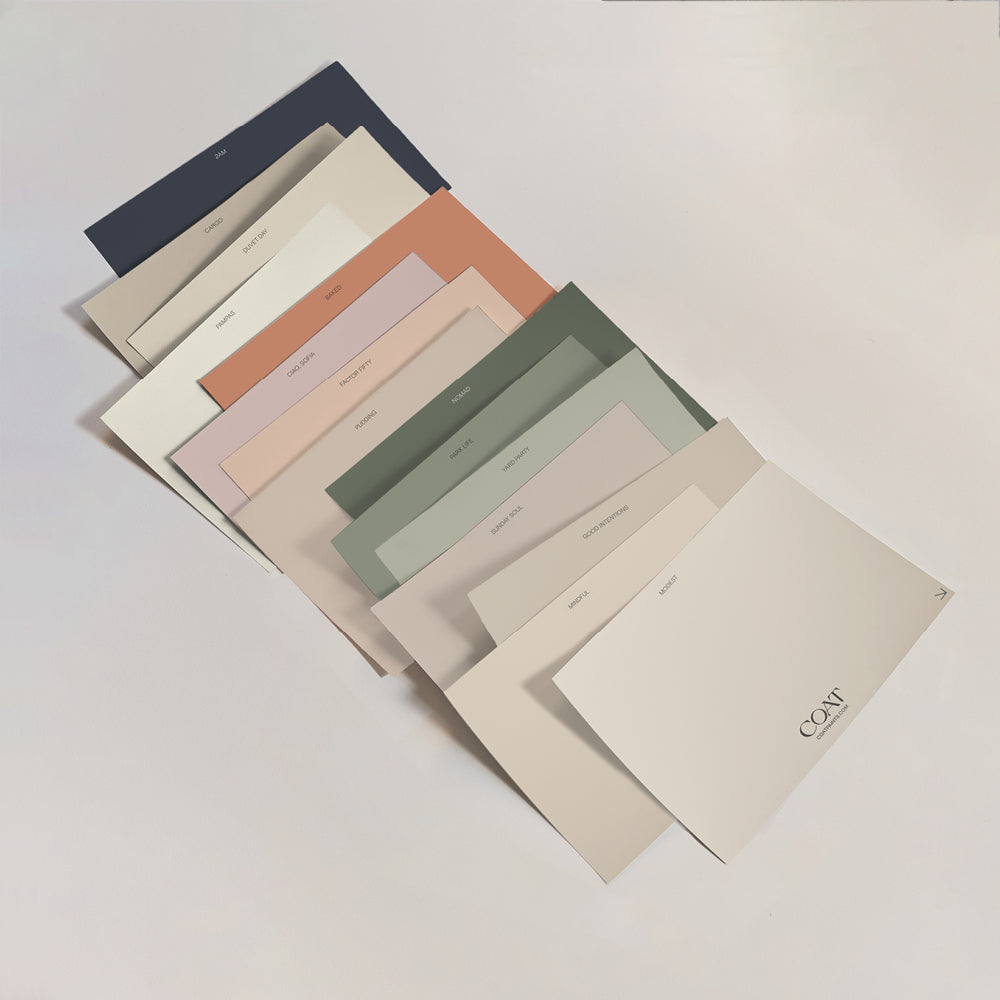
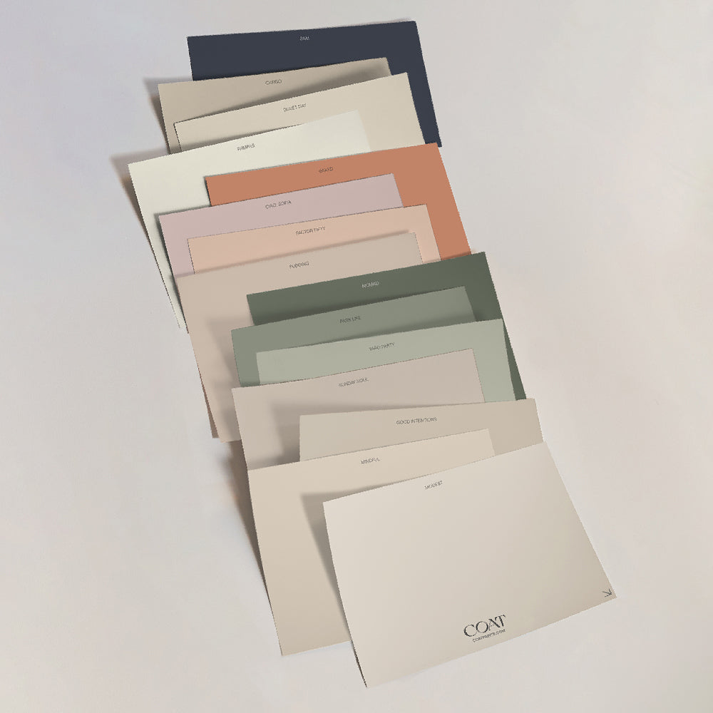
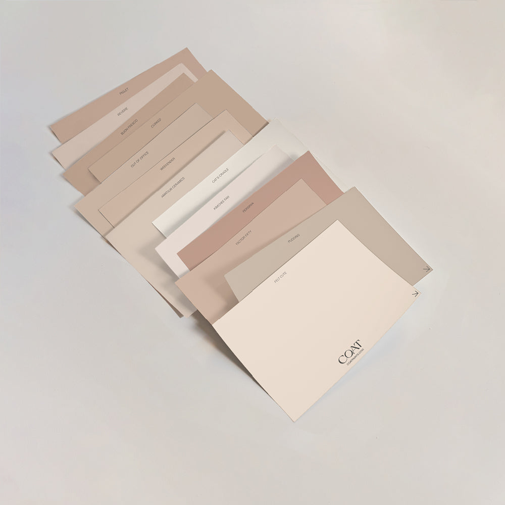
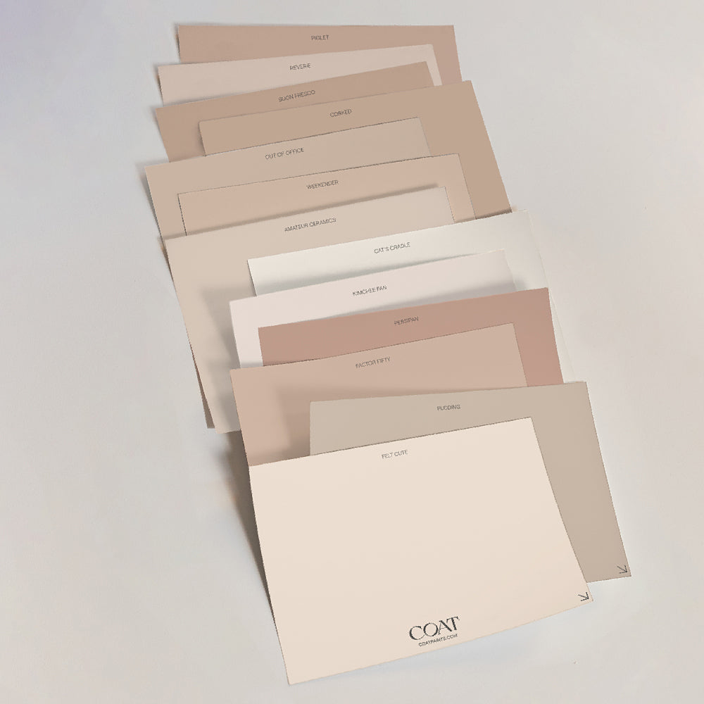
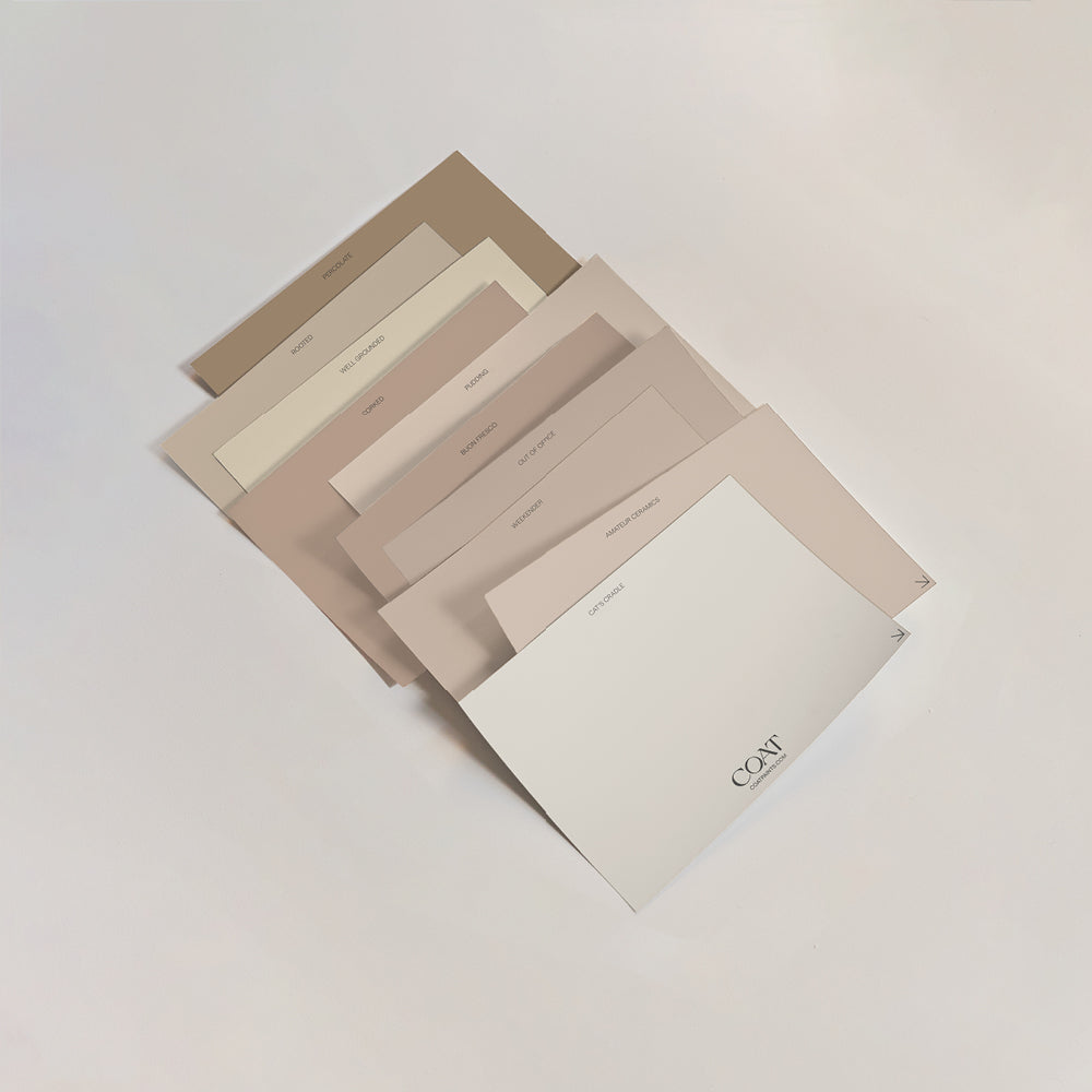
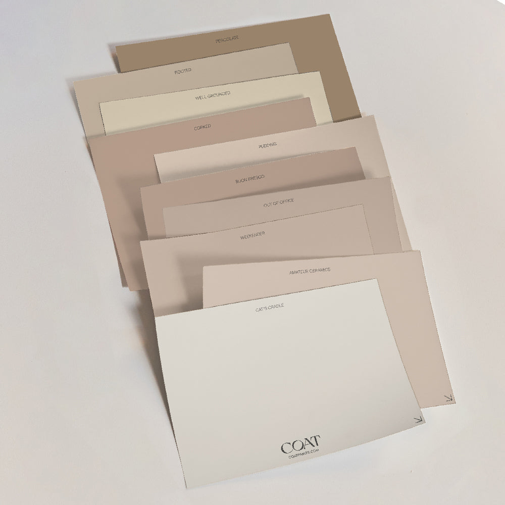
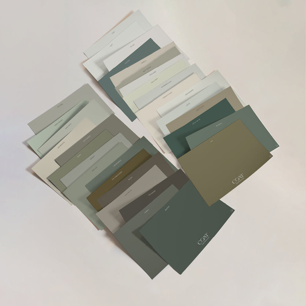
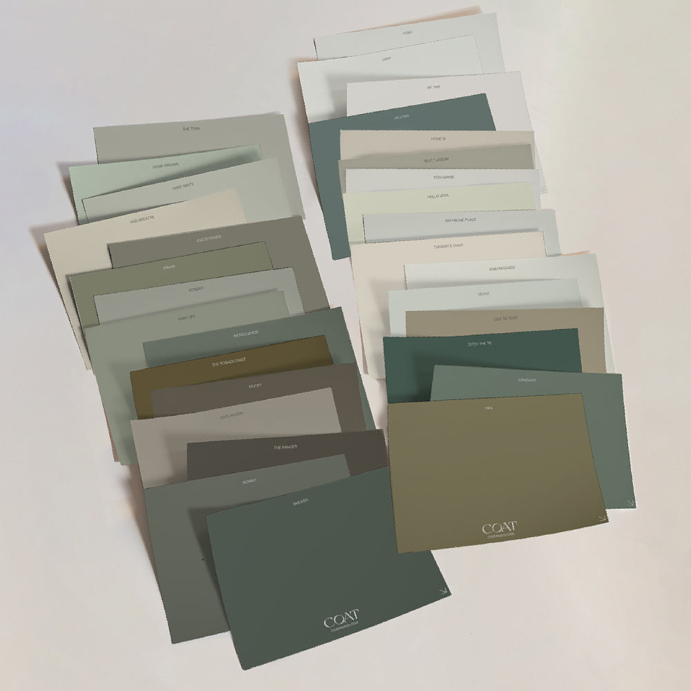
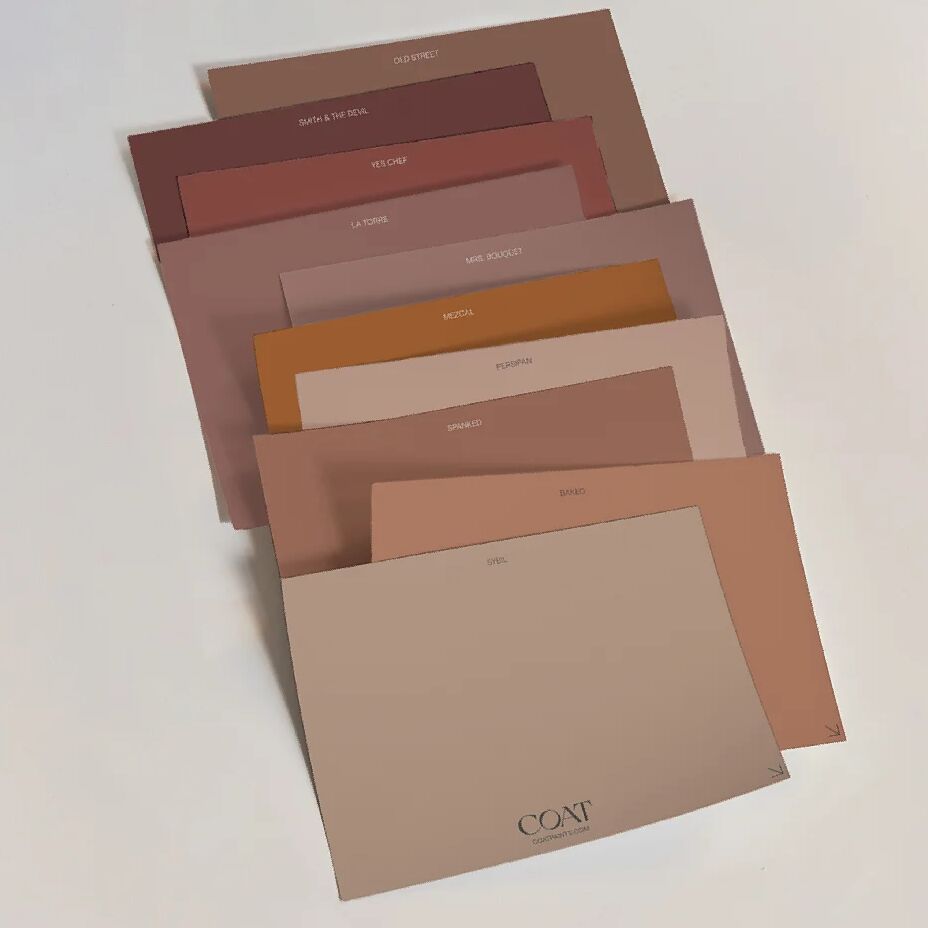
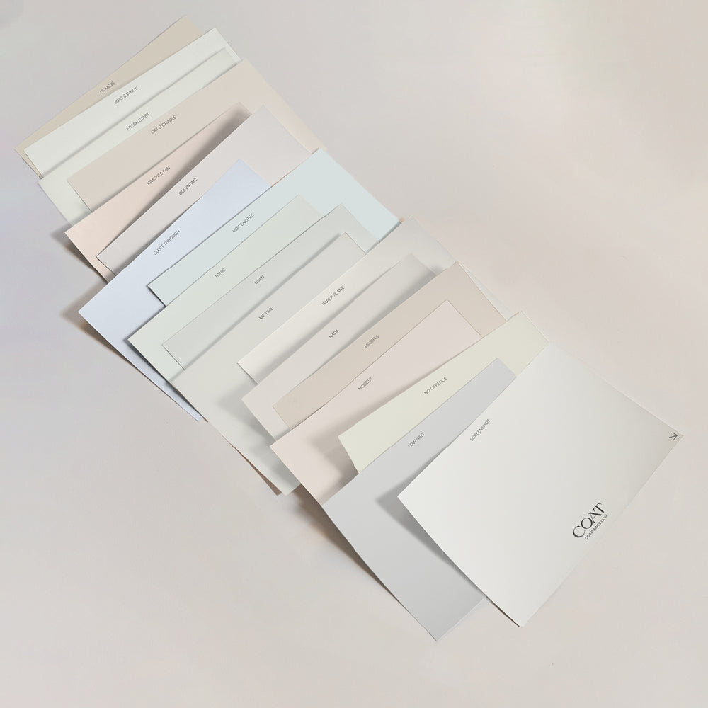
Inspired? Grab Peel & Stick Swatches to try at home 🙌🏼
As a first step, Ben ordered a whole bunch of our Peel & Stick Swatches to support his decision-making process; and once he had finished, he even passed them onto friends! We love this idea – ‘paint it forward’!
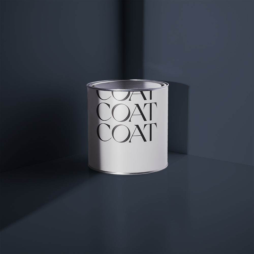
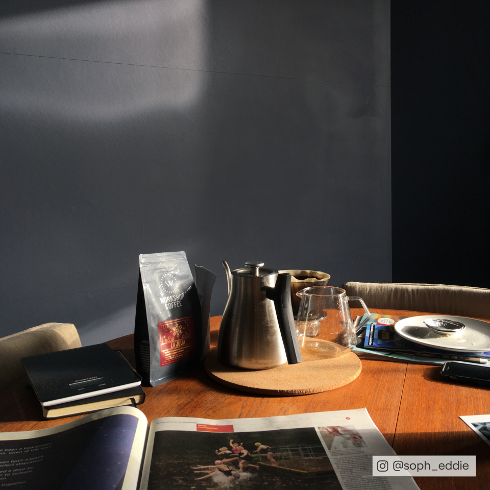
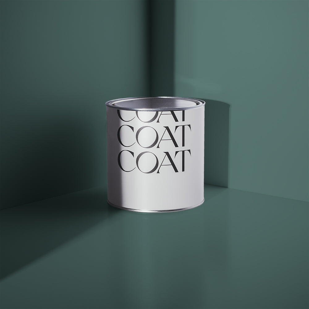
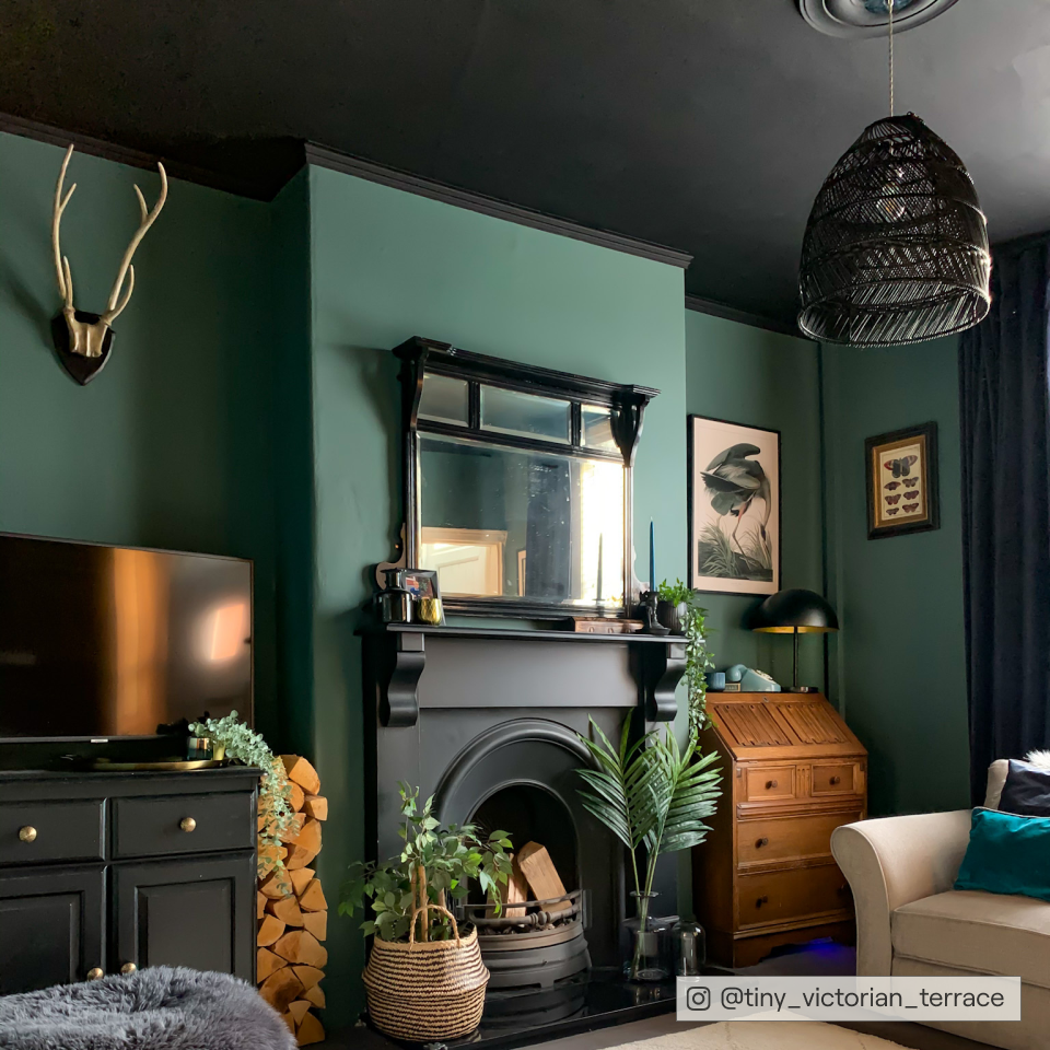
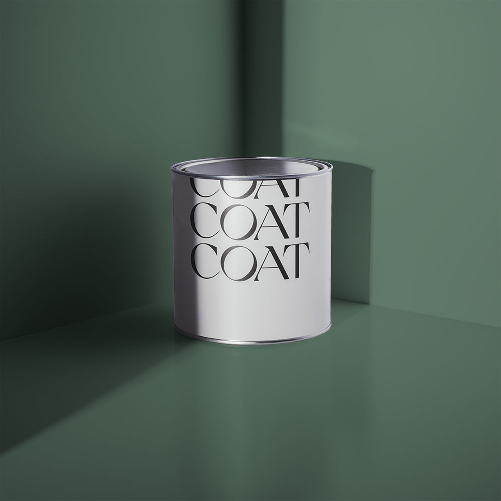
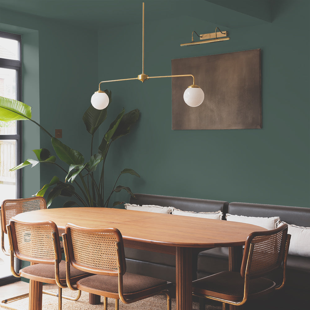
Ben chose ‘The Drink’ for accent walls in the hallway and living room, ‘Hamilton’ for his bedroom, and ‘David Rose’ for an accent wall in his spare bedroom/ study – which injected some drama into a previously uninteresting room.
“COAT’s paints were lovely to work with. Very easy to apply, and have good coverage. The finish is very pleasingly matt - I don’t really ‘do’ shiny, so this is perfect for me!”
TAKE A LOOK INSIDE…
Before Ben moved in, he described the flat as ‘dull and boring’, however – dull and boring is exactly what he wanted! Hear him out…

“I wanted a blank canvas, and that it certainly was! The doors were all that awful, yellowish wood veneer, so painting them white was the best feeling. In the living room, what is now the gallery wall, was just a nondescript white wall behind a sofa. Changing the configuration of the furniture, and ‘floating’ the sofa on the opposite side, opened up the possibilities for this wall to become a real focal point - something a lot of modern flats lack.”
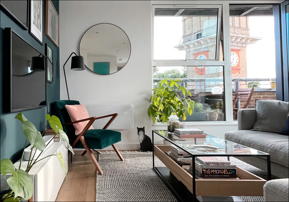
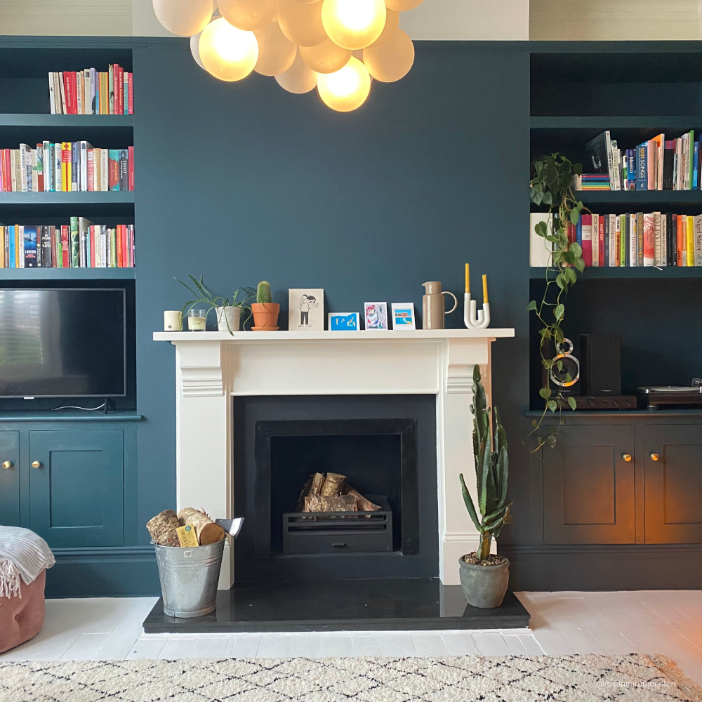
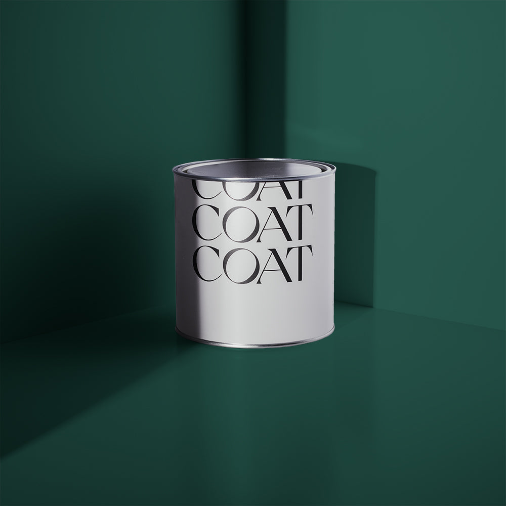
The first room we take a look around is the living room, which also coordinates perfectly with the hallway; giving the impression of more space. Both painted in ‘The Drink’, this stunning deep, dark shade of teal creates statement and warmth.
Inspired? Grab Peel & Stick Swatches to try at home 🙌🏼

In the hallway, Ben decided to paint both the front door and the alcove that surrounds it – creating a funky focal point. Adding a slim panel of mirror to the side of the door, also allows this smaller space to feel brighter – by reflecting the light that pours in from the living room. In a complete contrast, the door fades into the background on an evening, and becomes less of focus for Ben when he’s chilling out on the sofa and facing in that direction. What a great idea!

For his living room, Ben mounted his Samsung ‘The Frame’ TV onto the wall, and placed artwork and photography all around it – creating a gallery wall effect. Similar to his idea behind painting the front door; when the TV isn’t in use, it simply blends into the display of artwork and becomes a new feature in itself.
“This space is my favourite place to be. It’s got loads of light, and I find joy in my gallery wall and its colour scheme every day. Everyone who comes over comments on how comfortable and stylish it is.”
The next room is his principle bedroom, which he designed with a calming space in mind…

“I think ‘Hamilton’ really fits the bill in here. It’s a lovely hue of green/ blue, and whilst it’s a lot lighter than ‘The Drink’ and has its own personality, it was important to me that the whole flat was decorated in complementary colours.”
Before the makeover, this space lacked character and interest. Ben decided to install built-in bookshelves and storage units, which instantly elevated the room. He also fitted an extendable curtain rail, which ran larger than the width of the window frame to create the illusion of more space and a bigger window.
As finishing touches, Ben has styled this space with books, artwork and plenty soft furnishings.

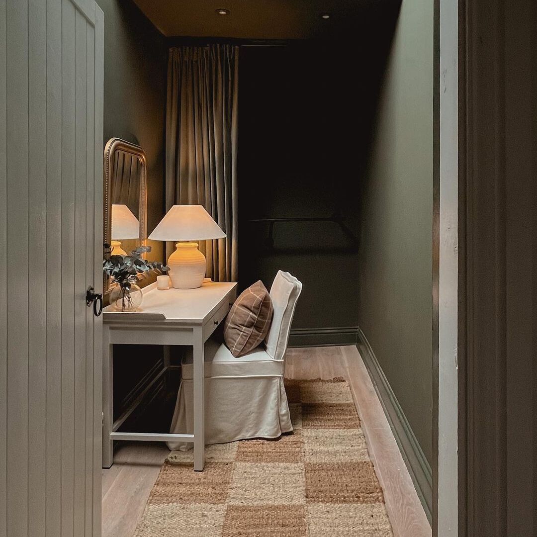
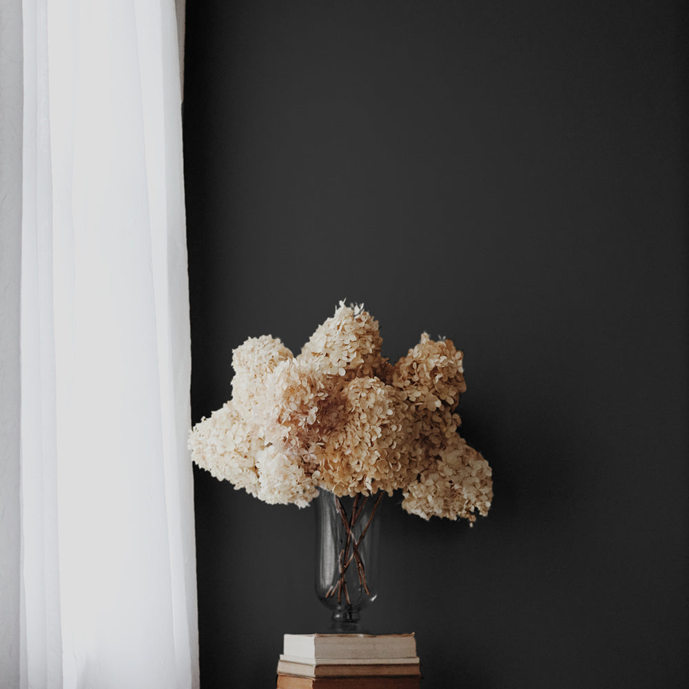
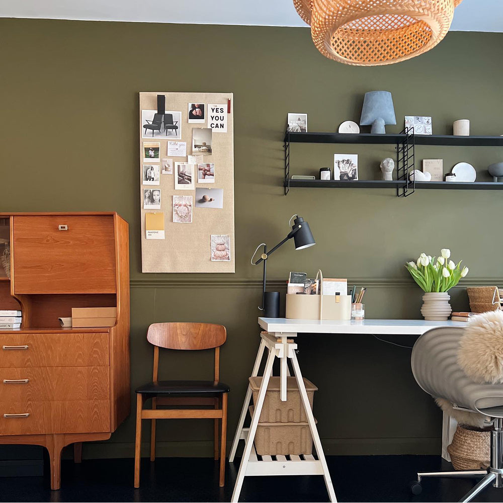
Finally, we get a quick peek inside his spare room, which also doubles up as a study. As previously mentioned, he painted one wall in ‘David Rose’ – and this has become the blueish/black backdrop to both the bed and his desk. We love the minimal and modern style of this space, allowing the striking matt paint colour to do all the talking!
Inspired? Grab Peel & Stick Swatches to try at home 🙌🏼
 3
3
WHAT THE FUTURE HOLDS…
Ben is currently in the mood board phase of his next renovation project – the bathroom. He describes the existing space as “very 2005”, and is looking forward to bringing the room up to date and in line with his super-modern style preferences.
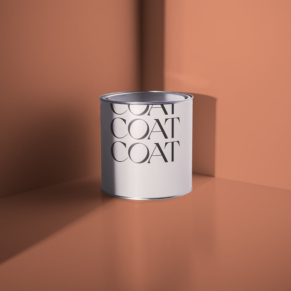
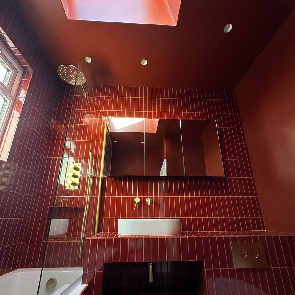
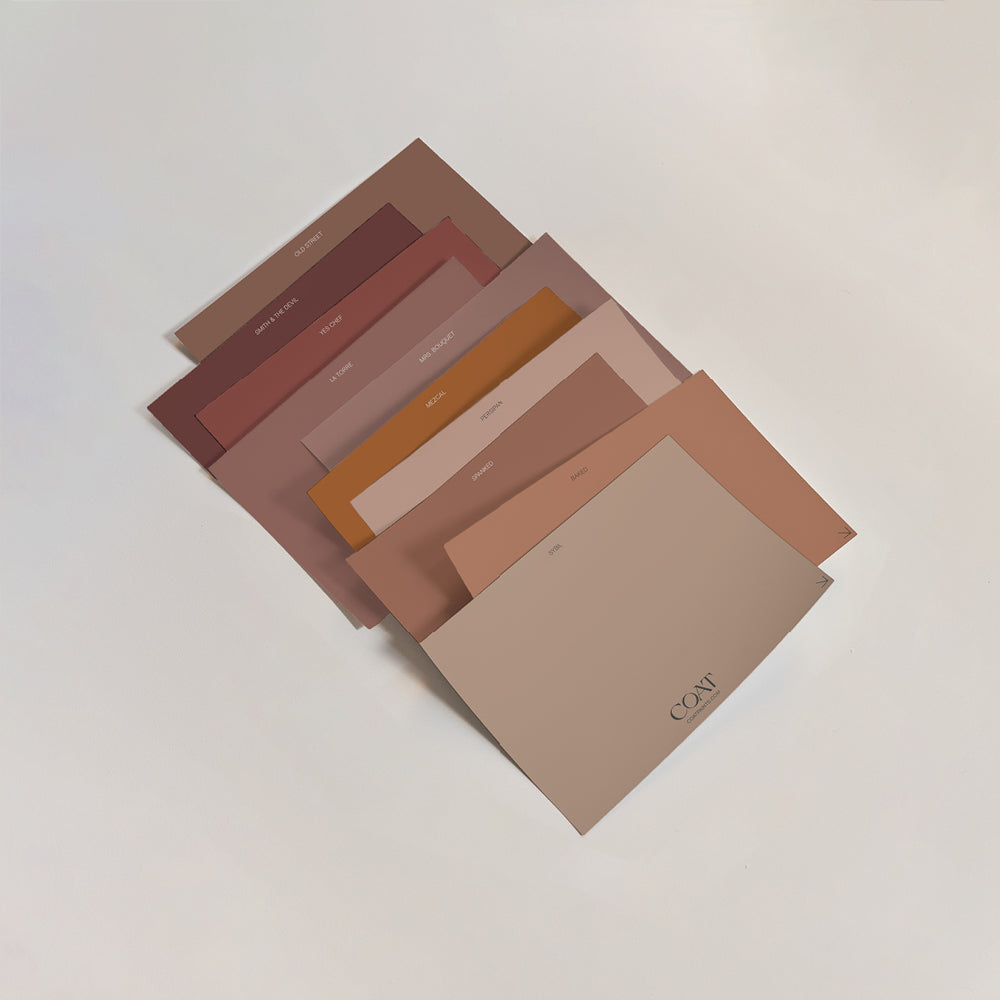
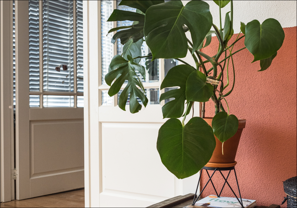
“I am massively trying to avoid the temptation to go green or blue, like the rest of the apartment. Instead, I’m considering painting the walls in a terracotta, such as ‘Sima’ – which would still feel in keeping with the overall palette, but might be a nice surprise.”
We will definitely be staying tuned for this makeover, especially if its anything like the rest of his beautiful and welcoming home!
BEN FROM @FLAPARTMENT LENDS SOME ADVICE…
“Don’t be afraid to move the furniture around. Think outside the box! Very often people just place furniture in the most obvious place for it - and this is often a mistake. There is something really satisfying about seeing how a room changes in feel, just from reconfiguring things.”
Publish Date
Author






Leave a comment