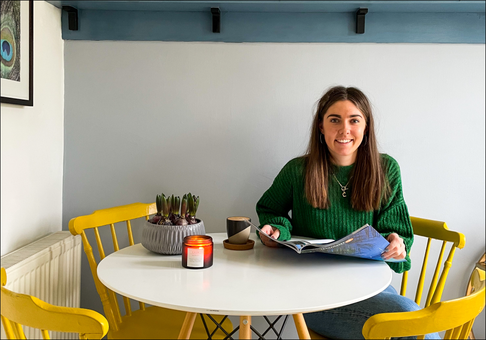
Bold & Bright, At Home with Carla Elliman
Say hey to Carla, a graphic designer and content creator from Chester; and, our lovely home owner for this week’s nosey into real homes on Instagram.
She lives with her partner, Fraser, and their cat, Bramble, in their three-bedroom semi-detached. Even though they’ve shared this home for six years now, it’s only recently that Carla admits to experimenting with colour.
“With this being my first home, it took me a while to figure out my interior style and build up the confidence to roll with it!”
Carla is obsessed with colour, and having fun with it is the most important factor when she is decorating a space. Patterns are also her thing, with plenty geometric lines, animal print and bold accents. With a world of inspiration at our fingers tips these days, Carla loves to turn to Pinterest and Instagram for ideas.

“I also get a lot of colourful inspiration by looking at compositions all over the place: fashion, shops, travel, advertising etc. I have so many random photos on my phone of things I’ve seen, where I’ve loved the mix of colours together.”
A COAT LOVE AFFAIR…
Although we may be renowned for our selection of neutral tones, we are also proud of our bold and bright offering – and this is why exactly why Carla became a fan!
“I really love the colour palette that COAT offer, they have a great choice of bright colours which are always my go to, and their bright yellow, ‘Moritz’, is a particular favourite of mine. The more neutral grey colours seem to have a real rich depth of underlying colour to them, too; which I’m really drawn to.”
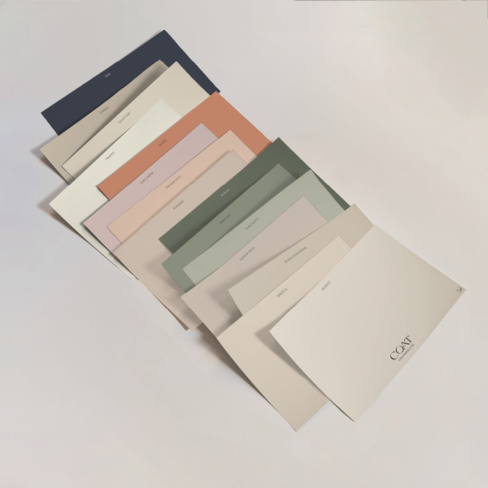
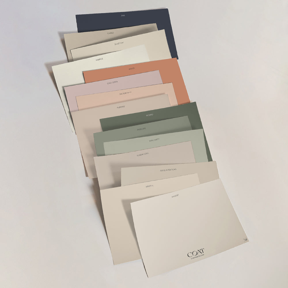
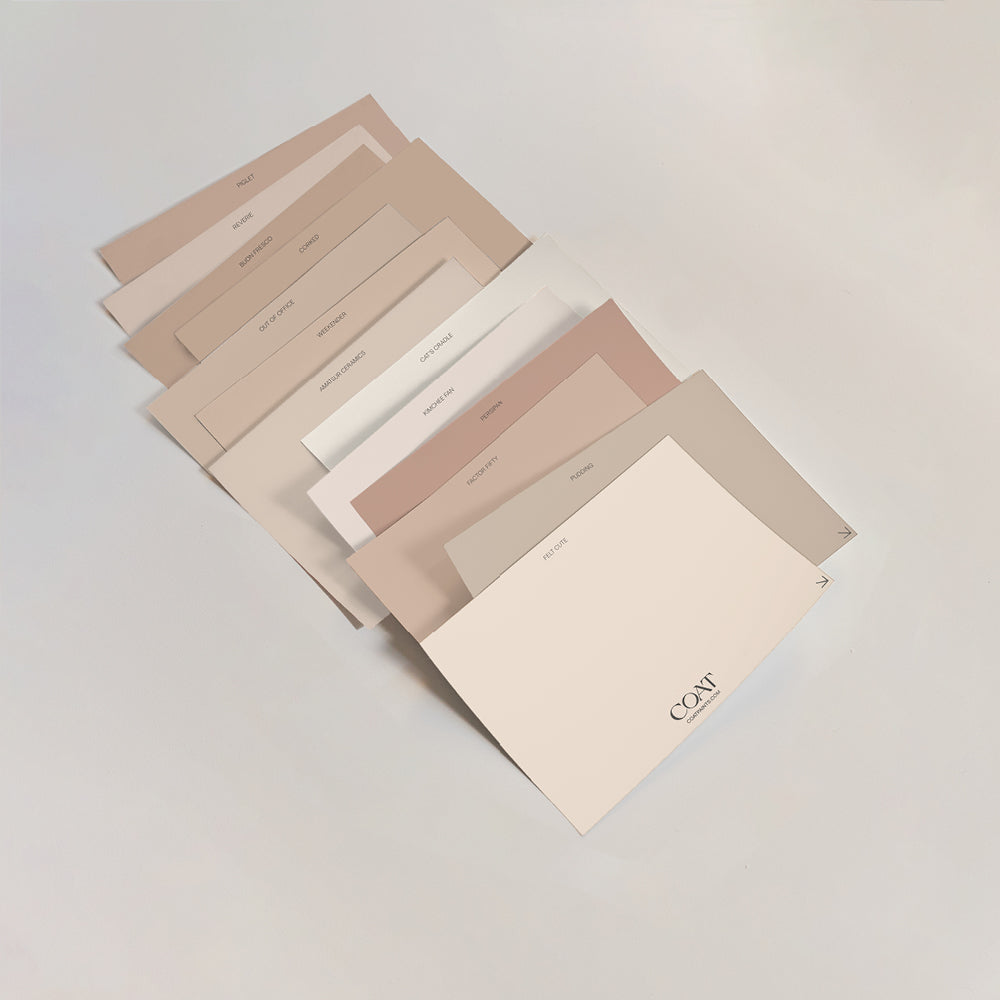
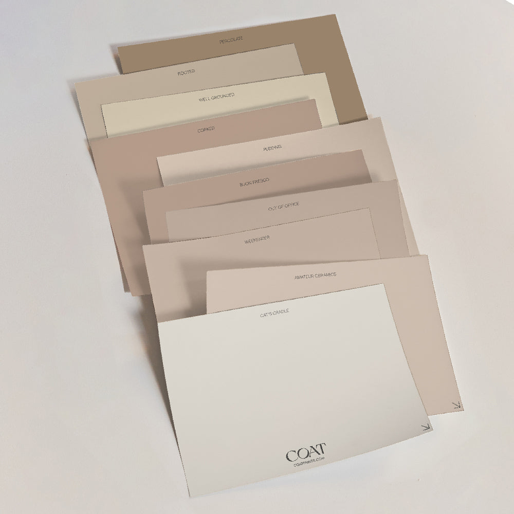
Carla has used our paint for many different projects now, and she loves the handiness of our Peel & Stick swatches; especially the ability to move them around amid natural and artificial light. It’s always important to live with your paint swatches, for a least a week, as it really helps you to feel supported in a decision when you can see them every day. As your mood changes, your preference may change – so diving too quickly into a decision can sometimes result in a feeling of dissatisfaction, over time.
“I was really impressed with the quality! Growing up, my parents ran a decorator’s merchant, so I’ve always been used to using the trade paints I’ve had from them. I found the quality of COAT paints to be just as good as the trade stuff; and the thickness of it meant we didn’t need to use loads of coats, and the coverage was great.”
TAKE A LOOK INSIDE…
“A big, blank canvas” is how Carla describes their house when they first moved in – with every single wall painted in magnolia and a bland, beige carpet running throughout. It was time to banish the beige, and bring their new home to life!

Carla used 'Moritz' to upcycle her kitchen chairs which really pop against the 'Lie-in' wall backdrop.
We start with their kitchen-diner, a space which beautifully boasts our colours, ‘Below Deck’ and ‘Lie In’, in a statement, colour-blocking fashion.
“The kitchen is all white, and was pretty new when I moved in, so spending money to replace it (to sit more with my style) seemed crazy. Instead, I decided to inject colour onto the dining area side. We also upcycled some old chairs in ‘Moritz’ for a bright pop of colour. The chairs have been passed down through my family for years, so hold a lot of sentimentality; and in a previous life, they used to be bright red and live in my parent’s kitchen!
We also hand painted the floor using stencils, to create a tile-like effect and add a bit of pattern to break up all the blocks of colours in the room.”

SHOP CARLA’S KITCHEN-DINER:
Ceramic kitchenware – Le Creuset
Black tap – The Tap Factory
Drinks trolley – George at Asda

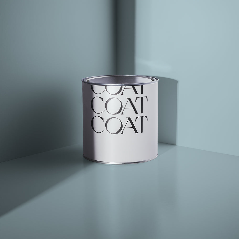
Copy Carla's wall details by using a grey tone like 'On Mute' paired with 'Low Salt'.
Next, Carla & Fraser’s bedroom – which houses a pretty awesome gallery wall of vibrant, patterned art. The bold colours help to create warmth, and the eclectic mix of accessories assist in building an exciting space with plenty stimulation and character.
“The gallery wall is the main feature in here, and I love how much colour and energy it adds to the room. We tend to swap some of some of the prints every six months or so, to keep things feeling fresh. For the walls, we used colour blocking in a subtle neutral colour, where the back wall meets the two side ones, to draw the eye onto all the prints and to make the room appear wider.”

SHOP CARLA’S BEDROOM:
Wall art – Junique / Fy! / ToucanTango
Bedspread – Made.com
Wall accessories – Sostrene Grene / Urban Outfitters

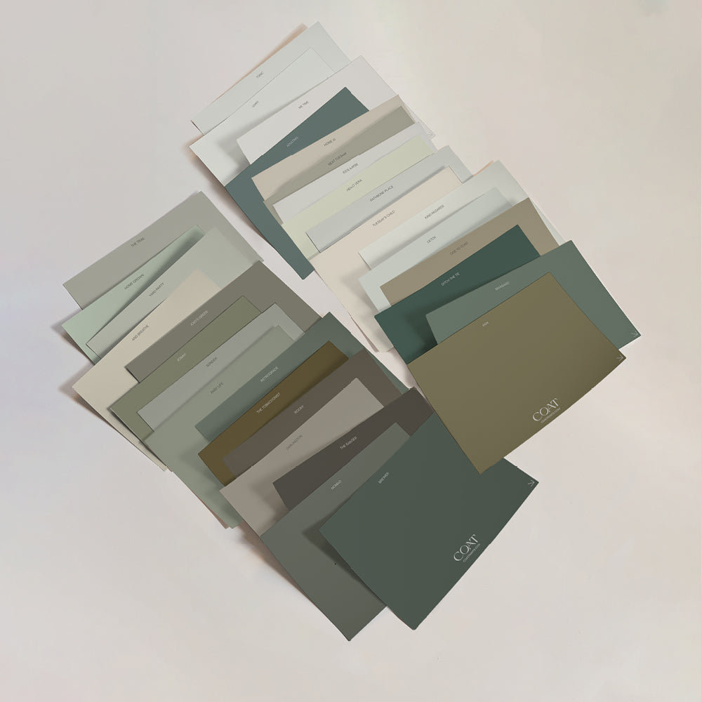
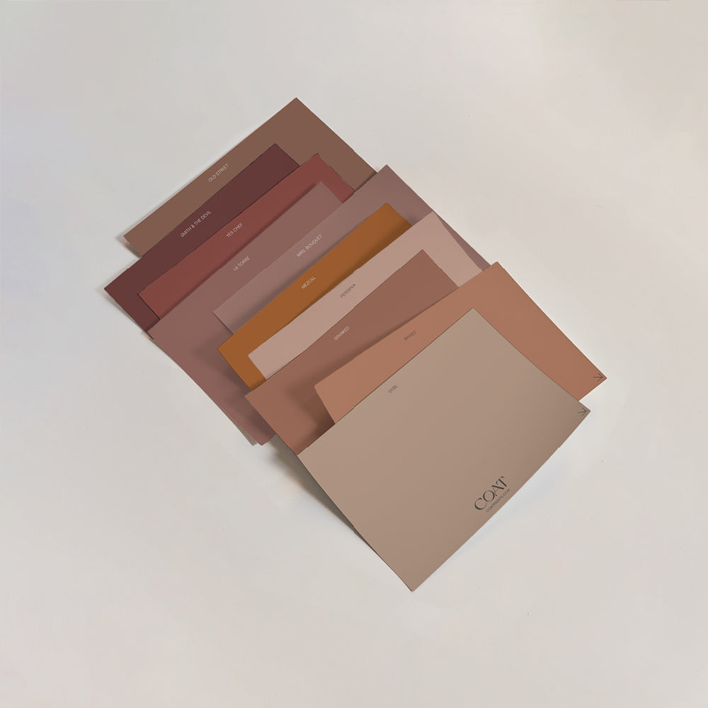
Check out our bold swatches and try out these colourful lines in your home.
Finally, we finish up in their living room, which was solely designed around the Made.com rug which they purchased during a sale a few years ago.
“The colours and geometric design were right up our street; we couldn’t believe our luck when we found it!”
Carla really enjoys styling a space with the accessories and soft furnishings which she feels naturally drawn to – from cushions and throws, to plant pots and wall art; we’re obsessed with it all! It’s no surprise that this room is her favourite, and the place where they spend most of their time.
“As the room is quite small, we’ve tried to keep furniture to a minimum by only having one big sofa, and also getting furniture that’s raised from the ground on legs; to give the illusion of more floor space.”

SHOP CARLA’S LIVING ROOM:
Accent cushions – H&M Home/ Habitat/ Made.com
Wall art – Junique
Yellow throw – Made.com
WHAT THE FUTURE HOLDS…
Carla’s next project is to upcycle her bedroom furniture. Yet another stunning home choosing to live sustainably – we love to see it!
The plans involve painting the furniture and making a new headboard for their bed, which will be wrapped in a velvet fabric. It truly is the projects we work hard on, that mean the most.

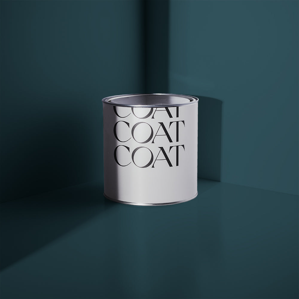
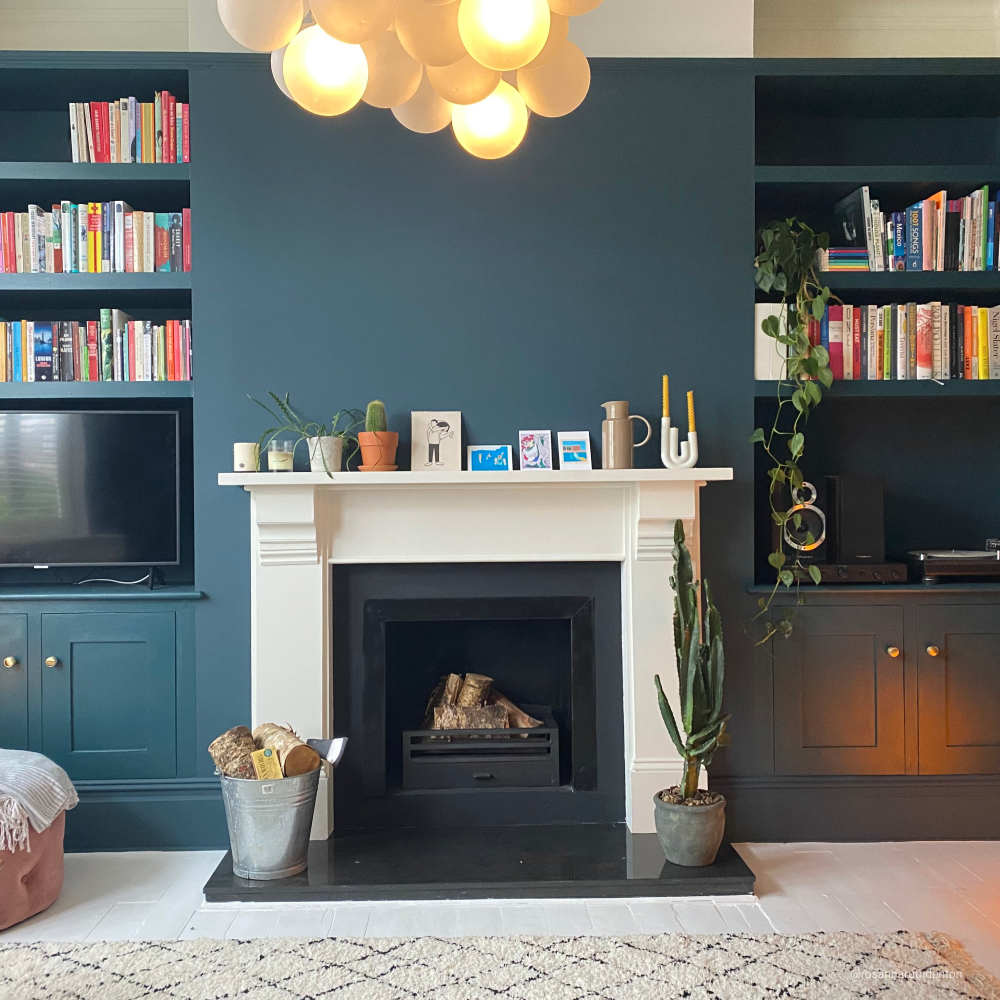
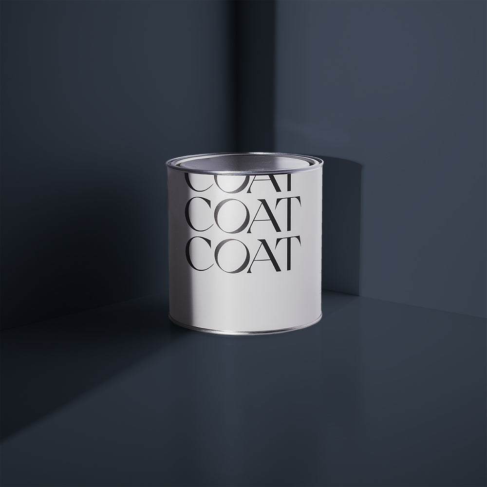
Using a blue like 'The Establishment' can help break up the room whilst making a statement.
CARLA FROM @CARLAELLIMAN LENDS SOME ADVICE…
“Something I’ve found that really works for me, is picking a focal point to design a room around. This could be an interesting piece of furniture, a bold fabric design, a paint colour, or anything else. If everything you choose is then based around something you really love, then it’s a simple way to end up with a cohesive room; no matter what the underlying décor style is.”
Feeling inspired? Grab your blue and yellow swatches to test out these bold colours in your home ✌️
Publish Date
Author







Leave a comment