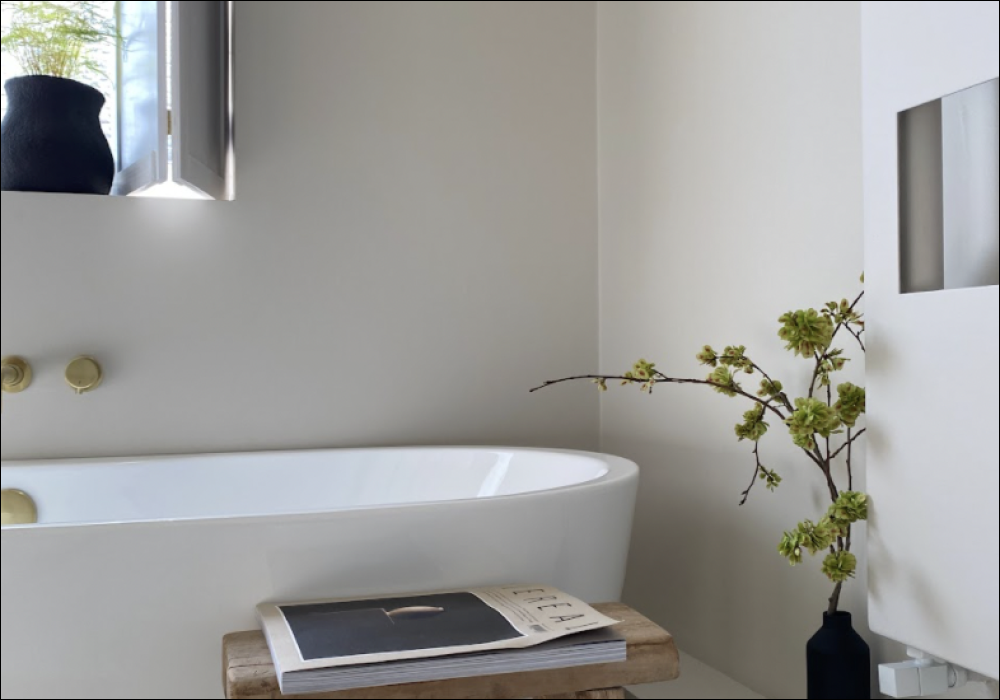
Bathroom Colour Ideas To Freshen Up Your Space
Looking to do a complete refit, or just an update, but stuck on ideas for bathroom paint colours? We got you.
Our bathrooms are sanctuaries, where we are at our most vulnerable, so the colours we choose need to be inviting and comforting. The paint colours for bathrooms that we pick also need to be complementary to the browns, tans, pinks and beiges of our skin tones; which will create a visual hug. Bathroom surfaces that are good to touch are also really important, as our bare bodies meet these surfaces during every visit. (Not that we’re all rubbing up against the walls, but you get what we mean!).
So, bathrooms can be difficult places to decorate. They usually require different finishes to the rest of your home, because of the high humidity and so these products can look quite a bit different to the colours that we fall in love with on the samples. This is because paints that are suitable for bathrooms are usually a higher sheen. So, here’s the lowdown on modern bathroom colours that look fab in our superior, moisture and mould resistant Soft Sheen finish.
Soft Greens
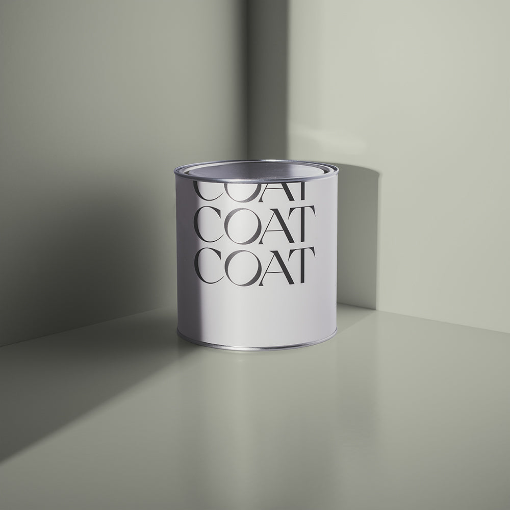
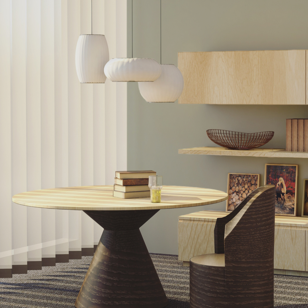
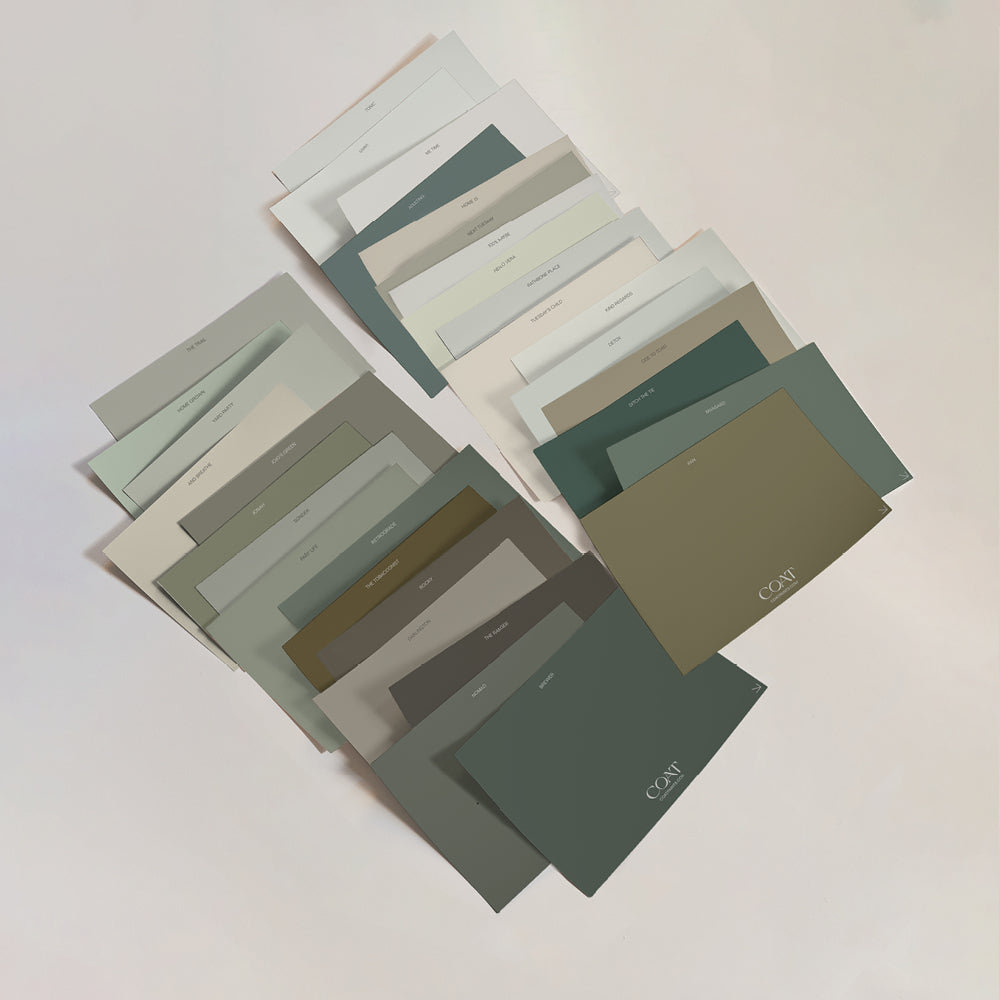
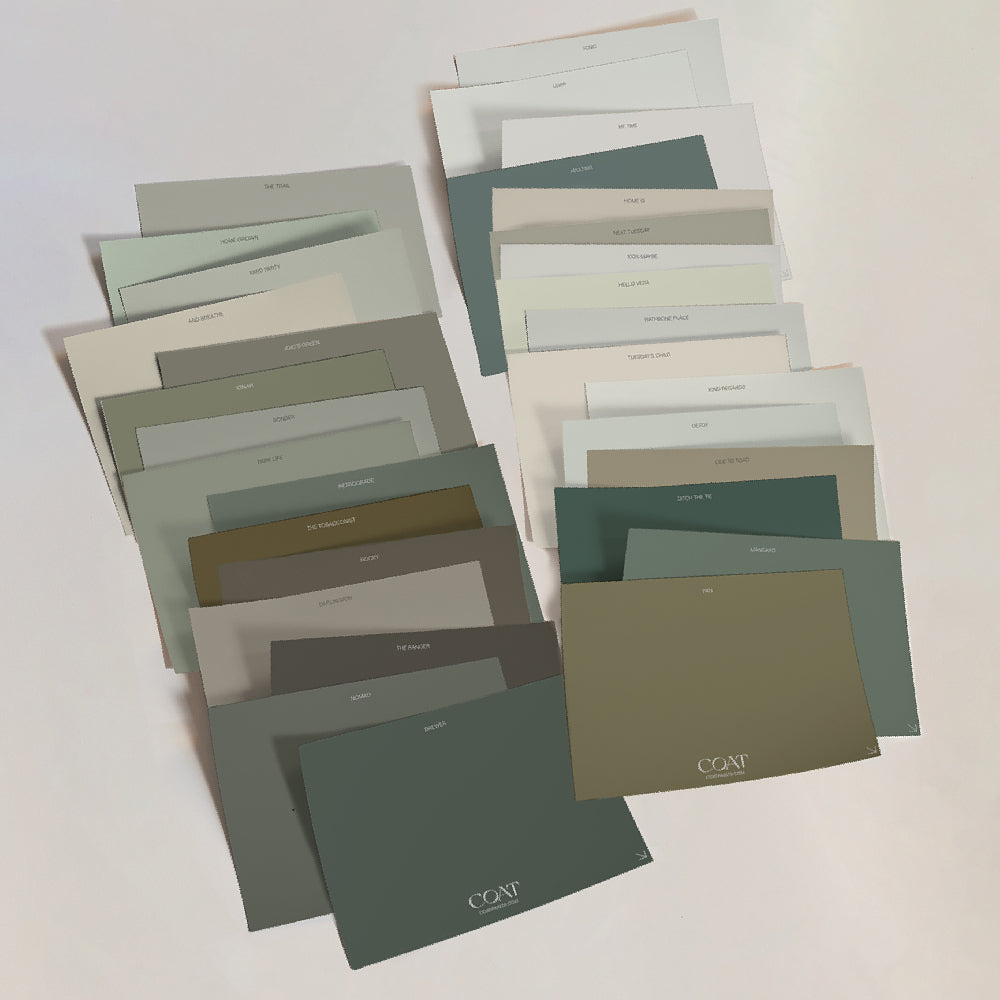
In recent years, there’s been a move away from completely white bathrooms. Mostly because they can feel cool and isolated, hardly ideal when you’re in your birthday suit. Soft green colour schemes for bathrooms can help bring a little more nature into your daily ablutions, which is probably why they’ve become some of the most popular modern bathroom colours.
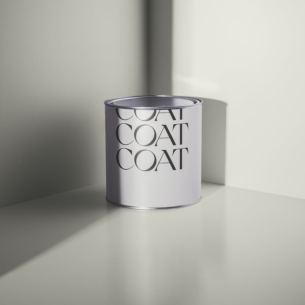
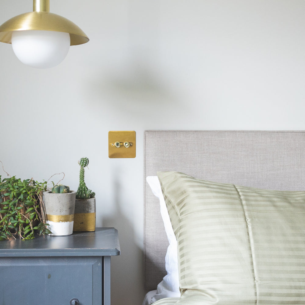
Many of us look for bathroom colours that are clean and bright. A perfect way of doing this is by using a cooler off white. Detox is a versatile, bright blue green, that can behave as a complimentary white for deeper marine colours like The Drink or Adulting (which would be perfect for your bathtub). Due to its marine undertones, Detox is the perfect backdrop to take a quick dip, and will leave you and your bathroom looking invigorated.
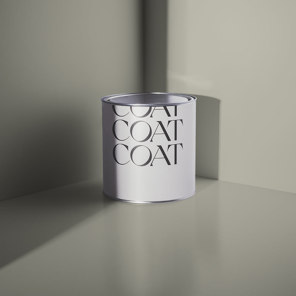
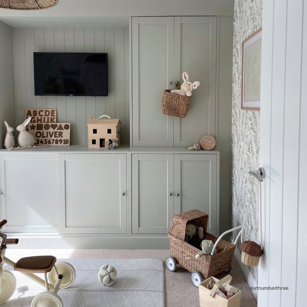
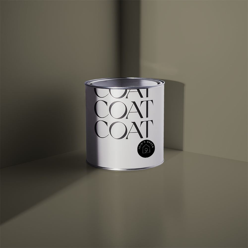
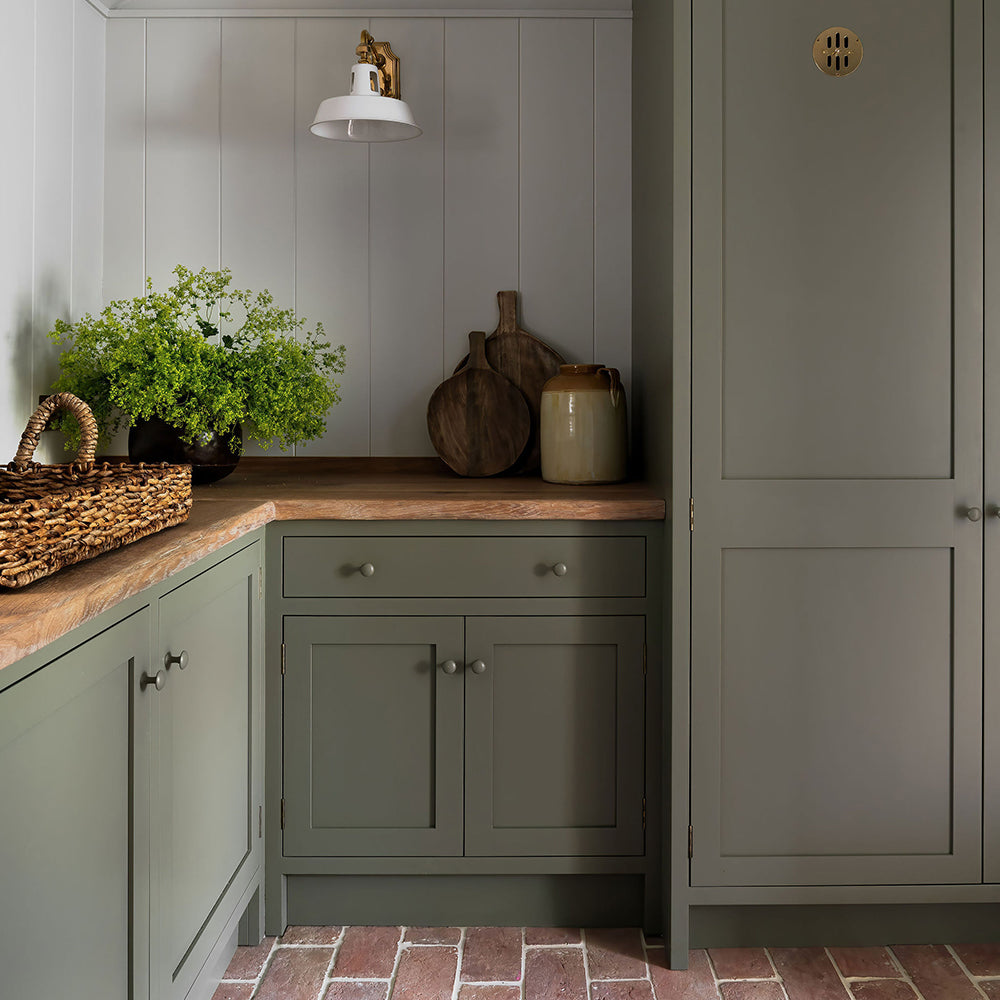
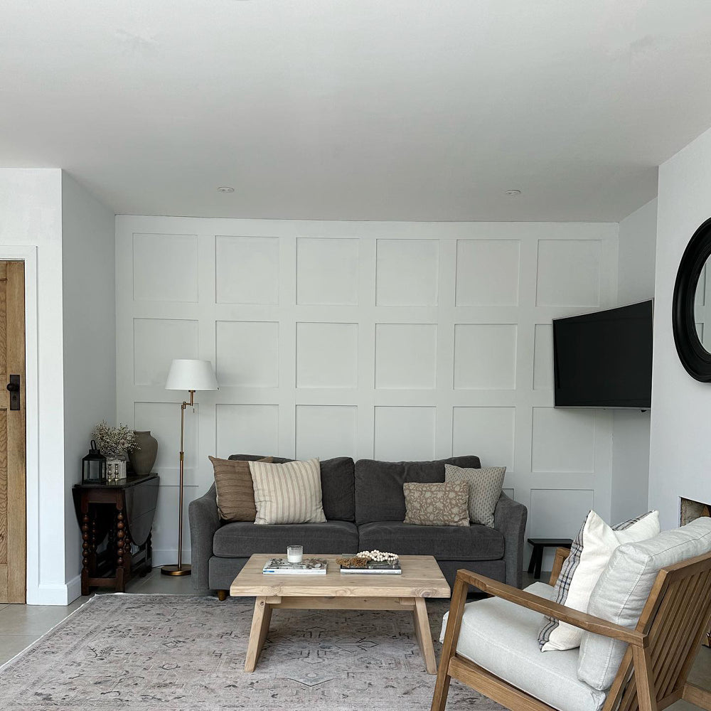
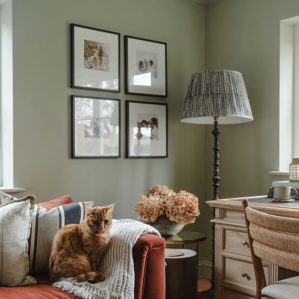
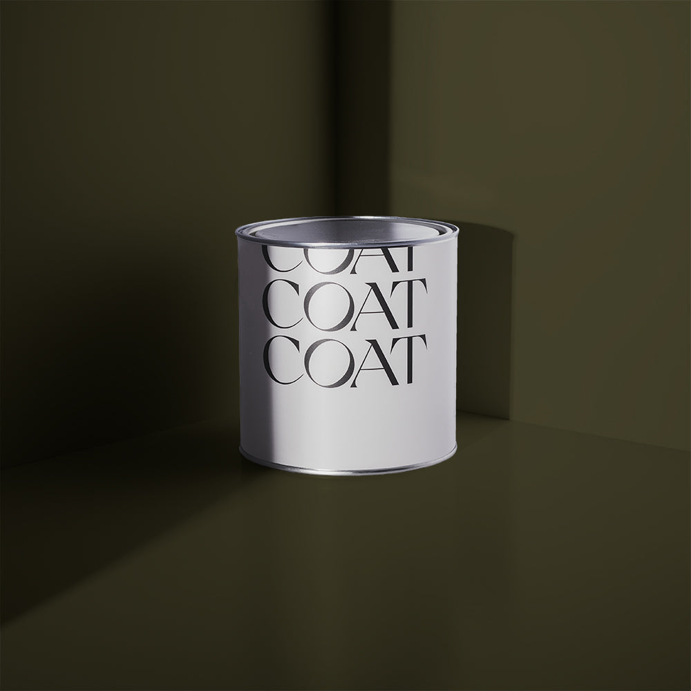
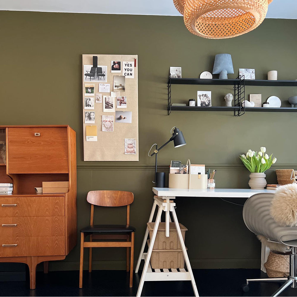
Home Grown paint has become a bit of a passion project here at COAT paints, ever since this gorgeous panelling appeared. So here’s an idea. How about using Home Grown in your bathroom and creating some DIY panelling for it to sit on? It’s a welcoming mid tone green that looks great with deeper greens and off whites alike. It’s secret is a tiny amount of yellow pigment, just to warm it up a little, and so it also works really well with natural bathroom linens, robes and that natural, environmentally friendly sponge you’ve been meaning to try for the last year. We even have a blog on how to make your own panelling if you’re struggling to see how this might be done!

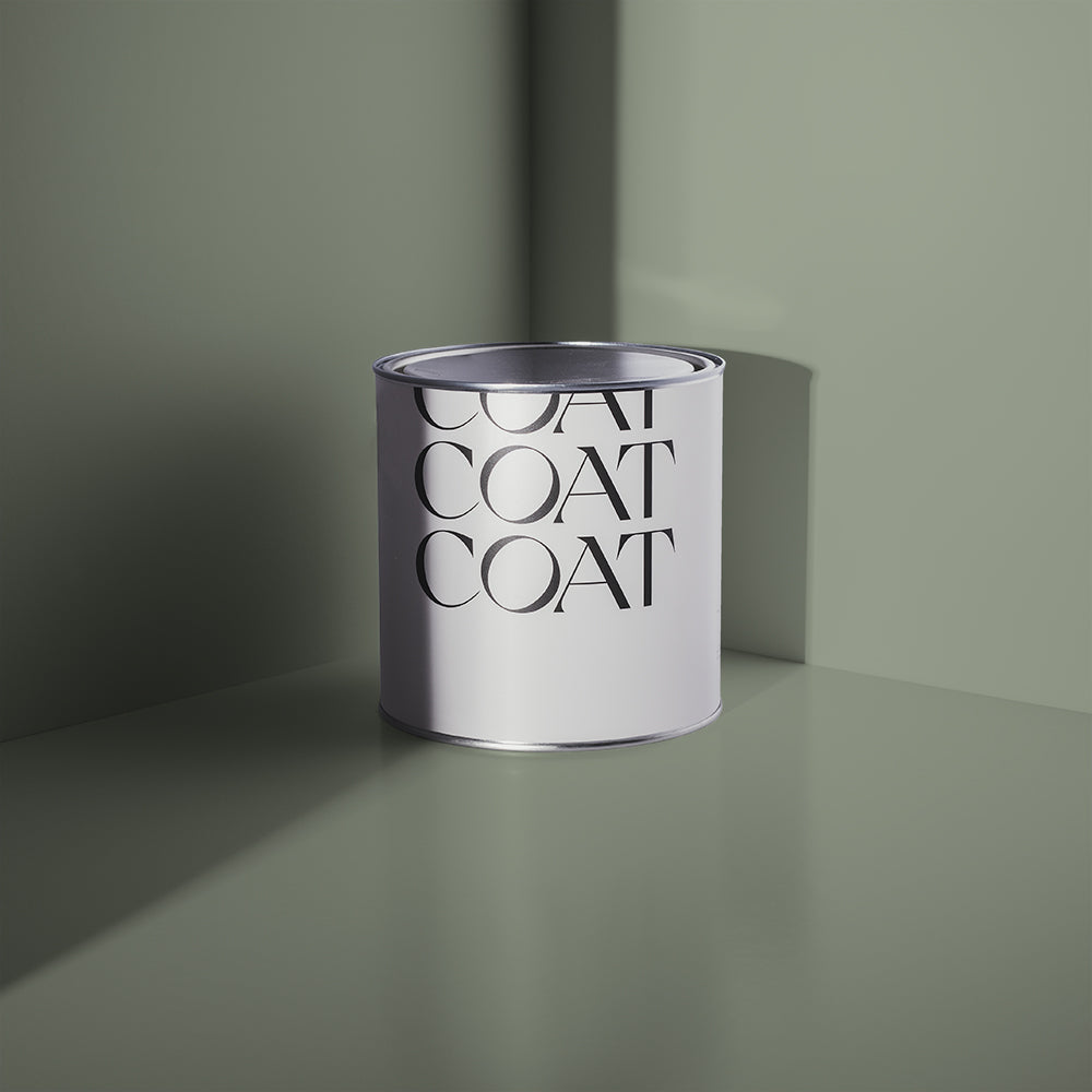
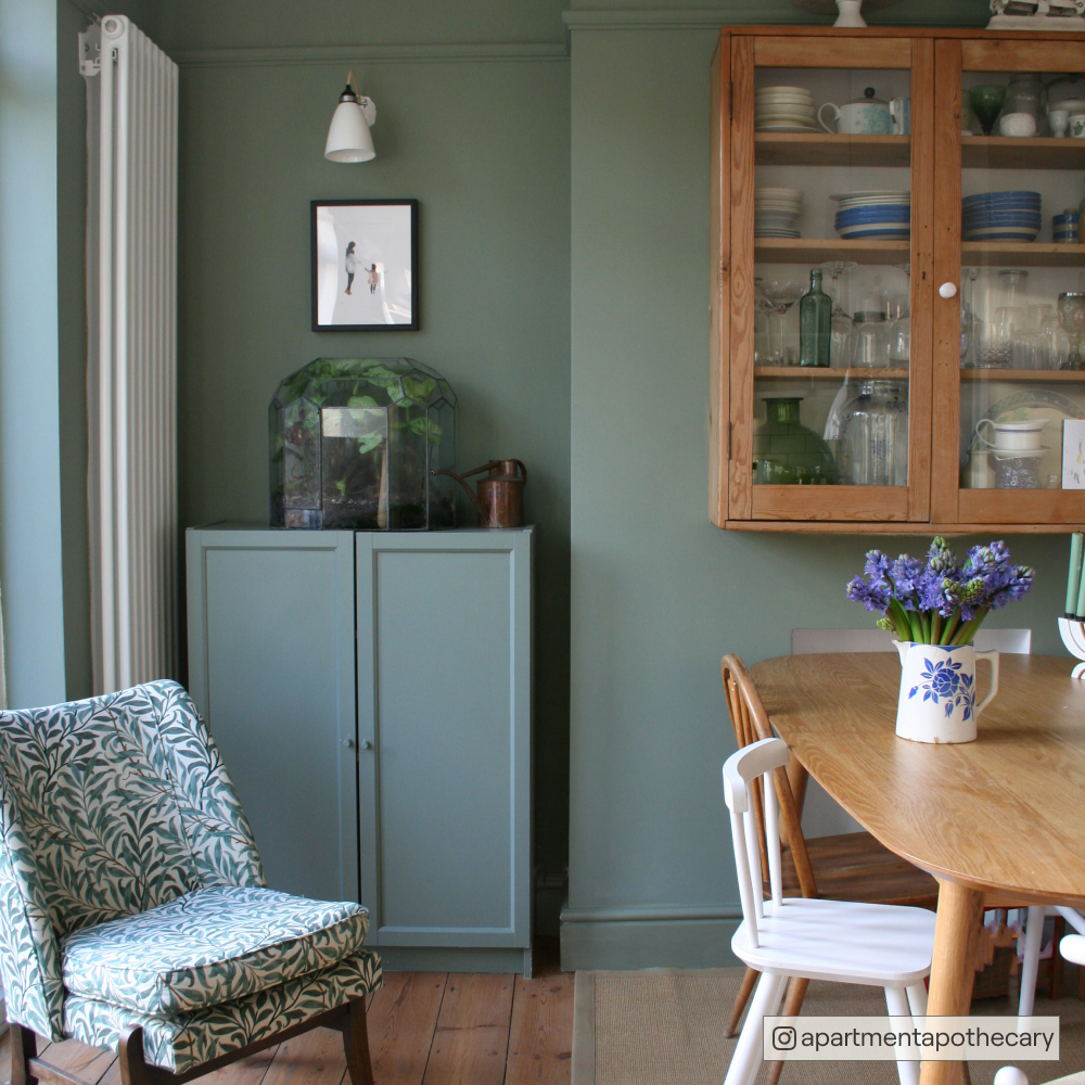
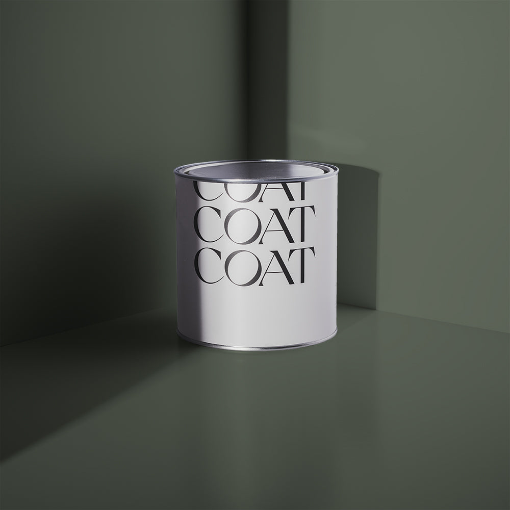
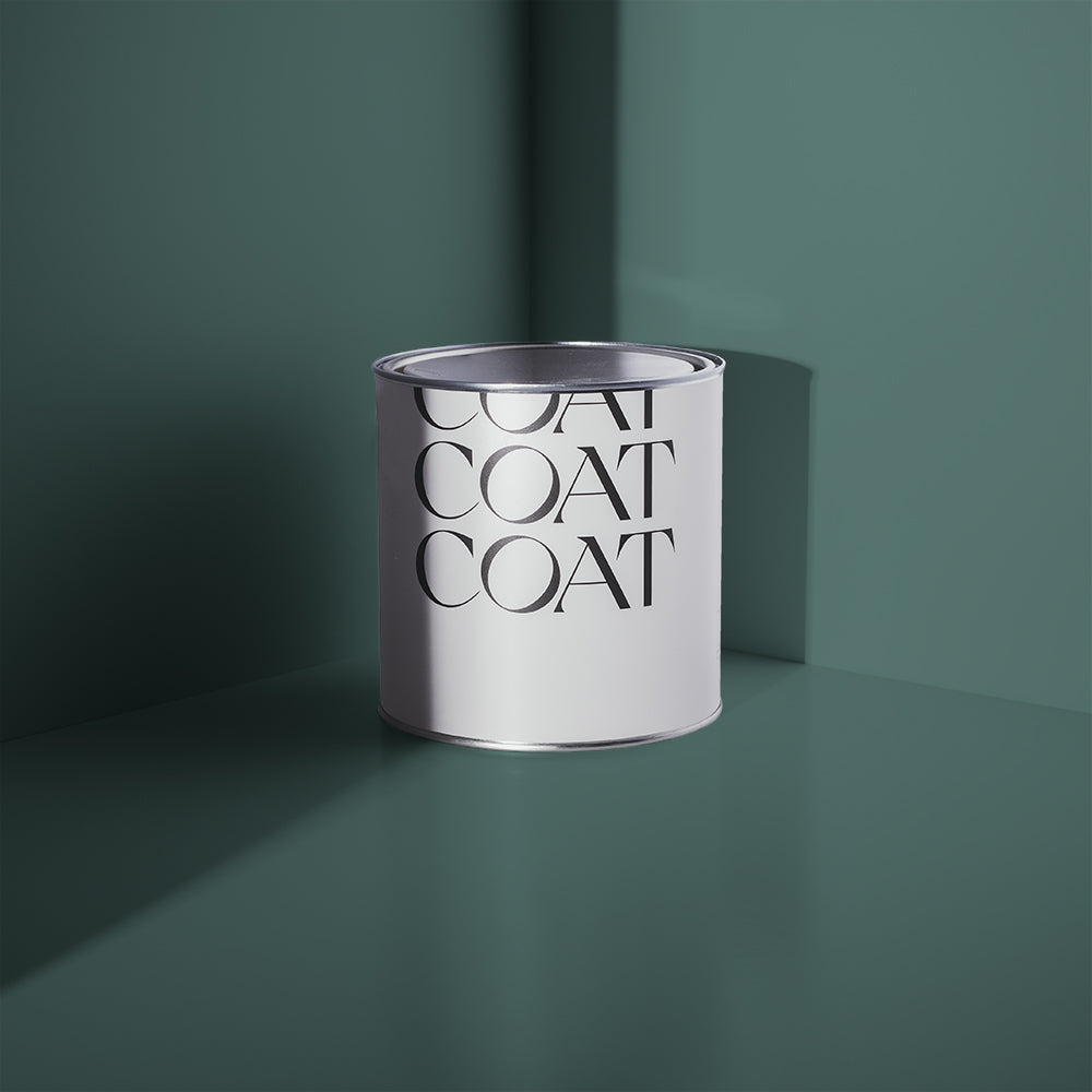
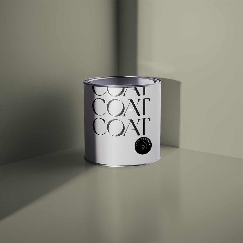
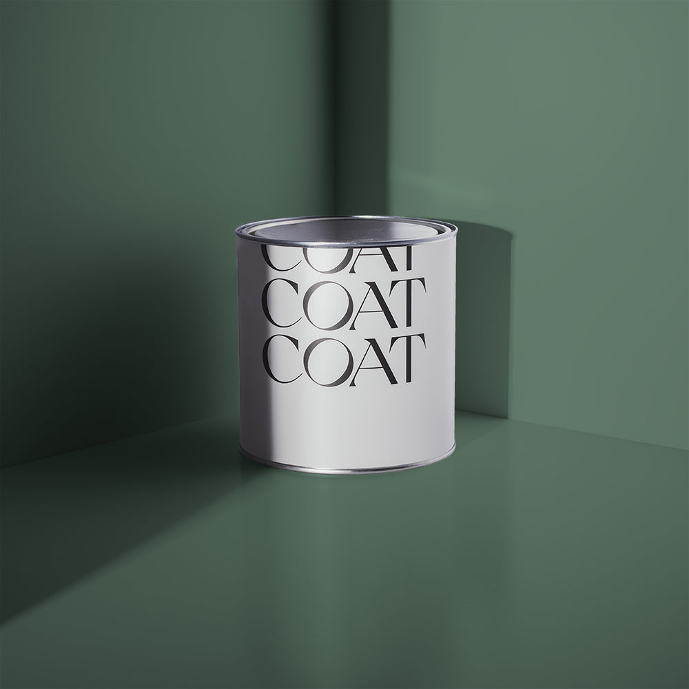
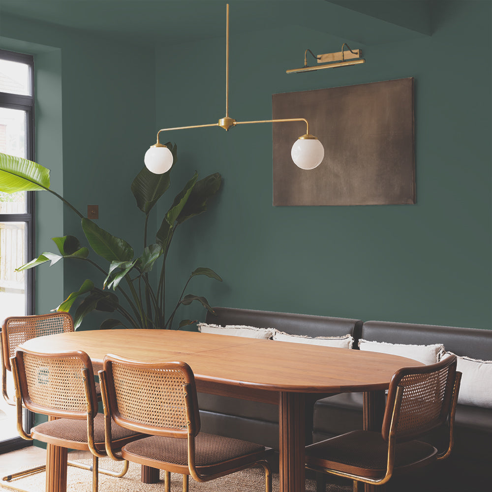
Darlington is a grubby mid green with grey undertones. This grey undertone creates a restful atmosphere, which is visually really soft for the eye. Great with grey grouting and glossy, deeper green tiles and lots of bathroom appropriate botanicals.
Pinks
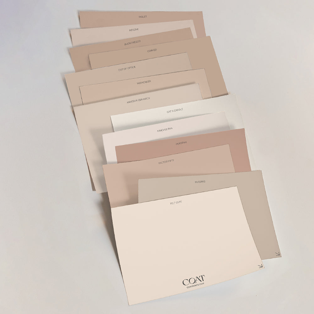
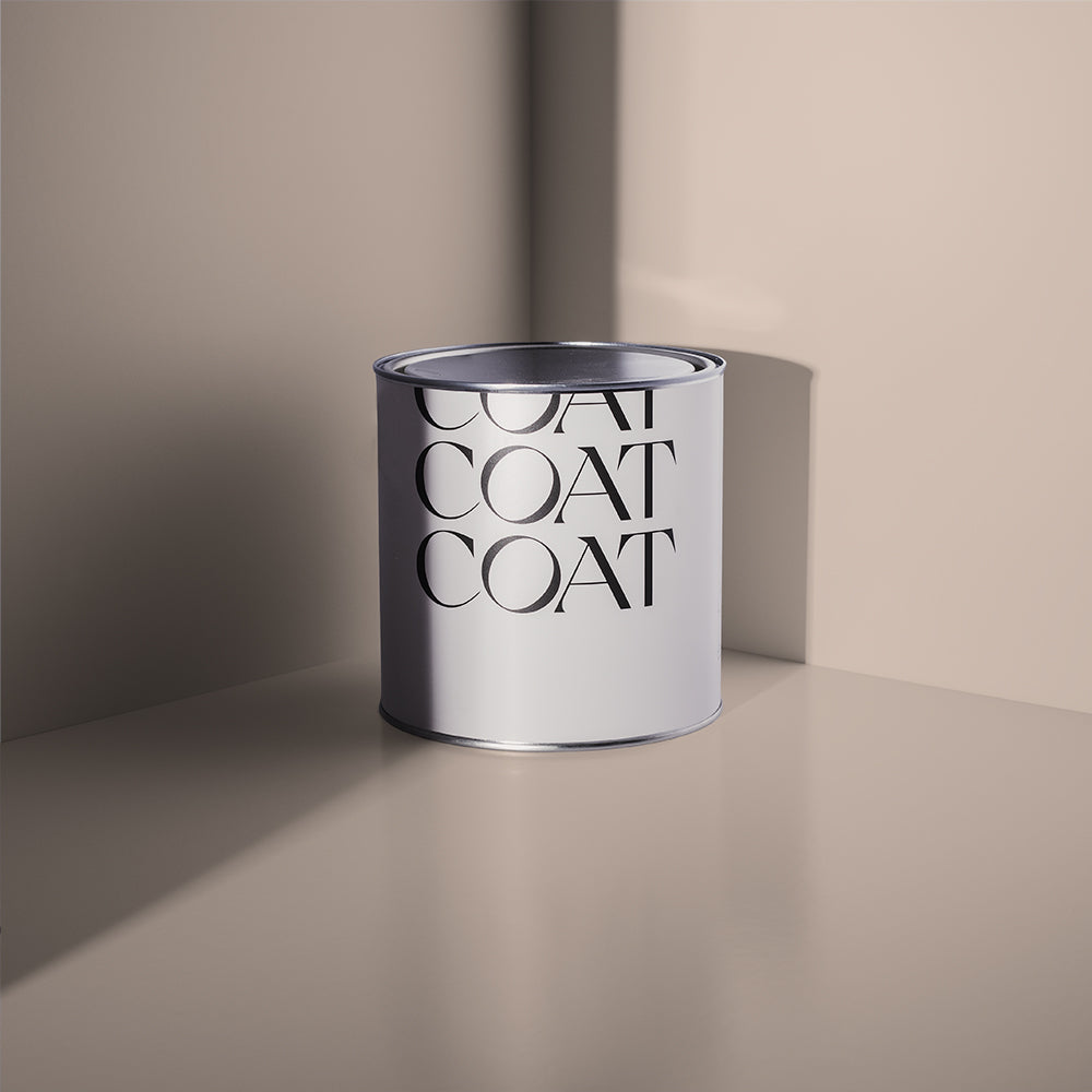
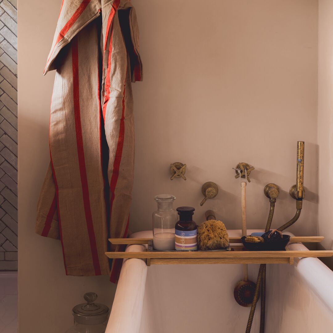
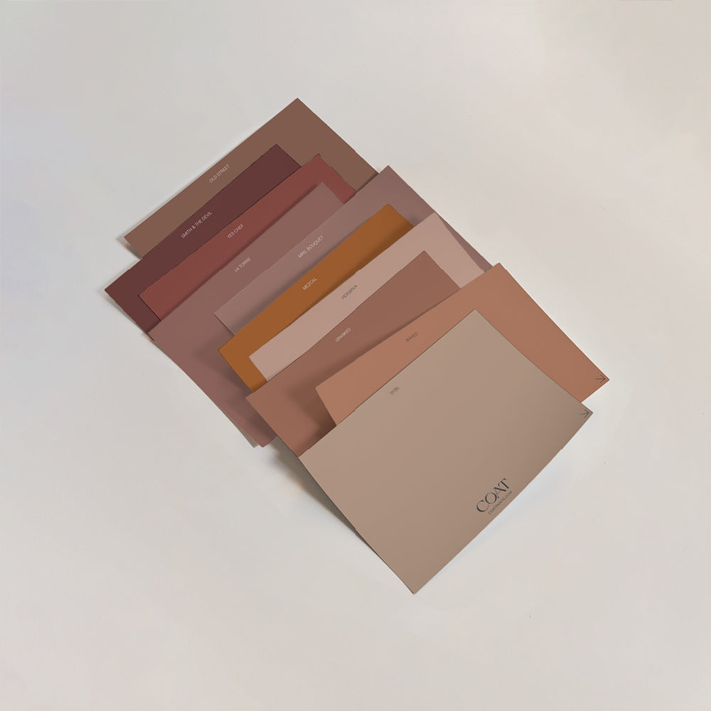
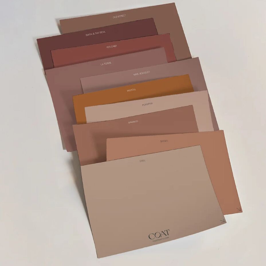
Pinks have been really in vogue as bathroom colours recently. This is probably because they compliment skin tones really beautifully and work well with natural, restful drab tones like beige and brown.
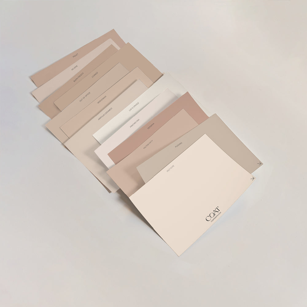
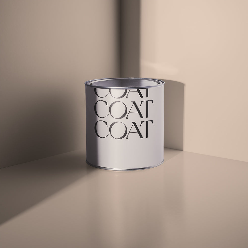
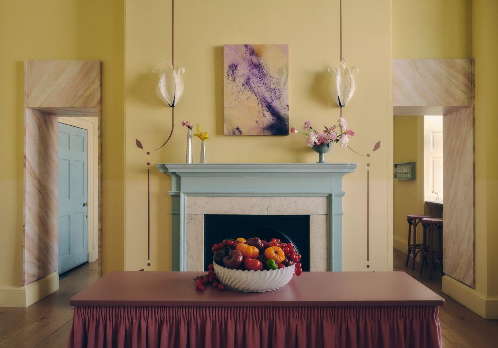
For a bright fleshy tone that sits beautifully against all skin tones, and you too can post the obligatory bathroom post on IG that you Felt Cute, might delete later. Felt Cute is a light yellow pink. It has that plaster type colour, but is cleaner and a bit more vibrant. Adorable when paired with white tiles, brown hand wash bottles and shells you’ve collected from the beach. Also, if you wanna feel even cuter, lay some orangey/pinky terrazzo tiles with this colour - literally ultimate bathroom goals.
Festival Eve is a grubby, dark pink. It has grey and purple undertones, which make it feel regal but also slightly pared back. These undertones are restful for the eyes and work particularly well with grey grouting and white carrera marble. Putting a deep pink with cooler or brighter colours helps to warm up the bathroom colour palette and makes familiar materials, like marble and tile, more welcoming.
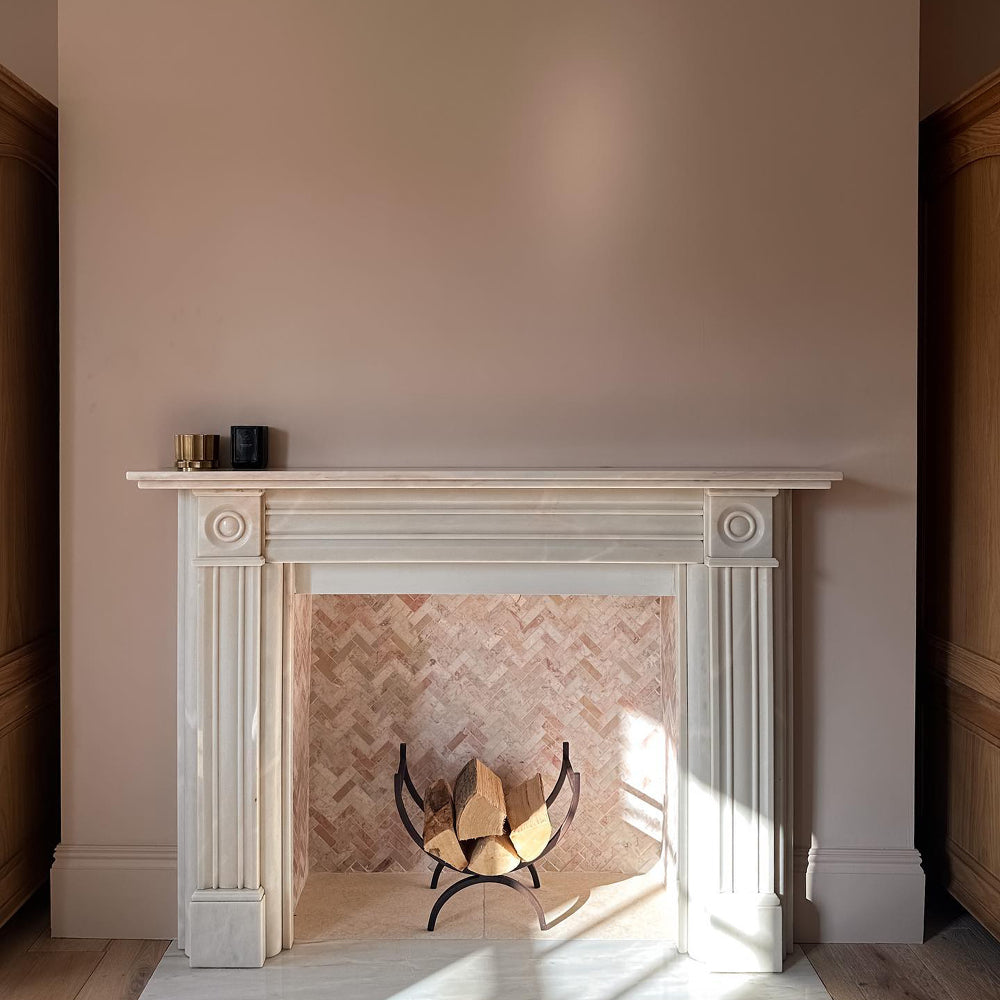
If Festival Eve is a bit too dark for you, you can achieve a similar result with a brighter, grey pink. This family of colours also work particularly well as ceiling colours, as they’re soft, cozy and when they’re uplit cleverly they can cast a warm glow across your bathroom. Try Ciao, Sofia for the prettiest pink ceiling and then complete the scheme with The Coal Drop on the wall. The ultimate bathroom scheme… and chill.

Greys
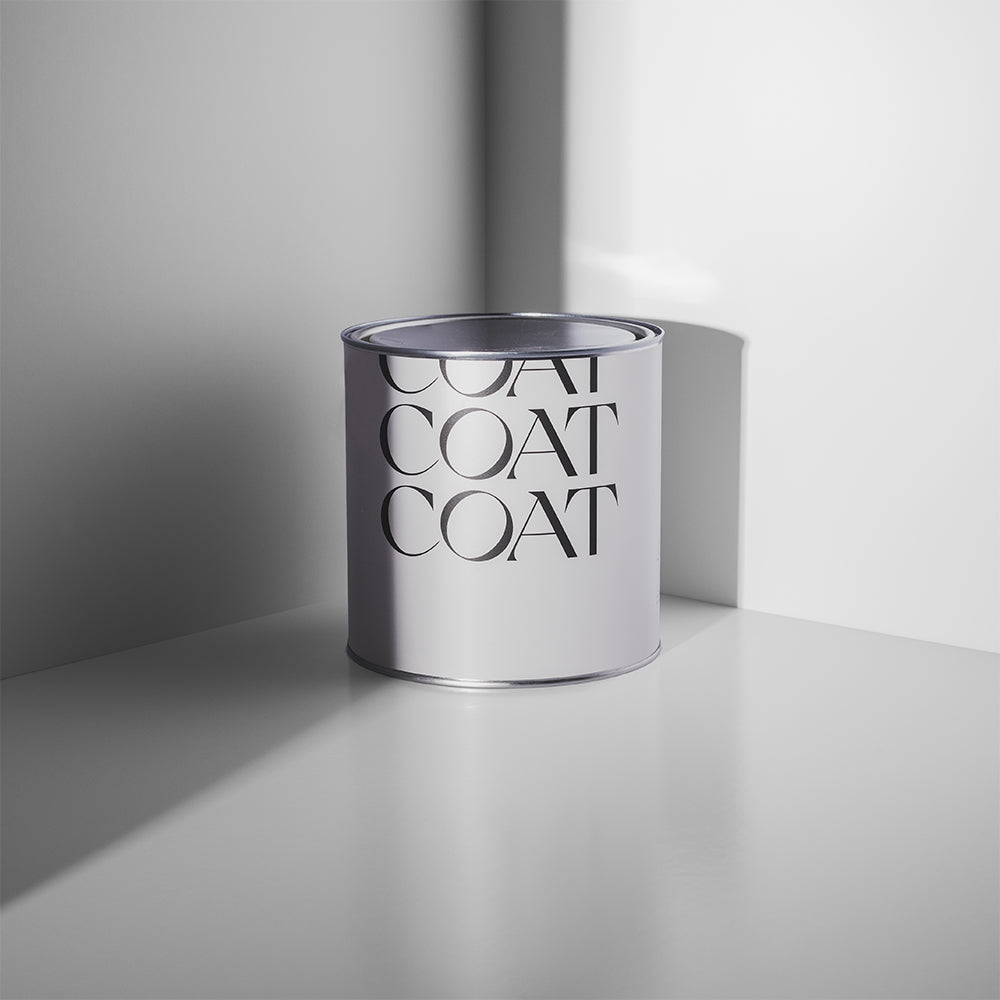
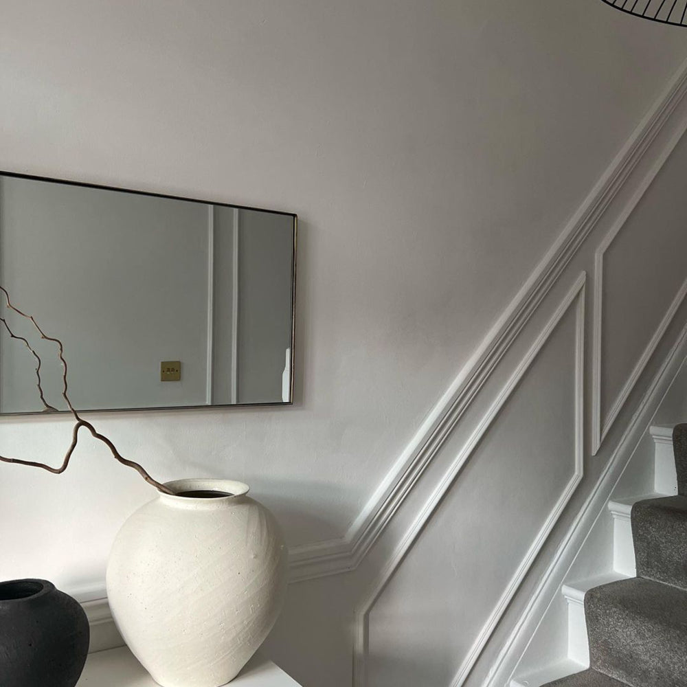
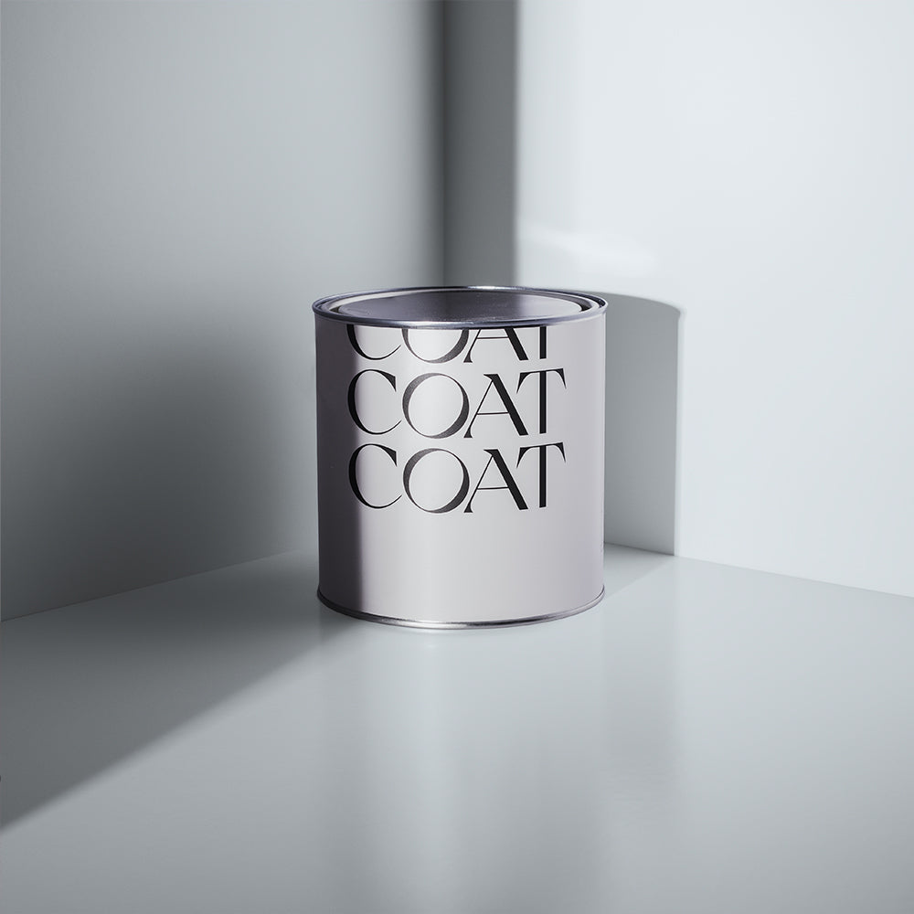
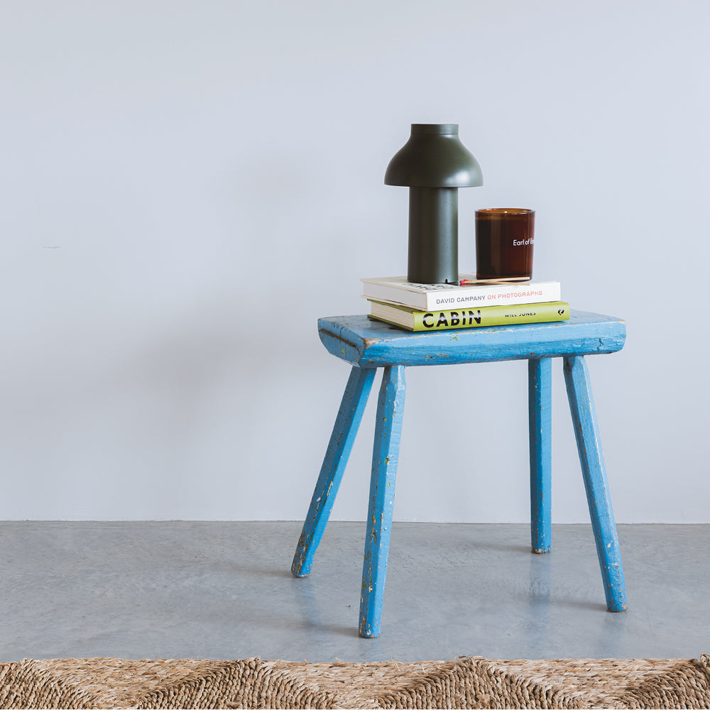
Put the world On Mute - that’s what your bathroom’s for. Grey has been happening for over a decade in the interior world, and no wonder. It’s totally neutral and looks awesome with more or less everything. On Mute is our bright, cool grey. It’s blue undertones make it the perfect pairing for deep grey or white marbles for a bathroom that looks fresh and bright. This scheme needs a little depth though, so make sure to use black ironmongery, taps etc. or paint your bath in a darker eggshell colour like The Coal Drop.
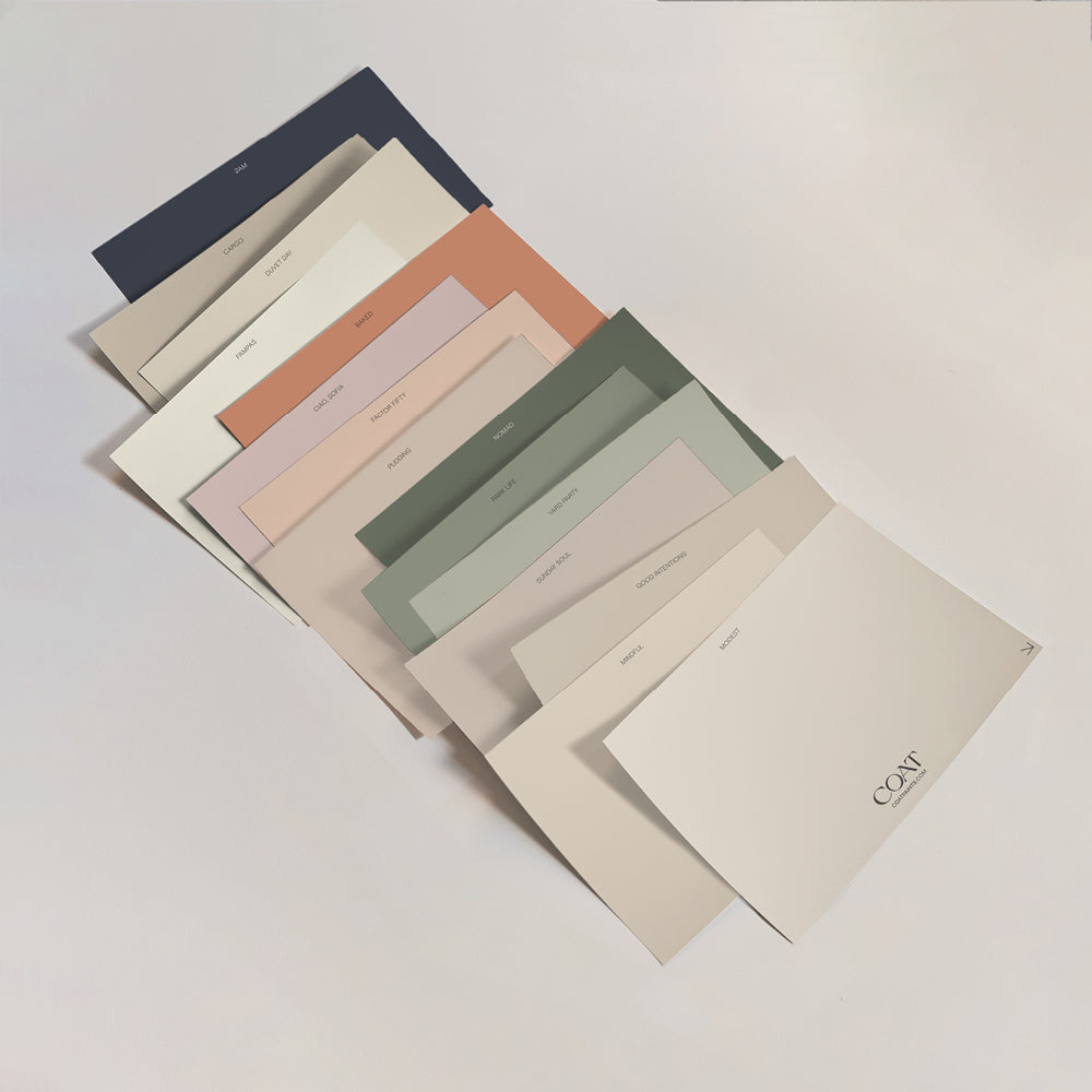
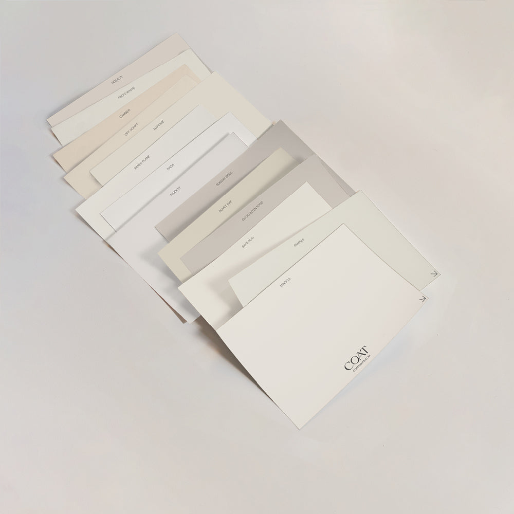
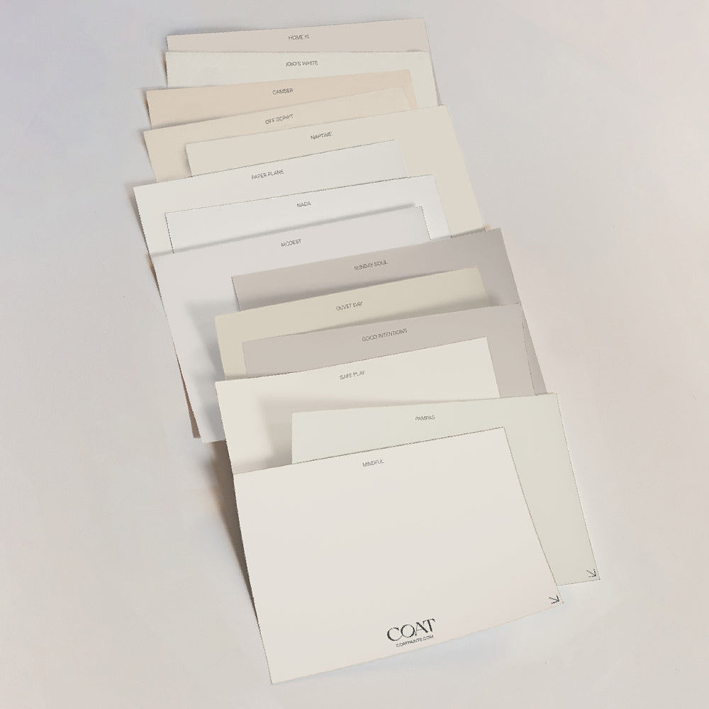
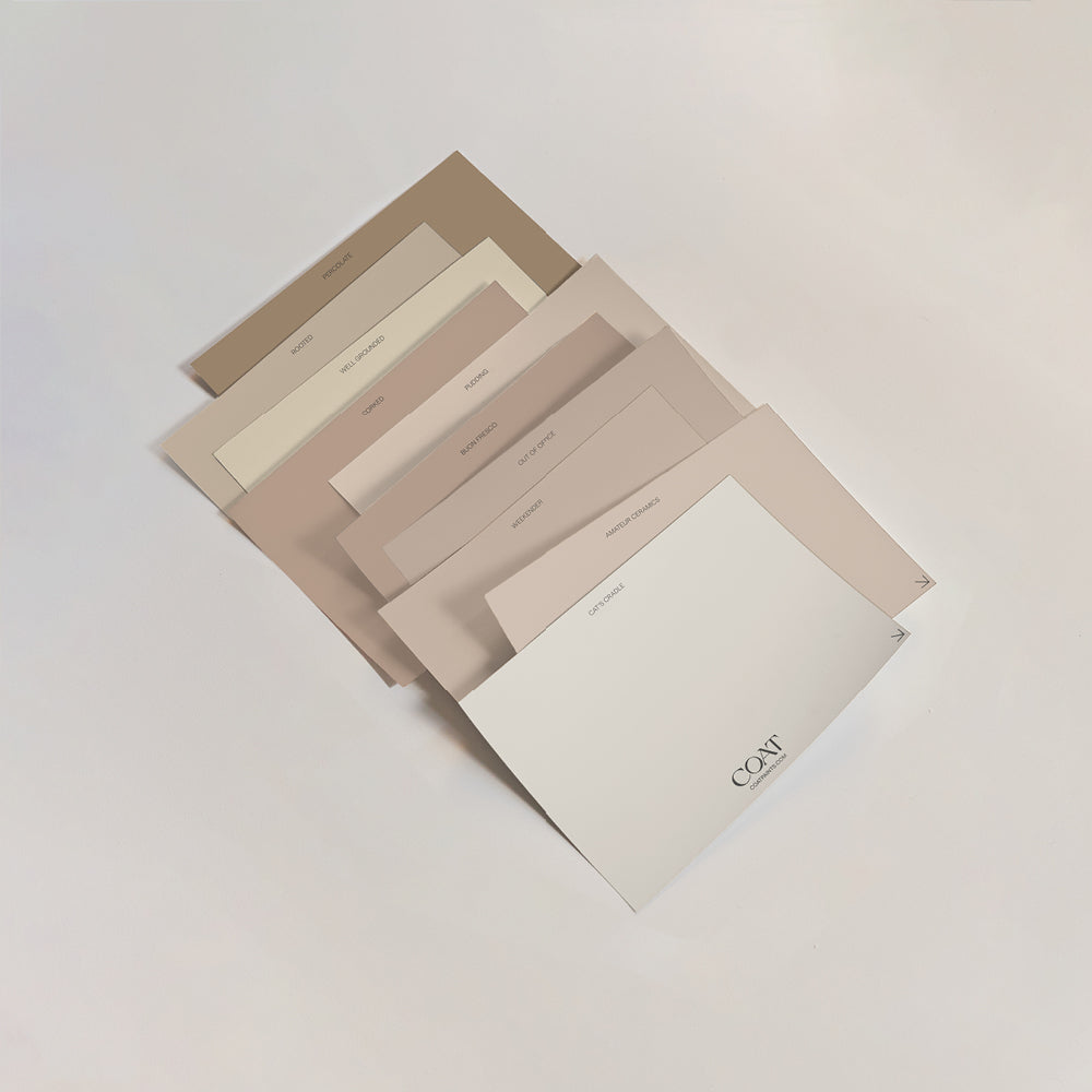
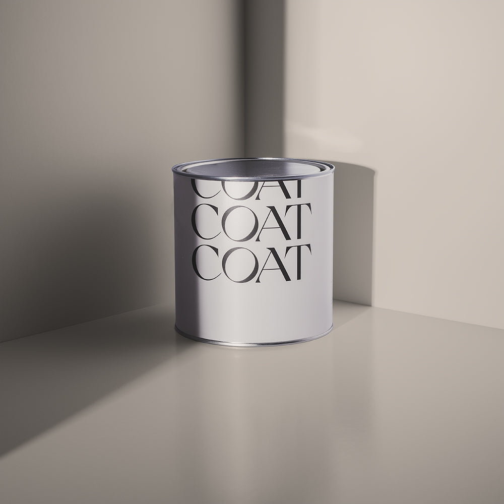
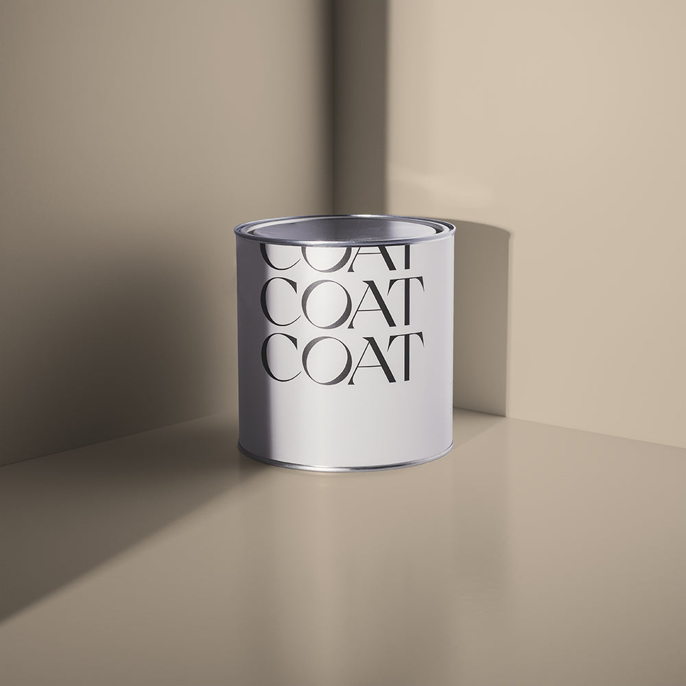
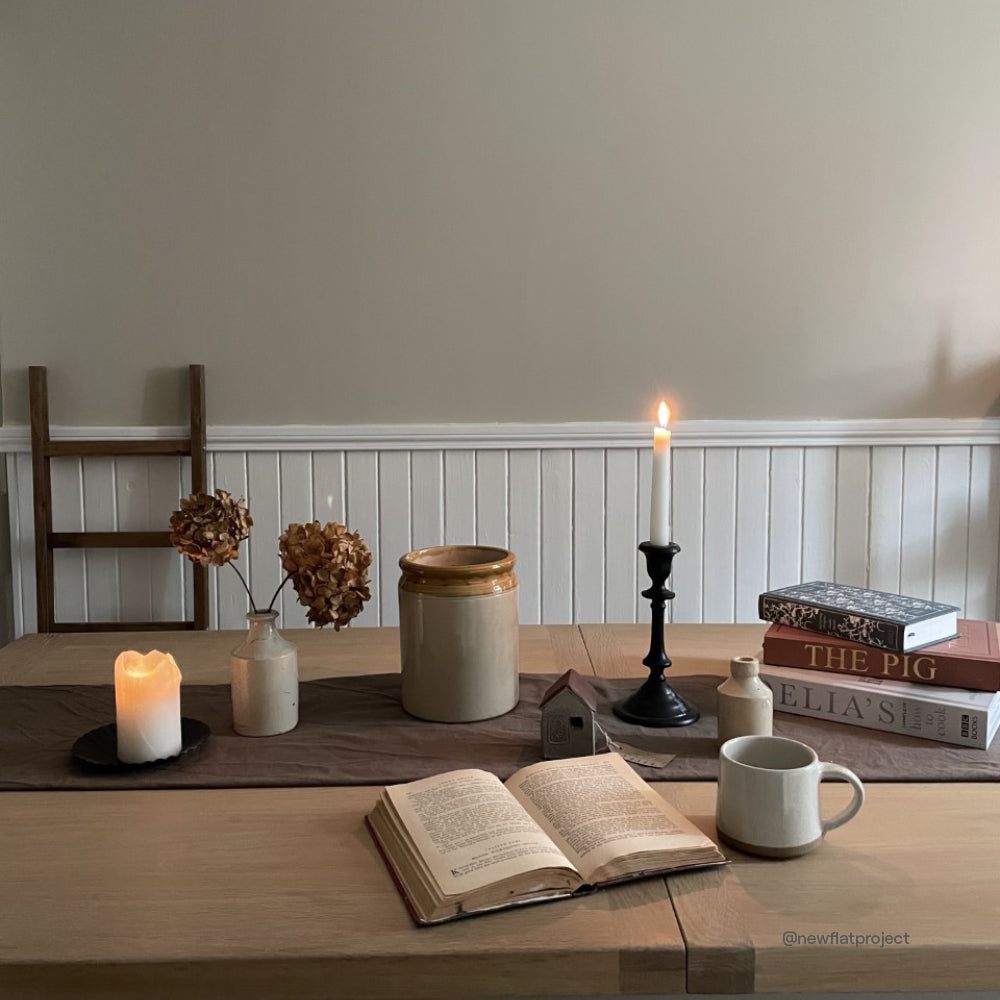
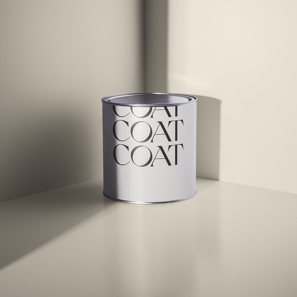
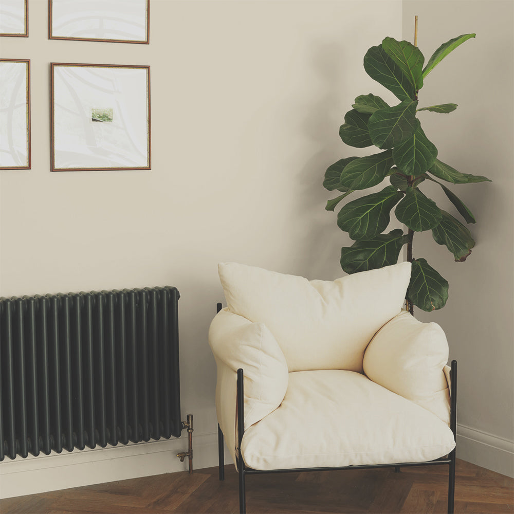
Warm neutrals for bathrooms have been making a comeback. Give your woodwork a little Sunday Soul and pair with Mindful walls and ceilings for a bathroom colour scheme so laid back, it’s practically horizontal. Both of these colours are grey taupes, perfect for the balanced nature of being neither too yellow nor too grey. These tones look beautiful with fleshy tones because of their complementary tones and their grey undertones will make your skin look more radiant. Gorge.
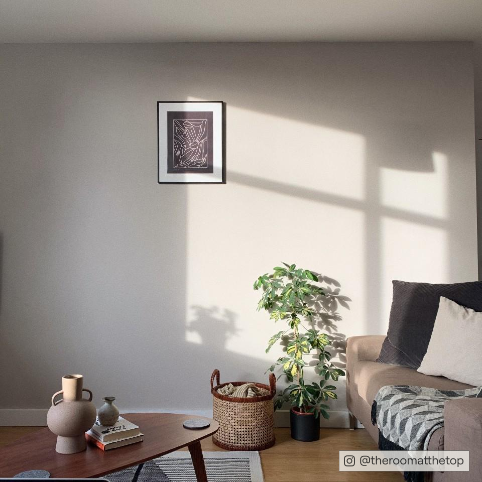
If you’re looking for warm grey bathroom paint colours that aren’t quite as mushroomy, then try Sweatpants. It’s a soft grey with warmer undertones than On Mute. This works perfectly with darker tiles or grouting and when used with luxe white Low Salt woodwork, you’ll get all the chilled vibes. Grey tracksuit season is everyone’s fave for comfort and many other reasons *winky face*, so use this pairing for a flattering bathroom scheme.

Blues
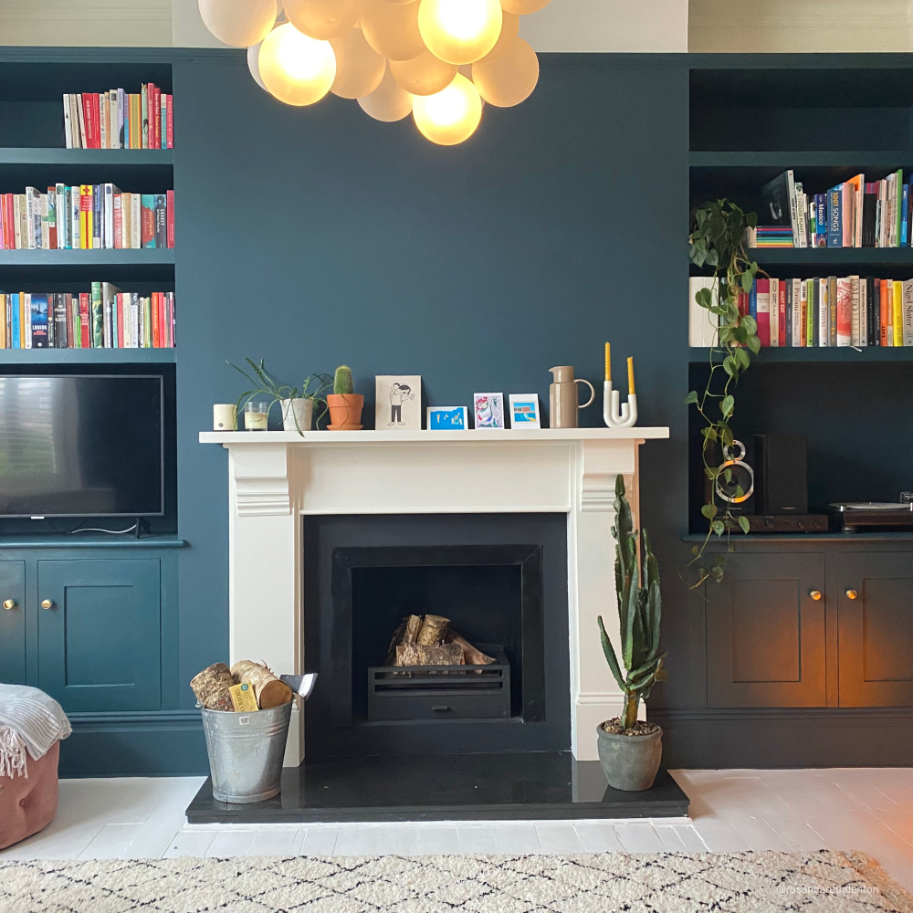
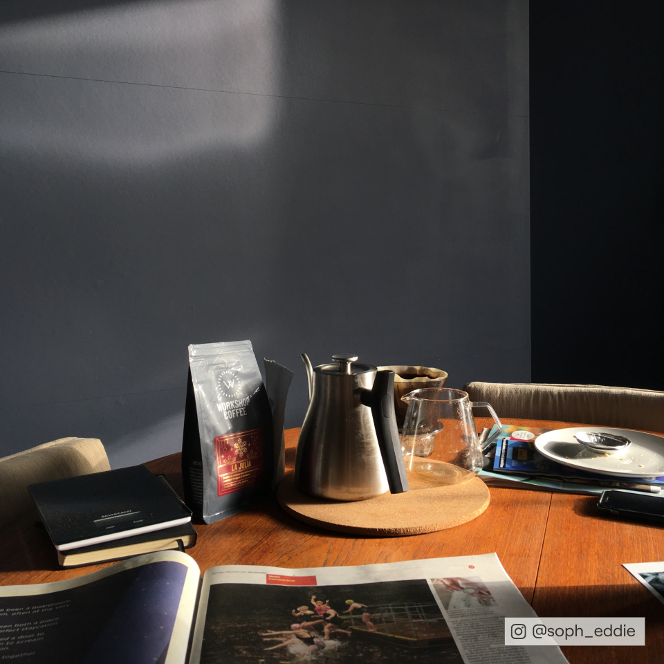
Blues have been a bathroom favourite for as long as most of us can remember. Brighter, watery tones are great for reminding us of the room's purpose, and provide subtle contrast to clean bright whites of sanitaryware. Deeper blues are reassuring and offer a feeling of safety, which is really important in spaces where we are most vulnerable. Although blue is a classic for bathrooms, here’s some tips to update and make it one of the most modern bathroom paint colours.
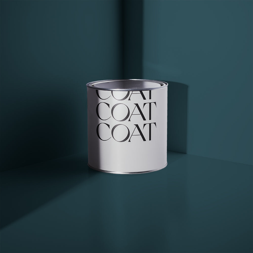
Escape the day (and the kids) for a little Adulting time. “Create a restful retreat with this classy green blue” says COAT colour guru, Aaron. “Although it’s dark, the trick to painting with darker colours is to pair them with smaller accents of even darker colours to make them feel a bit brighter. Ditch The Tie is a great woodwork colour, and adding a grounding, deep green gives you more options for tiling than just boring blue and white tiles.”
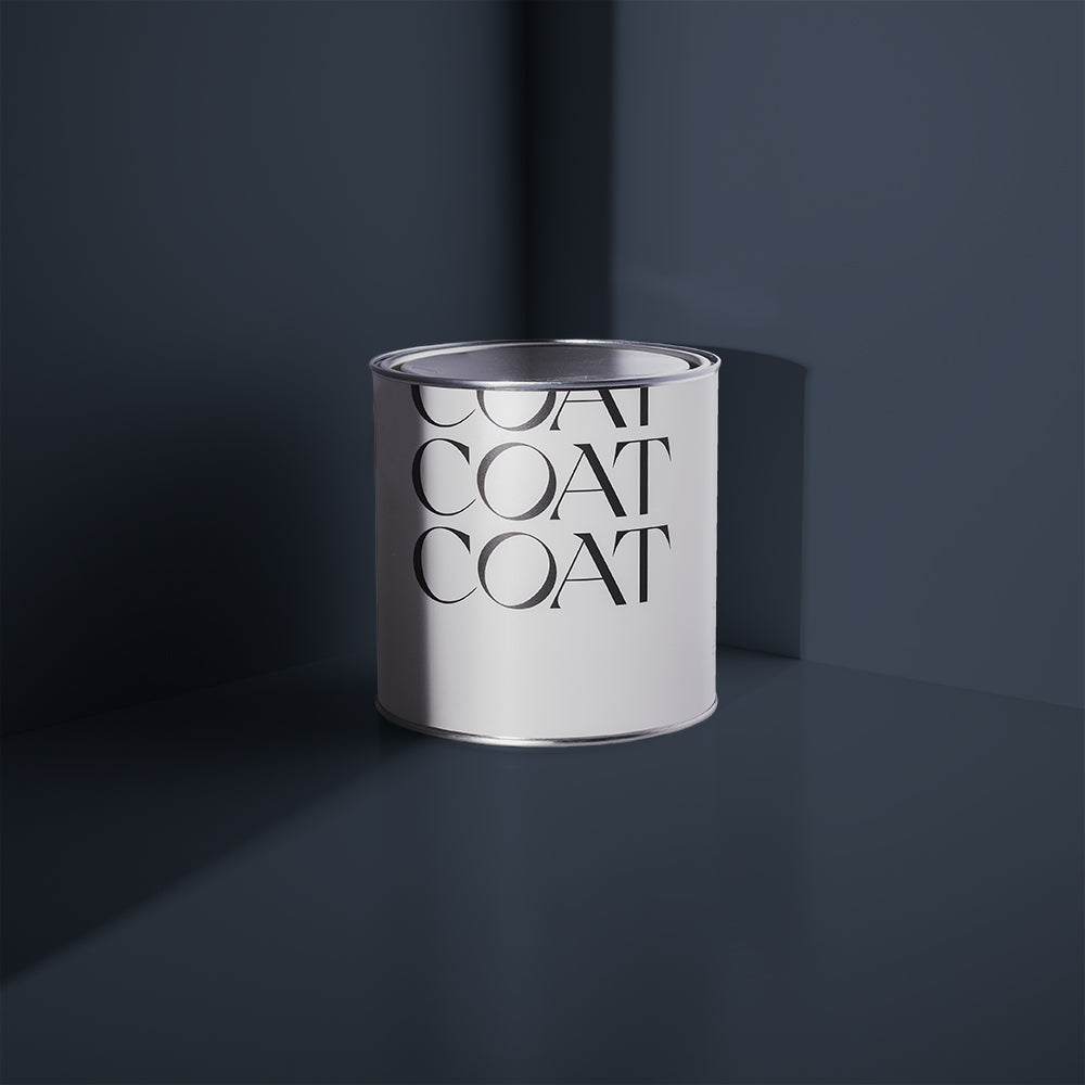
Want a marine mood in your bathroom? Imagine the classic beachside bathroom - white tiling with the blue and white striped lighthouse sat in the window, with the wall space COATed in a slightly grey, mid tone blue - that’s Below Deck. For a more contemporary version of this scheme: Below Deck also works well on woodwork in bathroom colour schemes, particularly when used with clean whites like Screenshot. Oi oi sailor.
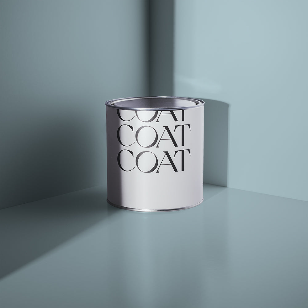
The family bathroom colour scheme usually requires a bright, calming colour for bath time. COAT the walls and ceiling in Lie-In, a chilled, light blue that invokes the sky and then use Low Salt on cornicing just to break up the colour a little. Use in combo with white and blue floor and wall tiles, which have endless possibilities and you’re on to a winner. All the family will find this space more relaxing and enjoyable and the less battles at bath time the better.

Go Dark
Japanese interiors are bang on trend right now. So let’s take some inspiration from Japanese design legend Junichiro Tanazaki, and his excellently written short essay; In Praise Of Shadows. “It turns out to be more hygienic and efficient to install modern sanitary facilities- tiles and a flush toilet- There is no denying the cleanliness; every nook and corner is pure white… A beautiful woman, no matter how lovely her skin, would be considered indecent were she to show her bare buttocks or feet in the presence of others; and how very crude and tasteless to expose the toilet to such excessive illumination… In such places the distinction between the clean and the unclean is best left obscure, shrouded in a dusky haze.”
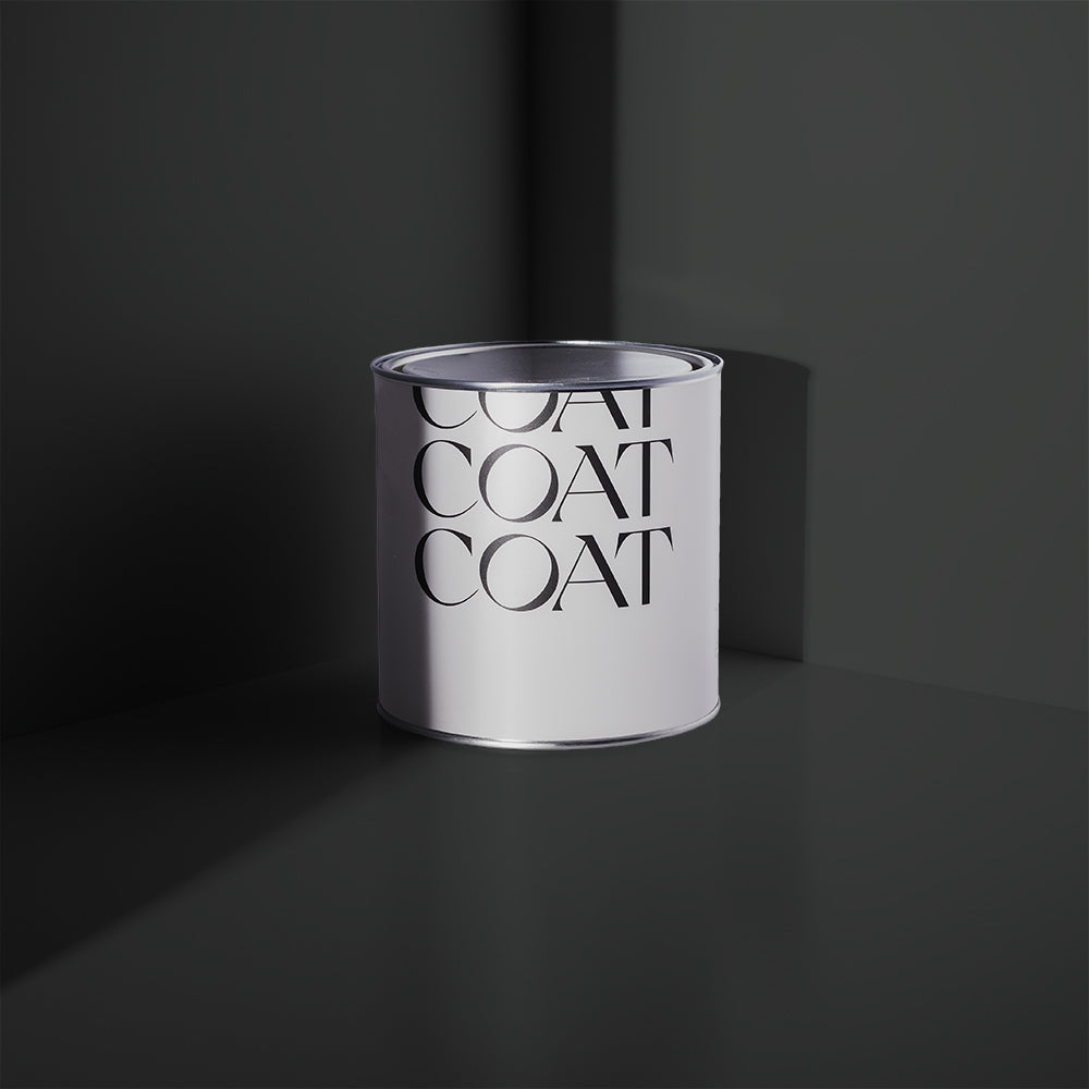
So how do we do this with paint colours for bathrooms? David Rose, on every paintable surface is probably the best answer! This deep black is embracing and inviting, and because it’s a pure black it doesn’t look cold. When you’re going bold with black, make sure to do your woodwork in our Eggshell finish too. The Record Store is also perfect for Pop Art pictures, and can be paired with white metro tiles for a monochromatic retro vibe too.

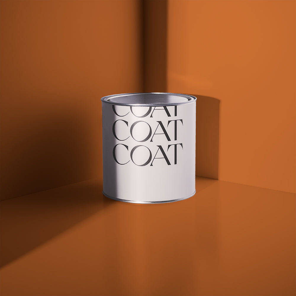
Looking to bring some romance to the bath but don’t have any bathroom colour ideas that will help you do that? Paint your ceilings and walls in dusky, dark 2AM. It’s violet undertones are deeply relaxing in an energetic way. Paint a bathroom chair in COAT’s blazing orange, Sima and invoke looking into the night sky, with your partner by the campfire, in your shared sleeping bag. Add some rose petals to your bath and you can thank us later.

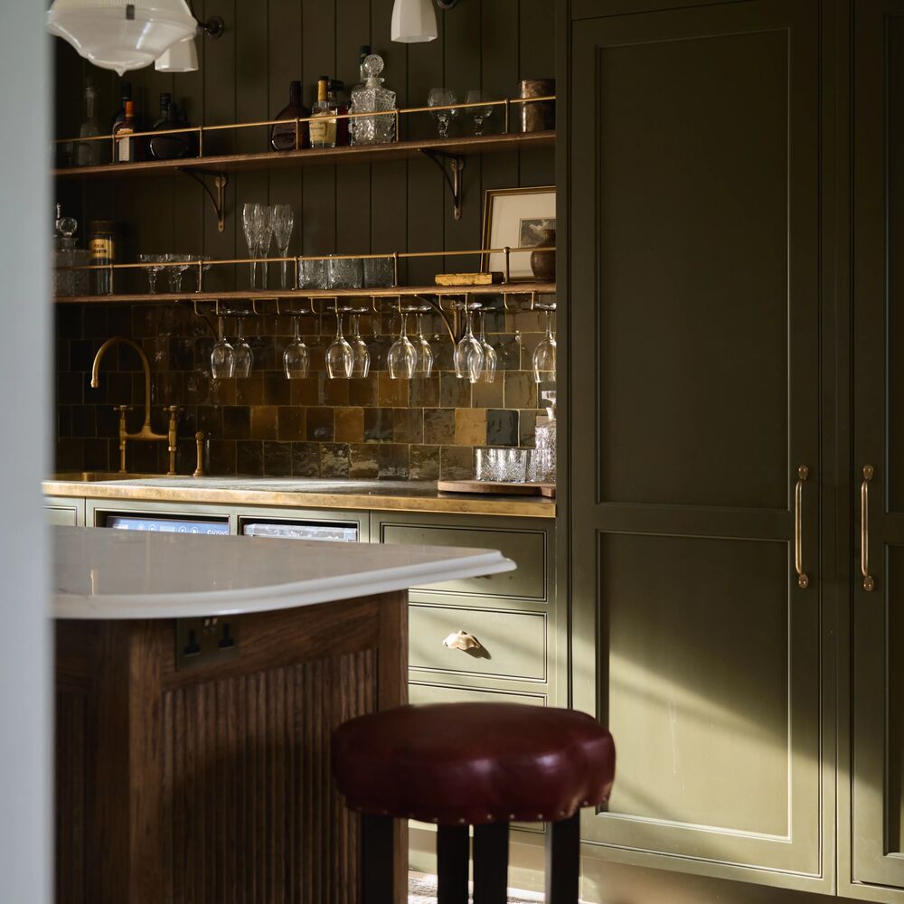
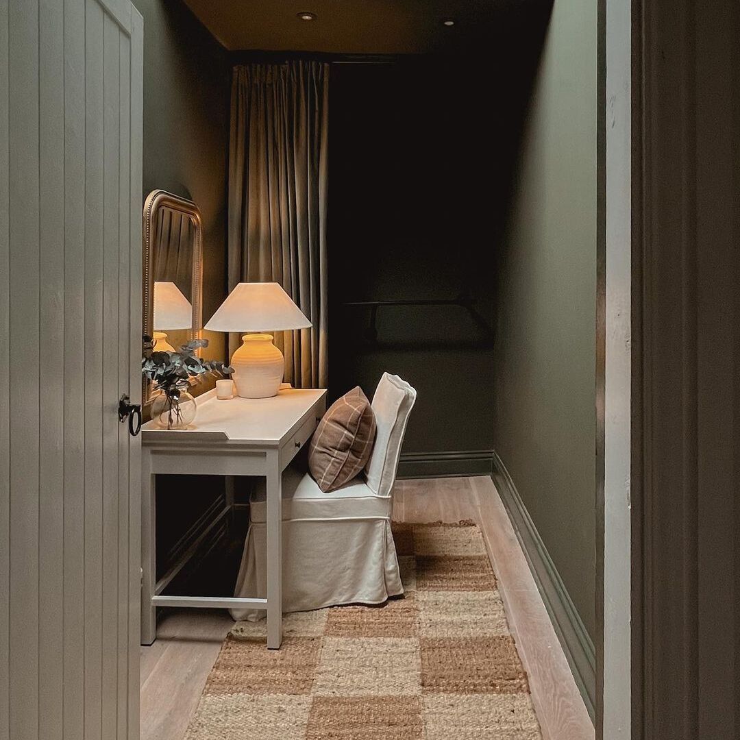
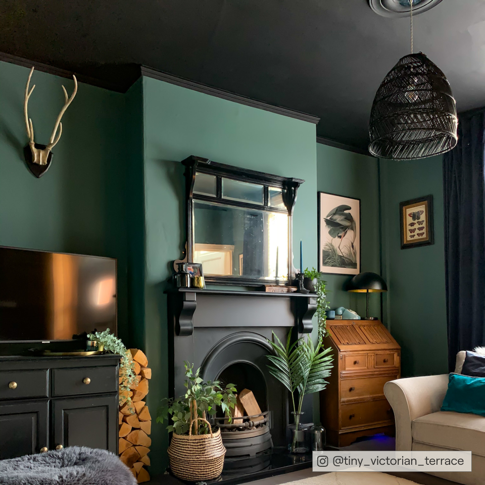
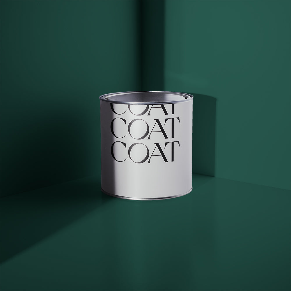
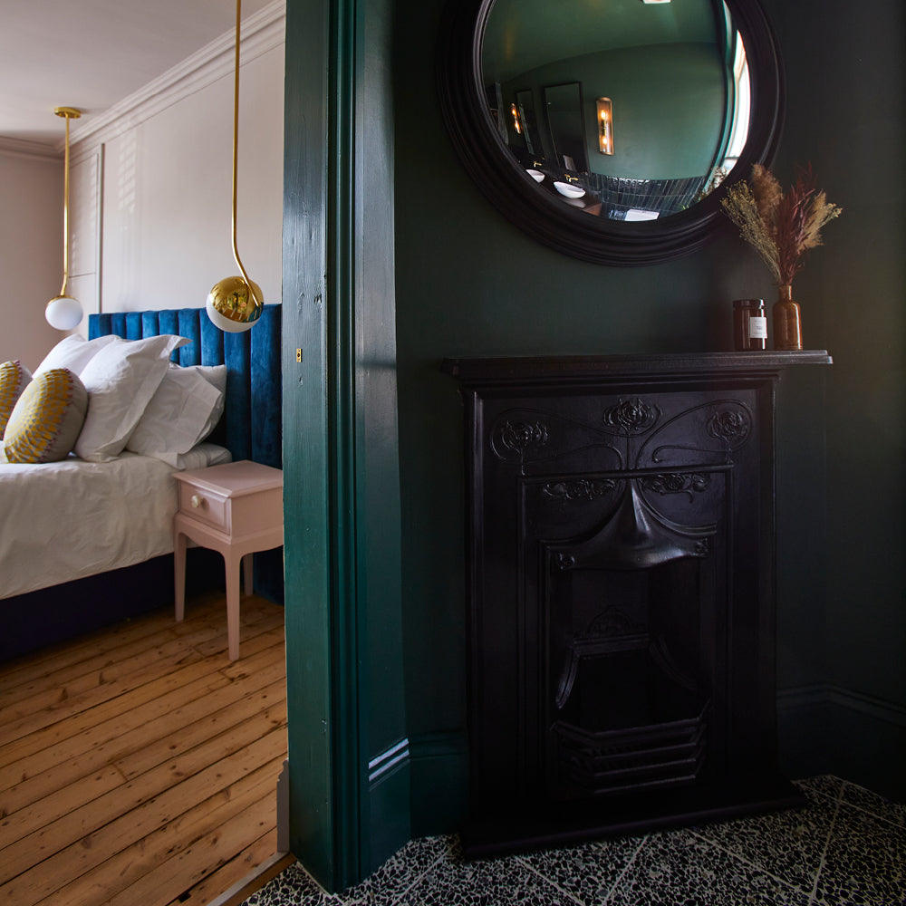
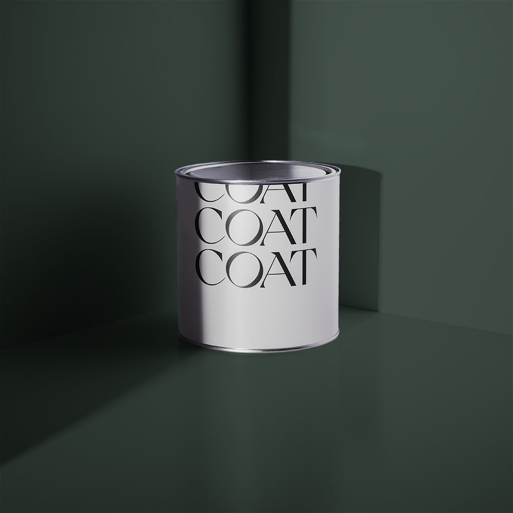
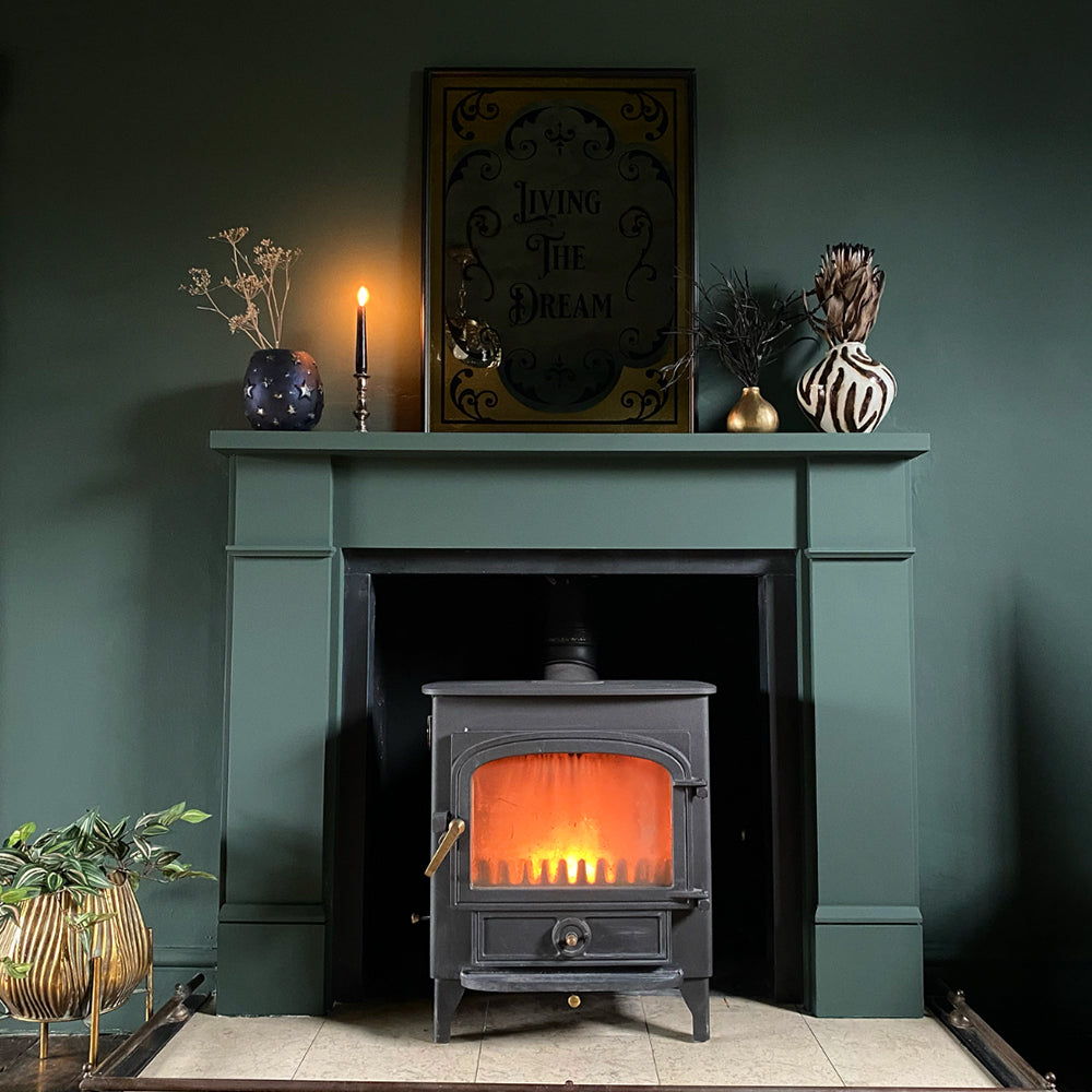
Brewer is a personal favourite as a paint colour for bathrooms. It’s our new deep green in collaboration with furniture giant Heal’s. This is a great colour to pair with black taps, so that it isn’t the deepest colour in the room and really compliments greige tiles, natural linens and neutral toweling colours.
Publish Date
Author







Leave a comment