Popular Paint Colours of 2023 - Our Predictions
New year, new vibe. and we’re breaking down the interior colour trends 2023. We’re going to discuss some ways to bring a new look to your home, what colours to use and how from our decorating experts.
Decorating a space gives it a completely new feel, even if it’s just changing the colour of the woodwork. You can make it feel cleaner and airier; or darker and more intimate. There’s so many options that you could go for and hopefully this breakdown of how to use the predicted popular paint colours of 2023 will be helpful to you.
Let’s get into and get you on trend for 2023 across your walls, ceilings, woodwork, picture frames or that old piece of furniture you’ve been meaning to paint forever.
Grey Paint Trends
2023’s trends are generally heading towards earthy colours with accents. It does look as though grey is on its way out, after dominating the paint market for the last decade. For some of us, this is a big leap. Fortunately, grey undertones help bring stability and familiarity to colours, helping them to create the perfect backdrop for most interior schemes. We’re gonna discuss some colours with grey undertones that will make your home feel more inviting.
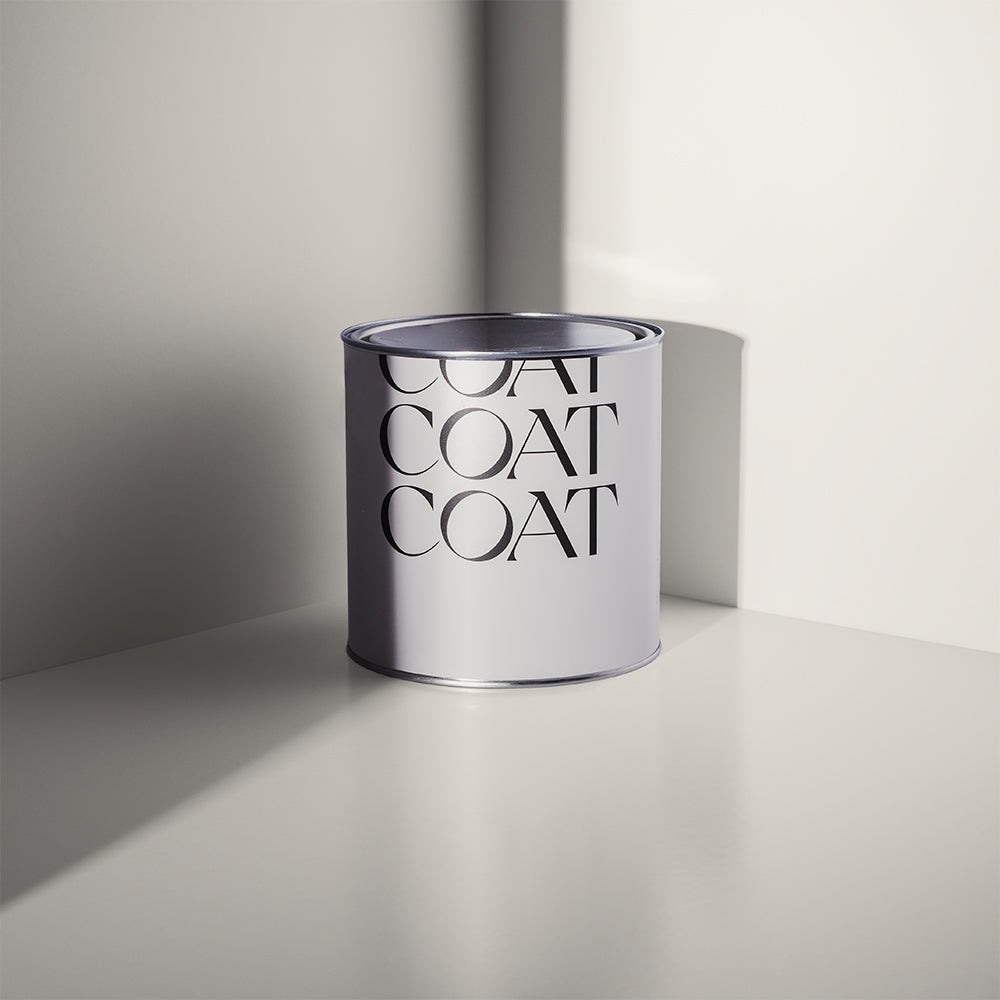
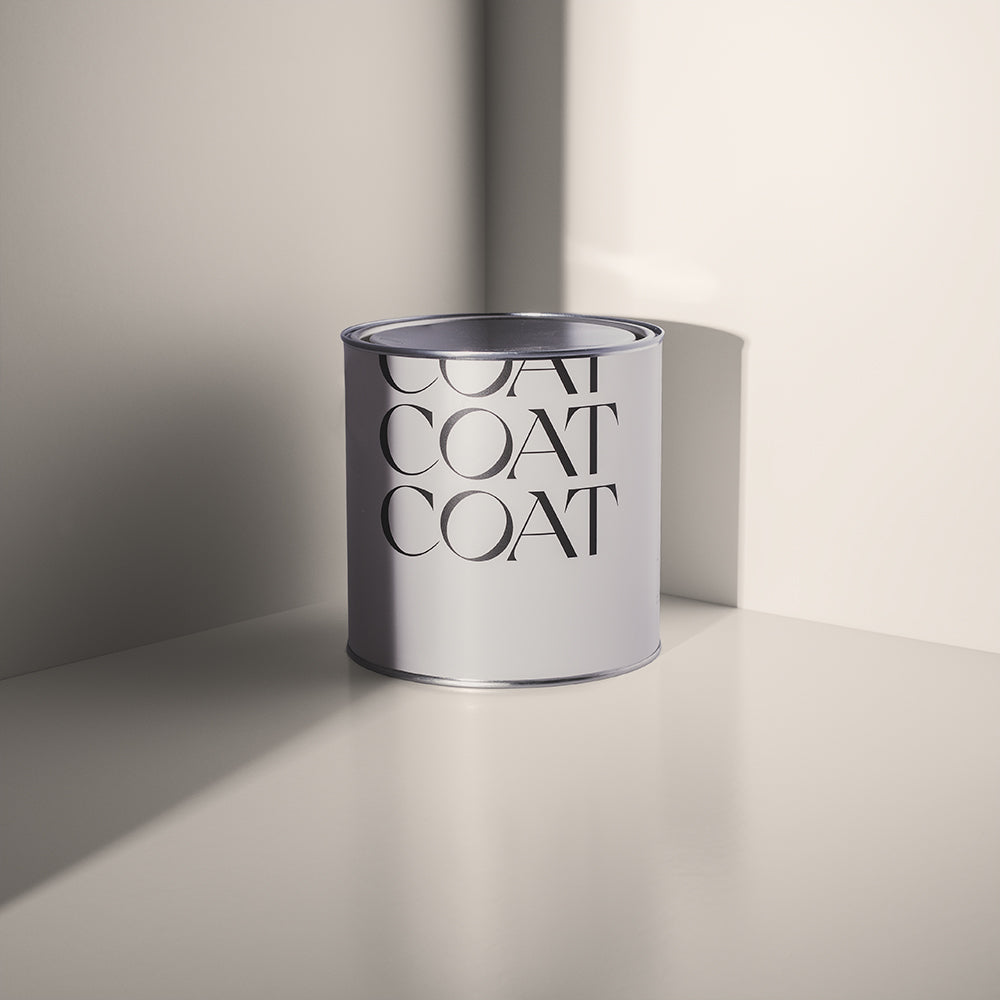
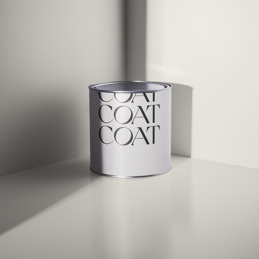
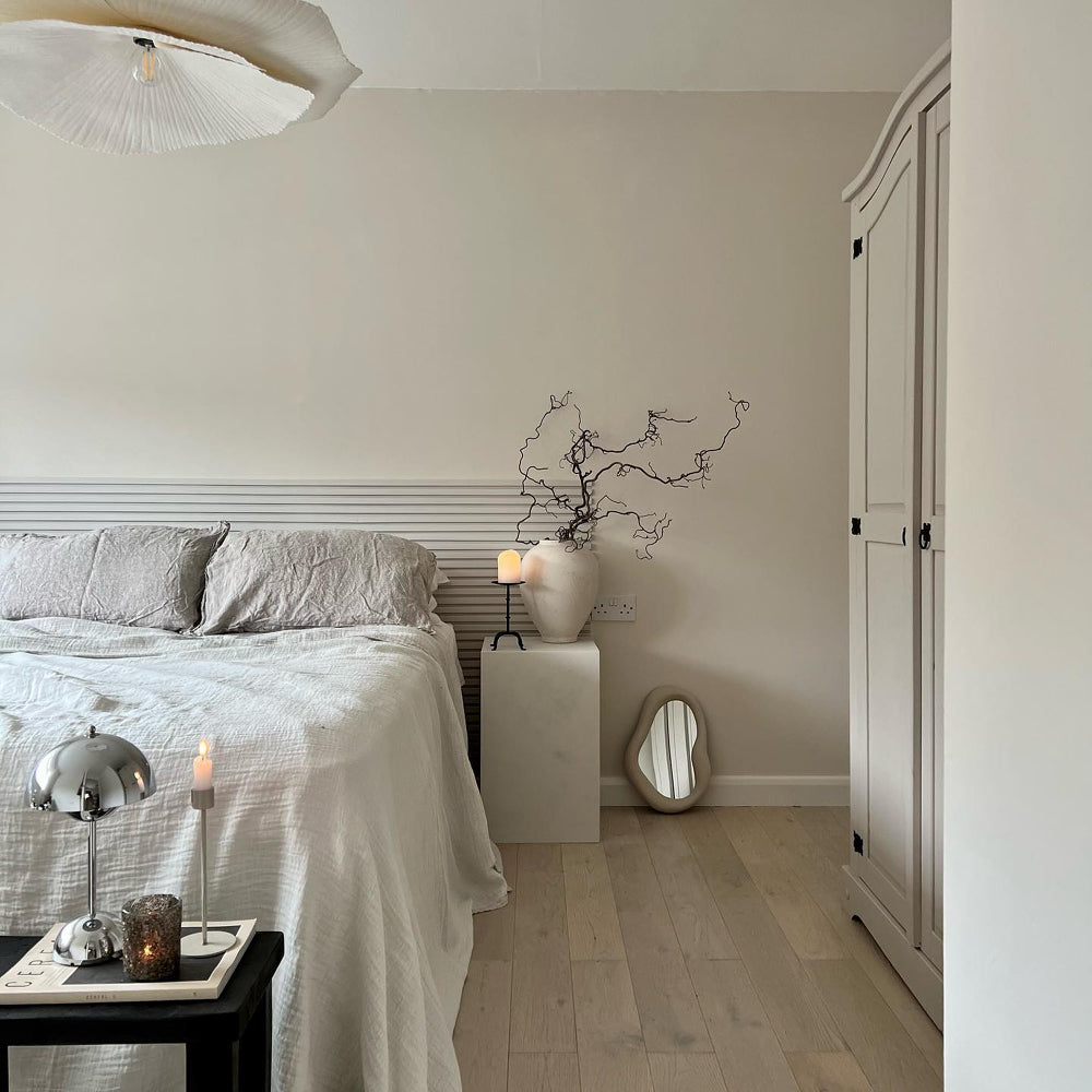
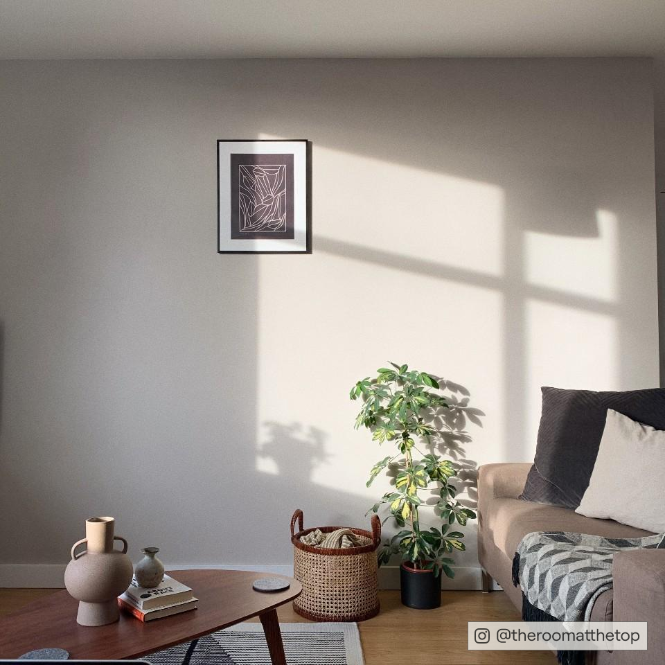
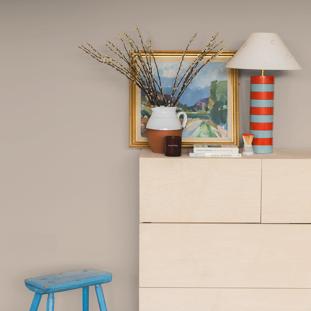
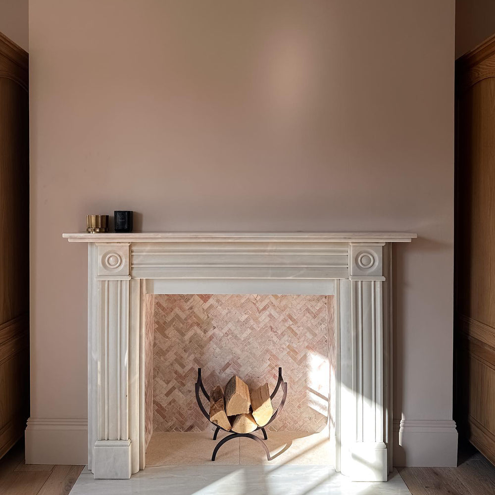
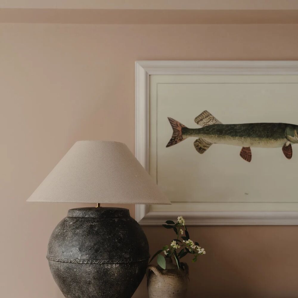
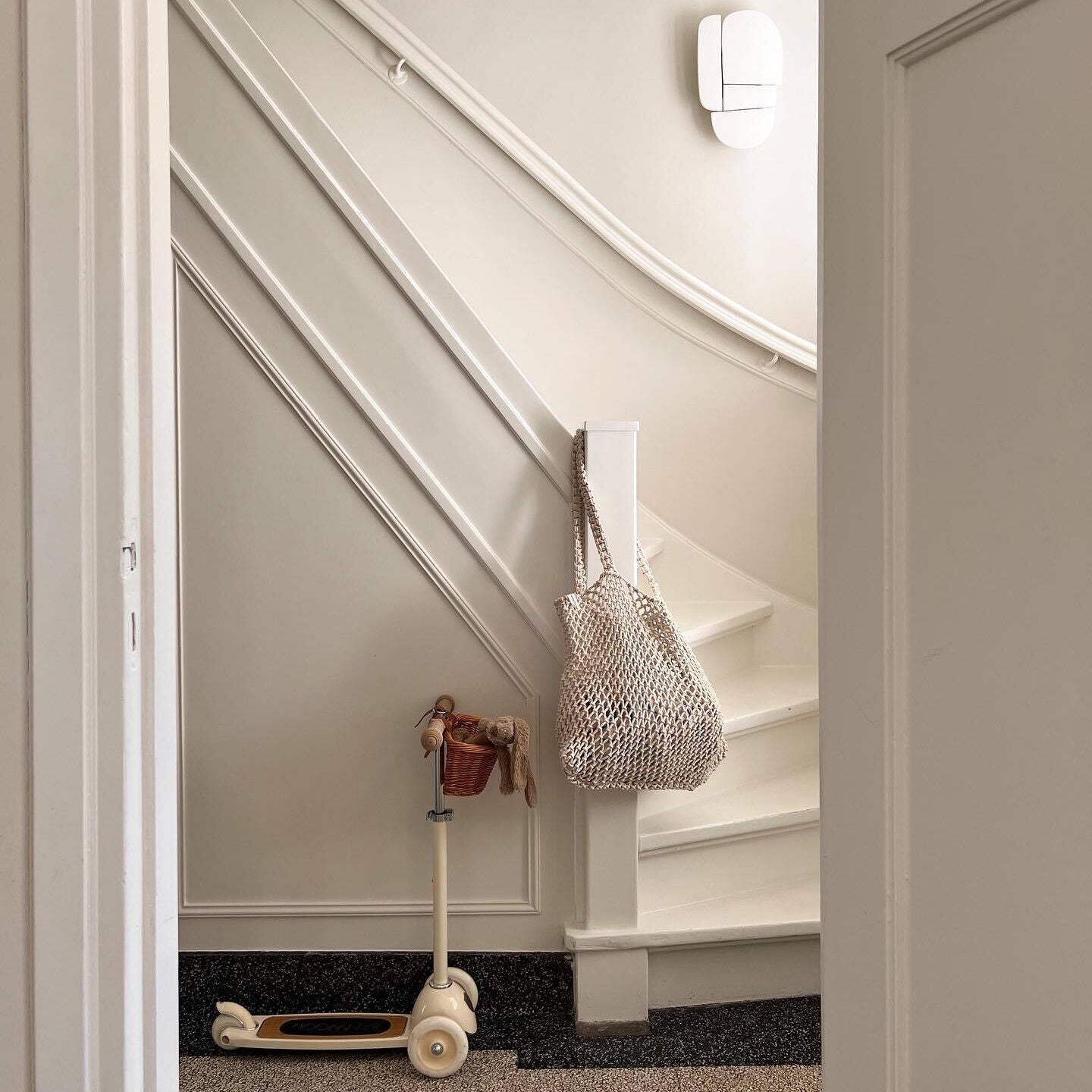
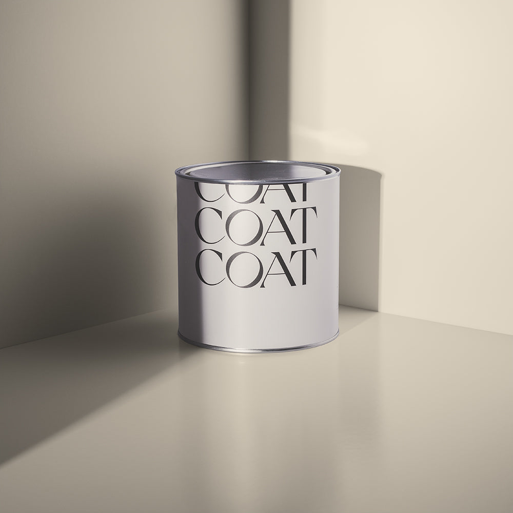
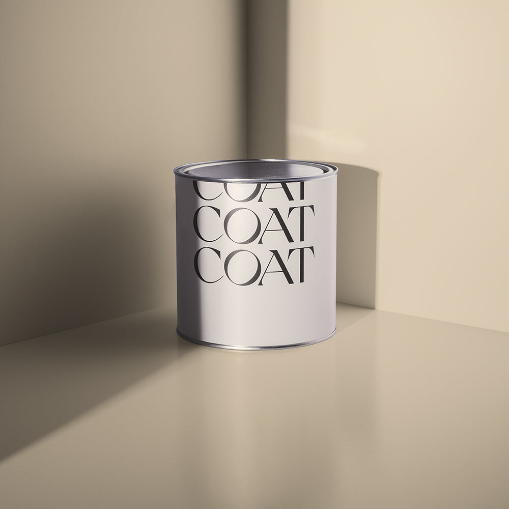
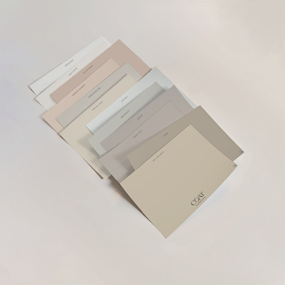
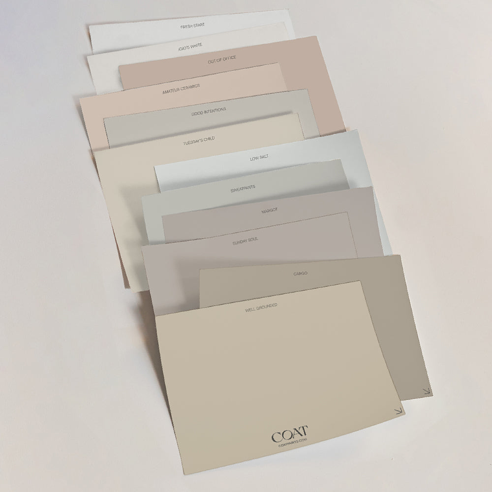
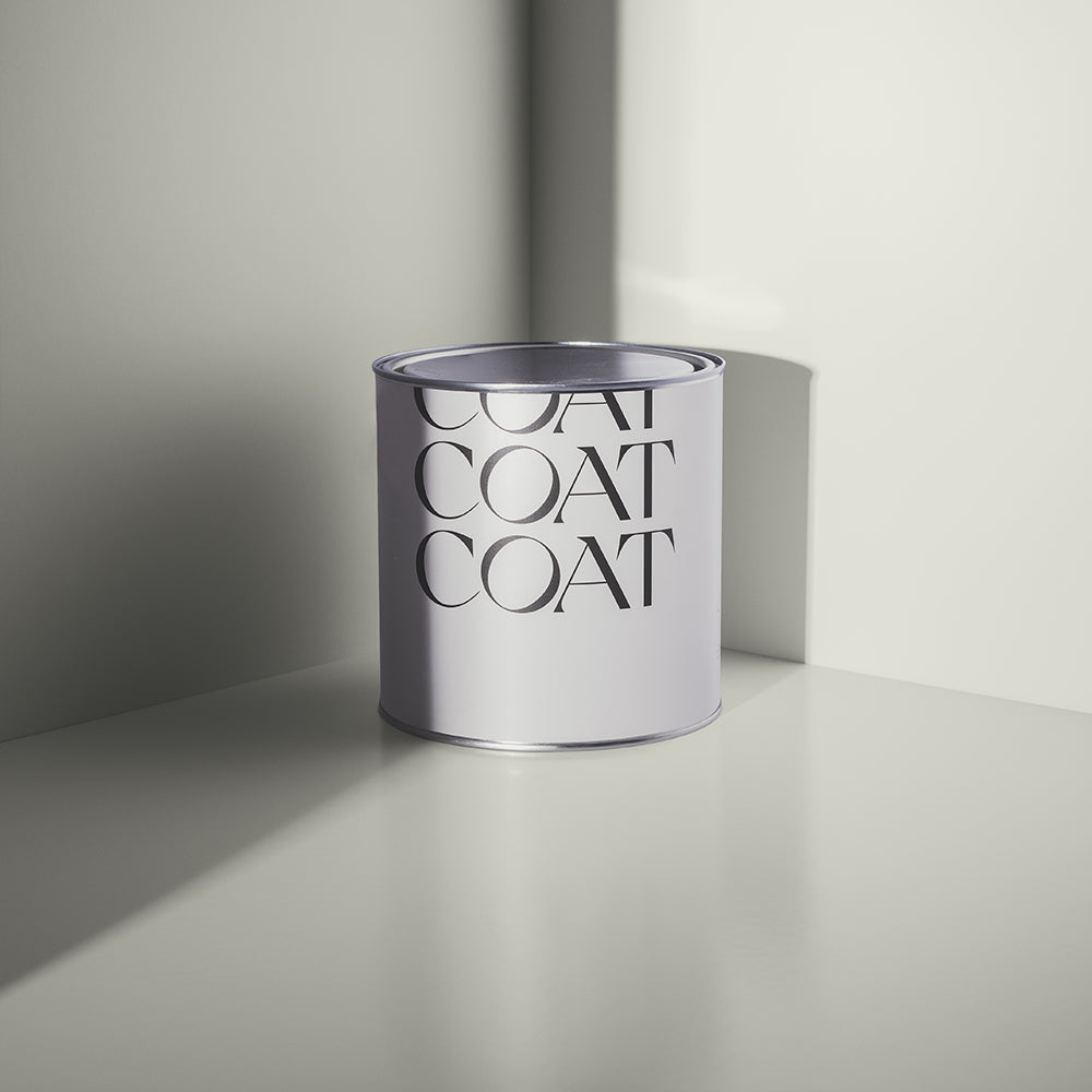
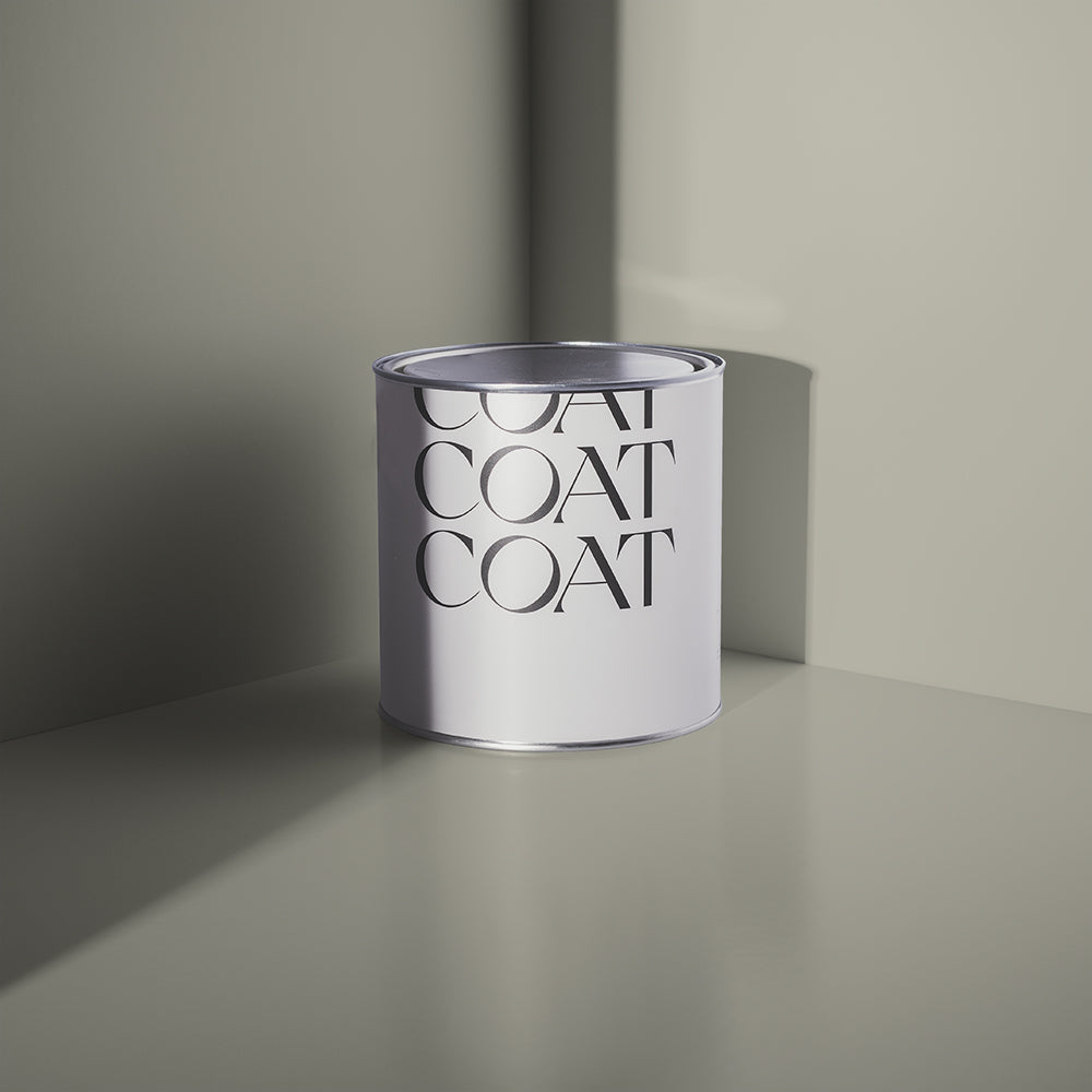
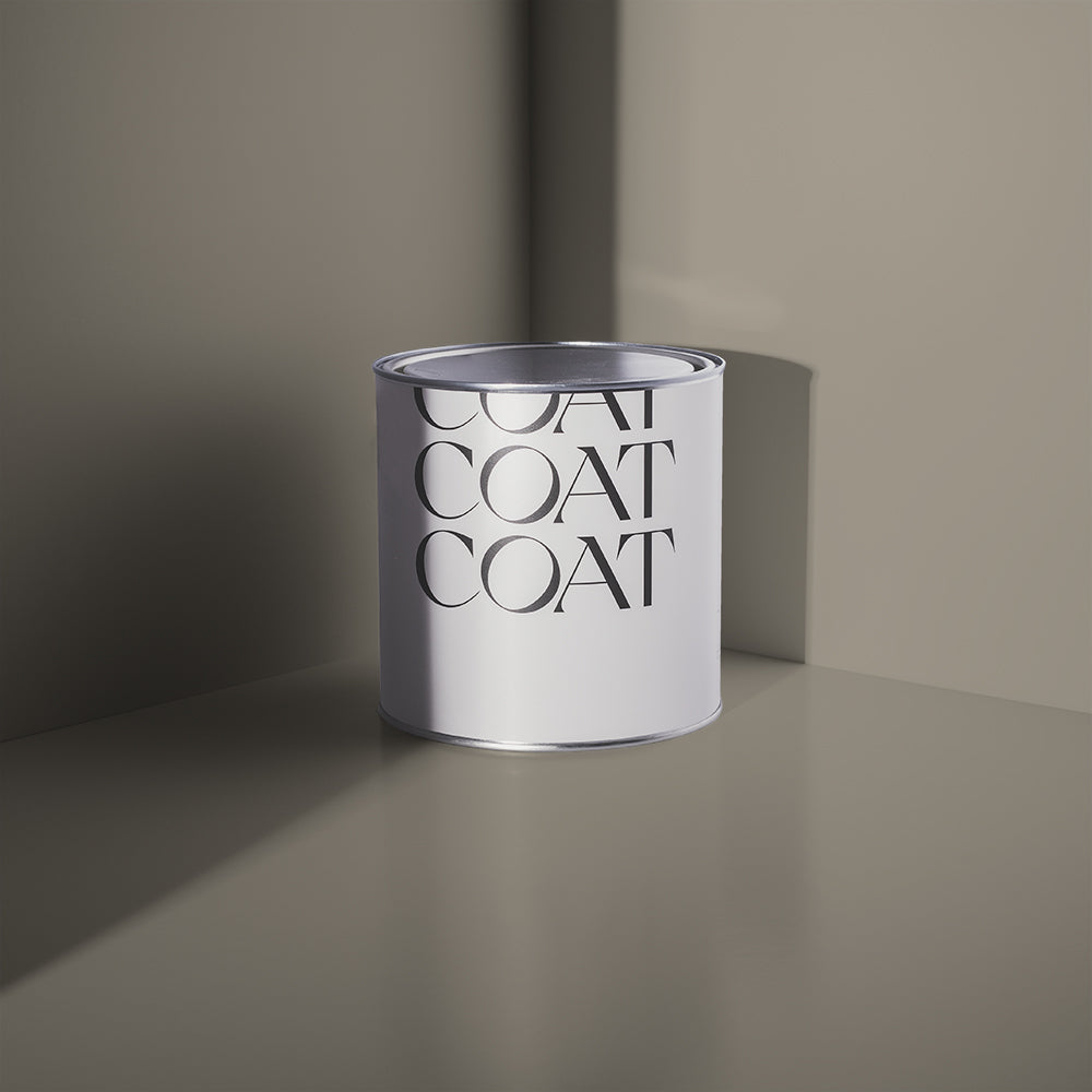
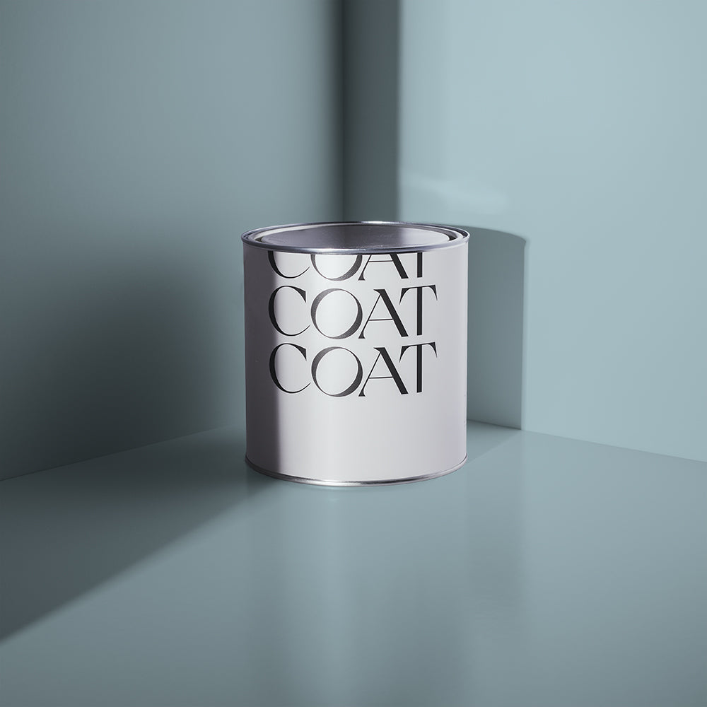
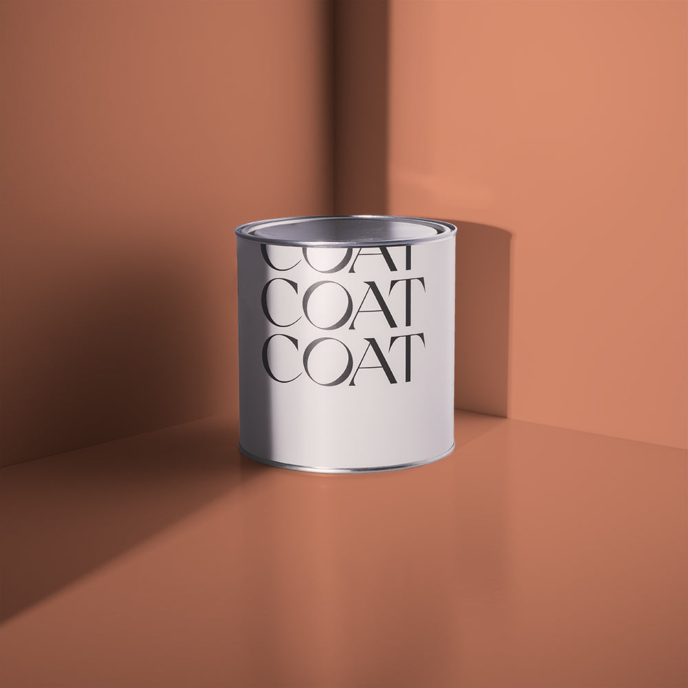
We’ve introduced Modest to our colour palette for 2023. A taupe off-white, with just a hint of greyness to it. This laid back colour is perfect for those that are looking for a softened white that has warmth and familiarity.

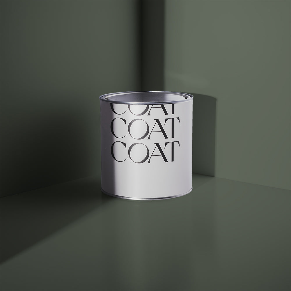
Modest, a taupe off-white, grab a sample to check it out ✌️
These grey colours make the perfect background for acidic greens, lavenders and bright yellows. Try using these as accent colours on cushions and art work on a more Modest backdrop. This helps your eye rest in between bursts of colour.
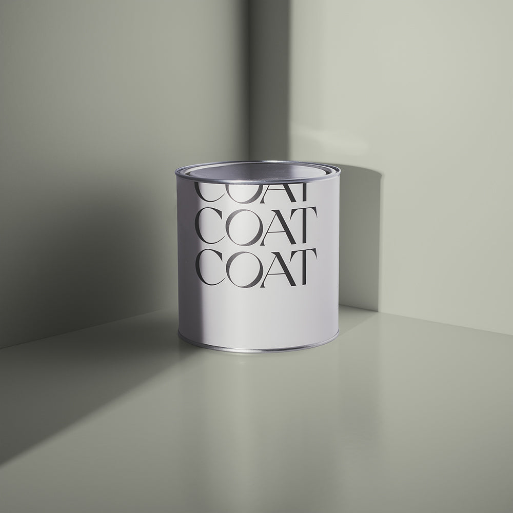
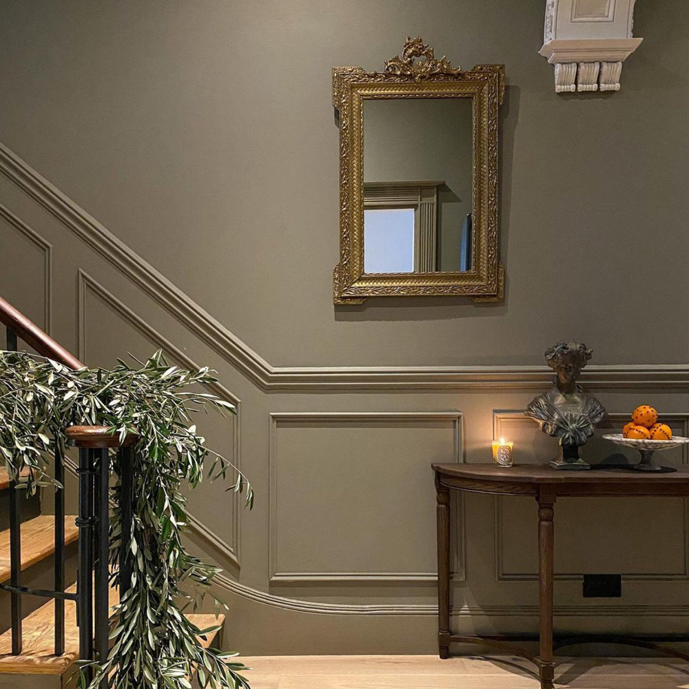
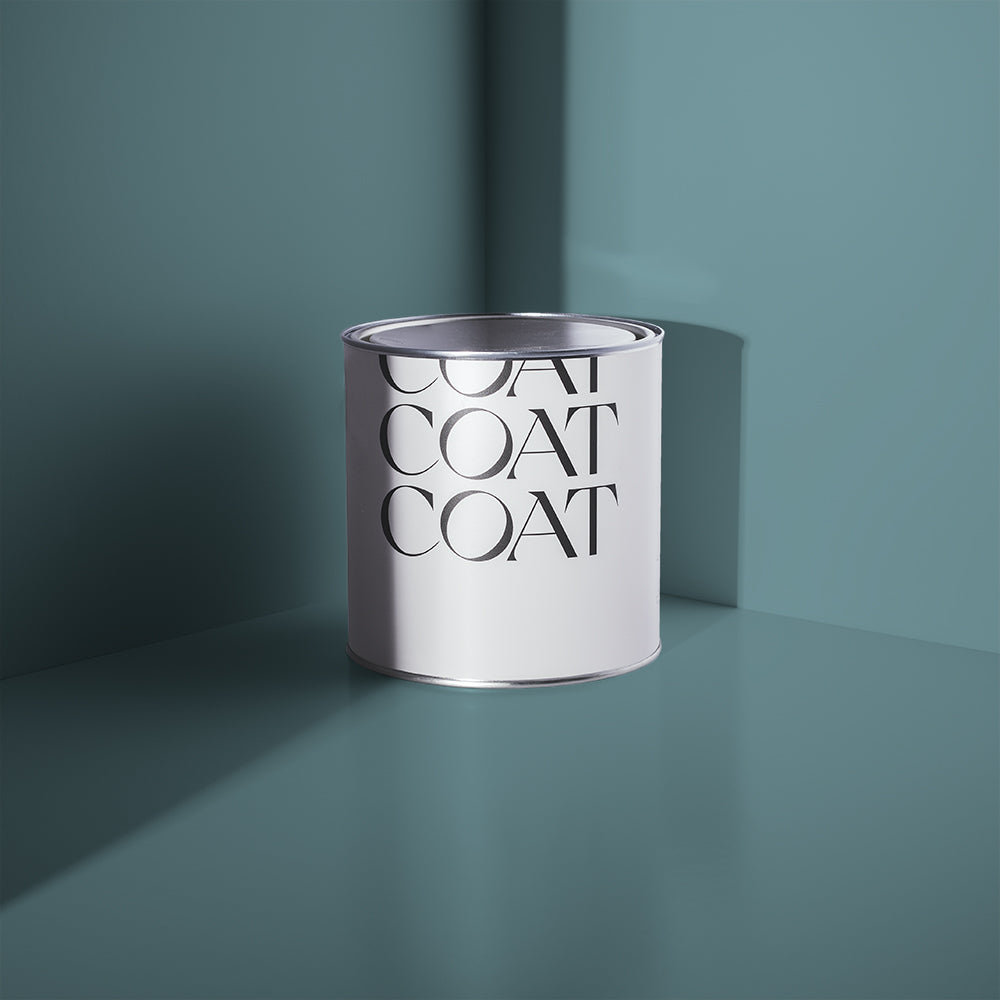
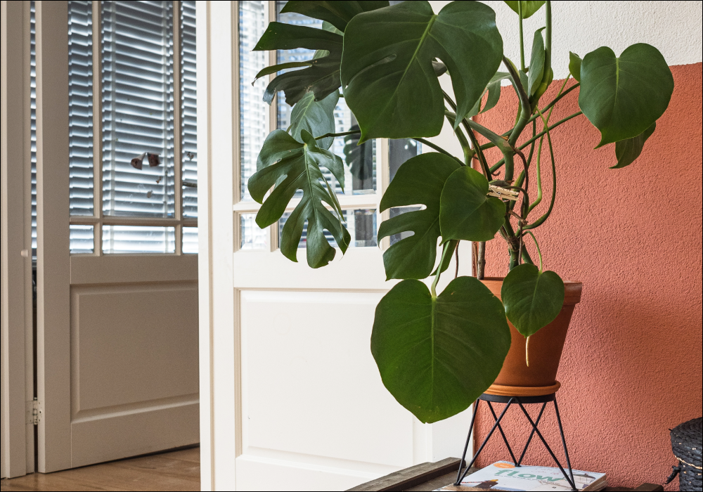
We’re seeing a small resurgence of more lavender and purple tones in the interior market. Going for a subtle combination of colours in this trend is a fantastic way of adding some colour that still feels relaxed. Paint walls and ceilings in Pablo, a natural putty tone that is just tinged with lilac. Pair with woodwork in our new grey lavender, Shampoo & Set. These colours both have grey undertones, which means they feel pretty chilled.

Take inspo from @be.you.bloom and paint your walls in Pablo
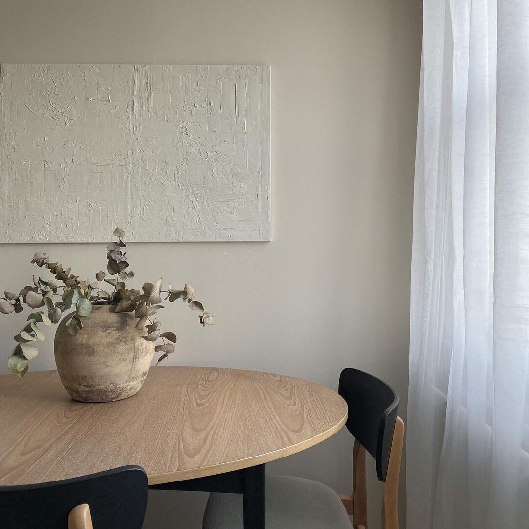
For those looking for a neutral off-white, try using Just, Barely. A greyed antique white that looks as though it’s been there forever. This colour effortlessly works in schemes with darker, more dramatic colours but also works on its own when combined with classic white woodwork. Its soft greyness makes it a great choice for any room facing, where it maintains warmth, but also won’t look yellow, red or pink.

Just, Barely is a great choice no matter what way your room faces, grab a sample and check it out for yourself
Greyed colours are the support players of many colour schemes, they’re easy to live with and neutralise acidic tones. They can be soothing when used in combination with each other and having a grey undertone in all the colours used across your home can also help promote a refined sense of flow.
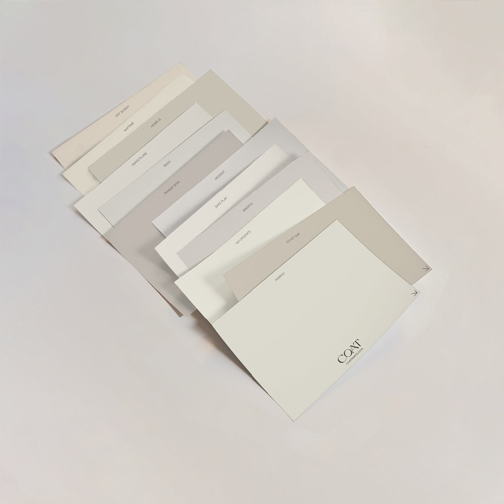
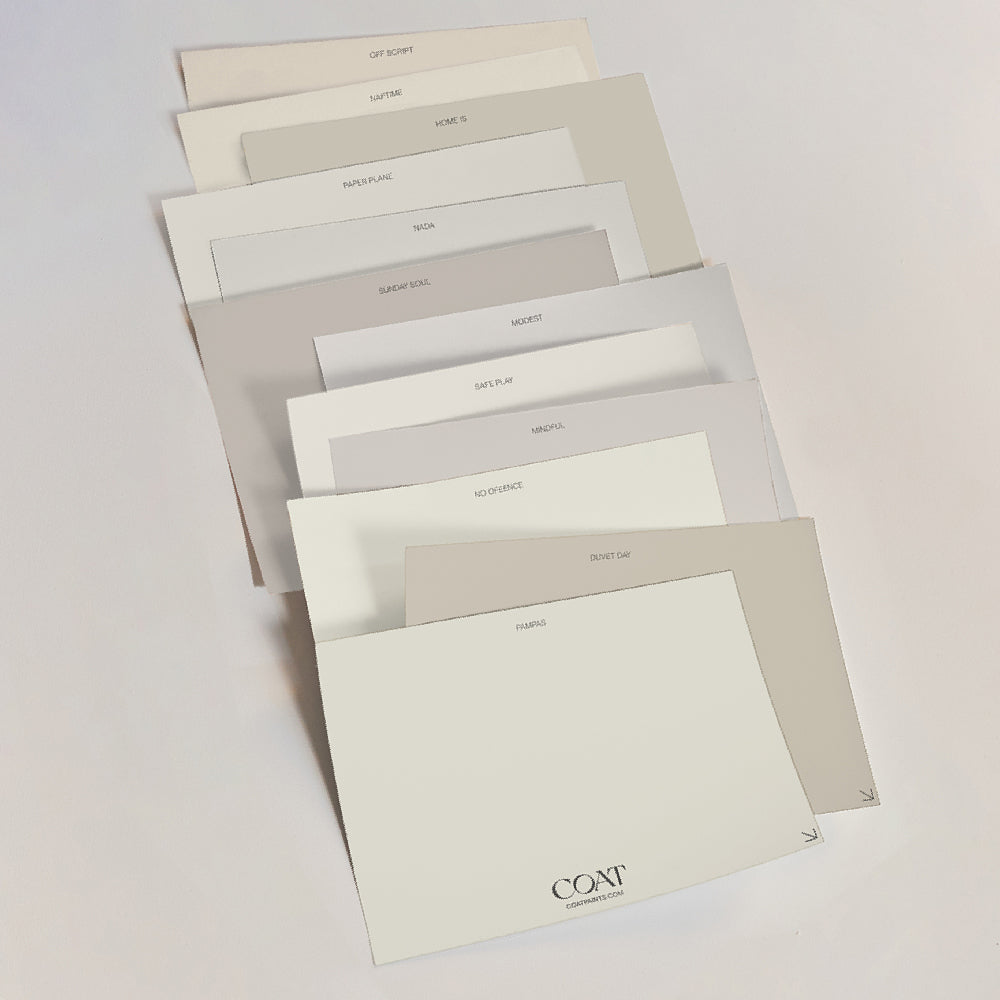
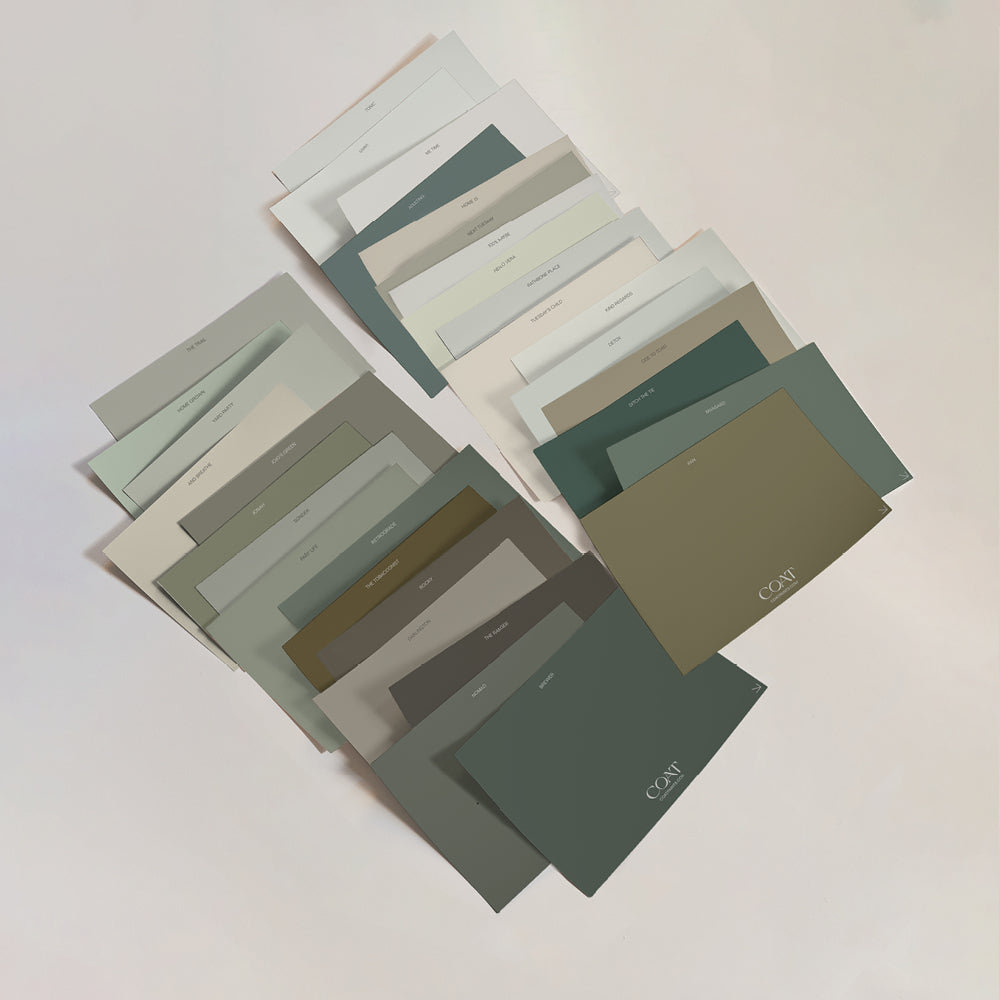
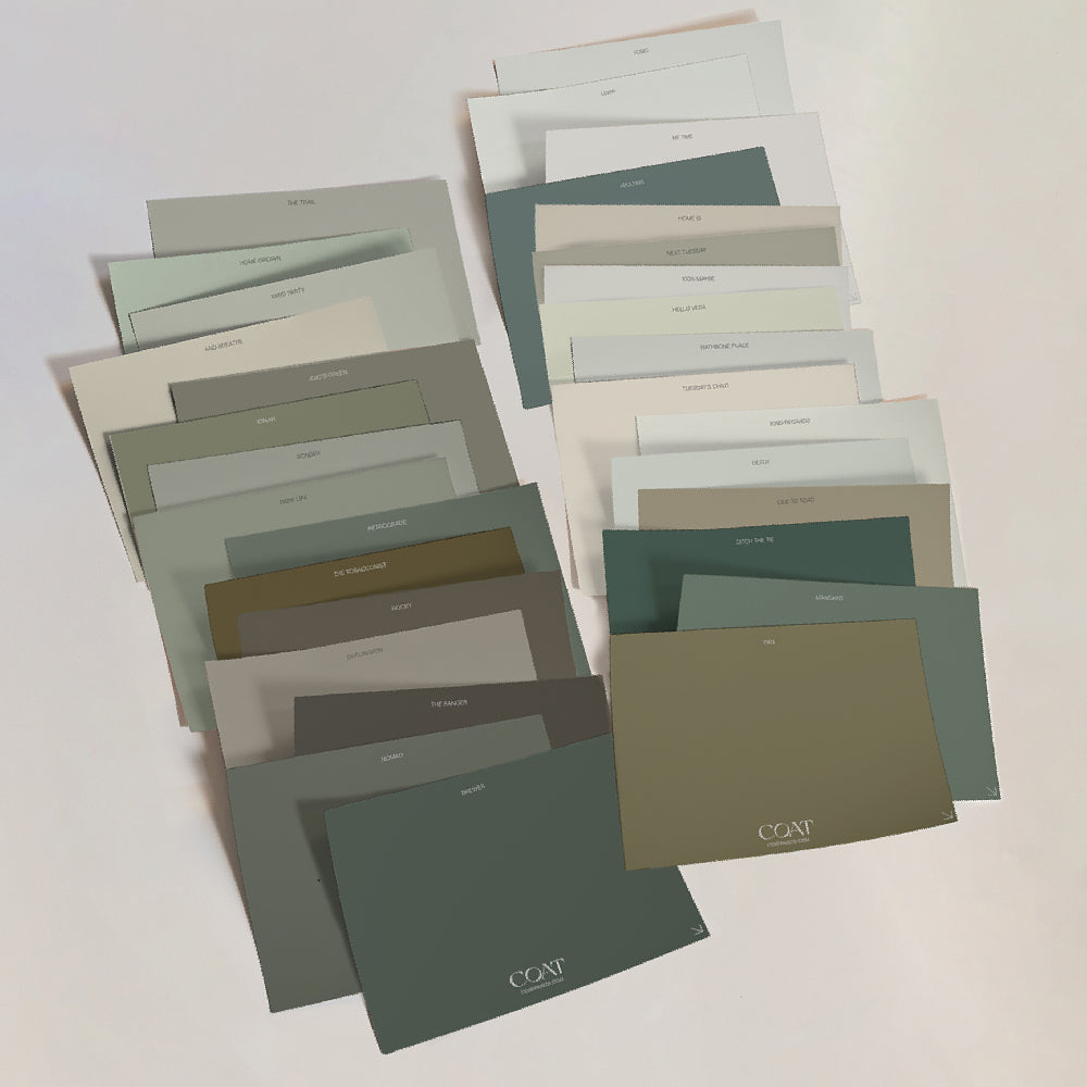
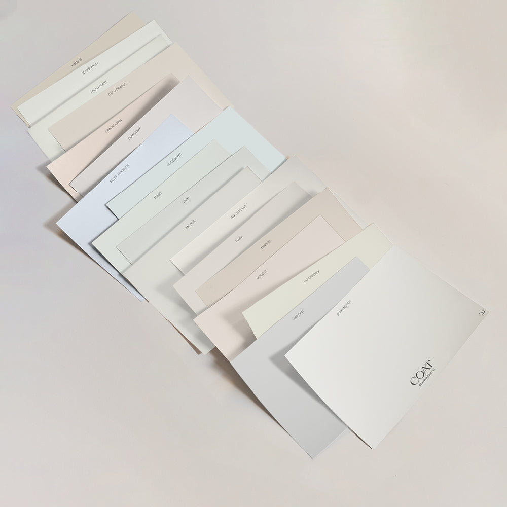
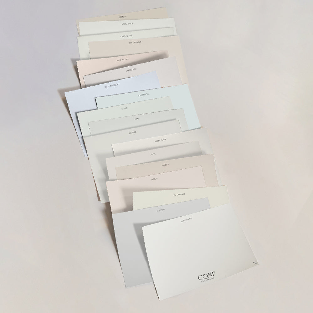
Order a grey sample pack, move them all around your room and pick your fav
Green Paint Trends
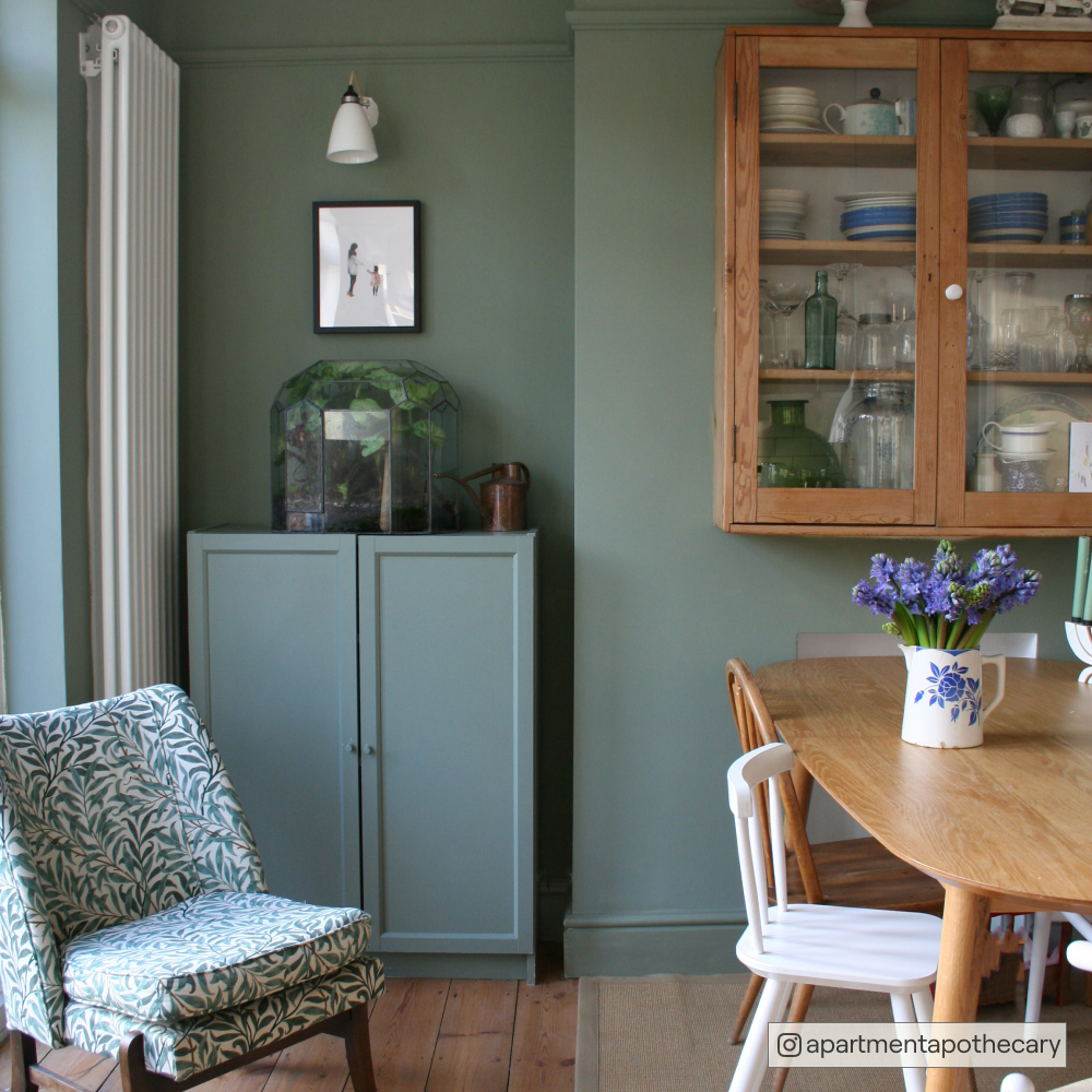
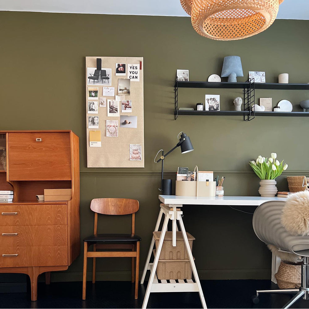
Natural, neutral and bringing the outdoors in, greens are harmonious with the world outside. This is a useful way to decorate spaces that face into gardens, or to liven up sombre city homes. COATing your walls and getting your fingers green is definitely the way to encourage a sense of serenity in your home.
Feeling inspired? Why not order a Light Green Sample Pack to check them out for yourself?
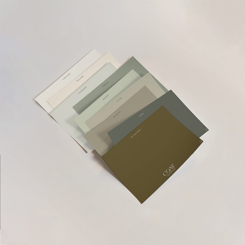
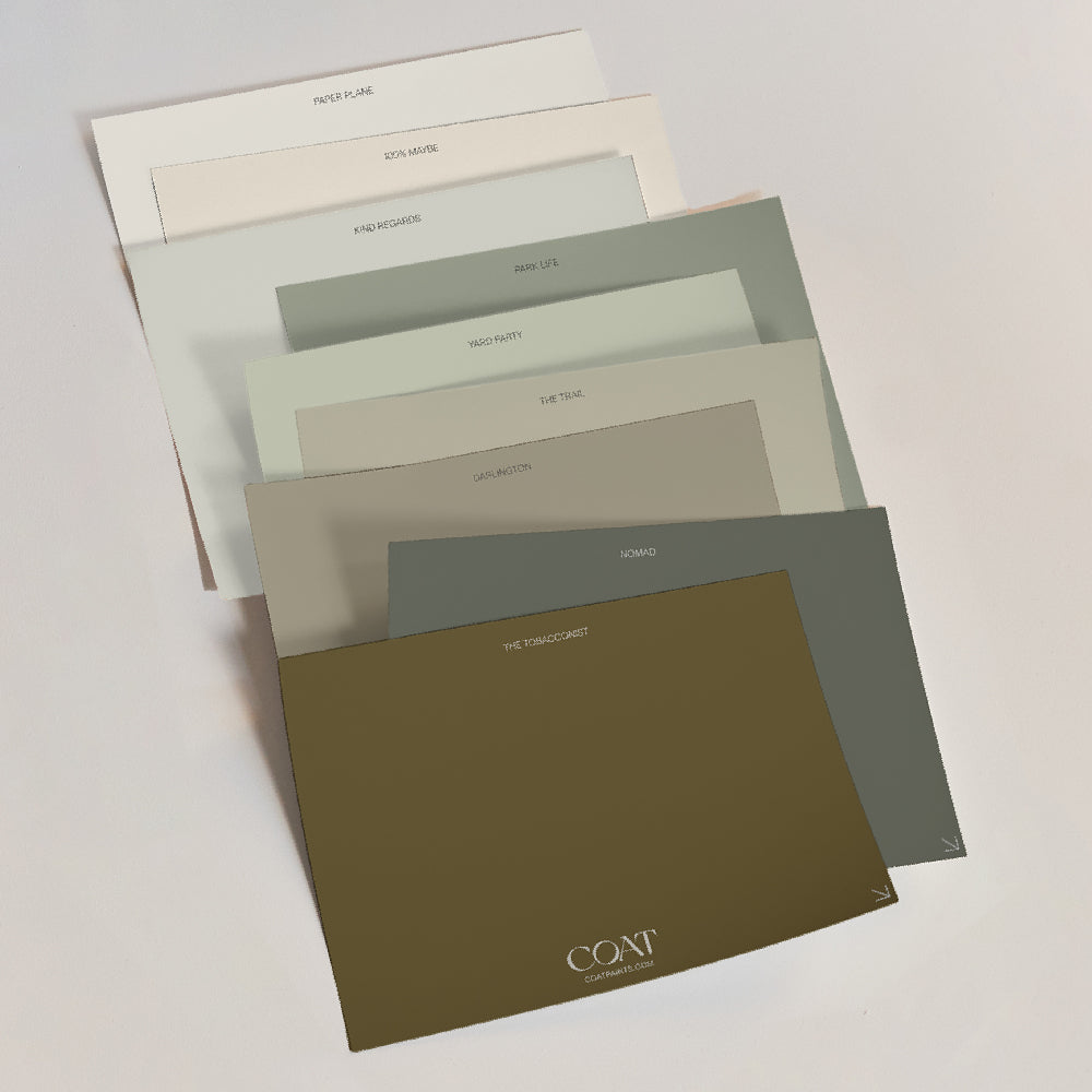
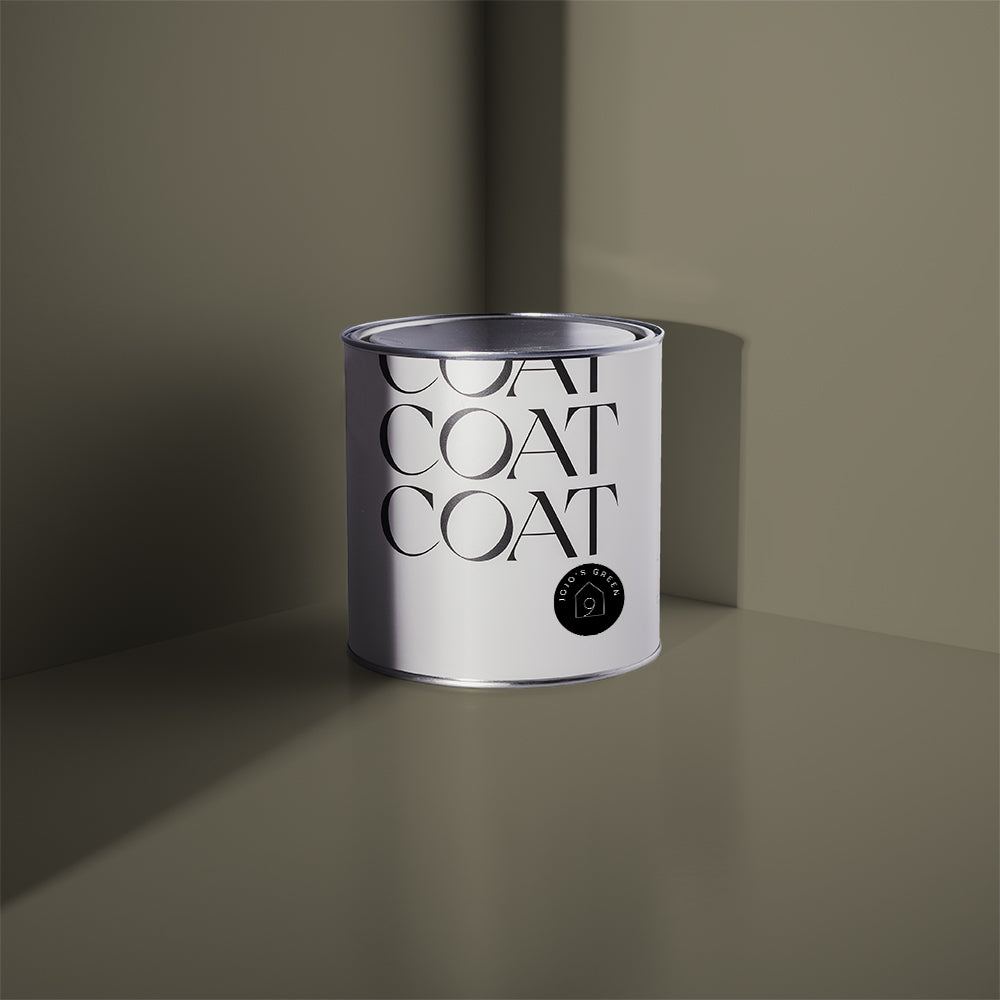
Green is here to stay for 2023, but is moving away from some of the more acrid, bold colours that we’ve seen in 2022. We’ve curated some greens to help you incorporate this shade in a more relaxed way this year. With greens and neutrals still being on top of why not get the best of both worlds. We’ve added a new green this year called Hello Vera. This pale beige green is reminiscent of the inside of an apple, and adds a bright freshness to interiors while maintaining a sense of warmth.

Hello Vera in, a pale beige green that provides warmth and brightness
Some interior colour trends 2023 are heading in a pretty vibrant, maximalist direction. We’ve decided to add a green to our palette that can only be described as green! East For Trees is a fantastic option for statement bookcases in more neutral schemes. It also pairs fantastically with Hello Vera as an option for woodwork. Alternatively, colour drench (paint all the surfaces the same colour) your room in this vibrant green to make a fantastical gallery space and add pattern and vibrant colours. It will then feel more laid back, where it offers a deep breath of freshness.
East For Trees Image
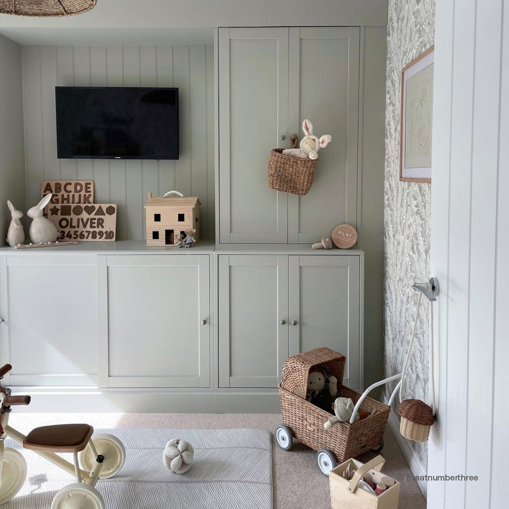
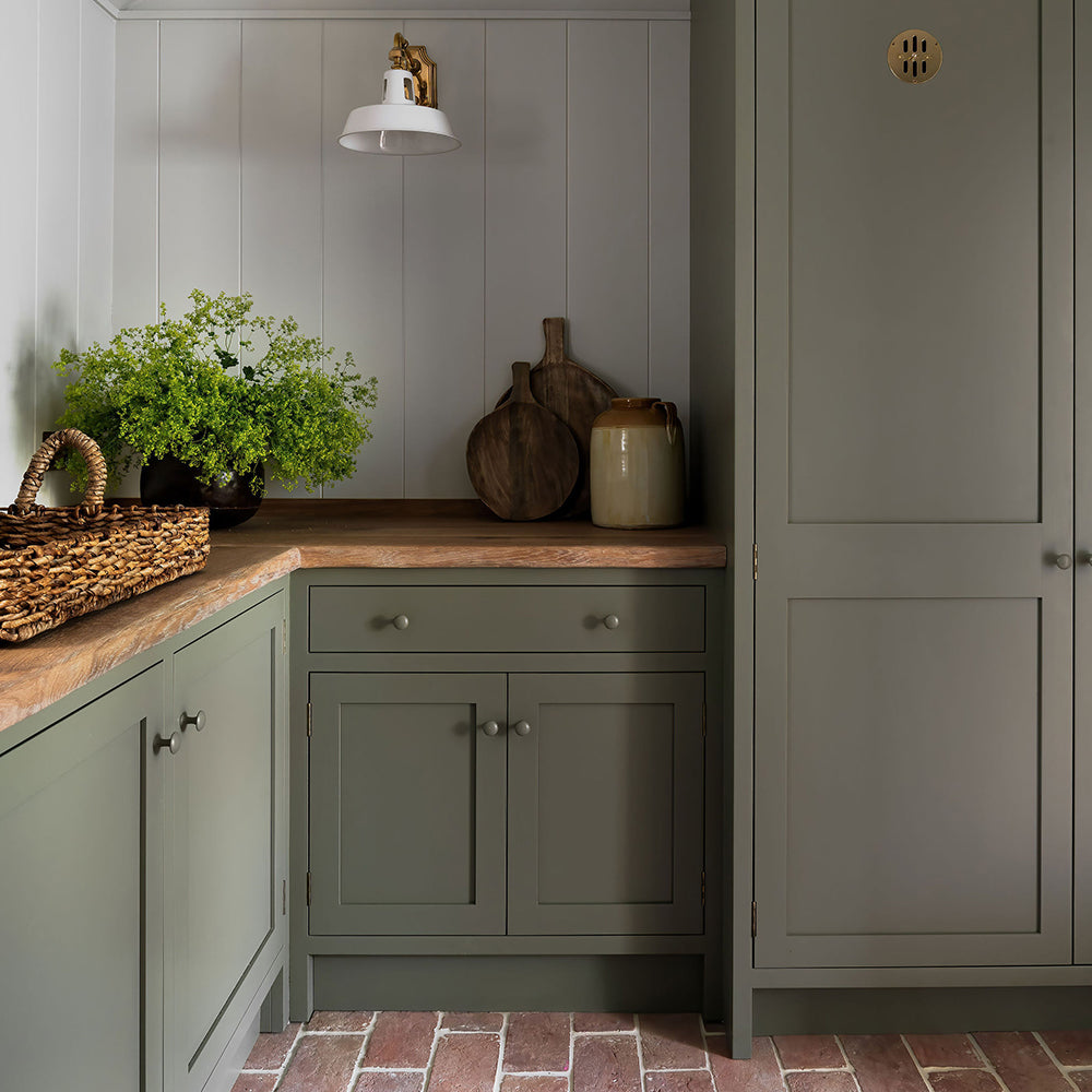
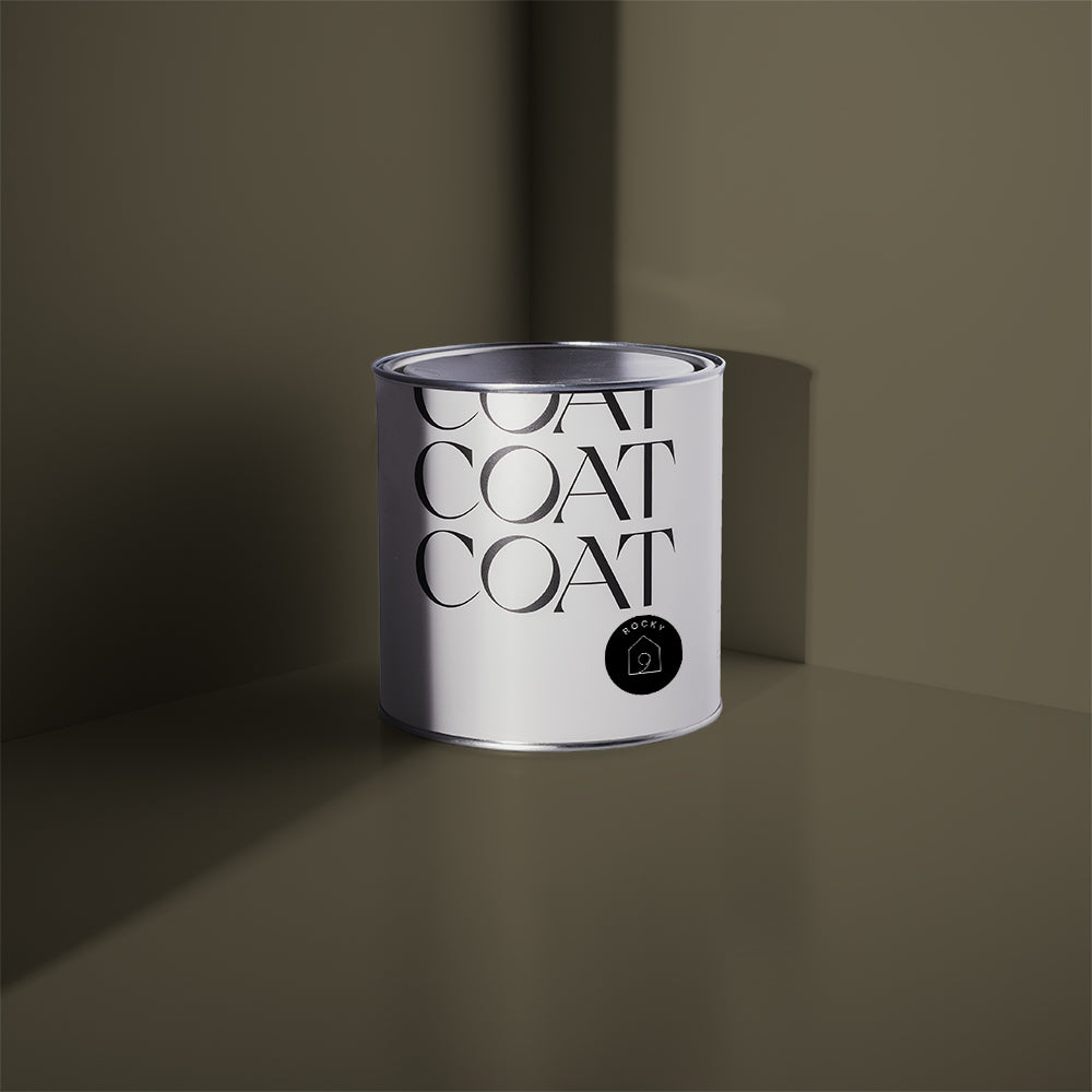
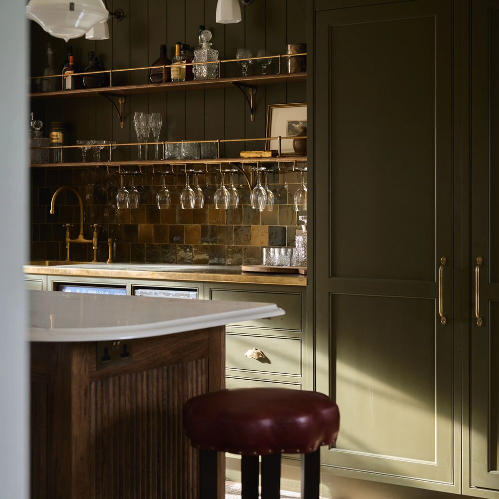
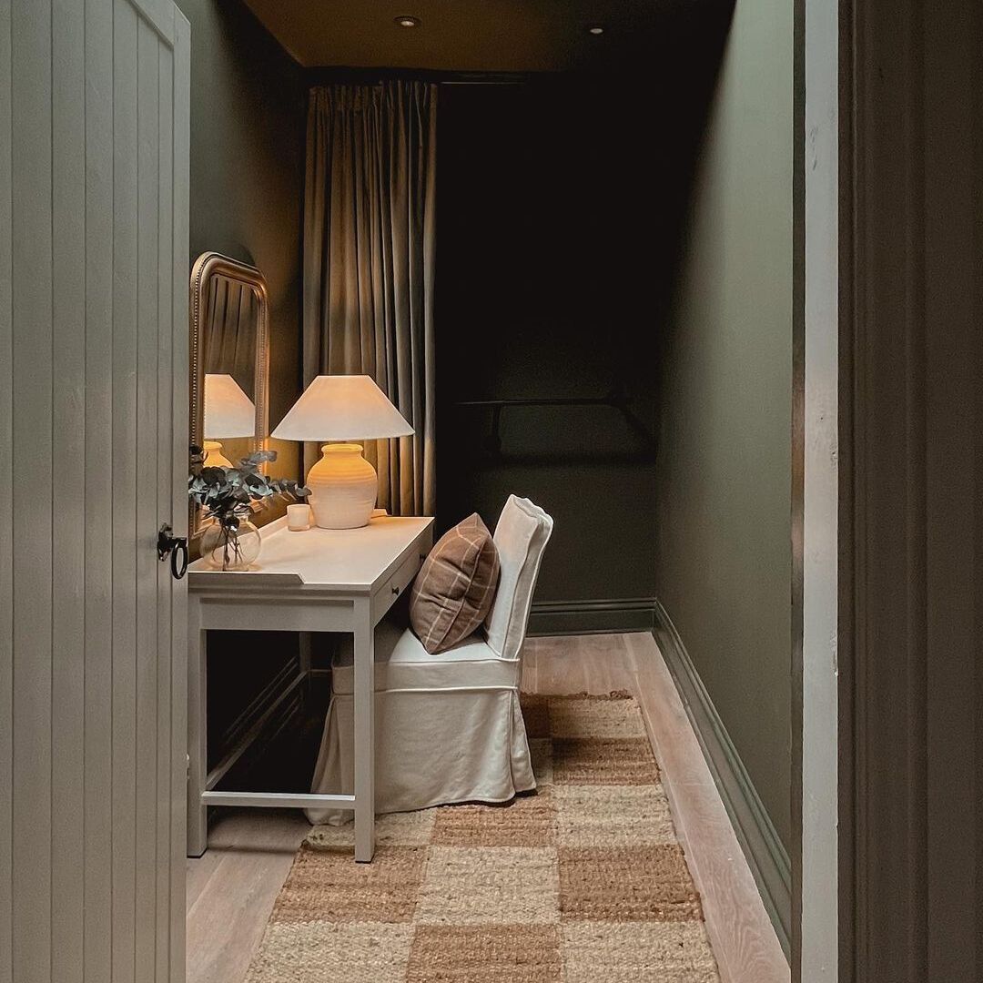
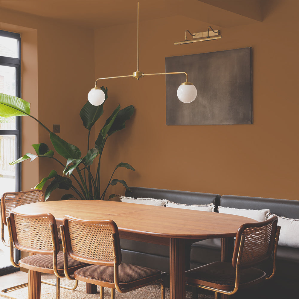
Dark emerald greens have been popular for quite a while for kitchen cabinets. We’re moving away from these jewel tones a little, but green is still a great option for the kitchen. Instead, try darker, grey greens like our 2023 addition to the palette, The Ranger. This colour is a dramatic green that when combined with soft, greeny off-whites like, 100% Maybe, makes a fantastic alternative to black, navy or jewel tone colours.

Neutral Paint Trends
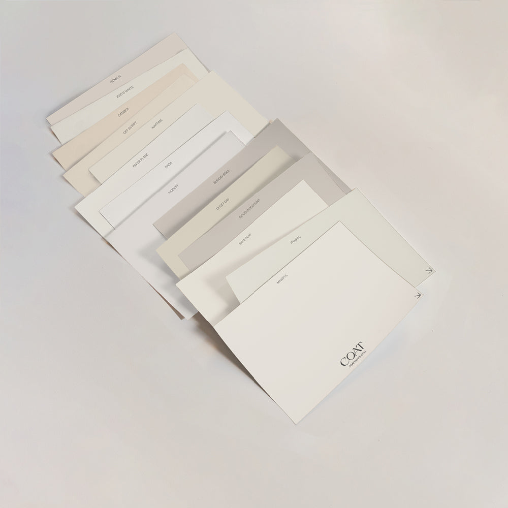
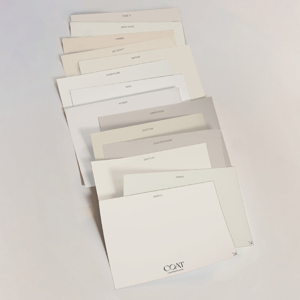
At COAT we’re known for our chilled, earthy neutrals such as Good Intentions, Sunday Soul and Duvet Day. They have warm undertones, which make the perfect backdrop for natural materials and textures for woods, linens and rich velvets.
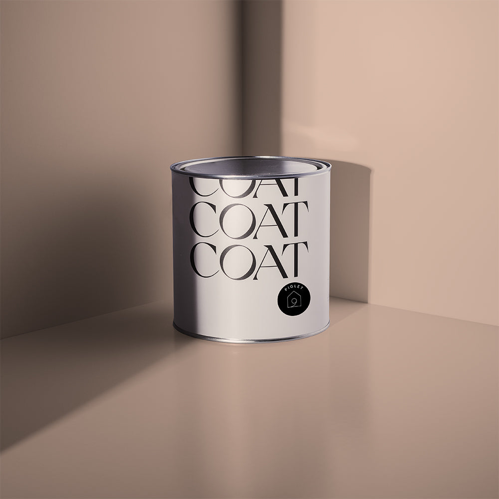
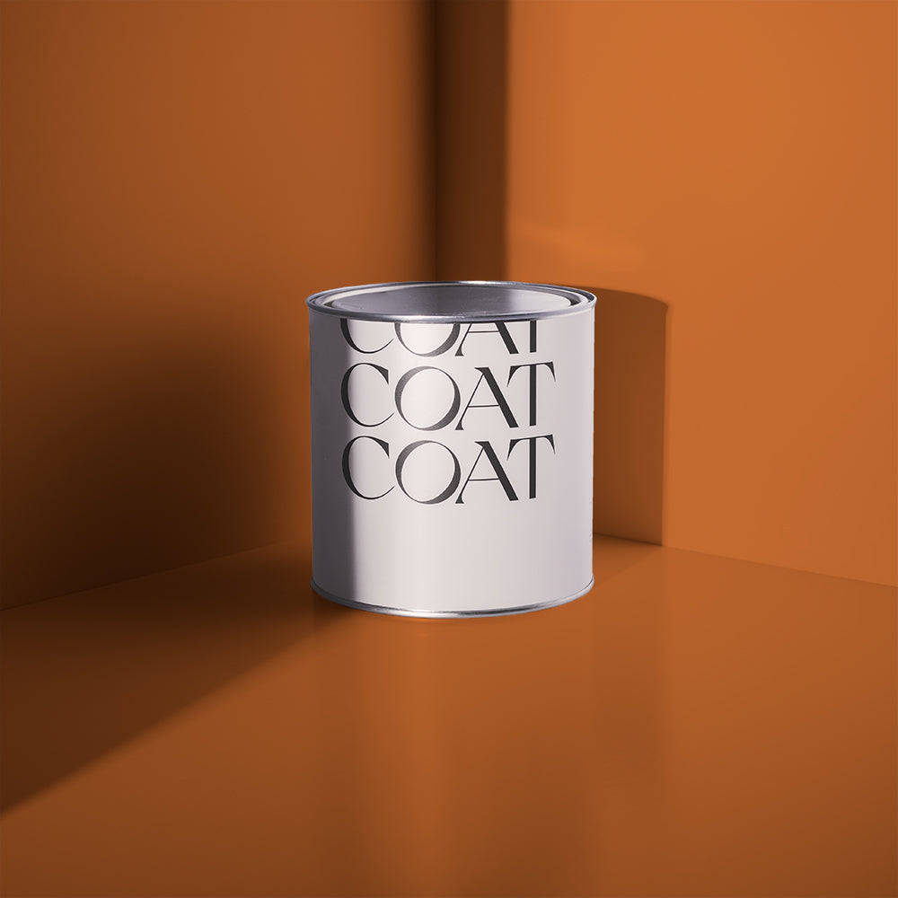
We’re introducing a new deep beige to our legendary neutral range, called Biscuits For Breakfast. Affectionately already named Bikkies around COAT HQ, “This deep beige has a grey undertone, making it effortlessly stylish and a great alternative to some of the more biscuity or yellow beiges that we know from 2022 trends” says COAT Colour Lead, Aaron Markwell. Pair with Duvet Day or Safe Play ceilings and woodwork for the ultimate in modern beige schemes.

Biscuits for Breakfast anyone? We see this new deep beige being a number one seller very soon...
Warm, yellow- pinky tones are still top of the 2023 colour trends because of their delicate and nurturing nature. The perfect backdrop for bright living rooms, bedrooms and bathrooms. Examples like Pudding create a welcoming vibe. It’s got the yellow and pink pigments to create a truly tasty neutral. It looks fab in south and west facing spaces, where the lighting is cooler in the mornings. Pair Pudding with a warm white like Pampas on the woodwork and ceilings and coral accessories for a squishy embrace.

Pudding is the perfect alternative to a white, providing a sense of warmth
For those looking for a neutral colour scheme that feels natural and easy, try hay-like tones like Moving Day. A deep beige with just a hint of green, that feels effortlessly aged and easy to live with. Combine with Pampas woodwork and ceiling for an easy off the shelf pairing that looks undeniably bespoke.
Blue Paint Trends
Blue is restful and relaxing, and has such a variety of shades and undertones which can really enrich your home. For air and light, paler blues are the way forward, and to ground spaces the use of a dark blue is extremely effective. Some greener undertones are great in blues for freshening up dark spaces, whereas a yellow undertone in a blue feels warmer and more inviting. The possibilities are endless, so let’s run through the most popular COAT blues and how they’ll work in 2023.
Sometimes we’re looking for a colour that has the cleanliness of a blue, but without committing to a full colour. Try Algorithm, a pale, cool grey. This has the chill vibes of a pale blue, without the baby blue connotations and makes an excellent partner for the ever popular monochromatic scheme. Try on the upper half of a wallway, when paired with charcoal blue, Dodie on the bottom.

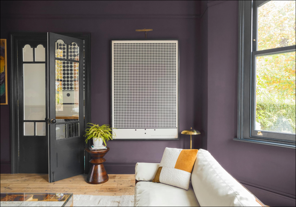
Purple tones are coming back into interiors in a rather large way, as we start to look more towards colourful interiors. If you’re not ready to go for deep purples, picking up on this regal look in a blue’s undertone is a great idea. 2AM is a dark royal blue, with a subtle purpleness to it. If this is too dark, you could also try All Inclusive, a less dark, but spectacularly saturated blue. Colour drench rooms in these colours and when you’re feeling a little bolder, paint an adjacent room in deep purple, Trinket.

Trinket, this deep purple will make any room pop, grab a sample to see it for yourself
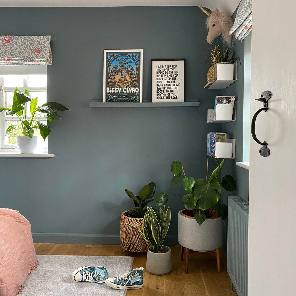
Sometimes you need a colour that isn’t blue or green or grey. It has to be all 3: enter Adulting. It pays its own way and finely balances three jobs: bringing botanical vibes, providing reliability and having a delicate, antique-like finish. It can do all these things because this most mature colour is a deep green blue with a grey undertone.

Using it in any space will certainly make you feel grown up, and picking it certainly takes out some of the stress of trying to pick between blues, greens and greys. Why make the choice so hard when you can choose all 3…that’s some proper adulting (see where we went there?).
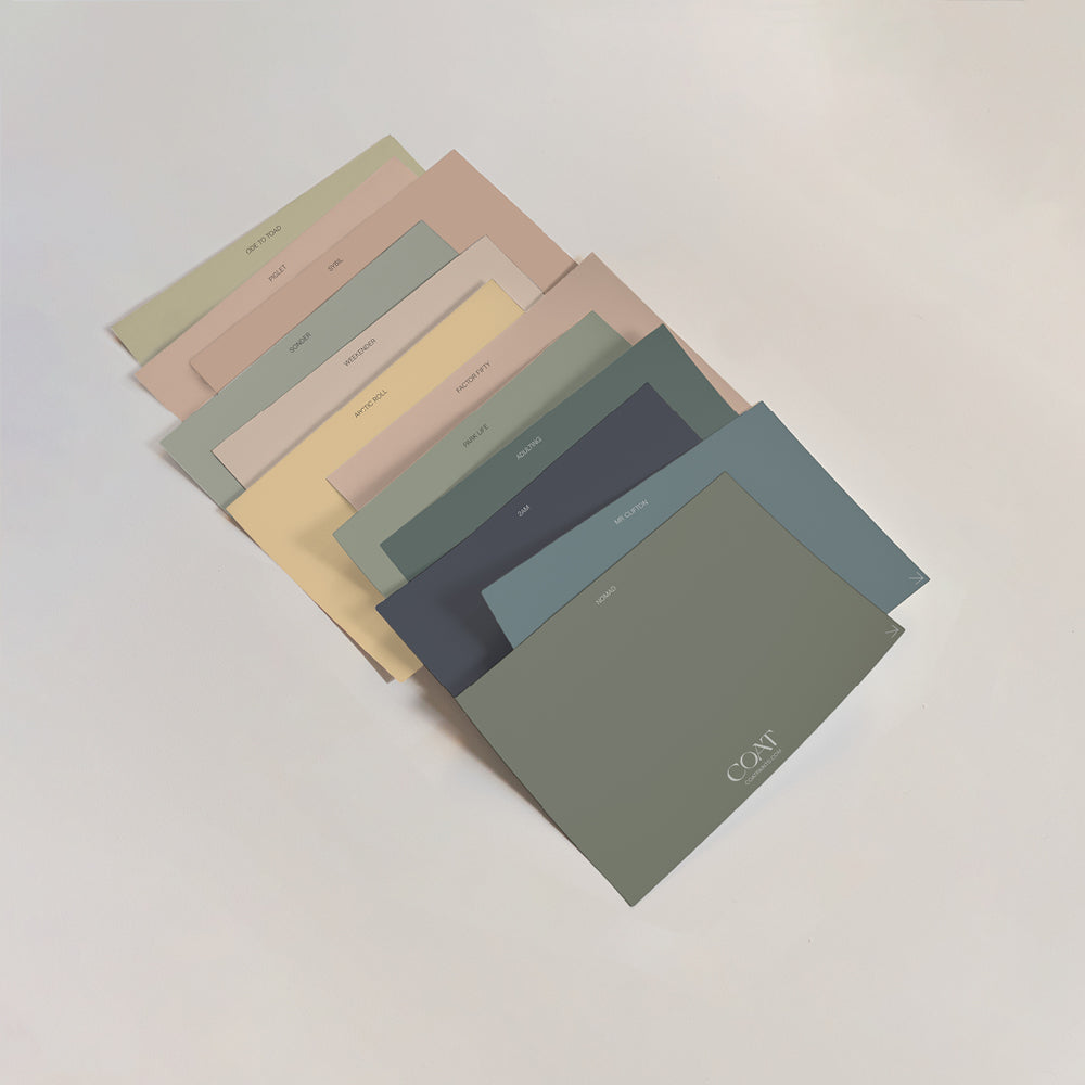
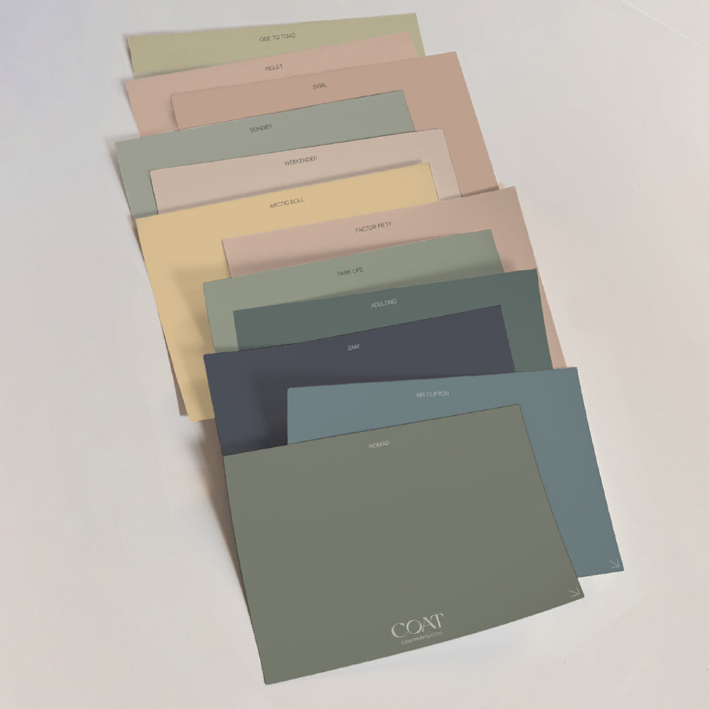
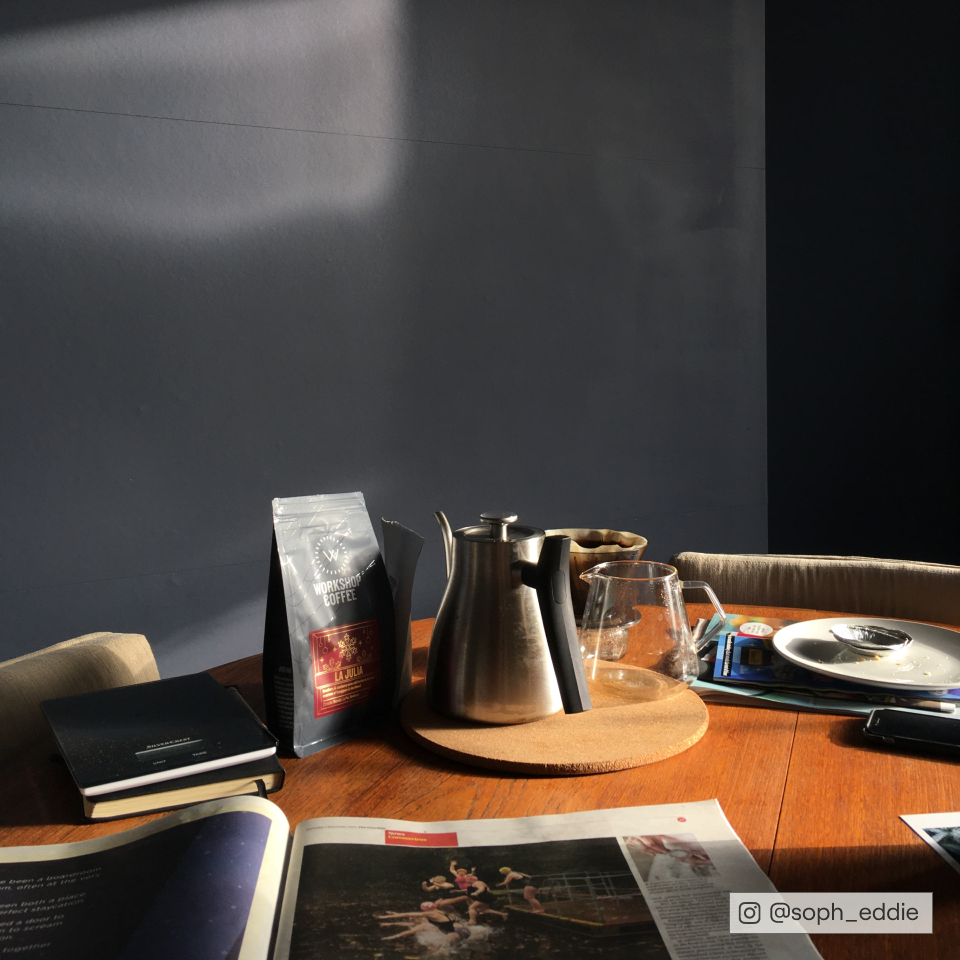
You don't have to take our word for you...grab your samples and let us know which are your number ones.
Publish Date
Author