2025 Paint Colour Trends That Will Actually Last
Expert advice from Ben The Hoose Interiors
Let’s talk colour. Specifically, the ones that are hitting interiors hard in 2025 — and doing it with longevity in mind. Because no one wants to repaint their living room six months after jumping on a trend train.
We asked interiors pro Abigail Fleming from Ben The Hoose Interiors to share her insight into what colours people are reaching for this year, and more importantly, why they work so well in real homes. The takeaway? A vibe shift is happening — and it’s one we’re completely here for.
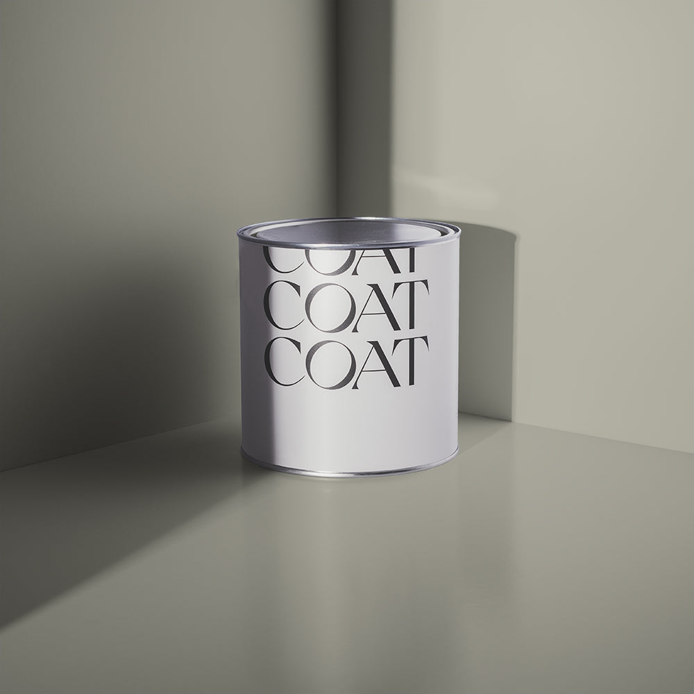
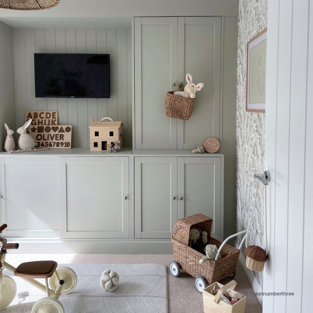
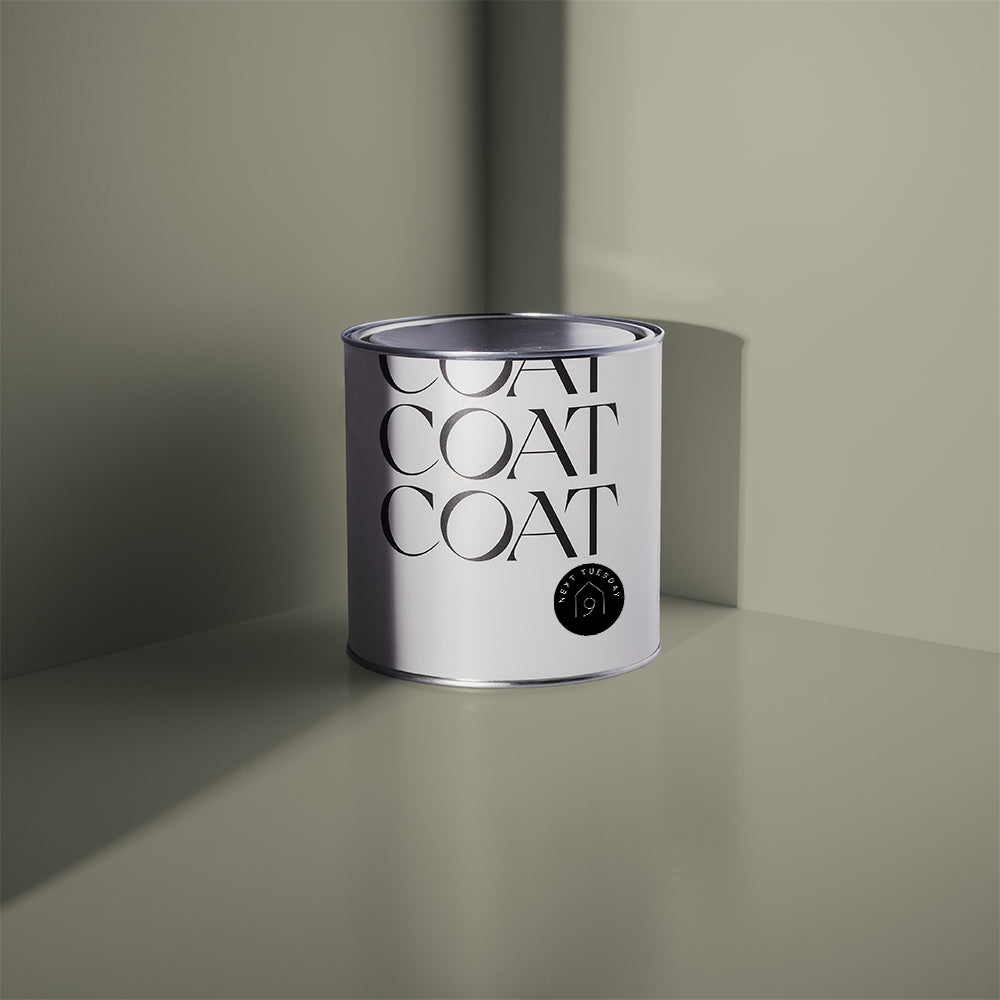
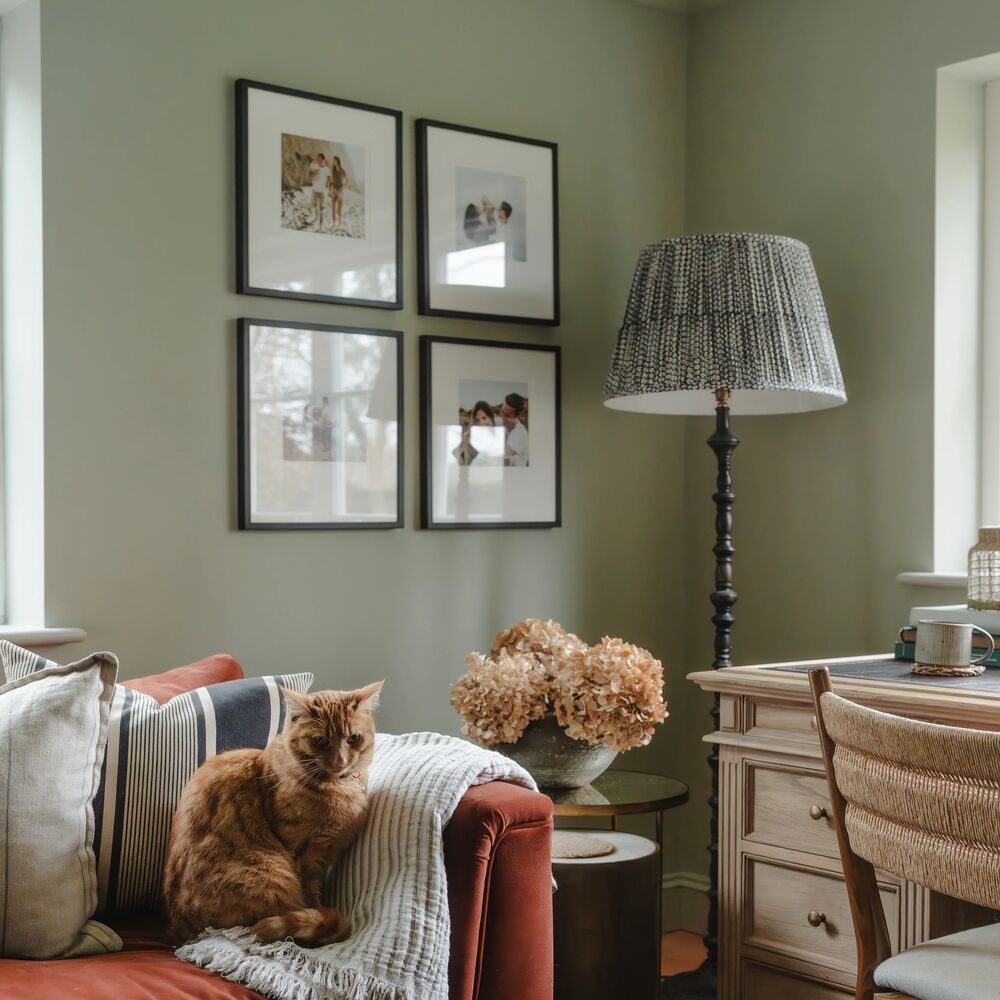
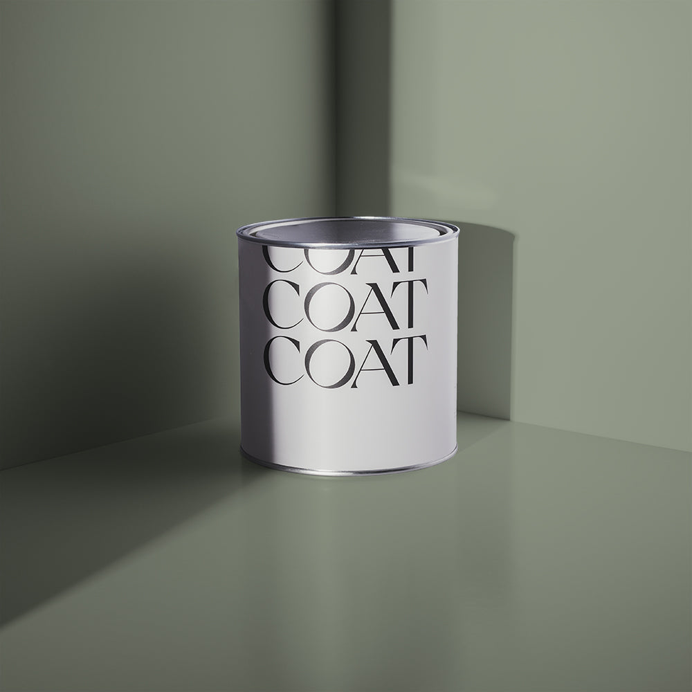
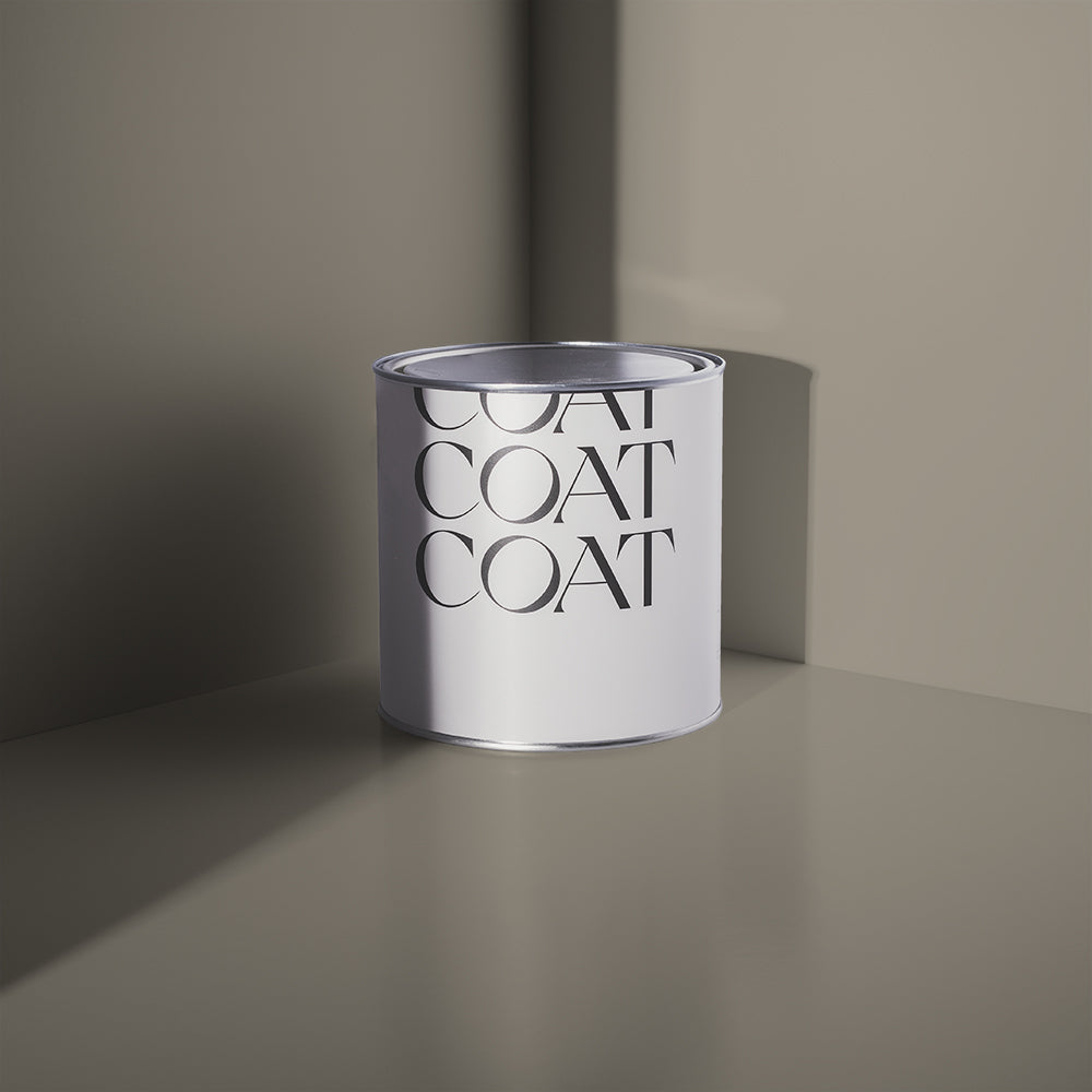
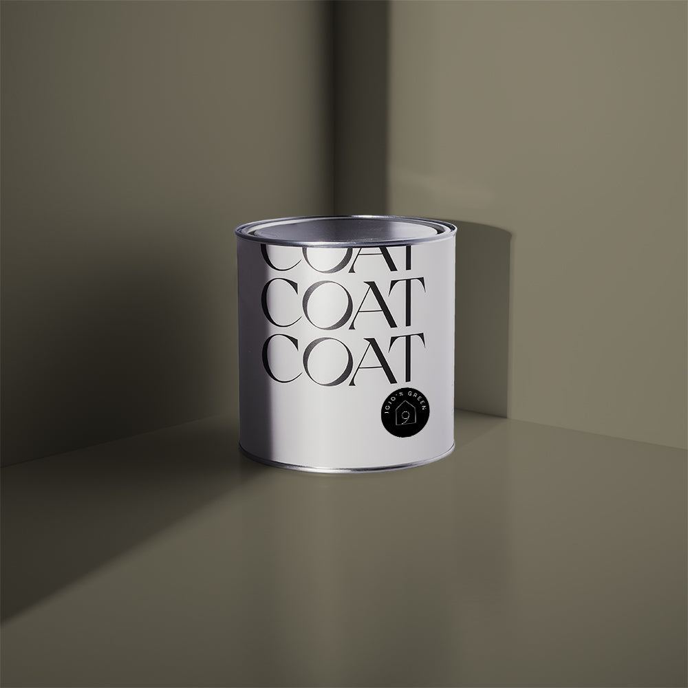
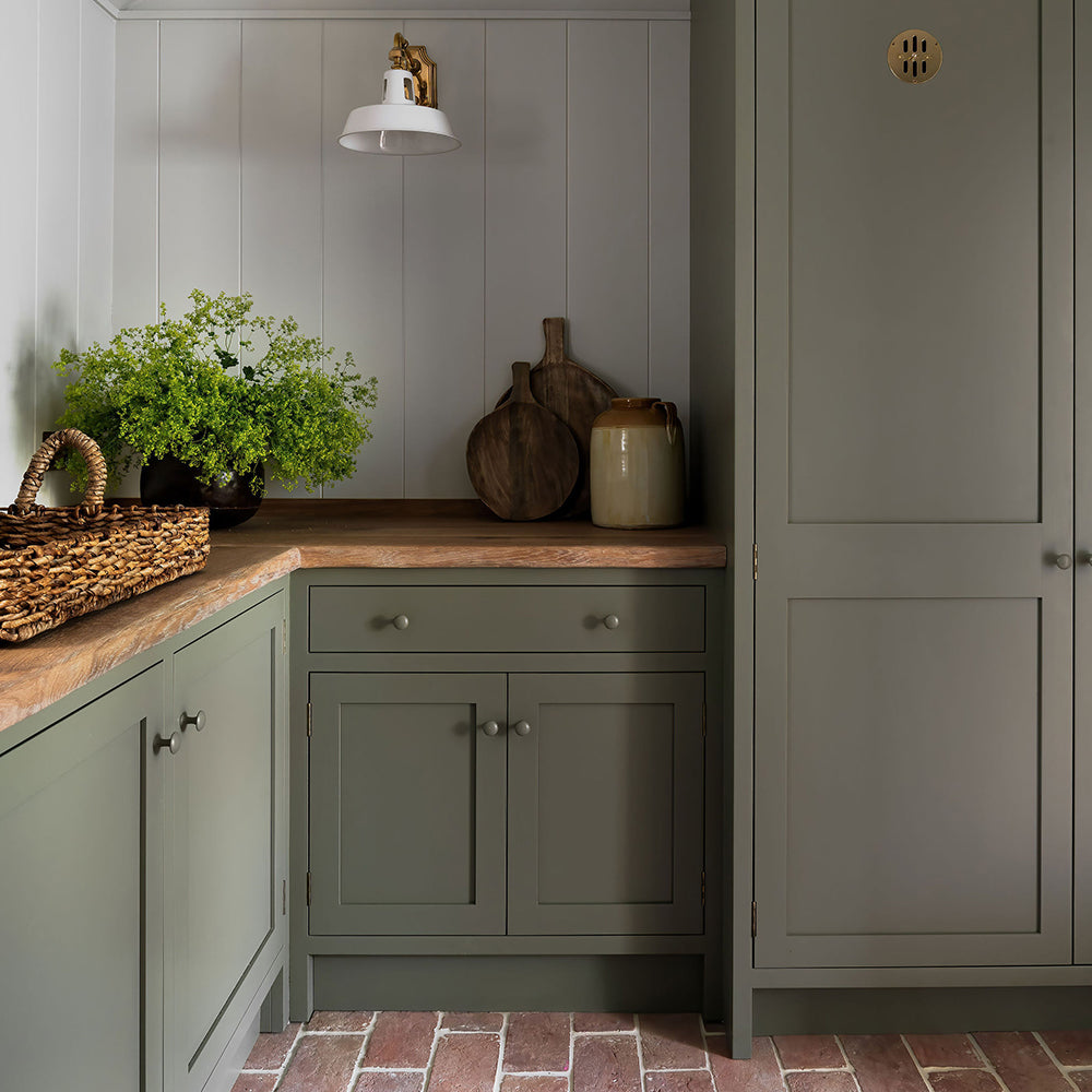
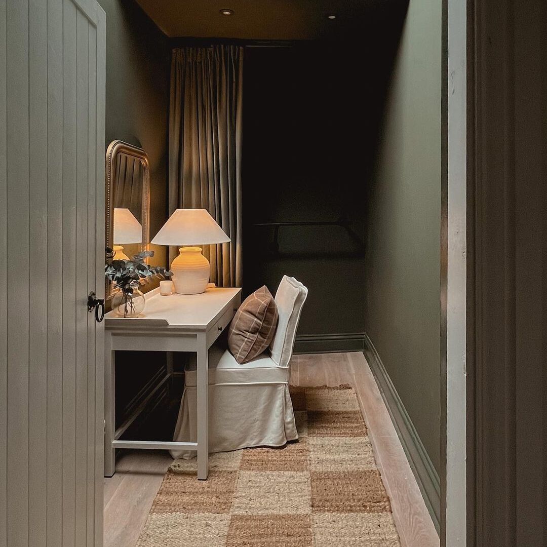
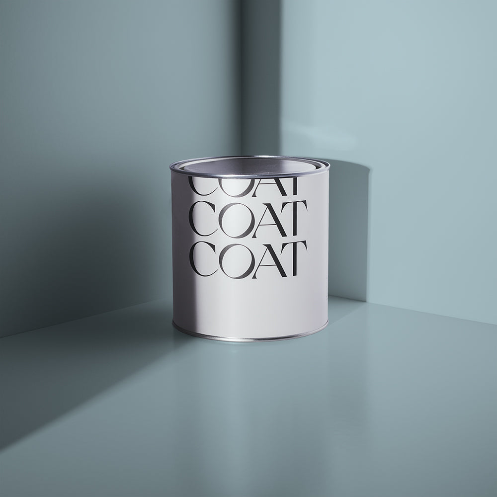
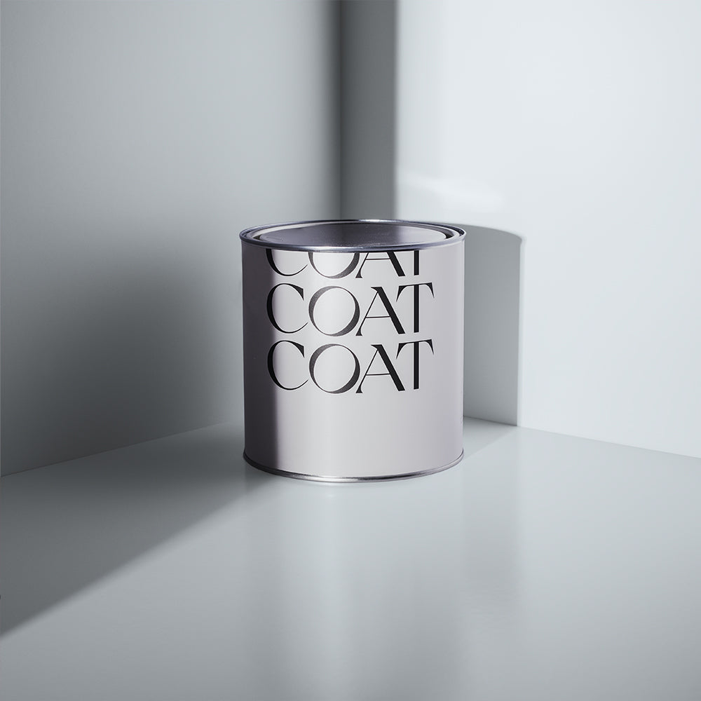
Green is Still the People’s Colour
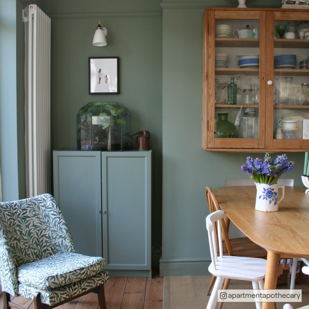
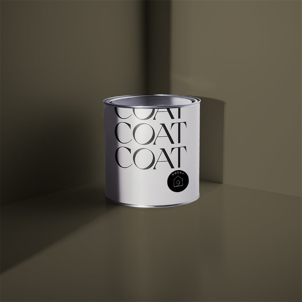
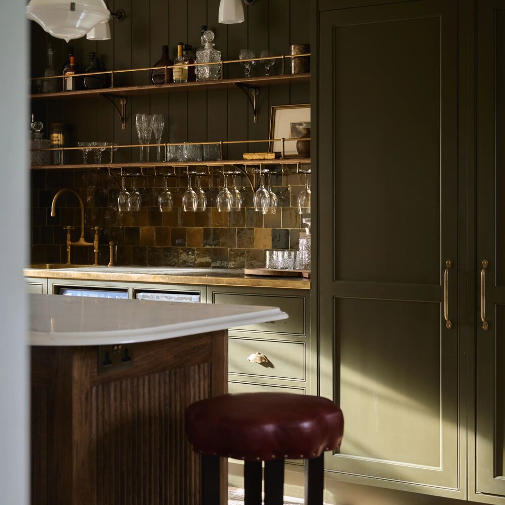
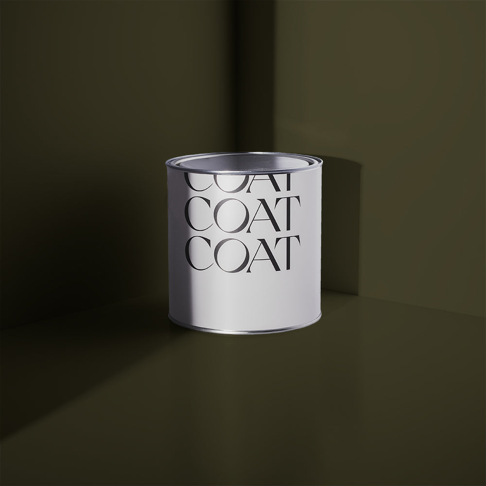
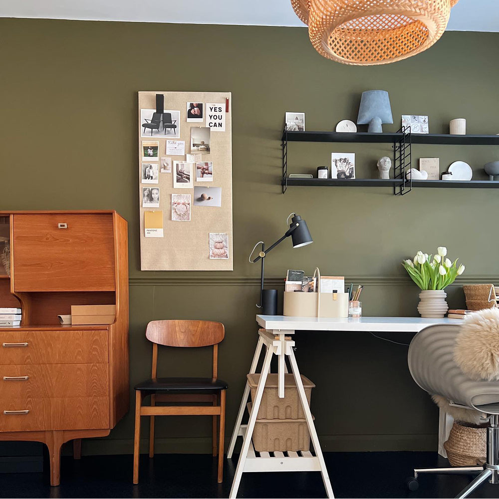
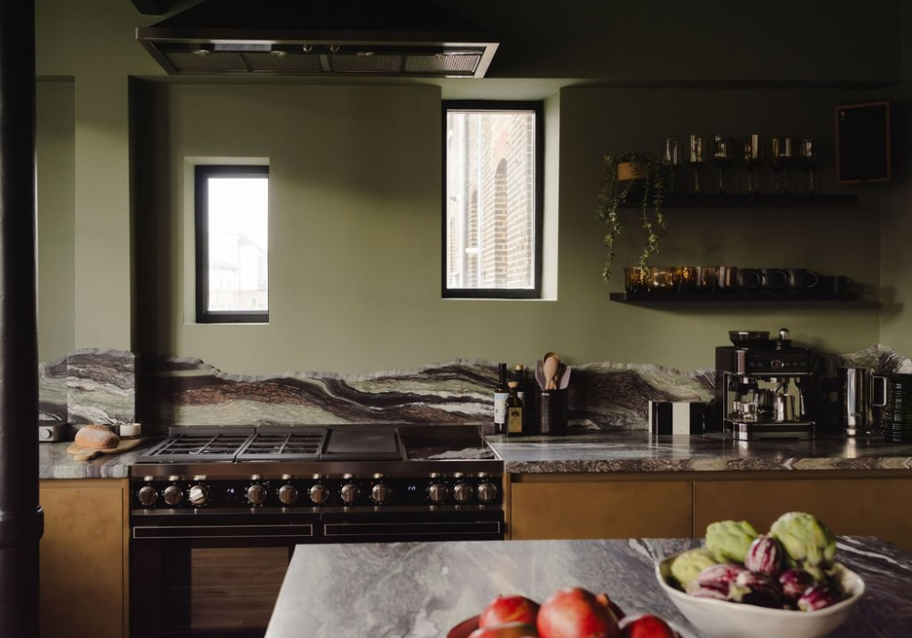
This one’s not exactly new, but it is evolving. Green is holding onto its crown as the go-to shade for anyone craving calm. But now it’s darker, more grounded, and full of depth.
“Green has such a calming influence,” says Abigail. “We’re seeing it used more in north-facing rooms and as a neutral base in kitchens and bedrooms. Pairing green with natural woods or vintage accessories really makes it sing.”
If your space needs a breath of fresh air without going pastel, try a grounded olive or a moody forest tone. They pair beautifully with raw textures like wood, stone, or linen.
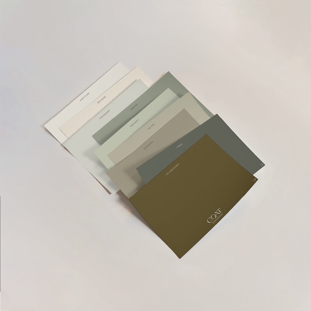
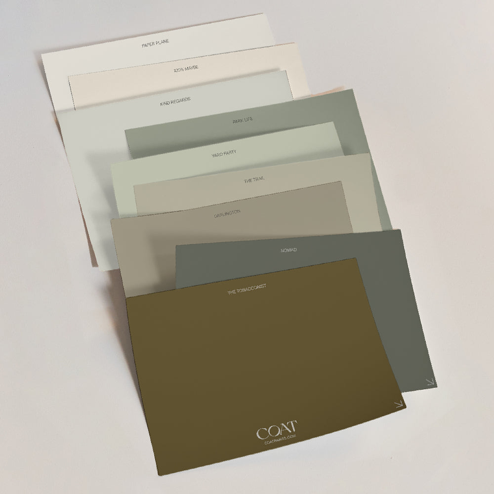
Park Life and Nomad are both solid choices. Think British garden in early spring. Low-key but full of character.
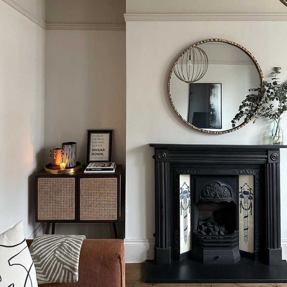
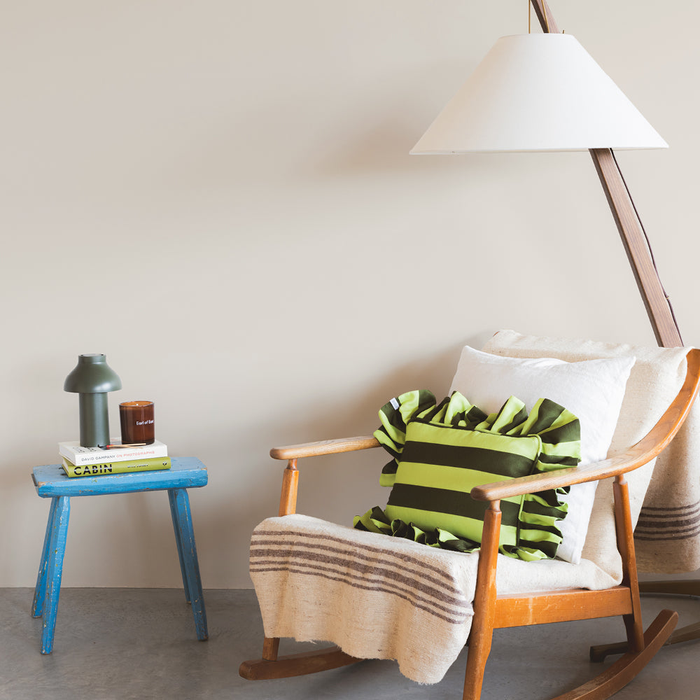
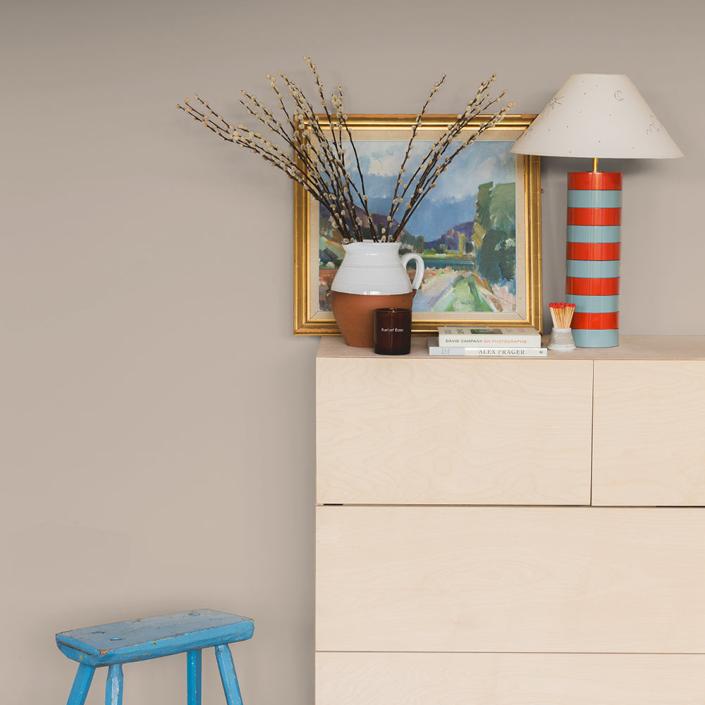
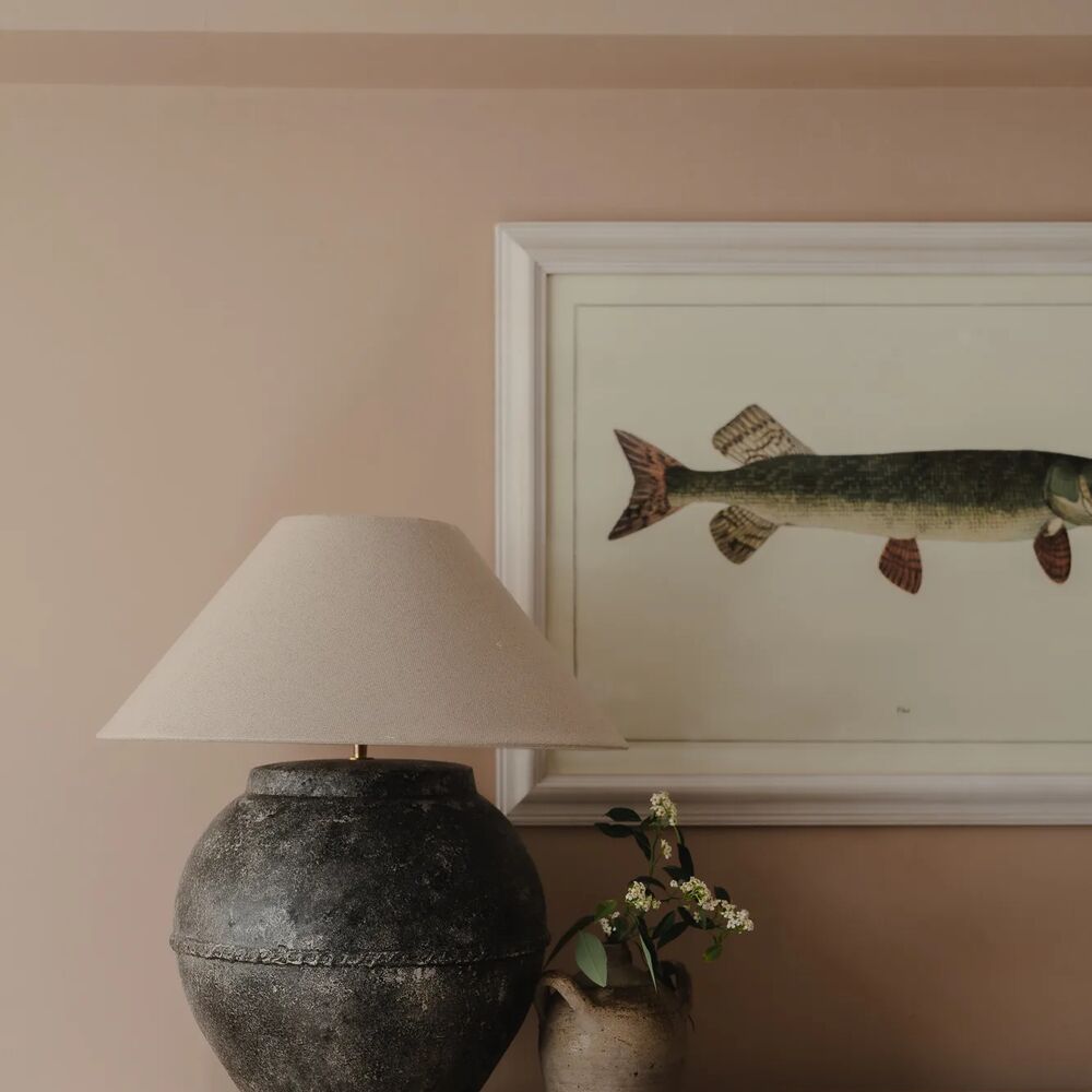
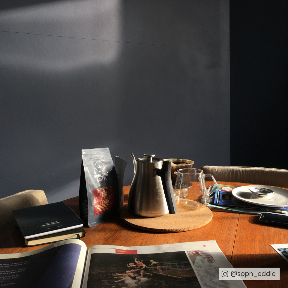
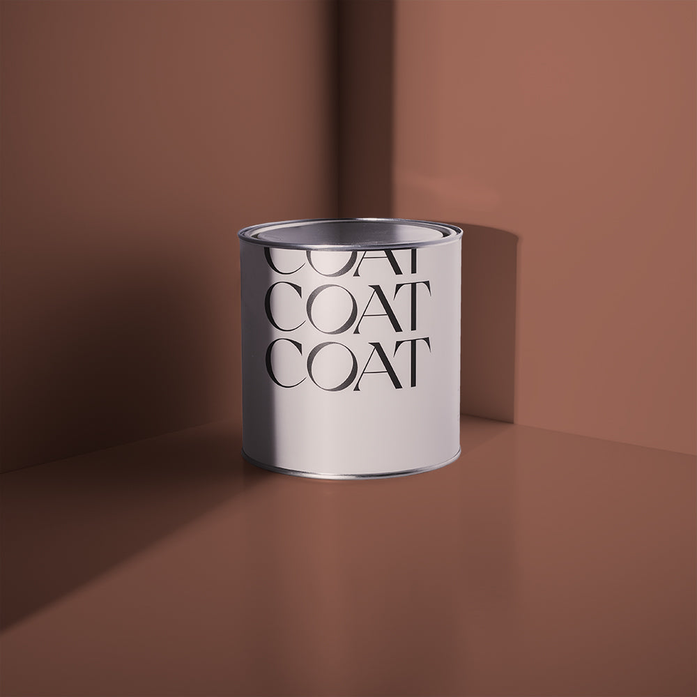
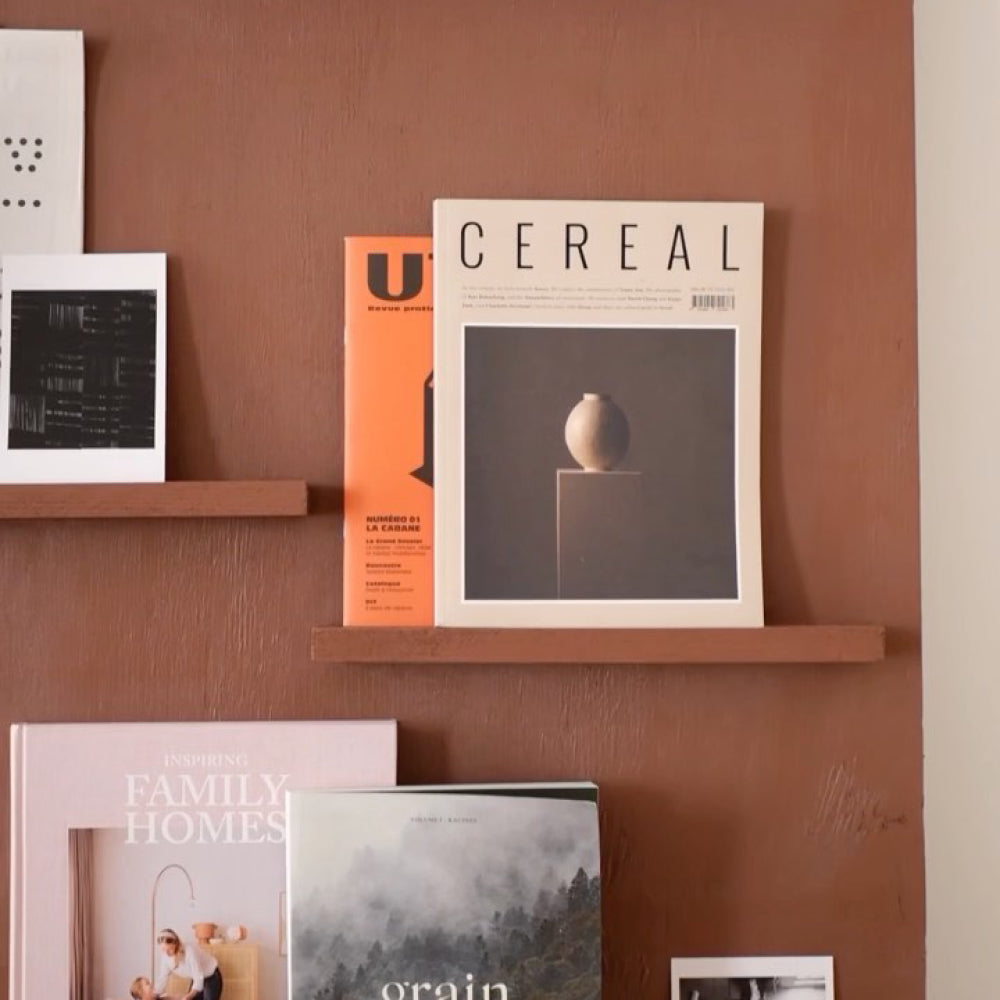
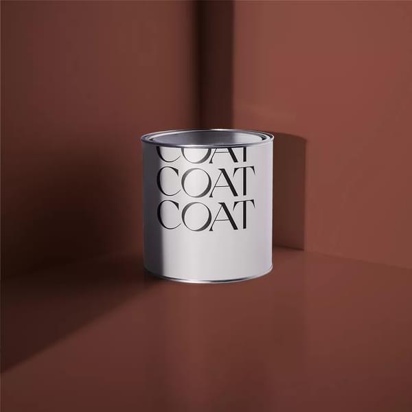
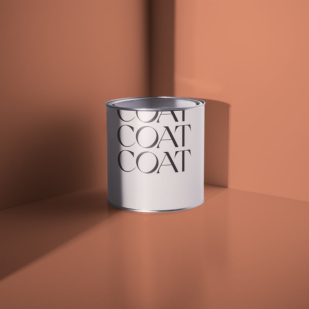
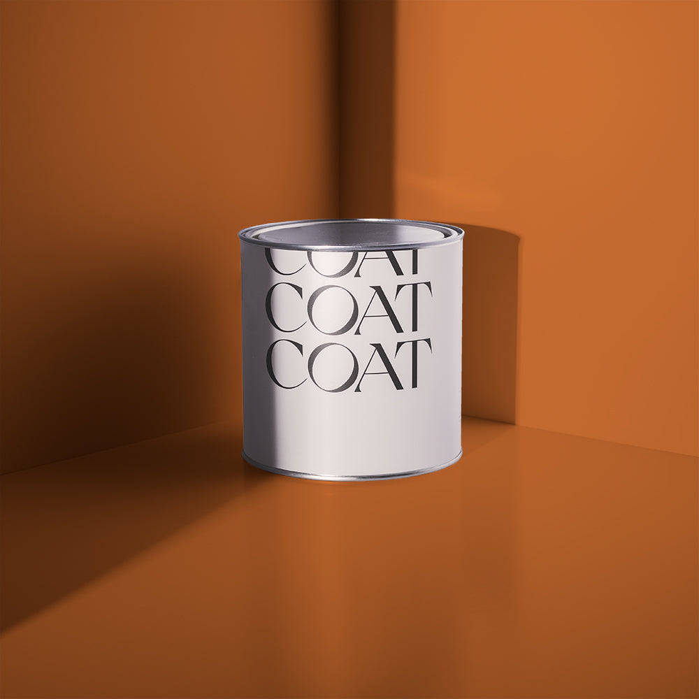
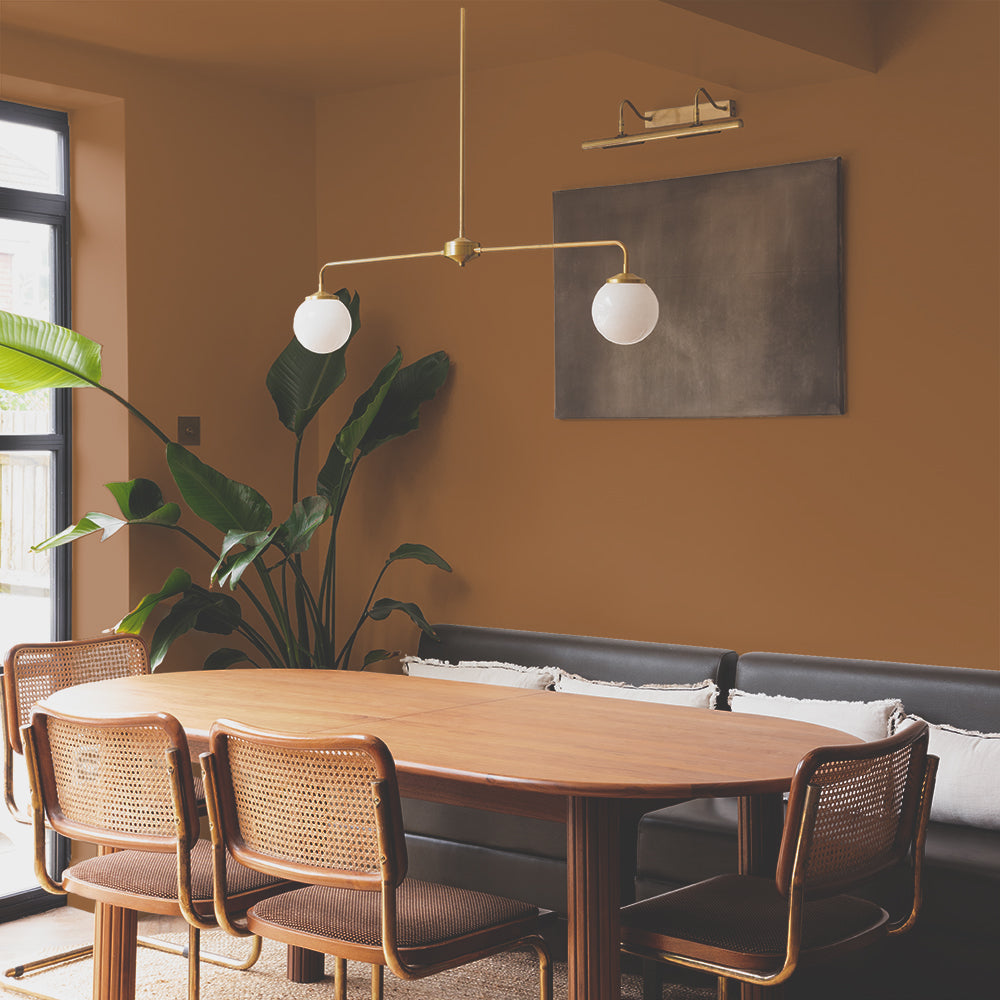
Brown is Back, and it’s Chic
Hear us out. Brown got a bad rap after the early 2000s, but it’s fully reclaimed its space — and it’s doing it with style.
“People are craving cosy,” says Abigail. “Brown offers that cocooning feeling without being too safe or bland. It’s especially popular in living rooms and dining spaces.”
Warm browns and clays have real charm. They create depth and bring a room together without sucking out the light. If you want a vibe that’s earthy but grown up, you’re in the right zone.
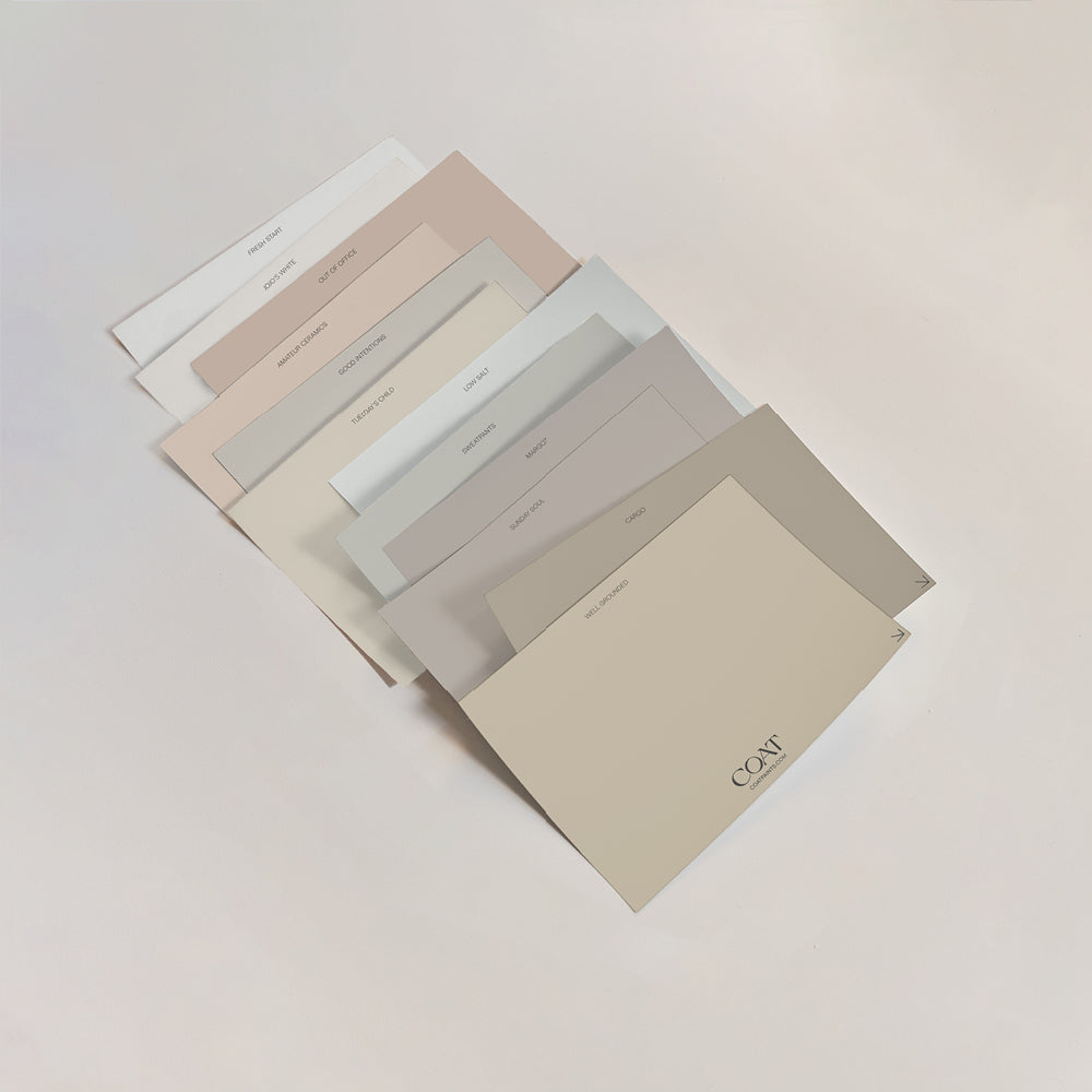
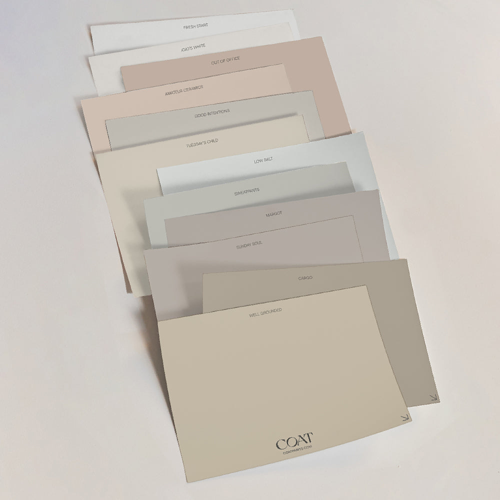
Well Grounded and Sunday Soul both give you that warm, relaxed feel without tipping into dull or dated.
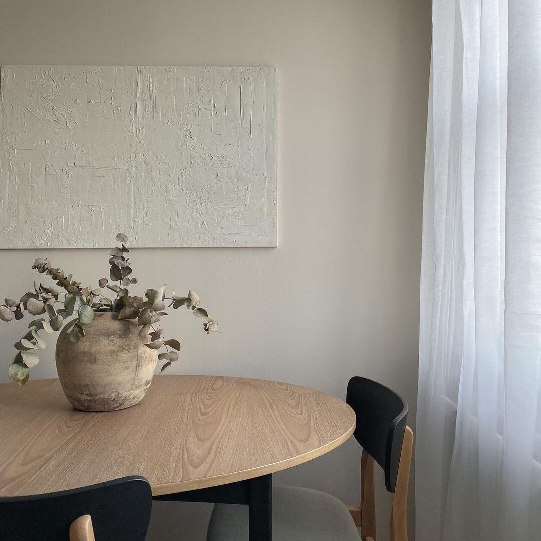
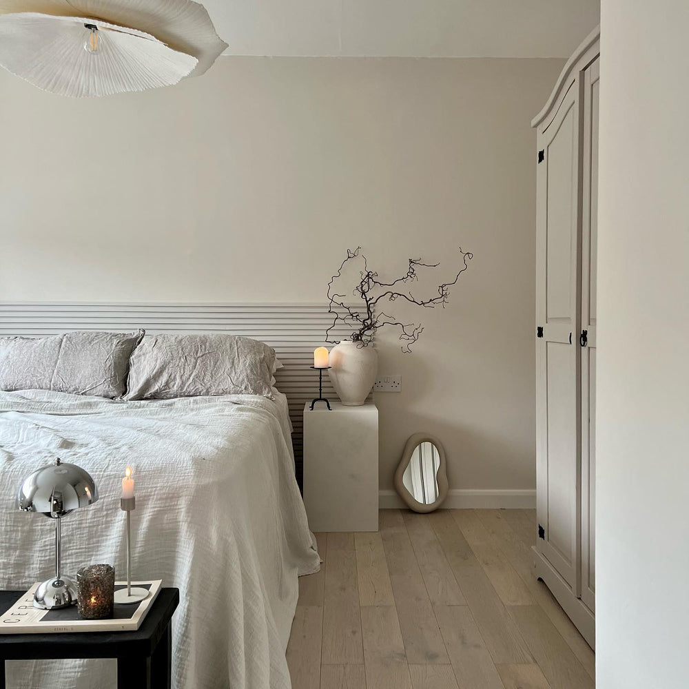
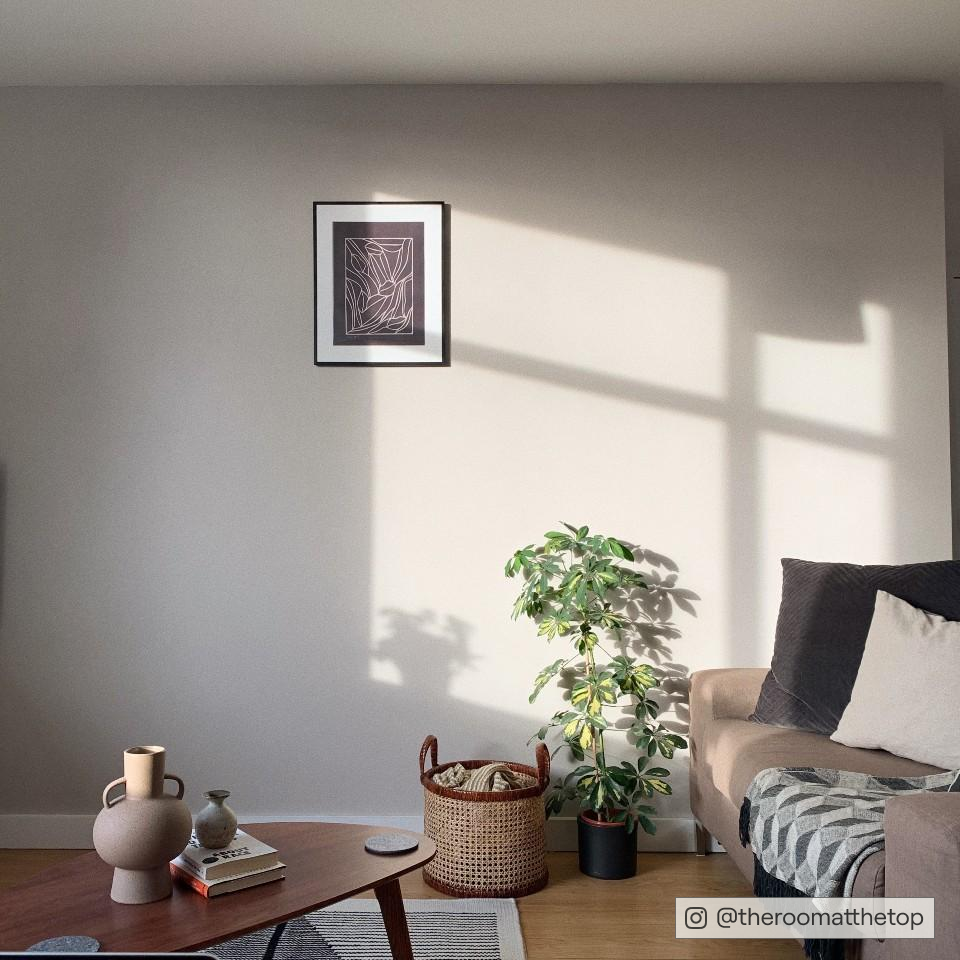
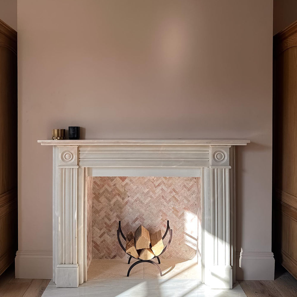
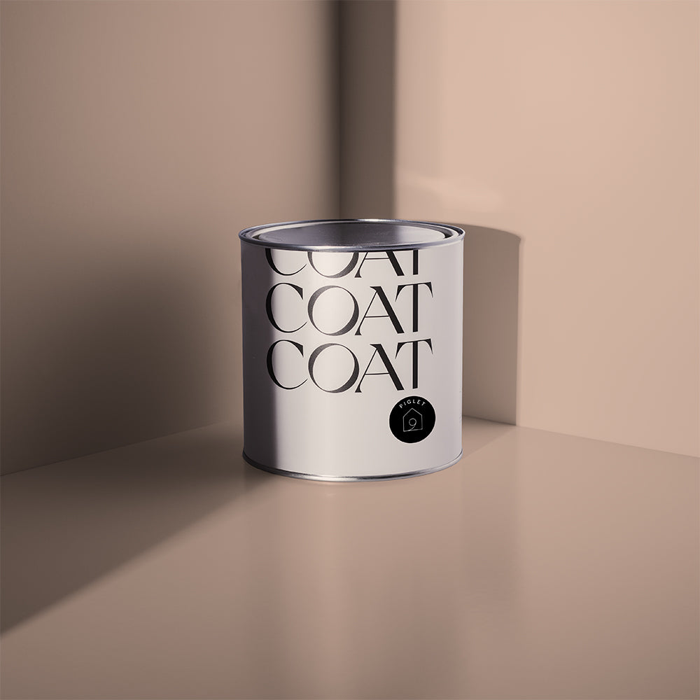
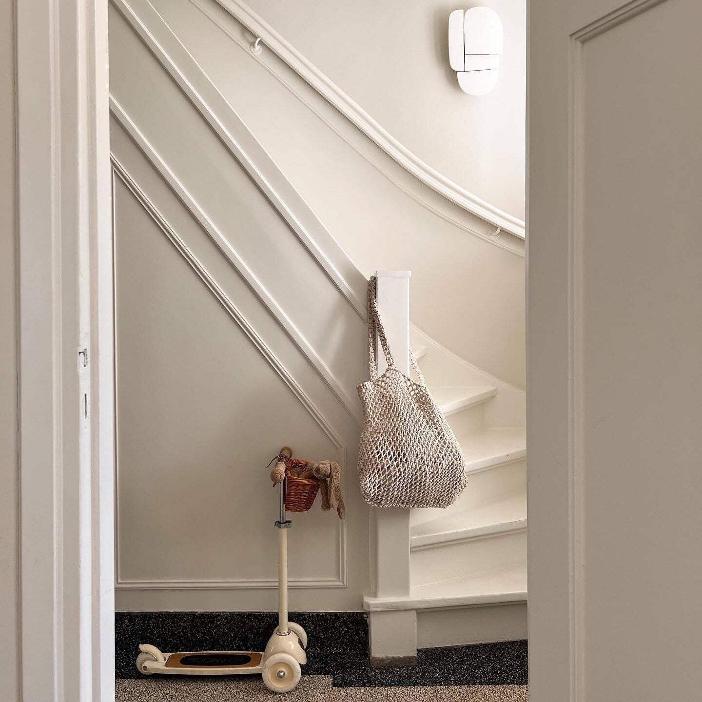
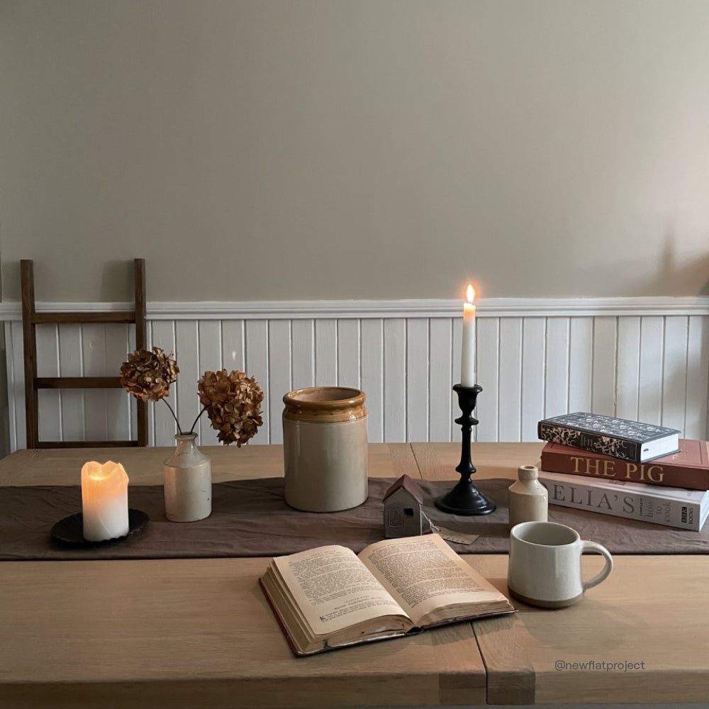
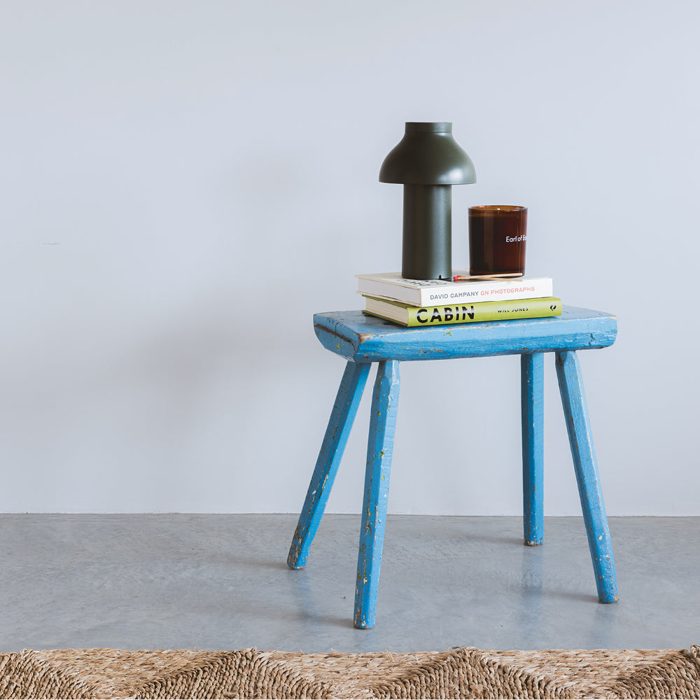
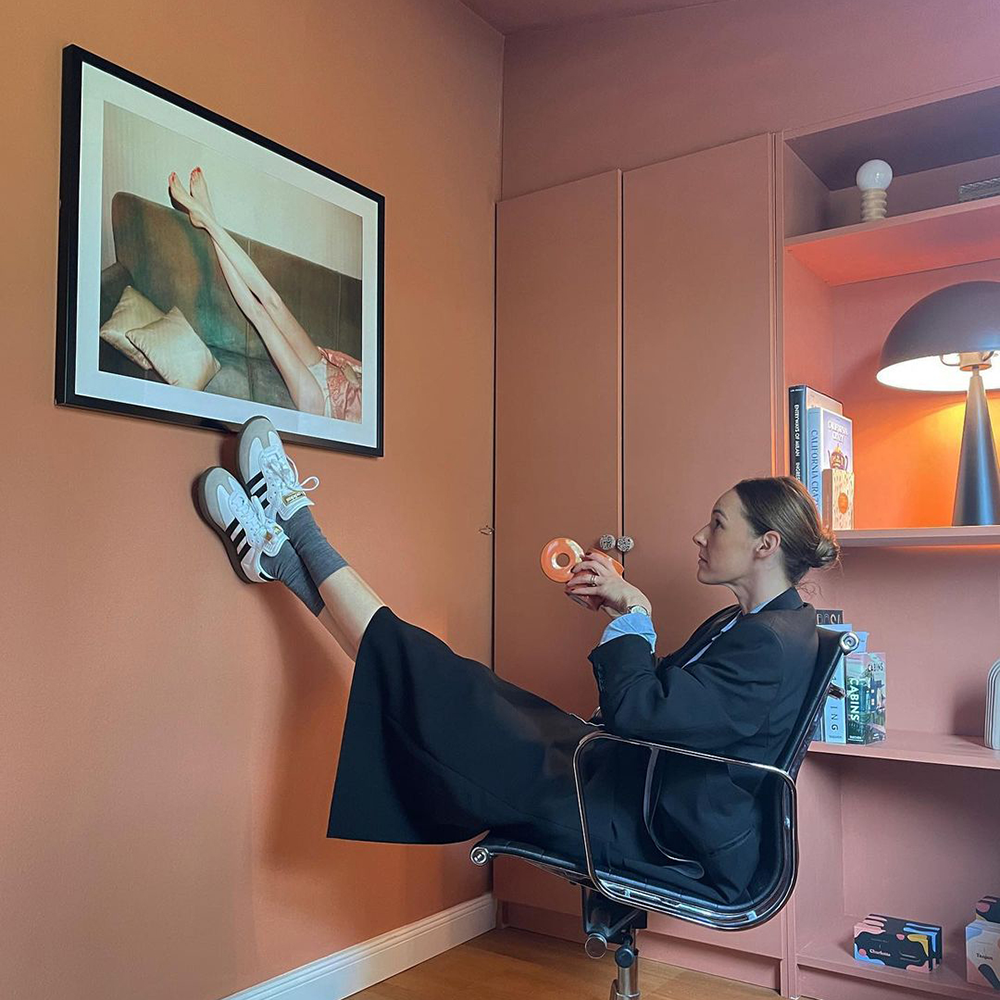
Neutrals Are Getting Toasty
Say goodbye to cold greys and hello to warm, creamy neutrals that feel like the softest blanket on a Sunday morning. They still give you that fresh, clean backdrop, but with way more soul.
“Neutrals are evolving,” explains Abigail. “It’s less about sterile minimalism and more about tactility and calm. Creamy tones make a room feel lived-in — in the best way.”
It’s not about going beige. It’s about tones that are soft without being washed out.
Mindful and Sunday Soul nail it. Both look incredible with layered whites or natural fibres, and work across any style.
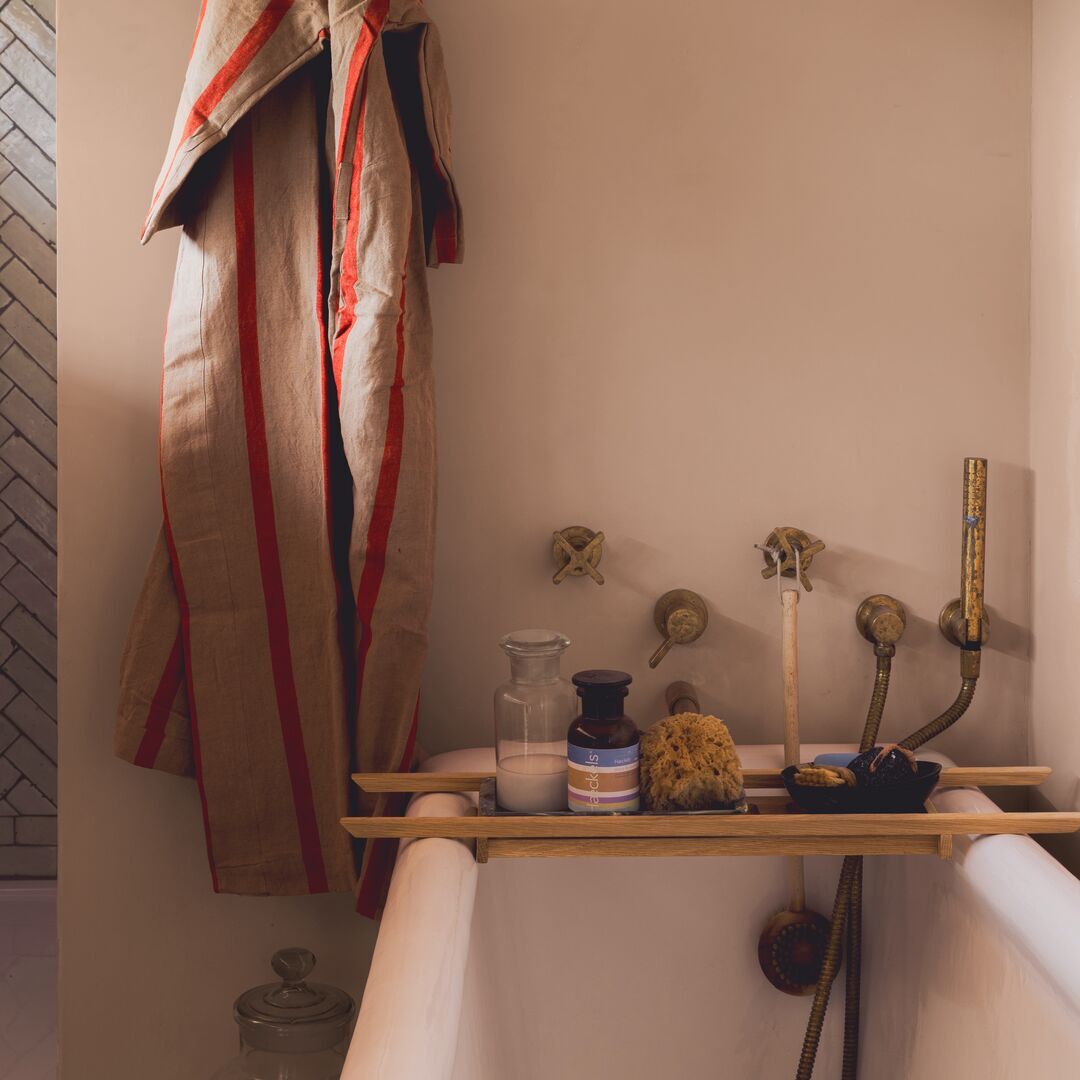
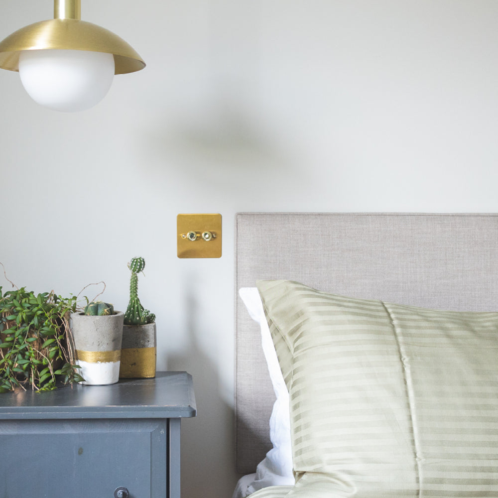
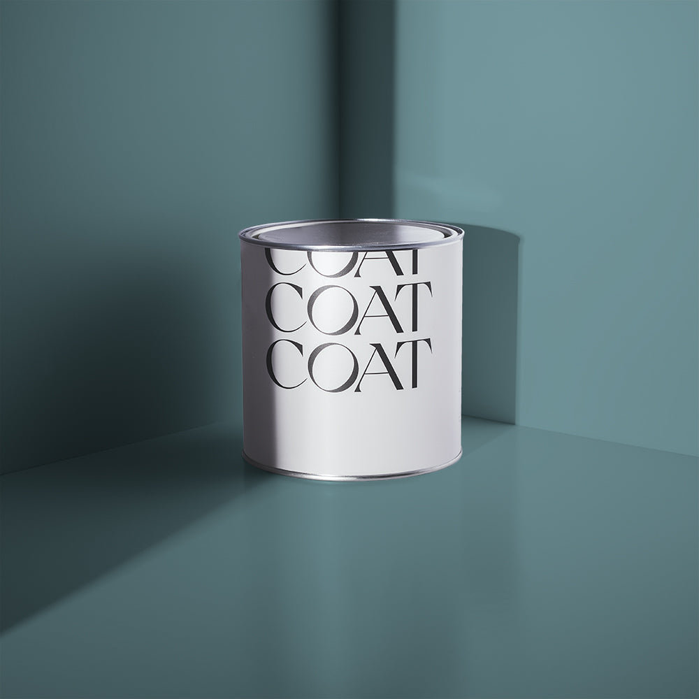
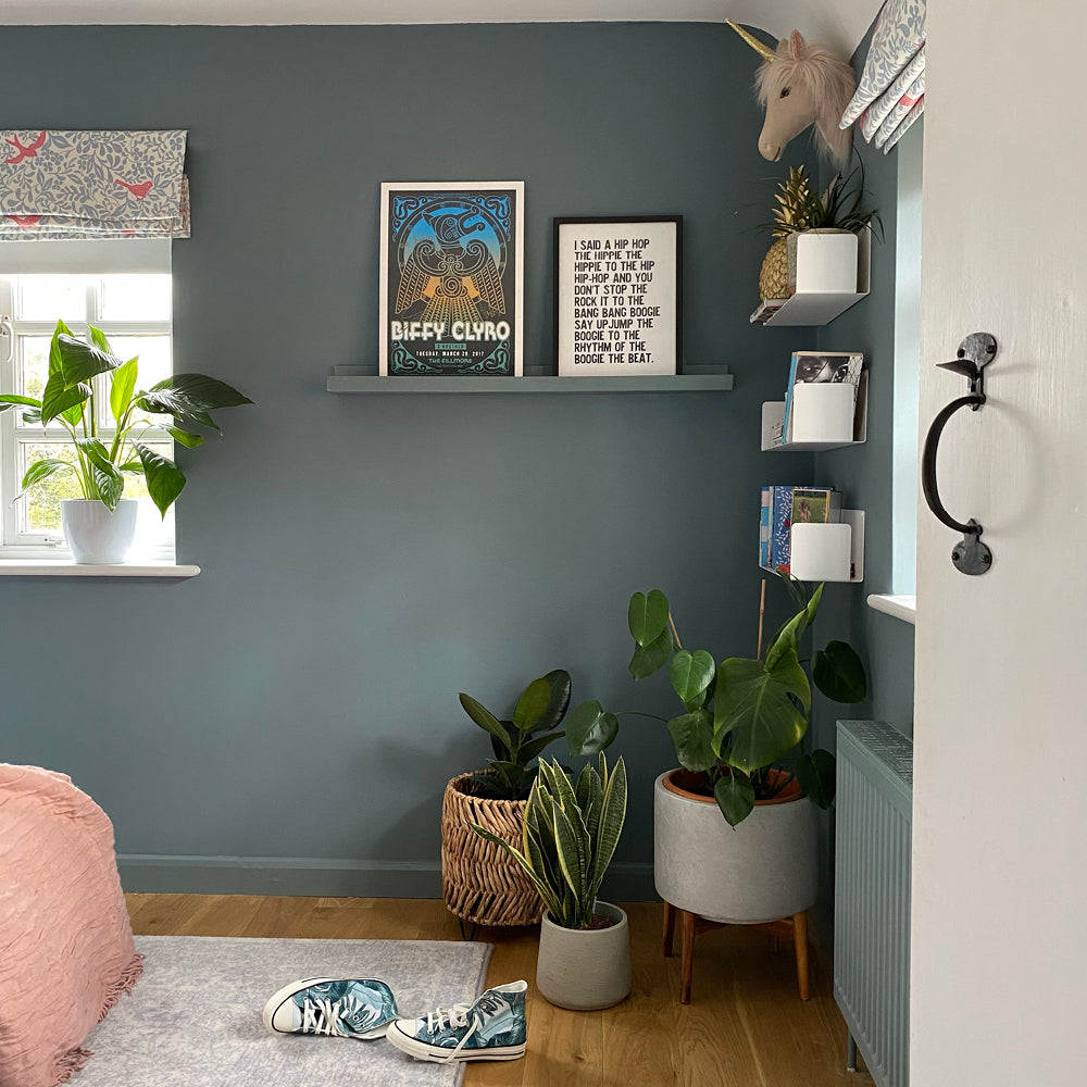
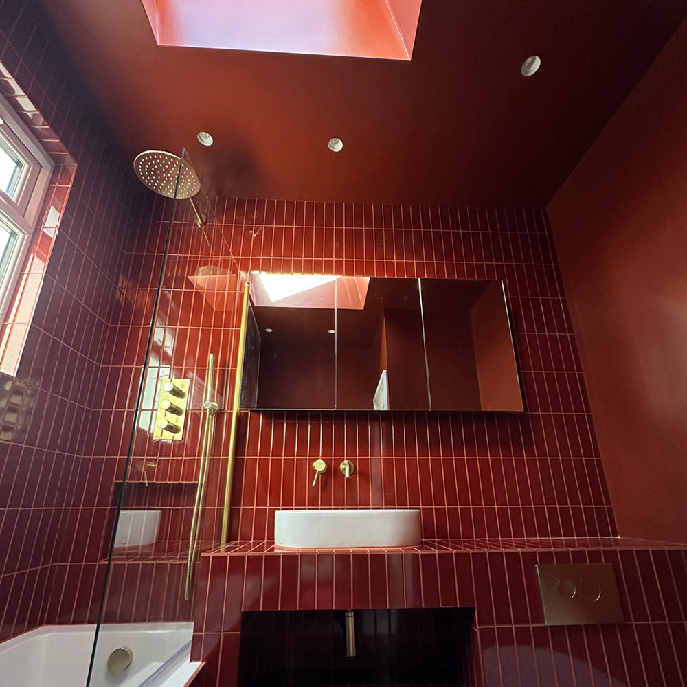
Blue Gets a Bit Brooding
Blues are back, and they’ve matured. Instead of the bright nautical pops of old, we’re seeing richer navies and softened sky tones that wrap a room up like a good book.
“Blue is classic, but we’re now seeing people layer different blue tones in the same space — wall, ceiling, woodwork — for a cocooning feel,” says Abigail.
You can lean into drama or stay light and breezy depending on your space. The key is to keep it tonal and intentional.
Below Deck is one of those inky blues that works in daylight and by candlelight. Good Intentions is perfect for a fresher take in bathrooms or hallways.
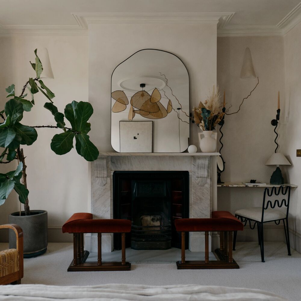
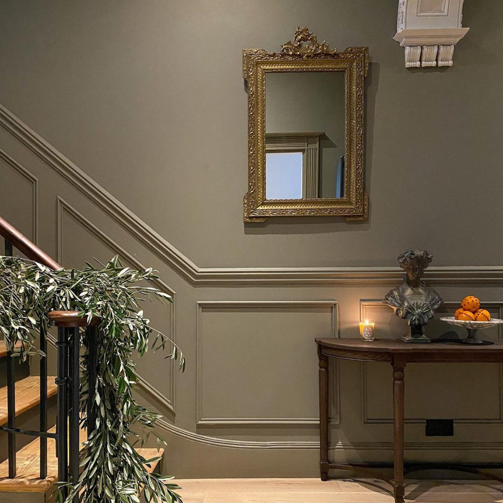
Feature Walls Just Grew Up
Forget the slap of colour behind the sofa. Accent walls are evolving. Think full-height colour blocks, colour-drenched ceilings, or alcoves in unexpected shades.
“People are braver with paint now,” says Abigail. “We’re seeing bold, creative uses of colour that reflect personality but still feel elevated.”
This trend is all about storytelling. Pick two shades that complement or contrast, and let the layout of your room guide you.
Try David Rose for a soft meets structured look. Or go full depth with The Record Store in shadowy corners.
Choose Feel Over Fashion
Here’s the real talk. Trends can be helpful. But the goal should always be a home that feels right. One you actually want to be in every day.
“Ask yourself how you want to feel in the room, not just what looks good on Instagram,” advises Abigail. “Paint should serve a feeling — comfort, creativity, calm.”
So pick colours with intent. Trust your instinct. And don’t be afraid to choose what you love, even if it’s not on the Pinterest homepage.
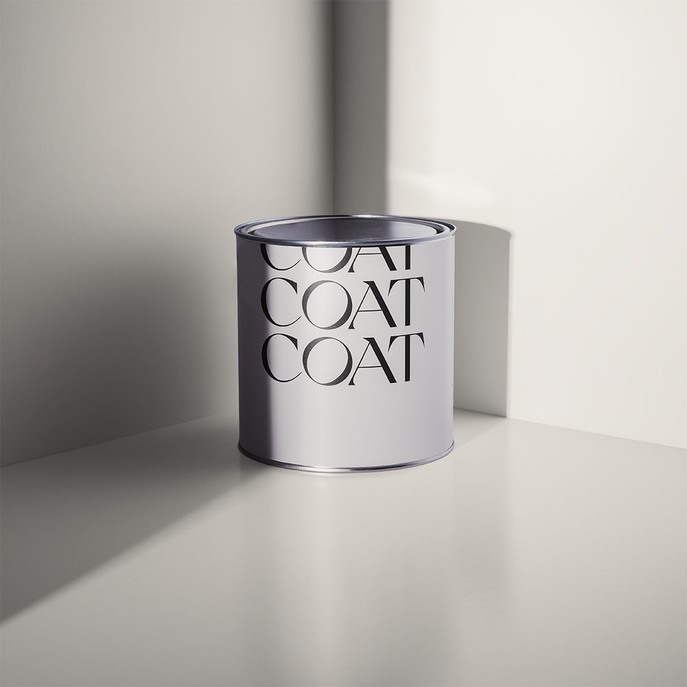
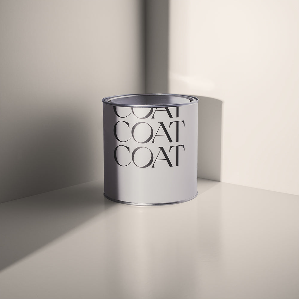
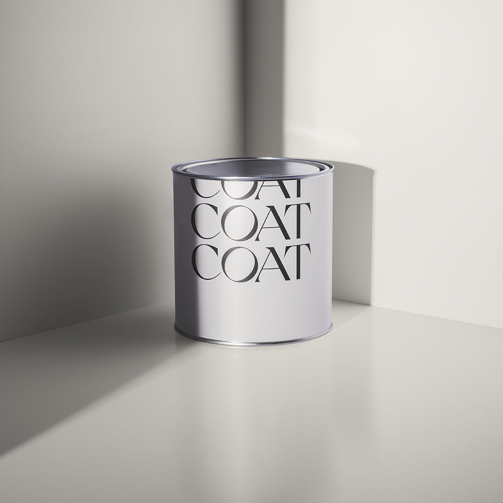
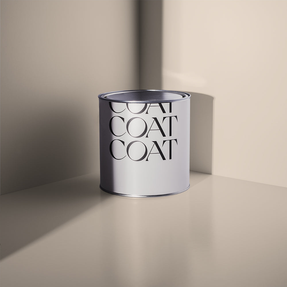
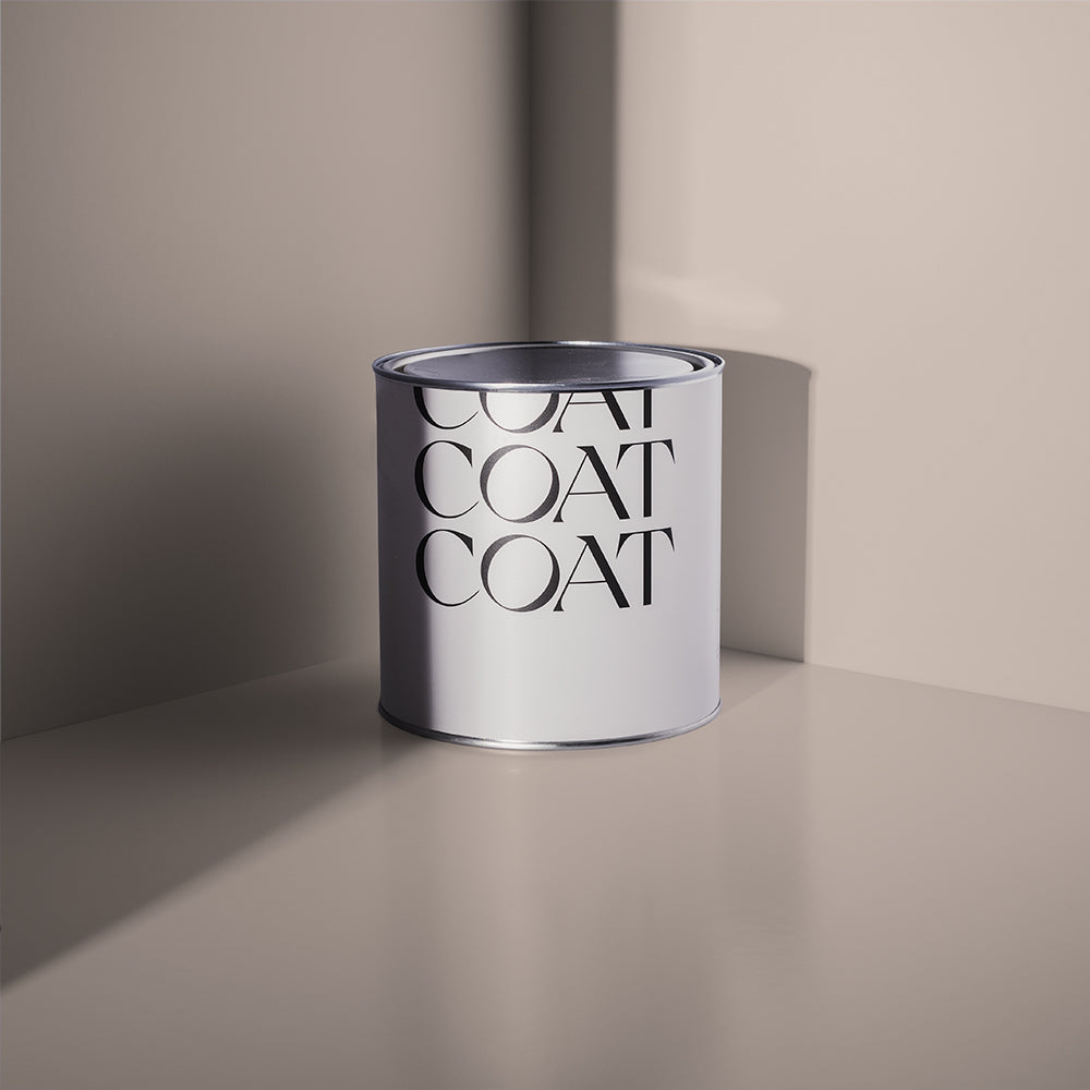
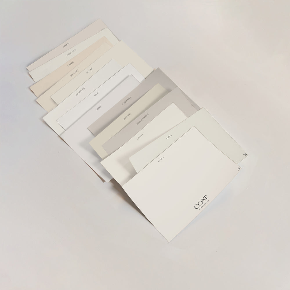
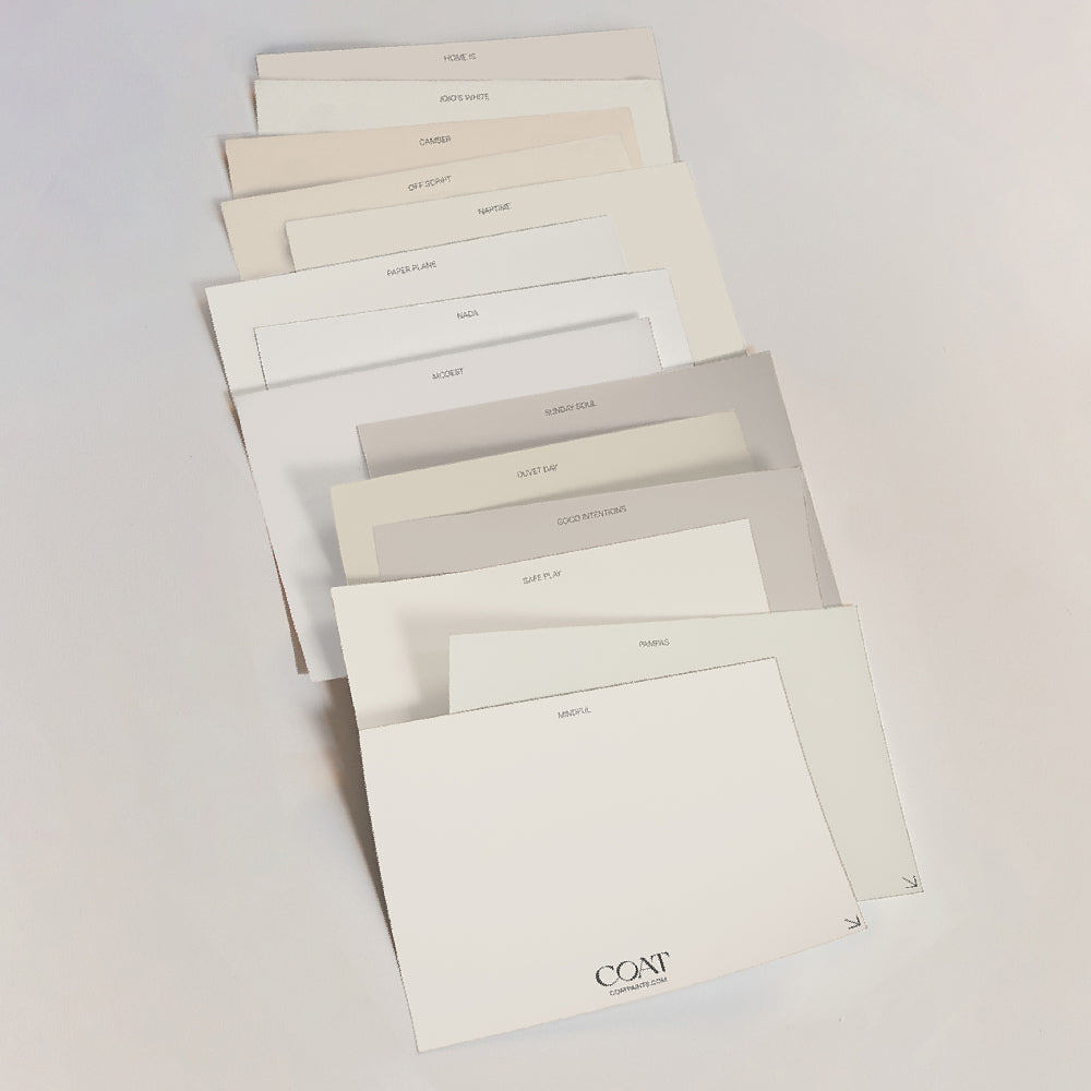
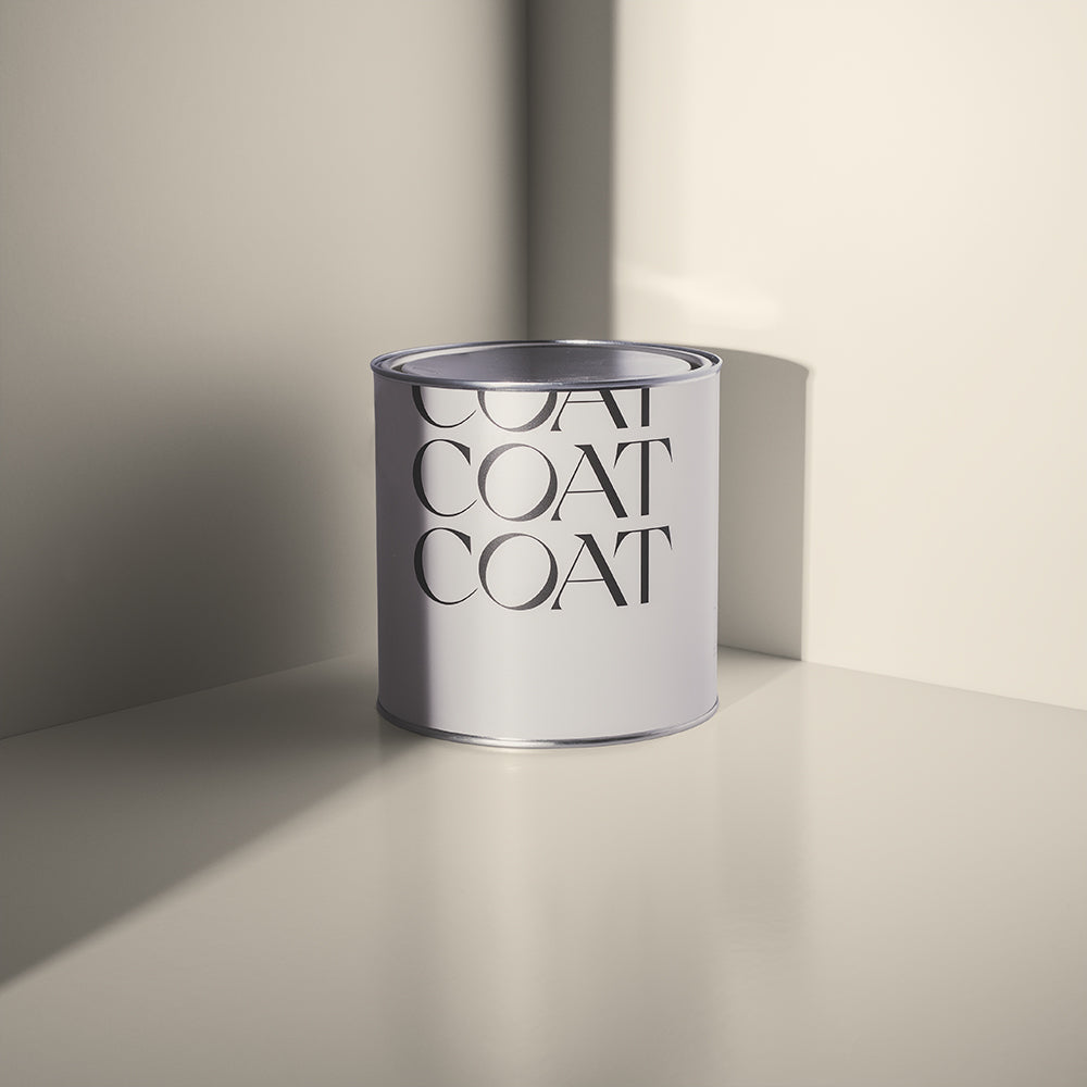
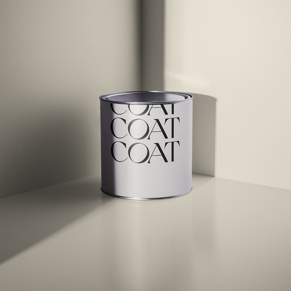
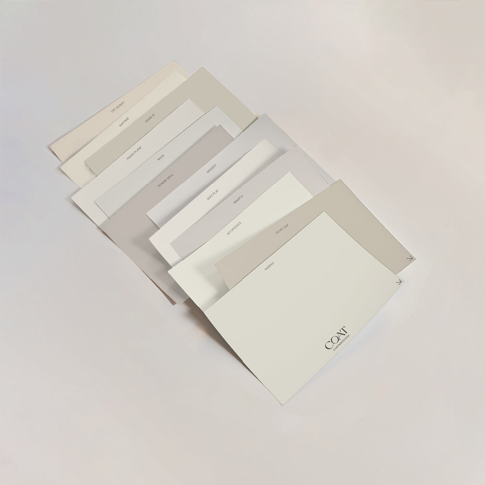
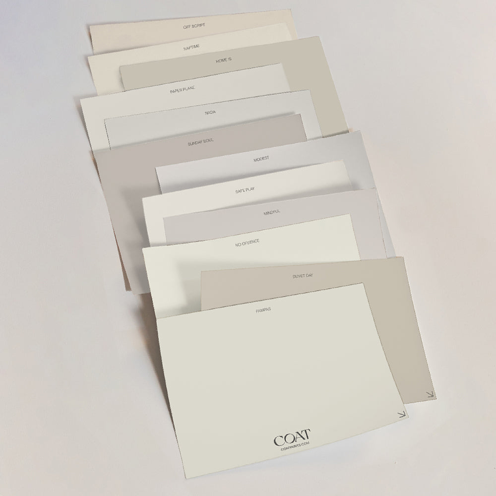
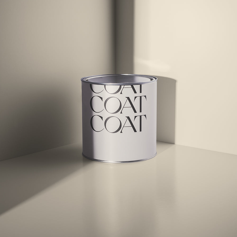
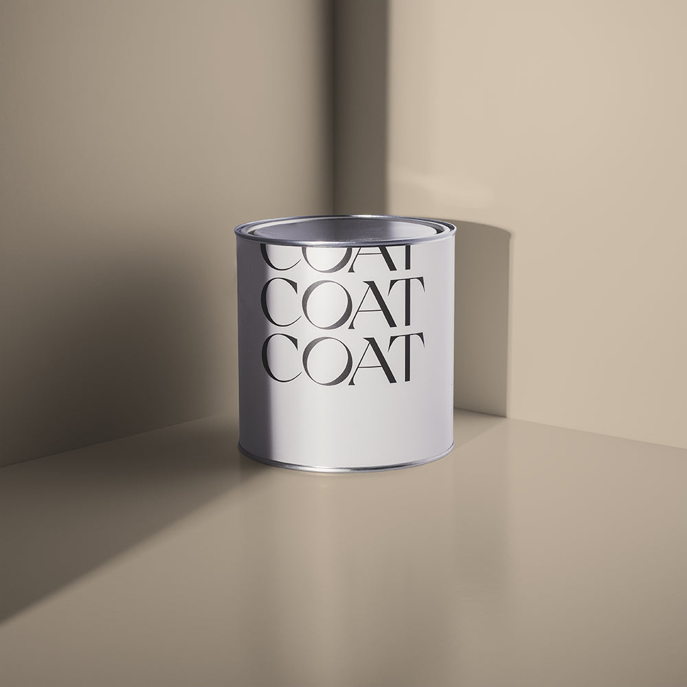
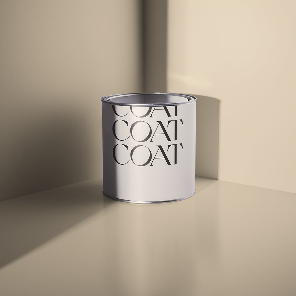
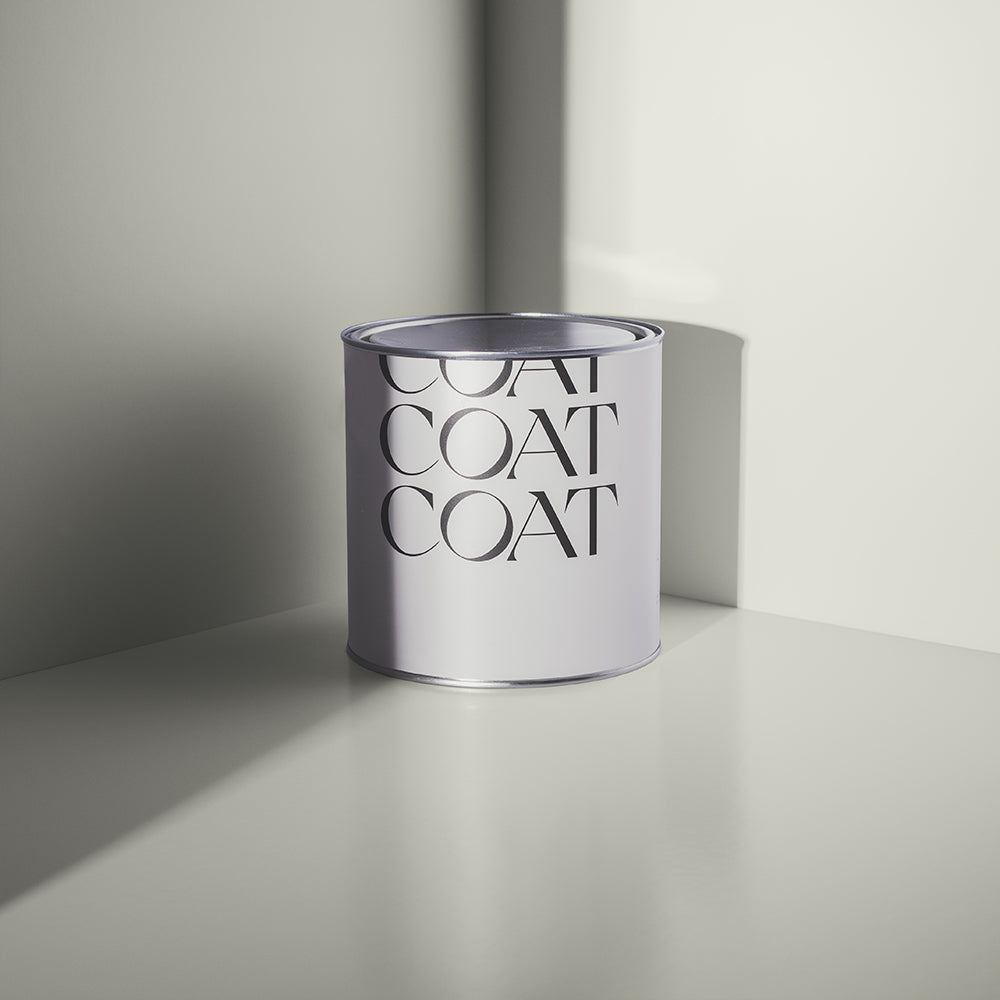
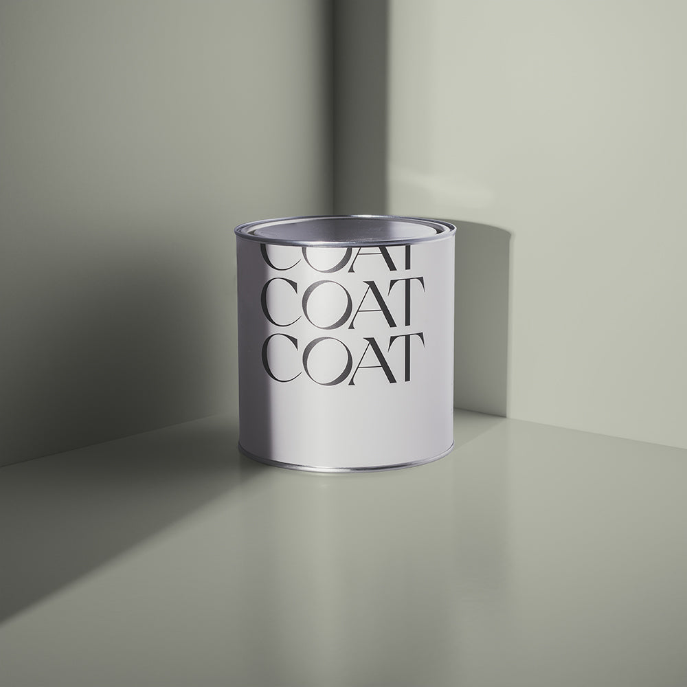
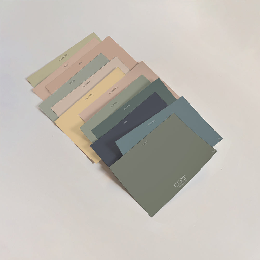
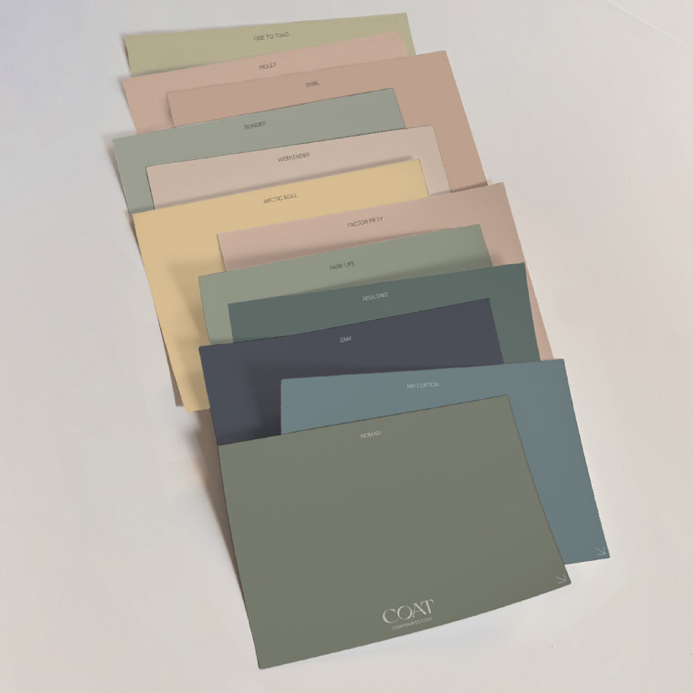
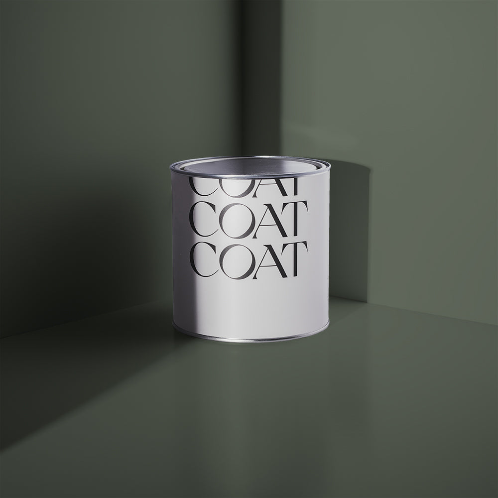
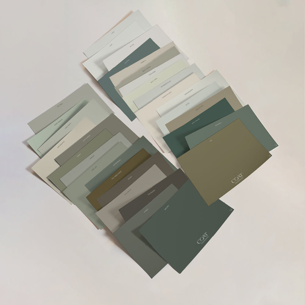
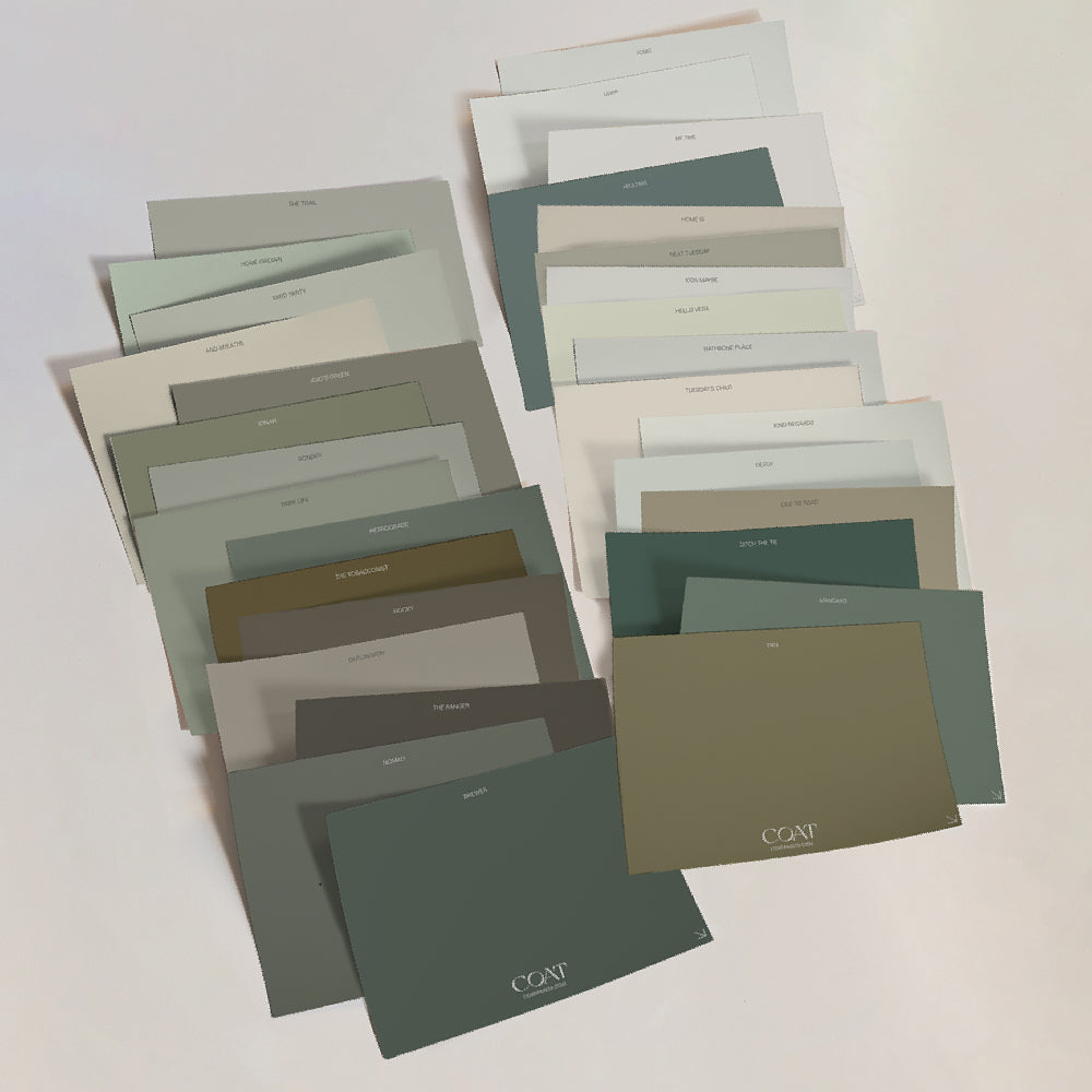
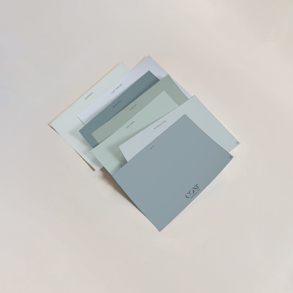
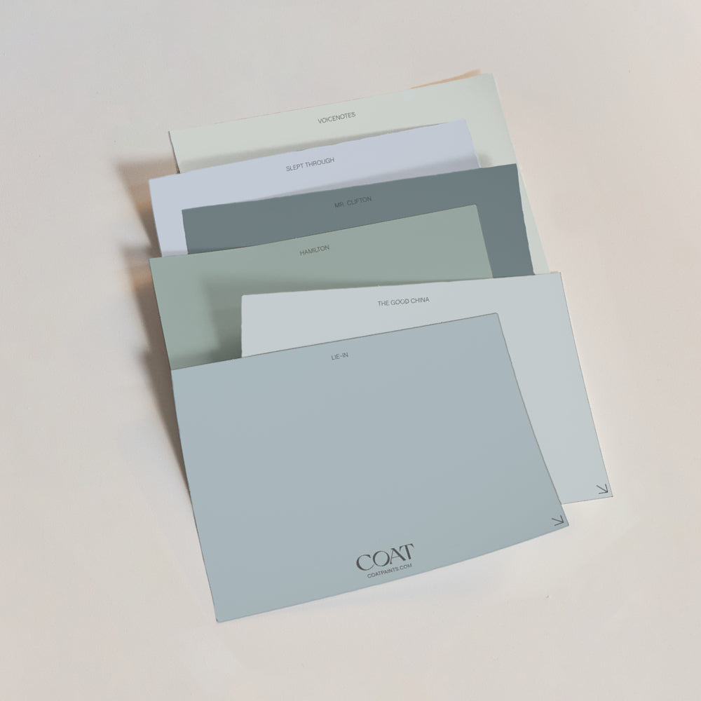
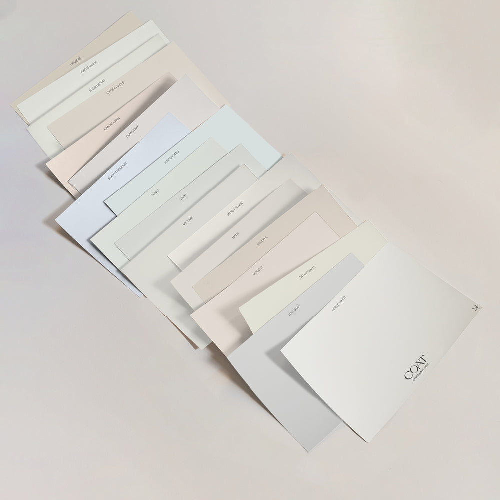
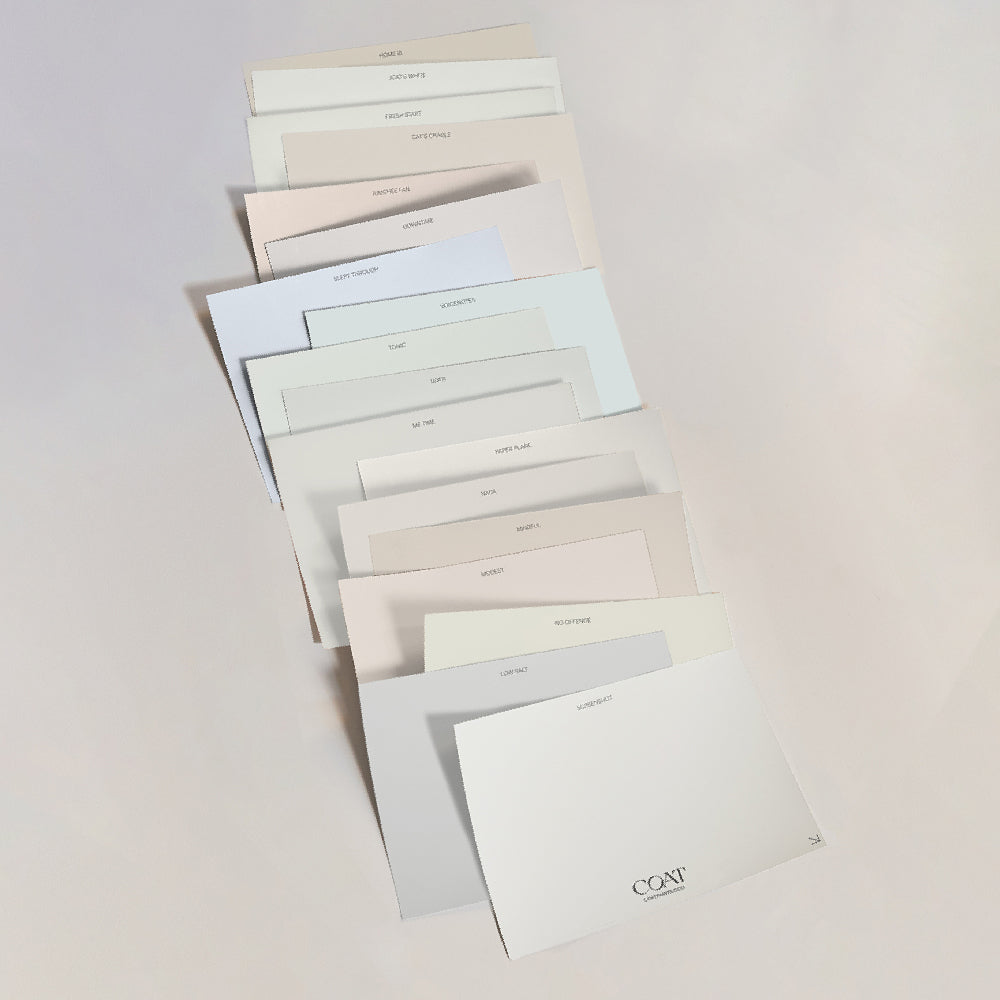
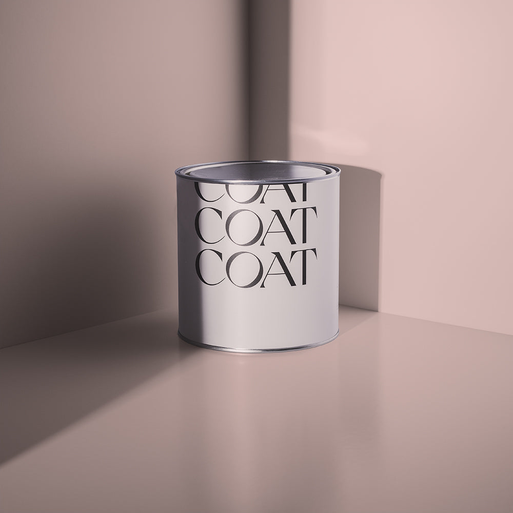
Want to Try Them IRL?
Order a COAT Sample Pack and test your favourites straight on the wall. No guesswork. No weird lighting surprises. Just bold colour, dead-on quality, and advice from real experts when you need it.
Publish Date
Author