How to Lift your Mood with Colour this Blue Monday
You made it! You've got through the darkest, dreariest fortnight of the year and you're here to tell the tale. We salute you. 🙌
But what is Blue Monday anyway? Well, experts reckon the third Monday in January is officially the most depressing day of the year. And it's not hard to see why. You've had enough of hauling your ass out of bed in the dark, the novelty of starting the day with yoga and ginger tea has lost its shine, and you ditched Veganuary at the first sniff of a bacon sarnie 🐷
Yes, this time of year is a toughie. But at COAT Paints, we reckon it's time to give Blue Monday the finger and show it who's boss 👊 So how do you cheer yourself up when everything around you looks grey and sad? With a blast of healing colour, that's how.
Join us on our mission to boost mental health and embrace positivity with the uplifting power of colour 🌈

COLOUR: THE ANTIDOTE TO BLUE MONDAY
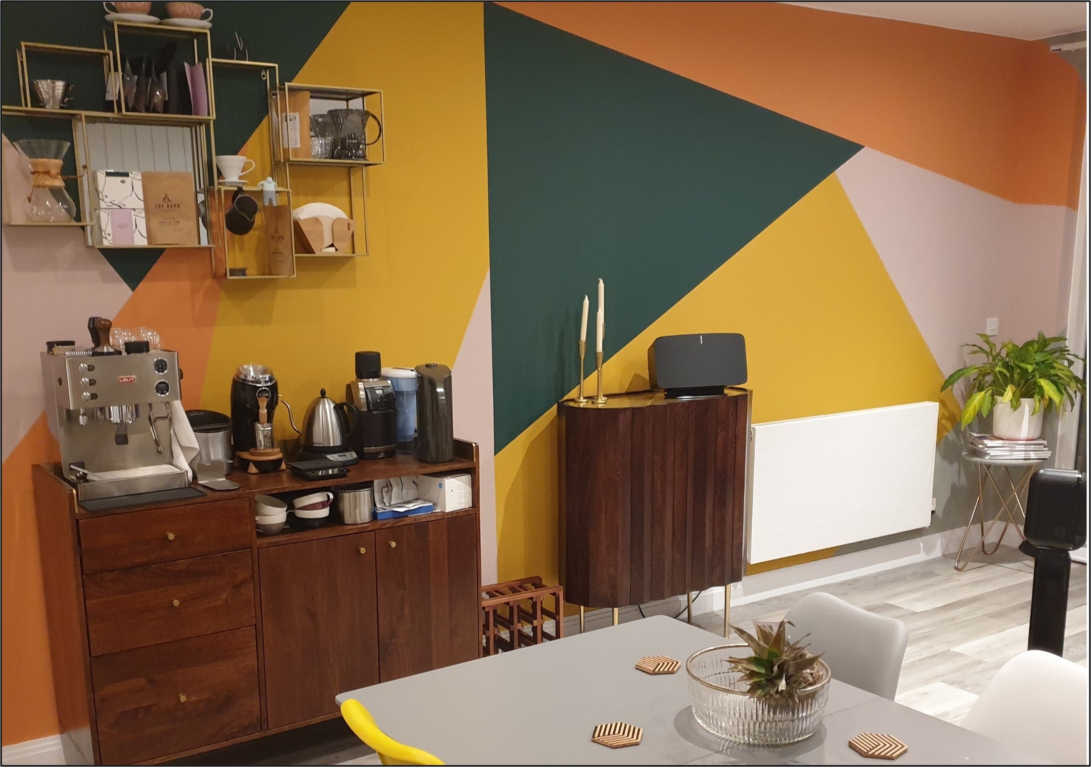
Yeah, we know it's cold and wet out there, but that doesn't mean you have to roll over and give in to the gloom. Instead, bring more colour into your life with a fresh new COAT of paint. Vibrant, energising colours have been shown to boost mood, improve productivity and have a positive impact on mental health. It's all a matter of choosing colours for your home which will lift the spirits and bring you joy.
"When we see colour we instantly feel something," says Karen Haller, an expert in behavioural design and the author of 'The Little Book of Colour'. "We have an emotional response – this is colour psychology. When we surround ourselves with colours that we resonate with, we feel good about ourselves; we feel nurtured, supported and happy.
"Listen to your instincts," advises Karen. "Trends come and go, but when you create something from within, it's timeless. Choosing colour based on your personality allows you to express the essence of who you are – your authentic self – and to live from the inside out in your own unique style."
LIFE-AFFIRMING GREENS
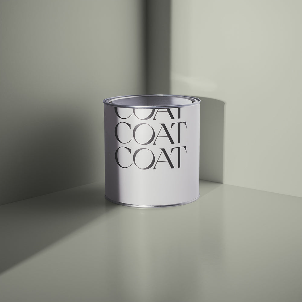
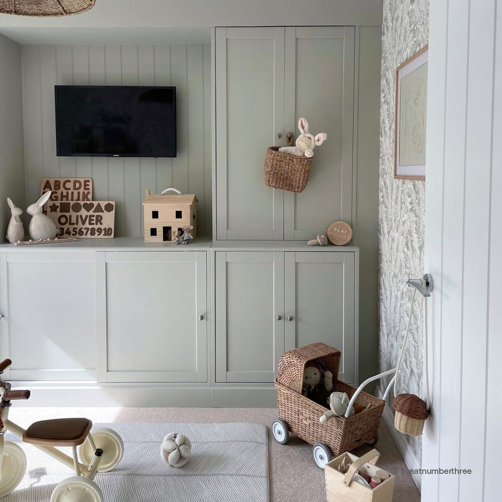
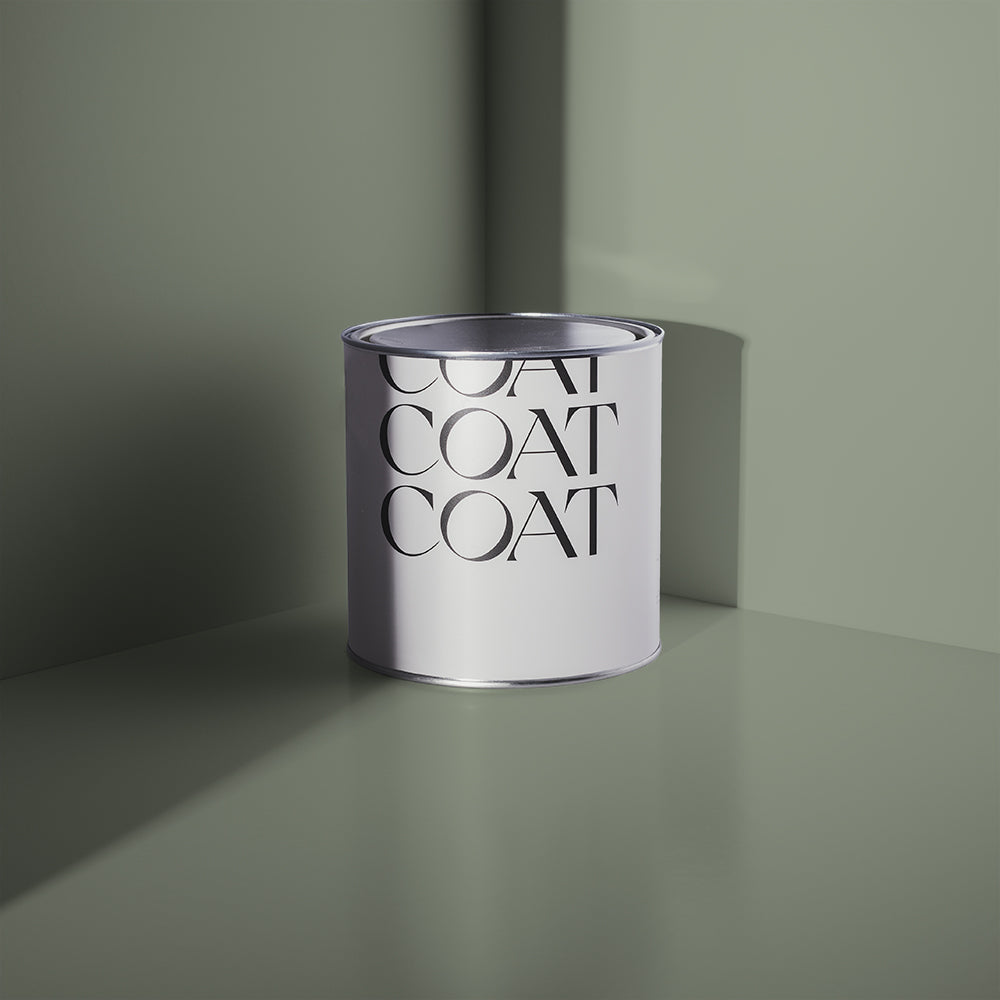
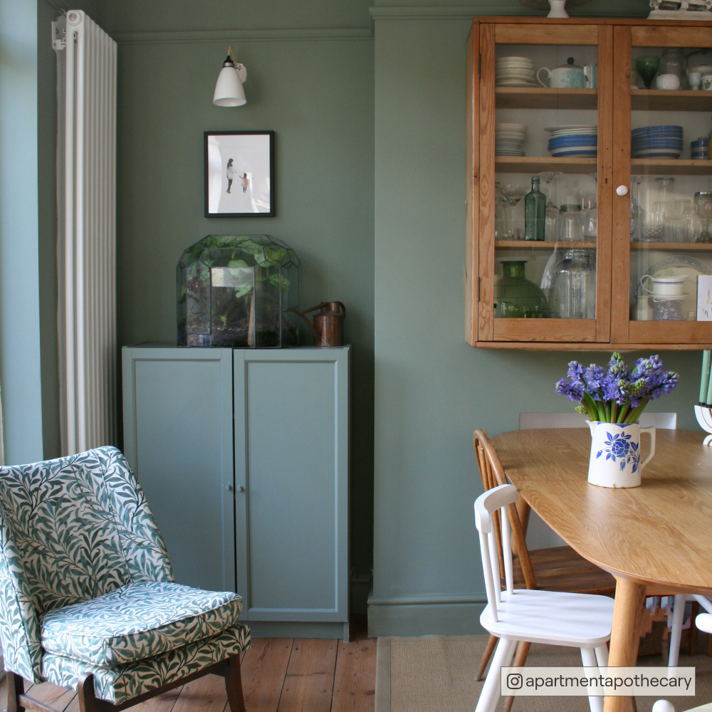
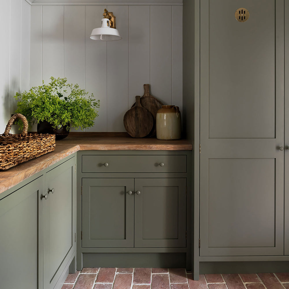
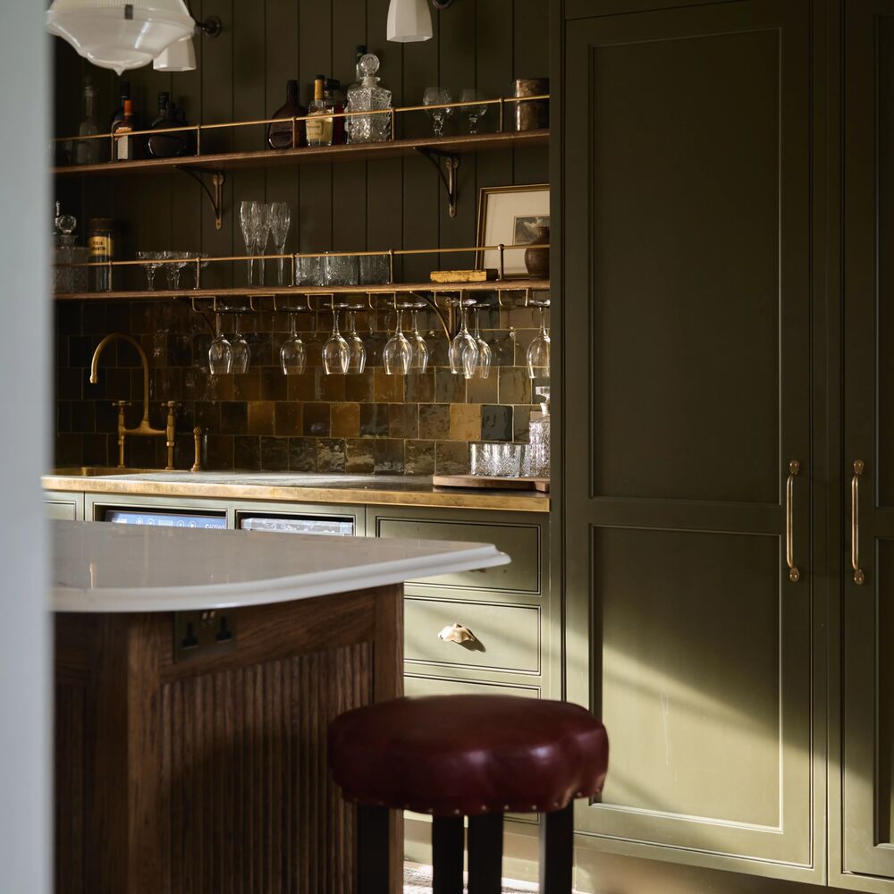
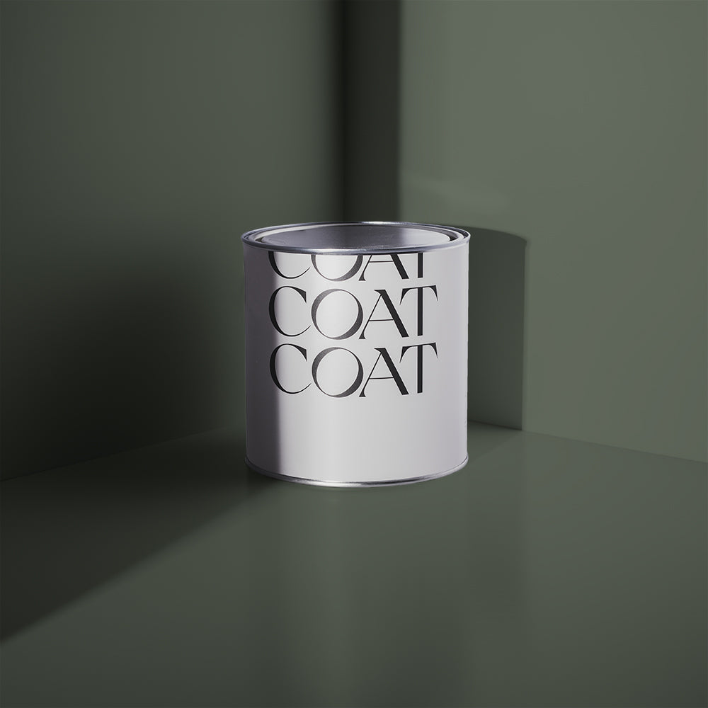
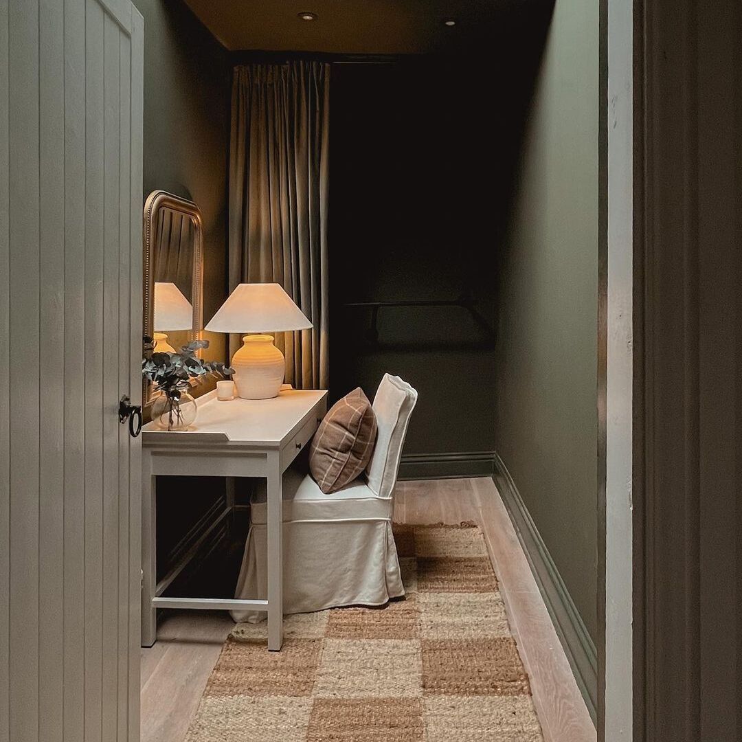
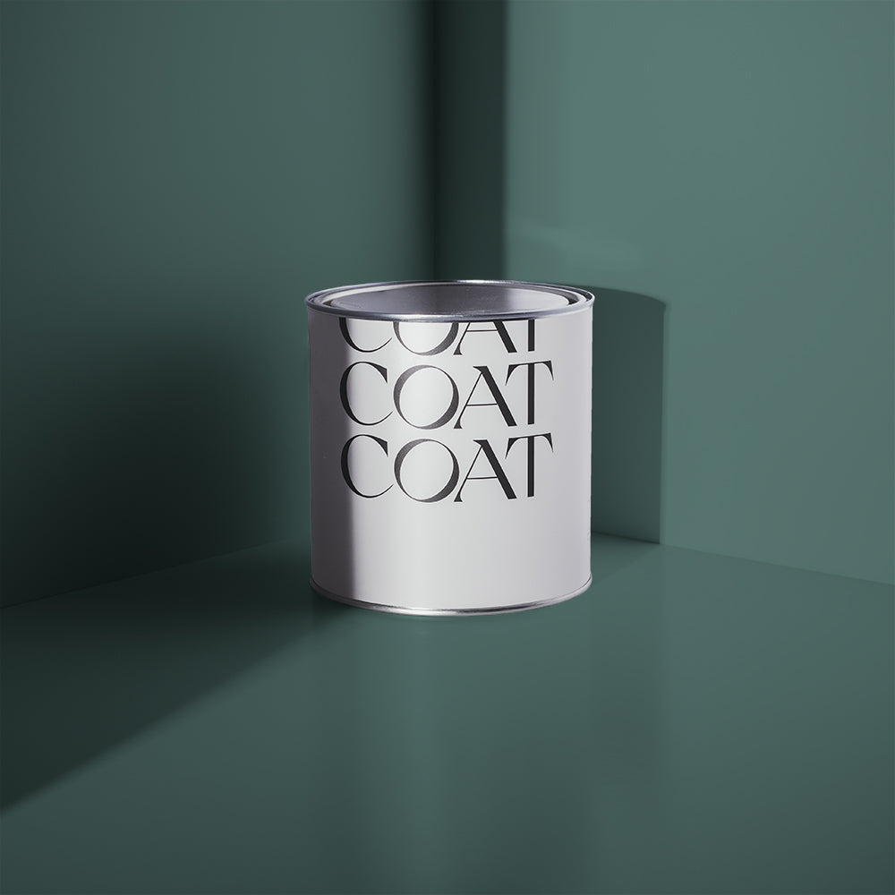
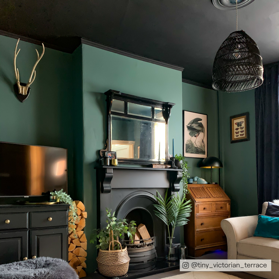
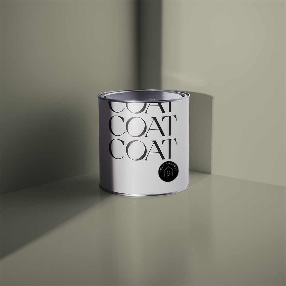
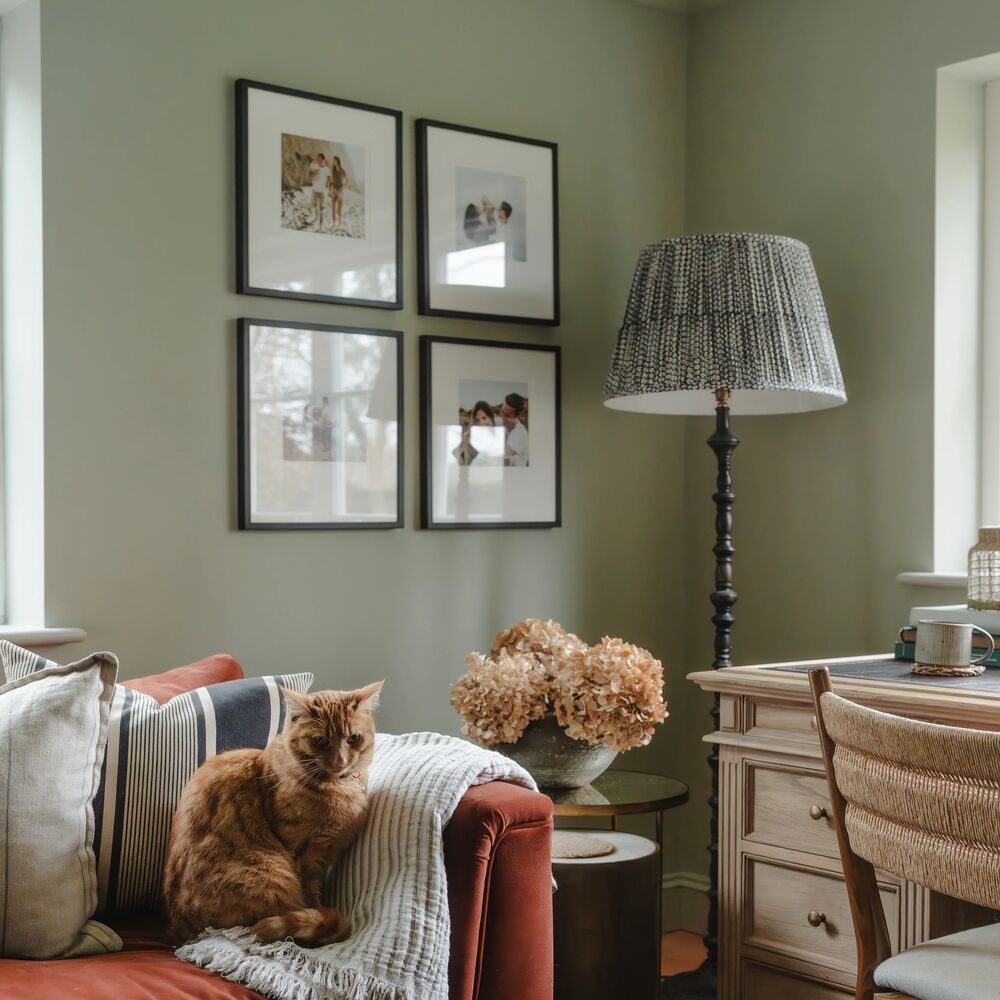
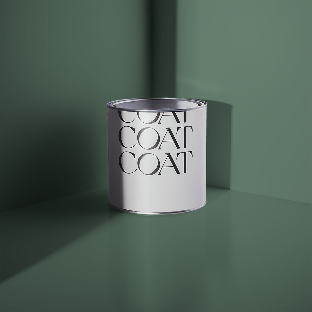
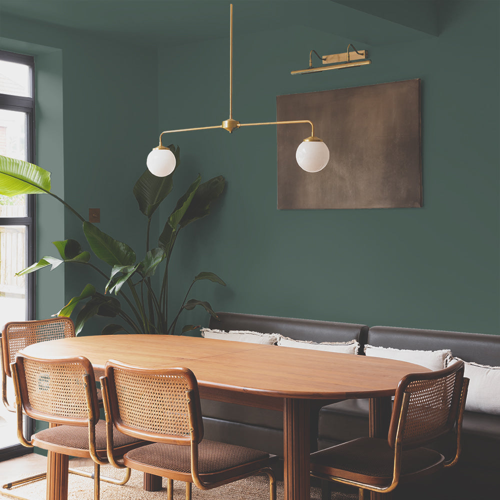
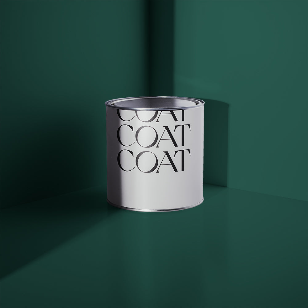
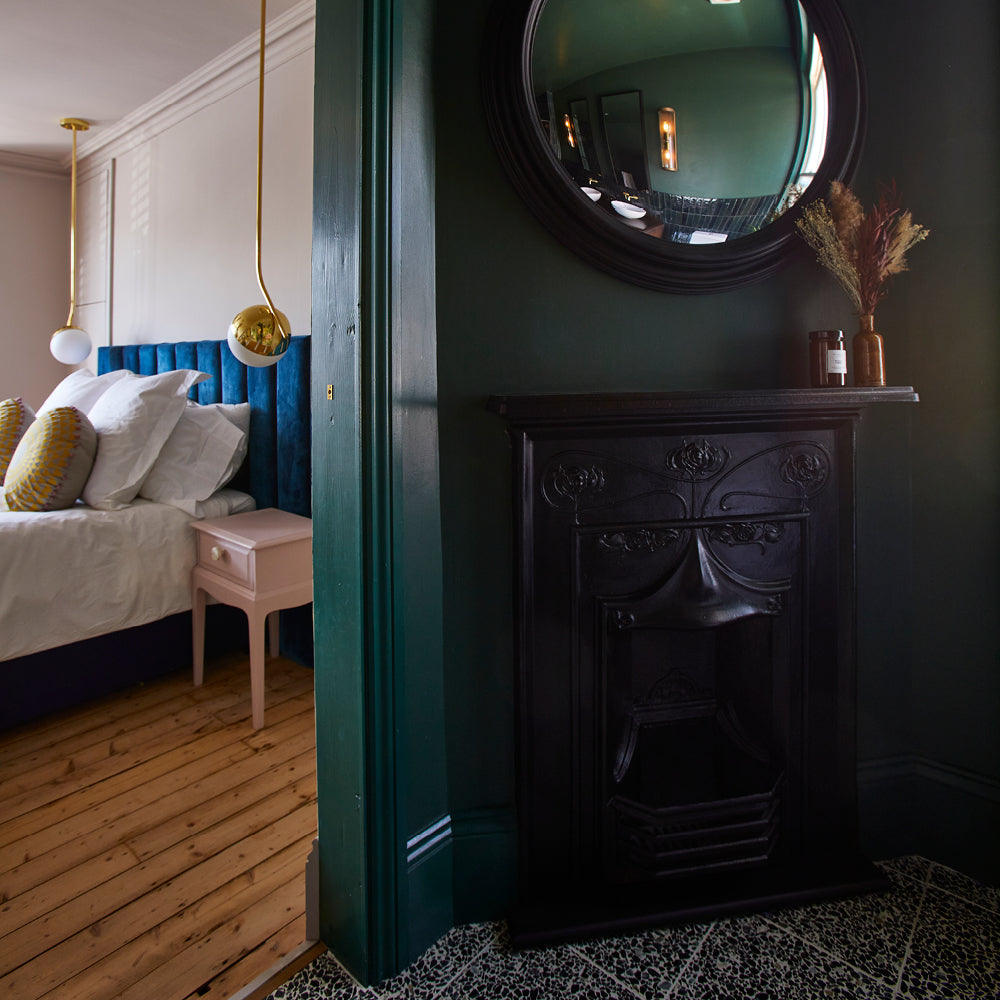
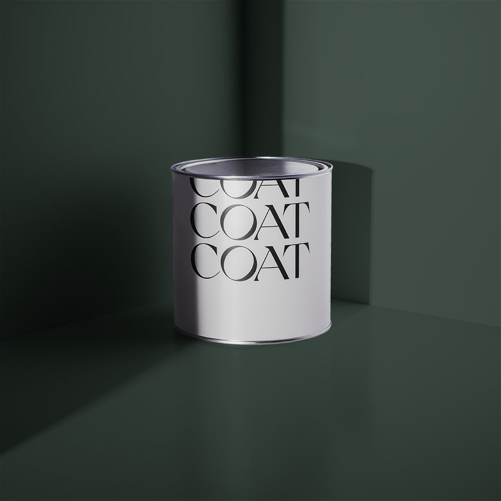
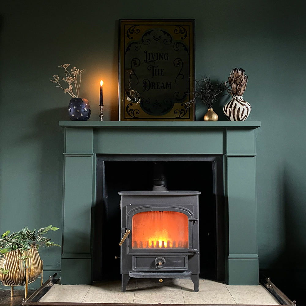
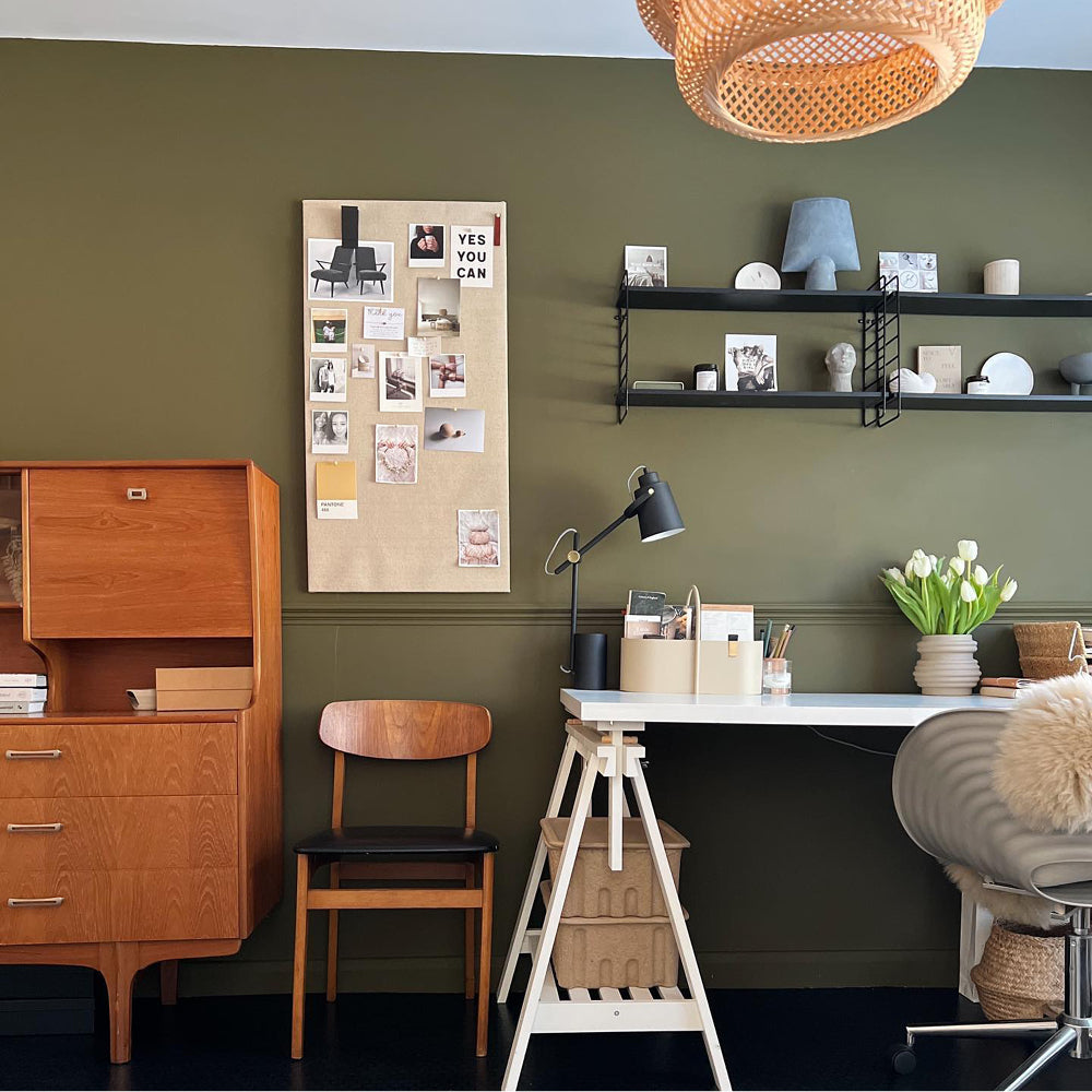
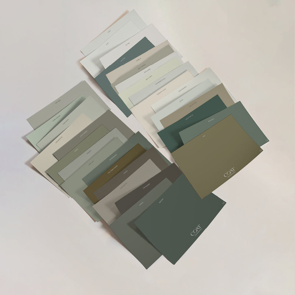
Mood-boosting greens can be a great choice for getting you out of the doldrums this January. Reflecting the hues of the natural world, greens are known to have a calming and fortifying effect. They can help reduce stress and anxiety, and deep greens such as Ditch The Tie and Adulting are linked to concentration and focus.

No stress here with @spantastichome's Ditch the Tie
"In colour psychology, green represents life, growth, renewal and the environment," says interior designer Mel Massey. "Green can be earthy and warm or cool and silvery, but it's always more pleasing than challenging."
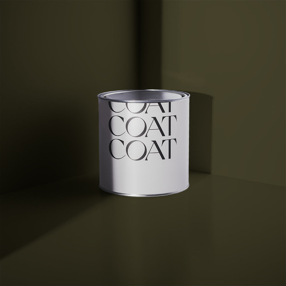
For a zingy pop of uplifting colour, why not try our new vivid lime green Plant Power which was launched to celebrate David Attenborough’s new BBC show, The Green Planet? This vibrant, acidic green with yellow undertones works brilliantly alongside moody darks such as Nomad, The Drink and The Record Store.

THE JANUARY BLUES
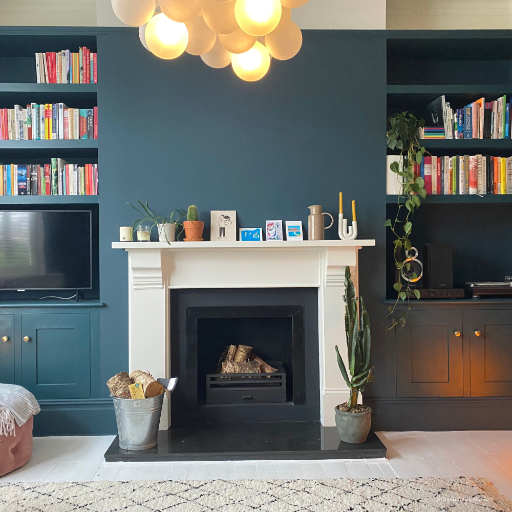
Despite what the songs say, blues don't have to make you feel blue. In fact, they can be the perfect mood booster because of their association with blue seas, blue skies and happy times. There's also something wonderfully dependable and orderly about blues which can calm the soul during challenging times.
"Blues are intrinsically uplifting because, from a psychological point of view, we associate them with the clear, sunny skies of summer," says interior designer Roselind Wilson from Roselind Wilson Design. "Add to that the timeless, classic quality of the colour blue and you really are onto a winner.

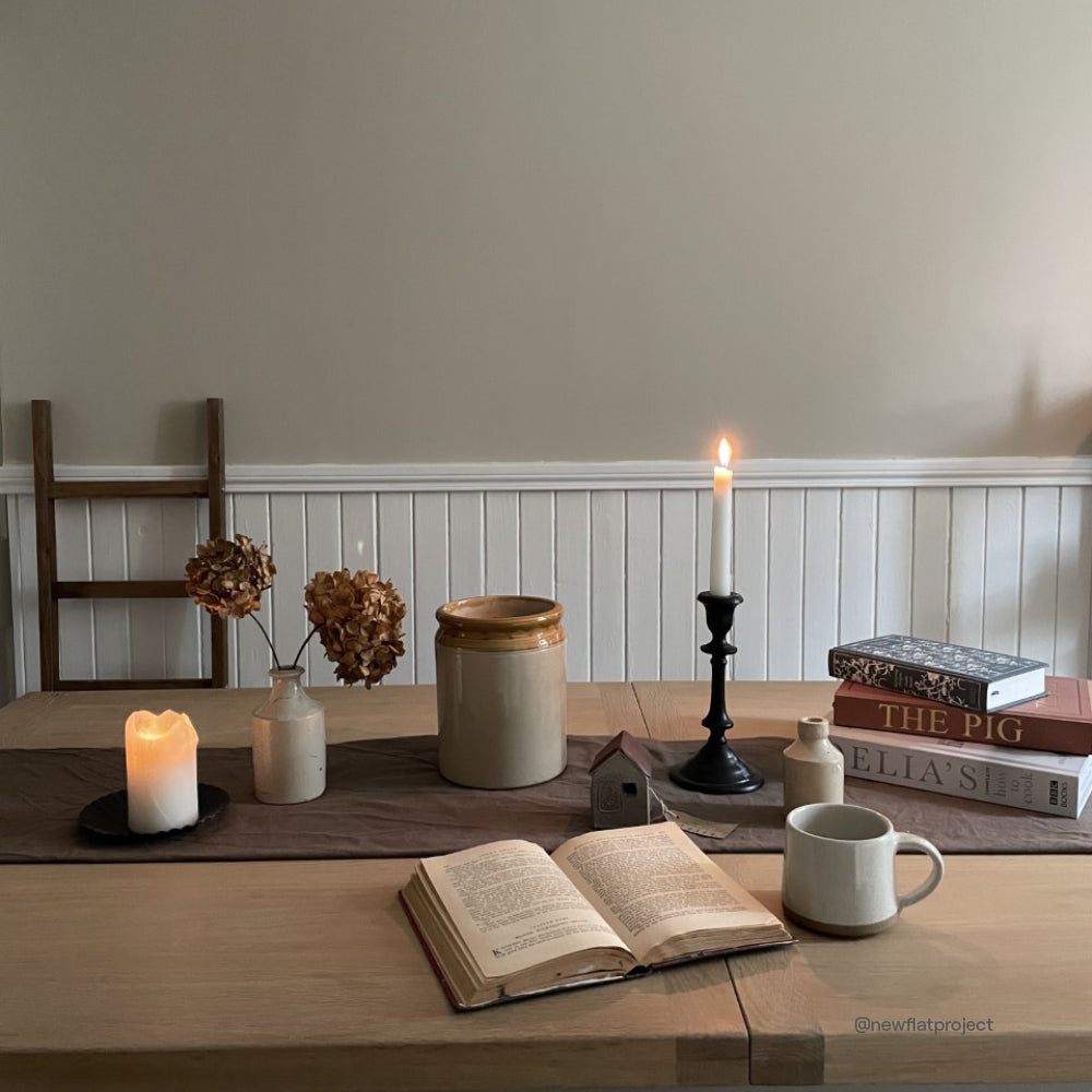
Below Deck bringing the bright sky vibes to @newflatproject
"The great thing about blue is that you can be really creative with it because it's such an adaptable colour,” continues Roselind. "It provides the perfect contrast to both pastels and primary colours, and works really well when used in bold paint patterns such as stripes or chevrons."

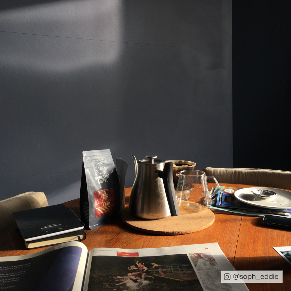
2AM giving @houseofhaz all the relaxing bedroom feels.
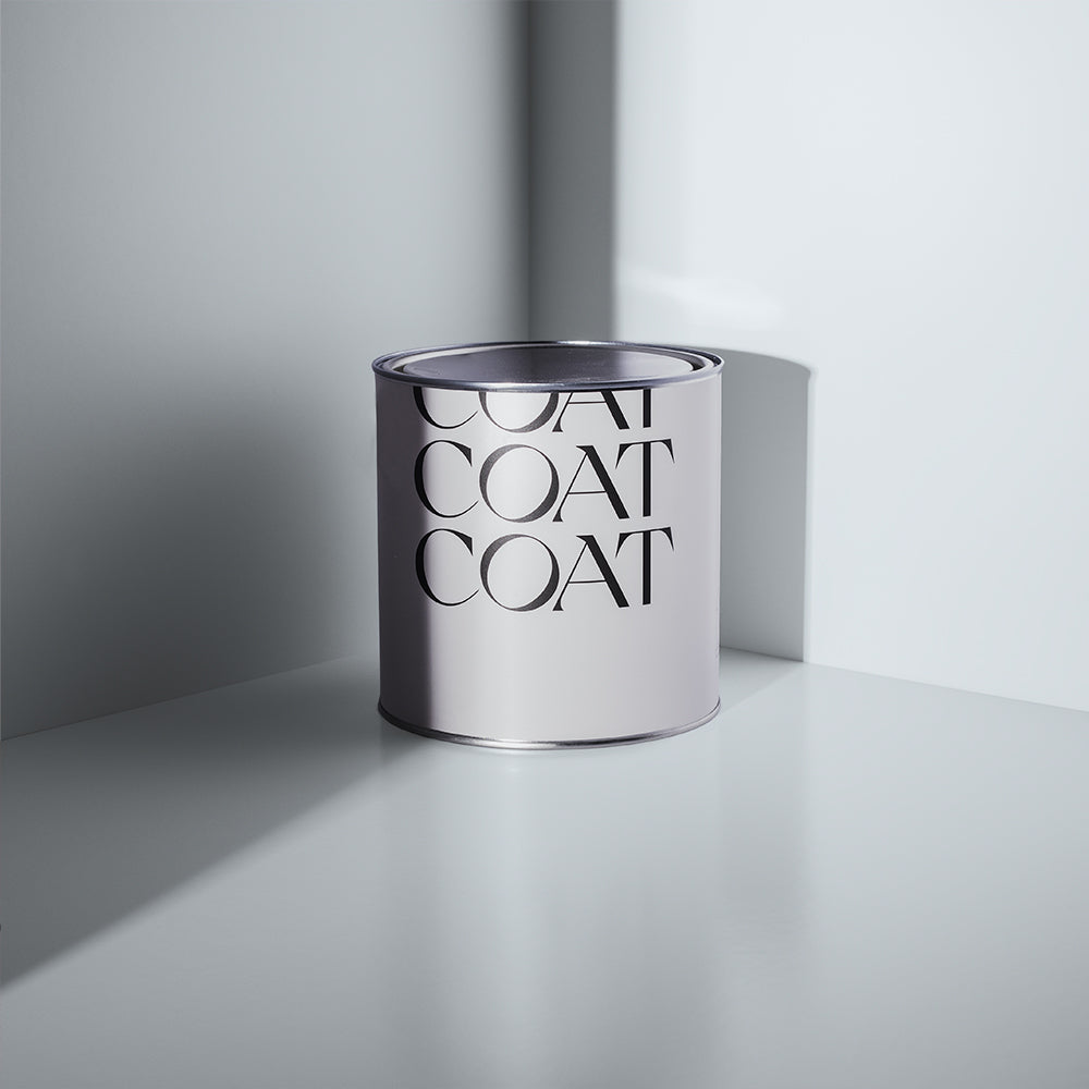
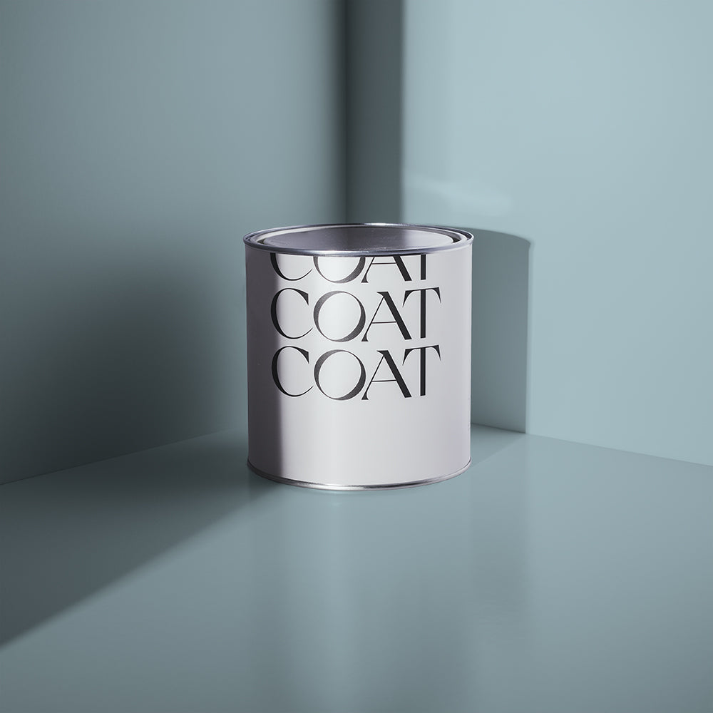
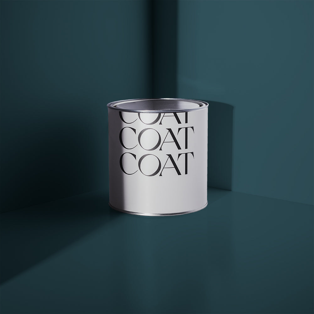
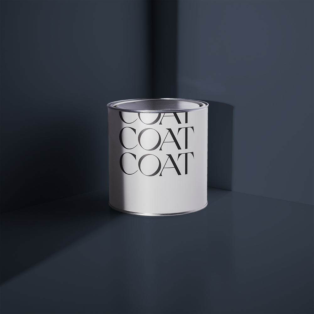
Why not try one of our best-selling dark blue hues such as 2AM or The Drink? Or get a light and airy feel with optimistic blues Lie In or Below Deck?
REASSURING NEUTRALS
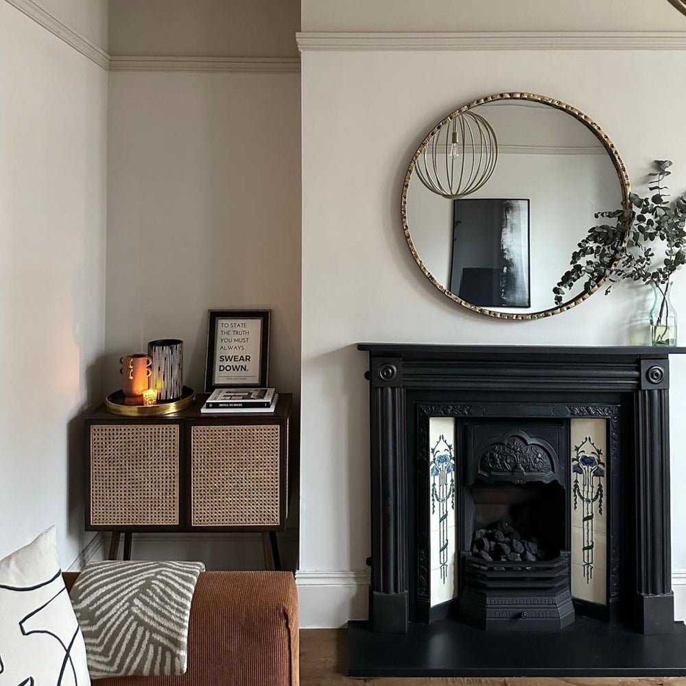
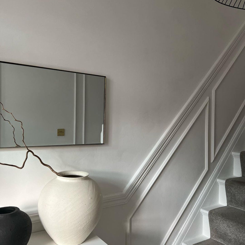
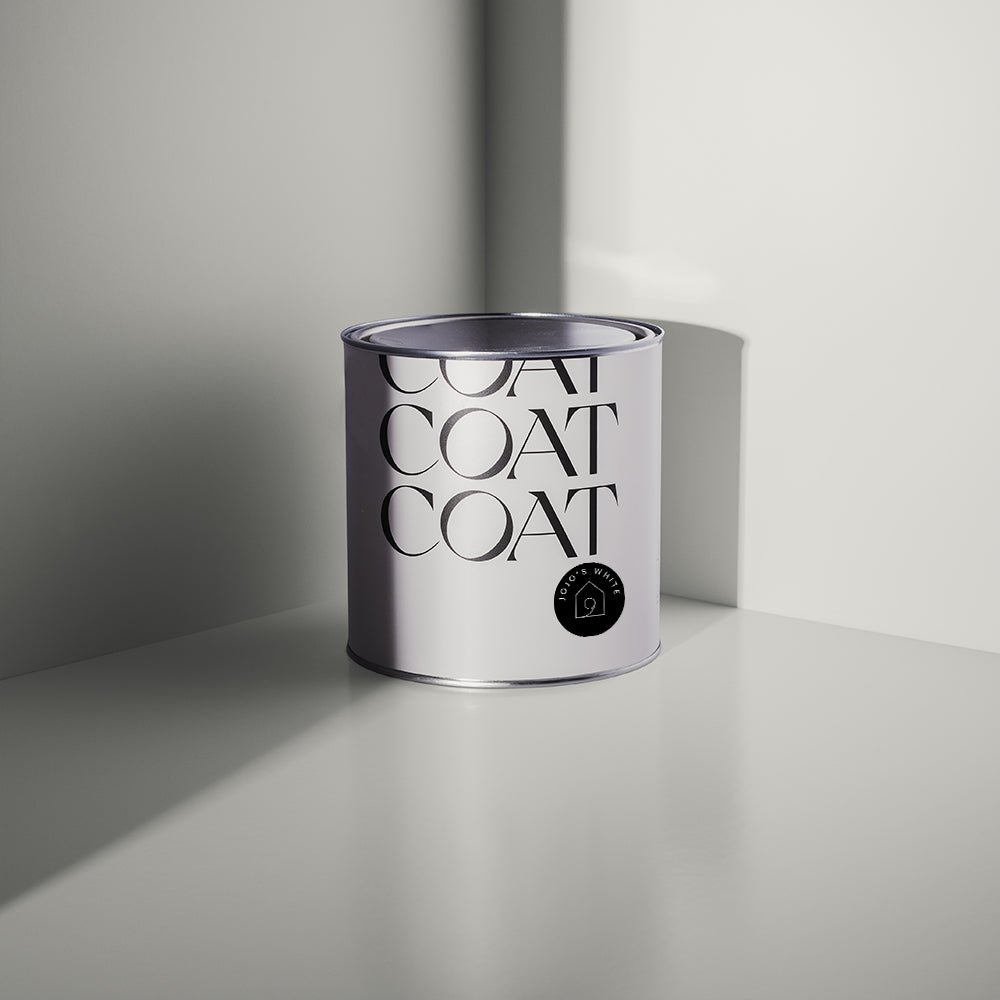
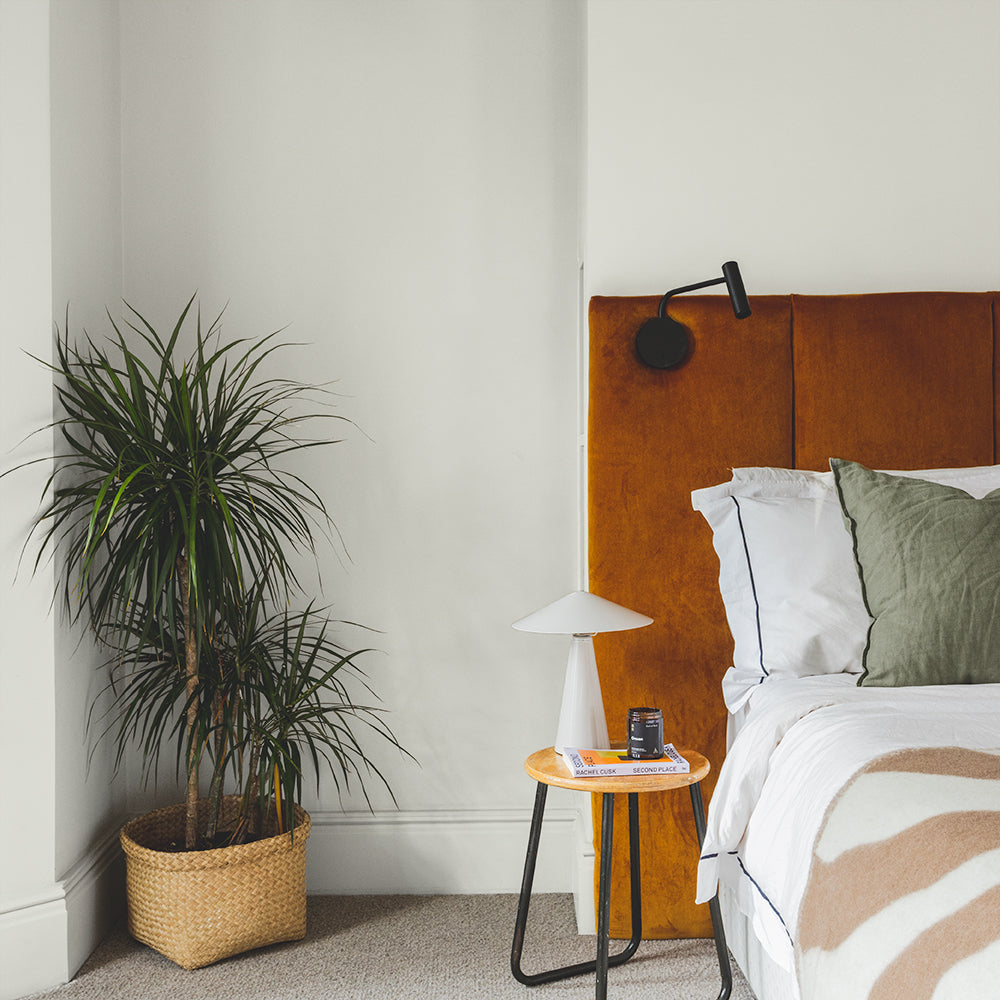
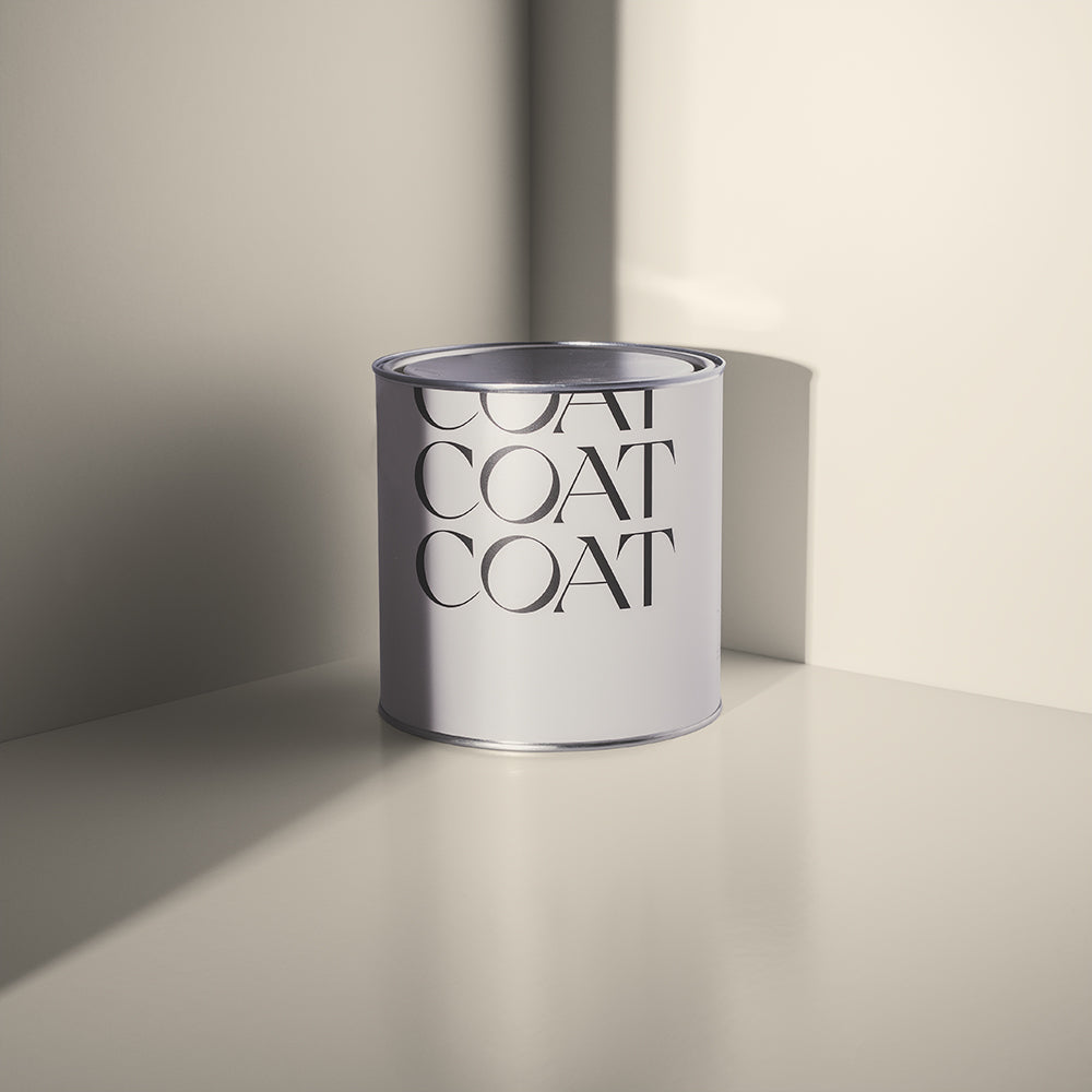
When we talk about colour having the ability to lift the spirits on dark days, we're not just talking about bold shades. Neutrals also have a part to play, providing a steady, reliable backdrop to help you navigate tricky times.
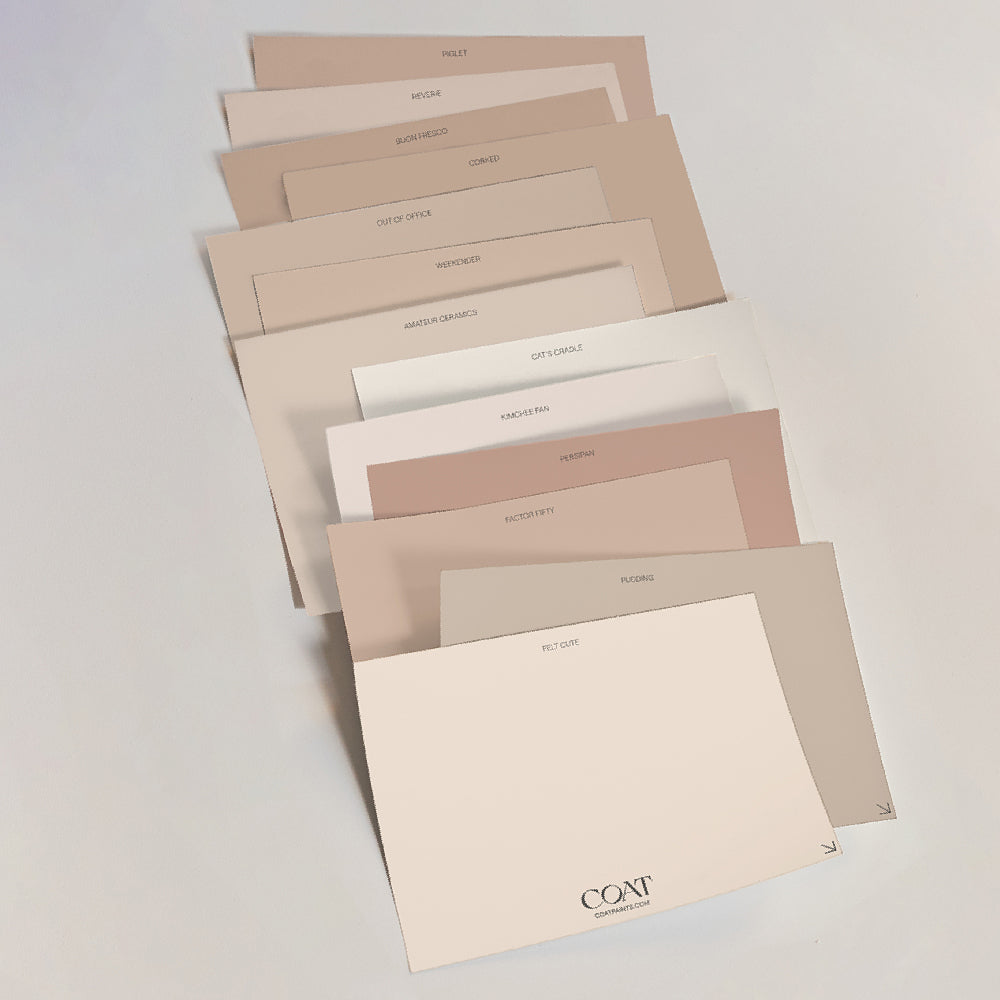
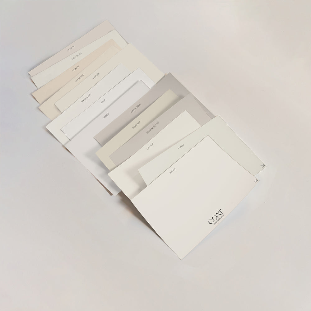
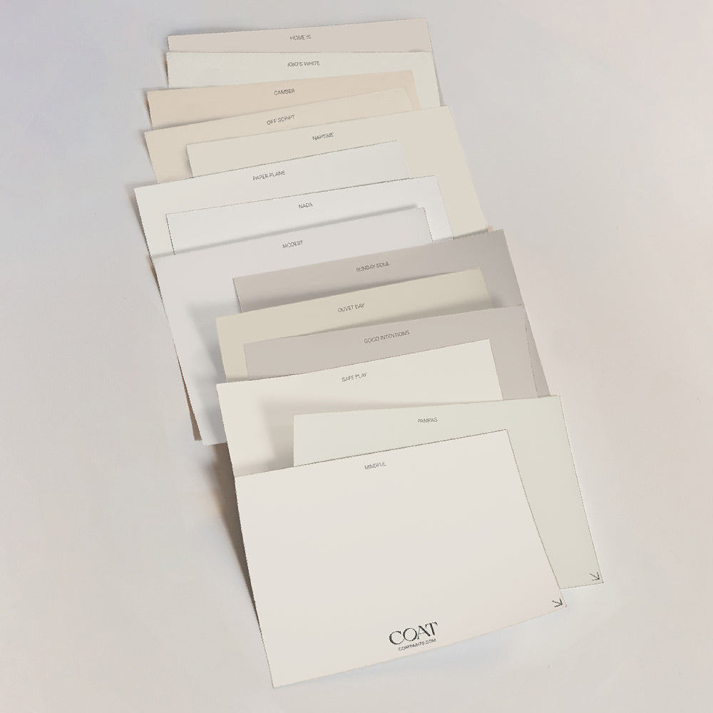
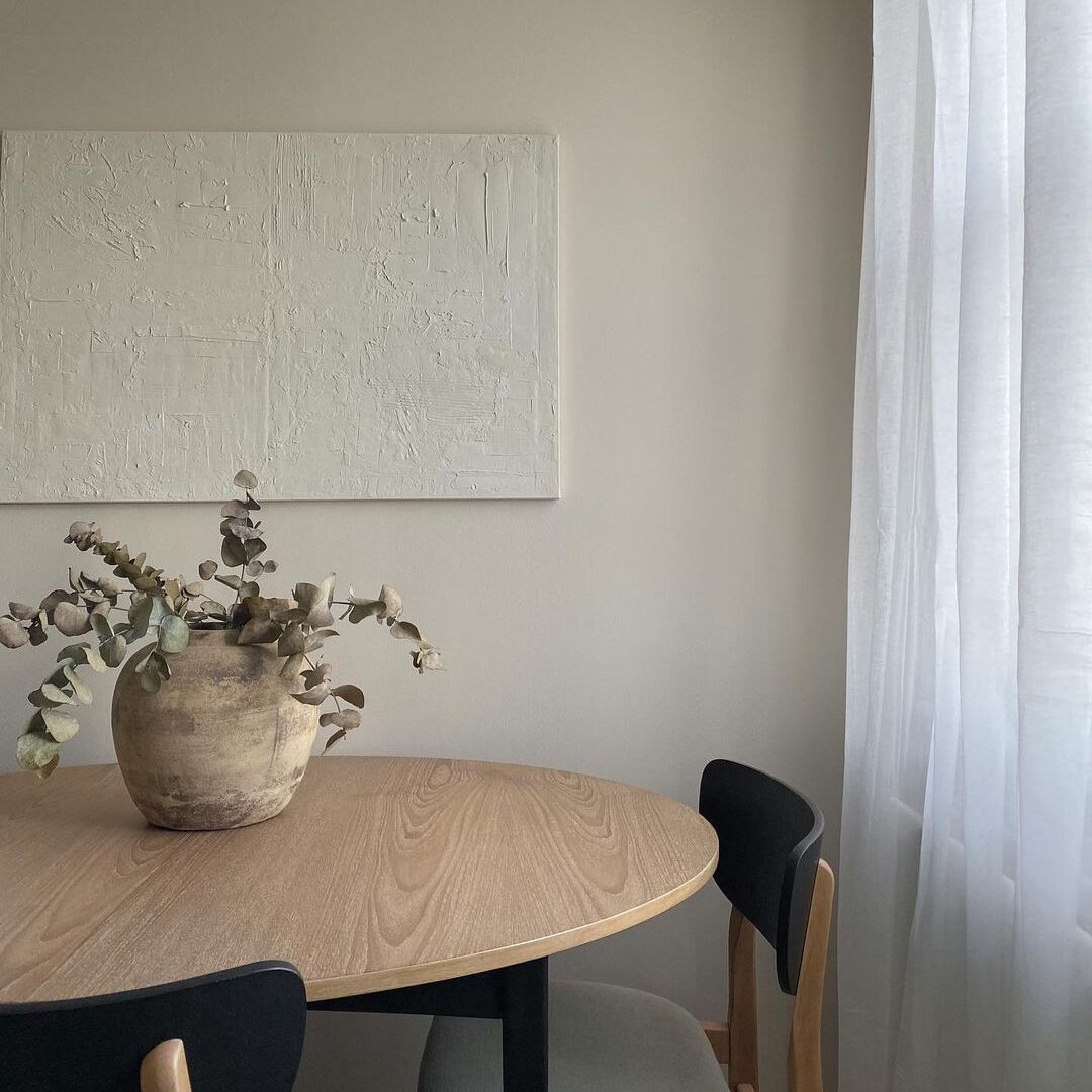
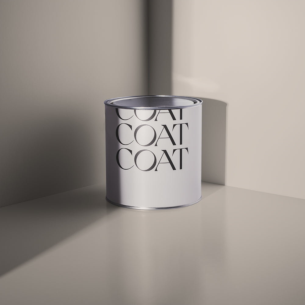
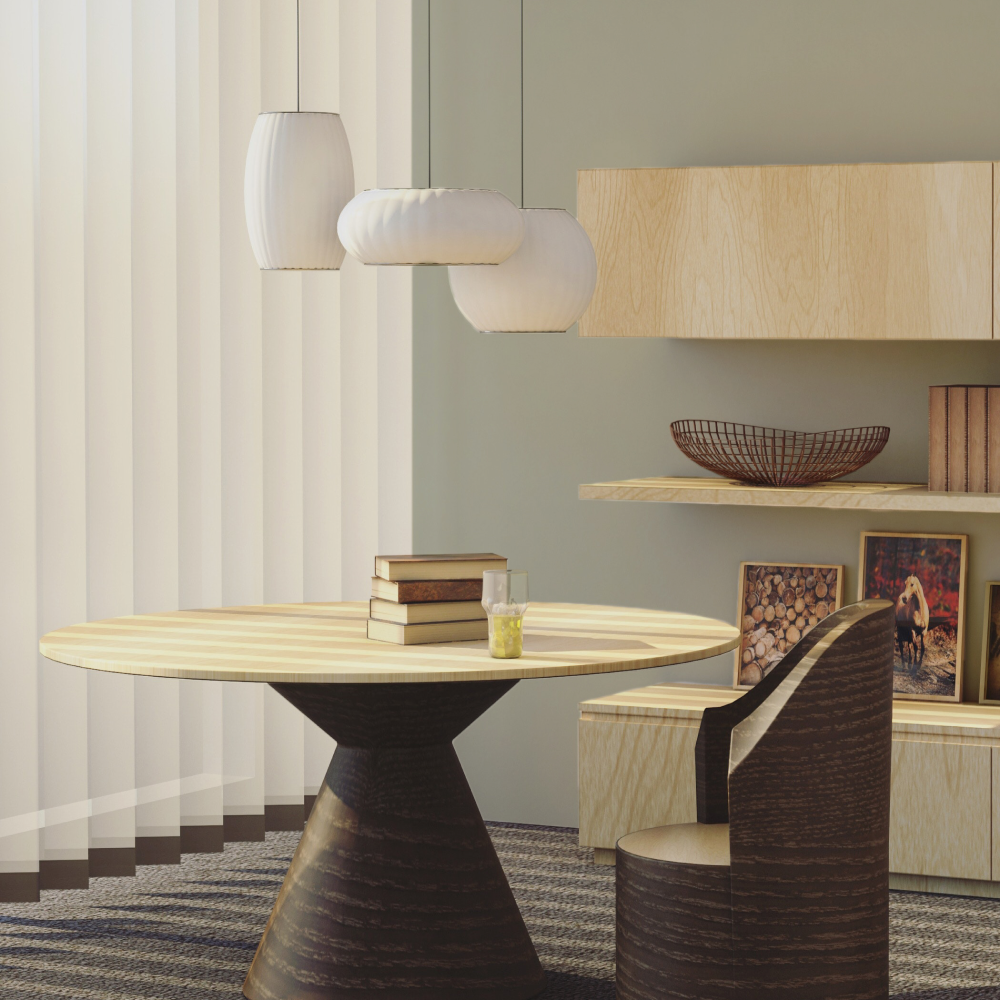
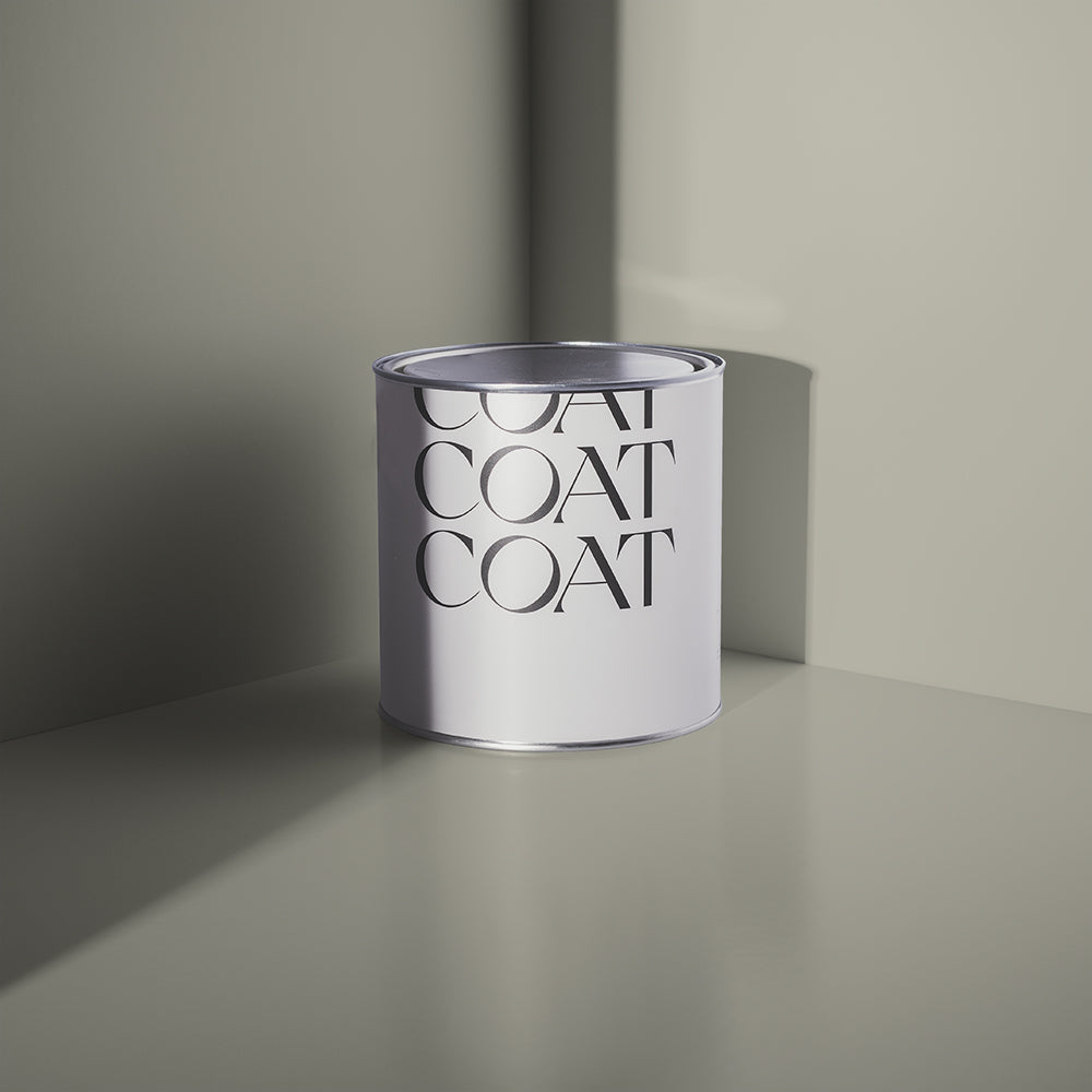
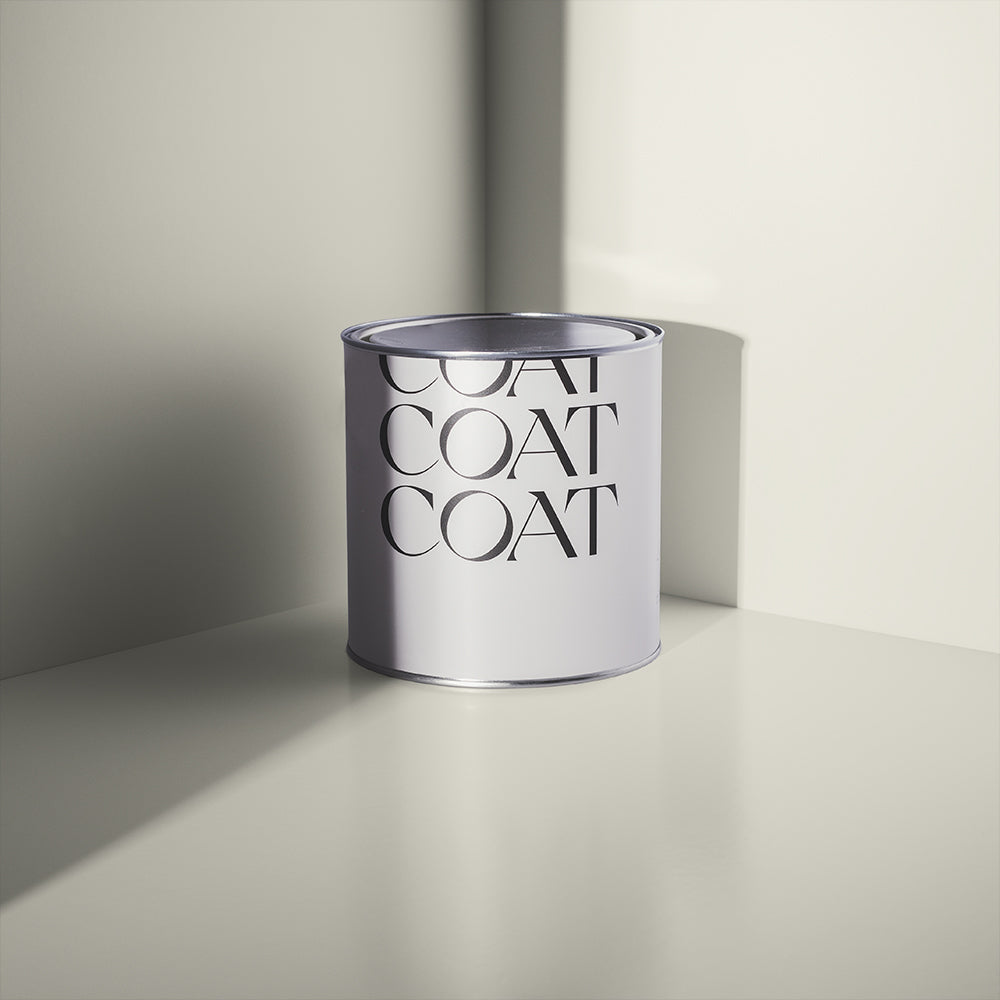
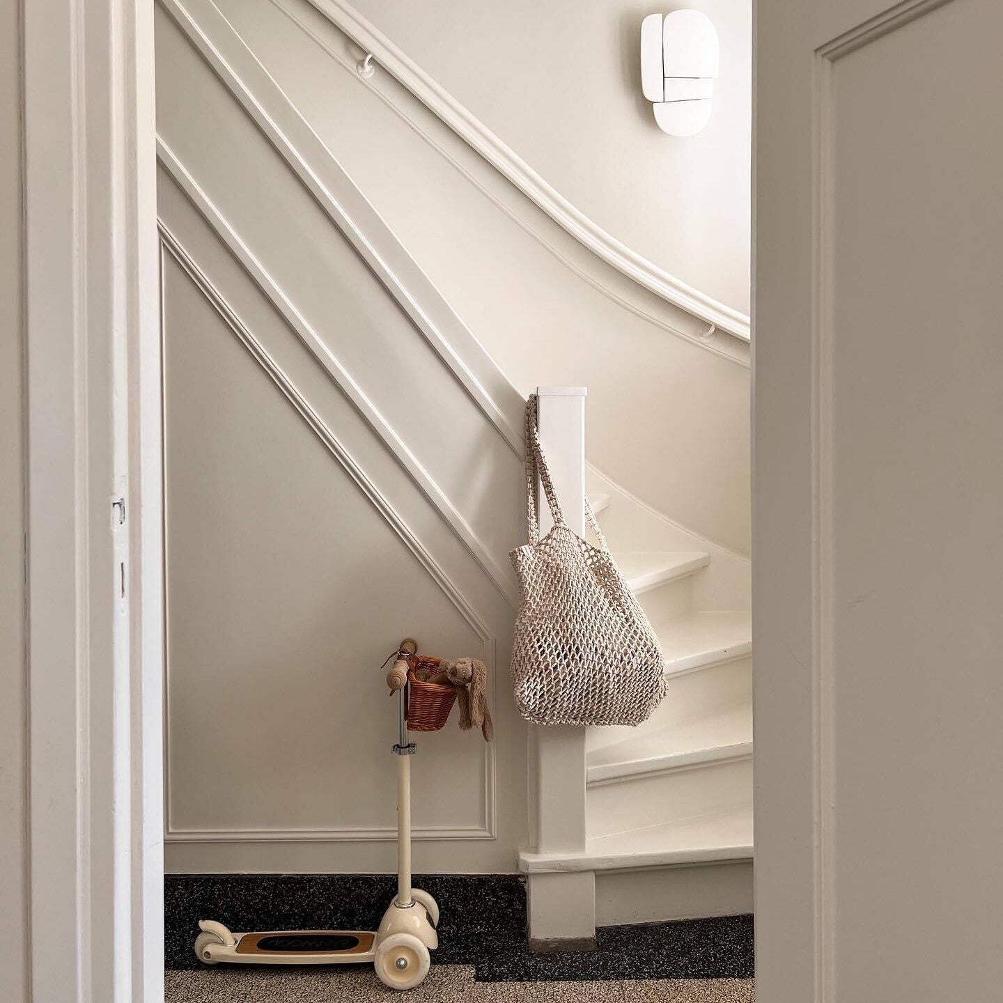
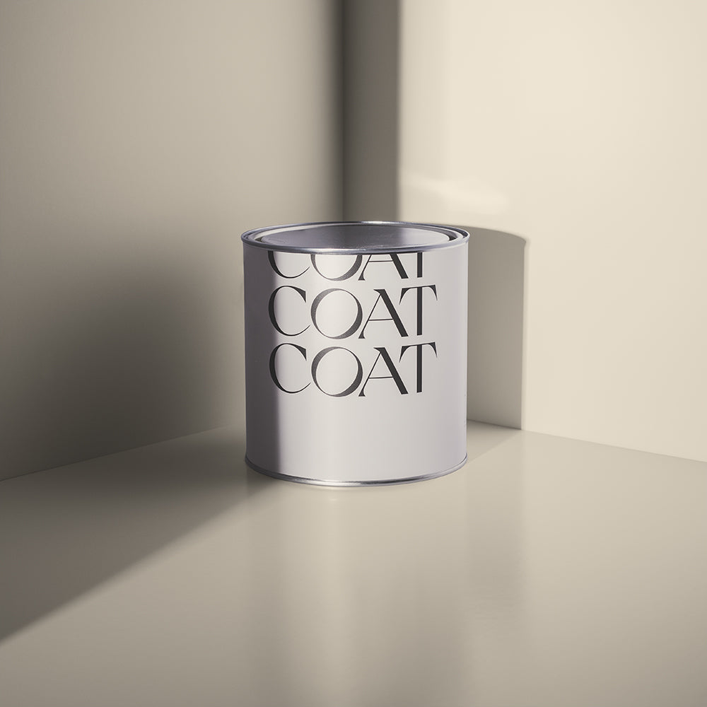
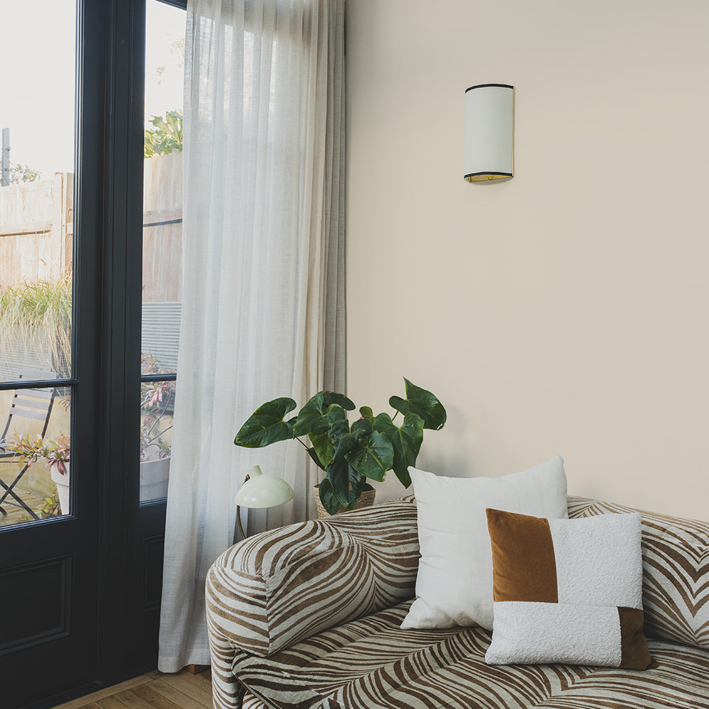
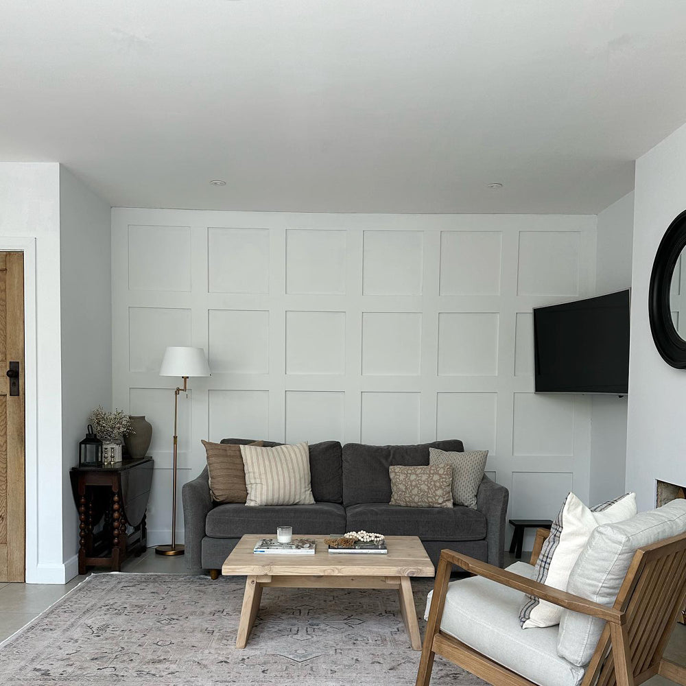
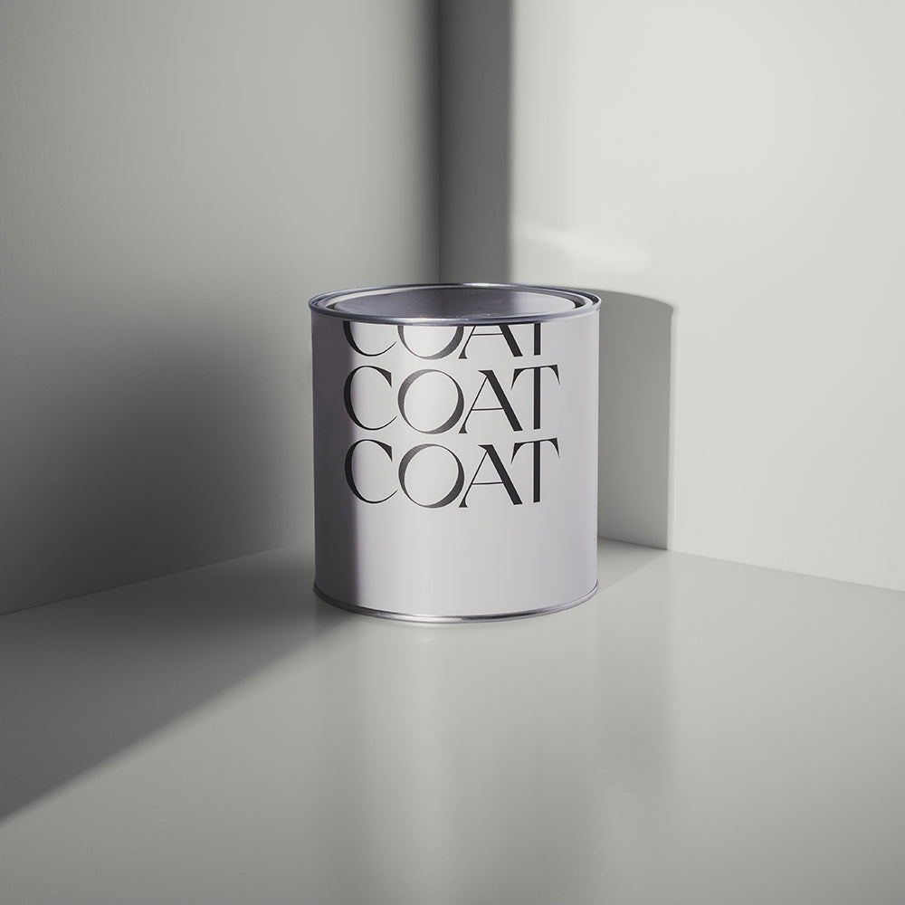
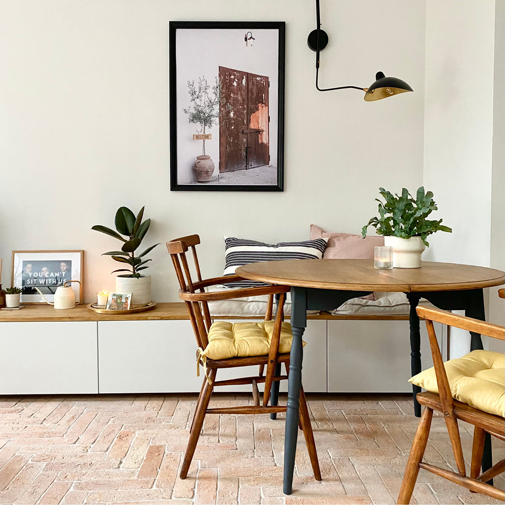
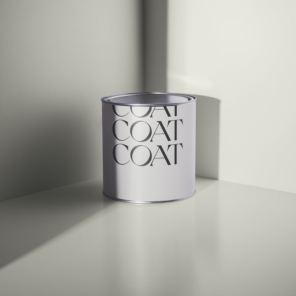
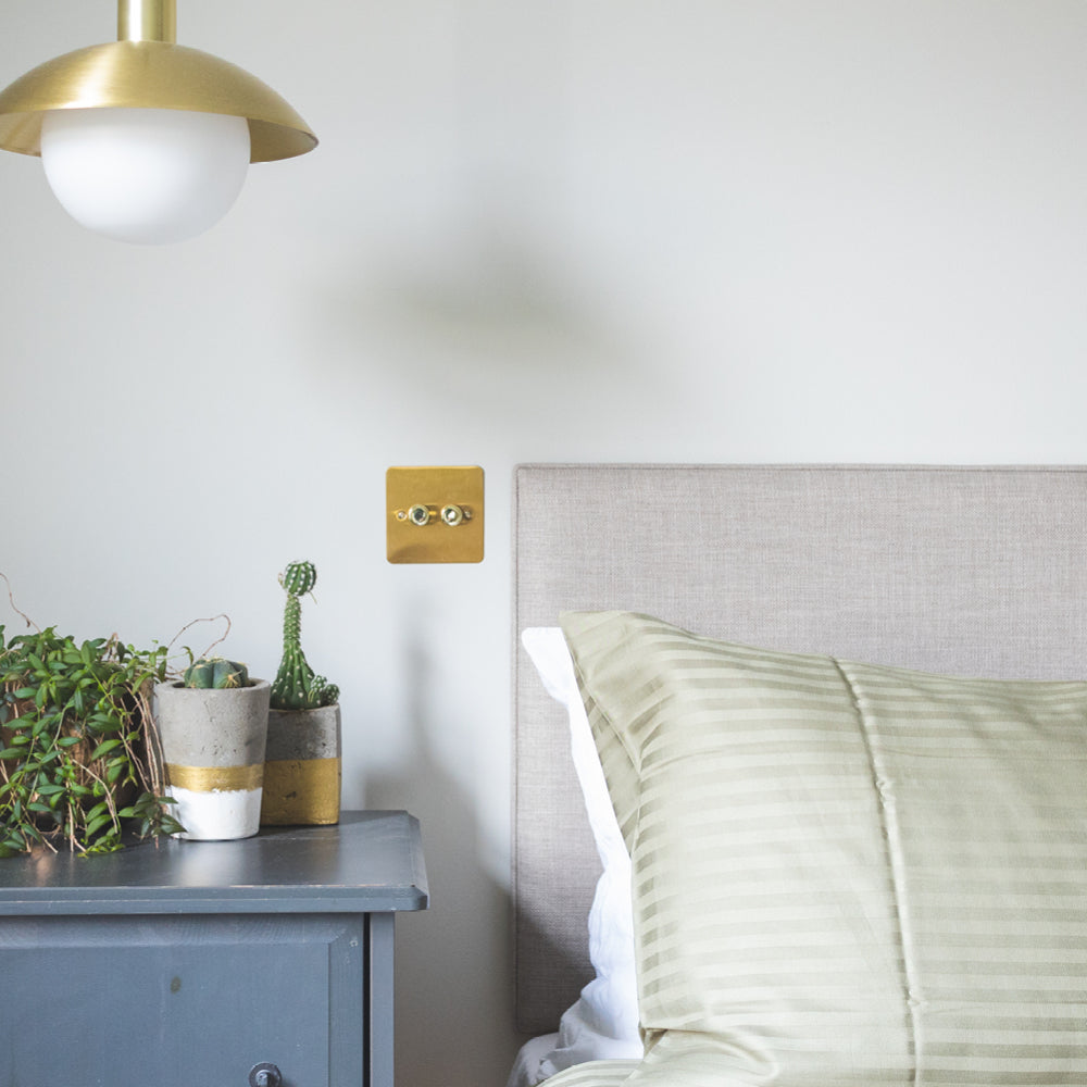
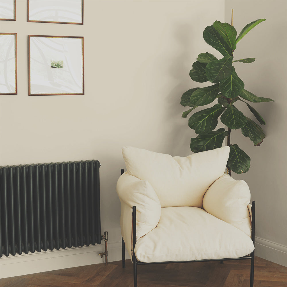
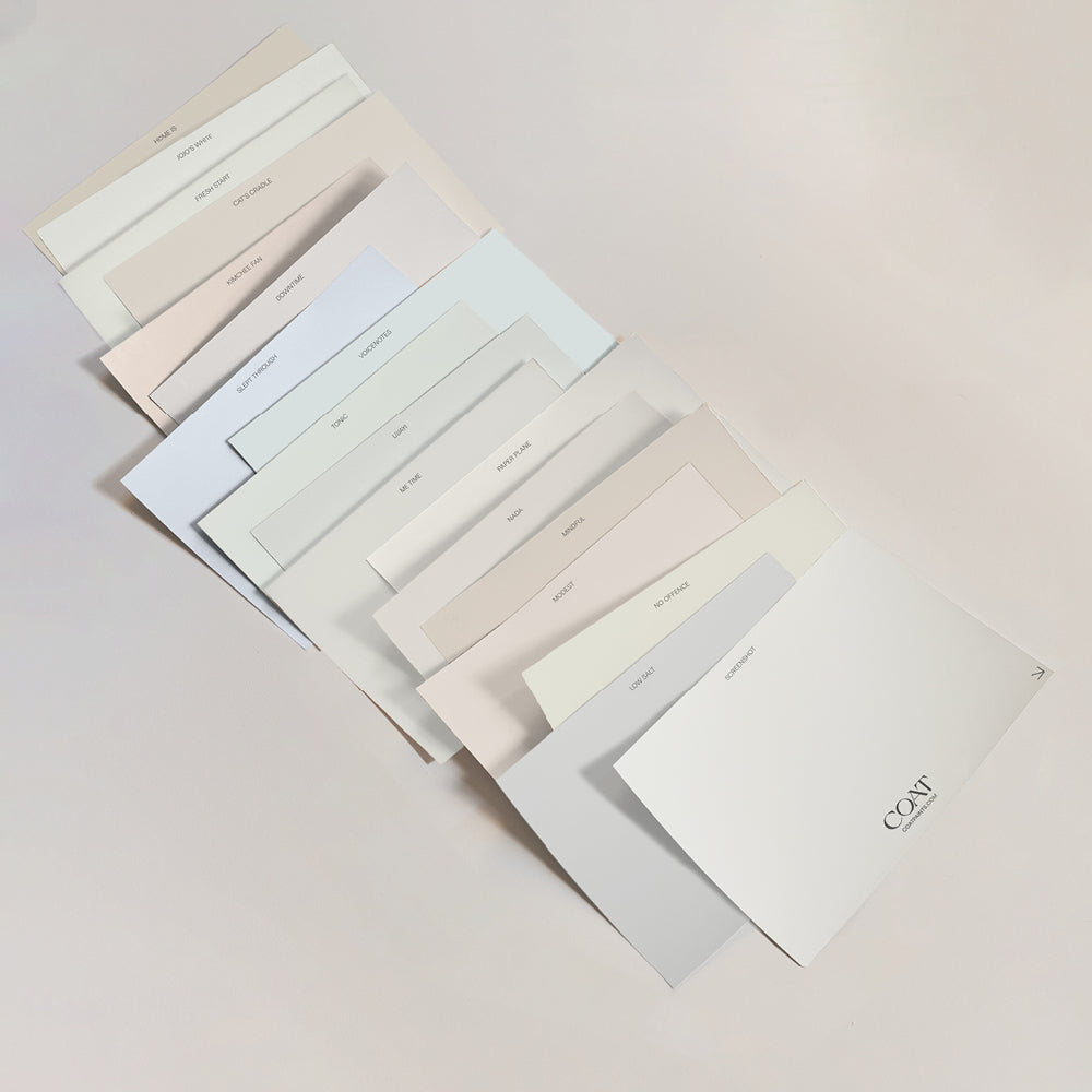
Our most popular neutral shades such as And Breathe and Kind Regards are restful and dependable, working particularly well in rooms which are flooded with natural light - nature's ultimate mood booster.

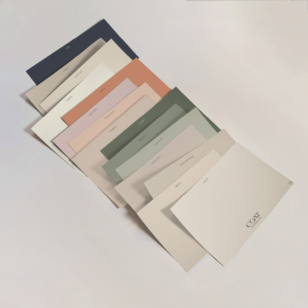
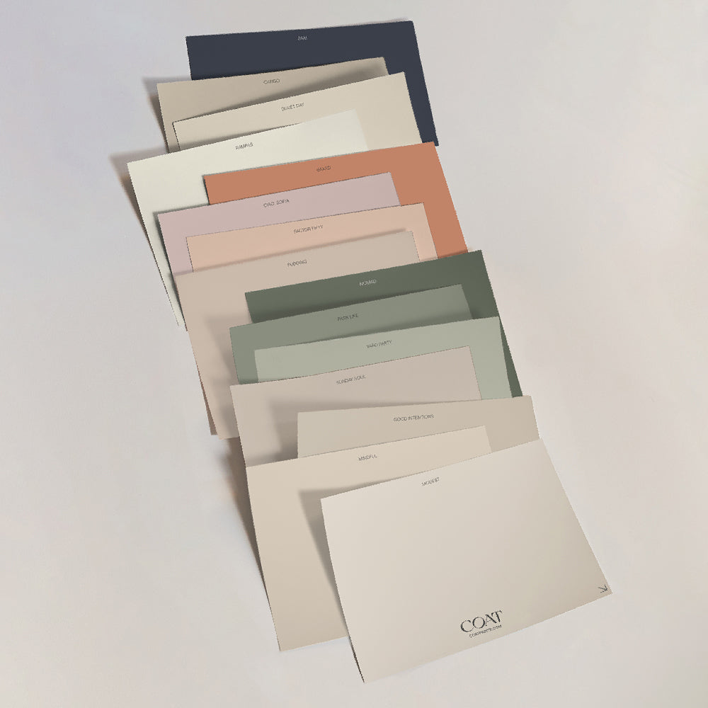
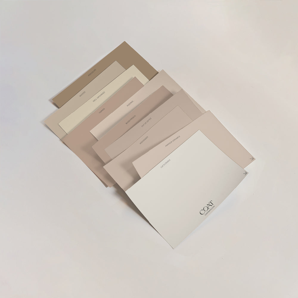
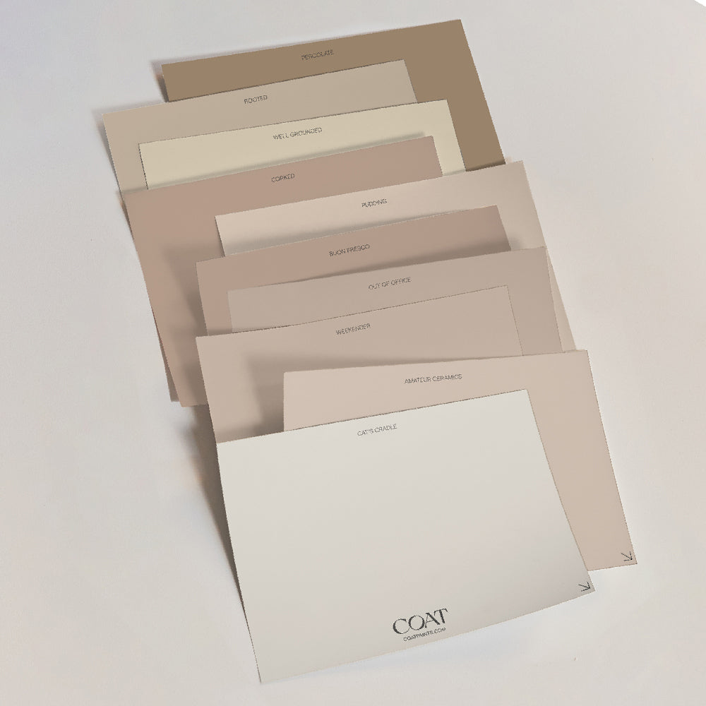
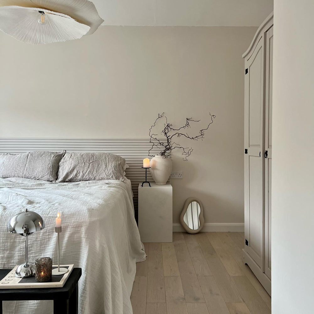
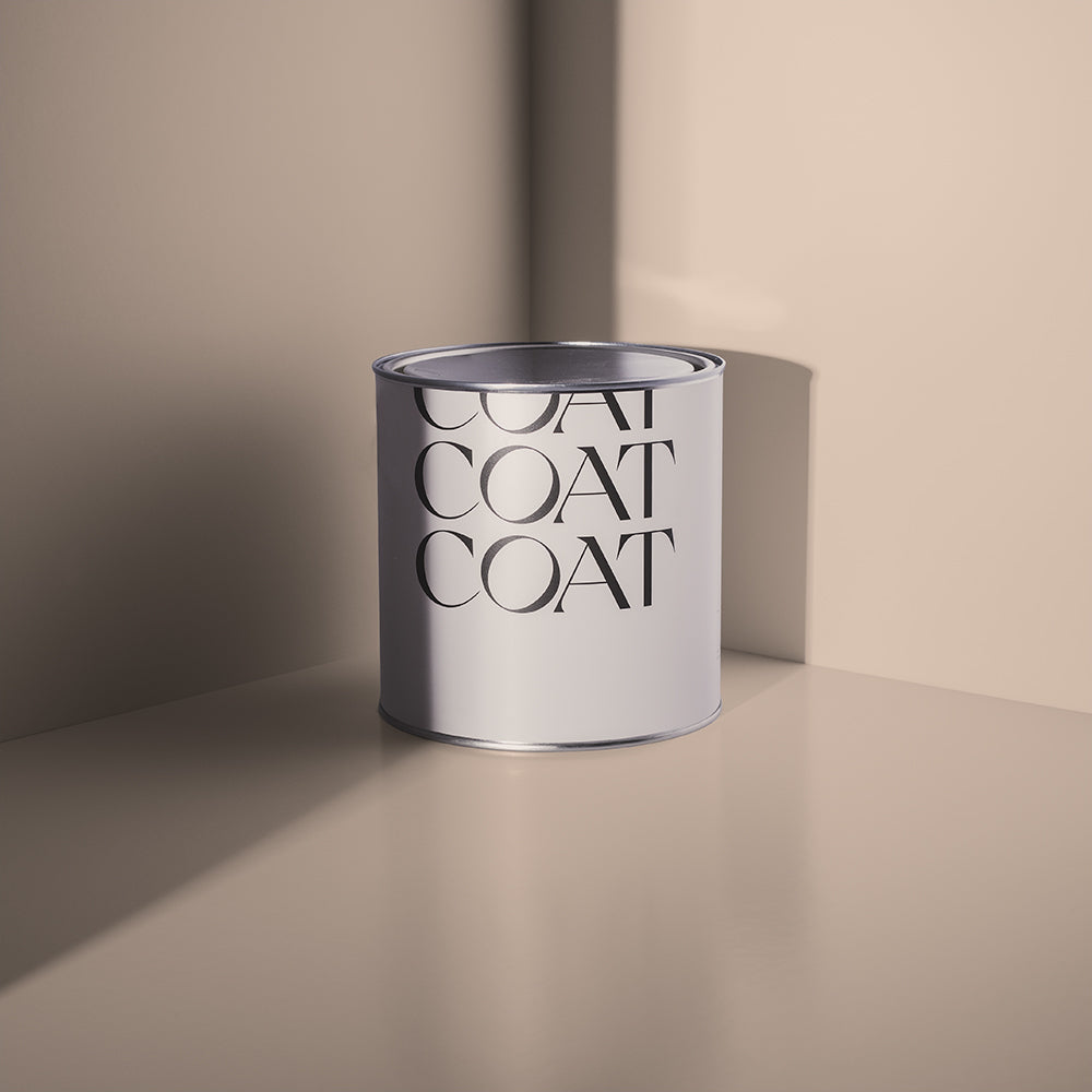
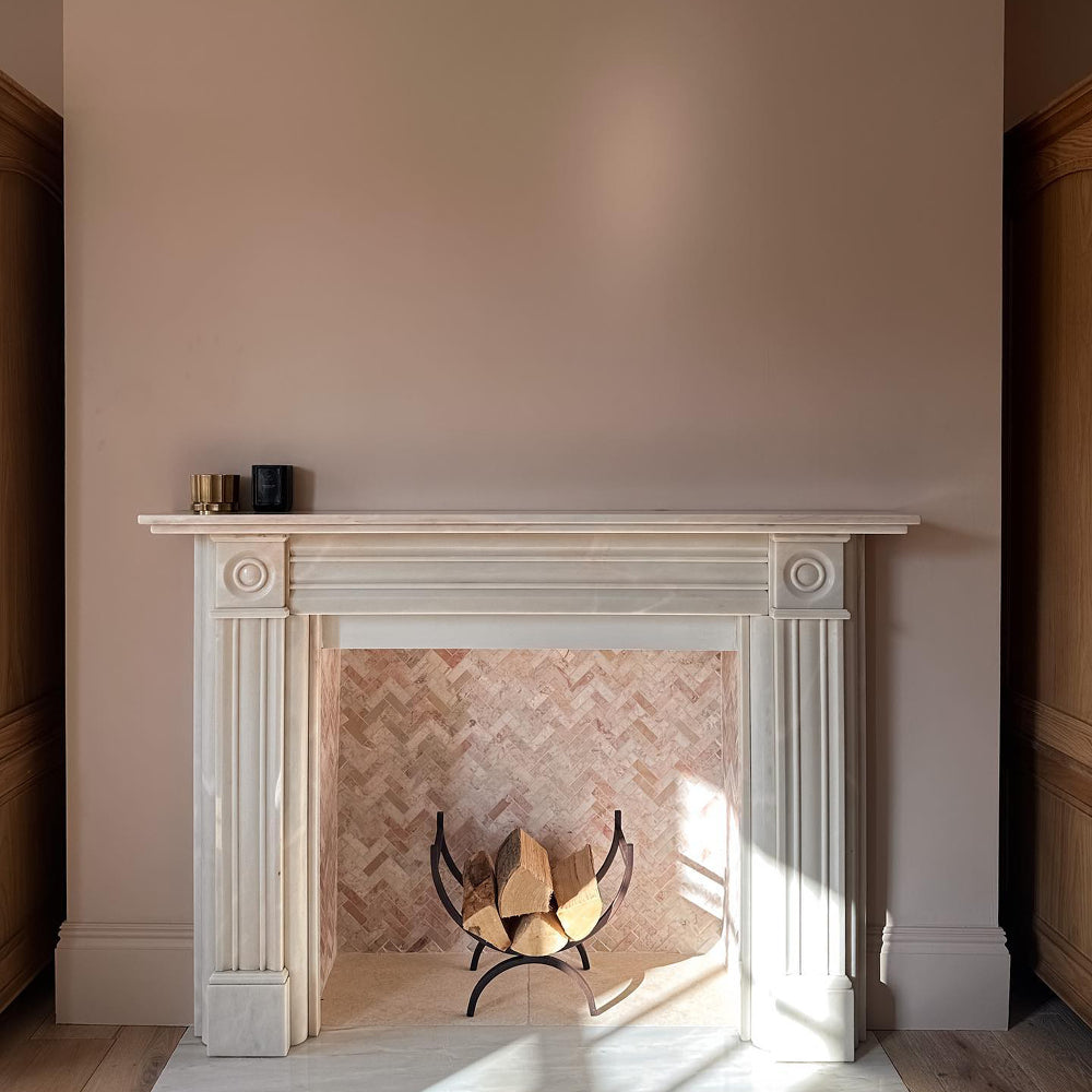
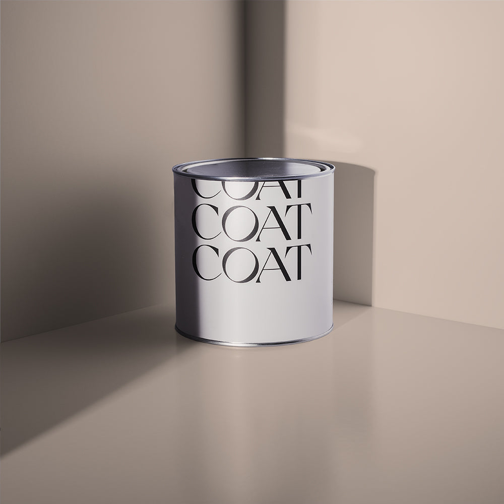
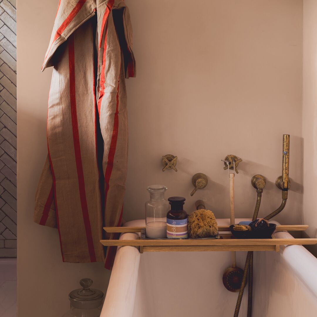
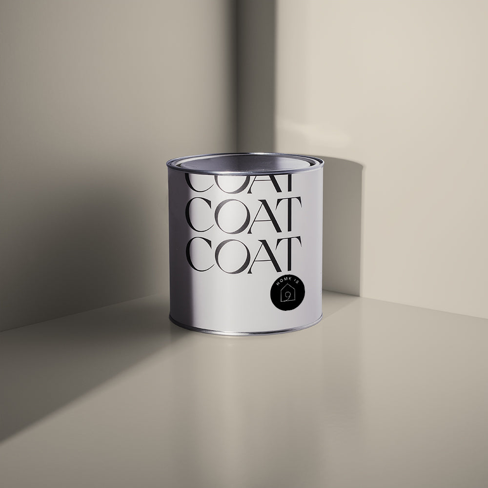
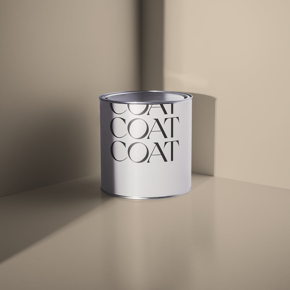
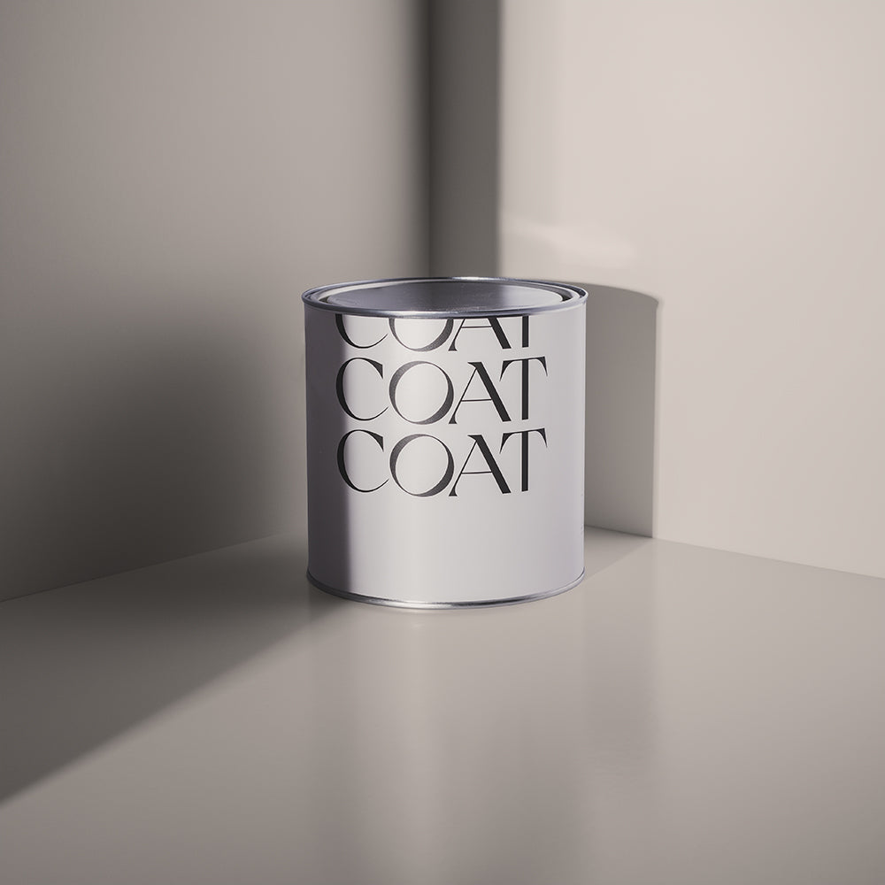
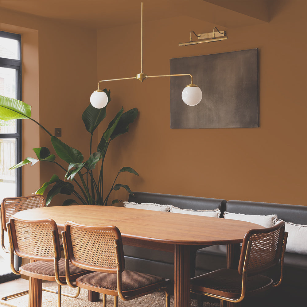
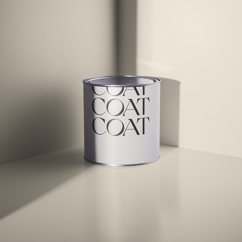
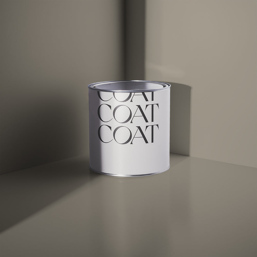
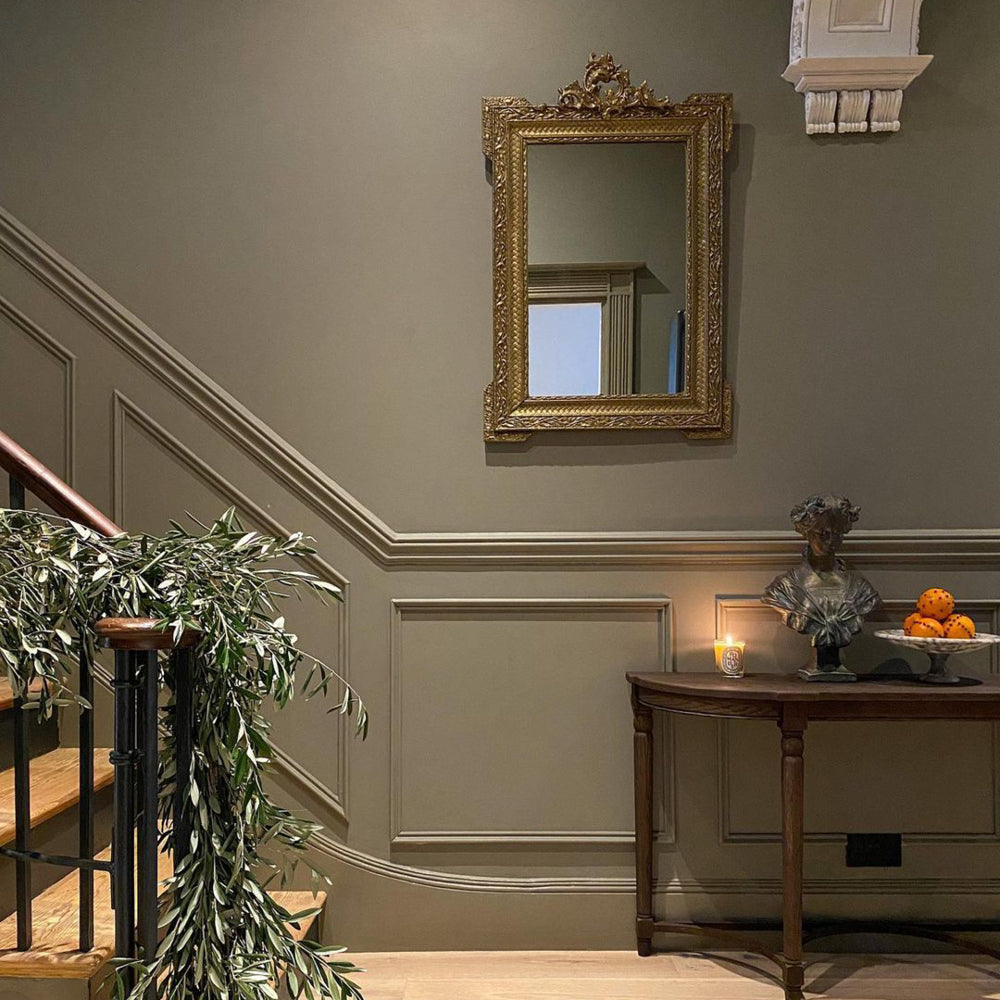
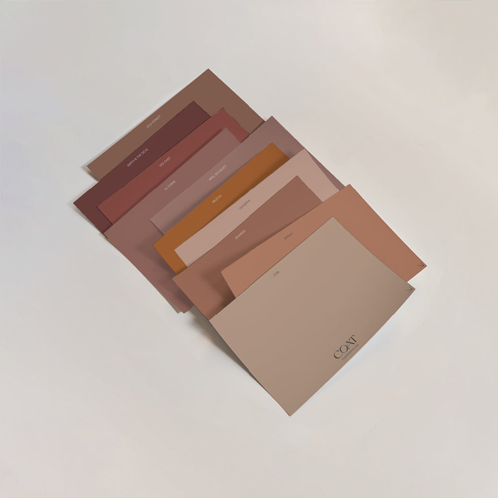
Brown-toned neutrals including Sunday Soul and Ambrose are particularly reassuring because of their links to the earthy tones of the natural world.

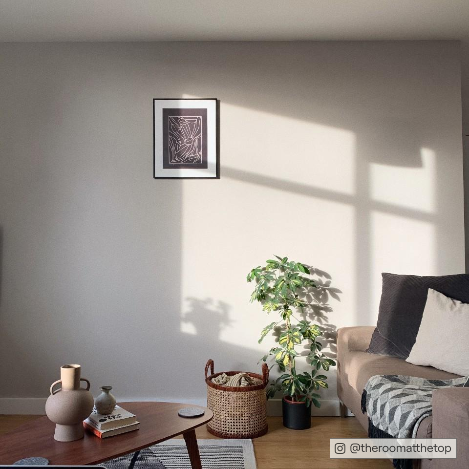
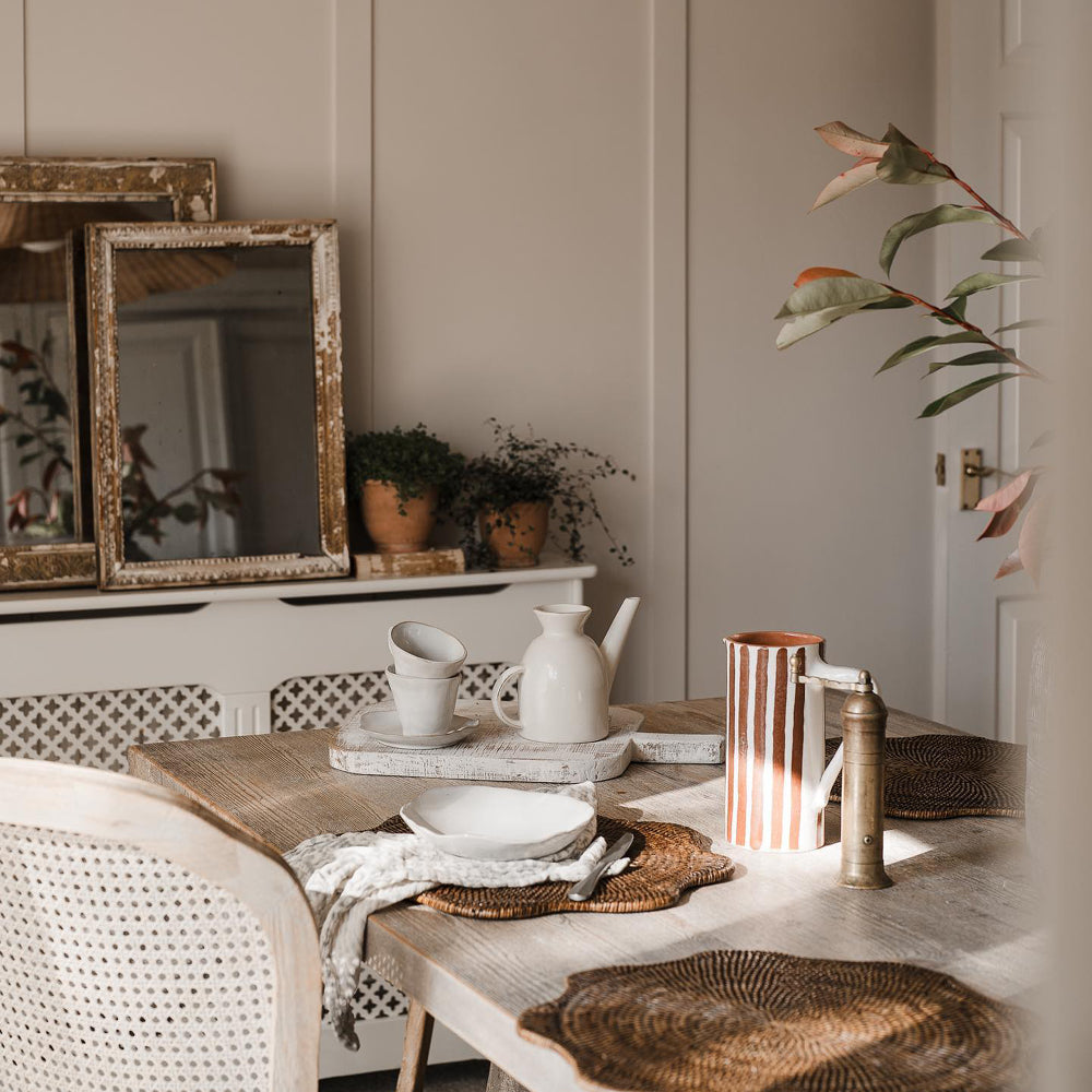
Sunday Soul channeling that much needed connection with nature from @aroomatthetop
“We love this cosy, warm greige," says sensory design expert Franky Roussell, from Jolie Studio, of Sunday Soul. "It's the perfect backdrop for any space where you want to feel reassured and nurtured. Brown tones subliminally connect us to the stability of wood and earth in nature – allowing us to feel grounded and safe. This is a perfect tone for any switch-off zones like bedrooms or comfy living spaces.”
Ready to kick Blue Monday into touch? Take your pick from our collection of uplifting, planet-friendly paint colours 🌈Publish Date
Author






Leave a comment