
Colourful Impact, At Home With Jessie Stanbrook
Say hello to our colourful home owners of the series, Jessie and Jurrat. After a recent move from London to Brighton, this two-bedroom garden flat and its surroundings are still pretty new to them. Before the COVID-19 pandemic, Jessie and Jurrat both worked as Civil Servants in the capital city; but when they realised they could work remotely, they took the leap to move closer to the seaside, and to Jessie’s family in Sussex.
As soon as they saw this flat for sale, they moved quickly in order to secure it. After already falling in love with the bright and airy kitchen, big bi-fold doors, private courtyard and super close location to the sea – not closing on this property wasn’t even an option for Jessie & Jurrat!

Jessie and Jurrat of @ginandhome live colourfully in Brighton
Jessie describes her interior style as ‘eclectic’, as she loves all things colour, pattern and prints! As a couple, they are definitely attracted to older, more historical interiors, furniture and accessories – the type that have a story to tell. They lived in Bangladesh for 4 years, and travelled a lot to Asia during that time, so Jessie admits that the majority of her home styles have been inspired by that part of the world; in particular, their guest room.
“I’ve never thought too hard about whether colours or styles match – and as you can see from some of our paint choices, we are fans of some serious and big colours! I think that’s definitely an influence from Bangladesh – the most colourful country in the whole world!”

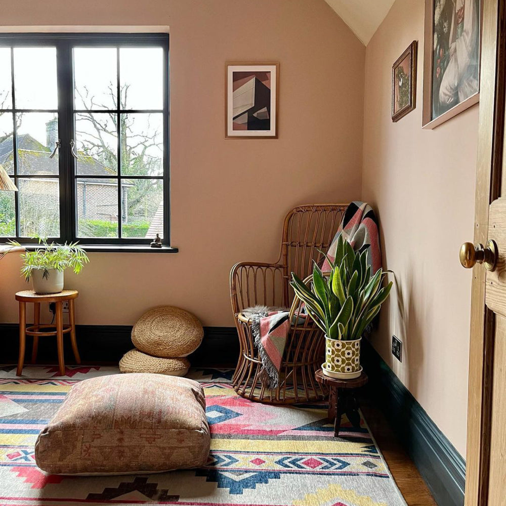
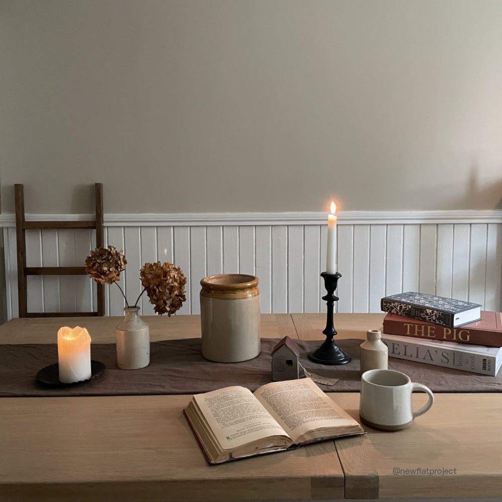
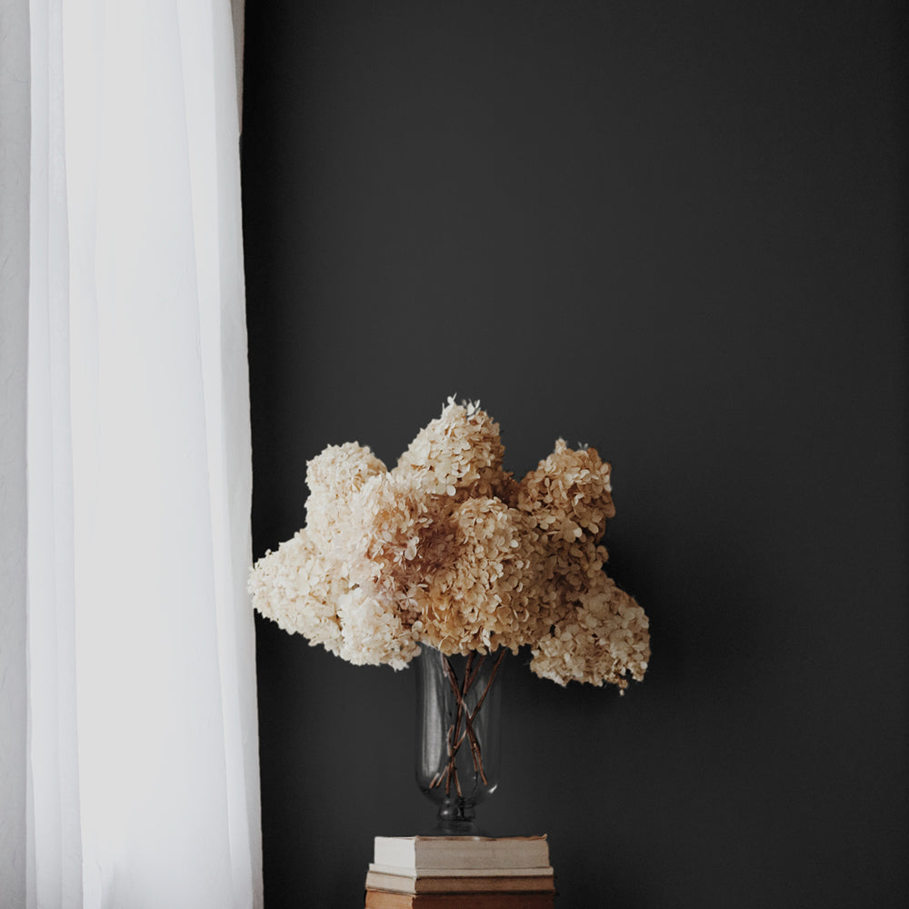
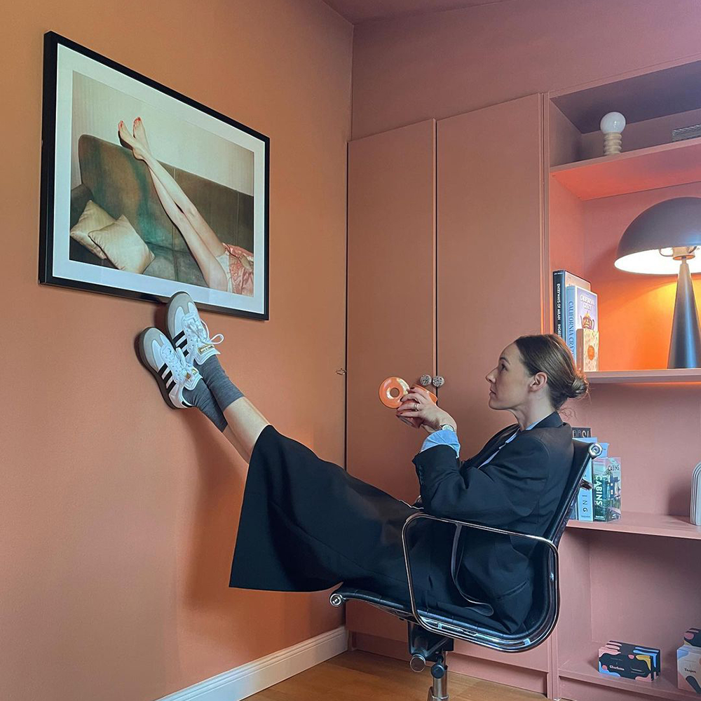
Jessie is a big fan of bold colours and patterns
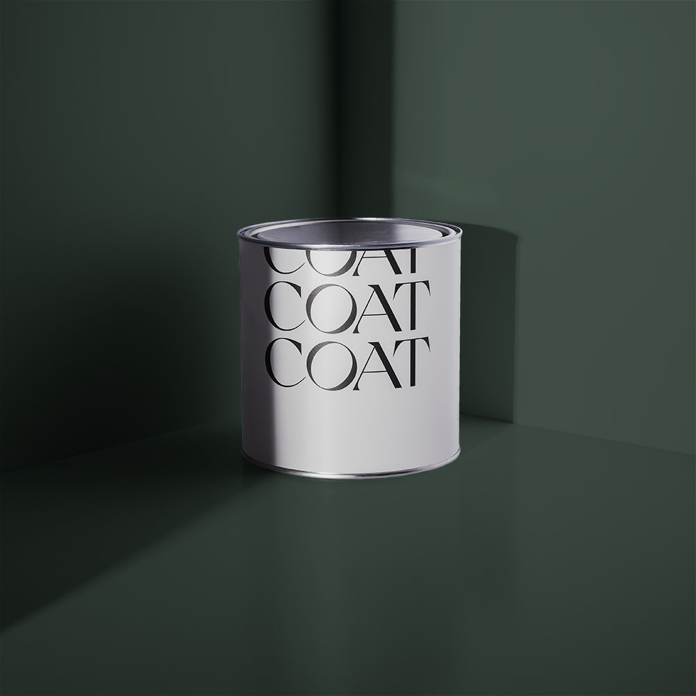
A COAT LOVE AFFAIR…
Once Jessie & Jurrat moved into their new home, they immediately wanted to start making it their own. As the world was still sitting amongst a global pandemic, spending a lot of time at home meant they wanted to feel happy and at ease there.
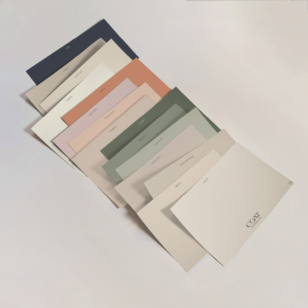
They admitted to feeling overwhelmed by the choice of paint colours on the market – and struggled to know where to start…
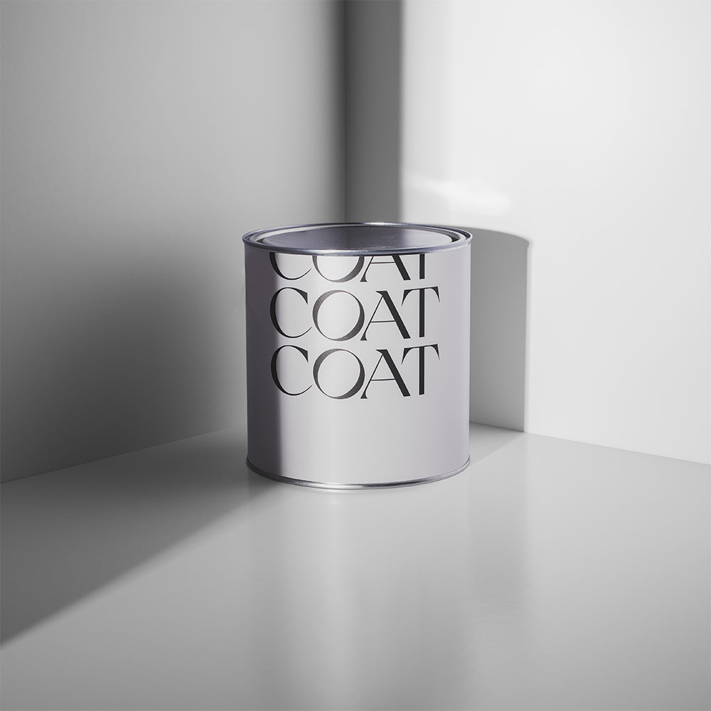
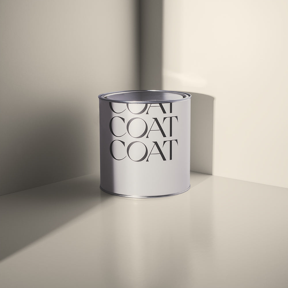
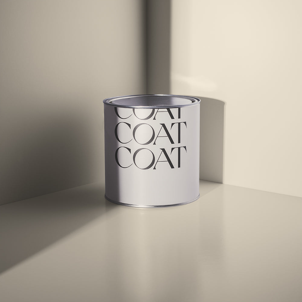
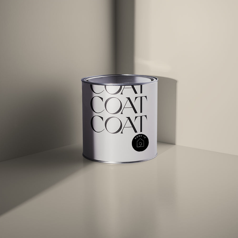
Inspired? Grab Peel & Stick Swatches to try at home 🙌🏼
“Every company had hundreds to pick from, and I’ve always found it a bit ridiculous having to consider 15 shades of white or grey that look virtually the same (until I did it, of course). I think what drew me to COAT initially, was that there were fewer colours to choose from – which sounds silly, but it felt like more care had gone into each of the choices that were available” says Jessie.

Dark Yellow 'Moritz' matching perfectly
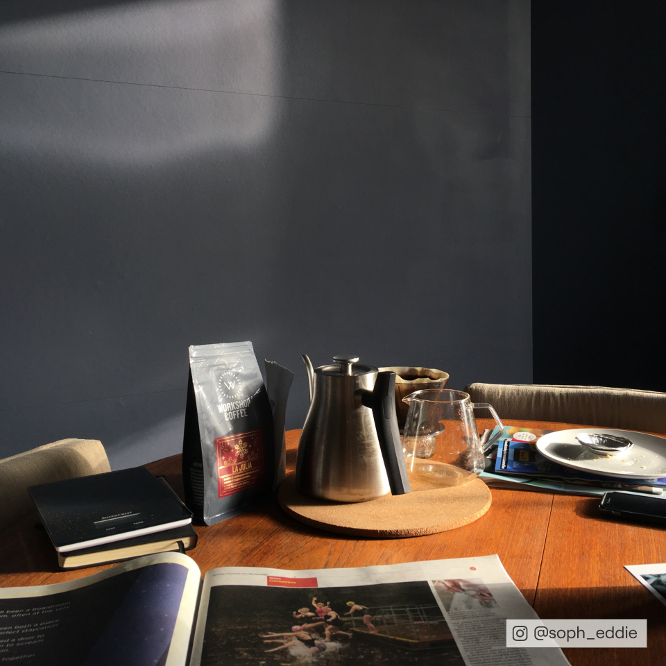
After spending time on our website, the first colour they decided to go with was the only yellow we currently have available – ‘Moritz’. This dark, grubby shade of sunshine turned out to be exactly what Jessie and Jurrat were looking to decorate their kitchen with! Our eco-credentials, carbon positive policy and customer service support were also huge sway factors; and, the reasons why they haven’t looked anywhere else for paint following their first purchase. Welcome to the cool paint club, guys.

Dark Yellow 'Moritz' as the backdrop to Jessie and Jurrat's eclectic accessories
Across their home, they now have seven of our paint colours – and counting! With the hallway and a bathroom still to go, there’s plenty of time to increase that already amazing total.
From seeing the colours online, to ordering swatches, to ordering the paint tins – Jessie continued to fall in love which each shade that they selected. Want to know which other colours they went for?
Here it goes…*takes deep breath in*…
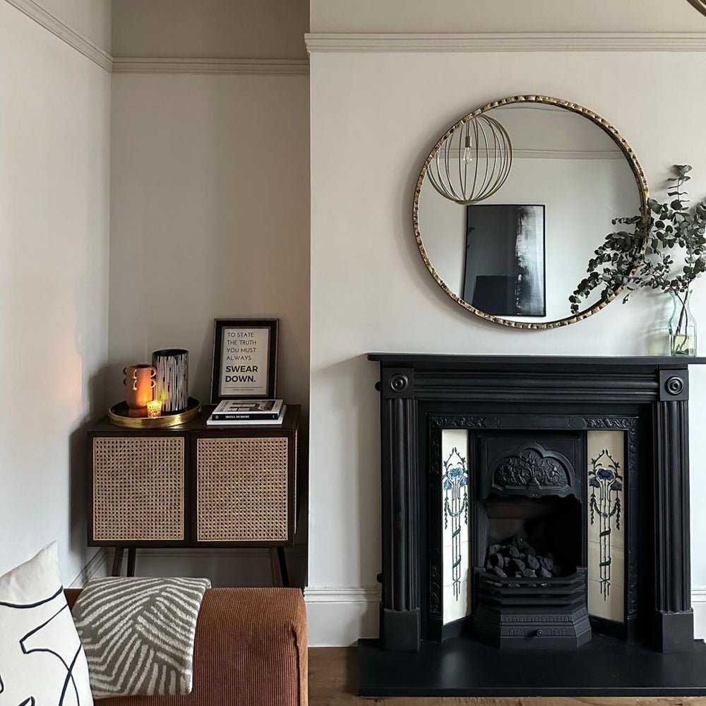
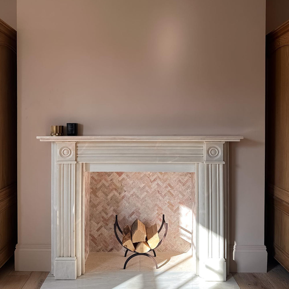
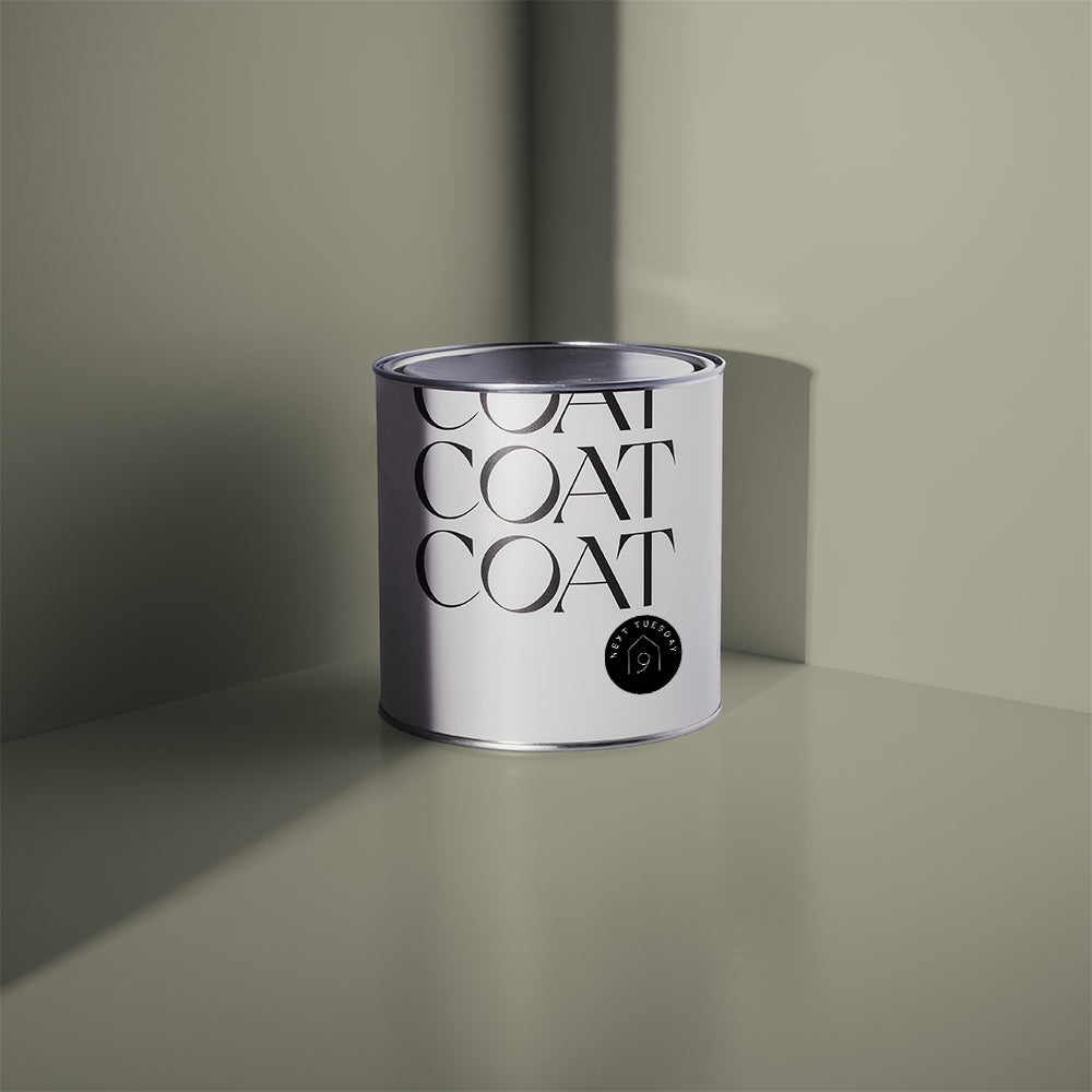
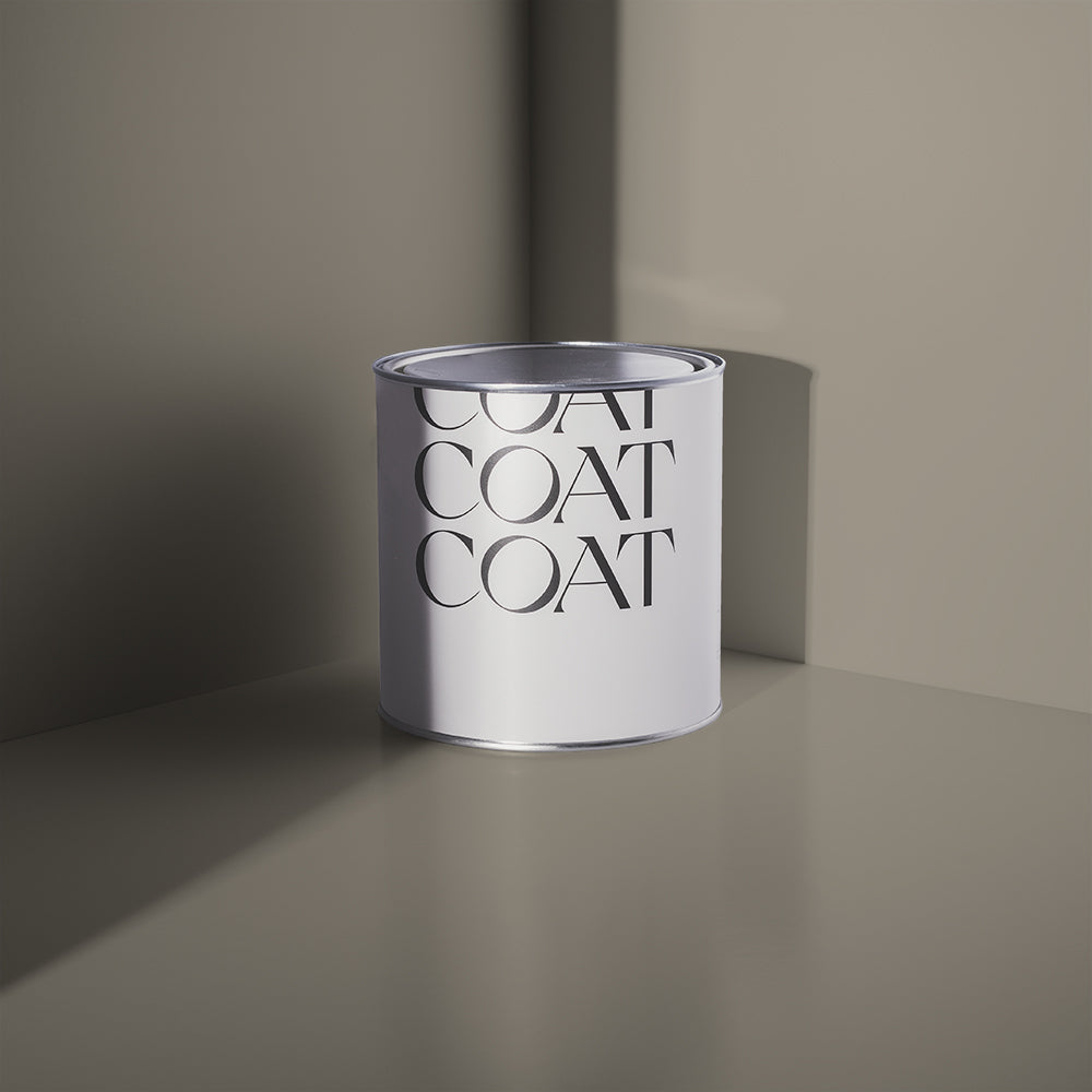
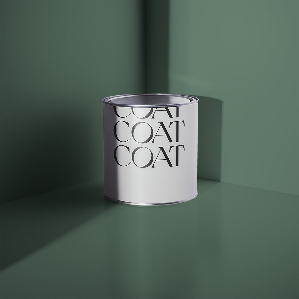
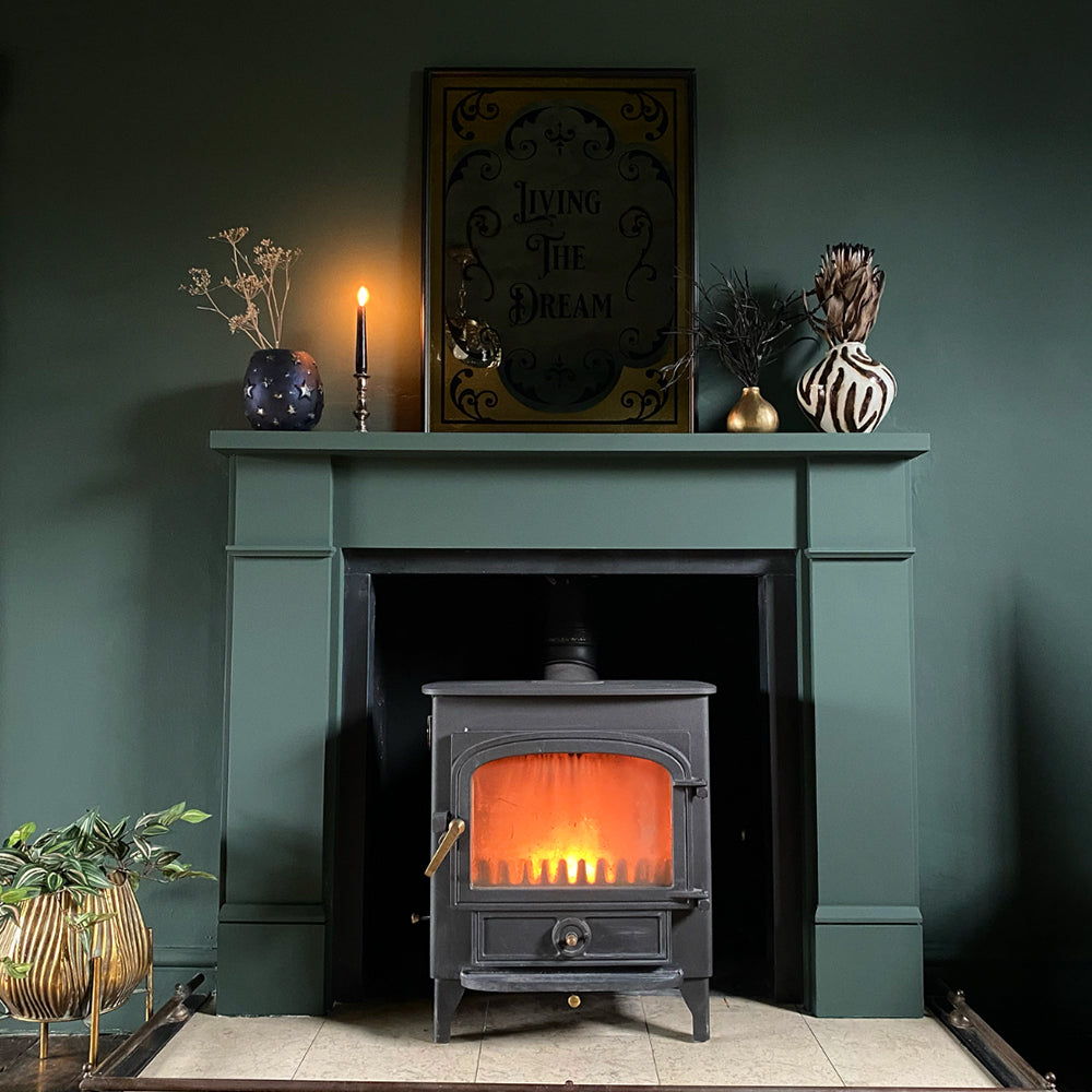
After discussion with our founders (Rob & Rob) via Instagram, they quickly chose Dark Blue ‘2AM’ for their bedroom. Following that second easy decision, it then took numerous peel & stick swatches and plenty thinking-time before deciding on all the rest. Dusty Orange ‘My Island’ was eventually the winner for their guest room (which doubles up as Jessie’s study); teamed with Blue Off-Black ‘David Rose’ for the fireplace surround. They then opted for Vibrant Teal ‘Pool House’ for Jurrat’s study, Dark Teal ‘Adulting’ for one wall in their living room, and Warm Off-White ‘Pampas’ for the other three… *exhales*

Dark Blue '2AM' is the perfect calming bedroom colour
“I like having different colours in all the rooms – I am not one for a monochrome house, and basically went with our gut for most of it. Luckily, Jurrat and I have quite similar tastes, so there weren’t any differences of opinion; we just talked through the different choices together, including, leaving about 10 different swatches up in the living room for two months, before deciding on the ones that we did!”
Jessie admits that both her and Jurrat were complete decorating amateurs when they first moved into this flat, so they didn’t really know what to expect; nor did they have any past experiences to compare to. However, they were super impressed by the thickness and colour of our paints – even just from one coat! The accuracy of our paint swatches also meant that choosing a colour was trustworthy and stress-free!
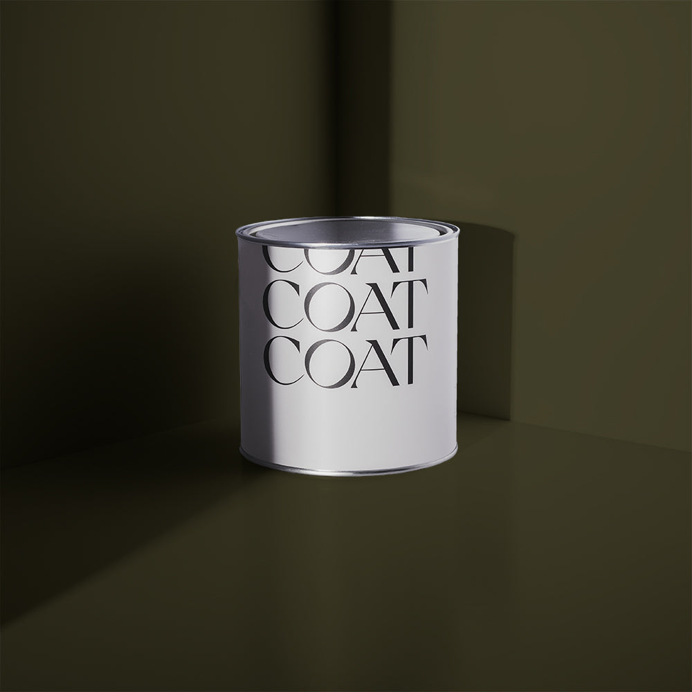
TAKE A LOOK INSIDE…

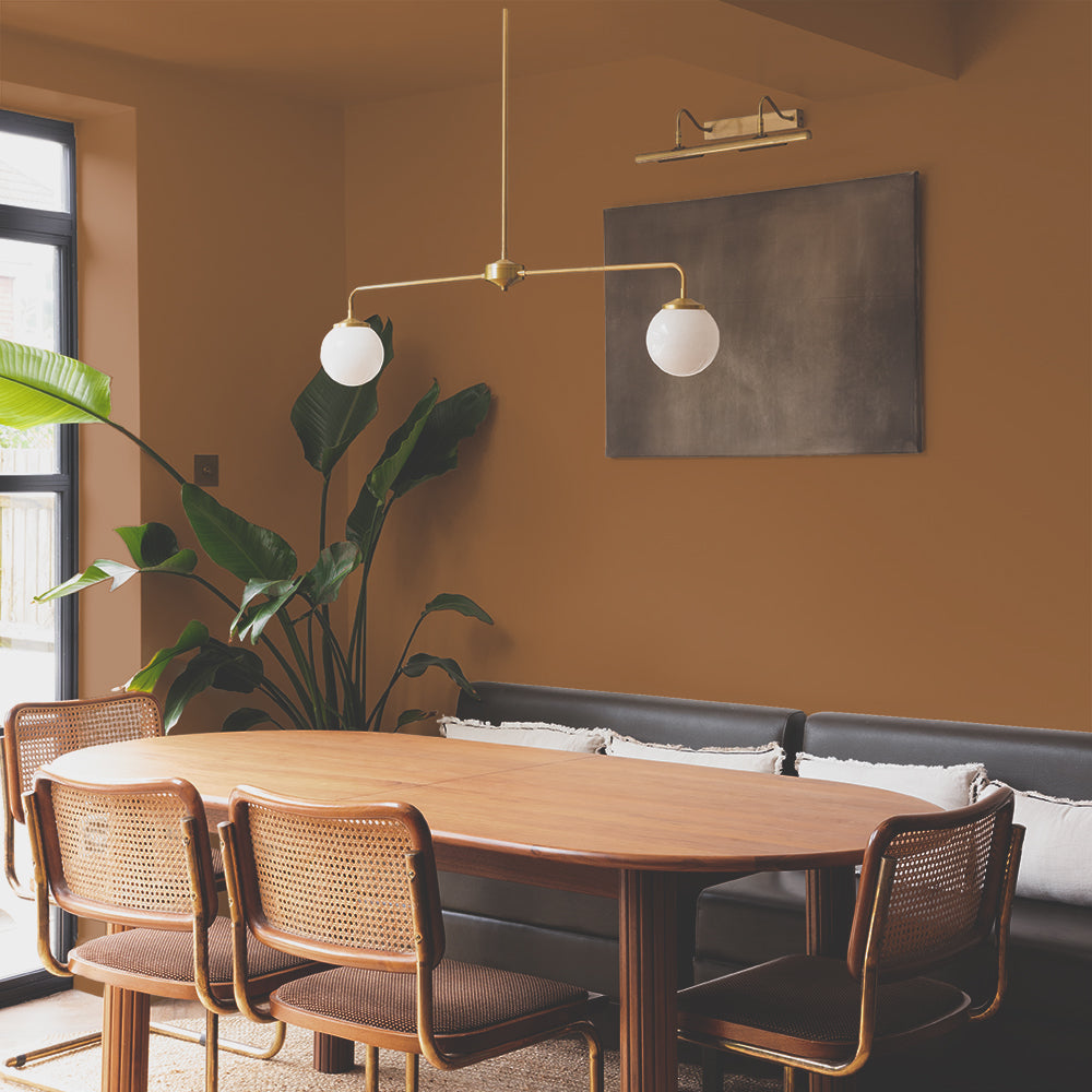
Inviting us to take a closer look at three rooms in their home, Jessie starts with their beautifully bright, and happy-vibe kitchen! Originally painted in a gun metal grey, they were eager to inject some serious colour and energy into this space, whilst also keeping the original exposed brickwork and open wooden shelves as features. Now painted in Dark Yellow ‘Mortiz’, it’s very much the heart of their home, and Jessie’s favourite space.

Dark Yellow 'Moritz' is bold, but not shout-y
“I was aiming for a *fun* kitchen! We love to host dinners and parties, and whilst we haven’t been able to do that very much since we moved in, our big dining room table, enclosed in the ‘Moritz’ yellow walls (amongst all the other colours), creates the perfect space to start hosting when the world is back to normal” says Jessie.
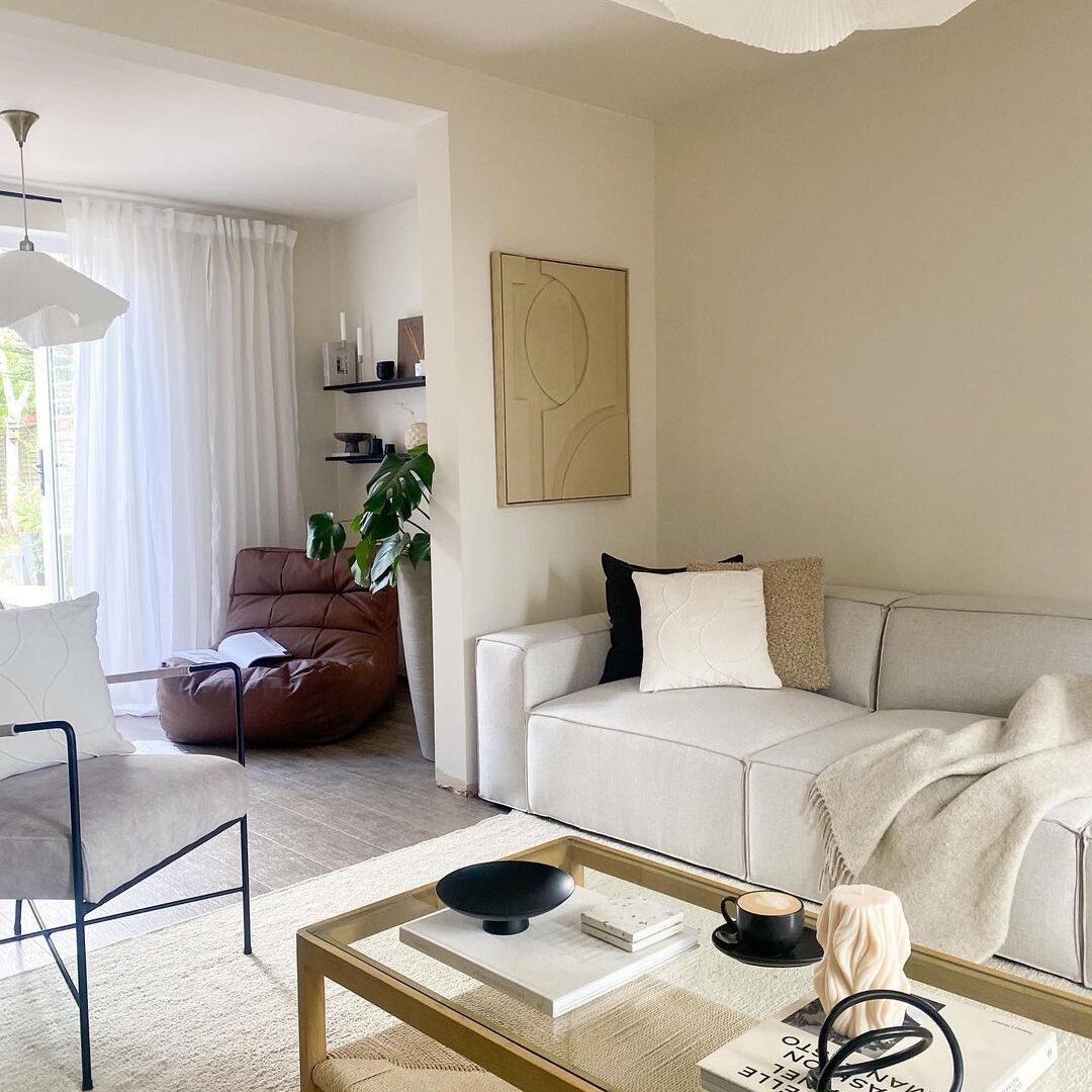
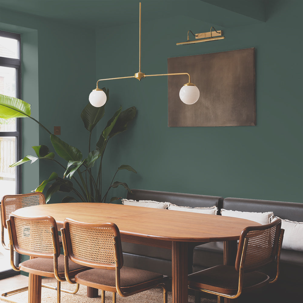
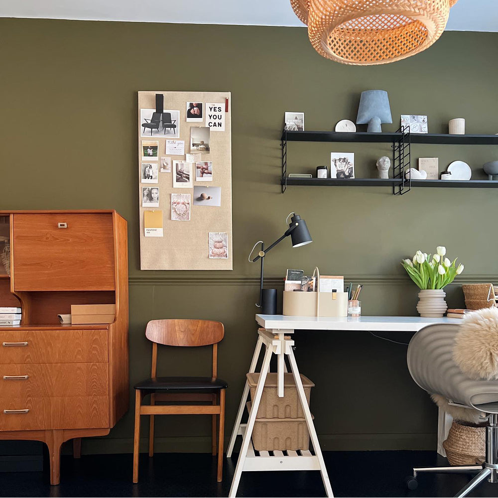
Next, we venture into their living room. Aside from the dark grey kitchen, the rest of the house had been painted in muted colours by the previous owners; so, it was easy enough for them to decorate and make their own.
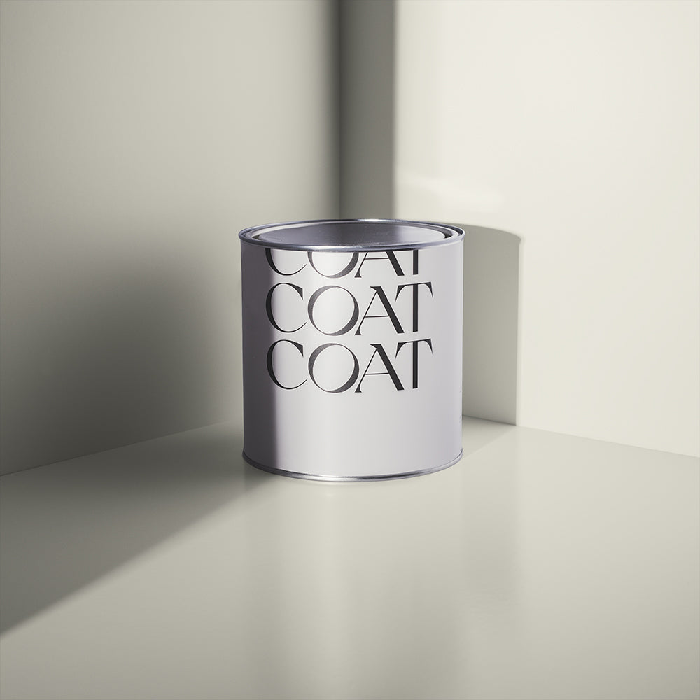
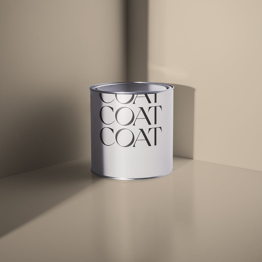
Inspired? Grab Peel & Stick Swatches to try at home 🙌🏼
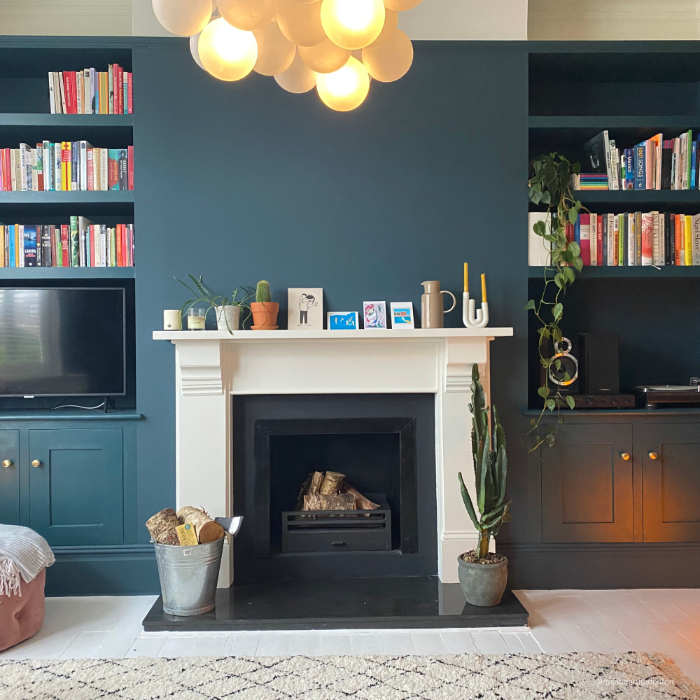
This space started off as one of Jessie’s least favourite rooms, but is now up there with her preferred; and, she tells us that this is partly thanks to the choice of paint colours, Dark Teal ‘Adulting’ & Warm Off-White ‘Pampas’, for bringing the whole look together.

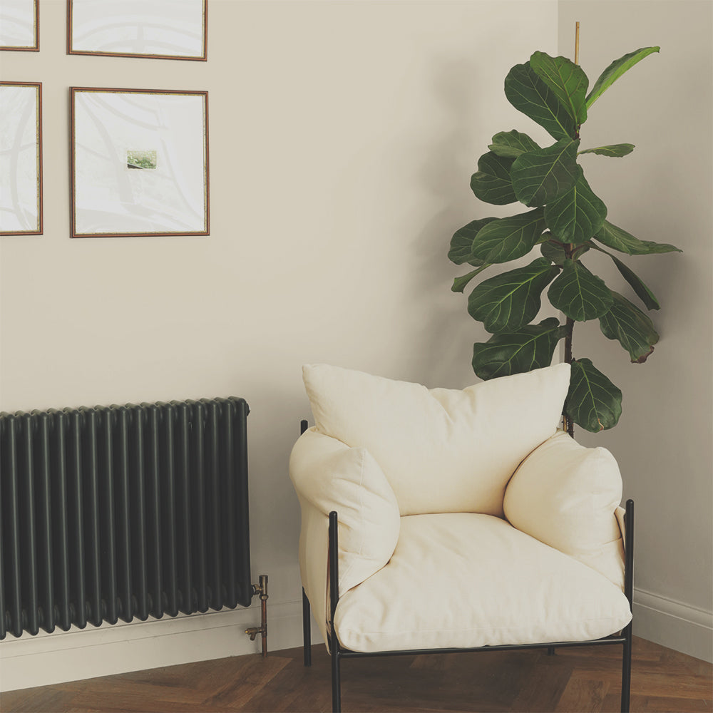
Off White 'Pampas' is the perfect neutral backdrop for artwork
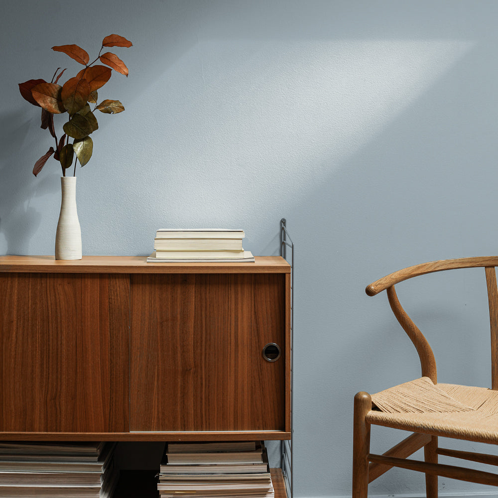
‘Adulting’ is a dark teal shade, which helps brings warmth and cosiness into a space; whilst ‘Pampas’ is our popular, off-white colour, which helps to inject brightness - even in the smallest of spaces. These colours work well as a duo, as they compliment one another, and create the perfect balance between light and dark.
“The style in this room is very eclectic, with the gallery wall covered in things I have brought back from various countries I have lived and travelled – including New Zealand, India, Indonesia, Nepal, Malaysia, South Korea, Sri Lanka, Bhutan, Portugal; and of course, Bangladesh. We don’t spend as much time in the living room as we do in the kitchen, but I love the range of colours; plus, it’s the first room you see when you walk through the front door, so a really welcoming vibe (I hope!)”

Dark Teal 'Adulting' creates a space that feels grown-up
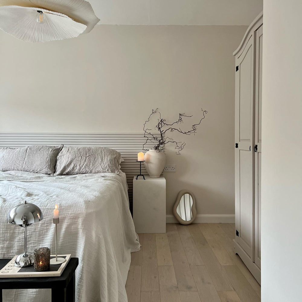
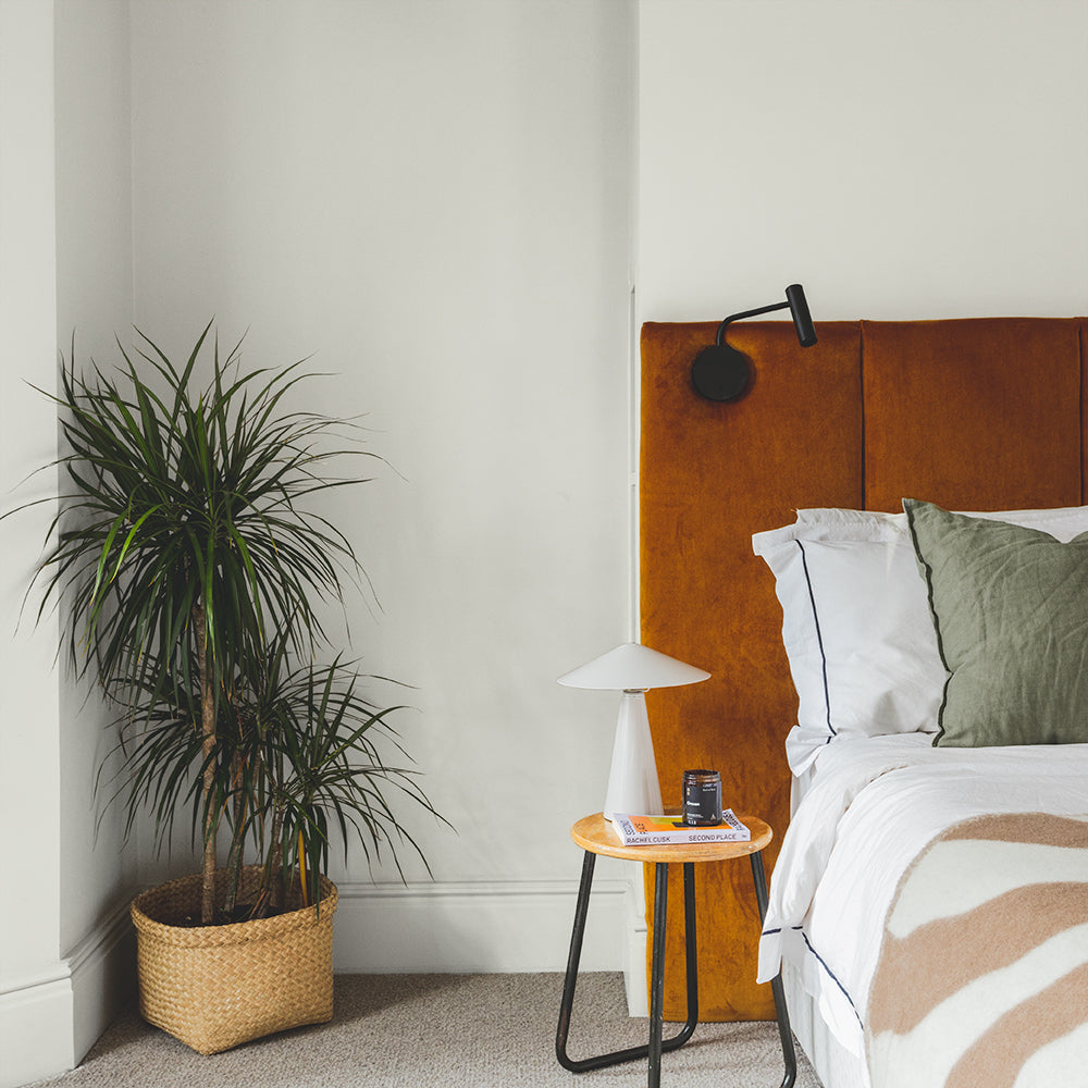
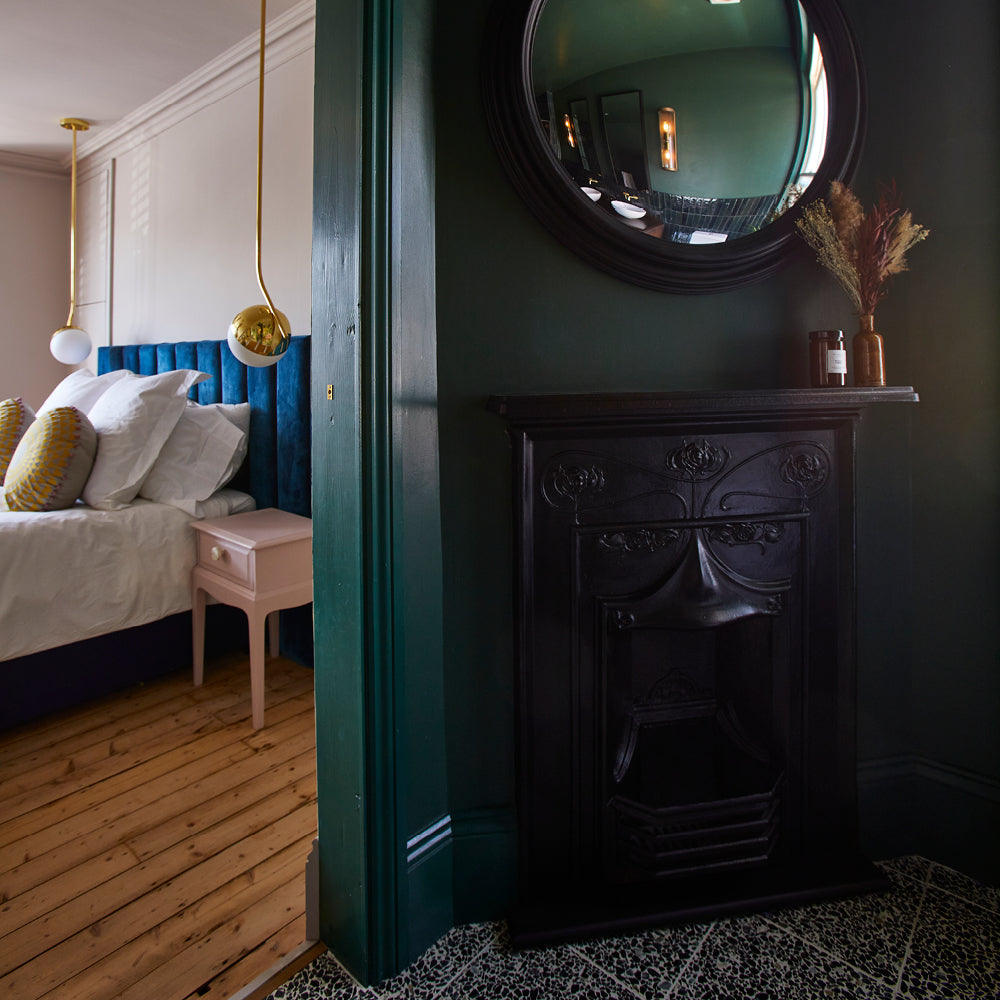
Finally, we explore their bedroom – one of the darkest rooms in their home. With only one small door that opens into a tiny courtyard space, it barely gets any sun or natural daylight. After making a decision to embrace the darkness, the couple chose Dark Blue ‘2AM’; which is one of our darkest blues – and perfect for unwinding at bedtime.
“I still have lots of plans for the bedroom, including some more strategically placed mirrors and lights to lighten the darkest corners; but, we’ve kept it minimal for now (at least, for us!), with some of our favourite photos of our travels, friends and family – to give it a very personal and private feel.”

Dusty Orange 'My Island' creates warmth in the guest room
WHAT THE FUTURE HOLDS…
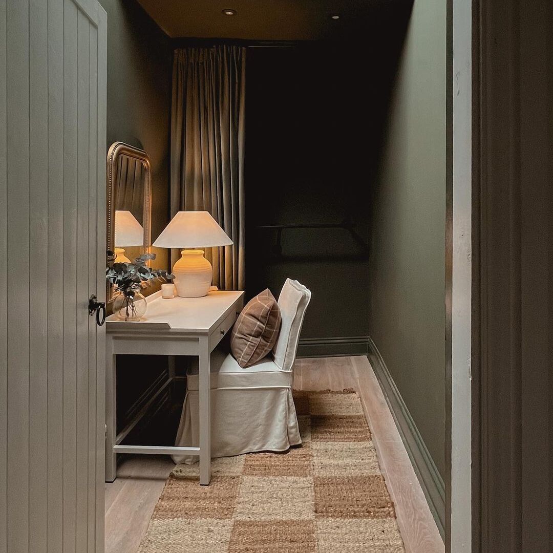
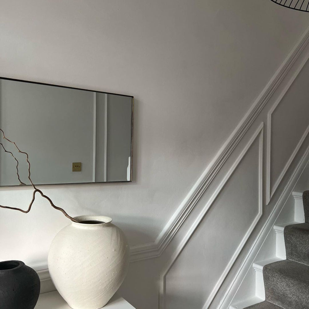
Like the rest of us, Jessie has a long and never-ending ‘to do’ list for the flat, but the next top priority is their hallway corridor; which runs the full length of their home.
“At the moment, the walls are a light grey – which is not a bad colour, but not massively us. I don’t think we will tackle that one on our own, though; despite having had mostly success with the self-painted rooms! This one is going to be a bit of a mega job!”

As the space has very little natural light, they’re going to opt for a brighter colour this time - to create the illusion of more space and a fresher feeling. As Jessie loves ‘Pampas’ so much, it’s currently the firm favourite for this makeover. Project hallway, coming soon!
JESSIE FROM @GINANDHOME LENDS SOME ADVICE…
“Be bold! It’s amazing how much joy you can get from some bright colours around your house; or, being in a space in your house that you’ve poured yourself and your personality into.

Be brave! Try bold colours at home, like Jessie!
Even in Bangladesh, when I thought I wasn’t going to stay very long in the flat I had, I decorated it and made it a place I wanted to spend time in; somewhere I could relax, and feel proud of. So much contentedness derives from looking around and being happy with where you are.”
Thanks to Jessie and Jurrat from @ginandhome for sharing their colourful home. Feeling inspired? Grab Peel & Stick Swatches to try at home 🙌🏼
Publish Date
Author


Leave a comment