Period Terrace? Side-return Extension? Si and Briony’s new place in Dulwich is the South London terrace of dreams. These guys are long term friends of COAT, and their stylish living space was just calling out for the camera. With some confident colour choices, Si and Briony’s home is proof that bold doesn’t have to mean brash. With the exception of one radiator that splits opinion... it’s styled to perfection ready for the arrival of their first bundle of joy!

We had a chat with Si and Briony in the latest Humans at Home series. Just weeks before the pitter patter, we chatted about the inspiration for their space and how they’ve created the perfect home for their new family.

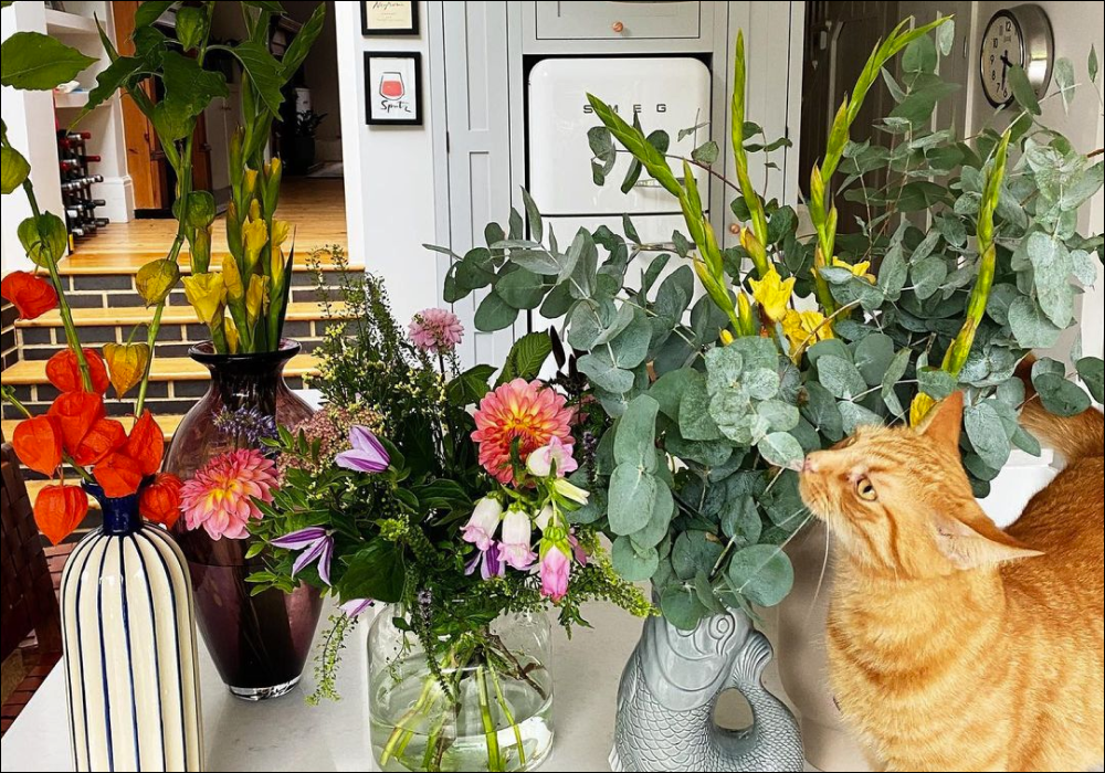
Si and Briony's open-plan Kitchen in Dulwich
“This room made us fall in love with the house” says Briony. “We’re not hardcore renovators, so we were quite happy that it was already built. The brickwork details, the island, the huge glass doors all work so well and we're thinking towards family time. We’re quite happy putting on a fresh coat of paint and hanging our artwork..!”
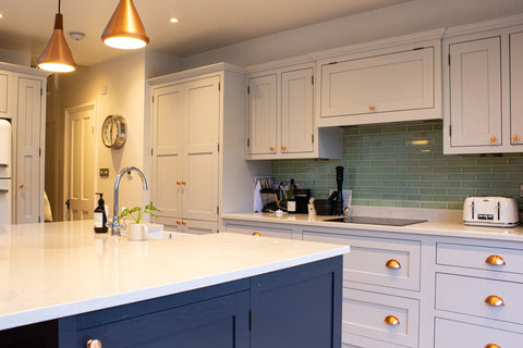
The Kitchen, feat. Screenshot Pure White paint by COAT
With the beautiful pale grey and dark blue units, Si and Briony were keen to keep the walls in here quite neutral. Choosing a bright white like Screenshot from COAT, they’ve maximised the impact of those big old glazed doors and given themselves a blank canvas for poppy artwork. White can sometimes be the boldest of colours, surprisingly.
Shop COAT Neutral shades here.

The Kitchen, feat. Screenshot Pure White paint by COAT and navy blue cabinets
“The exposed brickwork to half-height is a really nice feature in here” says Si, “it’s the kind of thing you wouldn’t usually think of doing, especially in the dark grey brick, but with the contrast pointing and the white walls it adds interest without being lary. Which is nice”
The Kitchen, feat. Screenshot Pure White paint by COAT and half-height exposed brickwork
The entire ground floor is open plan, but carefully sectioned by the choice of wall colour which flows from bright white at the back of the house, to warmer whites up-front. Good Intentions, a pale taupe from COAT, makes the living room feel nice and cosy without being too creamy. It’s a really tasteful, modern colour.
The classic living space, with Good Intentions pale taupe paint by COAT
“The front room faces North, so we thought pure white might look a bit grey” says Briony. “Good Intentions is such an awesome colour, in the evening with our lamps on it’s a really nice warm brown colour, whereas in the day in sunlight it’s a warm off-white”
Good Intentions pale taupe paint with poppy feature furniture
With a real mix of furniture and artwork collected over the years, Si and Briony’s space is an eclectic mix that seems to hang together so well. They’ve kept the wall colours neutral downstairs, and the details really shine but without being brash. That’s the great thing about period homes, they’re timeless, and really accommodating of such varied interior design choices. You can’t go wrong, so choose pieces you love and make it yours!
Shop COAT Warm Neutral shades here.

Good Intentions pale taupe paint with beautiful pink accents
Moving upstairs and the game changes slightly, starting with the hallway. Half-height colour in hallways is a popular choice right now, and it’s clear why. Choosing a darker colour for woodwork and the lower part draws the eye down, and helps maximise the double-height space you get where there’s a staircase. Not to mention being effortlessly dramatic, but classy af.
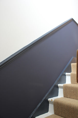
The hallway features half-height walls in 2AM Dark Blue Eggshell by COAT
“We went bold for the lower half, but carried through our neutral vibe with Low Salt from COAT at the top” says Briony. “It’s such a beautiful colour, only just off-white but quite warm. We didn’t quite get around to putting up our pictures yet, but the plan is for a gallery wall going up the staircase. ”
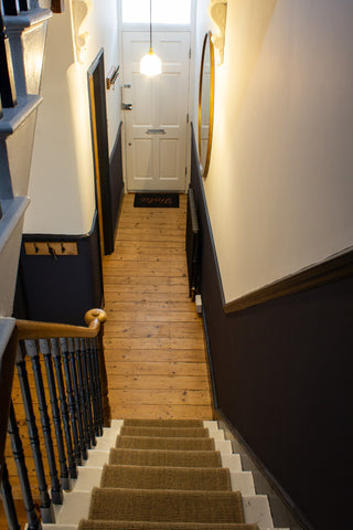
The upper walls of the hallway are in Low Salt off-white
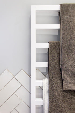
Using a durable paint like COAT’s Eggshell is important for woodwork - especially in hallways. It’s designed especially for woodwork and metal, so it’s super hardy to knocks and scuffs whilst having a beautiful matt-ish finish too. Perfect for prams in tight hallways!
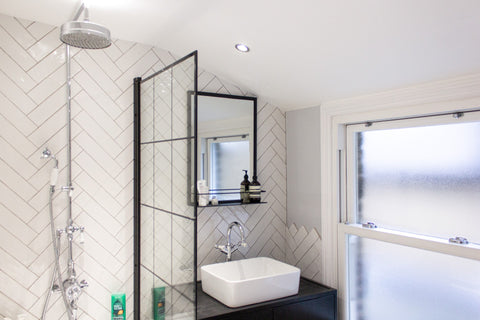
Muted pale grey Sweatpants in Soft Sheen for the beautifully balanced bathroom
Following the hallway upstairs and the bathroom is newly finished too. Featuring Sweatpants from COAT on the walls, this pale grey sits so nicely with the raw-edge tiles and urban look of the crittal-style fixtures.
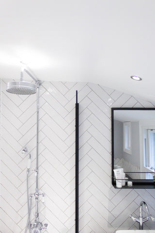
Crisp white Screenshot by COAT for the ceiling, you can't go wrong
The white tiles in a herringbone style have a raw-edge finish, which gives the space a modern edge whilst keeping up it’s period appearance. As for the crittal-style screen and mirror, we can’t get enough.
Shop COAT Bathroom shades here.
Herringbone tiles and muted pale grey walls work so well
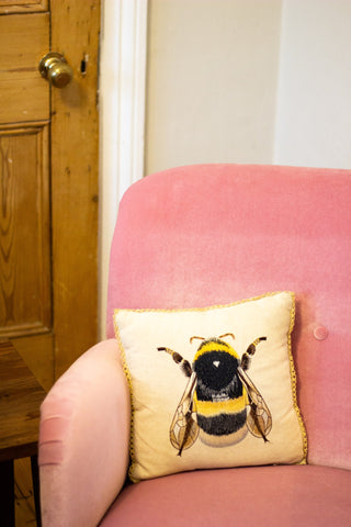
“It’s funny because when people walk into the nursery, it feels a little different. There’s this bright pink metal radiator that we inherited and you definitely can’t miss, then some punchy yellow walls in Moritz by COAT” says Si. “Most of the house is quite muted and plays to the period nature of it, but this room is a bit bolder”
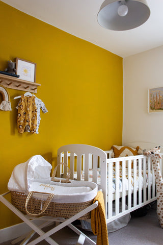
Grubby yellow Moritz makes this wall in the nursery pretty poppy
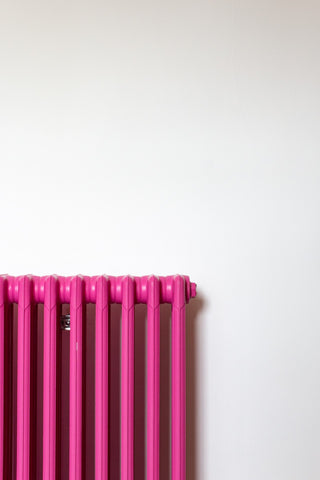
This pink radiator divides opinion. But we're giving it an artsy yes. Get the vibrant pink paint.
“The grubby yellow walls play nicely to our Safari theme for the nursery” says Briony, “and I think we were leaning more towards a bold shade than the usual nursery pastels. We don’t know whether we’re having a boy or a girl either, so wanted to create a gender-neutral theme. We also kept two walls and the woodwork white, which keeps it from being overbearing”

The yellow is bold, but not brash. Working with the safari theme in this nursery.
We’re huge fans of how Si and Briony have made this London Terrace feel both bold and understated. They’ve used several neutral colours downstairs to let their artwork and eclectic furniture do the talking. And taking on some modern trends like crittal-style details in the bathroom, and the dark woodwork in the hallway, creates interest in the space without being shout-y. Bold feature walls and statement radiators (ahem) are also great ways of creating visual interest, without being entirely dominant.
What is Humans at Home from COAT?
Perfectly polished interior shoots aren't really our thing. We're about chatting to people in the beautiful homes that they've created. So that's exactly what Humans at Home is about - real folks, real homes, and not a whiff of staging anywhere. Well, we get them to tidy up a bit.
