COAT is known for its timeless but modern colour palette and we’ve probably got the best neutrals in the business. Sometimes though, you need that extra injection of drama and personality in your home. Let’s roll through some easy ways to create homes that have impact and character.
“When it comes to decorating, I always start with the rooms that you live in, the living room, kitchen and the main bedroom. These are the key functions of your home, so nail those first. The hallway, landing and stairs always come last when choosing colours. These spaces tie together the whole scheme and means that you have more flexibility in the rooms coming off of it. Also, you want to decorate the hallway once all the rooms are kinda put together, so you don’t get scratches all up your freshly painted walls”, says Aaron Markwell, COAT’s Colour Lead.
For the purposes of this blog though, we’re gonna talk about the decorating journey in reverse, as a journey through your home.
*Image above featuring Baked walls in @alexandravonfrankenberg's home.
First Impressions

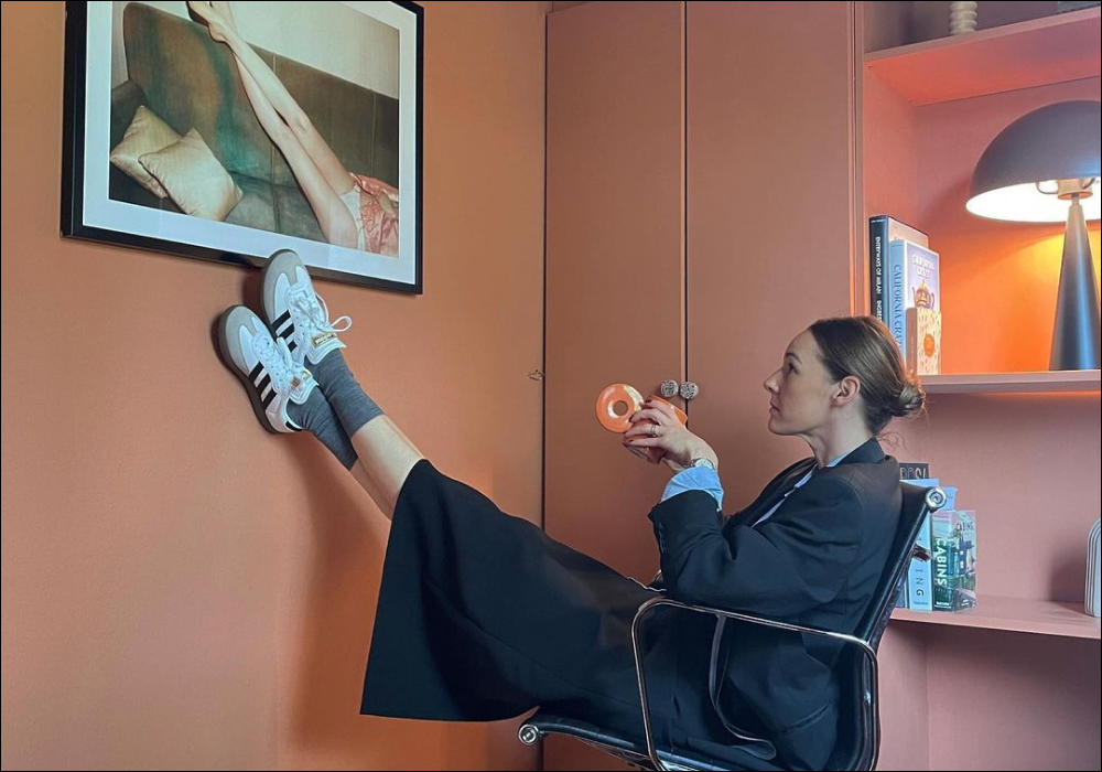
Dark colours like The Record Store & David Rose can really make a statement.
The front door is the first thing seen when anyone comes to your home. The cardinal sin for front doors (imo), especially if they’re impressive or beautifully detailed, is to have a colourful door with a white frame. It makes your door look pokey, like an under drawn lip on the face of your house. The door and its surround (sidelights, toplight, frame etc.) should all be the same colour. This makes the first impression much more dramatic, lush and inviting.
This is a super easy fix, all you need is a 1L tin of exterior paint. We recommend choosing one of your accent colours inside the house. This is the perfect way to give a small glimpse into the minds of the people that live there. You’re setting the mood for how you would like people to encounter you and your chosen family…

Warm colours like Ciao, Sofia and Factor Fifty are inviting and conversation starters. Why not grab a pink sample pack...
Warm colours are going to invite conversation, warmth and are great if you’re a dinner party house. Cooler hues are great for creating a calm space outside, settling your guests before you answer the door. Colour psychology is probably the most important at the front door, as it tells visitors what kind of experience they’re about to have, and reminds you of how you want your house to feel, when you get back from a naff day at the office.
Practical Beauty

Voltaire walls and Brasserie Brown featured in @laurajackson's home, the dream pairing.
Right, we’ve stepped through the front door and entered the hall. Depending on the architecture of your hallway, this can dramatically change how you would decorate it. But this blog is to help create drama right? So drama you shall get.
First thing’s first, if you’ve got bannisters, spindles, lots of flouncy woodwork around your stairs, let’s paint it dark. You’ve never seen a space with black spindles that you didn’t love. If you’ve got cool colours or greys, go for something like David Rose, or for warmer colours use The Record Store. For neutrals: Taupes- use Gumption, Greige- use Hardback or Green- use The Ranger.
Check out our Moody Dark colours for more inspiration.

Secondly, that beautiful dramatic dark you’ve just done your spindles with, also use on just the door frames and architraves in that colour too. Like a picture frame, this creates a real-life still-life of the beautiful room you’ve already decorated. The real question is, are you a Monet or a Dali?

We usually always recommend some kind of aged looking mid-tone colour as your base colour for your hallway; something that looks like it’s been there forever (and unless it’s a really old building, in a washable finish). That way when your dirty dog/ partner shakes mud up it, you scratch it with the bike/ pushchair, or it gets crayon on it after one of your wild nights in, it can be cleaned up. Also, slightly darker colours in hallways make the rooms you live in feel brighter and airier, if you’re after that.
Remember, the most time you’ll spend in a hallway, is when you’re picking paint colours for it, or you’re a drunk uni student sitting on the stairs of a house party.
TV / Entertaining / Hangover Rooms

Dark colours like 2AM and Nomad are perfect colours for your relaxing snug, you'll never want to leave.
Whether it’s wine with your pals, movie nights or the dreaded Sunday morning after a big night out: dark colours can do a lot to set the mood for your living room. If you have a small space for your living room, do the whole room the same colour (including the ceiling). This will create a snug, that will really show off your furniture and accessories. By reducing the contrast lines, you won’t be so aware of how small your room actually is. Nomad, 2AM and Cold Brew are all great choices for this. For large scale rooms, add drama by doing walls and woodwork in the same colour, then choose something complementary for the ceiling (and cornice). With the colours mentioned above, try And Breathe, Axolotl and Good Intentions as pairings for easy, breezy, beautiful schemes…
If dramatic darks are a little much for you, go for neutrals, but pull your woodwork through from the hallway. This gives the glimmer of personality that you want to show, without putting your living room into full drag. (Can you believe we are 15 seasons into Drag Race?)

Here’s some neutrals that can still feel dramatic for living rooms: Cold Brew, Debate Club, Darlington, Big Timer are all great options.
Cooking Up a Storm
Dramatic cabinet colours. Neutral walls and ceilings that are the same colour, and a beautiful quartz/ stone/ marble worktops. Finish with wooden dining furniture. Nailed It.
P.S. Mixed metals (brass and chrome elements) are really in right now.
Get Cosy

Why not try a colourful seeing to help you relax in the bedroom? @sparkandbell shared the love of an old favourite of ours, Sima.
One of our fave bedroom schemes is: paint a dark pink ceiling, like Mrs Bouquet, with Pudding walls and finish with woodwork in Cold Brew. Soft, enticing colours work best for bedrooms. You want to feel warm and toasty, and also, you want your skin to look its best in the bedroom… so choose colours that work with your skin tone.
In your own space, it’s better to paint all the walls the same colour and make it a properly cocooning space. Colourful ceilings work wonderfully for bedrooms, especially as we spend so much time laying in bed. With neutral walls this can make the room feel decompressing, in a good way.
Toddlers & Tiaras
If you don’t have or don’t want kids, that’s valid so you can skip this section...

Greens are our go-to colours for kids bedrooms, not only are they gender neutral but they have relaxing qualities. @fiveatnumberthree used The Trail in this beautiful room.
For those of you that do, the kids bed/ play room should all be about adventure and imagination. We love a blend of relaxed colours though, so these rooms aren’t overly stimulating in the evenings. Maybe a pop of green, in some stencilled foliage or hills that can be the background of your little one’s Jurassic Park adventure. The key to Instagram-worthy kids rooms is to not throw everything and the kitchen sink into these spaces. Use natural materials to add tactility and make it look more friendly. White IKEA furniture can be uninviting and clinical, it’s their room, so be playful with it.

If they’re old enough to be able to tell you, let your children have a say in how they want to decorate their bedroom. It’s a much easier life.
Man Caves
Dark and brooding is the way forward in these unfortunately necessary spaces. These colours draw attention on the screen they’re inevitably watching/ playing on. Dodie, David Rose, The Ranger are all great options for these spaces. Walls, ceilings, woodwork all in the same colour will make all those mismatched football shirts or figurines really sing, and you’re less at risk of having lots of ugly colour clashes in your home.
Now you can shut the door on this and forget about it.
Wet ‘n’ Wild
The main bathroom and guest bathrooms should be fairly chilled. Everyone uses these spaces, so go for a statement tile and pair with a lovely neutral. Take a look at our collaboration with Porcelain Superstore for inspiration.

If you’re lucky enough to have an ensuite, make it about you. It’s spa time, and you should be somewhere you LOVE while you do your skin care. Dial up the drama and character and fill your new bathroom with a selection of beautiful looking and smelling products that you can proudly display for just you.

Add a bit of drama in your downstairs bathroom by using colours like The Old Corset Factory or Mezcal.
For your downstairs loo, think statement wallpapers and unexpected panelling and ceiling colours. People are rarely going to spend a lot of time there, so be daring. Also, it’s a great conversation starter for boring guests at dinner, and is a great way to annoy your mother-in-law because “it’s not what I would do, but I suppose it’s your house.” Drama successfully created.
Right, there we have it: you now have a house with more drama than a series finale of Game Of Thrones. And say what you like, but the ending was rushed and disappointing: try not to do a rush job on your house.
Also, if you’re confused, book a colour consultantation. It takes so much hassle out of the decision making process, and it’s much more fun to have a conversation with someone that actually loves talking about your house.
