Subtotal
Shipping Options available at checkout Free Express Delivery

BASKET (0)

Warm Living Room Colour Schemes

Living room makeover time? Painting is an easy way to instantly transform the most important room in the house. Different colours can have different effects on behaviour and emotions when you’re in a room.

Neutrals are calm, relaxed and non-invasive. Adding brighter colour can provide a more energising mood to the room and darks bring a moody and cocooning effect into a room. Changing accessories can also dramatically change a colour palette in a room, and can help reflect your taste and personality.

Calming Neutrals

A neutral that is slightly green is a great way to introduce a feeling of calm into a space. Use neutrals that have a little beige and grey tone to them, with a green undertone like Tuesday’s Child or Kind Regards for a bright and timeless look. 

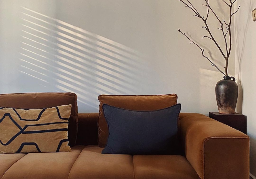
@thehomerebel choose the sophisticate Debate Club in her living room area, offering the perfect amount of warmth for a space. 

Deeper neutrals are great for creating a calm cocoon of colour. Debate Club is a bronze neutral. It’s quite dark but creates a fantastic snug space, because this colour is has yellow, green, grey and brown elements - making it sophisticated and relaxing.

Layer neutrals in soft furnishings with neutral walls and add a pop of greenery to create a complex colour scheme that feels really laid back and effortless (even though you’ve thought about it very carefully).

Are neutrals your thing? Then look no further, order our warm neutral sample pack here. 

Warm Terracotta Accents

Earthy colours like terracotta are a great way of adding warmth. Clay, terracotta or terrazzo with reddish tones in plant pots are fantastic at generating heat in cooler or more neutral schemes.

Grab your own bare plaster sample pack to play around with these warm tones in your home. 

If your living room is North facing or has very cool lighting then bolder colours like Baked are a great way to force these rooms to feel cosy and comforting. In brighter spaces, deep terracotta tones can look too bright, but where the light is grey and flat these colours look more subtle and relaxed. 

Take inspiration from @swoonworthblog and pair Persipan with Percy. 

If you’re not looking to lean so dramatically into terracotta, try calmer plaster-like colours like Persipan. While super saturated, because it’s a yellowish pink it creates a warm accent without looking too sweet.

Pink (Plural)

Plastery pinks are the easiest way to create warmth in the living room. Factor Fifty is a warm yellow based pink, like dry plaster before it’s painted. This underlying warmth creates a pink that is laid back. 

Get your Factor Fifty sample here and get this look.

Sweeter looking pinks will look warmer when paired with grey tones. Pair Ciao, Sofia, a proper pink that’s a bit grey with ceilings and woodwork in Margot, a relaxed French Grey.* For pink schemes that still feel bright, use bright yellowish pinks like Felt Cute. Pair with clean whites like Screenshot to bring out the warmth in paler colours.

Earthy Tones

Earthy greens are a great options for warm living room paint colours. And Breathe is a beige green that while fresh also feels complex and earthy making it the perfect laid back earthy tone. Pair with oaks and linens for a chilled living room that will make your neighbours green with envy.

@home_on_point uses The Trail on the panelling of the living room, paired beautifully with a greyish neutral. 

The Trail is a slightly grey toned earthy green. Perfect for spaces that need a touch of depth that will compliment greenery and rich toned velvets. Use grey taupes like Good Intentions on ceilings and woodwork to reduce contrast and lean in to more earthy, biophilic look. 
Darlington - deep and dramatic but of the earth. Pair with stone colours like Ambrose for a rich colour scheme and pull together with olive and brown velvets, leather and a pop boucle for a tactile scheme.

Sunbathed Beige

Using beige is a great wait to create calm and rich colour schemes for living rooms. Duvet Day is a modern beige that is slightly greyed. It maintains warmth throughout the day without the sickliness of a magnolia.

Take inspiration from all time Safe Play lover @yas.wyatt.home and use the colour to create a calm space in your living room. 

Safe Play is a great option if you’re looking for a beige that is light and airy but still has some character. Pair with deeper woodwork in Moving Day or  Duvet Day to exaggerate how bright your room is. Well Grounded is our warmest beige. This biscuity colour is a bit grey and a bit red allowing for a cozy sophisticated room. Pair with ceiling and woodwork in a brighter beige like Humble for a complimentary contrast.

Energizing Green

The right light green will help create energising schemes in your living room. Colours like Yard Party and pale grey green, will feel cool and relaxed without feeling cold. Pair with charcoal and dark green accents for a touch of warmth and modernity. 

If you're looking for a warm neutral, And Breathe is the way to go. Grab a sample....

And Breathe is a beige green that is one of the perfect warm colours for the living room. Compliment with bookcases or cabinetry in Nomad, a dark olive green, for an energising and cosy green scheme.

Sunshine Yellow

Bright yellows usually make for great accessories. Paired with greys, blacks or beiges they are joy and fun to a space. Using these sunshine colours as accent colours is particularly suited to pop art aesthetics and help show personality and flare. With paint, yellow can be a bit divisive. Clean yellows like Arctic Roll are pale and bright are perfect with black picture frames and clean white woodwork. Choosing yellows like this, that are not as saturated and feel more subdued helps bring sunshine into a room without it feeling too sickly.

Rich red

Red has fallen out of favour in decorating but when used in the right context creates cocooning warm and a sense of drama. Opt for more industrial tones like Old Street and then exaggerate it’s red tone by painting woodwork in a blue-ish black like David Rose. 

Don't let red scare you, check out Old Street is this living room here, it doesn't have to be a daunting choice. 

Traditional decorating for Victorian properties would have used lots of furniture decorating reds to help houses with no heating feel cosy. The Old Corset Factory is perfect for this. Try not to fall into the white woodwork trend here though, so the contrast between colours is very high and can make these deep reds look browny. Go for more biscuity colours like Well Grounded on ceilings and woodwork.

Be Bold

Bold living rooms are the way to go for those that want a personality filled living room. Dramatic darks help draw attention to artwork, furniture and personal items. The key to these colours working successfully is to do all the walls and woodwork the same colour for a touch of grandeur. Dark marine blues like The Drink are deep and mysterious. Pair with our emerald or ruby jewel tone velvets and lots of textural elements for a boldly dramatic look.
If you have lots of personal objects to exhibit, go bold and go black. The Record Store is the perfect for this. Blacks recede away from objects placed in front of them, providing depth. Pair with mixed metal finishes, deep woods and pops of beige upholstery for a monochromatic scheme that feels warm and inviting. This look also works really well for creating a cinema type feel in your living room. 

A deep brown like Brasserie Brown pairs well with a lighter ceiling and lots of soft fabrics and finishes. 

Traditionally browns were really cheap to make and so were quite common. But now warmer colours are making a come back, so should the ultimate warm colour. Picking deep browns like Sheldon or Brasserie Brown on walls and woodwork reduce contrast and help to make the room feel calmer. Particularly appropriate for rooms with panelling, or large skirting and picture rails. Pair with ceilings in plaster tones like Factor Fifty or beiges like Duvet Day and lots of pale beige, textural fabrics and tactile woods.

Greige 

Greige tones are some of the best warm colours for living room colour schemes. Neither fully grey or beige, these in-between colours feel timeless and subtle. Use complimentary whites like Pampas rather than a pure white to help these colours feel less muddy and then pair with lots of natural materials for a chilled Japandi vibe. Cargo is a mid toned greige that feels aged in a relaxed way. Natural materials and linens will help to keep your Cargo living room engaging.
@18thhomeonthestreet creates a cosy cottage feel using Cargo in her living room, who'd ever want to leave this room?
Use Pampas for ceilings and try deeper bookcases in Debate Club for a touch of depth. Stonier greiges provide a chilled backdrop to mid-century furniture and deep, warming woods like teaks and walnuts. Think tan and black leathers, textural sofas, lots of woods and some travertine stone work and finish with a COAT of Ambrose.

Golden Yellow 

Deep golden yellows like House Points perfectly compliment more neutral schemes, like Margot when used on pieces of furniture. Pair with black and brass accents for an elegant and relaxed room. For those that have a sunny bright living room, flip the scheme on this and paint your walls in House Points with Margot or Duvet Day woodwork and ceilings. In brighter spaces these golden walls will create a warming glow that doesn’t feel overwhelming.

Tonal Greys

Looking for grey warm living room colours can be arduous, so we’re going to break Mindful - slightly grey but with a warming orangey undertone. Pairs will all woods and neutral furniture. Or why not use Sweatpants & Margot as a pairing, slightly yellow greys for a feeling of relaxation. A classic Parisian interiors palette that’s complex and ethereal.

Feeling inspired? Order your samples here and get creative with your colour pairings and combos. 


READY TO GET YOUR COAT?

LET'S GET YOUR COAT...

Net Orders Checkout

Item Price Qty Total
Subtotal £0.00
Shipping
Total

Shipping Address

Shipping Methods