Does natural light matter?
Ah the classic North vs South (facing) debate. The amount of natural light in your room, as well as the aspect of the room whether mainly North or South, does dramatically affect how a colour looks (and feels) in your home. There's no escaping it, but it's no bad thing...
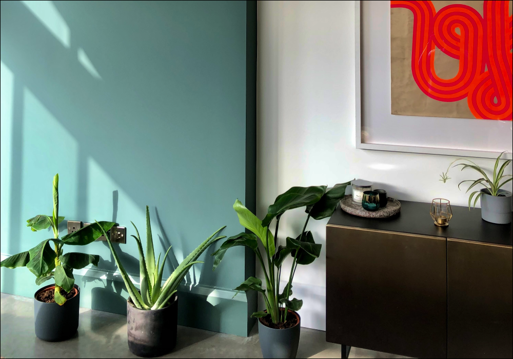
COAT paints are all richly pigmented. This means the colours always looks nice and deep on the wall, but they can change with different lights - skewing from muted and dusty to super dark and moody.
That's why Peel & Stick swatches make so much sense, allowing you to easily test play around with different interior colour schemes in your home.
Get Peel & Stick swatches to try at home.
How light affects colour
The way each and everyone one of us sees colour is completely different, we're not talking about the blue and black (black and gold) dress image that caused quite the stir a few years ago. But it's a fact, we're pretty sure none of us see the exact shade and light doesn't help with this either. Light can heavily impact the way we see colour and it can add an extra layer of complexity when choosing how to decorate.
So we've done the hard work for you and put together an easy guide on how to choose the right colour for your room and what tricks you can use to fake it if you're not blessed with it. It all comes down to the way your room is facing, once you know this, the rest is easy (well, kind of). Let's get into the details....
Best colours for north facing rooms
The light in north facing rooms just feels cooler than sunny south facing ones. It's a fact. Even with the biggest windows, well-lit north facing rooms are still going to feel naturally a bit darker.

Kind Regards, Greige Green, by @chequerfield
North facing room colour schemes the work really well are warm Neutral colours like Greige or warm Off-White which can help to knock out the cool edge in these spaces. Try avoiding colours for north facing rooms that have cooler undertones, like bright whites or stark greys in order to make the space to feel cosier - otherwise it could be a bit clinical. You could also choose a shade paler than you think you need, because it'll naturally appear darker in that north facing room.

Sunday Soul, warm Greige via @theroomatthetop
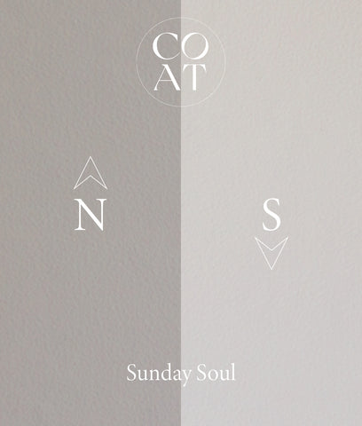
Sunday Soul, warm Greige, is a popular warm neutral

Pudding, Dark Beige, looks dark and rich
Dark Blues and Blacks will work well too, with north facing rooms bringing out the darkest most dramatic tones. We're all about embracing the natural darkness in a space, and 2AM or David Rose will look amazing in a north facing room - so why not embrace it and create a cocoon-like feeling. A chic cocoon admittedly...

2AM, Dark Blue, owning the northern light

2AM, Dark Blue, goes from deep to dusty

David Rose, Blue Off-Black, is deep and dramatic
Best colours for south facing rooms
That coveted light in south facing rooms is just a bit brighter and bouncier. Everyone wants a piece of south facing space - especially in kitchens or breakfast rooms, and those spaces with lots of glass. All that bright light has an effect on interior wall colours too - it can make them really sing, or wash them out. So choose carefully.

Sweatpants, Pale Grey, basking here @the_brixton_home_boys

Pampas, Off-White, is almost pure in southern light

Good Intentions, Pale Greige, is a great all-rounder
Mid-Grey shades can create a perfect calming feel in south facing rooms. They get the steely-ness knocked out by the southerly natural light, and take on a much warmer role. You can afford to go a shade darker too, to help the colour compete with the bright rays and not look washed out.

Sweatpants, Grey, but warm @gareth_at_31
Vibrant yellow and orange shades can sing in south facing spaces too, with the warm natural light bringing out that sunny side. In north facing spaces yellows can look a touch green thanks to the cooler light, but there's no chance of that here.

My Island, Mid Orange, skews almost pastel
Darker shades of traditional Green and Charcoal Grey take on a more humble stance in bright south facing spaces. Rather than feeling deep and moody, they can look almost pastel and chalky - especially in a Flat Matt paint finish. You can afford to go a shade darker in bright south-facing rooms to contend with the brighter natural light.

Adulting, Dark Teal, plays well with southern light via @homefromhole

Adulting, Dark Teal, goes from dark to dusty

Ditch the Tie, Dark Green, can change dramatically
What about east and west facing rooms?
Meh, it doesn't matter quite so much here, just think about where you'll mainly spend time in the room. West facing rooms get the bright light in the PM (Sunset), and East facing rooms get the right light in the AM (Sunrise).

Forever & Ever, Black, by @zephs_house
For example, if your bedroom is west facing think about warm paint colours like warm neutrals so it doesn't feel chilly when you wake up. Or if it's east facing you could embrace that natural morning sun with a deep dark blue - it'll feel nice and powdery in the morning, whilst taking on a deeply dramatic look in the cooler evening light.
What paint finish works best?
Flat Matt paint is the go-to for most people. COAT's Flat Matt is the chalkiest, flawless matt finish you can get - but durable too. In bright rooms it takes on a really nice powdery-ness that looks incredible in the sunlight.

Pudding, Dark Beige, by @theroomatthetop
But Soft Sheen paint is making a comeback, and is pegged to be a hot paint trend for 2021. Gone are the days of tacky shiny Vinyl paint from the 90's - Soft Sheen has a subtle and elegant shine that can bounce light around a bright room so nicely. It's also washable too. Think about using it on high ceilings to create a super dramatic light-filled space that draws the eyes upwards.

Hamilton, Dusty Teal, by @nickcarvell
So, light has a big impact on colour then...
Getting a Peel & Stick swatch and pondering your colour choice over a few days is a great idea. Check out the colour on different walls, move it around, and maybe even place it near furniture or artwork. Whatever you do, think about the shade you've chosen and how it'll feel in your space - because odds are, the pictures online won't do it real justice.
Shop Peel & Stick Colour Swatches from COAT
