We’ve seen lots of shades of green paint being used for interior walls in the last couple of years, due to biophilic design becoming increasingly popular. Different shades of green can be used to great effect when used in different settings, so we’re gonna introduce some of the best green paint colours and how you can use them in your home. The types of green colours can vary greatly, so often they can seem quite difficult to use, but we’re here to help your friends and family turn green with envy over your colour scheme.

@emjswalwell creating magic in her kitchen using The Trail.
Green is a great colour for your home, it reminds us of the outdoors and helps build a connection between your outdoor space and your interior. East facing rooms generally get greener light. These rooms are bright in the morning and darker and moodier in the evening. The traditional breakfast room would generally have been in shades of green paint, or a colour with a green undertone to create a scheme that was vibrant when the room would be used.
Dark Greens
In darker rooms, sometimes it's best to embrace the darkness. The best dark green paint colours are perfect for these spaces because they provide warmth in rooms with greyer or bluer light. Jewel tones, like our emerald green, Ditch The Tie, are really versatile, matching with many other popular upholstery and fabric trends like greys and beiges and also pairs wonderfully with more maximalist patterns. Saturate the whole room in Ditch The Tie and use lots of artwork to create the ultimate gallery wall.

Ditch The Tie is a COAT classic and it looks right at home at @spantastichome
Some of our favourite dark green paint ideas come from really simple schemes where the colours complement one another. Complete lighter green or neutral schemes with deep green tones on upcycled furniture for a botanical pop of colour, or use Ditch The Tie on door architraves with Detox walls for a clean, green look with a shot of depth.
Pale Greens
Pale green paint colours for bedrooms that are east facing are the perfect mix. They have more light in the morning so greens look energising, and then in the evening provide a little more warmth. Detox is a clean, pretty green which is ideal for this. Combine with Pampas woodwork for an effortless scheme that has a charming warmth to it.

@oursomersetnest opted for a cool, calm and collected vibe with 'Detox'
For those of you looking for light green paint but don’t want to commit to a fully saturated colour try one of our green based neutrals. Kind Regards is a really restful greige with a green undertone. Perfect for almost any space, this colour is a warm sign off for any space.

@chequerfield opted for a more neutral hue, 'Good Intentions'.
We have launched a collection of our favourite light green wall paint in our Pale Green Swatch Pack. This has been carefully curated to help you choose light green paint for your home.
Grey Greens
Some of the best green paint colours have become so popular because they have a grey undertone that makes them restful and easy to use in the home. Pretty, bright grey greens like Yard Party have become even more popular due to the popularity of the Biophilic and Japandi design movements. Yard Party is great for kitchen walls, where it provides a feeling of cleanliness without looking too cold. Pair with off-black kitchen units to add drama and depth.

It's one of newest but set to be a classic, 'Yard Party'.
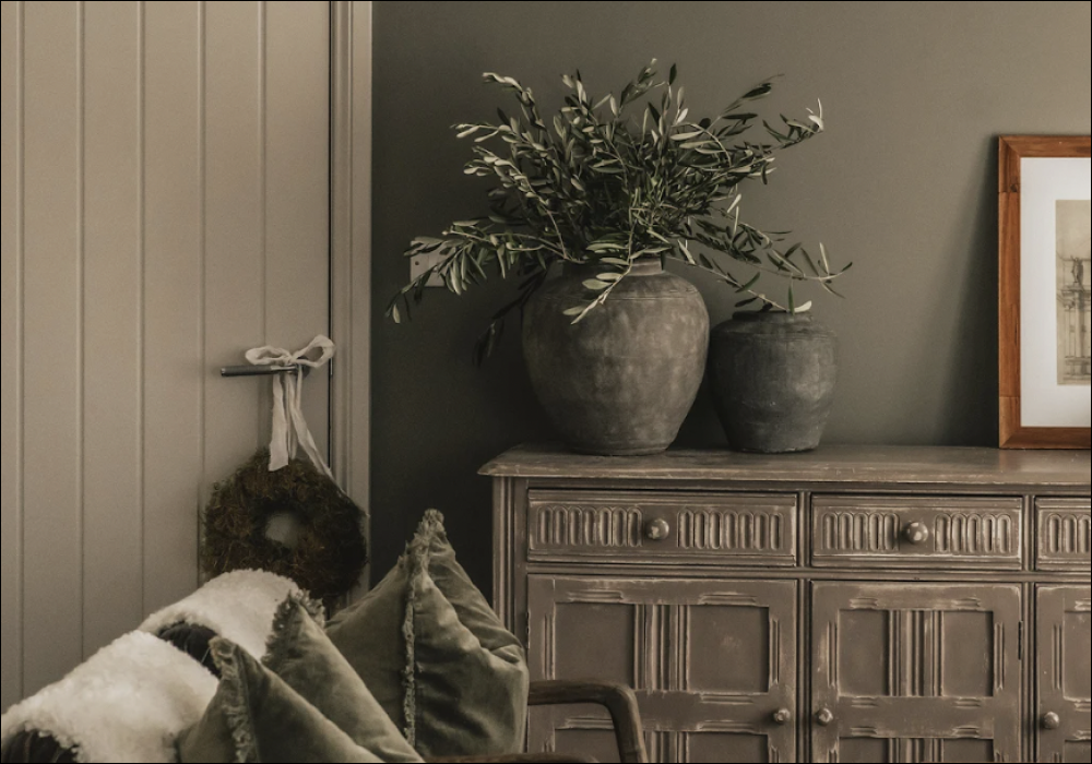
Some grey green paint colours have a yellow undertone too, making them really versatile. The Trail and Darlington are perfect examples of this. Use these different shades of green to create flow and harmony throughout your home. Living room walls in The Trail will feel relaxed and inviting, and your hallway painted in Darlington will make rooms coming off of that space feel brighter and airier.

@joeykendalbrown giving us all the inspo with a take on 'Darlington'
Olive Green
Olive greens have become popular accent colours more recently. It provides a heritage feel, but has an inviting warmth. Paint your walls and woodwork in Nomad for the most dramatic dark olive green house. Nomad is ideal for reading nooks or library spaces, make sure to paint the walls and woodwork the same colour; then get the fire going and get cosy. It also makes a stunning backdrop for florals, foliage and patterns in a maximalist scheme.

@jillylizzyinteriors fell for our olive green, 'Nomad' and transformed her sons bedroom.
Apart from having a dark olive green house, there are other ways to use Nomad. A feature wall alongside relaxed neutrals with olive undertones like Cargo is a lovely way to create a traditional scheme that has a modern twist. To do this, combine Cargo and Nomad with teak furniture, brass accents and earthy toned leathers, sculpture and artwork. Use olive toned velvet cushions on your sofa and chairs to tie back into the wall colours and create a harmonious scheme.

'Nomad' & 'Good Intentions' have transformed @brickdustbaby staircase.
Forest Green
Of all the interior green paints, Forest green is often the most difficult for people to figure out how to use. It is slightly cooler than olive and greyer tones and is much more saturated. Mansard is somewhere between a duck and a forest green, having a slightly blue undertone. A truly vivid colour, it creates an exhilarating backdrop for a gallery wall, and is named after the Mansard gallery that has now been reestablished on the top floor of the Heal’s department store. Keeping these really saturated colours in smaller spaces is ideal, creating density and excitement in rooms that would otherwise be austere white boxes.

Heal's x COAT green classic, 'Mansard' here.
For those of you looking to invoke Scandinavian pine forests in your interests, deep forest greens like Brewer are the answer. Deep and brooding, this misty green has a blue undertone that creates vibrancy. Wonderful in our soft sheen finish, used in bathrooms with black (preferably dimmable) wall lighting. The pop of black reminds the eye that the green isn’t that dark, and the sheen across the surface will add a wonderful lustre for your bathtime ritual.

Chartreuse Green
One of the hottest trends for 2022 has been adding chartreuse accents to more neutral colour schemes. This electric green adds a vibrant pop of colour that looks awesome with Pop Art prints. Plant Power looks fantastic next to relaxed neutrals with green undertones like Rathbone Place. Soften the scheme with pink velvet upholstery and brass accents. Plant Power also acts as a really vibrant backdrop for biophilic design, bringing out the richness of colour in your houseplants and pairs nicely with rattan and light woods.

If there was ever a time to go bold, it's now. 'Plant Power' is the one for you.
You can also use this colour to evoke a modern take on the steampunk style interiors. Pair with black walls and woodwork and use Plant Power on the ceiling to create an energising statement, then add Victoriana prints with elements of really saturated colour. You could also create your own by taking old pictures and splashing some vibrant paint on them!

It's moody with a pop of joy to brighten up your space. 'The Record Store' & 'Plant Power' doing their thing.
