
The past year has been a strange one in anyone’s book. Time at home has led millions of us to update and even transform our rooms to better suit a new and different way of life.
But what paint colours have people been choosing? And what does that say about our mindset as a nation? We discussed with sensory design expert Franky Rousell, Designer and Founder of Manchester-based Jolie Studio.
TL;DR? Shop popular colours.
“There’s a consistent theme of comfort in these popular shades” says Franky. “They’re all quite different on face value, but below the surface there’s a psychological ‘red thread’ of calm and reassurance that ties them together. In a time that feels so unstable and uncertain, it’s probably no surprise that people are naturally gravitating towards them.”
Ditch The Tie (Dark Traditional Green)

Ditch The Tie, styled by @manic_alnwick via Insta
Ditch The Tie is COAT’s take on a traditional dark green shade. Like the name suggests, it’s less about the stuffy stately greens of old - and more of a relaxed natural take on the colour. It’s been COAT’s most popular paint of the last year or so.

Ditch The Tie, moody styling by @inside.number.twelve on Insta
“We love dark green at Jolie, we treat it as a neutral, and the trick to get the full impact is to be brave with the application, allowing it to fully encapsulate the space, walls and ceilings!” says Franky. “Pair it with sandalwood or Ravensara diffused essential oils to bust anxiety and fully allow you to switch off. Lighter, tonal dried floristry works beautifully against this colour, to prevent going too overboard on the green.”

Feeling natural, Ditch The Tie by @theoda on Insta
Green harnesses the power of growth in nature, but by choosing a darker shade you’ll also evoke feelings of reassurance, rest and security. It's an incredibly powerful colour to put the mind at ease, so maybe try it in the bedroom.
Sunday Soul (Warm Brownish Grey/Greige)

Warm Greige Sunday Soul by @theroomatthetop on Insta
Sunday Soul is Greige, which is a thing apparently. Essentially it’s the best of calming Grey with a touch of natural Brown and Beige to warm it up. The front-runner in Neutrals for 2021 this shade is a versatile one that creates a calmness to any space, skewing more brown-y in darker rooms and a warm white in light-filled spaces.

Japandi vibes using Sunday Soul, by @my_grey_place on Insta
“We love this cosy, warm Greige, which is a perfect backdrop for any space where you want to feel reassured and nurtured” says Franky from Jolie. “Brown tones, again, subliminally connect us to the stability of wood and earth in nature - allowing us to feel grounded and in a safe space. This is a perfect tone for any switch off zones like bedrooms or comfy living spaces.”

Pairing with natural linen, Sunday Soul by @life_of_isatu on Insta
“We would recommend pairing Sunday Soul with a warm, organic shaped pendant light and infusing the space with a cotton flower fragrance to compliment. To bring in a sense of chic, use black edging through dressing touches like slim black picture frames and black curtain tracks, and balance with a comforting soft white sheer to lift the warmth of the greige” advises Franky.
Mr. Clifton (Mid-Blue Teal)

Classic, Mr Clifton by @renovation_leytonstone on Insta
Mr. Clifton is a classy character, combining a classic mid-blue with a green edge that puts it slap-bang on trend. It’s no surprise that it’s COAT’s most popular blue then. This complex character skews from a dark and moody number in the evenings, to taking on a dusty Mediterranean vibe in sunny spaces - it takes on the best characters at all times of the day.
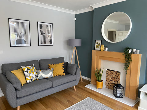
Perfect pairings, Mr Clifton by @number.3lc on Insta
“We love how Mr. Clifton carefully borrows from the power of blue and green at the same time” says Franky at Jolie. “The blue hue within this paint colour really brings a sense of calm and tranquility to a space - but paired with the green it draws on the natural element that brings in optimism and healing. Sitting in this mid-tone spectrum, this is the perfect shade for a space that demands focus or sophistication like dining rooms or home offices.”

The perfect mid blue Mr. Clifton, by @lexi.m.sexton in Insta
“Pair Mr. Clifton with amber, incense and patchouli to uplift and subside any anxieties for the ultimate go-getting mindset” says Franky. “We would recommend pairing this with textiles sitting either side of this colour spectrum, using dark greys and light beiges.”
WHAT ABOUT FUTURE COLOUR TRENDS?
If we’ve learnt one thing, it’s that colour psychology (the way colours make us feel) is timeless. The most popular COAT colours of the last year pretty accurately harness the nation’s underlying need for a sense of calm and reassurance - and we don’t ever see that shifting when it comes to creating homes we love.
Your next project starts with a Swatch. Shop now.
